 Whether you’re introducing how to measure user experience to an organization or trying to advance the maturity of your UX practice, you need a plan for measuring and improving the user experience.
Before you can implement any plan, you have to be sure you know who your users are. Perfectly executing the right plan on the wrong set of users is a recipe for disaster.
With a good idea about who your users are and how to collect data from them, here’s a high-level plan to start measuring and then improving the user experience.
1. Understand the company KPIs
A great place to start is to understand how your organization measures success. Every company has Key Process Indicators (KPIs)metrics that can make or break products and promotions. While revenue is usually the ultimate metric that the company brass and shareholders track, it’s a lagging indicator (you can’t do anything about last quarters numbers!).
For that reason, you need to track other metrics that give a clue about the revenue. These include behavioral metricsregistrations and repeat purchases as well as attitudinal onescustomer satisfaction, likelihood to repurchase, and likelihood to recommend. For organizations that have multiple product lines (e.g. Microsoft, Apple, Intuit) you’ll want to differentiate between brand and product metrics, too.
2. Benchmark perceptions of UX quality
With the KPIs identified, you’ll next want to be sure you have access or can collect these benchmarks along with some measure of the perception of the quality of the user experience. For websites, we use the SUPR-Q. For software, you can use a combination of the SUS, TAM, UMUX-Lite, or ideally some psychometrically validated instrument.
Many organizations already have annual customer surveys where they collect the more traditional metrics like customer satisfaction and NPS. Leverage these efforts by inserting standardized measures of UX quality in the same survey. Measuring perceptions of the user experience isn’t the same thing as measuring user experience behavior, but it’s half of the equationand a great place to start.
If some of the KPIs are actual revenue, purchases, cancelations, or some other behavior, link this behavioral data to the attitudinal data of the perceptions of the UX quality from the same customer. It’s important to have that linkage; otherwise you won’t be able to fully understand how changes in UX attitudes affect the company’s KPIs.
3. Associate UX measures to KPIs
With a measure of UX quality and KPIs from the same customer, you should seek to understand the mathematical relationship. For example, we’ve often seen strong correlations between NPS and SUS. Creating the association involves both examining verbatim comments as well as using multiple-regression analysis to understand what aspects of the user experience have the biggest (if any) impact on KPIs.
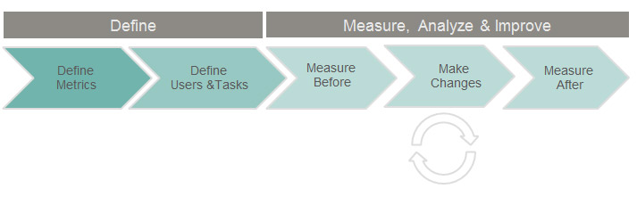
To create the chain of accountability from pixels to profits, you need to understand what a customer does and thinks. With this linkage you can then get into the more common methods for improving the user experience. I recommend the following framework for defining tasks, users, and metrics and then measuring before and after making changes:
4. Track top tasks by product areas
People use your products for a few reasons. Understand what those are and do them well. For each product or app area, conduct a top-task analysis. You’ll want to understand what tasks/functions are essential to customers.
You’ll also want to separate the long tail of trivial tasks from the handful of tasks that drive customers to reuse and recommend an experience. To do so, conduct a top-tasks survey. If you have trouble conducting a separate survey solely for this purpose, include a top-tasks question in customer surveys when you collect the KPIs and measures of UX quality. It usually adds only 2 to 3 minutes.
5. Benchmark the user experience
Once you know what the key tasks are, you’ll want to benchmark the user experience of the products and product functions that address the users’ top tasks. A lot goes into creating a successful benchmarking program. You want to do this right as it becomes the future comparison point. You don’t want to be optimizing around the wrong task, metrics, or experience. Use this checklist to help plan your benchmark.
If you have multiple products and teams, you’ll want to benchmark each product. This gives you additional points of comparison and more granular data to examine. Not all products from the same company have the same user experienceiTunes is a great example of a less than stellar performance from Apple.
6. Create a plan to improve
With an idea about where things are in the user experience you’ll need a plan to improve it. After all, the point of measuring is to improve the user experience, not just document it. This is where more traditional UX methods come in to play. From contextual inquiry (understanding customer problems and goals) to card sorting (how people perceive labels and phrases) to tree-testing (how people browse for products) to usability testing (what problems users encounter while attempting tasks).
While the best plans to improve the UX will be based on the context, you’ll want to use multiple methods, iterate early and often, and measure each phase with a core set of metrics.
7. Understand how changes in designs improved the KPIs
Once changes have been implemented and there’s a measurably better user experience, you should see an impact on the more high-level perceptions of UX quality. You’ll want to compare KPIs over time and see what’s having an impact and where you need to course correct. You can use some simple statistical comparisons to differentiate real movement from sampling error as well as more advanced techniques to help understand cause and effect.
8. Compute the ROI
Now that you’ve made changes and showed how changes have improved the user experience and the company KPIs, use that linkage to compute the return on investment. Usually ROI calculations get an eye roll from management because they rely on generalizations about discovering problems earlier versus later or some dated studies from decades ago. You can make a much more compelling case for the efficacy of UX budgets by showing how changes in your design moved the corporate needles.
9. Perform a periodic UX audit
Even healthy people and fancy sports cars need periodic checkups to make sure things are in order. Incorporate periodic checkpoints to be sure you have the right people and processes in place to ensure the right methods and metrics are being collected. Markets and customer needs change over time. You’ll want to be sure you’re properly aligned to the company and customer. And after all, the purpose of a company is to create AND keep a customer!

from MeasuringU: Usability, Customer Experience & Statistics http://www.measuringusability.com/blog/ux-measurement.php
