How To Design A Perfect Form With Validation?

Sometimes designers tend to forget basic ways to achieve usability in designs. And, one of the most common is form validation. Generally, users fulfill the action of completing web forms with required information successfully. But it is seen that they make mistakes while trying to fill the fields. So, the trouble is how to handle these errors? Well, thanks to web form validation, this can be sorted. The aim of web form validation is to keep a check on the necessity and formatting of the information that is essential for successful completion of an operation. The feature ideally gives a validation and points out when the user is wrong while entering information. Web-form sees to the entry of the details and passes it only if it is correct.

As a matter of fact, validations serve the purpose of having conversations with the users and help them during errors and certainty. You don’t have to wait for the entire page to reload in order to check that the form was filled with the right data or not. For instance, if the field mentions email address, the form will run the control to ensure that the text entered is a valid email address. Thus, a simple visual reminder to the user about an error in filling field can turn the irritation of guessing wrong entries to mere delight in successfully filling the form. Here, in this post we shall discuss not only validation but also explore various error feedback approaches that are of great use.

1. The Purpose

The main objective of good form validation is to talk to the user and communicate when the information entered is incorrect. Incorporating validation in web designs isn’t a big challenge but it is usually seen that the designers tend to get laid back with it and leave it onto developers to work at the last stage. This leaves UX at major risk because the developers don’t even know or bother about form validation. Neglecting form validation can actually leave users frustrated and this lack of attention can harm the website a lot.

2. The Methods

It is possible to validate user’s input both on the server and client. So, we have server-side as well as client-side validation. We will explain the positives and negatives of each.

3. Server-Side Validation

Server-side-validation

In this type of validation, the server receives the info and validates it with the help of one of server-side languages. However, if the validation fails, the response is reverted back to the client and the page that consists of the web form is refreshed and a feedback is made visible. This validation is safe as it is workable even if JavaScript is turned off in the browser and doesn’t grant easy access to malicious users. On the flip side, users are bound to fill in the information without getting a response until they submit the form.

This leads to a slow response from the server. Note that the exception to this type is validation using Ajax. Just as you type, the Ajax calls can do the validation and therefore, give immediate feedback. It majorly applies to validating rules such as username availability.

4. Client-Side Validation

Client-side-validation

Server-side validation is sufficient in itself for successful and secure form validation. But if you want to enhance user experience, you can go for client-side validation. Here the validation is done on the client with the aid of script languages such as JavaScript. Script languages enable validation of user’s input as they type. This leads to a more responsive and visually stimulating validation. In this type of validation, form doesn’t reach submission if the validation fails. The JavaScript methods that you devise take care of validation and the users get instant feedback if the validation is improper. The demerit of client-side validation is that it is too dependent on JavaScript.

If users disable JavaScript, they can easily bypass the validation. This is the main reason why validation should be integrated on both the client and server. By amalgamating both the server-side and client-side methods, we can get the best package, that is, quick response, safe validation and super user experience.

5. The Target Areas

Now the question arises, what all can you validate? The answer is necessary fields, right format and confirmation fields.

6. Necessary Information

Asterisk-form-input

Well it is a no brainer that the information that should be validated first is necessary information- the one without which operation cannot seek completion. The validation has to be particular that the user fulfills the criteria of providing required details in the web form and it has to object if at least one of the fields is not filled in. The requisite field should be properly marked so as to guide the users on which information has to be filled in up front. A common way to achieve this is to use an asterisk (*) symbol besides the required fields. But the problem is not everybody is aware of the meaning of an asterisk sign. Beginners and old users are most likely to assume the meaning of an asterisk symbol.

That is why it is important to include a note above the form that mentions that all fields marked with an asterisk are necessary to be filled in or put required field markers, whichever suits you. However, if the form has all the fields that are mandatory then you should save yourself the trouble of placing asterisks or markers in the form. A clear message that all the fields are necessary will serve the purpose.

7. Right Format

Right-format-form
Apart from regulating the submission of required information, validation has to take care that the users fill in the info in the right format. This includes various cases like email address, URL, dates, phone numbers and others. If the information fails to comply with the correct format then the users must be told about it and guided with the right format. Generally the simplest way to validate correct formatting is to utilize regular expressions. Remember that it is always better to not force the users to stick with a set input pattern and allow them to enter text in a variety of formats and syntaxes and then let the application understand it intelligently.

The user is usually concerned with getting something done, not about including correct formats or operating difficult UIs. Give the user the freedom to type whatever he wants and if it can be passed, make the software do the right changes with it. This style of design is also called forgiving format UI design pattern.

8. Confirmation Fields

Confirmation-fields
While using significant data for the system, it is preferable to allow the users confirm their input with the use of additional confirmation fields. This will ensure the users that the information they have entered is correct. Usually confirmation field is employed for passwords, but it can be created for other cases like an email address. A confirmation field must be included next or below the main field. It should clearly explain the motive of the field such as ‘confirm your password’. If two values are not identical then the user should be immediately told. In this scenario, you can also use a success indicator if the values are identical.

9. The Feedback

Form-validation-feedback
In case of failure in validation, the system should immediately inform the users through a direct and clear message and provide ways to rectify errors. As it is required for the users to take note of an error message immediately, place it at the top of a web form, above all the other fields. This will give leverage to the screen readers to easily read the message. The message should be tried to be displayed in red as it is the color that everyone relates to errors and the icon must be sized properly so that it catches more attention. It is better if the icon is globally recognizable like red circle with white cross.

This will assist users with visual impairments recognize the meaning of the message. Furthermore, users will know about the input fields that require accuracy. Besides error message and a list of invalid fields, the system must highlight the fields that are invalid. This can be achieved through-

  • By creating red inline messages or markers adjacent to every invalid field
  • By altering the background color or border color of wrong fields to red
  • By varying the color of field labels
  • By supporting error tips close to each field

If you go for giving error tips or help, make sure to be short, crisp and to the point. For instance, if date does not match the right format, give the users information on how to change it correctly- ‘the date should be in dd-mm-yyyy format’. Giving these hints as the initial value of your input fields can also be a nice approach. Here, the user’s eye will be caught by the hint inside the input box first and then when he/she will start entering the details, it will disappear.

10. Validation Upon Submit

Form-validation-feedback
The standard way to perform validation is when the users confirm his data by hitting submit button. The validation begins and if any fault is detected, feedback is given immediately to the user. This will encourage the user to fill in the particulars of the form without any interruptions. That said, it can cause inconvenience too as the users will be able to rectify the errors only when they have submitted the form and then get the response back from the server. This is quite the preferred approach for server-side validation, but can be used for the client side as well.

11. Real-Time/Instant Validation

Real-time-form-validation
Quite opposite to the previous approach, real-time validation informs the users during the process of filling the form. This doesn’t imply that validation is conducted on every single key press but during the time when the field loses focus. Through this users get immediate notification about their input, for instance, if a username is unique or if a date supports right format. And of course, instant validation performs during typing in an input field or after the input field goes vague. Generally, it is accompanied by a text message, tip or a status icon. Instant validation must be applied with care and only in cases where it is required as it can pose a lot of distraction if overused or misused.

12. Errors to Avoid

There are two mistakes which you should take special care while designing form validation. Firstly, single error pages are a big no-no. Single error page implies that the users are taken from the web form that they filled to a page that displays some feedback. Here, users are under compulsion to browse back so that they can rectify errors. When they go back, they have to retain the information you mentioned in the error message and this is when the problem arises. Sam is the case with feedback messages in popup windows. Apart from causing annoyance, popups when closed keeps no track of feedback.

13. Keep a Check

Keep--check
Besides pure validation, there are various methods that enable users make lesser errors. That said, not all these methods can be regarded validation. They channelize the users and help them to avoid mistakes.

14. Help Hints

Help-hints
If a web form needs complex data, then help hints can serve the purpose very well by helping the users in the task of filling the correct information. By explaining them how to enter right info, you enable them to fill the form quicker and prevent common validation mistakes. Help hints are displayed as simple text adjacent or above the input field. Remember the design of help hints must vary from the design of form labels. It is generally displayed in smaller, grayed text. The major merit of help info is that it is always available to the visitor even if the JavaScript option is turned off.

15. ToolTips

Tooltip
Contrary to help hints, tooltips at first hide the information and then display it on demand. They are usually fuelled by an icon with a question mark. Help information is given by keeping on help icon or selecting it. Once the mouse goes far from the icon, the tooltips vanishes. These can effectively help in reducing clutter especially when the help text is lengthy.

16. Dynamic Tips

Dynamic-tips
Just like tooltips technique, dynamic tips do not appear initially in front of the users. Once the user gives input, related tip becomes visible. Through this, tips are highlighted without creating any clutter any such in the form. Tips should be displayed in a manner that they don’t hide other information present in the form. They are generally placed adjacent to input fields, but you must try to keep them on the right side of the fields as that causes less distraction.

17. The Human Proof

The-human-proof-captcha
A pivotal part of web form validation is Captcha. It is important in validation as it detects whether the user of a system is human or a bot. In its simplest set, captcha comprise of an image with text, numbers or an expression and a field that requires content of the image as input. Nowadays, most spam bots can easily identify the text embedded in a simple captcha image, so it is better to use some question that only humans could answer correctly like ‘what color does the Sun have?’ with correct answer ‘yellow’ in all its variations; ‘YELLOW’, ‘yellow’,’Yellow’. A method called Honeypot Captcha can also be used if you want to create hidden form elements and then confirm on the server side that they remain empty.

Blind, visually impaired or dyslexic face problems or even find it impossible to complete the web form with Captchas. But now there are types like ReCaptcha that enables audio support for users with disabilities. All said, it is a fact that users hate captchas as it causes too much time for the users to read and fill the form. But note, captcha is for site owners not users. So, if you can avoid captchas, go ahead and grant the users more accessibility.

Final Word

Filling forms takes up time and effort. Correct the users through appropriate error messages and save them from unnecessary trouble of fixing mistakes. Implement effective form validation in your design so as to make your users stick to your website. There are various techniques to execute form validation, but not all are suitable in enhancing user experience. The above article mentions various methods to aid you in web form design; choose the ones that grant solution and lead to successful form completion rates for your site.

Summary

Article Name

How To Design A Perfect Form Validation ?

Author

Description

Good form validation designing is a important part of designing process. form validation is to ensure that the user provide necessary information properly.

The following two tabs change content below.

For 12+ years I have designed, developed and marketed websites / apps startups in New York, California, Florida and in India. Always focused on great User Interface is key.

Latest posts by Prince Pal (see all)


Subscribe To Our Newsletter

Join our mailing list to receive the latest UI/UX Design news and updates from our team.


You have Successfully Subscribed!


from Designer News Feed https://www.designernews.co/click/stories/71223

8 principles of bot design

Despite plenty of excitement it’s still unclear how conversational UIs can be made to work in a practical sense.

But opinionated design principles can help us push past the hype, and design something real people will want to use every day.

We’re not lacking for self-assured sermons on how conversational UIs are the future. Much less is written about the practicalities of actually designing chatbot interactions.

Yet it seems like this is precisely what we now need. Early attempts at chatbots have fallen flat in their execution, mostly because they have relied too much on natural language processing or A.I. capabilities that simply don’t yet exist. Others have jumped on the bandwagon and tried to shoehorn unsuitable use cases into this new pattern.

In all the excitement of diving into this new technology most of us seem to have forgotten about the most important actor in this enterprise: the human being who is expected to talk to the bot.

So how do we go about designing bots? When are they useful? Should they be friendly and simple like Slackbot, or fake yet smart like Facebook M? Should they allow for free text input or create IVR-like options? These are not insurmountable questions, but the truth is we’re still exploring how to use this new medium to build great experiences.

Situations like these call for strong opinions, weakly held. When you’re tackling a domain like chatbots that are still very much in flux, it’s essential to be guided by clear design principles.

(This post was first published on Inside Intercom, where we regularly share our thinking on design, startups and product management)

What are design principles?

All great, category-defining products are opinionated. Design principles lock these opinions in place upfront.

At their simplest, design principles are a list of strongly-held opinions that an entire team agrees on. They force clarity and reduce ambiguity, and represent a north star for everyone to aim for.

There’s an art to coming up with good design principles. They can’t be mere truisms. If they are, everyone will simply nod in agreement, but they won’t help you to make actual decisions.

For example, “We don’t make our designs too complex” is a terrible principle — nobody would realistically argue the opposite position. Truisms cannot guide your decision-making in any meaningful way.

We favor simplicity over power”, on the other hand, is a great design principle. The opposite principle could also be argued — “We add complexity so our users can do cool things”. Opinionated principles like these will help you make consistent decisions throughout your design process.

With that in mind, let’s lay out some principles that will allow us to make progress on designing conversational UIs.

Principles of bot design

1. Don’t pretend to be a human

Playing bait-and-switch with a user can make them feel that they have been duped, or that they don’t understand how a system works; both are bad user experiences. Don’t pull the rug out from under your users. This means not using “is-typing” indicators or artificial delays to make it seem more human. On the contrary, bot messages should be styled differently and be clearly labeled in a way that communicates they are not human. This doesn’t preclude us from giving the bot personality.

2. Keep it incredibly simple

Bot conversations should be bounded to very particular subjects and follow linear conversation routes; we avoid complicated branching paths. We’re not trying to create a general, self-aware A.I. here. It’s okay to expose and explain limitations. BASAAP. Individual bot designers shouldn’t have to account for tricky failure cases. Users will tire of complicated passages of dialogue.

3. Respect the chat medium

One advantage of smart messaging apps is that we can strip away a lot of apps and interface and reduce the interaction to a simple chat UI. It would therefore be pointless to turn around and drop an entire app directly into a conversation. Keep everything native to the conversational back-and-forth. Every bot interaction is about call and response, with the bot publishing comments into the chat thread and the end user responding in the reply area. Bots can’t modify conversations in ways that humans can. At the same time, make use of conventions: rather than printing out an ungainly URL in a bot response, show a nicely-formatted card previewing the linked page.

4. Optimize for the end user

Bots should be used to improve the end user experience, not just to make life easier for customer support teams. A designer should ask themselves: would a human be better for the end user? If the answer is yes, you shouldn’t be using a bot. Bots should not attempt to replace what humans are good at; rather they should attempt to improve what humans are slow at. Machines should work; people should think.

5. Use sparingly

Bot interactions should be short and precise. It should be impossible to get into a protracted back and forth conversation with a bot; anything above two inputs feels laborious.

6. Provide an escape hatch

Always have a human fallback option, allowing the user to express “I’d rather wait and talk to a real human, make this robot thing go away”.

7. Use structured input when possible

The more alleyways a conversation can go down, the greater the potential for dead ends. Don’t place users in a situation where they need to guess the correct incantation required to proceed. Custom soft keyboards permit a limited range of input and can save a bunch of typing. For example, rather than asking the end user to type “yes” or “no,” show them two mutually exclusive buttons. Or validate structured text like email addresses before sending. In this way you can keep responses on track and sidestep the complications of parsing unpredictable plain text input.

8. Everyone sees the same thing

Bots don’t only appear to the end user. The humans behind the bots need a record of the conversation’s context too — how a bot replied and how end users responded accordingly. Common or lengthy bot messages may be displayed in a collapsed state in the admin view for the sake of neatness. Cases in which bot messages are private to an admin and are only internally visible are an exception.

Obey the principles without being bound by them

It’s important to note that these principles will almost certainly evolve, due to new technical possibilities or the simple fact that some of them were misguided. We should allow for both.

But having them in place makes things so much simpler from here. We’ve got a stake in the ground. Now we just need to apply these rules consistently and methodically. Without principles you’re just randomly firing ideas in any direction and hoping you’ll hit something that works.

Hero image credit: Shawna X

Written by Emmet Connolly, Director of Product Design at Intercom. This post first appeared on the Inside Intercom blog, where we regularly share our thoughts on product strategy, design, customer experience, and startups.

Intercom is a platform that makes it easy for web and mobile businesses to communicate with their customers, personally and at scale.

Want to read more articles like this?

from Sidebar http://sidebar.io/out?url=https%3A%2F%2Fmedium.com%2Fintercom-inside%2F8-principles-of-bot-design-51f03df1d84c%23.2wrmh5i2l

Test & create the perfect typography setup for your website or app

It’s always good to use real words

Lorem ipsum changes the way copy is viewed. It reduces text-based content to a visual design element — a shape of text — instead of what it should be: valuable information someone is going to have to enter and/or read. Dummy text means you won’t see the inevitable variations that show up once real information is entered. It means you won’t know what it’s like to fill out forms on your site. Dummy text is a veil between you and reality.

You need real copy to know how long certain fields should be.

The easiest way to get to Odense from abroad is by plane to Copenhagen International Airport. From the airport trains frequently depart towards Odense and it is around a one hour commute. A small trick would be to use journeyplanner.dk to plan your journey when you arrive to the Airport.

Sure, it’s easier

.. to just run down the forms and fill the fields with garbage (“asdsadklja” “123usadfjasld” “snaxn2q9e7”) in order to plow through them quickly. But that’s not real. That’s not what your customers are going to do. Is it really smart to take a shortcut when customers are forced to take the long road?

Get the code

Oh no, we’re sorry but this awesome project serves no meaning on smaller devices, please visit from a computer instead

– Best regards team typeanything

from Designer News Feed https://www.designernews.co/click/stories/71106

7 ways to prepare for cross-cultural usability testing

It’s a diverse world we live in. Around 13% of the population in both the US and the UK was born overseas, jumping to 25% of the population in Australia. Technology and online communication continue to make geographical separation less relevant.

But while geography may be less relevant in the digital age, culture hasn’t lost its significance. If you’re conducting usability testing in a cross-cultural setting, it’s important to be prepared. After all, in an ever-globalising world, chances are that cross-cultural usability testing will crop up at some point in your career.

I learnt about cross-cultural usability testing the hard way when I was working on a project which involved a significant Japanese audience. I had never been to Japan or had the opportunity to get to know their culture in-depth.

The first round of testing for my project didn’t go well, which was a surprise. I thought I had set clear expectations with the group about speaking thoughts aloud. The findings were confusing, and I didn’t get a good sense of mutual communication, despite good rapport and good participation.

I discovered afterwards that I had made a few assumptions that led me astray. I didn’t realise that Japanese people tend to communicate implicitly, or indirectly via signals like body language and facial expressions. A think-aloud method was a big leap from their usual communication style.

Once I realised this, I changed my program to better accommodate those cultural differences. This led to far better results in the sessions that followed.

cultural-differences

Here are a few important lessons I picked up along the way, which will come in handy if you find yourself about to embark on cross-cultural usability research.

1. Establish rapport and trust from the beginning

When there’s an obvious cultural difference, it’s even more important to build trust early on. Pay more attention than usual to addressing concerns and questions of each participant at the outset.

2. Avoid stereotypes and assumptions

Assumptions can lead you astray in any usability testing scenario. In cross-cultural testing, it’s even more important to leave assumptions at the door and create a non-judgemental space.

Avoid stereotyping, which is easier to fall into when you’re floundering in new contexts. Suspend any judgements that aren’t specifically related to the research.

3. Be sensitive to cultural differences

Be mindful of cultural taboos, inappropriate topics and the way race, gender and class might affect things.

For example, while Americans wouldn’t bat an eyelid at pointing to someone, a Thai person would find this offensive, instead using their chin to indicate the person. Equally, there might be topics your group isn’t comfortable discussing.

Be sensitive to cultural differences in communication, etiquette, customs and body-language.

Be sensitive to cultural differences in communication, etiquette, customs and body-language.

4. Define the boundaries

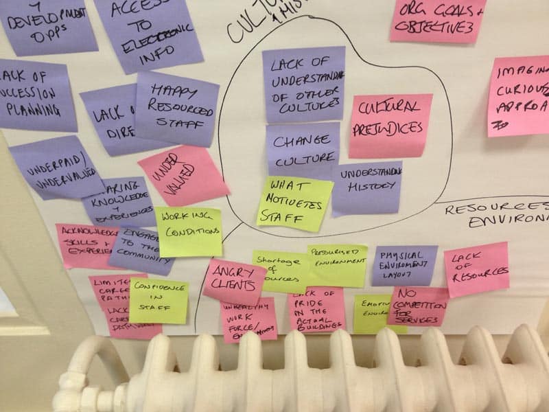
You can use a simple exercise to understand what people are happy to talk about. With my Japanese group, I created hand-drawn index cards with the interview topics written on them. We then played a sorting ‘game’ where they put them in two piles, of either ‘private’ or ‘public’ and had the ability to comment on their choices.

Any topics in the ‘private’ pile that I could live without, I discarded. The other ‘private’ ones I was very careful when asking amongst the other topics during the interview. I raised some others gently towards the end, after explaining why I needed to know, and only when I felt I had established a harmonious relationship with the participant.

5. Create cultural bridges

While understanding and acknowledging cultural differences is important, so is finding things you have in common.

I used a whiteboard to take turns playing another simple ‘game’ that acknowledged our different cultural backgrounds. We used this opportunity to figure out what we had in common, creating cultural ‘bridges’ throughout the session which helped establish rapport.

usability-testing

6. Be sensitive to language barriers

If language is an issue, make sure you communicate to participants as simply and clearly as you can.

Use straightforward language. Avoid metaphors, proverbs and colloquialisms, which are likely to confuse non-native English speakers. Be mindful that verbal and non-verbal cues are likely to be different.

Don’t forget to allow extra time. Most people might translate the English into their native language to understand better before responding.

7. Get a second set of eyes and ears

Given the increased potential for misreading signals or behaviour, the need to have a second person scribing notes is even more important than usual. A second perspective might help pick up things you miss.

A cross-cultural element in your usability testing adds an extra layer of complexity. But a little cultural sensitivity and preparation will go a long way to help you get meaningful results.

Do you have experience with cross-cultural usability testing? Share your tips in the comments.

The post 7 ways to prepare for cross-cultural usability testing appeared first on UX Mastery.

from UX Mastery http://uxmastery.com/7-ways-to-prepare-for-cross-cultural-usability-testing/

Design Insights for Virtual Reality UX

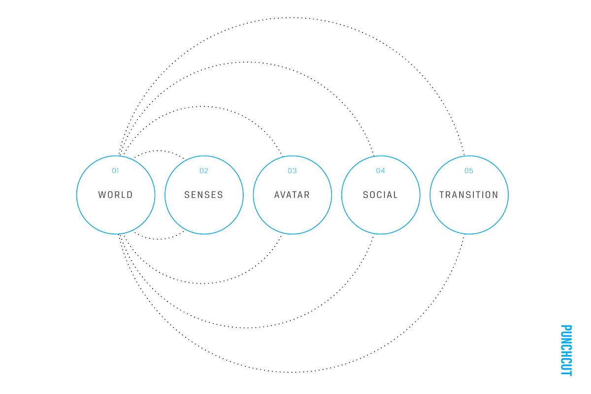
Enrich with the Right Senses

A virtual reality designer is a director orchestrating the senses. When a user has the freedom to look in any direction within a large world with seemingly limitless options, being able to focus the user’s attention towards the next objective or narrative moment is key. Providing this focus imbues the user with a sense of purpose (to explore, to act, to witness, etc), which leads to greater immersion and a more seamless experience.

One challenge with design for virtual reality today is the variety of input options that must be considered when creating a virtual experience. Some hardware solutions rely on sight alone, others allow for hand movement or game controllers, and others take advantage of a free range of motion. Virtual experience designers must consider a “responsive” solution to gracefully downgrade for user’s available sensory inputs and outputs.

In designing responsive experiences, the goal should be to keep a users look movement free and not rely on head movement to navigate or select. If all you have at your disposal is sight and sound, consider voice as a “killer app” for virtual experiences. For varying hardware configurations, the pairing of sight, audio and voice as a minimal requirement would still make for a very compelling experience.

When we think about touch, we need to broaden our thinking to account for in-game tactility, feedback from game controllers, and the incidental feel of the floor under our feet. Haptic feedback serves to orient the user, alerting them of changes in the environment. In addition, consider thermoception (temperature) or mechanoreception (vibration). Game experiences like The Void in Lindon, Utah give users a powerful sense of immersion as they sense sources of heat as they pass, or the vibration under foot as they activate lifts from one level to another. Paired with in-experience visuals, the smell of something burning in the air may lead participants forward if such were a relevant clue in the narrative.

The Void bills itself as a “hyper-reality” experience, blending the real world with the digital.

That said, virtual experiences also need to account for senses we don’t often think about. Consider vestibular senses (balance) and proprioceptive senses (the orientation of body position and movement of limbs). When experiences fail to consider these, the user experience greatly suffers.

As a best practice, orient the experience to the user when beginning a VR experience. They should never put on the headset and realize they’re looking at the wrong field of view and have to move their chair/body position to make the experience “work.” Physical comfort is key. For seated experiences, placement of story points and objectives should be within a comfortable angle to a user’s field of view. This also becomes a useful tool in creating meaningful moments pushing a user to look behind them or to feel lost in a space.

With all of these options available to VR designers as methods for directing users through their experience, the art is really in the combination and composition (even exclusion) of these senses to seamlessly move the user through the experience and evoke the desired response.

In Gallery: Call of the Starseed, the user gets haptic, sound and visual clues to solve puzzles throughout the game. For example, the player hears the repetitive sound of breaking glass before looking around to see items being thrown in the air. Seeing a glass fuse in the air, she realizes she needs to catch it before it breaks. Haptics let her know when she’s caught one.

from uxdesign.cc – User Experience Design — Medium https://uxdesign.cc/design-insights-for-virtual-reality-ux-7ae41a0c5a1a?source=rss—-138adf9c44c—4

Designing for Content-Heavy Websites

Even though minimal website design is the trend right now, it is not always possible to summarize our information into succinct blurbs that fit nicely on the page. Some websites need robust content…

from UsabilityGeek http://usabilitygeek.com/designing-content-heavy-websites/

Inline validation in forms: designing the experience

Designing the default UX

At the end of this research, my conclusion is the following:

Nobody knows what they’re doing, humanity is doomed and our only hope is the colonization of Mars.

Ok, it’s not that bad. But, we still have some serious problems:

  • There is no consensus on the default validation handling
  • Differences between the sites are huge, we can’t expect users to be familiar with any of the presented approaches
  • A lot of solutions are bug ridden, which is a good indicator of how hard it is to implement a good inline validation

Let’s recap the questions stated before the research:

  • When should the field be marked as dirty?
  • When should the errors be shown?
  • When should the field be validated?

If we can find the right answers to these questions, we can assure that the validation UX will be at least good. Validation UX is determined by the timeliness of the reaction, so let’s define the correct timing for each of those cases.

When should the field be marked as dirty?

In the research, you could see both approaches:

  • mark field as dirty as soon as the user focuses the field
  • mark field as dirty after the user entered some data in it

Facebook and JotForm mark the field as dirty immediately after you focus them. In my opinion that feels janky and aggressive. It felt much better when the field was marked as dirty after I had interacted with it. And I’m not counting focusing of the field as an interaction.

Also, when the user clicks the “Submit” button, all fields in the form should be considered dirty, and should be immediately validated.

When should the errors be shown?

This is another question where the research hasn’t given any clear answers. We’ve seen all of the possible combinations:

  • errors that are always shown
  • errors that are only shown when the user is interacting with the field
  • errors that are not shown only when the user is interacting with the field

None of these feel like the best answer, but my vote goes to the errors that are always shown. They do add some visual noise, and might feel redundant, but at least we can avoid the confusion where errors are disappearing on (seemingly) random occasions.

When should the field be validated?

To reiterate, we can validate the field either during the data entry or after the data entry.

In my opinion both of these approaches have timing issues.

Forms that perform the validation during the data entry punish the users as soon as they start entering the data. It is most apparent with the email fields. On the other hand, forms that perform validation after the data entry are not informing the user that they fixed the error soon enough.

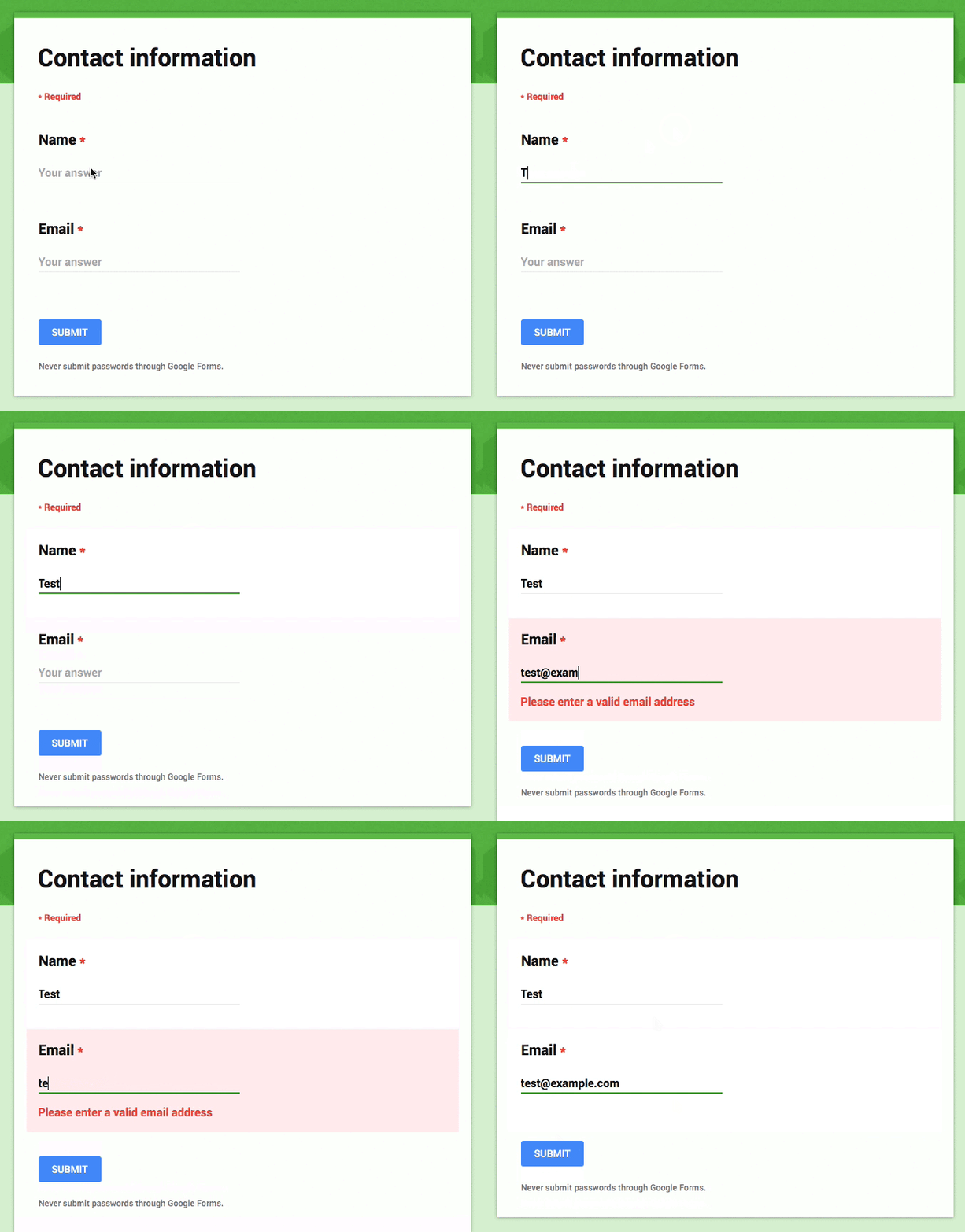
For the default behavior I propose a hybrid — reward early, punish late — approach:

  • If the user is entering the data in the field that was in a valid state, perform the validation after the data entry
  • If the user is entering the data in the field that was in an invalid state, perform the validation during the data entry
Hybrid — reward early, punish late — approach

Combining these two approaches feels like a pretty good compromise. Remember, we are looking for the best default behavior possible, different forms will have different needs, so make sure to adjust the approach as needed.

Notice how this implementation is not suffering from the email confirmation bug present in the Facebook registration form.

The implementation

If you are using ClojureScript, you should try out the Keechma Forms library because it definitely has you covered. That’s what I used to build the example (check out the code).

I don’t know of any other validation libraries that support this kind of customization (if you do, please send me the link to include it here), so I’ll just write down how to implement it:

  • The validation library must keep track of the dirty fields.
  • If the field was in a valid state, perform the validation on the blur event
  • If the field was in an invalid state, perform the validation when the field value is changed (using the combination of onchange, onblur and onkeypress events)
  • When the field goes from the invalid to valid state, treat it like a valid field

You should also make sure that the validation functions can check the current data of the whole form. For instance, email confirmation validation should be able to check what’s the current value of both the email and email confirmation fields. This way you can avoid bugs like in the Facebook registration form.

In my opinion (and implementation) the validation should not be defined on the input components. Validations should be always performed on the data, never on the fields itself.

Conclusion

I thought that the live validation is a solved problem, but after doing this analysis, it seems that every team has a different approach. I’m also pretty sure that most of these sites (they are some of the biggest sites in the world, after all) are doing extensive A/B testing on their forms, which left me pretty confused about the best approach.

In the end I’m pretty satisfied with the defaults, and I hope you found this article useful. Please let me know if you have any feedback, I’m very interested in your thoughts about this topic.

from Sidebar http://sidebar.io/out?url=https%3A%2F%2Fmedium.com%2Fwdstack%2Finline-validation-in-forms-designing-the-experience-123fb34088ce%23.r7k4cj34h

VSCO 5.0 launches

Description

Create, discover, and connect on VSCO®.

Create
Shoot and edit your images with our superior mobile presets and advanced camera controls.
Publish images and journals, or curate others to your VSCO profile.

Discover
Explore content from the people you follow, curated work from the community, and exclusive editorial content from VSCO Originals.

Connect
Join the VSCO community. Find and follow friends and people from around the world.

What’s New in Version 5.0

This version includes the following updates:
– New in app navigation – featuring gesture-based UI that allows for quick navigation between your personal space and a feed with updates from the people you follow and VSCO Original content
– Redesigned personal space – create, edit and publish images and journal posts to your profile
– Improved image capture and search
– Improved app speed and functionality
– Take a selfie with the front facing camera and find a surprise 🙂

If you encounter any issues or require further assistance, please contact support at support@vsco.co

from Designer News Feed https://www.designernews.co/click/stories/70363

6 UX Design Trends To Follow In 2016

Last year, we have experienced a great revolution in the domain of UX design. As we had stated back then, the most significant trends in UX design are here to stay and are assumed to be followed this…

from UsabilityGeek http://usabilitygeek.com/ux-design-trends-follow-2016/