Medium’s Best Design Writing of 2016

Creative, insightful, helpful, and actionable; we’ve curated and categorized 75 of Medium’s best design posts from the past year. Enjoy!

See Medium’s Best Design Writing of 2015.

Approaches to the Creative Process

The pathway to creative success is neither static nor singular, as the following articles reveal.

How to Apply a Design Thinking, HCD, UX, or Any Creative Process from Scratch by Dan Nessler.

8 Unintuitive Lessons on Being a Designer by Julie Zhuo.

4 Things Working at Facebook Has Taught Me About Design Critique by Tanner Christensen.

How We Tried to Design Our Own Book Cover (and How Jessica Hische Saved the Day) by Jake Knapp.

The Broken Window Theory In Design and Product Development explains why little problems are important problems; by Tobias van Schneider.

The Design Process characterizes the current state of UX — one of awkward pubescence — and suggests that some serious self-reflection, together, is necessary if design is to be taken seriously; by Pablo Stanley.

The Art of Designing With Heart reminds us that our software exists to help people and that if we build with them in mind, they’ll notice; by Jonas Downey.

In Defense of Homogeneous Design suggests that in our experimentation with products, we should also recognize when our ‘unique’ design gets in the way of our users’ experience; by Yaron Schoen.

Digital Product Design Principles gives you 12 considerations to help you make design decisions; by Wouter de Bres.

Behind the Scenes of the Creative Process

These in-depth articles explore some of the tech industry’s most successful products. Here we learn from the processes of Spotify, Facebook and Instagram.

Designing a New Look for Instagram, Inspired by the Community by Ian.

Design Doesn’t Scale reveals why Spotify’s product fragmentation was reflected in its team’s fragmentation and how when you invest in aligning and coordinating designers, design does scale; by Stanley Wood.

Redesigning the Spotify Icon Suite explores the visual, functional and contextual challenges faced over the four month process; by Andrea Limjoco & Rob Bartlett.

Peek Inside a Facebook Critique gives you a glimpse into how Facebook uses their product to help others make the world more open and connected; by Tanner Christensen.

Designing Complex Products shares insights about the growing landscape of interactions and how to cut through the complexities of people and products in your design projects; by Erik K.

Redesigning Chrome Desktop is a detailed account of Chrome Desktop’s redesign, the importance of a more future-proof design process and the value of a pixel; by Sebastien Gabriel.

UX

User experience is a broad topic and the focal point of any great product. Thankfully, these UX pieces cover a vast amount of ground, from basic tips to cutting-edge recommendations.

Complexion Reduction: A New Trend in Mobile Design explores the next level of ‘clean and minimal’ in mobile design and the ultimate guide to Complexion Reduction; by Michael Horton.

Designing More Efficient Forms: Structure, Inputs, Labels, and Actions by Nick Babich.

Design Better Forms outlines common mistakes that designers make and how to fix them; by Andrew Coyle.

Designing Smart Notifications is call for smarter notifications that provide value and are truly helpful; by Alex Potrivaev via Intercom.

Microinteractions: The Secret of Great App Design explains what a microinteraction is, why they work, how to identify opportunities, and the necessity of a human-centered design approach; by Nick Babich.

The Value of Multi-Typeface Design offers a counter-argument in defense of eclectic type systems and ways to effectively incorporate multiple typefaces in your projects; by Bethany Heck.

UX Design for Mobile: Bottom Navigation reiterates that navigation is a conversation and provides 3 rules for for good bottom navigation design; by Nick Babich.

Developing Your Eye for Design showcases a simple strategy that will help you develop and improve upon your taste and ability to identity strengths and weaknesses in designs; by Jonathan Z. White.

Functional Animation in UX Design: What Makes a Good Transition? by Nick Babich.

Button UX Design: Best Practices, Types and States by Nick Babich.

Designing Confirmation urges us to think about invoking action in a landscape where advanced technologies and interfaces are vastly changing user interaction; by Andrew Coyle.

Using Card-Based Design to Enhance UX details why web and mobile apps are moving away from pages towards cards and completely personalized experiences; by Nick Babich.

Hamburger Menu Alternatives for Mobile Navigation explores other menu types and why there isn’t a single one-off solution for mobile navigation; by Zoltan Kollin.

The Art of Stealing: How to Become A Master Designer looks at examples of how some designers have copied design work and effectively innovated upon it; by uxplanet.org via Michael Abehsera.

Designing Perfect Text Field: Clarity, Accessibility and User Effort by Nick Babich.

The Ultimate Guide to Chatbots: Why They’re Disrupting UX and Best Practices for Building; by Joe Toscano.

UI

UI is a robust, fascinating topic, especially in 2016. The following pieces reframe long-held assumptions concerning word design, television, best button practices, and present trends.

How To Be More Organized While Designing UI by Marek Minor.

How To Design Words claims that those who work with words should make reading as easy as possible and gives us 7 tips for designing them; by John Saito.

Motion Design is the Future of UI by Craig Dehner.

Designing for Television, a Three-Part Series by Molly Lafferty.

Effective Writing For Your UI: Things to Avoid offers 16 tips to build trust with more clear, accurate and concise text by Nick Babich.

Think Less. Design Better. promotes better UI design workflow through reduced decision-making and thought processes; Christian Miller.

4 Things I Learned Designing UIs for VR at Disney by James Hsu.

Buttons in UI Design: The Evolution of Style and Best Practices by Nick Babich.

Designing Future-Proof UI explores why UI has a limited lifespan and what we can do to ensure designs have longevity; by Christian Miller.

Animation / GIFs

Animation is an integral part of digital design, and its implementation has ignited some interesting debate and discussion over the past year.

UI Animation: Eye-Pleasing, Problem-Solving acknowledges those who view animation as an unnecessary feature overloading UI, but maintains that it’s the closest thing that captures the essence of actual and real interaction, and should support the user; by Tubik Studio.

5 Mistakes to Avoid When Designing Micro-Interactions by Issara Willenskomer.

UI Animation: Microinteraction for Macroresult explores the essence of microinteraction and how these cumulative microinteractions can grow into great usability, efficiency and popularity; by Tubik Studio.

How to Use Animation to Improve UX by Nick Babich.

10 Principles for Smooth Web Animations contains a complete guide to getting 60fps animations with CSS; by Anand Sharma.

Color

Color, a design element that is often taken for granted, is covered in a complete guide below.

How to Find Your Perfect Color Pairings — Introducing ColorClaim is a quick and short article about one designer’s color workflow by Tobias van Schneider.

Designing in Color serves as a guide for your color palette process because it’s important and at times intimidating, so much so that 90% of people’s snap decisions are made solely based on color; by Jonathan Z. White.

Picking a Color For Your Brand outlines the significance of color to a brand’s identity and provides some thoughts to guide you through answering this question — what colors are right for this brand?; by Bill S Kenney.

Trends

From card-based design to studying business, 2016’s design trends are covered below in great detail.

The Future Is Near: 13 Design Predictions for 2017 by Chase Buckley.

Why Designers Shouldn’t Code, But Study Business by Joshua Taylor.

The Next Big Thing in Design is a call to apply collective design practices to greater, more global challenges; by Tim Brown.

5 Actual Web Design Trends for 2016 by Nils Sköld.

Design and the Self reviews the various levels at which we can understand design and calls for good design in the world because good design helps us to be the best version of ourselves; by Irene Au.

5 Design Secrets from the Kids Who Will Replace You by Kim Cullen.

Top 3 UX Mobile Design Trends and the emphasis on personality, navigation and content; by Joanna Ngai.

50 Shades of #FAFAFA is a list of silly things designers do and don’t do, but don’t take it too seriously; by Jon Moore.

Misc.

How-to’s, myths, approaches, and assholes, the following pieces aren’t easily categorized, but merit inclusion on the list for their array of valuable thoughts on design.

9×9 Pixels, The World’s Smallest Website(s) challenges you to consider the 9×9 rule the next time you build a digital product or design a website, and why supreme excellence lies in simplicity by Daniel Eckler.

The Future of Design is Emotional explores form, function and feeling in design and our relationship to inanimate objects; by Daniel Eckler.

The Ideal Design Workflow provides 27 steps that you can follow to perfect your own design process, but don’t take it too seriously; by Keaton Herzer.

How to Pretend You’re a Great Designer lists some practical tips and principles to trick people into thinking you’re an industry thought leader; by Pablo Stanley.

10 Things You Need to Learn in Design School, especially if you’re tired of wasting your money; by Mike Monteiro.

Questions (and Answers) from Design Interviews at Facebook by Jasmine Friedl.

The Myths of UX Design/Product Design/Whatever They Call It This Weekby Christina Wodtke.

The Unbearable Homogeneity of Design poses many questions that urge us to reflect on a seeming complacency in present design; by Morgane Santos.

Human Centered Design & The 6 Fundamental Principles of Interaction Between Products and Users by César Bejarano.

What is the Purpose of a Logo? Why it’s more about purpose than design; by Brian Solis.

How to Make a Logo, For Free, in About 5 Minutes walks you through fonts, typesets, icons, colors, and layours; by Marc Hemeon.

7 Problems Growing Design Teams Face by Aarron Walter.

Product Design & The Asshole Contingency explains why you won’t be friends with all of your users; by Linnéa Strid.

If Satan was a Web Designer, this is how you’d probably have to enter your phone number. It’s hilarious and terrifying; by Fabricio Teixeira.

A Critical Analysis of the iOS 10 Lockscreen Experience explores how and why Apple’s iOS seems not to have scaled well as new features have been added; by Shankar.

Tools & Resources

No best of 2016 list would be complete without an obligatory rundown of key design tools and resources.

The Beginner’s Guide to Becoming the Best Designer explores different ways we can become the best at something while highlighting the importance of practice, commitment and a strategy for effective learning; by Michael Abehsera.

Great Books for Designers to Still Read in 2017 (if you didn’t get to them this year) by Robin Raszka.

20 Documentaries Every Designer Should Watch by Fabricio Teixeira.

Design at 1x — It’s a Fact makes a case for designing at 1x pixel density and gives us 8 reasons why we should start, too; by Kurt Varner.

The Best Designer Tools Collection by Muzli.

Design, Illustrated in 3 Charts is made up of a few doodles that illustrate one designer’s thought process of trying to out what, exactly, is design; by Julie Zhuo.

Let’s Talk About Design Portfolios is a compilation of impression and lessons learned while evaluating and hiring designers; by Daniel Fosco.

UX Design Methods & Deliverables contains some UX Designers’ most common methods and deliverables, each with a list of additional links and some of the best practices available in the industry; by uxdesign.cc.

64 People You Should Know in Design by Tradecraft.

An Iconic New Look and More shows off Sketch’s brand new icon as well as other app improvements and additions that will excite designers; by Sketch.

Thanks!

A long list, we know, but that’s it — all of our favourite design writing from the past 12 months. Thanks for reading (or skimming). If we missed a great design post from 2016, please let us know!

from Sidebar http://sidebar.io/out?url=https%3A%2F%2Fmedium.com%2Fswlh%2Fmediums-best-design-writing-of-2016-68de5ed2b7d9%23.otv3uz3yy

A guide to successful Design Handoffs

With this premise, I’d like to share some thoughts on how designers can adopt a few techniques to ease our & our colleagues’ work in the execution phase with the help of a well rounded & thorough design handoff —

When a design is handed over to the developer, there’s multiple layers of information that needs to be conveyed. In addition to the Mockups and Specs+Assets, one must also share the Interactions, Copy, and a Checklist. All these cover different aspects of the design solution and need to be collated in one, simple, accessible document that sits on the cloud. You can call it the Design Handoff Document.

A Design Handoff Document is a throwaway artefact. It serves the goal to build something, and that’s it.

  1. Mockups
  2. Interactions
  3. Copy
  4. Specs & Assets
  5. Checklist

1) Mockups

There isn’t much to mention here. We all have been generating & sharing UI mocks comfortably since many years now. But I do have a couple of points to make :

  1. Naming your files : Let the file/screen name not possess any form of versioning. The name of the screen should simply describe it’s function. If you’re not yet using a version control solution for your designs, you probably should. 
    Plus, make sure you use consistent casing when naming your screens, whether it’s ‘camelCasing’ or ‘Sentence casing’ or ‘lower casing’ etc.
  2. Have the necessary, archive the rest : At the time of handoff, you’d have collectively zero’ed on an option you’re going to build. So weed out all the older iterations & explorations. It also helps you write simpler filenames.
Suggested Tool(s) : InVision, Marvel

2) Interactions

  1. Make a flow : Putting the mockups together is only half the work done. You’d need to stitch the screens together based on the flow using Hotspots (or just make an Interactive Prototype). It helps the product manager understand how the user journey is panning out; and helps the developer plan his approach to code.
  2. Figure out the fidelity : Not every screen has to be fleshed out with high fidelity prototypes. Few screens could simply be static with explanatory comments, few could get away with platform-specific standard interaction patterns and few might require those custom prototypes. There’s no blanket rule for all the screens, so discuss with your developer & plan accordingly. Do not end up spend a ton of time prototyping a simple interaction pattern that already exists.

Whether you choose to communicate the interactions through an Interactive prototype or Comments marked up on each static screen — it’s upto you. But the idea is to have the interactions documented. There’s a tendency to leave this bit till the last minute when you hear designers say “I will sit with the developer & hash it out”; but it’s not efficient.

Suggested Tool(s) : Tour Points on InVision, Interactions on Atomic

3) Copy

  1. My advice is to list all the Copy in a 3-column table using any cloud tool of your team’s choice (Paper by Dropbox or Sheet by Google). There’s always a lot of Copy that cannot be shoe-horned in the UI mocks, so we’d need to record them somewhere else.
  2. For reference, I’ve drawn a brief template for our Copy table —
    • First, specify the type of copy. This helps developers quickly parse through the list. The rows could be grouped by the name of the screens (Homepage, Cart, Checkout etc.)
    • Second, specify the situation & context of the copy. (Eg. Whether the user is logged in or if it’s a repeat user. Or, if there’s an ephemeral event which’d influence a particular UX). Mentioning the context or the heuristic helps the developer understand when should the message appear/disappear. 
    • Lastly, the actual message.

More often than not, most of the product & design folks don’t spare enough brain cycles on Copywriting. Different team compositions would dictate if you’d need a specialist copywriter or not. But this post is not about whether the designer should write her/him own copy; nor is this another rant about how ‘copy is king’. I’m just saying you should have all the copy documented when you share the designs.

Plus, you’d anyway not want your developer to ‘fill in’ the copy for you in the final hour before the release. (‘cuz you are obviously not around ‘cuz you’ve already left for the day. Oh, designers.)

Suggested Tool(s) : Paper by Dropbox or Sheets by Google

4) Specs & Assets

  1. Automate : Today, with products like Zeplin, Avocode & InVision’s Inspect, a designer should not be allowed to waste any time redlining the designs with specs, measurements, and style guides. Let’s make use of these nifty tools and save our team’s time. A tool called Sympli even has plugins for Xcode & Android Studio. It’s just a matter of properly organising layers & groups in your sketch file and let the tools do the rest.
    Whenever you ought to define/refine your visual library — Give Lingo a spin, which helps you create a sharable style guide.
  2. Accountability : Automating the handoff process gives designers the authority to question the developer incase of deviation from the prescribed designs.

For example, raise a jira ticket against the responsible developer the moment you spot a discrepancy in the build. This way there’s organised accountability within a timeframe and no email escalations against the designer.

Here’s an aerial view of various tools with their handoff capabilities —

Suggested Tool(s) : Spec Mode by UX Pin, Avocode

5) Checklist

The most gut-wrenching part of any design execution exercise is the missing designs. There’s always an edge case or two missing from the designs shared, and this always gets escalated mostly during the last mile of design execution, with a sense of panic because of the looming deadlines. This leaves the designer reacting to the situation instead of responding with reasonable thought.

A practical solution to avoid all the last moment chaos, is —

  • Maintain a plain-jane checklist of all the cases & features that need to be designed; created & managed by the designer on the project.
  • The checklist will flag the status of the feature being picked up or not, and whether it’s completed or under works. All the completed rows should have the link to the corresponding design.
  • If a certain feature is moved to the next version because of a certain dependency, then the corresponding team is marked along with a describing comment.
  • Anything that does not exist on the checklist, is not accountable for implementation, and this understanding is established between product, design & engineering at the start of design solutioning. This way the checklist acts as a reference & single source of truth incase of a deadlock or confusion around whether or not the feature was agreed upon to build.
Suggested Tool(s) : Paper by Dropbox or Sheets by Google

from Sidebar http://sidebar.io/out?url=https%3A%2F%2Fuxdesign.cc%2Fhttps-medium-com-91bilal-guide-to-successful-design-handoffs-18345f42d5d6%23.9z8q025zk

Researchers See Augmented Reality as Enterprise Game Changer

Augmented reality is entering the workplace and researchers at the Massachusetts Institute of Technology anticipate that it has the potential to transform the way workers interact with large amounts of data, specifically in the supply chain. The use of AR, which superimposes digital content including hologram-like images onto a user’s view of the real world, […]

from CIO Journal. http://blogs.wsj.com/cio/2016/12/12/researchers-see-augmented-reality-as-enterprise-game-changer/?mod=WSJBlog

Wireflows, UX Books, Card Animations in Principle, and more UX this week

Wireflows, UX Books, Card Animations in Principle, and more UX this week

What’s hot in UX this week:

The State of UX in 2017 →

We are looking forward to how UX will evolve in 2017. In the meantime, here are the top trends we’re seeing in UX next year.

#1 Usability becomes a commodity
#2 The words we will stop using
#3 Everything is a conversation
#4 The year we begin breaking the glass
#5 Stitching all the pieces together
#6 Virtual Reality: a body and space puzzle
#7 Should designers design?
#8 Design must be automated
#9 Not your fault, but your responsibility

Read the report →

from uxdesign.cc – User Experience Design – Medium https://uxdesign.cc/wireflows-ux-books-card-animations-in-principle-and-more-ux-this-week-1b54e28a03ec?source=rss—-138adf9c44c—4

How Invisible Interfaces are going to transform the way we interact with computers

How Invisible Interfaces are going to transform the way we interact with computers

In the mid-nineties, a computer scientist at Xerox PARC theorized the concept of the Internet of Things, albeit with a different name, far before anyone else had and even further still before it had become possible.

Even though today we call it by that name, Ubiquitous Computing — as it was then coined by Mark Weiser — imagined a world wherein cheap and ubiquitous connected computing would radically alter the way we use and interact with computers. The idea was ahead of its time. In the world of ubiquitous computing, connected devices would become cheap and, thereby, would exist everywhere.

Importantly, these devices would as a result cease to become special or unique — they would become invisible.

As we near this utopian world filled with computers, our relationship with them inexorably will change. Each of us will come to interact with dozens of separate devices on a daily basis. As such, we will need to develop interfaces in a way so as not to distract us, as is currently done, but in a way in which to empower us.

Or, how Weiser put it, we will need to adopt the concepts of “Calm Technology”.

What is Ubiquitous Computing?

On the face of it, ubiquitous computing is just that, a reality in which computers are everywhere. Of course, with trends relating to IoT, we are nearing this, but we are not there yet. One of the most important implications to come from ubiquitous computing, for example, will be the changes it will make on how we perceive and interact with computers.

For instance, think of the electric motor: an old technology that is ubiquitous in the present. Today, there could be dozens of them in a single car. However, when we hit a button to roll down the windows, we don’t think at all about the motor pulling the window down. We simply think about the action of making the window go down. The electric motor is so mundane and ubiquitous in our lives that we don’t even think about it when using it. It is invisible.

It is this sort of invisibility that allows the user to take full control of their interactions with a given piece of technology. When using a piece of technology that has become invisible, the user thinks of using it in terms of end goals, rather than getting bogged down in the technology itself. The user doesn’t have to worry how it is going to work, they just make it happen.

Invisible technology keeps us focused on the task at hand.

In another example, Weiser simply states a good pencil “stays out of the way of the writing”. Now, even though technology surrounds us today, we aren’t at this point yet. Gadgets and devices are still special to us in a distracting way. We still not only still marvel at new technology, we are told to by whomever is producing it.

But why does this matter? The best way to see how ubiquitous computing will impact us is to examine the way we engineer and interact with the apps that exist today.

Apps written today are, in many cases, not created to save the user time and are certainly not created to keep them focused on a given task.

When creating a web app, for instance, you try to guide or manipulate the user into using your tool as much as possible. When you create a drip marketing email campaign for it, in most cases, you aren’t creating it so that the user needs to use your tool less. You are creating it so they can spend more time and use all of its features. That is to say, the goal isn’t foremost and necessarily to save the user time. Furthermore, there is no question asked as to whether the user aught to spend more time using whatever particular app is being optimized.

It goes without saying that the same is especially true for social media platforms.

Within a social media website, each user is given a piece of “social property”. A social media platform imbues each social property with a value system — think of the concept of likes, comments or shares — as incentive to spend time on the site. Each user interaction with a social property, whether it be a photo or a comment that is written, is then logged and recorded, so they can easily be rewarded for the time invested. Some social apps, such as LinkedIn, will have us hooked for something as simple as a pageview of our profiles.

These actions are further incentivized through the use of gamification. Apps send intrusive notifications, giving you some information about what they are about, but not everything. And this is crucial. Not knowing what is in the notification entices us to open it even further. It goes without saying, this is important for increasing the amount of screen time we give the app. For, if we saw everything in the notification, there would be no point in opening the app. It makes waking up every morning feel like opening a bunch of small presents.

The end result is that many of our interactions with technology are not determined by ourselves, but by the technology.

And, while it’s a stretch to say that developers are acting nefariously to steal our time, those building our web services and tools should construct them with respect to the user’s guilelessness. Doing so requires adopting principles of invisible or calm technology.

What exactly should an Invisible Interface look like?

Contradiction aside, the most accessible way we can get a glimpse into a future dominated by invisible interfaces is the movie “Her”. Although not the focus of the film, “Her” showcases a future wherein inputs given to devices are done so largely through voice commands. Yes, there are still smartphones, but the majority of interactions take place by simply talking to a given device using natural language.

Theodore is able to interact with technology in a manner that is completely at hand. He can ask any sort of question or create any sort of demand without getting bogged down in how the device works. Furthermore, the technology never tries to whisk his attention away from anything. The technology is always there, but it is only in the periphery.

According to Weiser, this is one of the key principles of designing calm technology. The device in question should never try to distract or pry the user away from what they are trying to accomplish. Yet, it must always be ready to accept user input. It is calming in the exact opposite way that receiving group chat notifications on your phone is not.

We can see this principle of design, in part, at play in the new Apple AirPods. Even though they have yet to be released, they promise to let us interact with the internet without ever needing to look down at our phones. And they are aware of their environment too.

They know such things like if they are in an ear or not, and, if they are not, they know to stop playing sound. It’s these small, micro-automations that will further make technology invisible and allow us to focus on whatever it is that we want from the technology and not worry about having to configure it.

Other, more simple, examples include the auto-brightness on your phone or its fingerprint scanner. They simply work without any sort of configuration or notification about what they are doing.

And more technologies like this are coming. There are, today, even advocacy groups such as Time Well Spent that try to spread awareness about how interfaces and apps can hijack the ways our brains work. Even more promising is that there are companies that are following suit in these designs principles. For instance, the upcoming Moment smartwatch is a device which interfaces with the user largely through touch feedback, instead of relying on the screen.

All that’s needed now? Better speech recognition.

from Sidebar http://sidebar.io/out?url=https%3A%2F%2Fmedium.com%2Fstartup-grind%2Fhow-invisible-interfaces-are-going-to-transform-the-way-we-interact-with-computers-39ef77a8a982%23.aus7gxrp8

The best new UX Books from the last 3 years

Best new UX Books from the last 3 years

A new generation of design books published in 2015, 2016 and 2017, that have recently become part of my virtual collection.

UX Books are still a thing. Although long-form articles on User Experience are increasingly becoming available online, for free, books still have a place in our hearts. The challenge of reading in the browser is that we’re constantly distracted by notifications, emails, and much more attractive browser tabs that derails us from finishing what we started – whereas books allow us to focus on a much more immersive type of reading experience.

When you think of UX Books, there’s a pretty well-known list of essential books for every UX designer circulating online. There are many versions of the same list, but they mostly revolve around the same usual publications.

But what about the most recent books?

What are some interesting UX and Design Books published over the last two or three years, that are worth considering to any designer’s personal collection?

The list below aggregates some of my favorite books, in no particular order. Hope you enjoy the selection.

We don’t ever link to Amazon or any ecommerce website because we don’t have any commercial interest that you buy these particular books. About uxdesign.cc.

from uxdesign.cc – User Experience Design – Medium https://uxdesign.cc/best-new-ux-books-from-the-last-3-years-d975403b2956?source=rss—-138adf9c44c—4

Bluetooth 5 launches and it’s a lot more powerful

Bluetooth 5 launches and it’s a lot more powerful

Following its announcement back in June, the Bluetooth Special Interest Group (Bluetooth SIG) has today revealed that the specification of the much-improved Bluetooth 5 technology has been finalized and is now ready for adoption by manufacturers all over the world.

Bluetooth 5 offers double the bandwidth, four times the range and eight times the broadcast message capacity of Bluetooth 4.2, which will likely prove to be useful for smart appliances and the Internet of Things as the current standard often isn’t powerful enough to connect an entire home.

Europe, are you ready?

TNW Conference is back for its 12th year. Reserve your 2-for-1 ticket voucher now.

“Bluetooth is revolutionizing how people experience the IoT. Bluetooth 5 continues to drive this revolution by delivering reliable IoT connections and mobilizing the adoption of beacons, which in turn will decrease connection barriers and enable a seamless IoT experience,” says the SIG’s executive director Mark Powell.

“This means whole-home and building coverage, as well as new use cases for outdoor, industrial, and commercial applications will be a reality. With the launch of Bluetooth 5, we continue to evolve to meet the needs of IoT developers and consumers […]”

Aside from providing users with a longer range for Bluetooth headphones, the latest standard won’t have an impact on sound quality for audio playback and telephone calls. Engadget notes that we shouldn’t expect to see any improvements to audio compression, latency and power use until 2018.

The SIG expects the first range of products equipped with Bluetooth 5 to hit the shelves early next year.


Bluetooth 5 Now Available
on Bluetooth

Josh Levenson is an avid technology enthusiast who writes news and the occasional how-to article. He’s also a self-proclaimed sneakerhead and has been an Apple fan for as long as he can remember.

from The Next Web http://thenextweb.com/insider/2016/12/08/bluetooth-5-launches-lot-powerful/

The Most Interesting UX eBooks Published in 2016

The Most Interesting UX eBooks Published in 2016

The latest available educational UX resources make me second guess my formal education. I have a degree in graphic design, but everything I learned about UX and product development has come from the sweat of my own brow.

Self-taught designers are empowered even more as design thought-leaders promote new thinking through a highly affordable and simple medium: eBooks. Without manufacturers or publishers, design knowledge is more accessible than ever.

Take some time to bolster your UX Library with some of the best eBooks of 2016.

Photo Credit: Brad Frost

Hot off the press! Brad just released his book this week! Pro-tip: it can be read online at atomicdesign.bradfrost.com, though you should totally support Brad and his new book. Atomic Design is the go-to for creating pattern libraries that allow for large-scale designs. Working on an in-house design team with an Agile engineering team, I can’t say how valuable these ideas are.

Photo Credit: Intercom

The only motivation should you need to read this eBook is knowing Samuel Hulick wrote the foreword (creator of UserOnboard). Anyone who has worked on a product knows that onboarding is one of the most difficult arts to master, and Intercom do a great job of breaking it down — from designing your product to getting your organization on board (get it?).

Photo Credit: O’Reilly

You can’t have a book list without an O’Reilly book, right? Contrary to popular belief, there’s a lot more to prototyping than picking which app you want to use. Digital designers still have much to learn from the timeless lessons of physical media. Kathryn walks through the goals and outcomes of prototyping, and how to create the right prototyping for your project.

Photo Credit: Typewolf

This eBook is unique because it’s constantly updated to include the latest free fonts. Jeremiah offers alternatives to the most popular fonts by providing links and comparisons. If you haven’t entered the world of free fonts, you should, as there is a whole new world of fonts beyond Typekit.

Photo Credit: UXPin

Okay, UXPin has well over 100 eBooks these days so it felt necessary to include one in this list. In this eBook, several companies and their design teams show how things work behind the curtain. If you work at an awesome company like me, you’re constantly looking to improve your design process. Read about the inner workings how Slack, Autodesk, 3M and more.

Photo Credit: InvisionApp

I’m always anxious to get my hands on industry surveys and reports. InVision’s industry report is a good gut check for your and your team. Are you ahead of the curve? Are you paid fairly? What tools is everyone using these days, anyways?

Photo Credit: Intercom

Bonus:

Photo Credit: Wired

While this is definitely not from 2016, it’s worth mentioning. Think gold, my friends. Even if Vignelli doesn’t follow your style, this is still worth your time. No designer can escape the importance of typography and grids, and one of the masters has shared everything he knows with you.

from Sidebar http://sidebar.io/out?url=https%3A%2F%2Fcmd-t.webydo.com%2Fthe-most-interesting-ux-ebooks-published-in-2016-d369bc4c3b10%23.n5rwi8b93

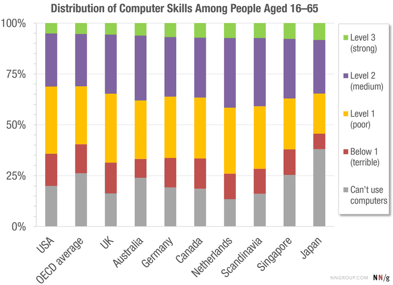
This Chart Shows How Computer Literate Most People Are

If you’ve ever gotten the impression that most people aren’t as skilled with computers as you are, you finally have some data to back it up. The above chart shows the distribution of tech skills, and there’s a pretty narrow pool at the top almost everywhere.

This chart comes from a study by the international Organisation for Economic Co-operation and Development group. The OECD conducted a study of 215,942 people across 33 countries from 2011-2015. The study tested the skills of people aged 16-65 to measure their literacy in job-related tech skills. Tests ranged from simple tasks like deleting an email (considered “below level 1”), up to figuring out things like “what percentage of the emails sent by John Smith last month were about sustainability?” (considered level 3). Participants were then graded based on the tasks they were able to complete.

The results aren’t terribly surprising if you’ve ever worked a help desk. Around 5% of the U.S. population ranks at level 3, the strongest level of computer literacy. Another 26% ranks at level 2, where users can do things like “find a sustainability-related document that was sent to you by John Smith in October last year.” Those who ranked in level 2 likely aren’t developers or engineers, but they get by.

However, for the 69% of the population below level 2, complex skills are still hard to come by. 26% of people weren’t even able to use computers. The full report at the source link below shows how these numbers break down over age ranges. Regardless, the numbers give some perspective on how skilled the overall population is.

If you’re the type who’s highly skilled with technology (and if you read this site, there’s a higher-than-usual chance you are), then it’s safe to assume not everyone shares your skills. Some people may not even have to. The average office worker may not need to mess around with command lines or complex spreadsheet functions as long as they can find their email. Rather than expecting everyone to know what you know intuitively, it might be better to be patient as you design things for them to use or walk them through learning a new skill.

OECD Skills Studies via Nielsen Norman Group

from Lifehacker, tips and downloads for getting things done http://lifehacker.com/this-chart-shows-how-computer-literate-most-people-are-1789761598

Year-Round Weatherproof Igloos for your Garden

Year-Round Weatherproof Igloos for your Garden

Summer days are limited but just because the nice weather doesn’t last 365 days a year doesn’t mean you can’t enjoy the outdoors beyond those warmer months. With the help of Gardenigloo, you can hang outdoors whether rain, snow, or shine any day of the year in their 360° Garden Igloo. The PVC geodesic domes are 100% weatherproof allowing you to spend more time outdoors dining, reading, napping, hot tubbing, or watching the stars. You can even use it as a greenhouse. Sign us up!

cuckooland-garden-igloo-2

The multi-purpose structure allows for 360 degree views of your outdoor space while keeping you protected from the elements. During warmer times, there are two windows and a door for ventilation. They’re easy to assemble and require no tools to make that happen.

cuckooland-garden-igloo-3

cuckooland-garden-igloo-3a

cuckooland-garden-igloo-3b

cuckooland-garden-igloo-3c

cuckooland-garden-igloo-4

cuckooland-garden-igloo-4a

cuckooland-garden-igloo-5

cuckooland-garden-igloo-6

cuckooland-garden-igloo-7

cuckooland-garden-igloo-8

from Design MilkDesign Milk http://design-milk.com/year-round-weatherproof-igloos-for-your-garden/