Levi Strauss & Co. has joined a wave of companies developing new digital interfaces based upon the fusion of messaging and machine learning. Levi announced Thursday the release of its artificially intelligent Virtual Stylist, which converses with online shoppers to offer jean recommendations based on style preferences and fit, similar to the the way a […]
from CIO Journal. https://blogs.wsj.com/cio/2017/08/31/levis-new-chatbot-helps-online-shoppers-find-jeans/?mod=WSJBlog
What would you do if you were tasked with inspiring people to open bank accounts? In 2004, Bank of America gave this same challenge to design firm IDEO—and a human-centered, ethnographic-based approach led to the solution, a campaign called “Keep The Change.”
After making observations across the country, the IDEO team realized several people in charge of household finances were intentionally fudging their math. That is—they were rounding up to make addition easier, which also added a buffer in their bank accounts.
This was something IDEO could really use. Instead of starting inside the walls of Bank of America headquarters with marketing tactics and assumptions, IDEO ventured into the field to observe real people’s relationships with money.
IDEO’s final solution became a huge business success for Bank of America, but it also created a change in mental state for customers. And that is why empathy is so crucial to design thinking.
“More than a methodology or framework, design thinking combines the problem-solving roots of design with deep empathy for the user.” —Eli Woolery, DesignBetter.Co
Guiding your own team to practice empathy is the surest way to create a relevant product that’s functional and delightful to use. To help people practice empathy, Stanford’s d.school created a challenge called The Wallet Project.
This project tasks participants with designing a wallet in just a few minutes. After they’ve sketched use cases and specifics, the participants are directed to interview someone specific. Following this conversation, they’re again directed to design a wallet—but for the specific individual instead.
We adapted this exercise so you can use it with your own team. The scope has been pared down, so it fits well within a 15-minute time block. In the interview portion, we also suggest a few specific questions elicit feedback that has the potential to truly influence your designs.
After you give this exercise a go, imagine how you could apply the practice to your work.
For expert insights and suggestions—or to learn more about IDEO and Bank of America’s “Keep the Change” campaign—check out the Design Thinking Handbook on DesignBetter.Co.
Most people don’t realize that they’re likely exposed to AI each and every time they shop online — whether it’s on eBay, Nordstrom.com, Warby Parker, or any other retailer. When you are searching for an item and a merchandising strip appears saying something like “similar items” — that’s AI in its simplest terms. It’s what gives retailers the ability to automatically make informed recommendations.
AI has been around for many years, but recent advancements have moved AI out of the realm of science fiction and made it a business imperative. The game changers: powerful new GPUs, dedicated hardware, new algorithms, and platforms for deep learning. These enable massive data inputs to be calculated quickly and made actionable, as technology powers new algorithms that dramatically increase the speed and depth of learning. In mere seconds, deep learning can reach across billions of data points with thousands of signals and dozens of layers.
We all aspire to a grand vision of AI’s role in commerce, and recent developments are creating a fertile environment for new forms of personalization to occur between brands and consumers. Make no mistake about it, the implications of AI will be profound. This is the new frontier of commerce.
A multimodal, multi-platform approach
As an industry, we are just beginning to scratch the surface of AI. In the next few years, we will see AI-powered shopping assistants embedded across a wide variety of devices and platforms. Shopping occasions will take advantage of camera, voice interfaces, and text.
We are already witnessing the early success of voice-activated assistants like Google Home, Siri, and Cortana. It won’t be long before we see virtual and augmented reality platforms commercialized, as well. We see a future rich with voice-activated and social media assistants on platforms such as Messenger, WeChat, WhatsApp, and Instagram. Personal assistants will be everywhere and are already being woven into the fabric of everyday life. This means commerce will become present wherever and whenever the user is engaged on the social, messaging, camera, or voice-activated platforms of their choice.
AI: The future is personal
AI by itself is simply a catalyst for achieving greater levels of personalization with shoppers. Customer data and human intelligence are the critical ingredients needed to run a personal AI engine. As we continue to launch more sophisticated applications, technologists should continue to focus on how to make greater use of our treasure trove of customer data. Looking ahead, the industry will evolve to combine customer data and human expertise into a deep knowledge graph. This will establish a knowledge base to create highly personal and contextual experiences for consumers. For the commerce industry, this will allow us to get a clearer understanding of shoppers’ intent and to service them in a more personalized way.
Personal commerce
Keyword search for shopping is not enough anymore. The ability to use text, voice, and photos is becoming the new norm because these avenues provide users with a much richer and more efficient way to express their initial shopping intent. We call this “multimodal shopping.” And these new types of consumer interactions yield a tremendous amount of user data that can be poured right back into AI algorithms to improve contextual understanding, predictive modeling, and deep learning.
Across the three spectrums of multimodal AI, we’re starting to get much better at understanding our customers and the way they like to interact with us. A few good examples of this have to do with how our personal shopping assistant, eBay ShopBot on Facebook Messenger, “remembers” you. It can keep track of your shirt size or the brands you like, so it won’t keep suggesting Nike when you prefer Adidas. The assistant also uses computer vision — it can find similar products it knows you like based on a similar image or an exact photo match.
Innovating on a canvas of AI provides many new opportunities to create highly contextual and personalized shopping experiences. From our perspective, every company should be investing heavily in AI, and it shouldn’t just be about using cognitive services. Companies should actually be developing their own models that keep them on the cutting edge of technology. While there is still a lot of work to be done in this area, one thing is clear. The companies that chart the right course in this exciting endeavor will prosper. The ones that don’t face extinction.
Paul Bakaus, Developer Advocate at Google who heads up outreach for AMP, DevTools and Games, explains why perceived performance matters much more than actual performance – delving into the perceived performance theory, Paul shares examples of how employing clever tricks and psychology can turn things that should be slow into things that feel incredibly fast.
On average people in passive wait mode overestimate their waiting time by about 36%
Get your free eBook!
Want to know more? Do not miss our eBook made in collaboration with Google and industry experts: Brain Food: Speed Matters – Designing for Mobile Performance, where you can find tons of TIPS and tricks to help you optimise your mobile websites to the highest level. Download your free copy here!
To keep up to date with the latest from Paul, follow him on twitter @pbakaus
Don’t miss out, BE THERE! Get your tickets for valuable networking with top web design agencies and learning first-hand the latest trends from thought leaders – next stop Awwwards Berlin!
from Awwwards – Blog https://www.awwwards.com/paul-bakaus-from-google-the-illusion-of-speed-improving-the-perceived-speed-of-websites.html
Tesla has a new way to demonstrate the possibilities of its home solar products to potential customers – using a ‘tiny house’ on wheels, which it can tow on a rolling tour with a Tesla Model X. The Tesla Tiny House made its official debut in Australia (via Electrek), where it will welcome visitors at Melbourne’s Federation Square, before taking off for a cross-country Australian tour.
The towable Tiny House is reminiscent of the mobile design studio it introduced last September, which was a reconfigured Airstream that let people build their own Tesla vehicle as a kind of mobile virtual studio. These solar-focused demonstration trailers also feature mobile design studios and configurators within, but for Tesla’s solar products, including solar panels and its Powerball energy storage battery for the home.
The Tiny House has actual siding this time around, which is made up of sustainable timber with not artificial chemical treatments. It weighs 2 tonnes (around 4,400 pounds) and has 2kW solar generation capacity using 6 panels, which can feed the single Powerwall battery mounted on the side.
Tesla’s touring the country with destinations at ever major Australian city, but residents can also request it swing by and pay a visit to smaller towns along the way, too. Tesla doesn’t yet offer solar installations in Australia, but it clearly wants to prime the pump, and it does sell Powerwall batteries for use with solar installations from other providers.
This model seems likely to be applied to other markets, too, should the Tiny House prove effective in swaying Australian customers. On the commercial side, Tesla is also building a huge renewable power storage facility using its Powerpack batteries, which will be the largest such facility in the world once it’s complete.
from TechCrunch https://techcrunch.com/2017/08/14/teslas-tiny-house-hits-the-road-in-australia-to-show-off-solar-power-potential/?ncid=rss
Design is often thought of as something pleasing to the user’s eye. With good design principles, companies gain a strategic advantage at creating an experience their customers like and want to return to.
But design thinking is a more comprehensive and holistic approach to problem-solving. While it’s deployed in many different industries, banks are increasingly using design thinking to build stronger services that solve user problems.
Such innovations can be found in fintech, self-service apps, and other elements of the financial industry. ABN AMRO uses design thinking with its own products, serving as a model for how this mindset can be put to use in banking.
What is design thinking?
There are many different approaches to design thinking, a term that goes as far back as the late 1960s. But in essence, it can be summarized as a mode for solution-based problem-solving. Think of design in this context as less of a noun and more of a process.
A good introduction to the concept is offered by Hugo Koster, a design thinking trainer at ABN AMRO.
“With design thinking, you work in a continuous feedback loop. When working with colleagues, you just show them your product and use their feedback to adjust it to their needs,” he said.
One of the key pillars of design thinking is focusing on the customer. To banking institutions, this is critically important. They are confronted with a growing number of competitors, while the way customers interact with their bank is also changing rapidly. Much of that journey now involves mobile devices and an internet connection.
According to Koster, the customer should always be kept in mind: “In order to understand your customer’s needs, you need to understand what kind of people they are. In order to become smarter as a team, and to think of better ideas, you need to understand what kind of people are on your team.”
VIDEO
Understanding needs
The key to design thinking, Koster says, is to not just find a solution that easily solves the problem or creates a series of easy-to-follow steps. Instead, through collaboration, you are required to really listen to your teammates and use their feedback. This will help you to come up with a solution that will benefit the customer.
“We have seen that if you really understand what your colleagues’ needs are, and if you are really empathetic, you could even come to insights your colleagues weren’t aware of. Because you help each other identifying the bottlenecks, you better understand what someone needs, as opposed to developing something that no one will actually use. So with a tool like design thinking, you are able to create the best suitable product and the most efficient user experience.”
When creating a product or experience, only looking at user data or different combinations of usability tests doesn’t fully cut it. Customers connect with a product in a number of different ways that can’t always be measured. Design thinking is more process-driven, believing that small iterations will bring you further down the road to an experience that matches up best with the brand and what customers expect.
Design thinkers need to focus on the solution while making sure that they are solving the right problem. This means asking “why?” in response to every offered solution and hammering down the details. As a result, teams are stirred away from solving different problems in a similar manner every time.
Just as important, it creates a more empathetic connection with the customer. Design thinking is meant to tap into the human element, solving the problems for users that can’t always be addressed with an algorithm. Teams are pushed to challenge themselves to build software solutions that create a worthwhile experience.
There are practical, business benefits to this approach. According to a 2014assessment by the Design Management Institute, design-led companies like Apple, IBM, Nike, and Whirlpool outperformed the S&P 500 over the past 10 years by 219 percent.
How banks can take advantage of design thinking
Such a competitive advantage can also be used by the banking industry. ABN AMRO has been one of the leaders in this area. The company, for example, is a major proponent of Dutch design and sponsorsDutch Design Week.
Banks have to adapt to an era in which the major Internet players are making inroads to their business. Services like Apple Pay are becoming ubiquitous as an easy and preferred way to pay for services.
ABN AMRO has its ownInnovation Centre that trains employees in becoming design thinkers. Team members are taught to innovate their way to better outcomes.
Koster sees the bank of the future as one that’s strongly focused on the customer. Now that customers can choose from a wide variety of mobile experiences, crafting the ideal experience has become essential.
“Seen from a design thinking principle, we now live in the age of the customer. The customer has never had so much power, while only using a mobile device. In order to keep up with the evolving world, we are reshaping our IT landscape. This means investing in new technologies and joining forces with fintechs. The bank of the future will look like an IT company with a banking license and will be driven from a customer’s perspective.”
ABN AMRO– With its long-standing history in banking and business operations, ABN AMRO is Reinventing the World of Banking. With them, we’re exploring current and future fintech trends; from sustainability to security to banking as a platform.
from The Next Web https://thenextweb.com/worldofbanking/2017/07/31/banks-beat-competitors-with-design-thinking-and-so-can-you/
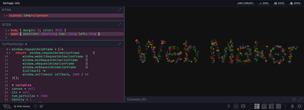
Web Maker is a Chrome extension that gives you a blazing fast and offline front-end playground — right inside your browser.
It’s used daily by thousands of developers around the world and has a 5 star rating from 300+ users. It was also a homepage featured extension on the Chrome Webstore.
You can use Web Maker to play with HTML, CSS and JavaScript right in the browser without any external editor or specific setup. You can use things like Angular, React, Sass, Babel, or Atomic CSS — just like that.
Why I made web maker
If you’re a front-end developer, you’ve probably tried one or more of the code playgrounds out there — like CodePen, JSBin, JSFiddle — to figure out code issues or to discuss snippets and logic pieces with colleagues.
They’re all great and do the job perfectly.
But I’ve always felt a slight friction in using them over the internet — there’s an inherent delay between starting them up and being able to use them.
I also wanted a quick way to hack stuff while traveling or waiting at the airport, where you’re mostly offline. I could go with traditional editor and browser thing, but that requires a bit of setup.
When I thought more about it, I realized there are many places in the world with limited or no internet connectivity at all. People who want to learn and do web development there can’t use these online playgrounds. That shouldn’t stop them from learning and creating things!
I tried looking for something that could give me what I wanted, but couldn’t find any. And so Web Maker was born.
How I made Web Maker
The initial version of Web Maker was very basic. It had three editable sections (which were CodeMirror instances) for HTML, CSS, and JavaScript each. Whenever code was updated, it was combined into an HTML string with everything placed inline. This HTML string was then dumped inside an iframe document and rendered.
This process has changed over time and multiple features have shipped since then. There are many interesting decisions, features, logic pieces and challenges that I’ll share in this article.
Chrome extension — the ultimate distribution platform
I wanted a very simple distribution platform for Web Maker since it was in early stages. I also wanted something with a wide reach, so I chose to make it a Chrome extension.
The Chrome Web Store is a breeze to use. Pushing an update is very easy and quick. The Chrome extension platform also offers capabilities that can be leveraged into interesting features. One example in Web Maker is screenshot capture of preview. It uses the captureVisibleTab API to grab the preview iframe’s screenshot and then the downloads API to download it for you with a click of a button.
Written in vanilla JavaScript and CSS
I have worked with JavaScript frameworks like Angular and Vue in small and large-scale applications. I could have used any of the available frameworks here too. But for Web Maker I decided to go vanilla to challenge myself and see how far could I go without a framework until the codebase becomes spaghetti. I wanted to use all the knowledge I have gained from working with those frameworks and libraries to keep the code sane, organized and DRY.
As most projects do, I started with a single script.js JavaScript file. To keep the codebase modular and organized, I moved big independent chunks out of it into separate files as needed (for example, utils.js and dropdown.js).
Apart from that I also wrote a small directive system (like in angular/Vue) that lets me do things like:
<a class=”btn” d-click=”someFunction”>Button</a>
and
<input d-change=”someOtherFunction” >
Note: I couldn’t use inline scripts like onclick or onchange. They’re not allowed in Chrome extensions due to security restrictions.
For CSS too, Web Maker only relies on browser provided features like CSS variables. Since I developed Web Maker just for Chrome, I can safely use new upcoming features without worrying about cross browser support — another perk of building a Chrome extension.
I plan to look into web components to break the UI into independent components.
Preview generation
As I mentioned earlier, in the first version of the app, the final preview was simply an HTML string which had user’s CSS as an inlined style tag and user’s JavaScript as inlined script tag. And this HTML string was written in a temporary HTML file which loaded in an iframe. The HTML file looked something like this:
<html>
 <head>
  <style>
   user CSS here...
  </style>
 </head>
 <body>
  user html here...
  <script>user JS here...</script>
 </body>
</html>
But while working on the version 2.0 of Web Maker I found that on Chrome Canary (v57 at the time) the preview was no longer running the user’s JavaScript. Upon inspection, I found a chrome policy error in the developer console that said:
Refused to execute inline script because it violates the following Content Security Policy directive…
Now, I already knew that the Content Security Policy (CSP) didn’t allow me to put inline scripts into a Chrome extension’s markup, and I had all my JavaScript in separate files. This was different. Starting with Chrome 57, the CSP had started applying to preview iframes, too. The solution was to move the user’s JavaScript from inline to a separate JavaScript file.
So I refactored the logic and now on every refresh, the user’s JavaScript is written into a temporary JavaScript file. This is then loaded in the preview iframe.
Note that the preview iframe isn’t refreshed on every keystroke in the editor. The refresh is debounced on user input — so the preview is only refreshed when the user has stopped typing for a short duration. Otherwise, it would result in a lot of unnecessary refreshes as the user is typing.
CSS updating is a little different though. Unlike HTML and JavaScript where the complete iframe is refreshed, CSS updates whenever it’s edited in the style tag of the iframe. There is no file writing or iframe refresh involved. Hence, for CSS, the preview refresh is a lot faster.
Infinite loop prevention in JavaScript
As I mentioned above, the preview refreshes as soon as the user stops typing. At this point, it’s possible that user paused while writing a loop in JavaScript, resulting in a partial form. Something like:
for (var i = 0; i<10; [user_cursor_here]) {
}
The increment/decrement condition is missing from this JavaScript — so if it was put inside the iframe, the browser tab would choke! Such cases need to be prevented by any playground like Web Maker.
Web Maker does this by parsing user’s JavaScript and modifying all the loops so that each loop keeps checking if it hasn’t taken too long to run.
Basically, this:
for (var i = 0; i<10; [user_cursor_here]) {
}
is converted to:
var _wmloopvar1 = Date.now();
for (var i = 0; i<10; [user_cursor_here]) {
 if (Date.now() - _wmloopvar1 > 1000) { break; }\
}
If we spend more than a second inside a loop, we break and come out.
I use Esprima for all this instrumentation. Here is a detailed blog post on how it’s done. Note, the logic mentioned in the blog post was recently refactored to be more efficient, as suggested by Esprima’s author Ariya Hidayat.
Preprocessors
Like most front-end playground, Web Maker gives many preprocessors for each HTML, CSS, and JavaScript.
Adding any preprocessor in the app requires getting hold of its transpiler (source-to-source compiler) and understanding how it transpiles the input code. You also need to know that it displays transpilation errors besides every line.
Now almost all of the online playgrounds out there transpile your code on their server. But Web Maker has no server — it sits in your browser and runs in your browser.
Many transpilers are meant to be run only in a NodeJS environment, so I made an effort to bundle them into browser compatible code. Web Maker uses transpilers like CoffeeScript, SASS, and Babel.
Upon every change in the editor, the user’s code is sent to the appropriate transpiler, and then the transpiled code is sent to preview generation. I used a Promise based API for transpiling code for two reasons:
SASS transpiler is not synchronous. It uses a worker to convert the SASS code to CSS on a separate thread.
I might move other transpilers to a separate worker too. Source compilation can sometimes take a long time. It can also result in infinite loops, blocking the main UI thread in such cases. Thus it’s better to move them to separate worker.
For example, the function that converts JavaScript looks like this in a broad sense:
function computeJs() { var d = deferred(); if (jsMode === JsModes.COFFEESCRIPT) {
Version 2.0 of Web Maker shipped with a very important capability to store user creations.
I decided to use localStorage. So, even if you are working on a different machine you can save all your Web Maker settings like indentation size, theme etc.
It would have been great if even the creations were stored in synced storage like the extension’s settings. That way they’d be accessible across devices. Synced storage come with comparatively lower space quota, however, and I didn’t want to risk the saved work.
You may be able to save all your work on the cloud in future versions!
Web Maker also has an option to export and import all the saved creations.
Built on open web technologies and open-source libraries
Web Maker is build over multiple awesome open source libraries and is itself open source.
The three editor panes where you actually type the code is is built with CodeMirror. CodeMirror comes with a lot of add-ons and modes, which allows Web Maker to support code autocompletion, code folding, syntax highlighting, and themes.
Thanks to Esprima, you can see generic JavaScript errors in your code as you type in the editor. As I mentioned before, Esprima also helps prevent infinite loops.
Apart from that Web Maker uses Split.js, Hint.css, Emmet, Inlet.js, and even Web Maker! Yes, Web Maker is made inside Web Maker.
Challenges
There were many slowdowns during the development, but I would like to talk about two major ones.
As I mentioned, when I was working on version 2.0, I discovered a major change in Chrome 57 which broke the ability to put inline scripts into the extension’s markup.
There was also a feature shipped with 2.0 that allowed the user to add any number of external JavaScript or CSS libraries. When the user enters a JavaScript library URL, it is added as a script tag with the src attribute set to the URL. Chrome extension CSP, apart from preventing inline JavaScript, also restricts JavaScript from loading domains except those mentioned in the CSP — which meant that user won’t be able to load external JavaScript from any random domain.
This is currently partially solved by whitelisting all the major CDNs in the manifest.json file. It’s still not perfect as user cannot load JavaScript from any domain apart from those.
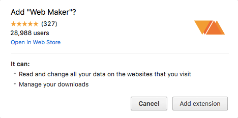
Another big thing that hit me was the Preview Screenshot feature. This feature allows the user to grab a screenshot of the current preview and download it as an image with a click of a button. This feature required me to bring in two more permissions: downloads and <all_urls>.
<all_urls> is actually a weird permission, but it’s a must-have if you want to use the captureVisibleTab API. Here’s how it looks while installing the extension:
Permissions dialog while installing Web Maker
The first line is pretty scary for anyone installing the extension.
Additionally, if you add a new permission for a new version of an extension, Chrome disables the installed extension and shows a popup that the extension requires new permission.
This alarmed some users who already had Web Maker installed. Many people who saw this new permission being asked, didn’t allow it, and uninstalled it right away.
After this particular release, I saw a big spike in the number of uninstalls.
The moral of the story: Be careful with the permissions you add to your app. Unless required for core-functioning, always go for optional in-app permissions.
Summing it up
Web Maker has come quite far in terms of usability, features, and adoption. Being quick and offline makes it usable in huge number of scenarios, from doing web experiments on a train/plane to teaching a classroom of students.
Web Maker can also be used by professionals and beginners in areas where the internet is slow or not present at all.
And I am sure Web Maker can help FreeCodeCamp campers tremendously in their learnings and practice.
Moreover, Web Maker is open-source, so everyone is welcome to suggest and implement features they think would make it more useful. It could be your first step to learn some practical JavaScript by contributing.
If you have any suggestions, comments or questions, tweet them @webmakerApp. I am excited to hear your feedback and experience with it.
Install Web Maker and give it a spin and follow Web Maker on Medium for tips, tricks and how-to articles.
An Introduction to the Basic Ingredients of a TV UI
A huge majority of consumers these days are cutting the cord with paid TV but this doesn’t mean they have shied away from the big screen to consume their content. According to a data release by Nielsen, the viewing habits of U.S. adults found that 92% of all viewing still takes place on the TV screen. These are pretty huge numbers.
Over 92% of viewing among U.S. adults still happens on the TV screen.
The meaning of “watching TV” has changed a great deal over the past few decades. We are no longer limited to a remote and cable box to fill our screens; we’re using Smart TVs, or streaming using pucks like Roku, Amazon Fire, and Apple TV, or connecting video game consoles like Xbox and Playstation. And each of these devices allows a user interface that’s much more powerful than your old-fashioned on-screen guide.
Paying to watch broadcast or VOD programming via subscription based online services such as Hulu, Netflix or Amazon represents 26% of global online respondents (Nielsen ). This is a significant number. However, 72% of the respondents confirmed they still pay to watch their content via a traditional TV connection.
Does this mean that the traditional TV connection is here to stay?
We all seem to think that the cord-cutters out there would represent a higher number. Nielsen reports that 116.4 million homes in the US were expected to watch TV during the 2015-16 season. This is a huge number and the report also found that about 9.5 million of those homes have switched over to free OTA TV. Of all the streaming services out there, Netflix (60.7%) seems to be ahead of the game followed by Amazon Prime Video (49.4%) and by Hulu (26%). I believe one of the biggest reasons people are cutting the cord is that we only want to pay for what we use.
When compared to computers and even mobile phones, designing UIs for TV is still a relatively new area. It’s also a fundamentally different platform and the way we consume our content is different. Design for TV requires a unique set of considerations, including screen size and viewer distance, technical constraints, and context of use. Users are in a “lean back” experience, sitting an average of 10 feet away and the user interface and experience need to reflect this. Contrary to touchscreen tablets and phones, the interactions on televisions are done via D-pad (directional control pad) using a remote or a video game controller, which ads to the complexity.
The Display
Televisions are not like tablets and phones.
TVs have changed a lot over time from a huge clunky piece of furniture to a sleek minimalist display hanging on a wall. Back when televisions would take up the entire living room, they used a technology which produced inconsistent images across TV sets, especially close to the edges. To compensate for these issues, CRT TVs were subject to overscan. This just means that the images were slightly enlarged so the edges were not outside the bounds of the viewing area.
Traditionally, broadcasters anticipated this and wanted to avoid any of their critical information being shown too close to the edges of the screen. To solve this issue, they created a title safe area to display the text with no distortion and an action safe area where the image could be safely displayed.
For reasons out of our control, overscan is still a thing… even on your new HDTVs. The amount of overscan is not consistent across TVs. To ensure that all of your primary information such as titles and important actions are safe, keep them inside the safe margins.
There is currently not a set “standard” for safe action areas; it is mostly defined by the platform itself. Google keeps their safe area narrow and Apple’s is a little more generous. From my many searches on the web, these zones will vary between 85% and 95% of a television screen from the center. In order to meet the requirements from all different platforms you might be working on, I would suggest using a safe zone of 60px top and bottom margins and 90px side margins. This means that all of your primary information will need to fit within this area in order to accommodate all tv screens and meet every platform requirement.
To start off your new television user interface design, create a new 1920 x 1080 canvas. Your padding (safe zone) should be 90 pixels on the sides (left and right) as well as 60 pixels for top and bottom. You can get your free file download here.
Navigation
How up-down-left-right shapes TV interfaces.
As a designer, the hardware we design against will define some of our design patterns. On mobile, we swipe, tap, long press, pull, etc. to perform actions. Tabs and menus are used as navigation patterns on our devices. Television offers a great big canvas which can easily become overly complex if not done right. Seeing long rows of content in order to maximize the amount of it visible to the users has become a standard element of television UIs.
Unlike mobile devices which we control with our fingers, the majority of TV UIs are controlled by a D-pad and used at a distance from the screen. Whether on a remote or a gamepad, the D-pad limits navigation to four directions: up, down, left, and right.
Each platform also has its own established conventions. On Xbox, for example, the triggers provide a “Page Up” and “Page Down” control while the bumpers are used to tab between content views. There are also a number of “power user” buttons on each platform that more experienced gamers would be familiar with.
The other critical element in TV UIs is the focus state. Without the ability to touch the screen or use a mouse, users must navigate to the element they want to select. As the user navigates within the app, different UI elements should be highlighted indicating that an navigation element is in focus.
Focus and highlight states when designing for television are very important. That focus state is the element that highlights a selectable component and signifies the user’s current on-screen location. The form in which the focus is displayed may vary; depending on the component, however, consistency will always be key. A clear and highly visible focus helps the user to quickly recognize their current on-screen location and eases navigation. When a user glances away momentarily from the TV and then return their gaze, it should automatically be clear what option is currently selected for navigation. Every item on the screen must be reachable by the cursor, and it should always be clear where the cursor can move next.
Examples of designs which could leave users wondering where they are in the app. These examples do not provide enough visual indication (focus state) of positioning. Users should be able to clearly see where they are at all times without having to move up or down. You should be able to glance away from the television set and back and still know your position.
Typography
Reading from ten feet away.
TV apps are often referred to as ten-foot experiences, a term that refers to a common distance between you and your television. Contrary to other devices such as mobile and desktop, television is set to be more of a “lean back and relax” environment. Given this distance, we need to treat a UI a bit differently than we would on web or mobile.
TV screens are generally larger than mobile devices and desktop computer monitors but are viewed from a greater distance. Legibility becomes an important feature, which means that the size of text and other elements must be adjusted accordingly. Depending on your age, 18px would probably be the smallest readable size and only appropriate for nonessential labels, like an eyebrow tab. Even so, as a general rule of thumb, your chosen font sizes should never be smaller than 24 pts. This is what I would consider the minimum font size to accommodate every type of user.
The key to good typography on TV is to test constantly. Thin, small type on your monitor will look clean and crisp, but once on a TV, it may appear blown out or become unintelligible.
Scan Lines
What are scan lines?
Unlike desktop, mobile, and tablet screens, the image on a television screen is composed of odd and even scan lines. The television renders these lines in phases alternating rapidly between odd and even scan lines. Any single pixel (or line of pixels) falling onto a single scan line will flicker. In order to avoid flickering of your items on screen, you should always keep your lines to even numbers and no thinner than 2 pixels. This is something to consider when working on cross-platform projects and preparing to transfer your designs from touch devices (mobile and tablet), where you can often find yourself creating 1px border buttons, for television.
Another way to avoid these blurry lines or shapes is to make sure your designs are always pixel perfect. The example below is a good example of lines that are created using uneven numbers. As you can see, we can clearly see the effects of this, and it becomes unsettling on the eyes.
Color
TV displays have limits.
The first element to keep in mind is that televisions have a much higher gamma value than desktop, tablet and handset devices. The best way to describe how gamma affects picture quality is that gamma represents the level of brightness difference between each step in the grayscale, or how “fast” blacks get brighter. We perceive twice the light as being only a fraction brighter. Different makes and models of TVs vary widely when it comes to brightness, display and other settings. Like type, color should be tested early and often on TVs.
A few guidelines to follow when choosing your colors: Bright colors might get harsh on the eyes when watching television at night or in a dark room. Avoid over-using saturated colors (especially red) and heavy use of white in large elements or backgrounds. Pure white will create halos and other visual distractions. When choosing whites, it is recommended to pick a #f1f1f1 hex value to avoid any flickering. In order to increase readability, make sure you create enough contrast between your elements
The general rule is to avoid sharp edges between highly-contrasting colors (especially bright colors next to dark colors), and to avoid “hot” colors such as very saturated reds and yellows. These will bleed more easily than less saturated colors, or cooler colors such as blues and greens.
Always test colors on an actual television to understand how your color choices translate to the big screen. If possible, preview your app on multiple TVs because colors can vary dramatically between television models. Simply attach the HDMI cable from your TV set and test it out.
The Basics
Little things to consider.
These elements should be used to guide your designs as a whole. The biggest considerations when designing your TV UIs are simplicity and lightweight interaction.
While many of the fundamentals and best practices for interaction design still apply, the television is used in a more relaxed fashion unlike a computer or mobile device. The UI on a television should be clear, simple and visual. The design requires simplicity and clarity with low information density. The elements need to be large and spaced far enough apart to be read from a distance. Present a clear set of actions or options for each screen.
This design is clean and simple, using nice big card treatments. Focus states are achieved with scale and drop shadows which are aligned with the rest of the clean design. Metadata is also only visible on hover, which allows the users to stay focused on the current card.
Product designs for You.i TV Pushing the limits on traditional TV designs. This provides an alternative cinematic approach to the usual 16 x 9 card treatment that many others use. Compared to many other services, the approach was to bring the menu at the bottom of the screen
Product designs for You.i TV Pushing the limits on traditional TV designs. Bringing news at the forefront, users focus on one piece of news at a time vs. rows and rows of content.
Product designs for You.i TV Kid user interfaces should be intuitive, fun, and easy to use. This design showcases that companies are able to push their designs further than a traditional grid system focusing on either 1×1, 2×3, or even 16×9 cards.
Place the most important content or options first on the screen so they are easily viewable and navigable by the user. Unnecessary screen levels must be removed. Going into different levels and getting out again must be easy and obvious.
The most crucial factor when designing a TV application is to include clear and accurate navigation for user operations. If navigation is ambiguous, users will feel confused and insecure.
In short, users should always know exactly where they are within an application. Remember, the user is only using basic controls to navigate. Move, Return, Enter, and other basic navigation functions must be clear. The users should be able to use the operations they want with these actions.
Turner Television pitch The focus was to push the boundaries of traditional television design. Find creative ways of demonstrating the wide breadth of content available to users while making it intuitive and easy to use.
As designers, our job is to create and design user interfaces that give users access to content in a way that’s clear and easy to navigate. We can’t expect the users to adapt new habits just so they can see our content. Rather, we have to adapt our user interfaces so that they can be operated in the dark by somebody who’s giving us less than their full intention, and with a very limited input device. It’s quite a challenge, but the potential payoff is enormous. Have fun designing!
With 12 years of experience in UI/UX and art/creative direction, Pascal has practiced, led, and built design teams in diverse environments—leaving him with a versatile skill set, strong work ethics, and a wide breadth of knowledge. He balances well between honoring users, achieving business objectives, and delivering immersive experiences. He’s crafted experiences for Sony, Turner, TCM, TNT-TBS, Fox, NBA, NFL, Nickelodeon, Disney, and more.