How Capital One designs their online forms

Developing effective online forms is something lots of companies struggle with; while it’s a great opportunity for engagement, it also leads to plenty of customer problems. In a recent InVision DesignTalk, Capital One designer Sara Walsh came in to explain how companies can utilize forms to create conversation and solve user issues.

Sara taught us that when designing customer interactions via a form, designers have to ask themselves a few basic questions:


  • What is the customer trying to do?
  • How does this experience fit into the user’s world?
  • Does the language feel human and real?


These are real-life excerpts from Sara’s team’s process for online form design. Read on for more about the step-by-step approach to forms that has helped her team figure out customer needs and develop their messaging strategy.

Step 1: Figure out the conversation


Designing online forms

Sara’s team gets started by nailing down the kind of conversation they want to have with their customers, starting with a simple task like opening a new account. From here, the team is able to put together some scenarios, like a customer talking to a bank representative, that give them an idea of what actual client interactions sound like—thought bubbles and all.


“This isn’t about the ‘fanciest’ way to design a form: it’s about figuring out the conversations you need to have with your customers, and using that as the foundation

for your form design project.”


Designing online forms

Once they’ve done this, team members can review what they wrote and come up with an action plan for their new form designs. It’s not just helpful for identifying knowledge gaps and coming up with new ideas: this process helps the designers create copy in their users’ language. This isn’t about the “fanciest” way to design a form: it’s about figuring out the conversations you need to have with your customers, and using that as the foundation for your form design project.


Step 2: Identify the problems

The second step in this process is identifying the problems you’ll be addressing in the new form.

Let’s use the team’s example of opening a new bank account. The main problem here that Sara’s team was solving was helping small business owners open online checking accounts with Capital One. The instructions on the existing forms weren’t clear so potential customers weren’t providing required information, didn’t have enough context to properly answer questions, and weren’t sure what they needed to do in order to apply. It was so frustrating that only 26% of users ended up actually completing the form.


Designing online forms

Sara’s team realized they were addressing customers like they were a risk to the company, which was definitely not what they wanted to convey. To get past this, the team went deep into researching problems with the form using data, customer feedback, and competitor research—and realized their copy didn’t support their story, the progress bar wasn’t helpful, and the tooltips were hiding important information. Yikes.


Step 3: Write the conversation

Once your team is clear on the problems, you can start writing conversations. This step is crucial to developing an outline for the new forms: something Sara describes as similar to a game of Mad Libs, as they give the customer a framework to complete their story.


“Once your team is clear on the problems, you can start writing conversations.”


Designing online forms

By writing a conversation based on what your customer is trying to accomplish, your team can discover your product’s natural information hierarchy—something that will help your team understand the most effective way to organize the form. For example, in Capital One’s case, the conversation revolved around signing up for an online business account—so it needed to include a greeting, a CTA, some questions about the process, and options to review and submit the application.

Step 4: Develop a form field strategy

The next step is to develop a form field strategy based on the conversations your team wrote. It’s important to remember that every field has a purpose: each space needs a reason to being on the form, and forms should follow the flow of an actual conversation.


Designing online forms

Designing online forms

Sara also provided some insight into what goes into the different form fields and how to get the most mileage out of them. You can see above that the field label lets you know what goes into the box—think name, street address—and whether or not it’s required. Anything else can be added or changed based on your company’s specific needs: something like field captions or hint texts.

Design teams should be aware that designing forms isn’t always a one-team show, and there’s a chance they’ll find themselves collaborating with developers.

Step 5: Create error messages that move customers forward

Even the most exceptional form design has to come with some error messages (that will help you solve problems and keep customers moving). Sara explained that natural, down-to-earth language is a great way to hit these goals, as well as presenting customers with options and identifying with their emotions. Helpfulness and empathy are key here: no one likes an error page, but by addressing customer frustration you can hopefully win them back and motivate them to keep going forward.

“Helpfulness and empathy are key here: no one likes an error page.”


Designing online forms

This new process helped Sara’s term develop a hyper-effective online application form, with 92% of users finishing the application (up from 26%!) and a major decrease in calls to customer support. Users were able to complete entire pages in 3-4 minutes—which used to be enough time for them to finish one question.

Don’t get too excited, though: Sara’s team spent almost three months developing this process! This kind of research isn’t quick or simple, and you’ll see there’s going to be lots of design iterations along the way. With that being said, Sara believes that by following these steps and being persistent, design teams everywhere can create exceptional and successful online forms.

Watch the recording of Sara’s DesignTalk

If you weren’t able to attend the event, no sweat—you can watch the recording here, along with the other three webinars that were a part of this series on UX copy.


Did you like this? Then you’ll like these too:


Tara Malone
Tara Malone is a professional freelance copywriter who specializes in writing long-form blog content for tech companies.

from InVision Blog https://www.invisionapp.com/blog/designing-online-forms/

Baroque Underwater Photography by Christy Lee Rogers

“A Dream Dreamed in the Presence of Reason”. All photos © Christy Lee Rogers

Photographer Christy Lee Rogers produces luminous scenes of swirling figures swathed in colorful fabrics. She creates a painterly quality in her large-scale images not by using wet pigments, but rather by completely submerging her subjects in illuminated water and photographing them at night.

The works shown here are part of Rogers’ most recent series, titled ‘Muses’, which were in response to a year of personal loss. She shared in an interview that “these final images represent a soft and peaceful place that I imagine exists, where you can be free to let go and experience the beauty surrounding you.”

Rogers grew up in Hawaii and continues to shoot there, though she now lives in Nashville. Her works are exhibited widely, alongside video installations, one of which can be viewed below.  The photographer recently had a solo show at Art Labor Gallery, who will also be representing her work at PHOTOFAIRS | Shangai, opening on September 21, 2018. You can see more from Rogers on Facebook and Vimeo. (via Booooooom)

“Our Hopes and Expectations”

“Love Live”

“Awaken”

“Alive”

“Cloud Nine”

“Rhapsody”

“Harmony”

“Apparition”

“Evolution”

from Colossal https://www.thisiscolossal.com/2018/08/baroque-underwater-photography-by-christy-lee-rogers/

The Left-Handed Struggle Is Real and Oreos Has Got Your Back

04d32908-4806-49ad-874a-98421f0b907c-left-handed-oreo-cookies.png

By: Rudy Sanchez

Being a leftie means living in a world not designed for you. Writing means getting your palm full of pencil or ink smudges. Thankfully, we use a keyboard for most of our writing, but everything from baseball gloves to guitars must be specially designed for southpaw use. Sure, Ned Flander’s Leftorium remote control is a bit of a stretch, but there’s an overwhelming need for ambidextrous or left-handed designed items.

In support of International Left-Handers Day, a day founded and first observed in 1976 by the Lefthanders Club every year on August 13th, Oreos released a special-edition package designed just for lefties.

The package plays on the general way the cookie is eaten as the graphics twist counter-clockwise, and that’s you know, to the left. The opening flap is now moved over to the right side, making it easier for a left-handed person to open the package.

Lefties are merely 10% of the population but represented fully by some of the most impressive overachievers in any field like Barack Obama, Bill Gates and Oprah Winfrey. Unfortunately, so was Osama bin Laden and Jack the Ripper, and, likely, the mad titan Thanos.

Is it something about having to struggle in a world designed for the right-handed that makes lefties rise above righties, or is there something inherently special about lefties beyond their hand preference? Whatever the case, special leftie Oreos takes the sting out of having to live in a world full of smudged ink, hard-to-use scissors and can openers.


Rudy_Headshot.jpg

Rudy Sanchez

Rudy Sanchez is a product marketing consultant based in Southern California. Once described by a friend as her “technology life coach,” he is a techie and avid lifelong gamer. When he’s not writing or helping clients improve their products, he’s either watching comedies on Netflix, playing the latest shooter or battle royale game or out exploring the world via Ingress and Pokémon Go.

from The Dieline http://www.thedieline.com/blog/2018/8/16/the-left-handed-struggle-is-real-and-oreos-has-got-your-back

The 4 UX Problems When Designing Blockchain-Based Smart Contract

As a designer and a tech enthusiast, I have a massive passion for solving problems that can change how people live and work.

Recently, I had the opportunity to design blockchain-based smart contract experience for one of my clients, bitjob.

If you’re not familiar with peculiar terms such as smart contracts or blockchain technologies, that’s fine. I wasn’t familiar with these terms too.

The one thing you need to know is that blockchain technology can minimize the amount of trust required from any single actor in the system.

Say what now?!

The people of the blockchain ecosystem call it “Trustless technology”.

Since, it’s already difficult to build trust with middle men like banks, realtors or even digital platforms such as Airbnb or Fiverr, blockchian technology aim to eliminate the trust factor.

Smart contracts that rely on blockchain technology help us to exchange money, property, shares, data or anything of value in a transparent, conflict-free way while avoiding the services of a middleman.

Let’s simplify it:

In this world of blockchain-based, decentralized apps there wouldn’t be a middleman to deduct commissions and the all thing is going to be trustless.

It’s about the right place at the right time

Before new products and technologies become a household name, revolutionary design concepts always have something to do with teaching the market how to incorporate the products and technologies into daily life.

For example, Raymond Loewy, considered the “Father of Industrial Design,” made the 20th century beautiful as one of the first modern designers.

Raymond Loewy standing on a train

Historians often talk about Loewy as the designer of the modern world, thanks to innovations like the Coke bottle and Lucky Strike pack.

But one of the most important things about Loewy is that he was designing in the right place at the right time, he leveraged the innovation and technology at any single moment to enhance the experience of the people he was designing for.

Today, blockchain technology is talked about almost everywhere.

When applied in our society, blockchain technology could, for the first time, change the way we perceive the concept of trust with other human beings.

It could change the way we rent cars,buy real estate and even vote.

We need forward-thinking design to get there.

But challenges lie ahead. When trying to design optimal user experiences for blockchain technology and smart contracts, I’ve identified four major hurdles:

1. Inconsistent design of smart contracts and crypto wallets.

A smart contract requires paying with cryptocurrency. But to date, there is no solution that hosts all the main currencies at once (even the top 30). Imagine getting a different browser for every site, or a different remote control for every TV channel.

That’s the current challenge when trying to host the world’s major currencies.

This is a huge problem.

User interfaces are designed differently and applications vary in the capabilities they offer.

As a result, users must re-learn how to do things each time they use a different wallet or payment processing system.

Think about how weird it would be if someone had to re-learn how to use a credit card every time they used a different card or tried to pay at a different store, and you get an idea of the blockchain world as it is today.

2. Smart contracts require knowledge of cryptocurrency.

Using money does not require knowledge of minting and circulating bills. But to use smart contracts, users need to know a lot about cryptocurrencies before utilizing blockchain technology.

Users need to know about their private wallet key, what a blockchain is, how long it takes to confirm transactions, and how much transaction fees cost.

Because cryptocurrencies are decentralized and users in essence become their own bank, I don’t know whether users can avoid this responsibility.

“Sometimes we feel nobody gets us.”

For example,

when someone sends you crypto coins over the blockchain, they’re sending them to a hashed version of what’s known as the “Public Key.”

There is another key hidden from users called the “Private Key.”

Basically, you give people that want to send you money your public key, but don’t tell outsiders about your private key (even not to your grandma).

The concept of managing keys can be complex and requires a high learning curve before diving deep into the world of cryptocurrency.

Smart contracts require extra effort because they place the workload on the user who has to download a cryptocurrency wallet application before making purchases.

Receiving and sending transactions also require user work.

3. Slow and tiring transactions

What I have come to realize is that crypto currency is a poor payment network,

but it’s a revolutionary breakthrough as an arbiter.

Crypto currency transactions, even at the very beginning, have always been unreliable and in comparison to credit card or PayPal.

“wait for meeeeee”

Let’s take bitcoin for example,

Even very early on, when fees were bitcoin transactions always were more expensive for the user than nearly every major centralized alternative.

Today, the bitcoin average transection fee is as high as $0.575, which is more expensive for the user than nearly every major centralized alternative.

On-chain transactions never have been well suited for in-store purchases and only work reasonably well for online purchases, sometimes.

4. Lack of regulations

Unlike regular contracts, governmental entities haven’t found a proper way to enforce the legal use of blockchain-based, decentralized apps and cryptocurrencies.

As a result, it’s a Wild, Wild West out there.

“Do you feel lucky, cyberpunk? Well do ya?”

Instead of creating the future of commerce systems, some people are using the system poorly or fraudulently.

Cryptocurrencies and blockchain technology without regulation offers a snapshot of what the days before banking looked like.

You probably ask yourself, is that even a UX problem?

Well, yes.

Since it’s a new and unregulated market, many hackers lure uneducated users to send their info such as the private key to take all of their money or even steal their identity.

Also, uneducated users can do all kind of crazy mistakes like sending their money to the wrong address, so it disappears.

Smart contract’s UX designers would have to find, using the given technology, solutions that would ensure and secure it users.

Otherwise, your grandma is going to send her smart contract will to the wrong heir.

What can designers do about it?

The people that are working to solve this kind of problems today are developers, cryptographers and mostly people with a technical background.

Which remind me of the early days of the Internet.

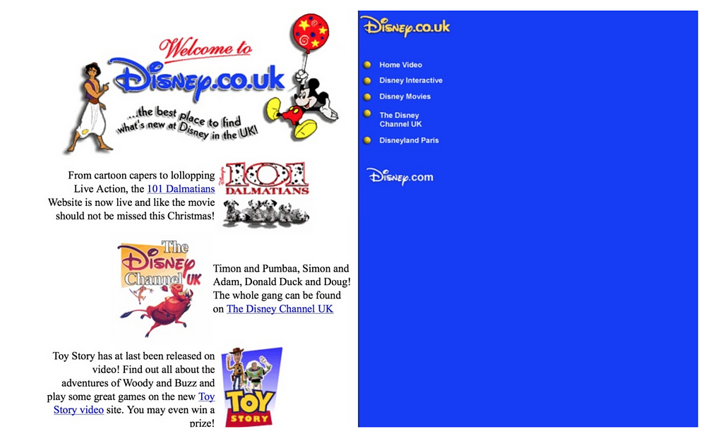
The 97 look of Disney’s website

It took more than two decades for UX designers to create a tailor-made experiences for its users.

Till then, the focus of creation the product was on the techie side of the team, designers was asked to make stuff look pretty, not functional and easy to operate.

Let’s avoid from making the same mistake again,

To solve the fundamental problem I mentioned in this post, we would have to involve UX designers in the process of creating blockchain and smart contracts products.

Just like Raymond Loewy, designers would have to educate their users on the possibilities of micro-transactions, being your bank, and other things that aren’t possible with cash or credit cards.

It’s the right place at the right time for designer to transform how users can experience trustless systems using blockchain technology.

Currently, my team is working hard to create the best design solutions for smart contract with bitjob as our client

If you want to share your ideas about UX and blockchain, join my new community of Blockchain UX.


The 4 UX Problems When Designing Blockchain-Based Smart Contract was originally published in Prototypr on Medium, where people are continuing the conversation by highlighting and responding to this story.

from Prototypr https://blog.prototypr.io/the-4-ux-problems-when-designing-blockchain-based-smart-contract-d37ee4c8c64b?source=rss—-eb297ea1161a—4

8 Design Mistakes That Spell Disaster


Just like anything else, product design can be done well, and it can be done poorly. When a product is designed well, users don’t notice it. But when a product is designed poorly, users not only notice, but also complain.

In this article, I want to share five the most common things that lead to bad product design.


1. Adding Too Many Features to a Product

All too often designers think about features as a synonymous with value. They believe that the more features they add to the product, the more valuable it adds for the user. As a result, a lot of products are designed with too many unnecessary features which detract from the product’s primary purpose. This effect is known as feature creep—a continuous addition of new product features beyond the original scope.

Here are two tips that will help you avoid this common pitfall:

  • When designing a product, it’s important to focus on its core value. Identify what’s most important and prioritize it. Cut any feature or content that doesn’t drive towards this value.
  • Ask ‘why’ instead of ‘how.’ When starting working on a new product, the biggest question should be not how we design a particular feature but why need to design it.


2. Skipping the Prototyping Phase

‘Why we need to create a prototype when we can create a real product and test it on the market?’ By thinking in this way, designers put the maximum effort on creating a high fidelity design that they ship on the market. Unfortunately, after the market release product team often realize that some parts of the design need to be changed. And the cost of the change often will be significant because the team will need to modify the real product, not a paper or digital prototype.

Prototyping helps product teams to test product design prior to market release. Testing can be done with real users. According to the NNGroup, testing with five users identifies 85% of usability problems. That’s why the results of the testing will make it clear whether the design works for users or not.


3. Becoming too Attached to a Design

It’s not that rare when designers fall in love with a design they create. When designers become too attached to design elements, it’s difficult to redesign or get rid of them. It becomes extremely hard to comprehend the critiques—designers start to take it personally. As a result, design decisions become too biased. The effect is known as confirmation bias—when designers search for, interpret, favor, and recall information in a way that confirms their preexisting beliefs.

It is possible to minimize the effect of confirmation bias by inviting designers into user testing sessions. Nothing can be compared with a feeling when you see a real person interact with a product you’ve designed. It helps designers realize that they design for their users, not for themselves. As a result, it becomes much easier to adjust design according to the user needs.


4. Making Assumptions instead of Conducting Proper Research

Almost everybody who designs digital products had a moment when they say “I am a user too, so I know what is good or bad for users.” After that designers come up with assumptions—assumptions about what can make the user live better.

It’s great when designers have personal feelings, but it’s wrong when designers allow personal feelings take over the process. Every design decision, no matter how it was arrived at, still needs to be verified. It’s excellent when design decisions are a result of user research. It’s much better when you clearly understand what your users need and then design based on that.


5. Not Involving Users in the Design Process

No matter whether a team is refining an existing product or designing a brand new product, it’s always essential to harness users in the process of knowledge exploration. Bad design is often a result of not thinking adequately about end users’ needs.

UX practitioners should not only gather knowledge about users, but they also share this information with stakeholders. It will help to create a shared understanding of real user needs.


6. Thinking about Design as a Linear Process

Some product teams believe that product design is a linear process which starts with ideation and ends with a product release. Following this process, they establish a goal at the beginning and strive to ship a product that is designed according to the goal.

In reality, product design is a highly iterative process—to release a product with excellent user experience, designers have to try a lot of different approaches before selecting the one that will be the best for their users. They might even adjust the goal, when they see that it’s required.


7. Not Building a Collaborative Environment

In a team that has a problem with collaboration, designers and developers don’t have a shared understanding of what they want to achieve. As a result, designers and developers stay in their silos.

Focus on creating a close collaboration between design and technical team members. Instead of design and development being sequential, these two activities should go in parallel.


8. Trying to Reinvent the Wheel

‘It’s boring to do something that everyone else is doing.’ With such idea, many designers have a temptation to try and reinvent the wheel — to design something new, something that nobody tried before. But what designers forget is that there are many solutions on the market, and each demands our time. With each product that has different interactions, users need to learn it. In our fast-paced world, users often don’t have to learn how to use a new product.

Before reinventing the wheel, designers have to evaluate the effort required from the users’ side. In most cases, the effort will be significant. As a result, it’s much safer to design familiar—creating a design that will be familiar for the majority of users.


from Webdesigner Depot https://www.webdesignerdepot.com/2018/08/8-design-mistakes-that-spell-disaster/

Before your idea dies, try the Disney way

Best ideas come as jokes. Make your thinking as funny as possible — David Ogilvy

Recently, I was participating in discussions with a group of people who ideate new concepts for the next big product visions.

The presenters were not able to articulate their ideas as expected. They had cool things to show but ideas remained fragile and not really taken shape.

Every attempt were immediately attacked by mixed opinions and rejections by an audience with different perspectives and characters types.

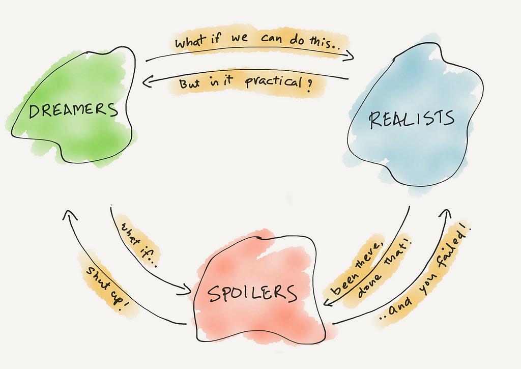
As an experiment, I tried to mentally group the participants based on their why-not and why-you-can’t-do-this arguments into the famous Disney’s Dreamers, Realists and Spoilers categories (which I’ll explain soon). And guess what, they all fell in place very nicely.

the lesson is..

If we put everyone in one room, Dreamers are the first one to die. Realists survive momentarily but eventually spoilers will not let both Dreamers and Realists talk.

This is exactly what I witnessed how the interactions happened

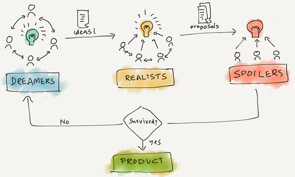
Here is the Disney way of ideation.. which would have worked for us

Different rooms for different groups.

Dreamers (Why not)

Ideas are the key focus. All ideas are welcome. No one criticise each other. Separate room. Chairs arranged in circle and all face each other. Document everything and take it to the Realists.

Realists (How to do)

Validate how practical are those ideas. Use experience to propose a solution on how to do it. Chairs arranged in semi-circle with ideas in front of them. Face each other but still get to work on solutions. Document everything and send to the Spoilers.

Spoilers (Why cannot)

Battle test. Ideas are criticized to the core. Find weaknesses and tell why this cannot be done. Each member has their own perspective and given a chance to punch holes in to the proposal. Chairs arranged in flat rows, each facing directly on the proposal.

This way, fragile ideas are super-strong before they reach the critics who test how strong the ideas were, and realists in the middle makes sure good ideas don’t die.

Not sure if it was really practices in Disney studios. But the process makes a lot of sense.


Before your idea dies, try the Disney way was originally published in UX Collective on Medium, where people are continuing the conversation by highlighting and responding to this story.

from UX Collective – Medium https://uxdesign.cc/when-your-idea-dies-follow-the-disney-way-a88cc8fef245?source=rss—-138adf9c44c—4