User experience wheel of enlightenment

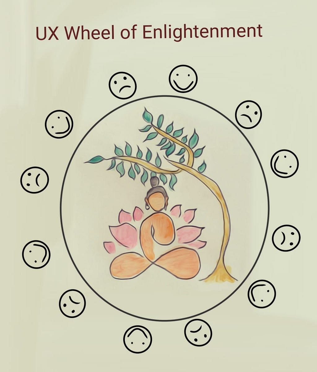
How my UX skills helped me in being mindful and get enlightened.

Have you ever wondered if your persona needed a redesign? Are you a slave of routine? Are you clutched by the claws of dogma? Have you taken some time off to think what is it that you do day in and day out, and then change for the better? Can we enable change using the Social Design?

Credits: Self

User Journey

In studying about user journeys, I chanced upon an older article by Bruce Temkin, who is a customer experience transformist. He had charted LEGO’s experience wheel (and many more). I am furnishing the exact wheel of experience below for a general idea of how it works.

Lego’s user experience wheel by Temkin Group’s Customer Experience Matters

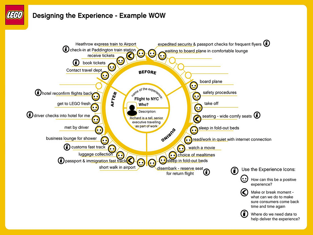
The Experience wheel is a simple depiction of a customer journey of a (potential) customer charted by an UXer which records the step by step activities that depicts before, during and after an event of interest.

The experience wheel had many facets to it, but more importantly, it provided the much-needed perspective that I personally required — Empathy. I had just changed jobs and, without the comfort of my previous work-friends and co-workers, I felt uncertain and insecure. I had some time to retrospect on the time spanning the past year. I had to become both the observer and the observed. After careful observation, I charted out a journey map of the everyday me with fairly accurate timelines. The User journey map doesn’t include weekends. This is purely a weekday map.

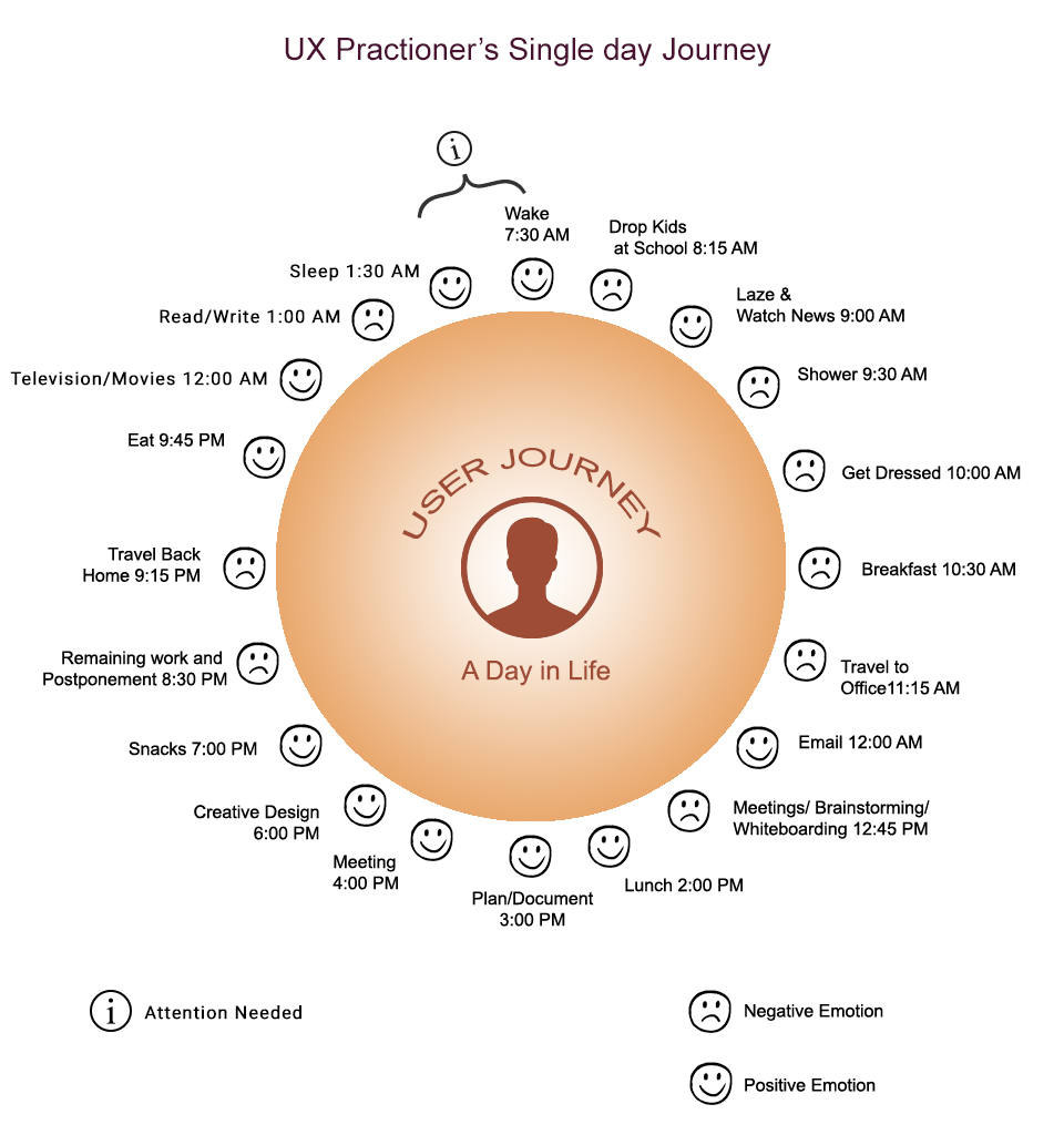
Why sad smileys for showering and breakfast?

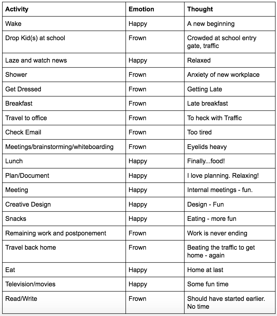
This is the journey of a singular individual, not all users and that is why emotions are singular. I will elaborate my emotional responses in the user journey with the following table.

Continual Improvement Process (CIP)

Most of us do not observe ourselves. When we do observe ourselves, we are usually shocked. Why? We clearly see our shortcomings. We (well, most of us) don’t operate with daily, or long-term objectives either. When we see and accept our shortcomings, we have an opportunity at Continual Improvement. W.Edwards Deming, the great American statistician once propounded a profound theory, a part of which goes,

…The key is to practice continual improvement and think of manufacturing as a system, not as bits and pieces.

What if this can be applied to our everyday routine?

Continual Improvement process, as the name suggests is an iterative methodology to improve processes, services or products. It is Continual and not Continuous because no process can be continuously happening without breaks (literally continuous). Continual means, discrete and with regular intervals. We take a piece out of this theory and apply it to all processes, not just manufacturing.

Toyota was well known for its implementation of the Continuous Improvement Process. It used a variant of the method called the “Kaizen”, which meant “Continual Improvement” in Japanese. Rather than implementing radical and disruptive changes, all line personnel in the Toyota Car assembly line were expected to stop their moving production line in case of any abnormality and, along with their supervisor, suggest an improvement to resolve the abnormality which may initiate a kaizen. Kaizen aimed to fix root cause issues of recurring problems. This is how Toyota approached the CIP.

Connecting CIP and Self-Management

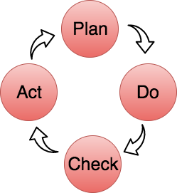
Continuous Improvement Process is a key tool for progress. It is a simple PDCA cycle. PDCA expands to Plan-Do-Check-Act. Look at the below diagram to understand the PDCA cycle. It is as the diagram goes:

  1. Plan an activity
  2. Do it
  3. Check for errors
  4. Act upon correcting the issues

Let us try and see how the PDCA cycle can help in tandem with the User Experience Wheel. The objective of the exercise would be to turn frowns into smiles in the User Experience wheel. We also need to remember that the core principle of Kaizen is to target the root cause of a problem and eradicate it. Let us take one example:

The Problem: Waking up was always enthusiastic, but after dropping kids at school there was a chain of frowns that happen until afternoon.

Elaboration and observation (Plan): At first, I used to think that all the traffic at the school gate frustrated me to the point of breakage. I then thought that I should cut down the news watching time as it delayed all my activities. I frowned all morning and called myself an afternoon person. A bag full of lies.

Experimental solutions (do): I tried to be cheerful at first. I thought it was all about the attitude. I thought that it was all the negative news from around the world. I tried to lay off the news. Changed from an Oats diet to a more solid diet. None of them worked. It took until afternoon to get cheery.

Retrospection (Check): All these were merely symptoms of a bigger problem. I seemed to be happier in the afternoons. I was irritable in the mornings. As the many experimental solutions didn’t pay off, I wondered if I was cheating myself that I wasn’t a morning person. That is when I decided to look into my sleeping habit.

The Solution (Act): I tried to advance my bedtime by two hours and advance wake up time by two hours. All the — “ I just need a 6– 8-hour sleep. Time to bed isn’t important”, was a load of hogwash. I slept at a saner hour. Things started looking up. I had time to do some quick exercises in the morning. I dropped kids earlier at school when the school entrance wasn’t as crowded as before. I had more time to watch the news, and because I felt more rested, I started becoming a morning person. The whole day felt peaceful.

How did the Self-management wheel help?

The whole introspection exercise was possible because I charted the user experience wheel. Though it may seem to be a logical solution to make, a lot of ignorant souls have no clue why their mornings are irritable. Observing and recording the As-is experience has been paramount in iterating the past “me” into the present “me”. It is almost kind of meditative. Buddhism introduced the concept of vipassana or the Focussed attention. We have MBSR (Mindfulness-based Stress Reduction) and MBI (Mindfulness-Based Intervention). These procedures turn the gaze inwards. Designers have the User Experience Wheel which will help in turning the gaze inwards and the solution as well. This process helped me with self-improvement. Let me know if it helps you as well.


User experience wheel of enlightenment was originally published in UX Collective on Medium, where people are continuing the conversation by highlighting and responding to this story.

from UX Collective – Medium https://uxdesign.cc/self-management-user-experience-wheel-5bcc3898be8?source=rss—-138adf9c44c—4

35 Awesome Examples of Script Typography on Packaging

Artboard 1 copy.png

Who doesn’t love a good script font? A cursive typeface can instantly transform a design into an elegant one and automatically add a flair of personality to a product. Here we’ve picked out 35 awesome examples of packaging that incorporate script typography.


1. Twin Peaks Brewing Co.

static1.squarespace.png
 

2. Skoff Pies

static1.squarespace-1.jpg
 

3. Check Out The Whimsically Colorful Packaging For Folklore Society Gin

entry-GqKDMNOw-626583.jpg
 

4. The Graphic, Gorgeous New Look of Van Leeuwen Artisan Ice Cream

03_Vanleeuwen_HiRes.jpg
 

5. Bottega Louie’s Summer Limited Edition Poppy Box

static1.squarespace-3.jpg
 

6. Get Freshly Baked With This Tropical-Inspired Self Tanner

static1.squarespace-14.jpg
 

7. NAŠA is a Chocolate That Aims To Represent Slovakia Through Graphics

4.jpg
 

8. Check Out This Gorgeous Conceptual Gin that Celebrates South African Nature

static1.squarespace-15.jpg
 

9. Absolute’s Summer Kiss IPA

static1.squarespace.jpg
 

10. Feast Your Eyes on Cooperstown Distillery’s Latest American Whiskey

Pavement_CoopersClassic_Detail2.jpg
 

11. Get Your California Dreamin’ On With These Cannabis Infused Juices

California-Dreamin-01.jpg
 

12. Melatta: Not Your Average Jam

static1.squarespace-9.jpg
 

13. Veganade Fruit Juice

static1.squarespace-8.jpg
 

14. Atlanta Brewing Gets a Vintage-Inspired Modern Update

Atl_3.jpg
 

15. Agder is a Beer Inspired By The White Houses of South Norway

fdad9856540295.59b277bad1de7.jpg
 

16. Celebrate Christmas in July With This Cheery Tea Packaging

sencha_navidad.jpg
 

17. Lazy Jack’s American-style Cider

static1.squarespace-2.jpg
 

18. The Packaging for These Fruit Snacks Were Inspired By The Isles of Hawaii

Halau-05.jpg
 

19. Gorgeous Vegan Chocolate Packaging

static1.squarespace-2.png
 

20. Marcella’s Authentic Mexican Tortilla Chips

static1.squarespace-5.jpg
 

21. Polkadot Want You To Curl Up With a Good Book and Some Beautiful Chocolate

Sweet_Holiday_Sin_1.jpg
 

22. Reindeer Meat Never Looked So Good – Check Out This Packaging for Min Boazu

entry-vjlykrzQ-621264.jpg
 

23. Latteria’s Range of Cheese Products Come With Striking Packaging

Latteria_QuesoPera_2400.jpg
 

24. The Dieline Awards 2017: Friends of Friends Wine

static1.squarespace-10.jpg
 

25. Jam and Jelly

48fc9b34886445.56eacdb37fbe6.jpg
 

26. Chernygovske

static1.squarespace-7.jpg
 

27. Luca & Linus Could Make the Olive Oil You Pour on Everything

olive+oil+03.jpg
 

28. Freaky Veggie Chips is a Concept That Wants to Combat Food Waste

FVC-01.jpg
 

29. Volkswagen | Eat the Road

static1.squarespace-4.jpg
 

30. Undr Underwear

static1.squarespace-1.png
 

31. Black Mama Craft Beer

static1.squarespace-6.jpg
 

32. FastaBarista is the Coffeehouse Inspired By The Open Road

static1.squarespace-12.jpg
 

33. This Uncommonly Spectacular Wine has a Label to Match

static1.squarespace-13.jpg
 

34. The Dieline Awards 2018 Outstanding Achievements: Victoria Craft Beer Week

entry-oYgaGneK-564790.jpg
 

35. Beautiful Sustainable Honey Packaging

static1.squarespace-11.jpg

from The Dieline http://www.thedieline.com/blog/2018/9/11/35-awesome-examples-of-script-typography-on-packaging

Umbra Composit could scan the world in 3D to the detail of a single grain of sand


Last year, Umbra unveiled a tool called Composit that will let you upload a complex 3D model to the cloud and then view it on any device. Now, the Helsinki, Finland-based company is showing how it can create a huge web-based virtual model of a city that can put something like Google Maps to shame.

Umbra claims its tech could scan the whole world down to the detail of a single grain of sand. It could be done via a kind of crowdsourcing, using only people with smartphones who use their devices as scanners. That might sound outlandish, but the company is already well under way with that mission in its native Finland.

Today, Umbra is releasing tools for enterprise customers to easily optimize massive 3D datasets and stream them to any device. In the near future, Umbra’s tools will enable creating a photo-realistic virtual model of the entire planet that’s accessible by everyone on any device from anywhere on the globe.

“It has taken us 15 years of research and work with the most demanding users in high-end 3D graphics, such as the creators of Fallout and Call of Duty, to create this technology,” says Otso Makinen, CEO and cofounder of Umbra, in a statement.

Umbra’s cloud service allows anyone with a camera or a drone to scan their surroundings and share a high-resolution 3D environment with other people. For professionals, this makes it a lot easier for dispersed teams of engineers and product designers to work on the same project without having to be tethered to a powerful workstation computer. The embedded video of Cologne shows what the Composit tool can do.

In June, Umbra announced that together with the city of Helsinki, it is digitizing the Finnish capital into a texture-mapped 3D mesh, with the possibility of streaming it in real time to web browsers, mobile devices, and AR and VR headsets around the globe. As the first company to make a 3D model of an entire city truly accessible as open data, Umbra is now taking the next step towards powering the recreation of the entire planet in high-resolution 3D. The company is today releasing tools that automate the optimization of massive scanned 3D datasets and can stream them to any device.

The process works like this. The user installs Composit and uploads a project with a single click. The file is then viewable instantly on any piece of hardware in real time. Composit is a fully automated, cloud-based solution that allows you to load complex engineering and product design images and view them on devices such as mixed reality headsets.

“This technology will disrupt the existing 3D mapping and scanning industries in a big way,” said Shawn Adamek, chief marketing officer at Umbra, in an email to VentureBeat. “The next-gen 3D digital twin of the real world could be crowdsourced by consumers with mobile phones.”

This new addition to Umbra’s Composit platform will enable the storage of super-high-resolution 3D content in the cloud and streaming directly to end-user devices at levels of quality that exceed other solutions on the market. Imagine 3D with every blade of grass and every grain of sand in perfect detail. In addition, the scanned data seamlessly integrates with architectural and building information models (BIMs) — allowing architects and construction companies to combine photo-realistic scans of the real world with building design models.

The platform is based on a novel and patented approach to 3D streaming, originally conceived while Umbra developed solutions for the high-end PC gaming industry. After years of intensive R&D and collaboration with industry-leading architecture companies, Umbra’s platform is now mature enough to easily process 3D datasets that are dozens of terabytes in size and deliver them directly to mixed-reality and mobile devices, web browsers, and even the Unity Game Engine at photo-realistic resolutions as high as 100 megapixels. Performance is also paramount, especially on mixed-reality devices, and Umbra delivers super-high frame rates that are comparable to even the highest end PC games.

Above: I’ve been on this bridge in Cologne, and it looks like this scan.

Image Credit: Umbra

Umbra was founded in 2007, and it has used its expertise to create 3D optimization for real-time triple-A game publishers that have content running at 60 frames per second. Now, the company has turned that technology to work with complex 3D models.

Composit works alongside popular authoring tools, such as Autodesk Revit. Once installed, Composit makes it possible for users to “umbrafy” — automatically optimize complex 3D models with a single click — projects from their Revit 3D View instantly. The umbrafied content is then pushed to Umbra’s cloud, where it can be shared to virtually any internet-connected device that has a web browser.

Umbra works with a growing number of VR and AR platforms, including Microsoft HoloLens, Apple ARKit, and Samsung Gear VR. This makes it possible for large, geographically dispersed teams of varying technical expertise to review renderings in real time, greatly accelerating the design review process.

Adamek said that the tech enables architects and designers to accelerate revision cycles with colleagues, clients, and other stakeholders. Composit makes it easy to resolve design conflicts and reach consensus on time and on budget.

Adamek said of the demo, “It illustrates our new capabilities to easily upload any massive 3D data set (buildings, cityscapes, objects, interiors, etc.) and stream that data at ‘single grain of sand’ quality to mobile mixed reality, and browser-capable devices. Check out the bridge planks in the video with sand on them.”

Of course, the R&D continues for Umbra in its quest to make this enterprise-quality technology available to consumer markets in the near future. Plans for the future focus on enabling anyone to capture 3D data using their mobile phone cameras, which continue to increase in resolution.

“Eventually, our tools will enable anyone to be part of crowdsourcing and the usage of the high-resolution scan of the entire planet, opening up endless possibilities for both enterprises and individual users,” Makinen said.

For instance, self-driving cars can finally get an accurate model of the surroundings. Buildings and cities can be designed on top of the pixel-perfect virtual environment, and gaming companies can develop experiences that take place in the real world. Because Umbra’s high-res 3D models can be embedded on any website and experienced on any device, the 3D digital copy of our earth becomes eventually accessible to all.

“We can create a high-resolution virtual copy of the entire world together. Anyone with a camera or drone can be part of creating it. As phone cameras and AI for image enhancement advance, one will soon be able to scan accurate virtual copies of the world directly from their mobile phones and explore them in 3D,” Makinen said.

If this works as planned, users won’t have to depend on Google, Apple, or others for 3D map content anymore, Umbra said.

Instead, users will soon have the ability to scan their own content whenever they want, keeping the virtual 3D copy of the world up to date. And unlike current 3D mapping platforms, Umbra does not own the data, allowing everyone to have control of their own data, creating an entirely new ecosystem around 3D content capture and distribution. On the Umbra near-term roadmap, the platform will include support for additional file formats, accurate georeferencing, and automated integration of scans into a shared digital twin of the world complete with detailed metadata.

from VentureBeat https://venturebeat.com/2018/09/25/umbra-composit-could-scan-the-world-in-3d-to-the-detail-of-a-single-grain-of-sand/

7 tips for smoother remote moderated usability studies


Today’s article is a guest post from Devin Harold, UX Research Manager at Verizon. Enjoy!

Remote moderated usability testing can be a great way of getting valuable insights quickly without potentially more expensive external facilities or a full lab set-up. While convenient, one must plan carefully to prepare for inevitable disruptions, maximize time during sessions, and keep the ecological validity of the study consistent. Here are seven simple tips to mitigate common issues and keep your research sound!

1.    Create backup plans

Just as one should prepare for in-person research sessions, you must arm yourself with backup plans in case things go wrong (and they certainly will at some point). Typical scenarios which I prepare for are: poor internet connection, limited video connectivity, poor participant audio, delayed session start times and, of course, no-shows.

To prepare for poor internet connection and shoddy video connectivity, consider screening participants with these criteria to mitigate potential issues. For example, a question regarding their monthly internet download speeds should help screen out any participants with less-than-adequate bandwidth for video conferencing. During your sessions, if you’re having a hard time understanding participants due to a weak audio connection, have them call into the conference using their cell phone. Make sure you’re well equipped with step-by-step instructions for finding the conference’s audio settings and dial-in numbers—this minimizes any wasted time.

Delayed start times and no-shows are always part of recruiting for any type of user experience research. However, there are ways you can prepare. Add buffer time within your test plan for tech checks (highly recommended), introductory material, or instructions before you begin each session. I typically allow for 10 minutes of introduction before jumping into the task script.

As always, be sure to over-recruit so you won’t be scrambling if some of your participants don’t show up. In my experience, remote moderated sessions are quite easy to join for participants, so no-show rates are typically lower than in-person studies hosted on-site, where participants need to drive to a facility location and block off a larger chunk of their day.

Since I run my studies in accordance with discount usability best practices (testing with five participants), I typically recruit six people for my usability sessions. The extra participant gives me a bit more confidence in my data while also providing a comfortable buffer for any no-shows.

2.    Show up early

As with any meeting, you should aim to show up a bit early. Not unlike other user research sessions, the reason you show up early is to alleviate any wasted time from technological issues and prepare necessary materials for the study. Specifically for remote moderated sessions, you should make sure that both you and the participant show up five to ten minutes before the session start time to do a quick tech check, setting up the video conference and sharing any instructions, documents, or web links with them before you begin.

3.    Interrupting is acceptable—for specific reasons

It is not a best practice to interrupt your participants while they’re speaking, sharing thoughts, or completing tasks. This practice may frustrate participants and lead them to feel disinclined to share information with you. That said, in the event of a technical issue or when the participant doesn’t understand the prompt or instructions given, you may intervene.

Politely ask the participant to repeat themselves and clearly explain that their audio cut out. If this is a persistent problem, you should ask them to check their internet network or wifi settings to ensure that their connection is solid. Of course, only ask this of them if you’ve already confirmed that yours is not the problem. This is where screening with a strong internet or wifi connection can prove beneficial.

If a participant doesn’t understand the prompt or instructions given, intervene and clearly state that you made a mistake in explaining the prompt. Never make the participant feel as though they misunderstood or they will begin to rely too much on you for additional explanations throughout the remainder of the session. Make a note of what they believe they were being asked and attempt to instruct them further. You should revisit your task scenario or instructions after the session and revise them accordingly.

In general with remote moderated sessions, it is OK to interrupt participants if they said something interesting or mentioned something which you need clarification on. In person, it’s easier to follow thoughtful moderation techniques for extracting a participant’s thought process than it is within a video conference; you lose out on subtle body language and nonverbal cues. If you need to be absolutely certain about what you heard or observed (and you can’t simply revisit the recording later on) then interrupting participants in this scenario is justified.

4.    “Unplug” during sessions

This rule should be a given. However, I wish to highlight specific examples of “unplugging” so that you can work to mitigate any risk of interruption or influencing participants. Be sure to turn off all of your notifications, both browser-based and computer-based, so that there aren’t alerts, chimes, or other noises that might prove distracting while giving instructions or observing.

Because remote moderated sessions can be so quick and easy to set up, it is easy to forget to block your calendar or inform relevant stakeholders you’ll be “out of pocket” during these times. I find this to be an absolute must when conducting remote research. This means, no matter the fire drill, request, or point of escalation by your team or superiors, they know you’re in the room with customers and cannot be bothered under any circumstances. In addition to blocking my calendar and informing others, I often put a sign outside of my conference room door saying “No interruptions—customer interviews in progress” so that passersby know to be quiet, professional, and courteous.

5.    Use the conference chat

Whether it be the frame of mind, scenario, individual task prompts web/download links, or step-by-step instructions, use the conference chat for providing participants with any necessary information. You should use the chat to post tasks so that you’re teaching participants to rely more on the task and less on you, the moderator, for useful information during the sessions.

In my experience, it has proved very beneficial to provide participants with individual tasks using the chat. Much like tasks given in unmoderated sessions, this allows them to revisit each activity/prompt so that they may work at their own pace and revisit them if they simply forget (memory is fallible, you know!). This is especially important if you require participants to use a faux credit card or login credentials while completing tasks.

6.    It’s OK to take notes

Taking notes while moderating interviews or usability sessions have long been a controversial topic, with the general consensus being that it is bad practice. This conclusion is usually found due to an invisible barrier which is introduced between you and the participant while you’re furiously scribbling in a notebook or typing on a computer. Remote moderated studies don’t impose such barriers; you’re already conversing via computer screen many miles away.

Be sure that when you’re taking notes, you’re paying full attention to the participant at all times and only documenting key interactions or quotes. While taking these high-level notes is OK, it is best practice to invite a colleague to observe sessions for more detailed notes such as time logs or the participant’s stream of consciousness.

7.    Don’t do Gen Pop recruitment

Even though remote moderated sessions can be so easily conducted within tight timelines, don’t fall into the trap of recruiting only the general population. You still need to make sure you’re recruiting representative users; these are the people who will have the true motive and mindset for completing real tasks on the system being tested. As we know, people pay attention to different things depending on their goal—if the goal of the participant is simply to do your task without motive, they’re likely to pay attention to very different things than your real users.

Representative users often pay closer attention to content, connotational meanings, and associations when they’re navigating and completing tasks. Given this, it is absolutely imperative that you continue to recruit representative users, even if you’re conducting “quick-tests” to evaluate only very general flows or the big “roadblocks” within an experience.

Follow these seven tips for conducting remotely-moderated user research, and you will find that your sessions not only will have richer insights but will go much more smoothly for yourself, your stakeholders and, ultimately, your participants as well.

Want to learn more?

To learn how UserTesting can help you understand your customers through on-demand human insights, contact us here.

Which qualitative research method is right for you?

Learn how to get the most out of your qualitative customer research through human insights.

Download now


About the author:
Devin is a UX Research Manager at Verizon, where he works closely with design teams and business leads to program, field and synthesize consumer experience research for understanding the potential pains and gains of new products and services.

from UserTesting Blog https://www.usertesting.com/blog/7-tips-smoother-remote-moderated-usability-studies/

3 Augmented Reality Apps You Must Try

Augmented Reality is the latest technology that is taking the mobile world by storm. The latest handsets are now being designed with Augmented …

from Google Alert https://www.google.com/url?rct=j&sa=t&url=https://www.filmoria.co.uk/3-augmented-reality-apps-you-must-try/&ct=ga&cd=CAIyGmJhYjllOWZjNzViYWJhMTA6Y29tOmVuOlVT&usg=AFQjCNERDg0FQM4Z1lMAHTblzDfi6TvvNg

5 best practices when you’re designing for developers


Over the course of my design career, I’ve seen firsthand the kinds of clunky, painful tools software developers use.

Many have overwhelming interfaces or don’t integrate well, making UX for developers often seem like an afterthought.

That’s why I was excited to take on the challenge of leading UX at DigitalOcean, a cloud provider focused on developers and their teams. As the developer community grows and their tools evolve, more design teams will be tackling this unique challenge.

So how can you and your team create a tailored design approach for developers? Here are some of the best practices we’ve learned.

Remember that developers are users, too

While developers are the people building new technologies, they also have specific needs as users.

Developers can be professionals, hobbyists, or both, and the tools they use at home or at work should be just as user-friendly as consumer products. In this way, our approach to understanding the user is the same as when designing for a non-developer. They are the end-users of the tools we design.

At DigitalOcean, we used this approach to improve our user onboarding experience. We launched a discovery initiative to understand what developers look for in a cloud vendor. After many customer interviews, we created a mental model to outline their pain points, opinions, and desires. During this process, we were careful not to assume anything about their technical knowledge.

Get into the developer mindset

One of the most important things I’ve learned in my career is that interface design is only one aspect of a deeper process.

Design combines all the research, information architecture exercises, style iterations, and validation work we do. And it all starts with listening to your users.

[Insert Usability Study Image]

At DigitalOcean, we spend much of our time working to understand the developer mindset. We gather insights from community feedback, support tickets, user research, and usage data. New tools and technologies are constantly changing how developers work, so keeping tabs on how they think allows us to continuously iterate and design products that fit into their evolving workflows.

We’re big fans of using methodologies like Jobs-to-Be-Done or Mental Models to understand user needs. Other tools like InVision, Fullstory, and Lookback help us test how they interact with our existing or future products.

Some questions to help put yourself in your developer’s shoes:

  • What are they trying to do at this moment? Or with this tool?
  • How do user needs vary based on their infrastructure knowledge?
  • When in their process might developers need guidance, and how can we provide it?
  • How can we design our offerings so they fit into their development process and ecosystem?
  • Besides our UI, what other interfaces are they using to interact with our products?

Your web UI is just one of many interfaces

As designers, we usually only have to worry about different screen sizes for the interfaces we work with.

When designing for developers, you also have to consider other interfaces they use to interact with your tools, like Application Program Interfaces (APIs) and Command Line Interfaces (CLIs).

One of the most important principles for a good user experience is consistency. Whatever our users can do in our web UI, they should be able to do in our other interfaces—and vice-versa.

We also have to design for those other interaction points, working with our developer teams to create consistent and learnable APIs. My team continues to grow in this area by partnering closely with product management and engineering.

This is a critical challenge with our larger customers. Since they’re managing thousands of resources at a time, our web user interface can be limiting. To handle the capacity needs for their applications, they mainly interact with DigitalOcean through our API. Designing for this interface should be no different than designing for a UI.

[Insert API Documentation Image]

[Caption] Detail of our API documentation

Take advantage of your (very close) subject matter experts (SMEs)

It’s usually rare to have access to your potential users during the design process. But when you’re designing for developers, you likely work with an entire team of engineers who will build what you design.

We always check in with our peers to help deepen our understanding of a concept or validate an idea. It’s helpful to combine these conversations with other methods, as your company’s needs might be very different from your users’ needs.

During the discovery phase for our new Kubernetes solution, we spoke to internal teams that currently use Kubernetes. This “meta study” gave our design team a firsthand understanding of what it’s like to use competing products—and saved the team countless hours of research planning and logistics.

Documentation is one of your products: Treat it as such

A crucial piece of creating a pleasant user experience is the help and guidance you provide your users.

Unfortunately, product documentation tends to be an afterthought of the development process. In reality, it should be considered as carefully as any of your other products. And the process is even more important when designing for developers, as they tend to prefer a self-guided experience.

At DigitalOcean, we’ve worked hard to make our tutorials, FAQs, and documentation part of the Product Development Life Cycle (PDLC). We strive to understand our users’ needs, test the effectiveness of what we write, and evaluate the reading experience within the context of using the products themselves.

[Insert Droplet Documentation Image]

[Caption] Screenshot of our documentation website. We strive to provide detailed information regarding our products and guidance on industry best practices.

While developers may be considered power users, the process to design for them is as important as with any other type of user. In fact, we need to pay even more attention to avoid making incorrect assumptions.

Understanding developers’ specific needs, workflows, and other tools is key to delivering the best experience for them. In turn, they can do the same for their own users.

from InVision Blog https://www.invisionapp.com/blog/designing-for-developers/

Times Newer Roman, a sneaky font designed to make essays look longer


As someone who is ostensibly a professional writer, I can say with some authority that sometimes, writing is hard. And when you’re staring at page three of an essay that your professor has insisted should be at least five pages, single-spaced, in size 12 Times New Roman fontsometimes, you need a little help.

Any skiving student worth their salt knows the usual tricks to make an essay look longer: use larger punctuation marks and spaces, mess around with the margins, maybe even try to creep up to a larger font size. But now, there’s an easier solution: Times Newer Roman, a font from internet marketing firm MSCHF (which you may remember from the Tabagotchi Chrome extension). Times Newer Roman looks a lot like the go-to academic font, but each character is subtly altered to be 5 to 10 percent wider, making your essays look longer without having to actually make them longer.

According to Times Newer Roman’s website, a 15-page, single-spaced document in 12 point type only requires 5,833 words, compared to 6,680 for the standard Times New Roman. (That’s 847 words you don’t need to write, which is more than twice the length of this post!)


To get around things like the fact that actual Times New Roman is a licensed font, Times Newer Roman is actually “an altered version of Nimbus Roman No.9 L (1), a free and open-source font meant to mimic the size and look of the original Times New Roman typeface.” All the changes that MSCHF has made simply make the Nimbus Roman No.9 L characters wider, leaving the vertical heights untouched. So, hopefully, it’s tougher to notice the difference.

Of course, it’s the digital age, so there are some downsides: Times Newer Roman will only work for assignments you have to submit by hand or in a PDF. If you’re sending in a Word document using a custom font that professors almost certainly don’t have installed won’t help. Similarly, Times Newer Roman is only useful for hitting larger page counts; if you have a strict word count limit, you’re out of luck.

Times Newer Roman is available now as a free download. (Please note that The Verge does not actually condone cheating on your essays.)

from WebdesignerNews https://www.theverge.com/2018/9/18/17875054/times-newer-roman-font-essay-length

Shopify AR Makes Shopping in Augmented Reality a Reality for Small Businesses

Shopify AR is an ecosystem of tools, partners, and resources to help you create your own augmented reality shopping experience for your Shopify …

from Google Alert https://www.google.com/url?rct=j&sa=t&url=https://www.shopify.com/blog/shopify-ar&ct=ga&cd=CAIyGmJhYjllOWZjNzViYWJhMTA6Y29tOmVuOlVT&usg=AFQjCNHTsqAV3artTHI1JAhvU1ch7hYF2A