Here’s my personal and proven approach on how to get faster on doing things in a digital era.
In no particular order, here we go:
If something crosses your mind while you are working or studying, especially a negative bugging piece of thought, just make a quick note of that something and record it in a notebook. Just get it out of your system!
InstallPapier(Chrome) or Board(Firefox) — if you want your note-taking to be digital. You can also do a brain dump on Google Keep or Evernote.
Experiment with the 30 + 5 method — sprint hard for 30 minutes (like writing this Medium post) and then take a 5-minute break (go to the bathroom, brush your teeth, do a stretch, drink water, read an article, do 10 push-ups, clean your desk etc.)
Learn to scan read — titles, intros & outros, summaries, blurbs etc. so that you can decide if it warrants a full read
Templetize email responses. One of my folder contains email templates for different scenarios.
Always single task! Remember: the conscious mind has a processing capacity of 120 bits per second. It’s hard for us to understand two people talking at the same time. Don’t get cocky.
Use automation software such as IFTT and Buffer (for Social Media)
Always ask this question: What would this look like if it were easy? (borrowed from Tim Ferriss)
Give yourself 5 minutes to do a morning e-mail check, if you really have to. Do it fast.
Schedule everything so you won’t forget it. Adjust along the way.
Create a pattern with your Pomodoros. Start small with a cycle of 2–3 Pomodoros followed by a 10– 15-minute break
Use gamificationfor daily value-adding tasks — e.g. 1000 written words gets you X reward. Switch the rewards.
Environmental design
Have a distraction-free office/desk.
Keep an organized junk drawer for keys, duct tape, lantern, batteries etc.
Have some sort of a stress ball. Play with it in your Pomodoro break. Ideas Doctor Gregory House has one too!
Work without your laptop charger as it will make you get things done quicker.
Invest in a big screen monitor. It’s easier to split your screen when needed.
Use music to get yourself in the zone. I prefer something without lyrics like the classics or some chillstep mixes. Here’s one I like.
Jog everywhere you go. Stop walking.
Take a fast cold shower. I prefer doing it in the morning. It can also be a huge reset button for your afternoon!
Set an alarm clock.
Go to bed at the same time every night.
Wake up at the same time every morning. Try getting to sleep at the same time.
Get up at your fixed time the next morning even if you have to stay late at night — the consistency of your cycles is more important than the amount of sleep.
Sleep in a cool, dark room. Preferably somewhere around 19 degrees Celsius.
Cover your windows to keep out the light.
Stretch in the morning.
Drink (and eat) up!
Green tea
Black coffee
Mushroom coffee
Camomile tea (if you feel the need to calm your nerves)
Dark chocolate
Experiment with intermittent fasting. This is not only for the health benefits but for the time you are going to save as well!
Conclusion
Things will add up. A minute here. An hour there. You will adjust. A good night sleep can lead to a good waking up experience which can lead to a calm mindset which can lead to a good workout which can lead to a good and productive work day which can lead to a good day which can lead to a happy life.
from Hacker Noon https://hackernoon.com/how-to-get-faster-at-doing-things-5561ed3857c0?source=rss—-3a8144eabfe3—4
Everyone wants the benefits of accessibility, but nobody wants to do the work
Web Accessibility. The unexpected lovechild of Sir Tim Berners Lee, a shoddy 12″ monochrome screen that went black (and never came back) and a cat that ran away with the mouse. The cat came back, but by the time we found the mouse again, Steve Jobs decided we should all be poking at our screens instead.
Rewind to August 6, 1991 — which to the snowflake generation may seem like ages ago, except it wasn’t — a mere 27 years ago, when the first web page went live, that web page was accessible. Its syntax was semantically correct, all of its content was in the DOM, it was readable by colour-blind people, dyslexics, 20–20 vision, poor vision or no vision individuals alike. It was keyboard navigable and its logical flow was from top to bottom, left to right. The only error on that page was and still is, the missing lang attribute, which came with HTML 4.01 in 1999, making this relic by today’s standards (Lighthouse audit, AXE under the hood) an 88% accessible page.
Except there is no 88% accessibility and this is where reality already starts hitting. Thinking that a site or an application being 88% accessible is “nearly there” is just as pointless and naive as having 88% of the necessary fuel on a flight between Chicago and Ontario. What you definitely never want to hear a pilot say is:
“Ladies and gentleman, screaming babies, snoring old folks, and that young couple who spent the last 20 minutes in the lavatory; first of all, yes we can hear all of it, and secondly I am pleased to announce that we have all the fuel to fly for 88% of the distance of this trip, the rest of it, we’ll wing it (pun intended) and glide, but based on my calculations and the questionable design of this DC10, that will only cover 88% of the remaining distance, so we’ll umm… crash.”
[Andre Rieu’s rendition of “Nearer my God to Thee” slowly fading in as the three engines fade out one by one…]
Say what?!? Well, think of it this way. Most of the good and important things in life are binary and cannot be represented by percentages. They either are, or aren’t. You cannot be 88% pregnant, 77% alive, 22% married (though this could be handy) or the Earth 55% inside the Solar System. You don’t believe me? Ask Neil Degrasse Tyson. He’ll tell you!
Same goes for accessibility. Your web presence either is, or isn’t accessible. It being binary also proves that accessibility is a good and important thing, and if you think otherwise, guess what? You’re a bad… thing, cause you’re definitely not human. Somewhere between Grinch, Cylon and Troll. Or nazi, and you can read all about it in my other article.
Now, the W3C decided a good while back not to be so harsh on the poor web designers and developers of our times, and came up with a nifty way of categorising accessible web experiences based on UX into three distinct levels: WCAG 2.1 A, AA and AAA. In loosely worded terms these translate into:
A — you really couldn’t be arsed to do a proper job, but you got lucky somehow. We can’t applaud you for your efforts, but in today’s society everybody has to be a winner, so we’re gonna give you A (literally!) for effort anyway. After all, the user, with some swearing and sweating in-between, does get the gist of what your s(h)ite/(cr)app is about and is able to stumble to where they want to get.
AA — there’s some genuine work done here, you actually went beyond semantic HTML and a couple of poorly chosen aria labels, and with occasionally shoddy user experience you can actually get from point A to B efficiently via keyboard. Nothing admirable, nor should you be bursting of pride either. It’s just… fine. It works.
AAA — some people will think you’re showing off, but that’s fine and they’re wrong. You actually give a damn and you genuinely care (or legally obligated if you’re a Government site/app). You’ve put real thought into this, and made considerable effort in both design, architecture and implementation to make the experience cover all disability types. We don’t hand out medals for what in fact was always your civic duty, but do know, that you can go to bed with the feeling, that you’ve made the lives of at least 1.9 billion people considerably better.
Hold yer horses! Why are we even doing this?
Well, umm, because we did it all wrong the first time. And the second time. And the third time. And the 26th time. Basically for 27 long years we just ignored disabled folks and it has now gotten so bad and so big that governments, major organisations and large corporations had to step in and tell us how to do our jobs because for over a quarter of a century we kept writing tables, Flash, absolutely positioned CSS and JavaScript that threw everything into a span or a div ending up with something like this:
’Cause who doesn’t want five wrapping and completely non-semantic elements around a paragraph that should probably be a <h1> to begin with, right?
We created a gazillion plugins, modules, libraries, frameworks, web stacks, local networks, remote networks, cloud networks, extraterrestrial networks (what did you think those satellites and the dead Laika were up there for, ay?!?), artificial intelligence, geo-location, Tinder, Grinder, and computers so small we can’t see them, but somehow we just couldn’t be arsed to write accessible code for the web. Well, we could, it just wasn’t ever a priority, and now it kinda is.
So here come the buzzwords…
Accessibility, WCAG, 508, A11Y, Lighthouse, Pa11y, AXE, alt tags, semantic HTML, tab navigation, screen readers, inclusive design, ethical development and the list goes on. Mentioning two or three of these at one of the fifty-two (random number, but there’s so many these days, I am pretty sure there’s one every week somewhere) web conferences, or at an interview, will definitely trigger a conversation. And that’s exactly what the problem is. It’s mostly a conversation and it’s mostly about “alt tags” for images. A big, fat nothing!
Oh, and by the way… It is not an alt tag! Stop calling it an alt tag. It’s an attribute. You cannot possibly expect people to take your web development and accessibility skills seriously (OK, they might/will, but come on, surely you can do better) if you can’t even make the distinction between a tag and a property! There is no alt tag. There. Just. Isn’t!
One must use Trump’s mug when trying to make a point.
Tools, tools, but none of them works!
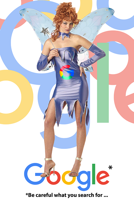
Sexy Google Fairy Godmother advising you on how to use her.
Because what is the answer to all of humanity’s problems? Automated tools. We’ve grown so accustomed to automated solutions that manual effort seems to have become foolish and demeaning. Every time a problem poses itself, someone just assumes “there’s an app for it”. It’s gotten so bad that whenever you dare say something must be done manually, people start frantically calling on fairy Godmother Google to magically solve the problem with a monthly SAAS subscription that has the button to fix it and prove you wrong. It’s gotten so bad that you’ll convince finance faster to pay for yet another app than convincing management that it has to be done manually; and there’s a reason for that — the misinterpretation and idealisation of automated accessibility tools.
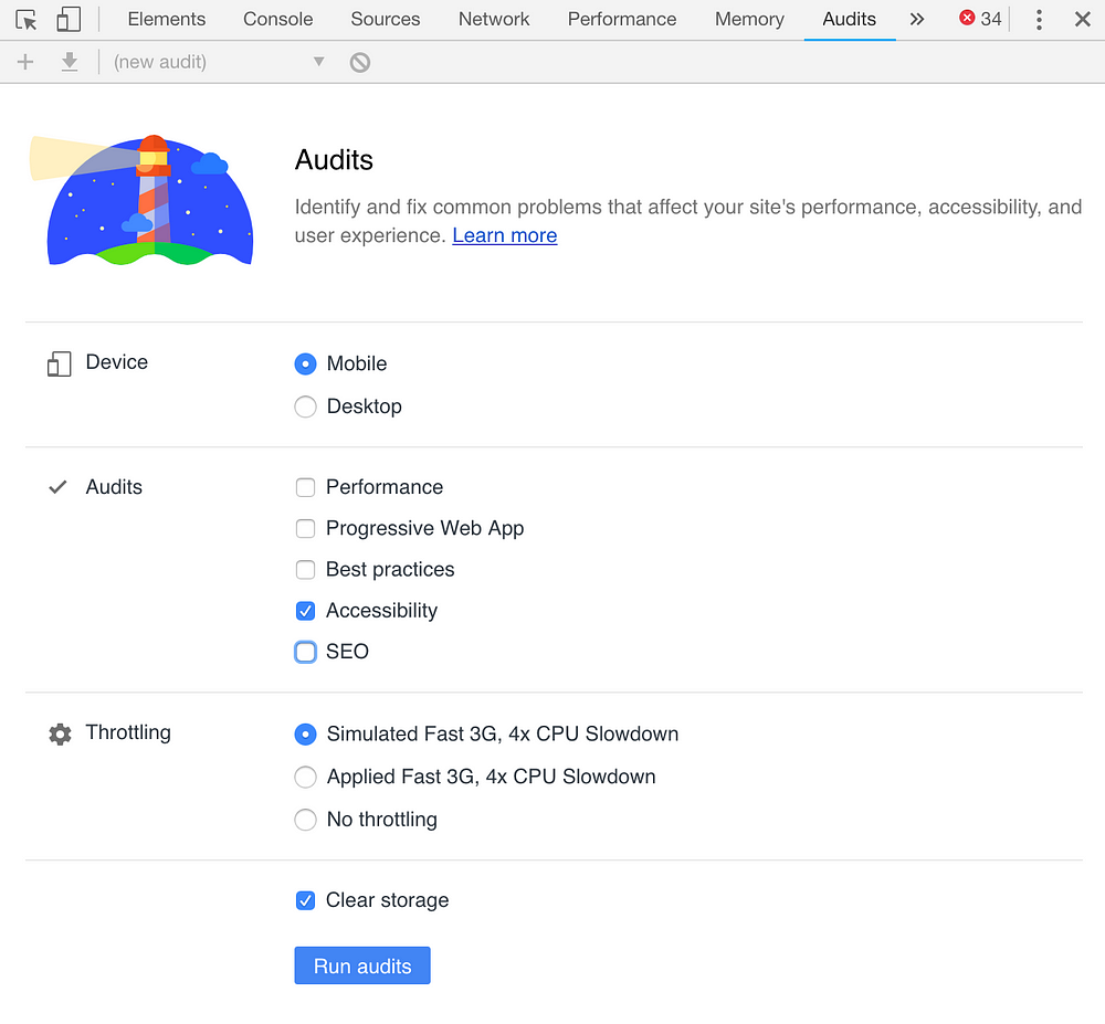
Let’s take AXE for instance. It is now the de-facto tool for checking your web app for accessibility errors. In fact its use has become so widespread that Google now includes its engine in Chrome under the Lighthouse branding, which you’ll find in the developer tools under “audits”. The road to hell though, is paved with good intentions. Isn’t it always…?
A screenshot of “Lighthouse” settings under Chrome’s Audits tab
While Google wanted to create great accessibility testing integration into the browser, what this resulted in is actually quite dangerous: a false sense of accessibility. Put it anyway you like, the moment you run that tool and the score is above 80%, most people will consider it done and dusted, when in fact that 80% in reality barely means 30%. Google states very clearly the severe limitations of the tool, but will anyone care about that or care to read the “small print”? Few. Will anyone start doing the manual checks with a screen reader and keyboard? Very few.
Not part of the development process
From create react-app to yarn build and from TDD to BDD we have all the bells and whistles to get something out there and make sure we don’t throw broken applications onto the web, which is all well and good, but nearly nowhere in the development or deployment process will you find testing for accessibility, and that’s a huge problem. There are currently no standard development patterns set to enable delivering an accessible application, and this is where I believe each individual developer and the industry as a whole need to sit down and fix things.
What I would be proposing, is a 3 tiered process:
local testing: this could be done in various ways. Either use a build plugin like React’s a11y tester, a Git hook or whatever else makes you aware of code-level accessibility issues before you even commit your code or submit it for a PR. If you’re using Storybook, it also has an accessibility plugin.
PR testing: this level proposes either strong collaboration with your code reviewers or an automated a11y Github plugin like AccessLint (if Github is what your teams are using).
deployment testing: finally, running accessibility tests as part of your e2e testing suite is an amazing way to ensure that everything still works after integration with no errors introduced. Here you can use things like Protractor’s accessibility plugin or Pa11y.
Note: automated testing deals with around 30% (at best) of accessibility checks and it’s on only code-level. Passing any or all of these will NOT make your application accessible! The rest is elbow-grease.
The unicorn effect
Because every website and app out there needs to be a rainbow-pooping unicorn — said no one ever! Not everything is about you, designers, and not everything has to be in a modal, carousel, drawer, mega-menu, etc. Just because it slides up and has drop shadow, it’s still a bloody pop up. Calling a donkey a unicorn, won’t make it one.
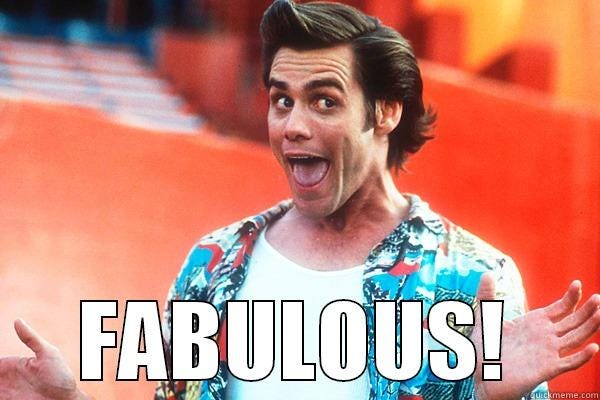
Please don’t ever go for fabulous over functional…
Nearly always it’s UI over UX — because (apparently) anything and everything that lives on the web needs to make designers shine, no matter the cost.
OK, I’m being overly harsh here, but here’s what I actually mean. Dear designers, we understand you are artists, but guess what percentage of this planet’s population understands and is able to appreciate Picasso’s work? A very small one. And do you know why infinitely more people identify with Van Gogh’s work? Well, interpreting Picasso’s work is guesswork and most of the time the average person has no idea what’s going on, and this is why whenever I take a girl out to a Picasso exhibition, I look smart because I make up things as I go, about their meaning — something that I cannot do with a Van Gogh because “Sunflowers in a vase” leaves nothing to guesswork or imagination; it is what it is and the brushstrokes are always consistent across all the paintings. Consistent, self-explanatory art!
The bottom line is, designers need to create “Sunflowers in a vase”. Consistent, easy to understand designs that lend themselves to all types of users. Keep your Picassos to yourselves. Please.
Is it a donkey? A horse? A zebra?
I can’t possibly end this article on a negative note, can I? Well, I won’t entirely, but I can’t ignore the current state of web design and development either. We all throw around fancy jargon, make a lot of noise how we all have a master plan of making the web this magical cloud of fluffy rainbows while underneath we’re propping it all up with more and more technical debt, false sense of achievement, bucketloads of expensive SEO, massaged accessibility and security audits, and it all seems to be falling apart, a bit like the ending to this article and that DC10 on its way to “nearly” Ontario.
The lack of cohesive and coherent software development processes on the web feel a lot like stepping on each other’s toes at a dance competition where you’re trying to do the tango while your partner is adamantly breaking out in hip-hop moves. Give yourself a second to imagine that. If you can’t, Seinfeld’s Elaine is the next best thing.
Design wants unicorns, product wants it yesterday, development gets distracted by the latest tech trends and wants to build a racehorse, while all along accessibility gets forgotten and we all end up with a limping ass (donkey) instead — only to find out three months after going to production, the customer actually wanted a zebra but that donkey will unfortunately haunt us and everyone else for generations.
Do you know what would have gotten that airplane safely to Ontario? Working together. It’s not a new concept. At all. Humans and animals have done it successfully for thousands of years. We wrote books about it and called it waterfall, agile, scrum, kanban, scrumban and a million plus one other names. Question is, can we all in web design and development start working together? Can we get that plane to land safely at Ontario airport or are we headed for our 28th consecutive year of failing ourselves, the web and that 1.9 billion? We can’t be headed for this. Not again…
Attila Vago — writer of codes, blogs and things that live on the web. Programming polyglot, pragmatic doer, member of the “taking care of business” crowd, with a no nonsense attitude. An easily inspired inspirational individual with a strong predilection towards most things nerdy, good, carnivorous food, and Lego. Uses a Mac. Runs at 6 a.m.
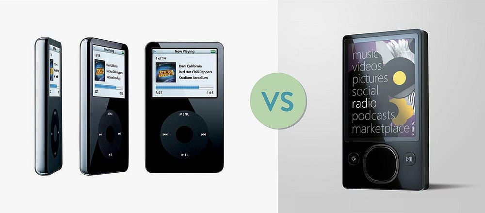
In 2006, Microsoft made a competitive move and released Zune, its version of the futuristic, one-buttoned, every-song-in-your-pocket iPod. The onscreen colors were punchy and the interface was type-led with a beautiful minimalist font. It was a bold move to challenge Apple, but in the world of product, success is not always about being first.
The Microsoft Zune was not a successful product because it didn’t address any special design problems in daily life not already fulfilled by features in other products.
It could be argued that the Zune-only features, such as wirelessly sending a song from one Zune to another (an innovative feature in the mid-aughts) were just as good as the iPod-exclusive features, making Microsoft’s product a seemingly strong contender. But instead, it was a failure.
Why?
You could unearth countless reasons why the Zune wasn’t a success (and probably a pile of reasons why it should have been). One major underlying cause was that Microsoft had not identified a problem the Zune would solve. There were no clear user needs that the iPod was failing to meet or any new innovation that would shake things up. The Zune was solving nothing.
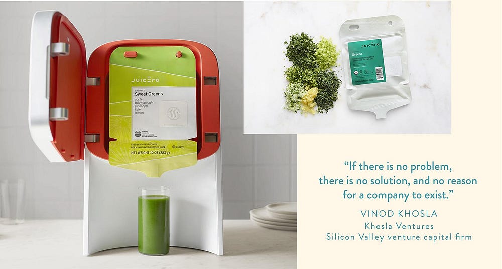
“If there is no problem, there is no solution, and no reason for a company to exist.” — Vinod Khosla, Khosla Ventures (a Silicon Valley venture capital firm)
What Exactly Is a “Design Problem”?
We’ve all had them, solved them, and most definitely caused them. But to put it in simple terms is a challenge in itself. The Oxford dictionary says a problem is “a matter or situation regarded as unwelcome or harmful and needing to be dealt with and overcome.” True, but this implies there is an awareness of the desired outcome. With all due respect to the brilliant minds at the Oxford Dictionary, this definition is missing an important component: unconscious desires.
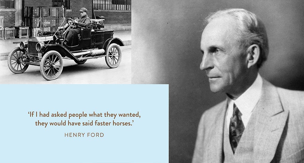
Inventor of the automobile, Henry Ford, knew about this layer of desire when he famously said, “If I had asked people what they wanted, they would have said faster horses.” He knew that the unwelcome matter at hand was that horses were too slow. But this wasn’t really the problem that needed solving. There was a deeper need that his customers couldn’t articulate.
Henry Ford, and a driver of the first Model T
Richard Buchanan is a “design theorist” whose career revolves around human-centered design thinking principles. In his paper, Design Research and the New Learning, he alludes to a user’s unarticulated need when he defines design as “the human power of conceiving, planning, and making products or services that serve human beings in the accomplishment of their individual and collective purposes.” It’s the user’s purpose that needs attention, not simply an unwelcome situation. This deeper need is at the root of what a user desires, whether or not they can articulate it.
Ford’s customers thought they needed a faster version of what they already had. But Ford understood their deeper purpose: to get from one place to another faster. This distinction helped him avoid simply engineering a faster horse and instead opened the doors to create something that had never existed before.
A problem isn’t simply an unwanted situation or a matter that deviates from the norm — although these are still valid definitions of a problem. For designers and creative problem solving, a problem is an unmet need that, if met, can satisfy the user’s purpose.
Framing a problem brings focus to an otherwise busy landscape.
Why Frame a Problem?
Framing a design problem is the first step in a human-centered design process. It prioritizes the elements just discussed: the user and the purpose they desire to accomplish. This means that an initial round of user research can be revolutionary in uncovering deep-rooted desires. Conducting user interviews or desktop research, such as competitive analysis, can reveal insights into potential users and what problems they face.
For example, a design problem statement may be, “New mums need a way to feel connected to a support group because they spend a large amount of time alone with their babies and end up feeling isolated and lonely.” These mums have a deep-rooted desire to know they’re not alone, and a new product might help them accomplish the purpose of feeling connected.
A design team could develop an app, a social network platform, or even a brick-and-mortar venue where mums could gather. The problem statement would guide the team in navigating decisions and features, like, should we use AI? What other apps should it link to? How could the environment be designed? The framed problem provides a framework for crafting the best solution for the user.
By framing the problem with a statement narrow enough to bring focus yet broad enough for creativity, the product design team can stay simultaneously focused on design problem-solving and open to innovative possibilities.
Identifying Barriers and Opportunities
When you know the direction you want to go, you can see what’s in front of you. With a clearly defined problem that’s rooted in a user’s purpose, it’s easier to see what barriers are in the way of reaching that end goal. And if the problem is clearly stated at the start of a project, it can act as a lens through which to find additional opportunities that might have gone unnoticed.
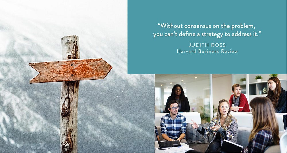
Aligning the Team Around Design Problem Solving
Without realizing it, members of a team — stakeholders, designers, developers, and even users — each have a different image in their head of what the end product should be. They are each thinking about it in a slightly different way informed by different mental models. Arguably the biggest impact of framing a problem is how it aligns these varying views.
The process of framing a problem collects multiple perspectives within a framework that sparks effective conversations and decisions. Once an articulated statement is made, expectations for the team can be managed and efforts are aligned.
A successful product team is focused on solving a clearly framed, common design problem.
Guiding the Project and All Future Decisions
A product team can function without a problem defined — it happens all the time. But when an explicit statement declares what problem needs to be solved, every effort is focused on that single outcome.
A well-framed design problem statement that is documented as part of a product design brief is a simple tool to weigh options and measure success. A good design problem statement will leave room for creativity, but it ultimately provides a clear lens through which to view each element of the project.
Outlining the problem statement and the design process steps act as a filter that sifts out superfluous or irrelevant ideas and retains only the ones that meet the need. As the design process progresses, the team should refer to the initial problem statement and ensure that what is being designed still addresses the core problem statement documented in the product design brief.
“God gave us ten styluses … let’s not invent another.” — Steve Jobs on his distaste for the Apple Newton’s unnecessary stylus pen
Saving Time and Money in the Long Run
With a shared perspective and sign-off on the ultimate purpose of the product, the design process can run more efficiently. There will always be inevitable tangents and dead ends in innovative projects, but even these learnings can be more insightful when everything is driven by finding a solution to a single problem.
Working from a shared understanding of the design problem needing to be solved can also prevent public embarrassment — apart from a failed product. When Juicero launched its extravagant juicing machine, it was met with jabs and jeers because it charged a premium price for what anyone can do with their hands — squeeze fresh juice from a packet. It managed to raise $120 million in investments but suspended sales 16 months after launching.
Ultimately, the product brought very little value to juice-lovers because it solved a non-existent problem. Not every idea should be executed, and a well-framed problem statement can help determine which ones should just stay in the sketchbook.
Juicero offered pre-sold packets of diced fruits and vegetables that users plugged into its $400 machines.
Helping Connect Emotionally to the User
A problem can’t be defined unless you know who is struggling. By taking the time to conduct research and speak to potential users and ask questions about their current situation and how they feel about it, your team can suddenly step into the shoes of the user.
The emotional engagement needed at the problem framing stage aligns the product with the person it’s meant to serve. The user’s motivations, desires, and fears can create a framework for measuring all ideas and proposals. Seeing a problem from a human perspective will inevitably illuminate intuitive and emotional insights that will make a product more lovable.
How Can a Problem Be Framed?
Even though the benefits of framing a problem are significant, it’s often a skipped step. It’s not uncommon to receive a thoroughly constructed design brief that includes everything from visual direction and functional requirements. And sometimes that’s all you need when you join the team.
But if you’re at the beginning of a project and the visual and functional decisions are already being made, it’s worth taking a step back to define the problem the product is solving. Sometimes there is plenty of time to do this, other times there’s resistance and limited resources. Regardless of where you find yourself, there are methods that can help bring a level of clarity to everyone involved.
“If I had an hour to solve a problem, I’d spend 55 minutes thinking about the problem and 5 minutes thinking about solutions.” — Albert Einstein
The Four Ws: Questions to Answer
Ideally, this is a method that gathers key stakeholders around a pile of Post-its and a large wall. By asking four simple questions, everyone can put their own thoughts up and together synthesize the content to find focus and clarity.
Who is affected? Who is experiencing the problem? Can this user be further specified (by demographic, persona, motivation, reason for being in the situation)?
What is the problem? What are the struggles? What task needs to be accomplished? What pain point needs to be relieved?
Where does it happen? What is the context in which the user experiences the problem? Is it in a physical or digital space? Who else is involved?
Why does it matter? Why is this problem worth solving? What value does it bring to the user? What value does it bring to the business?
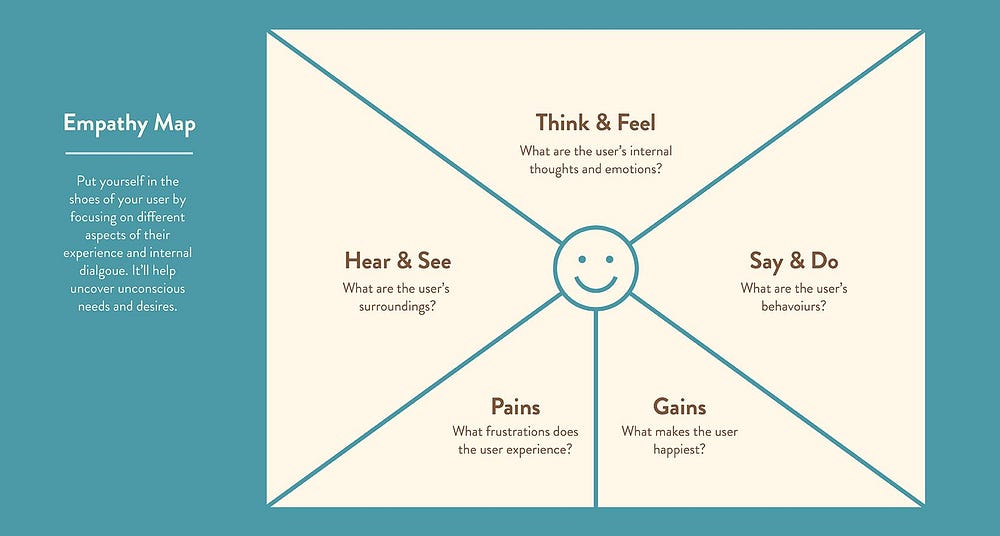
Empathy Map: Putting Yourself in the User’s Shoes
Empathy maps are a common tool used in UX design and can be helpful in many stages throughout a product’s development. Here, at the start, it instantly connects the team to the user to find out what their purpose might be. Depending on the amount of time you have for the problem framing stage, this method can involve user interviews and observational shadowing.
Hear and see. What kind of comments or concepts does the user encounter? What are others saying that the user is exposed to? What does the user observe others doing around her? (This category illustrates the user’s surroundings.)
Say and do. What are the user’s comments and behaviors? What is she saying out loud to others? What does she do in practice? (These are things that are explicitly done and can be clearly observed.)
Think and feel. What does the user think but keep to herself? How does she emotionally react to a situation? What are her desires? (These aren’t always apparent by simply observing a user, but can be revealed through conversational interviews. It takes some digging to understand what is happening on a subconscious level, but this is where great insights can be found.)
Pains and gains. What frustrations does the user have? What about the experience is unnecessary or disappointing? In contrast, what about the experience is improving the life of the user? What works well? Where or when is the user happiest? (These are the outcomes of the experience.)
Empathy maps help better understand the person the product is meant to serve.
The Final Problem Statement
This is a simple but really effective way to bring focus to the insights you’ve uncovered and the ultimate problem you can frame. The design problem statement structure template is like a page from MadLibs, a sentence with blank spaces to fill with your insights. It creates a concise statement rooted in your team’s collective thinking. It’s important to keep the statement specific enough so there is a shared vision for the product, but broad enough to allow for creativity and new insights.
Here are a few design problem statement example formats:
From the point of view of the user: “I am (persona) trying to (verb) but (barrier) because (cause) which makes me feel (emotional reaction).” e.g., “I am a new mum trying to take care of my baby in the best way possible, but I don’t know if I’m doing a good job because I’m always at home alone and don’t have anyone to talk to about it, which makes me feel isolated and alone.”
Drawn from user research: “(Persona) needs a way to (user’s need) because (insight).” e.g., “New mums need a way to connect with other mums because they are often at home alone during the day and feel isolated and alone.”
Using the 4 Ws: “Our (who) has the problem that (what) when (where). Our solution should deliver (why).” e.g., “Our new mum has the problem that she has no one to talk to about the best way to care for her baby when she is at home alone every day. Our solution should deliver a way for her to feel connected to other mums so she feels less isolated and alone.”
Every Good Problem Framing Phase, No Matter How Simple, Should:
Avoid proposing solutions. It’s easy to think in the tangible terms of features and functionality, but these will only distract from first understanding the fundamental problem.
Ask why. It’s a simple question to help find insights under the surface. But as Fast Company contributor Tina Seelig writes, asking “why” lets you see a situation from a different angle.
Reflect. Make time to step back and look for connections and patterns. This is where insights lie that can set a product apart from competitors.
Keep it universal. Avoid using jargon or any unnecessary complexities. The problem should be simple for anyone to understand, and ideally, to retell. Equipping team members to easily talk about what you are trying to achieve will build confidence and passion within the project.
Forget the Horse, Deliver a Car
What is a design problem statement? Some clients may set a brief that clearly defines the problem to solve. Others might not know about this crucial stage. Therein lies an opportunity for you to lead the client in taking a step back and evaluating why this product will exist. Together you can align the team, craft a framework, and kick off an effective and efficient process.
Perhaps the greatest value of this step is understanding the human psyche. Framing a problem from a customer’s perspective lets you more effectively deliver what people never knew they needed. Dave Thomsen, a former IDEO designer, writes that a human-centric approach leads to great user benefits and purpose.
When designers design a product that deeply connects to a user’s desired purpose, it becomes easier to build a product experience and a brand that connects to people on an emotional level. In turn, these will not only be more successful products but will prove to be more purposeful and meaningful in the lives of the people who use them.
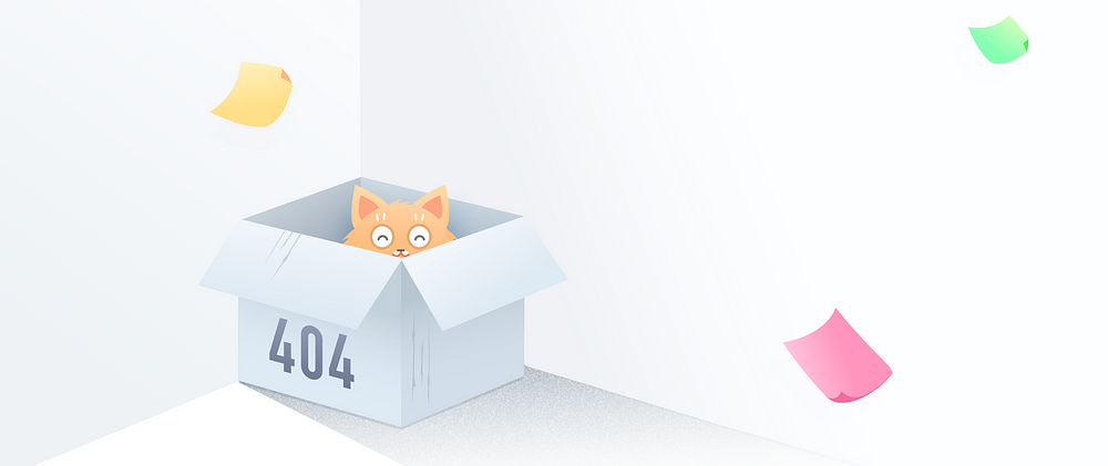
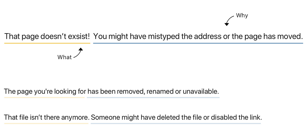
Theres more to a 404 page than you’d think. A cute illustration might raise a smile but we need to make sure we’re actually helping the user with the pain points they’re experiencing in that moment.
Design isn’t only about pushing pixels and creating UI. How a sentence is constructed, what information it’s conveying and the choice of words can make a huge difference in the success of a task.
Each design situation should address the basic who, what, when, why and how’s + a few others.
Who caused the issue?
What happened & whydid this happen?
When will this be solved? (Is it temporary or permanent?)
How can I solve this problem? (Actionable items or getting help)
Tie in the page with your company’s brand
Add unexpected delight
1. Who caused the issue?
Be mindful of the pronouns you use. Who’s actions are you referring to? Was it the user’s fault? The company’s fault? This will also help you determine whether you should say things like ‘sorry’ or ‘Uh oh!’ as your header. Let’s say it’s a maintenance page, use ‘we’ as it’s caused by the company, not the user.
2. What happened & why did it happen?
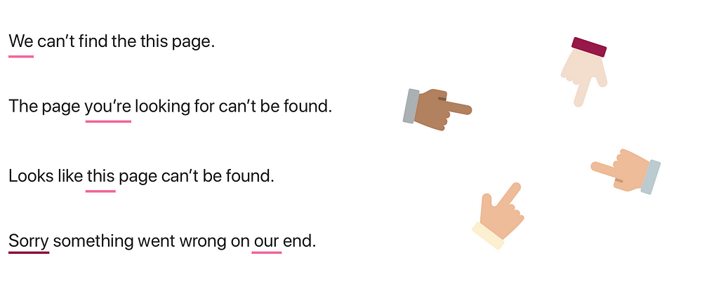
What is a 404? Why can’t it be found? An error code isn’t enough. We tend to freak out over things we don’t understand. So inform the user about what could be causing the issue. Keep it simple and authentic.
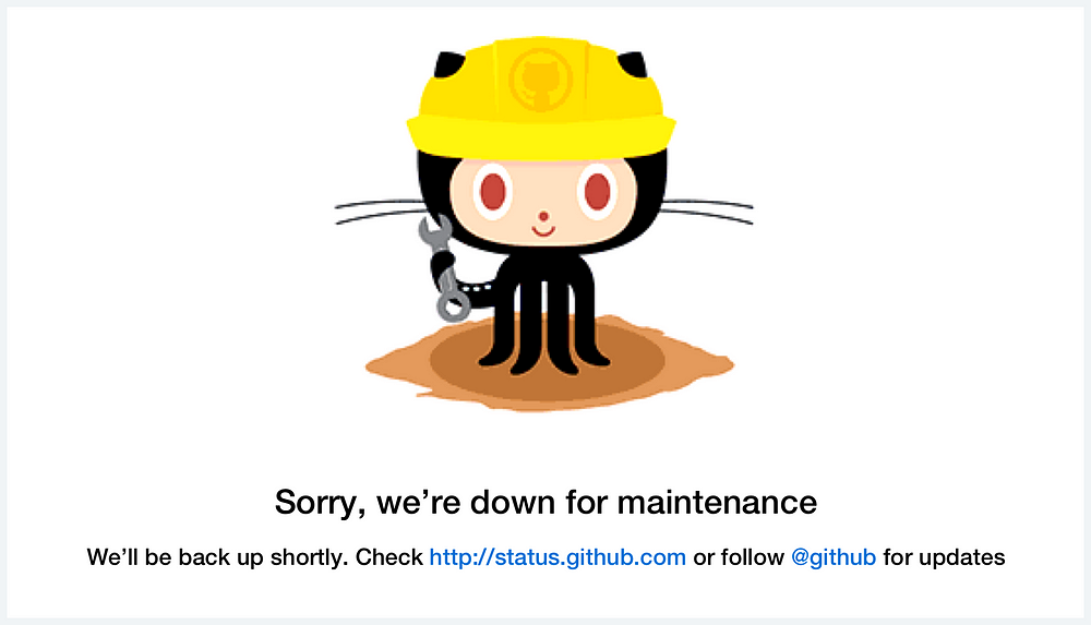
3. When will this problem be solved?
404 pages are a permanent state, while a maintenance page is temporary. So the information we’ll offer will be different. Inform the user about: when will it be back up?Was it scheduled or unexpected?How can I be updated when it comes back online?Sometimes there’s too many unknowns to be able to include this information in the hard copy. The best way keep people informed is by linking them to your active social media accounts.
“We’ll be back up shortly. Check …com or follow… for updates”
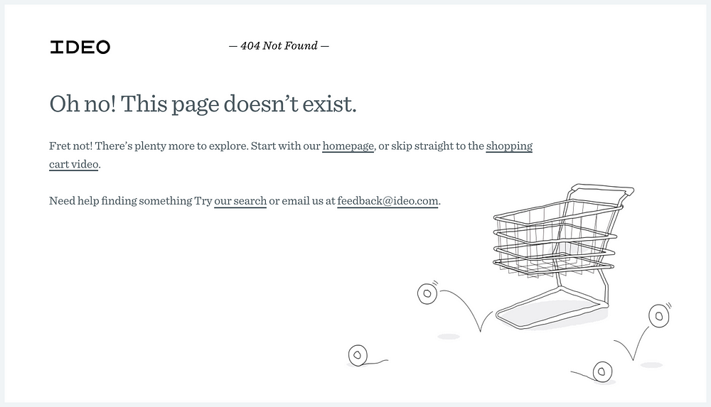
4. How can I solve this problem?
So now they know what’s happened and why, but what can they do about it? Give the user actionable things to do through the copy and active links. Point them to a way out or to something else to keep them in.
“Make sure you’ve got the right link, or you could try searching for something else”
Suggest new content
Open search bar
Primary navigation available
Other popular page links.
Home page link
Medium keeps you in with article suggestions.
“We couldn’t find the page you were looking for. Maybe our FAQ or Community can help?”
IDEO — Giving the user actions and ideas about where else to go
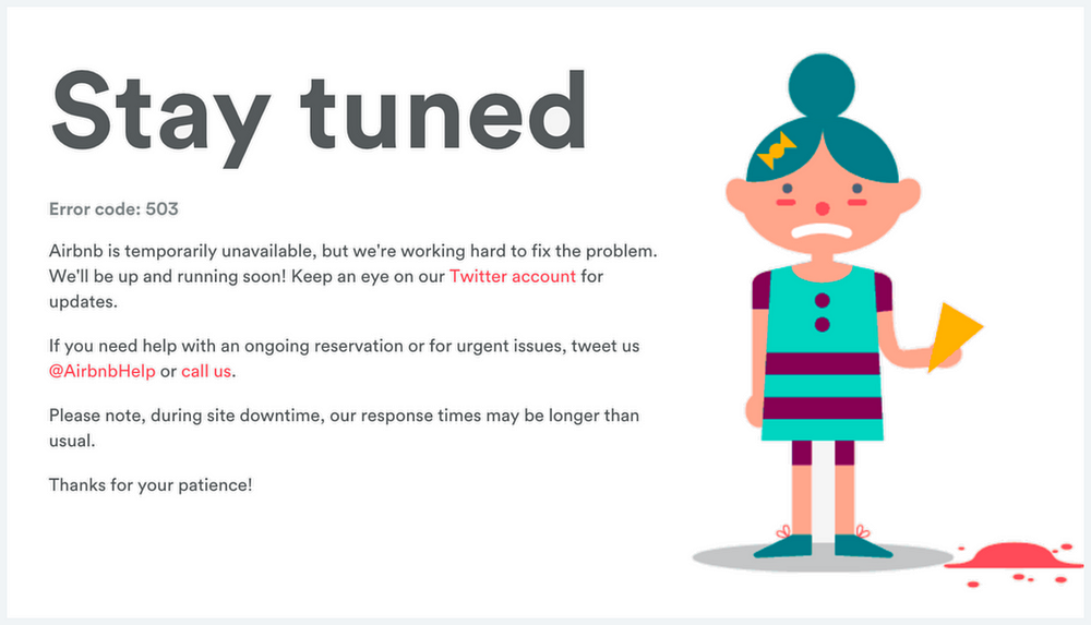
If your users rely on your site to get critical and highly consequential information, mitigate for emergency situations. For example, travel agents, government sites & healthcare. Include upfront information on how to get in touch via a different way.
“If you need help with an ongoing reservation or for urgent issues, tweet us at… or call us on… ”
Lastly, you can also ask the customer for feedback.
“If you got here from another site, we’d appreciate it if you told us from where so we can fix it and save others from ending up here”.
Mitigate for emergency situations— Airbnb 503
5. Tie it into the company’s brand or product.
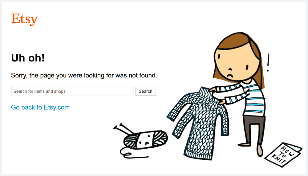
This is a great opportunity to engage with your users. Utilising symbols of the company to reinforce brand. Facebook has used the like symbol as a broken thumb, and Etsy is craft based, so she messed up knitting her sweater, aw.
Sure, these are cute, but they’re also communicating what the website is about if you’ve entered it with little to no context. ie a broken link from a different site.
Etsy — Aw her knitting :(
6. Add Unexpected Delight
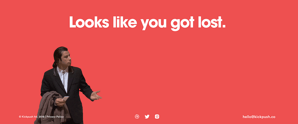
Injecting an element of fun can transform a negative experience into a delightful one. If you want to go an extra mile, treat it as an easter egg. An Easter egg is an intentional inside joke, a hidden message, or a secret feature. Digital agency Kickpush uses confused Travolta- Amazing.
Point them to a way out or to something else to keep them in.
Mitigate for emergency situations
Tie in the page with your company’s brand.
Reinforce brand
Communicate what the website is about
Engage with your users.
Add unexpected delight
Transform a negative experience into a delightful one.
If you found this article helpful send some 👏👏👏 to help others find it too! If you’d like to chat, reach out to me on Twitter. Or you can follow me on Medium for more design articles.
Every couple of weeks we see a new article come up that tries to answer the good old question: should designers learn to code? Our industry is finally reaching a point where we are able to step back and reframe that question altogether.
There are two fundamental arguments used by those who defend the fact that designers who learn to code become more valuable than others:
First, by creating prototypes that are as close as possible to the ultimate intent of the desired experience, it becomes more likely that it will be executed by others appropriately — if not by the designer itself.
Second, the more a designer can speak the language of their developer peers, the better they can collaborate to get to a stronger final product.
Of course designers should know how to code. This is about being a good artisan and knowing the materials you’re dealing with.
Of course designers shouldn’t spend all day creating code. This is as inefficient as asking an architect to build a wall herself.
However, it turns out we were asking the wrong question all along.
Relying on designers being able to code can be a symptom of systemic oppression in the workplace. “As a designer, I will go out of my way to speak the language of those who hold power, to assimilate, so they will trust me. At the heart of this [contradiction] is the foundation of anthropology and the notion of balancing the outsider and insider perspectives to bring understanding through comparison. I am only as valuable as a designer as I am able to maintain that balance between the outsider and insider perspectives and to hold the mindset of student/apprentice.” — states Malouf.
In parallel to this never-ending discussion, we have been observing an ongoing evolution of the design tools we use everyday that enable designers to go back to focusing on what they are really good at: designing (big surprise).
In 2018 we have seen a few transformations that corroborate that trend:
New tools like Framer X and Modulz have evolved to be able to automatically translate UI patterns into React components, which means in most cases developers can build upon designs instead of replicating them in production;
Tools like Hadron App have started to unify Design and Dev workflows into a single UI that has two distinct “views”.
from Sidebar https://sidebar.io/out?url=https%3A%2F%2Ftrends.uxdesign.cc%2F2019