What if you were floating on an ocean of design data—millions of small decisions made across industries, cultures, and countries? How would you begin to fish out the innumerable, invaluable insights and patterns hiding there? Salesforce is on course to find out.
It begins with Salesforce’s Lightning platform. Customers can use it to drag, drop, and tweak components until they bring an entire working application into existence—no coding skills required. Those with developer resources can also build apps with any coding language on the platform.
Often, the people who use Lightning to build business applications and mobile experiences are sitting in sales operations, marketing, IT, or human resources. In other words, they’re not designers by vocation.
That means one of the most crucial parts of the platform is the Lightning Design System (SLDS). A team of Salesforce designers and engineers built it to recommend design patterns, styles, and coded components to Salesforce customers. And now a team of UX minds is working to create AI tools that could tap into the vast amounts of design data across all Lightning experiences.
We spoke with a few of the key players on the Salesforce User Experience team about the future they foresee when machine learning is built into a customer-facing design system, namely:
Owen Schoppe (pictured above, right), principal product designer, UX R&D
Emily Witt (pictured above, left), senior user researcher, Trusted AI
Ambreen Hasan (pictured below, left), senior UX engineer, Design Systems
Alan Weibel (pictured below, right), principal product designer, Design Systems
Ambreen and Alan work on design systems tooling at Salesforce
What’s the relationship between machine learning and design systems at Salesforce?
Alan: We’re running algorithms and scripts to see how people are using styles, components, and patterns.
Owen: There’s a whole ecosystem of people outside Salesforce’s product teams who use Lightning to build apps and user experiences across all of our products. For instance, customers design self-service portals, storefronts, and landing pages in Commerce Cloud. Marketing Cloud is the most used email service provider of all vendors in the space.
That constant customization work our customers are doing creates mountains of design data. Imagine the trends and insights you could glean from all of that information. What patterns are they using most? What new pattern is emerging as a trend? How does color vary between industries or cultures? And the central challenge: How can we work with customers to find a way to answer these questions while maintaining the data privacy and trust we’ve built?
Alan: Right now the way we find out about new patterns is through a manual design review process with internal design teams. It would be impossible to manage the same review for customer designs at the scale we’re dealing with.
But what if a script could look at every customization and understand shapes, typography, colors, how components are arranged? What if it could get smart enough to recommend a color, or notify our own design system team about an emerging pattern? What if you could build a script to automate all of that?
It could be just as powerful for our own internal design operations team—what patterns and components are Salesforce designers using most? What can we streamline or develop to stay ahead of emerging trends?
We haven’t even begun to tap into the potential of this data.
Machine learning can surface patterns in the way people use components.
How much of this is already running in production, and how much is still being built?
Owen: Some of the algorithms we need are already built, and now we’re starting to repurpose them for design systems. Lightning already has so much of the data we need built-in. The components already have names, and each page already declares which piece is a button or a text field. So the component usage map already exists internally.
As with any AI project, the first step is a lot of heavy manual data science work. Data science is about training the algorithm on what to look for, to recognize the areas of code that are cookie-cutter patterns and spot things that are different because they’ve been customized. We have to slog through a lot of manual data entry, tweaking the direction of the algorithm. We dive into metadata from existing designs, and look for trends like radio button placement, custom field arrangement, and color usage across industries.
It’s hard work, and people start to worry, “Are we ever going to get there?” There might be a lull before it shows any benefits, and you need organizational support to get through that.
We’ve come a long way with that work, and now we’re starting to be able to say things like, “If you want to stand out from your competitors, these are the colors you should use.”
How do your current AI capabilities affect developers using Lightning to build Salesforce products?
Ambreen: Internal Salesforce developers aren’t forced to use Lightning Design System, but in our experience, they want to because of the value they get from it. Our devs get a report card that grades how closely the CSS they deliver matches the design system components. Sometimes you can visually inspect a button on the page, and it can look perfectly identical to the recommended button style. But the analysis looks at how they implemented the code for the button. It can detect that they didn’t use the classes, so it’s not fully using the design system. When that feedback comes out in the report card it gets them to really, really want to use the design system.
We’ve seen overall CSS payload shrink by big percentage points because of this. There have been large-scale feature wins too: When we shipped a new cozy and compact view, it was much easier to ship due to the fact that we had reached a tipping point in product adoption. For the first time, we were able to change a lot of the CSS in one step, from one central place, and we were able to quickly ship an important new feature to all Salesforce products.
How do you think through the ethics of using AI to influence design?
Emily: First, we always need to protect our customers and their data when training our models, so, for this technology, we’re building machine learning tools that only include metadata. The models look at the types of components on a page and their placement in relation to each other, but we never extract any of the information entered in those fields.
Second, we see this as an opportunity for us to try out new processes for thinking through both the positive and negative impacts of emerging technology. For one thing, we’re piloting consequence scanning. It’s a method created by DotEveryone, a nonprofit tech responsibility organization based in the UK. In consequence scanning, which is meant to fit into your existing agile processes, you brainstorm potential positive and negative consequences of what you’re building. Then you brainstorm ways to mitigate the negative consequences, and account for those mitigation strategies in your agile planning.
One easy example of a potential negative consequence might be in the area of accessibility.
Owen: Yes, for example, in our datasets, we may see that a gray-on-gray scheme is trending, indicating that the majority of people currently in designer roles seem to love it. But it doesn’t meet accessibility standards for visually impaired people. It’s on us to put that data through accessibility checks that can evaluate whether the tool should recommend that trending gray scheme. Yes, people are using it, but if it doesn’t meet standards, it shouldn’t get recommended. Our job is to add that extra layer of nuance. The data isn’t something to follow arbitrarily.
Emily: Third, we have to be inclusive in our user research as we think through this technology. We try to diversify user feedback and training data sources, so we’re not oversampling one group or using one method. We have to recognize that it’s not just about deciding what goes into the model, but understanding the context for use. User research is a powerful tool for understanding needs, use cases, and context for use, but we can’t outsource the responsibility of also thinking through potential negative outcomes to our users or customers, so we need to supplement our user research with other methods, like consequence scanning.
Beyond that, another set of consequences we’re thinking about involves the impact to the design industry. We have to consider the precarious balance between augmentation and automation. We’re in many ways designing the workplace, so how we can help customers not just automate, but support the human work of design with better data and insights?
Do you think this tool has the potential to improve inclusion and accessibility in design?
Emily: Yes. Without this data, the patterns we recommend in Lightning might be informed by a small group of designers in one city. We could have some of the biggest companies from all over the world building storefronts using that pattern, and they would be using something made by a group from one corner of the globe. Then other companies and cultures start to emulate the same pattern. It starts to spread, and people end up changing their patterns because a few people in California decided that’s how it should be, even though that decision may have been influenced by one small group’s bias. No one in this scenario has bad intentions; it’s just a process perpetuating a bias.
With this tool our customers could have a much more diverse knowledge set to draw from—millions of tiny choices and patterns from all kinds of places, people, and cultures. Salesforce customers don’t want to perpetuate biases. When we talk to them about our AI capabilities, they want features that help them do good. They look to Salesforce for guidance and best practices, not just for internal experiences, but for external flows that will be seen by everyone.
How might this technology affect design teams in their future work?
Alan: The most immediate benefit is the research capabilities. This data helps you get a very accurate sample size, so you can make better-informed decisions about new features for customers.
It also helps with pushing the envelope. If you already know what’s out there in the world, you can innovate beyond that.
And imagine if we fine-tuned this algorithm to the point where we had the right data to come up with suggestions that inform what you’re working on, not just neutral facts. Instead of starting from zero, you could start with what you know is going to work, and build from there.
In the future a team might kick things off by taking a look at what machine learning has produced and work with a much higher level of confidence from the very beginning. It gives you a jumpstart so, you can spend more time researching and building what’s important. You’d get to certainty faster and ideally end up with a stronger product.
Nowadays it’s hard to impress or even surprise with an interface animation. It shows interactions between screens, explains how to use the application or simply directs a user’s attention. While exploring the articles about animation, I found out that almost all of them describe only specific use cases or general facts about animation, but I haven’t come across any article where all rules concerning animation of interfaces would be clearly and practically described. Well, in this article I won’t write anything new, I just want to collect all the main principles & rules in one place, so that other designers who want to start animating interfaces don’t have to search for additional information.
When elements change their state or position, the duration of the animation should be slow enough to give users the possibility to notice the change, but at the same time quick enough not to cause waiting.
Numerous researches have discovered that optimal speed for interface animation is between 200 and 500 ms. These figures are based on the particular qualities of the human brain. Any animation shorter than 100 ms is instantaneous and won’t be recognized at all. Whereas the animation longer than 1 second would convey a sense of delay and thus be boring for the user.
On the mobile devices, Material Design Guidelines also suggests limiting the duration of animation to 200–300 ms. As for tablets, the duration should be longer by 30% — around 400–450 ms. The reason is simple: the size of the screen is bigger so objects overcome the longer path when they change position. On wearables, the duration should be accordingly 30% shorter — around 150–200 ms, because on a smaller screen the distance to travel is shorter.
Web animation is treated in a different way. Since we are accustomed to an almost instant opening of web-pages in a browser, we expect to transit between different states quickly as well. So, the duration of web transitions should last about 2 times shorter than on mobile devices — between 150–200 ms. In other cases, the user will inevitably think that the computer freezes or has troubles with the internet connection.
But. Forget about these rules if you are creating a decorative animation on your website or trying to attract the user’s attention to certain elements. In these cases, animation can be longer.
You need to remember that regardless of the platform the duration of the animation should depend not only on the traveled distance but also on the size of the object. Smaller elements or animation with small changes should move faster. Accordingly, the animation with large and complex elements looks better when it lasts a little longer.
Among the moving objects of the same size, the first one to stop is the object that has passed the shortest distance.
Small objects in comparison with large objects are moving slower since they make bigger offsets.
When objects collide, the energy of collision must be evenly distributed between them according to physical laws. So, it’s better to exclude the bounce effect. Use it only in exceptional cases when it makes sense.
The movement of the objects should be clear and sharp so do not use motion blur (yes, After Effects users, not this time). It is difficult to reproduce the effect even on modern mobile devices and it’s not used in interface animation at all.
List items (news cards, email lists, etc) should have a very short delay between its appearance. Each occurrence of the new element should last from 20 to 25 ms. The slower emergence of elements may annoy the user.
Easing helps to make the movement of the object more natural. It’s one of the essential principles of the animation, which is thoroughly described in the book The Illusion of Life: Disney Animation, written by two key Disney animators — Ollie Johnston and Frank Thomas.
For the animation not to look mechanical and artificial, the object should move with some acceleration or deceleration — just like all live objects in the physical world.
Linear motion
Objects that are not affected by any physical force move linearly, in other words with constant speed. And just because of this fact they look very unnatural and artificial for the human eye.
All applications for animation use the animation curves. I will try to explain how to read them and what they mean. The curve shows how the position of the object (y axis) changes during the same time intervals (x axis). In the current case, the movement is linear, so the object travels the same distance at the same time.
Linear motion can, for example, be used only when the object changes its color or transparency. Generally speaking, we can use it for the states when an object does not change its position.
Ease-in or acceleration curve
We can see on the curve that at the beginning the position of the object changes slowly and the speed increases gradually. That means the object is moving with a certain acceleration.
This curve should be used when the objects fly out of the screen at full speed. Those can be system notifications or just cards of the interface. But keep in mind that such type of curve should only be used when the objects leave the screen forever and we cannot recall or return them.
The animation curve helps to express the right mood. At the example below, we can see that the duration of movement and the distance for all objects is the same, but even small changes in the curve give you the possibility to influence the mood of animation.
And of course, by changing the curves, you can move the object as similar to the real world as possible.
Ease-out or deceleration curve
It’s opposite to ease-in curve, so the object quickly covers long distance then slowly reduces the speed till it finally stops.
This type of curve should be used when the element emerges on the screen — it flies up on the screen at full speed, gradually slows down until it completely stops. This can also be applied to different cards or objects that appear from the outside of the screen.
Ease-in-out or standard curve
This curve makes the objects gain speed at the beginning and then slowly drop it back to zero. That type of movement is the most frequently used in interface animation. Whenever you doubt what type of motion to use in your animation, use standard curve.
According to Material Design Guidelines, it is better to use an asymmetric curve to make the movement look more natural and realistic. The end of the curve must be more emphasized than its beginning, so that the duration of acceleration is shorter than that of slowing down. In this case, the user will pay more attention to the final movement of the element and thus to its new state.
Ease-in-out is used when the objects move from one part of the screen to another. In such case, animation avoids the eye-catching and dramatic effect.
The same movement type should be used when the element disappears from the screen but the user can return it to the previous place at any time. It concerns the navigation drawer, among others.
From these examples follows a fundamental rule that many beginners neglect — the beginning animation is not equal to the ending animation. As in the case with the navigation drawer — it appears with deceleration curve and disappears with the standard curve. Besides, according to Google Material Design, the time of the object’s emergence should be longer to attract more attention.
A function cubic-bezier() is used to describe the curves. It’s called cubic because it’s based on four points. The first point with coordinates 0;0 (bottom left), and the last one with coordinates 1;1 (top right) are already defined on the graph.
Based on that we need to describe only two points on the graph, which are given by four arguments of the function cubic-bezier(): the first two are the coordinates x and y of the first point, the second two are the coordinates x and y of the second point.
To simplify your work with curves I suggest using sites easings.net and cubic-bezier.com. The first one contains the list of the most frequently used curves, parameters of which you can copy to your prototyping tool. The second source gives you a possibility to play with different parameters of the curve and immediately see how the objects will move.
Just like in ballet choreography, the main idea is to guide the user’s attention in one fluid direction during the transition from one state to another.
There are two types of choreography — equal and subordinate interaction.
Equal interaction
Equal interaction means that the appearance of all objects obeys to one particular rule.
In that case, the appearance of all cards is perceived as one flow that guides user’s attention in one direction, namely from the top to down. If we don’t follow the order, the user’s attention will be scattered. The appearance of all elements at once would look bad as well.
As for the tabular view, it’s a bit more complicated. Here the user’s focus should be directed diagonally, so showing elements one by one is a poor idea. Revealing each element one by one will make animation excessively long, and the user’s attention will be zigzag-like, which is wrong.
Subordinate interaction
Subordinate interaction means that we have one central object which attracts all user’s attention, and all other elements are subordinate to it. This type of animation gives the sense of order and draws more attention to the main content.
In other cases, it would be very difficult for the user to know which object to follow so his attention would be dispersed. Therefore, if you have several elements that you want to animate, you need to clearly define the sequence of their motion and to animate as minimum objects as possible at one time.
According to Material Design, when the moving objects transform their size disproportionally, they should move along the arc rather than in a straight line. It helps making the movement more natural. By “disproportionally” I mean that the change of height and width of the object by increase/decrease is carried out asymmetrically, that is with different speed (for example, a square card turns into a rectangle).
The movement along the line is used when the object changes its size proportionally. Since the implementation of such movement is much easier, the rule of disproportional arc movement is often neglected. Looking at the real examples of applications, you’ll see the domination of the linear movement.
The motion on the curve can be achieved in two ways: the first called Vertical out — object starts moving horizontally and ends with a vertical movement; the second — Horizontal out — object begins to move vertically and ends with a horizontal motion.
The path of the object’s movement along the curve must coincide with the main axis of the scrolling interface. For instance, on the next image we can scroll interface up and down and accordingly the card unfolds in a Vertical out way — at first to the right and then down. The reverse movement is done in the opposite way — that is the card first rises vertically and ends up moving horizontally.
If the paths of the moving objects intersect one another, they cannot move through each other. The objects should leave enough space for the movement of another object by slowing down or accelerating their own speed. Another option — they just push away other objects. Why that? Since we assume that all objects in the interface lie in one plane.
In another case, the moving object can rise above other objects. But again no dissolving or movement through other objects. Why? Since we believe that the elements of the interface behave in accordance with the laws of physics, and no solid objects in the real world are capable of doing that.
So, if we sum up all of the above-mentioned rules and principles, the animation in the interface should reflect the movements that we know from the physical world — friction, acceleration, etc. Imitating the behavior of objects from the real world we can create a sequence that allows users to understand what to expect from the interface.
If the animation is built correctly, then it is unobtrusive and does not distract the users from their goals. If it does, you either need to soften it or even remove at all. That means that the animation shouldn’t slow down the user or prevent from performing the task.
But do not forget that animation is more of an art than science, so it’s better to experiment and test your decisions on users.
If you enjoyed this post, click on the applause button to help other people find it.
How to write more effectively and get your message across
Ok, I know what you are thinking. E-mail is probably one of the worst tools one could think of to communicate effectively. However, if you have a multinational team like me, where team members are all in different time zones, it is inevitable that a lot of the communication will need to be done through e-mails.
I am a firm believer that if done right, e-mail can still be a very powerful tool to get your message across. Here I will share with you a bad e-mail I made up, received from my imaginary boss, Peter. I will use it as an example, and how you could make it better with a few tricks.
Hi Claire,
I’m going to be on a plane Thursday night. Since I’m in HK, let’s try to reschedule our meeting some time more convenient.
Perhaps we can catch up after my meeting with John in the morning, I think I’m open around 10:30.
Also for our meeting with the analytics team on Friday night, can you check with Finance if they still need it? James will be on leave so he won’t be able to attend. If he’s not there, then we will only get a local perspective without the global view. I think I’d rather not have it, but if they think they still need it, then we can keep. It just means we might need to be prepared to have another follow up meeting, which I would really want to avoid.
Also, how are you going with the commercialization work on the machine learning model? I like the summary you shared. I think there is an interesting opportunity to use the model for a customer or segment view. As we explore that in more detail we should also continue the conversation about the potential “conduct” risk that we might open up.
Let’s get a good, clear set of actions here. Would be good to check in maybe 3–4 weeks from now just to ensure the details are falling in to place.
Peter
Plan your key message
The most common cause of confusing e-mails is that most people treat it as an “on-the-go” tool. They write it as if they are speaking, and they are “thinking-out-loud” with their e-mails.
Most of the times, the e-mails are unclear, simply because the senders haven’t quite made up their mind on what they want to do yet. Imagine, if you don’t know what you want to do, how do you expect the recipients to figure it out by following your fragmented thoughts here and there? What typically happens next are subsequent e-mails sent from the recipients, trying to get clarification. This is how you end up with back-and-forth e-mails which could have been avoided if you spend some time clearing up your mind and tell people exactly what it is that you want.
I would recommend before writing your e-mail, take some time to think about what is it you are hoping to achieve. Do you want to convince someone of something? Do you want to have a follow-up meeting? or is it simply an FYI.
I would also recommend not to send e-mails whenever ideas hit you. Let it sit in a bit. Because if you are like me, then very likely next second when another idea hits you, you would change your mind. E-mails are not the best tool if you just want to have an open discussion, leave that to IM, Slack or Jabber.
Provide clear actionable next step
Once you know what you want, you need to make sure the same message gets delivered to your recipients, too. Sentences like “I think it would be good if we do …”, or “maybe we should have a follow-up meeting on this” is not good. It is very ambiguous, and if you send the e-mail to several people, no one knows who should take action on it. In addition, it leaves a lot of room for people to interpret the message in ways that you did not intend for.
I would suggest if you want something to happen, be clear about the below:
Who is the action owner
What is the outcome you are expecting
By what time frame do you expect this to happen
If you want to avoid being accused of being a dictator, I would also suggest you provide the task owner with a “why”. It is easier for people to have some context, so they understand why they are carrying out certain tasks than just being given an order.
Make it short
I’m not sure about you guys, for me, there is an inverse relationship between long e-mails and my willingness to read it. It might be a millennial problem, but let’s face it, most people you will be working with these days are millennials. Soon (already?), there will be Gen Z coming to the market. These guys’ first mobile is an iPhone 5. You could pretty much expect that any e-mails requiring scrolling down their screens, you would lose their interests.
The good news is, if you have properly spent the time to plan your key message as we discussed above, it should have already significantly reduced the length of your e-mails.
It doesn’t mean there is no more room for improvement. A habit I have is to always read my e-mail three times before I send it. The final proof-read is not just to pick up grammatical mistakes, but for me to seek opportunities to get rid of some words.
My rule of thumb is, if by removing the words and sentences does not change my overall message, then I would drop it. For important e-mails that go to senior stakeholders, I would also get someone else to proofread it, just to make sure that my logic is sound.
Improve readability
This sounds like common sense, but you will probably agree with me that in reality, it is often not so common. Two ways to improve readability I would encourage you to consider are:
Use readable words
While using acronyms is almost inevitable, it is worthwhile to think about who the audience is, before deciding what acronyms, and how much acronyms you would use.
On top of that, e-mails are not for you to show off how much English literature you have studied. It is for getting your message across. In the corporate environment we are in these days, most of the time, we will be working with people from multiple cultures, where English might not be their first language. Hence I would suggest wherever you can, use layman words as much as possible. This really helps people to focus on your key message instead of the words you used.
Break down your sentence into smaller and more digestible chunks
It is hard to read long sentences. You either run out of breaths (yeah when I read e-mails, I actually read it out to myself), or you forget what the second part of the sentence is related to. Use proper full stop and comma, make it clear to people on which part of the sentence they can take a break to reflect.
Wrapping this all up, let me re-write my imaginary boss, Peter’s e-mail for you here.
Hi Claire,
Can you please re-schedule our 1:1 to 10.30am on Thursday?
More convenient timing given I’m in HK this week.
Can you suggest Finance to re-schedule the group meeting with analytics to next week when James is back?
So we could cover both local and global views in the same meeting.
Can you schedule an appointment in 3–4 weeks’ time for us to go through your recommendation on the next steps for the commercialization work?
Specifically, please make sure you cover potential “conduct’”risk that might open up.
Many thanks.
Peter
You would probably find Peter sound a bit bossy here. This is probably an extreme example as I wanted to demonstrate the points discussed. In reality, would be nice to actually think about who you are writing the e-mail to, and give it a bit more personal touch.
I hope you find these tips helpful. Writing better e-mails is a continuous learning journey for me, hence would appreciate any thoughts and feedback.
from The Startup – Medium https://medium.com/swlh/heres-why-your-colleagues-don-t-respond-to-your-e-mails-the-way-you-wanted-277174753ab8?source=rss—-f5af2b715248—4
Today we, digital designers, have a terrific opportunity to use real data — or generated — on our daily work. We can test and iterate our design solutions faster and in a better way for everyone. The days of Lorem Ipsum are long gone, thank God.
You can save hours of your time, provide better solutions faster and save the company’s money by using such functionality. In addition, even the most boring mockups come to life in seconds. Those of you who have used Sketch Data or Framer’s database “integration” knows what I’m talking about. However, both these features are useless if there are no proper datasets available.
I decided to fix that, and have created 320 various datasets, sorted and structured for ease of use with Sketch,
without destroying your workflow with buggy 3rd-party plugins. So if you’re designing a social, travel, tech, nature, urban, fin, or any other project, this article and datasets I’m providing will be really helpful!
Make sure to check out the videos below before diving into the details. So you will understand the beauty of Sketch Data feature on a few examples.
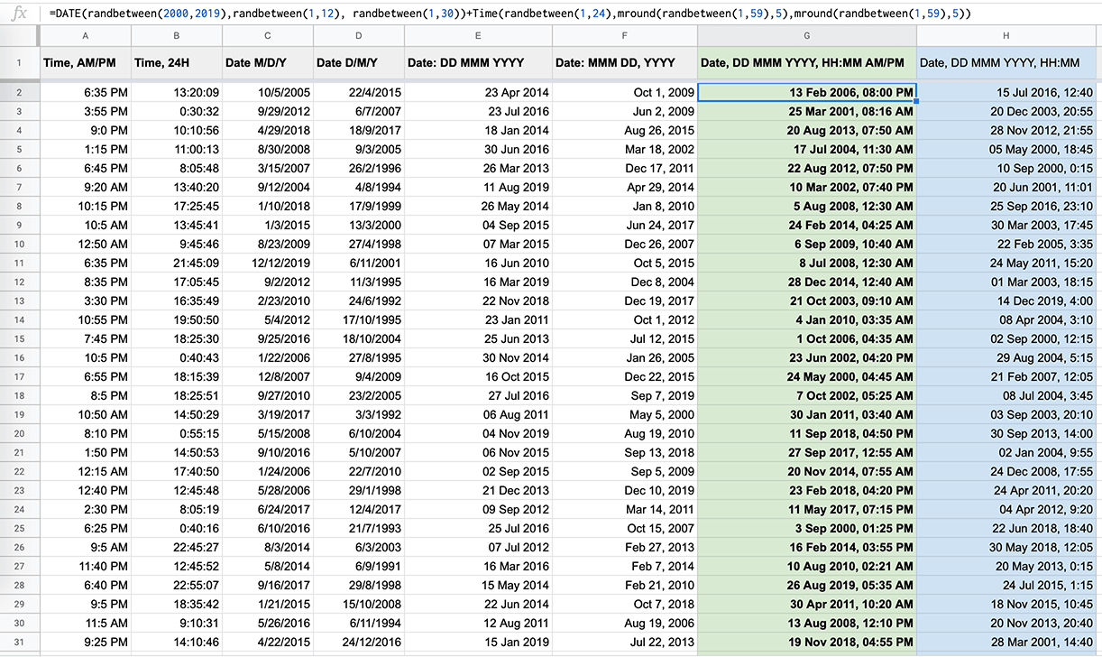
It’s nice to have a date & time generator like Craft, for instance. However, for different cases, you need to use different formats of date representation like:
• 06 May 2019 • 06/05/2019 • 06/05/2019 18:00 • 06/05/2019 6:00 PM • May 6, 2019 • Mon, 6th of May • 2 hours ago • Last week, etc.
For instance, if you’re designing a messenger app, more likely than not, you need to use relative time (e.g. 15 min ago) and a shortened but still readable date format (e.g. May 4, 11:35) instead of 06/05/2019 6:01:33, right?
It’s actually quite the opposite, if you’re working on a travelling project, you should be really specific in date & time and use 06 May 2019, 3:15 PM. Or for a huge database, the format like 2019/05/06 might be the case.
Step 1.
To generate date & time datasets at various formats I used the following formulas and Google Sheet.
Cell A1: =DATE(2018,10,30) Cell A2: =A1+1
Obviously, this one is aimed at generating a date starting from the 30th of October 2018 with one day step for each next cell. To get a valid date starting from today, change A1 to =CurrentDate.
This one is a bit more complex and generates a random date and time in a format 2019.04.04 18:40:10 where minutes and seconds are multiple of 5. Now it can be easily changed to any other format (e.g. 4 Apr 2019, 2:35 PM).
Step 2.
When I’ve all the needed formats/styles ready, I duplicate them to 100 rows to get a big enough list of randomly generated dates & times. Then all I need to do is to copy and paste them to the appropriate .txt files and save.
Here is a quick tutorial of how to create, save and connect a dataset:
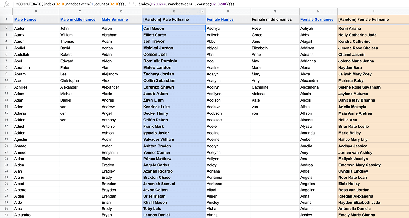
This one is more interesting. To generate the full names, I’ve prepared 4 columns:
Column B: 1000 Male first names Column D: 200 Male last names Column F: 1000 Female first names Column G: 200 Female last names
Full Name generation. Here I have middle names along w/ first and last names.
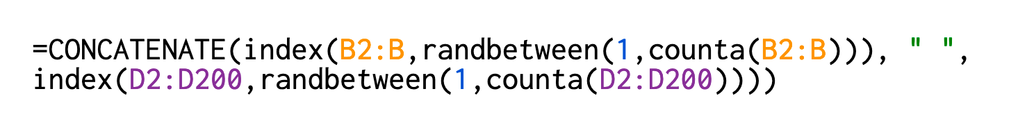
With the formula below, I generate a full name (both male and female) by randomly taking the values from the appropriate columns and combining them into one string value divided by space.
Full Name generation
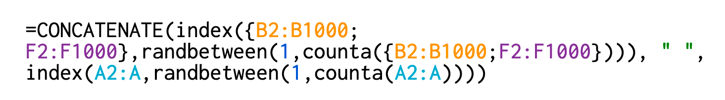
Okay. So now you have 2 separate lists. But what if you need a mix of both male and female full names? Easy. With the following formula, I’m just expanding the range from where to take the first and last names. Now generative full names for my dataset are ready.
Full Name. Mix.
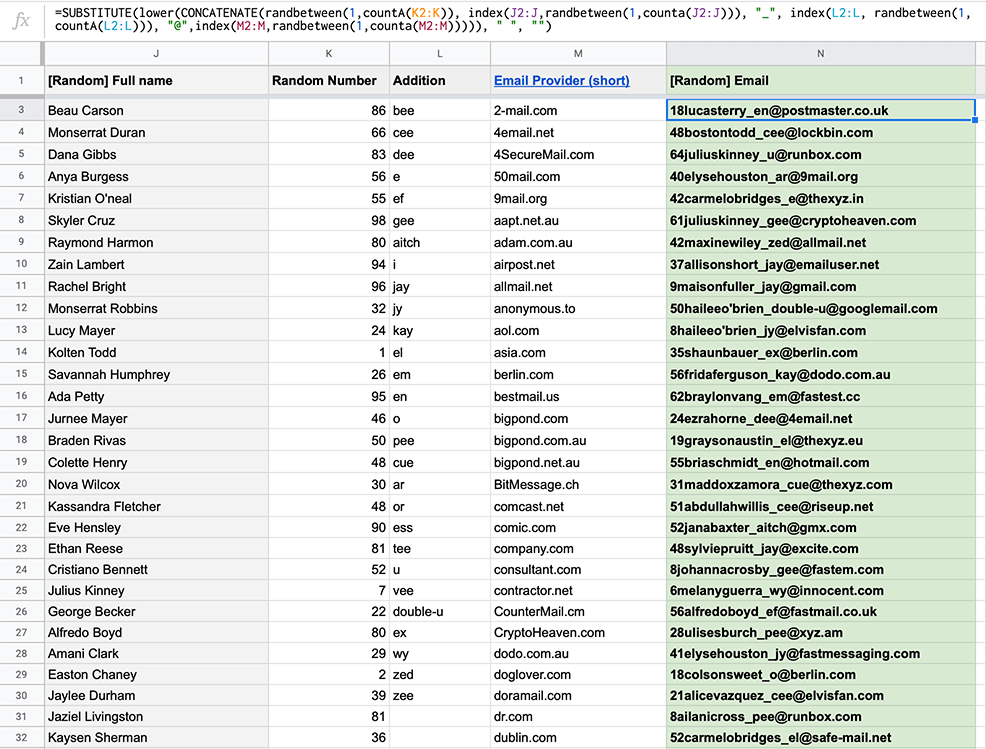
Now the trickiest one. So, how can one generate emails properly by ensuring any coincidences (at least to minimize them as much as possible) with the real/taken emails in terms of privacy and GDPR? Sounds tough, huh?
To do so, I’ve added 3 more columns (up to 4 previously mentioned with names) with the following values:
Column K: 100 Randomly generated numbers (1–100 range) Column L: English Alphabet is written in sounds (e.g. ei, bi, ci…) Column M: 160 popular email service providers
Email generation
Now, with the formula below, I’m combining everything into a randomly generated emails like 32bengamindelee_ach@fastimap.com.
Here is the breakdown:
substitute — removes spaces from the full names (column J)
lower — makes each letter lowercase
concatenate — combines the values into a single string
index+counta — takes string values from needed columns
randbetween — randomly takes the values among the mentioned columns
I’ve divided texts into 6 topics: design, motivation, nature, sport, tech, and travel. The difficulty here was about copyrights so far as someone’s materials couldn’t be used for any commercial purposes, unless they are from free-for-use resources. And because of the topics, I had to find a way to generate meaningful texts on my own. However, I have found another solution.
https://talktotransformer.com/ — this is a neural network that generates quite good texts based on a short message of some topic. Let’s say you need a few paragraphs of text about motivation. You can start with “Teach yourself to be a mentor. Your team still respects you enough to hear you and to keep moving in one direction but with fun and no bias.” And you will get the following:
So, I’ve grabbed some sentences from my own articles, fed them to this neural network and got the needed amount of texts for my dataset. The copyrights are not violated and no one has been injured 🙃
When datasets are ready, they needs to be connected to Sketch. It’s really easy to do.
1. Go to Settings ⇢ Data ⇢ Add Data tab. 2. Choose needed datasets or folders. Done.
I advice you to connect a root folder or at least the nested folders. In that way, it will be easier to update them and keep the structure clear. If you’ll add, let’s say, one more date format to your folder, it will automatically appear in Sketch Data list. But do not connect the datasets (.txt files) one-by-one. It ain’t Cool.
You can spend some time to create/generate such datasets on your own. Or 👉grab mine, already prepared, sorted, and structured for your convenience. Here is the list of datasets you will get:
1. Names • Male full, first and last names • Female full, first and last names • Full Names — mix
2. Date & Time • Date in various formats (e.g. 20/05/2019, 20 May 2019) • Time in various formats (e.g. 12:32:34, 11:17 AM) • Time relative (e.g. Last month, 2h ago) • Time Zones (e.g. EET+2, GMT+1, UTC-3) • Duration (e.g. 45h 30, 37 min)
3. Devices • Device type • Apple devices (iPhones, iPads, MacBooks) • Samsung phones • Display models, resolutions, refresh rate, matrix type, etc. • Mix of mobile devices • iOS and Android OS versions
4. Cities & countries • Countries worldwide • Countries AMER, APAC, EMEA regions • Countries capitals • Countries 2-, 3-letter and numeric codes • US States, their capitals and cities • Cities of 8 countries (China, France, Germany, Italy, Japan, Spain, Ukraine) • All names localized to 8 languages (DE, EN, ES, FR, IT, JA, UK, ZH) 🤩
5. Tech: File sizes • Random 10–500 KB • Random 10–800 MB • Random 1–500 GB • Random 1–20 TB
7. Phone Numbers • Random Phone numbers • Country codes
8. Currencies & Prices • Currencies codes, symbols and names • Worldwide currencies sorted by code, name, country • Prices (e.g. $16, 403 €, £800)
9. Languages • Languages 2- and 3-letter codes (e.g. ES, ENG) • Languages native names • All names localized to 8 languages (DE, EN, ES, IT, JA, UK, ZH) 🤗
10. Messages & Texts • Random short messages with 8 localizations! • Generated paragraphs of texts on various topics
11. Airports • Airports (most popular and worldwide) IATA codes • Airports sorted by names, cities, and countries • US popular airports sorted by IATA codes, names, and cities.
—
Here is the list of some functions that might be useful: • Randbetween (A,B) — randomly gets a value between A and B. • Mround (A, B) — rounds the value A to value B. • CountA (a, b) — allows to count the number of certain values within a specific data range. Use it to count string values. • Concatenate (A1, “:”, B1) — combines values from A1 and B1 cells and puts a colon between them. • SUBSTITUTE — search to needed text among needed values. • (A:A) — values from the entire A column. • (A:C) — values from the entire A, B and C columns. • ({A10:A100, D:D, F2:F}) — the multiple ranges of values from column A cells 10–100 AND the whole column D AND the whole column F excluding cell F1.
To summarize: using Sketch Data with the meaningful dataset is a smart and fast way to fulfill your designs with the proper data in seconds. No more hassle with the manual filling repeated text blocks for you and your team!
In addition, I’ll be adding more specific datasets and formats in the future. It will be available for Framer as well. So consider following me on Gumroad for valuable updates.
From the cons, I would mention only one. You could not save a specific or alphabetical order of values. Sketch taking values randomly. However, I’m pretty sure, the Sketch team will fix all that soon, right? 🙂
Please, encourage free knowledge sharing by 👏 !
from Medium https://medium.com/@justd/sketch-data-4d22f823253c
There’s been a lot of buzz about mobile onboarding lately. That’s because the mobile industry continues to grow at a rapid clip, and product managers are trying to figure out how they can distinguish their app from competitors.
Since we all know how important first introductions are, there should be no questioning how important (and effective) mobile onboarding can be. And indeed, the most effective way to set your app apart is during new users’ first experience with your app.
Looking for proof that onboarding matters? Just take a look at the 4 statistics below.
👋 25% of users abandon an app after just one use.
What this statistic tells us: There are several reasons users come to an app once and then promptly abandon ship: The user experience is bad, the app isn’t relevant to their needs, or they don’t see the value of the app. Let’s assume the first 2 don’t apply, since you’ve spent time and money on your UX and ensured you’re targeting the right audience with your ads.
This leaves the latter: users aren’t seeing the value of your app. That doesn’t mean it isn’t there! Remember that you’re battling a world of short attention spans. If how your app helps users isn’t explicitly clear right out of the gate, you risk losing them.
How better onboarding can help: One way to approach app onboarding is to treat it like a (well done) movie trailer that provides users with a synopsis of what the app has to offer and why it’s beneficial. Sure, there will be more to explore once the user gets into the app, but good app onboarding leaves them with a clear picture of what to expect and makes them excited to get started.
🌎 There are 2.6 million apps in Google Play, 2.2 million apps in the App Store—and 194 billion app downloads in 2018 alone.
What this statistic tells us: To say the app market is oversaturated is an understatement. As global trends shift towards mobile-first, it seems like everyone is vying for their piece of the pie. Competition is fierce, and only those apps that manage to make a lasting impression will survive.
How better onboarding can help: The faster you can relay the value of your app to users, the better chance you have of winning them over. And good onboarding has a strong trickle-down effect:
A strong app onboarding experience = happy new users = higher retention rates = more organic app downloads from recommendations = higher app store rankings and overall visibility
📲 In 2018, 58% of site visits and 42% of all web traffic came from mobile devices.
What this statistic tells us: Mobile is officially the first-screen preference and apps are the most efficient way for mobile users to complete tasks. Apps have the ability to remember preferences, allowing users to pick up where they left off and also personalize the user experience in ways web can’t. But getting mobile users to commit to new apps is tricky.
How better onboarding can help: App onboarding showcases the benefits of a tailored experience. From in-app customizations to faster check-outs, using an app over a mobile browser is a no-brainer. A great onboarding experience will relay this message to potential users.
📈 Retention rates increased by up to 50% with effective app onboarding.
What this statistic tells us: If the first 3 statistics didn’t do it for you, this one should. App onboarding is proven to be successful at boosting retention rates—which is the end goal for all mobile marketers and product managers.
How better onboarding can help: If you want to see a good lift to app retention rates, make sure your app onboarding clearly highlights the value of your app—aka what’s in it for the user. A great onboarding experience should leave users feeling bought in and excited to get started.
The above stats speak for themselves. As we move into 2020, app onboarding shouldn’t just be on your radar—it should be an integral part of your mobile strategy. If you think about it, it’s no surprise that app onboarding is so effective. Liken app onboarding to test driving a car or trying on a new pair of shoes before buying. Being able to understand a product’s value and how it aligns with their needs is what drives customer loyalty and retention.
Interested in creating an engaging app onboarding strategy that will highlight your app’s value, increase engagement, and boost retention? Of course you are! The great news is that Appcues is now available for mobile, meaning you can create, edit, and publish effective mobile onboarding experiences in a fraction of the time.
👉Sign up for Appcues for Mobile to get started! 👈
from The Appcues Blog https://www.appcues.com/blog/mobile-app-user-onboarding-statistics
A case study of how one team used quantitative and qualitative data to their advantage.
Sam Nordstrom had a big problem to solve. As a product manager for Intuit’s Quickbooks, Sam had learned that the new feature his team just shipped wasn’t used nearly as much as they’d hoped. He didn’t know why.
When they demoed their new feature, their users told them they loved it and would use it. Everyone agreed the feature offered huge advantages to QuickBooks users. Yet, now that it was out in the world, the users weren’t getting those benefits.
Sam’s team had implemented a new way for QuickBooks users to get their customer invoices paid. The software added a button to invoices labeled Pay Now. When customers pressed the button, the software set up an instant transaction that sent their invoice payment directly to the Quickbooks’ customer.
Early testing showed, when the customers paid this way, the Quickbooks user would get paid substantially sooner than when they used regular invoices. It was a huge advantage to every small business person using the product, as it increased their cash flow.
But users weren’t using it. Sam and his team didn’t know why.
Learning from deep hanging out
Sam and his team visited their users. Intuit has customer visits in their DNA, so this was not a special trip. It was common for the teams at Intuit to visit customers.
Yet, this time, Sam’s team was looking for specific answers. Why weren’t the users taking advantage of the speedy payment feature?
They hung out with several QuickBooks’ users. They watched those users send out their invoices and process their collections.
They saw it was awkward to use the Pay Now feature. Many of their users preferred Gmail to correspond with their customers. The QuickBooks users often had an existing correspondence thread, complete with price quotes and status updates.
The QuickBooks users would invoice their customers by replying with a Gmail message and attaching the invoice PDF. To these users, this made more sense than sending the invoice from within the QuickBooks user interface. But those users didn’t get the Pay Now capability, because saved PDFs can’t have the necessary button.
When users sent an invoice from inside the product, instead of in Gmail, their invoice message was disconnected to other messages in their thread. The users’ customers missed the Quickbooks-sent messages in their inbox, as they had a different ‘from address’ and ‘subject.’ This made collections more difficult.
Learning from deep data dives
Visiting a few users showed the new feature had a clear problem. Yet, Sam’s team wondered how widespread this issue was. Were other users avoiding the new Pay Now feature for the same reasons?
When Sam and his team returned to the office, they dove into the data QuickBooks already collected from their users. How many users were saving invoices as PDFs? It turns out it was a high percentage of regular users.
When those users saved invoice PDFs, were they attaching them to email threads in Gmail? The team asked a bunch more users and, sure enough, many of them were doing just that.
Were the users who were saving PDFs getting payments through the new Pay Now payment system? Their usage data said they weren’t.
Were the users who did get payments through the new payment system also saving PDFs? Rarely.
Their usage data suggested most users were saving PDFs and not using the payment system. More importantly, those users saving PDFs were paid substantially slower than those using the payment system.
Testing a hypothesis
Sam and his team formed a hypothesis: If they could get users to send invoices with a Pay Now button, those users would get paid faster. But how could they do that?
The team developed a Gmail extension that inserted an invoice with a Pay Now button directly into an email reply. They tried the extension out with a few customers and, sure enough, the customers found it easier than saving PDFs, adding them as attachments, and dealing with the collection headaches.
As Sam’s team rolled out the Gmail extension, they watched their usage data. Were users who installed the extension using it? Yes. Did they save fewer PDF invoices? Yes. Were they being paid faster? Yes.
Integrating Qualitative and Quantitative Data
Sam and his team solved their big problem. They created an innovative solution to a hard problem.
The team couldn’t have done it without their data. They formed their deep understanding by hanging out and observing a few customers. They learned how extensive the problem was by diving into the product’s usage data. They observed, in real-time, the changes in the usage data, as they rolled out the fix to the problem.
All of this data — qualitative and quantitative — guided the team to an ideal solution. It told a complete story that drove the team’s problem-solving process.
Sam’s team built a sophisticated approach to user research. They used data strategically, which delivered insight into their problem and its potential solutions. They couldn’t have achieved the improvement as quickly without it.
To deliver better designs, teams need to grow their own qualitative and quantitative data collection capabilities. They need to integrate these efforts into their user research processes. With this expanded capability, they’ll drive their organizations to deliver better-designed products and services.
UX Strategy with Jared Spool
This article was originally published in our new UX Strategy with Jared Spool newsletter. If you’re passionate about driving your organization to deliver better-designed products and services, you’ll want to subscribe. Subscribe here.
Strategies for growing our organization’s UX design efforts
At our 2-day Creating a UX Strategy Playbook workshop, we look at every aspect of a solid UX strategy, including how you’ll integrate your qualitative UX research with your quantitative metrics. We’ll look at activities that help you find champions, drive customer-centric decision making, and increase the design skills of the teams you work with. You’ll choose the strategies that are most feasible, ready to put them into action the day you return to work.
We limit each workshop to 24 attendees and they often sell out months in advance. You can learn more at Playbook.UIE.com.
from Stories by Jared M. Spool on Medium https://medium.com/creating-a-ux-strategy-playbook/building-an-integrated-qualitative-and-quantitative-user-research-capability-9087df4975c?source=rss-b90ef6212176——2
Deciding which features and fixes to prioritize is one of the most difficult parts of being a product manager or app owner. The reality is that there’s a lot of guesswork involved.
To say product managers “wing it” isn’t true—any good PM relies heavily on user data to steer things in the right direction. But as you probably know all too well, the inputs that go into product roadmap decisions aren’t so neat and tidy. There’s an endless onslaught of competing ideas and requests from executives, team leads, customers—even your competitors can influence the game plan.
Building any product is ultimately a highly subjective and iterative process. In the early days, even your concept of your own app’s core product value can change in an instance. Even for a well-established product, roadmapping is never a one and done event. Your plan for the future of your app can (and should) evolve.
Most of the top companies eventually figure out an important fact: You can’t please everyone with your mobile app—nor should you try. The best apps fill a specific niche and specialize in solving one clear problem:
Uber: getting a ride, anywhere anytime
Spotify: delivering a personalized, unlimited music library
Caviar: restaurant quality food, delivered to your door
As your app evolves, you may find yourself with a lot of feature baggage—features that seemed like a great idea at the time, but never quite struck the right cord with your users.
You need to cut features that are no longer contributing to your app’s core value or risk bogging down your app’s ability to thrive. But how exactly do you determine which features to cut? And how do you go about killing a feature?
Identifying the right features to cut
“If you let too many features creep into your product, the core value proposition and vision can easily get diluted. The product will start to seem “big” and “complex”, and does not easily solve the problem the customer had in the first place.”
Allowing deadweight, leftover, or non-contributing features to exist within your app is harmful for many reasons. Feature creep can kill your app over time by:
Diluting your core value: Your app exists to solve a problem. Features that exist on the fray just add fluff, and hinder the user’s ability to clearly recognize your app’s core value. Even worse, too many features will ultimately spread your teams thin and make you a master of nothing.
Draining resources: Even a minor feature needs to function properly and this means dedicating time and resources to maintaining it and squashing bugs as they arise (and they always arise).
Wasting money: Having a laissez-faire attitude towards deadweight features can directly impact your bottom line. There is a cost to maintaining every part of your app, and it adds up quickly for non-performing features.
Of course, if you’re reading this article, you probably already know that keeping low-performing features afloat is bad for your app. But choosing which features to cut can be hard—even if you know it’s necessary. There are a plethora of questions you can ask yourself during this process, but for simplicity’s sake we’ve narrowed it down to the 3 most important questions.
Does this feature contribute to my app’s core value? Make sure the feature directly relates back to your app’s core mission and value.
Is anyone using it? And does it contribute to user success? Stay true to your PM roots and let the user data drive your feature decisions. Take a close at how many users are actually using a feature, and whether these users are likely to stick around.
Is it worth the cost to maintain? Just because an app feature is expensive to build and maintain doesn’t mean it’s a useless drain on finances. Likewise, just because a feature is “cheap” to keep around doesn’t mean it’s worth holding onto past its expiration date. That’s why you need to look at the total picture—does the feature contribute enough to your MRR? Do customers that adopt this feature have a higher lifetime value?
If you answered “no” to any of those questions, it may be time to clean house. Just make sure you get the right buy-in first. Co-founder of Mind The Product Janna Bastow explains:
“Before you go slashing apart your product, create a ‘kill list’ of items you’re thinking you’d be better off without. Get a second or third set of eyes on the paper, and discuss why you’d like to sunset each item. Most will likely be obvious, but be ready to talk about the cost of upkeep vs. the benefit of keeping a small fraction of your users happy, or whatever else you’ve got to qualify your call.”
How to kill an app feature
Now let’s assume you’ve identified which feature needs to go. How do you sunset a feature smoothly? Let’s take a look at 3 key steps to saying goodbye to a feature that’s outlived its value.
1. Over-communicate
The biggest concern when it comes to killing an app feature is customer backlash. Tackle this head on by:
Letting customers know ahead of time about the feature change
Gradually deprioritizing the feature within your app
You should allow users to migrate off the doomed feature in the weeks and months before things go dark. Choose a prominent in-app messaging UI pattern (like a modal or slideout) to point users down an alternate path so that they can gradually wean themselves of the feature in overtime.Be prepared to support users with additional customer success and support resources during this time.
If you absolutely must kill a feature quickly, make sure you have something superior to offer them in its place—whether that something is a new-and-improved feature or simply a more streamlined workflow. Never delete stored user data or content without advanced notice.
And above all, you should be communicating with your customers throughout the process. Use a combination of in-app messaging, email, and CS outreach to make sure customers feel like they’re in the loop.
For example, when GrooveHQ realized their Live Chat app was a lost cause, diverting both revenue and resources away from their core values, they knew it was time to kill the app. It was a very difficult decision, but they chose to be open and honest with their users, which paid off in the long term. CEO Alex Turnbull’s email is a great example of what your customer communication should entail:
2. Perform a gut check
It’s nerve-wracking making any big product change, let alone chopping off an entire part of your product. That’s why it’s important to lead with the data, rather than emotions. You should follow up with data, too. Use the data that you gathered pre-cut as a benchmark for analyzing user behavior after the fact. Keep a close eye on things like engagement, number of support tickets, and NPS scores to ensure that app users are adjusting to the change and adopting whatever new feature you have in its place (if any).
When HubSpot overhauled their social media tools, they actually had the old and new versions running simultaneously until customers became acclimated with the update. They measured the user opt-out rate (those users who chose to switch back from the new social media UI in favor of the old) until it was down to the single digits before completely killing the product. Why?
“[This approach] made sure that we’d addressed most of the concerns our users had with the new interface. It also meant that most users were comfortable using the new tools before we took the option to use the old ones away.”
HubSpot measure user opt-out rate week over week
3. Make peace with your decision
You’ve made the call and done your due diligence to ensure it was the right one. Now it’s time to move on. Use that extra headspace to innovate and come up with fresh ideas about how to take your app to the next level. Put your newly freed up resources back to work on the features that matter most and the backlog that’s been piling up.
Look forward and move ahead. You’ll be amazed at what you can accomplish when you’re not bogged down by unnecessary features.
A product prioritization framework offers a clear path forward
After you’ve made the hard decision to shed the extra product weight, you need a solid plan in place to ensure you stay on track for the future. A product prioritization framework can help ensure that everyone on your team is on the same page and has a common goal in mind.
There are many different product prioritization methods to choose from. One simple method is story mapping, which emphasizes the user experience over internal stakeholders:
Another useful framework is the Value vs. Complexity Quadrant, which can help you identify the projects with the highest ROI for both you and your users:
Credit where credit’s due, we also like the RICE method originally developed at Intercom. The RICE model ensures their team ships the features that make the biggest impact.
All of these frameworks work by taking the emotion of building features (or at least organizing that emotion into quantifiable measures) and lets the data determine the best path forward.
Cutting features is part of growing up
When you build software, killing your darlings— aka cutting your beloved non-contributing features—is a necessary and normal part of growing up. The things that made sense a couple years ago might not be a good fit for your company today.
That’s why it’s not enough to just do it once. You should make killing app features a regular part of your product strategy. Your goal as an app product owner is to figure out what your users really want and need most— and then build the best version of that possible.
Previously on the Appcues Blog, Sarah Knapp dug deep into the idea of creating an omnichannel onboarding experience for your new users.
There, Knapp discussed the importance of creating a truly interconnected omnichannel onboarding experience—with a specific focus on merging in-app and email communications in a variety of ways.
To be sure, these 2 channels certainly can be used in conjunction with one another to enhance your onboarding experience—but there’s no need to stop there. Instead, we suggest that you use this double-barreled approach to communication throughout the customer lifecycle.
Which is exactly what we’re going to be talking about today.
Customer lifecycle marketing—where omnichannel fits in
Customer lifecycle marketing refers to the process of engaging with specific customers for a specific purpose, based on where, specifically, these customers are in their user journey with your brand.
Basically, the idea is to provide exactly what the customer needs to continue their journey in the right direction.
A few examples:
Throughout acquisition, you’ll need to provide prospects with in-depth information specific to their needs in order to nurture them toward conversion.
When onboarding new users, you’ll want to provide guidance about how to use your product, along with prompts to complete key tasks as they learn. The goal is to get these users to reach their aha moment and activate.
As users become acclimated with your product—becoming regular users—you’ll need to keep them engaged on a continual basis via relevant reminders and timely prompts to encourage ongoing use.
For your long-term users, keeping them engaged involves providing prompts for “power use” of your product, allowing them to supercharge the value they get from your brand.
Adopting an omnichannel approach to lifecycle marketing can be beneficial to both your customers and your business.
For one thing, engaging with your users on multiple channels increases the amount of exposure they have to your brand. Tangibly, this increases the chances that your users will see your message in the first place (since they’ll likely see it more than once on different channels). In the more abstract sense, increased exposure to your brand will likely lead to increased brand recall—in turn leading to more habitual use of your product or service.
Moreover, this omnichannel approach can enhance the quality of your customers’ experiences with your brand. Instead of creating separate communications for different channels, you’ll use each channel to strengthen singular messages at various times throughout the customer journey. This will lead your customers to continue digging deeper into the experience you’ve created for them.
Which brings us back to the main purpose of customer lifecycle marketing: increasing user engagement, and getting your users to take the “next step” in their journey. Again, it’s all about giving the customer exactly what they need—be it further instruction, timely prompts and reminders, or additional offers of value—to keep them engaged as active users of your product or service.
If you can consistently deliver all this to your customers at every point along their journey, you’ll have little trouble growing a raving crowd of loyal users.
Now, let’s dig into the many ways you can align and integrate your lifecycle emails with your in-app messages. More specifically, we’ll look at:
Aligning messaging for more effective onboarding
Aligning messaging to maintain engagement
Aligning messaging to supercharge app use
Let’s get to it.
1. Aligning messaging for more effective onboarding
Onboarding is probably the most critical stage of the entire customer lifecycle, because it sets new users up for success (or failure) down the line.
At this point, your new users may have a pretty good idea of the value your app has to offer in the abstract… but they likely don’t know how to use your app to fully extract this value.
It’s your job, then, to quickly get them up to speed—and to keep them motivated and engaged as they navigate your app and your overall brand experience.
By tying your in-app messaging to your email communications throughout the onboarding stage, you’ll reinforce not just the information and prompts being provided, but also the relationship you’ve begun to forge with your new users.
Here’s how to make it happen.
Welcoming new users
The very first part of the user onboarding experience involves welcoming newcomers to your app and brand.
To initiate this stage in the first place, the new user will need to officially register for your services.
(Note: As we’ve discussed before, you may want to allow new users to experiment with your app a bit before requiring them to sign up. For the purpose of this conversation, we’ll assume the user is 100% prepared to register.)
Once new users provide their contact information, you can set a confirmation email to be sent automatically to their inbox.
With regard to double opt-in prompts, there’s no single “best” approach. Rather, it depends on what works best to engage your target audience.
(The screenshot from Acorns, for example, has new mailing list members confirm via email that they did, in fact, intend to sign up for the service within the app. You could also have those who sign up for your service via your website confirm their registration via in-app messaging or email—depending on which is most effective for your audience.)
A double opt-in prompt all but ensures those who confirm their registration are prepared to move forward with their experience.
You might also use your confirmation email as a means of reinforcing the value of your app, as Ibotta does here:
Once you’ve confirmed your new user’s contact info, your next step will be to extract additional information about their profile and their needs—while also introducing them to your app’s features.
MailChimp takes a similar approach to this introductory phase, by asking new users to answer a series of questions that help MailChimp tailor the experience to each user’s needs:
These questions allow MailChimp to further segment individual users from the get-go—and begin delivering highly relevant and valuable content to their email inbox right away.
The goal here is to ensure your new users know exactly what they’re getting into when signing up for your app, and to learn as much as you can about their unique needs in order to provide maximum value to them at all times.
From there, you’ll be ready to ramp up their onboarding experience by…
Providing specific instructions
Once a new user has completed the initial intake process, they’ll be ready to learn how to use your app.
At this stage, you’ll want to use email as a means of communicating “big picture” messaging, and your in-app messaging for more “nitty-gritty” prompts and instructions.
For example, Square sends new users an email that allows them to complete a multitude of tasks at their own pace, in whichever order they choose:
The risk is that users won’t revisit this type of onboarding email and complete all the calls-to-action within. Another approach, is to break up these early learning tasks and create onboarding email drips to be delivered on a regular basis as the user gets acclimated with your app.
In the example above, Headspace accomplishes a few things really well:
First, the email acknowledges the user’s progress, and points out some of the hidden growth that is taking place within them. Second, it addresses any objections or fears the user may have regarding their experience thus far—and explains how to overcome them. Finally, it provides a gentle reminder to “keep up the good work”—prompting the user to return to the app as intended.
All of this is then reinforced directly within the app, via in-app messaging and gamified elements throughout the app experience:
Now, there may be times where your new users fail to take certain actions that would enhance their overall experience, either by adding delight or making them more successful users. In this case, you’ll want to send a targeted email reminding these users to take action—and explaining what they stand to gain by doing so.
In this example, downloading the desktop app will not only enhance the user’s overall experience with additional features, but will also provide Loom with another means of communicating with the user (via desktop notifications and further in-app messaging).
Whether you’re asking users to upgrade, download a different version of your app, or adopt new features, it should always be a win-win for you and your user.
Again, the onboarding process is all about getting new users up to speed and engaged with your app as quickly as possible. Because they may not yet use your app habitually—and therefore might not even see your in-app messages in the first place—it’s a good idea to use email as a springboard for further engagement, then back up these prompts with clear instruction within your app.
Acknowledging milestones
As we alluded to above, celebrating your new user’s progress is paramount to keeping them motivated to continue using your app on a regular basis.
Celebrating user progress helps improve both the user experience and your engagement rates by::
Acknowledging your user’s growth—potentially allowing them to recognize it themselves for the first time
Reminding the user of your app’s supporting role along their path to success
Facilitating not just repeat use, but also long-term use of your app
Once again, you’ll want to use email to celebrate “big picture” milestones, and in-app messaging for acknowledging quick wins and steady progress.
(The reason for this is simple: You want to celebrate quick wins directly and at the very moment your user makes progress—and you want to keep them on track in progressing even further. Pulling them away to their inbox after every quick win would only serve to distract them.)
Notice the uplifting nature of even the most basic copy. Here, the user simply selected USD as their preferred currency, and they’re met with an excited greeting, coupled with vital information for their account.
The point being:You don’t need to go overboard when celebrating quick wins. In many cases, you simply need to provide a quick pat on the back to let the user know they’re on the right track.
Now, in some cases, you’ll want to reinforce your acknowledgement of your user’s progress via email.
Using the example from above, Etsy might decide to send follow-up emails at certain points along the onboarding journey:
After the user names their shop, Etsy can send an email confirming the shop’s name, as well as any other preferences the user has stated thus far
After the user adds an item to their shop, Etsy might send an email providing further details about how to continue adding inventory efficiently
After they’ve set up their billing information, Etsy can provide a confirmation email that also directs the user to the next “big steps”
(Note that you wouldn’t force the user to engage with these emails before moving onto the next step—but this communication can still add value to the overall experience as an optional way to engage new users.)
The goal is to keep your new users moving forward in their onboarding journeyKeep them motivated and engaged, and they’ll be ready to use your services in no time.
2. Aligning messaging to maintain engagement
Once a user is onboarded, the last thing you want to do is go completely incommunicado on them.
Reason being: There’s no guarantee they’ll continue using your app. Period.
Instead of leaving their return completely up to chance, your best option is to actively reach out to them in order to keep them engaged.
Using reminders to develop habitual use
First and foremost, your goal is to get your newly onboarded users to begin using your app habitually, or as a matter of course.
This is where well-timed email reminders and push notifications come in.
How often you send these reminders should be related to how frequently your app is intended to be used, and/or the circumstances in which it’s meant to be used.
For example, Duolingo sends out push notifications and email messages at the same time every 24 hours (to users who have opted in to daily reminders, of course):
Note that each message uses different methods of nudging the user:
The email focuses on the user’s progress and the importance of sustained practice—the idea is to reinforce value
The push message focuses on how quick and easy it is to keep the habit up—the idea is to prompt immediate action
Both channels give users a clear reason to engage further with the app. And, if they happen to see both messages, well…they’ll have even more reasons to do so!
Again, the timing of your reminders depends on how, when, and why your users use your app.
You might choose to personalize these reminders based on individual use cases. For example, a workout app might send different reminders to a user on arms, legs, and chest day respectively. In backing up these reminders, the team might send emails reminding them of their progress, or of any “streaks” they might be breaking by missing a day.
For those whose usage rates start to decline, you’ll want to do whatever you can to get them back on track.
Duolingo takes both a proactive and reactive approach to re-engaging users. On a weekly basis, Duo sends users a progress report—complete with a comparison to their previous weeks’ work:
Here, users that haven’t been as active more recently might be inspired to get back into the habit upon seeing the progress they’d previously made.
On the reactive side, Duo sends individual emails to its at-risk users, and makes one last-ditch effort to engage via push notification:
While it might be wise to include a bit more personalization in these winback messages, they both serve as a sort of low-pressure reminder to check back in on the app whenever possible.
It takes time for your users to develop habitual use of your services. That said, it’s essential that you deliver well-placed and well-timed reminders to your new users in order to integrate your app into their lives.
Facilitating additional use and exploration of key features
Beyond getting your users to habitually use your app’s basic functions, you also want to get them to dig deeper into all you have to offer as time goes on.
In some cases, you’ll be prompting the user to revisit certain tasks they may have skipped or glanced over during onboarding.
In this example, Harvest nudges users to turn on push notifications by focusing on what they stand to gain by doing so. Presumably, these push notifications will supplement the reminders Harvest sends via email at the appropriate times.
You can also be a bit more open-ended here, providing optional opportunities for your users to check out additional features and functionalities.
Slack presents a similar list of features and tips directly in the app, as well:
Note that in both cases, the initial message is used to point the user toward further resources on Slack’s blog or website. When you promote a specific resource or piece of content, it’s essential that your in-app and email messages are 100% in-line with one another.
(Otherwise, you run the risk of throwing way too much information at your users at a single time. In turn, they may be even less likely to engage further at all.)
As your users become familiar with your app, they’ll also become used to it—meaning the novelty of your app will eventually wear off. Unfortunately, this can lead to decreased engagement, and even churn.
To keep this from happening, you should always be introducing your users to new features, functionalities, and shortcuts that will benefit their individual experience with your app. And of course, you should support these introductions with additional content across a variety of channels.
Note that Zomato allows users to provide feedback directly in the in-app form, but also gives them the option of emailing the team, as well.
Having options benefits the user, as it allows them to use their preferred channel to engage further with the brand while completing the survey. For the team, it increases the chances that users will give feedback in the first place—and also opens the door for them to provide more valuable, in-depth feedback, too.
You might also use your in-app survey to request further engagement via email:
Here, Human asks a quick question about the user’s preferences via their app, then promises follow-up communications via email—preparing the user for further messages from the brand in the near future.
It’s also worth mentioning that not every customer in need of assistance will actively seek out help from your team. So, it’s up to you to proactively provide customer service throughout the customer lifecycle.
At this stage of the customer lifecycle, the aim is to get your users comfortable enough with your app that they begin to use it on a regular basis.
But “regular” use isn’t the end game.
3. Aligning messaging to supercharge app use
The ultimate goal is to get your users to the point where they’re getting the most possible value from your app for their specific needs.
Incidentally, this also means that the user will be as engaged with your app as they possibly can be—meaning you’re getting maximum value from them, too.
There are a number of tricks to get (and keep) your users in a state of hyper-engagement. Such as…
Providing tips for “power use”
As mentioned, you want to be absolutely sure your most-engaged users know how to get optimum use out of your app. Ultimately, you want to get these users to a place where they’re so advanced and capable, that they start to discover the edges of your app’s capabilities.
So, as your users become better versed in the ins and outs of your app, you’ll want to continue introducing even more advanced features, functions, and use cases to them.
In some cases, you’ll want to begin directly in the app, as MailChimp does here, with pro tips sprinkled throughout the user dashboard:
In a case such as the above, users who engage further with the tips could then be sent follow-up emails that dig deeper into the feature at hand. This would not only reinforce the lesson in question, but will also provide the user with documentation for future reference.
Of course, you can also use email to point out specific features and provide expert tips, as well, and follow up with contextual in-app messaging once users click through to your product:
The idea is to gradually unroll the more advanced features your app has to offer as your users become more equipped to use them. (For example, most novice Trello users probably won’t be able to get much use out of automation features just yet.)
But, by introducing these features at just the right time in user’s lifecycle, you’ll deliver the exact value they need to continue using your app.
Introducing new features and functions
All good products evolve, and you’ll want to continue adding new features and functions to your app over time—and introducing them to your users as appropriate.
By providing in-depth instruction to your users across channels, you improve their ability to actually use the new features being unrolled, allowing them to get even more value from your app, overall. And by soliciting feedback from them, you ensure they stay engaged to see how else your app can help them in the future.
(And you can then use this feedback to make further improvements to the customer experience—both on an individual and audience-wide basis.)
Facilitating conversions and upgrades
Whether you’re aiming to convert freemium users for the first time or get your premium users to make additional purchases, aligning your in-app and email messaging is essential.
In certain cases, you’ll want to begin directly within the app. For example, Spotify informs freemium users when they’ve skipped too many tracks with a tongue-in-cheek nudge toward a Premium subscription:
From there, Spotfiy follows up via email with its famous “99 cents for 3 months” offer:
(And follows up… and follows up…)
Similarly, freemium users of Grammarly’s services are presented with a preview of all the additional editing features they’ll get once they become paying customers:
Users who view this page can then be sent a follow-up email further explaining the benefits of a Premium subscription:
The process of facilitating additional purchases from your users is similar to much of what we’ve discussed already. As always, you should be sure to focus on a user’s specific needs above all else—don’t make the mistake of sending all your users the same upgrade prompt indiscriminately or trying to upsell at the wrong moment.
If a user is currently a lower-tier subscriber, use in-app messaging or even your app UI to showcase ways in which your higher-tiered services would provide added value specifically to them
If you offer add-ons or other premium features, nudge your users to the best-fit plugins for their individual needs, as they complete relevant tasks
If you offer multiple apps that sync with one another, promote each of them within the others in your suite
And, of course, you’ll want to reach out via email to follow up with your individual users accordingly. Whether you offer additional information, a discount, or something else entirely should depend on what will provide the recipient with the best possible value.
Wrapping it all up
Keeping your in-app and email messaging aligned and closely knit allows you to reinforce and enhance your communications with your audience.
More importantly, creating this alignment allows you to become more present in your users’ lives, and enables them to further integrate your brand into their daily routine, as well. The stronger this connection becomes, the more likely the user will be to stick around well into the future.
Psst—Looking for a formula that will let you automatically send the right email drip for each in-app action? Check out the Growth Lab by Appcues for inventive ways to combine your product stack with integrations.
from The Appcues Blog https://www.appcues.com/blog/align-lifecycle-emails-in-app-messaging