Twitter is back with more examples of good copy versus bad copy when writing tweets, this time with examples related to publishing polls.
Twitter’s Global Creative Lead Joe Wadlington hosts what has now become a monthly video series full of Twitter tips.
Here’s his advice on Twitter polls in the latest installment of Good Copy, Bad Copy.
Twitter Polls – Engaging & Useful
Polls on Twitter can be a valuable source of market research data, but only if they’re utilized strategically.
When it comes to writing copy for polls, marketers have to find a balance between being engaging while also gathering usable information.
Good copywriting comes into play when writing the body of the tweet and also when crafting the poll options.
As explained later on in the examples, it’s easy to make the mistake of writing engaging copy that doesn’t actually produce any useful data.
In that case – it doesn’t really matter how many people engage with the poll if it does not generate anything your company can benefit from in the long run.
Bad Copy for Twitter Polls
Here’s the example provided of bad copy for Twitter polls:
“We’re completely out of ideas! Tell us what to put on our blog next.”
Blog posts
Videos
How-tos
Cat videos
There are a number of things wrong with this copy, not the least of which is the negative note it starts out on.
After demanding the audience for responses, it goes on to lead them toward a series of skewed answers.
Blog posts and videos are content formats, while how-tos is a topic that could be either a blog post or a video.
Cat videos is a funny and engaging answer, but it’s engaging to a fault.
Chances are most people will choose cat videos, and you may end up with a bunch of responses on the poll, but you won’t be able to use any of that data.
So that’s the bad copy. Here’s the good copy version.
Good Copy for Twitter Polls
The revised version with good copy reads:
“We want to hear from you! What type of content do you want to see on our blog?“
Product how-tos
Twitter trends
Marketing best practices
Right from the start, this poll begins by soliciting feedback from the audience in a positive way.
“We want to hear from you” shows that you care about what your audience has to say.
Especially when compared with “We’re completely out of ideas!”
The poll then leads users toward choosing from a selection of topics, rather than a mixture of topics and formats.
This is good copy, and in the end it will provide the business with information it can use to improve its blog.
Twitter is where you go to ask your audience what they want, and polls are a great way to do this. But this is bad copy.
“We’re completely out of ideas! Tell us what to put on our blog next.”
And then each of the answers included in this poll are a little skewed.
Blog posts and videos are a format, whereas how-tos are a topic. And cat videos – well that’s a funny joke answer but everyone’s going to vote cat videos and you won’t learn anything from this poll. This is bad copy.
The good copy version: “We want to hear from you! What type of content do you want to see on our blog?”
Asking questions always stimulates engagement, and each of these answers are something that the poll results can tell you and that you’ll learn from.
Product how-tos, Twitter trends, marketing best practices – this is going to help your team along the way.
It’s good copy.
from Search Engine Journal http://tracking.feedpress.it/link/13962/13488253
The more things change, the more they stay the same.
We recently published the 2nd edition of our How People Read Online report, almost 15 years after the 1stedition was published. Looking back over the findings from the 5 eyetracking studies conducted for these editions, we can trace how online reading behaviors have changed(or not).
We’ve been saying this since 1997: People rarely read online — they’re far more likely to scan than read word for word. That’s one fundamental truth of online information-seeking behavior that hasn’t changed in 23 years and which has substantial implications for how we create digital content.
The reason why that finding (and others discussed here) is still true is because it’s based on basic human behavior. Even though massive technology shifts have changed some behaviors, many of our original findings about how people read online remain true, even after 20+ years.
Methodology: Eyetracking
Eyetracking equipment tracks a user’s gaze as she uses an interface. This type of research is valuable for many purposes (including evaluating visual design), but is particularly useful for studying what people do (and don’t) read online.
Most of the studies discussed below contained both a quantitative and a qualitative portion:
In quantitative eyetracking studies, researchers aggregate viewing behavior across a large number of participants. The results include heatmaps and gaze metrics (for example, the average number of fixations on a particular element of interest in the interface.)
In qualitative eyetracking studies, researchers analyze individual users’ viewing behaviors through gazeplots and gaze replays. In many cases, we asked participants to bring their own tasks (for work, school, or personal life) to perform for this part of the session.
The findings in this second edition of the report come from a series of studies spanning 13 years, involving over 500 participants and more than 750 hours of eyetracking time.
Early Studies (2006-2013)
In 2006, we conducted a large-scale eyetracking study to understand how people read online. The study involved over 300 participants. The findings from the 2006 study formed the basis of the first edition of our How People Read on the Web report.
We later conducted two small qualitative studies (in 2009 and 2013) to generate new findings and examples to update the report, but these did not result in comprehensive changes or in a new edition of the report.
Latest Studies (2016-2019)
In 2016 and 2017, we conducted 2 quantitative eyetracking studies in two different locations in the United States:
In 2019, we conducted a large-scale eyetracking study specifically to gather findings for the second edition of the How People Read Online report. The study was conducted in two locations:
Raleigh, North Carolina, USA (48 participants)
Beijing, China (12 participants)
We find that behavior patterns, including reading patterns, are very similar across languages and cultures, because they’re based on human behavior. When we do find cultural differences, they’re often present when we compare American or European cultures to Asian cultures. The qualitative portion of the study that was carried out in Beijing aimed to identify any cultural differences in content processing, if they existed.
What Has Changed?
New Layouts, New Pattern
Since 2006, the ways we present language have changed. Responsive design means that content can be displayed flexibly depending on the window width or device size. As a consequence, some advice we gave in 2006 no longer applies. For example, the 1st edition recommended that people use a “liquid layout” instead of a “fixed layout” for text. While that recommendation was helpful at the time, the rise of responsive design has so thoroughly popularized that approach, that we don’t need to recommend it anymore.
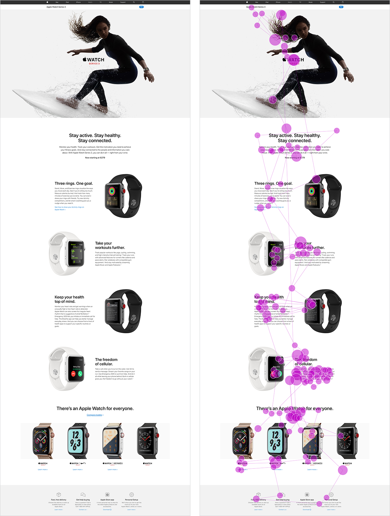
Additionally, the rise in popularity of comparison tables and zigzag layouts (where text and images alternate in each row on the page) has coincided with the development of a new gaze pattern.
On pages with distinct cells of content, people often process those cells in a lawn-mower pattern: they begin in the top left cell, move to right until the end of the row, then drop down to the next row, move to the left until the of the row, drop down the next row, and so on. (The name of this pattern is inspired by the way a lawn mower sweeps methodically back and forth across a field of grass. The mower moves from one side of the lawn to the other, then flips around and mows the next row of grass in the opposite direction.)
This skeleton page is a rough illustration of the lawn mower pattern. The arrows indicate how the eyes travel. In this case, the gaze moves across a row in a table from right to left, then down to the next row, and moves left.
One participant scanned this product description page for the Apple Watch 3 (left), which had a zigzag layout. Her eye movements are shown in a gazeplot (right). As she moved down the page, her eyes traveled from image, to text, to image, to text, in a lawn-mower pattern.
Complex Search-Results Pages
We found that users are scanning SERPs much less linearly than they used to — likely due to the rise of SERP features on Google’s SERPs, as well as competitors like Bing.
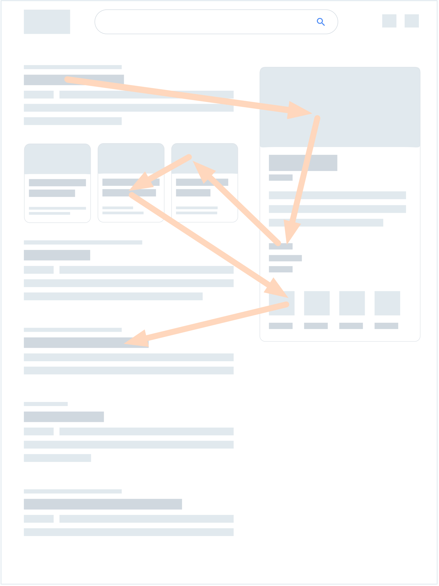
The rich, diverse layouts of modern SERPs caused the development of a new pattern: the pinball pattern. In a pinball pattern, the user scans a results page in a highly nonlinear path, bouncing around between results and SERP features.
This illustration is a rough depiction of a pinball pattern — characterized by “bouncing” gazes between different SERP elements, usually between the right sidebar and the center column of results. Individual examples can include more or less bouncing in any direction.
One participant was looking for pricing information for Botox. She googled raleigh botox. This numbered gazeplot shows all of her fixations in 14 seconds, which formed a pinball pattern. (And yes, she did look at 158 spots in 14 seconds — this scanning speed is normal.)
Beyond shifting gaze patterns, these SERP features also had immense impacts on information-seeking behavior. SERP features can:
Act as signposts: Their imagery can help users quickly verify that they’re searching for the intended entity.
Direct the user’s attention: SERP features have heavy visual weight on the page, which can pull the user’s gaze in different directions. This is the major cause of the pinball pattern.
Modify queries and tasks: Some SERP features, like the People also ask element or the carousel, enable Google to present several expanded interpretations of the query, and allow users to explore those alternatives without leaving the page.
Provide quick answers: For simple information needs, SERP features often answers users’ questions directly on the SERP itself, and users no longer need to click on search result to reach their goals — a phenomenon called good abandonment.
Gaze Patterns in China
In 2006, we studied only English-speaking sites and users, but hypothesized that we would find the same reading patterns in other languages as well. In our recent study of users in Beijing, we found that, indeed, almost every pattern and behavior we discovered in American users was also demonstrated by Chinese users.
One participant in our Beijing study scanned this extremely long page from WDZJ.com. The participant only scanned the first fifth of the full page (left) before abandoning it. His scanning formed a classic F-pattern (right).
The only exception was the pinball pattern; out of more than 60 instances of search, we observed only one instance of the pinball pattern on a Baidu SERP.
We hypothesize absence of pinball patterns is because Baidu provides:
Fewer SERP features per query than Google
SERP features that are not as visually attractive as Google’s SERP features (smaller and fewer images)
Sidebar elements that contain ads and links to other SERPs (like Baidu’s related queries or People Also Search elements), which are less related to the user’s current query than Google’s knowledge panel
There are at least 3 major differences between web use in the US and China:
Culture
Character set (Latin alphabet versus the much richer and denser Chinese writing system)
Taking those differences into account, it’s striking that users’ reading behaviors were almost the same in the two countries. While this finding is not proof that other countries will exhibit the same behaviors, we feel that this is likely to be the case. For example, the (noneyetracking) studies we did with Arab sites (reading right to left) found the same behaviors, but mirrored.
New Content Elements
Compared to 2006, 3 types of content have gained popularity:
ScienceMag.com used full-width pull quotes (as shown here) as well as inline messages about its newsletter.
As a result, our latest research uncovered behaviors and preferences around these content elements.
For example, while both pull quotes and inline messages received fixations in our study, we also noticed that they tended to disrupt reading. Several participants in our study began reading articles nearly linearly and completely until they hit a pull quote or inline ad. After reaching one of those elements, the participants abandoned their reading and fell into light scanning.
The participant scanned this article on Science Magazine’s site nearly linearly and completely, until she hit the inline ad. At that point, her attention dropped off sharply.
What Hasn’t Changed?
Tendency Towards Scanning
People still primarily scan, rather than read. Scanning all of the text on a page, or even a majority, is still extremely rare. Even when users do scan content in its entirety, they never scan it perfectly linearly. They still jump around pages, skipping some content, backtracking to scan what they skipped, and rescanning content they’ve already scanned.
Though light scanning is the primary method used to process information online, the amount of time any individual user is willing to spend reading depends on four factors:
Level of motivation: How important is this information to the user?
Type of task: Is the user looking for a specific fact, browsing for new or interesting information, or researching a topic?
Level of focus: How focused (or unfocused) a user is on the task at hand?
Personal characteristics: Does this individual show a proclivity for scanning and tend to scan even when highly motivated? Or is she very detail-oriented in her general approach to reading online?
As in 2006, content creators need to accept this fact: People are not likely to read your content completely or linearly. They just want to pick out the information that is most pertinent to their current needs. We can design content that supports scanning by:
Using clear, noticeable headings and subheadings to break up content and label sections so that people can scan to find only what they’re most interested in
Placing information up front (in other words, “front-loading”) in the structure of our content, as well as in subheadings and links, to allow people to understand the message quickly while scanning
Employing formatting techniques like bulleted lists and bold text to allow the eye to focus on the most important information
Using plain language to keep content concise and clear
Most Gaze Patterns
Almost all of the gaze patterns observed in 2006 were present in our 2019 study:
Left: One of our earliest instances of the F-pattern, discovered in the early 2000s, on 1900storm.com. Right: A recent instance of the F-pattern, on Investopedia.com.
Guidelines Based on Human Behavior Have Longevity
Our original findings were rooted in an understanding of humans’ information-seeking behavior. As a result, even though designs have shifted over the past two decades, online reading behaviors have remained, at their core, fundamentally similar. Technology changes quickly, but humans don’t.
If anything, we’ve simply observed new behaviors that have developed in response to design shifts (for example, the pinball pattern), but these are all symptomatic of the deeper truth: People don’t want to waste time or effort online. As long as we’re designing content that acknowledges that reality and helps to direct people to only the information they want, we’ll be on the right track.
When PMs think about user retention, they often think about the first few days or weeks after signup. Many user retention strategies focus on pointing users to value while their interest is still high. In our humble opinion, there’s just not enough focus on what happens after.
SaaS companies are under constant pressure to prove their value to users again and again. Every unengaged customer, regardless of how long they’ve been using your app, is in danger of churning. That’s why paying attention to late-stage retention is paramount. When the excitement of the new app has worn off, you have to concentrate on 3 things:
Acknowledging small achievements
Reminding users of your product’s impact
Deepening your relationship with your customers
All 3 of these can be accomplished by celebrating a user’s progress, effectively reminding them about the long-term value they have achieved and stand to achieve using your product.
To give you a better sense of how to achieve those objectives and incentive folks to stick around, let’s take a closer look at 7 ways to celebrate your users’ success throughout their journey.
1. Celebrate milestones
After customers get used to using your product, it’s easy for them to fall into a rhythm of complacency and stop thinking about the value your app adds to their daily life. Use milestones as a way to bring the success and usefulness of your app to the forefront.
You can set any kind of milestone, whether it’s using a feature for the first time, an annual anniversary, or a 500th login. YouTube, for example, congratulates users when they pass 100 subscribers:
Regardless of the occasion, milestones create an opportunity to offer users something special in recognition of their continued engagement.
Spotfiy’s annual Wrapped campaign is a particularly sophisticated and delightful example:
Milestones serve as reminders to the customer that you’re thinking about them and you care about their engagement, even months or years down the line.
2. Applaud and gamify small wins
It can be challenging to keep users motivated once the initial excitement of a new app has worn off. Celebrating progress is an effective way to improve user engagement during both onboarding and regular product usage.
That progress doesn’t need to be monumental. Recognizing small wins doesn’t just make users feel good about themselves—it makes them feel good about your app, too. And that translates to more frequent and engaged sessions.
Nike Run Club, for example, keeps users engaged by consistently celebrating small wins with messages that congratulate users on what they’ve accomplished so far and encourage them to keep going.
Many language learning apps use this tactic to keep users motivated through lessons. Duolingo is a frequently cited example of an app that uses immediate feedback and milestones (among other things) to encourage progress. Hello Chinese, an app for beginner Mandarin learners, takes a similar approach:
3. Motivate users with regular progress reports
It’s important for subscription-based products and services to consistently demonstrate value. Once users have adopted your product and fully integrated it into their workflows, they can start to take it for granted.
Regular progress reports not only reinforce the value you provide, but also allows users to recognize their own growth—and the fact that your product plays an active role in their success.
These personalized re-engagement emails don’t just add another touchpoint—they add value to the user experience and help people visualize how their productivity, accuracy, and vocabulary has improved by using the product.
4. Help users level up
Look at how customers are using your product and send them helpful tips about how to use it even more effectively.
That means analyzing your customers’ behavior and offering relevant suggestions—it does not mean cluttering users’ inboxes with irrelevant emails or recommending features that users are already well-versed in.
Make sure your tips and feature nudges are:
Minimally intrusive. Don’t interrupt your users’ workflows with pop-ups every time they go to use your app. Think critically about when and where the information you’re trying to convey will be most helpful.
Based on user behavior. Don’t set a bad precedent by sending irrelevant messages to your users. Doing so will only train people to ignore your marketing. Use behavioral data to make educated decisions about who should see what message.
Specific and actionable. Users have limited patience, so get straight to the point. Make sure your copy clearly conveys value and that the information can be put to use right away.
Create a VIP program for your best customers. This might mean special privileges, quicker support, or better deals. Show that their loyalty to you is something that isn’t taken lightly.
According to a study conducted by Stanford and Harvard researchers, people react positively when they are given a label that signifies importance. The study took 2 groups of people—one that they labeled “politically active” and one that didn’t receive a title at all. Those with the label were 15% more likely to vote.
Uber taps into this bias with their Uber Rewards program, which is a spin on traditional frequent flier programs. Users who have taken a certain number of trips, or ordered a certain amount from Uber Eats, get VIP benefits like flexible cancellations, complimentary upgrades, and free deliveries.
6. Give your power users exclusive beta access
Don’t take your loyal customers for granted. Instead, reward them by letting them be the first to test new features. Not only do beta tests let you identify friction and gauge how popular your new feature will be, but they also open up another channel of communication with your customers. These customers will feel like they have a voice and that their opinion really matters.
Here are all the necessary components of the invitation:
The result? On the very first day of the in-app campaign, dozens of users signed up, with an overall 5% conversion rate—a 10x increase in conversion compared to email campaigns.
Giving loyal customers exclusive privileges to have an impact on your app will increase emotional investment in your product. Maximize your beta outreach by combining an email invitation with targeted in-app messaging.
7. Cheer your customers on
According to a study in the Journal of Personality and Social Psychology, gratitude is a huge driver of action. In the experiment, researchers tested the willingness of participants to help a student in his job search. A simple thank you increased the number of people willing to engage with the student by 34%.
So say thank you to your customers. But get creative—a generic thank you email might earn you a few brownie points in the moment, but will be quickly forgotten. Instead, keep an ear to the ground for news about your customers. When something exciting happens—they release a new product, secure a Series B, move to a new office, whatever—celebrate with them! This celebration could be custom swag, a congratulatory phone call, or a shoutout on social.
At Appcues, we regularly celebrate our customers’s creativity by featuring customer content on ReallyGoodUX. Is it good for us to showcase content made with Appcues? Of course. But it’s also great for our customers to see their work appreciated in a public forum. It’s a win-win.
Your customers’ success is your success
After you’ve done so much heavy lifting to acquire your customers and get them engaged, you don’t want to throw all that away by assuming they’re a sure thing after just a few weeks.
It’s essential to develop a late-stage retention strategy to keep customers excited and interested in your product. By celebrating your customers’ achievements with your product, you can create an association between their success with your own.
The more your users come to see your product as an ingredient in their own success, the more traction you’ll have in the long term.
from The Appcues Blog https://www.appcues.com/blog/celebrate-user-success-improve-retention
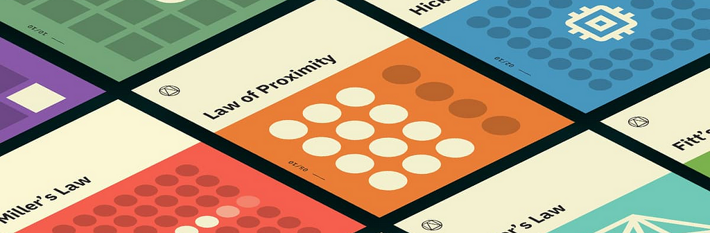
over the course of a few stories, I’ll try and cover a few of the sciences we draw upon in our art as a creative community to create engaging experiences.
Here’s 7 laws that are so good the people who created them put their names to them. Not all the UX laws, but a good way of choosing some to write an intro on.
If you’re interested in these laws, make sure to check out:
The time to acquire a target is a function of the distance to and size of the target.
Fitts’s Law was established to understanding human physical interaction and movement. It’s all about measuring the time or ease of interaction, which is made up of the distance needed to move and the size of the end interaction point.
Origin
In 1954, psychologist Paul Fitts, examining the human motor system, showed that the time required to move to a target depends on the distance to it and its size. Fast movements and small targets result in greater error rates, due to the speed-accuracy trade-off.
About Fitts’s Law
Fitts’ law can be used in UX and UI design, as guidance for size and positioning of interactive buttons. Larger buttons are better for touch devices as smaller buttons are more difficult and time-consuming to click. Also the distance between a user’s task/attention area and the task-related button should be kept as short as possible.
Key takeaways
The target area should be large enough for users to select it and also so it’s obvious.
Buttons should have sufficient spacing between each other.
Placing similarly used functions or features together allows them to be easily used.
2. Hick’s law
Simplify options to make decisions easier
The time it takes to make a decision increases with the number and complexity of choices.
Hick’s Law is named after a British and an American psychologist team of William Edmund Hick and Ray Hyman.
Origin
In 1952, Hicks and Hyman set out to examine the relationship between the number of stimuli and an individual’s reaction time.
About Hick’s Law
Hicks and Hyman found that the more options, the longer it takes the user to make a decision on which one to interact with. Users bombarded with choices have to take time to interpret and decide, giving them work they don’t want.
Key takeaways
Reduce the amount of choices for the user by breaking down complex tasks.
Avoid overwhelming users by highlighting recommended options.
Use progressive onboarding to minimise cognitive load for new users.
3. Jakob’s law
Previous knowledge and experience helps people to know how to interact with familiar things
Users spend most of their time on other sites. This means that users prefer your site to work the same way as all the other sites they already know.
Jakob’s Law is named after the founder, Jackob Neilson of the Nielsen Norman Group.
Origin
Jakob Nielsen established the ‘discount usability engineering’ movement for fast and cheap improvements of user interfaces and has invented several usability methods, including heuristic evaluation.
About Jakob’s Law
Jakob found that by using established interaction patterns and methods enabled users to feel familiar and more comfortable. Along with making things more understood and so easier to use. Meaning that users could focus on what they needed to do instead of how to do it.
Key takeaways
Users will transfer how to use something based on experience with similar things.
Using understand interaction patterns allows the user to focus on their task rather than learning how to use something.
Make the user feel comfortable by increasing familiarity.
4. Miller’s law
The average person can only keep 7 (plus or minus 2) items in their working memory.
Miller’s Law highlights the limitation on human’s ability to hold and make sense of information within their working memory.
Origin
In 1956, George Miller found that the immediate memory and judgment were both limited to around 7 pieces of information.
About Miller’s Law
The human mind can remember about 7 bits of information when completing a task. This puts a limit on how many things a person is able to do at the same time. These aren’t just reserved for new pieces of information though, as you might be moving, thinking or remembering previous bits of information. A way to simplify information is to chunk it up, to make it more accessible and easier to think about by reducing the amount, into bitesize chunks.
Key takeaways
Chunking is an effective method of presenting groups of content in a manageable way.
Organise content in groups of 5 – 9 items at a time.
5. Parkinson’s law
Any task will inflate until all of the available time is spent.
Parkinson’s Law is based on the theory that work expands so as to fill the time available for its completion.
Origin
Cyril Northcote Parkinson in 1955 wrote about the law in the Economist after observing how the number of employees at the Colonial Office increased, while the British Empire declined even after the Colonial Office was folded into the Foreign Office.
About Parkinson’s Law
Parkinson found that the officials were making work for each and the amount of time that the officials were given to perform a task was the amount of time it will take to complete the task. He observed officials elongating the task either by increasing the quality of work, the alternatives looked at in order to truly exhaust a task, as there were not defined goals or exit criteria.
Key takeaways
Something can take a longer period of time if it’s done in greater quality
More alternatives and work can be made in order to prolong a task
A task can be truly exhaustive with the absence of a goal and clear exit criteria
6. Postel’s law
Be liberal in what you accept, and conservative in what you send.
Postel’s Law is all about being forgiving of the user and the information formats that the user wants to use.
Origin
Postel’s Law (also known as the Robustness Principle) was formulated by Jon Postel, an early pioneer of the Internet. The Law is a design guideline for software, specifically in regards to TCP and networks.
About Postel’s Law
Postel’s Law is all about being forgiving of the format in which information or data is given and where possible interpret it into the desired input that you’re expecting to avoid an error or the user having to find a different format. From the simple input type all the way through to uploading data types. It’s about reducing the error rate and making some as flexible as it is realistic too.
Key takeaways
Be empathetic, flexible, and tolerant to any number of actions the user could possibly take.
This means accepting variable input from users, translating input to meet the requirements, defining boundaries for input, and providing clear feedback to the user.
7. Tesla’s law
Tesler’s Law, also known as The Law of Conservation of Complexity, states that for any system there is a certain amount of complexity which cannot be reduced.
Parkinson’s Law is based on the theory that work expands so as to fill the time available for its completion.
Origin
While working for Xerox in the mid-1980s, Larry Tesler realised that the way users interact with applications was just as important as the application itself. The book Designing for Interaction by Dan Saffer, includes an interview with Larry Tesler that describes the law of conservation of complexity.
About Tesla’s Law
Larry Tesler argues that, in most cases, an engineer should spend an extra week reducing the complexity of an application versus making millions of users spend an extra minute using the program because of the extra complexity.
Bruce Tognazzini found that people resist reductions to the amount of complexity in their lives. Thus, when an application is simplified, users begin attempting more complex tasks.
We’d all like to simplify processes and make them faster, but we have to take into account that sometimes there are things that cannot be simplified. In these cases, we’re simply transferring the complexity from one place to another.
Key takeaways
Spend more time simplifying your product so that thousands of users don’t more time to use it
Even when you’ve simplified your product, users may well use it to complete even more complex tasks
Sometimes complex things will just be complex and can’t be simplified further
While we’re on the subject of UX laws, I’m going to look at how to use the principals of affordances and semiotics to improve the usability of your experience.


.jpg "7 clever ways to celebrate your users and improve long-term retention")