Serverless: I’m a big kid now

Serverless: I’m a big kid now

Every year there are dozens of new tools and trends that pop up in the software engineering industry. Now that I’ve been around for a while I think I’m starting to develop a decent radar for which trends are going to have a lasting impact and which ones are going to fizzle out. To be sure, I have made a few embarrassing predictions, such as betting one of my friends that Git would lose out to Mercurial because Git’s user ergonomics were so horrific. We all know how that turned out.

But overall I think I have a really good sense of what technologies will be winners, and what technologies will be losers. And when it comes to Serverless computing, I don’t need to use any of that expertise.

Wait, what?

Yeah, you read that right. It doesn’t take a prognosticator to see that Serverless computing is the future. Nobody wants to manage servers. Managing servers is a nasty side effect of wanting to execute code. I need a secure environment to run code, and because of von Neumann architecture I need some memory, some disk space, and a processor. It doesn’t really matter what form those items take, as long as I have enough. My code needs some amount of all three, and I need an environment that provides it to me. Simple.

My desire to accomplish that doesn’t mean I want to manage a server, or the environment in which it runs. In an ideal scenario I would just go up to a cloud provider and say, “Here is my app, run it for me.”

What is Serverless?

Before we get started, let’s get on the same page about what exactly Serverless is. You’ll see some definitions of Serverless that say it provides computing resources on an as-needed basis. While that is a purist definition, the more frequently used wider definition is that it is a way of providing computing resources in a way that doesn’t require you to think about managing servers.

Serverless comes in a few flavors

Serverless Containers

Serverless container services such as Heroku, Netlify, AWS ECS/EKS Fargate, Google Kubernetes Engine, and Azure Kubernetes Service provide you with an environment where you can build a container and push it up into a service that manages the deployment and execution of the container. You don’t have to worry about running the cluster that hosts your control servers, node servers, etc., you just have to push up a container with some metadata and the service handles the rest.

Serverless Functions

Serverless functions such as AWS Lambda, Google Cloud Functions, or Azure Functions are services that provide an environment where you can push up a chunk of code with a specific interface and later invoke that code.

Serverless vs Virtual Machines

Many people don’t consider Serverless containers to be true Serverless, because when you build and push a container you are essentially bundling a whole server in a nice package. While I tend to agree that they aren’t *true* Serverless, they have absolutely have enormous benefits over running a full Virtual Machine, and distinct advantages in some situations over Serverless functions.

Pros of Serverless Containers

Serverless containers have a ton of advantages over traditional servers. Here are a few of them:

  1. Very little server management – No servers to manage, patch, or troubleshoot. You still have an operating system inside of the container, but that can be an incredibly minimal install, and the surface area of management is much smaller.
  2. Generally stateless – When building applications designed for containers, you’re usually building a 12-factor app or following a similar pattern. Your containers are cattle, not pets. If your container crashes, a new one is automatically fired up.
  3. Easy horizontal scalability – Nothing about a Virtual Machine is inherently limited in terms of scalability, but containers push you in a direction that allows Serverless Container services to easily scale your software as needed. Based on factors such as load, timing, and request count, your Serverless Container service can run one instance of your container or 10,000 instances of it all while transparently handling storage allocation, load balancing, routing, etc.
  4. Security – The operating system installed in a container is usually short-lived, very minimal, and sometimes read-only. It therefore provides a much smaller attack surface than a typical general purpose and long-lived server environment.
  5. Source controlled environment – Your container definition is described in a file that can be put into source control. While this is best practice in almost any situation these days, it is still a distinct advantage when compared with a traditional server environment where someone can get in and change things that make your server configurations drift.
  6. Application and environment bundling – You’re combining your application with the environment it is running in, and deploying that as a single unit. This way if the new version of your software uses updated libraries, operating system version, or new language version, it can all be deployed, and rolled back, as a single unit.
  7. Cost – You can easily scale your workloads up and down. While running a Serverless container might be a bit more expensive, with some providers you can make up for it in flexibility. Serverless containers usually provide you with more flexibility to slice up resources into smaller units than traditional Virtual Machine options. For instance, an EC2 T3 nano instance provides 2 vCPUs, but you can request a container with only 0.25 vCPUs.

Pros of Serverless Functions

Serverless functions have all of the advantages of Serverless containers, but take it to another level.

  1. Virtually zero management – You don’t need to think about the OS at all in most instances. You can just push your code up, and then run it. There’s nothing at the OS level to patch, and nothing to maintain—just push it and forget it.
  2. Stateless by default – Serverless functions force you to write your code in a stateless way, since you can’t depend on anything being left around between invocations. This allows them to easily scale, since your function can be fired up on any server without depending on local state.
  3. Almost perfect horizontal scalability – Something invokes your function, and it runs. If it is invoked once, then it runs once. If it is invoked 100,000 times, then it runs 100,000 times. Sure, there are some platform limitations that might come into play, but those are generally safeguards to keep you from accidentally spending $10,000, rather than limitations of the platform.
  4. Cost – Serverless functions only cost money while they are executing. So if you have functions that only execute rarely, or are very bursty, you can have significant savings.

Serverless Containers vs Serverless Functions

Advantages of Serverless Containers

  1. Easy migration – If you have an existing application, it might take a bit of work, but you can get it running inside of a container.
  2. Cheaper for stable workloads – If you have a consistent workload, then it is likely that Serverless containers will be cheaper than equivalent invocations of a Serverless function.
  3. Flexibility – There are no  limits to your OS, binaries, languages, versions, etc. you literally control the entire container. Serverless function services will limit you to particular runtimes and versions. Some Serverless function services allow custom runtimes, but you will still be locked into the OS.
  4. Troubleshooting – Containers make it easy to jump in and troubleshoot what is happening in your live environment. They also allow you to run a chunk of your environment locally, which makes it easier to debug what is happening.
  5. Long running tasks – A Serverless container runs all of the time, which suits long-running tasks best. Most Serverless functions are going to have limits around how long a function can execute. For example, as of this writing, AWS Lambda has a 15-minute limit.

Advantages of Serverless Functions

  1. Lower cost for bursty workloads – Serverless functions are pay-per-invocation, meaning that you only pay when your code is actually executing. This means that for workloads that don’t run very often, they can be much cheaper in comparison to typical servers or containers.
  2. Fast scaling – Serverless function services can create a new instance of your function and have it ready to serve traffic within a few seconds (sometimes with in a fraction of a second). There are certain limits to this, and you can see more discussion about those limits in the “Scaling Serverless functions” section below.
  3. Fine-grained scalability – Let’s say you have an application that consists of a few dozen different Serverless functions, and one of those functions is called 1000 times more than the other functions. That one function will be scaled independently of the rest of your functions and you don’t even have to think about it. .

Disadvantages of Serverless Containers

  1. Heavier deployments – Serverless containers usually require a large build step and then you have to push a several hundred megabyte container to your repository. Then you have to deploy your containers across your cluster which could take a while if you have large deployments. This turnaround time is significantly longer than pushing up a single cloud function and have it picked up and begin serving requests within a few seconds.
  2. Coarse scalability – When you deploy out a Serverless function you are really just deploying out a single function. That function could perform multiple tasks, but generally you are deploying a single-purpose function that can scale independently of all of your other functions. When you deploy a Serverless container you’re generally deploying an entire application or Microservice. All of the functionality in that application or Microservice is going to be deployed into a single container, so in order to scale it you have to spin up more instances of that container. That means the whole thing scales as a single unit. If one chunk of your application is getting hit a ton, you’ll have to scale the whole thing to increase the amount of traffic you can serve.

Disadvantages of Serverless Functions

  1. Lack of control – Someone is managing the servers your code is running on. Your code is running in an operating system, just not one you have any control over.
  2. Proprietary – There aren’t any real standards around Serverless functions. Because of this you are usually writing your Serverless applications using a particular provider’s tooling and interfaces. Using a tool such as AWS step functions makes for a strong vendor tie-in, because orchestrating across Serverless functions is not standard at all right now. This can pull you deeper into a particular vendor’s ecosystem and make it harder to switch.
  3. Rewrite – Taking an existing application and making it work within a Serverless function is generally not a possibility. You almost always have to write your application from scratch to take advantage of Serverless functions.
  4. Traceability – Serverless functions have the same challenges as Microservices, but taken to an extreme. Tracing a single request across your system could involve dozens of Serverless functions. You need to make sure you’re leveraging tools like AWS X-ray, Google Cloud Trace, or Distributed Tracing in Azure.
  5. Debugging/Testing – You can run a cloud function fairly easily on your local machine using tools like Serverless, Google Function Framework, or AWS SAM, but getting realistic invocations can be a challenge because cloud functions often integrate with cloud ecosystems in automated and proprietary ways. Also, services such as AWS step functions, which introduce an orchestration layer between lambdas, can make it even harder to debug what is happening in a live environment.
  6. Deployment – Deployment of Serverless functions can be a challenge, but mostly because they provide tools (like an IDE) that encourage bad behaviors. Using the Serverless framework can make your deployments automated and manageable, but you need to be sure you take the effort to set it up and keep it organized, otherwise versioning and maintaining dozens, or hundreds, of functions will become a real pain.

Scaling Serverless Functions

Scaling Serverless functions requires a bit of extra attention here because people often think that tools like AWS Lambda or GCP Cloud Functions are a panacea for scalability. They assume that you can just push up your cloud function and get virtually instant scalability. But this is far from the truth. These Serverless function services make scaling incredibly easy, but there are limitations to the platforms that affect how fast and how high your functions can scale.

As an example, AWS Lambda has an initial per-region limit of 1000 concurrent function invocations (this is across all functions in the region). This limit is in place as a safety limit to prevent accidental resource usage and can be increased by contacting AWS support.

Based on that you might think you can just call up AWS support and request an increase to 20,000 concurrent invocations, and then you can push a bunch of requests to your Lambda function and have it rapidly scale up to that level to meet the demands of your service. Unfortunately, this is not the case.

Even after getting AWS support to increase your limit to 20,000 concurrent invocations, AWS Lambda will still limit you to 500 additional concurrent invocations per minute, meaning that it will take nearly 40 minutes to scale up to 20,000 concurrent invocations if you’re starting from zero traffic. In the meantime, all of the requests hitting your service that can’t be routed to an active function will receive 429 errors.

If you know that your traffic will need to burst more than this, you can purchase what Amazon calls “provisioned concurrency.” This will keep a certain number of Lambda functions warm and ready to go, but then you’ll be giving up some of the benefits of Serverless functions because you’re paying to keep them running all of the time. But, in some cases, this is worth the tradeoff.

There’s also the concern that a single function will eat up all the concurrency available for a particular region. You could configure the “reserved concurrency” for specific functions to ensure that their concurrency can’t be completely consumed by other functions. But let’s say you have a total concurrency of 5000 and you set the reserved concurrency of a function to 1000, then you’ll only be left with 4000 concurrency for the rest of your functions in that region.

While many of these settings are necessary to provide an environment that is both safe and usable, it can provide a lot of surprises for folks new to working with Serverless functions.

Vendor Lock-In

Almost all cloud platforms take every opportunity to lock you in, and Serverless is no exception to that. However, Vendor Lock-In is more of a concern with Serverless functions than it is with Serverless containers. The ways in which functions are invoked, deployed, orchestrated, and allocated are all dependent on the cloud provider you’re using.

There are projects like Knative that are making progress in creating a standard environment that companies can use to deploy Serverless workloads, but, in general, you have to deploy and manage the platform itself to get the benefits. This can quash many of the upsides to running your code in a Serverless manner. The goal was to avoid running infrastructure, right? I should mention that you can get native support for Knative with Google Cloud Run and with some effort you can run Knative on AWS Fargate.

What Do You Have Against Serverless Functions?

It might sound like we don’t like Serverless functions, but that isn’t true at all. We just think their uses are more limited than Serverless containers. There are certain use cases when Serverless functions are the perfect solution. Surprisingly, it’s often when you need a strong integration with the underlying cloud platform. Say you want to upload an image to S3, and have it automatically trigger a cloud function that processes it in some way; or you have logs coming off a logging service like Cloudwatch and you want to have a piece of code to easily analyze the log stream. That’s when Serverless functions truly show their worth. They also work well in places where you have a handful of hot endpoints that you want to scale differently than the rest of your application.

As you can tell, in most cases we are still recommending Serverless containers. But you won’t see us leaping for joy because Serverless containers don’t provide the true holy grail of Serverless computing. What is the holy grail of Serverless computing? I’m so glad you asked.

The Holy Grail of Serverless Computing

The holy grail of Serverless computing is true utility computing. To have all of my resources available when I need them, as I need them. To be able to upload a chunk of code (whether that is a single function or a whole application) along with a bit of metadata and have it run in a way that allows it to infinitely scale (with some safety limits). To not have to think at all about how much memory, storage, or compute it needs, it just figures that out automatically. Serverless functions are actually closer to this than Serverless containers, but for the reasons noted above, they still miss the mark.

Serverless, All Grown Up

Please don’t interpret this post as saying that I don’t think Serverless functions or containers are ready for real-world adoption. For most organizations, running servers should be as important to them as generating their own power (and some large orgs need to do both!). With Serverless computing, your code is still running on a server somewhere, just not a server you have to care about. And that really should be the long-term goal for most organizations, to be able to just push a chunk of code into a service and have it run. Serverless computing isn’t quite able to achieve the dream of “push code up and forget about it,” but we’re getting close.

Serverless computing is here, and here to stay. We’ll continue to see Serverless services getting closer and closer to the ideal described here. But while Serverless has definitely grown up, we still have a ways to go. To truly reach the ideal of Serverless computing we need to significantly rethink current computing and security models. While the challenge is huge, the payoffs are even bigger, so we’ll probably get there more quickly than we think.

from Simple Thread https://www.simplethread.com/serverless-im-a-big-kid-now/

In-app ads are not the Dark Side


This article is part of a Gaming Insights series in partnership with Facebook and VB Lab. 


Alongside the disruptions of 2020, gamers play on. And they continue to engage with ads.

Industry data increasingly shows that ads complement in-app purchase revenue without a negative impact on retention or experience. As a result, more game studios are integrating player-friendly ad formats like rewarded video.

If you still see ads as the Dark Side of the mobile game experience, then it’s time to reassess.

Here are reasons why in-app ads won’t hurt your game — and instead, could spur the new revenue streams your business needs.

Rewarded video drives revenue and player experience — without impacting IAP

In the past, publishers and developers feared that in-app ads could cannibalize IAP revenue. In reality, publishers find that players who engage with in-app rewards after watching a rewarded video ad are more likely to make an in-app purchase.

IDC reports that rewarded video ads are particularly popular among U.S. gamers — specifically, that 71% of hardcore mobile gamers either like (41%) or are OK with (30%) rewarded video in their games, as detailed in the blog: Rewarded Video for the Win in Hardcore and Midcore Games.1

Ludia, a Montreal-based midcore publisher, saw this positive player response to rewarded video in their titles Jurassic World: The Game and Dragons: The Rise of Berk, as noted in this case study.

“We’ve seen a jump in revenue when it comes to rewarded video; ad revenue increased 4x without having a negative impact on our IAP monetization strategy,” said Rose Agozzino, Senior Marketing Specialist at Ludia.

Gogii Games, a New Brunswick-based indie games publisher, saw a 2x increase in revenue after implementing rewarded video — without an impact on IAP sales, as noted in this Q&A. Players actually asked Gogii to add rewarded video to more titles.

It’s clear that players like rewarded video ads. So if you choose not to maximize the revenue potential of your game with ads, you are ceding valuable competitive territory to those who have moved faster.

Ads offer sustainable revenue streams — along with higher retention

The future of mobile game ad spend is promising. In a recent forecast for U.S. mobile ad spending, eMarketer predicts overall gaming ad revenues to grow roughly 10% in 2020 to $3.61 billion, with the bulk of this spending in mobile, stating: “Most ads in games are for other games, so most gaming advertising avoided the worst effects of the lockdown, and in some cases, gained users and engagement.”2

Heading into 2020, 89% of the top mobile games worldwide had installed an ad SDK to support monetization,3 according to the report: Ad Monetization in Mobile Games: The Untapped Potential — a Facebook-commissioned report using App Annie data from the world’s top 1,000 gaming apps (March 2020).

According to the same report, retention and engagement factors held steady across mobile games that installed their first ad SDK in 2019, across genres and countries. Specifically, mobile games that started with ad monetization continued to grow in downloads, monthly active users, and time spent in-app over the three months following SDK installation3. Some genres or sub-genres showed an especially strong affinity between ads and engagement:

  • Casual: user sessions nearly doubled one month after ad SDK install
  • Puzzle: 133% increase in total minutes and over 100% increase in overall sessions three months after ad SDK install
  • Simulation: 54% increase in monthly active users three months after ad SDK install3

We also heard from gamers on their reaction to in-app ads. In an online survey of 12,277 respondents across 11 countries, 60% said they are happy with an ad-supported game model and 24% have taken an action directly after viewing an in-game ad, according to the Mobile Games Advertising 2020 Report by 2CV, commissioned by Facebook Audience Network (July 2020).4

Moving beyond myths — embracing the in-app ad opportunity

As you plan your monetization strategy and build new games, you can rely on mounting evidence that mobile ad formats like rewarded video can deliver an engaging player experience, along with the opportunity for new streams of revenue for your business. And remember, the Dark Side is just a brilliant piece of fiction from the mind of George Lucas.


For more insights and tips to help position your game for growth — including genre-specific best practices for integrating rewarded video in your game — visit Facebook Audience Network’s Supercharge Your Game resource hub.

Nate Morgan is global gaming strategy lead, Facebook Audience Network


1IDC, U.S. Mobile and Handheld Gamer Survey, 3Q19, February 2020.

2eMarketer, US Mobile Ad Spending Update Q3 2020, July 2020.

3Ad Monetization in Mobile Games: The Untapped Potential, App Annie (commissioned by Facebook Audience Network), March 2020 – a study of the global top 1,000 game apps, averaged across iOS and Google Play, from January 1 through December 31, 2019.

4Mobile Games Advertising Report 2020, 2CV (commissioned by Facebook Audience Network), a qualitative and quantitative study in the UK, US, FR, TK, BR, AR, JP, RU and VN between March to May 2020, July 2020


VB Lab Insights content is created in collaboration with a company that is either paying for the post or has a business relationship with VentureBeat, and they’re always clearly marked. Content produced by our editorial team is never influenced by advertisers or sponsors in any way. For more information, contact sales@venturebeat.com.

from VentureBeat https://venturebeat.com/2020/08/18/in-app-ads-are-not-the-dark-side/

‘You get 2 seconds to engage consumers online’: Mars neuroscientist shares key findings

Mars shares key findings from one of the largest, on-going neuroscience studies in the world. The problem is marketers may not like the results. Have we got your attention?

Digital ads are now the equivalent of a print or out-of-home ad. Why? Because extensive neuroscience studies, conducted by Mars, show that similar to these traditional methods, marketers now only have about two seconds to capture consumers’ attention in the digital realm.

Mars, the family-owned global company behind brands like M&M’s, Wrigley’s gum, Skittles, and the like, thrives on impulse buys for many of its products. What Sorin Patilinet, global consumer marketing insights director, Mars, Inc., and his team in the communications lab, are trying to solve for is how to first draw attention and then create an emotional connection. The two together are the magic formula for triggering impulse purchases.

“You don’t go to the store with gum on your shopping list,” says Patilinet. “We want to reach as many people as possible to build this memory structure, which will be triggered at the point of purchase, especially since half of our categories are mostly impulse buys like chocolate and gum.”

His team has spent the past six months working with RealEyes and other partners to develop what it calls the “future of pre-testing.” Through anonymous “facial coding,” it can detect attention and emotion. It has tested 130 digital ads across key geographies from the US to China in various durations ‑ six, 15, or 30-seconds and even long formats on YouTube, Facebook, and other platforms.

This is the latest tool within one of the largest neuromarketing studies in the world, which is now in its fifth year. One of the biggest takeaways from it all: “Marketers would be shocked if they knew how little active attention some of their executions are getting,” says Patilinet. “They think that people watch all the 15-seconds, and then they find out that in some cases, it’s only two seconds.”

In addition to the new “future of pre-testing” tool, Mars has gathered 4,000 campaigns from which they have identified a direct sales impact. They’ve done so in partnership with Nielsen, Catalina, IRI, Kantar and GFK. Of those thousands of ads, they’ve tested 250 for various elements of the cognitive process, attention, emotion, and memory. They’ve learned from the good and the bad to develop an understanding of what a “four-star ad” looks and feels like. The key finding: attention is a strong proxy for sales impact.

But attention alone isn’t the answer. “We look at it as a ladder. The first need is attention because we know that attention is declining. Once you’ve gotten that attention, you can then start eliciting emotions. We’ve proven that by building emotions, you can encode your distinctive assets into the consumer’s brain much, much better. And then [those assets] can be recalled. So, the ultimate goal is not emotion. The ultimate goal is memory encoding. But that happens faster through emotions than through rational messages.”

There are four challenges when it comes to creating emotional ads.

Emotion takes time 

The number one thing Mars realized is that it’s very difficult to elicit emotions in short form. The creative moves into a very tactical, rational space because of the short duration. A Facebook ad on newsfeed is seen for two seconds and a YouTube skippable ad is skipped as soon as possible. “So, we front load our creative. And this creates a little bit of tension with our belief that ads require emotional messages," says Patilinet. "The ads that we tested have lower levels of emotion. Our conclusion was that it’s probably because we’ve moved from 30 seconds to now six seconds, that it’s difficult to elicit emotions. And because we need our logo and we need our brand [in those six seconds], it’s hard to make the ad emotional without a story.”

You can’t trick your customers

Attention too often becomes the element tricking consumers into watching your ads. “We’re not really looking for that because we know that that does not create a long-term relationship. We want to teach them about something and then show them the product. Digital ads now are very similar to what out-of-home ads were in the past or print ads because you basically have one shot in which to say your message and that’s it.”

You need to strike at peak attention

Brands need to show their product or to highlight their brand at moments of peak attention. “We’ve landed on peak attention as a KPI that that drives success in digital,” he says. This issue is marketers have a maximum of five seconds to make in impact. “The only thing we can do is to elicit some polite attention within the duration that they watch.”

Don’t forget the art

Ads are a mix of art and science, says Patilinet. “We’re trying as much as possible to push the science. But you can only push it up to a certain level because there’s the art that your agency will come up with. We don’t want to become overly technical.”

So, what works? Here is one M&M’s ad that really scored high on attention and emotion. No change was needed to it. 

Patilinet and his team will continue to investigate how to strike the correct balance by leveraging neuroscience. They will also use it to remain rooted in reality. “I’d love to still live in the mirage, but I have my feet on the ground. We just need to be mindful that attention doesn’t become lower that because we’ve been doing this ourselves. Too many ads, too much clutter on websites has created this attitude of removing ads from your life.”

To keep up with all our dedicated US coverage, sign up for the free daily briefing newsletter.

from The Drum https://www.thedrum.com/news/2020/08/13/you-get-2-seconds-engage-consumers-online-mars-neuroscientist-shares-key-findings

How Lyft puts parity is at the heart of its universal design system

Parity is at the heart of how Lyft builds its universal design system. We build parity heavily into every step of our process because we prioritize treating our users, designers, and engineers equally.

At fast-paced start-ups, designers often only have time to hand off one design to both their iOS and Android engineers. Most of them have iPhones, so they design what they know. Android engineers are then put in a place where they have to solve the puzzle for what it means on Android. It starts to build a culture where one operating system becomes first class and everyone else is second. By eliminating the need to understand platform discrepancies, we enable designers and engineers to communicate and build for all platforms efficiently and consistently.

We accomplish parity across our mobile platforms through:

Naming

When we start building a new component, we spend a lot of time thinking about its name. Choosing a consistent name makes communicating about components much easier. A designer not familiar with Android might say “navigation bar” and create a lot of confusion until the engineer and designer realized they were talking about different things. For everything we build, a single name is a must.

naming

For example, on iOS “navigation bar” is the bar at the top of the screen with the back button. On Android, it’s the bar at the bottom with the system back and home buttons and the equivalent of iOS’s navigation bar is called the “app bar.” For this component, we landed on “header” since that describes what it’s used for and doesn’t conflict with platform names.

Feasibility

At the start, we determine a component’s feasibility based on its ability to work successfully on all platforms. This isn’t always easy because there are frequently solutions that work amazingly for one at the expense of the others.

naming

For example, we weighed the use of icons vs copy for actions in the header. Copy and icons are common on iOS, while Android commonly uses icons only. Icons have the added benefit of not growing too long or truncating when localized. Again, we prioritized parity for both platforms, which means a mix of text and icons. We work closely with our iconographers to make sure our icon-only actions in the header are clear.

Platform vs. Design System

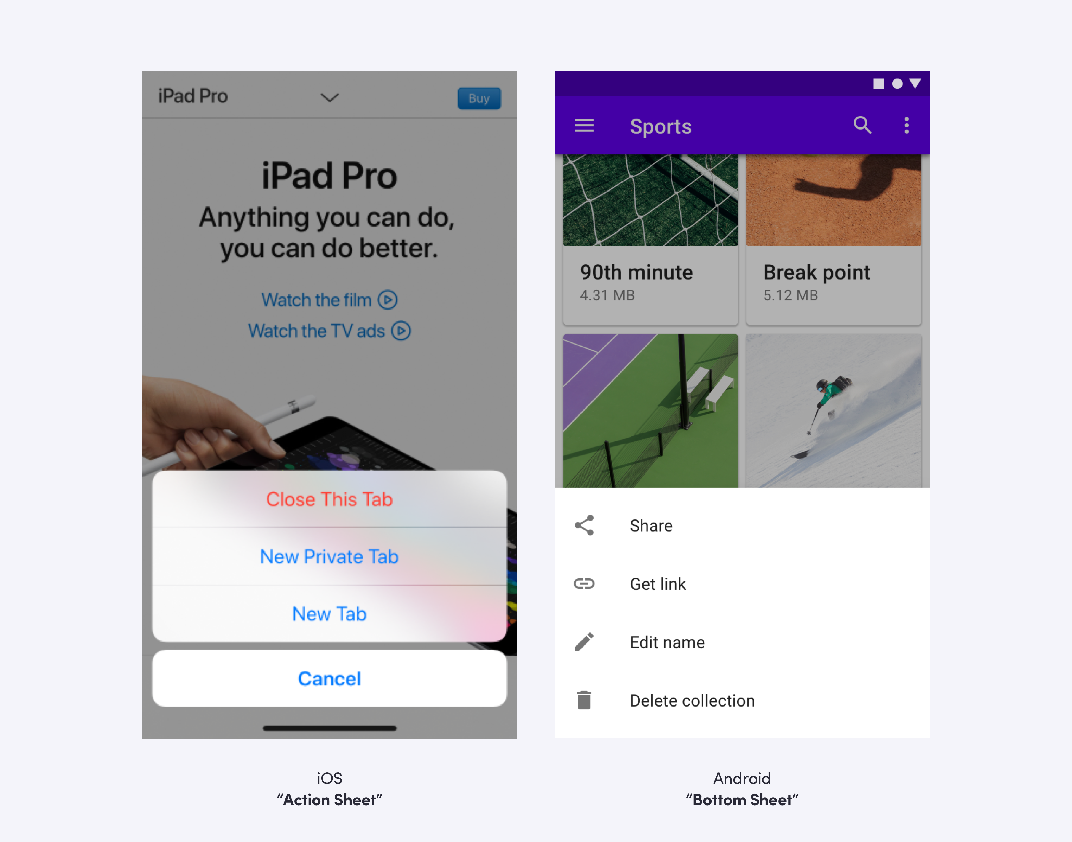
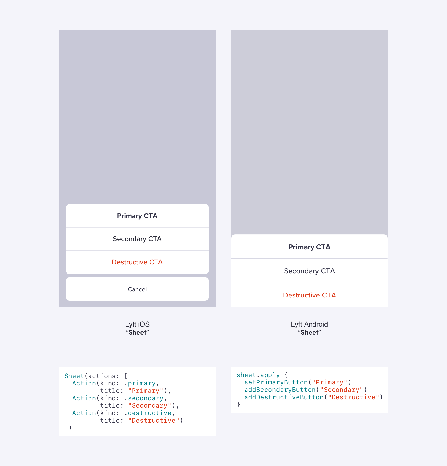
Let’s look at our “sheet” component as an example. It’s similar to “action sheet” on iOS and “bottom sheet” on Android.

platform versus design

For this component, we chose parity with the platform over parity with the design system. Giving the sheet a familiar feel for the user is more important than looking identical on each platform.

platform versus design

But, we deviate from platform conventions in favor of design system parity when it makes sense. On iOS, the recommended minimum tap target is 44×44. On Android, it is 48×48. Since our design system is in increments of 8, we chose 48×48 for the minimum tap target on each platform, which also provides more space for the user to tap the component.

tap targets

Contributions

Contributions from other teams can cause a component to fall out of sync. It is rare that both iOS and Android engineers from the contributing team are both available to create the component together (or at all). We treat this lack of parity like a bug and prioritize it over other elements on our roadmap. Parity is only possible with a dedicated design & engineering team focused on it consistently.

When a team is contributing a new component, we create tasks for both platforms before any work begins to ensure we’re building for parity. We’ve seen other teams volunteer their time to help work through the backlog of tasks to help increase parity, too!

Migration

Because Lyft grew rapidly and didn’t have a design system until early 2018, there are numerous legacy features built without parity in mind. By migrating these features to our system, we can fix inconsistent designs and behaviors and, more importantly, shift the responsibility of maintaining parity to a system level, ensuring future changes are propagated to all features in a consistent manner.

We begin the process of adoption and migration by auditing in-progress and existing features that don’t use our components and tracking these use cases in our internal task management system, JIRA. In cases where only a single platform has been migrated, the task of bringing the other platform to parity is prioritized.

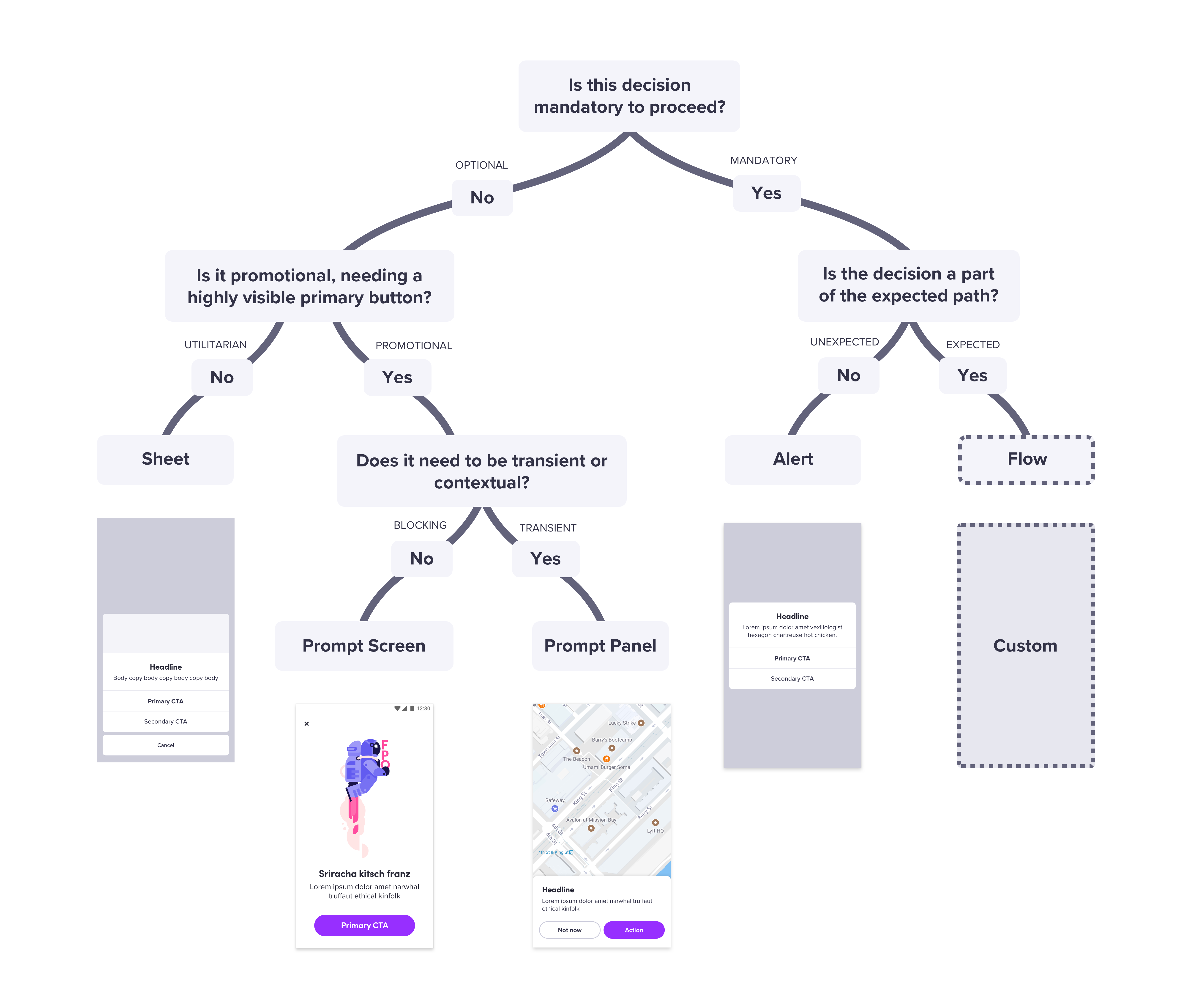
The advantages of a system with full parity shine during the migration process. By rigorously following the design guidelines established in our system, engineers on both platforms are able to independently migrate designs for the same feature and end up using the same system components. We make this process efficient by providing "cheat sheets" like a messaging decision tree to determine which messaging component to use. By solving design problems at a systemic level, we can easily apply these rules to a wide range of use cases.

migration cheat sheet

Migration projects are often highly time-consuming and require cross-platform coordination. We encourage the prioritization of these tasks for both our team and feature teams by ensuring equal support on all platforms in terms of documentation and dedicated 1:1 support from our team.

Conclusion

Prioritizing parity is important because we want to treat our users equally, communicate efficiently with the same language, and promote consistent designs and behaviors. We design and build in parallel so any discussions on details that come up during implementation (and there are usually many) get addressed and considered together. We don’t even announce a component as ready to use until it is complete in design, Android, and iOS. This focus on parity has enabled us to provide a truly universal design system that is adopted equally on all platforms.

Linzi, Kathy, and Sam lead the Design Systems team at Lyft, who are responsible for building, maintaining, and supporting ‘Lyft Product Language’ which spans across mobile and web. You can read more from Linzi over at Tap to Dismiss.

from DesignSystems.com https://www.designsystems.com/a-system-built-on-parity-how-to-treat-all-of-your-users-equally/

Documenting is designing: How documentation drives better design outcomes

It was the early stages of a new design project, and I was working on a task flow diagram when a colleague asked me about it. “You’re doing that now? I normally wait until the end of the project.”

I understood what he was saying: he would do the design and then include additional artifacts such as a flow diagram to document the design intent. It struck me, however, at that moment, how integral documenting design is for me to the actual creative part of doing design.

Indeed, in the early stages of design, it’s important to sketch and do other visual concepting. But once moving beyond concepts, a design must be well-reasoned, particularly if you are designing applications. In years past (and in some cases today), this “reasoning out” would be done by a business analyst. But that may not always be the case, in which case designers need to be prepared to take on this task.

One of the best ways to ensure a design is well-reasoned is to be “forced” to describe it verbally or by flowing out the logic. This approach is similar to a programmer’s code walkthrough — that in having to articulate reasoning, you can find the flaws in the logic more easily. If nothing else, the “documenting is designing” approach obviates the need for a big documentation pass at the end (when, honestly, not all the design thinking may be as fresh).

There can also be a situation of the time, sometimes significant time, elapsing between the end of design work and the start of development. Memories fade and what might have been abundantly clear a couple of months ago, may not be so evident in the future.

The other benefit of integrating documentation into your design practice is that it helps build explanatory writing skills. If you are a designer who doesn’t have the luxury of a dedicated writer, you will likely be pressed into writing copy as part of your design work, even if its only small bits. But, these small bits can sometimes be a critical part of the experience. If you’re not feeling comfortable with your UX writing skills (or even if you are!), I can highly recommend Writing is Designing by Michael Metts and Andy Welfe.

Types of Design Documentation

I’ve written before about the need, when designing, to look at a system from two perspectives: the structural perspective and the task perspective. As designers, the task perspective naturally demands our attention because, in the end, we are designing for people to accomplish tasks. But the structural perspective is equally important and is critical for keeping experiences simple and consistent across the range of tasks.

Task perspective documentation includes:

  • User Stories
  • Use Cases
  • Scenario Narratives
  • Screen Flow Diagrams
  • Page-Level Documentation

Structural perspective documentation includes:

  • Object Model
  • System Vocabulary
  • Architecture Map
  • Navigational Framework
  • Page Archetypes
  • Standardized Components

The above list could seem like an overwhelming amount of documentation but think of it as a toolkit — not every project requires every tool. The descriptions below should give you an idea of how these artifacts might fit into a given project.

User Stories

I’ve included user stories as a type of design documentation because, with the rise of agile development methods, stories have become ubiquitous. But in most situations, designers are working from existing user stories as part of the design process — not authoring stories. Much more useful from a design documentation standpoint are use cases (below).

Use Cases

User stories and use cases are not equivalent artifacts. User stories are deliberately brief and designed to generate discussion. Use cases are more lengthy and definitive, describing more precisely what the system will do. Use cases provide the necessary details to design and code a function.

Authoring use cases takes time and thought, but for designers writing even rough use cases can be a huge time-saver downstream where requirements might otherwise be unclear. Additionally, writing use cases forces you to think through the different system conditions (pre-conditions) under which tasks are performed — and the potential alternative paths when things don’t go as expected. The risk of not thinking through these details is that your design, once in development, may prove impractical once all conditions must be accommodated.

I am most likely to write use cases when designing new functionality (vs. redesigning existing functionality). I’ve gone into more detail about developing use cases in my article A UX-er’s Guide to the Task Perspective.

I typically work out use cases in a text editor. When close to final, I paste them into a page within my design tool (my tool of choice is Axure, which has some great options for integrating documentation and design). Pulling the use case into the design work allows me to link the use case to the design artifacts that support the case.

Scenario Narratives

Scenario narratives provide more descriptive details about how a set of tasks are performed. It can be helpful to choose an archetypical storyline — a particular scenario illustrative of the context in which tasks are performed. Again, my article A UX-er’s Guide to the Task Perspective has more detail about scenario narratives.

When authoring scenario narratives, I think about the narrative as a script that can drive prototyping. This script, in turn, can be used as the basis for user testing. Overall, it’s helpful to “begin with the end in mind” by thinking of the scenario narrative in terms of what you ultimately want to test.

I begin by authoring scenarios in a text editor. Then as I design to the scenario, the scenario gets “de-constructed” as page-level notes in the prototype, describing actions that are available on the page (see Page-Level Documentation). I will still include the whole scenario narrative, all together, in a page within my design tool, linking it as appropriate to the supporting prototype pages.

Screen Flow Diagrams

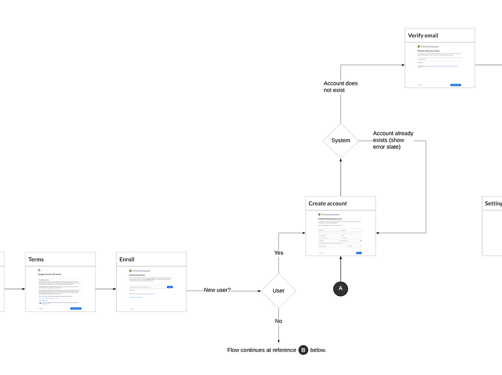
Screen flow diagrams, which provide a schematic on how users may move screen-to-screen, can vary from simple flows to more comprehensive diagrams that illustrate conditional logic. Absent screen flow diagrams, it can be hard for people consuming design work to get a sense of how the intended experience fits together as a whole.

Example screen flow diagram showing conditional logic

If you are unfamiliar with standard flow diagraming conventions, I highly recommend How to Build a Task Flow by Laura Klein.

Often I’m working on flows where there is conditional logic driving the experience. In that case, I will start will a more conceptual flow diagram and then evolve that over time into a more detailed screen flow diagram. For an excellent description of this process, refer to Why User Flows are Essential to Our Process by Vasudha Mamtani.

A key in the usability of final flow diagrams is to use screen thumbnails (rather than generic boxes) to represent each screen. If you’re using Axure, the snapshot feature makes this, well, a snap. Otherwise, it’s best to wait until screen layouts are final or near-final before incorporating the thumbnails into the diagram.

Page-Level Documentation

Page-level documentation typically includes:

  • An overview of the function of the page.
  • The available page-level functions and their purpose.
  • Step-by-step instructions for any interactive demos supported by the page.

Example page-level documentation is shown below:

The Experiment Summary page lists the user-defined tags associated with the experiment, the status of any jobs not yet completed, and provides options for exploring the experiment’s results.
 — — — —
Page-Level Functions
• The Edit button allows the user to edit the experiment’s name, description, and associated tags.
• The Archive button allows the user to move the experiment to the Archived view. • Clicking “Archive” returns the user to the Experiments page, with the experiment now moved from the Current to the Archived view.
• The Delete button allows the user to delete the experiment (after first confirming with the user).
• Additional tags displays user-create tags (beyond the system-provided “essential” tags)
• Jobs Pending lists jobs that have been submitted to run, but are awaiting resources to be assigned (are either queued or waiting for an allowed time slot).
• Jobs Running lists any jobs currently running
• Results: Users may filter results by applying one or more tags — or by using advanced filters that provide a full set of filter criteria.
• Users may sort the results by Date/Time Completed, Date/Time Run, Total Run Time.
• Users may switch the view type between card view and table view.
 — — — —

DEMO: Show/Hide Additional Tags
1) Click the “Additional tags” panel header to open it.
2) Click it again to close.

DEMO: Edit Experiment
1) Click the “Edit” button
…the system displays the edit form…

Process note: Though the above may seem like a lot of typing, I have set up standard documentation phrases in Text Expander, which greatly speeds the process of generating this level of detail.

How much to document at the page level is a judgment call. Some functions are apparent, and you don’t want to clutter your documentation by attempting to document everything. Other elements may be standard components that are documented elsewhere, such as within a design system.

It can be tempting to leave page-level documentation until the very end. However, particularly if you are creating unique, function-specific interactions (including micro-interactions), it can be essential to work these out as use cases, including primary and alternate flows, to ensure there are no logic flaws in your construct.

Object Model

Similar to the way that flow diagrams provide a 30,000 ft view of a system from the task perspective, an object model can provide that view from a structural standpoint. I’ve written elsewhere about object modeling and its importance to UX design, so I won’t repeat that here and instead refer you to my article Object Modeling for Designers.

System Vocabulary

Particularly for more complex systems or websites, it can be helpful to explicitly document system vocabulary (for anything not already defined as part of a design system).

I generally keep this documentation simple by creating separate lists for nouns and verbs in a spreadsheet, listing each preferred term, and any obvious non-preferred terms. For example, “Edit” might be the preferred term, with “Update” as a non-preferred term.

The topic of vocabulary can get into the field of library science, including the development of taxonomies and formal controlled vocabularies. Library Science is not my field, and so on projects where this level of vocabulary development has been a requirement, I’ve worked with library science specialists.

Architecture Map

The architecture map should be a familiar artifact for most UX designers. Its goal is to communicate how the application or web site is structured, and typically represents an information (or functional) hierarchy.

In practice, I find it’s most useful to communicate architecture as part of the navigational framework (described in the next section). However, I will often represent the very top level of the architecture in map form, along with a description of what each section or area is intended to contain.

Navigational Framework

I consider the navigational framework to include:

  • The top-level (global) menu bar, including global functions such as search
  • Top-level menus displaying second-level topics or function
  • Page-level navigation, including breadcrumb scheme and page-level navigation bars and menus
  • Within-page view manipulation controls

I document the navigational framework as on a set of pages within my design tool. The exact form of the documentation varies depending on the system’s breadth and depth. Systems that are both narrow in breadth and shallow in depth will have a simpler navigation scheme; broad and deep systems will have a more elaborate scheme.

For page-level navigation, it’s essential to develop conventions by working out a series of drill-down paths to the last (end) node in the path. Page archetypes (described in the next section) serve this purpose well.

Designing navigation using drill-down paths ensures the scheme hangs together without gaps or inconsistencies. Some example paths using page archetypes are below:

  • For a web site: Home > Topic Overview > Topic Detail
  • For an application: Dashboard > Status Summary > Status Detail
  • For a path initiated via search: Home > Search Results > Topic Detail

These are simplified examples for illustration purposes; in reality, both the page archetypes and drill-down paths can be more complicated.

Page Archetypes

Page archetypes are specific genres of pages that share layout characteristics and serve the same essential function.

Page archetypes may be defined as part of a design system, particularly more mature systems. But these may be more skeletal templates that require more documentation in their actual implementation.

Documentation I typically include for page archetypes includes the function of the archetype, an explanation of layout conventions, and any necessary annotations for standard elements such as menus, buttons, and controls.

Layout conventions for a page archetype

Standardized Components

Standardized components include elements that are shared across the breadth of a web site or system. These may already be documented as part of an existing design system (in which case there is no need to repeat it). However, you may have elements that are standard within your system, but not broadly applicable enough to be included in your organization’s design system.

For example, on a recent project, I designed a “Compare Results” function specific to that system’s data analysis. In this case, I reviewed the function with the design system committee, but they deemed it too specialized to include in the broader design system.

I consider the above a framework for creating design documentation, not a checklist or edict. It is always a judgment call on how much documentation is necessary to make sure design intent is clear. For each project, I mentally create a persona who will need to use the documentation — someone with no involvement in the project — and imagine what they would need to implement the design successfully.

I encourage all UX designers to document-as-you-go. In my experience, it ultimately saves everyone time and results in better design outcomes.

The UX Collective donates US$1 for each article published in our platform. This story contributed to UX Para Minas Pretas (UX For Black Women), a Brazilian organization focused on promoting equity of Black women in the tech industry through initiatives of action, empowerment, and knowledge sharing. Silence against systemic racism is not an option. Build the design community you believe in.


Documenting is designing: How documentation drives better design outcomes was originally published in UX Collective on Medium, where people are continuing the conversation by highlighting and responding to this story.

from UX Collective – Medium https://uxdesign.cc/documenting-is-designing-how-documentation-drives-better-design-outcomes-3ebd87a33d57?source=rss—-138adf9c44c—4

How to manage your Design Tokens with Style Dictionary | by Cristiano Rastelli

Cristiano Rastelli

Recently I have come across a tool, called Style Dictionary, developed by Danny Banks at Amazon, that allows you to manage design tokens (or “style properties”) for a design system. I’ve used it to replace the existing tool that we used to process the design tokens for our Cosmos design system. I’ve found the task very interesting, and I’ve decided to document it, so that other people may benefit from what I’ve learned during the process.


Notice: I’ve tried to be as comprehensive as possible, which means this blog post is extremely long. I know, I know… ¯\_(ツ)_/¯.

A reader, looking at the “24 min read” at the top of this page.

If you just want to look directly at the code, I have created a GitHub repo with a configuration and a setup similar to what we’ve used in our project:

➡️ https://github.com/didoo/style-dictionary-demo ⬅️

Go there and look at the code, it should be quite straightforward. If you want, clone the project and use it as a starting point (but keep in mind that is quite opinionated, and may not suit your particular context and needs).

If instead you want to understand a little bit more about Style Dictionary and how to configure it, and also see what were the technical reasons that made me adopt this tool, the choices I made and the decisions I took while introducing it in our design system, then please read on.


Before beginning, one disclaimer: my experience with Style Dictionary is limited to the setup and customisation of design tokens within our design system. For a more detailed explanation of what it can do, its features and APIs, its advanced capabilities, please refer to the official documentation. Also, all the credits for this impressive project go to its contributors and in particular to Danny Banks.


In a design system, people often use special entities called “design tokens” to store their “design decisions”. These entities are in the shape of key/value pairs, saved in specific file formats (usually JSON or YAML). These files are later used as input files, processed and transformed to generate different output files, with different formats, to be included and consumed by other projects and codebases. (If you want to know more about design tokens, I suggest to read here, here, here and here).

This, for example, is how we use some design tokens as Sass variables in the declaration of the styles for the <Button/> component:

.button {
position: relative;
display: block;
width: 100%;
min-height: $token-button-height;
margin: 0;
padding: $token-spacing-sm $token-spacing-xxlg;
border-radius: $token-button-border-radius;
text-align: center;
}

// variants

.button--stroke {


border: $token-button-border-width solid currentColor;
background: transparent;
}

.button--monochrome {


border: $token-button-border-width solid $token-colour-gray;
background: #fff;
color: $token-colour-black;
}

// and other variants here

...

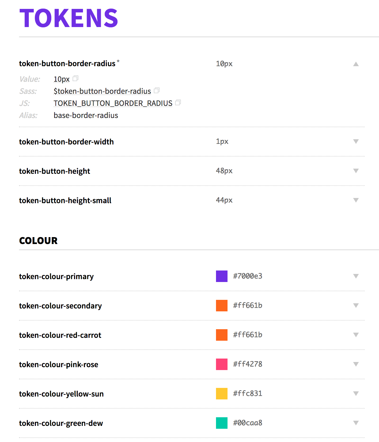
These properties are also exposed in our style guide so that they can be part of our documentation:

Image for post

Image for post

A portion of the “Tokens” page in our Cosmos design system

When one year ago we introduced the design tokens in our design system, at that time the state of the art for design token management was Theo, a tool developed by the design system team at Salesforce — mainly Adam Putinski and Kaelig Deloumeau-Prigent (now at Shopify) — to manage their impressively large number of design tokens in the Lightning Design System.

At that time, the available version was Theo5, and this is how our design tokens declarations looked like (until a few weeks ago):

{
"global": {
"type": "token",
"category": "brick"
},
"aliases": {
"TOKEN_BRICK_SIZE_SM": {
"value": "70px"
},
"TOKEN_BRICK_SIZE_MD": {
"value": "100px"
},
"TOKEN_BRICK_SIZE_LG": {
"value": "120px"
}
},
"props": {
"TOKEN_BRICK_SIZE_XXSM": {
"value": "36px"
},
"TOKEN_BRICK_SIZE_SM": {
"value": "{!TOKEN_BRICK_SIZE_SM}"
},
"TOKEN_BRICK_SIZE_MD": {
"value": "{!TOKEN_BRICK_SIZE_MD}"
},
"TOKEN_BRICK_SIZE_LG": {
"value": "{!TOKEN_BRICK_SIZE_LG}"
},
"TOKEN_BRICK_SIZE_XLG": {
"value": "150px"
}
}
}

Since then, Theo has evolved a lot (now we are at Theo8!) and the way you declare the token values has quite changed, but what remains a pain point (at least, for me) is the fact that in order to reference a value of a token in another token, you have to declare it before using a specific alias definition; and, if this declaration is in another file, you have to import the file where it’s used (which also means that, when declaring the files to import/process, the order of the declarations matters).

This way to define “aliases” leads to a lot of repetitions (see above, where I had to declare twice TOKEN_BRICK_SIZE_SM/MD/LG, as an alias and as a prop, or here for example). Besides, in this way, the resulting organisation of the design tokens, and the files where they are stored, tends to be very prescriptive (see for example here or here) and rigid when you need to refactor or re-arrange the design tokens.

I also made some tests, to associate custom meta-data to the tokens (to be used as documentation), but I couldn’t find a way to have this information exposed in the generated files. So I had to give up and leave the documentation for our tokens out of our style guide.

Don’t get me wrong: Theo is a great tool, and the issues I have mentioned above are small details, just a matter of personal preferences. (So don’t make your choices based on my impression. Always evaluate a tool for what it can do for you, how it solves your problems, in the context of your needs!).

Anyway, since the first time I implemented our design system’s tokens with Theo, I felt that our setup was OK… but not exactly what I wanted. There was always something I would have done slightly differently, but I couldn’t (because of these technical limitations, and because of the limits in my comprehension of the tool, probably).

The fact remains that I was not 100% satisfied. In the back of my mind, I always had this idea of replacing Theo with a custom-built tool. But lack of time (and hesitation to invest resources in such a complex task) made me reconsider this idea, and continue to keep the existing setup.

I don’t remember exactly where I read for the first time of Style Dictionary, probably on my Twitter feed, or in some Medium blog post, or in a chat in the Design Systems Slack channel (Shaun Bent rightly made me notice that it was announced on February this year, but I don’t remember that post).

Looking at the history of the project on GitHub it seems they have worked on it for a long time, but I’ve never heard about it until a couple of months ago.

I remember I quickly looked at the project website, I understood it was somehow related with design tokens but I didn’t understand exactly how (probably because of the use of the term “style properties” in lieu of the more common “design tokens”).

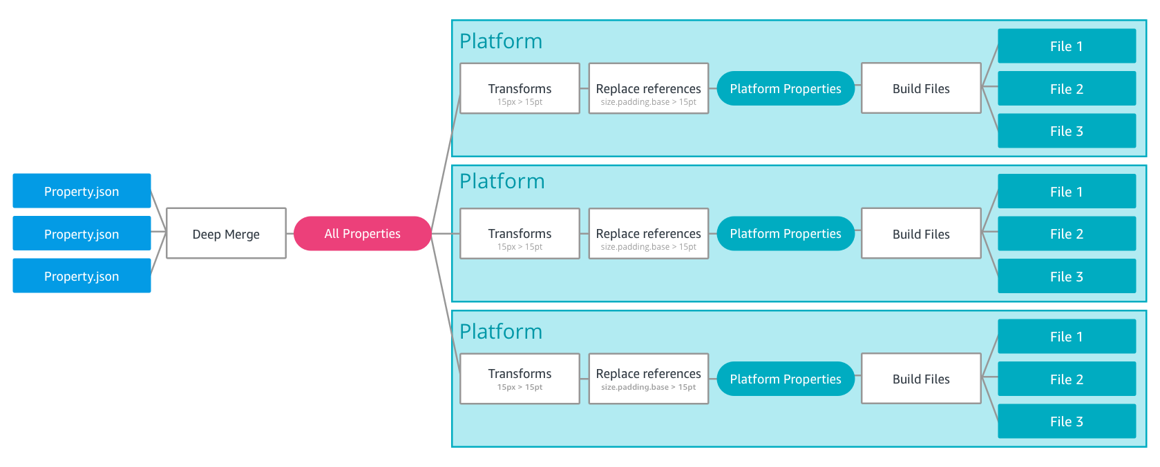
I also remember this illustration, that caught my eye:

Image for post

Image for post

How the build process of Style Dictionary works under the hood (source)

This “deep merge” of different JSON files (plus, the different compilations for different platforms) was exactly what I had in mind.

At that time I didn’t have time to investigate, so I starred the repo and promised myself to have a look in detail later. One day that I didn’t have that much to do, I made a quick test to see how Style Dictionary was supporting this “deep merge” of properties in the tokens’ JSON files. The results were exactly what I was hoping for: if you attach any extra attributes to a JSON key/value pair in Style Dictionary, these meta-informations are seamlessly carried over in the processed files in output. Bingo!

I created a ticket in my backlog—DO-132 — Evaluate Style Dictionary for the generation of the Design Tokens — and went on with the ordinary day-by-day components-related tasks.

Then a couple of weeks later a tweet caught my eyes:

I immediately looked at the slides of the presentation, and fell in love with the project: I wanted absolutely to try it as soon as possible.

At the first opportunity I had, I started to work on that ticket. Two days later, an entirely updated version of our design tokens system, built on Style Dictionary, was in production.

As I said above, given how simple and enjoyable it was for me to adopt Style Dictionary, I started to wonder if it was not the case to write a blog post about the experience, highlighting the reasons that made me decide to switch to it, but also what I learned during the process. So here below are my findings.

Compared to other tools, I found it very easy to be up and running using Style Dictionary: in less than five minutes, I was already building my new design tokens.

My suggestion is to create a folder, where you want to store your tokens, install the package, and then run the command:

style-dictionary init basic

This will create a basic project with some example JSON files and the config.json file required to process the tokens and generate the different formats of files in output (see later for more details).

In my case, I did it directly in my existing /tokens folder, because the default structure of Style Dictionary was different from the folder structure of my Theo implementation (Style Dictionary uses properties and build, I used src and dist, so there were no risks of conflicts). After the initial setup, I renamed my existing folders tokens/src.old and tokens/dist.old, and the new folders tokens/src and tokens/dist and updated the config.json file to reflect the new paths. In this way, I was able to continually compare the files generated with Theo and the ones generated with Style Dictionary, and see if there were differences. What I wanted to achieve was to seamlessly replace the tokens generated using Theo with the ones generated using Style Dictionary, without requiring any change in the code consuming the tokens (in our case, our Component Library in React, and our Mobile Web application).

Now, once your project is set up, all you have to do is run the “build” command in your CLI:

style-dictionary build

This will “transform” your JSON files and generate the resulting token files according to the options declared in your config file.

Using the pre-defined build command in your CLI is the simplest way to process your tokens, but you can also decide to implement a custom build script if you want or need (more on this later).

At this point, you can start to play around with your token’s JSON files (and you config file) to see the different options that you have, in term of the organisation of your style properties and generation of different output formats. If you want, you can look at the examples folder included in Style Dictionary’s project repository to see more complex organisations and use cases, but I suggest to start with the “basic” one to avoid getting lost in the more advanced features offered by Style Dictionary (e.g. the distribution of assets like fonts or icons as “tokens” or the generation of tokens for React Native projects).

Documentation

Style Dictionary is a very well documented project. You can use the official website available at this address: https://amzn.github.io/style-dictionary/ or you can read directly the markdown files from the GitHub repo: https://github.com/amzn/style-dictionary/tree/master/docs.

I have found very useful — and I strongly suggest to do the same — to play and experiment with the properties’ JSONs and the config files, trying to understand how the whole system works, and in parallel to read the documentation when something is not 100% clear or obvious. Following this approach in just a few hours I’ve found myself able to customise the entire set of my design tokens and create a custom build script.

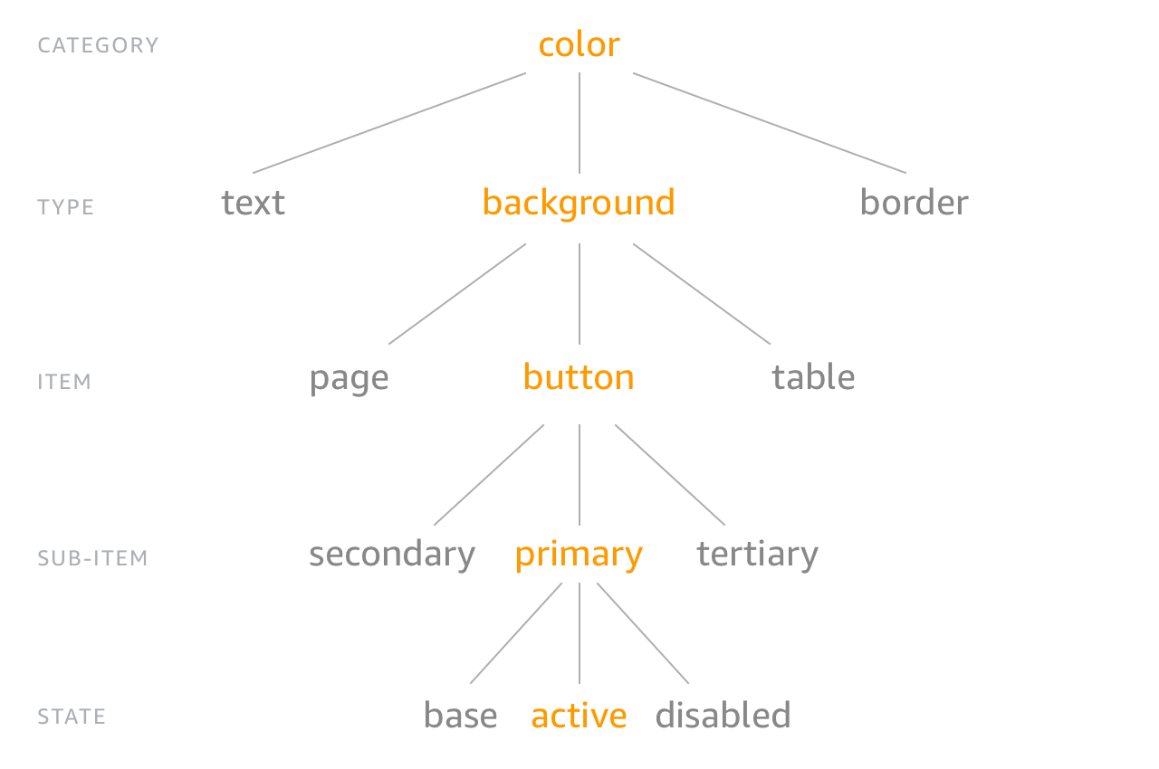
The ”Category > Type > Item” classification

Style Dictionary has an implicit classification of the tokens:

Image for post

Image for post

This classification is simply based on the nesting of the properties inside the JSON files. If we look at this code, for example:

{
"button": {
"border": {
"width": {
"value": "1px"
}
}
}
}

when we process it via the build command the resulting JSON is this:

{
"button": {
"border": {
"width": {
"name": "button-border-width",
"value": "1px",
"original": {
"value": "1px"
},
"attributes": {
"category": "button",
"type": "border",
"item": "width"
},

"path": [
"button",
"border",
"width"
]
}
}
}
}

As you can see, the order in the nesting of the source JSON is automatically interpreted as logical tree/structure, and it’s used to build the name of the properties (e.g. $button-border-width and BUTTON_BORDER_WIDTH in this example) but also to associate them a set of predefined “CTI” attributes.

While working with Style Dictionary, you will find this implicit CTI classification consistently across many helpers and functions. Luckily this is not something that you have to strictly follow (and this says a lot about the quality of the project and the cleverness of its authors). According to the documentation “you can organize and name your style properties however you want, there are no restrictions.”. It’s important anyway to keep in mind this inner trait of this tool, so you can use it correctly, or work around it, if you need/want (that’s what I have done in my project, because I preferred to have a different taxonomy for our design tokens).

Cosmos, our design system, has been built to support different “platforms” (Mobile Web, iOS and Android) and different “brands” (our application has white-label products).

The Cosmos component library, built in React, is entirely adopted by our Mobile Web application, while for the native platforms it works as a “reference” on how to break down the UI in components (for now; in the future we may consider a React Native version of the components, in which case the native platform could start to consume the Cosmos components too).

Conversely, the Cosmos design tokens are consumed by all our platforms. For this reason, we have organised our design tokens accordingly to the way the values of the tokens are related to the different brands and platforms that we need to support. Some of them depend on the brand (e.g primary and secondary colors), some depend on the platform (e.g. font-family and button-height) and some are instead global, which means they have the same value for every brand and platform, (e.g. color-facebook or spacing-small).

Here is a simplified schema of the folder structure of our JSON source files:

├── config.json
├── src/
│ ├── brands/
│ │ │── brand_#1/
│ │ │ ├── color.json
│ │ │── brand_#2/
│ │ │ ├── color.json
│ │ │── brand_#3/
│ │ │ ├── color.json
│ ├── globals/
│ │ │── base/
│ │ │ ├── index.json
│ │ │── color/
│ │ │ ├── basic.json
│ │ │ ├── grayscale.json
│ │ │ ├── features.json
│ │ │ ├── social.json
│ │ │── icon/
│ │ │ ├── index.json
│ │ │── ...
│ │ │── spacing/
│ │ │ ├── index.json
│ │ │── typography/
│ │ │ ├── index.json
│ ├── platforms/
│ │ │── android/
│ │ │ ├── button.json
│ │ │ ├── ...
│ │ │ ├── typography.json
│ │ │── ios/
│ │ │ ├── button.json
│ │ │ ├── ...
│ │ │ ├── typography.json
│ │ │── mobile_web/
│ │ │ ├── button.json
│ │ │ ├── ...
│ │ │ ├── typography.json

Using this organisation, it is quite easy and obvious where to find the different tokens, where to add a new token when needed, or which files to remove if a component is removed from the library.

When it came to the organisation of the destination/output folder, I’ve preferred a structure where it’s clear and obvious for the different “consumers” where to find the files they are interested in.

This is the schema of the folder structure for our generated files:

├── dist/
│ │── android/
│ │ ├── ...
│ │── ios/
│ │ ├── ...
│ │── mobile_web/
│ │ │── brand_#1/
│ │ │ ├── **.scss
│ │ │ ├── **.js
│ │ │ ├── **.json
│ │ │── brand_#2/
│ │ │ ├── **.scss
│ │ │ ├── **.js
│ │ │ ├── **.json
│ │ │── brand_#3/
│ │ │ ├── **.scss
│ │ │ ├── **.js
│ │ │ ├── **.json
│ │── style_guide/
│ │ ├── android_brand_#1.scss
│ │ ├── android_brand_#1.json
│ │ ├── android_brand_#2.scss
│ │ ├── android_brand_#2.json
│ │ ├── ...
│ │ ├── ios_brand_#1.scss
│ │ ├── ios_brand_#1.json
│ │ ├── ios_brand_#2.scss
│ │ ├── ios_brand_#2.json
│ │ ├── ...
│ │ ├── mobile_web_brand_#1.scss
│ │ ├── mobile_web_brand_#1.json
│ │ ├── mobile_web_brand_#2.scss
│ │ ├── mobile_web_brand_#2.json
│ │ ├── ...

As you can see, if I am an Android developer, I will immediately know that my tokens are stored in the /Android folder, and here I will find only the format I am interested in (e.g. XML files). If I am a Mobile Web developer, I will find my files under the /Mobile_Web folder, (SCSS, JS and JSON files, depending on what I need).

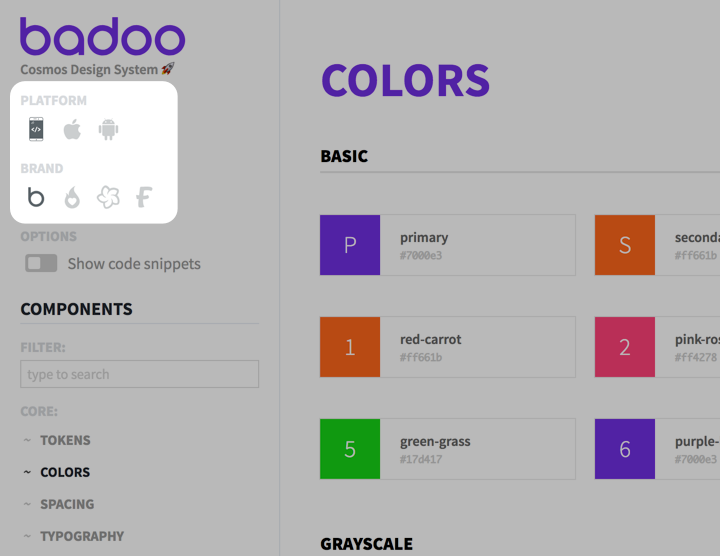
The /style_guide folder instead is slightly different, because in this case the tokens are consumed by the Cosmos style guide, and we need to expose the token values for all the possible combinations of platform/brand. The user can select them in the UI, so we need to dynamically load the corresponding token values depending on the selected combination, and in this case a flat structure with all the files under a single folder is better.

Image for post

Image for post

In our style guide, the user can switch between different platforms and brands.

Now, when it comes to the actual tokens’ values declarations inside the files, I’ve decided to arrange them in alignment with the actual components they were referring to. Instead of following the suggested CTI — Category > Type > Item — organisation (e.g. color > background > button) I’ve preferred to follow a classification which is more “component-oriented”.

I’ll give you a couple of examples.

Let’s consider the Input component. This is how it looks like in our style guide:

As you can see above, the <Input/> component is differentiated in three specialised components: <Choice/>, <Toggle/> and <Search/>. And this is how the files for these components are organised in our codebase:

├── component-library/
│ │ ...
│ ├── gift/
│ ├── icon/
│ ├── input/
│ │ ├── Input.js
│ │ ├── Input.scss
│ │ ├── Choice.js
│ │ ├── Search.js
│ │ ├── Toggle.js
│ ├── mark/
│ ├── modal/
│ │ ...

To be consistent with this structure, the design tokens for this group of components are saved in tokens/src/globals/input/index.json and the values are declared using this nested format:

{
"input": {
"choice": {
"size": {
"value": "24px"
}
},
"toggle": {
"width": {
"value": "40px"
},
"height": {
"value": "24px"
}
},
"search": {
"height": {
"value": "32px"
}
}
}
}

The generated variables, that are then used in the source code for these components, preserve this ‘no-brainer’ naming convention:

$token-input-choice-size: 24px;
$token-input-toggle-width: 40px;
$token-input-toggle-height: 24px;
$token-input-search-height: 32px;

(As you may have noticed, my generated variables have a “token” prefix. I’ll explain more on this later).


Another important result of this kind of organisation is how it’s easy to use “aliases” or refer to other token values from within different components.

For example, for the brands’ primary and secondary colors, I have not declared them as tokens, but as aliases:

{
"alias": {
"colour": {
"brand": {
"primary": {
"value": "#bada22"
},
"secondary": {
"value": "#c0ffee"
}
}
}
}
}

In this way I was able to use them directly in the /global color declarations:

{
"colour": {
"primary": {
"value": "{alias.colour.brand.primary.value}"
},
"secondary": {
"value": "{alias.colour.brand.secondary.value}"
},
...
}
}

Similarly, I can reference the value of another component’s token inside a different component.

For example, this is the file for the <Icon/> component:

{
"icon": {
"size": {
"xsm": { "value": "10px" },
"sm": { "value": "16px" },
"md": { "value": "22px" },
"lg": { "value": "30px" },
"xlg": { "value": "36px" },
"xxlg": { "value": "46px" }
},
"jumbo-size": {
"md": { "value": "{brick.size.md.value}" },
"lg": { "value": "{brick.size.lg.value}" }
}
}
}

where this is the file for the <Brick/> component, that contains the actual token values:

{
"brick": {
"size": {
"xxsm": {...},
"sm": {...},
"md": { "value": "100px" },
"lg": { "value": "120px" },
"xlg": {...}
}
}
}

As you can see, I have been able to express the correlation (decided by the designers) between the size of the Brick element and the ‘jumbo’ size of the Icon element, in a very simple, clear and — above all — semantic way.

Now, not only Style Dictionary allows this seamless management of the “aliases” values, but, even better, the order in which the files are imported is not relevant in term of resolution of the aliases!

This means you can have complete freedom in how you want to organise the tokens for your project. I suggest to play around with the structure of your design tokens and find the configuration that better suits your needs.


One last thing, before moving to the actual build process of the declared design tokens. As I mentioned before, one feature that you get “for free” with Style Dictionary, is that every attribute that you associate to a property in a source JSON file is transparently and automatically passed down along the transformations and will appear in the output files.

For example, if you write this declaration:

{
"button": {
"meta": {
"description": "design tokens for the button component"
},
"border": {
"width": {
"value": "1px",
"documentation": {
"comment": "the width of the border"
}
}
}
}
}

the generated JSON file is this:

{
"button": {
"meta": {
"description": "design tokens for the button component"
},
"border": {
"width": {
"value": "1px",
"documentation": {
"comment": "the width of the border"
},
"original": {...},
"name": "button-border-width",
"attributes": {...},
"path": [...]
}
}
}
}

As you can see, whatever you add in term of extra attributes to the original JSON files is preserved and passed down during the build process (of course, if the format of the generated file supports this kind of representation).

This means two important things: first, you can use it to associate meta-information to your tokens (for example, I use it to add documentation, comments and notes to them, to be shown in the style guide); second, you can create custom actions or transforms in your build process, where you can use these extra attributes to selectively decide if/how to process the values.

One last cool thing: if you simply add a comment property to a value, this is automatically added as a comment in the exported Scss file (actually, all the file formats that support comments):

{
"button": {
"border": {
"width": {
"value": "1px",
"comment": "this is a comment"
}
}
}
}

this will generate in output:

$button-border-width: 1px; // this is a comment

Useful if you want to export some kind of minimal documentation associated with your design tokens.

This is just one of many “cool” small details that make this library so well thought: I invite you to read the documentation, look at all the available options, and you will find many other gems like this.

You’re halfway through… keep going!

As I said above, the simplest way to build your design tokens with Style Dictionary is to run in the command line:

style-dictionary build

You can pass modifiers to the command, to specify the path of the config file and the platform you want to build.

Another possible way to build the tokens is using a Node script. Here as well you can build all the platforms with a simple command:

const SD = require('style-dictionary').extend('config.json');SD.buildAllPlatforms();

or decide to build only specific ones using a similar method:

SD.buildPlatform('web');

Now, as you can see from the code above, all the specifications of how to build the tokens are contained in a single place: the config file. Here is where you declare your source files, your destination folders, your platforms, your formats and the transformations that you want to apply to each token.

Style Dictionary comes with a set of pre-defined transform groups, (e.g web, scss, less, html, android, ios, assets). As the name says, they are just a group of transforms, which in turn are nothing more than functions that “transform a property so that each platform can consume the property in different ways”.

Some of these transform functions are applied to the name of a token (e.g. name/cti/camel or name/cti/kebab), some to its value (e.g. color/hex or size/rem or time/seconds) and some to its attributes (e.g. attribute/cti).

Now, because these functions operate directly on the name, value and attributes of a token, it means that they are somehow coupled with the way you want to declare your properties and values. For example, for some reason you could declare a “time” value with or without the unit of measure (it depends on who will consume your tokens, and how they will expect the data formatted), but the time/seconds transform “assumes a time in milliseconds and transforms it into a decimal”, which means you can use it only if you use that specific input format. In a similar way, almost all the size/** transforms assume a number as an input value, and are applied only to tokens that match the category === 'size' condition (which is not necessarily your use case).

Now, as explained above, I wanted to have a very specific organisation of the generated files for the different platforms: not only have specific formats for each one of them (Web, iOS and Android) saved in their corresponding folder, but I also needed all the possible combinations/permutations of platform and brand made available for the style guide.

I also wanted to have complete freedom in how I organised and declared the key/values properties for the tokens, to be able to manipulate them at will.

So I decided to venture in creating a custom build script leveraging the APIs made available by the Style Dictionary library. I started out of the example described in the documentation

const StyleDictionary = require('style-dictionary');const styleDictionary = StyleDictionary.extend( 'config.json' );// You can also extend with an object
// const styleDictionary = StyleDictionary.extend({ ... });
// you can call buildAllPlatforms or buildPlatform('...')
styleDictionary.buildAllPlatforms();

Reading the code, it was immediately clear to me what options I had: I could refer to an external config.json file or pass a custom object to the extend method; and I could build all the platforms at once via buildAllPlatforms or be more granular and use buildPlatform, with possibly a different configuration object for each platform.

With just these two options, it didn’t take me long to create my first build script. After a few attempts and iterations, my build script looked like this:

const StyleDictionaryPackage = require('./build-style-dictionary-package');
const getStyleDictionaryConfig = require('./build-style-dictionary-config');
console.log('Build started...');// PROCESS THE DESIGN TOKENS FOR THE DIFFEREN BRANDS AND PLATFORMS['web', 'ios', 'android'].map(function(platform) {
['brand#1', 'brand#2', 'brand#3'].map(function(brand) {
console.log('\n======================================');
console.log(`\nProcessing: [${platform}] [${brand}]`);
const StyleDictionary = StyleDictionaryPackage.extend(getStyleDictionaryConfig(brand, platform)); if (platform === 'web') {
StyleDictionary.buildPlatform('web/js');
StyleDictionary.buildPlatform('web/json');
StyleDictionary.buildPlatform('web/scss');
} else if (platform === 'ios') {
StyleDictionary.buildPlatform('ios');
} else if (platform === 'android') {
StyleDictionary.buildPlatform('android');
}
StyleDictionary.buildPlatform('styleguide');
console.log('\nEnd processing'); })
})
console.log('\n======================================');
console.log('\nBuild completed!');

What I am doing here is simple: I am looping through all the platforms and brands that I have; for each combination, I am running a specific build, which receives a dynamic config object, with platform and brand as parameters.

The getStyleDictionaryConfig is no more than a function, that returns the config object specific for that platform + brand combination:

function getStyleDictionaryConfig(brand, platform) {
return {
"source": [
`src/brands/${brand}/*.json`,
"src/globals/**/*.json",
`src/platforms/${platform}/*.json`
],
"platforms": {
"web/js": {
"transformGroup": "tokens-js",
"buildPath": `dist/web/${brand}/`,
"files": [
{
"destination": "tokens.es6.js",
"format": "javascript/es6"
}
]
},
"web/json": {
"transformGroup": "tokens-json",
"buildPath": `dist/web/${brand}/`,
"files": [
{
"destination": "tokens.json",
"format": "json/flat"
}
]
},
"web/scss": {
"transformGroup": "tokens-scss",
"buildPath": `dist/web/${brand}/`,
"files": [
{
"destination": "tokens.scss",
"format": "scss/variables"
}
]
},
"styleguide": {
"transformGroup": "styleguide",
"buildPath": `dist/styleguide/`,
"files": [
{
"destination": `${platform}_${brand}.json`,
"format": "json/flat"
},
{
"destination": `${platform}_${brand}.scss`,
"format": "scss/variables"
}
]
},
... // more declarations here
}
};
}
module.exports = getStyleDictionaryConfig;

Once I saw that this “proof of concept” worked, I started to tinker around the configuration object and see how much I could push the customisation of the design tokens to suit my very own specific “needs”. The results were beyond all possible expectations: using — once again — the APIs made available by Style Dictionary, in no time and with a minimal effort I was able to introduce custom formats, custom transforms and transform groups, and later on even custom template files, tuning every single detail in the generated files.

At the end of this process, my dynamic configuration file looked like this:

function getStyleDictionaryConfig(brand, platform) {
return {
"source": [
`src/brands/${brand}/*.json`,
"src/globals/**/*.json",
`src/platforms/${platform}/*.json`
],
"platforms": {
"web/js": {
"transformGroup": "tokens-js",
"buildPath": `dist/web/${brand}/`,
"prefix": "token",
"files": [
{
"destination": "tokens.es6.js",
"format": "javascript/es6"
}
]
},
"web/json": {
"transformGroup": "tokens-json",
"buildPath": `dist/web/${brand}/`,
"prefix": "token",
"files": [
{
"destination": "tokens.json",
"format": "json/flat"
}
]
},
"web/scss": {
"transformGroup": "tokens-scss",
"buildPath": `dist/web/${brand}/`,
"prefix": "token",
"files": [
{
"destination": "tokens.scss",
"format": "scss/variables"
}
]
},
"styleguide": {
"transformGroup": "styleguide",
"buildPath": `dist/styleguide/`,
"prefix": "token",
"files": [
{
"destination": `${platform}_${brand}.json`,
"format": "json/flat"
},
{
"destination": `${platform}_${brand}.scss`,
"format": "scss/variables"
}
]
},
"ios": {
"transformGroup": "tokens-ios",
"buildPath": `dist/ios/${brand}/`,
"prefix": "token",
"files": [
{
"destination": "tokens-all-generic.plist",
"template": "ios/generic.plist"
},
...
]
},
"android": {
"transformGroup": "android",
"buildPath": `dist/android/${brand}/`,
"prefix": "token",
"files": [
{
"destination": "tokens-all-generic.xml",
"template": "android/generic"
},
...
]
}
}
};
}

The custom functions are all declared in the “package” file, which looks like this:

const StyleDictionaryPackage = require('style-dictionary');// === CUSTOM FORMATS ===StyleDictionaryPackage.registerFormat({
name: 'json/flat',
formatter: function(dictionary) {
return JSON.stringify(dictionary.allProperties, null, 2);
}
});
// === CUSTOM TRANSFORMS ===StyleDictionaryPackage.registerTransform({
name: 'size/pxToPt',
type: 'value',
matcher: function(prop) {
return prop.value.match(/^[\d\.]+px$/);
},
transformer: function(prop) {
return prop.value.replace(/px$/, 'pt');
}
});
...// === CUSTOM TRANSFORM GROUPS ===StyleDictionaryPackage.registerTransformGroup({
name: 'styleguide',
transforms: ["attribute/cti", "name/cti/kebab", "size/px", "color/css"]
});
StyleDictionaryPackage.registerTransformGroup({
name: 'tokens-js',
transforms: ["name/cti/constant", "size/px", "color/hex"]
});
StyleDictionaryPackage.registerTransformGroup({
name: 'tokens-scss',
transforms: [ "name/cti/kebab", "time/seconds", "size/px", "color/css" ]
});
StyleDictionaryPackage.registerTransformGroup({
name: 'tokens-ios',
transforms: [ "attribute/cti", "name/cti/camel", "size/pxToPt"]
});
StyleDictionaryPackage.registerTransformGroup({
name: 'tokens-android',
transforms: [ "attribute/cti", "name/cti/camel", "size/pxToDp"]
});
// === CUSTOM TEMPLATES ===StyleDictionaryPackage.registerTemplate({
name: 'ios/generic.plist',
template: __dirname + '/templates/ios-generic.template'
});
...StyleDictionaryPackage.registerTemplate({
name: 'android/generic.xml',
template: __dirname + '/templates/android-generic.template'
});
...

Essentially, what is happening here is that — instead of using the formats and transforms offered out-of-the-box by Style Dictionary — I am creating custom functions (each one of which consists of just a few lines of code, and are all quite very similar). The names of these functions are then the parameters that are used to declare the formats, transforms, transform groups, and templates in the configuration of the build process. Simple as that!

The great thing about this is that everything is just plain JavaScript, and the APIs are well documented, so even a non-developer like me can create a custom build with a few lines of code (for me, this was a game changer).

If you want to see the entire build.js file in the demo project, and how the different parts connect one with the other, here is the link: https://github.com/didoo/style-dictionary-demo/blob/master/build.js

A few interesting tips & tricks that I’ve found out in the process, in case you want to do something similar for your build script:

  • you can override the names of the pre-defined functions (eg. you can register a size/px or a time/seconds function even if already exists)
  • you can use the prefix property to prepend a string to the tokens names
  • to get the list of pre-defined transform values in the transform groups (e.g. [‘attribute/cti’, ‘name/cti/pascal’, ‘size/rem’, ‘color/hex’] for the ‘JS’ group) you can do console.log(StyleDictionary.transformGroup[‘js’]) in your script and read the output in the command line shell
  • you can add custom meta-information to the tokens, and use it later in your filter/matcher functions and in the logic of your templates
  • you can add a filter declaration to a file block, to include only certain tokens values in the generated output files, based on some of their props (useful if you want to split the tokens into different files).

As you can see from the example above, using the registerTemplate function I have registered custom templates to generate PLIST and XML files in output for iOS and Android. The reason for that is that I wanted to have full control over the format of the generated files for these platforms, to meet the technical requirement that the native developers had, in order to adopt and consume the design tokens in their codebases.

If you want to do the same, and create your own templates, keep in mind that Style Dictionary uses the not-so-common lodash function _.template() to “compile” the templates. You will find almost nothing about this templating engine, apart from the official lodash documentation. The engine itself is pretty basic, but you can rely on Node/JavaScript to manipulate/format the values and the output. So my suggestion is to read carefully the examples section in the documentation of that function, where you can see what it can do, and infer what it can’t do, compared to other templating engines (remember that, according to the documentation, if you want you can use different templating languages, like Handlebars or similar: it’s up to you).


Beware: I’ll stress it again, because I want to be clear on this. What I have done is not what I suggest you to do, unless you have a very clear idea of what you need and what you want to achieve. Style Dictionary comes with a lot of pre-defined defaults, that most probably will work for you. Before starting to dig into all the possible customisations that you can have, try the default settings offered by the library, look at the output files, and see if they can suit your needs. Probably they will do. If they don’t, think how you want the output files generated, and see which one of the API methods you can use for that specific scope.


We have seen how to set up a project with Style Dictionary and how to run a custom build. But what are the final results? How do the generated design token files look like? Well, here they are.

This is the output as Scss file for the web platform:

// ./dist/web/brand#1/tokens.scss$token-alias-color-brand-primary: #3B5998;
$token-alias-color-brand-secondary: #4267B2;
$token-avatar-size-xxsm: 36px;
...

As explained above, the variable names have a “token” prefix, that we use to differentiate the Scss variables that come from the design tokens from the normal variables declared in the Scss files.

This the ES6 JavaScript format file:

// ./dist/web/brand#1/tokens.es6.jsexport const TOKEN_ALIAS_COLOR_BRAND_PRIMARY = '#3B5998';
export const TOKEN_ALIAS_COLOR_BRAND_SECONDARY = '#4267B2';
export const TOKEN_AVATAR_SIZE_XXSM = '36px';
...

And this the flat JSON file:

// ./dist/web/brand#1/tokens.json[
{
"value": "#3B5998",
"type": "color",
"comment": "this is a comment",
"original": {
"value": "#3B5998",
"type": "color",
"comment": "this is a comment"
},
"name": "token-alias-color-brand-primary",
"attributes": {
"category": "alias",
"type": "color",
"item": "brand",
"subitem": "primary"
},
"path": [
"alias",
"color",
"brand",
"primary"
]
},
{
"value": "#4267B2",
"type": "color",
"comment": "this one is a comment too",
"original": {
"value": "#4267B2",
"type": "color",
"comment": "this one is a comment too"
},
"name": "token-alias-color-brand-secondary",
"attributes": {
"category": "alias",
"type": "color",
"item": "brand",
"subitem": "secondary"
},
"path": [
"alias",
"color",
"brand",
"secondary"
]
},
{
"value": "36px",
"original": {
"value": "36px"
},
"name": "token-avatar-size-xxsm",
"attributes": {
"category": "avatar",
"type": "size",
"item": "xxsm"
},
"path": [
"avatar",
"size",
"xxsm"
]
},
...
]

As you can see, the flat JSON file exposes all the extra properties and meta-informations attached to the design token properties, and makes the design tokens ready to be further consumed/processed by other tools (eg. a style guide, like in our case) in a very simple and straightforward way.

Similarly, for the native platforms, this is the output format for iOS:

// ./dist/ios/brand#1/tokens-all.plist<?xml version="1.0" encoding="UTF-8"?>
<!DOCTYPE plist PUBLIC "-//Apple//DTD PLIST 1.0//EN" "http://www.apple.com/DTDs/PropertyList-1.0.dtd">
<plist version="1.0">
<dict>
<key>tokenAliasColorBrandPrimary</key><string>#3B5998</string>
<key>tokenAliasColorBrandSecondary</key><string>#4267B2</string>
<key>tokenAvatarSizeXxsm</key><string>36pt</string>
...
</dict>

And this is the output for Android:

// ./dist/android/brand#1/tokens-all.xml<?xml version="1.0" encoding="UTF-8"?>
<resources>
<color name="token_alias_color_brand_primary">#3B5998</color>
<color name="token_alias_color_brand_secondary">#4267B2</color>
<item name="token_avatar_size_xxsm" type="dimen">36dp</item> ...
</resources>

As you can see, for the native platforms I have converted the px values to pt/dp, while I have left the color values expressed in hex format. This is because both our iOS and Android application projects have already in place custom functions that can read hex values from PLIST and XML “style” files. Of course, this format is very specific to us, and you may need completely different formats. Before starting, I suggest you to speak with your iOS/Android developers and agree on which one is the best format for them (this may require the creation of custom formats/transforms/templates, as discussed above).

As I have already mentioned, I have created a repository with an example very similar to the way I have set up the design tokens for our Design System at Badoo. You can see the demo at this GitHub address:

http://github.com/didoo/style-dictionary-demo

Here is a quick overview of the project structure:

  • the /src folder contains the JSON files used in input, each one of them containing the key/value/attributes tokens declarations
  • the /dist folder contains the generated files, in different formats for the different target platforms
  • the /templates folder contains the template files used to generate the files
  • the /build.js contains the entire build task, from the declarations of the custom functions, to the build configuration, to the actual build runner.

It’s a relatively simple use case, but shows — quite clearly, I hope — how to set up and configure a Style Dictionary project that can handle multi-brand multi-platform design tokens. As I said, feel free to use it for inspiration, or as a starting point for your own implementation.

I have already said a lot, so I’ll try to be concise at least in the conclusions.

In the last days, weeks, I have used extensively Style Dictionary, and every time I find myself thinking Wow. It just works!. Everything in this project works as one would expect to, everything is so well-thought and clear (credits to Danny Banks for this) that the learning curve is almost zero. In no time you’ll find yourself doing things that you would have only dreamed of.

The best description of this library can be found in the contributing.md file:

The spirit of this framework is to allow flexibility and modularity so that anyone can fit it to their needs. This is why you can write your own transforms, formats, and templates with the register methods.

And I think flexibility is the keyword here. It’s no coincidence that one of the comments about Style Dictionary that I’ve read in the Design Systems Slack channel, was this one:

“I guess what I am seeing so far is it is ridiculously flexible” — Mark Johnston

So, if you had any doubts about starting to use design tokens in your system, now you have no more excuses: Style Dictionary is the perfect solution.


Update:

I have written a follow-up post, about how in Cosmos we use design tokens beyond colors, typography & spacing, how we add meta-information to filter/group/post-process them, how powerful they are to describe component properties and specifications:

from Medium https://medium.com/@didoo/how-to-manage-your-design-tokens-with-style-dictionary-98c795b938aa