

When it comes to interaction design, visibility of system status is the first of Jakob Nielsen’s ten heuristics of usability. These principles date all the way back to the 90s and remain as the general rules of thumb today in the design of interfaces, as well as experiences beyond the screen.
In this article, I want to take a dive into the first heuristic. The visibility of system status is all about leveraging the use of clear communication and transparency in order to build trust and provide a great experience.
Let’s take a look at a few examples of this in action.
The visibility of system status refers to how well the state of the system is conveyed to its users. Ideally, systems should always keep users informed about what is going on, through appropriate feedback within reasonable time.
Important and timely feedback
When a user interacts with a website or app, the most important thing they need to know is whether their action was recognized. This is true for everyday experiences as well. Think about taking an elevator ride up to your office or apartment. How frustrating would it be if the buttons didn’t immediately light up in response to you pressing it? You would be left wondering if the system received your action or if it was working at all.
In digital design, visual feedback can exist in the form of color or state changes or progress indicators. This relays to the user that the system is working and reduces uncertainty about the action.
This example from Loom’s sign up page really takes it to the next level. Real-time feedback during your new account set-up communicates which password requirements you’ve fulfilled as you type, saving you time, energy, and uncertainty during the process.

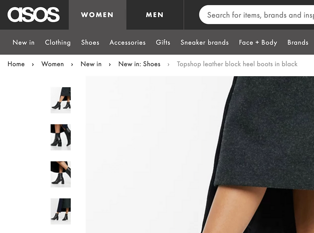
Where you are and where you can go
No one likes to feel lost, whether it’s somewhere in person or online. That leads us to another system status that falls under this usability principle. When navigating a site or an app, the user should be informed of where they are on the site. This can be achieved in the form of highlighted menu labels or use of breadcrumbs. Breadcrumbs help users understand their location by showing them how they arrived at their current page and can even lead them to other relevant pages.
Open communication
You probably wouldn’t be be very happy if any of your friends changed their dinner plans with you without ever updating you. That same idea applies to users as they should always be informed of any changes made in the system.
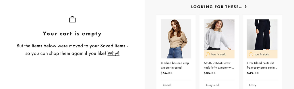
Take for example, my shopping cart on ASOS. After 60 minutes, my items are automatically moved to my saved items. If I left and came back the next day, I might be wondering why my cart is empty. The site does a great job of letting me know that all my items were moved and can be be easily accessed under saved items.
Another example can be seen on Amazon. I probably wouldn’t notice if the seller or price for a book changes in my cart, but they make sure to clearly indicate the details of any changes that might have occurred while I was away.

To sum it up, the visibility of system status heuristic encourages open and continuous communication to enable a smoother experience for the user. It’s easy to see how this principle applies to our relationships with devices as much as it does to our relationships with other people.
Exploring usability heuristics: Visibility of system status was originally published in Prototypr on Medium, where people are continuing the conversation by highlighting and responding to this story.
from Prototypr https://blog.prototypr.io/exploring-usability-heuristics-visibility-of-system-status-30c7ef077adf?source=rss—-eb297ea1161a—4