Build and Ship a Design System in 8 Steps Using Backlight

What is a Design System

If you ever wondered how Apple, Uber or Spotify keep their UI and UX perfectly consistent over their hundreds of pages, it’s because they use a Design System. Enhanced version of what used to be “pattern libraries” or “branding guidelines” a Design System could be defined as a library of reusable components, that includes documentation along each of these components to ensure the proper use of it and its consistency over the different applications. The documentation is at the core of the system, going beyond components by covering accessibility, layouts, overall guidelines, and much more.

By creating Design Systems, companies are building a Single Source of Truth for their front-end teams, thus allowing for shipment of products at scale, with perfect consistency of the User Experience guaranteed over the entire product range.

As well documented in this article, a Design System is made of different pieces which we can split into four main categories: Design tokens, Design kit, Component Library, and a Documentation site.

Who Design Systems are for

You could think that a Design System is costly to build and maintain and would need a dedicated team. If some companies do rely on a team, there are now tools that allow any company to benefit from a Design System, no matter the size of their frontend team or their existing product. One of these tools is Backlight.

What is Backlight

Backlight is an all-in-one collaborative tool that allows teams to build, ship, and maintain Design Systems at scale.

With Backlight, every aspect of the Design System is kept under a single roof, teams can build every component, document it, share it to gather feedback, and ship it, all without leaving Backlight environment. This allows for seamless collaboration between Developers and Designers on top of the productivity gain and the insurance of perfect UI and UX consistency among the products relying on the Design Systems.

Steps to build your Design System

#1 Pick your technology

You might already have existing components and you could choose to stick with your existing technology. While a lot of companies go for React, other technologies are worth considering.

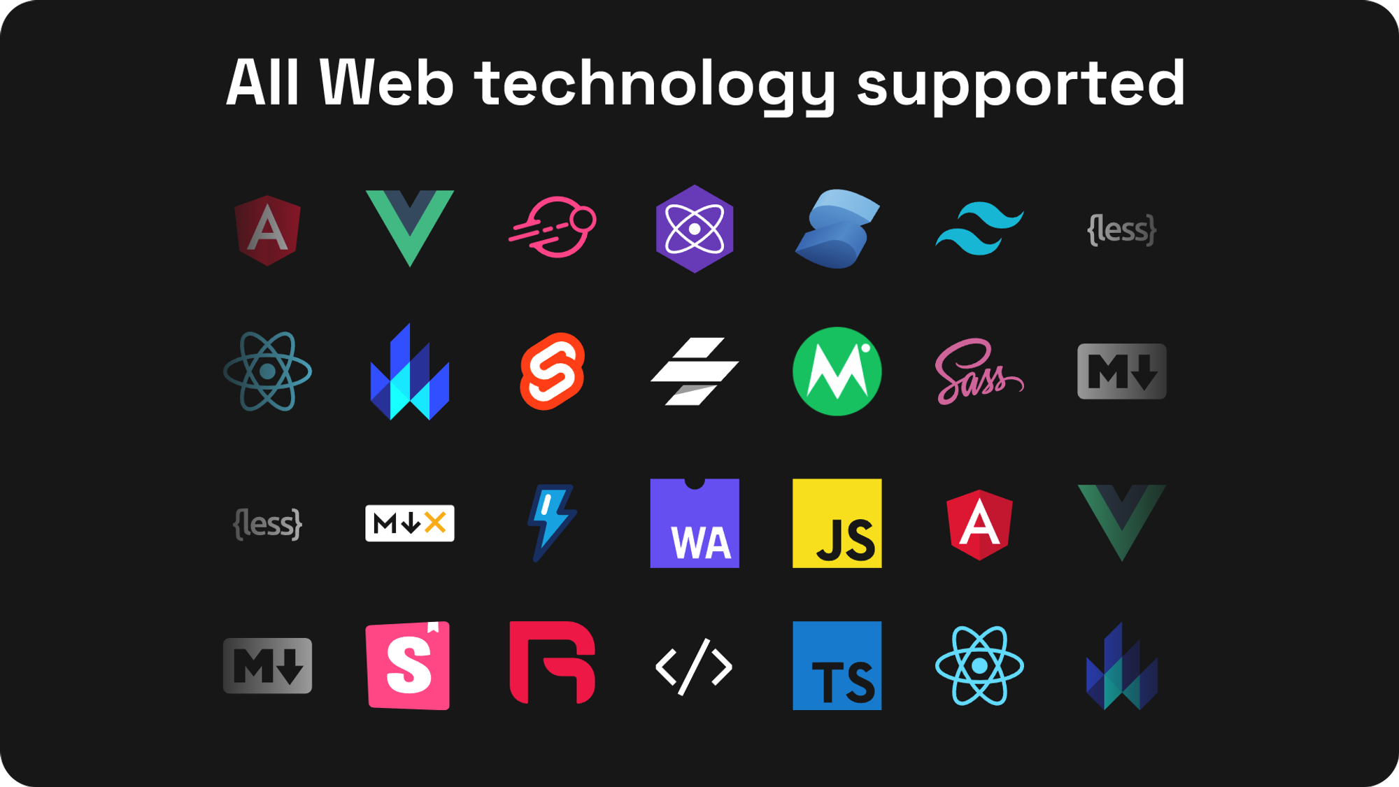
If you would prefer to not start a new Design System from scratch, Backlight offers a number of Design Systems starter-kits to chose from. Each comes with built-in tokens, components, interactive documentation, Storybook stories, all ready to be customized to your liking for your products.

#2 Set your Design Tokens

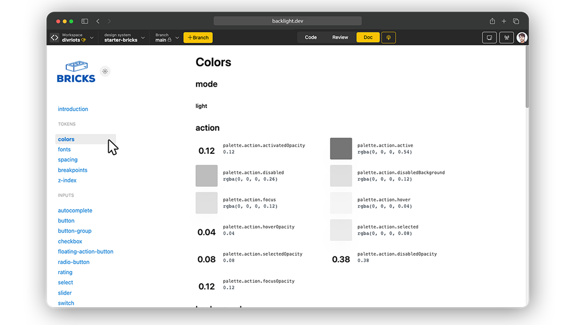
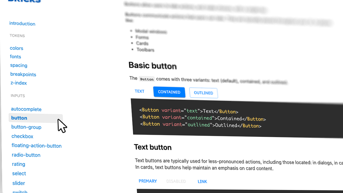
Once your technology is picked, you often start by creating (or customizing, if you chose to use a starter-kit) the basics Design tokens. Design tokens are the value that rules your Design System components, such as Color, Spacing, Typography, radii…

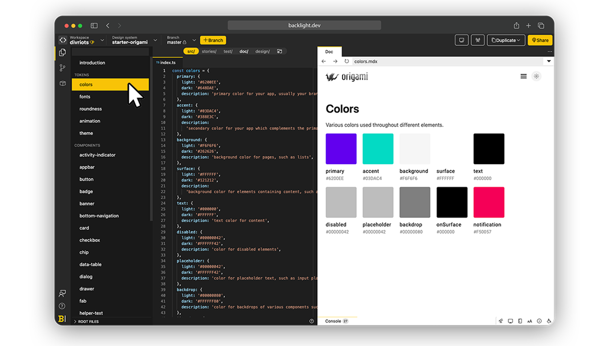
In Backlight, Design tokens are conveniently listed in the left-side panel so you can get an overview at a glance.

To create a new Token, simply hit the + button and start coding. In edit mode, the code is displayed next to the token so you can edit as you go with the benefit of having the preview window side by side with the code. Any change to the tokens code can be pushed automatically to the preview window so you can see the result of your changes instantly.

For users simply consulting the Design System, the list is displayed next to a preview for better clarity. You can observe that the UI of the documentation mode doesn’t display the code which allows for simpler and noise-free consultation of your Design System. You can see for yourself by playing with this starter-kit.

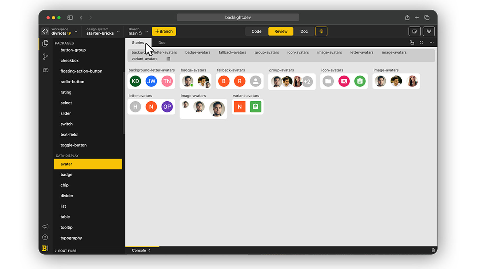
#3 Build your Components

Components are the core of your Design Systems, you can picture them as re-usable building blocks. Buttons, avatar, radio, tab, accordion, this list will be as complex or as simple as your UI need.

Most companies already have existing components. To get started with your Design System the first step would be to create an exhaustive list of every component used in the products to date and identify the most appropriate architecture, then you can start building them one by one.

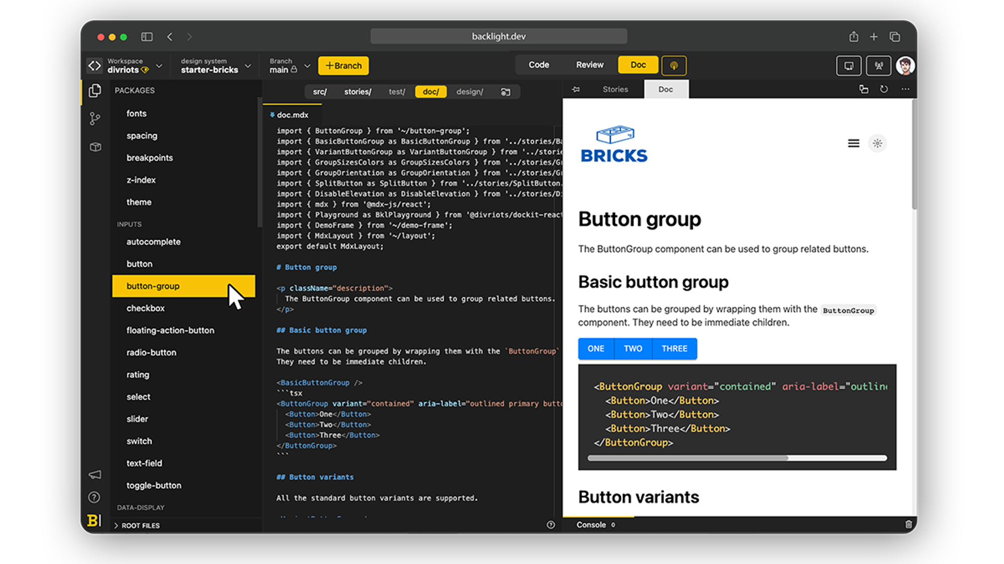
In Backlight you can build your components straight in the built-in browser IDE, always keeping the preview panel next to it, to verify the result at all times.

Once a component is created, it will live on your Design System for as long as it exists (or as you delete it) and because it will have to grow with it, Backlight makes it extra easy to update components on the go.

Also, if you build upon existing assets, with GitHub and Gitlab native support you can push changes on branches directly from Backlight and review pull-request in a click.
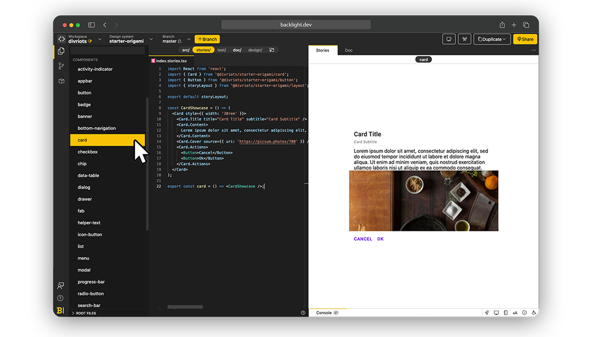
#4 Add Stories

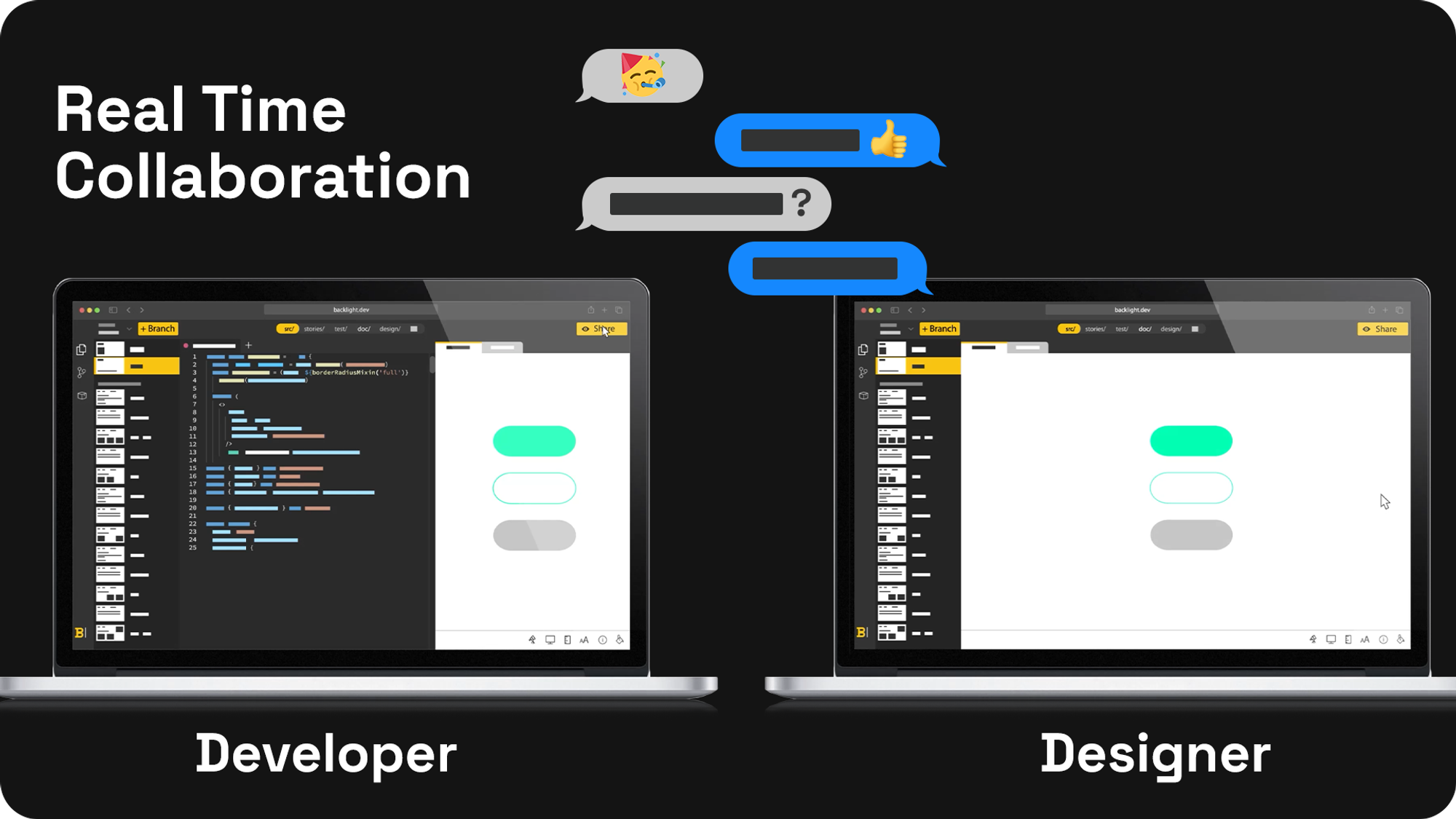
Collaboration between Designers and Developers is one of the bottlenecks that every team creating Design Systems will have to solve. One way to ensure alignment between the two is by providing simple visual iterations of a components state, which is a live representation of the code instead of being a simple screenshot at a given time.

In order to do so, Backlight added support to the most common solutions: Storybook

Backlight natively supports Storybooks’s story files. Stories are visual representations of a state of a UI component given a set of arguments, and one of the best ways to visualize a Design System or simply get a quick overview of a component iterations.

Stories can be coded directly into Backlight and displayed next to the documentation

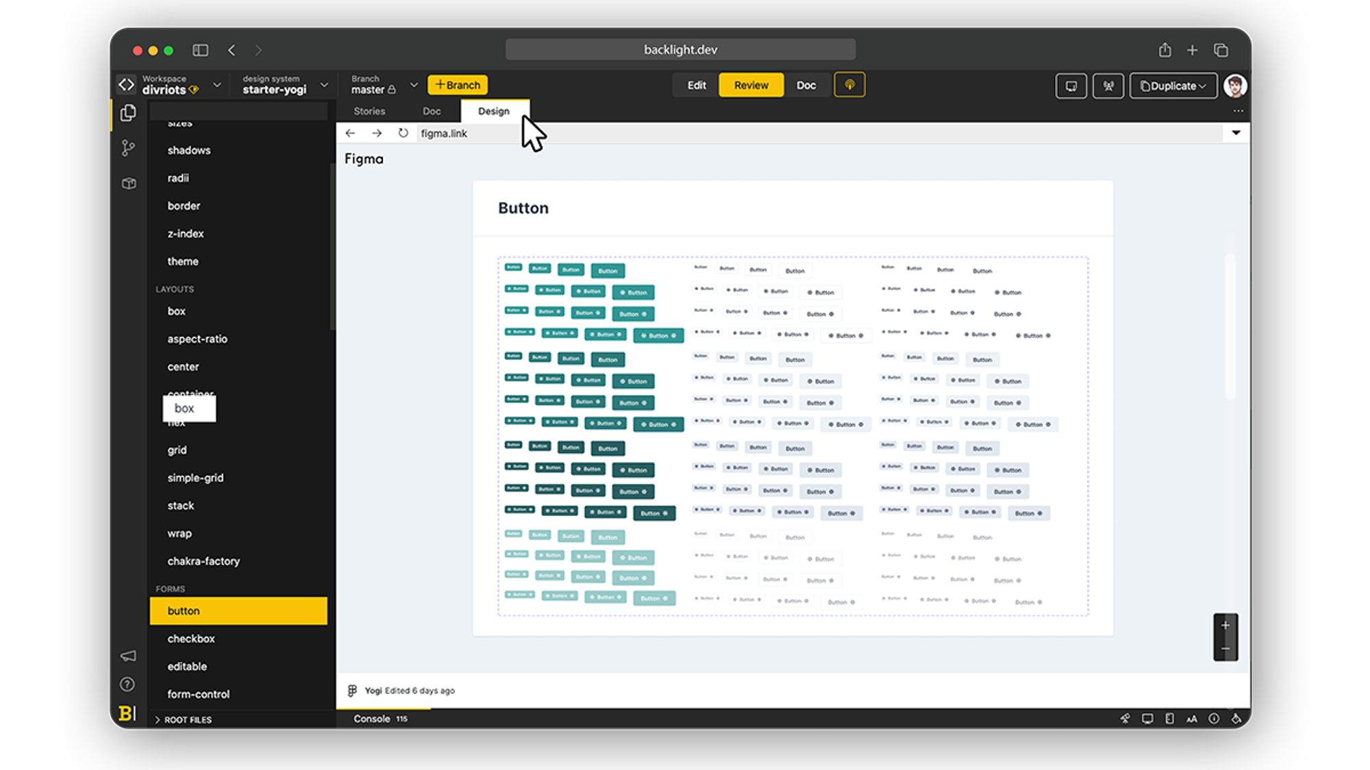
#5 Link your Design assets

If you already have design assets, Backlight support Figma as well as Adobe XD and Sketch. By embedding a link to the assets, Backlight will display them live within the interface along with the documentation and the code so developers can make sure that both are in sync.

  • Figma libraries

Among Designer tools, Figma is often one of the go-to, and its libraries can be natively displayed within Backlight, giving Developers direct access to the visuals.

  • Adobe XD

Next to Figma, Adobe XD hold a special place in the Designer community and it is as well supported in Backlight

  • Sketch

By supporting Sketch links and allowing them to be embedded within the documentation, Backlight ensures once again proper alignment between Designers and Developers, removing the need for long back and forth as well as team members relying on tools they are not comfortable with.

#6 Generate the Documentation

A Design System is only as great as its documentation. The core of your system, the documentation has multiple facets but will mostly be able to:

  • Facilitate the adoption of the design system among the product team thanks to visual preview and concise how-to.
  • Ease the maintenance, a well-documented system is like a documented code, knowing the how and why of every bit, it gets easier for the team to scale or adapt parts.
  • Ensure the survival of the Design System, an easy-to-digest documentation of your system will avoid team members taking shortcuts and ending up not using it.

Backlight supports multiple technologies to build your documentation, MDX, MD Vue, mdjs, or Astro, you can pick the one that suits you best. If you are wondering what technology to chose, this article will be able to guide you. However keep in mind that the best practice is to use a technology that can embed your real component, thus ensuring that the documentation has the latest visual iteration of it, at all times.

Backlight allows for users to build interactive documentation, with menu, dark and light mode, live code sandbox, components preview, and more.

Like for the rest of the Design System, the code is displayed next to the preview to have visual feedback at all times.

For inspiration purposes, here is a list of the best Design Systems document sites to date.

#7 Gather feedback from the team

One, if not THE, main bottleneck front-end teams encounter while building a Design System is communication between Developers and Designers. Both sides are living within their own tools, and it often ends up with teams creating multiple asynchronous Design Systems, which are costly to maintain and often sources of mistakes.

Backlight offers a platform that non only regroups everything under a single roof, but that outputs documentation and visuals that are easy to share to entire teams.

  • At any time a Developer can share a live preview of what he’s working on, and edit the components as he receives feedback. Each edit will be pushed to the live preview and the other side can directly see the results.
  • Designers can update a Figma or Adobe Xd library, it will be automatically shown in the respective tabs inside Backlight for a Developer to update the impacted components.
  • Thanks to the live preview panel, Designers that know code can quickly update any component or token to their liking, which then can be reviewed by a developer before pushing for release.

#8 Ship your Design System

Once you have a proper Design System, tokens, components, and the documentation that goes with it, it is now time to use it which means generating the outputs of the Design Systems (code, documents site…) for the team to consume it.

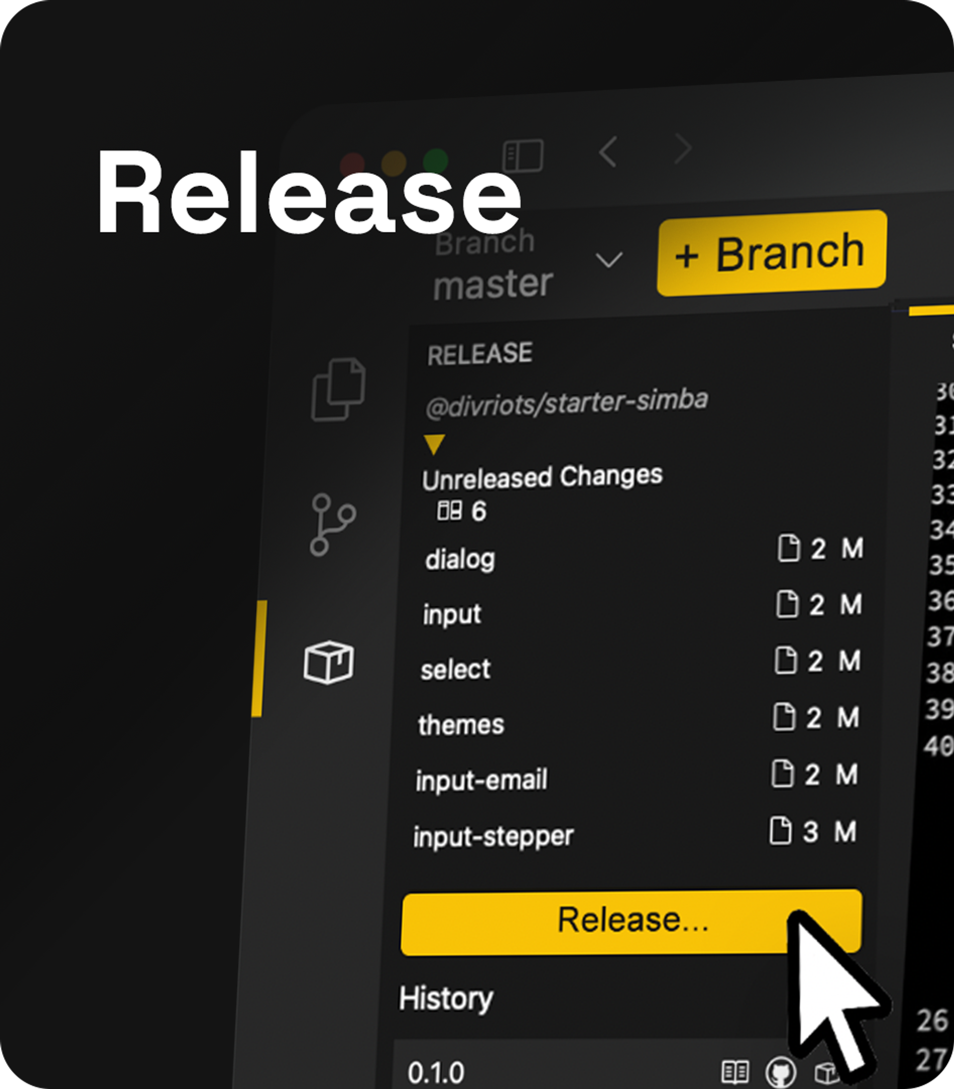
Before releasing you can double-check unreleased changes at a glance, using the built-in visual diff panel, and even automate testing.

Once everything is properly verified, to facilitate the release Backlight has a baked-in npm package publisher, so you can compile, package and version your Design System on demand.

Once published, you will be able to see the history of previous releases and access every corresponding package directly from the release panel.

Kickstart your own Design System

By simplifying every step and keeping it all under the same roof, Backlight makes Design Systems affordable for every team, no matter their size.

Sound promising? Wait until you learn that there are a LOT more built-in features and that you can start your own Design System now! More than a product, Backlight is a community that will set the starting blocks for you and guides you through the finish line.

The post Build and Ship a Design System in 8 Steps Using Backlight appeared first on Codrops.

from Codrops https://tympanus.net/codrops/2022/01/24/build-and-ship-a-design-system-in-8-steps-using-backlight/

Refreshing our Icon System: the why and how behind the changes


It’s a new year and we have a new look! In case you haven’t seen them yet, we’re in the process of rolling out a refreshed, bolder look for our icons, starting with the mobile and desktop apps.

Our current suite of icons has been with us since the last redesign in 2016 – and while they’ve served us well, recently, we identified a need to update them, bringing them in line with the evolution of our visual language. 

Framing the problem

To refresh our icons, one of our design systems teams, Encore Foundation, teamed up with Rob Bartlett, the skilled iconographer who worked on the 2016 redesign. Together, we identified the key challenges they needed to address:

The weight and thickness of strokes were too thin

We wanted to revisit the weight of our icons based on a few things:

  • In the evolution of our visual language over the last few years, we’ve increasingly switched out text-based buttons for icons and made them more prominent in our UI.

  • On top of that, we’ve also increased the size and weight of our typography, which made thin icons look a bit out of proportion.

  • Most importantly, we also saw an opportunity to increase the readability of icons, especially when they’re sitting on top of a variety of different backgrounds.

We had a few different sets of icons to merge

Over time, Encore systems had diverged and we set out to create a new set that could accommodate them all, making things more consistent and easier to manage.

Creating and managing icons wasn’t as easy as it should be

We saw a need to simplify our icon system for teams in general. One key aspect was to build on our recent switch to Figma by bringing the design source files for icons and creation flows there in full. Another one was to try and reduce the number of icon sizes we had to create for every single icon that was being added to the system.

Enabling a seamless transition for everyone

We wanted this update to feel like a seamless transition for end-users. For the vast majority of icons, we’ve kept the current metaphor intact for this very reason so that users can find their way but enjoy a refreshed icon style.

So, what’s new?

Along with an overall refresh, the key difference is that we’re increasing the weights of our icons by changing the main stroke size. We’re going from 1px to 2px at 24px icon size.

Two, bolder sizes: 24 & 16px

We’re increasing the stroke weight of our icons and simplifying our icon system by now only maintaining icons in these two sizes:

Any other sizes that are needed will be scaled versions of these distinct sizes.

The result is a balanced set of icons and typography, that’s more readable.

Refreshed style across the set

We merged the sets by redrawing every single icon in the new style with the thicker strokes. The vast majority of icons keep the same metaphor as before.

Increased the difference for active states

To increase clarity, active states are no longer using only subtle changes to weights but instead filling up a portion of the icon.

This is how we did it

Partnering with Rob Bartlett

Encore Foundation is responsible for all the core elements of Spotify’s design language. For several months, Rob Bartlett embedded with the team to ensure a very close and successful collaboration.

Identifying the new icon weight(s)

One of the key steps in this process was defining the icon weight we would use going forward. We primarily used 1px stroke weight and we knew we wanted to increase it – but by how much? We tried several different options; the bolder we got from where we’d been, the more we could see a clear improvement. After rounds of iterations, we settled on the two new weights. This decision was based on two key aspects:

  • In order to meet our goals for the project, the new weights needed to be noticeably bolder than before. With 1.5px and 2px, we were increasing the stroke-weight at 50% for the 16px sizes and 100% for the 24px sizes.

  • The new weights needed to be easy to design when creating new icons. This meant staying as close as possible to whole pixel or half-pixel values, which designers would find easier and faster to work with.

Which sizes would we use going forward?

In our previous icon set we had more than 220 icons x 5 size variants = 1,100 individual assets. Our aim with the refresh was to reduce the number of individual assets as much as possible, in order to make it faster and easier for teams to add to the system.

We already knew that Encore Web had successfully moved to using only 24px icons, but we also had to take the needs of the entire system into consideration. Using analytics, we could clearly see that 16 and 24px were the most used icon sizes – by far!

The main use-case for 16px icons was found to be in apps like desktop and in any instance where the icons might need to be even smaller, like our download indicators in all track rows for example. For downscaling to work properly in these cases, the 16px icons needed to use the full width and height of that icon space.

We determined that scaling the 24px size up would work for the vast majority of cases where icons are needed at larger sizes.

The final outcome was that we reduced the number of size variants in the system down to 40% of what we had before by using 2 sizes instead of 5 – a reduction by 660 individually drawn icons. When we make new additions or changes to the set going forward, that efficiency win will have great impact.

Streamlining the contribution flow with Figma

Another big focus for us was to bring as much of the contribution flow for new icons as possible to Figma, as that’s now the default tool at Spotify Design. This meant several things:

  • The whole process for adding icons is documented within Figma.

  • All the guidelines on how to follow the new structure and visual style are available in Figma.

  • When teams are making their icon submission, we’re encouraging them to also share explorations that led them to their final design. This means we can build a collective history of icon-focused explorations in close proximity to where all the production icons are being housed.

  • All icons have both their editable source vectors available, right next to the optimized versions used in production. This means everyone can easily build on top of existing icons when they’re considering an addition or an edit to the icon system.

Through close collaboration with our engineers, we also managed to automate almost all aspects of generating the necessary code and different output assets needed for our various platforms.

What’s next?

We’re excited for everyone to experience the refreshed icons in our mobile and desktop apps now and you’ll start to see them in other platforms gradually throughout this year.

Credits

Andreas Holmström

Senior Product Designer

Stockholm-based, 10 years at Spotify (5 in Brand, last 5 in Product/Design Systems working on Encore). Loves golf, running, deep house & spicy food!

Read More

Rob Bartlett

Icon Designer

A specialist in global icon deliveries, with 25 years of interaction design experience. Rob is also proud to be a carbon-neutral designer.

Read More

Spotify Encore Team

The Encore design systems team makes sure that Spotify looks, feels, and works great anywhere. We love building tools that allow designers, developers, and writers to create incredible experiences at scale.

Read More

from Sidebar https://spotify.design/article/refreshing-our-icon-system-the-why-and-how-behind-the-changes

Fintech Emerging Markets: Frictionless Cross-Border Payments

Mario Shiliashki, CEO of PayU tells us why emerging markets are leading the … has become a very lucrative source of growth for global merchants, …

from Google Alert – https://www.google.com/url?rct=j&sa=t&url=https://fintechmagazine.com/digital-payments/fintech-emerging-markets-frictionless-cross-border-payments&ct=ga&cd=CAIyGjRiZjI0YzRlZjA5NmMxYjQ6Y29tOmVuOlVT&usg=AFQjCNFdY8uaipPZFmvlkNn0MiLmRsn6GA

Sound design and the perception of time

A nonsense image generated by neural network
The image was generated by ruDALL-E with a text query “Game audio and perception of time”

We often say that humans are visual creatures. The Colavita visual dominance effect demonstrates that visually abled people are strongly biased towards visual information. When they see an image and hear a sound, they might pay so much more attention to the visuals that they entirely neglect the audio. There are some known phenomena when visual information overrides auditory input, such as the famous McGurk effect. But visual dominance is not universal. There are contexts and situations where vision becomes less efficient as our primary sense, and we start relying on other modalities. One of such contexts is the subjective perception of time.

Disclaimer: When reading my blog, you may get a false impression that I know something about cognitive psychology and other research fields I typically refer to. I have no expertise in those. I am a practicing sound designer, curious enough to read a couple of research papers every now and then. I check my sources and mostly mention things that make sense based on my professional experience, but I lack the competence and supervision to make scientifically accurate statements. Keep in mind that most studies I refer to were done outside of the video game context, and I did not conduct any experiments to confirm my hypotheses. In other words, prepare your grains of salt!

There is a lot of evidence that audition dominates vision in temporal processing. Experiments show that when we perceive the duration of audiovisual events based on the duration of the auditory, not the visual component. The effect of sound modulating the perceived duration of a visual stimulus is often called temporal ventriloquism, as opposed to the classic ventriloquist effect. The ventriloquist effect is the reason why we perceive movie characters’ speech as it is coming from the TV screen itself, not from our speakers. In this case, our vision “captures” sound, influencing our judgment of its spatial location. Temporal ventriloquism is the reverse effect that happens in the time domain.

My posts are usually oversimplified but pragmatic explanations of complex perceptual mechanisms tailored to the game development context. This one is no different, so here is my take on the phenomenon. Whenever we perceive audiovisual information, we mostly rely on visual cues to understand how things exist and behave in space, but we prefer sound to understand how they exist and behave in time. I’m not saying we don’t perceive time visually; rather, we use auditory information as the clock or the source of truth whenever we get somewhat conflicting inputs on both sensory channels. Given that hearing is faster than sight (more on this in an upcoming separate post), it is not surprising that the faster sense delivers more reliable input data to inform us about time.

A nonsense image generated by neural network
The image was generated by ruDALL-E with a text query “Temporal ventriloquism”

How can we use this knowledge in our day-to-day work? I see three levels of practical application. On the smallest scale, we can use individual sound effects to alter the visual events on the screen, making them subjectively faster, smoother, snappier, etc. On a medium scale, rhythmic sound patterns become helpful in efficiently communicating the gameplay dynamics or timing of individual events. Finally, on the largest scale, we can alter the soundtrack or soundscape to make the player feel that time passes subjectively faster or slower.

Sound effects and visual motion

A well-timed sound may affect the perception of visual events. One famous example is the so-called Double Flash Illusion, where sound makes some people see two rapid flashes instead of one. A less known but more fascinating example is the Motion-Bounce Illusion that demonstrates how sound can alter the visual motion perception and, in a way, completely change the meaning of the visual event. Those illusions are not particularly useful in the game development context, but they show how strongly can audio modulate what we see.

Thanks to auditory dominance, we can intentionally break audiovisual synchrony to separate simultaneous events in time and better communicate their quantity. I made a short example video to demonstrate this:

In the video, the arrows reach both targets at the same time. Intuitively, we want to synchronize sound with visuals and play them simultaneously, as in the beginning. However, without a proper separation in time, two sounds blend into one, which feels odd — such coincidence is unlikely in real life. But notice what happens when I start incrementally delaying the sound, associated with the right target, 50 milliseconds at a time. Both 50 and 100 ms delays feel natural and believable. Some of you may even perceive the second hit as visually delayed (thanks, temporal ventriloquism!). At 150 ms, the delay is noticeable but still acceptable. And only at 200 ms does the lack of synchronization become apparent, which aligns with the thresholds mentioned in ITU-R BT.1359–1.

This trick is helpful to perceptually clarify the visually cluttered scene with many simultaneous events. But there are other practical applications. One study shows that sound effects can influence the perceived smoothness of rendered animations. Motion smoothness variations at lower framerates became more apparent to the audience when the animations were presented with no sound. On top of that, it is not uncommon to observe a sharp, snappy sound making the visual movement appear faster than it would be if seen with no audio cue.

Note: I do not advocate using audio to compensate for visual shortcomings. The proper way to solve the problem above would be to separate the events visually in the first place. Any lack of audiovisual congruity decreases perceptual fluency, potentially adding to the cognitive load the player experiences. But these tricks could be helpful when you are desperately short on resources or want to experiment with different feels.

Keep in mind that these effects only appear on a relatively short time scale with a limited range of asynchrony. If audio and visuals are noticeably separated in time, they appear as two different messages, disconnected from each other. ITU-R BT.1359–1 recommends specific thresholds of audiovisual desynchronization in broadcasting: detectability thresholds of +45;-125 ms and acceptability thresholds of +90;-185 ms where positive value means that sound precedes the visuals. Given the interactive nature of our medium, I’d stick to even smaller ranges of detectability and acceptability to be safe.

Rhythmic patterns

Remember those countless videos on YouTube with funny animals dancing to music. Watching them carefully makes you realize that the animal’s movement doesn’t usually match the music rhythm that well. Your brain adjusts your perception of the movement based on the song’s rhythmic structure, tricking you into thinking they fit, even if they are out of sync. Most humans are pretty bad at visually analyzing rhythmic sequences. If you want to find out how bad you are, check the video demo on this page. Unless you have a kind of synesthesia that allows you “auralize” visual rhythms in your head, you will have difficulty differentiating between the pairs of flash sequences.

From the game development perspective, it means that audio becomes a primary information channel to communicate rhythmic patterns. This is obvious in rhythm- and music-based games but easy to overlook in cases when understanding a rhythm could help the player win the challenging fight or time their jumps in a platforming sequence. Of course, you don’t want to turn every game with repetitive event sequences into a rhythm game, but luckily you don’t have to. Accurate and synchronized sonic representation of in-game events is usually enough to guide the player. It is easy to understand this idea if you carefully listen to any popular fighting game and observe how rhythmic, not necessarily in the musical sense, the character moves are and how sound helps you understand these rhythms.

You may argue that intentionally omitting the auditory component of rhythmic action could add to the challenge. I think this is a valid point, but please remember that dealing with the shortcomings of our sensory systems is rarely a fun challenge. So, I’d strongly recommend carefully evaluating such design decisions in the context.

Auditory dominance is also why many sound designers seek framerate-independent implementation of gunfire sounds in shooter games. The player may not notice when the game skips a frame or two, but any deviation in steady auditory rhythm becomes too obvious to ignore. Check this video about the weapon audio of Borderlands 3 if you want to hear an example.

Music and temporal judgments

Although thematically connected to the other effects I describe in this post, long interval judgments, at least to my knowledge, have nothing to do with temporal ventriloquism. But given a vast amount of research on the effects of music on the perception of time, I thought I should mention it in this post.

A nonsense image generated by neural network
The image was generated by ruDALL-E with a text query “Music and chronoception”

First, there is strong evidence that the mere presence of music leads to time overestimation in an audiovisual context. It means that whenever any music plays while we experience something audiovisually, we think that experience has lasted longer than it did. Plot twist: there is also evidence about the mere presence of music is causing people to underestimate time! And both sides tend to agree that the mere presence of music leads to less accurate time estimations than an absence of music.

A large-scale study by Ansani and colleagues links the overestimation with arousal: the more intense music is, the more people overestimate time. Authors particularly highlight tempo and musical complexity as factors increasing arousal and thus influencing the perception of time. And there is no shortage of studies that support those ideas. It also makes perfect sense to me: whenever we are activated, time slows down to make us react to whatever happens around us.

Another study shows that adding music to the game causes the players to underestimate experienced (but not remembered) time. Researchers asked one group of test subjects to keep track of time while playing, while the other group was asked to evaluate the duration of play after the experiment. Only the first group members have significantly underestimated time when playing with music.

And as a cherry on the cake, a study on racing games demonstrated that players overestimated time when the music was selected by them and underestimated time when others chose the music. It parallels the notion that people spend less time shopping when familiar music plays in the background. More interestingly, the racing game study says that arousing music makes people report shorter periods of time, not longer ones, as mentioned above.

So, what the hell is going on? Overall, the area of research on music and perception of time is a rabbit hole, and I could spend months investigating it. I did not, so my takeovers are probably not very profound, if not just lame. One logical explanation for the contradiction would be that the influence is bidirectional; some music features cause overestimation, others result in underestimation. But to my knowledge, there is no clear, non-conflicting evidence supporting this idea.

There is evidence that perception of time shifts depending on whether people like the music or not. In an audiovisual context, overestimation likely happens when music is congruent with the experience. Unpleasantness and incongruity result in underestimation. If this is true, we can expect overestimation in most game-related contexts: games usually have congruent music that supports the experience even when the music itself is unpleasant to hear. Both studies on games linked above showed underestimation, but none of them used pieces explicitly authored to support the gameplay experience, so people likely perceived the music as incongruent.

Ansani and colleagues propose an alternative explanation that aligns with what I see from the studies. In most cases of underestimation, people were consciously aware of time passing by — either waiting for something to happen or knowing that somebody would ask them to estimate time spent. On the contrary, in most cases of overestimation, people did not track time and evaluated it retrospectively. So, music may have opposite effects on prospective and retrospective judgments of time. In cases when people are aware of time, music can be a distractor that drags our attention away from monitoring the time flow. In instances where we are not aware of time, it adds to the complexity of experience, making the brain register more events and use more attention and memory resources, leading to overestimating. The intensity of the music, resulting in higher arousal, could be a modulating factor in both effects.

A nonsense image generated by neural network
The image was generated by ruDALL-E with a text query “Temporal effects of music confuse me”

Why would we want to shape the player’s perception of time in the first place? Game designers may have a better answer for this question, but I see a few creative applications. For instance, we could alter the soundscape to make certain moments perceptually longer and more memorable. Or we could try to increase the average session length in a free-to-play game. I am especially interested in the audio treatment of low-intensity moments when the players wait for something to happen, such as matchmaking, loading screens, or similar idle periods.

Being familiar with only part of the evidence before writing this post, I thought I’d finish it with a clear recommendation: don’t add any complex custom audio to idle moments in your game, or they will appear to last longer than they are. Every bit of my subjective experience and professional intuition screams this is still true: when we add a custom music track to, say, loading screen, we make the players consciously aware of the time they need to wait for the game to load and seemingly stretch that time for them. But as the evidence suggests, there could be an opposite effect.

As an individual who writes this blog on weekends, I cannot test this in a proper experiment. But I would be very interested in finding this out: knowing how to make the idle moments less noticeable, we can tremendously improve player experience in many games. I’d be happy to discuss this! If you share my interest and know the answer or can find the answer (by experimenting or in any other way) — please reach out.


Sound design and the perception of time was originally published in UX Collective on Medium, where people are continuing the conversation by highlighting and responding to this story.

from UX Collective – Medium https://uxdesign.cc/game-audio-and-perception-of-time-9569a963772a

Walgreens moves to AI-driven search experience with Algolia


Did you miss a session from the Future of Work Summit? Head over to our Future of Work Summit on-demand library to stream.


Search and discovery API platform provider Algolia last week announced that retailer Walgreens had joined its customer base and will deploy the solution alongside the Microsoft Azure Cloud platform to help improve the search experience of its customers.

Algolia’s API integrated into Walgreens’ custom front-end architecture to provide an AI-driven search solution that can analyze users’ search terms, predict their intent, and deliver more search results. The intention is to drive an omnichannel browsing experience that enables customers to find the goods they want in less time.

“In the immediate future, Algolia’s API will help Walgreens’ click-and-collect efforts. It’s estimated that, by 2024, click-and-collect (or buy online, pickup in-store) sales will grow to reach $140.96 billion. This movement helps brick-and-mortar retailers compete against the one and two-day shipping of retailers like Amazon — and its push into an in-store pickup as well,” said CEO of Algolia, Bernadette Nixon, in an interview.

In addition, Algolia enables Walgreens to “better tailor experiences for their consumers and predict the types of things people need, not just from their own personal history, but trends in a region,” Nixon said.

“Imagine coming to the website and based on geolocation, if flu is trending, to be able to have a set of results for flu vaccine, testing, tissue box, etc. that are intent-driven selections, but at a macro level as well as based on personal profile and preferences. This will create a deeper level of loyalty and delivery of value that we see brands like Walgreens investing in,” she said.

The provider is part of the enterprise search market, a market estimated at $3.8 billion in 2020 and projected to reach $8 billion by 2027 as technical decision-makers look for new solutions to improve the search experience of on-site customers.

AI-driven search enters the cloud wars 

Walgreens partnership with Algolia comes amid the cloud wars, a technological arms race between modern organizations and retailers to offer seamless digital experiences for customers. Cloud transformation and creating an AI-driven customer experience are at the heart of this race, with organizations trying to build the infrastructure to generate operational insights that they can use to outstrip the competition.

For instance, just a few months ago, one of Walgreens’ largest competitors, Walmart, announced a partnership with Google Cloud in an attempt to better apply API to predict demand, optimize its supply chain, and build a superior customer experience.

As more retailers like Walgreens and Walmart move to the cloud, AI-driven search capabilities are becoming a must-have to remain competitive in the marketplace, as organizations that rely on poorly optimized and less relevant customer experiences get pushed out by those offering a more relevant experience.

A look at the digital search market 

Founded in 2012, Algolia has emerged as one of the leading enterprise search providers and is today in an ideal position to grow throughout the cloud wars era. The organization is currently worth $2.25 billion and maintains a customer base of over 10,000 customers, including some of the world’s leading retailers, like Dior, Lacoste, and Under Armour.

Its flagship solution, Algolia Search, is an API that can automatically extract website content, understand users’ intent, generate AI-driven synonyms, and direct users to relevant results faster.

More importantly, it can also provide product recommendations to customers that encourage further purchases, generating analytics displays of consumer preferences, and ultimately increase an organization’s revenue.

However, many other enterprise search solutions are competing to offer organizations a complete search and analytics solution. One of the most well-known is Elasticsearch, a search and analytics engine that raised $608.5 million in revenue in 2021, successfully working with clients including Adobe, T-Mobile, Audi, and Walmart.

Other competitors include AI search solution Yext, which generated $354.7 million in 2021, and Lucidworks Fusion, which has grown by 200% following a $100 million investment in 2019.

Simplicity may win the cloud search war 

While competing solutions like Elasticsearch offer AI search solutions designed for systems architects with immense configuration options, Algolia instead offers organizations a simplified API-driven approach to help its customers win the cloud search war.

Algolia is attempting to reduce the time organizations need to spend to build a custom search solution and hiring employees with in-demand back-end search expertise by providing a prebuilt search and discovery solution with a lower total cost of ownership.

VentureBeat

VentureBeat’s mission is to be a digital town square for technical decision-makers to gain knowledge about transformative technology and transact.

Our site delivers essential information on data technologies and strategies to guide you as you lead your organizations. We invite you to become a member of our community, to access:

  • up-to-date information on the subjects of interest to you
  • our newsletters
  • gated thought-leader content and discounted access to our prized events, such as Transform 2021: Learn More
  • networking features, and more

Become a member

from VentureBeat https://venturebeat.com/2022/01/17/walgreens-moves-to-ai-driven-search-experience-with-algolia/