Scroll Driven Animations are set to be released in Chrome 115, giving us the chance to animate elements based on a scroll instead of time, increasing our toolset to create some fun interactions. I’m sure many great tricks and articles will be found, as this feature opens a lot of possibilities.
Scroll driven VS scroll triggered
You heard that right, we’re talking about scroll driven animations, which is not completely the same as scroll trigger animations. In this case the animation gets played while the user is scrolling the page, using the scrollbar as its timeline. Although there are some tricks on how you can achieve a scroll triggered animation by using some modern CSS, you might still want to use an intersection observer in JS for this. These animations can be blazingly fast when using transforms as they run on the compositor in contrast to popular JS methods which run on the main thread increasing the chance of jank.
The animation-timeline is not part of the animation shorthand
I’m really happy that the CSSWG decided not to add this in the animation shorthand, because – let’s be honest – this shorthand is a bit of a mess and I always seem to forget the correct order for “animation” (luckily, browsers do forgive us most of the time when using this)
Combining scroll driven animations with scroll snapping
One of the things I love about all these new nifty CSS features is how well they go hand in hand. It seems only yesterday since we had scroll snapping in CSS and now we can already think about combining it with scroll driven animations… It’s pretty wild.
As an easy example, I created a Legend of Zelda game timeline with a horizontal scroll.
It basically is a timeline with articles inside of it that has some scroll snapping in the center, the HTML build-up is quite simple:
<sectionclass="timeline"><article><imgsrc="..."alt=""/><div><h2>The legend of Zelda</h2><time>1986</time> -
<strong>NES</strong></div></article></section>
Next up we have some basic styling by adding the articles next to each other with flexbox and add some general look and feel which I will leave out of the code example in order to stick to the essentials:
So, what happened here? We created a centered horizontal scroll snap and added a “reveal” animation to the parent scroll in the inline axis. The animation itself will place the article to its “active” state at 50%, which will be the 50% of its scroll distance and also the place where it snaps.
To avoid throwing insane chunks of code in this article, there is a lot more CSS going on for the styling, but when it comes to the scroll animations: The exact same animation technique was used for the images and the info panel that pops out to create the following little demo:
View Timeline Ranges
Another great feature that comes together with scroll driven animations is the ability to specify ranges of where the animation should play.
Current options for these are:
cover: Represents the full range of the view progress timeline.
entry: Represents the range during which the principal box is entering the view progress visibility range.
exit: Represents the range during which the principal box is exiting the view progress visibility range.
entry-crossing: Represents the range during which the principal box crosses the end border edge.
exit-crossing: Represents the range during which the principal box crosses the start border edge.
contain: Represents the range during which the principal box is either fully contained by, or fully covers, its view progress visibility range within the scrollport. This depends on whether the subject is taller or shorter than the scroller.
You can change the range of where the animation should play by defining a range-start and range-end by giving each of them a name and an offset (percentage, of fixed).
div{animation: reveal linear both;animation-timeline:view();animation-range: contain 0% entry 80%;}
To be completely honest, I find the naming of these ranges quite hard to memorize and I’m really looking forward to DevTools updates to work with them.
For me this feels a bit more natural because it’s actually inside of our keyframes. I would prefer to use this method more than a separate property, but that might just be me.
I went a bit over the top with the effect, but created a little demo with this technique as well:
Learning scroll driven animations
I know that this article wasn’t much of a tutorial, but more some sort of teaser to get you hyped into this new feature. Creating these demo’s was fun but also didn’t take too long to be honest and that’s a good thing.
Although the view timeline ranges are a bit hard to memorize, the basics of working with these scroll driven animations are quite easy to learn (but as many things with CSS, probably hard to master)
So where should you start when learning about this spec:
I’m really looking forward to all the creative demo’s using these techniques in the future. The best part of this feature is that it can be easily implemented as a progressive enhancement. Just adding that little extra touch of animation for an upcoming project. Looking forward to it.
from utilitybend.com https://utilitybend.com/blog/scroll-driven-animations-in-css-are-a-joy-to-play-around-with
Google’s Core Web Vitals initiative was launched in May of
2020
and, since then, its role in Search has morphed and evolved as roll-outs have
been made and feedback has been received.
However, to this day, messaging from Google can seem somewhat unclear and, in
places, even contradictory. In this post, I am going to distil everything that
you actually need to know using fully referenced and cited Google sources.
Don’t have time to read 5,500+ words? Need to get this message across to
your entire company? Hire me to deliver this talk
internally.
If you’re happy just to trust me, then this is all you need to know right now:
Google takes URL-level Core Web Vitals data from CrUX into
account when deciding where to rank you in a search results page. They do not
use Lighthouse or PageSpeed Insights scores. That said, it is just one of many
different factors (or signals) they use to determine your placement—the
best content still always wins.
To get a ranking boost, you need to pass all relevant Core Web Vitals and everything else in the Page Experience report. Google do
strongly encourage you to focus on site speed for better performance in Search,
but, if you don’t pass all relevant Core Web Vitals (and the applicable factors
from the Page Experience report) they will not push you down the rankings.
All Core Web Vitals data used to rank you is taken from actual Chrome-based
traffic to your site. This means your rankings are reliant on your
performance in Chrome, even if the majority of your customers are in
non-Chrome browsers. However, the search results pages themselves are
browser-agnostic: you’ll place the same for a search made in Chrome as you would
in Safari as you would in Firefox.
Conversely, search results on desktop and mobile may appear different as
desktop searches will use desktop Core Web Vitals data and mobile searches will
use mobile data. This means that your placement on each device type is
based on your performance on each device type. Interestingly, Google
have decided to keep the Core Web Vitals thresholds the same on both device
classifications. However, this is the full extent of the segmentation that they
make; slow experiences in, say, Australia, will negatively impact search results
in, say, the UK.
If you’re a Single-Page Application (SPA), you’re out of luck. While Google
have made adjustments to not overly penalise you, your SPA is never
really going to make much of a positive impact where Core Web Vitals are
concerned. In short, Google will treat a user’s landing page as the
source of its data, and any subsequent route change contributes nothing.
Therefore, optimise every SPA page for a first-time visit.
The best place to find the data that Google holds on your site is
Search Console. While sourced from CrUX, it’s here that is distilled
into actionable, Search-facing data.
The true impact of Core Web Vitals on ranking is not fully
understood, but investing in faster pages is still a sensible
endeavour for almost any reason you care to name.
Now would be a good time to mention: I am an independent web performance
consultant—one of the best. I am available to help you find and fix your
site-speed issues through performance audits, training and workshops, consultancy, and more. You should get in
touch.
For citations, quotes, proof, and evidence, read on…
Site-Speed Is More Than SEO
While this article is an objective look at the role of Core Web Vitals in SEO,
I want to take one section to add my own thoughts to the mix. While Core Web
Vitals can help with SEO, there’s so much more to site-speed than that.
Yes, SEO helps get people to your site, but their experience while they’re there
is a far bigger predictor of whether they are likely to convert or not.
Improving Core Web Vitals is likely to improve your rankings, but there are
myriad other reasons to focus on site-speed outside of SEO.
I’m happy that Google’s Core Web Vitals initiative has put site-speed on the
radar of so many individuals and organisations, but I’m keen to stress that
optimising for SEO is only really the start of your web performance journey.
With that said, everything from this point on is talking purely about optimising
Core Web Vitals for SEO, and does not take the user experience into account.
Ultimately, everything is all, always about the user experience, so improving
Core Web Vitals irrespective of SEO efforts should be assumed a good decision.
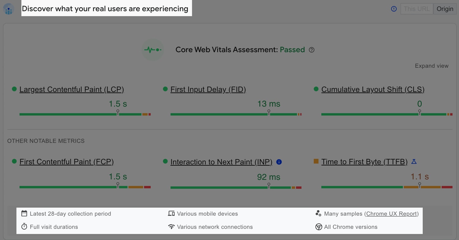
The Core Web Vitals Metrics
Generally, I approve of the Core Web Vitals metrics themselves (Largest
Contentful Paint, First Input
Delay, Cumulative Layout Shift,
and the nascent Interaction to Next Paint). I think they
do a decent job of quantifying the user experience in a broadly applicable
manner and I’m happy that the Core Web Vitals team constantly evolve or even
replace the metrics in response to changes in the landscape.
I still feel that site owners who are serious about web performance should
augment Core Web Vitals with their own custom metrics (e.g. ‘largest content’ is
not the same as ‘most important content’), but as off-the-shelf metrics go, Core
Web Vitals are the best user-facing metrics since Patrick
Meenan’s work on SpeedIndex.
N.B. In March 2024, First Input Delay (FID) will be
removed, and Interaction to Next Paint (INP) will take its place. – Advancing Interaction to Next
Paint
Some History
Google has actually used Page Speed in rankings in some form or another since as
early as 2010:
Although speed has been used in ranking for some time, that signal was focused
on desktop searches. Today we’re announcing that starting in July 2018, page
speed will be a ranking factor for mobile searches.
— Using page speed in mobile search ranking
The criteria was undefined, and we were offered little more than it applies
the same standard to all pages, regardless of the technology used to build the
page.
Interestingly, even back then, Google made it clear that the best content would
always win, and that relevance was still the strongest signal. From 2010:
The intent of the search query is still a very strong signal, so a slow page
may still rank highly if it has great, relevant content.
— Using page speed in mobile search ranking
In that case, let’s talk about relevance and content…
The Best Content Always Wins
Google’s mission is to surface the best possible response to a user’s query,
which means they prioritise relevant content above all else. Even if a site is
slow, insecure, and not mobile friendly, it will rank first if it is exactly
what a user is looking for.
In the event that there are a number of possible matches, Google will begin to
look at other ranking signals to further arrange the hierarchy of results. To
this end, Core Web Vitals (and all other ranking signals) should be thought of
as tie-breakers:
Google Search always seeks to show the most relevant content, even if the page
experience is sub-par. But for many queries, there is lots of helpful content
available. Having a great page experience can contribute to success in
Search, in such cases.
— Understanding page experience in Google Search results
The latter half of that paragraph is of particular interest to us, though: Core
Web Vitals do still matter…
Need some of the same?
I’m available for hire to help you out with workshops, consultancy, advice, and development.
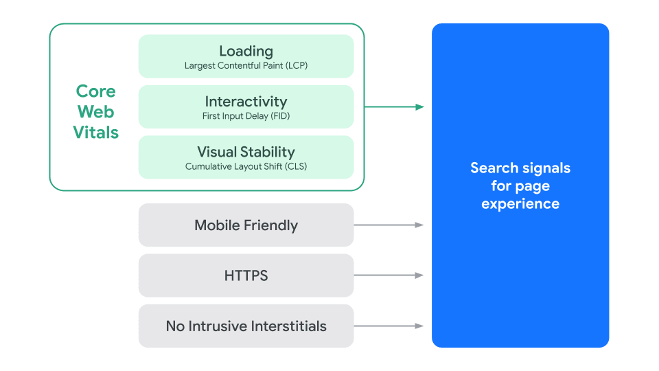
Core Web Vitals Are Important
Though it’s true we have to prioritise the best and most relevant content,
Google still stresses the importance of site speed if you care about rankings:
What’s this phrase page experience that we keep hearing about?
It turns out that Core Web Vitals on their own are not enough. Core Web Vitals
are a subset of the Page Experience
report, and it’s
actually this that you need to pass in order to get a boost in rankings.
In May
2020,
Google announced the Page Experience report, and, a year later, from June to
August
2021,
they rolled it out for mobile. Also in August
2021,
they removed Safe Browsing and Ad Experience from the report, and in February
2022,
they rolled Page Experience out for desktop.
…great page experience involves more than Core Web Vitals. Good stats
within the Core Web Vitals report in Search Console or third-party Core Web
Vitals reports don’t guarantee good rankings.
— Understanding page experience in Google Search results
What this means is we shouldn’t be focusing only on Core Web Vitals, but on
the whole suite of Page Experience signals. That said, Core Web Vitals are quite
a lot more difficult to achieve than being mobile friendly, which is usually
baked in from the beginning of a project.
You Don’t Need to Pass FID
You don’t need to pass First Input Delay. This is because—while all pages will
have a Largest Contentful Paint event at some point, and the ideal Cumulative
Layout Shift score is none at all—not all pages will incur a user interaction.
While rare, it is possible that a URL’s FID data will read Not enough data.
To this end, passing Core Web Vitals means Good LCP and CLS, and Good or Not enough data FID.
The URL has Good status in the Core Web Vitals in both CLS and LCP, and
Good (or not enough data) in FID
— Page Experience report
Interaction to Next Paint Doesn’t Matter Yet
Search Console, and other tools, are surfacing INP already, but it won’t become
a Core Web Vital (and therefore part of Page Experience (and therefore part of
the ranking signal)) until March 2024:
INP (Interaction to Next Paint) is a new metric that will replace FID (First
Input Delay) as a Core Web Vital in March 2024. Until then, INP is not a part
of Core Web Vitals. Search Console reports INP data to help you prepare.
— Core Web Vitals report
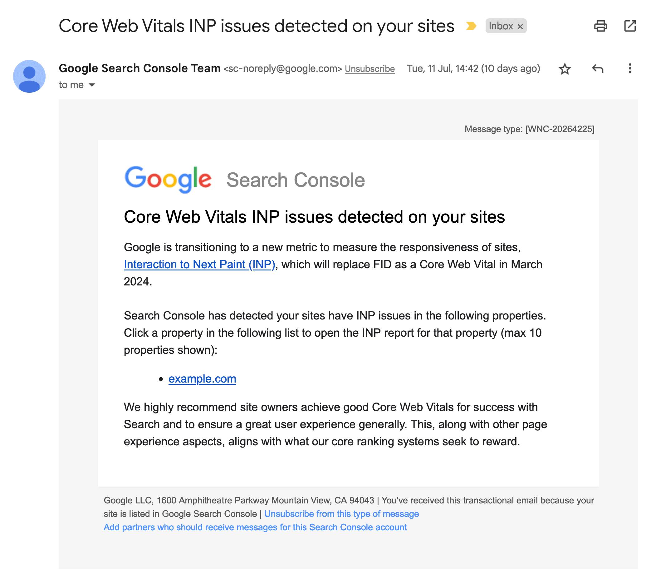
Incidentally, although INP isn’t yet a Core Web Vital, Search Console has
started sending emails warning site owners about INP issues:
Search Console emails have begun warning people about INP issues. Credit: Ryan Townsend.
You don’t need to worry about it yet, but do make sure it’s on your roadmap.
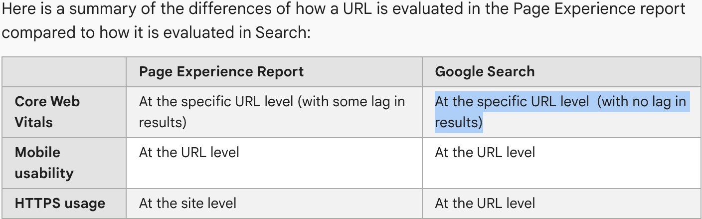
You’re Ranked on Individual URLs
This has been one of the most persistently confusing aspect of Core Web Vitals:
are pages ranked on their individual URL status, or the status of the URL Group
they live in (or something else entirely)?
Google evaluates page experience metrics for individual URLs on your site
and will use them as a ranking signal for a URL in Google Search results.
— Page Experience report
There are also URL Groups and larger groupings of URL data:
If there isn’t enough data for a specific URL Group, Google will fall back to an
origin-level assessment:
If a URL group doesn’t have enough information to display in the report, Search Console creates a higher-level origin group…
— Core Web Vitals report
This doesn’t tell us why we have URL Groups in the first place. How do they
tie into SEO and rankings if we work on a URL- or site-level basis?
My feeling is that it’s less about rankings and more about helping developers
troubleshoot issues in bulk:
URLs in the report are grouped [and] it is assumed that these groups have
a common framework and the reasons for any poor behavior of the group will
likely be caused by the same underlying reasons.
— Core Web Vitals report
URLs are judged on the three Core Web Vitals, which means they could be Good, Needs Improvement, and Poor in each Vital respectively. Unfortunately, URLs
are ranked on their lowest common denominator: if a URL is Good, Good, Poor, it’s marked Poor. If it’s Needs Improvement, Good, Needs
Improvement, it’s marked Needs Improvement:
The status for a URL group defaults to the slowest status assigned to it for
that device type…
— Core Web Vitals report
The URLs that appear in Search Console are non-canonical. This means that https://shop.com/products/red-bicycle and https://shop.com/bikes/red-bicycle
may both be listed in the report even if their rel=canonical both point to the
same location.
Data is assigned to the actual URL, not the canonical URL, as it is in most
other reports.
— Core Web Vitals report
Note that this only discusses the report and not rankings—it is my understanding
that this is to help developers find variations of pages that are slower, and
not to rank multiple variants of the same URL. The latter would contravene their
own rules on canonicalisation:
Google can only index the canonical URL from a set of duplicate pages.
— Canonical
Or, expressed a little more logically, canonical alternative (and noindex)
pages can’t appear in Search in the first place, so there’s little point
worrying about Core Web Vitals for SEO in this case anyway.
Need some of the same?
I’m available for hire to help you out with workshops, consultancy, advice, and development.
Interestingly:
Core Web Vitals URLs include URL parameters when distinguishing the page;
PageSpeed Insights strips all parameter data from the URL, and then assigns
all results to the bare URL.
— Core Web Vitals report
This means that if we were to drop https://shop.com/products?sort=descending
into pagespeed.web.dev, the Core Web Vitals it
presents back would be the data for https://shop.com/products.
Search Console Is Gospel
When looking into Core Web Vitals for SEO purposes, the only real place to
consult is Search Console. Core Web Vitals information is surfaced in a number
of different Google properties, and is underpinned by data sourced from the
Chrome User Experience Report, or CrUX:
CrUX is the official dataset of the Web Vitals program. All user-centric
Core Web Vitals metrics will be represented in the dataset.
— About CrUX
And:
The data for the Core Web Vitals report comes from the CrUX report. The
CrUX report gathers anonymized metrics about performance times from actual
users visiting your URL (called field data). The CrUX database gathers
information about URLs whether or not the URL is part of a Search Console
property.
— Core Web Vitals report
This is the data that is then used in Search to influence rankings:
The data collected by CrUX is available publicly through a number of tools and is used by Google Search to inform the page experience ranking factor.
— About CrUX
The data is then surfaced to us in Search Console.
Search Console shows how CrUX data influences the page experience ranking
factor by URL and URL group.
— CrUX methodology
Basically, the data originates in CrUX, so it’s CrUX all the way down, but it’s
in Search Console that Google kindly aggregates, segments, and otherwise
visualises and displays the data to make it actionable. Google expects you to
look to Search Console to find and fix your Core Web Vitals issues:
This is one of the most pervasive and definitely the most common
misunderstandings I see surrounding site-speed and SEO. Your Lighthouse
Performance scores have absolutely no bearing on your rankings. None whatsoever.
As before, the data Google use to influence rankings is stored in Search
Console, and you won’t find a single Lighthouse score in there.
Frustratingly, there is no black-and-white statement from Google that tells us we do not use Lighthouse scores in ranking, but we can prove the
equivalent quite quickly:
The Core Web Vitals report shows how your pages perform, based on real world
usage data (sometimes called field data).
– Core Web Vitals report
And:
The data for the Core Web Vitals report comes from the CrUX report. The CrUX
report gathers anonymized metrics about performance times from actual users
visiting your URL (called field data).
– Core Web Vitals report
That’s two definitive statements saying where the data does come from: the
field. So any data that doesn’t come from the field is not counted.
PSI provides both lab and field data about a page. Lab data is useful for
debugging issues, as it is collected in a controlled environment. However, it
may not capture real-world bottlenecks. Field data is useful for capturing
true, real-world user experience – but has a more limited set of metrics.
— About PageSpeed Insights
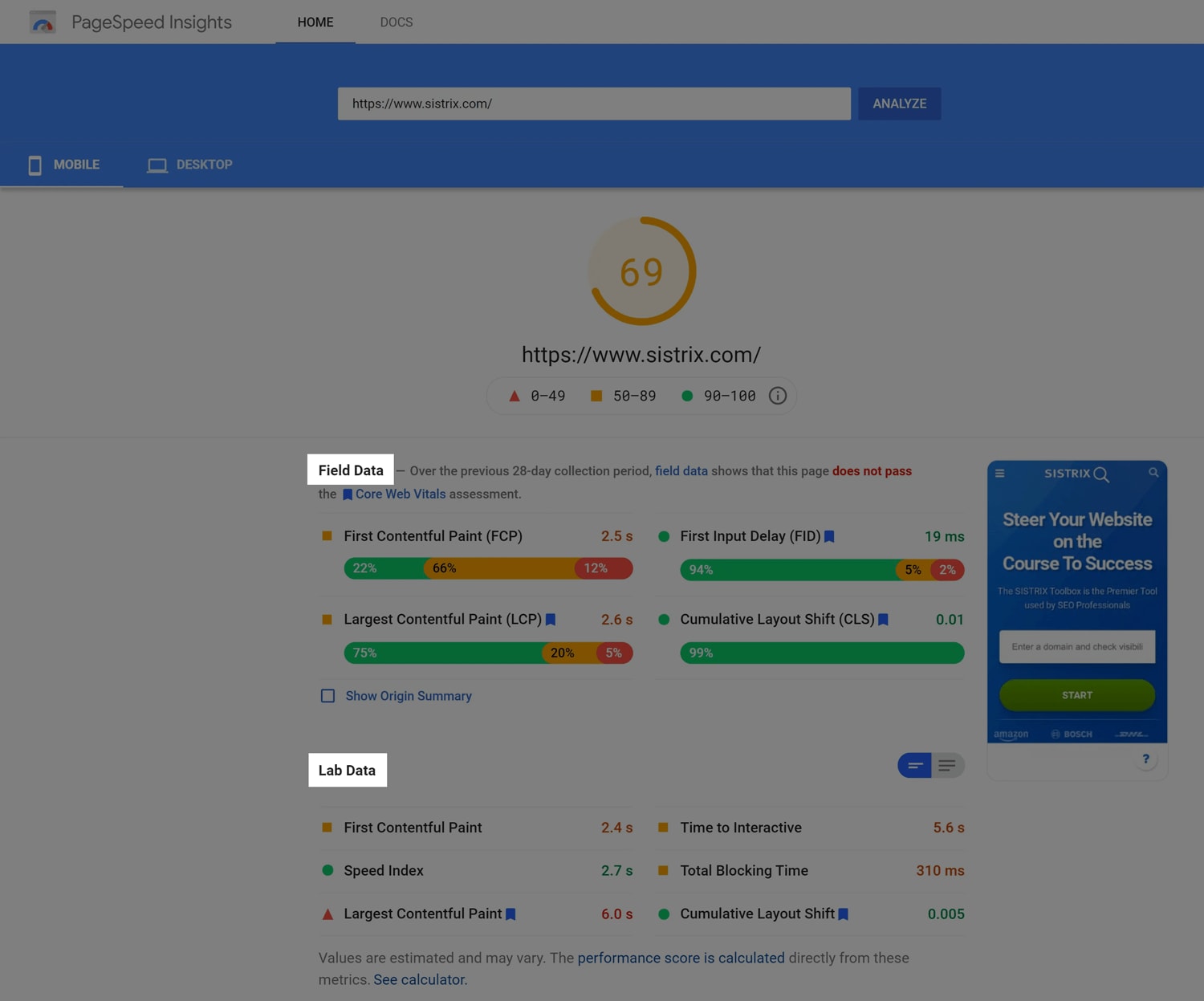
In the past—and I can’t determine the exact date of the following
screenshot—Google used to clearly mark lab and field data in
PageSpeed Insights:
Nowadays, the same data and layout exists, but with much less deliberate
wording. Field data is still presented first:
Here we can see that this data came from CrUX and is based on real, aggregated data.
And lab data, from the Lighthouse test we just initiated, beneath that:
Here we can clearly see that this was run from a predetermined location, on a predetermined device, over a predetermined connection speed. This was one page load run by us, for us.
So for all there is no definitive warning from Google that we shouldn’t factor
Lighthouse Performance scores into SEO, we can quickly piece together the
information ourselves. It’s more a case of what they haven’t said, and nowhere
have they ever said your Lighthouse/PageSpeed scores impact rankings.
On the subject of things they haven’t said…
Failing Pages Don’t Get Penalised
This is a critical piece of information that is almost impressively-well hidden.
Google tell us that the criteria for a Good page experience are:
Passes all relevant Core Web Vitals
No mobile usability issues on mobile
Served over HTTPS
If a URL achieves Good status, that status will be used as a ranking signal in
search results.
Note that this is in contrast to their 2018
announcement which stated that The “Speed Update” […] will only affect
pages that deliver the slowest experience to users… – Speed Update
was a precursor to Core Web Vitals.
This means that failing URLs will not get pushed down the search results page,
which is probably a huge and overdue relief for many of you reading this.
However…
If one of your competitors puts in a huge effort to improve their Page
Experience and begins moving up the search results pages, that will have the net
effect of pushing you down.
Put another way, while you won’t be penalised, you might not get to simply stay
where you are. Which means…
Core Web Vitals Are a Tie-Breaker
Core Web Vitals really shine in competitive environments, or when users aren’t
searching for something that only you could possibly provide. When Google could
rank a number of different URLs highly, it defers to other tanking signals to
refine its ordering.
I’m available for hire to help you out with workshops, consultancy, advice, and development.
There Are No Shades of Good or Failed URLs
Going back to the Good versus Failed columns above, notice that it’s
binary—there are no grades of Good or Failed—it’s just one or the other.
A URL is considered Failed the moment it doesn’t pass even one of the relevant
Core Web Vitals, which means a Largest Contentful Paint of 2.6s is just as bad
as a Largest Contentful Paint of 26s.
Put another way, anything other than Good is Failed, so the actual numbers
are irrelevant.
Mobile and Desktop Thresholds Are the Same
Interestingly, the thresholds for Good, Needs Improvement, and Poor are
the same on both mobile and desktop. Because Google announced Core Web Vitals
for mobile first, the same thresholds on desktop should be achieved
automatically—it’s very rare that desktop experiences would fare worse than
mobile ones. The only exception might be Cumulative Layout Shift in which
desktop devices have more screen real estate for things to move around.
For each of the above metrics, to ensure you’re hitting the recommended target
for most of your users, a good threshold to measure is the 75th percentile of
page loads, segmented across mobile and desktop devices.
— Web Vitals
This does help simplify things a little, with only one set of numbers to
remember.
Slow Countries Can Harm Global Rankings
While Google does segment on desktop and mobile—ranking you on each device type
proportionate to your performance on each device type—that’s as far at they go.
This means that if an experience is Poor on mobile but Good on desktop,
any searches for you on desktop will have your fast site taken into
consideration.
…it does not make its way into Search Console or
any ranking decision:
Remember that data is combined for all requests from all locations. If you
have a substantial amount of traffic from a country with, say, slow internet
connections, then your performance in general will go down.
— Core Web Vitals report
Unfortunately, for now at least, this means that if the majority of your paying
customers are in a region that enjoys Good experiences, but you have a lot of
traffic from regions that suffer Poor experiences, those worse data points may
be negatively impacting your success elsewhere.
iOS (and Other) Traffic Doesn’t Count
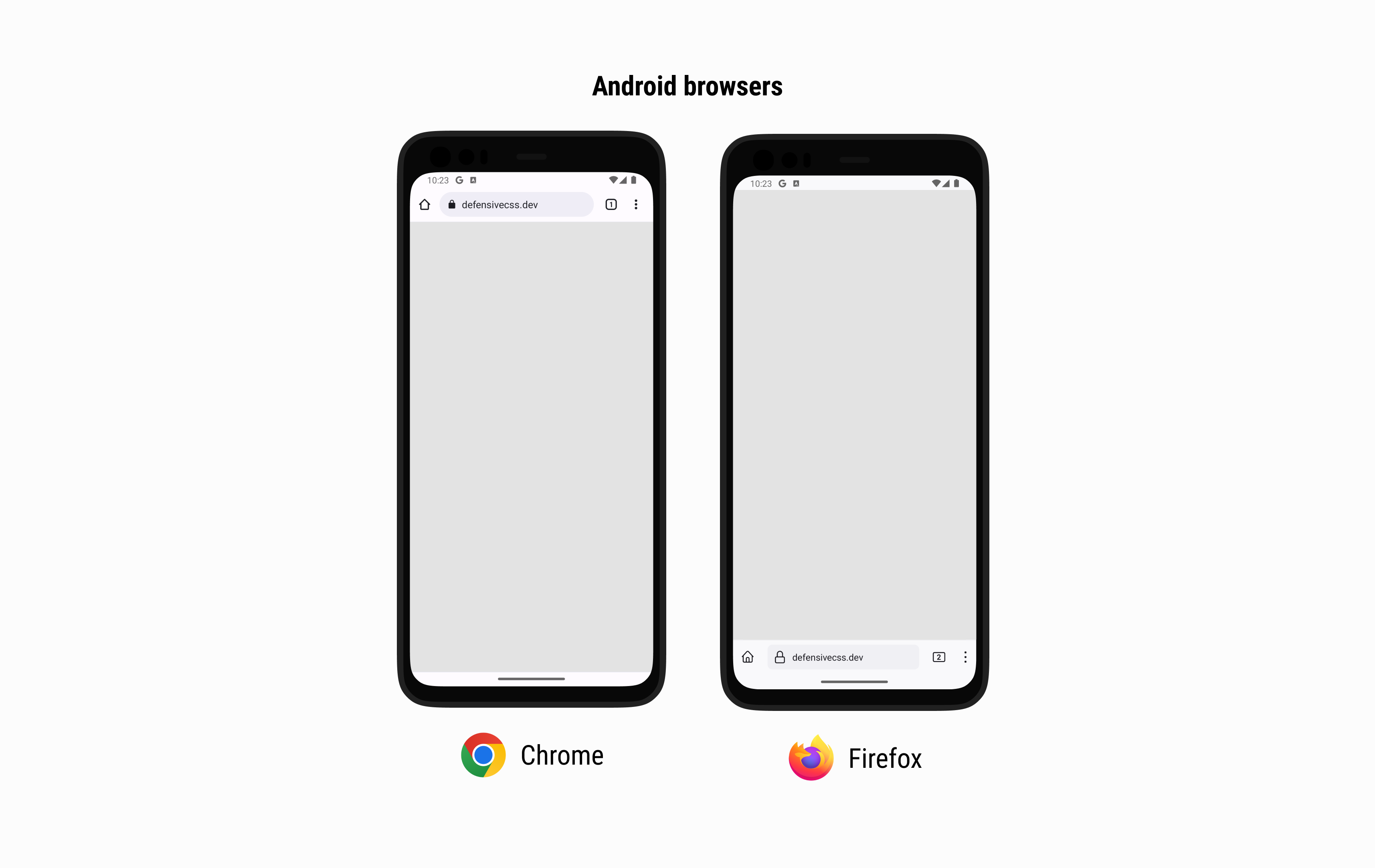
Core Web Vitals is a Chrome initiative—evidenced by Chrome User Experience
Report, among other things. The APIs used to capture the three Core Web Vitals
are available in Blink,
the browser engine that powers Chromium-based browsers such as Chrome, Edge, and
Opera. While the APIs are available to these non-Chrome browsers, only Chrome
currently captures data themselves, and populates the Chrome User Experience
Report from there. So, Blink-based browsers have the Core Web Vitals APIs, but
only Chrome captures data for CrUX.
It should be, hopefully, fairly obvious that non-Chrome browsers such as Firefox
or Edge would not contribute data to the Chrome User Experience Report, but
what about Chrome on iOS? That is called Chrome, after all?
Unfortunately, while Chrome on iOS is a project owned by the Chromium team, the
browser itself does not use Blink—the only engine that can currently capture
Core Web Vitals data:
Due to constraints of the iOS platform, all browsers must be built on top of
the WebKit rendering engine. For Chromium, this means supporting both WebKit
as well as Blink, Chrome’s rendering engine for other platforms.
— Open-sourcing Chrome on iOS!
From Apple themselves:
2.5.6 Apps that browse the web must use the appropriate WebKit framework
and WebKit JavaScript.
— App Store Review Guidelines
Any browser on the iOS platform—Chrome, Firefox, Edge, Safari, you name it—uses
WebKit, and the APIs that power Core Web Vitals aren’t currently available
there:
There are a few notable exceptions that do not provide data to the CrUX
dataset […] Chrome on iOS.
— CrUX methodology
The key takeaway here is that Chrome on iOS is actually WebKit under the hood,
so capturing Core Web Vitals is not possible at all, for developers or for the
Chrome team.
Core Web Vitals and Single Page Applications
If you’re building a Single-Page Application (SPA), you’re going to have to take
a different approach. Core Web Vitals was not designed with SPAs in mind, and
while Google have made efforts to mitigate undue penalties for SPAs, they don’t
currently provide any way for SPAs to shine.
Core Web Vitals data is captured for every page load, or navigation. Because
SPAs don’t have traditional page loads, and instead have route changes, or soft
navigations, they don’t emit a standardised way to tell Google that a page has
indeed changed. Because of this, Google has no way of capturing reliable Core
Web Vitals data for these non-standard soft navigations on which SPAs are built.
The First Page View Is All That Counts
This is critical for optimising SPA Core Web Vitals for SEO purposes. Chrome
only captures data from the first page a user actually lands on:
Each of the Core Web Vitals metrics is measured relative to the current,
top-level page navigation. If a page dynamically loads new content and updates
the URL of the page in the address bar, it will have no effect on how the Core
Web Vitals metrics are measured. Metric values are not reset, and the URL
associated with each metric measurement is the URL the user navigated to that
initiated the page load.
— How SPA architectures affect Core Web Vitals
Subsequent soft navigations are not registered, so you need to optimise every
page for a first-time visit.
What is particularly painful here is that SPAs are notoriously bad at first-time
visits due to front-loading the entire application. They front-load this
application in order to make subsequent page views much faster, which is the one
thing Core Web Vitals will not measure. It’s a lose–lose. Sorry.
The (Near) Future Doesn’t Look Bright
Although Google are experimenting with defining soft navigations, any update or
change will not be seen in the CrUX dataset anytime soon:
As soft navigations are not counted, the user’s landing page appears very long
lived: as far as Core Web Vitals sees, the user hasn’t ever left the first page
they came to. This means Core Web Vitals scores could grow dramatically out of
hand, counting n page views against one unfortunate URL. To help
mitigate these blind spots inherent in not-using native web platform features,
Chrome have done a couple of things to not overly penalise SPAs.
Firstly, Largest Contentful Paint stops being tracked after user interaction:
The browser will stop reporting new entries as soon as the user interacts with
the page.
— Largest Contentful Paint (LCP)
This means that the browser won’t keep looking for new LCP candidates as the
user traverses soft navigations—it would be very detrimental if a new route
loading at 120 seconds fired a new LCP event against the initial URL.
Similarly, Cumulative Layout Shift was modified to be more sympathetic to
long-lived pages (e.g. SPAs):
We (the Chrome Speed Metrics Team) recently outlined our initial research into
options for making the CLS metric more fair to pages that are open for
a long time.
— Evolving the CLS metric
CLS takes the cumulative shifts in the most extreme five-second window, which
means that although CLS will constantly update throughout the whole SPA
lifecycle, only the worst five-second slice counts against you.
These Mitigations Don’t Help Us Much
No such mitigations have been made with First Input Delay or Interaction to Next
Paint, and none of these mitigations change the fact that you are effectively
only measured on the first page in a session, or that all subsequent updates to
a metric may count against the first URL a visitor encountered.
Solutions are:
Move to an MPA. It’s probably going to be faster for most use cases
anyway.
Optimise heavily for first visits. This is Core Web Vitals-friendly, but
you’ll still only capture one URL’s worth of data per session.
Cross your fingers and wait. Work on new APIs is promising, and we can
only hope that this eventually gets incorporated into CrUX.
We Don’t Know How Much Core Web Vitals Help
Historically, Google have never typically told us what weighting they give to
each of their ranking signals. The most insight we got was back in their 2010
announcement:
While site speed is a new signal, it doesn’t carry as much weight as the
relevance of a page. Currently, fewer than 1% of search queries are affected
by the site speed signal in our implementation and the signal for site speed
only applies for visitors searching in English on Google.com at this point. We
launched this change a few weeks back after rigorous testing. If you haven’t
seen much change to your site rankings, then this site speed change possibly
did not impact your site.
— Using site speed in web search ranking
Measuring the Impact of Core Web Vitals on SEO
To the best of my knowledge, no one has done any meaningful study about just how
much Good Page Experience might help organic rankings. The only way to really
work it out would be take some very solid baseline measurements of a set of
failing URLs, move them all into Good, and then measure the uptick in organic
traffic to those pages. We’d also need to be very careful not to make any other
SEO-facing changes to those URLs for the duration of the experiment.
Anecdotally, I do have one client that sees more than double average
click-through rate—and almost the same improvement in average position—for Good Page Experience over the site’s average. For them, the data suggests that Good Page Experience is highly impactful.
So, What Do We Do?!
Search is complicated and, understandably, quite opaque. Core Web Vitals and SEO
is, as we’ve seen, very intricate. But, my official advice, at a very high
level is:
Keep focusing on producing high-quality, relevant content and work on
site-speed because it’s the right thing to do—everything else will follow.
Faster websites benefit everyone: they convert better, they retain better,
they’re cheaper to run, they’re better for the environment, and they rank
better. There is no reason not to do it.
If you’d like help getting your Core Web Vitals in order, you can hire
me.
Need some of the same?
I’m available for hire to help you out with workshops, consultancy, advice, and development.
Sources
For this post, I have only taken official Google publications into account.
I haven’t included any information from Google employees’ Tweets, personal
sites, conference talks, etc. This is because there is no expectation or
requirement for non-official sources to edit or update their content as Core Web
Vitals information changes.
Along the journey of building a great design system, let’s talk about what you need to know.
STEP 1. Review the existing components
Skills ✅ User Need Analysis ✅ Organization
Firstly, we want to understand what’s out there for your product (design system) to serve. We look at the company’s product screen by screen and list out all the existing components.
Take the medium page as an example, I took a screenshot and label the components on the screen.
Components Review on Medium Page, illustration by Jean Huang
The process can be tedious but it pays off later. In this step, be sure to pay attention to the below.
The components
Their categories
Their quantities
The importance (or factors based on company strategy for prioritization later)
Design inconsistencies
STEP 2. Research
Skills ✅ Market Research
There are tons of design systems for us to learn from. They can focus on components based…
from Design Systems on Medium https://medium.com/@jean-huang/why-your-design-system-needs-a-product-manager-e25c0afb9a1
Scroll-driven animations are a way to add interactivity and visual interest to your website or web application, triggered by the user’s scroll position. This can be a great way to keep users engaged and make your website more visually appealing.
In the past, the only way to create scroll-driven animations was to respond to the scroll event on the main thread. This caused two major problems:
Scrolling is performed on a separate process and therefore delivers scroll events asynchronously.
This makes creating performant scroll-driven animations that are in-sync with scrolling impossible or very difficult.
We are now introducing a new set of APIs to support scroll-driven animations, which you can use from CSS or JavaScript. The API tries to use as few main thread resources as possible, making scroll-driven animations far easier to implement, and also much smoother. The scroll-driven animations API is currently supported in the following browsers:
This article compares the new approach with the classic JavaScript technique to show just how easy and silky-smooth scroll-driven animations can be with the new API.
The following example progress bar is built using class JavaScript techniques.
The document responds each time the scroll event happens to calculate how much percentage of the scrollHeight the user has scrolled to.
document.addEventListener("scroll",()=>{ var winScroll = document.body.scrollTop || document.documentElement.scrollTop; var height = document.documentElement.scrollHeight - document.documentElement.clientHeight; var scrolled =(winScroll / height)*100; document.getElementById("progress").style.width = scrolled +"%"; })
The following demo shows the same progress bar using the new API with CSS.
animation: grow-progress auto linear forwards; animation-timeline:scroll(block root); }
The new animation-timeline CSS feature, automatically converts a position in a scroll range into a percentage of progress, therefore doing all the heavy-lifting.
Now here’s the interesting part—let’s say that you implemented a super-heavy calculation on both versions of the website that would eat up most of the main thread resources.
functionsomeHeavyJS(){ let time =0; window.setInterval(function(){ time++; for(var i =0; i <1e9; i++){ result = i; } console.log(time) },100); }
As you might have expected, the classic JavaScript version becomes janky and sluggish due to the main thread resources junction. On the other hand, the CSS version is completely unaffected by the heavy JavaScript work and can respond to the user’s scroll interactions.
The CPU usage is completely different in DevTools, as shown in the following screenshots.
The following demo shows an application of scroll driven animation created by CyberAgent. You can see that the photo fades in as you scroll.
The benefit of the new API is not only limited to CSS. You are able to create silky smooth scroll-driven animations using JavaScript as well. Take a look at the following example:
This enables you to create the same progress bar animation shown in the previous CSS demo using just JavaScript. The underlying technology is the same as the CSS version. The API tries to use as few main thread resources as possible, making the animations far smoother when compared to the classic JavaScript approach.
You can check out the different implementations of scroll driven animation via this demo site, where you can compare demos using these new APIs from CSS and JavaScript.
If you are interested in learning more about the new scroll-driven animations, check out this article and the I/O 2023 talk!
from Chrome Developers https://developer.chrome.com/blog/scroll-animation-performance-case-study/
We have been using CSS viewport units since 2012. They are useful to help us in sizing elements based on the viewport width or height.
However, using the vh unit on mobile is buggy. The reason is that the viewport size won’t include the browser’s address bar UI.
To solve that, we now have new viewport units. Let’s find out about them in this article.
CSS viewport units
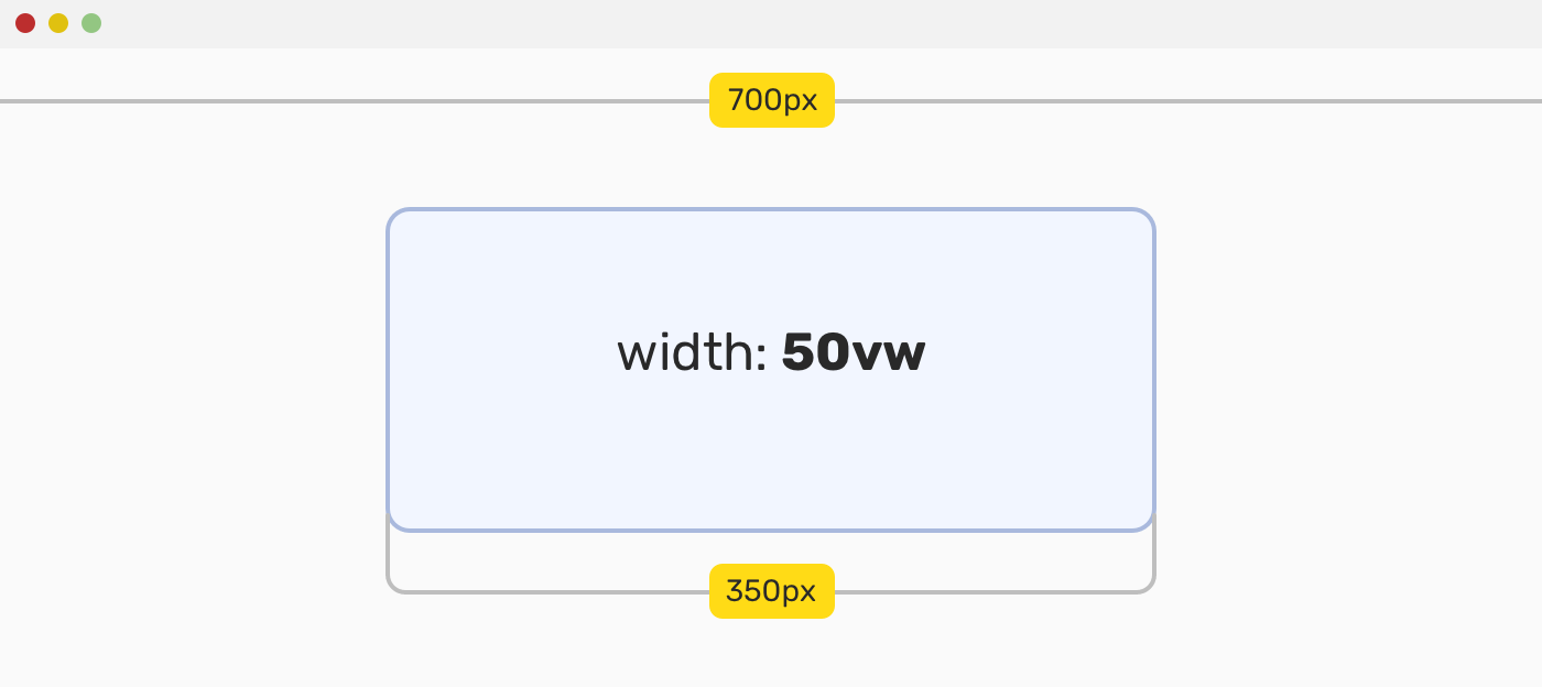
For example, when we need to size an element against the viewport size. The viewport units are vw, vh, vmin, and vmax.
Consider the following figure:
The value 50vw means: to give the element a width equal to 50% of the viewport width.
If you want to learn more, I wrote a detailed article on viewport units.
The problem
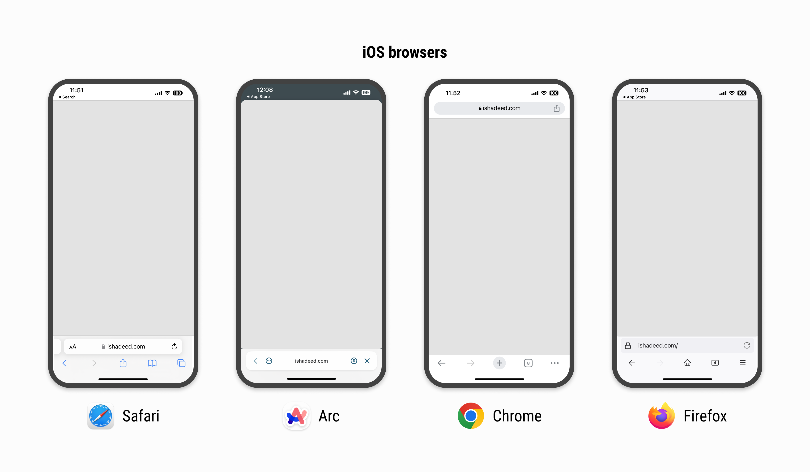
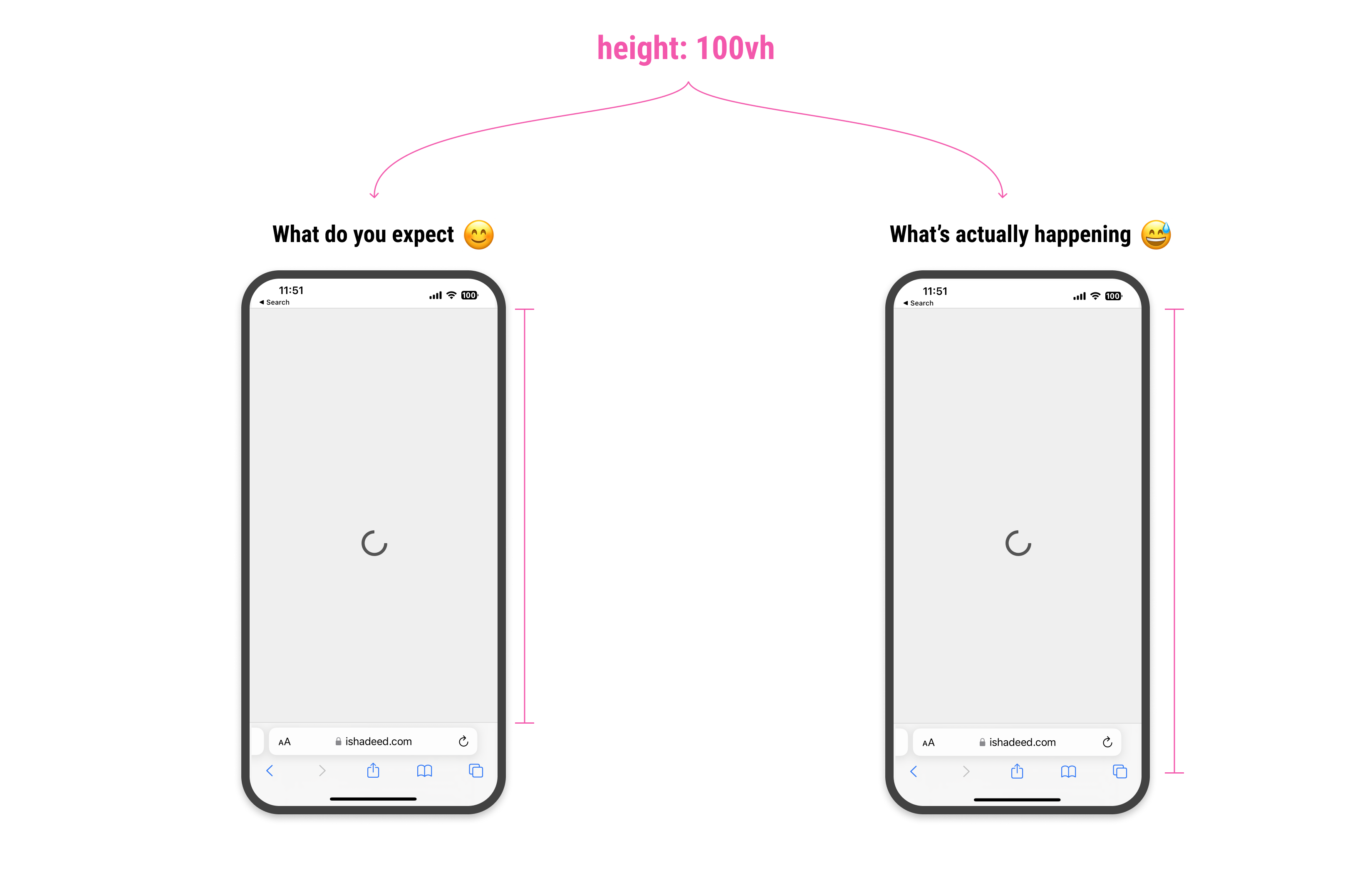
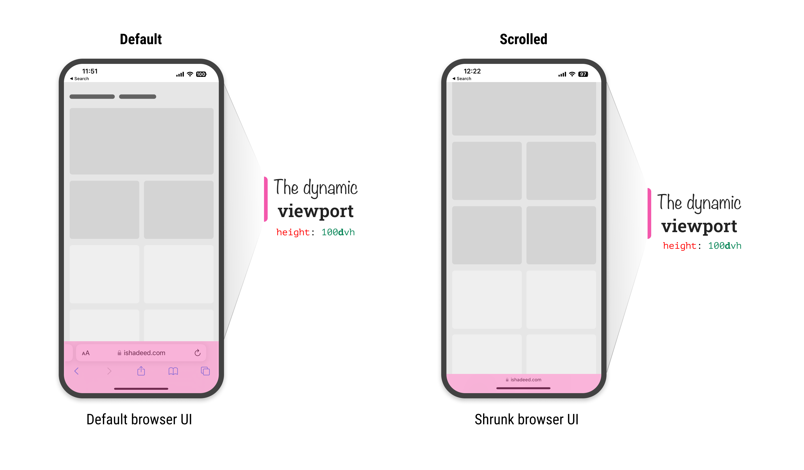
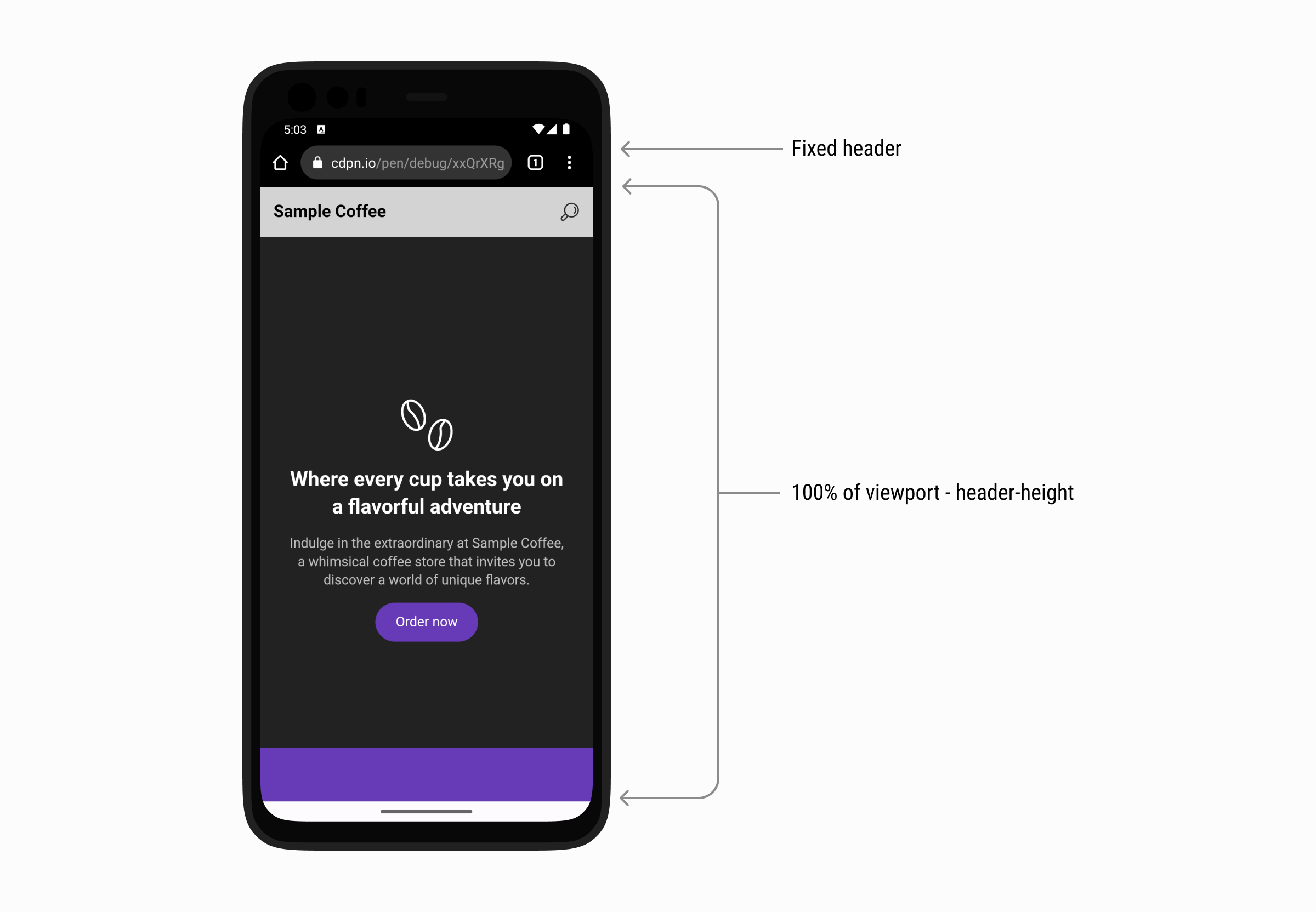
When using 100vh to size an element to take the full height of the viewport on mobile, it will be larger than the space between the top and bottom bars. This will happen in browsers that shrink their UI on scrolling, such as Safari or Chrome on Android.
Here is a figure that shows how each mobile browser has a different UI for the top and bottom UI.
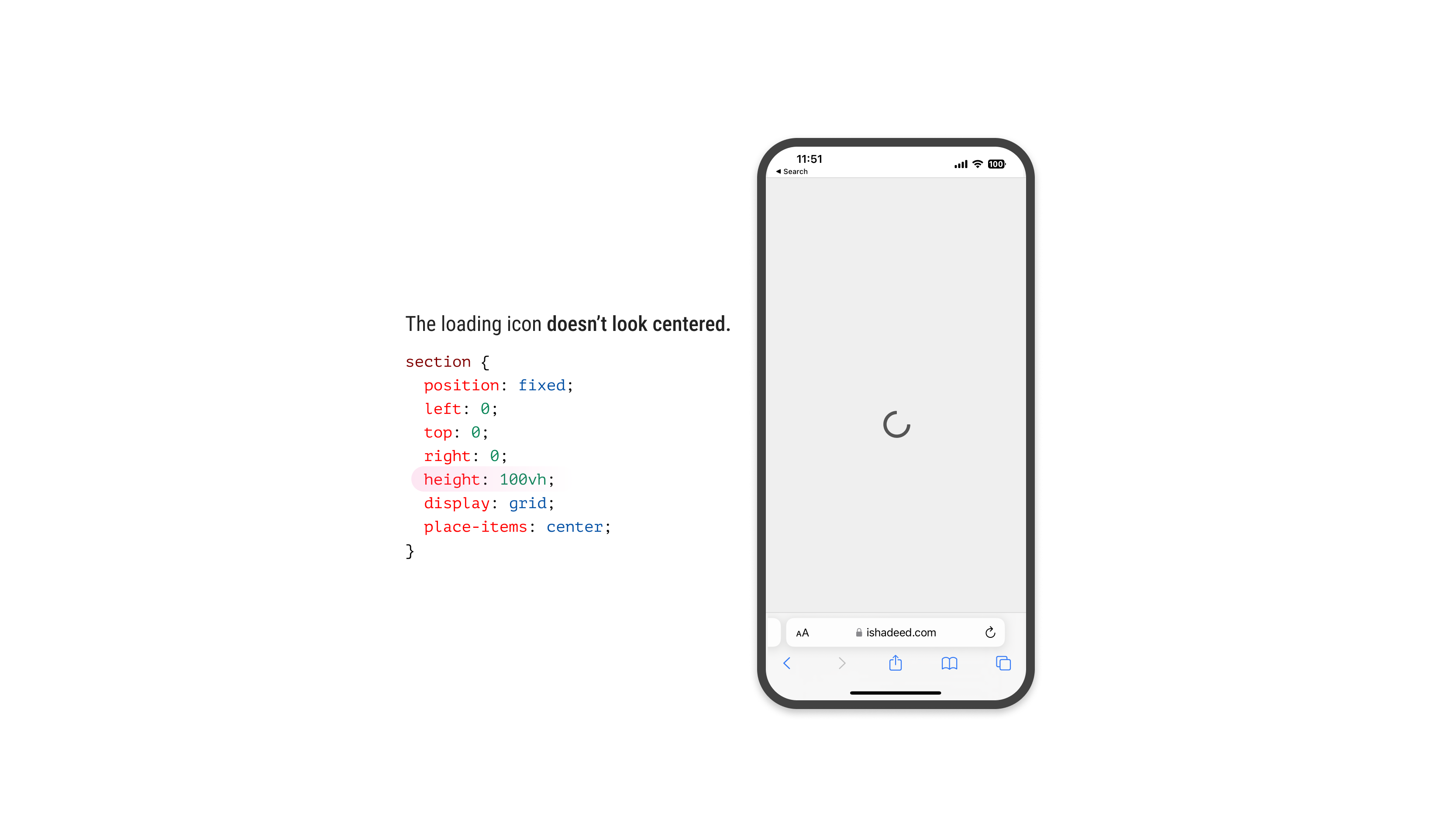
Suppose that we have a loading view that fills the whole screen.
/* I know that we can use bottom: 0 instead of height: 100vh, but this is to intentionally highlight the issue. */.loading-wrapper{position:fixed;left:0;right:0;top:0;height:100vh;display:grid;place-items:center;}
Consider the following figure:
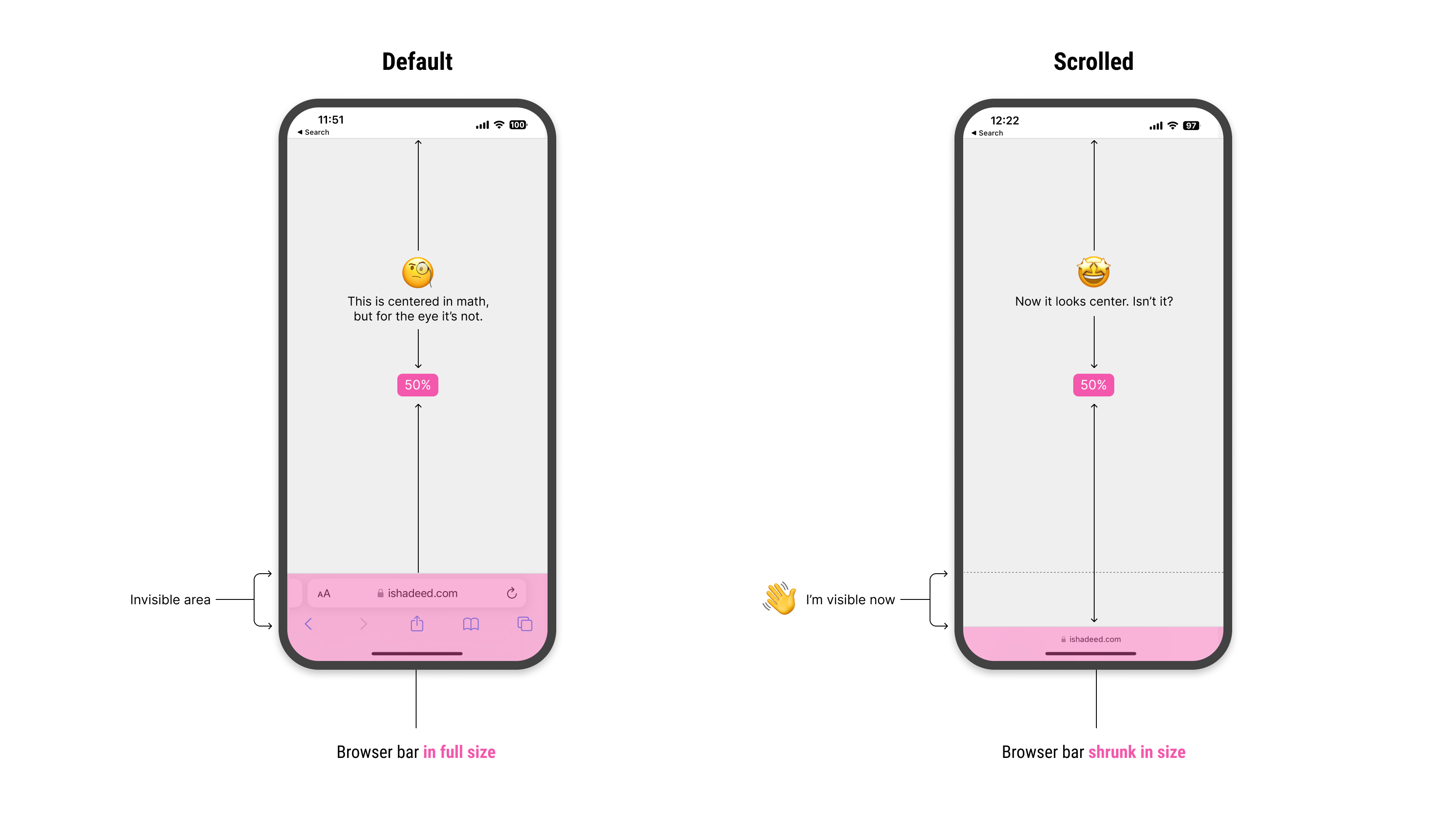
The loading icon is centered in CSS, but visually, it looks like it’s positioned slightly to the bottom. Why is that happening?
For the browser, height: 100vh means that the element will fill the viewport height, but it won’t calculate the computed value dynamically. That means the bottom address and toolbar won’t be calculated.
Because of that, we have an expectation that 100vh will be equal from the top of the viewport to the start of the address bar UI.
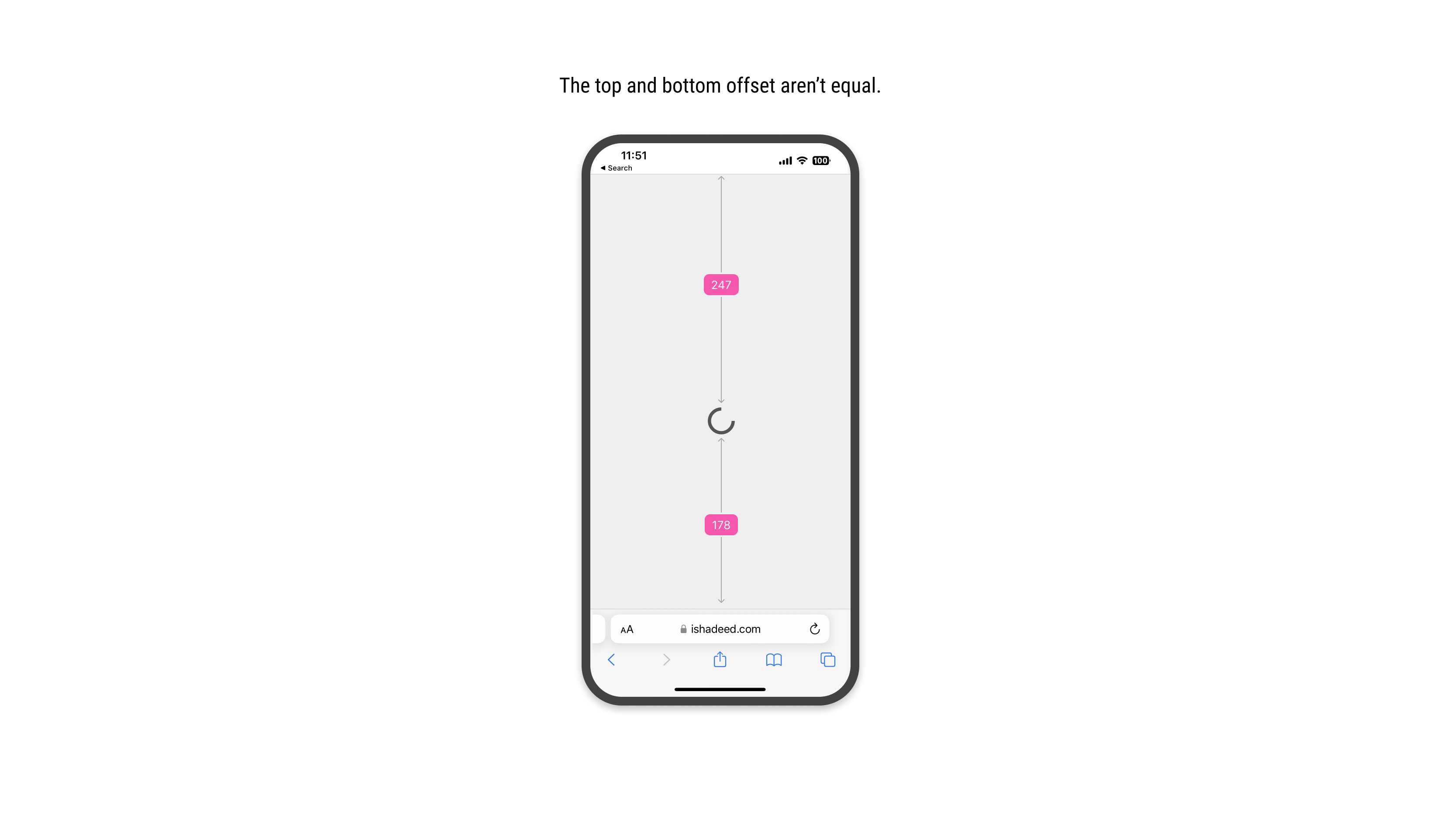
When we scroll down, the address bar UI will shrink its size. This is good, as it gives the user more vertical space to browse the page. At the same time, it’s breaking the UI somehow.
In the following figure, the center of the vertical space is off when the address bar is visible. When scrolling, it looks fine.
Notice how I highlighted the invisible area. When scrolled down, it become visible. How to deal with that in CSS?
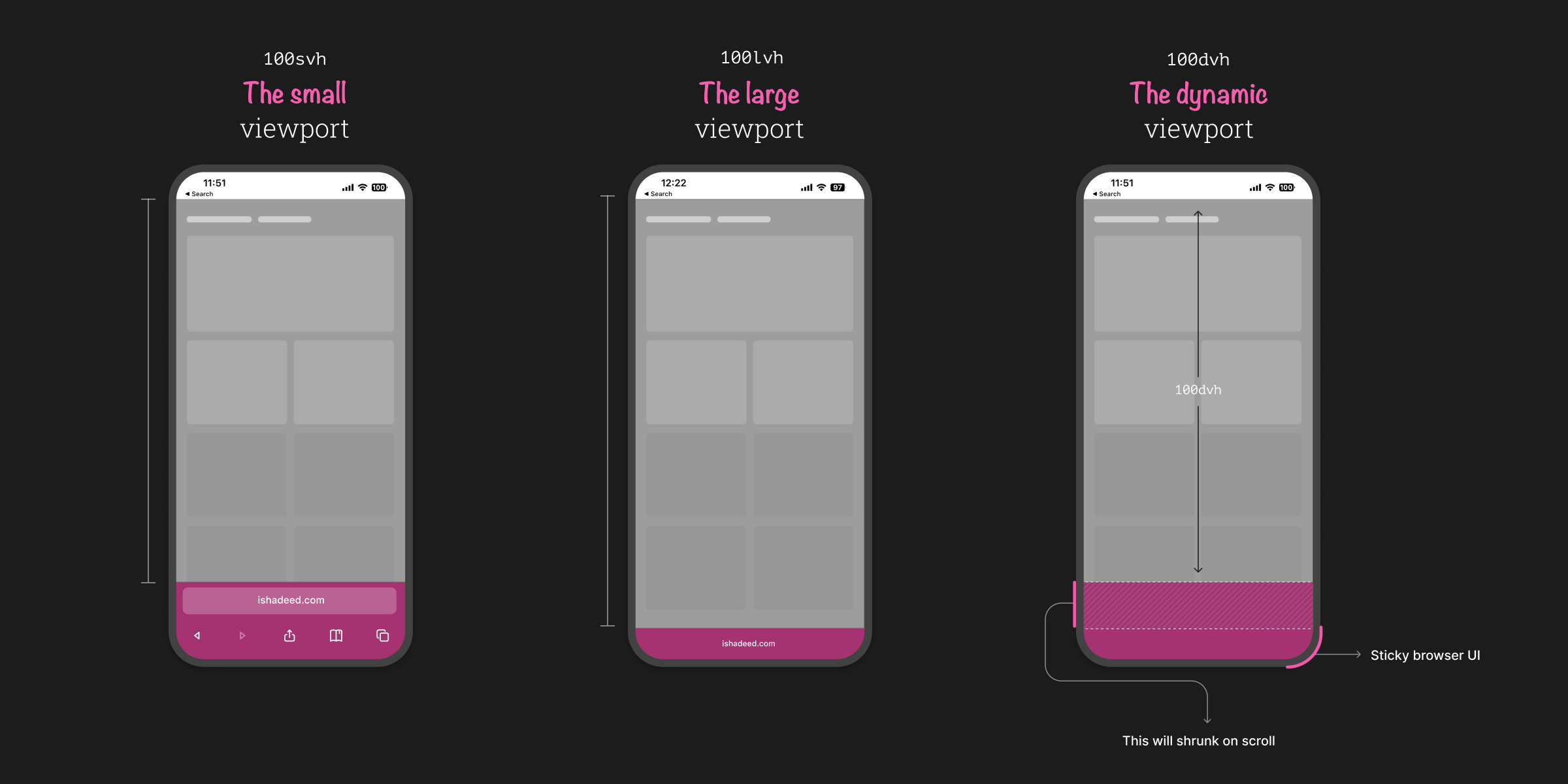
The small, large, and dynamic viewport units
To solve that, the CSS working group agreed on having a new set of units: svh, lvh, and dvh. They stand for the small, large, and dynamic viewport, respectively.
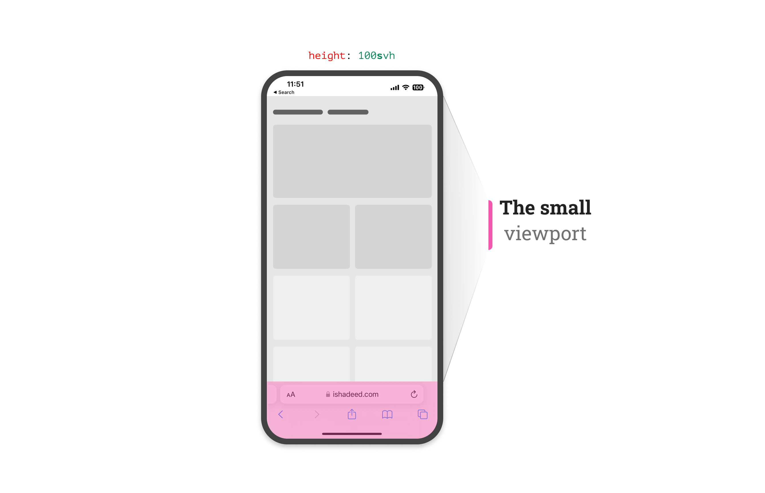
The small viewport
The svh represents the viewport height when the address bar UI hasn’t shrunk its size yet.
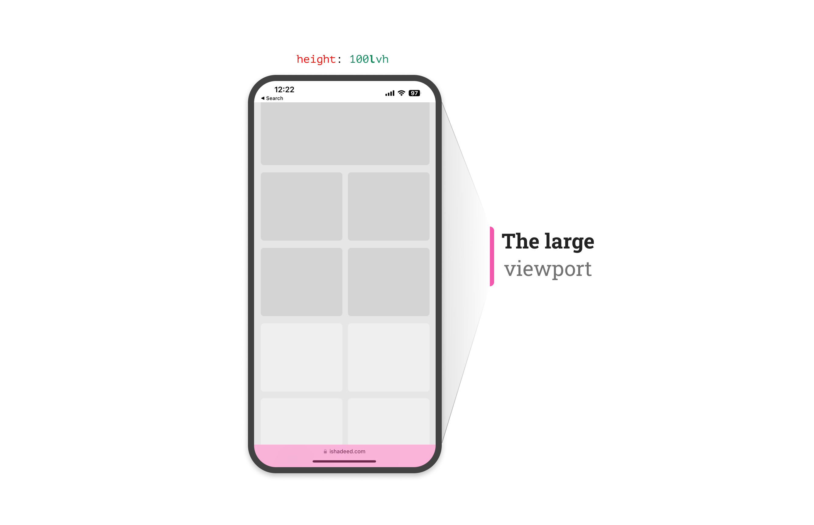
The large viewport
The lvh represents the viewport height after the address bar UI shrunk its size.
The dynamic viewport
From its name, this unit is dynamic. That means it will use any of the small, in-between, and large units based on whether the address bar UI is shrunk or not.
During the initial scroll, the dynamic viewport unit will change as the browser UI will shrunk. Here is a video that shows how the dynamic viewport changes:
Use cases and examples
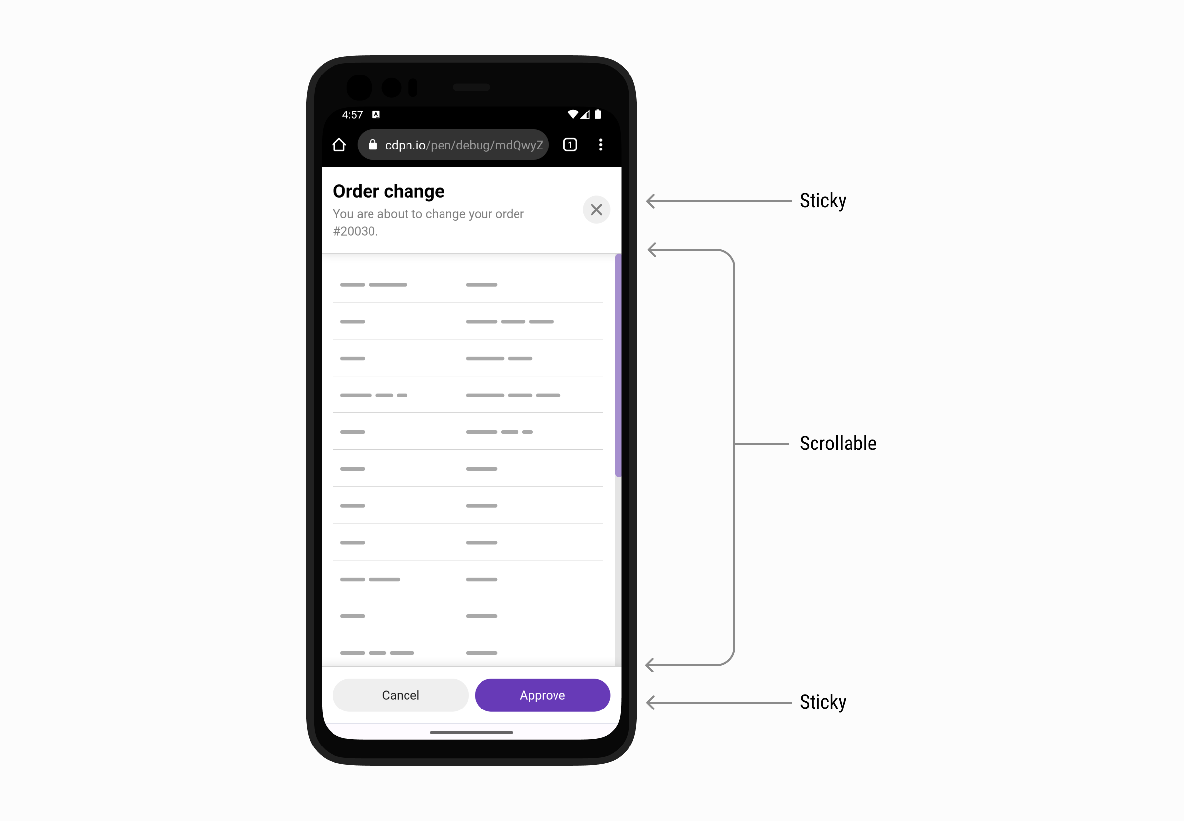
Modal with sticky header and footer
In this example, we have a modal with a sticky header and footer. The middle part should scroll if the content is long enough. This example is inspired by a figure by Max Schmitt while researching the topic.
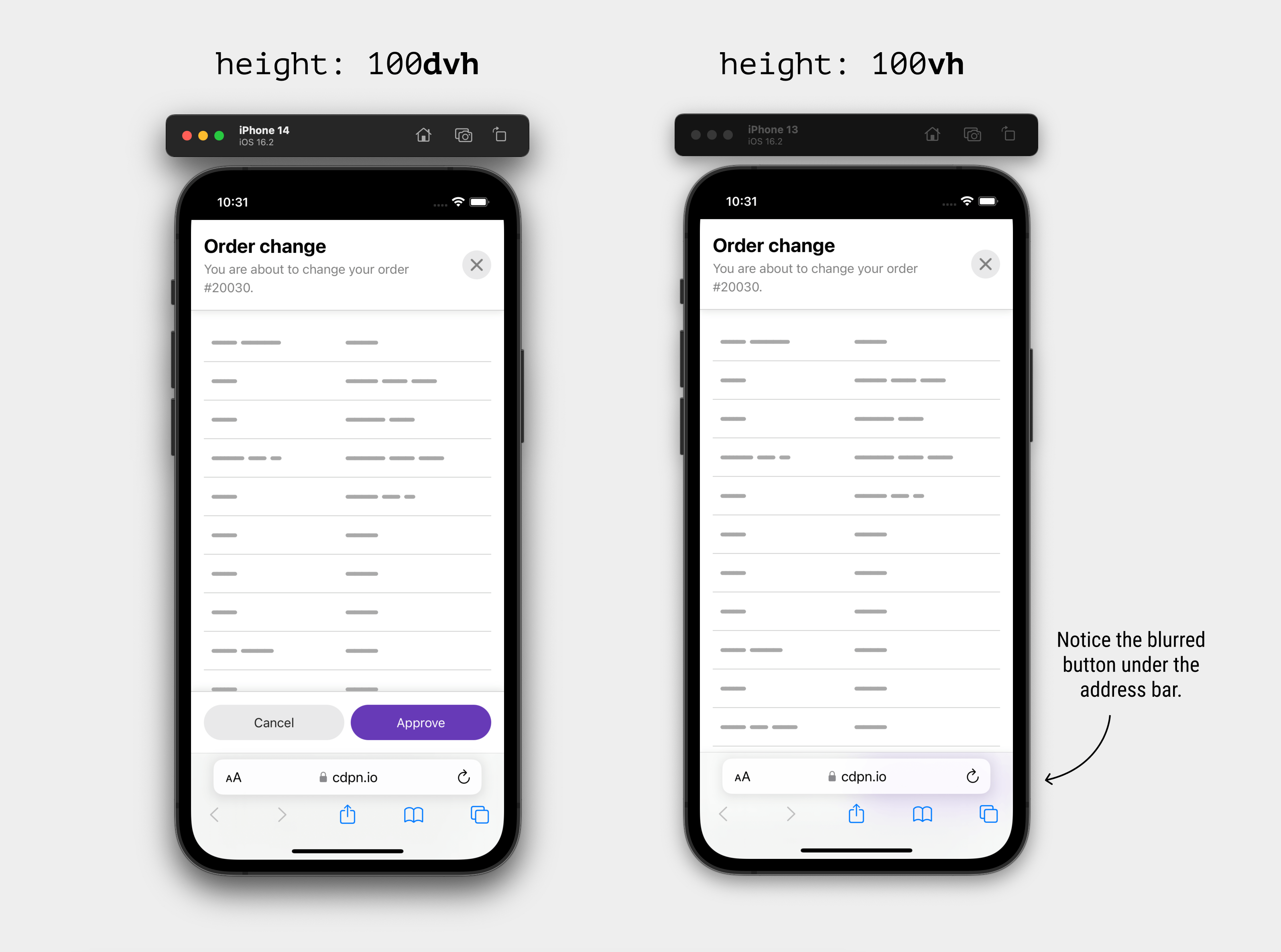
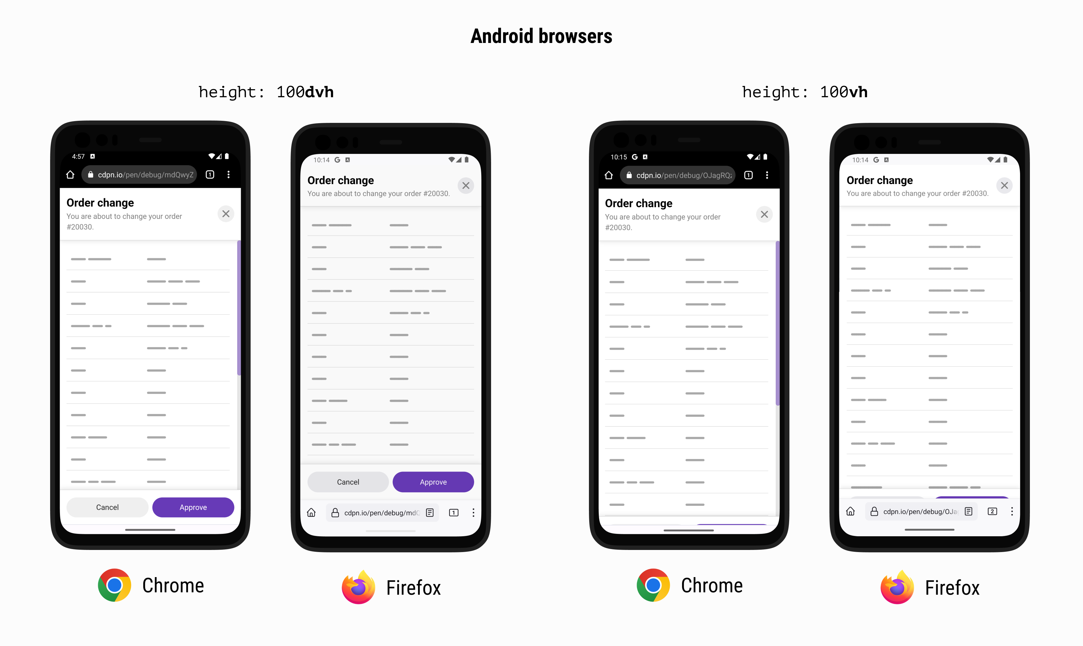
Using 100vh will make the bottom part of the modal invisible. In the example, that means the footer won’t be visible and this will break the UX.
Here is how it looks with traditional and new viewport units on iOS:
..plus Chrome and Firefox on Android:
To solve that, we can either use svh or the dvh units.
Here is a video that shows the differences between dvh and vh.
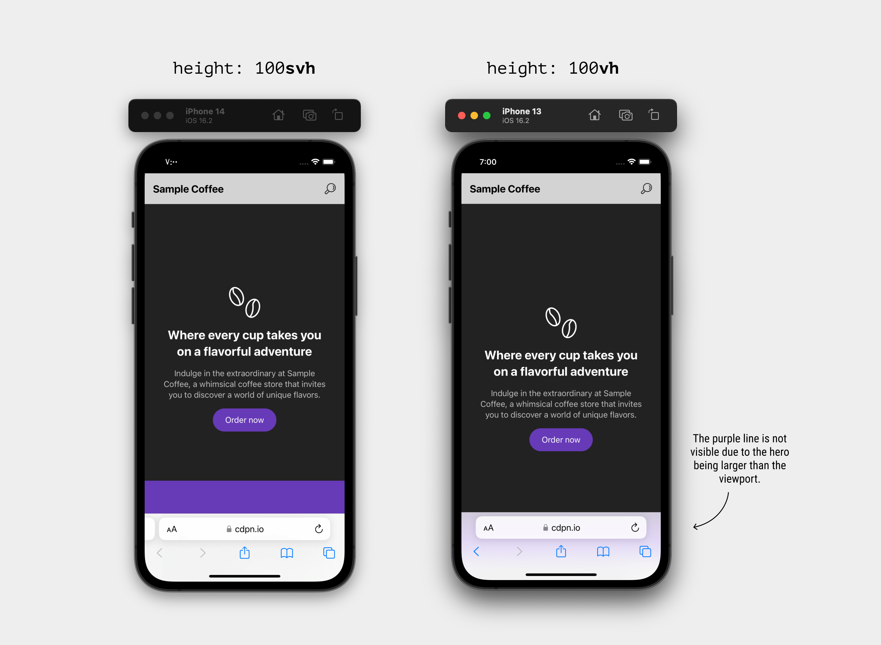
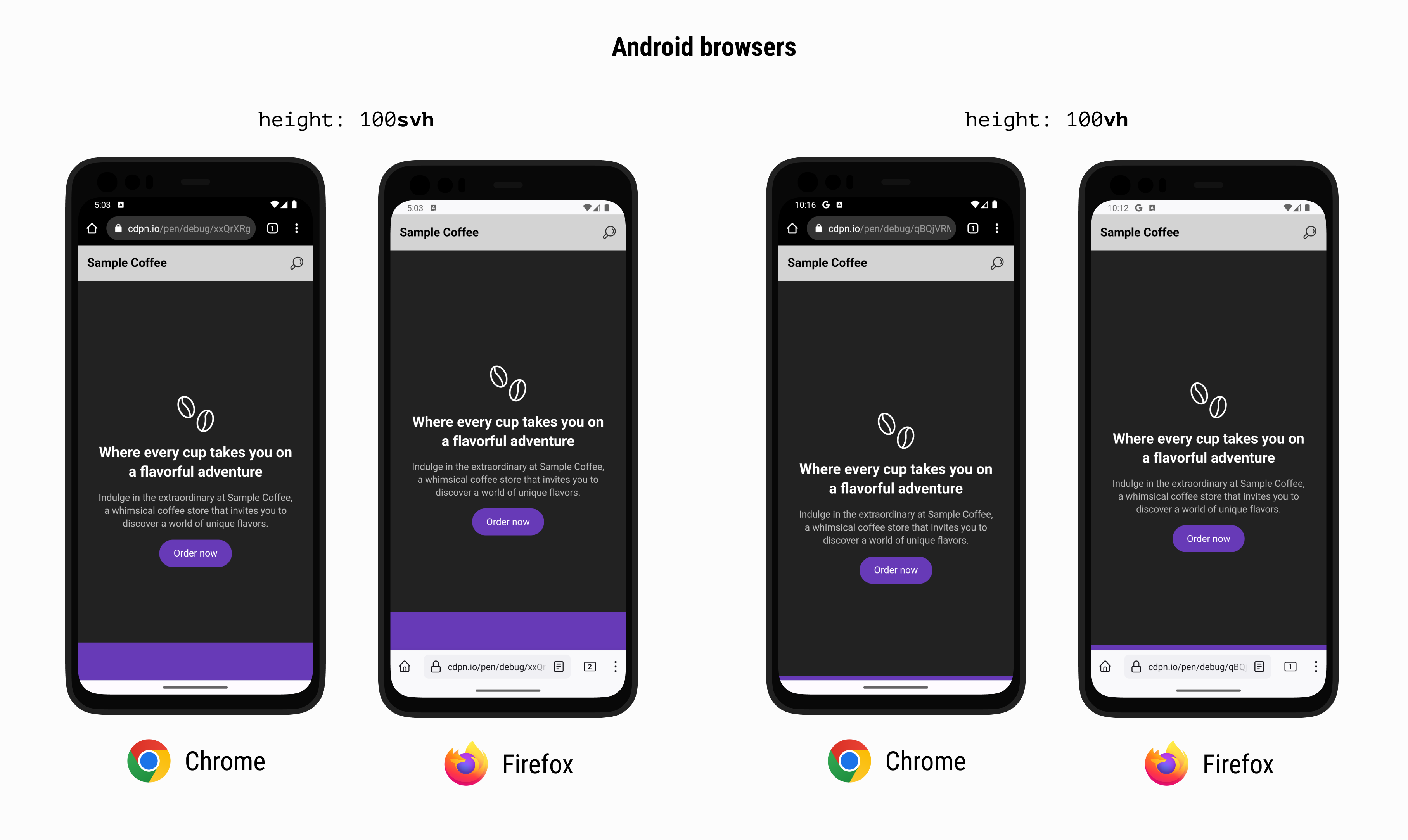
Hero section
It’s a common case that we need to make the hero section height equal to the full viewport height minus the header height. Using the traditional vh for that case will fail in a browser that shrinks its UI on scrolls like iOS Safari and Firefox and Chrome for Android.
First, we need to make sure that the header height is fixed. I used min-height for that.
When using vh, the decorative element (in purple) isn’t visible at all. In fact, if you look closer, it’s blurred underneath the address bar UI in iOS Safari and cropped in Android browsers.
Here is a comparison between svh and vh on Safari iOS.
..plus Chrome and Firefox on Android:
See the following video and spot the difference between using svh and vh.
In such a case, using svh will solve the problem.
Is it possible to make dvh the default unit?
At first, the answer was “Yes, why not?”. Then I thought to myself, the dvh value will change as you scroll, so it might create a confusing experience when used for stuff like font-size.
h1{font-size:calc(1rem+5dvh);}
Check out the following video and notice how the font-size change after the address bar UI is shrunk:
The dynamic viewport unit might impact the performance of the page, as it will be a lot of work for the browser to recalculate the styles which the user is scrolling up or down.
I didn’t get the chance to do intensive performance testing, but I would be careful when using it. I hope that I will get the time to update on that here.
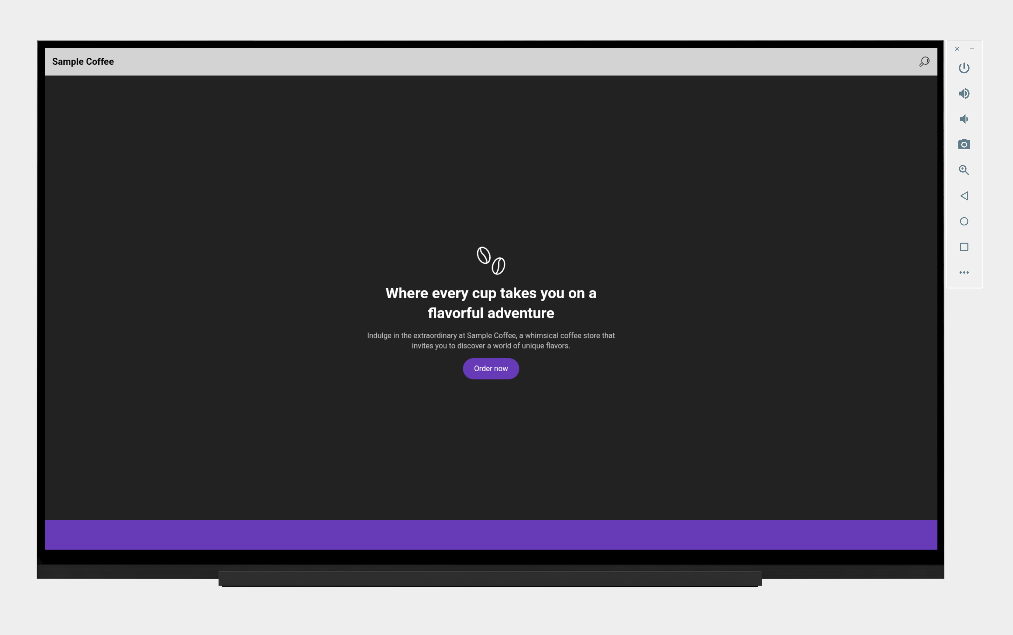
Other places where the new viewport units are useful
Those new viewport units might not be only about mobile browsers. In fact, you can browse the web on a TV today. Who knows what browser will come for a TV that has a UI that changes on scrolling and thus resize the viewport?
For example, here is the hero section example viewed on an Android TV:
It works perfectly and will keep working even if we have a dynamic UI.
Go from basic to a more advanced content strategy with Azeem in this Whiteboard Friday episode. Diversify your content strategy by creating the right content for your audience at the right time.
Click on the whiteboard image above to open a high resolution version in a new tab!
Video Transcription
Hi, everyone. My name is Azeem. I’m the host of the “Azeem Digital Asks” podcast, and I’m here to show you a very brief whistle-stop tour of how you can diversify your content strategy on this Whiteboard Friday.
3 examples of where marketers get measurement wrong
So I’m going to start off and make a very bold statement as a bald man and say that I think that we, as marketers, get measurement wrong, and I’m going to give you three examples here.
So if you are measuring brand awareness, for example, there are a number of things that you can measure, such as downloads, traffic, referrals, mentions. If you look at engagement as a key KPI, you’ll be looking at things like links, likes, comments, shares, retweets, all that sort of stuff. For lead gen, you’re typically looking at MQL, SQL, subscriptions, and call backs. So it’s three very quick examples of how I think we get measurement wrong.
Create an advanced content strategy
When it comes to our audience, I think we know what they want, but we don’t know how they want it, and I genuinely think that the internet is in a position now where hit and hope with just purely written content doesn’t work anymore. I genuinely think the internet has moved on. So I’m going to show you a very brief way of how you can take your content strategy from basic to even better to hopefully advanced, and that starts with this.
I think a lot of marketers are in the basic section, and that is where you have a particular topic, topic X as I’ve listed there, and that is your framework for the rest of your content. So if you were talking about trees, for example, you might have trees as your topic, and that would be the framework to branch out and create even more of topic around trees to move on.
That’s fine. That’s where I think a lot of marketers are. The better version would be looking at UA, universal analytics or multi-channel funnels, understanding what performs well, and creating more content of that based on where your audience is in the purchase journey. Then the advanced version would be looking into GA4, splitting out your top five markets as I’ve put there, understanding how they perform with a data-driven attribution model, and creating the right content for the audience at the right time, the Holy Grail of what we are trying to achieve here.
How to use this information
I’ll give you four examples of how you can actually use this information and take it away, and literally from tomorrow you can be able to improve your content strategy. So example 1 would be let’s say you have set up scroll tracking and YouTube view measurements on your GA4. Layer the two together.
You can understand how, for example, your audience in France will be engaging with your content in the sense of how far do they scroll down on a page and how much of your videos on your page they are watching. Example 1 would be a particular audience that scrolls not a lot, but engages with video quite a lot. In which case, I would introduce very early on in the page long-form videos.
You know what your audience wants. Don’t make them work for it. Don’t make them scroll down the page, because you know what they want. Make it as simple for your audience as possible. Example 2 would be the opposite, where you know your audience will scroll quite a lot, but you know that they won’t watch the videos that you put on the page. In which case, you can create highly-detailed content and then utilize remarketing to bring them back to your website.
The third example would be if you have an average scroll and an average video time, but a high ASD, which I have peddled as average settle duration. These are people that I call page hoppers. They’re very likely going to be in the research stage of their journey, of their purchase journey. So this is where you want to focus on your brand and why you stand out against the rest of your competition.
The fourth example would be people who don’t scroll and don’t watch your videos at all. I think in that situation you’ve very clearly got a disconnect, but there is still an opportunity for you to introduce short-form videos earlier on in the purchase journey. Utilize this information, find out which one of the four you sit in, and use that to create your content strategy in a more diverse way by including audio, snippets, video teases of varying different formats, and I guarantee you’ll be onto a winner and have more success with your content strategies moving forward.
I hope that in this very short video you’ve taken something away. You can find me on social media @AzeemDigital. If my SEO is any good, you should be able to type in “how can I contact Azeem” and you’ll come across my website. Very much enjoyed being here. Thank you for having me, and I’ll see you soon.
Azeem will be speaking at MozCon 2023 this August in Seattle! Join us for inspiring sessions with our incredible lineup of speakers.
We hope you’re as excited as we are for August 7th and 8th to hurry up and get here. And again, if you haven’t grabbed your ticket yet and need help making a case we have a handy template to convince your boss!