Exploring the reasons for Design Thinking criticism

Design thinking has been called revolutionary, a “failed experiment,” and a set of buzzwords. While contradictory, these statements shed light on the increasing criticism of design thinking.

Design Thinking

If you aren’t familiar with design thinking, Tim Brown, CEO of design consultancy IDEO, defines it as “a human-centered approach to innovation that draws from the designer’s toolkit to integrate the needs of people, the possibilities of technology, and the requirements for business success.”

Fundamentally, design thinking is applying the same process designers have used for decades to make everything from cars, appliances, and digital products to business strategy and other large system problems.

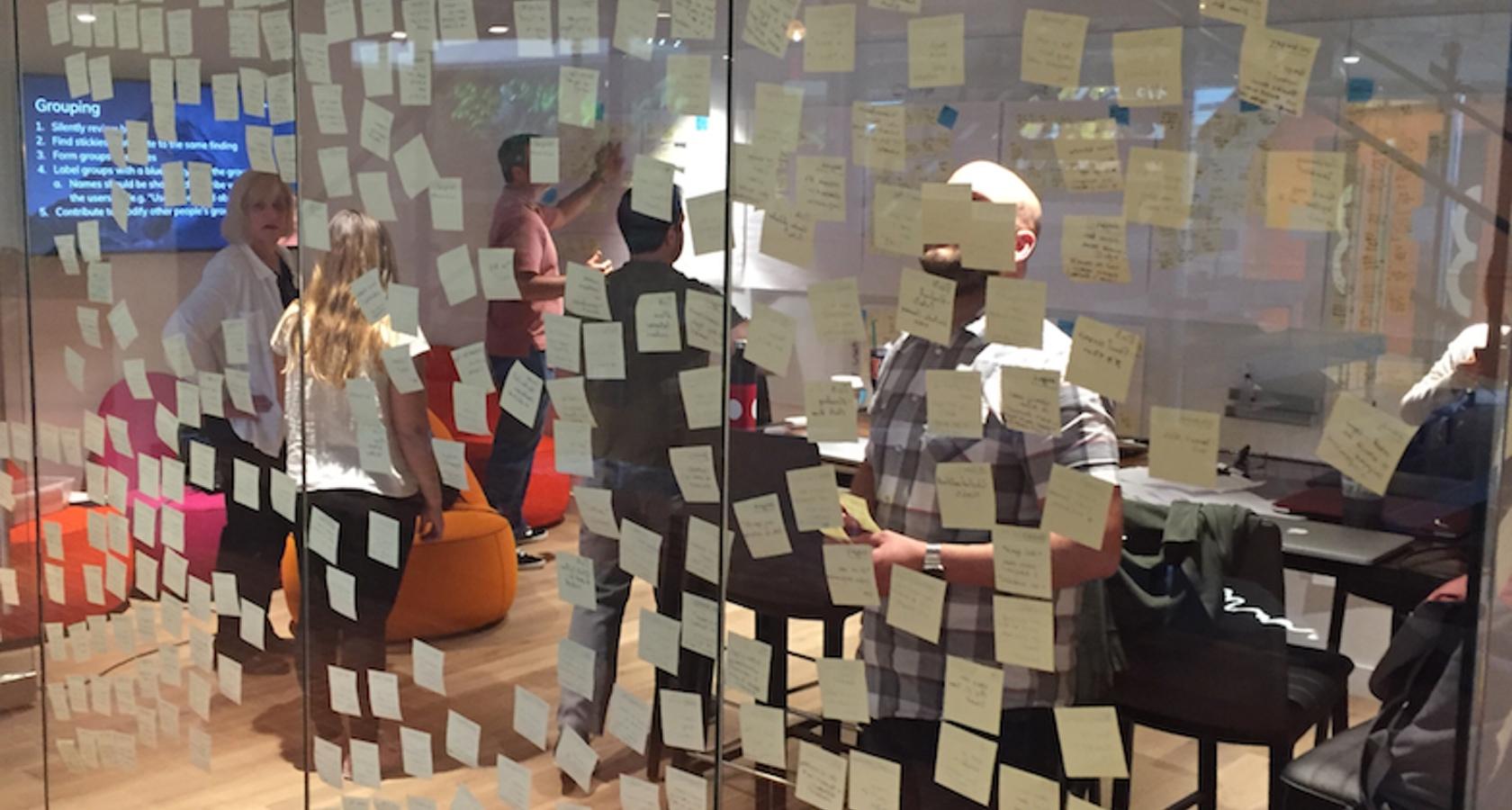
A search for “design thinking” will result in images of Post-It notes scattered on a whiteboard, or these five steps in its process:
Design thinking ideation process

The ideation phase of design thinking involves brainstorming using techniques such as Post-It notes for idea sharing.

  • Empathize – Learn about your audience through research and interviews.
  • Define – Construct a point of view based on user needs.
  • Ideate – Brainstorm (Post-It notes on walls).
  • Prototype – Build a representation of your ideas.
  • Test – Test your ideas.

It is expected that this inclusive, exploratory, iterative process will help designers arrive at decisions on what future customers truly want.

An example is a request from a new client to redesign a bike part. Sales have slowed, and they believe that a new design will spark renewed interest and help fend off competitors. Absent of design thinking, we would dive in and create a new, slick design for this specific bike part.

Employing the design thinking process, however, we would get dramatically different results. The five-step design thinking process reveals that the problem can’t be resolved with a newly designed bike part.

The actual problem: A growing portion of the market feels intimidated by the complexity of newer bikes and longs for the simple, easy-to-use ones they grew up with.

The answer: Create an entirely new category of bike that resonates with the unmet needs of the market for simple, back-to-basics biking. The value of design thinking lies in the identification of a larger problem which then leads to a solution around that theory.

Design Thinking: A Brief History

Over the past fifty years, design thinking has transformed into a way of approaching and solving large problems whereby, in order to develop a formal, meaningful, and emotional connection, the user becomes a kind of co-designer.

Here’s a brief history of design thinking:

  • 1969 – Herbert A. Simon and Robert McKim describe a type of rudimentary “design process” that can be applied to science and engineering.
  • 1980 – Bryan Lawson addresses design in architecture. This would be the first time people are introduced to the idea of designers working with more humility in a participatory and democratic environment.
  • 1982 – Nigel Cross introduces design thinking to a general education audience, resulting in a broader and widely accepted view of design thinking.
  • 1991 – Design thinking is applied to business problems by David M. Kelly, founder of the design consultancy IDEO. The term becomes commercialized due to IDEO’s successful media coverage and high-profile case studies.

Regrettably, design thinking has evolved from an industrial approach to something superficial. From 1991 on, the popularity of design thinking would also become its greatest weakness.

The Value of Design Thinking

“Design Thinking isn’t just a method, it fundamentally changes the fabric of your organization and your business.” – David Kelley, founder of IDEO and The Stanford d.school

Design thinking is about creating a thoughtful environment where divergent voices have a seat at the table. The process of building empathy, exploring problems, prototyping, and testing affords designers the ability to engage in intellectual investigations.

Some benefits of the design thinking process are:

Inclusive design. The design thinking process unleashes people’s creative energy through brainstorming sessions and group involvement. This approach is often described as a democratic process where the gap between “designers” and “users” is closed, helping to destroy top-down thinking and create diversified solutions.

Problem synthesis. Design thinking employs a user-driven set of criteria that is approached with a blend of logical, linear thinking. In order to find the real problem, designers use these criteria to discover causality.

Diverse voices. The ideation phase of design thinking invites people from various backgrounds and includes them in brainstorming sessions. This enhances the creative process by supporting a divergent set of ideas.

Low-Risk. Design thinking is a low-risk process. The only thing invested is a set of ideas. Nothing has been built and no money has been spent developing solutions that require an outlay of cash and resources.

Design Thinking Criticism

A search online will reveal two divergent paths of design thinking. It won’t take long to realize that design thinking has become a victim of its own success. But why?

Alan Cooper shares his thoughts on design thinking

Alan Cooper shares his thoughts on design thinking on Twitter.

In some respects, it becomes vogue or trendy to attack what is currently popular.

A common argument against design thinking is that it dilutes design into a structured, linear, and clean process. Critics argue that real design is messy, complex, and nonlinear, it isn’t derived from a stack of Post-It notes and a few brainstorming sessions.

Design Thinking Isn’t Design

Natasha Jen, design partner at Pentagram, shared her criticism of design thinking in a now-infamous video that sparked heated debate and lengthy discussions within the design community.

Even without the hyperbole surrounding her talk, Jen brings up a couple of sound arguments against design thinking:

  • Design is human intuition. Does it really take an expensive and exhaustive design thinking process to understand that a medical treatment room for kids should have whimsical colors and a more delightful environment? She argues that spending money to arrive at this conclusion is nonsense.
  • Lack of crit. Design thinking has become a bunch of buzzwords lacking criticism. “Crits,” or criticizing others’ work, is a messy process where designers surround themselves with evidence. This process helps designers evaluate whether something is good or not and it isn’t linear or reduced to a bunch of Post-It notes. She argues that without crit, design thinking is actually anti-intellectual.

If we picture design thinking as a linear process void of messiness and mired in sequences, then it’s easy to see where Jen is coming from. True design is not linear and it is not clean. Out of the chaos comes the solution.

Design Thinking As a Buzzword

Businesses love systems, frameworks, and buzzwords. In the 1980s, the US was introduced to Total Quality Management (TQM). The concept, based on the idea of continuous improvement, transformed the entire manufacturing core.

TQM was everywhere. Classes sprouted up overnight. Management spent millions of dollars rolling it out. And if a company was not implementing TQM, then something must be wrong.

TQM eventually fell victim to its own popularity. It soon became trendy to attack. Forbes posits that design thinking is on the same trajectory.

Design Thinking as a Corporate Checkbox

Critics of design thinking believe that it has become yet another corporate box to check off. Once it becomes a: “Did you remember to check off that box?” mentality, it is no longer thought-provoking, nor does it stoke the fires of creativity.

Businesses feel an urgency to find new ways to innovate, so they jump on the next popular framework and feel good about what they are doing. But are they actually doing any good?

This dilution of design into a systemized process is worthy of the attacks. Designers know that it takes a thoughtful, complex, iterative, and messy process to arrive at a solution. We can’t learn this from a two-day workshop or a TED talk. Learning about empathy doesn’t mean we are empathetic all of a sudden.

Design Thinking SWOT

The classic marketing tool, SWOT—strengths, weaknesses, opportunities, and threats—is used to evaluate the internal and external opportunities of an organization. We can adapt this model to concepts outside of marketing. Here is a “SWOT” for design thinking:

Strengths

  • Helps people solve problems in a creative way
  • A low-risk exercise
  • Brings in divergent voices
  • Encourages idea generation
  • Inclusive
  • Helps pick apart business problems

Weaknesses

  • A linear, structured process
  • Reduces the design process to contained thinking
  • A corporate box to check off
  • Missing critical thinking (crits)

Opportunities

  • Helps bring people together to generate ideas
  • Helps solve problems in a linear process
  • Helps better understand customer needs
  • Gives structure to an otherwise messy process

Threats

  • Has become a buzzword
  • Popularity makes it open to attack
  • Losing relevance when seen as a box to check off
  • No clear understanding of what it really is

Conclusion

For the past fifty years, design thinking has been taking shape. Until the early 90s, when consulting firm IDEO began using it to solve large business problems, it was largely associated with science and engineering. In the corporate world, systemizing and frameworks are applauded so it was not long before design thinking became the newest trend.

In some ways, design thinking has become a victim of its own popularity, as evidenced by increasing criticism from those in the design community. Whether warranted or seen as vogue to go against the grain, the fact that design thinking lacks many of the messy, non-linear elements of the classic design process distinguishes it and sets it apart.

Both points of view can be considered with some conclusions:

  • Design thinking helps solve business problems. It should not be thought of as a replacement for classic and more traditional forms of design, such as industrial, product or digital design.
  • Design thinking is a type of design-related process, but not design in total.
  • Design thinking is a human-centered approach to solving problems. It isn’t trying to replace the messy, non-linear, and critique-oriented design process.
  • The term “design thinking” can be a misnomer because of the word “design.” It should be thought of as a business exercise which brings people together to help solve a problem.
  • It has fallen victim to attacks because of its popularity and the desire to go against the grain.

If used properly, design thinking is here to stay. It helps solve problems, brings divergent voices to the table, and carries a low risk. On the other hand, the classic design process is distinct from the design thinking process—it should remain so and continue to stand on its own.

•••

Further reading on the Toptal Design Blog:

from UX Collective https://www.toptal.com/designers/product-design/design-thinking-criticism

The Hungry Designer


Written by Ben Pujji at Atomic
Go to the profile of Atomic

Every software team has one. Good teams have a few. Great teams are packed with them.

Hungry designers are deeply motivated to design better products, create better experiences and help their team move faster.

Hungry designers are not defined by rank, or prefix. They are defined by their style. It doesn’t matter if they’re senior, junior or somewhere in-between. They can be the boss, but often they’re not. Nor does it matter how they signal their strengths: UX, Product, Interface, Interaction or Visual, whatever.

Hungry designers come to work each day relentlessly spotting and prioritising opportunities. They push to make things better, they create the momentum which drives their whole team forward.

The hungry are the ones who are forever starting conversations with their teams about better ways to design.

They’re the ones investing energy into refactoring tired workflow and spending hours learning new tools. They’re the optimists. The facilitators of change.

On the other hand, the satisfied designer isn’t driven to improve.

The satisfied designer has no appetite to create greater impact. They’re reluctant to find ways to make design a truly collaborative effort. They’re pathetically grateful for tiny advances in design tools, but with no underlying motivation to design better. They’re content with tired workflow.


We love the hungry

It’s easy for us to spot hungry designers at Atomic, because they challenge us too!

They ask us for features, and point out our shortcomings. They’re not deciding new tools via checklists, they’re hands-on and engaged.

But they also take time to share with us how their teams are struggling, where their workflow is creaking and how their tools are holding them back.

The hungry are the best customers we could ask for.

Here’s what our hungriest designers are most focussed on right now:

Graduating from feedback to collaboration

The bigger the team, the more likely feedback is being confused for collaboration.

Design feedback is an easy sport. Comments can be fired from everywhere, thanks to frictionless feedback mechanisms and the messaging apps that now occupy the center of every screen.

Feedback is great — but it’s the lowest form of collaboration. It requires little effort for the giver but can quickly become burdensome for the recipient. It easily becomes combative or aggressive and so much intent gets lost in the noise.

The hungry are embracing any new form of collaborative design they can find. They’re searching for ways to design closer together, to iterate each others ideas, and bring other core members of the software team closer towards design.

It’s hard to challenge an established workflow, especially if it feels like it requires a trade of velocity for quality. But bad ideas shipped faster are still bad ideas. They just arrive sooner.

Reducing confirmation bias

The more time we invest in exploring an idea, the more attached to it we become. The hungry are fighting by finding ways to reach fidelity in design sooner, with less effort.

Many are creating sophisticated pattern libraries to speed up their exploration process. Others are abandoning slow wireframing and paper-based prototyping in favour of early interactive prototypes to understand ideas more deeply, sooner.

Terms like goldilocks quality (not too much, not too little fidelity, but just right) coined in GV’s new book Sprint are being embraced as we hunt for language to frame how far to go when prototyping.

Center-stage, not top-table

Design is already rising to the top-table — that’s become a given for organizations who want competitive advantage. But it’s not all we imagined. Being trusted with more responsibility, bigger budgets and being given a bigger stick doesn’t immediately make design more impactful. Being center-stage does.

Designers who understand that design is a team sport aren’t focussed on power — they’re focused on impact. They’re building better connections and relationships with other parts of the software team and organization. They’re pushing for design to be visible and within an arm’s-length of every part of the team, at every level.


What are you hungry for?

Are you hungry to design better products and experiences?

We owe a huge debt to those around us who are — who keep us focussed on what matters, relentlessly pushing us forward.

Have you shared what you’re hungry for with your team? There’s no time like the present!

from Medium https://medium.com/atomic-io/the-hungry-designer-b295459b29ec

Designing Apps That Perform Well Even In Poor Connectivity


Go to the profile of uxplanet.org

Wish all we may for high speed internet connectivity, we cannot deny that networks do let us down, sometimes even on a broadband connection. Things are even harder when designing apps for regions that have even slower internet, like Asian countries. Apps that are too feature rich and heavy may look great and feel amazing, but can be a source of frustration when they do not work smoothly on poor networks.

Frustration leads to abandonment, lost sales and even bad reviews. So you end up paying for the network’s weakness. As unfair as that may sound, it’s a reality and the best we can do is find ways to design for poor networks. If we can successfully design apps that are light enough to work smoothly on lower bandwidths without sacrificing visual aesthetic and rich experience, that’s a win.

Fortunately, there are ways.

Let’s quickly dive into the best practices that will help you design apps that perform impressively even in poor connectivity:

1. Design Content That Can Be Viewed Offline

The designer’s worst enemy is an empty page. If your app just loses all data and draws a blank the moment connectivity is lost, it can mean a deal breaker. Instead, always make sure you design some pages that contain offline content that can ease the users into app inactivity. For instance, Facebook shows a cached section of the newsfeed even when the app is offline, with a clear alert that you are not connected to the internet. Instagram and Twitter too do a decent, if not spectacular job of showing at least some content even when offline.

Of course the pre-requisite to being able to provide content when offline is caching, which is the developer’s job, but as a designer, you need to design pages that are clear, concise and lightweight. This would mean using plain text, compressed to a point where it is just adequate, without much show and flair.

2. Design a Prioritized Logical Hierarchy

Designing for optimized bandwidth usage should be your priority from the get go. Develop a proper app structure, wherein all pages are organized in such a way that the users don’t have to open unnecessary pages. Impart all your pages a sound logical hierarchy so that users can quickly get to the content they want and not have to search their way around, opening and closing multiple avenues en-route. This would require a good deal of thinking and planning at the navigation design stage, so that moving from one page to another is intuitive enough to minimize downloading of pages.

3. Optimize Images

Rich high resolution images are the very lifeblood of your app’s visual appeal. However, they are also the most data-consuming aspects of your app. Fortunately, there are tools and techniques to help load images faster. You can use compression plugins in Sketch and Photoshop to compress files. Another extremely helpful technique is to use image slicing, so that parts of the image keep loading one at a time instead of making the user wait a long while before anything shows up. However, in too poor a connectivity, it is advisable to use CSS or Layout for visual appeal and minimize the use of images as much as possible. Alternatively, you can resort to using styled background colors instead of images.

Never replace text with images, as far as possible. Always convey important message in texts so users can read them even when connectivity is too poor to load images. Using a JPEG or PNG file with text in it should always be followed by a plain text alternative to fall back on. Also, Jpeg is better suited to low bandwidth than GIF or PNG. You can even explore a relatively new option in Styled Vector Graphics or SVG. Using the most suitable image formats can go a long way in reducing data consumption.

Optimizing your images is a large chunk of optimizing your app performance on low bandwidth. So pay special attention in this area when designing a stunning app.

4. Use A Mix Of Static And Dynamic Content

Most apps are big on dynamic content that is created real-time with scripted languages like PHP. This requires constant connectivity. Static content doesn’t change. It is easier to cache on the user end and loads up much faster. By having a good mix of static and dynamic content, you can not only reduce network requests and reduce downloads but also have something to offer when poor connectivity won’t let dynamic content load.

5. Design A ‘Text Only’ Version

Many apps are heavy in the images, videos and graphics that are very difficult to load on low bandwidths or in poor connectivity. News and magazine apps are an example. Clearly, quality pictures and video are an integral part of news. But you could follow in the footsteps of some of the biggest names like NPR, CNN and launch ‘text only’ versions of your apps that can be used in times of poor connectivity. In fact CNN and NPR launched their ‘text only’ sites when Americans were hit by the hurricane Irma and needed a news source for critical updates in a time of crisis.

6. Design a ‘Lite’ app

Most major social networks like Facebook and Twitter have a Lite version of their apps that are minimalistic and low on graphics, providing the bare essential content, even in poor connectivity. Not only should you consider designing a Lite app but also set it up in a way that the user is automatically shifted to it when the connectivity goes down. They shouldn’t have to re-login or switch apps manually.

7. Mention Clearly That there’s a Problem in Connection

Not informing the user that the problem is in the connection can be harmful too. No error message or a random error message does you little good.

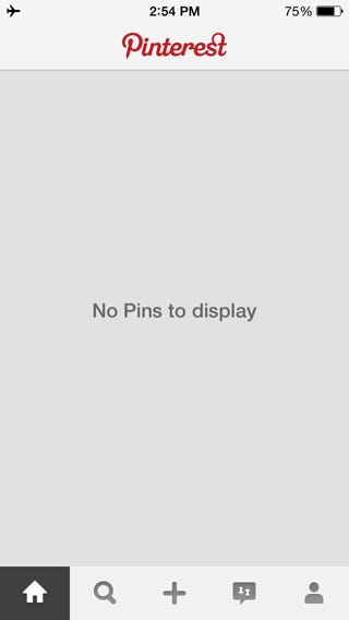
If you open the Pinterest app without an internet connection, you will see a blank page with a message saying ‘No Pins to Display’. That’s about it. You aren’t given an explanation why, neither are you informed that there is a problem with the internet connection. This makes you think that there is a problem with the app, and that it’s the app’s fault.

Subtly and politely but clearly stating that there is no internet connectivity helps users understand where the problem is so they can either try to fix it — by checking and trying to reconnect — or can wait for connection to be re-established. At the least, they wouldn’t be blaming your app for their fractured experience.

Conclusion

A number of developing economies in places like Asia are currently housing a large chunk of the global app user population. However, poor internet connectivity is a regular feature in these areas. By not optimizing your app to perform flawlessly in low bandwidth areas, you could be missing out on a massive amount of users and hence revenue. By following the above guidelines, you could significantly reduce the amount of data your app consumes, making it perfect for users across the world even when the connectivity is poor, making sure that your revenue never goes down, and neither does your popularity.

About the author:

Jaykishan Panchal is a content marketing strategist at MoveoApps, an Mobile app development company. He enjoys writing about Technology,marketing & industry trends.


from UX Planet https://uxplanet.org/designing-apps-that-perform-well-even-in-poor-connectivity-8332e58d7f07

How to include research in your UX project?

10 easy ways to get insight into the needs & pain points of users

User Research is no magic — everyone can do it.

Having studied research at university I didn’t fully grasp the importance of it. I took all that knowledge for granted, and also didn’t quite know where I’d apply it later on in my job. Working as a UX designer today, I learned how important the role of research is in our daily practice, and want to share my knowledge with fellow designers who don’t know how to start making research for UX.

Which information is missing? 🤔

First of all: To know what kind of research you need to do, you need to know which information you are missing to create a kick-ass user experience. Knowing that you can pick a research method and start collecting data to answer all your questions and get the info you need!

Do you need to know how people plan their museum visit? Or who these people are? Or maybe what they dislike about current museum pages? Make sure, you know what you want your research for.

Better done than perfect ⌛

It’s always better to reach out to potential and current users in a quick DIY way than not reaching out because you don’t consider yourself a research expert.

„A surprisingly large number of people claim to practice user-centered design, but fail to ever actually speak with or spend time with users“.
User Experience Team of One

It’s always good to talk to people you design things for — no matter how experienced you are as a UX designer. It’s important to remember that other people probably think differently from you, know different things/don’t know the same things as you, and probably use the internet differently.

Two kinds of research ☯ 

  • Open-ended (qualitative): questions that require an individual answer, which is longer than a word. “Why” and “How” questions are great for that. You can ask those open-ended questions in person or in an online survey. Qualitative research is necessary to get to know the scope of the problem, hear different approaches and opinions.
  • Quantitative: Participants pick one (or several) answers from a range of options. Here you want to find out, which of the 100 things that were mentioned during qualitative research are important for most of your users. The questions should ask “who”, “what”, “when” — find more on how to write great quantitative questions here.

10 DIY research options 🖐️🖐️

In this article, I want to give you a quick overview of easy ways to get some insight into what the people you design for need, want and experience — and how they use your products or products alike.

1. Watch people use the product/page — Observation

If you want to redesign an existing page, a great way to understand its pain points is to watch some people navigating through it. We are not talking about hours and hours of observations in a perfect lab with people who are a 100% fit to the customer profile.

A quick test with a random person during a workshop for only 15 minutes will give astonishing insights — and show your stakeholders, how much needs to get done, and how important research is for a project. This kind of DIY research can be done with your existing product/page/app or a competitor’s page.

Similar to a usability test (point 10), but a little smaller.

2. Get many opinions that you can compare — Online Survey

A quantitative online survey is a great option if you have easy access to potential or current customers/users/visitors online. Only around 1–3% of people who’ll see the survey are going to participate. To get reliable results from the survey, you want to have at least 200 participants.

3. Get some opinions that you can compare — In-person surveys

Often you won’t have access to a big group of people, but still want to get insights into their way of thinking, their needs and current ways to do things. A survey in person can consist of the same questions, like an online questionnaire, so “What”, “When”, “Where”-Questions. The difference is, that you can ask those questions in person — face-to-face, via phone, email or chat.

4. Analyze existing data — Online reviews & groups

Sometimes you can find online reviews about your product or some similar one online, on review pages or Facebook groups. Here you can see what people complain about, what they love about the product/service and what they wish was different.

5. Talk to people who know your customers — Expert interview

Talk to support service, people who are directly in touch with the users/customers and ask them about their experience. What is often misunderstood? What are common questions and pain points? Which are the most common reasons to reach out to the support service? Which information seems unclear?

6. Talk to potential/current customers — Personal interview

Your personal interview of a user/customer can be extremely open and just directed towards understanding their way of thinking and acting — more on that in the book Practical Empathy.

Or you can already have concrete questions you want to ask, for example how they pick a product/service or what are their pain points and wishes for a specific part of their life, etc.

The most important tip for personal interviews is: Listen, give time to think (60sek+), don’t suggest answers or finish their sentences.

7. Qualitative online survey

This method is a little time-consuming but is a great way to find out many individual approaches to something, if you don’t have time, resources or access to meeting the people in person.

In this case, you write a questionnaire consisting of open-ended questions and send it to relevant people. With only 5–6 open questions you will get a great variety of responses, and need to combine similar answers together to know a whole range or different approaches to your question.

8. Use existing data

Understand who is the target audience using Google Analytics Research, Market Research Results, benchmark analysis or other surveys your company/your client’s company has done. You’ll be able to find out the demographic data as well as some behavioral patterns and preferences in that way already.

9. Go where your users are

Talk to people in public places — depending on the product/service you might find your target audience in a coffee shop, grocery store or waiting in line into the opera house. Or ask your friends, colleagues, and acquaintances if they know somebody you are looking for. Get to know what’s driving them, the way they think. Or just tell them you are working on a project in that area, and hear what topic they come up with. Do they give you tips, complain or try to help? That’s already a great insight itself.

10. Usability tests

This type of research is the most commonly mentioned when talking about research for UX designers.

With the help of usability research, you can test if your design solves the user issues by watching people interact with your prototype.

„Usability tests are about watching one person at a time try to use something (whether it’s a Web site, a prototype, or some sketches of a new design) to do typical tasks so you can detect and fix the things that confuse or frustrate them.“ (Don’t Make Me Think, p. 110)

Some overall tips 🌟

  • Ask about past/current events: Don’t ask generic questions like „What do you eat for dinner usually?“ It’s easier for participants to recall (and for you to get useful data) if you ask specifically ”What did you have for dinner for the past seven days?“
  • Compensation for interviewees and their time helping you is important!
  • Explain what’s going to happen before an interview, observation or chit-chat, what you are interested and why
  • Make it clear to your clients, that investing some thousands for research is essential to create a fantastic user experience. Their ideas for the website/app/service won’t be able to replace talking to their audience directly to make it truly user-centered

I hope this small overview helped you to get the first idea about the research you can do as a UX designer. Let me know if you have some questions and stay tuned as I will write more detailed articles on parts mentioned here.

Other articles I loved on the topic:


How to include research in your UX project? was originally published in UX Collective on Medium, where people are continuing the conversation by highlighting and responding to this story.

from UX Collective – Medium https://uxdesign.cc/how-to-include-research-in-your-ux-project-e64f7c801275?source=rss—-138adf9c44c—4

5 steps to designing a great user experience for your chatbot

This article was originally published on the SAP Conversational AI Blog under A Guide To Designing A Great UX For Your Chatbot by Shilpa Tripathi (thats me! :)) and has been repurposed for the UX Collective.

So your customer-facing teams are inundated with inquiries that are repetitive and mundane, draining employee motivation and resources. You get an idea, “let’s create a chatbot!” You do. But people don’t use it. The experience feels a little worse than a search engine and a little better than a static FAQ page. What went wrong?

In this blog, I uncover some simple tips that can drastically improve your content-retrieving chatbot experience.

First of all, hi! I’m Shilpa and I create conversational user interfaces at SAP Conversational AI.

Over time, I have learned that as bot creators, we need to start honing our instincts when it comes to using chatbots as a solution to our problems.

So lets dive into scenarios where chatbots were preferred by users:

  1. If the perceived amount of time it will take for them to sift through a massive chunk of information far exceeds the value they will receive from the information.
  2. If they know that there are low-stakes tasks they can do quickly. In this instance, they would use a chatbot for something like activating a credit card, but might not want to use one when they want to reverse a large fee on their account (because they know that they will be unable to plead their case without a human being).

The takeaway here is that the more time you spend over the use-cases where your client might need a bot, the better the chances of your clients adopting your chatbot offering.

This leads to my first tip:

1. Ask yourself “Why, Why, Why A Chatbot?“

Knowing when to use a chatbot is essential to the success of your undertaking. A chatbot is a great solution, but it isn’t always the best solution.

We know that data retrieval and dispersal is a space where chatbots can really improve the experience of the user, allowing them to directly find the information they are looking for, in a dialogue-driven format. If your data can be configured to meet your clients where they are at, even better!

Here is a case where a chatbot is a great solution:

  • You have a FAQ document that explains your shipping policies across the world. It is dense and presents exhaustive information which may not be pertinent to all your users. If you create a chatbot that allows your users to define their location in order to display only relevant shipping information — Success! If you create a chatbot that is able to provide accurate shipping information pertaining to your users by using anonymized locational data — Priceless! This is contingent on protecting your users’ identities and respecting their privacy settings, of course.

Here is are cases where chatbots are not the best solution:

  • A chatbot that retrieves incredibly dense information
  • A chatbot that displays too many detailed illustrations or gives too many external references
  • A chatbot that retrieves information which loses either value or comprehensibility, when truncated or summarized

The above would all be better cases for an interactive webpage.

Creating a chatbot is easy with our platform. But, making your chatbot truly invaluable to your clients’ experience takes time. A lot of time. Often, it means picking apart use-cases and finding exactly which kind of dialogue would lead to user satisfaction and retention. The payoff is incredible but it is hard work.

So, ask yourself: “Why am I creating a chatbot? What unique experiences can my chatbot provide over other platforms for the same purpose?

2. Pre-work: Scoping your solution, understanding the platform and defining your use-cases

Reach out to your clients

Do as much concept validation as possible before embarking on this journey.

If you have existing clients, find out if they would use a chatbot for the tasks you want automated. That is the single best way to avoid wasting resources. If you do not have clients, find related businesses or groups that tackle the same problems you do and find out if they are using a chatbot. If not, inquire about why a chatbot would complete the experiences they are lacking.

Define your user’s journey

I can’t stress this enough. You need to create user journeys for every offering you have on your chatbot platform. Evidence suggests that having clarity about every use-case is one of the simplest practices a chatbot creator can undertake to avoid deeper problems later.

For example, let’s say you are offering a card activation solution via chatbot, you should:

Define what the quickest path to card activation looks like for your users.

  • Ask what your users would need to achieve this task.
  • Do they need their physical card handy?

Sketch out all the functionalities of the skill.

  • Would this skill lead to another skill?
  • Could this skill be connected to another skill?
  • Where does this skill fit amongst the myriad of skills you are presenting your users with?

Determine the dialogue your users will go through.

  • What are possible ways that your users will trigger this skill?
  • Are there shortcuts available and visible?
  • Do you need graphics? External links? Forwarding/emailing services?

Figure out how you will introduce this functionality.

  • How will your users know that they can do this via chatbot?

The above is just ONE use case!

Remember the parameters of your chat bubble

It will surprise you how many people do not realize the restrictions and freedoms that come with a specific platform.

With chat windows, you have small real-estate, so the content you are sharing needs to mostly be text-based.

Furthermore, the number of external links provided should be limited. This reduces jarring users as they jump from one portal to the next. In general, keeping people within your chat window for all their needs is a good practice.

Secondly, you are in a dialogue-driven medium, so if you want to just display chunks of data without taking the time to convert them into dialogue, be prepared for reduced engagement. Remember — they have Google for that!

3. Creation: Remembering the beginning, middle, and end of a successful dialogue

The Dialogue Journey

Everything has a beginning, a middle, and an end.

Ensure that you are providing your user with a great first message that tells them:

  • Who you are.
  • Why you are here.
  • How your chat solution can uniquely help them.
  • What they can do with this chat.
  • Where they can find other information not available in this chat.

Continuity in Dialogue

When setting up your dialogue-flows, remind yourself that every question comes from something and should lead to something.

Continuity with content will differentiate your chatbot from what’s already out there.

Although your users are using chat to get their information quickly, they also want to have an interaction. The best kind of interactions flows with ease. So remember to prompt your users for possible questions that may naturally flow out of their initial query. This creates context through subject-related prompting or recommendations.

Graceful Exit

When the user achieves his objective, remember to exit the conversation gracefully. The way you exit your conversation should be strategic and genuine.

It is your last moment to make a great impression. Here are a few ways you can exit gracefully:

  • Ask only ONE feedback question and make it count.
  • Provide them next steps such as a new offering, or more information.
  • Perhaps provide a link to a representative if your users’ feedback is negative.

Effective Dialogue Tips

  • Keep your dialogue first-person. After all, this is the whole point of one-on-one interaction.
  • Keep the tone conversational. Don’t be too friendly, too formal, too happy, or anything on the extreme ends of the spectrum. Think: “helpful neighbor” when creating the language.
  • Keep the vocabulary simple, yet impactful: You don’t want to have too many technical or complicated terms because it will inevitably cause frustration. You also don’t want the content so oversimplified that it is insulting to your user. Remember: “helpful neighbor.”
  • Remind users that your bot is learning, especially if your users indicate that their query wasn’t answered. This is a great “get out of jail free” card.

4. General tips: providing quality, control, creating natural dialogue and establishing context

Ensuring quality

If you are starting with a question and answer knowledge bank, do the work to ensure that each answer is succinct, complete, and leads to an appropriate next question.

Here are other points to think about:

  • Determining the appropriate next question is the real trick to keeping your users engaged and helping them move through your content easily.
  • Reminding yourself that people hate scrolling is a good mindset while creating your chatbot, so you can limit the length of your answers.
  • Unchecked content with errors loses user trust. Always edit your content in a text editor and ensure that your grammar is correct.
  • Ensure that there are no unknown symbols or accidental changes to your content when importing or exporting it.

Visibility of background processes

The more you tell your users about how you are providing them with a piece of information or a service, the more they empathize with you.

You can do this by telling them that your bot is finding the requested information from a document or that your bot is connecting to a service. When you can’t help your users immediately, explain to them, in simple words, about why this is the case and what they can do next. Creating and leveraging your clients’ or users’ empathy is critical as you collect user feedback to improve your bot. So do it early and often.

Acknowledgment and natural delay

There is always confusion over whether your query was received by a bot.

Remember to play around with states where your bot is finding or accessing information. A trick we like to use is to act like a person would. No matter how quickly information is received or processed, a slight delay is natural in conversation and is less intimidating to the end users.

So whether you use an ellipses animation suggesting that your bot is typing, or a statement like “I’m looking for your answer in my database,” let your users know you’ve received their query and are processing it.

Ask followup questions

If the user poses a question that your bot can’t identify, define how your bot should follow up.

Asking the user to rephrase the question once can help matching, but more than that is annoying.

If the bot isn’t able to match the question, your users may have helped you identify a gap in your content database or new context for a question existing in your database.

Either way, the best way to approach it is to provide possible topics that fall within the context of your users’ queries or to point them to an external source containing the information they are looking for.

5. Reiteration

The chatbot creation journey is an iterative one. Ensure that you continue to improve your bot as you start getting real users’ queries. Ensure that they are receiving what they need and keep refining the experience one use-case at a time.

We have noticed that successful chatbots promote a learning experience for themselves and those using it.

Ask for feedback that will genuinely help you gauge the effectiveness of your content or the tools you are providing.

Strategic feedback integration

Don’t ask your users for feedback after every question. It is frustrating.

Once you get a feeling that your users are comfortable with your chatbot, include strategic feedback prompts that are quick and relevant to their immediate experience. The best way to know what works is to test different feedback collecting strategies before deploying.

Keep it up

Lastly, ensure that all your links and content stays updated, and continuously hone the quality of your content and user experience.

I hope that this blog helps you successfully deploy the “knowledge bot” experiences that will take your business or passion to the next level!

Clap if you found value in this article, so I know that I should continue to write about this topic! If you want to dig deeper or want me to cover another topic, leave a comment below…


5 steps to designing a great user experience for your chatbot was originally published in UX Collective on Medium, where people are continuing the conversation by highlighting and responding to this story.

from UX Collective – Medium https://uxdesign.cc/5-steps-to-designing-a-great-user-experience-for-your-chatbot-5317e943fcbe?source=rss—-138adf9c44c—4

An ultimate guide to designing user-friendly forms

Pawel Szymankiewicz is a Senior Product designer at Netguru and co-founder of the coco apps team. Drawing on his expertise in user-centered design, Pawel shares his ultimate guide to designing user-friendly forms people will actually want to complete!

Forms are a key conversion tool—which is why it’s important to master the most effective form design techniques. Frustration should never be a part of a user’s process when filling out a form, and the tips outlined below should help create a more pleasant experience for them.

To start off, I’ll cover the three main components in every form and how to effectively use them. Next, I’ll jump into some best practices for constructing your form from start to finish. Finally, I’ll outline the three types of form layouts to help you decide which format works best for the kind of data you want to collect. Let’s jump in.

The 3 basic form components

Components are the foundation of every form and can be easily compared to a list of ingredients for a Sunday night dinner—you’ll want to choose the best ingredients and serve them well. Let’s cover the three essential components of a form and then jump into the most overlooked nuances around them:

1. Textfields

This is the primary form component that often ends up being over-designed. Save yourself some time and do not reinvent the wheel.

  • Pick a familiar look: Use one of the two most recognizable textfield shapes: a well-known rectangle or a simple line (made popular by Google’s Material Design). Suggest the expected length of an input by its size.
7c53a946fac50f9add7b4f988feed5f2
  • Describe what you need: Use labels to tell what input is expected. Make sure they are always visible so your form is easy to scan even when it’s filled. Place labels on top of the textfields or as a placeholder that transforms into a floating label while typing. Avoid putting labels on the left or right side of a textfield as it will create a mess once your form starts growing.
F0119731fa4193e43d8cb65363573a52

Dropdown menus gained their popularity on the web and are here to stay. After all, they do their job pretty well.

  • Sort dropdown lists alphabetically: Sort answers in alphabetical order to help people find the answer they are looking for quickly.
94a1eb6bd86dfa4f6ef982bc7ca160d6
  • Place suggested answers on top: If you are sure one (or more) of the answers from the list will be chosen by most people (e.g. based on their current location), put this answer at the top of the dropdown and separate it from the others with a subtle divider.
D222b3b6638d07eb18a48bf0e9df3827

3. Buttons

The real superstar of every form. Without a button, your form is useless. It’s extremely important to make sure it’s understandable and visible to everyone.

  • Describe what the action button does: The word “Submit” doesn’t say it all. Make sure the text within your button is as simple and clear as possible. If it’s being used to add products to a shopping cart, label it, “Add to cart”. If it functions to remove unwanted products, label it, “Remove”. Try to describe the action that happens after clicking as concretely as you can.
8f86d022c878999c881a4f69a80404a8
  • Use different styles to drive attention: Use colors to suggest whether your button is facilitating a positive or negative action. Different styles can also suggest which action is primary and secondary.

Form construction

Now that you’ve got the basics covered, how are you going to build your form so it’s successful? How is it going to work and interact with your users? Let’s dive into some best practices for constructing your form:

  • Show advantages of filling the form: If your business depends on people successfully filling out a form, make sure you tell users why it’s worth spending a few minutes of their time on. Carefully choose your words and make sure they indicate the value users will get from filling the form out. Prepare something special—for example, an e-book packed with awesome tips for your target group. In this case, your button’s text can say something like, “Sign Up and Get the FREE e-book!”
  • Arrange all components under one column: Naturally, we read from top to bottom. Try to place all of the elements under one column—this will make it easier to quickly scan your form without jumping from one side to the other.
A7e287d18a5a9e5733072fba6d5847b2
  • Ask only for stuff you really, REALLY need: Keep forms short. Avoid asking for data that isn’t necessary at the moment—you can always gather that later. The shorter your form is, the more likely people are actually going to fill it out.
  • Explain why you are asking for sensitive data: If you need to ask for some sort of sensitive data that folks might hesitate to share, explain why you are asking for it. Build trust by being transparent about how and why you are going to use this data.
  • Label fields that are optional: If your form contains some optional textfields, mark them with an “Optional” label instead of placing an asterisk next to them. People generally don’t like asterisks in forms because they remind them of signing complicated contracts and hidden statements.
79b91870501a3b2a8b859a1f9afe78f3
  • Group components and list them in logical order: Make it easier to quickly scan your form by inserting a heading on top of the grouped components. Try to follow familiar patterns that people already know from different, common situations.
  • Don’t use an additional textfield asking users to confirm their password: Instead of making people type their password twice, allow them to peek at it. Even if they don’t and misspell their password at first, they’ll always have a chance (or at least they should) to change it later on.
  • Show form progress: If your form is rather long, it’s important to show progress so people know where they are and how much of the form is left to complete. This can be done with a simple progress bar or by dividing your form into shorter steps. As long as it gives hope that the end is near, it does the job well.
B9f387bc481a2dd9aa5a7f4c198b237f
  • Save progress: Just as important as showing progress, is actively saving it while the form is being filled. There is no worse scenario than a solid amount of time spent on a form then a lost connection resulting in all of the input data to disappear.
  • Use icons and images when possible: If you’re asking for something strictly connected with images, besides describing it, show the image as well.
  • Suggest answers: If your form is open and people are asked to type in different answers that in general are common as Skills or Tags used on Dribbble, suggest answers from your database as they are typed in.
  • Leave enter/return alone: This key on the keyboard has a very well known role. Don’t make it send the form immediately, especially when it’s long and consists of a couple of text areas. Let the enter be an enter and navigate the cursor to a new line.
  • Show what went wrong, and remember color is not everything: If there are some validation issues, show what went wrong. That doesn’t mean simply using the color red as an indicator. A nice description ideally supported with advice on how to make things right would be useful as well. You can also try applying a shake animation to poorly filled fields.
35cd415b555fb9e87607d990c7a391d9
  • Let people know what went right: A simple message that the form was successfully sent to your server is pure gold. No more guessing whether it went through or if some problem occurred during the process.

Types of form layouts

The final stage of designing a form is its presentation. How are you going to sell it visually?

Standard (one page) form:

The most common presentation is a simple one-page form. It consists of all of the components and works great for short and less complicated forms.

Multi-step form:

Multi-step forms are mostly used for check-out processes on e-commerce platforms. People like doing things step-by-step so it’s immediately familiar. By design, it also shows the user’s current progress. This format is best for more complicated, longer forms. It makes them less scary. Just remember to group components well and make sure each step is a closed part of the process.

Conversational form:

Conversational forms are a really nice and natural way of collecting data seamlessly. Their potential still seems to be undiscovered, however, they’ve been around for a while. Asking for one thing at a time gives the impression of a faster form process. While people focus on the conversation, they overlook the actual length of the form.

While forms may not be the most exciting thing to design, we can’t deny their importance and impact. Next time you feel like running away from designing a form, just remember to stop overthinking it, use these tips as general guidelines, and last but not least, think about the people that are going to be filling it out. Keeping them happy will make your business successful!

Want to keep up with Pawel? Find him on Dribbble and Twitter.


Find more Process stories on our blog Courtside.
Have a suggestion? Contact stories@dribbble.com.

from Dribbble https://dribbble.com/stories/2019/05/20/an-ultimate-guide-to-designing-user-friendly-forms

6 tips for remote user testing

https://www.invisionapp.com/inside-design/6-tips-for-remote-user-testing/

from WebdesignerNews https://www.invisionapp.com/inside-design/6-tips-for-remote-user-testing/

How to Write Faster

If you want to improve your writing speed, there are several steps that you can take to improve your efficiency and get assignments done faster. First, you’ll want to do all of your research and organize your thoughts in an outline form. From there, you can set realistic goals for yourself and continue to practice until you improve. If you’re struggling with the act of writing with a pen and paper, you should make sure that you’re comfortable and have the right writing tools. With the right amount of practice and repetition, you can improve your writing speed.

EditSteps

EditFinishing Writing Assignments Quicker

  1. Set realistic goals and deadlines for yourself. If you are newer at writing or aren’t used to writing on a deadline, there’s a good possibility you’ll be slower at writing than someone with more experience. Set goals that make sense for you and are within your ability. If you set a goal and you are stressed or feel like meeting the goal is impossible, set lighter goals for yourself.[1]
    Write Faster Step 3 Version 5.jpg
    • Set incrementally higher goals for yourself rather than taking on too much too fast.
    • If you haven’t written a lot in the past, you won’t be able to write quickly without practice.
    • For instance, you can set a goal that you’ll have a certain number of pages or words completed within a day. If you’re still working on building speed, daily goals can feel more manageable than more short-term ones (such as hourly goals).
  2. Use a timer to help meet your goals. In order to improve your writing speed, you’ll need a way to measure if you’re improving. Set a timer to the goal that you set for yourself earlier and try to meet your goal within the allotted time. If you don’t have a stopwatch or timer, there are apps that were created specifically for that purpose.[2]
    Write Faster Step 4 Version 5.jpg
    • Don’t let the timer stress you out. It’s merely there to remind you of how much time you’re spending on an assignment.
  3. Determine the time of day that you’re most productive. Some people write faster and more efficiently in the morning, while others excel at night. Try writing in both settings and determine which time feels best for you. Then, try to get as much writing done as you can during the times of day when you’re most productive.[3]
    Write Faster Step 1 Version 5.jpg
    • Even if you’re a night owl, you may still be more productive in the morning. Write during different parts of the day to see what works best for you.
  4. Write an outline for your assignment. Read the prompt or assignment so you know what you have to write. Perform research and plot out the main points in your essay, paper, or story in an outline form. Determine what you want to include in your writing, and then write 2-3 sentences, or subpoints, within those main points. This will keep your writing precise and on topic, which will reduce the amount you need to delete or edit later.[4]
    Write Faster Step 2 Version 5.jpg
    • For example, the main points of your article could be something like, "Describing circuits" and "Powering Electronics." "Describing circuits" could include points like "Explaining a simple circuit" and "Completing a circuit."
    • Researching things in the middle of writing wastes valuable time.
    • Include your sources in your outline to save time, especially if you have to make citations later. If you’re using electronic sources, bookmark them on your computer. Include notes in your outline about how you’re going to use your sources and what information you hope to take from them.
  5. Write your first draft quickly and revisit it for edits. Write concisely and accurately, but don’t obsess about spelling or grammar on the first draft. Instead, write your first draft and then come back and edit and review the writing later. This will allow you to get the bulk of the work out of the way and enable you to concentrate on grammar and spelling the second time around.[5]
    Write Faster Step 5 Version 5.jpg
    • Wasting time on smaller details can drain time and make the entire writing process much longer.
    • If you find yourself stuck in a section, move past it and revisit it later with a fresh mind.
  6. Minimize the distractions around you. Distractions like surfing the web, TV, or open chat programs can hinder your efficiency and slow down your writing speed. Find a solitary space where you can write and won’t be distracted by the things going on around you.[6]
    Write Faster Step 6 Version 4.jpg
    • Clearing the clutter off your writing desk may also minimize distractions and improve your efficiency.
    • If you can, put away your phone, tablet, or other devices you might be tempted to use to check social media or browse the web. You can also use productivity apps or extensions (like StayFocused) that temporarily cut off your access to time-wasting websites.

EditImproving Your Handwriting Speed

  1. Maintain good posture. Straighten your back and make sure that your feet are resting flat on the floor. Your lower back and hips should be fully supported by the chair that you’re sitting in. Both your knees and your elbows should be bent and you should feel comfortable while you sit. Maintain this posture to reduce fatigue and improve stamina as you write.[7]
    Write Faster Step 7 Version 4.jpg
    • Whenever you feel yourself slouching, adjust your posture so you’re sitting correctly.
    • If your chair is too low or your desk is too high, you may need to purchase new furniture.
    • Maintaining good posture is also beneficial for your back and hips.
  2. Hold the pen or pencil in a way that’s comfortable for you. The way that you grip your pencil doesn’t have as much of an impact on your writing speed as your comfort does. When writing, make sure that your hand is in a comfortable position and doesn’t cramp or get fatigued as you write. If it does, consider switching the way that you’re holding the pencil or pen to improve your writing speed.[8]
    Write Faster Step 8 Version 4.jpg
    • The traditional way to hold a pen or pencil is to support the pen in between your index finger and thumb while the pen rests on your middle finger.
    • Angling the paper in a different way may also feel more comfortable for you.
  3. Use a pen or pencil that doesn’t require you to press down hard. If you have to press down hard as you write, your hand will get fatigued faster. Find a pen that isn’t so thin that it’s hard to grip, but that isn’t so thick that writing is uncomfortable.[9]
    Write Faster Step 9 Version 4.jpg
    • A gel pen may be easier to write with than a ballpoint pen.
    • A mechanical pencil requires less force to write with than a traditional pencil.
    • You can purchase a pencil or pen grip to make your writing tool thicker.
  4. Use shorthand if you aren’t writing for an assignment. Methods like Pitman Shorthand and Gregg Shorthand use symbols to represent words, letters, and punctuation. Most of these symbols are quicker and easier to write than letters and words in English and could vastly improve your writing speed. Research and learn how to use either of these shorthand methods online or at a library.[10]
    Write Faster Step 10 Version 5.jpg
    • Keep in mind that these shorthand methods aren’t known by everyone and can’t be used for assignments or on tests.
    • It may take several weeks or even months to master these shorthand methods.
  5. Keep practicing. Practice every day to improve the speed and the appearance of your handwriting. The more that you do it, the quicker and neater your handwriting will become. You can try writing at home, or transcribing notes quickly in the middle of class. Use the things that work and avoid things that slow you down.[11]
    Write Faster Step 11 Version 5.jpg
    • If you still aren’t improving after trying everything, talk to a teacher and see if they have any techniques that may help you.

EditReferences

EditQuick Summary

Cite error: <ref> tags exist, but no <references/> tag was found

from How to of the Day https://www.wikihow.com/Write-Faster

What UX Designers can Learn From Filmmaking

Credit: Jakob Owens via Unsplash

By Joanna Ngai

Film making is an art form. For UX designers, it’s a place to find inspiration through stories coming to life. The teamwork and efforts of multi-disciplinary teams coming together for a film offers a revealing perspective into the creative process that can be helpful in understanding design.

Looking back to your own favorite films — why are they so memorable? What is the nature of a compelling story? Here’s some lessons from cinematography to carry over to design.

Credit: Moonlight

1. Choices carry meaning

Colors, like features, follow the changes of the emotions.
— Pablo Picasso

While it is a human tendency to look for patterns, things in frame (or out of the frame) play a crucial role in supporting the larger storyline of a film. Color is used to evoke certain emotional shifts or match the tone of the genre. Directors can use palettes to convey tension or suspense, or to highlight an object or person. Subtle framing choices in composition help ensure every shot contributes to the story.

In the same way, UX designers should intentionally craft information architecture that supports customer, organization and business goals, being mindful that such choices (whether intentional or not) steer users toward certain actions and behaviors. The details add up, whether it’s the choices in color, pixels or other imagery to evoke an emotional response.

Lastly, what is obvious to you as a designer may not be obvious to the user, so make sure to incorporate user research to stimulate customer experiences/reactions early and often.

Credit: Schindler’s List

2. Help create focus

Images, like words in a dictionary, have no power or value except through their position and relation.
— Robert Bresson

A filmmaker uses composition techniques like adjusting the field of view, camera angles, lights and staging to guide a user’s eye to what’s important in a scene. There’s a belief that overwhelming the senses is counterproductive to delivering a story. Therefore, editing is a ruthless but critical part of the process that deletes, re-arranges and filters the film to help give the product its final polish.

In the same way, elements in design need to work together to ensure clarity and simplicity over features. Be candid about what is necessary and what can be omitted, whether it’s a superfluous feature or verbose content. A smooth transition or timely animation can aid in tying together a flow or keeping a user’s attention.

While it’s tempting to neglect your content strategy, it will serve your product well in the long run if you use familiar understandable words that are relevant for your audience, in the UI copy and documentation.

3. Know the rules so you can break them

I’ve found a rut is the consequence of sticking to tried and tested methods that don’t take into account how you or the world has changed.
Twyla Tharp

It’s important to understand why certain methods are used classically so you can know how and when not too “follow the rules”. In film, the 180 degree rule says that the camera should remain on one side of an interaction as a way to keep the audience oriented to characters in a scene so that cuts aren’t jarring or confusing. That statement also hints at when the rule can be violated.

Credit: Stanley Kubrick shifts the camera for a motivated reason in The Shining.

Similarly, in design, there’s a deference for patterns and rules around grid, typography, etc. And while best practices are there for a reason, it’s important to understand that even the good guidelines and rules have their limitations.

For example, David Carson is a notable graphic designer who’s ground-breaking indifference to the grid system demonstrates that breaking of rules can push typography, visual communication and layout to the next level. William Bernbach, the advertising powerhouse known for his campaigns for Volkswagen (Think Small and Lemon), Avis (We Try Harder), and Life Cereal (Mikey Likes It), has said that “the memorable never emerged from a formula”. Rules can be broken, for the right reasons.

Conclusion

There is a natural evolution between art, design and film that makes it inevitable to find parallels. In both great films and UX, you must create focus and clarify what is happening in order to meet your goals. Remember to use all the tools in your arsenal (be it composition, editing, color, imagery, motion, etc.) to not only make the product real for your audience and also for your team throughout the creative process.

Did you find this useful? Buy me a coffee to give my brain a hug 🍵

Feel free to check out my design work or my handbook on UX design, upgrading your portfolio and understanding design thinking.

7 Reasons to Join IDF and Learn UX Design

from Stories by Joanna Ngai on Medium https://medium.com/@ngai.yt/what-ux-designers-can-learn-from-filmmaking-e87a7cc4288e?source=rss-225928e09472——2

Google’s lung cancer detection AI outperforms 6 human radiologists

Google AI researchers working with Northwestern Medicine created an AI model capable of detecting lung cancer from screening tests better than human radiologists with an average of eight years experience.

When analyzing a single CT scan, the model detected cancer 5% more often on average than a group of 6 human experts and 11% more likely to reduce false-positive exams. Humans and AI achieved similar results when radiologists were able to view prior CT scans.

Risk of cancer two after a screening the model was able to find cancer 9.5% more often but about 5% more likely to reduce false-positive exams compared to estimated radiologist performance laid out in the National Lung Screening Test (NLST) study.

Detailed in research published today in Nature Medicine, the end-to-end deep learning model can predict whether a patient has lung cancer. It also generates a patient lung cancer malignancy risk score and identifies the location of the malignant tissue in the lungs.

The model will be made available through Google Cloud Healthcare API as Google continues trials and additional tests with partner organizations.

“The AI system uses 3D volumetric deep learning to analyze the full anatomy on chest CT scans as well as patches based on object detection techniques that identify regions with malignant lesions,”Google technical lead Shravya Shetty and product manager Daniel Tse said in a blog post today.

The model was trained using more than 42,000 chest CT screenings images. The CT scans were taken from near 15,000 patients, 578 of whom developed cancer within a year during the 2002 NLST study by the National Institutes of Health (NIH).

Results were then validated with datasets from Northwestern Medicine.

Lung cancer is one of the most common causes of death on Earth, according to World Health Organization data, taking more than 2 million lives annually, killing roughly as many people each year as breast cancer.

The NLST first carried out in 2002 by the National Institutes of Health (NIH) is a low-dose computed tomography (LDCT)screening. A 2015 analysis found that only 2-4% of patients get a LDCT screening today.

“By showing that deep learning can increase specificity without sacrificing sensitivity, we hope to spur more research and conversation around the role AI can play in tipping the cost-benefit scale for cancer screening,” the blog post reads.

The news follows the use of Google’s Inception v3 to detect lung cancer by New York University researchers last year

Deep learning is also behind Google’s advances in diabetic retinopathy diagnosis through eye scans, and DeepMind’s AI that can accurately recommend the proper line of treatment for 50 eye diseases with 94% accuracy.

from VentureBeat https://venturebeat.com/2019/05/20/googles-lung-cancer-detection-ai-outperforms-6-human-radiologists/