A case study on scroll-driven animations performance

Scroll-driven animations are a way to add interactivity and visual interest to your website or web application, triggered by the user’s scroll position. This can be a great way to keep users engaged and make your website more visually appealing.

In the past, the only way to create scroll-driven animations was to respond to the scroll event on the main thread. This caused two major problems:

  • Scrolling is performed on a separate process and therefore delivers scroll events asynchronously.
  • Main thread animations are subject to jank.

This makes creating performant scroll-driven animations that are in-sync with scrolling impossible or very difficult.

We are now introducing a new set of APIs to support scroll-driven animations, which you can use from CSS or JavaScript. The API tries to use as few main thread resources as possible, making scroll-driven animations far easier to implement, and also much smoother. The scroll-driven animations API is currently supported in the following browsers:

Browser support

  • Chrome 115, Supported 115
  • Firefox 110, Behind a flag
  • Edge 115, Supported 115
  • Safari, Not supported

Source

This article compares the new approach with the classic JavaScript technique to show just how easy and silky-smooth scroll-driven animations can be with the new API.

The following example progress bar is built using class JavaScript techniques.

The document responds each time the scroll event happens to calculate how much percentage of the scrollHeight the user has scrolled to.

document.addEventListener("scroll", () => {
var winScroll = document.body.scrollTop || document.documentElement.scrollTop;
var height = document.documentElement.scrollHeight - document.documentElement.clientHeight;
var scrolled = (winScroll / height) * 100;
document.getElementById("progress").style.width = scrolled + "%";
})

The following demo shows the same progress bar using the new API with CSS.

@keyframes grow-progress {
from {
transform: scaleX(0);
}
to {
transform: scaleX(1);
}
}

#progress {


animation: grow-progress auto linear forwards;
animation-timeline: scroll(block root);
}

The new animation-timeline CSS feature, automatically converts a position in a scroll range into a percentage of progress, therefore doing all the heavy-lifting.

Now here’s the interesting part—let’s say that you implemented a super-heavy calculation on both versions of the website that would eat up most of the main thread resources.

function someHeavyJS(){
let time = 0;
window.setInterval(function () {
time++;
for (var i = 0; i < 1e9; i++) {
result = i;
}
console.log(time)
}, 100);
}

As you might have expected, the classic JavaScript version becomes janky and sluggish due to the main thread resources junction. On the other hand, the CSS version is completely unaffected by the heavy JavaScript work and can respond to the user’s scroll interactions.

The CPU usage is completely different in DevTools, as shown in the following screenshots.

Main thread comparison.

The following demo shows an application of scroll driven animation created by CyberAgent. You can see that the photo fades in as you scroll.

The benefit of the new API is not only limited to CSS. You are able to create silky smooth scroll-driven animations using JavaScript as well. Take a look at the following example:

const progressbar = document.querySelector('#progress');
progressbar.style.transformOrigin = '0% 50%';
progressbar.animate(
{
transform: ['scaleX(0)', 'scaleX(1)'],
},
{
fill: 'forwards',
timeline: new ScrollTimeline({
source: document.documentElement,
}),
}
);

This enables you to create the same progress bar animation shown in the previous CSS demo using just JavaScript. The underlying technology is the same as the CSS version. The API tries to use as few main thread resources as possible, making the animations far smoother when compared to the classic JavaScript approach.

Also, this new API works in conjunction with the existing Web Animations API (WAAPI) and CSS Animations API to enable declarative scroll-driven animations.

# More demos and resources

You can check out the different implementations of scroll driven animation via this demo site, where you can compare demos using these new APIs from CSS and JavaScript.

If you are interested in learning more about the new scroll-driven animations, check out this article and the I/O 2023 talk!

from Chrome Developers https://developer.chrome.com/blog/scroll-animation-performance-case-study/

New Viewport Units – Ahmad Shadeed

We have been using CSS viewport units since 2012. They are useful to help us in sizing elements based on the viewport width or height.

However, using the vh unit on mobile is buggy. The reason is that the viewport size won’t include the browser’s address bar UI.

To solve that, we now have new viewport units. Let’s find out about them in this article.

CSS viewport units

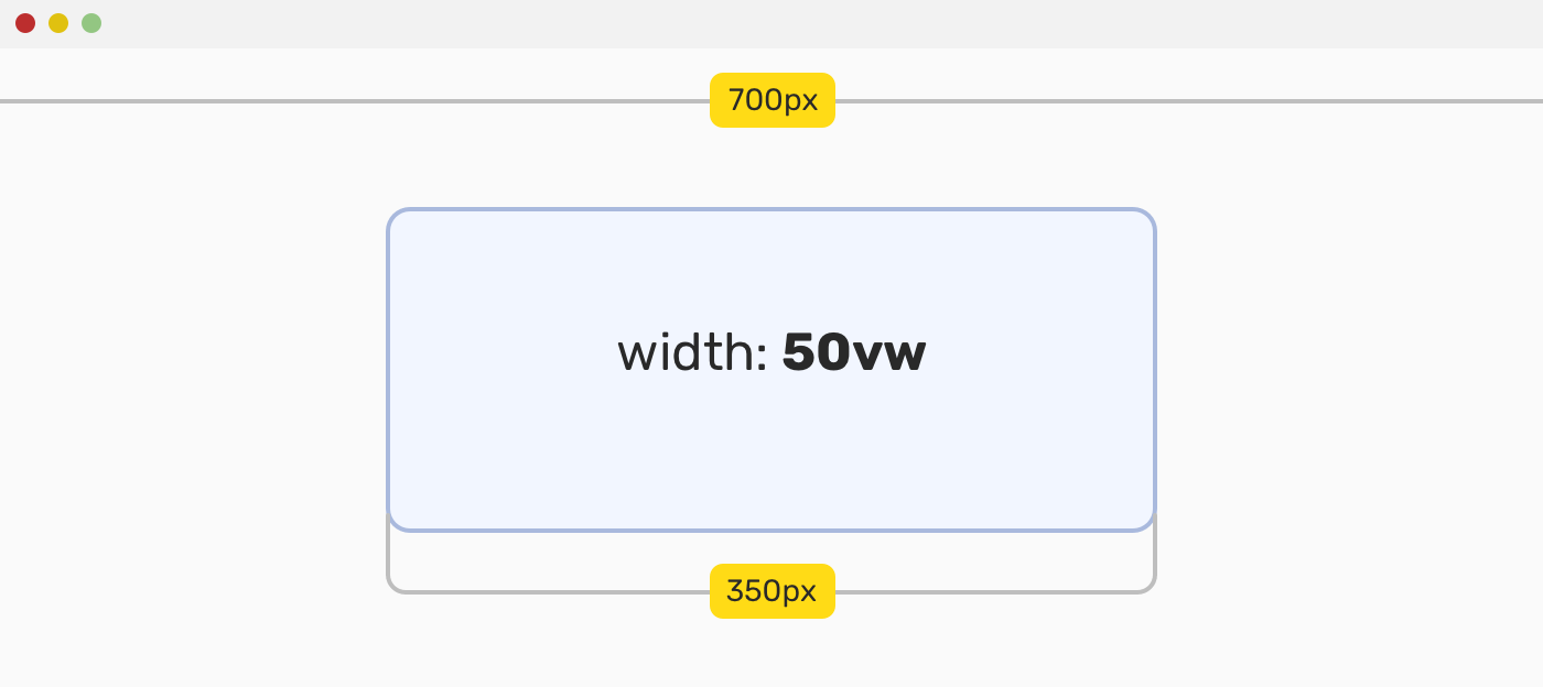
For example, when we need to size an element against the viewport size. The viewport units are vw, vh, vmin, and vmax.

Consider the following figure:

The value 50vw means: to give the element a width equal to 50% of the viewport width.

If you want to learn more, I wrote a detailed article on viewport units.

The problem

When using 100vh to size an element to take the full height of the viewport on mobile, it will be larger than the space between the top and bottom bars. This will happen in browsers that shrink their UI on scrolling, such as Safari or Chrome on Android.

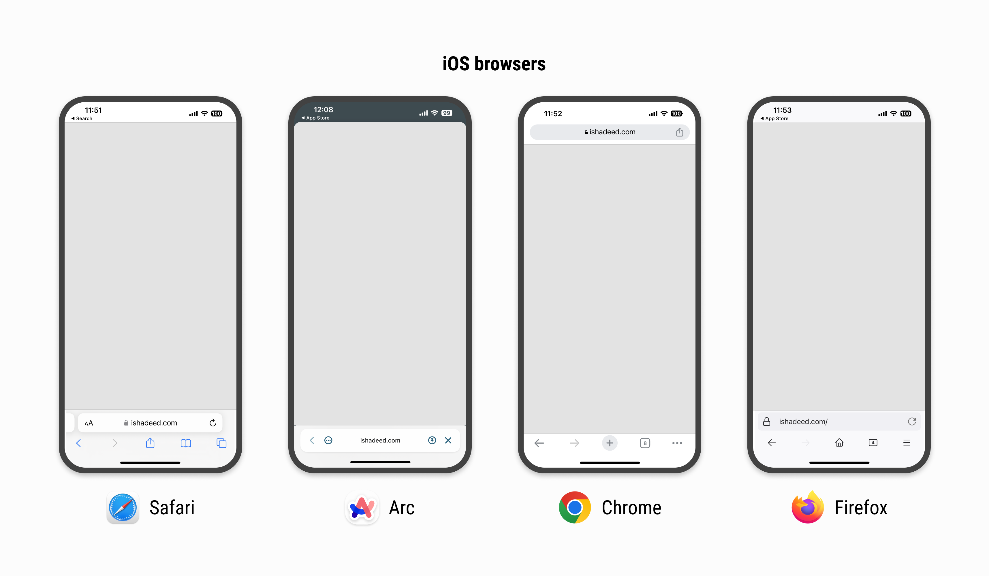
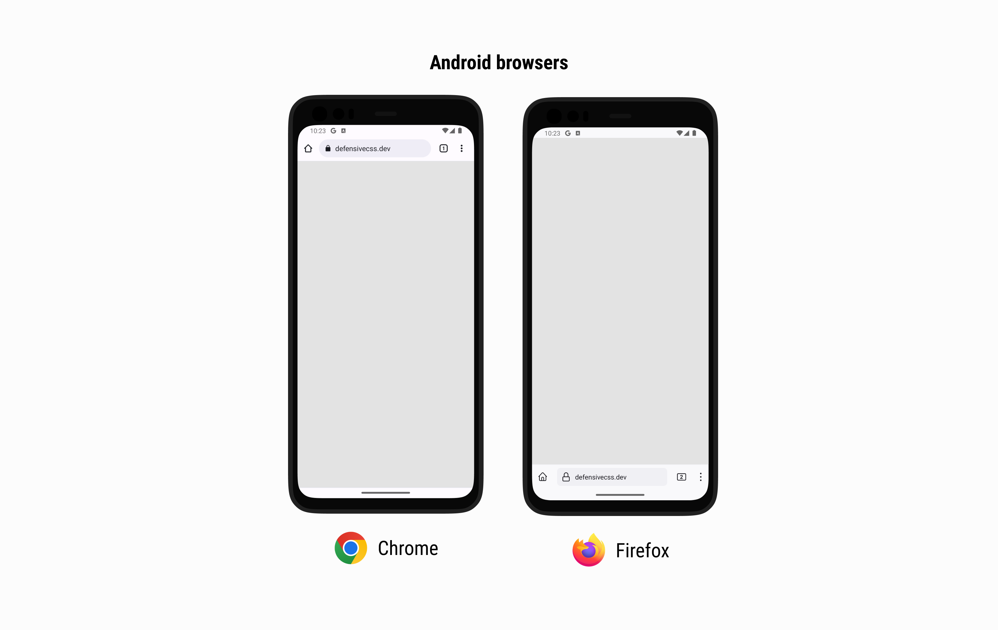
Here is a figure that shows how each mobile browser has a different UI for the top and bottom UI.

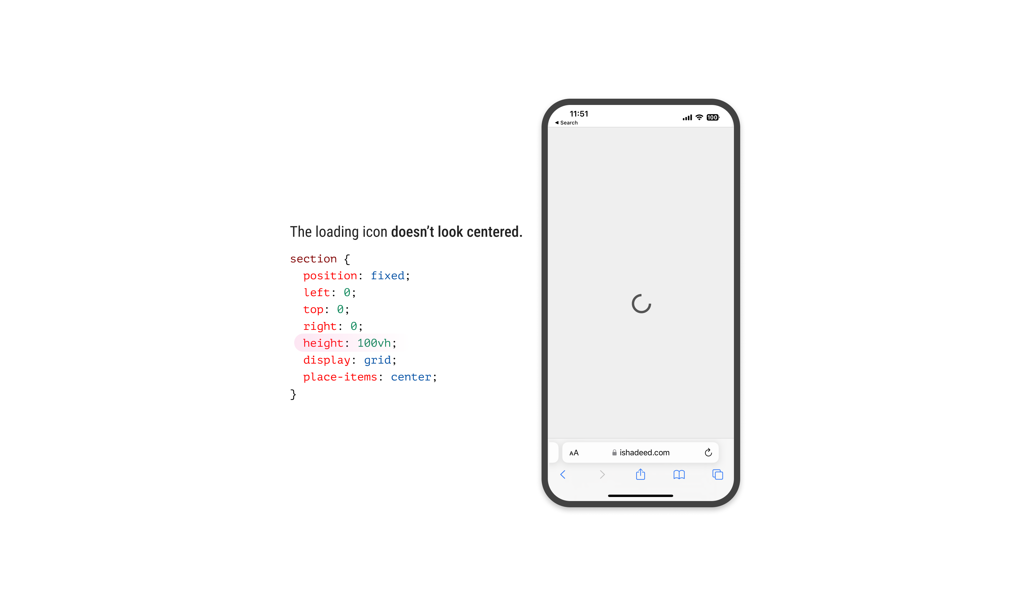
Suppose that we have a loading view that fills the whole screen.

/* I know that we can use bottom: 0 instead of height: 100vh, but this is to intentionally highlight the issue. */
.loading-wrapper {
  position: fixed;
  left: 0;
  right: 0;
  top: 0;
  height: 100vh;
  display: grid;
  place-items: center;
}

Consider the following figure:

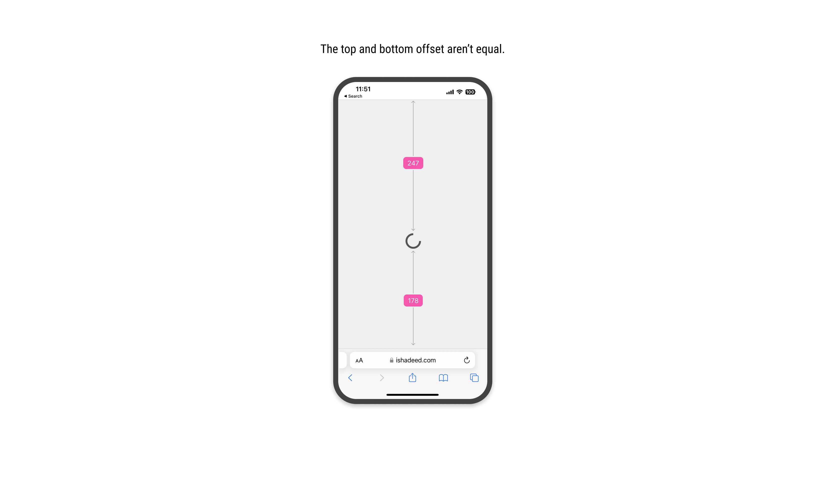
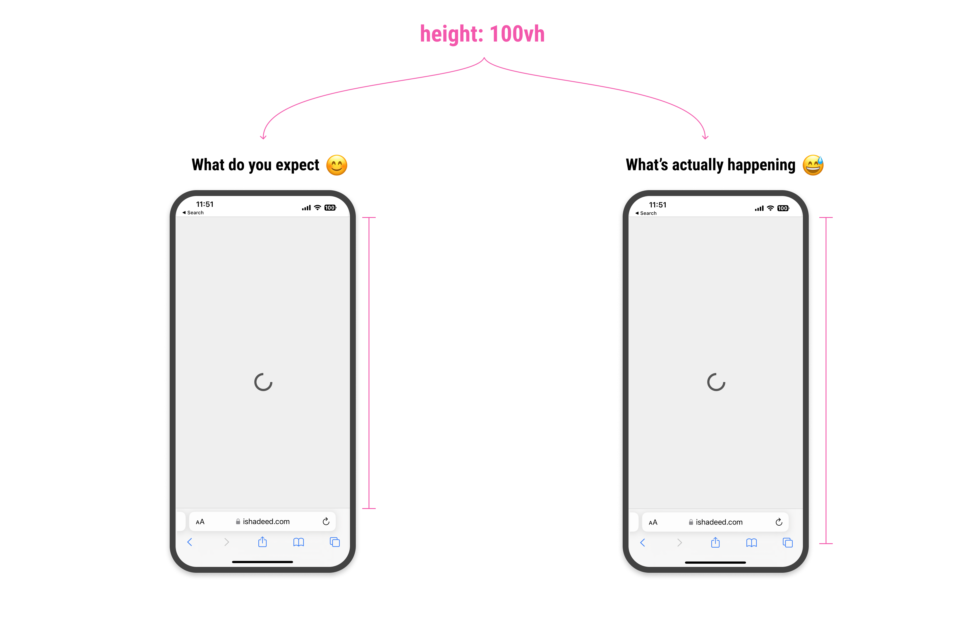
The loading icon is centered in CSS, but visually, it looks like it’s positioned slightly to the bottom. Why is that happening?

For the browser, height: 100vh means that the element will fill the viewport height, but it won’t calculate the computed value dynamically. That means the bottom address and toolbar won’t be calculated.

Because of that, we have an expectation that 100vh will be equal from the top of the viewport to the start of the address bar UI.

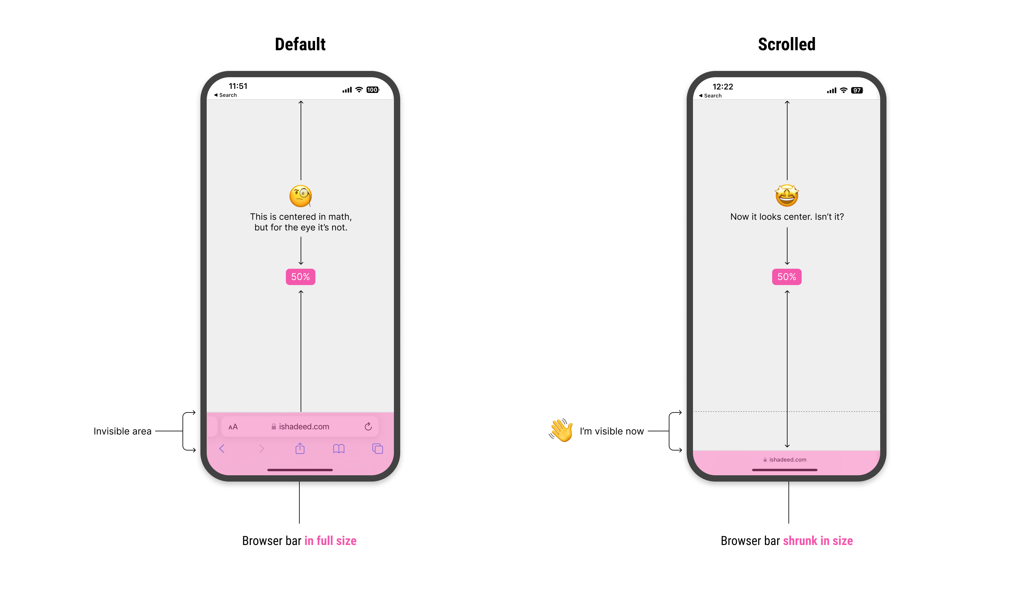
When we scroll down, the address bar UI will shrink its size. This is good, as it gives the user more vertical space to browse the page. At the same time, it’s breaking the UI somehow.

In the following figure, the center of the vertical space is off when the address bar is visible. When scrolling, it looks fine.

Notice how I highlighted the invisible area. When scrolled down, it become visible. How to deal with that in CSS?

The small, large, and dynamic viewport units

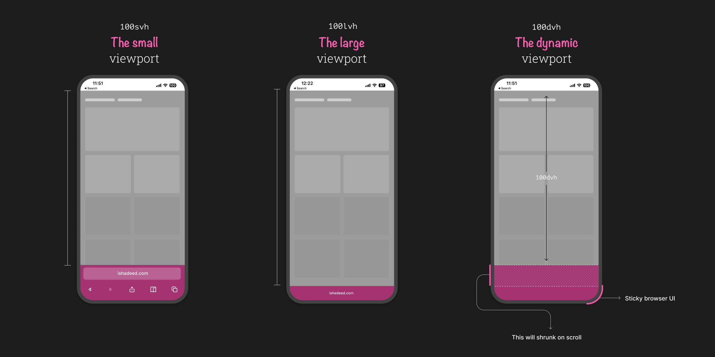
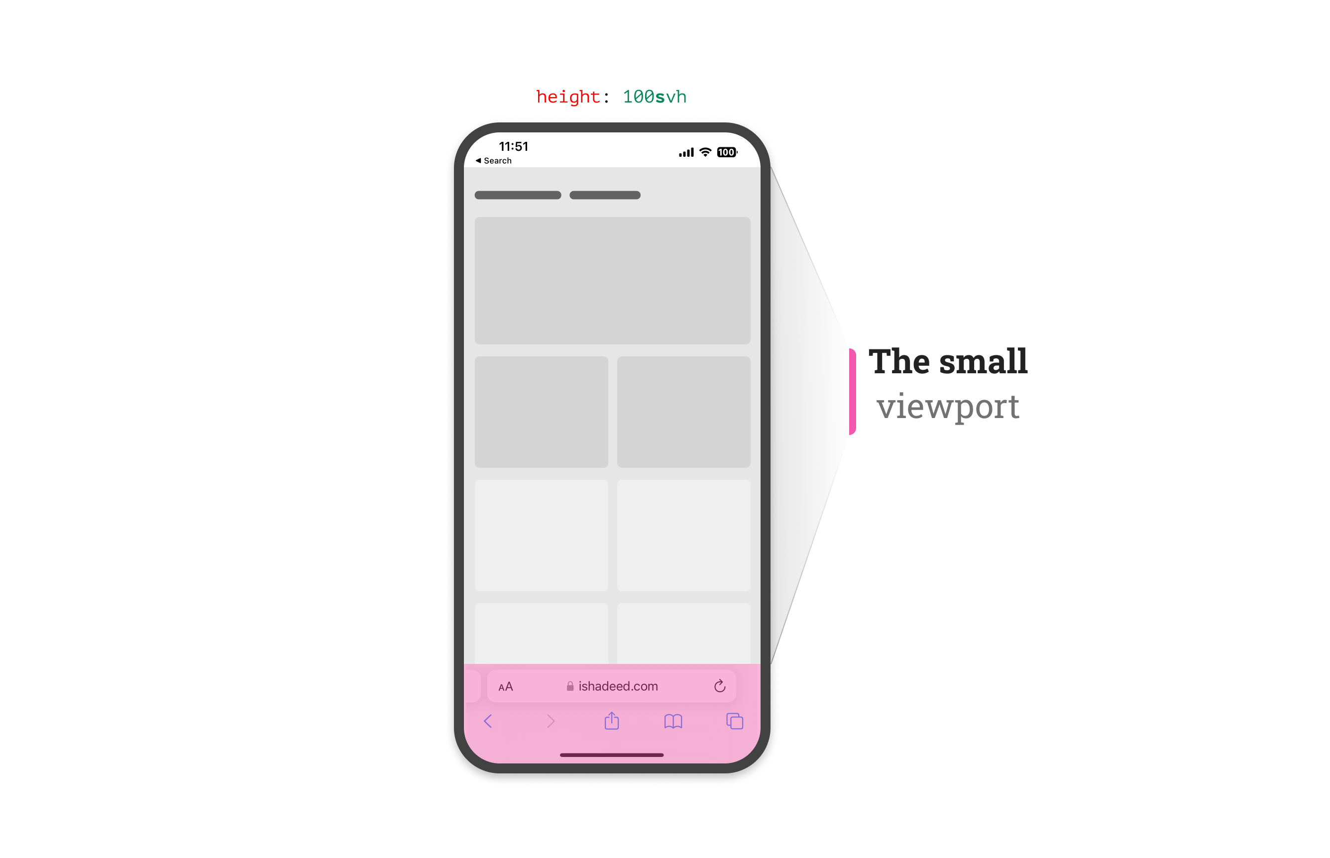
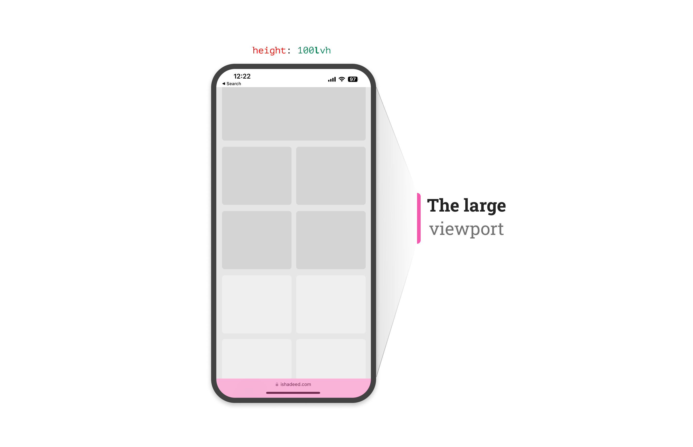
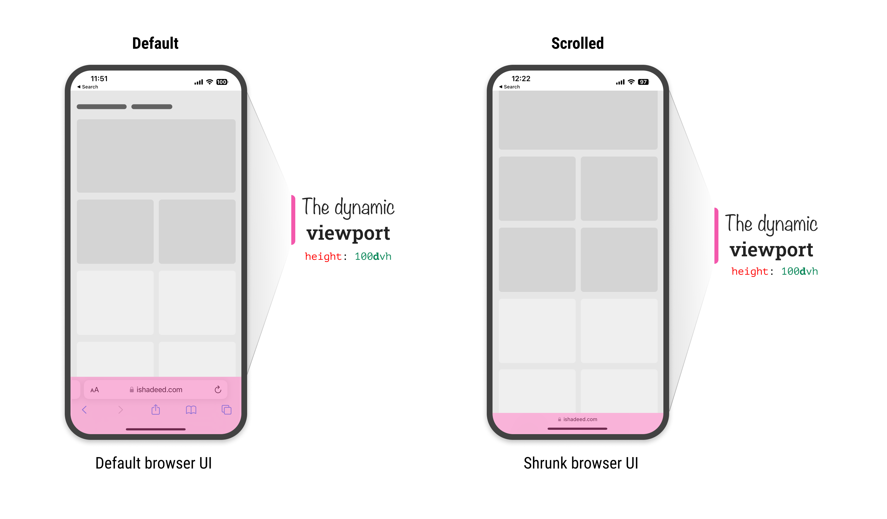
To solve that, the CSS working group agreed on having a new set of units: svh, lvh, and dvh. They stand for the small, large, and dynamic viewport, respectively.

The small viewport

The svh represents the viewport height when the address bar UI hasn’t shrunk its size yet.

The large viewport

The lvh represents the viewport height after the address bar UI shrunk its size.

The dynamic viewport

From its name, this unit is dynamic. That means it will use any of the small, in-between, and large units based on whether the address bar UI is shrunk or not.

During the initial scroll, the dynamic viewport unit will change as the browser UI will shrunk. Here is a video that shows how the dynamic viewport changes:

Use cases and examples

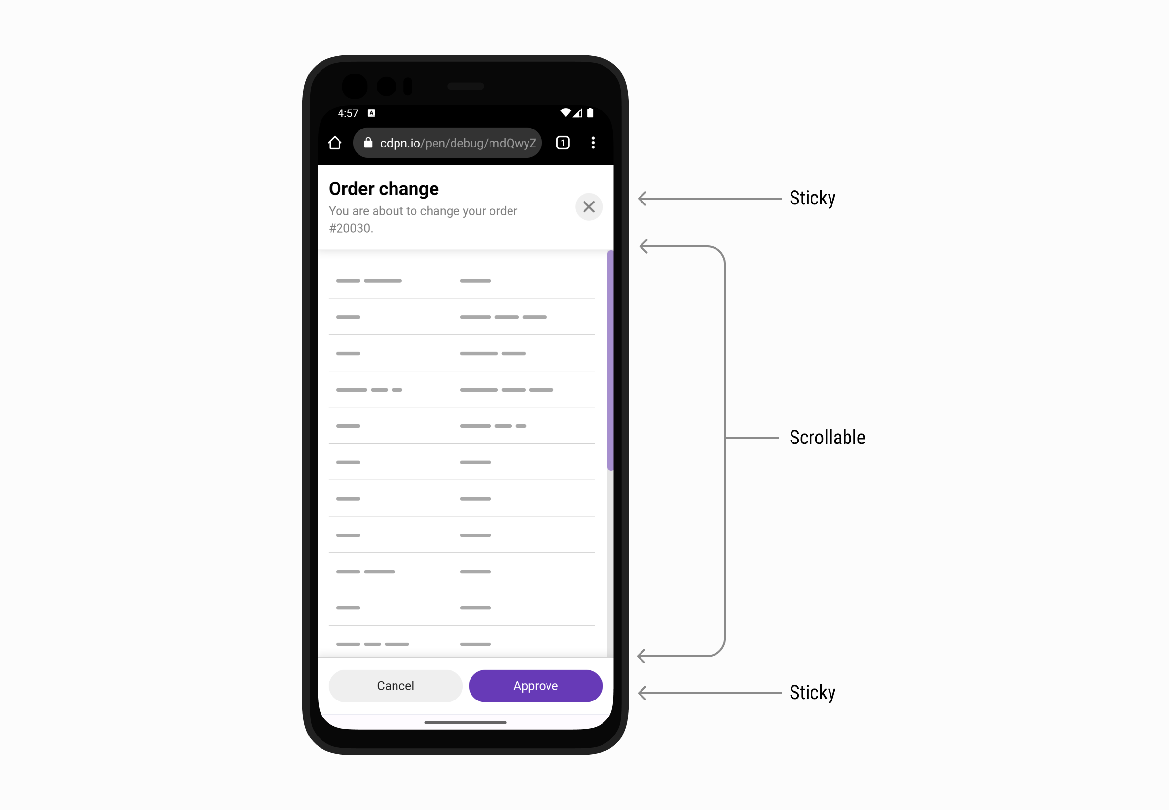
Modal with sticky header and footer

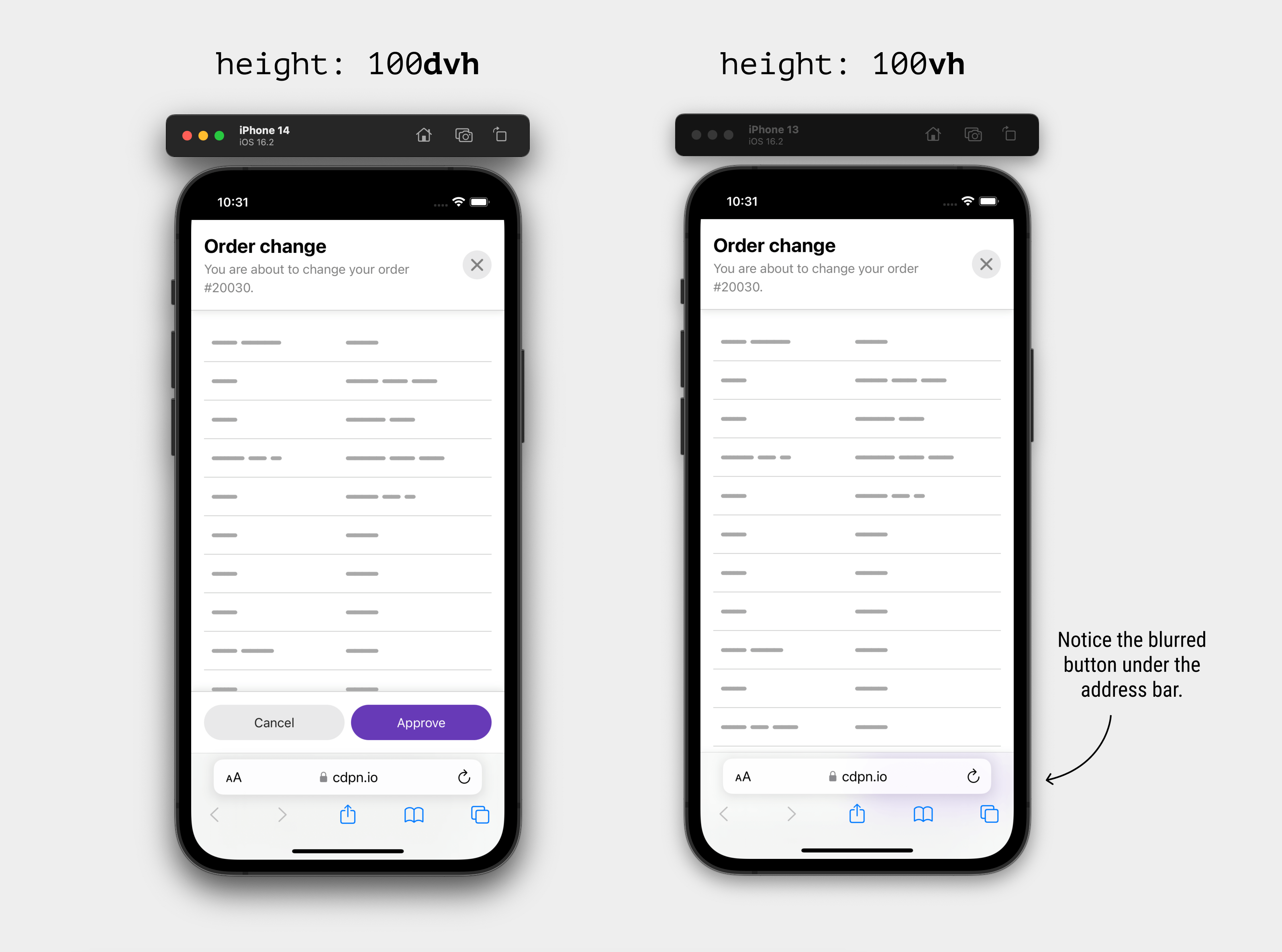
In this example, we have a modal with a sticky header and footer. The middle part should scroll if the content is long enough. This example is inspired by a figure by Max Schmitt while researching the topic.

Consider the following CSS:

.modal {
  position: fixed;
  top: 0;
  left: 0;
  right: 0;
  height: 100vh;
}

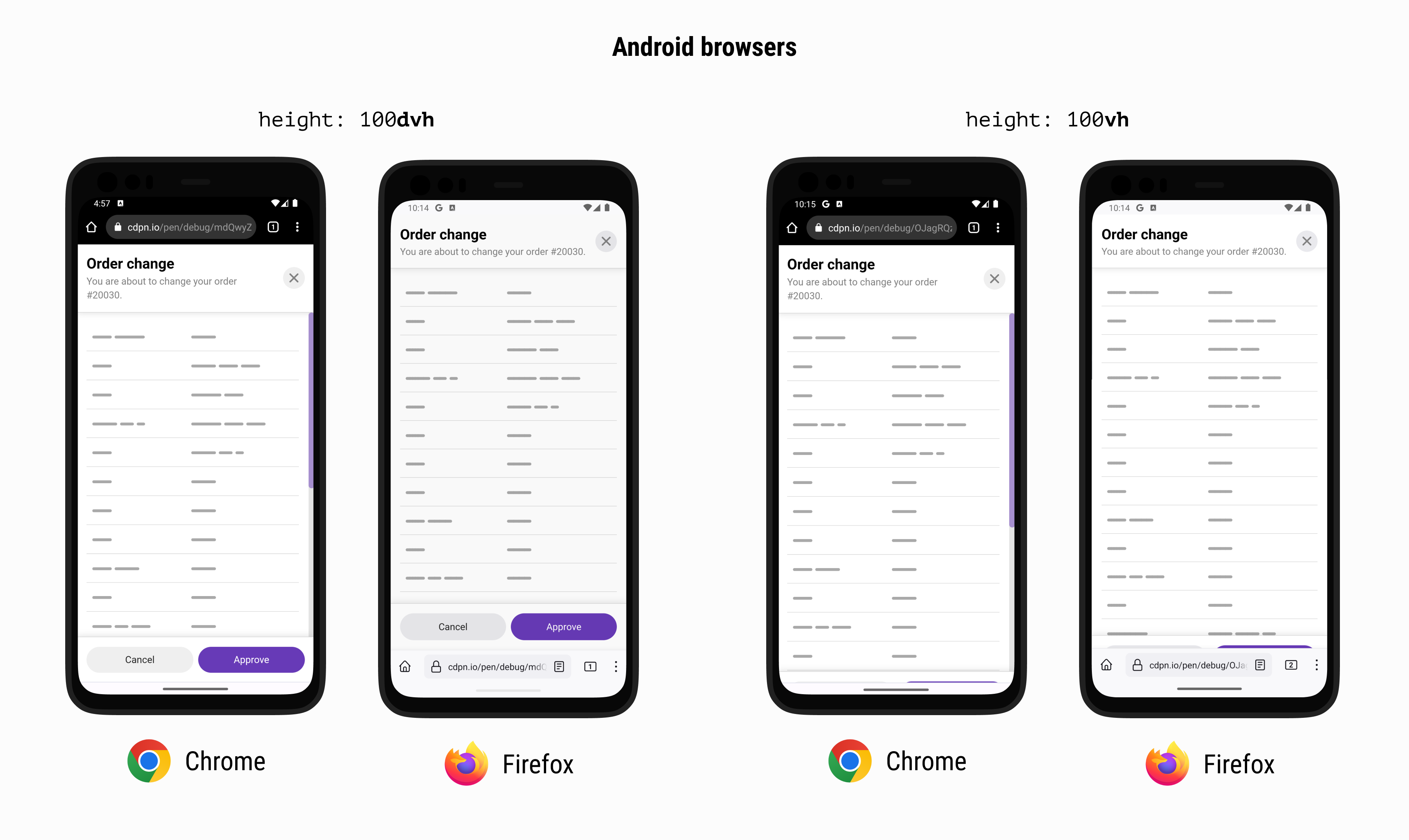
Using 100vh will make the bottom part of the modal invisible. In the example, that means the footer won’t be visible and this will break the UX.

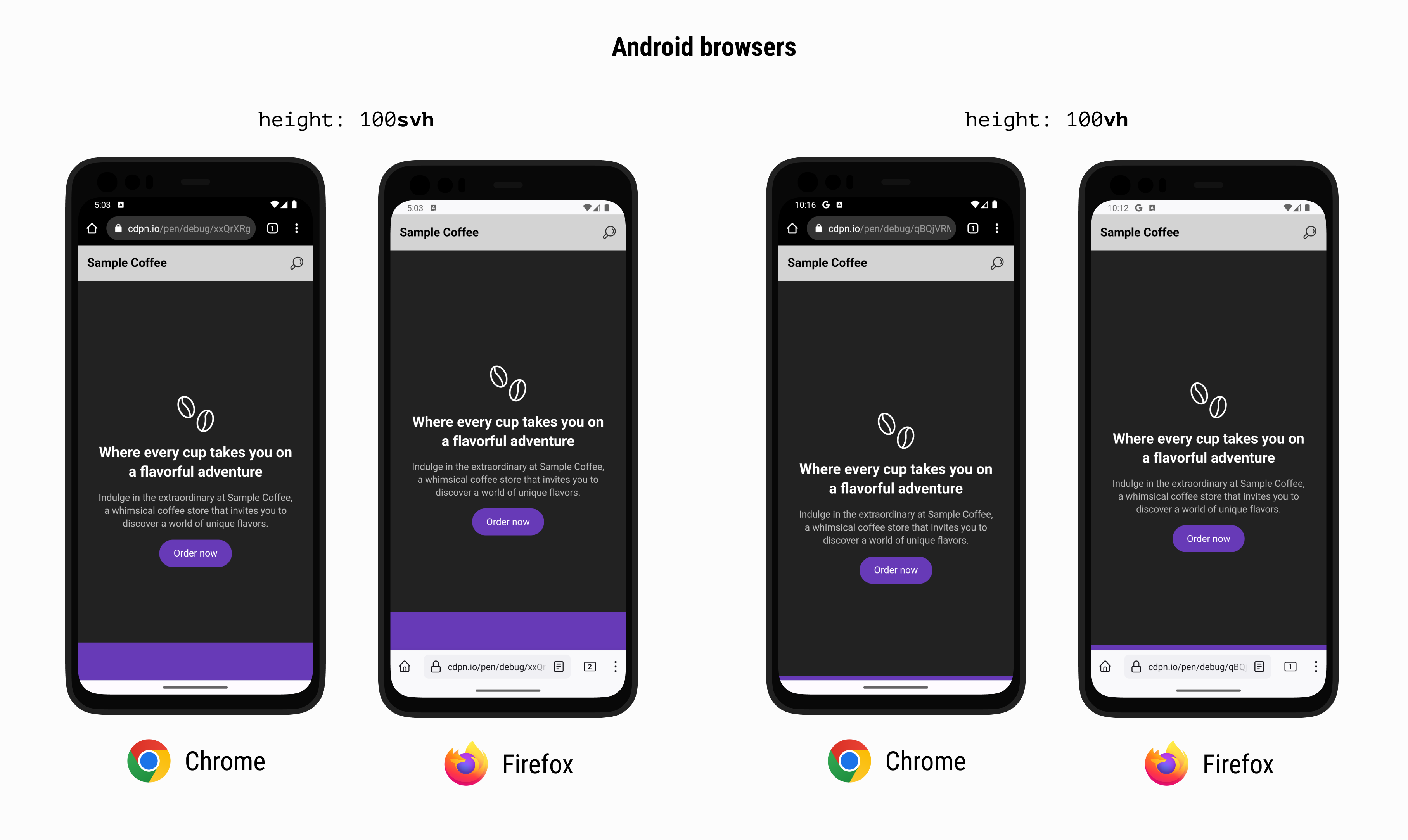
Here is how it looks with traditional and new viewport units on iOS:

..plus Chrome and Firefox on Android:

To solve that, we can either use svh or the dvh units.

Here is a video that shows the differences between dvh and vh.

Hero section

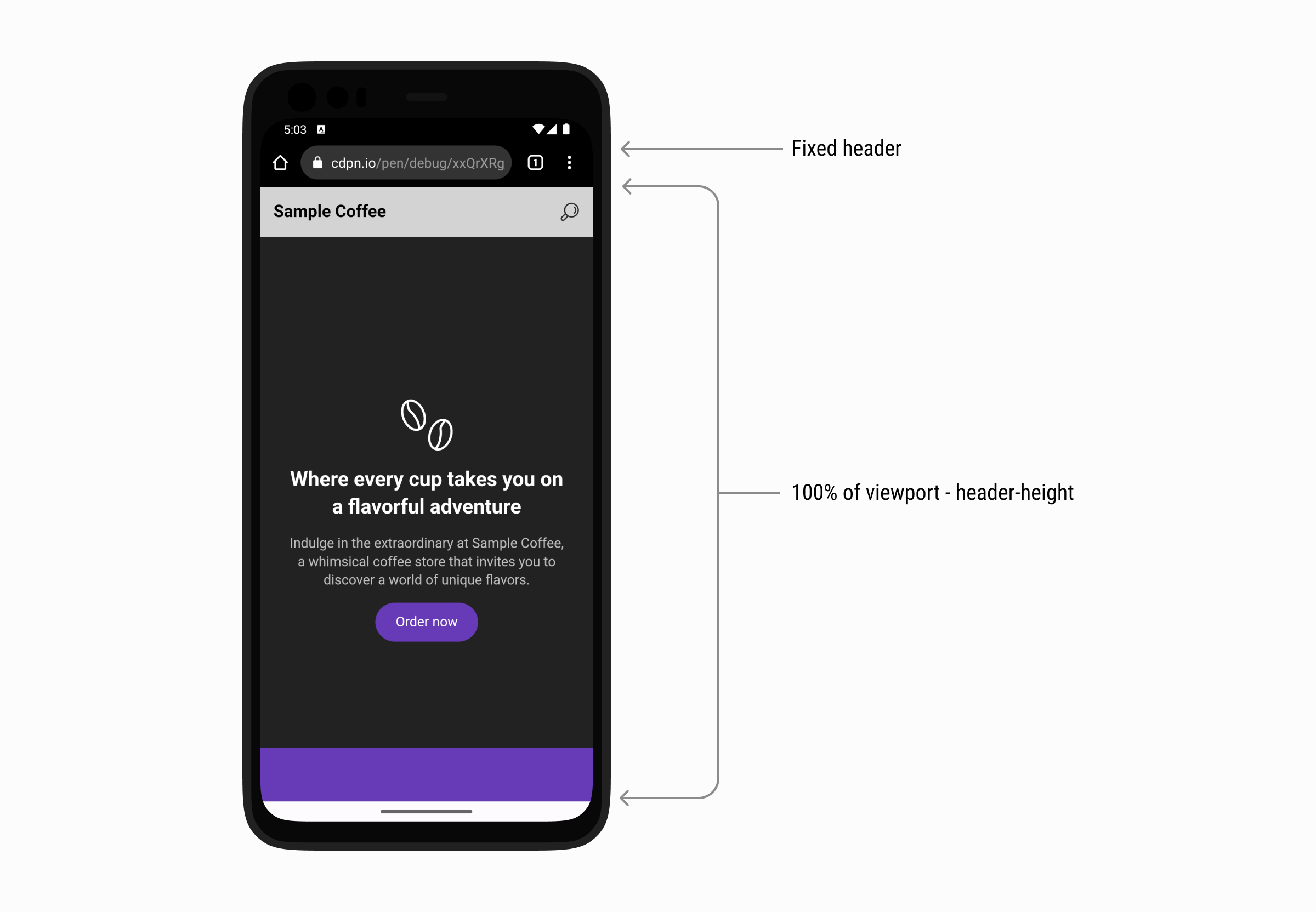
It’s a common case that we need to make the hero section height equal to the full viewport height minus the header height. Using the traditional vh for that case will fail in a browser that shrinks its UI on scrolls like iOS Safari and Firefox and Chrome for Android.

First, we need to make sure that the header height is fixed. I used min-height for that.

:root {
  --header-height: 60px;
}

.site-header {
  position: sticky;
  top: 0;
  min-height: var(--header-height, initial);
}

After that, I added min-height to the hero section and used calc().

.hero {
  min-height: calc(100svh - var(--header-height));
}

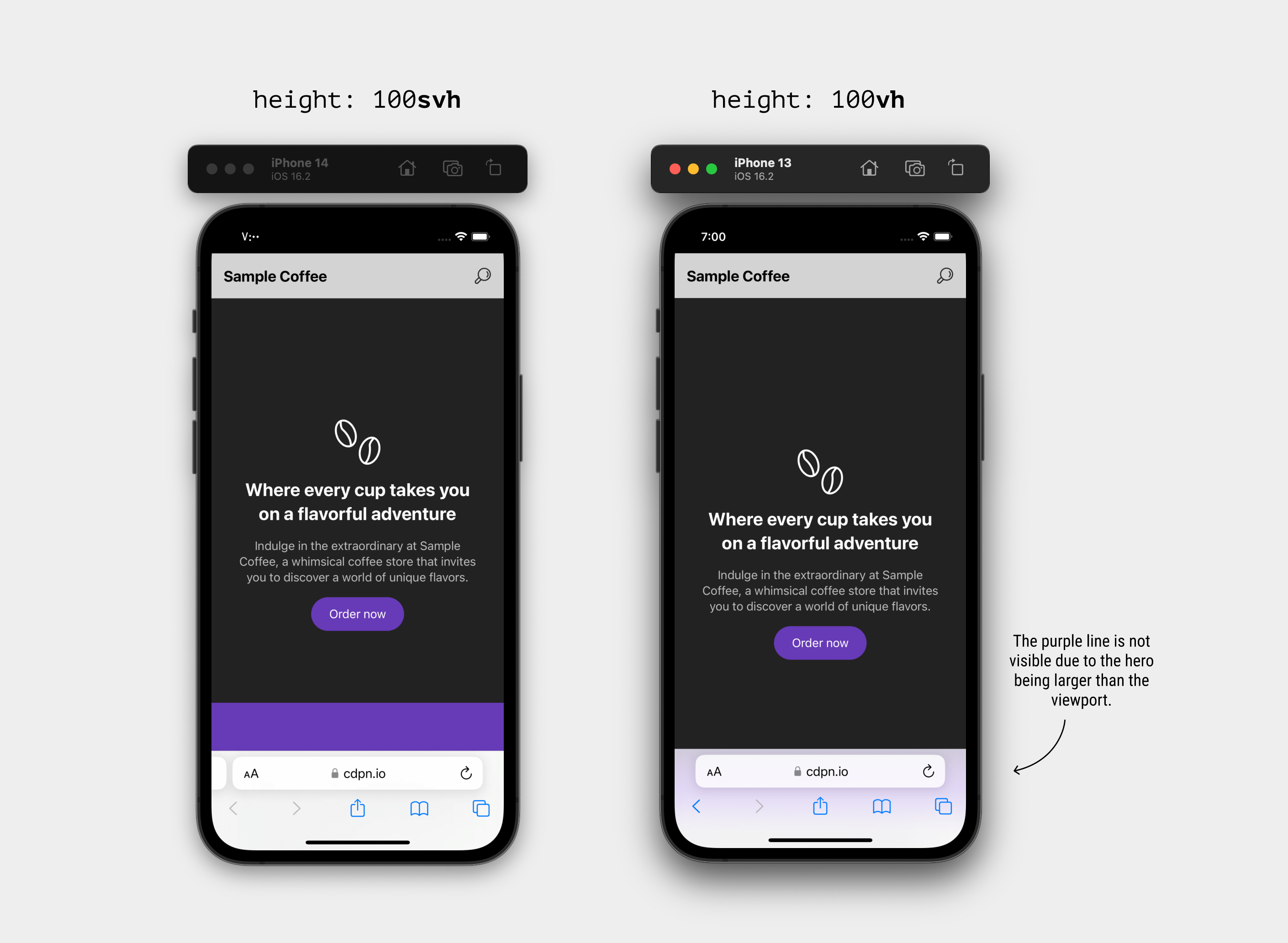
When using vh, the decorative element (in purple) isn’t visible at all. In fact, if you look closer, it’s blurred underneath the address bar UI in iOS Safari and cropped in Android browsers.

Here is a comparison between svh and vh on Safari iOS.

..plus Chrome and Firefox on Android:

See the following video and spot the difference between using svh and vh.

In such a case, using svh will solve the problem.

Is it possible to make dvh the default unit?

At first, the answer was “Yes, why not?”. Then I thought to myself, the dvh value will change as you scroll, so it might create a confusing experience when used for stuff like font-size.

h1 {
  font-size: calc(1rem + 5dvh);
}

Check out the following video and notice how the font-size change after the address bar UI is shrunk:

Demo

Be careful with the dvh viewport unit

The dynamic viewport unit might impact the performance of the page, as it will be a lot of work for the browser to recalculate the styles which the user is scrolling up or down.

I didn’t get the chance to do intensive performance testing, but I would be careful when using it. I hope that I will get the time to update on that here.

Other places where the new viewport units are useful

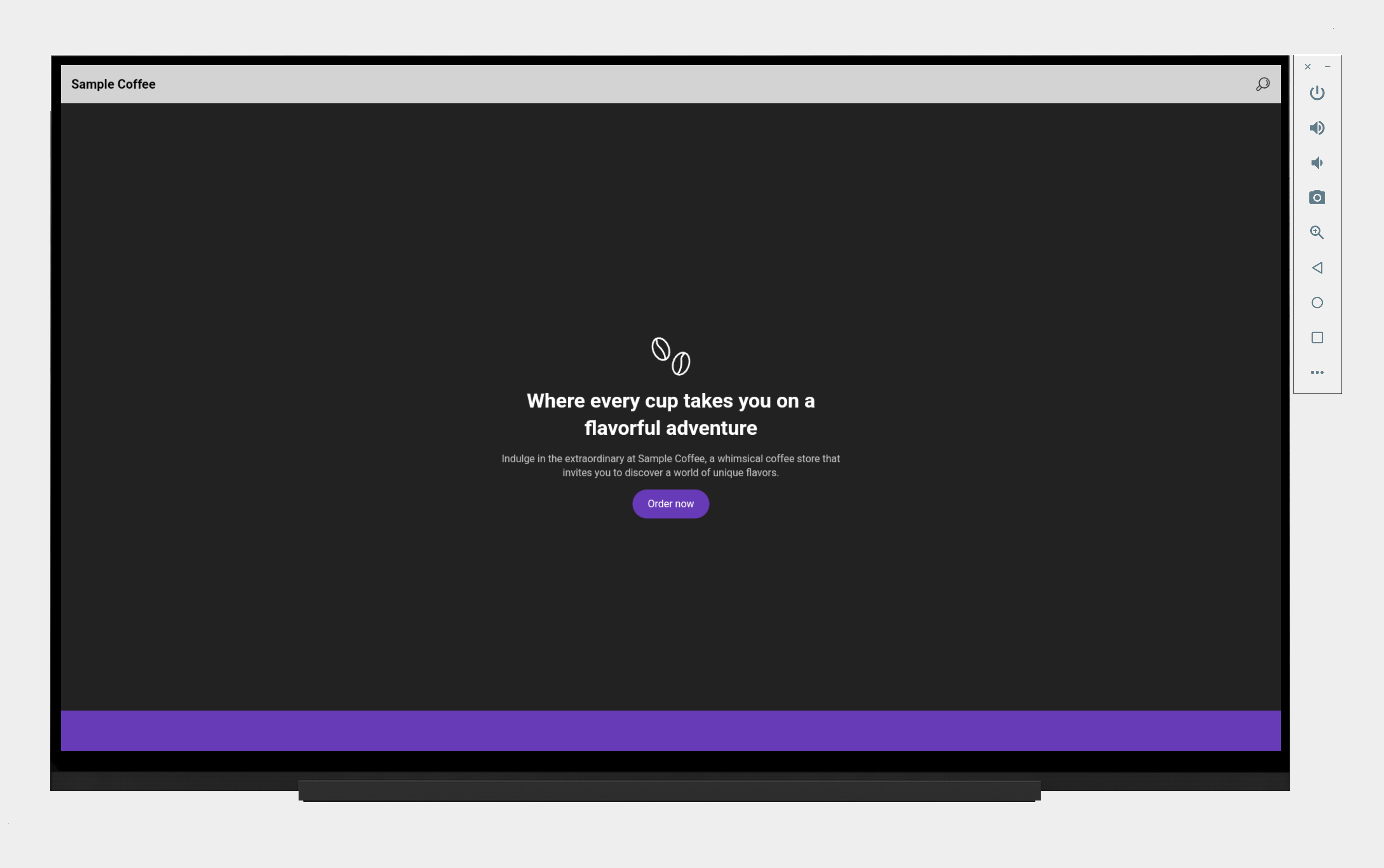
Those new viewport units might not be only about mobile browsers. In fact, you can browse the web on a TV today. Who knows what browser will come for a TV that has a UI that changes on scrolling and thus resize the viewport?

For example, here is the hero section example viewed on an Android TV:

It works perfectly and will keep working even if we have a dynamic UI.

Further resources

from Ahmad Shadeed Blog https://ishadeed.com/article/new-viewport-units/

Diversify Your Content Strategy Whiteboard Friday

Go from basic to a more advanced content strategy with Azeem in this Whiteboard Friday episode. Diversify your content strategy by creating the right content for your audience at the right time.

digital whiteboard image describing how to diversify your content strategy

Click on the whiteboard image above to open a high resolution version in a new tab!

Video Transcription

Hi, everyone. My name is Azeem. I’m the host of the “Azeem Digital Asks” podcast, and I’m here to show you a very brief whistle-stop tour of how you can diversify your content strategy on this Whiteboard Friday.

3 examples of where marketers get measurement wrong

3 examples of where marketers get measurement wrong

So I’m going to start off and make a very bold statement as a bald man and say that I think that we, as marketers, get measurement wrong, and I’m going to give you three examples here.

So if you are measuring brand awareness, for example, there are a number of things that you can measure, such as downloads, traffic, referrals, mentions. If you look at engagement as a key KPI, you’ll be looking at things like links, likes, comments, shares, retweets, all that sort of stuff. For lead gen, you’re typically looking at MQL, SQL, subscriptions, and call backs. So it’s three very quick examples of how I think we get measurement wrong.

Create an advanced content strategy

how to create an advanced content strategy

When it comes to our audience, I think we know what they want, but we don’t know how they want it, and I genuinely think that the internet is in a position now where hit and hope with just purely written content doesn’t work anymore. I genuinely think the internet has moved on. So I’m going to show you a very brief way of how you can take your content strategy from basic to even better to hopefully advanced, and that starts with this.

I think a lot of marketers are in the basic section, and that is where you have a particular topic, topic X as I’ve listed there, and that is your framework for the rest of your content. So if you were talking about trees, for example, you might have trees as your topic, and that would be the framework to branch out and create even more of topic around trees to move on.

That’s fine. That’s where I think a lot of marketers are. The better version would be looking at UA, universal analytics or multi-channel funnels, understanding what performs well, and creating more content of that based on where your audience is in the purchase journey. Then the advanced version would be looking into GA4, splitting out your top five markets as I’ve put there, understanding how they perform with a data-driven attribution model, and creating the right content for the audience at the right time, the Holy Grail of what we are trying to achieve here.

How to use this information

examples of advanced content

I’ll give you four examples of how you can actually use this information and take it away, and literally from tomorrow you can be able to improve your content strategy. So example 1 would be let’s say you have set up scroll tracking and YouTube view measurements on your GA4. Layer the two together.

You can understand how, for example, your audience in France will be engaging with your content in the sense of how far do they scroll down on a page and how much of your videos on your page they are watching. Example 1 would be a particular audience that scrolls not a lot, but engages with video quite a lot. In which case, I would introduce very early on in the page long-form videos.

You know what your audience wants. Don’t make them work for it. Don’t make them scroll down the page, because you know what they want. Make it as simple for your audience as possible. Example 2 would be the opposite, where you know your audience will scroll quite a lot, but you know that they won’t watch the videos that you put on the page. In which case, you can create highly-detailed content and then utilize remarketing to bring them back to your website.

The third example would be if you have an average scroll and an average video time, but a high ASD, which I have peddled as average settle duration. These are people that I call page hoppers. They’re very likely going to be in the research stage of their journey, of their purchase journey. So this is where you want to focus on your brand and why you stand out against the rest of your competition.

The fourth example would be people who don’t scroll and don’t watch your videos at all. I think in that situation you’ve very clearly got a disconnect, but there is still an opportunity for you to introduce short-form videos earlier on in the purchase journey. Utilize this information, find out which one of the four you sit in, and use that to create your content strategy in a more diverse way by including audio, snippets, video teases of varying different formats, and I guarantee you’ll be onto a winner and have more success with your content strategies moving forward.

I hope that in this very short video you’ve taken something away. You can find me on social media @AzeemDigital. If my SEO is any good, you should be able to type in “how can I contact Azeem” and you’ll come across my website. Very much enjoyed being here. Thank you for having me, and I’ll see you soon.

Video transcription by Speechpad.com

Azeem will be speaking at MozCon 2023 this August in Seattle! Join us for inspiring sessions with our incredible lineup of speakers.

We hope you’re as excited as we are for August 7th and 8th to hurry up and get here. And again, if you haven’t grabbed your ticket yet and need help making a case we have a handy template to convince your boss!

Register for MozCon

MozCon SEO conference 90%  sold out

from Moz https://moz.com/blog/whiteboard-friday-diversify-content-strategy

What is a PWA? Progressive Web Apps for Beginners

These days, everything is made possible with the help of mobile phones and applications.

Let’s say you need to order food – you can do so instantly via the company’s app. Maybe you need government services – the same thing applies. You can even get medical emergency dial services via an app.

There’s an app for everything – from banking to studying and from trading to shopping. Every business has an app, and even our governments have simplified their services into app form.

Hold on, building and maintaining an app is cumbersome, and it’s quite expensive for small businesses, so how do they manage?

Well it’s simple: with the help of advancements in technology there is an option that helps small businesses out. This option combines the features of an app with the technology used in web development to build affordable services for businesses – I’m talking about Progressive Web Apps.

Let’s dive in and get a better understanding of what PWAs are all about.

What is a Progressive Web App?

Progressive Web Applications (PWAs) are apps built with web technologies that we probably all know and love, like HTML, CSS, and JavaScript. But they have the feel and functionality of an actual native app. Wait a minute! Native Apps, what do we mean by this?

A Native App is a software application built in a specific programming language for a specific device platform, either IOS or Android.
PWAs are built with the capabilities like push notifications and the ability to work offline. They are also built on and enhanced with modern APIs which makes it easy to deliver improved capabilities along with reliability and the ability to install them on any device.

PWAs takes advantage of the huge web ecosystem this is inclusive of the plugins, and community and the relative ease of deploying and keeping a website contrary to a native application which is pretty difficult to develop. This means you can build a PWA quickly and easily.

With its popularity many companies have shifted into the product, I tend to believe that this is because of its ability to run on an android and iOS without much difference. Some good examples of top companies who have their products as PWAs include: Twitter, Pintrest, Uber, Tiktok, Spotify, Jumia (a leading e-commerce site in Africa) etc…

A common feature about this products is that they are all installable on your home screen, able to work offline from where you last left and offer a comparable experience and features to their native apps.

Just like when building a native mobile app there are some expectations that should be met to make a good product for consumer use, the same thing applies to PWAs. Let’s discuss what makes a good PWA.

Characteristics of PWAs

Below is what should be considered when developing a PWA:

Responsiveness

Different companies produce gadgets with different screen sizes, and as a developer it’s your responsibility to ensure all the different users enjoy the product regardless the device they are using. So it’s a good idea to make sure your app can be used on any screen size and it’s content is available at any view-port size.

Installable

Research has shown that users tend to engage more with installed apps compared to visiting the official sites. Having a PWA as your product gives the users the look, feel and engagement of a normal app.

Independent Connectivity

By keeping a user engaged to your app even while they are offline, provides a more consistent experience than dropping them back to a default offline page.

A good example to illustrate this will be that of a music app, your users should be able to access offline playback and listen to saved music even without internet connection. Another good example is twitter app, a user is able to go back a read through tweets which they might have missed.

Discoverability

Since most PWAs are converted websites, it is fair to make them discoverable on the search engines, this will help generate extra traffic to your app. This also acts as an advantage over native apps which can’t be discovered over the search engines.

Appearance

The appearance of the app should feel and look like that of a normal app, so be sure to include things like an app icon, this will help make it easily recognizable also things like splash screen will add the touch and feel of an app.

Cross Platform

PWAs are developed as web app first, which means that they need to work on all browsers/systems and not just a selected few. Users should be able to use them in any browser before they decide to install them.

So folks! there you have it, the general info about PWAs. Along the way you might have noticed occasionally a comparison between PWAs and Native App and this might have confused you a bit, Well let’s clear the airwaves by checking the comparison between the two to get a clear understanding.

Differences Between PWAs and Native Apps

Development Cost

PWAs are cheaper to develop compared to Native AppsWhen you’re developing a native app, you’ll have to learn a certain programming language and then build a version of the app for each type of device, Android and iOS. On the other hand you can choose to hire a experienced professional to do the work for you which will even turn out to be more costly.

Down the road, you will also need resources to maintain and update the app, which means lots of money and time is required.

In the case of a PWA, you can have a single codebase for the different platforms. It’s also time-saving since you will not need to develop it from scratch you can configure your current web site to fit.

And if you choose to hire developer it will only be one compared to native where you can hire up-to two depending on where you need your app.

Discoverability

Native apps cannot be indexed by the search engines, they can just be found through the App/Play store’s website. You can make your app more discoverable on the App/Play store by using App Store Optimization(ASO), but that’s another story.

Unlike native apps, PWAs work like websites so they can be indexed by search engines. This helps them rank better in search results.

Safety

Nowadays in order to run a website, it should be encrypted with a SSL certificate, this adds an extra layer of security. Now, as we already know PWAs are site converted into app which means they are more secure because they run on HTTPS. These are security protocols that allow safe exchange of data between client and server so that is doesn’t get tampered with.

To secure your native apps, you need to implement various security measures, like multi-factor authentication and so on.

Installation and Download

Native apps need to be downloaded and installed from an app store. This requires some commitment from the user to do it from start to finish. Users have to pass and check multiple permissions before installing an app.

On the other hand, PWAs don’t require any of those steps. From the browser you can bookmark it and add the app to your home screen with just a few taps.

Benefits of PWAs

A lot of organizations both private and public are switching to PWAs not only because they are cheap to develop but also because they offer greater engagement.
Now let’s look at a quick summary of the benefits of a PWA:

  • They are responsive and work with many different screen sizes.
  • They can run on multiple platforms and any device with a modern web browser.
  • They function just like normal Native Apps.
  • The updates are independent, you don’t need to visit the play store for an update.
  • They’re built with common web technologies.
  • They’re fast and lightweight.
  • They work offline unlike other sites.
  • They are discoverable via search engine.
  • They are easily installable.
  • Low maintenance cost.

Requirements to Get Started with PWA Development

It does not take much to get started building a PWA. You just need a few things and you are good to go.

Tools
The best known technology stack to develop PWAs is AngularJS. Speaking of Angular, here is a resourceful guide on how you can convert your already existing Angular app into PWA. Others stacks include ReactJS and Polymer.

HTTPS
You will need a server with a HTTPS connection. This makes sure your user’s data is secure. It adds an extra layer of security to you site.

Application Shell
It provides a good first impression when your app loads. In simpler words this is what the user sees when they interact with your app for the first time.

Service workers
This is one of the key technologies behind PWAs. They help support your app work offline, and they perform advanced caching and run background tasks. Service workers can complete tasks even when your PWA is not running.Some other functions associated with Service Worker include:

  • Sending push notification
  • Badging icons
  • Running background fetch tasks etc…

Manifest file
This is a JSON file that is created with a Web App Manifest Generator. This file contains the information that tells how your PWA should appear and function. It allows you to determine the name, description, icon, colors and other features of your PWA. Here’s an example of a manifest file:

{
"short_name": "DevBlogger",  
"name": "DevBlogger",  
"description": "All dev stories under one roof",
"theme_color": "#eb5252",  
"background_color": "#000000",  
"display": "fullscreen",  
"Scope": "/",  "orientation": "portrait",  
"icons": [    
    {
        "src": "images/android/android-launchericon-48-48.png",      
        "type": "image/png",      
        "sizes": "48x48"
    },
    {      
        "src": "images/android/android-launchericon-96-96.png",
        "type": "image/png",      
        "sizes": "96x96"    
    },    
    {      
        "src": "images/android/android-launchericon-192-192.png",
        "type": "image/png",      
        "sizes": "192x192"    
    }  
   ],  
       "start_url": "index.html?utm_source=homescreen"
  }
  • Audit your App
    This is possible using the Google Lighthouse tool. Google Lighthouse is a open-source software that anyone can use on any webpage. Google is a big champion of PWAs and pushes them as the future of the web. You can use Lighthouse to help you see how fast, accessible, and SEO readiness your PWA is.

How to Build a PWA

By following the steps below, you can easily create a fully functional PWA that offers an mazing user experience across all devices.

Step 1 – Plan your app

Before diving into development, you should consider the goals of your PWA, what features you want to include, priorities and user experience. You can create first design concepts and wireframes for the app to visualize the structure and layout.
In most scenarios, this is often referred to as a ‘discovery phase’. You get the opportunity to ideate and gather user and stakeholder feedback as well as considering the functionalities of your to be product.

Step 2 – Designing the User Interface

After getting everything right from planning, you can now proceed to designing the UI of your app. During this stage consider things like responsiveness, compatibility with different platforms etc.. Be sure to capture all details that are crucial to the user including their interaction and engagement during usage.

Step 3 – Developing the Front-End

Using the web technologies that is HTML, CSS, JavaScript and frameworks like Angular. React or Vue.js develop a visually appealing interface for the users. And always remember they key principle in development using this stack implement a mobile first approach while ensuring responsiveness for larger screens too.

Step 4 – Implementing Service Workers

As mentioned previously, service workers are a key component of PWAs. They are JavaScript files that run in the background, enabling offline functionality, push notifications, and caching. To make sure your PWA works to its fullest potential, you’ll need to register and implement a service worker. The way on how you can do this massively depends on which framework you are using.

Step 5 – Adding Push Notifications

Leverage the Push API and service workers to implement push notifications. Obtain the necessary user consent and use a push notification service to send notifications to users.

Step 6 – Optimizing Performance

Optimization is a very important step in development in general. This is how you provide a seamless experience to your users. by ensuring you reduce loading times. by leveraging techniques such as code splitting and caching we should be able to achieve a fast and efficient operation for our PWA.

Step 7 – Testing and Debugging

Test your PWA on different devices, browsers and network condition to be sure that it meets the objective. Also be sure to gather user feedback and make necessary improvements when necessary.

Resources to Get Started with PWA Development

If you want to learn and move with the trend, finding resources to help you might be a bit tedious, to help you get started here are some of the best resources listed for you:
Online Tutorials and Guides

Documentation and Reference Materials

PWA Development Tools

Conclusion

Keeping in mind that PWAs are new to the industry and haven’t yet been fully utilized, they can be a great addition to add to your toolkit.

With the latest technologies and the right tools getting started with PWAs can ultimately increase sales and monetary gain for your product either as an individual or organization. With it’s many features including they are fast, able to work offline, and also they perform like normal native apps. This offers your users a great experience and keeps them satisfied.

If you have read this far I really appreciate it.

Enjoy Coding ❤.

from freeCodeCamp https://www.freecodecamp.org/news/what-are-progressive-web-apps/

Getting started with native design tokens in Figma

Getting started with native design tokens in Figma

How to use Figma variables to implement different design token strategies

What are design tokens anyway?

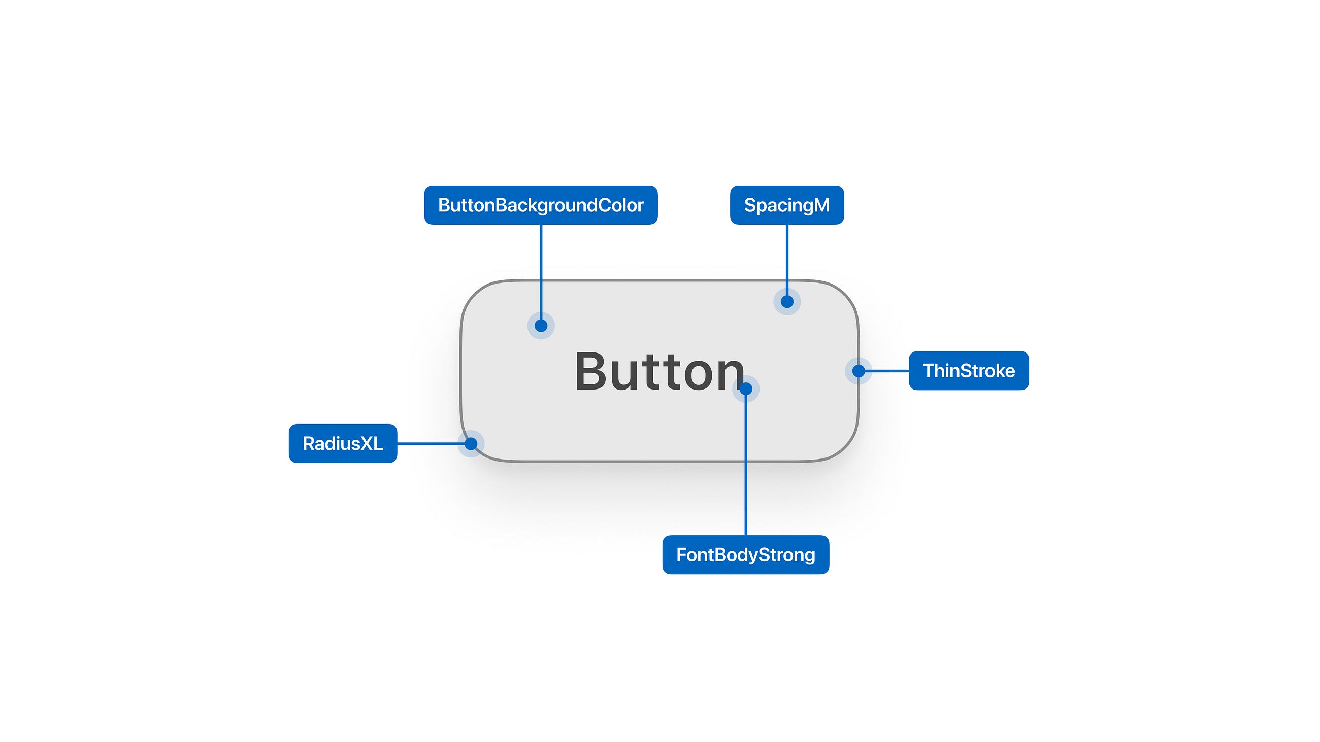
Design tokens are named entities that store raw, indivisible design values like colors or pixel sizes. They are the core pieces of a design system. Stored in a technology agnostic format they can be transformed for use on any platform, replacing hard-coded values. ~ Design tokens — What are they & how will they help you?¹

Your text and color styles, shadows, etc. can be represented as design tokens. The important part is to share design tokens between all parts of the product team. The goal is for design and development to use the same tokens from the same source of truth.

With design tokens, both hand-off and global changes get easier. If set up correctly, any design token change must be done at one place only, the design token source of truth. And this change will still affect the entire system, e.g. changing the brand color everywhere all at once.

Variables vs. design tokens

Figma introduced variables². They work well as design tokens, but they are more, they can also be used for prototyping³.

This article focuses on using the Figma variables feature to implement design tokens. I may refer to it as either variables or design tokens.

Variables can be one of four types: solid color, number, string, and Boolean.

Color

Color variables can be applied as fills, text fills or stroke color².

Currently, variables can’t be used in effects like shadows, in layout grids or in gradients.

Color variables can only be solid colors. Gradients are not supported, and you can’t change the opacity of a color variable.

You can use color variable in styles, but you can’t change its opacity. You can, however, add another layer on top of the color variable. If you created a style with a variable and add a 60% white on top, you could create a muted version of your variable.

Number

Number variables can be used as text, for sizes, paddings, gaps, and border radii². This covers most things you would need design tokens for.

The three things currently not supported are border-width, opacities, and effects. This means you can’t make styles or components semi-transparent using a variable. And you can’t define shadows with number variables from your design system. 😢

String / Text

Text can be used in text layers and for variant names². They are useful for translations or to tokenize UI copy.

To translate your entire app, create a collection with a mode for each language you support. Now you can switch the language of your entire app from a dropdown.

You can also use text strings to switch between variants. For example, you could set a text string to mobile or desktop. With this you can change a component variant between mobile or desktop. This is great if instead of different token values, you use different tokens on the two platforms.

Boolean

Boolean variables don’t seem to have a lot of use for design tokens.

They are great at toggling things within component depending on specific modes though. For example, to show or hide icons depending on the screen size.

At the time of writing Boolean variables can only be used for Boolean variants. Not for Boolean component properties.

Design tokens vs. styles

Styles in Figma are similar to design tokens. But they have some capabilities that design tokens are lacking. For example, design tokens don’t support blend modes or mutations like alpha changes. But they can be referenced in other tokens or even styles⁴. This is not possible using styles.

While some of those functionalities may come to design tokens at some point, many may not. And this is a good thing. Design tokens are purposely kept close to the w3c design token specs⁵.

Styles however are a Figma primitive, similar to classes in CSS. Maybe styles will get more capabilities in the future. For example, being able to set the opacity of a referenced variable.

When to use tokens?

At the moment styles have little unique use cases. I suggest using variables for all design tokens that can be represented as variables.

For now, only simple tokens can be created, composite tokens are not available in Figma.

You will also not be able to replicate tokens if you stray away from the w3c design token draft⁶ ⁵.

That being said, tokens should still most of your needs for color, and size base values.

When to use styles?

Use styles for anything that tokens can’t do. For example, you can use styles to replicate composite tokens⁶ for typography, shadows, or borders.

Typographic tokens are supposed to come to Figma at the end of 2023. But if this happens there are still borders and shadows left.

Design tokens in Figma libraries

Design tokens can be shared as part of a library just like styles. They also have the same limitations. This means they don’t get passed on through files.

Imagine you have three files: design tokens, components, app

  • The components file imports design tokens and uses it on the components, which get exported
  • app imports components, this will allow it to use the exported components. But the design tokens will NOT be available.
  • app needs to additionally import the design tokens file to be able to use the design tokens directly.

from Design Systems on Medium https://uxdesign.cc/getting-started-with-native-design-tokens-in-figma-5d9c5fcdd9f7

Guillermo del Toro: I Dont Fear Artificial Intelligence. I Fear Natural Stupidity – Yahoo Canada Shine On

“Guillermo del Toro: Crafting Pinocchio,” the roving, ever-expanding, 8,000-square-foot exhibit dedicated to the art of making Guillermo del Toro and co-director Mark Gustafson’s meticulous Oscar-winning stop-motion film, has made its way from New York’s Museum of Modern Art to the Portland Art Museum in Oregon.

This past weekend, the three-time Academy Award winner came in person to the Rose City to accept a Cinema Unbound award from PAM CUT (the Portland Art Museum’s new-media-focused Center for an Untold Tomorrow) and later sit down for a relaxed chat with PAM CUT’s curator Amy Dotson. As usual, the director sounded off unguardedly about a range of topics, from struggling to get even his own passion projects greenlit to his commitment to animation and the threat of artificial intelligence looming over the creative community.

More from IndieWire

“Since I was a kid, all I wanted to do was monsters and stop-motion animation, and that’s what I’m doing, so why the fuck should I not do it?” the “Shape of Water” and “Pan’s Labyrinth” director laughed. His next film — also for “Pinocchio” distributor Netflix — is an animated adaptation of Kazuo Ishiguro’s fantasy novel “The Buried Giant.” The film, which is two years out from production, utilizes stop-motion but is certainly less monster-based in centering on a version of England where King Arthur actually existed. “Pinocchio” animators ShadowMachine back the project.

Del Toro, who recently said that five of his projects have been turned down by studios this year so far, told the Portland museum audience, “But we keep going. With ShadowMachine, Mark, everybody, when we were involved with ‘Pinocchio,’ you have no idea how we were involved in meeting after meeting after meeting, and hearing no … if you have the conviction that it must be made, ‘no’ is a ‘yes’ waiting to happen, and you just have to say, alright, your loss. You literally have to believe that. You should not question your material. You should not say, ‘What am I doing wrong?’ The last time somebody passed on ‘The Buried Giant,’ I wrote an email, and I said, it’s easier for me to do it than to argue with you. I’ll just show it to you. And you’ll see I was right. Or not. There’s a lot of things to do, but it’s very important to have that certainty.”

Del Toro said that as he continues to develop movies like “The Buried Giant,” he still watches “three movies a day” for inspiration, and often that means rewatching. “If you see all ‘All About Eve’ when you’re 15, and you see ‘All About Eve’ when you’re 40, you see two entirely different movies.”

When asked about his optimism for the state of creativity in general right now, del Toro said, “I remain enthusiastic but skeptical, meaning I know we are a horrible human race, but we do great stuff, and many people are great. What brings me hope and makes me think that it’s worth it? The next generation because we undoubtedly fucked it up… in that hope, it can only come with your full support,” motioning to the people in the standing-room-only crowd at the Portland Art Museum.

He added, “When I see people who are fearless, I get inspired and I like it, and I like the possibilities when people talk about now, and how it’s all dire, and [how] people are afraid of artificial intelligence… I don’t fear artificial intelligence, I fear natural stupidity. Any intelligence in this world is artificial. When I look at the people coming into the art scene and how they are in spite of all the things that are hardships and all the things weighing against it, they love art, and that’s what makes my spirit sing.”

While praising the next generation, del Toro also cautioned that ages 14 through 24 are “hell,” adding, “Since I was seven, I’ve been looking forward to being old. The real crime in our existence is to look for perfection. We should all aspire to imperfection.”

The advice for his eight-year-old self he wishes he could tell now? “Don’t eat that fucking cupcake.”

Best of IndieWire

Sign up for Indiewire’s Newsletter. For the latest news, follow us on Facebook, Twitter, and Instagram.

Click here to read the full article.

from “artificial intelligence” – Google News https://www.indiewire.com/news/breaking-news/guillermo-del-toro-ai-the-buried-giant-pinocchio-1234878950/

Design syntropy

A concept embracing the evolving nature of design work and the unique roles of design artifacts and design systems

Photo by Vincent Botta on Unsplash

There’s a concept that I’ve come to refer to as “design syntropy.” It’s related to the creation and use of design artifacts — all those things we create as designers and product managers and engineers as we shape a product or concept.

Most design artifacts are temporary sources of truth. They help guide our thinking, collaboration, and decisions while a project is underway. But their “truthfulness” has a short shelf life.

I’ve often wondered and have been asked which design artifact is the “source of truth” for something in a product, and honestly, I don’t think that’s a realistic or even desirable goal.

I think design has a quality of syntropy, an antonym to entropy. Unlike entropy, which suggests a natural decline into chaos and disorder, syntropy represents the idea of order, evolution, and the ability to bring together ever-increasing complexity to create something new.

In product design, our work creates ripple effects, influencing areas of the product that we might not have directly touched. This is design syntropy. A design artifact left untouched doesn’t descend into chaos, but it may slowly drift out of alignment with the reality of the product, while the thing it represents evolves on its own, indirectly influenced by changes elsewhere in the product.

Design artifacts represent a source of truth only in a moment of time.

This isn’t a problem to solve, nor a flaw to correct — it’s just the nature of design work. Design artifacts are a record of a project’s journey, showing us the thought processes, tradeoffs, and context of decisions. Great design artifacts multiply collaborative impact across a team and help to build momentum. Ultimately, they’re a form of documentation — and in that capacity, that’s why even simple sketches and breadboards convey immense value.

In the long run, the real source of truth is the design system. A good design system is enduring even as different projects come and go. The design system needs to stay aligned with the product, and it needs active maintenance, documentation, and champions.

I don’t like the idea of design artifacts automatically updating to mirror changes in the design system. This might sound appealing on paper, but in practice, it tends to break the value of the artifact as a record of the project’s context and history.

Design syntropy as a concept embraces the evolving nature of design work and the unique roles of design artifacts and design systems.

Originally published at quinnkeast.com/writing/design-syntropy.

Quinn Keast is a partner & designer at Caribou, and also product designer at Airplane.


Design syntropy was originally published in UX Collective on Medium, where people are continuing the conversation by highlighting and responding to this story.

from UX Collective – Medium https://uxdesign.cc/design-syntropy-334080295f47?source=rss—-138adf9c44c—4

Design Tokens

Design tokens are essential for creating and maintaining a coherent design system. They provide many benefits such as consistency…

Continue reading on Medium »

from Design Systems on Medium https://medium.com/@hoomanahmadi/design-tokens-8a726afe427e