10 diagrams to help you think straight about UX Research

Some of the problems we work on as UX researchers are simple and are easily solved by getting users in front of our product. But other problems can be complex and it’s hard to know how to start solving them. In situations like that, a simple 2×2 diagram can cut through the “what ifs”, the “how abouts” and the edge cases and provide a simple way of looking at the problem. Here are 10 examples of 2×2 diagrams to simplify UX research discussions.

Loved by management consultants, a 2×2 diagram is a simple — some might say simplistic — way of looking at a problem. You consider each of the various factors in your problem and choose two that are important and that can be classified into discrete values.

One of my favourite examples comes from Steve Jobs. When Jobs returned to Apple in 1997, he looked at the product line up and thought it a mess. There were 15 product platforms and many variants of each one. He wanted to simplify Apple’s product line, so in 1998 he presented a four-quadrant product grid at the Macworld Expo. One axis on the grid was the platform (Desktop / Portable). The other axis was the market segment (Consumer / Professional). He then re-oriented Apple around creating the best possible product in each quadrant, leading to the iMac and the iBook in the consumer segments and the Power Mac and the PowerBook in the professional segments.

The problems that we deal with in product development are sometimes multi-factorial and complex. In these situations we can get swept up in discussions of technical issues or business rules and forget the importance of users and their goals. If you find that happening in your next meeting, turn to the whiteboard and try using one of these diagrams to simplify the problem and keep user needs in the forefront of the discussion.

How to decide what user groups to research with first

When we think of all the different user types for our product or service, it can sometimes seem overwhelming. It’s not clear where we should start our research. When I find a team in that position, I sketch out Diagram 1. The vertical axis is the amount we will learn (or expect to learn) by visiting a particular user group. Some user groups will teach us a lot about how they work in the product domain and there are others that we may already know much about. The horizontal axis is how easy or difficult it is to get to that user group. Some groups are simple to find (they may be in the same town as us) whereas others may be difficult to access because of factors like their geographical location or work schedule.
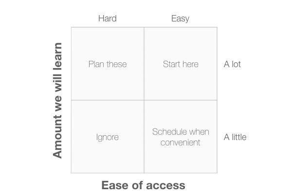
Diagram 1: A 2×2 plot with the axes,”Amount we will learn” and “Ease of access”.

The four quadrants are:

  • Ignore: User groups in this quadrant are hard to get to and will teach us little, so we can ignore them.
  • Schedule when convenient: User groups in this quadrant are easy to get to but we won’t learn much from them. It makes sense to schedule visits to these groups only if you have some spare time between visiting the other groups of users.
  • Plan these: We expect to learn a lot from these user groups, but for one reason or another they are hard to get to. We should start planning these visits to ensure we see these groups in the future.
  • Start here: These user groups are easy to get to and we expect to learn a lot from them. It makes sense to start our research here as we can get going immediately and provide some real value to the development team.

How to create personas

A simple way to identify personas from your research is to identify two dimensions that appear of overriding importance in your research and then to group your research participants in the appropriate quadrant. In Diagram 2, I’ve chosen two dimensions that tend to be of importance on many projects: people’s expertise with technology and their knowledge of the domain of interest.
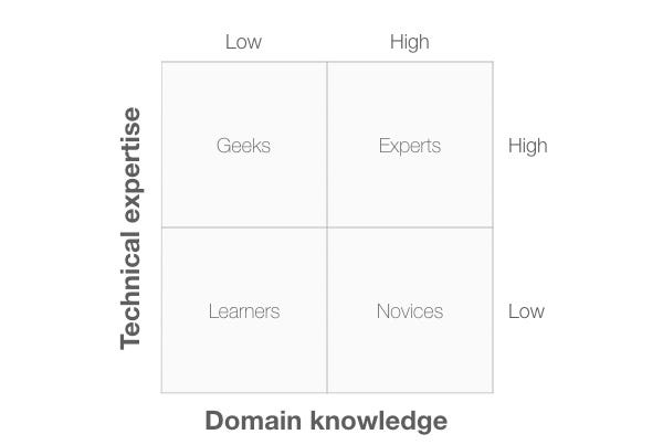
Diagram 2: A 2×2 plot with the axes,”Technical expertise” and “Domain knowledge”.

The four quadrants are:

  • Learners: This persona has low technical expertise and little domain knowledge.
  • Geeks: This persona has high technical expertise and little domain knowledge.
  • Experts: This persona has high technical expertise and high domain knowledge.
  • Novices: This persona has low technical expertise and high domain knowledge.

Assuming you have data from field visits, you should be able to create more meaningful dimensions than these. If not, these dimensions often work well to generate assumption personas.

How to identify red routes

A 2×2 plot makes it easy to identify the red routes —the key tasks —that users carry out. In this example, the two dimensions are task frequency (that is, how often users carry out the task) and task importance (that is, how important the task is for users).
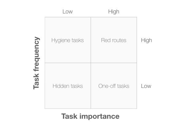
Diagram 3: A 2×2 plot with the axes,”Task frequency” and “Task importance”.

The four quadrants are:

  • Hidden tasks: These are low frequency, low importance tasks. It doesn’t make sense to spend much time researching or optimising these tasks.
  • Hygiene tasks: These are high frequency, low importance tasks: the mundane tasks (such as authentication) that users have to complete before doing what they actually want to.
  • One-off tasks: These are low frequency, high importance tasks: an example might be software installation or creating an account.
  • Red routes: These are high frequency, high importance tasks: we must optimise the usability of these tasks in our system.

How to decide what to fix

On completion of a usability evaluation, the development team needs to prioritise the problems so they know which ones to fix first. Diagram 4 shows a 2×2 diagram that can help here. The two dimensions are “Task frequency” (how often the task is carried out) and “Task difficulty” (how difficult the task is to complete). It makes sense to spend our time focusing on the hard, high frequency tasks.
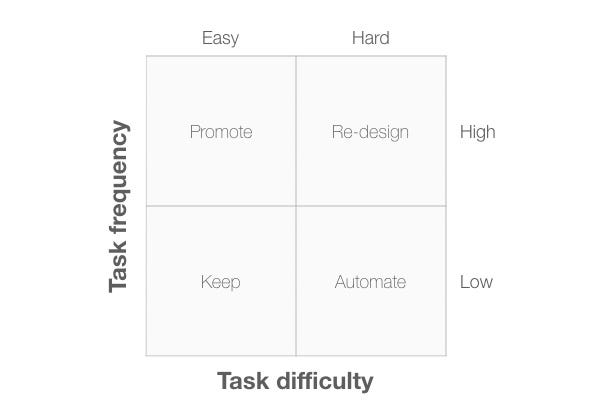
Diagram 4: A 2×2 plot with the axes,”Task frequency” and “Task difficulty”.

The four quadrants are:

  • Keep: These are low frequency tasks that are easy to complete. We need to make sure that any changes we make don’t have a negative effect on these tasks.
  • Promote: These are high frequency tasks that are easy to complete: we should encourage marketing to make more of these when describing our product.
  • Automate: These are low frequency, difficult tasks. We need to ask if there is a way to automate these tasks so that the system can do them on behalf of the user. If not, a Wizard design pattern might simplify the task for users.
  • Re-design: These are high frequency, difficult tasks. Tasks in this quadrant are the ones we need to fix first.

How to choose a UX research method

We can also use a 2×2 diagram to decide what kind of research method we should carry out. Diagram 5 shows a 2×2 diagram with “Type of research method” plotted against “Type of data”. With “Type of research method” we can classify research methods into behaviour-based methods, and intention (or opinion) based methods. With “Type of data” we can classify research methods into quantitative (“What is happening?”) and qualitative (“Why is it happening?”).
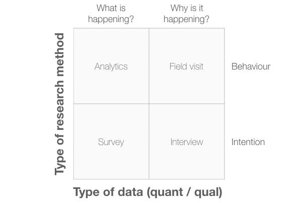
Diagram 5: A 2×2 plot with the axes,”Type of research method” and “Type of data”.

In this example, I’ve placed specific research methods in each quadrant, but these aren’t the only methods you can use. Consider these as examples only.

How to choose a usability evaluation method

Burrowing down further, here’s how we can use a 2×2 to choose a specific kind of usability evaluation method. One of the axes in Diagram 6 is “Our knowledge of users”. Although not an ideal situation, it’s common for product teams to not have a great deal of knowledge about users yet still have a product that they need to evaluate. In that case their knowledge of users is low. In contrast, another product team may have spent time doing field visits to users and so the team knows a thing or two about its users. The other axis is “Urgency”. Sometimes we need an answer in a day or so and other times we have the luxury of a 2-week sprint to find the answer.

This diagram helps us choose between different types of usability test and usability inspection methods.
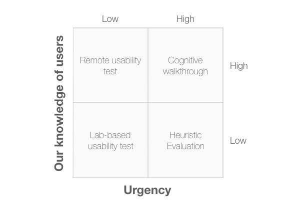
Diagram 6: A 2×2 plot with the axes,”Our knowledge of users” and “Urgency”.

The four quadrants are:

  • Lab-based usability test: If our knowledge of users is low, a lab-based test is a good choice, especially when the test is of low urgency. By having users in the lab, we can expose the design team to users and increase their overall awareness of users and their capabilities.
  • Remote usability test: When our knowledge of users is high and we have more than a few days to work on the issue, then a remote usability test is a good choice.
  • Cognitive walkthrough: This inspection method makes sense when we have a good knowledge of users and it’s important to get the results urgently. This is because a cognitive walkthrough can be completed in a few hours but it does require a good knowledge of users and their tasks.
  • Heuristic evaluation: This inspection method offers value when we need quick answers but don’t know a great deal about our users. Instead, we can use standardised usability principles to provide the team with a quick answer.

How to decide what to prototype

I’ve adapted Diagram 7 from Leah Buley’s book, The UX Team of One. It provides a useful way of deciding where, exactly, you should focus when creating a prototype. This speeds up development because you can now prototype only those aspects of the product that are both critical to get right and complex to do well.
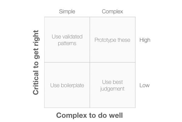
Diagram 7: A 2×2 plot with the axes,”Critical to get right and “Complex to do well”.

The four quadrants are:

  • Use boilerpate: Functions in this quadrant are simple to do and aren’t critical. We can use boilerplate solutions here and not spend time prototyping them.
  • Use validated patterns: Functions is this quadrant are simple to do and it’s important to get them right. A good choice here would be to use an existing design pattern that we can use out of the box.
  • Use best judgement: Functions is this quadrant are complex to do well but aren’t critical. We should use our judgement here of whether the function is actually needed.
  • Prototype these: items in this quadrant are complex to do well and are critical to get right. It makes sense to create prototypes to explore the way these functions could be implemented and test these out with users.

How to simplify the product backlog

The next 3 diagrams provide a useful way to simplify the product backlog by focusing on the value to users. Each 2×2 diagram has the same horizontal axis (“Value to users”).

In Diagram 8, the vertical axis is “Importance to business”. When combined with the “Value to Users” axis, this creates 4 quadrants.

Diagram 8: A 2×2 plot with the axes,”Importance to business” and “Value to User”.
  • Ignore: Items in this quadrant plot low on both criteria so can be safely ignored.
  • Explore: items in this quadrant are of importance to the business but offer low value to the user. We need to explore these items further to see how we can adapt them to provide user value.
  • Research: items in this quadrant are important to users but of low importance to the business. We need to research these items to find out more about the value they provide.
  • Do now: items in this quadrant offer value to the user and are important to the business, so it makes sense to focus on these first.

In Diagram 9, the vertical axis is now “Ease of implementation”.
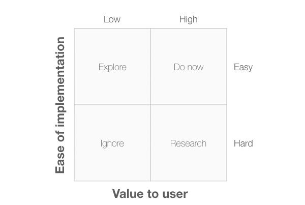
Diagram 9: A 2×2 plot with the axes,”Ease of implementation” and “Value to User”.

The four quadrants are:

  • Ignore: Items in this quadrant plot low on both criteria so can be safely ignored.
  • Explore: items in this quadrant offer low value to the user but they are relatively easy to implement. We need to explore these items to see if we can adapt them to provide more user value, otherwise there is little point in working on them.
  • Research: items in this quadrant are important to users but are hard for us to implement. We need to research these items to find out more about the value they provide to see if we can include some of that value in items that are easier to develop.
  • Do now: items in this quadrant offer value to the user and are relatively easy to implement, so it makes sense to focus on these first.

In Diagram 10, I’ve changed the vertical axis to “Impact on revenue”. This would be an important dimension for a start up trying to identify which functions to prioritise.
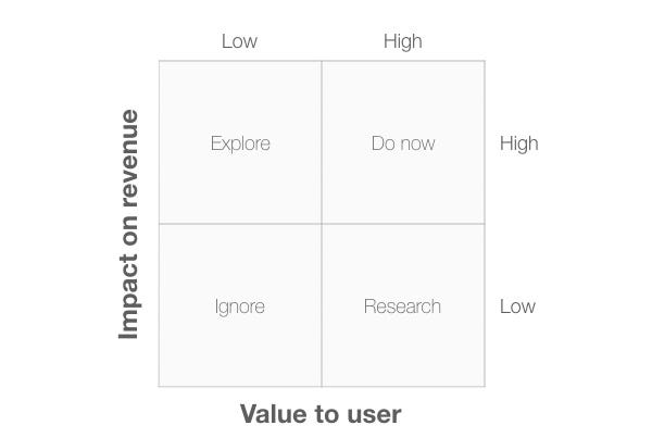
Diagram 10: A 2×2 plot with the axes,”Impact on revenue” and “Value to User”.

The four quadrants are:

  • Ignore: Items in this quadrant plot low on both criteria so can be safely ignored.
  • Explore: items in this quadrant offer low value to the user but they have a high impact on revenue. We need to explore these items to see if we can adapt them to provide more user value, otherwise they won’t generate the revenue we’re hoping for.
  • Research: items in this quadrant are important to users but have a low impact on revenue. We need to research these items to find out more about the value they provide to see if we can generate revenue from them.
  • Do now: items in this quadrant offer value to the user and have a high impact on revenue, so it makes sense to focus on these first.

Bonus diagram: How to make an ethical design choice

We can also use a 2×2 diagram to help us make ethical design decisions about features and workflow. In Diagram 11, the diagram has two axes, “Type of persuasion” and “Who benefits?”. Here’s how we can use it to check if we are making an ethical design choice or manipulating users.
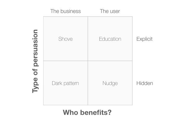
Diagram 11: A 2×2 plot with the axes,”Type of persuasion” and “Who benefits?”

The four quadrants are:

  • Dark pattern: These are sneaky methods that attempt to manipulate the user into carrying out some action that would be of benefit to the business. A classic example of this would be a pre-checked checkbox adding someone to a mailing list if they buy a product.
  • Shove: This would include more explicit methods of manipulation that encourage the user into carrying out some action that would be of benefit to the business. An example of this might be a web site that insists you sign up to their mailing list in order to receive an otherwise free report.
  • Nudge: The difference between a “nudge” and a “dark pattern” is simply that the user (or society) benefits from the situation, rather than the business. An example of this might be automatic enrolment into an organ donation scheme when you apply for a driving license.
  • Education: These are methods that describe a situation that is of benefit to the user, but still leave it up to the user to take action. For example, UK mobile network provider giffgaff sends its users a text at the end of each month to let them know if they should switch to another data plan, based on their previous month’s usage.

How to create your own 2x2s

Although simple, 2×2 diagrams are a useful way to simplify a complex problem into a small number of alternative choices. But they become even more powerful when you create specific diagrams based on dimensions that are particular to your users and your industry.

Be sure to keep in mind that the most useful dimensions from a UX research perspective tend to focus on the context of use: your users, your tasks and the environments they work in. Indeed, Steve Jobs’ diagram that transformed Apple did just this: its two dimensions were “users” (consumer / professional) and “environment” (desktop / portable).

Want to dive deeper into UX research? Try my book, Think Like a UX Researcher.

Originally published at www.userfocus.co.uk.

from Stories by David Travis on Medium https://medium.com/@userfocus/10-diagrams-to-help-you-think-straight-about-ux-research-aa030f7ca41c?source=rss-934fcb05e8b5——2

2019 is the year of DAOs

2019 is the year of DAOs – Now we urgently need robust Consensus protocols for the People

U.S. president Abraham Lincoln (1809–1865) defined democracy as: “Government of the people, by the people, for the people“ Democracy is by far the most challenging form of government — both for politicians and for the people. DAOs are challenging all forms of governance in dimensions we have not seen before.

1. Introduction

Summer of 2018 marked a disastrous moment for blockchain enthusiasts. Remembered as the Black Friday in the history of blockchain, that was the time of crashed crypto prices, declined ICOs and disruption of the crypto bubble. Since then we have witnessed the brutal implementation of Darwin’s Law. The blockchain market healed itself, refrained from weak (and bogus) projects while projects with substance and a strong technological vision survived. There is also much evidence that these kind of projects solving a sophisticated technical challenge and contributing with a solution to affirm decentralization get the support of the community. Although ICOs have been condemned as “dead” after the market crash, projects with strong deep tech vision received nevertheless a descent amount of fundings from the community. Most notable are the ICOs of Fetch.AI and Ocean Protocol raising 6m and 1.8m USD, respectively. Far away from the craze of the past, these are fair numbers for early-stage ventures to showcase the viability of their technology and to prove a product-to-market fit.

2. The Opportunity — DAOs

After the storm comes the sun. 2019 is full of positive energy and innovation. Much hope is given to projects related to Decentralized Autonomous Organizations (DAOs). They lift the core principles of blockchains — decentralization, incentivization and democratization — to the next level. Instead of machines agreeing on the global state of the network, humans agree through a democratic decision on the next state of the community. This idea disrupts the way organisations, governments or enterprises are operated and executed. Consider, for example, a DAO where

  • devs working within an open source project vote on the integration of code proposals, this way overcoming the interests of a central project owner that tends to guide the development into a direction believing to do right things but his decision stands in sharp contrast with the interests of the community. The mission pursuits, for example, the ditcraft.io project.
  • fans of a soccer club vote on the budget spent on new players and coaches, this way realizing the dream of governing “their” club instead of accepting the choices of oligarchs who own the club.

Philosophically and technically DAOs implement the very powerful notion – disruption of centralization – with the slight difference that the central parties are rather human authorities, governments or owners. Against this background decentralized autonomous organisations have all what it takes to become the next killer application on top of a blockchain network.

3. The Challenge – Voting Schemes on the Blockchain

At the protocol layer, blockchain networks and DAOs have also much in common.

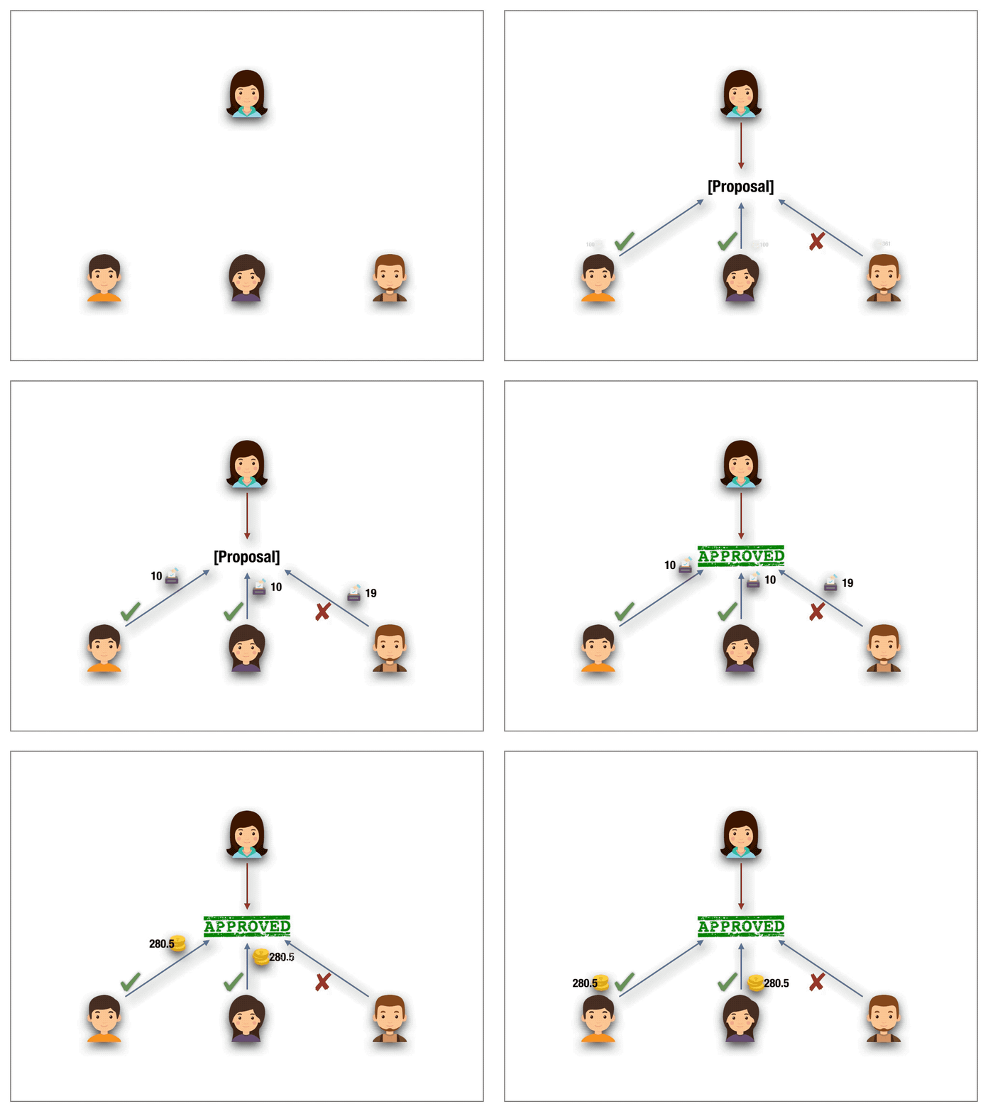
What a consensus protocol is for blockchain nodes, a voting protocol is for DAO participants.

In fact, one can call a voting scheme a consensus with the additional property of voter privacy. The additional privacy property is necessary to safeguard that the choices made by each voter are taken independently and anonymously. The latter is a prerequisite of the first property and protects voters against rebounds after the ballot.

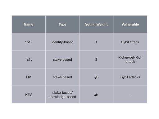
Comparison of voting schemes for permissionless blockchain. S denotes #stake and K denotes #knowledge tokens.

There are a handful of voting protocols for permissionless blockchains. Yet some research is required to verify their suitability for DAOs.

3.1. The One-Person-One-Vote (1p1v) protocol

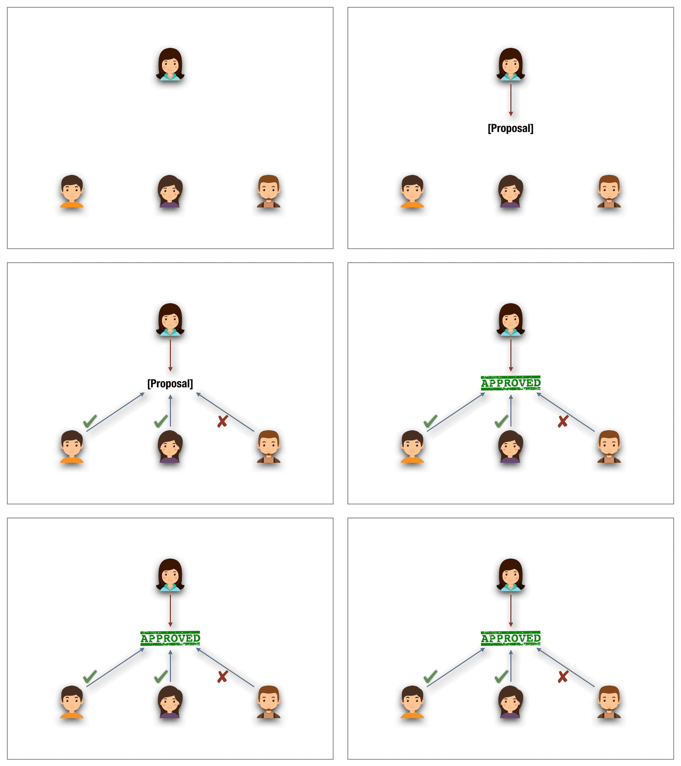
Known as the mother of voting mechanisms, the one-person-one-vote scheme is the preferred method to reach a consensus in matters of governance (eg. presidential elections). The scheme permits each eligible voter to cast a vote. Typically a trusted third party (eg. delegates of the government) manage and orchestrate the election. They safeguard the voting follows a protocol of conduct. Once the voting period ended, they count the votes and announce the result following a majority quorum.

One-person-one-vote (1p1v) protocol.

One might be tempted to adapt 1p1v to the blockchain setting. However there are problems with that. In a permissionless network wallet addresses serve as the only means to identify a voter. As long as no identity layer is in place to link the addresses with real-world identities, 1p1v falls prey to Sybil attacks. In a Sybil attack a malicious voter simply creates multiple wallet addresses, each permitting him to cast a vote in a ballot. Due to the permissionless nature of the blockchain network, such attacks are unavoidable and hence make 1p1v schemes unsuitable for voting schemes.

1p1v is an unsuitable voting mechanism in permissionless blockchains (as long as no identity layer is in place).

3.2. The One-Stake-One-Vote (1s1v) protocol

One-stake-one-vote schemes are the de-facto standard mechanism for votings in permissionless setting. Inspired by proof-of-stake consensus protocols and the fact that a naive adaption of 1p1v to the blockchain fails in a 1s1v protocol each voter deposits a stake. The number of staked tokens weights his vote. The quorum is defined over the decision with majority stake and the stake of the minority is slashed.

One-Stake-One-Voter (1s1v) protocol.

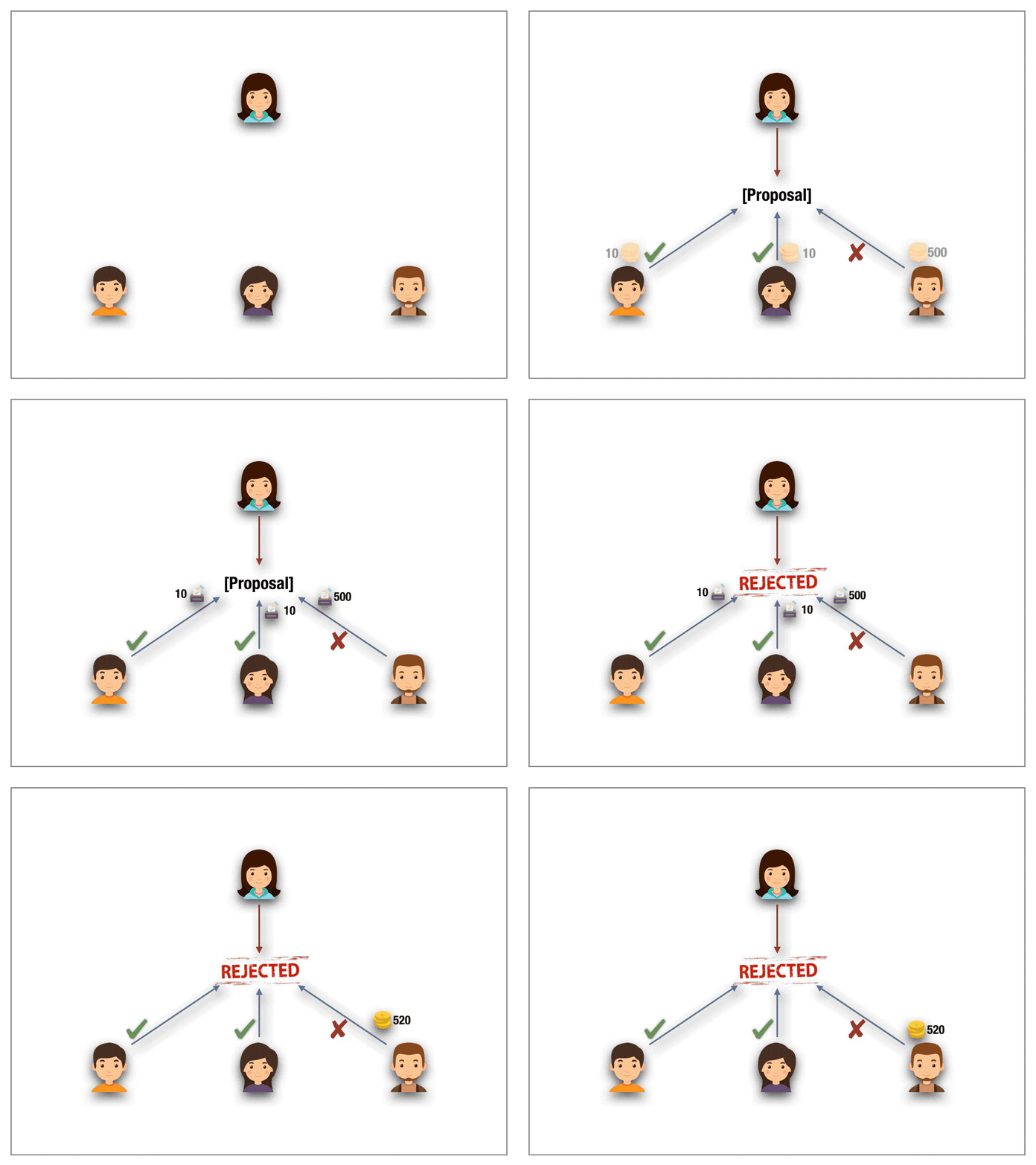
1s1v must be considered with care, as the protocol can harm the democratic choice in DAOs. Though 1s1v remedies the problem of Sybil attacks in 1p1v schemes (there is simply no need anymore for the creation of multiple addresses as the size of the stake dictates the voting power) a new weakness arises. The protocol gives financial oligarchs, that rich voters able to put forth high stakes, a non-negligible advantage to game the outcome of the ballot. In fact, they can hijack the voting mechanism by overstaking all (minority) voters and collect their shares. Such a “voting bot” can easily be automated and be used not only to contaminate the notion of democracy, but also to harvest the stakes of honest voters. One might be tempted to assume limiting the total amount of stake per voter might solve the vulnerability. By casting a Sybil attack an oligarch still can game the outcome of the ballot and thus hijack the protocol.

Rich-get-Richer Attack against 1s1v protocols. A major stake holder can game the outcome of the decision and collect the slashed stake of the minority voters.

3.2 Quadratic Voting (QV) protocol

A radically new idea was proposed by Steven Lalley and Glen Weyl to mitigate the problem of unfair wealth distribution. The authors put forth the beautiful notion of Quadratic Voting. Their idea is based on buying votes. A bit more precise, each voter can buy as many votes he wishes by paying the tokens in a fund with one caveat. The voter has to pay quadratically in the number of votes. The money is then returned to voters on a per capita basis. Suppose, for example, a voter intends to cast 10 votes. Then he pays 10²=100 tokens to acquire the votes. On a high level, the quadratic pricing function acts like a wealth slow down mechanism. Lalley and Weyl have proven under certain assumptions QV to be a mechanism against a tyranny of majority stake holders.

Quadratic voting (QV) protocol

While their results apply to real-world decision makings, transferring the scheme to the permission-less blockchain setting does not carry over with the expected outcome. The problem with the blockchain world are Sybil attacks. The design of blockchain technologies allows a voter to cast many anonymous identities. Hence, to accumulate 10 votes, the sybil attacker simply creates 10 accounts under different identities. This way, the attacker requires 10 tokens in total to cast 10 votes. However, we would like to stress that QV may satisfy the desired outcome in the case of permission-based settings where the identities of the players are known and fixed in advance throughout the lifetime of the system(For example a proof of authority based system).

QV protocols are susceptible to Sybil attacks.

3.4. Knowledge-extractable Voting (KEV) protocol

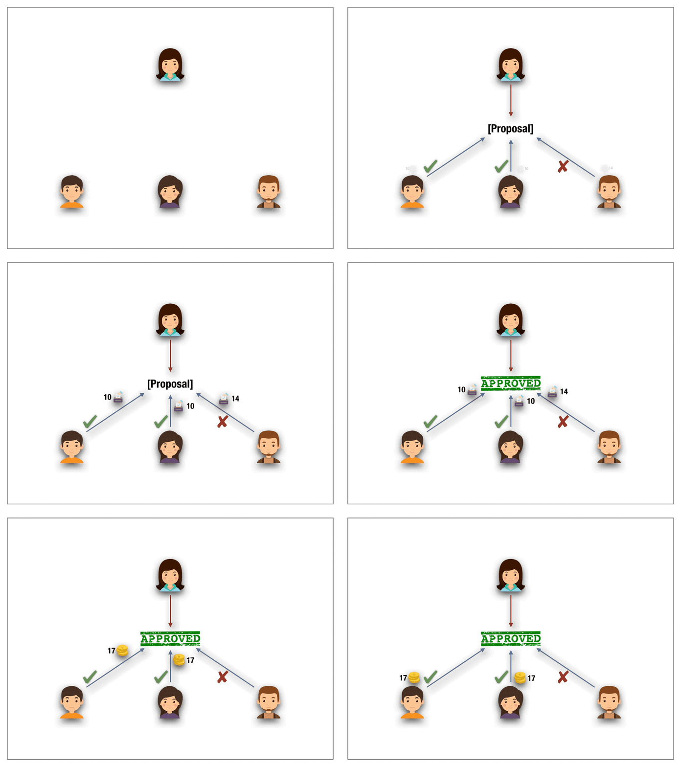
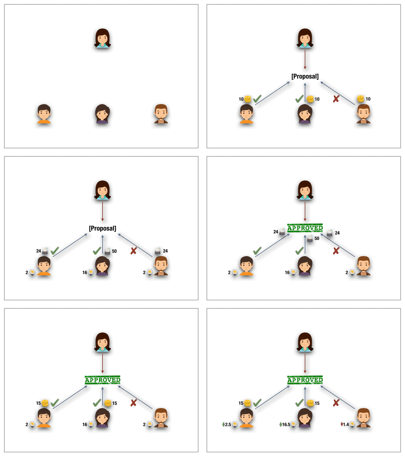
Inspired by the radically new and brilliant ideas behind QV, knowledge-extractable voting bases decisions on something which is sparse and better suited for blockchain applications — namely knowledge — to achieve a decision (partially) independent of wealth. As opposed to wealth knowledge is acquired through experience or education by perceiving, discovering, or learning. It can’t be bought on an exchange. It can’t be transferred from a knowledgable to less-knowledgable or wealthy person. Moreover, knowledge is non-fungible, as knowledge relates to a particular field of interest and expertise.

Knowledge-extractable voting (KEV) protocol

Knowledge-extractable voting adds to the mechanics of 1s1v protocols a second token, called the knowledge token. A crucial property of knowledge tokens is that they are non-purchasable and non-transferable. The only way to mint knowledge token is to contribute in votings and comply with the decisions of the quorum. If the voter deviates in a ballot from the quorum decision then not only his stake is slashed but also the voters’ knowledge tokens are drastically burned (to the square root). Hence an increased number of knowledge tokens in a particular field allows to quantify the expertise of the voter. It is this expertise that is taken into account to weight the power of the voter in the ballot.

4. Conclusion

Voting schemes are for the stability of DAOs as vital as consensus protocols are for the blockchain network. Looking at the impact voting schemes have for DAOs, it is of crucial interest to understand the security guarantees they provide for blockchain-based applications. We analyzed the suggested voting protocols and concluded that diligence and care must be taken when choosing the right voting scheme. We compared the de-facto voting protocols and concluded that knowledge-extractable voting is an attractive candidate to overcome richer-get-richer attacks on the blockchain. This implies resistance against Sybil attacks a property other stake-based voting schemes fall prey.

Acknowledgement

This is joint work with Marvin Kruse and all animations are his courtesy.


2019 is the year of DAOs was originally published in Hacker Noon on Medium, where people are continuing the conversation by highlighting and responding to this story.

from Hacker Noon https://hackernoon.com/2019-is-the-year-of-daos-9728618873f5?source=rss—-3a8144eabfe3—4

Why You Can’t Get Serious About Productivity Unless You Optimize How Your People Use Your Space

I fund startups for a living and before that I ran two software startups that I founded. I’ve spent countless hours looking at historical finances, budgets, forecasts and future projections. With a standard tech startup I can tell you in my sleep that your two biggest cost items by a long shot are people (between 60–75% of total costs) and space (10–20% of total costs). The only other significant cost item that I see in some early-stage startups is inventory (for hardware or eCommerce companies).

In the earliest stages of a company a startup will often cram as many people into small rooms as is possible in order to conserve on office costs. When a company raises capital it inevitably begins to look for office space in order to increase worker productivity and happiness. Because it’s hard to predict how much space you’ll need as you expand (or, gulp, downside) startups have increasingly turned to shared spaces like WeWork, which act a bit like cloud hosting in that they allow you scale up or scale down as your business expands or slows down.

Anybody who has spent time around startups can tell you that there are bunch of productivity drains that can come from these environments:

  • Lack of meeting space for having discussions
  • Inability to concentrate due to being surrounded by “loud talkers”
  • Huge lines waiting at shared security check-ins, elevators or lunch lines

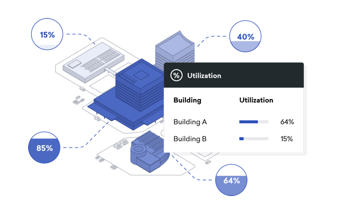
Knowing the problems of “managing people around spaces” was one of the primary reasons I backed the company Density, who built a “depth sensor” that hangs above doors and anonymously tracks spaces as seen in the GIF below.

The technology is now deployed across many clients including LinkedIn, NYU, Dropbox, Envoy and many others so we’ve learned a lot about how people use solutions like Density to increase productivity, improve physical security and better match space with people. Below are some great examples of common problems & solutions we’ve seen:

The meeting room camper / the meeting room squatter / phantom

Gartner estimates the average employee spends 27 hours/year looking for available spaces to meet — this is rarely because companies don’t have enough space. Most often, it’s because they don’t have the right mix of small / large / flex working space and as a result people tend to hog space when it is available.

Once organizations scale they inevitably implement systems to make booking shared spaces more streamlined and usually more democratic — the general procedure being that you “book a meeting room” by the hour via a scheduling system. We’ve all experienced the “squatter” who just goes into a meeting room and startups working on takes a 1–1 meeting in a room built for 12 and doesn’t bother booking it. Some people go the opposite route and book hours on end so that they can “camp” in a meeting room to get long periods of quiet work done or take 1–1 meetings at the expense of group needs.

Equally problematic is the “phantom” who books the meeting room for hours on end to block the room, only using it periodically. I saw this kind of behavior even 20 years ago when I worked at Accenture where staff was mostly at client sites but when they returned to the office there was a rush to phantom book the limited meeting rooms.

At Density we worked with clients to integrate into their Outlook system so management could better evaluate when teams booked meeting room space and then compare against the Density sensor data to see when the room was actually used. It can compare hours booked vs. used as well at number of people booked vs. attended with the goal of helping the enterprise better manage its limited space resources.

The lunch conundrum

Another major productivity drain as companies scale (or as shared work spaces fill up) are lunch lines. We have seen the rise in companies using Density to better track the flow of people through the commissaries at breakfast, lunch and dinner. They have integrated this with internal systems on Slack or Facebook Messenger to allow employees to check the wait times in real time and plan their days accordingly. This has also helped management figure out how to staff up restaurant staff in peak hours. We’ve even seen some forward thinking airlines and travel companies use these sensors to better track the staffing levels of lounges throughout the day.

The tailgater

Most offices employ physical security to protect both assets and safety yet we’ve all witnessed the “tailgater” who waits for somebody else to scan his or her card and then walks quickly behind them and gets access. This is much harder to do in high-rise buildings with sufficient security guards but even there after-hour problems persist. As you’ll see in the video below, Dropbox has used Density paired with its access-control system to flag for security whenever there is a tailgater. In the video they show a real-life situation (faces blurred) where a tailgater posing as just another employee looking at his smart phone who then broke in and stole several laptops. This problem is even more pronounced on campuses where buildings have more ingress & egress points. Dropbox was having more than 100 tailgating events / week and while most of these are likely not nefarious, having employees become aware of the problem is the first line of defense.

The wasted space / the oversized meeting rooms

Perhaps the group that most values the ability to know how people use spaces are the facilities management groups responsible for space planning. As businesses expand you naturally find meeting rooms built for 12 but used mostly for 2–4 people at a time that would more effectively be built at 2 meeting rooms. We see companies that do large acquisitions and have to figure out how to consolidate companies and staff. During a customer pilot, a Fortune 1000 company discovered that an 8-person conference room was used by 3 or fewer people for 78% of all business hours; it was used by 8 people (its intended capacity) just 3% of the time. By expanding the study and right-sizing their conference room mix, this company is likely to solve their meeting room problem and save tens of millions of dollars in avoided real estate expansion costs.

The insurance risk

Have you ever noticed when you walk into a bar, concert hall, stadium or similar venue and there is a person with a counter that clicks when you walk through? Almost certainly what they’re doing is manually monitoring crowd sizes for insurance (and ultimately for safety) purposes.

Photo by Mark Pan4ratte on Unsplash

We now have venues using Density to control crowd sizes and ensure they aren’t violating their insurance policies. A bar we work with was getting multiple $1,000 fines from the Fire Dept every month for being over capacity — this despite having staff on hand to count manually. After installing Density, the fire marshal looked at the count on the bar manager’s iPhone and said, “that’s really cool.” He then left them alone because they could prove they were in compliance w/ the code.

Unintended use cases

By now, we’ve seen a lot! From people wanting Density to track that Alzheimer’s patients aren’t moving outside of a pre-agreed space to gig-economy companies wanting to be able to anonymously track whether their workers or whether their customers are initiating unwanted physical contact. People often ask me, “why don’t they just use cameras?” Of course there are some good uses for cameras in fields like surveillance but in the modern world there are many places where we want to track the flow of people (bathroom usage, just one example!) but don’t want to record people. In addition, the ability to interpret the data and deal with the volumes of information is much more cost-effective when you’re dealing with “polygons” (shapes from a laser) than dealing with full video footage.


Why You Can’t Get Serious About Productivity Unless You Optimize How Your People Use Your Space was originally published in Both Sides of the Table on Medium, where people are continuing the conversation by highlighting and responding to this story.

from Both Sides of the Table https://bothsidesofthetable.com/why-you-cant-get-serious-about-productivity-unless-you-optimize-how-your-people-use-your-space-d07d1d1fb6a2?source=rss—-97f98e5df342—4

If you’re not uncomfortable showing your work, that might be a bad sign

Photo by Vinicius Amano

Sharing work is a natural part of the design process.

If you have been in this industry for some time, you know the drill: you pull up your design files, share your screen with the room/with your remote peers, set up what you are going to walk them through in that session, and then start explaining the thinking behind your design decisions.

At some point, you get so used to following that protocol, you get a little numb. You don’t feel that adrenaline rush anymore, that anxiety of hearing what your peers have to say about the work you’re presenting.

But if you’re not uncomfortable presenting your work, that can be a bad sign.

One of these might be happening:

  • You are not pushing the limits. The design is too conventional, and you are only using familiar UI elements. Nothing in the experience feels fresh or has that never-seen-before feeling to it. If you don’t get any visceral reactions (big or small) from your peers, that might be a sign the work could use some extra design love.
  • The work is not future-friendly enough. When you present work (especially in larger projects), you are usually presenting something that will take several months to be implemented and launched. If you are designing for now (your company’s current challenges) without an eye in the future, there’s a chance the work will get outdated before it even sees the light of day.
  • The design is not challenging expectations. When your peers join a design review meeting, they have certain expectations of what they are going to see. If you are only giving them what you know they want, you are just executing ideas that were created by other people. Be smart about which expectations you want to break, though — on the other hand, innovating just for innovation sake can be harmful to the user experience and for the business goals. Make sure to pick the right battles.
  • The work is too polished, everything is too final. If you are not feeling uncomfortable when sharing work with your peers, it might be because you have overprepared for the meeting: your prototypes are insanely polished, the copy is final, every aspect has been thought through. Which is great — don’t get me wrong. But that probably took you more time than if you were to share a slightly more in-progress version of the same flows. For internal reviews, where you are expecting feedback, it’s important to leave enough room for interpretation and space for your peers to connect the missing dots.
  • The work is not emotional or relatable. Part of sharing design work is sharing a story behind it. What is the concept behind your designs, and where did you get inspiration from — nature, an art exhibition you’ve seen, a film you’ve watched? Making yourself vulnerable and revealing the emotions that led to the work you’re sharing (not just rational arguments and facts), can make your peers connect to it more deeply.

Whenever I’m feeling too confident or too assured of what my team and I are sharing, I try to add something to the work that gives me a reason to become uncomfortable again: a slide, a new screen, an alternative version to one of the flows that pushes conventions a bit more.

Anything but becoming numb to the thing I enjoy doing the most.

This article is part of Journey: lessons from the amazing journey of being a designer.


If you’re not uncomfortable showing your work, that might be a bad sign was originally published in UX Collective on Medium, where people are continuing the conversation by highlighting and responding to this story.

from UX Collective – Medium https://uxdesign.cc/if-youre-not-uncomfortable-showing-your-work-that-might-be-a-bad-sign-275269d00c5a?source=rss—-138adf9c44c—4

How AI Is Transforming The Future Of Healthcare Industry

The power of Artificial Intelligence is echoing across many industries. But its impact on healthcare is truly life-changing. With its ability to mimic human cognitive functions, AI is bringing a paradigm shift in the healthcare industry.

This transformative technology is revolutionizing the health sectors in many ways. From drug development to clinical research, AI has helped improve patient outcomes at reduced costs. Besides, the introduction of this technology in healthcare promises easy access, affordability, and effectiveness.

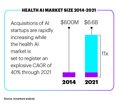
For the same reasons, there has been a huge investment by public and private sectors in the healthcare industry. According to a study, the investment will reach $6.6 billion by 2021. Accenture’s reports are even more astonishing. According to their analysis, AI applications can create annual savings of $150 billion by 2026 for US healthcare.

Big Data & AI in Healthcare

Recent advancements in AI have fueled discussion of whether AI doctors will replace human doctors in the future. While the idea of replacing human doctors may sound absurd, but AI can help human physicians to make better decisions. In certain areas of healthcare like radiology, it can replace human judgment entirely.

Big Data has made successful applications of Artificial Intelligence in healthcare. There has been a rapid development in big data analytic methods, and so much healthcare data is available. Using this data, a lot of clinically relevant information hidden in a large amount of data can be unlocked by powerful AI techniques. This will help in making better clinical decisions.

Motivation

The ability of AI to use sophisticated algorithms and learn features from a massive amount of data is truly commendable. With the help of these algorithms, insights for assisting clinical practice can be obtained. AI can be equipped with self-correcting and learning abilities which help the system get better accuracy based on the feedback it receives.

Therefore, it gets better with time. These AI systems can help physicians in many ways. Since they are armed with a lot of information, they can assist in clinical decision making. Also, diagnostic errors and therapeutic errors can be minimized.

Besides, AI systems have access to large volumes of data; they can make predictions about potential health risks by extracting useful information.

But do we really need it?

AI is big and powerful. We cannot question its effectiveness. It is going to have a huge impact on the healthcare industry. Facts listed below tell us why:

  • Hospital error is one of the leading causes of patients’ death. Such errors can be addressed and prevented by Artificial Intelligence.
  • Nearly 440,000 Americans die each year due to medical errors which can be easily prevented by AI.
  • In the healthcare industry, nearly 86% of the mistakes are preventable.
  • In the next 5 years, AI health market will grow by more than 10 percent.

Applications Of Artificial Intelligence

Artificial is changing the healthcare industry for better. From early detection to improved diagnosis, AI is positively contributing to the betterment of humanity. In some areas, it is already being used, and there are areas where we can see the introduction of AI in the coming time. In specialty care including pharma, radiology, and pathology, AI is delivering high value.

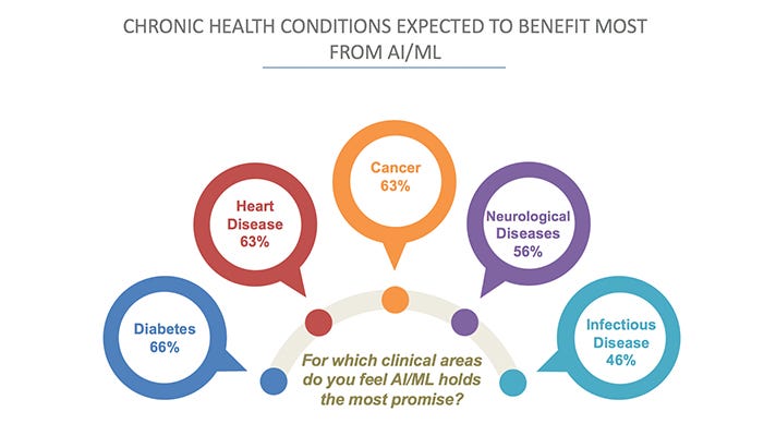
Chronic health conditions are expected to benefit the most from AI systems. Cancer, diabetes, heart diseases are big opportunities for healthcare trends such as pop culture and precision medicines.

Here are a few ways in which AI is (or will) changing the healthcare industry:

Personal Health Virtual Assistant

In the present era, most people have access to a smartphone. They are likely to have their virtual assistant on their mobile devices. Advanced AI algorithms power assistants like Cortana, Google Assistant, Siri. When combined with healthcare apps, they will provide massive value to the users.

Healthcare apps will act as a personal health assistant. They will also be used to provide medication alerts, and human-like interactions will also be possible. AI as a personal assistant will also help in assisting the patients when the clinical personnel is not available.

AI Improves The Quality Of Sleep

It has been proved that night of good night sleep is very important for better physical and mental health. People who get sound sleep at night are happier, healthier, and more productive during the day.

There are a lot of effective sleep gadgets in the market that help you sleep better at nights. From AI-powered smart mattresses to baby monitors, sleep apps, AI technology is continually working to improve the overall quality of sleep.

A healthcare company named AXA PPP created two lullabies; one by AI and other by humans. With deep learning, the AI system could get a feel for rhythm and harmony resulting in a new composition. This composition was then converted into a song with the help of a human, and it can help you sleep better.

Medical Imaging Analysis

Another important field in healthcare which is using AI is radiology. AI systems can help with diagnostic processes. It can examine medical images like X-rays, CT scans, MRIs, etc. and can provide feedback on what it thinks a human eye can miss.

Thus, medical imaging analysis becomes much more accurate and effective. It reduces the chances of errors.

IBM Watson is a live example. In the field of oncology, it can provide clinicians with evidence-based treatment options for the cancer patients based on the training provided by Memorial Sloan Kettering (MSK) physicians.

Precision Medicine

Genomic is the branch of molecular biology which deals with the structure, evolution, function, and mapping of genomes. It looks for the links to disease from the information obtained from the DNA.

When combined with AI, it is possible to spot cancer and some vascular diseases at a very early stage. Moreover, it can predict the health issues the patients might face based on their genes.

Healthcare Bots

AI technology is also gaining traction in the customer service domain. The world is likely to see healthcare bots very soon. Patients will be able to interact with these AI bots on the website through a chat window or via telephone.

Healthcare bots will be used to schedule appointments with the patient’s healthcare provider. These bots can help patients with their medication as well. They can also improve customer service by offering 24 x 7 support.

These are some of the great things that AI can do. But it is not limited to that. As innovation pushes the boundaries of healthcare, better solutions to save time, money, and efficiency will be possible.


How AI Is Transforming The Future Of Healthcare Industry was originally published in Hacker Noon on Medium, where people are continuing the conversation by highlighting and responding to this story.

from Hacker Noon https://hackernoon.com/how-ai-is-transforming-the-future-of-healthcare-industry-f6020cc18323?source=rss—-3a8144eabfe3—4

Why Everyone Working On A Product Needs To Be Aware Of The Voice Of The Customer

Nichole Elizabeth DeMeré B2B SaaS Consultant (right) and Poornima Vijayashanker, Founder of Femgineer (left)

Interview with Nichole Elizabeth DeMeré B2B SaaS Consultant

I am the self-appointed family travel agent. Though if you ask my partner and the rest of my family members they’d agree that I am the best person for the job.

Why?

Because over the years I have become adept at making sure I don’t overlook the details when planning a vacation — you know where the devil hides! And who wants the devil to turn up on their vacation?!

Unless of course, it’s a blue devil 😉 #marchmadness #goduke

I take the time to read through ALL the descriptions and fine print, talk to customer support agents to find out if there are any additional fees, and make sure that family members who have accessibility needs like my 10-month-old baby and 82-year-old grandma will be taken care of.

Once I’ve done all this planning, I know I have truly earned my vacation 😉

Despite all my effort, there have been times when things didn’t turn out as planned. Like the time I booked a home in India only to find out that the address was incorrect. The host mixed the street name with the city name. We would have had to drive 3 hours after 24+ hours of travel, but I called customer support and they resolved the issue for us quickly.

It was a positive customer support experience: responsive, seamless, and efficient. As a result, I continued using that service to book my travel, knowing that if something screwy happened I could count on them next time.

But there are other companies whose customer support agents place me on hold — for more than a few minutes. When the agent returns, they tell me that I’ve reached the wrong department. Then they transfer me to the “correct” department. Once the transfer is complete, I have to repeat what I told the first support person to the second support person, all the while hoping that they can help me resolve the issue. They can’t. When I look at how much time I’ve spent, and the exorbitant fee or unreconcilable charge, I am frustrated and vow to never do business with them again!

I know I’m not alone.

No one likes being at the receiving end of a bad customer support experience. It’s easy to place blame on customer support, but it’s not their fault because the problem originated somewhere else — when the product or service’s feature was being created.

Someone designed the experience in a way that wasn’t particularly customer friendly, and then it became a challenge to change the experience because of the silos that formed in the company between teams: sales, marketing, product, engineering, and customer support.

At the start of a company, teams are usually flat and highly collaborative, but over time, silos start to form, slowing things down, making it hard to innovate, and distancing teams from their customers.

Is it even possible to slow or stop them from forming? And to enable everyone across teams a chance to interact with customers?

Well in today’s episode of Build we’re going to answer these questions and more, We’ll show how silos form of overtime, some best practices for keeping silos at bay, and what to do once they have formed to break them down.

To help us out I’ve invited Nichole Elizabeth DeMeré who is a B2B SaaS Consultant with 20+ years of experience in online marketing, and a champion for customer success.

As you tune into today’s episode you’ll learn the following from Nichole Elizabeth:

  • Why everyone on a team including software developers and engineers should have a chance to interact with customers, not just people who are on the customer support, sales, and marketing teams
  • How to empower teams to break down silos, and a framework for evaluating experiments and features that factor in constraints
  • When to automate and when to interact with customers
  • How silos form over time, how to avoid them, and what to do once they’ve formed
  • Why when building B2B products it’s important to focus on making your customers successful not happy
  • Why you need to rethink off-boarding customers and make it easy for them to leave

“When everyone on the team is aware of the voice of the customer, everyone is super excited about what is going on (with the product).

If you really want to stand out right now it isn’t pricing, it’s team alignment and customer experience.” — Nichole Elizabeth DeMeré

Prefer to listen to the episode?

Listen on iTunes here or listen on Stitcher here.

In the episode, Nichole Elizabeth mentions a number of resources, here are links to them:

Build is brought to you by Femgineer an education company dedicated to helping techies build companies, products, and level-up in their careers


Why Everyone Working On A Product Needs To Be Aware Of The Voice Of The Customer was originally published in Hacker Noon on Medium, where people are continuing the conversation by highlighting and responding to this story.

from Hacker Noon https://hackernoon.com/why-everyone-working-on-a-product-needs-to-be-aware-of-the-voice-of-the-customer-9bb0379a8341?source=rss—-3a8144eabfe3—4

16 Best Resources to Learn AI & Machine Learning in 2019

While making GeekForge — a daily listing of interesting coding tasks — we researched several sources where you can learn AI and ML, and we thought it would be a good idea to share this list with you.

Two years have already passed since Mark Cuban said that if you don’t understand artificial intelligence, deep learning, and machine learning “you’re going to be a dinosaur within three years.” If you still didn’t dig yourself into that knowledge, especially if you’re a developer, then you’ve got about a year left to see whether he was right or not.

But luckily for you, if you are in fact interested in keeping your skills up to date, I hand-picked the best resources that are relevant today, regardless if you’re a beginner in the field or if you’ve already got your feet wet a long time ago. From video courses and books to interactive classes and coding tasks, within this list you will find the way to keep yourself out of the prehistoric era!

Introduction to Machine Learning Problem Framing from Google

This one-hour course introduces the machine-learning mindset and helps you identify the appropriate situations for machine learning.

Artificial Intelligence: Principles and Techniques from Stanford University

This prepares students to make meaningful contributions to society as engaged citizens and leaders in a complex world.

Daily email list of AI and ML coding tasks from GeekForge

You can solve tasks independently or discuss them with the community. It’s the best way to educate yourself on new technology and build a portfolio of your completed tasks.

CS405: Artificial Intelligence from Saylor Academy

Materials on AI programming and ML (machine learning) introduce you to their applications to computational problems and understanding intelligence.

Intro to Artificial Intelligence at Udacity

This course will introduce you to the basics of AI. Topics include machine learning, probabilistic reasoning, robotics, computer vision, and natural language processing.

CS188 Intro to AI from UC Berkeley

UC Berkeley was born out of a vision in the State Constitution for a university that would “contribute even more than California’s gold to the glory and happiness of advancing generations.”

Artificial Intelligence course at edX

Learn the fundamentals of AI and apply them. Design intelligent agents to solve real-world problems including search, logic, and constraint satisfaction problems.

Artificial Intelligence course from MIT

This course includes interactive demonstrations that are intended to stimulate interest and to help students gain intuition about how artificial intelligence methods work under a variety of circumstances.

Artificial Intelligence A-Z: Learn How To Build An AI at Udemy

Combine the power of Data Science, Machine Learning and Deep Learning to create powerful AI for Real-World applications.

Artificial Intelligence: A Modern Approach” at Amazon

This best-selling book offers the most comprehensive, up-to-date introduction on the theory and practice of artificial intelligence

Foundations of Statistical Natural Language Processing” at Amazon

Statistical approaches to processing natural language text have become dominant during the recent years. This foundational text is the first comprehensive introduction to statistical natural language processing (NLP) to appear.

Machine Learning at Coursera

This course provides a broad introduction to machine learning, datamining, and statistical pattern recognition.

Machine Learning and AI Foundations: Classification Modeling at Lynda.com

This course explains why predictive analytics projects are ultimately classification problems, and how data scientists can choose the right strategy for their projects.

Machine Learning” at Amazon

This book covers the field of machine learning, which is the study of algorithms that allow computer programs to automatically improve through experience.

Deep Learning in Neural Networks from the University of Lugano

This historical survey compactly summarizes relevant work on deep artificial neural networks, which have won numerous contests in pattern recognition and machine learning.

Grokking Deep Learning in Motion by Manning

Grokking Deep Learning in Motion is a new live video course that takes you on a journey into the world of deep learning.

No matter what your prior experience is, the fact that you can learn the basics of the most important technologies in the world, like artificial intelligence and machine learning, to improve your coding skill set could place you above your peers in no time. Any of the following resources could be a starting point. Which one will it be for you? Ordering one of the books, enrolling in a university course, or maybe just signing yourself in for the daily tasks on GeekForge. Any of these options are better than doing nothing.


16 Best Resources to Learn AI & Machine Learning in 2019 was originally published in Hacker Noon on Medium, where people are continuing the conversation by highlighting and responding to this story.

from Hacker Noon https://hackernoon.com/16-best-resources-to-learn-ai-machine-learning-in-2019-f95c4f59018b?source=rss—-3a8144eabfe3—4

The advantages of Document Markup Languages vs WYSIWYG editors

Image by Pixabay

Introduction

Did you ever wonder what’s the best tool to write an article, user manual, book, or any other kind of text document?

There are many options to choose from. Most people use a What-You-See-Is-What-You-Get (WYSIWYG) editor (also called a text processor), such as Google Docs, LibreOffice or Word. However, more and more people are writing their documents using another, less known option: a document markup language.

Why?

Should you, too, use a document markup language instead of a WYSIWYG editor? Let’s see.

Note: This article does not compare or evaluate different writing solutions/products. It will not tell you why product X is better than product Y. The purpose of this article is to point out general advantages of document markup languages.

WYSIWYG Editors

Offline or online WYSIWYG editors are often the best solution for non-technical people who occasionally write short or medium-size documents. Some websites have their own WYSIWYG editor integrated in the website, which makes it very easy to write formatted text.

WYSIWYG software is also the right choice for design-intensive publications where you want to have total control of the position, size, font, and other visual properties of the document’s elements, and you want to immediately see and trim the end result while working on the document. Examples of such documents are flyers, advertisements, party invitations, posters, etc.

There are many word processors to choose from.

Some word processors offer advanced features for particular tasks, such as writing a novel.

However, as said already, this article focuses on markup languages, so let’s move on and see why many people prefer them over WYSIWYG editors.

Document Markup Languages

Basic Concept

A document markup language consists of a set of rules and symbols (special characters) used to annotate plain text. The annotated text can then be read by a markup processor to generate styled documents (e.g. HTML, PDF, ePub, etc.) or any other kind of data.

For example, in some markup languages an underline (_) is used to emphasize text and render it in italics. Writing:

A _nice_ dog.

… results in:
A nice dog.

Hence, markup code is just plain text intermixed with markup instructions.

A markup document consists of one or more text files that contain markup code.

There are many document markup languages to choose from.

Simple Example

Suppose you create a text file with the following content (written in Markdown syntax):

# Simple Markup Example
This is just a _simple_ example.
Here is a list:
- orange
- banana
- apple

After the above text has been converted to HTML (by the markup processor), the result in the browser looks like this:

The style of the final document can be customized. This is often done by modifying a separate CSS files.

Ubiquitous Advantages

All document markup languages work like this:

  • A markup document consists of plain text.
  • Content and presentation are defined in separate files. The content file contains the text and markup instructions. The presentation file contains the stylesheet (e.g. a CSS file).

It turns out that these two simple concepts lead to an astonishing set of practical advantages, explained in the following chapters.

Distraction-Free Writing

When you write, you focus on content, not on presentation. You focus on what you want to say, instead of how it should be displayed or printed.

Moreover, you can customize your writing environment (editor) without worrying about the end result. For example, you can use a different font and a different number of characters displayed per line, without thinking about how this will affect the final document.

Thus, when you write, it’s easier to be in the flow (in the zone), which Wikipedia describes as a “mental state of operation in which a person performing an activity is fully immersed in a feeling of energized focus, full involvement, and enjoyment in the process of the activity”.

This is a big deal!

Choice of Editor

You can use your preferred text editor or Integrated Development Environment (IDE) to write your document. You are not tied to a specific editor. There is no vendor lock-in.

Imagine a team of writers collaborating on the same document. Everybody just uses the text editor they like the most for the task at hand. For example, Bob and Alice are working on a new user manual, but Bob uses Emacs on Linux, while Alice uses Notepad++ on Windows.

Some high-end text editors provide incredibly powerful features (some out-of-the-box, some via extensions) and are highly customizable, so that you can setup your ideal writing software. As a result, you have a more enjoyable writing experience and you are more productive than with a WYSIWYG editor.

Choice of Presentation

Because content and presentation are defined in separate files, you can change presentation by simply choosing another stylesheet (e.g. CSS file) from a predefined set, and adapt it if needed. If your document is read on different reading/printing devices, you can use different presentations for each device.

Sometimes the same stylesheet is used for many documents. Thus, presentation remains consistent over large sets of documents. Moreover, global presentation changes can often be done in a matter of seconds, because only one file needs to be changed.

Choice of Transformation

Depending on the language and tools you use, you can transform your markup code into final documents of different formats, such as HTML, PDF, ePub etc.

And if your tool can’t do it, there is Pandoc, the Swiss-army-knife for document conversions. At the time of writing, Pandoc can convert not less than 31 input formats into not less than 49 output formats. That’s 31 x 49 = 1,519 transformations supported by one tool.

Choice of Text Tools

There are many tools and online services available to handle plain text files — some possibly pre-installed on your PC. You can use them to handle your markup documents, in whatever way you want.

Examples:

  • You can use a version control service such as Github, Gitlab, or Bitbucket to track changes and issues, collaborate on documents, synchronize documents on different devices, and use all other powerful features.
  • To get an idea of free tools for technical people, look at this List of Unix Text Processing Tools. Nowadays, you can also easily install these Linux tools on Windows.

Customized Tools

Reading and writing plain text files is very well supported in most programming languages. Therefore it is easier for programmers to develop customized tools to explore and manipulate documents.

For instance, pre-processors and post-processors can be created to add features and automate recurring tasks. A concrete example would be a tool that displays a sorted list of website links used in your document and checks for any broken links.

Moreover, it is easy to programmatically create documents. For instance, a product catalog or a reference manual could be created automatically based on structured data stored in a database.

Portability

As content and presentation is defined in plain text files, documents are portable among different operating systems (Windows, Unix/Linux, macOS, etc.). All operating systems have very good support for text files.

Language-Dependent Advantages

In this section we’ll look at additional advantages found in some document markup languages.

File Splitting

Some markup languages allow you to split a document into different files.

For example, each chapter of a book (and maybe also each sub-chapter) can be stored in a different file and in a directory hierarchy of your choice.

This can be a game-changer when a team collaborates on mid-size or big documents, because it makes editing, reorganizing, and collaborating much more convenient.

Semantic Markup

Some document markup languages support only presentation tags. The better breed of them prefer semantic tags over presentation tags. This means that, when you use markup, you specify the meaning of a piece of text. You do not specify how the text will be displayed or printed. You define the What, not the How.

A first benefit is that this leads to much more flexibility in the rendering process.

Suppose your text contains several warning messages that need to stand out. If you use a markup language that supports only presentation tags, you could decide to aggressively display a centered text in red on yellow, like this:

This works well if the warnings are displayed on a color screen. But if the document is printed on a color-less printer, or displayed on a black-and-white e-ink device, the result is a mess.

On the other hand, in a markup language that provides semantic tags, you would simply adorn your warnings with a warning tag. The stylesheet used in the conversion process specifies how all warnings are displayed. Hence, you can globally change the presentation of all warnings for a given output device by simply changing one entry in the corresponding stylesheet.

For example, in the stylesheet used for e-ink devices, you could specify to display the warnings in italics with a bigger font. Moreover, if you have other messages that have to stand out, like errors or tips, you can use different, specific tags and handle them separately, without any interference.

A second advantage is that semantic markup opens the door for searchable documentation databases. You can query your markup code and extract useful information. For example, you could create a tool to count the number of warnings contained in the document or extract and save the warnings in a separate file for further exploration.

Parameters

Advanced markup languages support parameters embedded in the markup code. You first define a parameter by assigning a value to a name (e.g. my_email=foo@example.com). Then, later in the document, you use the parameter name, instead of the value. If the value changes later, you just need to change it in one place, which is easy, fast, and less error-prone.

This is an application of the important Don’t Repeat Yourself (DRY) principle. It improves maintainability, productivity, and reliability. It is useful for all kinds of recurring text and markup attribute values, especially if they are subject to change. For example: your email address, the price of your product, the name of your dog, or whatever.

Advanced Features

Here is a brief summary of additional powerful options:

Real-time preview

Sometimes it is convenient to see a preview of the final document (e.g. a HTML page) while typing the markup code. As soon as you edit the markup code, you can immediately see the effect, without the need to re-launch the markup processor. Some editors support this kind of immediate feedback out-of-the-box or by plugins. For example, you type the document in one window, and you see the real-time preview in an adjacent window.

You can think of this as a markup editor with WYSIWYG support.

Public API

A public Application Program Interface (API) allows programmers to programmatically execute, change, or extend the markup processor’s operations.

At the bare minimum, an API enables other applications to convert documents. For example, a web server could read markup code stored in a file or entered by the user and convert it to HTML on-the-fly, by using the API. This could be used, for instance, to provide an online markup tester, so that people can try out snippets of markup code, without the need to install anything on their PC.

More advanced APIs can provide additional functionality, such as:

  • Change the rendering of some tags
  • Add more tags to the language
  • Add more output formats to the converter
  • Create a markup document programmatically, by retrieving data from different sources.
  • Hooks (also called extension points). Hooks allow programmers to execute functions when specific events occur. For example, once the Abstract Syntax Tree (AST) (i.e. tree structure) of the document has been created by the markup processor, an extension point can programmatically explore the AST to extract and report useful information, or even change it to implement the most extravagant requirements.

Templates

Templates allow you to customize or redefine the rendering of specific tags, by modifying text files containing the template code.

User-defined tags

You can use configuration files to extend the language and add your own tags to the markup language, and specify how each tag is rendered.

Processor Directives

Processor Directives are special instructions inserted in the markup code and interpreted by the markup processor.

Suppose somebody writes a test sheet for students. The sheet contains instructions that should only be visible for teachers. In that case, a directive could be used to display specific text blocks only if the document is printed for teachers.

Further readings

Conclusion

Should you use a WYSIWYG editor or a markup language?

As so often, the answer depends on your use case.

However, as demonstrated in this article, in many cases a document markup language is the better choice, because you can benefit from considerable advantages. In a nutshell:

  • When you write, you can focus on writing, because you don’t have to think about presentation, and you can use your preferred text editor with your customized setup.
  • Your writing environment is more flexible and powerful, because you have a lot of options to handle plain text files.
  • It is easier to automate and customize your writing process, which saves time and reduces errors.

Ultimately, a well-designed document markup language makes your writing experience more enjoyable and increases your productivity.

What’s your own experience? Please share it by leaving a comment.


The advantages of Document Markup Languages vs WYSIWYG editors was originally published in freeCodeCamp.org on Medium, where people are continuing the conversation by highlighting and responding to this story.

from freeCodeCamp https://medium.freecodecamp.org/the-advantages-of-document-markup-languages-vs-wysiwyg-editors-829dc8362219?source=rss—-336d898217ee—4

1,000 female VCs are building the world’s largest self-reported directory

Venture funding in female-founded businesses has remained painfully stagnant at only 2.2 percent for two years in a row. Insiders expect that figure to begin trending upwards, albeit slowly.

A new survey of female founders reveals that a mere 8 percent feel supported by the venture community. The sluggish growth of female leadership in venture capital is considered the largest culprit — nearly three-quarters of U.S. firms lack even a single female partner. Many junior female investors burn out before reaching senior ranks, frequently citing a shortage of support as a factor. But now nearly 1,000 female VCs globally are working together on a fix.

The Global Women in VC Directory is the largest self-reported directory of women investors at institutional, corporate, and family offices on record. It includes VCs across over 600 funds from more than 25 countries. The private directory is password protected and for women currently in the venture community only, but the co-creators of this initiative — Sutian Dong, Partner at Female Founders Fund, and Jessica Peltz-Zatulove, Partner at MDC Ventures — have just released some key findings from the group.

Common stages that female VCs invest in — and why

By a huge margin, women predominantly invest in the early stage, with 71 percent investing in Series A and 66 percent investing at the seed stage, according to data collected through the directory. Meanwhile, when it comes to Series B and growth stage deals, significantly fewer women invest — 44 and 30 percent, respectively. The gap widens at the partner level — just 20 percent invest at the growth stage and 37 percent at Series B (compared to 75 percent investing at the seed stage and 68 percent at Series A). The problem is clear: When fewer women are at the table and — more specifically — writing checks, fewer women-led companies get funded. Looking at these figures, it’s not surprising so few female founders successfully raise Series B and growth rounds.

The sectors women invest in

The top sectors women invest in are enterprise, healthcare, fintech, and consumer products, with about 20 percent of women investors active in each of these areas. About 15 percent invest in SaaS and 14 percent in AI/machine learning, followed by marketplaces (10 percent), education (10 percent), and commerce (10 percent).

The top industries vary widely when reviewing deal flow among partners vs. those at more junior levels. For instance, the number one sector women partners invest in is healthcare. They’re also more likely to focus on marketplaces, biotech, education, AI, and commerce than their more junior counterparts. Junior VCs, on the other hand, show a greater preference for fintech, transportation, agtech, insurtech, and AR/VR than partners.

A path towards more women in leadership

Thirty-seven percent of women in VC hold a partner or general partner title. This leaves a huge pipeline of VC talent with upward mobility potential in need of support and mentorship. Eleven percent of women are currently at the principal level — most likely on a track towards partner or building a fund of their own. A larger chunk, 16 percent, is made up of associates, a role that most frequently churns out of VC. Further, six percent of women hold analyst roles, while senior associate, VP, and investment director positions are held by just over 10 percent of women in VC combined.

“We have to uplevel both support for junior talent to reach the partner level and funding initiatives for women to increase the number of first-time female fund managers globally. It starts with more women not only speaking up, but working together to identify solutions,” Dong told me.

Markets attracting the most female VC power

Most women in VC work in San Francisco (29 percent) and New York (27 percent), followed by London (9 percent), Boston (5 percent), and Chicago (4 percent), according to the directory’s data. While 36 percent of all female partners are unsurprisingly based in the Bay Area, the New York venture market is bursting with junior female talent — 32 percent of all non-partners in VC reside there. SF follows with 25 percent. Some global markets for emerging junior talent are Toronto, LA, DC, Sydney, Berlin, Singapore, St. Louis, Amsterdam, Bangkok, and Tel Aviv.

“This research demonstrates that women are betting big on technical businesses and investing in a wide range of markets. It debunks any misconceptions that women predominately invest in consumer or commerce companies,” Peltz-Zatulove told me. Since the women in the directory hail from 74 cities and 29 countries, the community “has become a gateway to a larger support system when there’s often a shortage of other women investors in their local market, it’s helping keep them in the industry instead of churning out.

The directory of women VCs does more than shine a light on these statistics, though, say Peltz-Zatulove and Dong. They see it as a community that can effect change. “[It enables] women VCs to better connect with each other to collaborate, share deal flow, and foster a strong sense of community,” said Dong. “The broad access to real-time industry data and trends [in that community] is a powerful added benefit. It can be used to identify growth, detect gaps, and understand exactly where and why women are still hitting major roadblocks within venture.”

Beck Bamberger is an investor and founder of Bam Communications. She contributes regularly to Forbes, Fast Company, and AdAge.

from VentureBeat https://venturebeat.com/2019/03/26/1000-female-vcs-are-building-the-worlds-largest-self-reported-directory/

User Need Statements: The ‘Define’ Stage in Design Thinking

In design thinking (as well as in any product-development process), it is important to define the problem you want to solve before spending time and resources on generating possible solutions. (A great solution to the wrong problem will fail.) This approach maximizes resource use and decreases the likelihood for friction and disagreement in the prototyping, testing, and implementation stages.

User need statements, also often called problem statements or point-of-view statements, are the primary tool in the second stage of design thinking — the define stage; they align different points of view before moving forward into ideating. It doesn’t matter which term you choose to use (user need, problem, or point of view)— it only matters that you remain consistent throughout your organization.

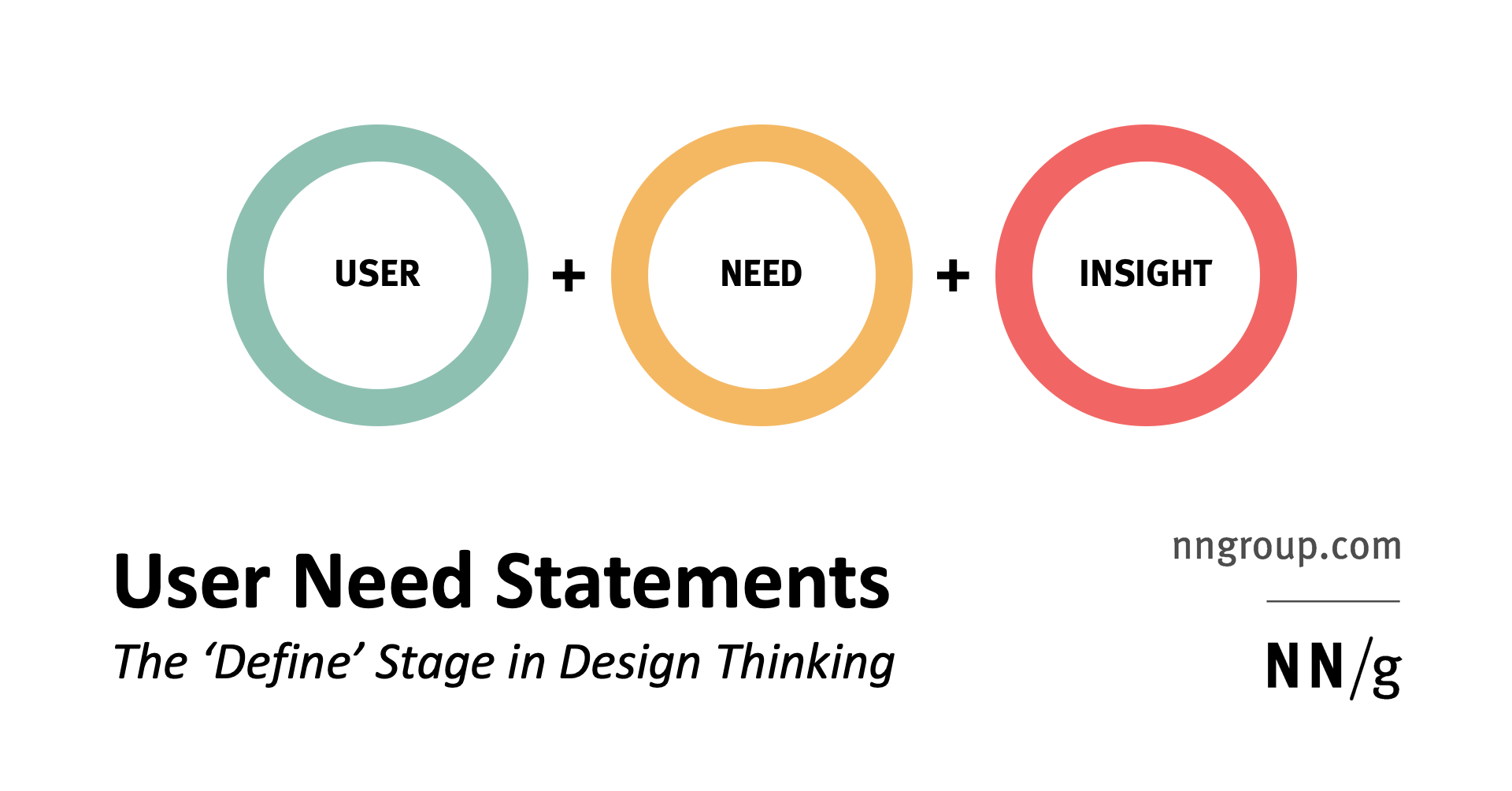
Definition: A user need statement is an actionable problem statement used to summarize who a particular user is, the user’s need, and why the need is important to that user. It defines what you want to solve before you move on to generating potential solutions, in order to 1) condense your perspective on the problem, and 2) provide a metric for success to be used throughout the design thinking process.

Most importantly, the purpose of user need statements is to capture what we want to achieve with our design, not how. They help advance our presumptive solutions from specific features (such as a button or other UI implementation) towards deep insights about the problem that the user needs to solve. Simplistically, user need statements encourage us to see users’ needs as verbs (that is, goals and end states) instead of nouns that describe solutions. For example, users don’t ever need a dropdown (noun); they need to see the choices that they can make and select one of them (verb). They don’t need a dashboard (noun) — they need to digest varied information in one place (verb). The nouns are possible solutions to users’ needs, but they are not the only solutions. If we focus on these nouns, we run the risk of ending up with suboptimal designs. The entire purpose of ideation is to explore ideas, so don’t lock yourself down prematurely by selecting the solution too early.

Format: 3-Part

Traditional need statements have 3 components: 1) a user, 2) a need, and 3) a goal. These are then combined following the pattern [A user] needs [need] in order to accomplish [goal].

For example, [Alieda, a multitasking, tech-savvy mother of 2] needs [to quickly and confidently compare options without leaving her comfort zone] in order to [spend more time doing the things that really matter].

The user should correspond to a specific persona or real end-user segment you’ve done research on. It is helpful to include a short tagline that helps remind everyone who the user is, especially if the need statement will be used by a large team or by stakeholders who are removed from research:

  • Alieda, a multitasking, tech-savvy mother of 2
  • Carol Ann, a researcher with an appetite for adventure
  • Sam, a connected YouTuber in the city

The need should be real, should belong to users, should not be made up by the team, and should not be phrased as a solution. Stay away from features, interface components, and specific technology. For example, possible goals may be:

  • To quickly and confidently compare options without leaving her comfort zone
  • To meet and socialize with others, while maintaining family balance
  • To get validation from others when making an important decision

Keep in mind: users do not always know what they need, even though they may say so. A famous quote, attributed to Henry Ford, says, “If I asked people what they wanted, they would have said faster horses.” It is your job to understand the real need of your user.

The insight, or goal, is the result of meeting that need. It should be rooted in empathy. Look beyond the obvious — what will this solution allow the user to accomplish? For example, think about the user’s hopes, fears, and motivations:

  • Spend more time doing the things that really matter
  • Feel confident having new friends over for dinner
  • Pursue a lifelong dream that has always taken the back seat

Benefits

The cognitive and collaborative process of making a user need statement and the finished statement itself have important benefits for your team and your organization:

  • Capture the user and the need

A need statement distills your knowledge of the users and their need into a single sentence. It is especially helpful in condensing research insights (survey answers, user-interview transcripts, empathy maps) before looking for solutions — thus increasing clarity and allocation of time.

  • Align the team along a concise goal

A user need statement is a concise, articulate way of communicating your user and their need across multiple team members and stakeholders. Once created, it should act as a guiding force — alignment throughout a project of what you and your team seek to solve.

  • Identify a benchmark and measurement for success

User need statements, if properly crafted, have the added benefit of providing a metric for success prior to the onset of ideation, prototyping, and testing. Use the insight, or goal, and ask yourself: how will we know if we accomplish this? Then, as you create your needs statements, establish corresponding metrics for success. This approach will decrease friction down the road and set a clear bar for your team or organization.

Process

1. Set the scope

User need statements can be applied to varying scopes. It is likely you will have multiple need statements within one project: an overarching, umbrella statement and subordinate need statements that articulate smaller goals for that user type. You should scope your need statements based on your current project needs.

Start by creating an ‘umbrella’ or ‘parent’ (broadly scoped) need statement when your goal is to:

  • Establish alignment for a long-term vision or roadmap
  • Define the problem statement at the onset of a product’s conception

A ‘parent’ need statement will likely have a broad goal that will overarch each component of the project. For example, the need statement from above could be regarded as a parent goal:

[Alieda, a multitasking, tech-savvy mother of 2] needs [to quickly and confidently compare options without leaving her comfort zone] in order to [spend more time doing the things that really matter].

Conversely, it is beneficial to start with a ‘child’ (small-scope) need statement if your goal is to:

  • Increase your comfort and fluency with need statements
  • Create personal benchmarks for success as an individual practitioner or UX team of one
  • Align the team on a user need within a larger product or service
  • Set a goal for a week-long sprint

A ‘child’ need statement will have a specific need and a goal that can be satisfied in 1-2 releases:

[Alieda, a multitasking, tech-savvy mother of 2] needs [to schedule an installation appointment] in order to [coordinate her family’s schedule ahead of time and prevent additional stress].

2. Conduct (or gather existing) qualitative research

Gather the research you will be using to fuel your understanding of the users and their needs. Qualitative inputs such as user interviews, field studies, diary studies, or qualitative surveys can drive deep insights about your users. Also look at maps that your team has already made, such as empathy maps, journey maps, or service blueprints.

3. Generate, then mix and match

Using your research, generate candidates for the 3 variables in your needs statement: a user with tagline, a need, and an insight. Don’t worry about creating the perfect statement from the onset; instead, think about each variable in isolation, then start to mix and match. Combine different pairings until you have a statement that represents the user’s real need.

First time practitioners are often apprehensive to include anything that is not a verbatim finding from research in their need statements. However, it is important to remember that our users will not always directly say or even know precisely what they specifically need or why. Instead, it is our job as user-experience professionals to use the research, combined with our expertise, to derive insights. As Rebecca Sinclair, of Airbnb, reminds us “you are the designer. Your job is to be a deep, empathetic listener and to imagine ways to solve their problem. Take responsibility to create something better than the customer could have imagined. They are the inspiration, but you are the creator.” Practice this by continuing to ask yourself why:

  • What does the user care about?
  • Why is this important to the user?
  • What emotion is driving the user’s behavior?
  • What does the user stand to gain?

4. Critique your statement

Once you have a working statement, begin critiquing and iterating on it. Mix and match, altering the language and combining different inputs. Challenge yourself with questions:

  • Are you thinking about your users’ needs as a verb, rather than a noun?
  • Does this need statement launch you into ideation?
  • Does the statement capture the nuances of what solving this need would mean in your user’s life?

5. Add methods of measurement

Upon landing on a final need statement, identify how you can measure its success. If you were to satisfy that need for your user, how would you know? Common methods of measurement include:

User Need Statements in Practice

A user need statement must be used throughout the product-development cycle in order for teams to reap the full benefits. Below are examples of when and why it is helpful to create and refer to a user need statement:

Example 1: Research

When: Analyzing and sharing a key finding from a user interview

How: After completing individual research analysis, create a user need statement on your own. Compare this user need statement to that generated by peer researchers. Combine and remix the various needs statements until you have a user need statement that is the best objective representation of the interview insights.

Why: To help you condense the essential from research into a single actionable statement that is easy to digest, share, and distribute

Tip: Directly compare need statements for different users to articulate the differences between user segments.

Example 2: Project Kick-off

When: Identifying goals at the beginning of a new-release cycle or sprint

How: Create the user need statement in a collaborative, hour-long workshop. Ask participants generate needs, then insights for a particular user. Prompt them to mix, match, and rewrite until they agree on one statement.

Why: To force alignment and prioritization across a multi-disciplinary team in a clear, articulated statement that team members can unite behind; also to mitigate objections or concerns later on in the release cycle

Tip: Have each team member sign or initial the statement to indicate they bought in and aligned behind the release goal.

Example 3: Retrospective

When: Reviewing the success of an added feature or capability after it has been implemented

How: Begin a retrospective by returning to the user need statement created at the onset of the project. Ask participants to rank their perception of success against the statement.

Why: To compare the effectiveness of what was implemented, against the original purpose (A user need statement should be accompanied by a clear definition of what success means —for example, higher click rate, more return purchases, etc.)

Tip: Compare self-evaluations of success to analytics and user data of the new feature or capability. Identify relationships and themes, and use the insights for the next release.

User Need Statements vs. Development Tasks, Stories, and Epics

At a glance, user need statements seem to be like other structures commonly used product development. Development tasks, user stories, and epics often take the same format: “[a user] needs [a way to do something].”

To better highlight the difference, let’s compare a need statement with a development statement:

Need statement:

[Alieda, a multitasking, tech-savvy mother of 2] needs [to quickly and confidently compare options without leaving her comfort zone] in order to [spend more time doing the things that really matter].

Development statement:

A user needs a comparison table in order to see different prices.

The need statement gives us a specific user, something that the user needs to do, and a clear, empathetic insight into why Alieda has that need. The development statement presents a generic user and a solution (comparison table), with an insight that explains what the solution will support, and is not based on research.

Both have their time and place. If you are early in the design thinking process, you should be pushing yourself to generate quality need statements that can act as a pillar throughout the ideation and prototyping. Use development statements as a mechanism for implementation, once you know what you want to address.

If you currently work with epics, stories, or tasks similar to user need statements, return to them and challenge yourself: can you make the user more specific? If you were to turn the noun into a verb, how would that need change? What is the deeper insight?

Conclusion

As their name suggests, user need statements articulate the end user’s problem we are going to solve, and why it is worth solving. They are a tool to help us stop thinking about users’ needs as nouns and start thinking about them as verbs. When done collaboratively and correctly, they can serve as a single source of truth for what you want to achieve as a team or organization.

Learn and practice creating needs statements in our full-day course Generating Big Ideas with Design Thinking.

from NN/g latest articles and announcements https://www.nngroup.com/articles/user-need-statements/