Dear PMs, It’s Time to Rethink Agile at Enterprise Startups

Just like Google’s become ubiquitous in our everyday lives — and a popular verb in our language — its influence on best practices in the tech industry is enormous. Nearly 20 years after its founding, the company has literally shaped a generation of tech professionals. To an even greater extent, it’s molded product managers to build high-quality consumer products at scale.

In many ways, this is a great thing. Together, Google and Facebook (and their brethren Amazon, Uber, Snapchat, Twitter, Dropbox…) have produced product leaders who’ve changed global conversations about how to innovate, how to assemble happy teams, how to test, iterate and learn. But according to Ogi Kavazovic, CMO and SVP Product Strategy at Flatiron Health, this powerful tide has left a crucial gap in its wake: All of these PMs — now spread across dozens of tech companies — while skilled at building consumer-facing products, are coming up short when they apply the same strategies to build winning enterprise software.

In this exclusive interview, Kavazovic identifies the two most common ways B2B product orgs get stuck, and how to get them back on track. He also makes a compelling case for enterprise software PMs to let go of what they’ve been taught to build more successful teams.

The Problem

Simply stated: Too many product leaders attempt to develop enterprise software using a consumer app playbook.

In Kavazovic’s experience, when product managers leave the consumer sphere for a B2B role, they bring their well-worn tactics and hit the ground running. The trouble is, the product development cycles and customer relationships they encounter are fundamentally different. There are two common — and potentially debilitating — ways things can go wrong:

1. Falling in love with agile at the expense of a clear product vision.

“These days, agile is essentially the law of the land if you’re in product management or engineering,” says Kavazovic. But the resulting emphasis on sprints and short-term planning can lead to a lack of a larger product vision. It’s also often incompatible with the longer planning cycles of enterprise customers and partners.

When customer-facing teams bump up against an agile product org, that incompatibility can quickly turn into friction. “A sales reps may say to a PM, ‘Hey my customer is asking what we’re doing with the product over the next year or so?’ And the PM will likely say something like, ‘Oh, we’re not sure yet, we’re agile’ — usually paired with a hint of disdain in their voice.” Product-focused teams are trained to think in one to three month chunks. They value agility and optionality, and avoid anything that sounds like a long-term commitment at all costs.

The downside of this agile orthodoxy is that its short-term focus can make it very difficult for the sales and BD teams to close that next big 5-year deal or key strategic partnership.

“It becomes a point of tension in B2B companies really quickly,” says Kavazovic. More often than not, that tension is temporarily resolved when sales or marketing draws up hasty, if well-intentioned, pictures of where the product could be going.”

That seems like an okay fix in the short term, but if you let this happen over an extended period of time, marketing artifacts can become the de facto product vision, and a dynamic forms where the product management team is wondering who’s actually setting the product direction. Are they? Or are the sales and marketing and BD teams?

Kavazovic recalls working with a talented product lead who’d come to his prior company, Opower, from Google. “He was great and came in with a lot of best practices from his prior role: He implemented OKRs for the first time, and people loved it. He talked about the product manager being the CEO of the product and led the organization from a technology-driven place.” His impact on team motivation was fast and positive. Be he also brought another value from his B2C background — in order to protect the product organization and remain agile, he limited the “committed roadmap” to six months (and anything past three months out, even, was a pretty loose commitment).

When Opower got their next RFP from a large customer, the lack of a longer-term product vision quickly became a real issue. “It was a big deal event in the industry — a 5-year deal with one of the biggest utilities in the country. The customer was planning a rollout of 18 to 24 months in the future.” Naturally, they had questions about what functionality they could expect two or three years down the road — and Opower’s sales and marketing teams were caught flat-footed. “It was a last-minute scramble, we really needed to win this deal,” says Kavazovic. The team spent 10 crazed days shaping a product plan that would fit that customer’s needs.

In the end, it was a happy outcome. The deal was signed. “But it was definitely one of those cases where, for the subsequent two years, we were locked into a half-baked product vision that really came together over the course of a handful of days, and some very late nights. It was a bitter-sweet moment. We all wished we had more time to do the proper research needed to create a longer-term vision that we were all more confident in.”

2. Focusing on user research at the expense of better understanding market dynamics.

The other way B2B product management can go off the rails is forgetting, in most cases, that the user is not the buyer.

This might sound blasphemous to a B2C product manager. Of course the user should be top of mind. And they’re right — in the consumer space, if users love your product, you’re on the right track. “If Google Maps is great and everybody wants to use it, that equals success,” says Kavazovic.

In the B2B world, though, users may not have much of a voice when it comes to a buying decision. A department VP may be the buyer, but it’s the team working for her who’ll actually be using the product. When you’re selling to a business, you need to understand every factor that goes into its purchasing decisions — and it’s quite possible that how delightful a product is to use won’t be anywhere near the top of that list. Therefore, you need to listen — not to the voice of the user but — as Kavazovic calls it, the voice of the market.

Heeding the voice of the market requires looking at all the broader forces — what your competition is pitching, upcoming regulations, as well as the ambitions and needs of your biggest and most important customers (current and prospective).

“All of these things need to be fully considered in order to make the right product strategy decisions,” says Kavazovic. “And that’s quite a bit of work.” While there are plenty of industry-standard B2C best practices for how to do user research, he’s found a void when it comes to baking various market forces into your roadmap. As a result, product teams either stick to what they know — well-run focus groups and user research — but stumble through an ad hoc approach incorporating all the market dynamics that will likely influence a buyer’s decision.

Often, the result is a rude awakening when the sales team gets into the field. “We thought we were doing great at Opower — the current customers were happy and we were confident we had the best product in the market from a user experience perspective,” says Kavazovic. “Then out of nowhere we lost the next three deals — a new competitor backed by a well-known Silicon Valley billionaire interested in cleantech entered the game. We soon found out they were winning because they pitched a grander platform vision about where the market was going and where the product may need to be years from now, complete with very convincing mocks and demos. We started seeing customers partnering with a company whose product didn’t even exist.

In the B2B world, you can have great underlying tech and a superior user experience, but still lose badly to a competitor selling ‘the future.’

Kavazovic near the Flatiron office in New York.

The Solution

Bridging this gap between B2C training and B2B needs is about one thing: adopting a hybrid approach to strategic planning.

In Kavazovic’s experience, the two pitfalls described above boil down to a key misunderstanding: agile development and longer-term planning are NOT actually the mutually exclusive modus operandi the tech world has portrayed them to be.

There’s a quote that’s stuck with him, from someone who doesn’t pop up on TechCrunch too often: Dwight Eisenhower. “He said, ‘Plans are useless, but planning is indispensable.’ It occurred to me when I read that for the first time that this tension between staying agile and strategic planning is something the military has been dealing with for generations.”

Eisenhower knew that any plan crafted before battle would be obsolete at first contact with the enemy. In his work, Kavazovic wants to be this realistic too. “Translating this into tech: no long-term plan or product vision survives contact with the user in the product-design sense. That’s why agile methodology is specifically designed to create user experiences that work,” he says. “It’s absolutely suboptimal to design a particular product all the way down to years’ worth of features, make that the blueprint, and build it out.” Inevitably, sticking to a rigid long-term plan without a mechanism to iterate on user feedback would result in features users don’t want, costly re-dos and potentially total product failure.

But there’s still a vital difference between consumer and enterprise sales: Selling to users vs. selling to buyers.

“Agile is really good for making sure that you create a successful user experience. But it’s important to separate that from the overall product roadmap, which requires meeting the needs of your buyer.” The key is to take a two-pronged approach: 1) articulate a long-term product vision, but 2) establish a culture of flexibility when it comes to the details.

“If you’re a B2B product manager, you now have two deliverables. One is a high-level roadmap — I think a healthy timeline is between 18 to 24 months,” says Kavazovic. “That document is sometimes called the ‘vision roadmap,’ and includes big, directional boulders. It should be exciting! Importantly, it comes with hi-fi mocks — something that can be used to bring it to life, to galvanize the troops internally — especially engineering — to stay ahead of a competitor pitching vaporware, and to compel a strategic buyer or a partner that you’re the right long-term choice. The benefits are manifold.”

For day-to-day execution, you’ll also need a shorter-term, development roadmap. “This one is the real brass tacks. It’s your next one to three months, broken down by feature, and spelling out the committed, ‘shovel ready’ plan that the engineers will execute on.”

By bifurcating the process, you arrive at two guiding artifacts, each with its own purpose and process:

The Long-term Plan & Roadmap

At a startup (no matter how big), the whole company needs to be bought into and feel ownership of this overarching vision, so it should be the product of cross-functional teamwork. Opower’s process was months long and carefully formalized: Every department had a representative on the strategic planning team for a given product, ranging from the executive team to customer support to BD — and of course product management and marketing.

Together, the cross-functional group produces two artifacts: “One is what is sometimes called the market requirements document — that’s the voice of the market. At Flatiron, this is everything from what our salespeople are hearing, to the analysis our product marketing team has done, to what the accounts people are learning from their customers,” says Kavazovic. “A ton of market intelligence can bubble up from within a company if you take the time to do it.”

From there, the market requirements document goes to the product leadership to determine what’s feasible and compatible with the technology stack as it stands. “Meshing those two things together is a judgment call by the product leads, and is a bit of an art, but the result is a well-baked draft of a product vision.”

Still, they’re not done yet. This vision roadmap then undergoes no fewer than two rounds of review and feedback, first by the leadership team and then by the entire company. “This seems like a lot of work, and it is. But the benefit of casting a wide net, of getting everybody’s input in a very methodical way, is that — by the time you come out on the other end — you have a product vision and a strategy that everybody understands and finds exciting and motivating,” says Kavazovic.

The Development Roadmap

“This one is pretty much entirely the purview of product managers and engineers,” he says. “They do the hard work of disaggregating and figuring out, based on a whole slew of factors, which set of features are the most optimal to build next and how you’re going to get it done.”

At Opower, there was a week-long planning process every quarter led by tech leads and PMs to map out the next few iterations with their scrum teams. The development roadmap lived in engineering-oriented systems like JIRA, accompanied by a more accessible, higher-level document published to the rest of the company.

At Flatiron, the team named this deliverable the “transparent roadmap,” and its purpose is to guide the operations of various other functions. This includes informing key customers who may be waiting for a particular feature, giving the marketing team new content for an upcoming campaign, or allowing the customer success team to inform existing customers of upcoming product changes. It’s also an important check-in against progress on the overall strategy and product vision.”

These two documents are obviously linked, but importantly, they’re distinct. “Over time, after you get through three or four of your shorter-term development roadmaps, you should find yourself on your way to realizing the 2-year vision,” says Kavazovic. “At Opower, we found — contrary to some anti-long-term planning rhetoric out there — that we were able to deliver better than 80% of the functionality in the original vision with lower than a 20% error margin on estimated time and budget.” The key is to leave enough flexibility in your product vision to accommodate inevitable shifts and feature-level scope adjustments as you work out the details of your development roadmap.

Communicate, internally and to customers, that your vision roadmap is directional.

“I’ve found that most customers are very receptive to things changing over time, even when they work at a stodgy company like a 100-year-old, extremely risk-averse electric utility,” he says. “They intuitively get that a lot of the details may change over 18 months.”

Give Your Customers the Benefit of the Doubt

Many startups are, understandably, apprehensive about sharing what they (supposedly) have in store for a year or two out, even in broad strokes. After all, what if a customer gets attached to a feature from a mock-up that never comes to fruition? What if you change your minds? Isn’t it safer to say nothing at all?

“Actually, the opposite is true, I’ve found,” says Kavazovic. “The majority of customers totally get that things change, that priorities may change. More importantly, they understand that we may discover better solutions.”

If this kind of transparency is uncomfortable, he suggests a couple of paradigm shifts that will set you up for productive customer-facing interactions:

  • It’s never too early to hear what your customers think.
    Ideally, your product marketing organization starts serving as the customer’s proxy during the strategic planning phase. “Usually they take the lead in documenting what the customer wants to see,” says Kavazovic. “They weigh what your big customers want, what the competition is doing, and so on. It’s a heavy lift, but when you deliver a quality market requirements document, a lot of that should be baked in.”

Once you have a roadmap you feel good about, be open and share it with a broader set of customers. See what resonates. Revisit what doesn’t. You won’t let the air out of your plans. Instead, you’ll make sure you have a winning strategy. “Even better, you may be able to get some customers to sign up before it’s built — this can be very positive for your cashflow if you’re a startup, and perhaps more importantly, it can help you pre-empt a competitor.”

  • Customer education never ends. As you move through the long-term roadmap, you may deviate from a development or feature that a customer has come to expect. When you do, by all means explain that — and teach them why the new approach is better.

Kavazovic recalls one incident at Opower, when a customer had grown quite attached to a spinning pie chart feature that was highlighted prominently in a demo of their product vision. “They kept asking our account team when it was coming.” But the UX team decided to scrap it based on “really, really bad” user testing.

“UX was very nervous about presenting this — they were our biggest customer. But they did an incredible job preparing the deck, which featured all the recent research they’d done. That meeting was one of the most successful, slam-dunk client meetings I’ve ever been in,” he says. “The customer was not upset, and on the contrary, was floored by the level of research and the data that we brought to the table. We candidly explained what we’d learned through our agile process, and we described how we got from our original plan to where we ended up — and why that was much more aligned with what their users wanted. They forgot all about the spinning pie chart in less than an hour.”

At the end of the day, your customers care most about achieving their business objectives. So stay focused on their business case — that’s where alignment is really necessary.

Turn Planning Into a High-Performance Team Sport

At Flatiron, Kavazovic and his colleagues took the democratic aspect of cross-functional strategic planning pretty far. “Each of those cross-functional teams met to come up with what they thought the strategy should be for their particular product line, an 18-month vision that they then presented to the leadership team. We decided to live broadcast all of the presentations to the entire company,” he says.

This was a somewhat controversial idea. But come presentation day, Flatiron’s 80-person conference room was packed with over 100 employees — with many more dialed in online. From 8 a.m. to 6 p.m., presentations took place and voices from across the company chimed in on each team’s strategic vision.

“The feedback that day was overwhelmingly positive,” says Kavazovic. “For the people who were presenting, it was great visibility, and an important opportunity to get the company excited about what they were working on.” While some members of the leadership team had initially feared this would be an unruly free-for-all, it turned into a forcing function for the company’s best thinking.

The benefits of including your team in vision building are multiplicative. The people building your product feel engaged with their work, and the people talking about it can do so with confidence and authority.

Moreover, rallying everyone around strategy becomes a great equalizer. “Once a company gets to a certain size, the most important management challenge becomes ensuring that all those people are rowing in the same direction,” Kavazovic says. “When you include everybody in this high-level planning and product vision process, you all know what you’re moving toward and can get to work immediately.”

from First Round Review http://firstround.com/review/dear-pms-its-time-to-rethink-agile-at-enterprise-startups/?utm_medium=rss&utm_source=frr_feed&utm_campaign=home_stream&utm_content=RSSLink

The types of design research every designer should know


The types of design research every designer should know NOW

In UX design, research is a fundamental part in solving relevant problems and/or narrowing down to the “right” problem users face. A designer’s job is to understand their users, which means going beyond their initial assumptions to put themselves in another persons shoes in order to create products that respond to a human need.

Good research doesn’t just end with good data; it ends with good design and functionality users love, want and need.

Design research is often overlooked in that designers emphasize the result of how a design looks. This results in having a surface level understanding of the people they design for. Having this mindset goes against what UX is all about; being user centered.

UX design is centered around research to understand the needs of people and how the kind of products/services we build will help them.

Here are some research methods every designer should know on the top of their head when going into a project, and even if they are not the ones doing research, they can communicate better with UX researchers to drive engagement in the industry.

Primary

Primary research is essentially coming up with new data to understand who you are designing for and what you would potentially plan on designing. It allows us to validate our ideas with our users and design more meaningful solutions for them. Designers typically gather this type of data through interviews with individuals or through small groups, surveys, or questionnaires.

It is important to understand what you want to research before going out of your way to find people as well as the kind/quality of data you want to gather. In an article from the University of Surrey, the author points out two important points to address when conducting primary research; validity and practicality.

The validity of data refers to the truth that it tells about the subject or phenomenon being studied. It is possible for data to be reliable without being valid.

The practicalities of the research needs to be carefully considered when developing the research design, for instance:

– cost and budget

– time and scale

– size of sample

Bryman in Social Research Methods (2001) identifies four types of validity which can influence your findings:

  1. Measurement validity or construct validity: whether a measure being used really measures what it claims.

i.e. do statistics regarding church attendance really measure the strength of religious beliefs?

2. Internal validity: refers to causality and whether a conclusion of the research or theory developed is a true reflection of the causes.

i.e. is it a true cause that being unemployed causes crime or are there other explanations?

3. External validity: considers whether the results of a particular piece of research can be generalised to other groups.

i.e. if one form of community development approach works in this region, will it necessarily have the same impact in another location?

4. Ecological validity: considers whether ‘…social scientific findings are appropriate to people’s everyday natural setting’ (Bryman, 2001)

i.e. if a situation is being observed in a false setting, how may that influence people’s behavior?

Secondary

Secondary research is using existing data such as internet, books, or articles to support your design choices and the context behind your design. Secondary research is also used as a way to further validate user insights from primary research and create a stronger case for an overall design. Typically secondary research is already summarized insights of existing research.

It is okay to use only secondary research to assess your design, but if you have time, I would definitely recommend doing primary research along with secondary research to really get a sense of who you are designing for and gather insights that are more relevant and compelling than existing data. When you collect user data that is specific to your design, it will generate better insights and a better product.

Evaluative

Evaluative research is assessing a specific problem to ensure usability and ground it in the wants, needs, and desires of real people. One way to do an evaluative study is by having an user use your product and provide questions or tasks for them to think out loud when they try to complete a task. There are two types of evaluative studies; summative and formative.

Summative evaluation- Summative evaluation seeks to understand the outcomes or effects of something. It is more emphasized on the outcome than the process.

Summative evaluation can assess things such as:

  • Finance: Effect in terms of cost, savings, profit and so on.
  • Impact: Broad effect, both positive and negative, including depth, spread and time effects.
  • Outcomes: Whether desired or unwanted effects are achieved.
  • Secondary analysis: Analysis of existing data to derive additional information.
  • Meta-analysis: Integrating results of multiple studies.

Formative evaluation- Formative evaluation is used to help strengthen or improve the person or thing being tested.

Formative evaluation can assess things such as:

  • Implementation: Monitoring success of a process or project.
  • Needs: Looking at such as type and level of need.
  • Potential: The ability of using information for formative purpose.

(source: 1)

Exploratory

Connecting pieces of data together and making sense of it is part of the exploratory research process

Exploratory research is conducting research around a topic where little or none is known about it. The purpose of an exploratory study is to gain a deep understanding and familiarity of the topic by immersing yourself as much as you can in order to create a direction for how this data could be potentially used in the future.

With exploratory research, you have the opportunity to gain new insights and create worthwhile solutions for bigger issues more meaningful than what already exists.

Exploratory research allows us to confirm our assumptions on a topic that would often be overlooked (i.e. prisoners, homeless) by providing an opportunity to generate new ideas and development for existing problems/opportunities.

Based on an article from Lynn University, exploratory research tells us that:

  1. Design is a useful approach for gaining background information on a particular topic.
  2. Exploratory research is flexible and can address research questions of all types (what, why, how).
  3. Provides an opportunity to define new terms and clarify existing concepts.
  4. Exploratory research is often used to generate formal hypotheses and develop more precise research problems.
  5. Exploratory studies help establish research priorities.

(source: 2)

Generative

Autism Empathy Tools by Heeju KIm (RCA). Allowing the wearer to experience first-hand what it’s like for people with autism to see, hear and speak.

Generative research is about taking the research you have conducted and being able to use those insights to decide on which problem you want to solve and create solutions for it. These solutions are generally new or an improvement from an existing problem.

Because generative research is more or less the opportunity/solution creating stage, you must understand your users wants, needs and goals beforehand. Generative research allows us to observe a user’s nuanced behaviors in a natural environment which would can be understood more through ethnography, contextual interviews, focus groups, and data mining.

What is the difference between market research and design research?

https://reboot.org/2012/02/19/design-research-what-is-it-and-why-do-it/

You can market to users what they said they wanted but market research can’t tell you about solving problems customers can’t conceive are solvable (Eric Schmidt and Jonathan Rosenberg)

The main difference between market research and design research is that design research is more fluid, intuitive. This means data is based on how people feel and simply through our human nature to connect with others in order to come to an understanding that drives change. The motive behind design research is about getting as close to connecting with another person in order to develop value for their goals. Market research is often based on logic and a need for a company to scope out their competition, but along with design research, both can be used in conjunction to design better user experiences through connecting with users and understanding them.

Conclusion

So why is design research so important? Design research allows us to understand complex human behavior by getting to the root of a problem by understanding a user’s needs, wants and goals. It also grounds us in what exactly shapes a user’s experience to help us solve for their top pain points. Overall, the data we collect through design research allows us to make decisions. This results in applying that data into useful applications that drive us to create products that are relevant, accessible and applicable for users and the people we work with, whether it be with stakeholders, product managers or other designers on a team.

If you have questions or just want to chat, feel free to connect and message me on Linkedin 🙂

If you liked my post, please recommend it!

Links to some other cool reads:

from Sidebar http://sidebar.io/out?url=https%3A%2F%2Fuxplanet.org%2Fthe-types-of-design-research-every-designer-should-know-now-5dad49106f02

Artificial intelligence predicts patient lifespans

A computer’s ability to predict a patient’s lifespan simply by looking at images of their organs is a step closer to becoming a reality, thanks to new research led by the University of Adelaide.

The research, now published in the Nature journal Scientific Reports, has implications for the early diagnosis of serious illness, and medical intervention.

Researchers from the University’s School of Public Health and School of Computer Science, along with Australian and international collaborators, used artificial intelligence to analyse the medical imaging of 48 patients’ chests. This computer-based analysis was able to predict which patients would die within five years, with 69% accuracy — comparable to ‘manual’ predictions by clinicians.

This is the first study of its kind using medical images and artificial intelligence.

“Predicting the future of a patient is useful because it may enable doctors to tailor treatments to the individual,” says lead author Dr Luke Oakden-Rayner, a radiologist and PhD student with the University of Adelaide’s School of Public Health.

“The accurate assessment of biological age and the prediction of a patient’s longevity has so far been limited by doctors’ inability to look inside the body and measure the health of each organ.

“Our research has investigated the use of ‘deep learning’, a technique where computer systems can learn how to understand and analyse images.

“Although for this study only a small sample of patients was used, our research suggests that the computer has learnt to recognise the complex imaging appearances of diseases, something that requires extensive training for human experts,” Dr Oakden-Rayner says.

While the researchers could not identify exactly what the computer system was seeing in the images to make its predictions, the most confident predictions were made for patients with severe chronic diseases such as emphysema and congestive heart failure.

“Instead of focusing on diagnosing diseases, the automated systems can predict medical outcomes in a way that doctors are not trained to do, by incorporating large volumes of data and detecting subtle patterns,” Dr Oakden-Rayner says.

“Our research opens new avenues for the application of artificial intelligence technology in medical image analysis, and could offer new hope for the early detection of serious illness, requiring specific medical interventions.”

The researchers hope to apply the same techniques to predict other important medical conditions, such as the onset of heart attacks.

The next stage of their research involves analysing tens of thousands of patient images.

Story Source:

Materials provided by University of Adelaide. Note: Content may be edited for style and length.

from Artificial Intelligence News — ScienceDaily https://www.sciencedaily.com/releases/2017/06/170601124126.htm

Pied Piper’s New Internet Isn’t Just Possible—It’s Almost Here

On HBO’s Silicon Valley, startups promise to “change the world” by tackling silly, often non-existent problems. But this season, the show’s characters are tackling a project that really could. In their latest pivot, Richard Hendricks and the Pied Piper gang are trying to create new internet that cuts out intermediaries like Facebook, Google, and the fictional Hooli. Their idea: use a peer-to-peer network built atop every smartphone on the planet, effectively rendering huge data centers full of servers unnecessary.

“If we could do it we could build a completely decentralized version of our current internet,” Hendricks says. “With no firewalls, no tolls, no government regulation, no spying, information would be totally free in every sense of the word.”

But wait: Isn’t the internet already a decentralized network that no one owns? In theory, yes. But in practice, a small number of enormous companies control or at least mediate so much of the internet. Sure, anyone can publish whatever they want to the web. But without Facebook and Google, will anyone be able to find it? Amazon, meanwhile, controls not just the web’s biggest online store but a cloud computing service so large and important that when part of it went offline briefly earlier this year, the internet itself seemed to go down. Similarly, when hackers attacked the lesser-known company Dyn–now owned by tech giant Oracle–last year, large swaths of the internet came crashing down with it. Meanwhile, a handful of telecommunications giants, including Comcast, Charter, and Verizon, control the market for internet access and have the technical capability to block you from accessing particular sites or apps. In some countries, a single state-owned telco controls internet access completely.

Given those very non-utopian realities, people in the real world are also hard at work trying to rebuild the internet in a way that comes closer to the decentralized ideal. They’re still pretty far from Richard’s utopian vision, but it’s already possible to do some of what he describes. Still, it’s not enough to just cut out today’s internet power players. You also need to build a new internet that people will actually want to use.

Storage Everywhere

On the show, Richard’s plan stems from the realization that just about everyone carries around a smartphone with hundreds of times more computing power than the machines that sent humans to the moon. What’s more, those phones are just sitting in people’s pockets doing nothing for most of the day. Richard proposes to use his fictional compression technology—his big innovation from season one—to free up extra space on people’s phones. In exchange for using the app, users would agree to share some of the space they free up with Pied Piper, who will then resell it to companies for far less than they currently pay giants like Amazon.

The closest thing to what’s what’s described on Silicon Valley might be Storj, a decentralized cloud storage company. Much like Pied Piper, Storj has built a network of people who sell their unused storage capacity. If you want to buy space on the Storj network, you upload your files and the company splits them up into smaller pieces, encrypts them so that no one but you can read your data, and then distributes those pieces across its network.

“You control your own encryption keys so we have no access to the data,” says co-founder John Quinn. “We have no knowledge of what is being stored.”

Also like Pied Piper, Storj bills itself as safer than traditional storage systems, because your files will reside on multiple computers throughout the world. Quinn says that in order to lose a file, 21 out of 40 of the computers hosting it would have to go offline.

Storj proves that the Silicon Valley‘s basic idea is feasible. But unlike Pied Piper, Storj doesn’t rely on smartphones. “Phones don’t have much storage and the network capability isn’t great, so the show’s idea is a little fanciful,” says Quinn. Someday, 5G wireless networks might make phones a more viable part of the Storj network. If Richard’s compression algorithm was real, those smaller files will help too. But for now, the Storj network relies on primarily on servers, laptops, and desktop computers. The reality is less grand than the HBO fantasy.

IPFS

As interesting as Storj is, it’s not quite what Richard actually described in his pitch. Storj is a storage service, not a whole new internet. A more ambitious project called IPFS (short for “Interplanetary File System”) is probably a bit closer to Richard’s grand vision of a censorship-resistant internet with privacy features built right in.

The idea behind IPFS is to have web browsers store copies of the pages they visit and then do double-duty as web servers. That way, if the original server disappears, the people who visited the page can still share it with the world. Publishers get improved resilience, and readers get to help support the content they care about. With encryption a part of the protocol, criminals and spies can’t in theory see what you’re looking at. Eventually, the IPFS team and a gaggle of other groups hope to make it possible to build interactive apps along the lines of Facebook that don’t require any centralized servers to run.

You need to build a new internet that people will actually want to use.

But the idea of a building a censorship-proof internet by backing copies up throughout the internet isn’t without its potential problems. Sometimes publishers want to remove old content. IPFS creator Juan Benet told us last year that the project is trying to work out ways to let publishers “recall” pages that are being shared. But that idea is also fraught. What’s to stop a government censor from using the recall feature? What happens if someone creates a version that ignores recalls?

Then there are moral and legal risks. Tools like Storj and the venerable peer-to-peer sharing system Freenet make it impossible to know just what content you’re storing for other people, which means you could be playing host to, say, child pornography. Quinn says that the Storj team is currently working on ways to block known problem users. But it won’t be able to completely guarantee that none of its hosts will end up storing illegal content.

IPFS gets around this largely by letting people decide which of the content they’ve visited they actually want to share. But this means that less popular content, even if it’s perfectly legal and ethical, might end up disappearing if too few people share it. Benet and company are working on system called Filecoin that, not unlike Storj, would compensate people for providing access.

Even overcoming these trade-offs inherent in decentralization, people may still not want to use these apps. Storj may be able to win over businesses by being cheaper, but even if it is more reliable, the idea of storing data on random machines scattered across the internet instead of in a traditional data center sounds risky compared to, say, the massively robust AWS, backed by Amazon’s technical know-how and billions of dollars. Convincing people to use decentralized alternatives to Facebook and Twitter has proven to be a notoriously difficult problem. Getting people to use what amounts to a whole new version of the web could be even harder.

Mesh

Even if IPFS, Storj, or one of the countless other decentralized platforms out there do win people over, they’re still technically riding atop the existing internet infrastructure controlled by a shrinking number of telcos. Silicon Valley hasn’t addressed this problem yet. But what if you could chain the smart phones and laptops of the world together using WiFi and Bluetooth to create a wireless network that was free and open to everyone, with no need for Big Telecom?

Australian computer scientist Paul Gardner-Stephen tried to do something like that after the Haiti earthquake in 2010. “Mobile phones have the capability to run autonomous networks, it’s just that no one had implemented it,” he says. Gardner-Stephen helped build Serval, a decentralized messaging app that can spread texts in a peer-to-peer fashion without the need for a traditional telco carrier. But he quickly realized, as the Pied Piper team likely will, that trying to turn people’s mobile phones into servers drains their batteries too quickly to be practical. Today, the Serval team relies on solar powered base stations to relay messages.

Serval and similar apps like Firechat aren’t meant to replace the internet, just provide communications during disasters or in remote locations. But the idea of creating decentralized wireless networks—mesh networks—still has merit. One such network, Wlan Slovenija, for example, now covers all of Slovenia and is spreading to neighboring countries. But these mesh networks are still along way from replacing telcos–especially in the US. Even as wireless base stations improve, they can’t quite yet compete with the fiber optic cables that link the nation’s telco infrastructure on speed and reliability, and some community networks, such as Guifi in Spain, are bolstering their wireless connections with fiber.

Even then, given a choice, would people really pick a decentralized option over the status quo? Customer service at big broadband companies may be bad to non-existent, but you can still call someone. For those who would nevertheless prefer to wrest control of the internet from large corporations, these new alternatives will need to be better and faster than the services they hope to displace. Simply being decentralized isn’t enough. It wasn’t so long ago that people questioned whether people would ever take to the internet itself at all. As the season finale approaches, Pied Piper will find out whether its version of a new internet works—and whether anyone wants it. They just have to build it and see—just like in the real world.

Go Back to Top. Skip To: Start of Article.

from Wired Top Stories https://www.wired.com/2017/06/pied-pipers-new-internet-isnt-just-possible-almost/

AI will outperform humans in all tasks in just 45 years – Daily Mail

In less than 50 years, artificial intelligence will be able to beat humans at all of their own tasks, according to a new study.

And, the first hints of this shift will become apparent much sooner.

Within the next ten years alone, the researchers found AI will outperform humans in language translation, truck driving, and even writing high-school essays – and, they say machines could be writing bestselling books by 2049.

Scroll down for video 

In less than 50 years, artificial intelligence will be able to beat humans at all of their own tasks, according to a new study. And, the first hints of this shift will become apparent much sooner. A stock image is pictured 

In a new study, researchers from Oxford University’s Future of Humanity Institute, Yale University, and AI Impacts surveyed 352 machine learning experts to forecast the progress of AI in the next few decades.

The experts were asked about the timing of specific capabilities and occupations, as well as their predictions on when AI will become superior over humans in all tasks – and what the social implications of this might be.

The researchers predicted that machines will be better than humans at translating languages by 2024, writing high-school essays by 2026, driving a truck by 2027, and working in retail by 2031.

By 2049, they’ll be able to write a bestseller, and by 2053, they’ll be working as surgeons, they said.

According to the researchers, there’s a 50 percent chance artificial intelligence will outperform humans in all tasks in just 45 years.

And, by the same likelihood, they say machines could take over all human jobs in 120 years.

Some said this could even happen sooner.

JOBS THAT PAY LESS THAN $20 ARE AT RISK OF ROBOT TAKEOVER 

There is an 83 percent chance that artificial intelligence will eventually takeover positions that pay low-wages, says White House’s Council of Economic Advisors (CEA).

A recent report suggests that those who are paid less than $20 an hour will be unemployed and see their jobs filled by robots over the next few years.

But for workers who earn more than $20 an hour there is only a 31 percent chance and those paid double have just a 4 percent risk.

To reach these numbers the CEA’s 2016 economic report referred to a 2013 study about the ‘automation of jobs performed by Oxford researchers that assigned a risk of automation to 702 different occupations’.

Those jobs were then matched to a wage that determines the worker’s risk of having their jobs taken over by a robot.

‘The median probability of automation was then calculated for three ranges of hourly wage: less than 20 dollars; 20 to 40 dollars; and more than 40 dollars,’ reads the report.

The risk of having your job taken over by a robot, Council of Economic Advisers Chairman Jason Furman told reporters that it ‘varies enormously based on what your salary is.’ 

Furman also noted that the threat of robots moving in on low-wage jobs is, ‘another example of why those investments in education to make sure that people have skills that complements automation are so important,’ referring to programs advocated by President Obama. 

Artificial intelligence is fast improving its capabilities, and has increasingly proven itself in historically human-dominated fields.

The Google-owned algorithm AlphaGo, for example, just recently defeated the world’s top player in the ancient Chinese game Go, sweeping a three-game series.

After outperforming humans on numerous occasions, the algorithm – which has been anointed the new ‘Go god’ – is now retiring.

While AI is expected to benefit society in many ways, the researchers also say machines will present a new set of challenges.

‘Advances in artificial intelligence will have massive social consequences,’ the authors wrote.

Artificial intelligence is fast improving its capabilities, and has increasingly proven itself in historically human-dominated fields. The experts were asked about the timing of specific capabilities and occupations. A stock image is pictured 

‘Self-driving technology might replace millions of driving jobs over the coming decade.

‘In addition to possible unemployment, the transition will bring new challenges, such as rebuilding infrastructure, protecting vehicle cyber-security, and adapting laws and regulations.

‘New challenges, both for AI developers and policy-makers, will also arise from applications in law enforcement, military technology, and marketing.’

The news isn’t all bad, though.

In the survey, the researchers also determined the probability of an ‘extremely bad’ outcome, like human extinction as a result of AI, is only 5 percent.

from artificial intelligence – Google News http://news.google.com/news/url?sa=t&fd=R&ct2=us&usg=AFQjCNEn-QDigHNP8oQqg8NpZevTMNx8wA&clid=c3a7d30bb8a4878e06b80cf16b898331&ei=xxwwWeiDK9bNhQHskYGIDQ&url=http://www.dailymail.co.uk/sciencetech/article-4560824/AI-outperform-humans-tasks-just-45-years.html

The 8 competencies of user experience: a tool for assessing and developing UX Practitioners

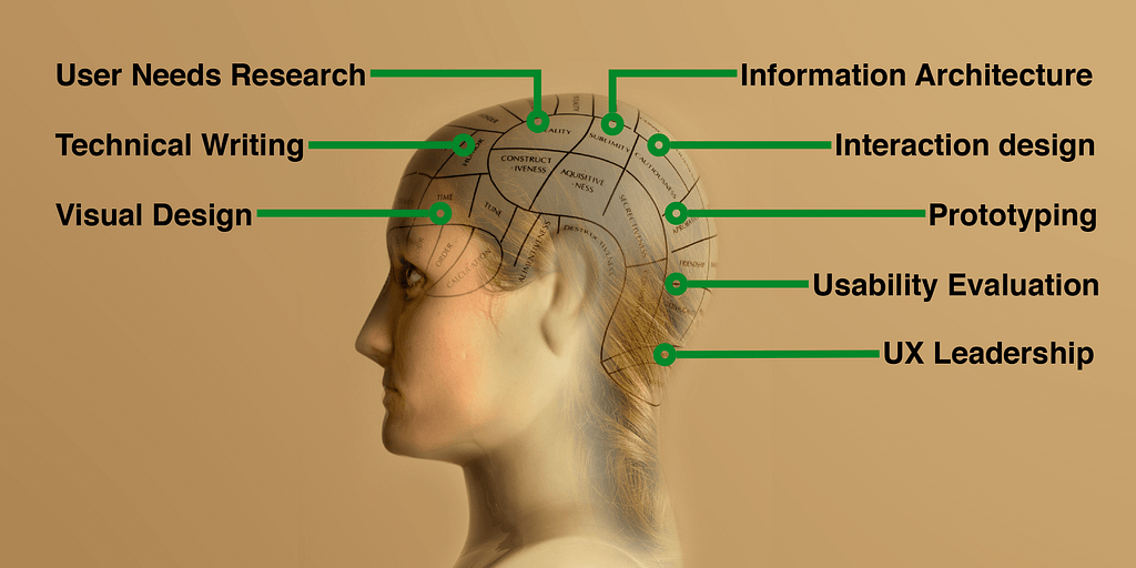
A UX practitioner demonstrates 8 core competencies. By assessing each team member’s ‘signature’ in these eight areas, managers can build a fully rounded user experience team. This approach also helps identify the roles for which each team member is most suited alongside areas for individual development.

I’ve written before about the fact that a full-stack user experience professional needs to be like a modern day Leonardo da Vinci, but I’m still often asked: ‘What skills does a UX designer need?’ It’s true that the term ‘UX Designer’ is problematic but that doesn’t mean we should avoid identifying the competences in which an individual needs to be accomplished to work in the field of user experience. Managers still need to identify the gaps in their user experience team and HR departments still need to set proper criteria for hiring and writing job postings (instead of just scanning CVs for keywords that they may not understand).

Key competencies

I’ve previously argued that the key competences you need as a user experience practitioner fall into 8 areas:

  • User needs research
  • Usability evaluation
  • Information architecture
  • Interaction design
  • Visual design
  • Technical writing
  • User interface prototyping
  • User experience leadership

These are ‘competencies’ but to properly understand them we need to identify the behaviours that underlie them. What behaviours describe the knowledge, skills and actions shown by the best performers in each of these competency areas?

In the following sections, I describe the behaviours behind each of these competences along with a downloadable star chart that you can use to create a ‘signature’ for each member of your team. Then I’ll review the canonical signatures for a range of different practitioners so you can build a fully rounded user experience team.

User needs research

This competence is defined by the following behaviours:

  • Articulate the importance of user research, not just before the system is designed but also during design and after deployment.
  • Identify the potential users of the system.
  • Plan site visits to end users, including deciding who to sample.
  • Structure an effective interview that gets beyond the surface opinions (what users say) to reveal user goals (what users want).
  • Keep appropriate records of each observation.
  • Analyse qualitative data from a site visit.
  • Present the data from a site visit in ways that can be used to drive design: for example, personas, user stories, user journey maps.
  • Analyse and interpret existing data (for example web analytics, user surveys, customer support calls).
  • Critically evaluate previous user research.

Usability evaluation

This competence is defined by the following behaviours:

  • Choose the most appropriate evaluation method (e.g. formative v summative test, moderated v unmoderated test, lab v remote test, usability testing v expert review, usability testing v A/B test, usability testing v survey).
  • Interpret usability principles and guidelines and use them to identify likely problems in user interfaces.
  • Understand how to design an experiment, and how to control and measure variables.
  • Plan and administer different types of usability evaluation.
  • Log the data from usability evaluations.
  • Analyse the data from usability evaluations.
  • Measure usability.
  • Prioritise usability problems.
  • Choose the most appropriate format for sharing findings and recommendations: for example, a report, a presentation, a daily stand-up or a highlights video.
  • Persuade the design team to take action on the results.

Information architecture

This competence is defined by the following behaviours:

  • Establish the flow between a person and a product, service, or environment (‘service design’).
  • Uncover and describe users’ models of the work domain.
  • Organise, structure and label content, functions and features.
  • Choose between different design patterns for organising content (such as faceted navigation, tagging, hub and spoke etc).
  • Develop a controlled vocabulary.
  • Articulate the importance and use of metadata.
  • Analyse search logs.
  • Run online and offline card sorting sessions.

Interaction design

This competence is defined by the following behaviours:

  • Choose between different user interface patterns (for example, Wizards, Organiser Workspaces and Coach Marks).
  • Use the correct user interface ‘grammar’: e.g., choosing the correct control in an interface, such as checkbox v radio button.
  • Describe how a specific user interface interaction will behave (for example, pinch to zoom).
  • Create user interface animations.
  • Create affordances within a user interface.
  • Create design ideas toward a solution.
  • Sketch and tell user-centred stories about the way an interaction should work.

Visual design

This competence is defined by the following behaviours:

  • Use fundamental principles of visual design (like contrast, alignment, repetition and proximity) to de-clutter user interfaces.
  • Choose appropriate typography.
  • Devise grids.
  • Lay out pages.
  • Choose colour palettes.
  • Develop icons.
  • Articulate the importance of following a common brand style.

Technical writing

This competence is defined by the following behaviours:

  • Write content in plain English.
  • Phrase content from the user’s perspective (rather than the system’s perspective).
  • Create content that helps users complete tasks and transactions.
  • Express complex ideas concisely.
  • Create and edit macro- and micro-copy.
  • Write content in the tone of voice that matches the organisation’s identity or brand.
  • Choose the right kind of help for the situation: tutorials v manuals v contextual help v micro-copy.

User interface prototyping

This competence is defined by the following behaviours:

  • Translate ideas into interactions by developing prototypes and simulations.
  • Choose the appropriate fidelity of prototype for the phase of design.
  • Articulate the benefits of fast iteration.
  • Create paper prototypes.
  • Properly explore the design space before deciding on a solution.
  • Create interactive electronic prototypes.

User experience leadership

This competence is defined by the following behaviours:

  • Plan and schedule user experience work.
  • Constructively critique the work of team members.
  • Argue the cost-benefit of user experience activities.
  • Lead a multidisciplinary team.
  • Assemble team members for a project.
  • Promote ongoing professional development of the team.
  • Liaise with stakeholders.
  • Manage client expectations.
  • Measure and monitor the effect of UX on the company’s success.
  • Evangelise UX throughout the company.

How to assess the competence of your team

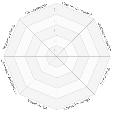
When I’m coaching people in these competences, I’ve found it useful to formalise the discussion around a simple star chart. The purpose of the star chart is simply to provide a framework for our conversation, although people tell me they find it a useful reference that they can return to and assess their progress over time.

You’ll notice that the star chart contains the 8 competences that I’ve reviewed in this article along with a 5-point scale for each one. This 5-point scale is to frame a discussion only; it’s there to help people identify their strengths and weaknesses.

Unless you have worked with each of your team members for several years, I recommend that you ask team members to assess their own competency. I usually give people the following instructions:

Pick one of the competency areas on this star chart that you are most familiar with. Read over the behavioural descriptions for this competency area and then rate your own competency between 0 and 5, using the following scale:

0 I don’t understand this competence or it is non-existent
1 Novice: I have a basic understanding of this competence
2 Advanced beginner: I can demonstrate this competence under supervision
3 Competent: I can demonstrate this competence independently
4 Proficient: I can supervise other people in this competence
5 Expert: I develop new ways of applying this competence

Then move onto the other competency areas and complete the diagram.

There are problems when you ask people to rate their own competence. The Dunning-Kruger effect tells us that novices tend to overestimate their competency and experts tend to underestimate their competency. For example, a novice who should rate themselves a ‘1’ may over-rate themselves as a 2 or 3 whereas an expert that should rate themselves a ‘5’ may under-rate themselves as a 3 or 4. To counteract this bias, I recommend that you either (a) ignore the absolute ratings and instead look at a team member’s general pattern across the 8 competencies; or (b) you follow up each chart with an interview where you ask team members to provide specific examples of behaviours to justify their rating. I have some other suggestions on how you can use the star charts in the ‘Next Steps’ section at the end of this article.

Mapping the competences to UX design roles

The field of user experience has a bewildering array of job titles (I wrote about this in the past in The UX Job Title Generator). So to map these competencies onto different user experience roles, I’ve taken some of the practitioner roles from Merholz and Skinner’s (2016) recent book, ‘Org Design for Design Orgs’. I’ve chosen this book because it’s both up-to-date and written by acknowledged experts in the field.

If you skip ahead to the star charts, you’ll notice that I would expect every practitioner in every role to have at least a basic understanding of each competence area: this is the level of knowledge someone would have that has acquired the BCS Foundation Certificate in User Experience. Beyond that, there are different patterns for each role.

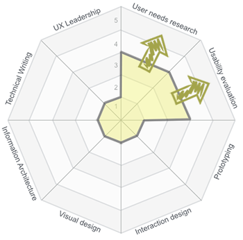
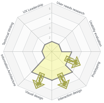
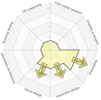
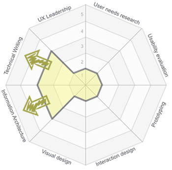
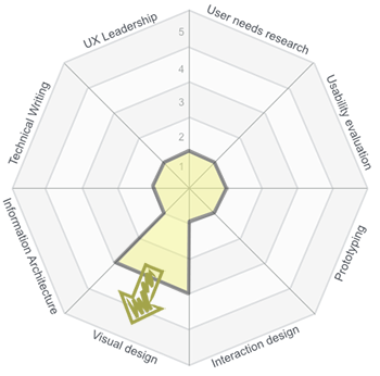
The following charts show the mapping for both junior and senior practitioners. The solid line shows the minimum levels of competence for a junior practitioner and the arrows show the areas where a senior practitioner should extend into (the ‘4’ and ‘5’ areas). Because of their breadth of experience, I would expect senior practitioners to show an expansion into 2s and 3s in other competencies too. However, to keep the diagrams simple, I’ve not shown this.

The question of what an optimal star chart looks like is ultimately going to vary with each person, their personal goals, and the needs of the organisation. But the following role-based descriptions may help you with this discussion. And just as importantly, this approach should prevent your team from trying to recruit clones of themselves. It should help everyone realise the range of competencies needed by a fully rounded user experience team.

UX Researcher

Merholz and Skinner describe the UX Researcher as responsible for generative and evaluative research. Generative research means field research to generate “insights for framing problems in new ways” and evaluative research means testing the “efficacy of designed solutions, through observing use and seeing where people have problems”. The competence signature I would expect to see of someone in this role would show expertise in user needs research and usability evaluation.

The solid line shows the minimum competence levels for a junior UX Researcher. The arrows show the levels that senior practitioners should attain (usually 4s and 5s). Because of their breadth of experience, senior practitioners should also display a broader signature (2s and 3s) in other areas of the star chart (this will be individual-specific and not role-specific).

Product Designer

Merholz and Skinner describe the Product Designer as “responsible for the interaction design, the visual design and sometimes even front-end development”. The competence signature I would expect to see of someone in this role would show expertise in visual design and interaction design and to a lesser extent, prototyping.

The solid line shows the minimum competence levels for a junior Product Designer. The arrows show the levels that senior practitioners should attain (usually 4s and 5s). Because of their breadth of experience, senior practitioners should also display a broader signature (2s and 3s) in other areas of the star chart (this will be individual-specific and not role-specific).

Creative Technologist

Merholz and Skinner describe the Creative Technologist as someone who helps the design team explore design solutions through interactive prototyping. This role is distinct from front-end development: “The Creative Technologist is less concerned about delivery than possibility”. The competence signature I would expect to see of someone in this role would show expertise in prototyping and to a lesser extent, visual design and interaction design.

The solid line shows the minimum competence levels for a junior Creative Technologist. The arrows show the levels that senior practitioners should attain (usually 4s and 5s). Because of their breadth of experience, senior practitioners should also display a broader signature (2s and 3s) in other areas of the star chart (this will be individual-specific and not role-specific).

Content Strategist

Merholz and Skinner describe the Content Strategist as someone who “develops content models and navigation design” and who “write[s] the words, whether it’s the labels in the user interface, or the copy that helps people accomplish their tasks”. The competence signature I would expect to see of someone in this role would show expertise in technical writing and information architecture.

The solid line shows the minimum competence levels for a junior Content Strategist. The arrows show the levels that senior practitioners should attain (usually 4s and 5s). Because of their breadth of experience, senior practitioners should also display a broader signature (2s and 3s) in other areas of the star chart (this will be individual-specific and not role-specific).

Communication Designer

Merholz and Skinner describe the Communication Designer as someone with a background in the visual arts and graphic design and is aware of “core concepts such as layout, color, composition, typography, and use of imagery”. The competence signature I would expect to see of someone in this role would show expertise in visual design.

The solid line shows the minimum competence levels for a junior Communication Designer. The arrows show the levels that senior practitioners should attain (usually 4s and 5s). Because of their breadth of experience, senior practitioners should also display a broader signature (2s and 3s) in other areas of the star chart (this will be individual-specific and not role-specific).

Next steps

If you manage a user experience team:

  • Download the PDF template and ask each member of your team complete the star chart as a self-reflection exercise. Discuss the results as a group and use the discussion to identify the competency areas where your team thinks it needs support.
  • Given the environment where your team works, what would an ‘ideal’ team composition look like?
  • Discuss the results individually with each team member in a 1–1 to objectively identify areas where your rating of their competence differs from their rating. What behaviours do you expect them to demonstrate to prove they actually are a 3, 4 or 5?
  • The diagram could also serve as a way to set performance goals for evaluation and professional development purposes.

If you are a practitioner who works in the field, I encourage you to download the PDF template and sketch out your own competence signature.

  • Use the diagram as a benchmark (current state) to identify areas for improvement.
  • Compare your signature with the ones in this article to discover if you are in the role you want and if not, see what competencies you need to develop to move into a different role.
  • Use the 8 competency areas as a structure for your portfolio.

If you do not work in the field but are responsible for recruiting people to user experience teams:

  • Use the competency descriptions in this article to set behavioural-based criteria for hiring and writing job postings.

Acknowledgements

Thanks to Philip Hodgson and Todd Zazelenchuk for comments on an earlier draft of this article.

Originally published at userfocus.co.uk.

from Stories by David Travis on Medium https://medium.com/@userfocus/the-8-competencies-of-user-experience-a-tool-for-assessing-and-developing-ux-practitioners-631770c6d2da?source=rss-934fcb05e8b5——2

The best Data Science courses on the internet, ranked by your reviews


The best Data Science courses on the internet, ranked by your reviews

A year and a half ago, I dropped out of one of the best computer science programs in Canada. I started creating my own data science master’s program using online resources. I realized that I could learn everything I needed through edX, Coursera, and Udacity instead. And I could learn it faster, more efficiently, and for a fraction of the cost.

I’m almost finished now. I’ve taken many data science-related courses and audited portions of many more. I know the options out there, and what skills are needed for learners preparing for a data analyst or data scientist role. So I started creating a review-driven guide that recommends the best courses for each subject within data science.

For the first guide in the series, I recommended a few coding classes for the beginner data scientist. Then it was statistics and probability classes. Then introductions to data science. Then data visualization. Machine learning was the fifth and latest guide. And now I’m back to conclude this series with even more resources.

Here’s a summary of all my previous guides, plus recommendations for 13 other data science topics.

For each of the five major guides in this series, I spent several hours trying to identify every online course for the subject in question, extracting key bits of information from their syllabi and reviews, and compiling their ratings. My goal was to identify the three best courses available for each subject and present them to you.

The 13 supplemental topics — like databases, big data, and general software engineering — didn’t have enough courses to justify full guides. But over the past eight months, I kept track of them as I came across them. I also scoured the internet for courses I may have missed.

For these tasks, I turned to none other than the open source Class Central community, and its database of thousands of course ratings and reviews.

Class Central’s homepage.

Since 2011, Class Central founder Dhawal Shah has kept a closer eye on online courses than arguably anyone else in the world. Dhawal personally helped me assemble this list of resources.

How we picked courses to consider

Each course within each guide must fit certain criteria. There were subject-specific criteria, then two common ones that each guide shared:

  1. It must be on-demand or offered every few months.
  2. It must be an interactive online course, so no books or read-only tutorials. Though these are viable ways to learn, this guide focuses on courses. Courses that are strictly videos (i.e. with no quizzes, assignments, etc.) are also excluded.

We believe we covered every notable course that fit the criteria in each guide. There is always a chance that we missed something, though. Please let us know in each guide’s comments section if we left a good course out.

How we evaluated courses

We compiled average ratings and number of reviews from Class Central and other review sites to calculate a weighted average rating for each course. We read text reviews and used this feedback to supplement the numerical ratings.

We made subjective syllabus judgment calls based on a variety of factors specific to each subject. The criteria in our intro to programming guide, for example:

  1. Coverage of the fundamentals of programming.
  2. Coverage of more advanced, but useful, topics in programming.
  3. How much of the syllabus is relevant to data science?

Here are the best courses overall for each of these topics. Together these form a comprehensive data science curriculum.

Subject #1: Intro to Programming

Learn to Program: The Fundamentals (LPT1) and Crafting Quality Code (LPT2) by the University of Toronto via Coursera

The University of Toronto’s Learn to Program series has an excellent mix of content difficulty and scope for the beginner data scientist. Taught in Python, the series has a 4.71-star weighted average rating over 284 reviews.

The University of Toronto offers Learn to Program: The Fundamentals (LPT1) and Crafting Quality Code (LPT2), taught by Jennifer Campbell and Paul Gries, via Coursera.

An Introduction to Interactive Programming in Python (Part 1) and (Part 2) by Rice University via Coursera

Rice University’s Interactive Programming in Python series contains two of the best online courses ever. They skew towards games and interactive applications, which are less applicable topics in data science. The series has a 4.93-star weighted average rating over 6,069 reviews.

R Programming Track by DataCamp

If you are set on learning R, DataCamp’s R Programming Track effectively combines programming fundamentals and R syntax instruction. It has a 4.29-star weighted average rating over 14 reviews.

Subject #2: Statistics & Probability

Foundations of Data Analysis — Part 1: Statistics Using R and Part 2: Inferential Statistics by the University of Texas at Austin via edX

The courses in the UT Austin’s Foundations of Data Analysis series are two of the few with great reviews that also teach statistics and probability with a focus on coding up examples. The series has a 4.61-star weighted average rating over 28 reviews.

The promo video for UT Austin’s Foundations of Data Analysis, taught by Michael J. Mahometa.

Statistics with R Specialization by Duke University via Coursera

Duke’s Statistics with R Specialization, which is split into five courses, has a comprehensive syllabus with full sections dedicated to probability. It has a 3.6-star weighted average rating over 5 reviews, but the course it was based upon has a 4.77-star weighted average rating over 60 reviews.

Introduction to Probability — The Science of Uncertainty by the Massachusetts Institute of Technology (MIT) via edX

MIT’s Intro to Probability course by far has the highest ratings of the courses considered in the statistics and probability guide. It exclusively probability in great detail, plus it is longer (15 weeks) and more challenging than most MOOCs. It has a 4.82-star weighted average rating over 38 reviews.

Subject #3: Intro to Data Science

Data Science A-Z™: Real-Life Data Science Exercises Included by Kirill Eremenko and the SuperDataScience Team via Udemy

Kirill Eremenko’s Data Science A-Z excels in breadth and depth of coverage of the data science process. The instructor’s natural teaching ability is frequently praised by reviewers. It has a 4.5-star weighted average rating over 5,078 reviews.

The promo video for Data Science A-Z™, taught by Kirill Eremenko.

Intro to Data Analysis by Udacity

Udacity’s Intro to Data Analysis covers the data science process cohesively using Python. It has a 5-star weighted average rating over 2 reviews.

Data Science Fundamentals by Big Data University

Big Data University’s Data Science Fundamentals covers the full data science process and introduces Python, R, and several other open-source tools. There are no reviews for this course on the review sites used for this analysis.

Subject #4: Data Visualization

Data Visualization with Tableau Specialization by the University of California, Davis via Coursera

A five-course series, UC Davis’ Data Visualization with Tableau Specialization dives deep into visualization theory. Opportunities to practice Tableau are provided through walkthroughs and a final project. It has a 4-star weighted average rating over 2 reviews.

Data Visualization with ggplot2 Series by DataCamp

Endorsed by ggplot2 creator Hadley Wickham, a substantial amount of theory is covered in DataCamp’s Data Visualization with ggplot2 series. You will know R and its quirky syntax quite well leaving these courses. There are no reviews for these courses on the review sites used for this analysis.

Tableau 10 Series (Tableau 10 A-Z and Tableau 10 Advanced Training) by Kirill Eremenko and the SuperDataScience Team on Udemy

An effective practical introduction, Kirill Eremenko’s Tableau 10 series focuses mostly on tool coverage (Tableau) rather than data visualization theory. Together, the two courses have a 4.6-star weighted average rating over 3,724 reviews.

Subject #5: Machine Learning

Machine Learning by Stanford University via Coursera

Taught by the famous Andrew Ng, Google Brain founder and former chief scientist at Baidu, Stanford University’s Machine Learning covers all aspects of the machine learning workflow and several algorithms. Taught in MATLAB or Octave, It has a 4.7-star weighted average rating over 422 reviews.

The promo video for Stanford University’s Machine Learning, taught by Andrew Ng.

Machine Learning by Columbia University via edX

A more advanced introduction than Stanford’s, CoIumbia University’s Machine Learning is a newer course with exceptional reviews and a revered instructor. The course’s assignments can be completed using Python, MATLAB, or Octave. It has a 4.8-star weighted average rating over 10 reviews.

Machine Learning A-Z™: Hands-On Python & R In Data Science by Kirill Eremenko and Hadelin de Ponteves via Udemy

Kirill Eremenko and Hadelin de Ponteves’ Machine Learning A-Z is an impressively detailed offering that provides instruction in both Python and R, which is rare and can’t be said for any of the other top courses. It has a 4.5-star weighted average rating over 8,119 reviews.

Subject #6: Deep Learning

Creative Applications of Deep Learning with TensorFlow by Kadenze

Parag Mital’s Creative Applications of Deep Learning with Tensorflow adds a unique twist to a technical subject. The “creative applications” are inspiring, the course is professionally produced, and the instructor knows his stuff. Taught in Python, It has a 4.75-star weighted average rating over 16 reviews.

The promo video for Kadenze’s Creative Applications of Deep Learning with TensorFlow, taught by Parag Mital.

Neural Networks for Machine Learning by the University of Toronto via Coursera

Learn from a legend. Geoffrey Hinton is known as the “godfather of deep learning” is internationally distinguished for his work on artificial neural nets. His Neural Networks for Machine Learning is an advanced class. Taught in Python, it has a 4.11-star weighted average rating over 35 reviews.

Deep Learning A-Z™: Hands-On Artificial Neural Networks by Kirill Eremenko and Hadelin de Ponteves via Udemy

Deep Learning A-Z is an accessible introduction to deep learning, with intuitive explanations from Kirill Eremenko and helpful code demos from Hadelin de Ponteves. Taught in Python, it has a 4.6-star weighted average rating over 1,314 reviews.

And here’s our top course pick for each of the supplementary subjects within data science.

Python & its tools

Python Programming Track by DataCamp, plus their individual pandas courses:

DataCamp’s code-heavy instruction style and in-browser programming environment are great for learning syntax. Their Python courses have a 4.64-star weighted average rating over 14 reviews. Udacity’s Intro to Data Analysis, one of our recommendations for intro to data science courses, covers NumPy and pandas as well.

R & its tools

R Programming Track by DataCamp, plus their individual dplyr and data.table courses:

Again, DataCamp’s code-heavy instruction style and in-browser programming environment are great for learning syntax. Their R Programming Track, which is also one of our recommendations for programming courses in general, effectively combines programming fundamentals and R syntax instruction. The series has a 4.29-star weighted average rating over 14 reviews.

Databases & SQL

Introduction to Databases by Stanford University via Stanford OpenEdx (note: reviews from the deprecated version on Coursera)

Stanford University’s Introduction to Databases covers database theory comprehensively while introducing several open source tools. Programming exercises are challenging. Jennifer Widom, now the Dean of Stanford’s School of Engineering, is clear and precise. It has a 4.61-star weighted average rating over 59 reviews.

The promo video for Stanford University’s Introduction to Databases, taught by Jennifer Widom.

Data Preparation

Importing & Cleaning Data Tracks by DataCamp:

DataCamp’s Importing & Cleaning Data Tracks (one in Python and one in R) excel at teaching the mechanics of preparing your data for analysis and/or visualization. There are no reviews for these courses on the review sites used for this analysis.

Exploratory Data Analysis

Data Analysis with R by Udacity and Facebook

Udacity’s Data Analysis with R is an enjoyable introduction to exploratory data analysis. The expert interviews with Facebook’s data scientists are insightful and inspiring. The course has a 4.58-star weighted average rating over 19 reviews. It also serves as a light introduction to R.

An interview with Aude Hofleitner, Facebook Data Scientist, in Udacity’s Data Analysis with R.

Big Data

The Ultimate Hands-On Hadoop — Tame your Big Data! by Frank Kane via Udemy, then if you want more on specific tools (all by Frank Kane via Udemy):

Frank Kane’s Big Data series teaches all of the most popular big data technologies, including over 25 in the “Ultimate” course alone. Kane shares his knowledge from a decade of industry experience working with distributed systems at Amazon and IMDb. Together, the courses have a 4.52-star weighted average rating over 6,932 reviews.

The promo video for Frank Kane’s The Ultimate Hands-On Hadoop — Tame your Big Data!

Software Skills

Software Testing by Udacity

Software Debugging by Udacity

Version Control with Git and GitHub & Collaboration by Udacity (updates to Udacity’s popular How to Use Git & GitHub course)

Software skills are an oft-overlooked part of a data science education. Udacity’s testing, debugging, and version control courses introduce three core topics relevant to anyone who deals with code, especially those in team-based environments. Together, the courses have a 4.34-star weighted average rating over 68 reviews. Georgia Tech and Udacity have a new course that covers software testing and debugging together, though it is more advanced and not all relevant for data scientists.

The intro video for Udacity’s GitHub & Collaboration, taught by Richard Kalehoff.

Miscellaneous

Building a Data Science Team by Johns Hopkins University via Coursera

Learning How to Learn: Powerful mental tools to help you master tough subjects by Dr. Barbara Oakley and the University of California, San Diego via Coursera

Mindshift: Break Through Obstacles to Learning and Discover Your Hidden Potential by Dr. Barbara Oakley and McMaster University via Coursera

Johns Hopkins University’s Building a Data Science Team provides a useful peek into data science in practice. It is an extremely short course that can be completed in a handful of hours and audited for free. Ignore its 3.41-star weighted average rating over 12 reviews, some of which were likely from paying customers.

Dr. Barbara Oakley’s Learning How to Learn and Mindshift aren’t data science courses per se. Learning How to Learn, the most popular online course ever, covers best practices shown by research to be most effective for mastering tough subjects, including memory techniques and dealing with procrastination. In Mindshift, she demonstrates how to get the most out of online learning and MOOCs, how to seek out and work with mentors, and the secrets to avoiding career ruts and general ruts in life. These are two courses that everyone should take. They have a 4.74-star and a 4.87-star weighted average rating over 959 and 407 reviews, respectively.

The promo video for Learning How to Learn, taught by Dr. Barbara Oakley.

This Future of This Guide

This Data Science Career Guide will continue to be updated as new courses are released and ratings and reviews for them are generated.

Are you passionate about another discipline (e.g. Computer Science)? Would you like to help educate the world? If you are interested in creating a Career Guide similar in structure to this one, drop us a note at guides@class-central.com.

My Future

As for my future, I’m excited to share that I have taken a position with Udacity as a Content Developer. That means I’ll be creating and teaching courses. That also means that this guide will be updated by somebody else.

I’m joining Udacity because I believe they are creating the best educational product in the world. Of all of the courses I have taken, online or at university, I learned best while enrolled a Nanodegree. They are incorporating the latest in pedagogy and production, and still boast the best-in-class project review system, upbeat instructors, and healthy student and career support teams. Though a piecewise approach like the one we took in this guide can work, I believe there is a ton of value in a cohesive, high-quality program.

What is a Nanodegree?

Updating the Data Analyst Nanodegree is my first task, which is a part of a larger effort to create a clear path of Nanodegrees for all things data. Students will soon be able to start from scratch with data basics at Udacity and progress all the way through machine learning, artificial intelligence, and even self-driving cars if they wish.

Wrapping it Up

This is the final piece of a six-piece series that covers the best online courses for launching yourself into the data science field. We covered programming in the first article, statistics and probability in the second article, intros to data science in the third article, data visualization in the fourth, and machine learning in the fifth.

Here, we summarized the above five articles, and recommended the best online courses for other key topics such as databases, big data, and even software engineering.

If you’re looking for a complete list of Data Science online courses, you can find them on Class Central’s Data Science and Big Data subject page.

If you enjoyed reading this, check out some of Class Central’s other pieces:

If you found this helpful, click the 💚 so more people will see it here on Medium.

This is a condensed version of my original article published on Class Central.

from freeCodeCamp https://medium.freecodecamp.com/the-best-data-science-courses-on-the-internet-ranked-by-your-reviews-6dc5b910ea40?source=rss—-336d898217ee—4

My kind of contract

The work for hire terms at Segura, a design firm in Chicago. My three favorite bits: 1. “Time is money. More time is more money.” 2. “If you want something that’s been done before, use that.” 3. The pro bono amendments.

You give me money, I’ll give you creative.
I’ll start when the check clears.
Time is money. More time is more money.
I’ll listen to you. You listen to me.
You tell me what you want, I’ll tell you what you need.
You want me to be on time, I want you to be on time.
What you use is yours, what you don’t is mine.
I can’t give you stuff I don’t own.
I’ll try not to be an ass, you should do the same.
If you want something that’s been done before, use that.

PRO BONO

If you want your way, you have to pay.
If you don’t pay, I have final say.

Let’s create something great together.

For those who will be quick to point out legal holes or missing protections, there are many ways to do business. One way is working with clients you trust — people who appreciate this approach to work. And if you guessed wrong, and someone fucks you, rather than pursuing legal remedies which cost even more time, money, and hassle, there’s an alternative: Take your losses, wash your hands, and don’t work with them again.


My kind of contract was originally published in Signal v. Noise on Medium, where people are continuing the conversation by highlighting and responding to this story.

from Stories by Jason Fried on Medium https://m.signalvnoise.com/my-kind-of-contract-e7327e98e3ea?source=rss-c030228809f2——2

Graphic Means documentary

A look back on the beginning of graphic design: Graphic Means documentary

From time to time we stop, look eerily at an actual newspaper, assess the technological advances in printing and revere at the limitless creativity in individuals. Then we casually follow our screen while it easily transposes our imagination into drawing, typography or photography. That’s a taste of graphic design, on fast forward. Just a glimpse into the short history of a business we can’t imagine living without. If this seems confusing to you, I have another thing you will really enjoy. Especially if you are fascinated by the fast-paced evolution of technology, in general.

graphic means documentary

Graphic Means is a documentary, created by Briar Levit, director and producer, but also Assistant Professor of Graphic Design at Portland State University. Her material follows the evolution of graphic design in the span of 30 years, from linecaster to PDF. It is an exploration of how design worked in the 1950s through the 1990s. She felt inspired to do this thanks to the collection of manuals she gathered from this period. When nostalgia hit hard, she decided to document the tools, processes, and people, of this brief moment in the design world.

The film premiered at the ByDesign film festival in Seattle in April and got a Kickstarter page. Now it’s already screening festivals and other events. It will also be available for streaming on iTunes and Amazon at the beginning of 2018.

Briar Levit on making Graphic Means from Briar Levit on Vimeo.

No matter for how long you’ve been in the graphic design industry, a trip down memory lane, from the beginning up to today’s technology is mind boggling. To see where it all came from, before the PDF’s, Photoshop and professional tablets in such a short time, truly puts things into perspective. The question on everyone’s lips is: what’s next, how soon can we expect the next revolutionary product in graphic design?

Watch the trailer below:

Graphic Means (Official Trailer) from Briar Levit on Vimeo.

The post Graphic Means documentary appeared first on Tshirt-Factory Blog.

from Tshirt-Factory Blog http://blog.tshirt-factory.com/graphic-means-documentary.html

Intel’s Core i9 Extreme Edition CPU is an 18-core beast

Priced at $1,999, the 7980XE is clearly not a chip you’d see in an average desktop. Instead, it’s more of a statement from Intel. It beats out AMD’s 16-core Threadripper CPU, which was slated to be that company’s most powerful consumer processor for 2017. And it gives Intel yet another way to satisfy the demands of power-hungry users who might want to do things like play games in 4K while broadcasting them in HD over Twitch. And as if its massive core count wasn’t enough, the i9-7980XE is also the first Intel consumer chip that packs in over a teraflop worth of computing power.

If 18 cores is a bit too rich for you, Intel also has other Core i9 Extreme Edition chips in 10, 12, 14 and 16-core variants. Perhaps the best news for hardware geeks: the 10 core i9-7900X will retail for $999, a significant discount from last year’s version.

All of the i9 chips feature base clock speeds of 3.3GHz, reaching up to 4.3GHz dual-core speeds with Turbo Boost 2.0 and 4.5GHz with Turbo Boost 3.0. And speaking of Turbo Boost 3.0, its performance has also been improved in the new Extreme Edition chips to increase both single and dual-core speeds. Rounding out the X-Series family are the quad-core i5-7640X and i7 models in 4, 6 and 8-core models.

While it might all seem like overkill, Intel says its Core i9 lineup was driven by the surprising demand for last year’s 10-core chip. “Broadwell-E was kind of an experiment,” an Intel rep said. “It sold… Proving that our enthusiast community will go after the best of the best… Yes we’re adding higher core count, but we’re also introducing lower core counts. Scalability on both ends are what we went after.”

As you can imagine, stuffing more cores into a processor leads to some significant heat issues. For that reason, Intel developed its own liquid cooling solution, which will work across these new chips, as well as some previous generations. All of the new Core i9 processors, along with the 6 and 8-core i7 chips, feature scorching hot 140W thermal design points (TDPs), the maximum amount of power that they’ll draw. That’s the same as last year’s 10-core CPU, but it’s still well above the 91W TDP from Intel’s more affordable i7-7700K.

Over the past few years, Intel’s laptop chips have been far more interesting than its desktop CPUs. Partially, that’s because the rise of ultraportables and convertible laptops have shifted its focus away from delivering as much computing power as possible, to offering a reasonable amount of processing power efficiently. The new Core i9 X-series processors might not be feasible for most consumers, but for the hardware geeks who treat their rigs like hot rods, they’re a dream come true.

VIDEO

from Engadget https://www.engadget.com/2017/05/30/intel-core-i9-extreme/