Reading through Microsoft’s 1995 Interface Guidelines is like unearthing a lost relic. The 381-page tome — for designers creating Windows apps — got me thinking about how much has changed, not only with Microsoft but with software overall. The guidelines are ahead of their time.
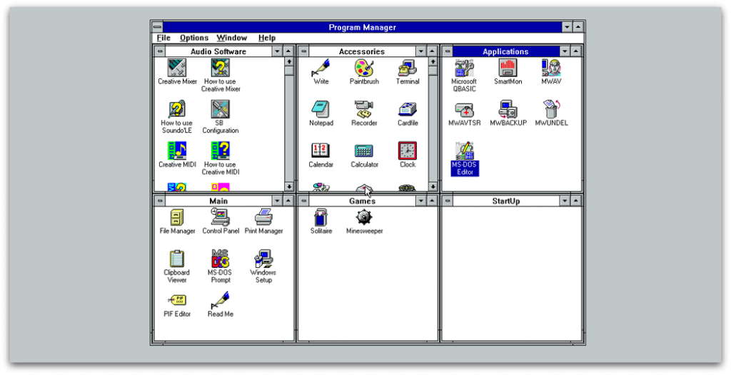
They’re concerned with helping the user get to grips with the OS, and there’s a focus on empathy and a hint Microsoft is starting to think about UX. That’s which isn’t something Windows 3.1 makes any effort to do. On first run, you’re thrown into this jumble:
I decided to take a nostalgic trip back to Windows 98, re-experience it and write the article I wished I could have read.
For me, a notable part of Windows 98’s UX is its user onboarding process. After the cryptic start screen from Windows 3.1, it’s a great thing to see. User onboarding is getting the user from a state of confusion to feeling comfortable with the software as quickly as possible. It’s about teaching them enough fundamentals that they can learn the rest on their own, minimizing the ‘red tape’ of setup and getting them ready to go in the most frictionless way possible.
First of all — what are some examples of user onboarding techniques?
Before the days of dedicated apps for creating an onboarding experience, software designers had to do it themselves. Now, thanks to powerful processors and bigger-than-floppy-disk memory size, experiences are smoother and fancier. Even so, the principles are the same as ever. Here are some examples:
Registration forms
No one wants a game of 20 questions where the prize is signing up. Back in the days of Windows 98, as I’ll look at in a moment, you had to put in very little information before landing on the desktop. This is even easier nowadays thanks to Google/social authentication, as shown below in Process Street:

Empty states
As covered in a previous article, empty states are what the user sees when there is no data to display on the screen. Any holes in the user onboarding process can be fixed with empty states since they (should) tell you why you’re seeing nothingness, and how to fill that space with something useful. Here are some good empty state examples: Spotify
Spotify’s (cunningly optimized) interface won’t show you an empty space if you have no stations.
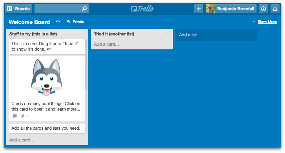
Trello’s empty state is an example board that explains the core features and makes Trello’s onboarding experience fun and educational, not a trawl through the user manual.
Interactions, not user manuals
Even if they’re not paper, apps do still have documentation. Check out GitHub’s massive help section, for example. There’s nothing stopping software companies providing online user manuals and FAQs, but far away from the age of documentation-driven onboarding and have adopted a ‘learn by doing’ mindset.
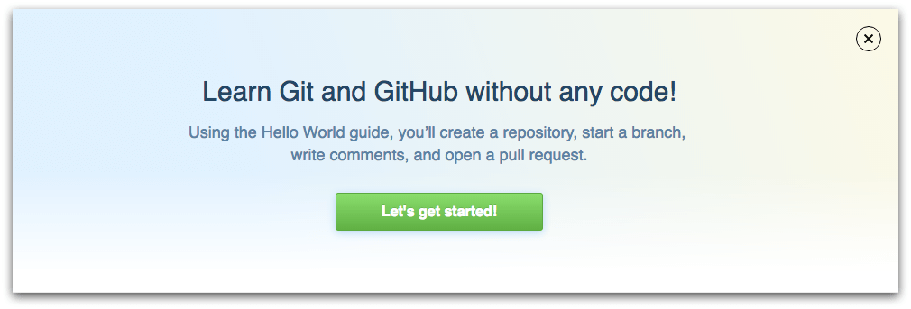
When you create a new GitHub account, the banner above is what you see over your empty dashboard.
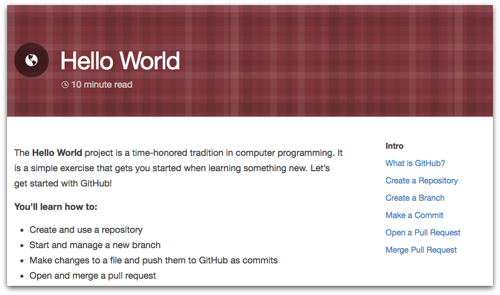
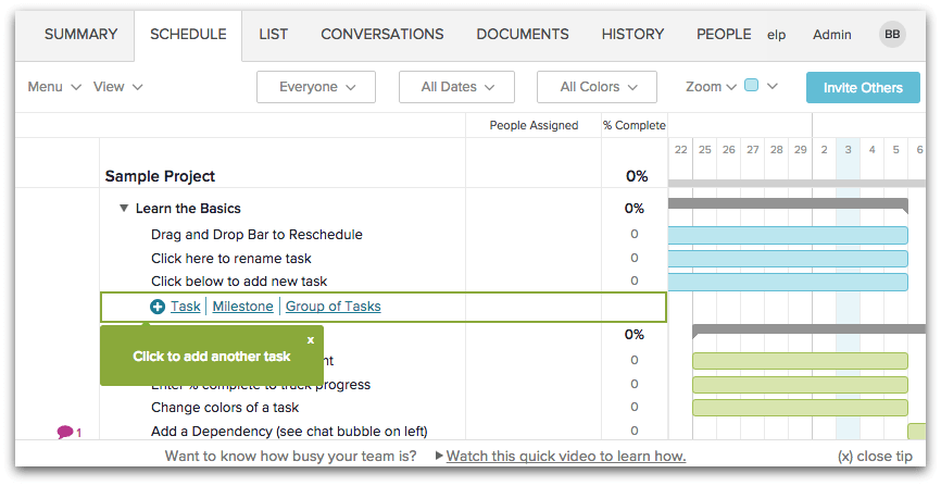
While it does technically take you to an online user manual, it teaches you how to use the app by guiding you step-by-step through a real use case, not an abstract glossary of features. Similarly, when signing up for TeamGantt the first choice you make is whether to be guided through an interactive sample project or to start fresh.
The sample project comes with tip boxes which take you through a basic workflow with the app that’s vital to your proficiency.
Now let’s look at how Windows 98 uses these user onboarding techniques.
User onboarding: Windows 98 style
I’ve looked before at how Microsoft build their user onboarding into games for Windows 3.1, but the truth is that 3.1’s onboarding was otherwise pretty poor. The software was designed for command line users with prior knowledge, and the only help offered was with getting used to the GUI, not the OS itself. Perhaps that’s why Windows 95 & 98 — the first Windows operating systems which considered onboarding for the common user — sold over 10 times more copies than 3.1 did, 6 years prior.
Windows 98 uses Progressive Profiling
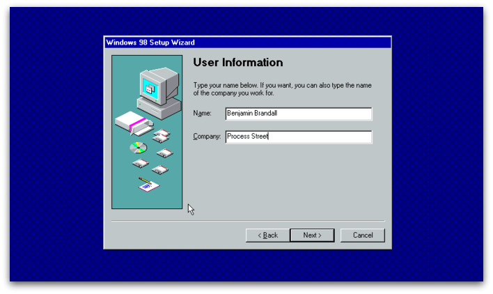
Progressive Profiling — what Auth0 calls breaking down a registration form into manageable steps — helps beat the overwhelming experience of being presented with a huge form upon signup.
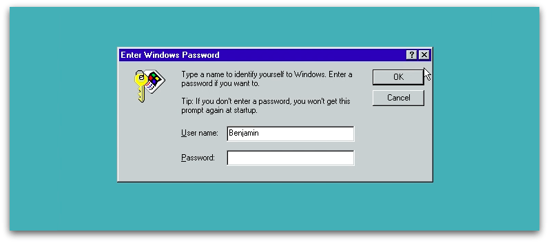
Windows 98, even though it’d love for you to register every detail under the sun, doesn’t force it. In fact, the first time I was asked to provide a password was when logging off for the first time.
The initial setup is as friction-free as you could ask for, even saving the modem setup for when you decide to connect to the internet — either when opening Outlook, Internet Explorer or trying to connect directly.
The recycling bin is a great empty state
Windows 98 doesn’t have many true empty states because it comes populated with a ton of shortcuts and files. I did, however, find a great example in the recycling bin that’s just as useful as the modern day ones I pointed out earlier.
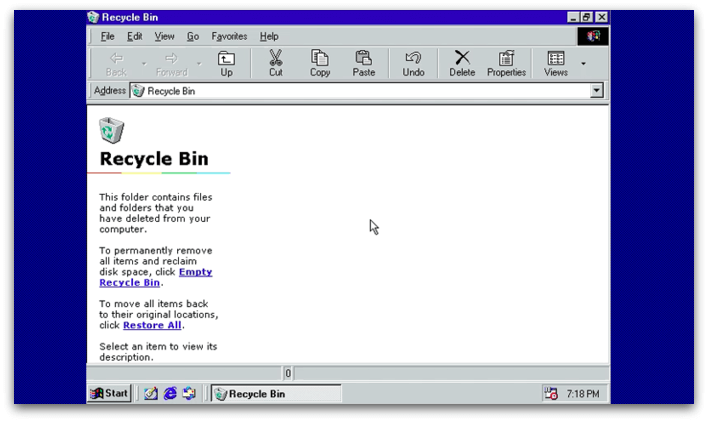
The process of throwing something into a bin and being able to either permanently trash it or uncrumple it and use it again is also a familiar one, so that helps the mechanics here make sense to new users.
Setup lets you take the path of least resistance
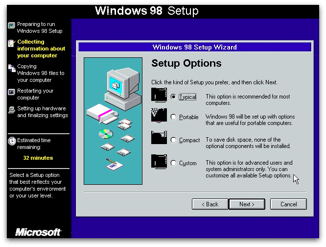
If you don’t want to ‘customize all available Setup options’, you’re welcome to take a typical installation.
Unlike 3.1, which assumes you’re familiar with computers and the command line, 98 puts together a starter pack of components for the average user so you can get set up as quickly as possible, without too many decisions.
Learning to use Windows 98 by completing small exercises
Part of Window 98’s onboarding sequence is getting used to using the mouse and keyboard. In line with the interface guidelines:
“The user should always feel in control of the software, rather than feeling controlled by the software”
It teaches you to control the software, as well as letting you skip the tutorial at any time.
By completing these small exercises the user’s going to get used to the fundamentals of Windows, framed in a way that’s more obvious to them than if they were thrown into the OS without explanation. There’s even a test at the end so you can see how much you know!
Comparing software to real world experiences
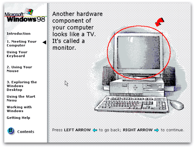
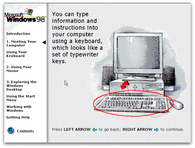
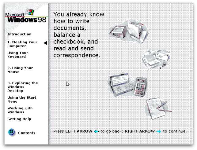
In 1997, computers weren’t nearly as widespread as they are now. For that reason, Microsoft compared computers to objects the user was sure to be familiar with, like a typewriter and a TV.
Back when this comparison was made, 64% of US households didn’t own a computer. That’s since dropped to 16%, which explains why we don’t see charming explanations like these any more.
The idea of comparing technology to past objects was popular with Steve Jobs, who used it as a main component of his designs until the release of iOS7.
“Skeuomorphism is a catch-all term for when objects retain ornamental elements of past, derivative iterations–elements that are no longer necessary to the current objects’ functions.” — Tim Worstall
For Windows 98 (unlike Apple’s terrible brushed chrome phase), it wasn’t purely a design aesthetic. It was a way to familarize users with what they’re seeing by drawing on their past experiences. It’s the reason why recognizable UI elements make sense. Nowadays we know what the red plus is for on Google Drive, and can reliably theorize that it does the same thing in Google Photos. Back then, we knew what a TV and typewriter is so could use that knowledge to make sense of new technology in the exact same way.
Why did Windows 98 turn out so well?
The dramatic jump in quality between Windows 3.1 and 95/98 could be explained by the presence of documentation. In the documentation, the writer shows concern, and awareness of a user’s experience that wasn’t obvious in 3.1’s approach of throwing you headfirst onto your desktop. Quoting from the 1995 Windows Interface Guidelines:
“Avoid adding new elements or behaviors unless the interface does not otherwise support them. More importantly, avoid changing an existing behavior for common elements. A user builds up expectations about the workings of an interface. Inconsistencies not only confuse the user, they also add unnecessary complexity.”
This also applies to how Microsoft connect the experience with a computer to situations and objects the user already understands.
Why it’s so good: Microsoft made no assumptions about its market
After the brief setup, you can choose to either get straight to it, or select an option that says you’ve never used a computer before. It has another selective help section purely for users of 3.1, Mac, and people who have never used a mouse or keyboard before. And what have we got now? Thankfully Microsoft recycle-binned Windows 8 — an OS my mum said is ‘rubbish’ — but its failings and the core UX principles it overlooked after writing them 20 years earlier don’t give me much hope that we’ll ever again see as much genuine empathy for the user as we saw in 98.
And it’s that empathy Microsoft knew they needed to tap into that helped them create such the experience. They knew it was a ‘do or die’ moment for them — if the user didn’t pick up on the OS’s functions quickly, it’d be dead in the water.
There’s nothing like the terrifying consequence of outright failure to motivate you to create an amazing user onboarding experience.
About the author:
Benjamin Brandall is the head of content marketing at Process Street. When he’s not writing on SaaS, design, and startups, you’ll find him on his personal blog or Twitter.
from Sidebar http://sidebar.io/out?url=http%3A%2F%2Fusersnap.com%2Fblog%2Fwindows-98-user-onboarding%2F



 https://www.fastcodesign.com/3064251/vr-may-be-a-legitimate-design-tool-sooner-than-you-think


