New Study – Mobile Registration Forms on E-commerce Websites

(This branded content is brought to you by UseItBetter)

The European e-commerce market has witnessed substantial growth over the past several years. Last year, online shoppers contributed 455.3 billion euros to the market, and this figure goes up each year.

20 Gorgeous Mobile App Landing Pages

20 Gorgeous Mobile App Landing Pages

Most mobile app developers have an accompanying site that introduces and describes what their mobile app can do.…Read more

If you’re working in e-commerce, your list of resolutions for the New Year should include optimizing your registration and checkout forms for small screens. And, unless you are planning to quit smoking, it should be on the top of that list.

A great way to start is to compare how big brands design their forms. Well, the good news is that UseItBetter, the company behind highly effective form analytics, has done all the hard work.

useitbetter forms

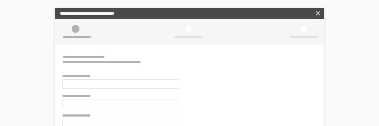
UseItBetter conducted a comparative analysis of mobile registration forms on 40 top e-commerce websites from the perspective of a UK mobile shopper. They compiled all form fields, buttons and labels and turned this information into numbers and charts.

You can see the full study, including screenshots of those forms here. But let’s look together at some of the points that we found interesting.

Number of fields in registration forms

Customers prefer registration forms they can fill out quickly and easily. Especially when they are shopping on mobile. They accept information requests that seem appropriate, but usually balk at requests they regard as intrusive.

The business on the other hand, wants or needs certain data, and at times, data that can be used for marketing purposes, or to personalize a user’s shopping experience.

A rough rule of thumb is that for every additional question asked, the greater is the risk of abandonment. So how far websites are pushing their luck?

Out of the 40 websites that UseItBetter studied, 33 require users to take 10 or more actions (complete form fields and click buttons) in order to register an account.

useitbetter studies

Considering that all websites in the study are big successful online stores, we can assume that the risk pays off for them, and at their scale even a small percentage of users abandoning forms are worth a lot of money.

No “One-Form Fits All”

It’s interesting how similar some of those forms look like. Some of them have absolutely no branding, and so it’s practically impossible to say which is which. Yet, after a closer look at all those forms, it seems that there’s no fixed formula for building a perfect registration form.

no one form fits all

The UseItBetter study allows you to compare side by side, forms from different websites.

The number of form elements ranged from as few as five, to as many as 34, but it’s difficult to spot any patterns. Multi-department stores like jdwilliams.co.uk or very.co.uk requires 20 interactions but their competitor johnlewis.com just 5: email address, password, password confirmation, newsletter signup, and the registration button. Fashion brand hm.com has 8 form elements and zara.com has 17 – twice as many.

Requirement to enter the password

The UseItBetter study also revealed that 72% of the online retailers require users to enter their passwords twice, to correct any problems due to negligence. Even though it places an added burden on users, very few users object to this, as they are more prone to making typo errors using their mobile.

Roughly 20% of the retailers give the user an option to see their password while writing. A third requires user email addresses to be repeated.

For instance, qvick.com has the most complex registration process. Users must enter and confirm their email and password, respond to a security question, provide a security answer, and enter a PIN number.

Requirement of entering the Birth Dates

Birth dates are typically used by hospitals and clinics to ensure that patients do not receive the wrong treatments or medications, as well as to keep patient files organized. Retailers usually request this information for marketing and demographic reasons, to better personalize customers’ accounts, or to offer birthday greetings or birthday discounts. Some retailers require this information for security reasons. Or because they sell certain age-restricted items.

Examples:

  • asos.com – If you tell us, you’ll get a birthday treat.

Providing a birth date would appear to be optional in this example. However, in the following examples, it appears to be mandatory.

  • jdwilliams.co.uk – Please provide your date of birth as an additional security measure.
  • next.co.uk – You must be 18 years old or over to shop at nextco.uk
  • qvcuk.com – We request your date of birth because we sell certain age-restricted products.
useitbetter dropdown

How retailers put these requests forward is equally important as how a UX specialist presents these requests. A dropdown form, a calendar, and type and text are the most common options. Most retailers appear to prefer the dropdown menu approach. They also prefer that the number of input fields be kept to a minimum, due to issues that an empty field can sometimes cause.

How personal data is used

How retailers use personal data has been an important, and at times, a controversial topic. The study indicated that 85% of online retailers request this information for marketing purposes (for marketing strategy and demographic research, rather than for promotional activities), while 15% request this information for 3rd party marketing.

Approximately two-thirds of European retailers’ websites can take personal information by default, to be used for marketing purposes. Users can opt out, but mobile users especially may find it difficult to fathom the fine print.

Combine best practices with real data

Even when registration forms are designed in keeping with business practices, any attempt to create a perfect form for a given business will fail, and that’s because of the users. Different users have different mindsets and varying histories of online experience. A form that does not present a problem for one user, may present a challenge, or even appear objectionable, to another.

That’s why it is necessary to go beyond best-practices, usability testing and start looking at your real users with analytics. The analytics can provide the retailers field-after-field conversion funnels, tracks form validation errors and even auto-detects critical issues by comparing patterns among failed and successful user visits.

If not, then at least check their guidelines for form tracking which you can implement using Google Analytics or any other tool you use.

4 Form Design UX Tips You Should Know (With Examples)

4 Form Design UX Tips You Should Know (With Examples)

We tend to think about forms as simply a means to collect user data, but they are also…Read more

from Hongkiat.com http://www.hongkiat.com/blog/mobile-registration-forms-ecommerce-websites/

Isaac Asimov: How to Never Run Out of Ideas Again

3. Beware the Resistance

All creatives — be they entrepreneurs, writers or artists — know the fear of giving shape to ideas. Once we bring something into the world, it’s forever naked to rejection and criticism by millions of angry eyes.

Sometimes, after publishing an article, I am so afraid that I will actively avoid all comments and email correspondence…

This fear is the creative’s greatest enemy. In the The War of Art, Steven Pressfield gives the fear a name.

He calls it Resistance.

Asimov knows the Resistance too —

The ordinary writer is bound to be assailed by insecurities as he writes. Is the sentence he has just created a sensible one? Is it expressed as well as it might be? Would it sound better if it were written differently? The ordinary writer is therefore always revising, always chopping and changing, always trying on different ways of expressing himself, and, for all I know, never being entirely satisfied.

Self-doubt is the mind-killer.

I am a relentless editor. I’ve probably tweaked and re-tweaked this article a dozen times. It still looks like shit. But I must stop now, or I’ll never publish at all.

The fear of rejection makes us into “perfectionists”. But that perfectionism is just a shell. We draw into it when times are hard. It gives us safety… The safety of a lie.

The truth is, all of us have ideas. Little seeds of creativity waft in through the windowsills of the mind. The difference between Asimov and the rest of us is that we reject our ideas before giving them a chance.

After all, never having ideas means never having to fail.

from Sidebar http://sidebar.io/out?url=https%3A%2F%2Fmedium.com%2Fpersonal-growth%2Fisaac-asimov-how-to-never-run-out-of-ideas-again-b7bf8e09cc91%23.e9plvz3ba

Has the Internet Killed Curly Quotes?

The trouble with being a former typesetter is that every day online is a new adventure in torture. Take the shape of quotation marks. These humble symbols are a dagger in my eye when a straight, or typewriter-style, pair appears in the midst of what is often otherwise typographic beauty. It’s a small, infuriating difference: “this” versus “this.”

Many aspects of website design have improved to the point that nuances and flourishes formerly reserved for the printed page are feasible and pleasing. But there’s a seemingly contrary motion afoot with quotation marks: At an increasing number of publications, they’ve been ironed straight. This may stem from a lack of awareness on the part of website designers or from the difficulty in a content-management system (CMS) getting the curl direction correct every time. It may also be that curly quotes’ time has come and gone.

Major periodicals have fallen prey, including those with a long and continuing print edition. Not long ago, Rolling Stone had straight quotes in its news-item previews, but educated them for features; the “smart” quotes later returned. Fast Company opts generally for all “dumb” quotes online, while the newborn digital publication The Outline recently mixed straight and typographic in the same line of text at its launch. Even the fine publication you’re currently reading has occasionally neglected to crook its pinky.

This baffles Matthew Carter, a type designer whose work spans everything from metal type’s last stand to digital’s first, and whose dozens of typefaces, like Verdana and Georgia, are viewed daily by a billion-odd people. “I have no idea why people don’t use proper quotes. They are always [included] in the font,” Carter says.

This lack of quote sophistication is odd, because the web’s design origins owe a lot to choices Steve Jobs made at Apple and later at his second computer firm, Next. Jobs’s attachment to type famously stems from a calligraphy class taken at Reed College, and he ensured that the first Mac had a mix of bespoke and classic typefaces that included curly quotes and all the other punctuation a designer could want. At Next, he went further, and the web’s father, Tim Berners-Lee, built the first browser and server on a Next.

But in the early days of the web, different computing platforms—Unix, Mac, and Windows, primarily—didn’t always agree with how text was encoded, leading to garbled cross-platform exchanges. The only viable lingua franca was 7-bit ASCII, which included fewer than 100 characters, and omitted letters from alphabets outside English and curly quotes.

Marcin Wichary, the current design lead at Medium responsible for pushing forward on typographic niceties, grew up in Poland, and says in his youth, most computers simply omitted his language’s ę, ł, and other diacriticals. He says he felt privately glad that his first and last names lacked a missing Polish letter. It took years before one of his middle names was easy to type.

But ASCII and a few similar small character sets acted as a limitation only early on. With the right effort, even by the late 1990s, a browser could properly show the right curly quotes. But effort is the right word: While browsers could show typographers’ quotes, it was hard for users to type them.

* * *

Straight quotes appear as an abomination in a typeface, because their designers rarely love them; they’re included by necessity and often lack cohesion with other characters. The non-curly quote comes from the typewriting tradition, and arose from cost. As U. Sherman MacCormack wrote in The Stenographer in 1893: “For some time past the manufacturers of typewriters have adopted straight quotation marks, for the reason that the same character can be used at the beginning and end of the sentence, thus saving one key.”

At the time of the single quote’s popularization in the 1870s, the use of paired quotation marks was just over a hundred years old. Keith Houston, the author of The Book, has traced the history of many punctuation marks back hundreds and thousands of years on his blog Shady Characters, and in a book of the same name. “There was no quotation mark for a very long time,” he says. One first appeared in the third century BCE alongside the invention of basic punctuation. It resembled a right angle bracket, >, which was resurrected in the 1970s for quoting email without any apparent connection. (The history of that newer use of > remains undocumented.)

Scribes and printers chose different symbols and conventions, Houston says, until a regular comma and an inverted one—one rotated 180 degrees—used in the left and right margins came into vogue as “quotations marks” in 1525. “You’d see it on the outer margin or inner margin depending on who printed it,” sometimes pointing toward and sometimes away from the text.

But it took Samuel Richardson to make a consistently used paired set within the text. While he remains best known for his invention of the epistolary novel in English with Pamela in 1740, followed by other literary innovations, his trade as a printer long predated his novel writing. Until he came along, quotations remained marked in the margin for each line that contained any referenced text, not the starting and end point of the quote within the text itself. (It was also commonly used only for excerpts from other documents, not dialog.)

In the 1748 edition of Pamela, however, Richardson included not just these per-line commas, but also what we see as an opening quote and mirrored closing quote at the beginning and end of excerpts at the exact start and end in the run of text. The pairing and intraline practices quickly became standard, although it varied in style among countries. French writing instead features guillemets, « and », close relatives of the ancient > mark.

Typesetters likely first inverted commas until type foundries started casting proper quotes as separate pieces of type. When a “hot-metal” mechanized typesetter appeared in the late 1800s, it followed the tradition: The earliest Linotype keyboards had paired curly quotes and no straight ones. But practical typewriters, which began to appear around the same time as the Linotype, followed a different path. As a tool for note-takers like stenographers, telegraphers, and business secretaries, the typewriter had no need for the flourish of the curled quote—and it would have added cost, as MacCormack noted.

As metal typesetting equipment moved on an inexorable path towards extinction, typewriters begat teletypewriters, and those begat computer keyboards. Medium’s Wichary, at work on a book about keyboards, says he’s found just one computer keyboard that has curly quotes instead of straight: the Xerox Star 8010. Virtual keyboards have mostly followed the physical style.

Paul Ford, a writer and programmer known for his thoughts about how code affects culture, notes that even on a mobile device “the energy to type a curly quote feels prohibitive. You have to hold down the quote. The effort of typing one on a regular keyboard [also] can be prohibitive.” Some software automatically swaps in the “smart” quote, but doesn’t always get the right curl (decades should always be ’90s, but autoformat software often drops in ‘90s). For wonks, you can find cheatsheets for explicit shortcuts on desktop machines, like Shift-Option-] for a curly apostrophe on the Mac, but it requires additional effort and memorization.

* * *

Even when a writer gets things right, the CMS remains a stumbling block. “Smart quotes are traditionally one of the things that get turned into weird garbage characters when the character encoding is set poorly,” Ford says.

The result of the variation in input from Word documents and other sources, explains Claudia Rojas, Fast Company’s website product manager, led that publication’s website (but not print publication) to standardize on straight quotes for consistency. Fast Company doesn’t seem alone, as any survey of sites quickly finds others that have made the same choice. As Greg Knauss, a humorist and programmer who has built CMSes, elaborates: “If you use [straight] ASCII quotes, you know that they’re going to survive the cut-and-paste transition that often happens with text, as well as old or broken email servers and other 7-bit indignities.”

Straight quotes are a way to play things safe, in other words—but they’re not the only solution. Wichary has taken the opposite tack at Medium, developing code to guess a user’s intent as they type and format quotes automatically. “We took it further than I originally thought was possible,” he says, and estimates the site covers about 95 percent of possible situations. “A fraction of people who type rock ’n’ roll ask, ‘Why do those point the same way?’”

Conceivably, if they wanted to, all CMS designers could employ algorithms to always make the curl happen. It’s ultimately a software choice when quotes either all get converted to typewriter versions or remain inconsistent in the final product. Because of this, there’s a temptation to read the push toward straight quotes as a principled, pragmatic stand against the needless embellishment of a curl. But Anil Dash, once the chief evangelist of Six Apart, makers of Movable Type, argues there’s a different underlying issue with the current generation of widely used CMS software. “Typography is the kind of refinement that happens at the end of a generation of CMS tech,” he says.

While it might seem that CMSes—like WordPress and others—are mature, Dash says periodicals’ systems are in the midst of continuous updates to deal with all the formats required by content partners: Facebook’s Instant Articles, Google’s support for Accelerated Mobile Pages (AMP), Apple’s News feed requirements, and others. “Once this stuff is nice and boring in a year or two, their developers will probably refocus on type and layout details,” Dash says.

So perhaps curled quotation marks will again have their day. Or, by then, it’s possible conventions will have changed enough that people cease to notice. Wichary says in Poland, the lack of Polish-style quotation marks („ and ”)  have led the current generation to use American-style quotes and think the native ones look wrong.

Maybe periodicals, which sometimes commission typefaces or pay to adapt existing ones, will demand type designers draw better-looking, harmonious straight quotes that don’t seem pulled from typewriter typebars. Paul Ford is just plain resigned: “They sure do look nicer to old people like you and me, but frankly do they actually add any magical semantic value to a given text? Not really.”

from Sidebar http://sidebar.io/out?url=https%3A%2F%2Fwww.theatlantic.com%2Ftechnology%2Farchive%2F2016%2F12%2Fquotation-mark-wars%2F511766%2F

Introducing Auto-Layout for Sketch

What is Auto-Layout for Sketch?

A Sketch Plugin that integrates seamlessly into Sketch and enables defining and viewing different iPhone/iPad sizes including Portrait/Landscape.

Defining Auto-Layout is a piece of cake

As well as generate an overview of all screen sizes for all artboards at once:

Generated overview of all screen sizes

from Sidebar http://sidebar.io/out?url=https%3A%2F%2Fmedium.com%2Fsketch-app-sources%2Fintroducing-auto-layout-for-sketch-24e7b5d068f9%23.11gicl7bv

CIOs Name Their Favorite Books of 2016

We asked technology executives to share the best non-business book they read this year. Want to share your favorite? Leave a note in the comments. The Morning Download email newsletter will be on hiatus from Dec. 26 though Jan. 2. We wish all of our readers and their family and friends a great holiday season and good […]

from CIO Journal. http://blogs.wsj.com/cio/2016/12/27/tech-executives-name-their-favorite-books-of-2016/?mod=WSJBlog

The 10 Best Data Visualization Articles of 2016 (and Why They Were Awesome)

The 10 Best Data Visualization Articles of 2016 (and Why They Were Awesome)

2016 was an astounding year for insightful, informative data visualization articles — here were the top 10 I saw all year (in no particular order), in each case including a representative quote from the piece and a brief note of why it was at the top of my must-read list:

For the last several years, I’ve wondered about what we actually know from scientific studies about how humans perceive graphics. I’ve collected things here and there, but when I started to get into the thick of it, I realized how extensive this body of research really is.

A stunningly-valuable compilation of the research foundations for data visualization. Almost every major factor making visualizations work or fail can be explained by the evidence summarized here.

I announced that I would prepare a list of potential research projects that would address actual problems and needs that are faced by data visualization practitioners. So far I’ve prepared an initial 33-project list to seed an ongoing effort, which I’ll do my best to maintain as new ideas emerge and old ideas are actually addressed by researchers. […] My intention is to help practitioners by making researchers aware of ways that they can address real needs.

Despite the earlier article summarizing 39 pieces of visualization research evidence, many open questions continue to bedevil dataviz practitioners, limiting the scope and influence of visualization in applied settings — Stephen’s article provides a vital framework and accelerator for closing this gap.

There are no perfect tools, just good tools for people with certain goals. Data visualization is a communication form used by many subfields, e.g. science, business and of course journalism. All these fields come with different needs — but even in the space of data journalism, data visualization is used for different goals and with different approaches in mind. There can’t be a tool that satisfies them all.

Lisa’s consistently one of the strongest and most creative voices on visualization topics, and in this article, a culmination of several earlier pieces, she systematically uses and evaluates 24 tools. This is the kind of work that propels data visualization’s approachability and reach to new levels, an educated consumer’s guide to dataviz time and cost investments amidst an increasingly crowded and chaotic landscape.

The Data Visualization Checklist contains the foundational techniques needed for clear, effective graphs. […] Stephanie and I included the core techniques in a single document so that you’ll have all the strategies in one central place. It’s your job to customize these techniques for your viewer and your dissemination format.

Ann and Stephanie, each prolific thought leaders in visualization, joined forces to produce this revised and improved checklist for dataviz techniques — given that 90%+ of the visualizations I see would fail to pass even 1/3 of their standards, the need for easy-to-use self-scoring criteria such as this to raise the visualization bar is painfully clear!

The trends of data visualisation are forever shifting and changing as the data climate evolves at an ever faster pace. I’ve put together some thoughts on trends that I have identified in the last five or more years, where we are now and where, I believe, some of the focus is going.

Christian stretches our conception of what data visualization is and what it can become, with a focus on customization, connectivity, and complexity — the latter an increasingly-necessary reminder as a counterweight to misconceptions that visualizations need or should be a path to simplifying the complex and worse, that all dataviz needs to be fully processed at a 3-second glance. Rather, visualizations are a powerful weapon in clarifying — but not necessarily simplifying — the unavoidable complexity in our information-rich world.

This report builds on our experiences of producing data visualisations and in data journalism more broadly, and brings together the lessons we have learned with insights from the broader sector of research communication. What follows will help researchers, research communication managers and journalists to make more informed decisions about when to invest in data visualisations in order to meet research communication goals.

One of the most robust dataviz articles I came across all year, this SciDev.Net work is an exhaustively-sourced overview of the role visualization plays in scientific exploration and translation. Though targeted at data journalists and researchers, this article is absolutely dripping with implications for anyone seeking to stimulate discussion with data, yet it does not ignore the risks of visualization approaches to scientific communication — ethics, audience visual literacy, and so on.

Last Friday I participated in my second Responsible Data Forum. […] Today’s event about data visualization for social impact did not disappoint. At the top of the day, we did the classic Post-It note brainstorm to inventory all of the potential avenues for working groups. Given the incredible experience of the people in the room, there was a lot to work with.

Building on the ethical theme, Matt’s article summarizes a “wow — wish I’d been there!” set of discussions and brainstorming on ethically communicating data visually. Dozens of key considerations are listed for dataviz practitioners to check and challenge themselves on the ethics of their work. The article also links to sites where ongoing discussions of these topics continue.

Your visual communication will prove far more successful if you begin by acknowledging that it is not a lone action but, rather, several activities, each of which requires distinct types of planning, resources, and skills. The typology I offer here was created as a reaction to my making the very mistake I just described.

As the use of data visualization in business settings has soared, Scott has worked alongside this trend to provide a practical taxonomy for doing it well: efficiently, attractively, and accurately. The quadrant system above is a particularly-useful tool for differentiating types and purposes of visualizations, and designing them — with an empahsis on design elements that make visualizations sing — accordingly.

What follows is a framework for how story techniques can help the data analysis process. It is useful for any individual (or group) working with data, whether you’re a scientist, a marketer, an engineer or a policy-maker. The challenge in each case is similar: how do you put yourself in the best position to make sense of a mass of data in order to gain insights, and then inspire people to change based on the discoveries?

Though not limited to visualization-based data presentation, Shawn’s article extends the discourse on storytelling far beyond its too-common status as a single word or phrase on a bulleted list of data communication techniques. This article is especially unique in extending the trajectory of the storytelling process before and during, as well as after the data analysis itself. He also reviews types of stories and advises on initial triggers for establishing receptivity to a story-centered approach.

There are many possible new visualizations using typography, some of which I’ve previously discussed in posts on this blog. One way to consider this design space is to decompose it into the different elements that can be used to assemble visualizations.

Few authors delve into text as a data visualization element, and fewer still speak about it as creatively and insightfully as Richard. This article convinced me that I’d been long undervaluing text itself as a visualization property and how to better incorporate it into my work. Also included via the article above is a link to Richard’s journal manuscript on the topic which substantially expands on the topics covered here.

from Sidebar http://sidebar.io/out?url=https%3A%2F%2Fmedium.com%2F%40EvanSinar%2Fthe-10-best-data-visualization-articles-of-2016-and-why-they-were-awesome-ce30618ea06a%23.a8ihfnspv

The most promising design tools you should try in 2017

The most promising design tools you should try in 2017

2016 was clearly the year for design tools, with new tools being released to the public and previously existing tools being improved with new features. I’ve picked some design tools worth keeping an eye out for throughout 2017. These tools are based on popularity among design tool user communities, and I am sure that I’m not mentioning some tools.

01. Figma

With Sketch becoming more popular, vector-based drawing software is becoming more mainstream. Figma stands out for its real-time collaborative features on top of its core design toolset. Just like how programmers can add their own code into one project in real time, Figma allows multiple designers to work together from far away. You might wonder just how often two or more designers would be working on the same project simultaneously, but if you think of a setting where team members are looking at a project and offering feedback in a meeting and simultaneously modifying a project, Figma will fit the bill.

Official site: https://www.figma.com

More info: https://medium.com/figma-design

Community: https://www.facebook.com/figmadesign/

02. Adobe XD

One lesser-known fact is that Adobe has been heavily involved in prototyping for a long time. Adobe launched Edge Tools in 2012, but unfortunately discontinued it in 2015. However, Adobe returned with Adobe XD in 2016. XD is a vector drawing app that allows easy prototyping by building click-through prototypes with numerous artboards. Some users say that XD is a copycat of Sketch, or a combination of either Sketch and InVision or Sketch and Craft (formerly known as Silverflow), but it is very likely that Adobe will continue to improve on XD and feature greater connectivity among other Adobe software. Furthermore, unlike Sketch, which is exclusive to Mac OS X, XD is also available on Windows.

Official site: http://www.adobe.com/products/experience-design.html

More info: https://blogs.adobe.com/creativecloud/tag/xd-product-updates/?segment=design

Community: https://www.facebook.com/AdobeExperienceDesign/

03. Sketch & Plugins

Zeplin is the best-known plugin for Sketch. It helps developers easily check the UI Specs of layers in the Artboard. Furthermore, they can comment on an Artboard or download necessary assets for development directly through Zeplin. With the help of Zeplin, designers do not have to individually draw UI Specs, and developers do not have to manually request specs or assets that were mistakenly left out by designers.

Offcial site: https://zeplin.io

More info: https://medium.com/zeplin-gazette

Community:https://www.facebook.com/zeplin.io/

05. Stage & Gallery

Following the acquisition of Pixate and Form by Google, the teams behind both pieces of software are now working together on a new design tool. Stage is an interaction prototyping tool, while Gallery is a collaboration tool for designers. However, beyond this, additional features have yet to be unveiled to the public. Some speculate that these two apps may make full use of Google’s cloud platform, but one way or another, both apps are slated to be unveiled next year, so all will likely be known then.

Official sites: https://material.io/stage/, https://material.io/gallery/

06. Framer

Unlike other prototyping tools for designers, Framer utilizes coding (Coffeescript) for prototyping. Out of all prototyping tools mentioned in this post, it has the highest learning curve. In previous versions, designers had to manually type in code, but a revamped version released in the summer of 2016 Auto-Code to reduce manual coding.

Official site: https://framerjs.com/

More info: https://blog.framerjs.com/

Community: https://www.facebook.com/groups/framerjs/

07. ProtoPie

ProtoPie makes it possible to create microinteraction prototypes without a single line of code. Other tools seemingly require designers to become coders and frame designing from a programming perspective. ProtoPie has been developed as a designer’s tool, allowing the re-interpretation of interactions from a designer’s perspective. Unlike other prototyping tools, prototypes made by ProtoPie do not merely show a visual preview of a prototype on a mobile screen. Rather, ProtoPie makes it possible to physically test multi-finger gestures, sensor usage and device-to-device communication, making it possible to create a prototype that uses most of a smart device’s functions in a realistic context. Recently, ProtoPie was updated to allow conditional interactions, and a Windows version is currently in the works.

Official site: https://www.protopie.io/

More info: https://blog.protopie.io/

Community: https://www.facebook.com/protopie/

New design tools will be featured in the market in the very near future and undergo further development.

How about branching out to other tools in the name of becoming more productive instead of stubbornly sticking with previous tools in the new year? The tools mentioned in this post will be a good first step.

from Sidebar http://sidebar.io/out?url=https%3A%2F%2Fblog.prototypr.io%2Fthe-most-promising-design-tools-you-should-try-in-2017-2e5d34b16261%23.pkeipyydk