Research shows that over 53 million Americans currently work as freelancers, and an estimated half of the American workforce will be freelancers by 2020. However, all is not necessarily rosy for freelancers; it has been revealed that finding work and achieving income stability are the top barriers for freelancers.
If you work as a freelancer, you’re probably struggling to get clients. With over 53 million Americans freelancing, and more expected to join soon, you simply can’t fold your arms and watch and hope to get freelance clients. With the following seven techniques, you can proactively work to get more freelance clients than you can handle.
Leverage Your Products to Promote Your Services
Many freelance designers and developers create free themes, plugins, graphic packs and other useful products for other people to use, and there isn’t much benefit they derive from this.
If you have a plugin that thousands of people are installing and you are not advertising your services in it, you are missing out. For example, if you have a plugin that helps people optimize their database, you can include a note in the plugin page that you offer consulting aimed at helping people boost their site speed. If you have a plugin aimed at helping people make their site mobile responsive, you can also note that you offer web design help.
Even if your products are paid, it doesn’t hurt to include a note to let people know that you are a freelancer that they can hire for their design needs.
Partner With Other Freelancers to Get Jobs
If you are a freelance web designer, there’s every probability that your clients will want content for their website when it is finally ready. Since you are not a freelance writer, it is impossible for you to do this job. A mistake most freelancers make is that they let this offer go and forget about it. Instead, you can be creative by partnering with other freelancers and establish a relationship in which you send each other work you cannot do; for example, a freelance designer partners with a freelance writer, and the designer sends his clients to the writer if they have writing jobs. The freelance writer does the same and sends his clients to the designer if they have design jobs.
If done strategically, this alone can serve as a source of more jobs than you can handle for you.
Partner With Agencies to Get Jobs
Also in line with partnering with other freelancers is partnering with agencies. The only difference is that agencies are more likely to have more job offers than individual freelancers.
You can identify SEO agencies, writing agencies and other agencies, and convince them to start offering design services to their clients while you do the work; they charge their clients more, they pay you a part of it and both you and the agency win.
Leverage Content Marketing to Get Clients by Blogging
Interestingly, many freelance web designers and developers have set up countless blogs for other people but they do not have one of their own.
According to data from Hubspot, businesses that blog generate significantly more leads than businesses that do not blog. It doesn’t take much effort to realize why this is the case; blogging — in essence, publishing content — means search engines have something to index and rank when people ask questions online. In turn, the people who read this content, if impressed, are potential clients that can use your services. Once you start your blog, use the following techniques to leverage your blog to boost your client portfolio:
Create in-depth tutorials about what your potential clients are struggling with
Do occasional critiques of some of the major organizations in the industry of your potential clients
Try to have articles published on other relevant blogs that link back to you
Make it clear on your blog, and in your bio in your articles, that you are a freelancer looking for work
Leverage Freelance Job Boards
Freelance job boards are one of the most popular means freelancers use to get jobs, but a mistake many people make is assuming that you can only get job offers on popular, and often overcrowded, job boards like Upwork.
In reality, there are many popular alternatives to sites like Upwork; not only are these sites less crowded, making it easier for you to get jobs, but they also often result in clients that pay more. They provide opportunities for designers, developers, writers and other freelancers.
Some top sites like this include CloudPeeps and Twago. A simple Google search will reveal many more.
Have a Waiting List for Clients
Pretty much every freelancer goes through the “feast or famine cycle.” The feast or famine cycle is a period where you have a lot of client opportunities at a time and little to none at other times; for most freelance writers, it happens every year. Sometimes, they have more work than they can handle and have to turn work down. At other times, however, they barely have enough work to keep food on the table.
The solution to avoiding this and ensuring that you have work all year round is to create a waiting list; whenever you have more work than you can handle, instead of having to turn clients away, you simply ask clients to sign up to your waiting list and tell them that you will reach out to them once you’re available for more work.
By doing this, you are getting permission from the clients you couldn’t work with to reach out to them when you are finally ready. While not all of them will eventually work with you, a good portion will, and this will ensure you have consistent work at all times.
Strategic Cold Pitching
Finally, mastering the art of strategic cold pitching will help you get more jobs than you know what to do with, season in and season out.
You will notice my emphasis on “strategic.” We all get those cold pitches that we immediately regard as spam, and our reaction is either to send them to the spam or trash folder. You don’t want to be lumped in the same category as these people.
Here are some tips to help you get results through strategic cold pitching:
First establish your credibility; if you’ve been featured in a major place, or if you’ve worked for a famous person, start by referencing this fact.
Make it clear that you know the person you are pitching; through their site, social media or elsewhere. If you’re a stranger, you’ll probably be ignored.
Tell them about the service you want to offer.
End by letting them know you’re open to questions/concerns they have.
When you conduct all UX Research close to a company’s home base, you run the risk of designing for a potentially homogenous group of users. A good user experience is a good user experience. So, if you create a good user experience, it should work for all your users, right? But regional exploration of users’ needs helps you uncover gems that turn a good user experience into a great user experience.
During the research I conducted for my company, differences appeared among geographical regions—for example, the North East versus the South versus the Midwest—as well as for different types of communities within those regions—rural versus suburban versus urban.
Maybe you’ve heard the refrain: “rural communities are slower to adopt technology.” The assumption is that rural communities get access to technology later than urban users. While present-day distribution services are making this reality less prevalent, the second tenet in user research is to validate our assumptions. (The first tenet being: “You are not your user.”) What our research showed us was that rural users were not slower to adopt technology. However, they did respect their local customs and standards of decorum, and the technology got in the way.
These users felt it was rude to place technology between themselves, as a service provider, and their customers. Users expressed this same sentiment across geographical lines—including users in Georgia, Missouri, and Idaho, as well as in a rural area of California just outside Silicon Valley.
What can a software development company do to overcome users’ manners, customs, and culture and increase usage rates among users in rural regions? Streamlining the workflow and tightening up the user interface so users can create or update records more efficiently helps. And this improves the user experience for all users.
However, designing a workflow so it passes seamlessly between team members lets users maintain that feeling of visiting with their customers. It enables users to work together to provide personal service to their customers and unobtrusively capture all the necessary data to facilitate customer purchases without offending local sensibilities.
Another common assumption is that urban users want everything to work faster because they’re always on the go. Our regional research findings revealed that it’s not so much about users being on the go. It’s that urban customers have the ability to leave and go down the block to another service provider.
In more densely populated, better-served regions, customers have more choices. If a customer experiences inefficiencies in a process with service provider A, he may walk out the door and take his business to service provider B. This is especially true if a customer might be able to complete his intended business in less time—factoring in the distance the customer must travel between service provider A and B—than if he were to wait through service provider A’s struggles with inefficient technology.
But simply streamlining workflows—which create a good user experience in general—wasn’t enough. The solution was to give users more control over how their customers progress through the purchase process. When customers had choices, they chose to work with service providers who could give them individualized attention.
If you don’t get out to see how your users actually work, you won’t fully understand their painpoints.
One of the most revealing days I had when doing user research for this company ended with my walking out of the conference room where I had spent the day conducting back-to-back research sessions to find three police cars lined up in front of the store and quite a conversation going on in the manager’s office across from that room.
All of a sudden I understood why this successful, high-volume auto dealership was using old, 1024×768 monitors. The monitors and PCs were installed behind a wall with a bar-height desktop that held the keyboard and mouse wired to each terminal. There was nowhere for customers to sit at these terminals. As a result, salespeople had to be super quick and efficient in looking up and entering information while customers were still excited about their test drive—before they had time to rethink their vehicle purchase.
The design team was creating beautiful, thorough, linear workflows that let users capture the entire customer story quickly, in one shot. However, while that might work for many users, it was a broken model for this dealership in a less than secure neighborhood. The solution was to break down data entry into small chunks and build more robust information-retrieval capabilities into the system to get the user back in front of the customer quickly.
The executives and product teams expected that users would be thrilled with the expanded, responsive screens and that the small percentage of users still working on older equipment would excitedly upgrade. Regional research revealed that this might not be universally true. More valuable equipment might attract more unwanted attention from opportunists. So the redesigned system would continue to support the 1024×768 screen size.
The biggest regional revelations came when doing research with Canadian users. The consulting, sales, and support teams were aware of differences in the business practices of our neighbors to the north and were helping those users utilize the system as effectively as possible.
Users found workarounds that fit their business practices and basically did the job. However, because the workarounds did the job, issues that were bubbling up in the field were slow to make it back to headquarters and weren’t actionable. Conducting research with users from Canada ensured the redesign accommodated the differences in their business practices.
Rewards
Regional UX research is rewarding. Users throughout North America enjoyed the chance to participate in the research. They welcomed the opportunity to share how they do business, how they interact with their customers, and how they use and would like to be able to use the system. They felt they were part of the design process.
By reaching out beyond customers who were in close proximity to headquarters and learning about regional dissimilarities, the company now has stronger relationships with its customers. In some cases, the results of conducting UX research turned around troubled accounts.
UX research also helped users to understand why they can’t have design changes tomorrow by demonstrating the process that goes into redesigning a rich, robust system. Explaining that we were conducting UX research throughout North America helped users to understand the time and process involved. Being involved in UX research excited users across the continent and earned their patience at the same time.
Our regional outreach built stronger cross-functional relationships within the company, too. Those boots-on-the-ground team members all across the continent felt more engaged with the design and development process. They got excited about what’s ahead. For some, this was the first time they had been given a voice in product development—even though they interact with customers and the products day in and day out. Working with these users also revealed that their work practices are different across different regions.
In the end, one of the strategic services directors declared gratefully, “You are making a positive difference in our future livelihoods!” By extending the reach of UX research beyond the company headquarters’ local region, we made a positive difference to users in 11,000 stores across North America, as well as the team members who support them. That is rewarding!
from UXmatters http://www.uxmatters.com/mt/archives/2016/07/the-three-rs-of-regional-ux-research-roadblocks-relevance-and-rewards.php
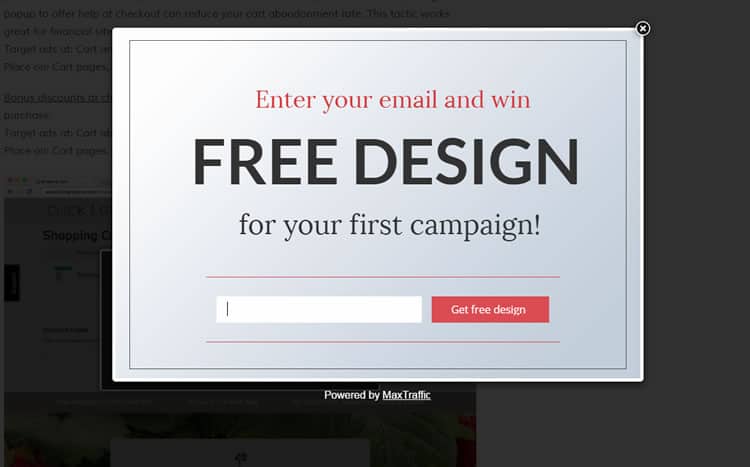
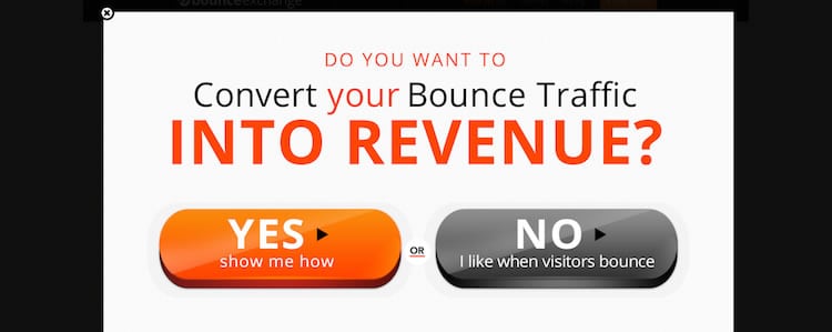
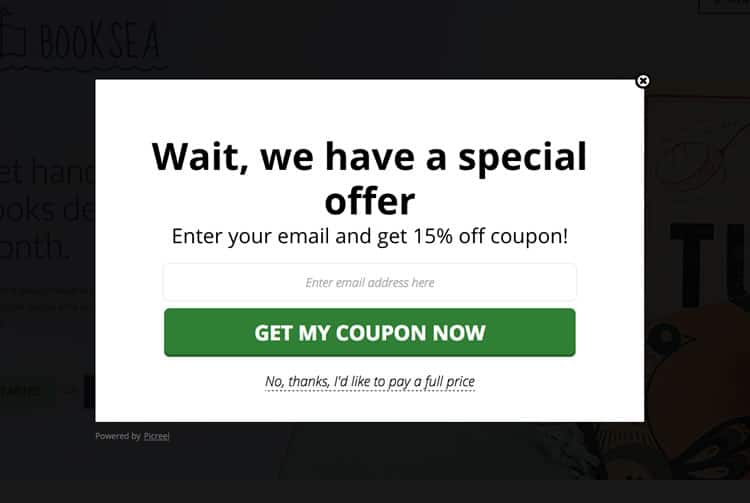
They go by many names – modal windows, dialog boxes, modal pop-ups – but whatever you call them, pop-ups have a reputation for being divisive when it comes to usability. Judging by the frequency of pop-up use on the average web page, UI designers and developers love these little guys.
However, users seem less enamored. Indeed, pop-ups certainly have a bad rap among the majority of users and a fair proportion of UX practitioners. So why are they still so prevalent? Over here at Justinmind we decided to do some investigation, canvas some user opinions and get the skinny from our in-house designers. Here is what we found out about the modal pop-up window and, more importantly, the best alternatives out there.
The Rise of the Modal Pop-up
Stripping things right back to basics, the attraction of the pop-up window in terms of raw functionality is not hard to grasp. As a graphical control element, the pop-up conveys to the user information that is related, yet subordinate to the main page content, blocking access to the main window until users interact with it. Aimed at temporarily interrupting user workflows, pop-ups are simple and effective at first glance; you want to communicate something to the user, you do it, ask them to respond and then everyone goes on their way, right?
The pop-up has a variety of uses, from delivering irrelevant pop-up spam to relevant content suggestions and confirmation calls. For UI designers the pop-up window quickly came to represent the “gift of newfound space“, according to UX Mag – a way to cater for last-minute additions or prune existing page content.
Looks like the modal pop-up is the answer to all your UI design real estate prayers, right? Problem is, according to usability and UX-perts, this is far from universally true.
Pop-up windows typically have a mixed reputation among both users and designers
The Popup Positives
Before addressing all the reasons why pop-ups so often find themselves in ‘most-hated UI element’ lists, the positives cannot and should not be dismissed. After all, when Justinmind carried out an online survey into ‘Are pop-ups here to stay?’ 21% of respondents replied in the affirmative, defending the power of the pop-up against the 23% who thought they were the devil’s design pattern and the 56% of fence-sitters. So let us look at some of the upsides to this UI element.
1. C is for Conversion Rates
First up, The Big C. Conversions. Most online content producers are looking for one thing above all – conversions. Whether that is in the form of email sign ups, downloads or purchases.
As far as raw statistics go, the conversion-focused pop-up takes some beating. Take for example the expansive claims made by Appsumo, who say their ListBuilder pop-up plug-in helped sites using the widget collect 110,313 emails in 30 days. Or Steven McDonald’s claims in User Testing.com, where he identifies his pop-ups as “the third biggest lead generator on the site.”
Why does this matter so much for e-commerce? In an online world where, according to Ott Niggulis in ConversionXL, 99% of site visitors don’t ‘buy’ on their first visit to your site but 75% intend to return to do so in the future, the modal pop-up seems like an irreplaceable tool for collecting follow-up email contacts. Why? It is all thanks to the power of ‘persuasion’, or interruption marketing.
Interruption marketing works, as anyone who has ever experienced tele-marketing or TV ad campaigns knows. It works in the sense that users have to stop what they are doing and deal with the marketing message presented to them. This is particularly true of modals because, to continue browsing a webpage, you have to interact with them and their message, even if it is just by clicking ‘close’.
The results of using conversion-focused pop-ups can be compelling. The University of Alberta had witnessed an increase in newsletter sign-ups when they introduced the sign-up form via a pop-up: from 1-2 sign ups a day they rose to 12-15 – still tiny numbers, but nonetheless a potent percentage increase.
Pop-ups boost conversion rates, but snooty microcopy can put users off
2. B is for Bounce Rates
But surely if you are interrupting your users all the time and diverting their navigation flows with pop-ups, they are going to bounce from your site, right? According ConversionXL, wrong. In the two examples cited by Niggulis, WPBeginner and Backlinko, the introduction of modal pop-up windows had zero effect on site bounce rates. Zero.
From a purely conversion perspective, pop-ups seem to work.
The Negatives
1. Big Numbers, Zero Engagement
So far, so awesome when speaking only about raw conversion stats. But sometimes numbers can be deceptive. Let us take a closer look at those ‘incredible’ newsletter sign-up rates. Mauro d’ Andrea found that engagement from subscribers garnered through pop-ups is significantly lower than that of autonomous sign-ups. So yes, you might boost your subscriber list, but be aware that those very same subscribers might never open your marketing mails, much less click through and convert.
2. Brand Credibility
In fact, pop-ups may be doing your brand harm even as they simultaneously boost conversions. Nielsen Norman Group, in their piece on ‘needy design patterns’, and more specifically exit-intent pop-ups (pop-ups that try to make you carry out an action before leaving the web page), identify that “needy patterns like the please-don’t-go popover … chip away at the presentation of a professional, confident website. They also damage users’ perceptions of credibility.”
Do not rely on users letting you know they are TO-ed with your pop-up: as Jon Reed points out, complaining is time-consuming, and “If you had a box on your site saying “do you hate our pop-ups,” I would have clicked “yes”.
It could be that the era of interruption marketing in general, and pop-ups in particular, is drawing to a close. Inbound marketing shows no signs of releasing its grip in the digital era, and in an increasingly crowded online marketplace, users are freer than ever to choose to which brands they pledge loyalty to. As Jon Reed says in his round rebuke to pop-ups, B2B audiences in particular are “looking for long-term relationships with experts they can trust.” If your product or content is good, chances are users will find their way to it without a pop-up.
Exit intent pop-ups can increase subscriber lists but can also make brands seem ‘needy’
3. User Experience and Usability
Let us get down to the nuts and bolts – how users feel about pop-ups. What is it like to experience a pop-up in the wild? Are users left frothing at the mouth at having useful content held hostage behind an intransigent pop-up?
Justinmind’s in-house UXer Sergi Arevalo points out that the answer is more complex than it you might first assume: “Despite pop-up windows having a variety of different functions and some applicable contexts, they can still be aggressive.” That is backed up by our online survey, in which numerous variations on “it depends on the context” to “devil’s design pattern” captured some of the ambivalence felt by users when faced with pop-ups they found unhelpful.
It seems context is king when it comes to pop-ups. In terms of advertising, the stats are enlightening: 70% of US users are annoyed by pop-up ads, and according to SearchEngineLand, the primary reason for blocking a site is annoying ads. Of course, not all pop-ups are ad pop-ups, and some pop-ups add value. As Sergi points out, “they’re ideal if you want to show related content while keeping the user on the same page, and for a designer they’re a great way to add focused value within a reduced area.” Pop-ups – it is complicated.
4. Mobile Modals
There might be one clear case however when pop-ups are persona non-grata. Way back when the pop-up first appeared on interfaces, most of us were interacting with desktop devices by pointing and clicking. It is fairly easy to close an annoying pop-up with a mouse gesture. But we are now living in the mobile era, and pop-ups have failed to morph with the times.
Pop-ups are a tough call for designers of mobile UIs. Different operating systems require different designs. The usual top-right close button is way out of the thumb zone and tricky to hit accurately, and all too often mobile pop-ups fail to resize adequately, leaving users scrolling around desperately looking for the ‘close’. Basically, as UX Mag points out, modal pop-ups “just don’t work well on tablets and mobile devices“.
So Can a Pop-up Ever Make for Good UX?
If you listen to Jon Reed then the answer is definitely no: “pop-ups, by definition, ruin user experience.” But despite its aforementioned negative aspects, in certain web apps or desktop interfaces the pop-up can be a welcome addition.
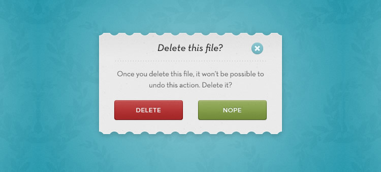
On our Justinmind survey, respondents pointed out that modal pop-ups could be vital when used to guide users through a potentially confusing process, or provide necessary information. UXmag points out that in programs or apps that require user confirmation or certain actions, modal pop-ups are an unbeatable way of focusing user attention before irreversible actions are carried out.
If you are designing this kind of software our UXer Sergi recommends running A/B tests on how best to communicate with users. It might be that your interactively prototyped pop-ups actually go down better with users if they see the true value of the interruption.
However, be aware that A/B tests between two pop-ups will only give you the best of two worlds. Run an option without pop-ups to see what kind of experience users truly value.
How to do Pop-ups Right
If you do eventually incorporate a modal pop-up into your UI, it is probably wise to establish some best practice guidelines. Our survey revealed that users were willing to accept a pop-up if it:
Forced them to confirm an action or decision at a crucial moment in the workflow
Gave them useful feedback or advice
Focused them on a single, relevant piece of content (‘relevant’ is important here)
Users probably are not going to fall in love with your pop-ups even if done impeccably, but they might not abandon your site and curse your brand name.
Users will accept a pop-up if its objective is to confirm workflow decisions
Here is some advice fresh from the Justinmind design team:
Despite what ConversionXL claims, resist the temptation to be a smart-ass when it comes to copy, because no one likes belittling microcopy, really. Instead, positive calls to action and microcopy that genuinely add value to the user, not just to your brand, are important.
Track your pop-ups with cookies so you do not show the same users the same cookie repeatedly. Of course, you are assuming the same user will access your site with the same browser from the same device all the time. On a side-note, HubSpot should really do this: every time I go to their blog they ask me if I want to sign up for updates, something that I did months ago.
Offer users valuable content and incentives, not junk. And do not just ask them for their contact details – that makes for creepy UX. How about user-friendly pop-ups which do not ask for jack, and instead send readers to a free resources page? A welcome interruption for many.
Think carefully about timing and position. SumoMe found that the best (ie most conversion friendly) time to introduce a pop-up was after a user had been on a site 5 seconds, but in terms of UX this is probably way mistaken. Why would a user want to engage with your brand or content if they have not even had time to evaluate it? Do not hold your users hostage to your conversion rates.
If you are designing for mobile, follow UX Mag’s advice and place the ‘touch = targets’ where users can reach them based on usage scenarios (and thumb zone). Place the close tab in the lower right corner and do not ask users to scroll around the pop-up.
Most importantly, every time you design a pop-up, ask yourself the question “Do my users really need this interruption?” Most often they will not. Like one of our survey respondents said, “only use a hammer when you need a hammer.”
The Take-Away
Evaluating the user experience impact of modal pop-ups is, as seen, a complex business. While it may seem intuitive to assume that pop-ups automatically ruin the usability of a web or mobile app, the statistics shed light on a more a complex landscape in which users implicitly understand the importance of context.
They are not going to throw their arms around you in gratitude for designing an interface with full-screen SIGN UP HERE pop-ups and patronizing microcopy, but then again they probably (probably!) will not abandon your site.
They will thank you, however, if you work in a pop-up that elucidates rather than obfuscates, that prioritizes their needs rather than your conversion desires. You may need to play the long-game, but judicious use of pop-ups and, as always, a focus on usability, will win users’ respect and ultimately, their loyalty.
Do you ever get that feeling when you’re in a supermarket, looking at a sea of different types of toothpaste and you have no idea what to get?
The reason why you get overwhelmed by these excessive options has to do with, you guessed it, psychology. British psychologist William Edmund Hick and his American colleague Ray Hyman discovered that the greater the number of potential choices, the longer it will take to make a decision.
What this means for us designers is that we have to be mindful with the amount of information or options we provide to our users. Too much of it and it will overwhelm the user or create analysis paralysis, in which they will overthink the situation. This is why most websites or apps take on a “less is more” approach. By reducing clutter and focussing on small single tasks, we can optimize the flow and overall experience.
The A/B Test
A few weeks ago we set out to A/B test designs for our mobile ecommerce app. Version A, the first version, has all the categories and subcategories available as a carousel on the landing screen. Making it easy for the user to find what they are looking for right away, eliminating the amount of steps and providing an overview of all the available options.
Version B forces you to first select the category and then the subcategory, guiding you through the funnel. This approach gives our users an extra step to take first, but narrowing down the options and choices they have to make.
The result was surprising. Version B performed much better and enabled our users to decide much faster and not get lost in a sea of options. This shows that Hick’s theory can be applied here and that even though this means adding an extra step, the decision is easier to make.
Imagery and Emotions
Images are a great way to evoke emotions and a powerful way to tell a story. It has the ability to move people in different ways.
Neuroscientists at MIT have found that the brain can identify images in as little as 13 milliseconds. This means that images are much easier to process than text and indicates that this is something the brain does all day — trying to understand what we’re looking at. By using images in a certain way we can improve the experience and user engagement on our website or app.
This is why we’re focussing on a product first approach. We’re eliminating the distractions and letting you decide by focussing on the visual representation of our product.
Netflix recently released an interesting study that examines the use of imagery on their platform. People are very visual creatures and respond to certain visual cues. We’re hardwired to respond to faces and other people and the results even showed that an expressive facial emotion that aligns with the title drives even more engagement.
Another example is that we also tend to respond better to images that have a limited amount of information. Instead of showing 10 people or a range of objects, we tend to prefer images that focus on a single person or object.
Especially on smaller screens, it’s easier to process and identify images that don’t have too many distractions.
Conclusion
Using these techniques can help us optimize the experience of our app or website. There is still lots to discover about human behavior and driving engagement. But that’s the cool thing, we can figure these things out by user testing our designs and looking at the data. Because it usually shows we can’t assume anything and there’s still lots to learn. Stay hungry.
from uxdesign.cc – User Experience Design — Medium https://uxdesign.cc/a-psychological-approach-to-designing-interfaces-c94b2d43eaa3?source=rss—-138adf9c44c—4
Kids naturally play and learn by using their hands, building stuff and doing things together. One of the benefits of tangible programming is that it makes code physical, so kids can play with it.
Ultimately, our goal is to enable kids to develop computational thinking (a set of foundational problem-solving skills) from a young age through coding experiences that are playful, tactile, and collaborative.
Creating an open platform for designers, developers and researchers will remove the technical barriers that get in their way: so they can focus on innovating, experimenting, and creating new ways to help kids develop computational thinking.
The project is inspired by previous academic work in the field and is still in active research.
Years ago I had a successful startup that I sold for a lot of money. I thought because I did this that I could do anything. I let me ego run my life. I started a new venture and acted like I was “the bomb” and nothing could stop me. This destroyed my business. It wasn’t the company, product or people behind the business… it was 100% me that killed this company. As a result, I lost almost everything I owned.
As a business, having a healthy ego can be a great thing. It’s your ego that can give you the self-respect and the self-confidence to take the risks it will take to start a business in the first place. However, when it’s not kept in check, your ego can run rampant and actually be detrimental to your business, like it was with mine.
Here are eight ways that my ego killed my business.
1. My ego wouldn’t recognize how much I needed to learn.
When I started my blog, I wrote three posts a day for most of a year without making a dime before I asked for help. Six months later I was making more than I had with my full time job.
A lot of leaders think they have every answer out there, therefore admitting they could improve by learning something new is admitting weakness. That’s their ego lying to them because it couldn’t be further from the truth. Admitting you need to learn is not a weakness.
Don’t be afraid you’ll be judged badly if you ask questions and accept opportunities to learn from others. Ask employees and friends what their ideas are for something you are working. That on keeps your head in the (innovative) game and reminds your ego that you still want and need help. Learning by asking questions helps keep your ego in its place.
2. Made me ignore opportunities.
You would think that the ego would make you push toward the “biggest and the best” of everything for your business. but ego is complacent and resists change. My ego was telling me, “you are so incredible, you’ve already thought of and done everything that must be done, period.” Because of this, my ego prevented me from seizing innovative and beneficial opportunities that could have helped my business move forward and succeed.
Take Gary Vaynerchuk, for example. If he didn’t embrace social media platforms early-on, such as his video podcast Wine Library TV in 2006 and Twitter in 2007, his VaynerMedia wouldn’t have become the empire that it is today. When there’s an opportunity, don’t hesitate to leap onto the possibilities and become a pioneer.
When I started my payments company around a year ago, I thought I was smart enough to figure out everything needed to make it work. HA! Life seemed to laugh at me. While business owners like myself are expected to wear multiple hats, don’t kid yourself that you need to wear every hat.
Look, having self-confidence is important but as your business grows, you have to bring in people more talented than you at what they do. Don’t let your ego tell you that you are a master at everything in your business. I was unafraid to tackle the books and learn some accounting basics, but I learned the hard way that I didn’t know every tax deduction, code and regulation related to my small business. I ended up letting go of my ego and hiring someone who actually knows what they are doing with bookkeeping and accounting. It turned out that I needed several people like this person.
You can’t do it all, so stop trying. Let go of your ego. Learn enough to get started, then be humble enough to know when you need to hire a specialist.
4. I micromanaged.
I have really struggled with this over the years. I feel like I have to control everything, which leads to micromanaging every aspect of my business. Obviously you want to care about the details regarding your business. Here’s the thing though. You and your team aren’t perfect. There will be times when expectations aren’t met. And, that should perfectly acceptable. But, instead of being overbearing, critical and constantly watching your team, you’re creating a culture where your team believes that you don’t trust them. Furthermore, science has found that people actually perform at lower level.
In other words, micromanagement doesn’t work. Back off a little and give your team the freedom to shine on their own.
5. My ego wouldn’t let me ask for help.
We’ve all read the stories of successful entrepreneurs. One topic that isn’t as heavily discussed is the assistance that these entrepreneurs have had along the way. Jobs had Wozniak. Gates had Allen. My billionaire mentor, Phil, showed me what my ego wouldn’t let see, that without these people companies like Apple and Microsoft wouldn’t have grown into the juggernauts they are today.
Phil told me that, even with all his wealth, he still has mentors. I thought it strange that a 76-year-old guy who is retired, much less one who is among the richest people alive, had a mentor. He told me having a mentor has allowed him to learn from the experience of other people.”
“There are things you’ll never understand until you have experience it,” Phil said. “I have never once in my life been without a mentor. They are the people who help me become confident in my decisions.”
Whether it’s bringing in a partner, seeking out a mentor or coach, or polling your team, don’t let your ego prevent you from asking for help when you need it.
Just because your favorite color is red does not mean red is the best possible color for your logo (but maybe the walls in your office). That color may not fit your brand’s voice. Red might just be too stimulating for your accounting firm. But, because it’s your business and red is your favorite color, you won’t budge. It’s not actually about the color – it’s about the mindset that won’t allow other ideas to be suggested or considered. The ego problem we’re talking about here is the mindset that remains inflexible.
My business isn’t about me. It’s about my customers and how I can enhance their lives. If I’m not listening to their wants and needs, they won’t continue to support me and my business. Focus on your customers.
7. I couldn’t back down, I had to ‘win.’
Your ego wants you to always be right. This means that when you get into a discussion or argument on ways that you can make your business grow, you won’t back down until you’ve gotten your way. Instead of looking for ways to make your business stronger, you fight for something that won’t help your business succeed.
My friend Zac Johnson always says “You’re just fighting to fight because you can’t stand being wrong. True leaders know when the battle is over.” This hits home with most people like myself!
Finally, thanks to my ego, I set impossible goals. The worst part about this? I then beat myself up when I didn’t reach those goals.
I’ve been here 1000x. I’ve set my alarm to wake up at 5:30 countless times to go to the gym. It’s not going to happen and I’m only sabotaging myself by setting an impossible goal. Just like in the business world. I won’t set a goal to reach $1 million recurring revenue in my first month of business because it’s not possible.
As a business owner, it’s important that you set goals that are attainable and realistic. Set goals that you can reach wit a step-by-step plan. When your mind is clouded with unrealistic expectations problems arise and you actually accomplish less.
from Entrepreneur https://www.entrepreneur.com/article/278901
Instagram has fast become one of the largest, most lucrative social networks: 300 million people use the app every day and Instagram’s users spend more in purchases than any other major social network.
That’s a huge audience and a huge opportunity!
We’re thrilled at the chance to help you succeed there.
There are many different tactics and strategies for finding success on Instagram—timing, consistency, hashtags, links, and more. Being able to act on these strategies and to do so in a streamlined way alongside your other social media marketing can be a huge difference maker as you seek results on Instagram.
We’re so excited to announce today that we’re setting out to help you achieve this with the launch of Buffer for Instagram!
As you may know, Instagram does not allow outside apps to post directly to Instagram. So while Buffer can’t do the posting for you, we’re excited to help you at every step. Buffer for Instagram works by sending a notification to your phone when it’s time to post.
1. Find your best time to post to Instagram
Like most other social networks, two of the most important factors for success with Instagram content are …
When you’re posting
How consistently you’re posting
With Buffer for Instagram, you can make good on both (read more about consistency in point #2 below).
Here’s how to find your best time to post to Instagram, with Buffer:
Visit Buffer’s Analytics section for your Instagram profile
Click on the Posts tab
Click to sort your Instagram posts according to the Most Popular (a combination of likes and comments)
The sorting works just like Buffer’s support on our paid plans (Awesome & Business) for networks like Facebook and Twitter. With Buffer for Instagram, you can sort every post by the most popular, most likes, and most comments. You can also select any custom timeframe or choose from presets like 7, 30, or 90 days.
Once you’ve sorted, do you notice any trends?
If the same time keeps coming up on your top posts, you can feel confident knowing this might be a time to focus on with your future posts. This tip works great when you test multiple times, say a best practice like 8:00 to 9:00 a.m. Eastern plus an outlier like 9:00 p.m.
Using this method, we’ve found that our best time at Buffer is 11:00 a.m. Pacific.
2. Post consistently to Instagram
After timing, the next consideration to make is how to post consistently.
What feels best for a consistent rhythm on Instagram?
Union Metrics put together data on brands and Instagram (note: data came prior to the change to an algorithm), finding that most brands post 1 to 2 times a day on Instagram (the actual average was right in the middle, 1.5), and — this was really interesting — that there was no correlation between increased frequency and lower engagement, meaning brands that posted more than twice per day didn’t see any ill effects.
The takeaway: Post often on Instagram. Brands that get in a regular flow with Instagram posts tend to see the best results.
To post consistently with Instagram, we schedule Instagram reminders in Buffer. Here’s the process:
Find, edit, and upload a beautiful picture to Buffer. Add a caption with hashtags, @-mentions, and emoji. Schedule for the ideal time.
Receive a push notification from the Buffer mobile app at the scheduled time.
Open the notification, select Open in Instagram. This loads the photo into Instagram, with the caption saved to the phone’s clipboard, ready to be pasted.
Make any final edits (filters, geolocation) and share from the Instagram app.
The Instagram API doesn’t quite allow scheduling, so Buffer has made it possible to plan in advance by adding a post through the Buffer dashboard on web or mobile and having a reminder pop up on a user’s phone when it’s time to send it out.
Here’s a look at how things appear from the web dashboard:
And this is the look from a mobile device:
To see the effect of a consistent Instagram presence, you can dig into the advanced analytics for your Instagram account in Buffer (available on our paid plans). Here’s how:
Visit Buffer’s Analytics section for your Instagram profile
Click over to the Analysis tab
View Posts Per Day plus Likes or Followers
The combination of these stats can help you judge the effect of a consistent schedule on important Instagram metrics like likes and followers. If the spikes in engagement match the spikes in posting, you can have visual evidence of a strong correlation between the two.
3. Track and sort through your Instagram history
Right now, when you connect an Instagram account to your Buffer, all of your past Instagram posts will appear in your analytics dashboard, giving you loads of great data on what’s working best for you on Instagram.
Then each successive time you share to Instagram, all your stats will be integrated directly into the Buffer dashboard where you can sort, compare, and analyze.
What this means: You don’t have to wait until a week from now to start analyzing what’s been working for you on Instagram.
You can get insights, today, on what’s worked well yesterday, last week, last month, and beyond.
When I connected my Instagram account, the first thing I did was visit my analytics and sort my past photos to see my most popular Instagram posts. Having that knowledge helped me prep and plan for the next one (in my case, hashtags proved quite key).
Speaking of hashtags …
4. Add a hashtag (or 11) to your caption
Buffer for Instagram cannot post directly to the app for you — but it can get you 95% of the way there!
You can plan nearly every detail from the Buffer dashboard, including the full caption you wish to use with your photo. And as part of this caption, we’ve found that hashtags work extremely well on Instagram.
Hashtags have become a uniform way to categorize content on many social media platforms, especially Instagram. Hashtags allow Instagrammers to discover content to view and accounts to follow.
Research from Track Maven found that posts with over 11 hashtags tend to get more engagement.
To find your best hashtags, we recommend a tool like hashtagify.me, which ranks and analyzes all sorts of different hashtags. This is what we typically look for:
Hashtags used by others in your industry
Hashtags that are the most popular (by volume of posts)
Hashtags that are the most active (trending)
When you’ve chosen your hashtag, you can add it to your caption and set your Instagram notification in Buffer. Later, when it’s time to post, you can open the reminder notification from your phone to have your photo automatically added to Instagram and your full caption copied to your phone’s clipboard.
5. Include emoji in your caption
Along with hashtags, you can also include emoji in your captions (there’s even a bonus 3rd thing you can include, if you keep reading).
Plus, they’re a key part to the language of Instagram, so much so that Instagram itself commissioned an emoji study on their network. What Instagram found is that many popular emoji have meanings in-line with early internet slang and have been adopted as a way to replace these words.
Here are a few emoji and the slang Instagram found them to represent:
There’s only one place on Instagram where you can add a link: in your bio.
The way that savvy marketers have skirted this limitation is by changing that bio link often, and referencing the bio link in the caption of new photos. It’s as simple as writing a caption like this:
“… Click the link in our bio to read more.”
“…Check out the link in our bio!”
(or the super short Gary Vaynerchuk method)
“… Link in bio.”
This tip works even better if you use a shortened URL with tracking information as the bio link. Tools like bitly let you shorten a URL that contains UTM parameters: you can track the links to your bitly URL and also analyze the UTM information in Google Analytics for deeper insights.
We manage all this via Buffer for Instagram by using the “link in bio” language in the captions that we compose. The Buffer app notification to post also serves as a reminder to update our bio!
7. Post the same picture + native content to each network
Many brands choose to post natively to Instagram, opening the app each time they wish to send a message.
This was the way we had done it for quite some time at Buffer, too.
We’re happy to be using a more streamlined workflow now. All of our Instagram posts begin in the Buffer dashboard, right alongside our posts for Facebook, Twitter, Pinterest, LinkedIn, and Google+.
One key benefit we notice from this: We have a coordinated presence on all networks while also being free to honor the individuality of each.
Let’s say we have a team photo that we’d love to share with our social media followers. We can share it to Facebook, Twitter, and Instagram all from the same dashboard without needing to log in to any extra places. We can coordinate the time so it all posts in sync. Plus, we’re able to create custom messages on each network, speaking in Instagram’s language (hashtags + emoji) on Instagram, speaking Twitter on Twitter (brief + 140 characters), and Facebook on Facebook (personal + fun).
8. Mention other users
A lot can happen in an Instagram caption, and we’re excited to let you do it all. In addition to hashtags and emoji, another key inclusion for growing your Instagram marketing is to use @-mentions in your caption.
Every time you @-mention a brand or person (for example, @buffer or @kellybakes), they receive a notification. This has a number of neat effects:
It feels good to be mentioned! When you’re acknowledging a contributor, partner, or friend in your feed, you’re passing along a bit of social media karma.
It might help your post spread! There’s a bit of viral “pay it forward” when it comes to @-mentions. Many influencer strategies start by mentioning the influencer in a post.
To add an @-mention to your Buffer for Instagram caption, simply type it as you would any other text, and when pasted into Instagram’s text field on your device, Instagram will recognize it as a mention.
Questions and Answers on Buffer for Instagram
Is this for all users or is it a paid feature?
This feature is for everyone! Any user can connect one Instagram account. The Awesome plan and above lets users connect more than one account.
What happens if I miss a reminder?
If for whatever reason you miss a notification, you will be able to find the posts you missed by clicking on the “View past reminders” link in your Buffer dashboard, and you’ll still be able to share them on Instagram or reschedule them from there.
How can I access Instagram reminders?
This feature has been rolled out to everyone! If you are already a Buffer user, you can head to your Buffer dashboard here, and if you haven’t yet signed up, you can do so here. Composing a post for Instagram is available on the Buffer web app, as well as Android and iPhone apps.
How do I add a post?
You can add an Instagram Reminder from within the Buffer dashboard on the web (https://buffer.com) or from any mobile device. Since Instagram is a mobile-first social network, to complete the process of posting to Instagram, you’ll need to have a mobile device with the Buffer app (for receiving reminders) and the Instagram app (for posting).
Any restrictions on content?
The content shared to Instagram through Buffer still needs to comply with both our own terms at Buffer, and Instagram’s own terms around content.
Get Buffer for Instagram! Start amplifying your Instagram marketing today
With Buffer for Instagram, we’re excited to be giving you the power to manage your social media marketing from one central location, and we’re eager for you to have the tools you need to plan, track, and amplify your Instagram marketing.
We’d love to hear what you think!
We’ll be hanging out in the comments here to answer any questions, and you can get in touch with us any time at hello@buffer.com.
Happy Instagramming!
from Social https://blog.bufferapp.com/buffer-for-instagram-how-to
If your product suffers from inconsistent behavior or performance, you’ve probably made long-term sacrifices for short-term gains. You’ve accumulated UX debt.
For example, it’s not uncommon for a company to release a “critical mass” of features to gain market share. The team worries first about quick user acquisition, scheduling the cleanup work for later sprints.
When it comes to UX debt, you won’t know all the answers immediately. And you probably won’t fix it all by the next release. But that doesn’t mean you should give up. If you can create a plan that doesn’t give product management a heart attack, you will eventually eliminate your debt.
Roll up your sleeves. We can do this.
Step 1: Create and Validate a UX Debt Inventory
Whether you’re at the receiving end of an incoming product acquisition or joining as a new hire, corralling UX debt starts with discovering what you’re up against. And that means conducting an inventory.
Let me walk you through the process.
First, sit down and use the product. You want to do this yourself to highlight anything you find unintuitive or confusing. Keep notes as you go, or ask someone to write down your comments as you use the product—then switch places.
UX debt spreadsheet used by my team
Another collaboration option entails using a spreadsheet (like this one) in your team’s cloud folder while evaluating the heuristics together. As the creators Susan Rector and Kim Dunwoody suggest, review the system based on criteria in the following categories:
Findability
Accessibility
Clarity of Communication
Usefulness
Credibility
Learnability
Overall Aesthetics
Persuasive Design
You can create a solid snapshot of UX gaps by involving the whole team. Completing the evaluation will definitely take more than a week. Be sure to block out a manageable timespan to slowly chip away at it (e.g., 1-2 months).
Remember that while this exercise is highly informative, at the end of the day, you’re not the intended user.
Now that you’ve conducted a UX debt inventory, it’s time to validate your findings by observing and talking with actual users and subject matter experts (read more on that in Rian van der Merwe’s free guide Practical Enterprise User Research).
This will help you better prioritize the work with product managers for the payback sprints or the backlog.
Step 2: Prioritization
Once you’ve revealed all the debt, you must prioritize so that it can be addressed in realistic stages.
Severity & Impact
How big is the issue? Is it keeping users from doing their work? Is it creating a safety or security risk? Is it causing a potential customer to turn around and look to a competitor’s product?
As explained in the free guide Eliminate UX Gaps In Your Product I wrote with UXPin, these are all relatively severe effects that suggest the issue is a high priority.
But don’t just consider the negatives. How big an improvement will the user see? Will the improvement save hours of time in the course of a month? Will it reduce errors? If so, it may be worthy of high prioritization, even if it isn’t currently considered to be a big problem.
If you have a lot of products, you may consider employing a UX Maturity Model as the basis for prioritization.
Estimated Time to Address
How long is it going to take to fix?
If all you have to do is tweak the CSS, you might slip it into the next build. On the other hand, if it’s going to require a significant amount of development or will have to be thoroughly regression tested, it may make sense to hold off until it can be resolved with other issues requiring similar treatment.
Responsible Party
Who will be tasked with addressing the issue?
If it falls primarily on the UX team, and they currently have a light workload, it may be given a high priority. If it requires the attention of a specific developer who is already assigned to other high-priority work, then it will have to wait.
Step 3: Schedule
After prioritizing your debt, the next step is to work with product management to get it into your release schedule.
Agile is so popular these days that it seems like any process that isn’t Agile is labeled “waterfall.” I find that to be a bit dismissive. There are degrees of being Agile, and you can have an effective, iterative process that doesn’t involve stories, scrums, and sprints.
For our purposes, however, I’ll address all non-Agile processes at once. Then I’ll make suggestions for Agile teams.
If You Aren’t Agile
Your work is likely planned based on a release cycle. Your organization decides what will go into the next release based on criteria such as how long the development effort will be; how badly a feature is needed by customers; what will sell; what bugs exist and how bad they are; and so forth.
I recommend handling UX debt issues as bugs. The real benefit of this approach is that debt items can be entered and tracked using the same tools and business processes as bugs. This will ensure that they get reviewed and treated equally. A representative from the UX team on the issue review board should prioritize items, ensuring that usability issues get the full weight they deserve.
Ideally, a representative from the UX team will also work closely with product management when releases are scheduled.
When a particular part of the application is being scheduled for work, check it for UX debt. Would it add much effort to address the debt at the same time? Often, there will be savings simply because the code is already being updated by developers. Even if it’s a low-priority item, take advantage of the opportunity to pay down some debt.
If You Are Agile
A company that employs a healthy Agile process shouldn’t have any problem prioritizing debt with other types of work, assigning it story points, and fitting it into sprints.
Find the rhythm
In my own experience, however, Agile has been embraced as a way to get more work done faster, rather than as a method of iterative improvement.
In such situations, you may have a harder time scheduling UX debt because (as management sees it) there’s not enough time to fit in everything they aim to wrap up, so there certainly isn’t time for all those trivial corrections you’re asking for.
If you find yourself in such an environment, your goal should be to find a rhythm for addressing debt.
Propose a certain number of story points per sprint (or every other sprint). Or, perhaps a sprint could be devoted to addressing debt at some regular interval (payback sprint). This should be done at least until the backlog of historic debt—your debt inventory—has been handled. Then it should become easier to keep up with new debt that crops up without that regular schedule.
Try a “Cheese Day”
For even tighter schedules, consider holding a Cheese Day to knock out as much debt as possible. Management is almost always receptive to a one-day workshop every 60 days where you knock many items off the debt list.
The following procedure suggested by Roy Man is both realistic and effective:
About 2-4 weeks before Cheese Day, create the project in your app of choice (Asana, Trello, Basecamp, etc) and encourage everyone from customer support to developers and designers to briefly describe product annoyances.
Prioritize the cheese list based on the advice in the below chart. Separate the “Quick Wins” from the “Nice-to-Haves”.
Schedule 6-8 hours for the Cheese Day, inform everyone of the date, then dive right into the “Quick Wins”. Everyone will feel productive, and you’ll have progress to show management at the end.
Conclusion
Most importantly, we address UX debt through collaboration.
UX debt should be understood as the responsibility of the entire organization—not just the UX group. It takes a good working relationship with your entire team to ensure that UX debt is given the attention it deserves.
And of course, the best way to eliminate UX debt is always avoiding it in the first place.