

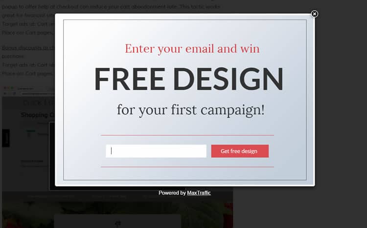
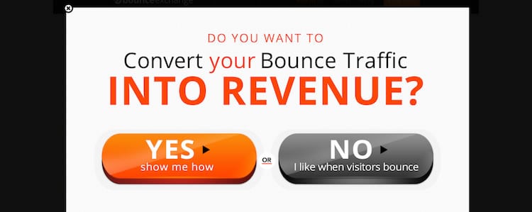
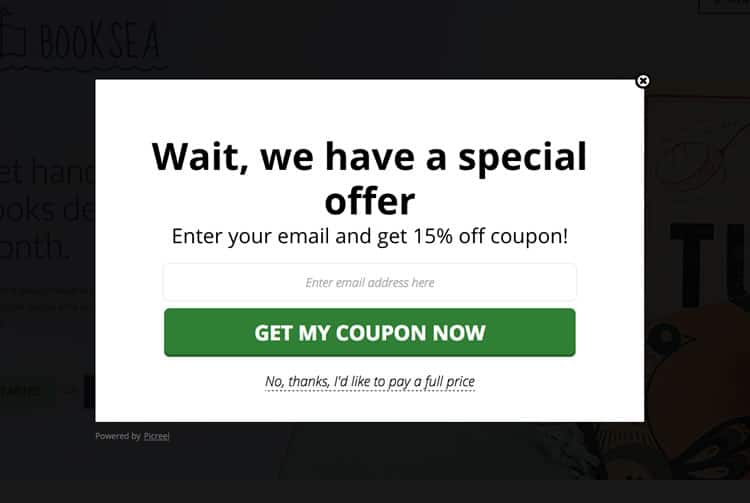
They go by many names – modal windows, dialog boxes, modal pop-ups – but whatever you call them, pop-ups have a reputation for being divisive when it comes to usability. Judging by the frequency of pop-up use on the average web page, UI designers and developers love these little guys.
However, users seem less enamored. Indeed, pop-ups certainly have a bad rap among the majority of users and a fair proportion of UX practitioners. So why are they still so prevalent? Over here at Justinmind we decided to do some investigation, canvas some user opinions and get the skinny from our in-house designers. Here is what we found out about the modal pop-up window and, more importantly, the best alternatives out there.
The Rise of the Modal Pop-up
Stripping things right back to basics, the attraction of the pop-up window in terms of raw functionality is not hard to grasp. As a graphical control element, the pop-up conveys to the user information that is related, yet subordinate to the main page content, blocking access to the main window until users interact with it. Aimed at temporarily interrupting user workflows, pop-ups are simple and effective at first glance; you want to communicate something to the user, you do it, ask them to respond and then everyone goes on their way, right?
The pop-up has a variety of uses, from delivering irrelevant pop-up spam to relevant content suggestions and confirmation calls. For UI designers the pop-up window quickly came to represent the “gift of newfound space“, according to UX Mag – a way to cater for last-minute additions or prune existing page content.
Looks like the modal pop-up is the answer to all your UI design real estate prayers, right? Problem is, according to usability and UX-perts, this is far from universally true.
The Popup Positives
Before addressing all the reasons why pop-ups so often find themselves in ‘most-hated UI element’ lists, the positives cannot and should not be dismissed. After all, when Justinmind carried out an online survey into ‘Are pop-ups here to stay?’ 21% of respondents replied in the affirmative, defending the power of the pop-up against the 23% who thought they were the devil’s design pattern and the 56% of fence-sitters. So let us look at some of the upsides to this UI element.
1. C is for Conversion Rates
First up, The Big C. Conversions. Most online content producers are looking for one thing above all – conversions. Whether that is in the form of email sign ups, downloads or purchases.
As far as raw statistics go, the conversion-focused pop-up takes some beating. Take for example the expansive claims made by Appsumo, who say their ListBuilder pop-up plug-in helped sites using the widget collect 110,313 emails in 30 days. Or Steven McDonald’s claims in User Testing.com, where he identifies his pop-ups as “the third biggest lead generator on the site.”
Why does this matter so much for e-commerce? In an online world where, according to Ott Niggulis in ConversionXL, 99% of site visitors don’t ‘buy’ on their first visit to your site but 75% intend to return to do so in the future, the modal pop-up seems like an irreplaceable tool for collecting follow-up email contacts. Why? It is all thanks to the power of ‘persuasion’, or interruption marketing.
Interruption marketing works, as anyone who has ever experienced tele-marketing or TV ad campaigns knows. It works in the sense that users have to stop what they are doing and deal with the marketing message presented to them. This is particularly true of modals because, to continue browsing a webpage, you have to interact with them and their message, even if it is just by clicking ‘close’.
The results of using conversion-focused pop-ups can be compelling. The University of Alberta had witnessed an increase in newsletter sign-ups when they introduced the sign-up form via a pop-up: from 1-2 sign ups a day they rose to 12-15 – still tiny numbers, but nonetheless a potent percentage increase.
2. B is for Bounce Rates
But surely if you are interrupting your users all the time and diverting their navigation flows with pop-ups, they are going to bounce from your site, right? According ConversionXL, wrong. In the two examples cited by Niggulis, WPBeginner and Backlinko, the introduction of modal pop-up windows had zero effect on site bounce rates. Zero.
From a purely conversion perspective, pop-ups seem to work.
The Negatives
1. Big Numbers, Zero Engagement
So far, so awesome when speaking only about raw conversion stats. But sometimes numbers can be deceptive. Let us take a closer look at those ‘incredible’ newsletter sign-up rates. Mauro d’ Andrea found that engagement from subscribers garnered through pop-ups is significantly lower than that of autonomous sign-ups. So yes, you might boost your subscriber list, but be aware that those very same subscribers might never open your marketing mails, much less click through and convert.
2. Brand Credibility
In fact, pop-ups may be doing your brand harm even as they simultaneously boost conversions. Nielsen Norman Group, in their piece on ‘needy design patterns’, and more specifically exit-intent pop-ups (pop-ups that try to make you carry out an action before leaving the web page), identify that “needy patterns like the please-don’t-go popover … chip away at the presentation of a professional, confident website. They also damage users’ perceptions of credibility.”
Do not rely on users letting you know they are TO-ed with your pop-up: as Jon Reed points out, complaining is time-consuming, and “If you had a box on your site saying “do you hate our pop-ups,” I would have clicked “yes”.
It could be that the era of interruption marketing in general, and pop-ups in particular, is drawing to a close. Inbound marketing shows no signs of releasing its grip in the digital era, and in an increasingly crowded online marketplace, users are freer than ever to choose to which brands they pledge loyalty to. As Jon Reed says in his round rebuke to pop-ups, B2B audiences in particular are “looking for long-term relationships with experts they can trust.” If your product or content is good, chances are users will find their way to it without a pop-up.
3. User Experience and Usability
Let us get down to the nuts and bolts – how users feel about pop-ups. What is it like to experience a pop-up in the wild? Are users left frothing at the mouth at having useful content held hostage behind an intransigent pop-up?
Justinmind’s in-house UXer Sergi Arevalo points out that the answer is more complex than it you might first assume: “Despite pop-up windows having a variety of different functions and some applicable contexts, they can still be aggressive.” That is backed up by our online survey, in which numerous variations on “it depends on the context” to “devil’s design pattern” captured some of the ambivalence felt by users when faced with pop-ups they found unhelpful.
It seems context is king when it comes to pop-ups. In terms of advertising, the stats are enlightening: 70% of US users are annoyed by pop-up ads, and according to SearchEngineLand, the primary reason for blocking a site is annoying ads. Of course, not all pop-ups are ad pop-ups, and some pop-ups add value. As Sergi points out, “they’re ideal if you want to show related content while keeping the user on the same page, and for a designer they’re a great way to add focused value within a reduced area.” Pop-ups – it is complicated.
4. Mobile Modals
There might be one clear case however when pop-ups are persona non-grata. Way back when the pop-up first appeared on interfaces, most of us were interacting with desktop devices by pointing and clicking. It is fairly easy to close an annoying pop-up with a mouse gesture. But we are now living in the mobile era, and pop-ups have failed to morph with the times.
Pop-ups are a tough call for designers of mobile UIs. Different operating systems require different designs. The usual top-right close button is way out of the thumb zone and tricky to hit accurately, and all too often mobile pop-ups fail to resize adequately, leaving users scrolling around desperately looking for the ‘close’. Basically, as UX Mag points out, modal pop-ups “just don’t work well on tablets and mobile devices“.
So Can a Pop-up Ever Make for Good UX?
If you listen to Jon Reed then the answer is definitely no: “pop-ups, by definition, ruin user experience.” But despite its aforementioned negative aspects, in certain web apps or desktop interfaces the pop-up can be a welcome addition.
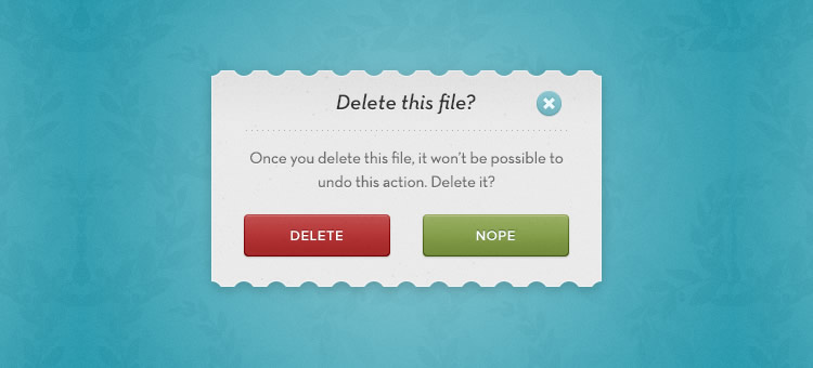
On our Justinmind survey, respondents pointed out that modal pop-ups could be vital when used to guide users through a potentially confusing process, or provide necessary information. UXmag points out that in programs or apps that require user confirmation or certain actions, modal pop-ups are an unbeatable way of focusing user attention before irreversible actions are carried out.
If you are designing this kind of software our UXer Sergi recommends running A/B tests on how best to communicate with users. It might be that your interactively prototyped pop-ups actually go down better with users if they see the true value of the interruption.
However, be aware that A/B tests between two pop-ups will only give you the best of two worlds. Run an option without pop-ups to see what kind of experience users truly value.
How to do Pop-ups Right
If you do eventually incorporate a modal pop-up into your UI, it is probably wise to establish some best practice guidelines. Our survey revealed that users were willing to accept a pop-up if it:
- Forced them to confirm an action or decision at a crucial moment in the workflow
- Gave them useful feedback or advice
- Focused them on a single, relevant piece of content (‘relevant’ is important here)
Users probably are not going to fall in love with your pop-ups even if done impeccably, but they might not abandon your site and curse your brand name.
Here is some advice fresh from the Justinmind design team:
- Despite what ConversionXL claims, resist the temptation to be a smart-ass when it comes to copy, because no one likes belittling microcopy, really. Instead, positive calls to action and microcopy that genuinely add value to the user, not just to your brand, are important.
- Track your pop-ups with cookies so you do not show the same users the same cookie repeatedly. Of course, you are assuming the same user will access your site with the same browser from the same device all the time. On a side-note, HubSpot should really do this: every time I go to their blog they ask me if I want to sign up for updates, something that I did months ago.
- Offer users valuable content and incentives, not junk. And do not just ask them for their contact details – that makes for creepy UX. How about user-friendly pop-ups which do not ask for jack, and instead send readers to a free resources page? A welcome interruption for many.
- Think carefully about timing and position. SumoMe found that the best (ie most conversion friendly) time to introduce a pop-up was after a user had been on a site 5 seconds, but in terms of UX this is probably way mistaken. Why would a user want to engage with your brand or content if they have not even had time to evaluate it? Do not hold your users hostage to your conversion rates.
- If you are designing for mobile, follow UX Mag’s advice and place the ‘touch = targets’ where users can reach them based on usage scenarios (and thumb zone). Place the close tab in the lower right corner and do not ask users to scroll around the pop-up.
- Most importantly, every time you design a pop-up, ask yourself the question “Do my users really need this interruption?” Most often they will not. Like one of our survey respondents said, “only use a hammer when you need a hammer.”
The Take-Away
Evaluating the user experience impact of modal pop-ups is, as seen, a complex business. While it may seem intuitive to assume that pop-ups automatically ruin the usability of a web or mobile app, the statistics shed light on a more a complex landscape in which users implicitly understand the importance of context.
They are not going to throw their arms around you in gratitude for designing an interface with full-screen SIGN UP HERE pop-ups and patronizing microcopy, but then again they probably (probably!) will not abandon your site.
They will thank you, however, if you work in a pop-up that elucidates rather than obfuscates, that prioritizes their needs rather than your conversion desires. You may need to play the long-game, but judicious use of pop-ups and, as always, a focus on usability, will win users’ respect and ultimately, their loyalty.
(Lead image source: Cory Doctorow – Creative Commons)
from UsabilityGeek http://usabilitygeek.com/pop-ups-vs-usability-conversions-bounce-rates/