Two weeks ago in the middle of the night, Italian photographer Lorenzo Montezemolo climbed Mt. Tamalpais in Marin County, California and waited for what he knew would be the perfect conditions for a spectacular long-exposure photograph. As the fog slowly rolled by he opened his shutter for three minutes, long enough for the full moon above to illuminate the surreal landscape you see here. The resulting image is nothing short of phenomenal.
“I chose to use a long exposure in order to give the incoming fog a smooth, striated appearance as it slithered over the ridge below,” Montezemolo shares with Colossal. “For the past year I’ve been crossing the Golden Gate Bridge several times a week to photograph the beautiful landscapes, seascapes and fog of Marin County, just north of San Francisco.”
You can see much more of Montezemolo’s photography on Flickr, and Instagram.
Our story begins in 1950 in Minneapolis, Minnesota, when five brothers sat around a conference room table trying to build a plan for the future.
This blog post first began life as a talk on our Inside Intercom world tour. You can watch a recording of the talk above and the slides are embedded below. If you want to continue reading just scroll down.
They had each inherited an equal share of the family business, Dayton’s, a small department store chain established in 1902. Dayton’s was small, it was local, it was traditional. Their advertising was pretty low key and uninspiring.
Their first print ad, published in 1903, has arguably the worst call to action ever: “Tonight Goodfellows, Monday, Dayton’s, formerly Goodfellow’s.” What are you supposed to do with that?
It’s a really good example of just how small their thinking was. But the five brothers had big ambitions. They wanted to build a business that had a footprint across America, and potentially across the world, but they had a problem – Sears. At the time, Sears was the incumbent. They were 40 times the size of Dayton’s, had a huge footprint across America and were a household brand name.
Sears was an intimidating opponent, but the brothers decided to go for it and hashed out a four point plan to compete. One of those points was an ambition to expand beyond their existing 10 locations into suburbia, where more of their customers were spending more of their time.
At around the same time an Austrian, Victor Gruen, was thinking deeply about the same challenge – suburbia – but from a very different angle. Victor came to the US from Austria in 1938, and he quickly embedded himself in American life. He liked it, but he didn’t love it. The biggest problem was suburbia, or as he called it, the suburban labyrinth.
His solution enclosed all the services and stores that people might need.
It frustrated him so much that he mapped it out. Gruen hated how cars, motorcycles and motorways had broken up the day-to-day lives of modern people. Suburbia was disconnected and impersonal. He missed the enclosed yet airy arcades of Europe. He felt suburban American was missing what Ray Oldenburg later called “a third place,” a place for people to connect and transact, so he designed a solution. He called it “the multifunctional center”, and it enclosed all the services and stores that people might need. This would be the new place for suburbanites to connect and transact.
The Dayton family heard about Victor, reached out to him and formed a partnership. Victor set about designing the solution to his problems and Dayton’s problems – and in his view, America’s problems too.
In 1956 together they launched the Southdale Center in Edina, Minnesota. It was the first fully enclosed, climate-controlled shopping center in history, and it defined how shopping centers are designed and built today.
It was an overnight success – Dayton’s sales rose almost 60%. And the other stores in the mall flourished as well. It was the start of something way, way bigger.
Solving a similar problem with software
Today Dayton’s has evolved. It’s become Target corporation, a household name across the world. The battle with Sears had a clear winner. Today Target is a $40 billion business, while Sears is worth a pretty paltry $1.5 billion.
Target’s logo is recognized by 96% of people in the US, which is amazing. 2004 was the year that Target last iterated on their logo, the bullseye. It was also the first time a young man named Mark Zuckerberg came into our lives.
Mark started a little college website called thefacebook.com. It was an experiment, a side project, and he just wanted to connect college students on campus (we probably know why). It was super simple and super local. But he soon realized that he was onto something bigger. Engagement was off the charts; students were spending hours and hours of every single day on Facebook. He figured, okay, let’s scale this thing globally.
Like Dayton’s, Zuck had a problem of his own. It wasn’t Sears; it was MySpace. At the time they were the incumbent, the big boys. It had a little bit of everything – blogs, videos, music, classifieds, etc. MySpace was the self-proclaimed “place for friends”. That’s a big, bold claim, but it was fair. In 2006, 12% of all US time spent online was on MySpace. Facebook by comparison had a mere 1%. MySpace was winning.
In 2006, Zuck and his team hatched together a plan to beat MySpace. At the very first F8 conference the following year, they launched Facebook platform. They offered deep integrations, mass distribution and a whole new opportunity to developers across the world. It worked.
Less than two years later, the game was totally up for MySpace. Facebook’s growth accelerated and their trajectory changed forever. MySpace all but died. The graph above stops in 2011. Facebook have obviously grown way more since then. They are now a technology powerhouse, a family of apps including What’s App, Instagram and Oculus. It’s worth more than $330 billion. At its peak, MySpace was worth about $12 billion.
The makings of a successful platform
These are two really different stories, two different companies operating at very different times, but they are actually really similar. Both changed their businesses from being product-focused, where they served one type of consumer, to becoming platforms that served many different types of consumers at once.
It’s interesting to look at a sketch from a book that Victor Gruen wrote many years ago. When he was designing shopping centers he didn’t just focus on the storefronts that customers walk through, he actually designed the layer of services that enable the stores to operate. The layer beneath, which powered the layer above. He actually used the word platform to describe it.
Don’t forget, this was in the 1950’s, when “platform” in the technology context wasn’t even a thing. Facebook did the exact same thing. They launched a platform, they opened up their layer of services to developers, many developers built a lot of volume on top of them, and a lot of consumers were happy. It was a true platform play.
Platforms succeed when they are truly open. The Victor Gruen take on this was parking. He actually spent a lot of time designing how cars were parked and designed the experience for the customer to get into the mall as quickly as possible. And the longer you spend in a shopping center, the more chance that you are going to spend money.
Platforms succeed when they are truly open.
Just like Gruen’s mall parking, Facebook was free. While social networks were charging up front for access, Facebook was free for anyone to join. It was actually free for developers too. The only tax for developers was their time. They didn’t have to pay for API access or SDKs.
Both focused on this idea of anchored tenants. Dayton’s partnered up with Donaldson’s and Woolworths when they moved into new markets across America. Local brand names that would bring audiences and loyalty into their stores and into their malls.
Facebook did the exact same thing when it launched Facebook platform. They didn’t just launch it alone, they launched it with Amazon, Washington Post and Microsoft. Each of them brought customers and content and loyalty, and they helped Facebook expand their reach across the globe.
Both companies also focused on driving discovery. They knew there was no point in helping to build this value if people couldn’t discover it. Contextual discovery, the experience of discovering the right thing at the right time, doesn’t happen by accident. It’s actual well planned serendipity.
In designing shopping centers for Dayton’s, Victor Gruen designed from the inside out. He didn’t stop at designing parking lots and the mall itself; he actually designed the entire experience of getting there. Gruen spent a lot of time sketching urban transport maps, planning ways to bring customers close to the stores. Facebook’s version of this was Open Graph, which provided a way for developers to define the types of content users would interact with. They wanted to use that to drive people to the right content at the right time. They wanted people to find their relevant friends and groups quickly and easily.
The similarity of thinking is uncanny. On the left side of the above image is another urban transport sketch from Victor Gruen. The right hand side is actually F8’s logo from a few years back. They actually look really similar. Designing friend connections actually isn’t all that different from designing urban transport routes. Dayton’s and Facebook – similar traits, similar stories.
Software takeaways
So what can software companies learn from shopping centers? Here are a few really simple things.
Platforms aren’t about technology. Platforms in the software world are actually micro representations of the real world, micro economies, and economies are powered by people.
When designing platforms, or designing a product for a platform, design experiences around people and behavior, not in isolation.
Make sure the platform you are building or the platform you want to integrate with is truly open. There is a massive distinction between companies with freemium models and enterprise “buy before you try” software companies.
Successful platforms fuel contextual discovery. The job isn’t done when platforms are designed, or when products are designed for platforms. Customers have specific needs that these niche products can meet, and developers want to make money from what they’ve built.
Platforms never succeed without great partners. If you are building a platform, know your roadmap. Know what you are never going to build and offer up that opportunity to developers. If you are choosing a platform to integrate with, consider how complimentary your product is to that platform.
Software platforms aren’t complicated. They work exactly the same way as the real world. If you want to see how they work, go to your local shopping center, grab a coffee, and observe. You never know what you might learn.
Anima is currently allowing people to join their waitlist. They describe the app as “A Modern Way to Create UI & UX”. In addition to recently putting up their teaser site, they’ve also written a blog entry explaining whey they “Believe Designers Should Own Their Design” and how Anima can help make this possible.
Check out the pre-release video below and visit their site if you want to get in line to try it out…
6 Things Professional Cooks Have in Common with User Experience Designers
Img: Jacek Yerka, “Between Heaven and Hell”
“How did you go from working in kitchens to becoming a UX designer?”
I get asked this question a lot by my peers, and I’d found it hard to explain, because it was simply intuitive for me to become a UX designer in my second career. All these similarities between cooks and UX designers emerged when I began to think about how I would tell them my story.
Good UX designers observe most current best UX practices and are educated on the appropriate UX methods and tools. They also understand where and when to apply these practices, methods, and tools. Cooks are also cognizant of ingredients that are standard to the season and cuisines, are up-to-date with cooking techniques, whether traditional or modern, and know when and how to apply each ingredient and technique. This comes from tons of research done outside of work, including reading, cooking, testing, networking with purveyors, tasting the food at competitor restaurants for research, and sometimes coming into their own restaurants on off-days for some contextual inquiry.
“No one is born a great cook, one learns by doing.” — Julia Child
2. They learn, make, test, and iterate.
Think about all the ingredients there are in the world, and think about all the flavor pairing possibilities. The best cooks want to learn about all these ingredients, to know which ones come together, and to explore and use appropriate techniques to make them taste great, testing recipes until the dish is ready to be put on the menu.
Similarly, a UX designer first learns about the industry that s/he is designing for, and, after researching and arriving at a solution, tests and iterates before finally passing the design to developers for production, ready for the end user.
3. They solve problems. A lot of them.
Making space out of no space, creating new dishes out of traditional dishes, fixing broken machinery, cleaning the grease trap, combining flavors from different cultures, finding use for carrot fronds and broccoli stems — these are some of the daily tasks performed by cooks, even if the task is outside of the scope of their job description. Like UX designers, cooks are multi-disciplinary natural problem solvers who are willing to get their hands dirty.
Left: Vicente and Emily ideating a new dish on paper; Right: IA exercise for the cook — re-organizing an already completely stocked fridge
4. They must pay attention to details.
Like a l0t of details. Because cooks are perfectionists when it comes to the taste, smell, look, sound, and feel of each ingredient and dish, whether on the workbench or on the stovetop or on the plate.
UX designers are also extremely organized, diligent to create pixel-perfect mockups, and relentless until their work is up to standards. A dish should never be sent out unless it’s perfect in taste, temperate, presentation, the way a product should never be shipped and used by the end customer until it is useful, valuable, and beautiful.
Critique is at the core of collaboration. — Adam Connor
5. They are great communicators that grow with feedback from others.
Responsible cooks (humans?) are not afraid to admit when they’ve made a mistake. The important part about making a mistake is owning up to it and making up for it, whether simply re-doing what you’d done in a better way, fixing the original product, or coming up with another solution altogether. In a time-sensitive environment such as in the kitchen or during a sprint, both cooks and UX designers have to make quick assessments on what to do and prioritizing tasks. If a mistake is made, a remedy will be found.
Cooks are also great communicators because they must think quickly on their feet (no pun intended) and speak concisely to save those seconds. But if you want them to explain something to you, such as why they do certain things certain ways, they would be happy to talk your ears off. And they have fun while doing so, no different from passionate UX designers who love their jobs and who love to talk about why things are made the way they are made.
Junsoo at Gramercy Tavern created many dishes on our tasting menu and made my family smile lots during Mother’s Day dinner
6. They just want to see you smile.
When I started cooking, my parents were unsupportive. “Go back to school,” my dad said to me, “Do you want to be the person sitting and enjoying the food, or do you want to be the person working hard on the other side preparing the food?”
The answer was clear to me, and remains so even as life took a turn and I changed my career. Regardless of what I do, I’m a consumer; therefore, given the opportunity, of course I want to be the person working hard on the other side. I want to be the person doing the making and creating.
Sometimes the products that UX designers and cooks create seem under-appreciated. When the end result is seamlessly functional or absolutely delicious, people often don’t notice because they already expect for the product to work nicely, or for the food to be tasty. But when we see people delighted by our product and using them with smiles on their faces, it is one of the most rewarding feelings in the world.
Thanks for reading!
from uxdesign.cc – User Experience Design – Medium https://uxdesign.cc/6-reasons-why-a-serious-professional-cook-makes-an-excellent-ux-designer-aaacdbd21de0?source=rss—-138adf9c44c—4
"The cost of excess bureaucracy in the U.S. economy amounts to more than $3 trillion in lost economic output, or about 17% of GDP," write Gary Hamel and Michele Zanini in Harvard Business Review. Their recommendation? Cut management in half. The don’t specify if that’s crosswise or lengthwise.
They identify 7 companies that are at the vanguard of this movement: Nucor, Morning Star, W.L. Gore, Svenska Handelsbanken, Sun Hydraulics, Valve, and a General Electric jet engine plant in North Carolina:
The experience of the vanguard suggests it should be possible to double the ratio of employees to managers and administrators, from 4.7:1 to 10:1. Doing so would free up 12.5 million individuals for other work that is more creative and productive.
They also examine time lost to "low-value management processes" like budgeting and performance review, concluding that "as much as 50% of all internal compliance activity is of questionable value."
While it’s nice to have some data to back it up, this has long been obvious to anyone who has worked in a soul-crushing large company. An earlier version of this report appeared here:
On Friday, Facebook started deleting posts containing “The Terror of War,” Nick Ut’s photo depicting a young Vietnamese girl fleeing a napalm attack on her village; Facebook approach this photo with a scorched earth (ahem) policy, even deleting it when it was posted by the Prime Minister of Norway.
Dmitry Zakharchenko, the deputy head of the Energy Industry Department of the General Administration of Economic Security and Combating the Corruption, also had €2m in cash.
Cobham PLC is a surveillance vendor who sells to some of the world’s most egregious human rights abusing governments; in 2014, they provided a catalog of cyberweapons and spy tools to Florida Department of Law Enforcement, from whom it leaked.
It’s no secret that tiny drones are super fun to fly because of their nimble movements, high speeds, and easy maneuverability. The downside is missing out on the cameras offered by larger drones on the market. That’s exactly why the World’s Smallest Camera Drone is so amazing. Get all the benefits of a mini drone with the […]
PDFs can be extremely frustrating when you need to sign a document or make a small edit. That’s why we swear by PDF Expert 2.0 for Mac—the app that lets you finally edit PDFs directly.With this convenient app, you can alter text, images, links, and outlines, without having to convert your PDFs into Word documents. In fact, you can […]
Raspberry Pi is the microcomputer revolutionizing computer science and programming across the globe. Apart from being super fun to build projects like robots and RC cars with, Raspberry Pi is also an interactive way to learn to program. There’s no better time than the present to start tinkering with Raspberry Pi, as they recently released the […]
report this ad
from Boing Boing http://boingboing.net/2016/09/13/bloated-u-s-management-costs.html
It is often easy to overlook the underlying principles that compel people to take action. Instead, we tend to obsess over minute details — things like button color1, pricing2 and headlines. While these things can compel users to take action, it is worth considering the psychological principles that influence users’ behavior.
Unfortunately, few organizations try to understand what influences user action. Research by Eisenberg Holdings3 shows that for every $92 the average company spends attracting customers, a meager $1 is spent converting them. Real conversion optimization is rooted deeply in psychology.
In this article, we will analyze seven psychology studies that date as far back as 1961. Each experiment raises principles that will help you boost conversions on your website. Some of the experiments are so controversial that they will make you cringe, but the lessons are fundamental.
The Authority Principle: Leverage The Influence Of Authority Figures To Get People To Act Link
In perhaps the most famous study about obedience in psychology, Yale University psychologist Stanley Milgram conducted a series of experiments4 to observe how people react when instructed by an authority figure to do something that conflicts with their conscience. The aim of the experiment was to see how far people would go to obey authority, even if the act of obedience involved harming someone else and acting against their conscience.
For the studies, which began in 1961, Milgram selected participants for his experiment by placing an advert in a newspaper. Once people responded to the advert, Milgram paired the participants and cast lots to determine which of each pair would be the learner and which the teacher. Unbeknownst to the participants, the experiment was rigged — all of them would be teachers, while all of Milgram’s associates would be chosen as learners.
The learner (Milgram’s associate) was taken into a room and connected to an electric chair; the teacher (one of the participants) was then taken to a room next door that contained a row of switches, marked with a scale of 15 to 450 volts — with 15 volts being a “slight shock” and 450 volts producing a “fatal shock.” The teacher was able to see the reactions of the learner through a screen.
Once in the other room, the researcher told the teacher (i.e. the participant) to administer an electric shock every time the learner answered a question incorrectly. The learner was then asked a series of questions and mainly gave wrong answers (on purpose). In return, the authority figure — dressed in a gray lab coat — asked the teacher to administer an electric shock for each wrong answer. The result was stunning: 65% of participants administered the electric shock to the maximum 450 volts, even when the learner long stopped showing signs of breathing. In a variation of the experiment, the authority figure was replaced with an ordinary person, and compliance dropped to a stunning 20%.
Milgram’s experiment7 shows that we will go to great lengths to obey orders, especially from those seen to be as legitimate authorities (whether legal or moral).
How to Use The Authority Principle to Boost Conversions Link
The authority principle can be used to boost conversions in your business. For instance, getting authority endorsements will always go a long way to boosting your conversions and profits. You are far better off, of course, avoiding trying to sell products to people who don’t want them, but even scrupulous websites can boost conversions by tapping into the power of authority. Here are some tips:
Get an authority figure or respected celebrity in your industry to endorse you.
A great example8 of the effectiveness of endorsements from authority figures is Dr. Oz. Dr. Oz is renowned in the health field, and products will sell out at stores as soon as he recommends them. The phrase “Dr. Oz Approved” currently has 1.6 million results in Google (shown below), showing how seriously people take his recommendations.
9 (Image: John Stevens)
Get an authoritative publication to endorse you.
Mainstream publications are also regarded as authorities. In the absence of an endorsement from a person, an endorsement from a reputable publication would go a long way to boosting your credibility. Rent the Runway reported a 200% increase in conversions13 from visitors referred by fashion magazines and blogs compared to visitors from paid search ads.
Become an authority yourself.
Why get Oprah to endorse you when you can be Oprah yourself? Establish yourself as an authority figure and an industry leader by writing for relevant publications, speaking at relevant events and conferences and establishing relationships with other authority figures. Think of the difference between receiving an email from a stranger and receiving an email from a known thought leader. Making a name for yourself is a great way to warm up your sales leads before you even reach out to them. Seven-figure blogger Neil Patel14 (pictured below) established himself as an authority by highlighting major brands he has worked with, his recognition from the United Nations and the President of the United States, and major publications that have featured him.
15 (Image: John Steven)
The Amos Tversky And Daniel Kahneman Experiment: Use Anchoring To Make People Feel They Are Getting A Bargain Link
Whether you are working for a company or selling your own products, you have probably seen prospective customers bounce from your website because they feel that your products are too expensive. Well, an experiment16 (PDF) conducted by psychologists Amos Tversky and Daniel Kahneman in 1974 holds a solution to boost conversions with these customers, too.
During the experiment, the researchers observed how an initial perception influenced the subjects’ behavior. They surveyed people and asked them to estimate the percentage of African nations that are a part of the United Nations. Before people were allowed to answer, though, the researchers had them spin a wheel painted with numbers from 0 to 100. Unbeknownst to the participants, the wheel had been rigged to stop at either 10 or 65. The experimenters found that the people who landed on the higher number on the wheel were more likely to choose a higher percentage than people who had landed on the lower number. Those who were shown 10 on the wheel estimated, on average, that 25% of African nations were a part of the UN, while those who were shown 65 estimated that the percentage was 45%.
The study reveals the effect of anchoring on our actions. If you want to buy a bomber jacket, and all of the jackets you find are around $200, and you later see a similar jacket that costs $150, you would think it’s a bargain, even if the jacket actually costs $50.
Amazon does this effectively, and automatically, for most of its products:
17 A listing of books on Amazon (Image: John Stevens)
How to Use the Anchoring Principle to Boost Conversions Link
You can use this psychological effect to boost your sales. First, put your product in high esteem — if possible, make people feel that your product is so amazing that they would never be able to afford it. When they later find out the price you are asking, even if it is expensive, they will see it as a bargain. It is no longer a matter of “$500 is too much,” but rather, “Wow, this could easily sell for $2,500, and I’m getting it for $500!”
Many major brands leverage the anchoring effect by offering deals that appear to be such a great bargain that users might feel that they’re crazy to offer them. Below is shown AT&T deliberately offering both a 32 GB and a 64 GB iPad at the discount price of $529.
The original prices of the 32 GB and 64 GB iPads were $729 and $829, respectively. The latter would be regarded as expensive. At the discounted price of $529, however, it’s a bargain. The user feels, “Wow! I’m getting double the storage for the same price!” They no longer focus on the high cost of the 64 GB model, but rather on the fact that it costs the same as the model with half the storage.
The Little Albert Experiment: Use The Conditioning Principle To Turbocharge Your Conversions Link
The “Little Albert” experiment is pretty extreme compared to the other experiments discussed here, and it probably wouldn’t be allowed today, not only because of the nature of the experiment itself, but also because the subject was just a child at the time. (It was widely reported that the child, known as Little Albert, never recovered from the effects of the experiment.) The experiment, however, does teach some fundamental lessons about how the human brain is wired.
Psychologist John B. Watson conducted the experiment to observe the phenomenon of classical conditioning20. In simple terms21, classical conditioning is “a learning process by which a subject comes to respond in a specific way to a previously neutral stimulus after the subject repeatedly encounters the neutral stimulus together with another stimulus that already elicits the response.”
The study observed a child who Watson referred to as Albert B. and who is popularly known today as “Little Albert.” Little Albert was nine months old at the time, and he loved animals prior to the experiment — particularly, a white rat. However, Watson began to pair the presence of the rat as well as other animals with the loud bang of a hammer hitting metal. Eventually, Little Albert developed a fear of animals, including the white rat he initially loved, due to the associated discomfort that came with the loud bang. Although the two stimuli were completely unrelated, their association was strong enough to elicit a response in Little Albert.
How to Use the Little Albert Principle to Boost Your Conversions Link
Associate a positive emotion with your brand and products.
In Little Albert’s case, the emotion associated with the presence of animals was fear and anxiety. As a result, he came to dislike animals. For Nike, this emotion is a feeling of being able to achieve your goals by using its products. Nike has carefully positioned itself as the brand to help you achieve your goals. From its trademarked “Just do it” slogan to its strategic use of the underdog character who becomes a hero in some of its ads, Nike has associated the positive emotion of achievement with its brand.
Make this positive association obvious.
Constantly repeat the association until an image is created in the mind of your users, and you’ll notice a significant increase in responses to your messages.
In Nike’s “Find Your Greatness22” ad, we see an overweight boy running desperately and not giving up. The implied message is that anyone can do it, which is in line with Nike’s advertising over the decades.
23 Nike’s “Find Your Greatness” ad campaign (Image: DailyMail24)
The Jam Study: Giving People Too Many Choices Can Cripple Sales Link
In his book The Paradox of Choice, psychologist Barry Schwartz famously argues that having too many choices isn’t necessarily good for people and might have unintended effects. This holds true for conversion optimization. The effect was well demonstrated through the famous “jam study.”
Psychologists Sheena Iyengar and Mark Lepper published the jam study in 2000. The study observed the behavior of 754 shoppers25 in an upscale grocery store and how they responded to the choices they were presented with. The shoppers were observed on two consecutive Saturdays. A tasting booth was set up in the grocery store with jam selections on display. The first group of people were exposed to a table displaying 24 varieties of gourmet jam, while the second group were exposed to a table displaying 6 varieties of jam.
The study found that, while the table with more varieties of jam attracted more consumer attention (60% of shoppers stopped at the booth) than the table with fewer varieties of jam (40% of shoppers stopped at the booth), the latter outperformed the former in sales by a factor of 10 to 1.
That’s basically a 900% increase in conversion rate. How would you like the same?
26 The jam study shows that less is more. (Image: Noah Rickun27)
This has a fairly logical explanation. Research shows28 that human attention span is rapidly declining, shrinking from 12 seconds back in 2000 to 8 seconds now. Rather than increasing your conversions, giving people more options will actually harm it by crippling their decision-making ability.
How to Use the Choice Principle to Boost Your Conversions Link
Offering more options sounds like a good thing, until it isn’t. Giving people more options will draw their attention; if you ask them, they will tell you that’s what they want. However, research shows that most people actually respond better to fewer options. Limit the choices you present to users, and you will more likely get them to take the action you desire right away.
Dropbox’s minimalist home page29 is a great example of this. It’s plainly obvious that Dropbox simply wants you to sign up, and its home page focuses on helping you do just that.
30 Dropbox’s minimalist home page shows that less is more. (Image: John Stevens)
In “The Minimal Homepage31,” Mattan Griffel observes that the fastest-growing companies in the world — especially in their early days, when they needed fast adoption — all had something in common: a minimalist home page. Dropbox, Quora, LinkedIn, Twitter and Pinterest are some notable examples.
The Decoy Principle: Drive Users Toward One Option Link
Another famous conversion optimization experiment is known as the economist pricing experiment. Psychologist Dan Ariely popularized this experiment32 in his book Predictably Irrational. Ariely surveyed 100 of his students at the Massachusetts Institute of Technology and asked them to choose between the following three options:
web-only subscription ($59),
print-only subscription ($125),
print and web subscription ($125).
The results of the experiment were amazing33: 16 of the 100 people surveyed chose the web-only subscription, while 84 people chose the print and web subscription. Nobody chose the print-only subscription.
Why is the contrast so sharp? This is the decoy effect in action; the print-only option was introduced to make the print and web option more attractive and to make the web-only option less attractive. Seeing that the print and web option cost the same amount as the print-only option, people felt that there must have been an error and that they were getting a bargain. But this was psychology in action.
The AT&T offer referred to earlier in the section on anchoring is also a form of decoy pricing. The fact that both the 32 and 64 GB iPads were sold at the same price made the 64 GB model an instant bargain. The 32 GB model could be said to be a decoy to boost sales of the 64 GB.
How to Use the Decoy Principle to Boost Your Conversions Link
You can use the decoy principle to boost sales by introducing an appealing offer that costs less and has more features. This way, people will feel that they are getting a bargain and will be compelled to act immediately. When people see that package A has twice the features of package B, yet both cost the same, they will instantly develop a preference for package A.
Here is another example of decoy pricing used by Apple to sell the iPod Touch:
By putting the 8 and 32 GB iPod Touch models side by side and pricing them so closely, some users will feel compelled to select the 32 GB model without considering that competing products might be superior and cost less. Instead, they will focus on the fact that they are getting the 32 GB at a much better price. With those three models marked at those price points, and all with apparently similar features, the 32 GB model looks like the bargain!
As you can see, adding one or more purchasing options can boost conversions. However, something more fundamental is going on here. Why will many people easily hand over their money for a product from one brand, yet be reluctant to pay a fraction of that amount for a similar competing product? Let’s find out.
The Richard Thaler Experiment: Use Context To Boost The Perceived Value Of Your Product Link
Context influences value, which explains why people are more likely to bargain in a flea market than in a boutique. Richard Thaler conducted an experiment39 to demonstrate this principle. Subjects were asked how much they were willing to pay for beer. The first group was told that the beer would be purchased from a local grocery store, while the second group was told that the beer would be purchased from a fancy hotel. The study revealed that people offered to pay more for the very same beer when it came from the fancy hotel.
To boost conversions, master the art of conveying exclusivity through context. The grander people consider your brand to be, the more likely they will pay for your product, even if it is worth much less.
For example, you are more likely to pay a premium for a baseball glove like the ones shown below if you see it on a curated e-commerce website than in an online superstore. Canopy’s home page lists one glove for $250, whereas Amazon’s search results display infielder baseball gloves ranging from $9 to $45.
40 Listings from Canopy (Image: Canopy41)42 Listings from Amazon (Image: Amazon43)
How to Use the Principle of Context to Boost Your Conversions Link
Create a premium feel to attract premium customers. Some believe that offering discounts or competing on price is not a smart long-term approach to business. Instead, create a premium impression and you will command premium rates.
That being said, it’s not always about what you’re offering. Simple brand positioning and marketing can go a long way to improving your conversions. This brings us to our next point.
The Familiarity Principle: Use Repetition To Get People To Notice Your Offer Link
The power of repetition in boosting conversions is deeply rooted in psychology, and it is one of the principles advocated by Robert Cialdini in his book Influence: The Psychology of Persuasion.
A 2013 study by Jaroslaw Jankowski44 found that content repetition can boost conversions on websites. The more exposed people are to your offer, the more familiar they become with it, and the higher the probability that they will act on it. This is known in marketing as the rule of seven45; that is, prospective customers need to come across your offer at least seven times before they take action.
How to Use the Familiarity Principle to Boost Your Conversions Link
Don’t limit yourself to one marketing channel. Spread your message across multiple channels, maximizing touch points, and you will likely notice a boost in conversions. Jay Baer offers a great case study46. He says that his Jay Today show, a daily three-minute video, is one of his strongest content-marketing performers. After each video is published, he repurposes it into eight different pieces of useful content, which he then distributes on eight different platforms, including YouTube, LinkedIn and Medium. This helps grow his business by attracting more attention and increasing his likability, using the power of repetition.
Below is the YouTube version of one of his recent shows promoted as a linked post on Facebook, followed by the same content in iTunes podcast form.
His effective distribution of content based on the familiarity principle has been a key driver of growth for Baer’s company.
The familiarity principle also works well in advertising. Research shows that companies will consistently repeat ads51 to the same people because it creates in them a subconscious desire for the products.
Effective conversion optimization goes beyond simply changing a button’s color or making a few tweaks here and there. The trick is knowing the fundamental principles that make people act the way they do. Hopefully, the psychology studies reviewed in this article have provided you with some practical insight to boost your conversion rates.
Whether by leveraging the power of classical conditioning (the Little Albert experiment), keying into the effectiveness of decoy pricing (the economist pricing experiment) or using plain-old social proof (Milgram’s experiments), you can do much to boost your website’s conversion rates. The key is in the implementation. Take lessons from the studies referred to above, implement them on your website, and watch your conversions increase.
Disclaimer: I just ate, so food is on my mind. Roll with me.
If you watch The Travel Channel or The Food Network as much as I do, you’ll have seen plenty of amazing kitchens from the top restaurants around the world.
Something they all have in common? Squeaky-clean kitchens.
A kitchen so clean that they let the patrons watch! Photo by star5112 on Flickr. CC BY-SA 2.0.
Restaurants like Alinea in Chicago take their cleaning very seriously, and the proof is in their pudding (though I doubt a 3-Michelin star restaurant serves pudding). Here’s what someone said regarding the Alinea kitchen cleaning ritual:
We cleaned at least 4 times during the 9 to 10 hours that I was there [visiting]. Four big all out cleans, and numerous smaller cleans. Add that on to constant line sweeps, and vacuuming every 20 minutes. Everyone’s station was spotless, and if it was less than perfect, the chef was sure to sweep over, scold you, and fix it. It was conducive to working clean, having such a clean environment. Everything was shiny, no ‘kitchen grime’ anywhere. All the equipment—the coolers, the bottom shelf on the prep table, the bottom of the pots and pans, the bottoms of the hotel pans, the backs of the equipment, the shelves under the line, the windows—everything was clean. This was a kitchen in which any surface was clean enough to eat off of. (more here)
The cleaner your kitchen is, the better your product will be. Here are a couple recommendations for avoiding the “kitchen grime” in your Sketch designs so you stay efficient, and your deliverables stay polished:
I’m not gonna tell you to use any particular size, just as long as you stick to it. I personally prefer an 8px baseline grid because it plays nicely with various typographic standards and has more divisors (1, 2, 4, 8px versus 1, 5, 10px), but I know 10px baseline grids are popular since all design applications ship with Shift+← as 10px. So use whatever floats your tugboat. You can use Nudg.it to change the default Shift+← distance to save yourself time. This does wonders when you’re designing in a style like Google Material Design that works off of an 8px grid.
Sticking to a grid will make spacing components a breeze—and it’ll ensure perfect visual rhythm. It removes guesswork when spacing out components, because distances must be multiples of your baseline grid value. As a bonus, your developers will love you because they’ll likely be working with a layout framework that adheres to a grid system.
2. Use bounding boxes
Once you’ve set your baseline grid, it’s incredibly useful to use bounding boxes to keep objects on your artboard organized and spaced consistently. In the image below, I use bounding boxes for each tab item, and I don’t actually have to put any space between the tab groups. The spacing is built into the bounding box, so each tab is snug against the one next to it.
Using a plugin like Ken Moore’s Relabel Button will allow you to create evenly spaced tabs like this in seconds.
Additionally, objects with bounding boxes have larger click areas and allow you to use things like inner shadows as dividers or highlighters. Which brings us to…
While we’re on the topic of click area sizes, can we talk about how difficult it is to grab a line segment?! It’s like Sketch is saying “We know there are 2 million pixels on the screen, but you need to click just this one. Not that one… nope… the… nope… almos… nailed i… nope.”
Secondly, even if you select the Fit to Pixel option in Sketch preferences, drag-resizing a line will always put it on sub-pixels. Super aggravating, and it’ll really mess up your spacing elsewhere because the ruler will round up values for any object that sits on sub-pixels.
So what should you do instead? I recommend using inner shadows to draw lines. Draw a rectangle and give it an inner shadow like so:
Why is this better? You now have a much larger click area, you’re protected from the dreaded sub-pixel, and, most importantly, you can use it as a style. Imagine you’re creating a list of items and you want a line separating each item. Instead of a bunch of text plus a line, now you can set your bounding box and give it an inner shadow. How cool is that?!
Note: Until Sketch supports borders with controllable sides, I’ve found inner shadows to be the best method for things like this.
4. Organize your styles and symbols
This one is easy. Did you know you can create style and symbol submenus in Sketch? By putting slashes in your style and symbol names, you can create an organized “folder” structure for finding things later.
It even alphabetizes things in your submenu for you! Thanks, Sketch!
5. Name your layers—all of them
Select an object on your artboard and learn this hotkey sequence:
Command+Shift+J
Command+R
Got it? It should select the layer in your layers list, then highlight the layer name to allow you to change it.
Pro-tip: Use the Tab key to jump to the next layer in your layers list to rename that one, too! I recommend this plugin by Rodrigo Soares to rename multiple layers at once, find and replace, and rename with sequencing!
In the screenshot above, you’ll see that I’ve called the “Jason Burke” layer “Name”. Why? Well, because that’s what it is. By default, Sketch names the layer to whatever the text is inside of it, but seeing “Jason Burke” in a list of potentially hundreds of layers isn’t particularly useful for me.
So what? It’s not a huge deal. Not really, no. But where it becomes exceptionally useful is when you can do things like this:
Confession: I used to never use the Search function to find layers, but once I started naming layers semantically to describe what the content was and not what the content said, then I realized the power of searching layers.
One last thing: Clean as you go. When you finish designing that list item, rename it! Group it! If you’re feeling wild… symbolize it! Tiny amounts of work along the way will save you a ton of time in the long run.
No one likes cleaning a tower of dirty dishes after spending an hour cooking dinner, so do yourself a favor and clean as you go.
Happy Sketching! 🌟
Many of the images used in this post were taken directly from the UX Power Tools that we’ve been meticulously designing with these (and other) techniques in mind. Check it out here.
Jon Moore Jon is a Senior Design Partner at Innovatemap in Indianapolis where he leads conceptual design and tech innovation to help clients build successful products. On the side, he’s a co-founder and designer of UX Power Tools, a collection of premium design components for Sketch.
Latest KDnuggets poll identifies the list of top algorithms actually used by Data Scientists, finds surprises including the most academic and most industry-oriented algorithms.
we note that the top methods are still Regression, Clustering, Decision Trees/Rules, and Visualization. The biggest relative increases,
measured by (pct2016 /pct2011 – 1) are for
Boosting, up 40% to 32.8% share in 2016 from 23.5% share in 2011
Text Mining, up 30% to 35.9% from 27.7%
Visualization, up 27% to 48.7% from 38.3%
Time series/Sequence analysis, up 25% to 37.0% from 29.6%
Anomaly/Deviation detection, up 19% to 19.5% from 16.4%
Ensemble methods, up 19% to 33.6% from 28.3%
SVM, up 18% to 33.6% from 28.6%
Regression, up 16% to 67.1% from 57.9%
Most popular among new options added in 2016 are
K-nearest neighbors, 46% share
PCA, 43%
Random Forests, 38%
Optimization, 24%
Neural networks – Deep Learning, 19%
Singular Value Decomposition, 16%
The biggest declines are for
Association rules, down 47% to 15.3% from 28.6%
Uplift modeling, down 36% to 3.1% from 4.8% (that is a surprise, given strong results published)
Factor Analysis, down 24% to 14.2% from 18.6%
Survival Analysis, down 15% to 7.9% from 9.3%
The following table shows usage of different algorithms types:
Supervised, Unsupervised, Meta, and other by Employment type.
We excluded NA (4.5%) and Other (3%) employment types.
Table 1: Algorithm usage by Employment Type
Employment Type
% Voters
Avg Num Algorithms Used
% Used Super- vised
% Used Unsuper- vised
% Used Meta
% Used Other Methods
Industry
59%
8.4
94%
81%
55%
83%
Government/Non-profit
4.1%
9.5
91%
89%
49%
89%
Student
16%
8.1
94%
76%
47%
77%
Academia
12%
7.2
95%
81%
44%
77%
All
8.3
94%
82%
48%
81%
We note that almost
everyone uses supervised learning algorithms
.
Government and Industry Data Scientists used
more different types of algorithms
than students or academic researchers,
and
Industry Data Scientists were more likely to use Meta-algorithms
.
Next, we analyzed the usage of top 10 algorithms + Deep Learning by employment type.
Table 2: Top 10 Algorithms + Deep Learning usage by Employment Type
Algorithm
Industry
Government/Non-profit
Academia
Student
All
Regression
71%
63%
51%
64%
67%
Clustering
58%
63%
51%
58%
57%
Decision
59%
63%
38%
57%
55%
Visualization
55%
71%
28%
47%
49%
K-NN
46%
54%
48%
47%
46%
PCA
43%
57%
48%
40%
43%
Statistics
47%
49%
37%
36%
43%
Random Forests
40%
40%
29%
36%
38%
Time series
42%
54%
26%
24%
37%
Text Mining
36%
40%
33%
38%
36%
Deep Learning
18%
9%
24%
19%
19%
To make the differences easier to see, we compute the algorithm bias for a particular employment type relative to average algorithm usage as Bias(Alg,Type)=Usage(Alg,Type)/Usage(Alg,All) – 1.
Fig. 2: Algorithm usage bias by Employment.
We note that Industry/Government are more likely to use Visualization and Time Series,
Next, we look at regional participation which was representative of overall KDnuggets visitors.
from KDnuggets http://www.kdnuggets.com/2016/09/poll-algorithms-used-data-scientists.html
This girl isn’t real, and it’s proof that CGI isn’t creepy anymore
CGI is moving fast, very fast. Not just for added effects in movies, but also for creating completely lifelike 3D models.
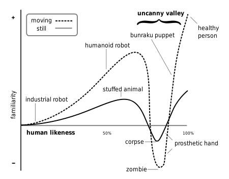
The biggest problem facing the animation community is an effect called the ‘uncanny valley’. We’re confronted with this when we see something that looks nearly human, but just not quite.
Do business with 5,000 people
Momentum by TNW is our New York technology event for anyone interested in helping their company grow.
Humans are so good at recognizing other humans, that’s it’s extremely hard to create a thing that looks like a normal, healthy person and not a zombie or a corpse.
It’s explained in the graph below:
We’ve become pretty good at making CGI look like it’s almost real, but the real challenge is making it seem like its normal.
Japanese artists Teruyuki Ishikawa & Yuka Ishikawa — otherwise known as Telyuka — started a project in 2015 to create an extremely realistic computer-generated schoolgirl. Her name is Saya, and she has been improved on since then.
This is the 2016 version (click to enlarge):
And these are some pictures of the 2015 version (again, click to enlarge):
Even her shoes look incredibly realistic:
Take a close look at all of these pictures. How do they make you feel? Personally, I’m not sensing the uncanny valley — it just looks real.
Everything from her hair to the texture of her skin doesn’t make me feel like it’s not a real person. If I would’ve come across the image without knowing the context, I’d probably think nothing special of it.
With it becoming increasingly harder to differentiate between real and fake humans, weird things start to happen. For example, take a look at the Instagram account of lilmiquela. When she popped up on the social network a few months ago, people couldn’t figure out if she was real or not.
The illusion lasted for a while, until she posted a video of herself which was obviously fake.
However, it goes to show the line is definitely blurring — it makes me think about the future, where there might be serious confusion to see if you’re dealing with a real person or a computer-generated version of one.
What do you think? Did we destroy the uncanny valley, or is there still something off about most animated figures? Let us know in the comments.
from The Next Web http://thenextweb.com/creativity/2016/09/09/cgi-girl-isnt-real/