
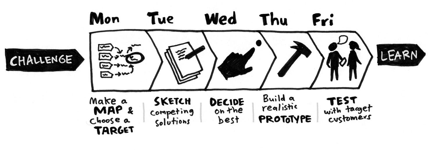
For years, people have told us group brainstorms don’t work. And yet, we keep right on brainstorming…
from Stories by Jake Knapp on Medium https://medium.com/@jakek/stop-brainstorming-and-start-sprinting-16180839b43d?source=rss-f230699aec44——2
For years, people have told us group brainstorms don’t work. And yet, we keep right on brainstorming…
from Stories by Jake Knapp on Medium https://medium.com/@jakek/stop-brainstorming-and-start-sprinting-16180839b43d?source=rss-f230699aec44——2

What is Auto-Layout for Sketch?
A Sketch Plugin that integrates seamlessly into Sketch and enables defining and viewing different iPhone/iPad sizes including Portrait/Landscape.
As well as generate an overview of all screen sizes for all artboards at once:
from Sidebar http://sidebar.io/out?url=https%3A%2F%2Fmedium.com%2Fsketch-app-sources%2Fintroducing-auto-layout-for-sketch-24e7b5d068f9%23.11gicl7bv
We asked technology executives to share the best non-business book they read this year. Want to share your favorite? Leave a note in the comments. The Morning Download email newsletter will be on hiatus from Dec. 26 though Jan. 2. We wish all of our readers and their family and friends a great holiday season and good […]
from CIO Journal. http://blogs.wsj.com/cio/2016/12/27/tech-executives-name-their-favorite-books-of-2016/?mod=WSJBlog
from Stories by Jason Fried on Medium https://medium.com/@jasonfried/adding-more-people-to-a-team-doesnt-speed-things-up-it-typically-slows-things-down-8c0f9da56f1b?source=rss-c030228809f2——2
")
2016 was an astounding year for insightful, informative data visualization articles — here were the top 10 I saw all year (in no particular order), in each case including a representative quote from the piece and a brief note of why it was at the top of my must-read list:
For the last several years, I’ve wondered about what we actually know from scientific studies about how humans perceive graphics. I’ve collected things here and there, but when I started to get into the thick of it, I realized how extensive this body of research really is.
A stunningly-valuable compilation of the research foundations for data visualization. Almost every major factor making visualizations work or fail can be explained by the evidence summarized here.
I announced that I would prepare a list of potential research projects that would address actual problems and needs that are faced by data visualization practitioners. So far I’ve prepared an initial 33-project list to seed an ongoing effort, which I’ll do my best to maintain as new ideas emerge and old ideas are actually addressed by researchers. […] My intention is to help practitioners by making researchers aware of ways that they can address real needs.
Despite the earlier article summarizing 39 pieces of visualization research evidence, many open questions continue to bedevil dataviz practitioners, limiting the scope and influence of visualization in applied settings — Stephen’s article provides a vital framework and accelerator for closing this gap.
There are no perfect tools, just good tools for people with certain goals. Data visualization is a communication form used by many subfields, e.g. science, business and of course journalism. All these fields come with different needs — but even in the space of data journalism, data visualization is used for different goals and with different approaches in mind. There can’t be a tool that satisfies them all.
Lisa’s consistently one of the strongest and most creative voices on visualization topics, and in this article, a culmination of several earlier pieces, she systematically uses and evaluates 24 tools. This is the kind of work that propels data visualization’s approachability and reach to new levels, an educated consumer’s guide to dataviz time and cost investments amidst an increasingly crowded and chaotic landscape.
The Data Visualization Checklist contains the foundational techniques needed for clear, effective graphs. […] Stephanie and I included the core techniques in a single document so that you’ll have all the strategies in one central place. It’s your job to customize these techniques for your viewer and your dissemination format.
Ann and Stephanie, each prolific thought leaders in visualization, joined forces to produce this revised and improved checklist for dataviz techniques — given that 90%+ of the visualizations I see would fail to pass even 1/3 of their standards, the need for easy-to-use self-scoring criteria such as this to raise the visualization bar is painfully clear!
The trends of data visualisation are forever shifting and changing as the data climate evolves at an ever faster pace. I’ve put together some thoughts on trends that I have identified in the last five or more years, where we are now and where, I believe, some of the focus is going.
Christian stretches our conception of what data visualization is and what it can become, with a focus on customization, connectivity, and complexity — the latter an increasingly-necessary reminder as a counterweight to misconceptions that visualizations need or should be a path to simplifying the complex and worse, that all dataviz needs to be fully processed at a 3-second glance. Rather, visualizations are a powerful weapon in clarifying — but not necessarily simplifying — the unavoidable complexity in our information-rich world.
This report builds on our experiences of producing data visualisations and in data journalism more broadly, and brings together the lessons we have learned with insights from the broader sector of research communication. What follows will help researchers, research communication managers and journalists to make more informed decisions about when to invest in data visualisations in order to meet research communication goals.
One of the most robust dataviz articles I came across all year, this SciDev.Net work is an exhaustively-sourced overview of the role visualization plays in scientific exploration and translation. Though targeted at data journalists and researchers, this article is absolutely dripping with implications for anyone seeking to stimulate discussion with data, yet it does not ignore the risks of visualization approaches to scientific communication — ethics, audience visual literacy, and so on.
Last Friday I participated in my second Responsible Data Forum. […] Today’s event about data visualization for social impact did not disappoint. At the top of the day, we did the classic Post-It note brainstorm to inventory all of the potential avenues for working groups. Given the incredible experience of the people in the room, there was a lot to work with.
Building on the ethical theme, Matt’s article summarizes a “wow — wish I’d been there!” set of discussions and brainstorming on ethically communicating data visually. Dozens of key considerations are listed for dataviz practitioners to check and challenge themselves on the ethics of their work. The article also links to sites where ongoing discussions of these topics continue.
Your visual communication will prove far more successful if you begin by acknowledging that it is not a lone action but, rather, several activities, each of which requires distinct types of planning, resources, and skills. The typology I offer here was created as a reaction to my making the very mistake I just described.
As the use of data visualization in business settings has soared, Scott has worked alongside this trend to provide a practical taxonomy for doing it well: efficiently, attractively, and accurately. The quadrant system above is a particularly-useful tool for differentiating types and purposes of visualizations, and designing them — with an empahsis on design elements that make visualizations sing — accordingly.
What follows is a framework for how story techniques can help the data analysis process. It is useful for any individual (or group) working with data, whether you’re a scientist, a marketer, an engineer or a policy-maker. The challenge in each case is similar: how do you put yourself in the best position to make sense of a mass of data in order to gain insights, and then inspire people to change based on the discoveries?
Though not limited to visualization-based data presentation, Shawn’s article extends the discourse on storytelling far beyond its too-common status as a single word or phrase on a bulleted list of data communication techniques. This article is especially unique in extending the trajectory of the storytelling process before and during, as well as after the data analysis itself. He also reviews types of stories and advises on initial triggers for establishing receptivity to a story-centered approach.
There are many possible new visualizations using typography, some of which I’ve previously discussed in posts on this blog. One way to consider this design space is to decompose it into the different elements that can be used to assemble visualizations.
Few authors delve into text as a data visualization element, and fewer still speak about it as creatively and insightfully as Richard. This article convinced me that I’d been long undervaluing text itself as a visualization property and how to better incorporate it into my work. Also included via the article above is a link to Richard’s journal manuscript on the topic which substantially expands on the topics covered here.
from Sidebar http://sidebar.io/out?url=https%3A%2F%2Fmedium.com%2F%40EvanSinar%2Fthe-10-best-data-visualization-articles-of-2016-and-why-they-were-awesome-ce30618ea06a%23.a8ihfnspv

2016 was clearly the year for design tools, with new tools being released to the public and previously existing tools being improved with new features. I’ve picked some design tools worth keeping an eye out for throughout 2017. These tools are based on popularity among design tool user communities, and I am sure that I’m not mentioning some tools.
With Sketch becoming more popular, vector-based drawing software is becoming more mainstream. Figma stands out for its real-time collaborative features on top of its core design toolset. Just like how programmers can add their own code into one project in real time, Figma allows multiple designers to work together from far away. You might wonder just how often two or more designers would be working on the same project simultaneously, but if you think of a setting where team members are looking at a project and offering feedback in a meeting and simultaneously modifying a project, Figma will fit the bill.
Official site: https://www.figma.com
More info: https://medium.com/figma-design
Community: https://www.facebook.com/figmadesign/
One lesser-known fact is that Adobe has been heavily involved in prototyping for a long time. Adobe launched Edge Tools in 2012, but unfortunately discontinued it in 2015. However, Adobe returned with Adobe XD in 2016. XD is a vector drawing app that allows easy prototyping by building click-through prototypes with numerous artboards. Some users say that XD is a copycat of Sketch, or a combination of either Sketch and InVision or Sketch and Craft (formerly known as Silverflow), but it is very likely that Adobe will continue to improve on XD and feature greater connectivity among other Adobe software. Furthermore, unlike Sketch, which is exclusive to Mac OS X, XD is also available on Windows.
Official site: http://www.adobe.com/products/experience-design.html
More info: https://blogs.adobe.com/creativecloud/tag/xd-product-updates/?segment=design
Community: https://www.facebook.com/AdobeExperienceDesign/
Zeplin is the best-known plugin for Sketch. It helps developers easily check the UI Specs of layers in the Artboard. Furthermore, they can comment on an Artboard or download necessary assets for development directly through Zeplin. With the help of Zeplin, designers do not have to individually draw UI Specs, and developers do not have to manually request specs or assets that were mistakenly left out by designers.
Offcial site: https://zeplin.io
More info: https://medium.com/zeplin-gazette
Community:https://www.facebook.com/zeplin.io/
Following the acquisition of Pixate and Form by Google, the teams behind both pieces of software are now working together on a new design tool. Stage is an interaction prototyping tool, while Gallery is a collaboration tool for designers. However, beyond this, additional features have yet to be unveiled to the public. Some speculate that these two apps may make full use of Google’s cloud platform, but one way or another, both apps are slated to be unveiled next year, so all will likely be known then.
Official sites: https://material.io/stage/, https://material.io/gallery/
Unlike other prototyping tools for designers, Framer utilizes coding (Coffeescript) for prototyping. Out of all prototyping tools mentioned in this post, it has the highest learning curve. In previous versions, designers had to manually type in code, but a revamped version released in the summer of 2016 Auto-Code to reduce manual coding.
Official site: https://framerjs.com/
More info: https://blog.framerjs.com/
Community: https://www.facebook.com/groups/framerjs/
ProtoPie makes it possible to create microinteraction prototypes without a single line of code. Other tools seemingly require designers to become coders and frame designing from a programming perspective. ProtoPie has been developed as a designer’s tool, allowing the re-interpretation of interactions from a designer’s perspective. Unlike other prototyping tools, prototypes made by ProtoPie do not merely show a visual preview of a prototype on a mobile screen. Rather, ProtoPie makes it possible to physically test multi-finger gestures, sensor usage and device-to-device communication, making it possible to create a prototype that uses most of a smart device’s functions in a realistic context. Recently, ProtoPie was updated to allow conditional interactions, and a Windows version is currently in the works.
Official site: https://www.protopie.io/
More info: https://blog.protopie.io/
Community: https://www.facebook.com/protopie/
New design tools will be featured in the market in the very near future and undergo further development.
How about branching out to other tools in the name of becoming more productive instead of stubbornly sticking with previous tools in the new year? The tools mentioned in this post will be a good first step.
from Sidebar http://sidebar.io/out?url=https%3A%2F%2Fblog.prototypr.io%2Fthe-most-promising-design-tools-you-should-try-in-2017-2e5d34b16261%23.pkeipyydk

Let’s revisit the 240-ft elevation boundary proposed previously to see how we can improve upon our intuition.
Clearly, this requires a different perspective.
By transforming our visualization into a histogram, we can better see how frequently homes appear at each elevation.
While the highest home in New York is ~240 ft, the majority of them seem to have far lower elevations.
A decision tree uses if-then statements to define patterns in data.
For example, if a home’s elevation is above some number, then the home is probably in San Francisco.
In machine learning, these statements are called forks, and they split the data into two branches based on some value.
That value between the branches is called a split point. Homes to the left of that point get categorized in one way, while those to the right are categorized in another. A split point is the decision tree’s version of a boundary.
Picking a split point has tradeoffs. Our initial split (~240 ft) incorrectly classifies some San Francisco homes as New York ones.
Look at that large slice of green in the left pie chart, those are all the San Francisco homes that are misclassified. These are called false negatives.
However, a split point meant to capture every San Francisco home will include many New York homes as well. These are called false positives.
At the best split, the results of each branch should be as homogeneous (or pure) as possible. There are several mathematical methods you can choose between to calculate the best split.
As we see here, even the best split on a single feature does not fully separate the San Francisco homes from the New York ones.
To add another split point, the algorithm repeats the process above on the subsets of data. This repetition is called recursion, and it is a concept that appears frequently in training models.
The histograms to the left show the distribution of each subset, repeated for each variable.
The best split will vary based which branch of the tree you are looking at.
For lower elevation homes, price per square foot is, at X dollars per sqft, is the best variable for the next if-then statement. For higher elevation homes, it is price, at Y dollars.
from Sidebar http://sidebar.io/out?url=http%3A%2F%2Fwww.r2d3.us%2Fvisual-intro-to-machine-learning-part-1%2F
If you’re a designer, you’ve no doubt come across CSS (Cascading Style Sheets) many times before. Maybe you’ve heard your colleagues speak about how powerful they can be for styling websites, decreasing page load times, or saving web developers precious time. (It’s certainly less of a headache than styling each page individually within the HTML code.)
CSS can also be a lifesaver when you want to rebrand your whole website, since updating your style sheet will apply the changes across the board. CSS can be incredibly valuable to both developers and designers when working together to create beautiful, dynamic websites.
“Keeping a clean CSS file helps you implement design ideas without delay.”
But if you’re still not exactly sure how knowledge of CSS can benefit your work, or you’re simply not confident about how to use it, then keep reading for a step-by-step guide to CSS, and how to keep your style sheets in order to benefit your designs and clients alike.
Related: Learn how to design with your developer in mind

Just as fashion icons set the tone for what will be “in” this season, tech trendsetters influence the style of thousands of websites. How?
Web developers create and publish frameworks, a set of rules for common website elements. This gives other developers a starting point for their website design..
Frameworks can help you get a decent-looking website up and running quickly. It’s like trusting that you’ll look okay in anything you pull off the rack in a fashionable high-end retail store—you don’t want your website to be a fashion faux pas akin to wearing a neon green shirt with purple Wellington boots.
A framework is a reliable base, but you should still experiment. Tweak the colors, fonts, etc. You never know—your style sheet could become the next popular framework. After all, who knew ripped jeans would come back in style, or even become fashionable in the first place, right?

You’ll find that as a website grows, you’ll develop a pretty long, scrolling list of various elements and CSS rules. Some of the rules might overlap or override each other eventually (in that case, usually the more specific rule will win).
You can end up with a lot more code than you expected, especially considering the different variations of a rule you need for different browsers and screen sizes.
“Influential style frameworks can set trends for a generation of websites.”
Sooner or later, you’ll feel like you’re splashing through endless puddles of CSS code, struggling to find the exact rule for the exact section you want to edit.
It’s good practice to always check before adding a new style rule—maybe an existing one could apply.

There are many ways to refactor your CSS code to make it easier to navigate and use. Some of the easiest methods are the most effective and have the most mileage. Here are some of the quickest ones:

If you have some programming skills, you can use more advanced CSS options like Syntactically Awesome Style Sheets (SASS) or LESS. With these pre-processors, you can take advantage of more complex code options like variables, nesting, mixins, and functions to further clean up your CSS and avoid duplicates.
CSS is a great tool to improve the presentation of your website. These visuals are what create your brand and your identity, and they influence the UX of your website.
But with great power comes great responsibility. Remember to keep your CSS organized. Just as keeping a tidy closet is important so you can find your favorite neon green shirt without hassle, keeping a clean CSS file will help you implement those spontaneous design ideas without delay.

from InVision Blog http://blog.invisionapp.com/design-css/

Ever wondered what’s the line-height, font or a button size on a website? We
provide you the ultimate tool to satisfy every designer’s curiosity.
CSS styles shown in a well-organised and structured form.
One-click access to color values, typography or object size.
Only accurate data. No more digging in a code.
Exporting all assets from website as a ZIP pack.
Thanks for being with us. We’re proud of our audience.
We are still in early stages of developing the product. Feel free to try our tool and leave your feedback via email!
from Sidebar http://sidebar.io/out?url=https%3A%2F%2Fcsspeeper.com%2F

The survey closed on December 19th at 11:59 PM EST. Over 9,500 people participated. We encourage everyone to explore the results, and visit our gallery page to learn how you can bring the data to life. The gallery will open January 17th.
from Sidebar http://sidebar.io/out?url=http%3A%2F%2Fdesigncensus.org%2F%23!%2Fresults%2F