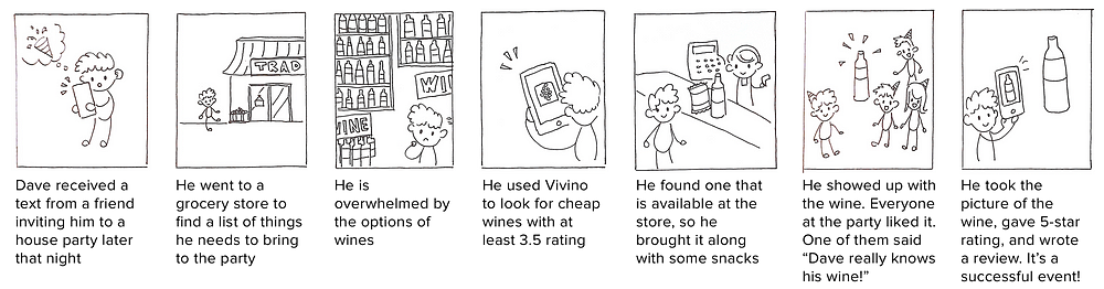
It all began one night at the Press Club in San Francisco, where I was attending my first company event. As the youngest guy in the company, I was the least knowledgeable when it came to alcohol (debatable) and wine. When I was asked which wine I preferred, the only two things that came to my mind were red and white.
Let’s be honest, we’ve all experienced a similar situation, and it didn’t help that Press Club has a 17-page long wine list. I waited until everyone ordered, and kindly said “I will get that one too.” After that night, it’s been my goal to better understand wine. I found Vivino, an app for wine lovers and it has been my best drink companion ever since.
A few pages of endless wine list at Press Club
So What’s Vivino?
Vivino is a mobile app that allows users to photograph any wine, and instantly see ratings, price, and reviews. While my experience with the label scanning feature has been amazing, I have always struggled with the search (explorer) feature. Trying to find a bottle that suits both my taste and my wallet is difficult. Putting on my UX designer hat, I conducted usability tests to discover pain points and redesigned this feature of my beloved Vivino.
What I Accomplished from This Study
How I did it
I used guerrilla usability testing, affinity mapping, and persona creation for my initial user research. During the redesign process, I discovered two pain points that I wanted to focus on, then created task flows and wireframes for the changes I wanted to make. Through building an interactive prototype, I was able to validate my assumptions. To better emulate a real-world startup time frame, I gave myself only a week for this case study. Now let’s go deeper into each step.
User Research
Guerrilla Usability Testing
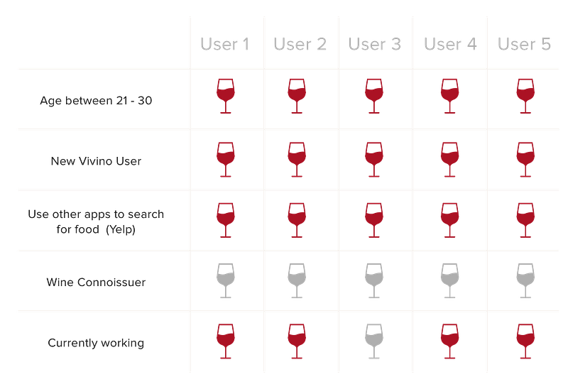
To eliminate any personal bias, I carried a bottle of wine to Yerba Buena Gardens. I then asked five people who had never used Vivino to complete the following tasks, “Imagine it’s Thursday’s evening, and you are looking for a bottle of cheap, good wine to bring to a housewarming party. How would you go about it?” I filmed their interaction with the app (with permission), so I could analyze their interactions later.
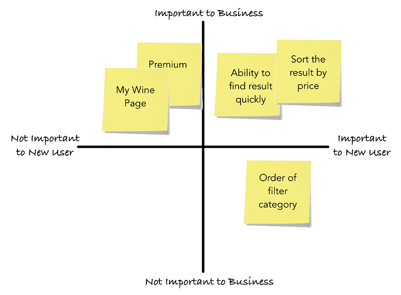
Affinity Mapping
To organize my findings from the conversations, I watched the user interactions with the app, and I jotted down insights on a pile of sticky notes. I then categorized similar insights into an affinity mapandweighedthem against the Importance to User vs. Importance to Business on a 2×2 metric.
Users need to be able to find the list of wine quickly and accurately to help them make their purchasing decision. Since I don’t have access to Vivino’s business goals, I made the assumptions that user engagement and satisfaction are the most important things to the company.
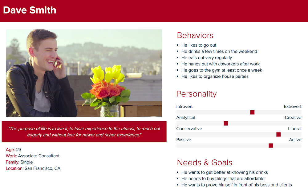
Persona Creation
From the usability tests, I learned the following:
To better understand the typical user, I collected the information above, and created a persona that reflects the characteristics of those I had interviewed.
I also created a scenario that my persona might go through.
Images by Katie Chen!
Redesign
Define & Analyze
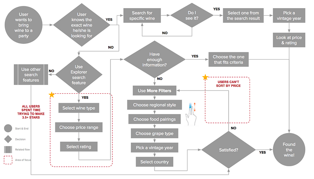
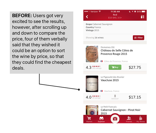
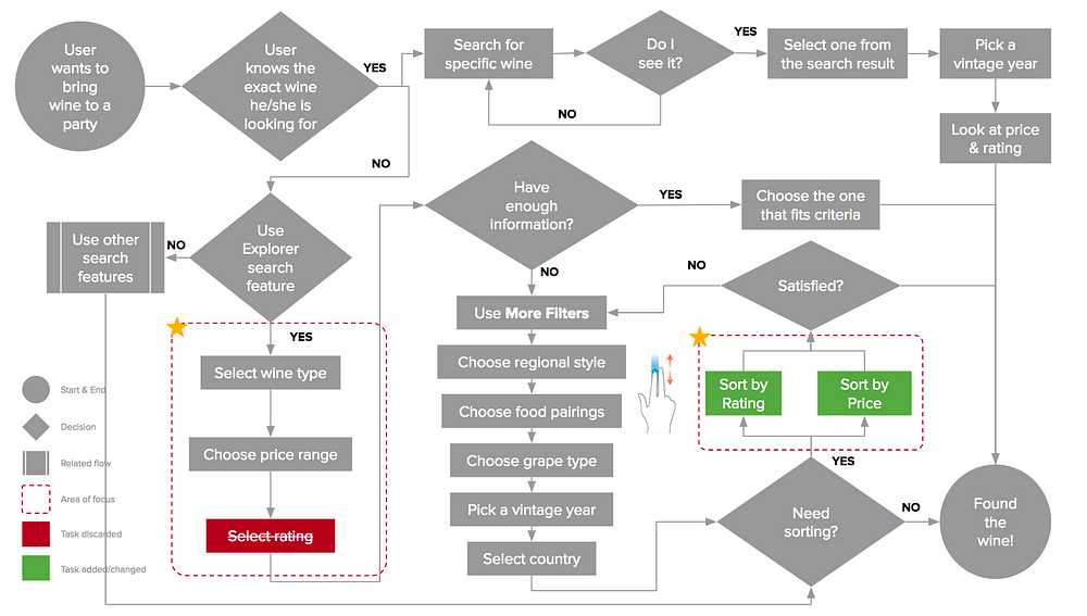
While none of users had a problem finding a wine, most of their interactions showed that they were either confused or frustrated with the inability to complete a certain action. I mapped these interactions out using the task flow below.
Original Task Flow
With this task flow, I was able to discover the two pain points that users were having. Below are my proposed solutions based on each of the pain points.
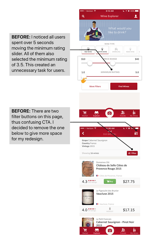
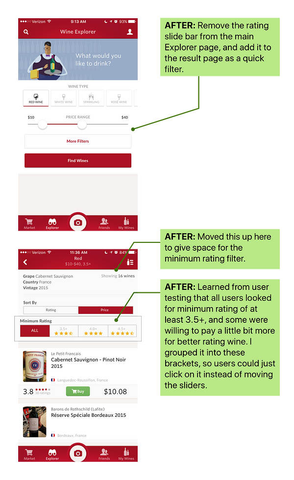
Pain Point 1
Users struggled to move the minimum rating slider
Pain Point 2
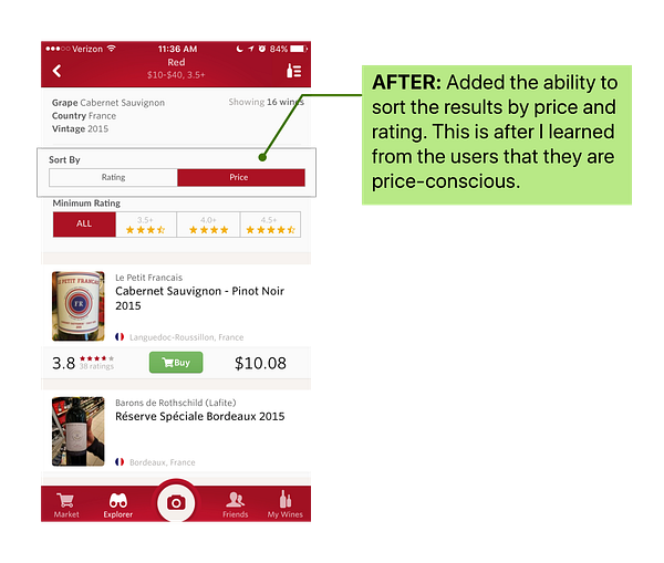
Users expressed frustration when they couldn’t sort the result and list of wine by price
Bringing It All Together
In order to make sure that my changes are reflected well in the overall user experience, I revisited the task flow created earlier, and made an update to it.
New Task Flow
Validation Testing
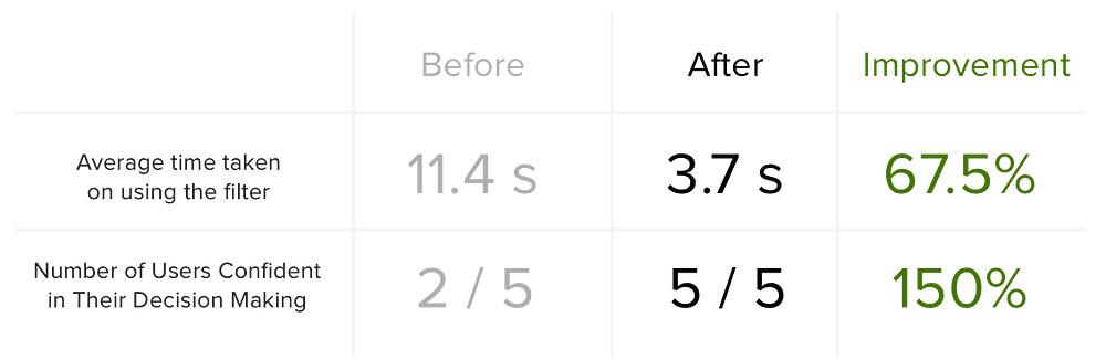
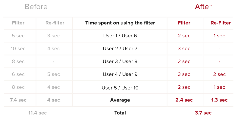
After a week of user research, analysis and redesign, I was able to validate the assumptions and changes I had made. I did this by testing my interactive prototype with five new users. The results are:
The average time taken on using and reusing the filter was reduced from 11.4 seconds to 3.7 seconds
All users were confident and happy in selecting the wines that fit their price range
Conclusion
This UX case study has been a challenging and rewarding experience for me. Not only did I get to exercise my UX skills, I was also able to make a positive impact with the proposed changes for my wine buddy, Vivino. With these changes, I hope that people will be able to search for their perfect wine with ease and become a wine connoisseur at their company events and business meetings! For now we all need…
I’m currently consulting startups on growth, product and UX strategy. If you’d like to chat about growth, product, UX or startups, please reach me at casper.sermsuksan@gmail.com, Twitter or LinkedIn =)
from Sidebar http://sidebar.io/out?url=https%3A%2F%2Fmedium.com%2F%40casper.sermsuksan%2Fux-study-the-search-for-wine-492be5bb3b77
Vivaldi Browser, the brainchild of Opera co-founder Jon von Tetzchner, is launching a new feature that’s downright historic. Today, the browser reveals its History feature, which provides users with detailed insight into their browsing behavior.
This isn’t just your average history record. Instead of users simply looking at what websites they visited—line-by-line and row-by-row, like other browsers—Vivaldi gives them visual clues instead.
According to the company’s latest press release, the new feature means users can conduct a full-fledged analysis of their browsing patterns, all supported by stats and a visually friendly interface.
As von Tetzchner puts it:
Instead of having to scroll through hundreds of lines, Vivaldi gives a comprehensive overview of history, presented in a visual way. This lets our users analyze their online activity and helps them find what they are looking for.
So say goodbye to the days of monotonously scanning your browser’s history until you finally find what you’ve been looking for. This new feature lets Vivaldi’s users efficiently locate what they’re searching for by allowing quick scans through visited sites and offering helpful hints when searching for older URLs.
The end result is a better user experience.
Users will also be pleasantly surprised by the use of a calendar view to present all this history data. Changing to a calendar view provides users with a more user-friendly interface that’s easier to look through than having to scan line-by-line, as with traditional history views.
In addition, a color-coded heat map and graphs to the right of the calendar give users a further layer of depth to their history browsing. Key browsing trends and the user’s online-activity peak round out the data that’s available for analysis.
These changes allow users to locate previously visited webpages even if they fail to remember the exact search term. That’s because this new feature puts searches in context. For instance, it will help users find an old URL if they see it show up on a specific day when they were more active on the web.
Users also have full control over their history search: They’re able to narrow down their search to a range of dates from the monthly view or just from the Day Picker Calendar. Just for good measure, users also have the power to filter their search results by title, date, views and addresses.
Perhaps the best part of this update is the emphasis on privacy rights. Vivaldi never collects the user’s history data because all of this data is local to a user’s browser.
Using the history feature is straightforward. Vivaldi has incorporated History into the browser’s Side Panel, so simply clicking on the History icon will show the user the list of previously visited URLs, right next to the open sites. This design allows users to efficiently search through their history without having to leave their current page.
Google’s new site showcases its open source projects and favorite tools
Over the years, Google has not only implemented numerous pieces open source software in its own products and services, but also contributed several tools for people to use in their own projects.
That includes things like a JPEG encoder which can reduce file sizes by 35 percent, beautiful usable fonts including Roboto and Noto, and Bazel for testing software builds.
“We’re hunting for awesome startups”
Run an early-stage company? We’re inviting 250 to exhibit at TNW Conference and pitch on stage!
It’s now launched a new site that showcases all these efforts. Google Open Source includes a directory of projects that the company has made available to the community, a list of initiatives it runs to engage with programmers, as well as documentation explaining how Google uses, contributes to and releases open source code, so other organizations can follow suit.
Word leaked Monday via The Wall Street Journal that Tesla / SpaceX industrialist Elon Musk has been funding a company called Neuralink— allegedly with some of his own money — attempting to connect computers directly into human brains. This is the same Musk profiled in this month’s Vanity Fair, where he tells journalist Maureen Dowd in all seriousness that humanity needs a Mars colony to which we can escape ‘if AI goes rogue and turns on humanity.”
Which side is he on?
In short, Musk is one of many big thinkers who believe a human-computer hybrid is essential to allowing humans to keep their own machines from marginalizing them. Neuralink’s technology is said to be a neural lace, which Musk has spoken about for over a year.
But for most people, the first question isn’t whether artificial intelligence will usurp our planet. The first question is: What exactly is AI?
Let’s skip the science fiction and get to the science: AI research and development spans a broad range of fields and myriad goals, as befits the concept of mimicking the vast breadth and depth of a human mind as compared to a calculator. Even people who work in AI, and reporters who’ve covered it for years, can’t agree on what doesn’t and doesn’t count as “intelligence,” or how to group all AI projects into a few understandable categories. We tried asking.
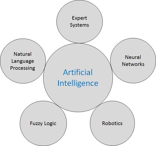
Five Types of AI
The explanation-friendly people at Tutorials Point have done a tidy job of breaking AI research into an understandable graphic with five major categories. (Their tutorial is a good next step to learn more details about AI research areas.)
These are computer systems which are programmed with vast histories of human expertise on a topic, so that they can quickly examine far more options, scenarios and solutions than a team of experts could ever come up with. Google Maps, which solves the apocryphal traveling salesman’s dilemma before you’ve realized you have one, is a familiar example. Air traffic control systems juggle even bigger arrays of data points, options and restrictions.
Clinical systems, which dispense medical advice, are one of the promising areas for AI — what doctor can keep on top of all medical knowledge today, even in one field? But doctors point out that these systems are a long way from replacing a human clinician — they’re helpful advisers, not successors.
Neural Networks
Artificial neural network systems somewhat mimic the neurons in the human brain. They are already far superior to humans at tasks that involve pattern-matching. They can spot a face in a crowd from old photos, or tell you not only what someone said or wrote, but who like said it or wrote it (or didn’t!) based on language patterns too subtle and complex for mere mortals to spot.
Fuzzy Logic
Traditional computer programs work with hard logic — true or false, 1 or 0, yes or no. Fuzzy logic allows an array of possible values, a sliding scale of trueness, a “truthiness” rather than the inflexible numbers of a spreadsheet. It’s much more like how humans think.
Your washing machine may already use fuzzy logic — that’s how it can do one-touch cleaning. But more advanced fuzzy logic is what will enable a self-driving car. If it’s going to run over one baby or five old people, which will it choose? Silly human, you’re looking for there to be one right answer.
Robotics
Most babies learn to walk in less than a year. Many animals can scamper up, over, and around terrain where humans wouldn’t dare. Researchers are learning a simple truth: Walking is hard. Getting a robot to take a single step under its own balance took years. That second step is a doozy.
But robotic systems are already much better than people at many precision tasks, such as assembling products or shipping boxes from an Amazon warehouse. Not only are they precise, they’re smart — they scan spot production glitches or incorrect parts, and can compensate for variances from one product to the next.
Even products that require craftsmanship, like building guitars, can often be done better, faster and more reliably by CNC manufacturing now. It’s getting harder for experienced players to tell a $400 robot-made G&L guitar from Indonesia — or is it China now? — from a $1,500 one built by hand in California.
“Great, he’s finally getting to the chatbots.”
AI for Chatbots: Natural Language Processing
NLP, as everyone calls it, is the corner of AI most applicable to chatbots. The goal of natural language processing is to hold everyday conversations with humans, without them needing to speak in restricted syntaxes and vocabularies, or speak (or type) special commands. Researcher Alan Turing proposed a simple test for a successful program: “A computer would deserve to be called intelligent if it could deceive a human into believing that it was human.” By that standard, the Twitterbots have already won.
But as Pandorabots founder Lauren Kunze, who built her first chatbot at age fifteen, told us recently, “Walking is complex, language is far beyond that.” Human languages are far more complex than computer programming languages in complexity, flexibility, malleability and nuance. As a human, you can read a 500-year-old play by Shakespeare and sort of tell what’s going on. Try typing some Shakespeare at an Internet chatbot.
Musk told Vanity Fair that he believes a human-brain interface is four to five years away. But IBM researchers once claimed they would have software that could not only understand any human language, but translate it into any other language, in three years. That was in 1954.
A Never-Ending Quest
Artificial intelligence — hardware and software that performs functions once believed possible only by a living brain — has been a concrete goal of technologists for more than 150 years, since Charles Babbage drafted the design for his Difference Engine (never built until the 1990’s, as a museum piece) and Ada Lovelace realized it could manipulate not just numbers, but musical notes or anything else with a formulaic system.
But the path from vision to reality is one that continues to get longer and longer the further we travel down it. Dead ends, imminent breakthroughs that never happen, and algorithms that almost work have become pretty much expected of any direction AI research takes.
The people who pay for that research frequently become disillusioned. Scientists talk about the AI Winters of the 1970’s and 1980’s, when one institution after another refused to pour more money into projects that were neither sticking to schedule nor delivering the hoped-for results.
AI took a mini-hit this past year in the world of chatbots. Facebook’s announcement of an AI-enabling platform for its Messenger communication channel spurred a slew of investments in automated friends, assistants and services (including Octane AI, which publishes Chatbots Magazine.) A year later, reports claimed that Facebook’s M project, advanced AI designed to understand Messenger users, could comprehend and complete fewer than one in three requests.
Moreover, AI research today is unlike the Internet R&D that pawns thousands of products from a never-ending stream of small startup companies. Modern AI research uses an almost unimaginable amount of computing power and time — beyond the financial reach of many startups. And engineers who understand sub-disciplines like machine learning — whereby one doesn’t program software directly, but instead gives it an ocean of example data from which to learn on its own — are rare and therefore expensive, even for computer programmers.
That’s why startup investment firm Y Combinator recently announced a special funding track for AI startups. Y Combinator plans to provide entrepreneurs whose ideas seem financially promising with extra computational credits for cloud computing, and with experts in machine learning consultants who will make office hours to help young founders. Those are what Google, Facebook, IBM and other big-budget firms can afford that two Stanford dropouts in a loft can’t.
So What Are Musk and Others Afraid Of?
Many discussions of artificial intelligence skip past what it is or isn’t to an apocalyptic worry: That a sufficiently complex computer system will develop self-awareness, literally thinking for itself. And that one or more such artificial superminds will then decide the pesky humans who built them are in the way. The Vanity Fair article is a well-written primer on who worries about what among leading tech thinkers.
But one reason world-conquering AI seems to always be just a few more years out is that to us humans, advanced software only earns the title of “artificial intelligence” until it becomes part of everyday life. What we once imagined only a human mind could deduce, like finding the fastest driving route through five spots across Los Angeles, loses its mystique once Lyft does it. Dude, it’s just an app.
It’s been deemed the AI effect, tidily summarized as Tesler’s Law: “AI is whatever hasn’t been done yet.”
This series continues Wednesday with “What is NLP?” and Thursday with “What is Machine Learning?
Click the ❤ below to recommend this story to other Medium readers looking to learn more about the world of AI and chatbots.
from Chatbots Magazine – Medium https://chatbotsmagazine.com/what-is-ai-even-elon-musk-cant-explain-1070b492d3d5?source=rss—-d6dc2c824f17—4
What do the countries and continents of the world really look like? If we look at a map on a piece of paper or a computer screen, we are viewing a flat, two-dimensional representation of the world. It’s inevitably wrong – to get from three dimensions to two, some accuracy of the real dimensions of the world’s land and seas is lost.
There are different ways to compromise between the actual shape and size of land masses in the world in order to get them down in two dimensions. The most common way that the round world is shown on a flat map is the Mercator projection, first devised to aid sea navigation in 1569.
This projection tries to maintain the right overall shape of land masses, at the expense of accurately representing their actual size. This means that the further you get to the equator, the more land masses are stretched. So a square mile close to the North Pole appears far larger on this map than a square mile at the equator.
It’s such a familiar map that it’s easy to forget that countries don’t in fact look like this at all. Our ideas of how big a country or continent is are often very far from reality.
There are other ways to compromise: the Gall-Peters projection preserves size at the expense of shape. This makes land at the equator appear elongated and land toward the poles appear squished.
To an untrained eye, the Galls-Peters projection looks very peculiar, but that’s just because it never really caught on in and is seen so rarely compared with the famous Mercator projection.
Here are 10 ways that show just how wrong the much-loved Mercator projection is.
Using Data As Part Of A User Centred Design Process
The Definition. User-centered design (UCD) is a framework of processes (not restricted to interfaces or technologies) in which the needs, wants, and limitations of end users of a product, service or process are given extensive attention at each stage of the design process.
When I started out as a web designer, I had no real understanding of what user experience design (UXD) meant, or even that it existed as a term. I was led into the industry through my passion for both e-commerce and graphic design.
As an entry level designer I realised I spent all my time diving into analytics to discover what I could about users of the site. I was really trying my hardest to undertake UX design without even realising I was doing so.
As my career has progressed I managed to move a lot closer to UX design and begun to undertake user testing as part of my design process. This is where my fascination with UXD & UCD really began and where I started to understand that analytics data can only be fully understood when the user provides context and true qualitative insight.
In this article I want to share a few things I’ve learnt along the way into how to use both the web analytics and user testing data throughout the design process and as part of continuous learning and improvement cycle to create the best possible products for your customers.
The Quantitative Insight
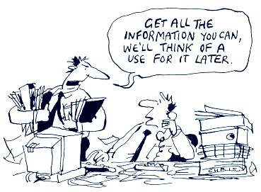
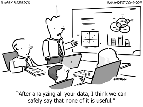
Quantitative insight can be gained by using analytics in the form of statistics, figures and reports to collate trends and patterns on user behaviour. Data leaves assumptions behind and provides us with facts.
In God We Trust, all Others Must Bring Data. W. Edwards Deming
Data is insightful. All data however, needs context and needs to be validated with qualitative insight, from your users. You can collect all the data in the world, but in the wrong hands, assumptions will be made and you won’t know what to do with it.
Data is like garbage. You’d better know what you are going to do with it before you collect it. Mark Twain
Diving into the analytics and quantitative research can often be a can of worms and will more than likely throw up more questions than you get answers. It’s important to try to stick to the specifics and try to focus on certain areas that are of the most significance.
The data you hold will then be more actionable and you will be able to use your findings to make decisions and to influence design.
Facts Do Not Cease To Exist Because They Are Ignored. Aldous Huxley
You cannot ignore data. Data rings true, it can help you get your point across. It can prove right or wrong and can enable you to be able to act upon your findings.
With the above said, it’s important to communicate data in a simple and understandable way to effectively to help get your point across to different areas of the business and senior stakeholders. When doing so however, the importance of backing up this qualitative insight with input from users must be stressed, the what must be framed with the why.
It’s important to balance between the quantitative data you have collected and use qualitative data through user centric research to not only validate your findings but to also either reinforce them or prove them wrong.
The Qualitative Insight
Qualitative insight is the best way to creating user centric designs and can be gained through many varying methods of data capture. There really is no substitute for one on one time with your users, however user testing doesn’t need to be so costly of time, money or resource. Insight can be gained through remote, online user testing, gaining voice of customer insight through surveys and questionnaires and so on.
You Are Not Your User And You Cannot Think Like A User Unless You’re Meeting Users Regularly. Leisa Reichelt
Having been involved in many user testing sessions both in-person and remote I have never once failed to be completely surprised by something that is said or done. Users will always be completely irrational and highlight problems, it’s all part of the test and learn cycle.
No matter how much user testing you do, you will never fail to be surprised, however you will also never be able to answer every single question or cater for all users. It’s important to stick to what’s most important for you, whether that be designing for personas or answering specific questions.
Not Everything That Can Be Counted Counts, And Not Everything That Counts Can Be Counted. Albert Einstein
Qualitative user research techniques provide invaluable insight that go far beyond the analytics. It’s important to test and validate at every stage of the design process. Then to continue to iterate and re-evaluate once a product has been shipped. Your first solution will almost certainly not be your final solution.
When People Talk, Listen Completely. Ernest Hemingway
One of the best pieces of advice I’ve ever heard used in the context of conducting user research is the above quote. No matter how proud or attached you are to a design, forget it, it’s useless unless you listen to the voice of the customer. Listen to their feedback and understand it to be able to shape your design progressively.
In Conclusion…
I’ve only scratched the surface here, although hopefully that has shared some insight. Using data can highlight the importance of key issues and can provide key insights. You can use it to influence and shape your designs. Though you must always ensure you are testing and validating with your users. Although you will never be able to design to suit the needs of every user, you should use personas and key demographics to help you target your designs. Once your product is live you must implement data and user research as part of a continuous test and learn cycle to keep improving and learning about your product.
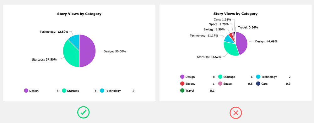
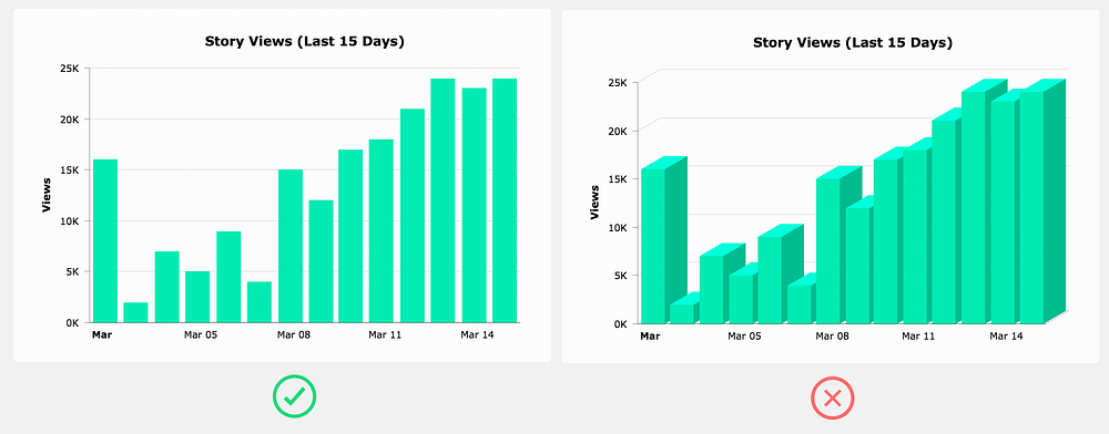
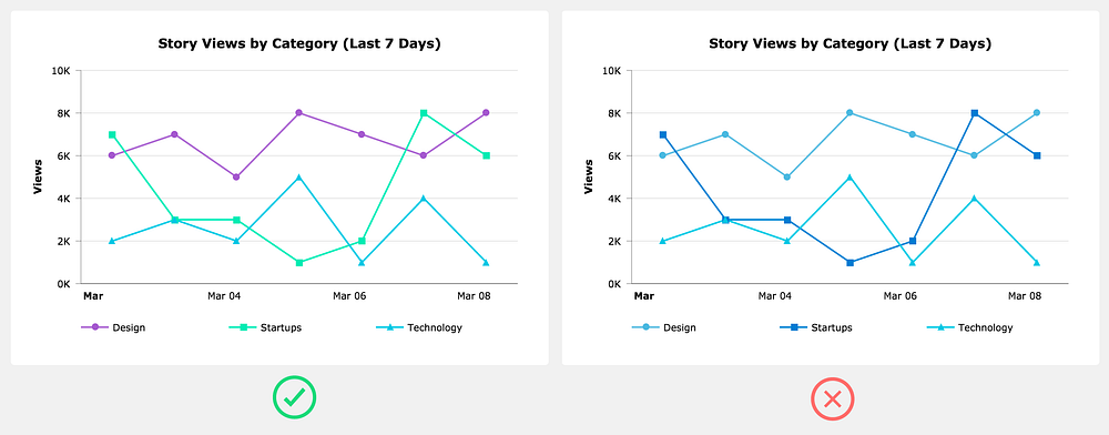
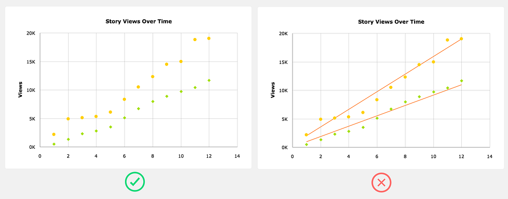
Designing Charts — Principles Every Designer Should Know
Let’s talk about charts. Any designer who has worked on a project that requires some kind of data visualization knows that it can be an extremely difficult (and rewarding) design challenge.
I’ve been designing complex, data-heavy web and mobile apps for the past 15 years so I work with charts on a daily basis (see what I mean on Dribbble). Therefore, I want to share some of the design principles I use to build aesthetically pleasing and functional charts that users love.
Use a familiar chart type
As a designer it can be a fun exercise to experiment with unique and strange chart types, such as a Streamgraph, but users shouldn’t have to learn how to read the chart you just invented. In most cases you should use one of the more common charts: area, bar/column, line, or pie/donut.
Add no more than 5 slices to a pie chart
As a general rule of thumb, if you really need to use a pie chart, try to keep the slices at five or less. The more slices in the pie chart, the more difficult it’s going to be to show the user a meaningful story. You’ll end up having to come up with goofy solutions to show the labels and make hover interactions work. Honestly, it’s usually easier just to avoid it altogether by using a different chart type.
Order the data series
Unless you’re working with dates, you can greatly improve the readability of the chart by sorting the series either ascending or descending. This applies mainly to bar/column charts.
Avoid 3D charts
3D charts serve absolutely no practical purpose (unless you’re in VR maybe) — they don’t even look good.
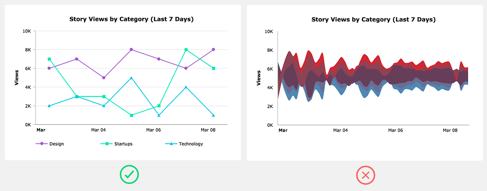
Don’t use randomly generated colors
Some charting frameworks will randomly generate data series colors. These algorithms rarely assign colors that both fit with the overall color scheme and provide enough visual distinction between data series. It’s best to come up with your own color scheme. Make sure you have enough colors for all the data series that could potentially be on the chart.
Trend lines are usually a distraction
Trend lines always seem like a great addition to a chart, but the truth is that they rarely provide anything the user can’t already see with the existing plotted data. If you decide to add a trend line, at the very least allow the user to toggle it off.
Don’t depend on tooltips
Think of tooltips as providing supplemental or expanded information. In other words, a tooltip shouldn’t be the only way a user can see the plotted value.
Don’t include a legend when it’s not needed
When you only have one data series, rather than adding a legend that takes up space, simply use the chart title to indicate the data that’s plotted.
Only use grid lines when it’s helpful
Grid lines can be helpful in guiding the user’s eyes from an axis label to the data point. However, grid lines usually aren’t necessary on simpler charts. When you do use grid lines, it’s important to decide if you need them on both the x-axis and the y-axis. Many times you only need it on one or the other.
Use real data in your chart mock ups
Designers have a tendency to create the most beautiful version of a chart possible without any regard to the real data that it needs to handle when it’s actually implemented.
This can cause endless headaches for the developers trying to build this thing you designed, and even more importantly, you haven’t even verified that the chart design will be practical in a real life situation.
The best solution is to create two versions of the design. The first version shows the chart in a state where the data is perfect, (i.e., optimized for purely aesthetic purposes). This design can be used for your portfolio and to present to potential clients. In the second version, use data that the chart is likely to display when it’s actually implemented. This is the design you can hand off to developers.
As a designer it’s your responsibility to use your best judgement and creativity when designing around data. However, data can be complex and creating a meaningful story around that data isn’t always cookie cutter.
You might find that the data you’re working with doesn’t play well with some of the principles outlined above — no problem, it’s ok to break the rules sometimes. The important thing is that you test your designs against real world situations.
And don’t forget the heart if you found the article helpful :)
Ryan Bales is the Founder & Creative Director at Bync.com. He has over 15 years of design experience with an emphasis on data visualization and designing for data heavy SaaS apps.
from uxdesign.cc – User Experience Design – Medium https://uxdesign.cc/designing-charts-principles-every-designer-should-know-5bd3969a0150?source=rss—-138adf9c44c—4
How I got a second degree and earned 5 developer certifications in just one year, while working and raising two kids
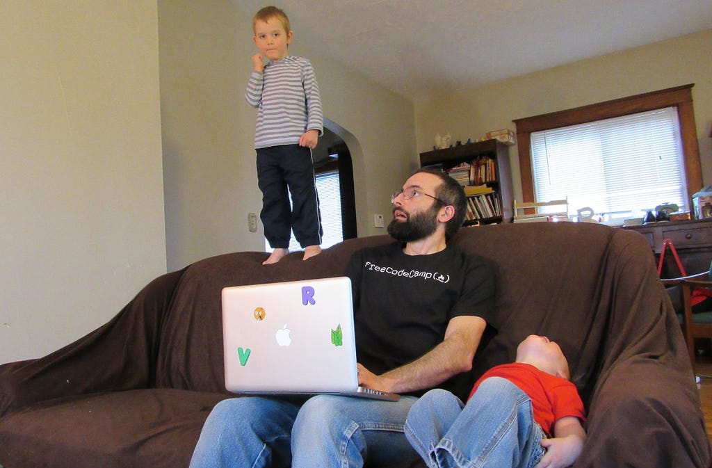
Me getting some work done while watching my kids.
“The standard pace is for chumps. The system is designed so anyone can keep up. If you’re more driven than ‘just anyone’ — you can do so much more than anyone expects. And this applies to ALL of life — not just school.” — Derek Sivers, founder of CD Baby
Learning to code can be challenging — especially when you also have a job and a family with small kids. Despite those things, I decided that the standard pace was not for me.
My goal in writing all this is not to brag — though I am extremely proud of these accomplishments. My goal is to convince you that the standard pace isn’t for you, either.
I’ve done a lot in the past year. I earned two Oracle Java Certifications, two CompTia Certifications, and freeCodeCamp’s Front End Certification. Each of these take most people many months of preparation, but I did them all in three weeks each.
And last but not least, I completed all the coursework necessary to earn a second Bachelor’s degree in software development from an accredited university, in less than six months.
I did this all while working full-time, spending time regularly with my wife and two young kids, and volunteering in my community.
One of the keys to accomplishing all of this was an amazing and supportive spouse. 😍
But there were also some other things that helped.
What’s Your Motivation?
After being a K-12 teacher for five years (with a teaching degree I was able to earn in two years), I realized I did not want to teach in a school the rest of my life.
I loved the teaching part of teaching, but I hated the forcing-kids-to-do-things-they-don’t-want-to-do part of teaching. Classroom management in my urban school district was very stressful for me. I was also becoming disenchanted with the whole educational system. We seem to be preparing students for jobs that will no longer exist.
I had always been interested in coding and even sometimes taught my students basic coding using Scratch and Code.org. I decided it was time to learn enough to do it full-time.
Wanting a new job was great motivation. Everyday I spent at my teaching job was an incentive to keep pushing myself towards my goal.
Research, research, research
It’s important not to rush into learning. Not all schools or learning resources are equal, and the wrong choice can make a big difference in your ability to meet your goals.
I tried to determine what learning method would work best for me and my family. While I know there are many ways to break into the tech industry, I decided on a somewhat traditional route: a Bachelor’s degree. I knew I had some classes already that would transfer into a new program. I looked into many school options but I decided on Western Governors University for the following reasons:
It is all online so I would not have to take time from my family for transportation.
You can work at your own pace, so I knew I could finish very quickly. As soon as you finish all the assignments and exams for one class, you can go immediately to the next class.
The degree included industry recognized certifications. I knew those would add to the credibility of my education.
Beating ambitions goals
At first, my goal was to finish my entire Bachelor’s degree in one year. One month into the program, I decided to revise my goal and finish in six months.
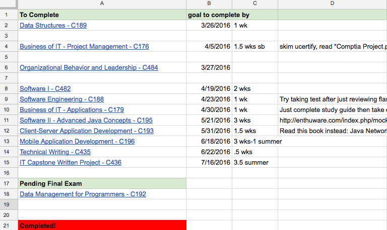
It was at this point that I did what helped me most in my goal to finish quickly: I made a schedule of the exact day I would finish each class so I could finish within 6 months.
I scheduled between 1 and 3 weeks for each class, depending on class requirements. I also made plans at that time about how I would finish each class very quickly. It was very helpful to have many subgoals throughout the learning process to make sure I stayed on track.
Section of actual spreadsheet I used to plan for classes.
Ambitious goals are important. These provided me additional motivation to push myself. A study by the Journal of Consumer Research showed that ambitious goals make people happier. I ended up meeting or surpassing all my self-imposed deadlines and that definitely made me happy!
Detailed schedule
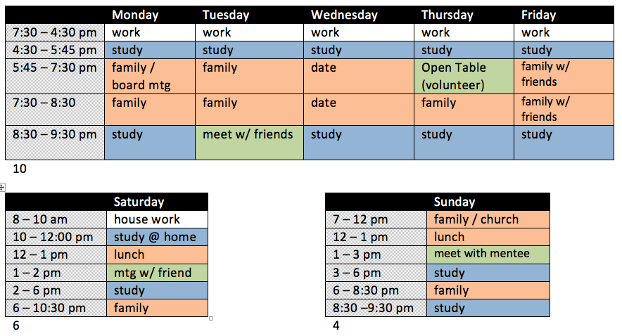
I created a detailed weekly schedule to help me spend a lot of time learning without neglecting my family and other responsibilities. I scheduled in family time, volunteering time, time with friends, and even a weekly date night!
The schedule I created at the beginning of my degree. I have an even more detailed schedule now.
A detailed schedule helped me make sure that my life stayed balanced. However, there is one thing I did not put on my schedule: television.
I watched only 3 episodes of television the entire time I worked on my degree. I had such a tight schedule to keep so I could meet my goals so I did not have time for TV. Also, any time spent watching television meant less time with my family. Since graduating, I have continued to limit television so I can focus on coding.
It was important for me to give things up in order to accomplish my goals.
Ignore the haters!
Every student at Western Governors University is assigned a mentor. Students have weekly calls with their mentors to help keep them on track. Whenever I shared my goals with my mentor she tried to encourage me to be a little more reasonable.
Well, instead of being more reasonable I decided to set more ridiculous goals. I know she had good intentions but I decided to ignore her warnings and stopped sharing my goals with her.
I have found that it is sometimes helpful to not share goals with certain people if they are not going to be encouraging.
Maximizing time
Besides my scheduled time to learn software development, I also found ways to fit in even more studying. For instance, I used most of my lunch breaks to study. Also, I often carried notes in my pocket that I could review whenever I had a free moment.
Another thing I did (and still do) was to take days off my teaching job to work on my classes or programming projects. While completing my degree, I planned my days off to line up in my schedule when I knew I had harder classes to pass.
I try to be constantly reevaluating my schedule and how I spend my time so I can have greater effectiveness.
I used to code a lot after my kids went to bed. However, I noticed that by the end of the day, my brain just did not work as well. I switched up my sleep schedule so I now go to bed around 9pm and wake up at 4am to code (and create training videos). This may sound a little crazy but it has greatly increased my productivity.
Learn what others do
I spent a lot of time on the Reddit page for my college and various forums reading about what others did that helped them with their classes. For the industry certifications, there were even more resources available to help. This allowed me to better plan the quickest way to finish.
There is almost always someone out there who has gone before you, and it’s important to identify them and learn from them.
Learning from others was also very helpful while going through the freeCodeCamp curriculum. Experienced people in the community are always willing to help or offer suggestions in their forums and community chat rooms.
Just ship it!
Shipping means to send out a completed product.
There were many times when I wondered if I needed to put in more time working on projects or studying. Then I would realize that I didn’t have time if I wanted to meet my self-imposed deadlines.
My deadlines forced me to act before I felt completely ready, and this definitely paid off.
I’ve found that it’s more important to get projects out there than to make them perfect. If you try to make sure everything is just right, you may never finish. When in doubt, just ship it!
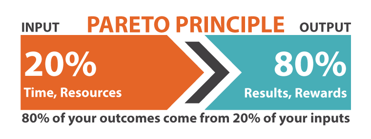
The 80/20 Rule
The 80/20 rule states that for many events, roughly 80% of the effects come from 20% of the causes. When learning software development, this means that about 20% of the learning content will contain about 80% of what you will actually use. You can save a lot of time if you just focus on the top 20%.
For my degree, I only read between 20–30% of the required content. According to the 80/20 rule, this was enough to understand over 80% of the subject matter.
The trick is determining which 20% to focus on. I would often ask myself, “If I were designing the exam, would I include this material?”
Really, when learning anything, you should ask yourself if it is part of the 20% of learning content that will give you 80% of value.
This relates to the idea of just-in-time information. It’s usually not beneficial to learn something that you don’t plan to use in the near future, especially when your memory is as bad as mine. 😊 When working on projects I try to learn what I will need just for that project.
Employers often care more about projects you’ve created than how you learned to code. Keeping this fact in mind will help you decide how to best use your time.
Keeping things moving forward
I didn’t take any time off from learning once my degree was finished. I realized the importance of projects, so I went straight into freeCodeCamp and started creating personal projects to build up my portfolio. I was able to continue to apply all of the strategies that I used while completing my Bachelor’s degree.
I also continued to use these strategies when I decided to start creating JavaScript training videos. Now I’m posting JavaScript training videos almost every day on the freeCodeCamp YouTube channel.
If you’re interested in the specific things I did for each class to finish my WGU degree quickly, you can check out this blog post.
I hope some of the strategies I used can also be helpful to you, even if your life is as busy as mine.
Remember: the standard pace is for chumps. You can do better!
from freeCodeCamp https://medium.freecodecamp.com/how-i-got-a-second-degree-and-earned-5-developer-certifications-in-just-one-year-while-working-and-2b902ee291ab?source=rss—-336d898217ee—4
from freeCodeCamp https://medium.freecodecamp.com/why-american-farmers-are-hacking-their-tractors-with-ukrainian-firmware-488029e07cac?source=rss—-336d898217ee—4


 Vivaldi Browser, the brainchild of Opera co-founder Jon von Tetzchner, is launching a new feature that’s downright historic. Today, the browser reveals its History feature, which provides users with detailed insight into their browsing behavior.


 https://techcrunch.com/2017/03/22/apple-has-acquired-workflow-a-powerful-automation-tool-for-ipad-and-iphone/