
UX Study: The Search for Wine
It all began one night at the Press Club in San Francisco, where I was attending my first company event. As the youngest guy in the company, I was the least knowledgeable when it came to alcohol (debatable) and wine. When I was asked which wine I preferred, the only two things that came to my mind were red and white.
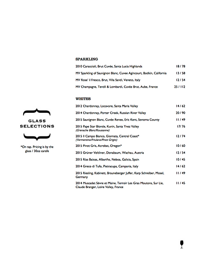
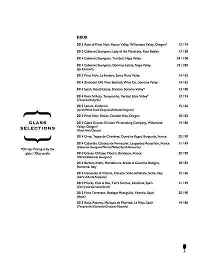
Let’s be honest, we’ve all experienced a similar situation, and it didn’t help that Press Club has a 17-page long wine list. I waited until everyone ordered, and kindly said “I will get that one too.” After that night, it’s been my goal to better understand wine. I found Vivino, an app for wine lovers and it has been my best drink companion ever since.

So What’s Vivino?
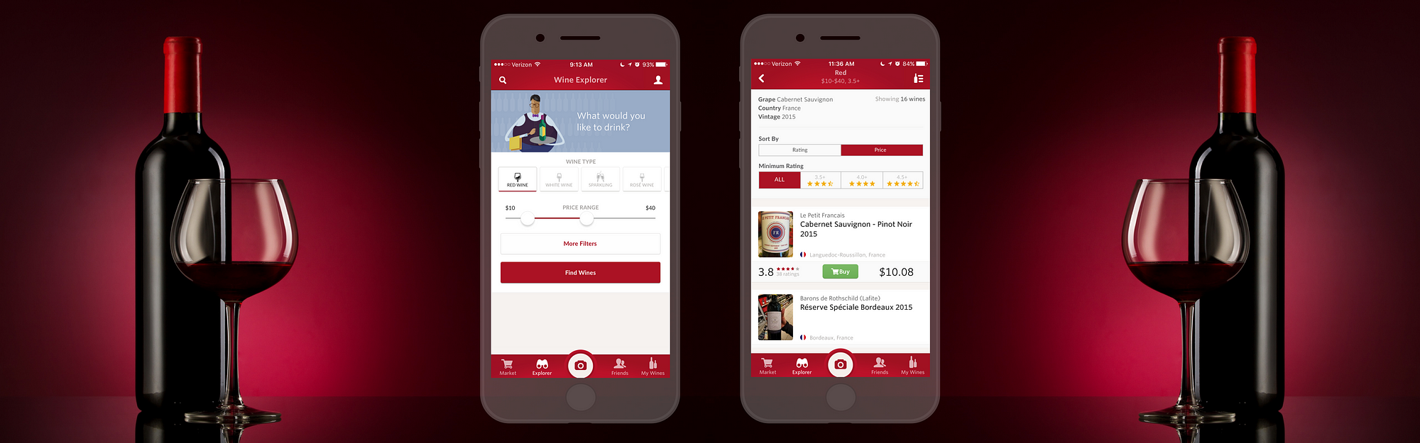
Vivino is a mobile app that allows users to photograph any wine, and instantly see ratings, price, and reviews. While my experience with the label scanning feature has been amazing, I have always struggled with the search (explorer) feature. Trying to find a bottle that suits both my taste and my wallet is difficult. Putting on my UX designer hat, I conducted usability tests to discover pain points and redesigned this feature of my beloved Vivino.
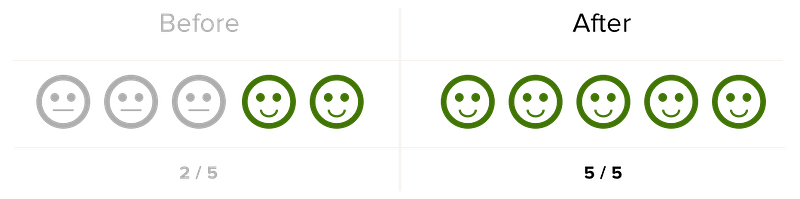
What I Accomplished from This Study
How I did it
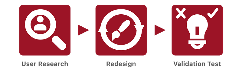
I used guerrilla usability testing, affinity mapping, and persona creation for my initial user research. During the redesign process, I discovered two pain points that I wanted to focus on, then created task flows and wireframes for the changes I wanted to make. Through building an interactive prototype, I was able to validate my assumptions. To better emulate a real-world startup time frame, I gave myself only a week for this case study. Now let’s go deeper into each step.
User Research
Guerrilla Usability Testing
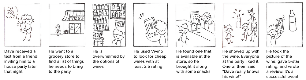
To eliminate any personal bias, I carried a bottle of wine to Yerba Buena Gardens. I then asked five people who had never used Vivino to complete the following tasks, “Imagine it’s Thursday’s evening, and you are looking for a bottle of cheap, good wine to bring to a housewarming party. How would you go about it?” I filmed their interaction with the app (with permission), so I could analyze their interactions later.
Affinity Mapping
To organize my findings from the conversations, I watched the user interactions with the app, and I jotted down insights on a pile of sticky notes. I then categorized similar insights into an affinity map and weighed them against the Importance to User vs. Importance to Business on a 2×2 metric.
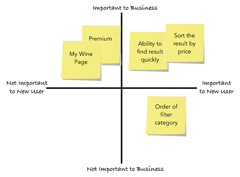
Users need to be able to find the list of wine quickly and accurately to help them make their purchasing decision. Since I don’t have access to Vivino’s business goals, I made the assumptions that user engagement and satisfaction are the most important things to the company.
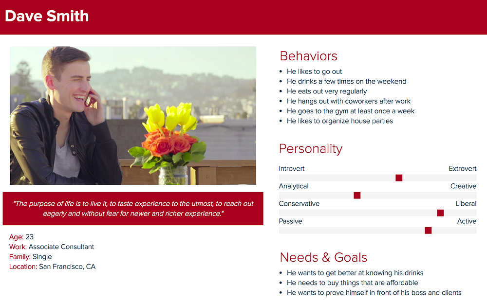
Persona Creation
From the usability tests, I learned the following:
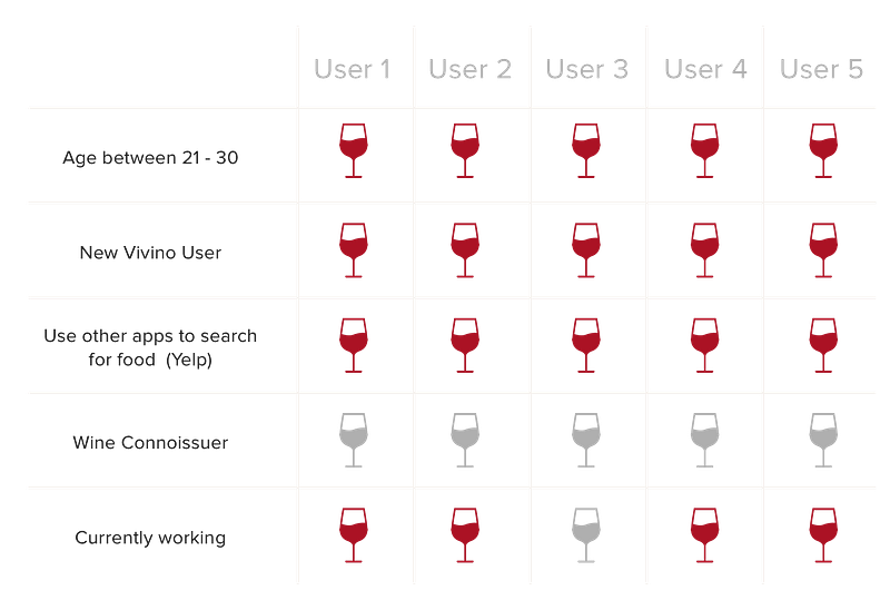
To better understand the typical user, I collected the information above, and created a persona that reflects the characteristics of those I had interviewed.
I also created a scenario that my persona might go through.
Redesign
Define & Analyze
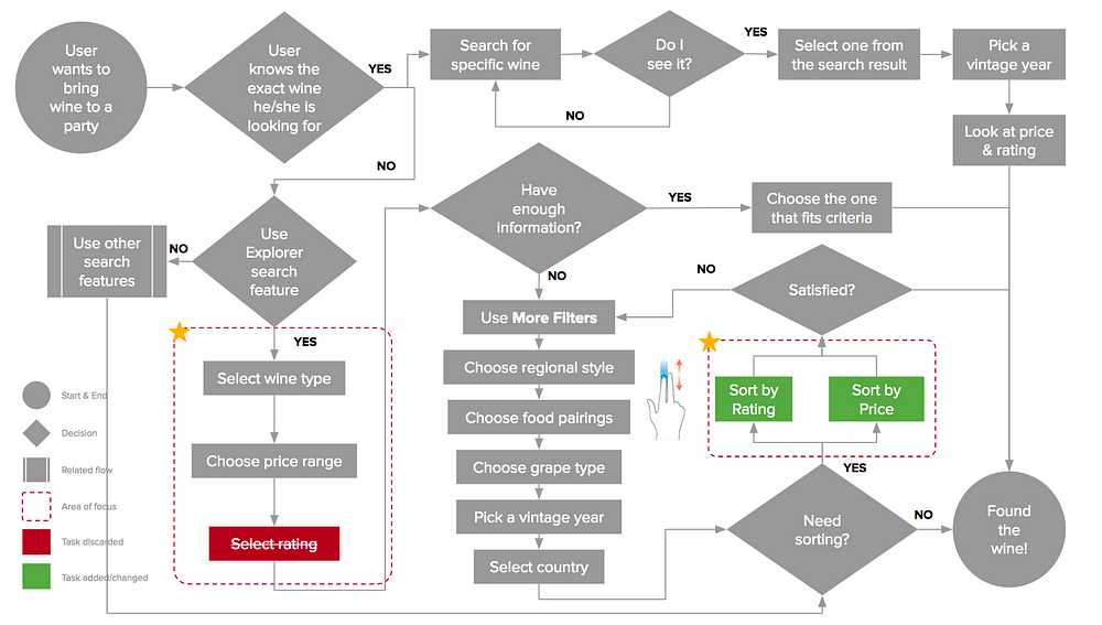
While none of users had a problem finding a wine, most of their interactions showed that they were either confused or frustrated with the inability to complete a certain action. I mapped these interactions out using the task flow below.
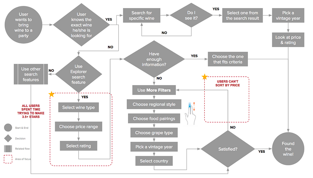
With this task flow, I was able to discover the two pain points that users were having. Below are my proposed solutions based on each of the pain points.
Pain Point 1
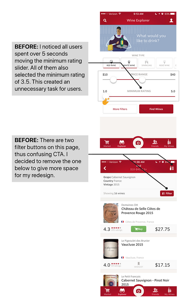
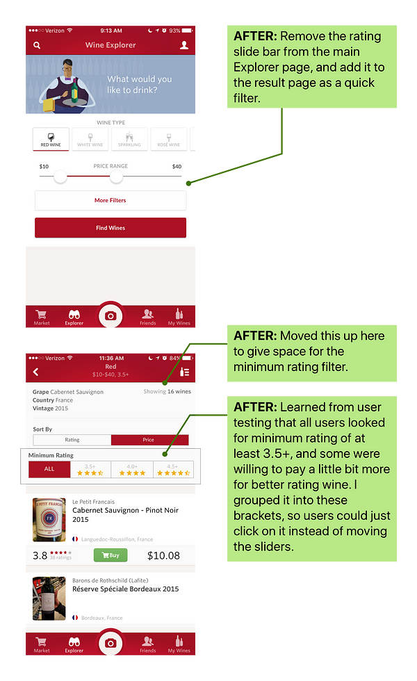
Users struggled to move the minimum rating slider
Pain Point 2
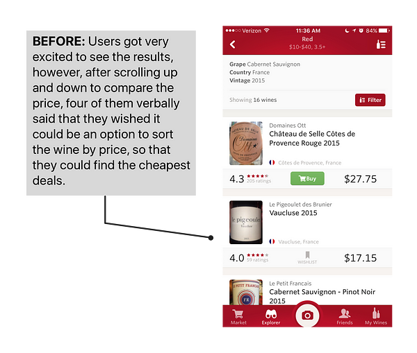
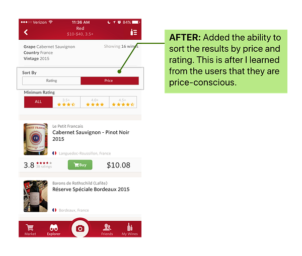
Users expressed frustration when they couldn’t sort the result and list of wine by price
Bringing It All Together
In order to make sure that my changes are reflected well in the overall user experience, I revisited the task flow created earlier, and made an update to it.
Validation Testing
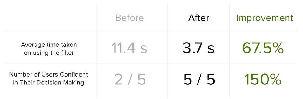
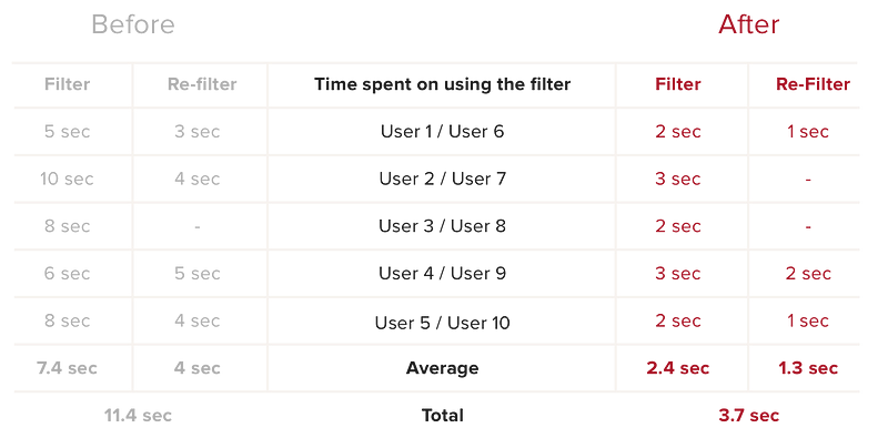
After a week of user research, analysis and redesign, I was able to validate the assumptions and changes I had made. I did this by testing my interactive prototype with five new users. The results are:
- The average time taken on using and reusing the filter was reduced from 11.4 seconds to 3.7 seconds
- All users were confident and happy in selecting the wines that fit their price range
Conclusion
This UX case study has been a challenging and rewarding experience for me. Not only did I get to exercise my UX skills, I was also able to make a positive impact with the proposed changes for my wine buddy, Vivino. With these changes, I hope that people will be able to search for their perfect wine with ease and become a wine connoisseur at their company events and business meetings! For now we all need…
I’m currently consulting startups on growth, product and UX strategy. If you’d like to chat about growth, product, UX or startups, please reach me at casper.sermsuksan@gmail.com, Twitter or LinkedIn =)
from Sidebar http://sidebar.io/out?url=https%3A%2F%2Fmedium.com%2F%40casper.sermsuksan%2Fux-study-the-search-for-wine-492be5bb3b77