Graphic Means documentary

A look back on the beginning of graphic design: Graphic Means documentary

From time to time we stop, look eerily at an actual newspaper, assess the technological advances in printing and revere at the limitless creativity in individuals. Then we casually follow our screen while it easily transposes our imagination into drawing, typography or photography. That’s a taste of graphic design, on fast forward. Just a glimpse into the short history of a business we can’t imagine living without. If this seems confusing to you, I have another thing you will really enjoy. Especially if you are fascinated by the fast-paced evolution of technology, in general.

graphic means documentary

Graphic Means is a documentary, created by Briar Levit, director and producer, but also Assistant Professor of Graphic Design at Portland State University. Her material follows the evolution of graphic design in the span of 30 years, from linecaster to PDF. It is an exploration of how design worked in the 1950s through the 1990s. She felt inspired to do this thanks to the collection of manuals she gathered from this period. When nostalgia hit hard, she decided to document the tools, processes, and people, of this brief moment in the design world.

The film premiered at the ByDesign film festival in Seattle in April and got a Kickstarter page. Now it’s already screening festivals and other events. It will also be available for streaming on iTunes and Amazon at the beginning of 2018.

Briar Levit on making Graphic Means from Briar Levit on Vimeo.

No matter for how long you’ve been in the graphic design industry, a trip down memory lane, from the beginning up to today’s technology is mind boggling. To see where it all came from, before the PDF’s, Photoshop and professional tablets in such a short time, truly puts things into perspective. The question on everyone’s lips is: what’s next, how soon can we expect the next revolutionary product in graphic design?

Watch the trailer below:

Graphic Means (Official Trailer) from Briar Levit on Vimeo.

The post Graphic Means documentary appeared first on Tshirt-Factory Blog.

from Tshirt-Factory Blog http://blog.tshirt-factory.com/graphic-means-documentary.html

Intel’s Core i9 Extreme Edition CPU is an 18-core beast

Priced at $1,999, the 7980XE is clearly not a chip you’d see in an average desktop. Instead, it’s more of a statement from Intel. It beats out AMD’s 16-core Threadripper CPU, which was slated to be that company’s most powerful consumer processor for 2017. And it gives Intel yet another way to satisfy the demands of power-hungry users who might want to do things like play games in 4K while broadcasting them in HD over Twitch. And as if its massive core count wasn’t enough, the i9-7980XE is also the first Intel consumer chip that packs in over a teraflop worth of computing power.

If 18 cores is a bit too rich for you, Intel also has other Core i9 Extreme Edition chips in 10, 12, 14 and 16-core variants. Perhaps the best news for hardware geeks: the 10 core i9-7900X will retail for $999, a significant discount from last year’s version.

All of the i9 chips feature base clock speeds of 3.3GHz, reaching up to 4.3GHz dual-core speeds with Turbo Boost 2.0 and 4.5GHz with Turbo Boost 3.0. And speaking of Turbo Boost 3.0, its performance has also been improved in the new Extreme Edition chips to increase both single and dual-core speeds. Rounding out the X-Series family are the quad-core i5-7640X and i7 models in 4, 6 and 8-core models.

While it might all seem like overkill, Intel says its Core i9 lineup was driven by the surprising demand for last year’s 10-core chip. “Broadwell-E was kind of an experiment,” an Intel rep said. “It sold… Proving that our enthusiast community will go after the best of the best… Yes we’re adding higher core count, but we’re also introducing lower core counts. Scalability on both ends are what we went after.”

As you can imagine, stuffing more cores into a processor leads to some significant heat issues. For that reason, Intel developed its own liquid cooling solution, which will work across these new chips, as well as some previous generations. All of the new Core i9 processors, along with the 6 and 8-core i7 chips, feature scorching hot 140W thermal design points (TDPs), the maximum amount of power that they’ll draw. That’s the same as last year’s 10-core CPU, but it’s still well above the 91W TDP from Intel’s more affordable i7-7700K.

Over the past few years, Intel’s laptop chips have been far more interesting than its desktop CPUs. Partially, that’s because the rise of ultraportables and convertible laptops have shifted its focus away from delivering as much computing power as possible, to offering a reasonable amount of processing power efficiently. The new Core i9 X-series processors might not be feasible for most consumers, but for the hardware geeks who treat their rigs like hot rods, they’re a dream come true.

VIDEO

from Engadget https://www.engadget.com/2017/05/30/intel-core-i9-extreme/

How Fonts Are Fueling the Culture Wars


How Fonts Are Fueling the Culture Wars

Pay attention: Typography isn’t just catchy visuals. It can also be dangerous.

(ullstein bild / Getty Images)

Typography is undergoing a public renaissance. Typography usually strives to be invisible, but recently it’s become a mark of sophistication for readers to notice it and have an opinion.

Suddenly, people outside of the design profession seem to care about its many intricacies. Usually, this awareness focuses on execution. This year’s Oscars put visual hierarchy on the map. XKCD readers will never miss an opportunity to point out bad keming. And anyone on the internet can tell you, Comic Sans has become a joke.

Follow Backchannel: FacebookTwitter

But by focusing on the smaller gaffes, we’re missing the big picture. Typography is much bigger than a “gotcha” moment for the visually challenged. Typography can silently influence: It can signify dangerous ideas, normalize dictatorships, and sever broken nations. In some cases it may be a matter of life and death. And it can do this as powerfully as the words it depicts.

Why We’re Afraid of Blackletter

You’ve seen blackletter typography before. It’s dense, old-fashioned, and elaborate. It almost always feels like an anachronism. It looks like this:

But usually when you see it in popular culture, it looks more like this:

Or like this:

A tattoo identifying a member of the MS-13 gang. (Wikimedia Commons)

You probably know blackletter as the script of choice for bad guys, prison tattoos, and black metal album art—and you wouldn’t be wrong.

Blackletter looks esoteric and illegible now, but it started off as a normal pattern that people across Europe used every day for hundreds of years. It stayed that way until pretty recently. A third of the original fonts at Monotype, the American company behind classics like Times New Roman and Gil Sans, were blackletter.

One particularly ominous use of Blackletter type in Nazi Germany

Why don’t we use blackletter anymore? The answer is literally “Hitler.” Nazi leadership used the Fraktur, an archetypal variety of blackletter, as their official typeface. They positioned it as a symbol of German national identity and denounced papers that printed with anything else.

As you might imagine, the typeface hasn’t aged well in the post-war period. In just a few years, blackletter went from ordinary to a widespread taboo—the same way the name “Adolf” and the toothbrush mustache have been all but eradicated.

The Nazis played a part in this. In 1941, the regime re-characterized Fraktur as Judenletter, “Jewish letters,” and systematically banned it from use. The long history of Jewish writers and printers had tainted the letterforms themselves, they argued, and it was time for Germany to move on. Historians speculate that the reversal had more to do with the logistics of occupying countries reliant on Latin typefaces, but the result was the same. No printed matter of any kind could use Fraktur, for German audiences or abroad. Even blackletter handwriting was banned from being taught in school.

Think about that: The government of one of the world’s great powers banned a typeface. That is the power of a symbol.

It’s Hard to Text in Arabic

We take it for granted that we can type any word with a keyboard, but really, you should check your anglophone privilege. In English, each letter stands on its own, while Arabic connects every letter in a word, allowing many letters to take on new shapes based on context. Arabic lends itself to lush and poetic calligraphy, but it doesn’t square with traditional European methods for making typefaces.

Arabic calligraphy blurs the line between writing and art. (Wikimedia Commons)

Much of the Arab world fell under Western colonial rule, and print communication remained a challenge. Rather than rethinking or expanding the conventions that had been designed around the Latin alphabet, the colonial powers changed Arabic. What we see in books and newspapers to this day is a ghost of Arabic script, reworked to use discrete letters that behave on a standard printing press.

Yakout, a popular typeface designed by the German-British company Linotype and Machinery Ltd.

It’s not surprising that colonial powers would pull their subjects closer to their center of gravity. But even today, many Arab countries struggle with that legacy. There are over 20,000 ways to format a word in English; the Arabic world only has about 100 clunky typefaces to support communication between half a billion people.

Rana Abou Rjeily, a contemporary Lebanese designer, is reclaiming Arabic typography. After studying design in the US and UK, she developed Mirsaal, an experimental typeface to bridge the gap between Arabic and Latin text.

Rana’s book is worth a read. Photo Credit: Rana Abou Rjeily

Mirsaal looks for the right balance of western conventions to make Arabic work in a modern context. It uses simplified, distinct letterforms, but with the goal of making written Arabic more expressive and authentic.

This isn’t a purely symbolic exercise. The Middle East is dealing with political instability that stems from deep cultural divisions. It is not hard to imagine how a more robust written language might play some role in making a better future.

Piecing Together the Balkans

The Balkans are synonymous with fragmentation. The region has seen generations of violence, much spurred by the ethnic tensions within. Their typography reflects these divisions. The regional languages are a hodgepodge of typographic spheres: Latin, Blackletter, Cyrillic, and Arabic. Never mind the locally designed Glagolitic scripts.

A map of the dominant scripts across Europe, 1900. (Wikimedia Commons)

Typography took on special meaning during the Cold War, as Latin and Cyrillic alphabets came to symbolize allegiance to global powers.

(SVF2 / Getty Images)

Since the fall of the Soviet Union, typography continues to communicate political leanings, be they nostalgia for the Soviet era or alignment with the globalized West. Using the wrong typeface could get you in a lot of trouble.

In 2013, Croatian designers Nikola Djurek and Marija Juza created the East-West hybrid Balkan Sans. Balkan Sans uses the same glyphs to represent the equivalent letters in Latin and Cyrillic alphabets. In the words of its makers, it “… demystifies, depoliticizes, and reconciles them for the sake of education, tolerance, and, above all, communication.”

Balkan Sans. (Wikimedia Commons)

Croatian and Serbian are similar languages that could hardly look more different in their written forms. Balkan Sans makes them mutually intelligible, so that two neighbors might be able to correspond over email without thinking twice. They transformed typography from a barrier between nations into an olive branch.

The Culture War at Home

The US is not so different from the rest of the world when it comes to tribalism and conflicted identity. This has crystalized in last few months, and we’ve seen typography play a substantial role.

Hillary Clinton’s 2016 campaign logo

Hillary Clinton ran for president with a slick logo befitting a Fortune 100 company. It had detractors, but I think we’ll remember it fondly as a symbol of what could have been — clarity, professionalism, and restraint.

Donald Trump countered with a garish baseball cap that looked like it had been designed in a Google Doc by the man himself. This proved to be an effective way of selling Trump’s unique brand.

(Bloomberg / Getty Images)

I’m not interested in whether Clinton or Trump had good logos. I’m interested in the different values they reveal. Clinton’s typography embodies the spirit of modernism and enlightenment values. It was designed to appeal to smart, progressive people who like visual puns. They appreciate the serendipity of an arrow that completes a lettermark while also symbolizing progress. In other words, coastal elites who like “design.”

Trump’s typography speaks with a more primal, and seemingly earnest voice. “Make America Great Again” symbolizes “Make America Great Again.” It tells everyone what team you’re on, and what you believe in. Period. It speaks to a distrust of “clean” corporate aesthetics and snobs who think they’re better than Times New Roman on a baseball cap. Its mere existence is a political statement.

The two typographies are mutually intelligible at first glance, but a lot gets lost in translation. We live in a divided country, split on typographic lines as cleanly as the Serbs and the Croats.

I’d Like to Leave You With a Mission:

The next time you go shopping, download an app or send an email, take a second to look at the typography in front of you. Don’t evaluate it. Don’t critique it. Just observe it. What does it say about you? What does it say about the world you live in?

The stakes are higher than you think. The next generation of fascists will not love geometric sans serifs as much as Mussolini did. They won’t be threatening journalists in blackletter.

The world is changing around us. We constantly debate and analyze the conflicts between the militaries, governments and cultures that surround us. But there’s a visual war that’s happening right in front of our eyes, undetected. Its power — to divide us or bring us together — hinges on our choice to pay attention.

Another famous physical TV identity was the BBC’s “globe and mirror” logo in use from 1981 to 1985 that was based on a physical device. After filming the rotating globe against a panoramic mirror, it appears the results were then traced by hand similar to rotoscoping. One of the more elaborate physical TV intro sequences was the 1983 HBO intro that despite giving the impression of being animated or created digitally was in fact built almost entirely with practical effects. You can watch a 10 minute video about how they did it below. (via Quipsologies, Reddit, Andrew Wiseman)

from Colossal http://www.thisiscolossal.com/2017/05/when-tv-logos-were-physical-objects/

Four Public Speaking Myths That Keep Ruining Your Presentations

Hint: Stop trying so hard to read your audience.

Many of the misconceptions you unknowingly cling to don’t do you any real harm. Your mistaken belief that the Great Wall of China is visible from space won’t jeopardize your professional success, let alone your survival.

Read Full Story

from Fast Company https://www.fastcompany.com/40421468/four-public-speaking-myths-that-keep-ruining-your-presentations?partner=feedburner&utm_source=feedburner&utm_medium=feed&utm_campaign=feedburner+fastcompany&utm_content=feedburner

The Top 9 Animation Libraries for UI Designers in 2017

Animation libraries.

Take your CSS animations to the next level with our Animating with CSS course by Donovan Hutchinson, the man behind CSS Animation Rocks.

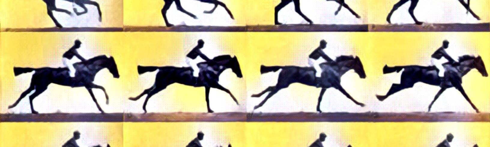
Frontend web design has been through a revolution in the last decade. In 2007, most of us were still designing static magazine layouts – in 2017 we’re building ‘digital machines’ with thousands of resizing, coordinated, moving parts.

Quite simply, great UI designers need to be great animators too – with a solid working understanding of the web animation techniques.

This is the latest update to our guide to helping you choose the right animation library for each task. We’re going to run-through 9 free, well-coded animation libraries best-suited to UI design work – their strengths and weaknesses and when to choose each one.

Keep in mind that we’re looking at each library from the perspective of a code-savvy UI designer – not as a ‘code guru’ developer. Some of these libraries are pure CSS. Others are JavaScript, but none require anything more than basic HTML/CSS understanding to be useful. Link the library – add a CSS class.

The 2017 Top 9 Animation Libraries List

  1. Animate.css
  2. Bounce.js
  3. AnimeJS
  4. Magic Animations
  5. DynCSS
  6. CSShake
  7. Hover.CSS
  8. Velocity.js
  9. AniJS

Animate.css is one of the smallest and most easy-to-use CSS animation libraries available. Applying the Animate library to your project is as simple as linking the CSS and adding the required CSS classes to your HTML elements. You can also use jQuery to trigger the animations on a particular event if you prefer.

Animate.css

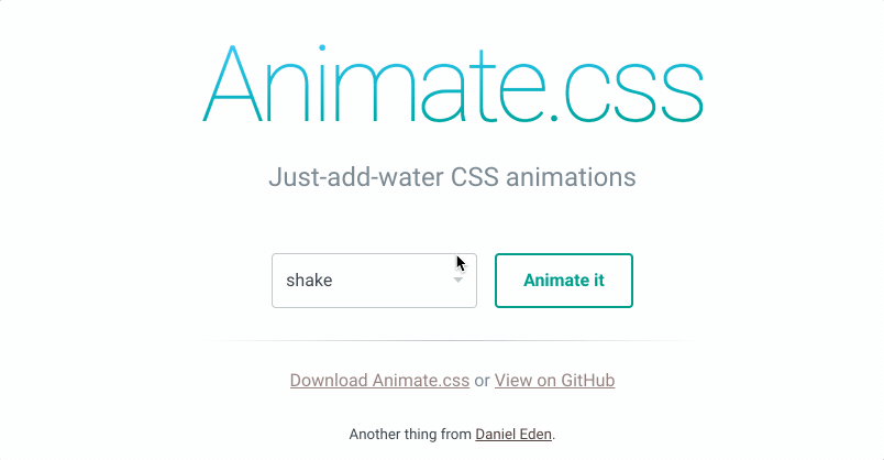
As of mid-2017, it still one of the most popular and widely-used CSS animation libraries and its minified file is small enough (16.6kb) for inclusion in mobile websites as well. It has 41,000 stars on Github and is often packaged as a component in many larger projects.

Animate.css is still under active development after 4 years. This is one of the simplest and most robust animation libraries and we wouldn’t hesitate to use this in any project.

Bounce.js is a JavaScript animation library that focusses on providing a selection of unique fun, bouncy, ‘Warner brothers-esque’ animations to your website.

Bounce.js

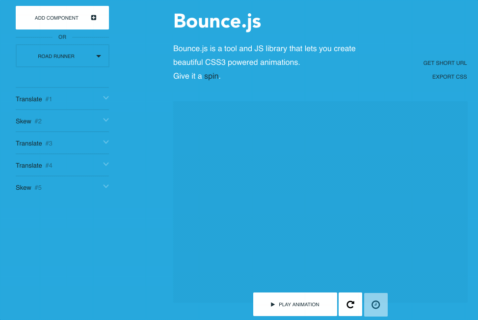
Bounce.js is a neat animation library that ships with about ten animation ‘pre-sets’ – hence the small size of the library. As with animate.css, the animations are smooth and flawless. You might want to consider using this library if your needs center around ‘pop and bubble’ style animation types and could benefit from a lower file size overhead.

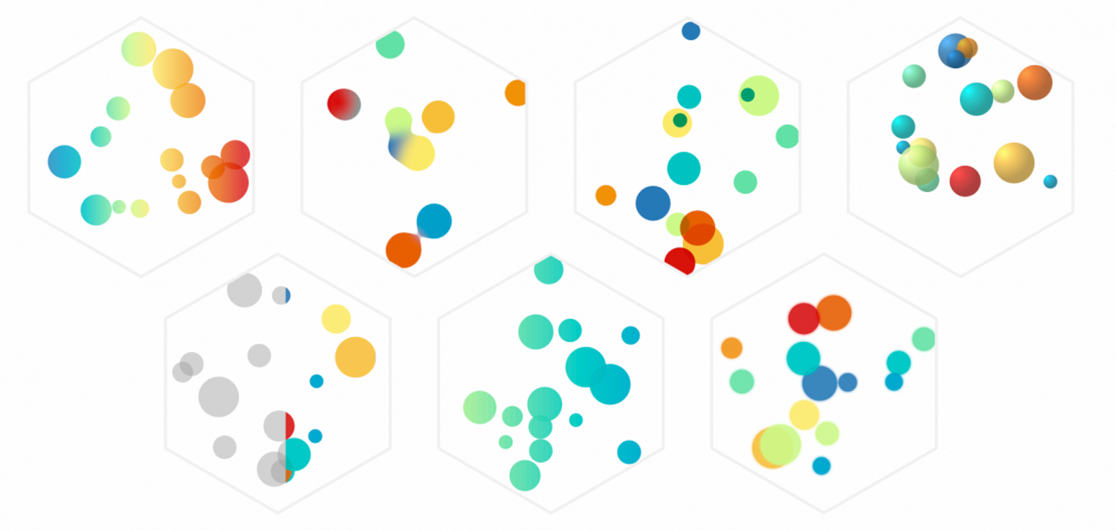
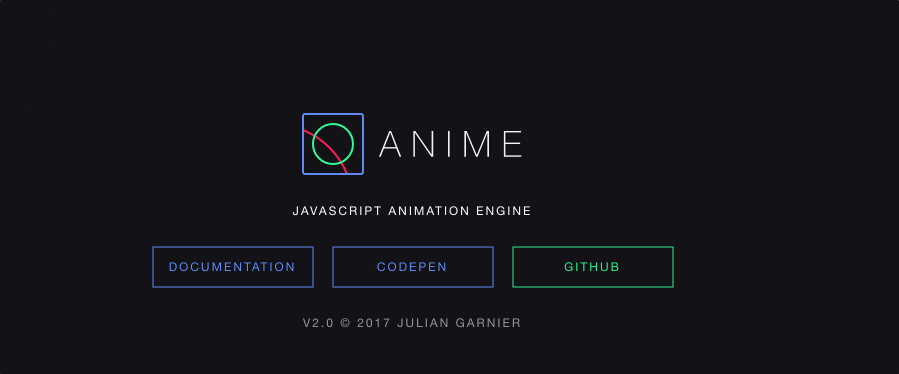
AnimeJS is the only newcomer to our list – but has won a great many converts in the 12 months since it’s creation. It’s incredibly versatile and powerful and wouldn’t be out of place powering HTML game animations. The only real question is ‘is it overkill for simple web apps‘?

Maybe. But as it’s also fast, small and relatively easy to learn, it’s hard to find fault with it.

AnimeJS is described as a lightweight JavaScript animation library that ‘works with any CSS Properties, individual CSS transforms, SVG or any DOM attributes, and JavaScript Objects’. It’s pretty awesome – so awesome, in fact, that the GIF capture I took below can’t do justice to how smooth and buttery the motion is.

AnimeJS

This project is available on GitHub.

Most impressively, Anime.JS has stunning ‘documentation’ that demonstrates HTML, JavaScript code and working examples in a beautiful app environment.

Iin short, if you’re comfortable with a JavaScript animation solution, it’s hard to find reasons to ignore Anime.JS.

Magic Animations has been one impressive animation libraries available. It has many different animations, many of which are quite unique to this library. As with Animate.css, you can implement Magic by simply importing the CSS file. You can also make use of the animations from jQuery. This project offers a particularly cool demo application.

Magic Animations

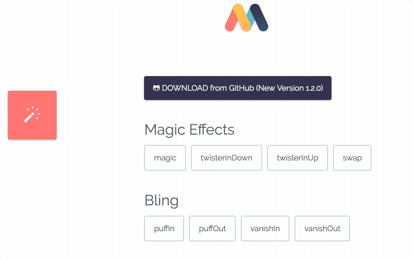
Magic animations file size is moderate as compared to animate.css and it is known for its signature animations, such as the magic effects, foolish effects, and bomb effects.

If you’re looking for something a little out of the ordinary, I would definitely recommend you to give this animation library a shot in your next project. You won’t be disappointed.

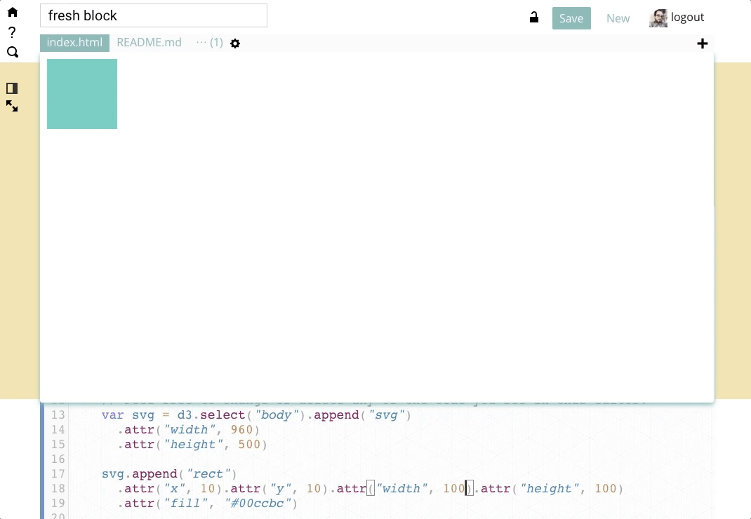
DynCSS is an animation library that you might like to use in your website along with parallax effect. To get a clearer idea of what you can do with this library, take a look at this demo.

DynCSS

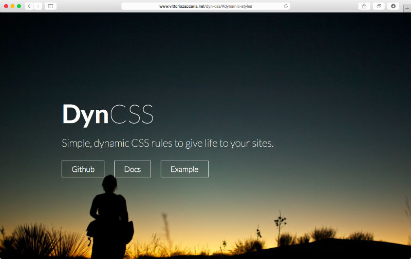
DynCSS is a simple library that might grow in popularity in the near future, but it is currently a fairly new project, as demonstrated by its number of stars on GitHub. One of the cool features that this library offers is the rotation of elements with respect to scrolling, which Vittorio demonstrates beautifully on the DynCSS home page (which makes a perfect use case for parallax related pages).

CSShake delivers exactly what it says on the box – a CSS library designed specifically for shaking elements within your webpage. As you might expect, there are a quite a number of variations available for shaking your web components.

CSShake

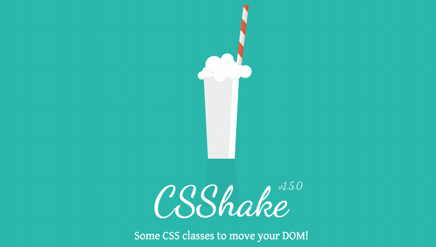
Apple popularized the UI trope of vigorously shaking a UI element (a dialog, modal or textbox) when a user enters an incorrect response – mimicking a person shaking their head ‘no’. CSShake provides a range of interesting “shake” animations and there is no lack of variation in this library.

Though currently, the library is more popular than DynCSS, I feel that often file-size might not be justified by the functionality it adds. While the animations are clever, I can’t think of a great many use cases where you wouldn’t still need to include a second animation library for non-shaking effects.

But perhaps I’m simply lacking imagination?

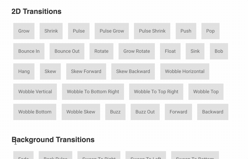
Hover.css is a CSS animation library designed for use with buttons and other UI elements in your website. It has really nice 2D transitions, along with a host of other well-crafted animations.

Hover.css

  • Current Version:
  • Popularity:
  • Description: “Easily apply to your own elements, modify or just use for inspiration.”
  • Library Size: 104.2 kB
  • GitHub: https://github.com/IanLunn/Hover
  • License:

Hover.css is best suited for animating discrete page elements such as buttons, logos, SVG components or featured images more than larger, complex page animations. It has a comprehensive list of routines and this accounts for its relatively large size (however, I still feel that the size can be much more optimized). Arguably its most notable animation effects are its distinctive speech bubbles and curls.

Velocity.js is another sophisticated, full-featured JavaScript animation suite including functions such as Fade & Slide, Scroll, Stop, Finish, Reverse and many others.

It currently boasts an impressive list of big-name users, including Tumblr, WhatsApp, MailChimp, Scribd, Gap and HTC, so you know it’s been battle-tested against large userbases and weird edge cases.

Velocity JS

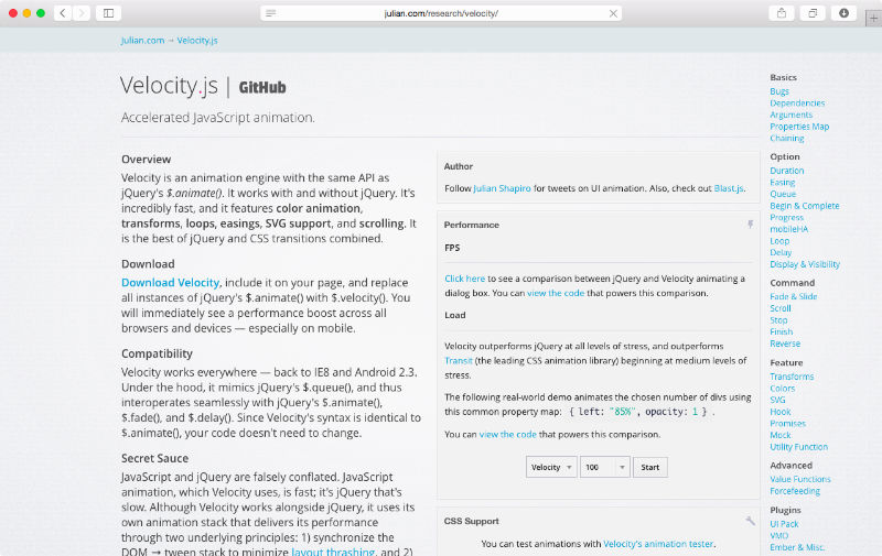
Velocity might not a perfect fit for some as it is a JavaScript animation engine and it is actually an animation engine using the same API as jQuery’s $.animate(). This works both with and without the presence of jQuery. That said, it’s incredibly fast and it features include color animation, transforms, loops, easing – essentially it’s the best of jQuery and CSS transitions combined.

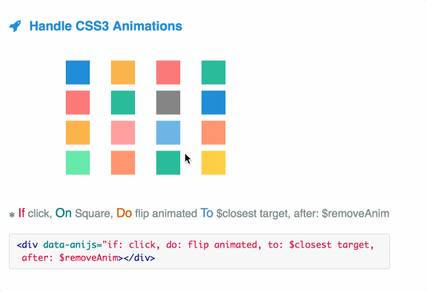
Our final library is interesting for its unique approach. AniJS is an animation library that allows you to add animations to elements in a simple ‘sentence-like’ struture. Take the following format:

If click, On Square, Do wobble animated To .container-box

<div data-anijs="if: click, do: flipInY, to: .container-box"></div>

If you don’t have a long familiarity with JavaScript, this may well be a great way to step into JS-choreographed movements.


AniJS

  • Creators: anijs
  • Released: 2014
  • Most Recent Update:
  • Popularity:
  • Description: “A Library to Raise your Web Design without Coding.”
  • Library Size: 10.5 kB
  • GitHub: https://github.com/anijs/anijs
  • License:

AniJS is a library with a very reasonable size factoring in its functionality. The format it uses for implementation is quite original and different as compared to other animation libraries (which many other might find unconventional).

Nevertheless, this library is worth giving a try at least once for your projects. It may lack the overall power and polish of some of the competition but it has the potential to grow in the future.

Which library should you choose?

There are many animation libraries out there ready and waiting to be implemented in your project. Those listed above are a few with the best combination of sophistication and stability.

If you’re looking for a simple-to-use, robust CSS solution, Animate.CSS is probably the most versatile, ‘bang-for-buck’ option available.

If you’re looking for a more complete, powerful JavaScript option, VelocityJS and Anime.JS are very hard to split. Velocity currently has the track record and larger install base, but Anime.JS is incredibly polished and exciting for such a new project. Right now, Anime.JS’s beautiful documentation might be enough to win us over.

Although using an animation library in your web application can certainly improve interactivity, overdoing it defeats the purpose and often confuses the user. Be careful and use them judiciously.

Do you use animation libraries for your projects? What are your favorite animation libraries?

Take your CSS animations to the next level with our Animating with CSS course by Donovan Hutchinson, the man behind CSS Animation Rocks.

from WebdesignerNews https://www.sitepoint.com/our-top-9-animation-libraries/

The Hitchhiker’s Guide to d3.js


The Hitchhiker’s Guide to d3.js

the d3 learning landscape in all its glory

The landscape for learning d3 is rich, vast and sometimes perilous. You may be intimidated by the long list of functions in d3’s API documentation or paralyzed by choice reviewing the dozens of tutorials on the home page. There are over 20,000+ d3 examples you could learn from, but you never know how approachable any given one will be.

we are still working on mapping out the whole landscape…

If all you need is a quick bar or line chart, maybe this article isn’t for you, there are plenty of charting libraries out there for that. If you’re into books, check out Interactive Data Visualization for the Web by Scott Murray as a great place to start. D3.js in Action by Elijah Meeks is a comprehensive way to go much deeper into some regions of the API.

This guide is meant to prepare you mentally as well as give you some fruitful directions to pursue. There is a lot to learn besides the d3.js API, both technical knowledge around web standards like HTML, SVG, CSS and JavaScript as well as communication concepts and data visualization principles. Chances are you know something about some of those things, so this guide will attempt to give you good starting points for the things you want to learn more about.

Communicate Complex Concepts

Before we dive into data visualization principles and technical skills, lets take a second to be aspirational. There are some amazing examples of what’s possible in this medium, whether its a New York Times article, r2d3, distill.pub, datasketch|es, polygraph, or ncase. Be sure to leave a comment with any inspirations I didn’t list here!

Don’t just look to others though, one of the most important things you can do is set an aspiration for yourself. I found out from interviewing some of the top data visualization practitioners using d3.js that one of the best ways to learn is to set your sights something you really want to build and figure out what you need to build it.

Visual Representations

D3 does not introduce a new visual representation. Unlike Processing, Raphaël, or Protovis, D3’s vocabulary of graphical marks comes directly from web standards: HTML, SVG, and CSS
 — http://d3js.org

Learning d3.js to write charts is like to learning French to write nutrition labels. To be fair, @syntagmatic has made some beautiful nutrition visualizations

Charts are just rectangles with shapes inside of them. There are a handful of configurations of those shapes we recognize as common charts or graphs. What d3 provides is a way to define your own visual representations by manipulating graphical marks or creating your own shapes. It makes it easy to add interactions to visuals and declare how your visuals behave. You are here to learn how to express things that aren’t possible to express in any other medium.

If you want to learn about some of the principles behind the different kinds of marks and graphical representations people use, you can’t go wrong exploring the Grammar of Graphics.

Don’t worry though, there are a ton of creative things you can do with just circles, rectangles and some careful positioning. Start simple, always try to get something to show up on the screen and build up from there.

On the web

SVG Beyond Mere Shapes is an awesome demonstration of web standards graphics manipulation

One of the reasons you want to use d3.js is so you can share your work instantly with anyone who uses a web browser (at least half of the people on Earth!). That means you need to have at least a passing understanding of the medium you’ll be working in, which is HTML5. So before you even start calling d3 API functions you’ll need some basics in SVG, HMTL and CSS. You’ll probably also want to learn some Canvas if you want to be serious about rendering a lot of data (don’t worry, its actually kind of easier to learn than SVG). I recommend this is a great intermediate tutorial on using d3 with Canvas after you are comfortable with the basics of both.

For SVG I recommend starting with this short but sweet SVG primer by Scott Murray. Play around with manually creating SVG elements and seeing how they work. Use a tool like BlockBuilder to quickly get started without setting up any kind of development environment. You may want to refer to the MDN reference site for SVG. Once you’ve mastered the basics, check out SVG beyond mere shapes by Nadieh Brehmer.

http://blockbuilder.org makes it easy to play with web standards!

You don’t have to use SVG to make your visualization, it’s relatively common to manipulate HTML elements like <div> tags with d3. You will need to be familiar with CSS positioning to make it work well. You can even mix HTML, SVG and Canvas all at once!

It can be a bit overwhelming to figure out which rendering system you should use, and even how to use any one of them. I’m going to reiterate the importance of knowing basic HTML, CSS, SVG (and a little Canvas) before getting started with d3.js!

Getting started with d3.js

How do you build up your visualization from first principles? Piece by piece and a whole lot of utility functions. As you’ve probably seen, d3’s API is massive, so lets call out a few of the utilities that will be particularly helpful early on.

d3-scale

colors are one common use of scales!

Some of the most fundamental tools in the d3 tool belt are scales. Start with the Introducing d3-scale post by Mike Bostock to get an overview of what they are and how to use them. No matter what kind of visualization you do, you will likely use at least one kind of scale to make it happen.

d3-shape

A streamgraph, thanks to SVG paths!

SVG paths are pretty intense (see this thorough overview), so d3-shape includes functions that will make them easier to create and manipulate for some use cases. Read Mike’s Introducing d3-shape article to get an overview of what it offers and how to get started using them. d3-shape can also help you render things like lines, areas and arbitrary paths to Canvas with just one extra line of code!

d3-selection

One of the hardest parts of d3 to learn is the selection system, also referred to as the General Update Pattern. It took me months of banging my head against my desk to internalize it, but don’t let that scare you! You don’t actually need to be a master of selections to get a ton of cool stuff done. When you are ready to give it a shot, you can start with the d3-selections README and be sure to click on the links like Thinking in Joins.

d3-collection

d3-nest makes it easy to group similar things together

Manipulating data is an incredibly important part of visualizing it. This can often be the hardest part to do depending on how good your data is and how well you understand it. Having more tools that make working with the data by reshaping it, slicing and dicing or aggregating it can really help. To this end I recommend getting familiar with d3-collection, particularly the nest function.

d3-hierarchy

a Treemap is easy to layout thanks to d3-hierarchy

Continuing the theme of working with data, the key part to many visualizations is laying out your visual representations based on your data’s structure. Some common functions for helping you do this are found in d3-hierarchy for making things like trees, treemaps or circle packs.

d3-zoom

A common interaction behavior you may want to add to your visualization is zooming. Mike has a series of examples that show various ways of adding zoom to your visualization with d3-zoom. Check out zoom’s close cousin d3-drag for some additional interaction help!

d3-force

sparse matrices, amirite?

One of d3’s capabilities that inspires a lot of people is the force layout. It’s pretty easy to use but definitely difficult to master. Just don’t let it pull you to the dark side! See d3-force for more details.

Search!

One final tip you can use for any API function is to use BlockBuilder’s search capability. You can also limit your searches to examples that use d3 v4!

look at all those blocks!

Community

Welcome to the Blockiverse

Connect with like-minded folks! We have a vibrant online community in the d3.js slack channel. Find a meetup near you, the SF Bay Area has one of the biggest groups, but you can probably find some groups near you. If you’re really dedicated, come to the annual d3.unconf held in SF every fall!

how I see the d3 community and the many learning curves one encounters on their journey

Many thanks to Erik Hazzard for editing and helping shape this post. Thanks to Kai Chang for his suggestions in this post but more so for helping shape the d3 community. Thanks to #teaching-d3 in the d3js Slack, especially Sebastian and John for their feedback. Of course Infinite thanks to Mike Bostock for creating the playground we all get to work in!

from Sidebar http://sidebar.io/out?url=https%3A%2F%2Fmedium.com%2F%40enjalot%2Fthe-hitchhikers-guide-to-d3-js-a8552174733a

User Onboarding Spotlight: Why Yummly’s UX is Absolutely Delicious


User Onboarding Spotlight: Why Yummly’s UX is Absolutely Delicious

We love to shine the spotlight on apps that deliver stellar user experiences- and today is no different. Today, we’d like to highlight an app that has completely satisfied our craving for good UX: Yummly.

In short, Yummly is a one-of-a-kind recipe app that allows users to discover, index, and share recipes from all over the world. To top it off it also provides users with mouth watering personalization, high-caliber search capabilities, and the ability to purchase cooking supplies to execute their desired dish.

There are many different facets of Yummly’s UX that we can detail for their usage of best practices and thoughtful design. Yet in particular, we find its user onboarding experience to be one of the most noteworthy components of its success.

Yummly’s user onboarding artfully familiarizes users with the app all the while whetting their appetite to start searching for recipes.

Let’s explore exactly why Yummly’s user onboarding is simply a ‘slice’ above the rest.

The Sign-up Screen

This is the first screen users encounter after the Yummly splash screen. The UI is simple, crisp, and users are presented with four clear-cut options for entering the app. If users want to sign-up via an external account- they can choose to connect via their Facebook, gmail, or another email account. External account registration enables users to quickly sign-up to the app and begin their in-app experience. However, what about users who do not feel comfortable with signing up for the app right away or are just simply impatient and want to get straight to finding a recipe? Yummly offers the option for users to start using the app without signing up and personalizing their account. While signing-up is the preferred option in terms of obtaining personalized recipe recommendations, the fact that Yummly also offers a means for users to start using the app right away without sign-up, demonstrates a keen understanding of today’s users.

Today’s users are impatient and on the go. When they want to enter an app (especially a recipe app like Yummly) and the sign-up screen ends up acting as a huge barrier to entry, that user is likely to become frustrated and worse- uninstall. Yummly directly combats this possibility by providing users with the ability to enter the app without signing up.

Password Screen

If users decide to go with the route of signing up for Yummly with gmail. They are then presented with a simple screen for creating a password:

Two key things to notice here. First, there are no strict password requirements. Users can choose whatever password they want, without any stipulations such as one letter in caps lock, one number, one symbol etc. This is a smart move by Yummly, especially since the app does not innately possess any highly sensitive user information- just recipe preferences. Second, Yummly allows users to ‘see’ their password before they continue to the next screen. A good option because today’s users are easily distracted and forgetful, especially when it comes to remembering one of the hundreds of passwords they might have.

‘Tell us About Yourself’ Screens

Now comes the personalization part. In order for Yummly to provides the most relevant recipe recommendations possible, the app first needs to understand the user to a certain degree.

This requires a tiny bit of work from the user- and Yummly understands that it’s ‘work’. Thus they have designed this section to be as appealing and intuitive as possible.

Users first select their gender, then drag a nifty little slider to select their age, and then proceed to specify how many people they are cooking for. This whole section is full of fun little microinteractions and easily relatable symbols.

What’s noteworthy about the actual user profile questions? Yummly understands that users’ recipe preferences are not solely determined by likes and dislikes of certain foods and cuisines, but by the users’ actual age, gender, and ultimately how many people they will need to prepare a said meal for. By asking users to complete these details in the beginning and in a creative manner, Yummly is able to provide more accurate personalization and ultimately, increase user engagement and retention.

(Pssst… did you also see the progress dots at the top of the screen? Great user onboarding tactic right there.)

Food and Cuisine Preferences Screens

Now comes the ultra-necessary part of having users select their food and cuisine preferences.

First, cuisine selection. Yummly makes the selection very effortless yet thorough. Users swipe left through an assortment of cuisine names accompanied with helpful, tasty images. As soon as users select a cuisine, the circle depicting the food changes into a distinct “check mark” confirming to users that they have selected that type of food. Whether a user prefers Cajun & Creole style food or Mediterranean, Yummly covers the whole spectrum.

Now onto specific food dislikes and diets. Oof- today’s users are picky! Twenty years ago, maybe even ten years ago, if someone wanted to make spaghetti bolognese, the might find a few variations of recipes- one with turkey meat, one with pork, and one vegetarian. In present day, you can find “spaghetti bolognese” recipes ranging from ones “under two hundred calories”, to recipes with zucchini noodles or seitan. Yummly totally embraces users’ uber specific food preferences and diets, and enables users to select from a multitude of diets and food dislikes. If there is a particular disliked food (i.e. shredded coconut) that the user cannot find within the initials options presented by Yummly, users can also simply type it into the search form and add it to their preferences.

To top it off, Yummly pairs all diets and food dislikes with neat little illustrations, to reinforce the users’ understanding of what they are selecting.

Getting hungry? We definitely are. That’s Yummly’s goal. It’s whetting our appetite- getting us excited to fully dive into their app and discover their personalized recipe recommendations.

Before we get too hungry, let’s jump to the final part of their delectable user onboarding.

Cooking Level and Final User Onboarding Screens

All of these food preferences and profile specifications mean nothing if Yummly does not know the user’s cooking level. For example, let’s say a user who is a novice cook selects that they like French cuisine. However, without a proper specification of skill level,Yummly might accidentally recommend eclairs and turkey paupiettes that are way beyond the user’s scope of cooking. Sacre bleu!

Of course Yummly has considered this factor, and dedicates a screen to asking users to note their cooking level. But what if a user all of a sudden decides they also like Chinese cuisine and want to navigate back to the cuisine selection screen to add that preference? Yummly also incorporates this specific user onboarding best practice, by permitting users to navigate to previous screens and edit their choices.

Once a user has completed all the personalization parameters, Yummly displays a screen with some initial recipe recommendations. Users can begin to swipe through recipes and ‘Yum’ certain recipes that peak their interest. This engagement allows Yummly to further refine its user personalization before the user fully enters the app. It also rewards the user with a “taste” of the results from all the “effort” they put into refining their recipe preferences.

After users tap the ‘Next’ button, Yummly thanks the user “for telling us about yourself” and then incorporates a smart little “loading” animation that conveys to users that the app is computing all of their food preference inputs. In less than five seconds, the app opens up and the user can start exploring the Yummly’s cornucopia of recipe recommendations.

The essence of the Yummly app is built around precisely personalized recipe recommendations- which Yummly completely nails. Yet those recommendations would be totally lacking if not for the app’s extremely effective and engaging user onboarding experience. A medley of appetizing images, reconizable icons, fun microinteractions, and coherent navigation makes its user onboarding not only “work” but get users excited about what they will discover inside the app. This is smart user onboarding at its finest.

Now you must excuse us, we have a crazy craving for creamy artichoke dip (for today’s Appsee happy hour), and need to start recipe searching stat!