
User Onboarding Spotlight: Why Yummly’s UX is Absolutely Delicious

We love to shine the spotlight on apps that deliver stellar user experiences- and today is no different. Today, we’d like to highlight an app that has completely satisfied our craving for good UX: Yummly.
In short, Yummly is a one-of-a-kind recipe app that allows users to discover, index, and share recipes from all over the world. To top it off it also provides users with mouth watering personalization, high-caliber search capabilities, and the ability to purchase cooking supplies to execute their desired dish.
There are many different facets of Yummly’s UX that we can detail for their usage of best practices and thoughtful design. Yet in particular, we find its user onboarding experience to be one of the most noteworthy components of its success.
Yummly’s user onboarding artfully familiarizes users with the app all the while whetting their appetite to start searching for recipes.
Let’s explore exactly why Yummly’s user onboarding is simply a ‘slice’ above the rest.
The Sign-up Screen

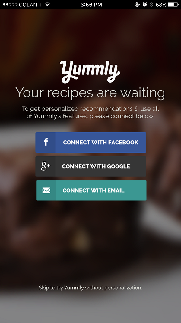
This is the first screen users encounter after the Yummly splash screen. The UI is simple, crisp, and users are presented with four clear-cut options for entering the app. If users want to sign-up via an external account- they can choose to connect via their Facebook, gmail, or another email account. External account registration enables users to quickly sign-up to the app and begin their in-app experience. However, what about users who do not feel comfortable with signing up for the app right away or are just simply impatient and want to get straight to finding a recipe? Yummly offers the option for users to start using the app without signing up and personalizing their account. While signing-up is the preferred option in terms of obtaining personalized recipe recommendations, the fact that Yummly also offers a means for users to start using the app right away without sign-up, demonstrates a keen understanding of today’s users.
Today’s users are impatient and on the go. When they want to enter an app (especially a recipe app like Yummly) and the sign-up screen ends up acting as a huge barrier to entry, that user is likely to become frustrated and worse- uninstall. Yummly directly combats this possibility by providing users with the ability to enter the app without signing up.
Password Screen
If users decide to go with the route of signing up for Yummly with gmail. They are then presented with a simple screen for creating a password:

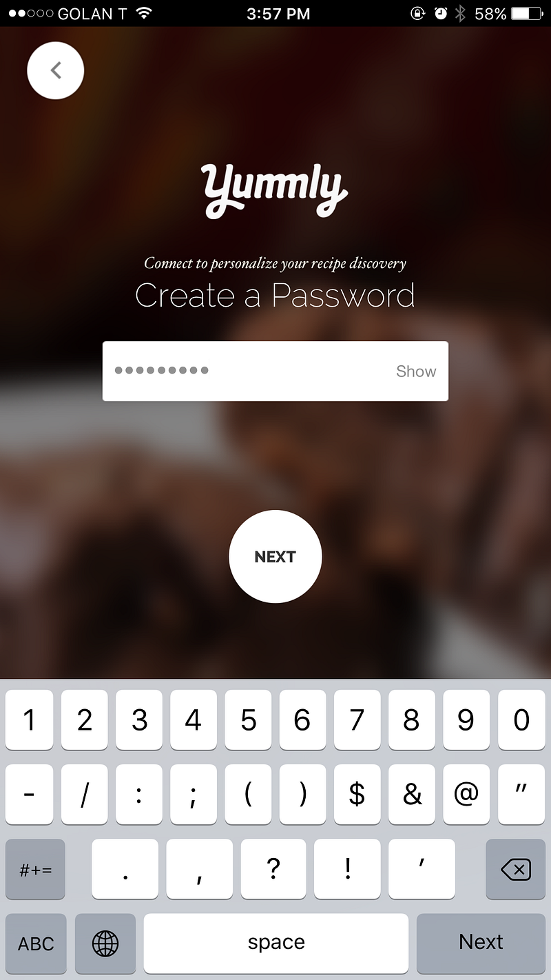
Two key things to notice here. First, there are no strict password requirements. Users can choose whatever password they want, without any stipulations such as one letter in caps lock, one number, one symbol etc. This is a smart move by Yummly, especially since the app does not innately possess any highly sensitive user information- just recipe preferences. Second, Yummly allows users to ‘see’ their password before they continue to the next screen. A good option because today’s users are easily distracted and forgetful, especially when it comes to remembering one of the hundreds of passwords they might have.
‘Tell us About Yourself’ Screens

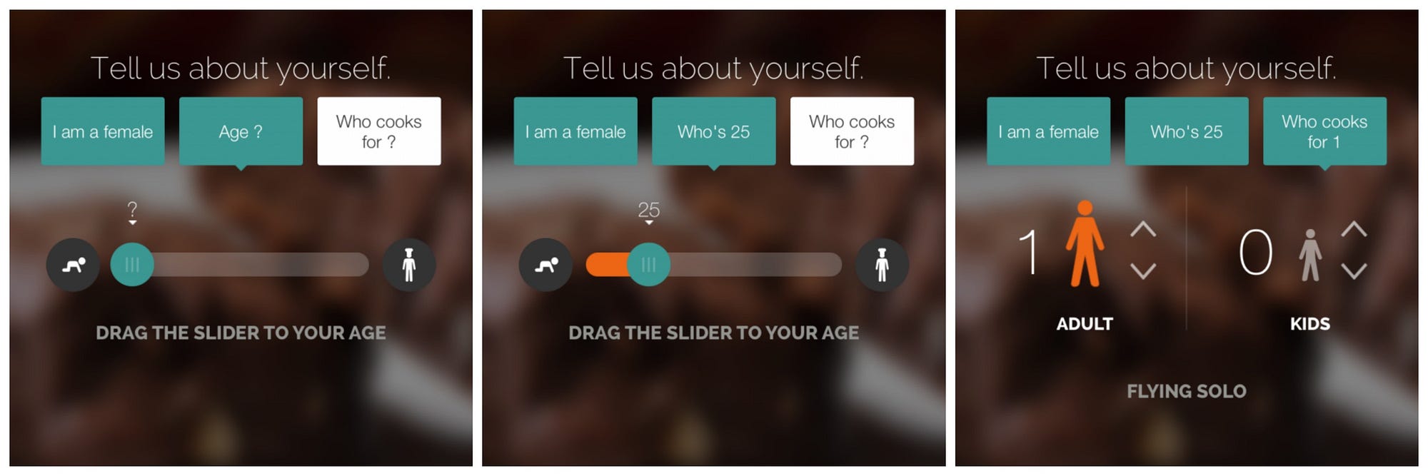
Now comes the personalization part. In order for Yummly to provides the most relevant recipe recommendations possible, the app first needs to understand the user to a certain degree.
This requires a tiny bit of work from the user- and Yummly understands that it’s ‘work’. Thus they have designed this section to be as appealing and intuitive as possible.
Users first select their gender, then drag a nifty little slider to select their age, and then proceed to specify how many people they are cooking for. This whole section is full of fun little microinteractions and easily relatable symbols.
What’s noteworthy about the actual user profile questions? Yummly understands that users’ recipe preferences are not solely determined by likes and dislikes of certain foods and cuisines, but by the users’ actual age, gender, and ultimately how many people they will need to prepare a said meal for. By asking users to complete these details in the beginning and in a creative manner, Yummly is able to provide more accurate personalization and ultimately, increase user engagement and retention.
(Pssst… did you also see the progress dots at the top of the screen? Great user onboarding tactic right there.)
Food and Cuisine Preferences Screens

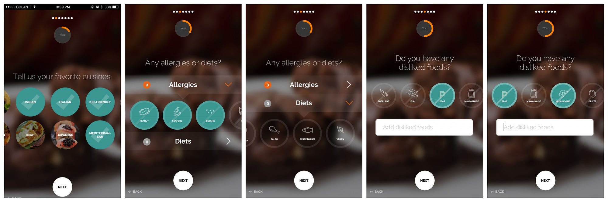
Now comes the ultra-necessary part of having users select their food and cuisine preferences.
First, cuisine selection. Yummly makes the selection very effortless yet thorough. Users swipe left through an assortment of cuisine names accompanied with helpful, tasty images. As soon as users select a cuisine, the circle depicting the food changes into a distinct “check mark” confirming to users that they have selected that type of food. Whether a user prefers Cajun & Creole style food or Mediterranean, Yummly covers the whole spectrum.
Now onto specific food dislikes and diets. Oof- today’s users are picky! Twenty years ago, maybe even ten years ago, if someone wanted to make spaghetti bolognese, the might find a few variations of recipes- one with turkey meat, one with pork, and one vegetarian. In present day, you can find “spaghetti bolognese” recipes ranging from ones “under two hundred calories”, to recipes with zucchini noodles or seitan. Yummly totally embraces users’ uber specific food preferences and diets, and enables users to select from a multitude of diets and food dislikes. If there is a particular disliked food (i.e. shredded coconut) that the user cannot find within the initials options presented by Yummly, users can also simply type it into the search form and add it to their preferences.
To top it off, Yummly pairs all diets and food dislikes with neat little illustrations, to reinforce the users’ understanding of what they are selecting.
Getting hungry? We definitely are. That’s Yummly’s goal. It’s whetting our appetite- getting us excited to fully dive into their app and discover their personalized recipe recommendations.
Before we get too hungry, let’s jump to the final part of their delectable user onboarding.
Cooking Level and Final User Onboarding Screens

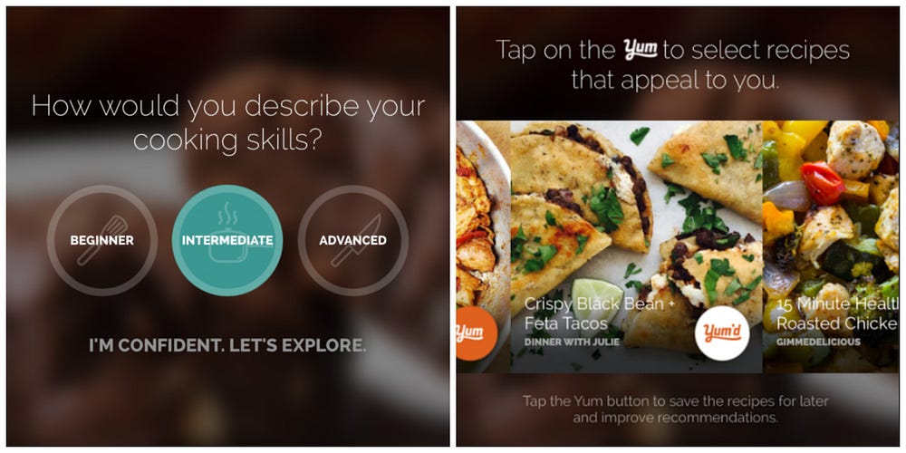

All of these food preferences and profile specifications mean nothing if Yummly does not know the user’s cooking level. For example, let’s say a user who is a novice cook selects that they like French cuisine. However, without a proper specification of skill level,Yummly might accidentally recommend eclairs and turkey paupiettes that are way beyond the user’s scope of cooking. Sacre bleu!
Of course Yummly has considered this factor, and dedicates a screen to asking users to note their cooking level. But what if a user all of a sudden decides they also like Chinese cuisine and want to navigate back to the cuisine selection screen to add that preference? Yummly also incorporates this specific user onboarding best practice, by permitting users to navigate to previous screens and edit their choices.
Once a user has completed all the personalization parameters, Yummly displays a screen with some initial recipe recommendations. Users can begin to swipe through recipes and ‘Yum’ certain recipes that peak their interest. This engagement allows Yummly to further refine its user personalization before the user fully enters the app. It also rewards the user with a “taste” of the results from all the “effort” they put into refining their recipe preferences.
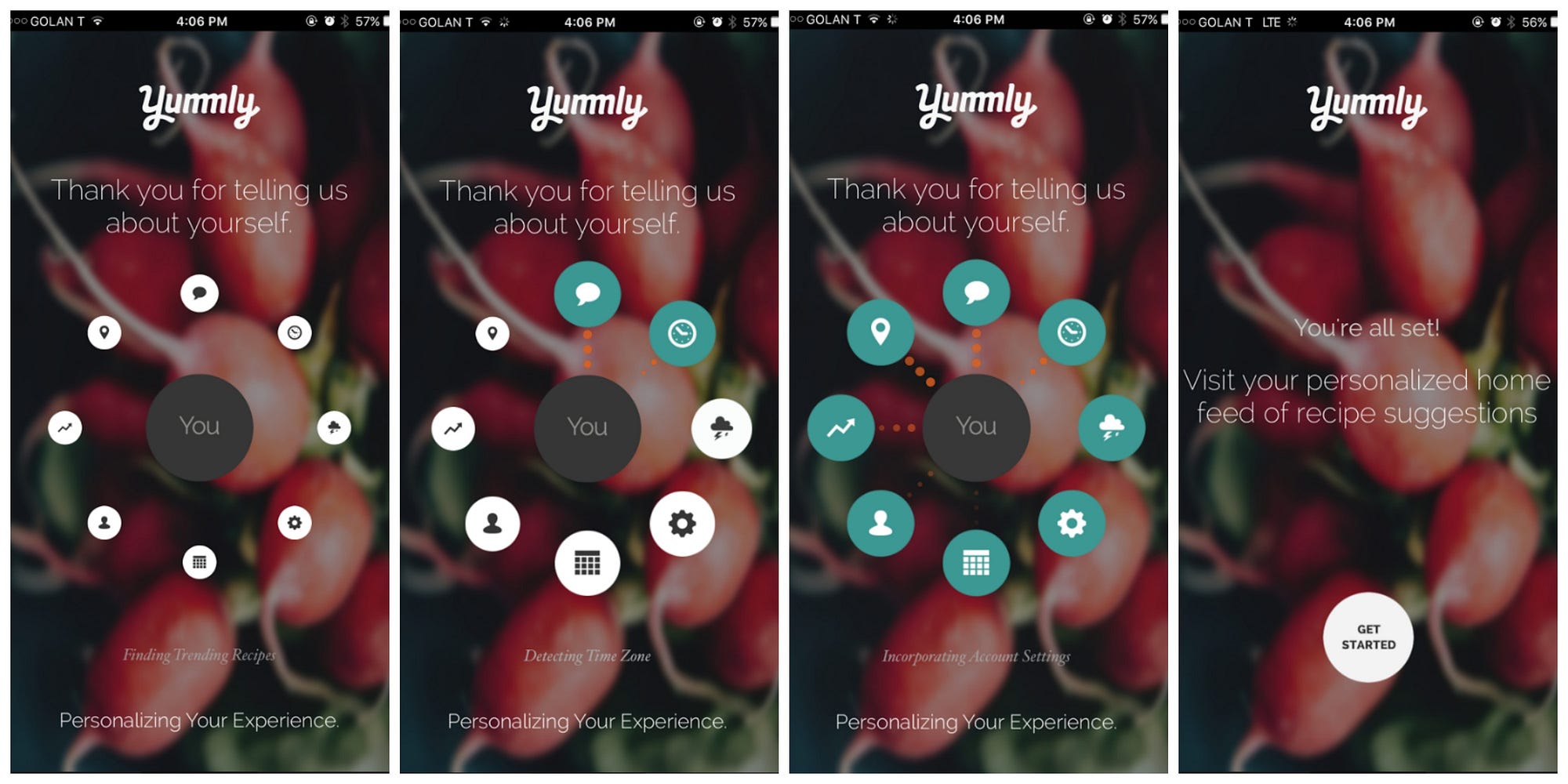
After users tap the ‘Next’ button, Yummly thanks the user “for telling us about yourself” and then incorporates a smart little “loading” animation that conveys to users that the app is computing all of their food preference inputs. In less than five seconds, the app opens up and the user can start exploring the Yummly’s cornucopia of recipe recommendations.
The essence of the Yummly app is built around precisely personalized recipe recommendations- which Yummly completely nails. Yet those recommendations would be totally lacking if not for the app’s extremely effective and engaging user onboarding experience. A medley of appetizing images, reconizable icons, fun microinteractions, and coherent navigation makes its user onboarding not only “work” but get users excited about what they will discover inside the app. This is smart user onboarding at its finest.
Now you must excuse us, we have a crazy craving for creamy artichoke dip (for today’s Appsee happy hour), and need to start recipe searching stat!


from Sidebar http://sidebar.io/out?url=https%3A%2F%2Fblog.prototypr.io%2Fuser-onboarding-spotlight-why-yummlys-ux-is-absolutely-delicious-46956e9bd8ef