The internet and web brought a badly needed culture of collaboration and standards to the IT industry. Likewise for blockchain to succeed, it will similarly require the stewardship of international organizations to oversee its evolution. A few weeks ago, the World Economic Forum released Realizing the Potential of Blockchain, a report by Don Tapscott and Alex Tapscott, […]
from CIO Journal. https://blogs.wsj.com/cio/2017/07/11/what-blockchain-advocates-can-learn-from-the-internets-evolution/?mod=WSJBlog
The act of withdrawing money from an ATM has largely remained the same, ever since Barclays Bank introduced the first “Hole in the wall” in London, way back in 1967. But now it’s about to see a radical update with CashDash — a range of ATMs launching in London where your debit card is your smartphone.
To withdraw cash, you first need to download the CashDash app, and top up your virtual wallet with funds. When you get to the ATM, you key in your phone number, and authorize the transaction on your phone. The machine will then spurt out the requested money.
So far, the company has launched 50 CashDash-enabled ATMs, all in London (although two are in Hatfield, which isn’t technically London).
Most are in Central London, and are in tourist areas like Covent Garden, Selfridges, and Madame Toussauds. The company also has aggressive expansion plans, and is targeting Barcelona and New York next.
When you top up your CashDash wallet, you can do so in a number of different currencies, and change between them easily. The company promises that its rates are better than what you’d expect in the airport, at a high-street currency exchange, or at a bank.
This claim holds up. At the time of writing, the market pound-to-euro conversion rate is 1.13, which is what CashDash offers through the app. While if you went with currency-exchange giant Travelex, you’ll get only 1.102 euros for your pound.
Speaking to TNW over email, CashDash’s CEO Arik Shtilman explained that the idea for the company came after a bachelor party in Eastern Europe.
During the trip we started to notice that we were getting ripped off by all the parties that are involved in the currency exchange process.
We got ripped off in the airport by an exchange booth, later in the city the same happened at an ATM and then again by the credit card companies. We were pissed off, and because we had free time we decided to research the space and understand how things work. As part of the research we were shocked to understand how many parties are involved in each transaction (and each taking its own piece of the pie.)
After looking into this problem, he decided to tackle the gargantuan task of creating a brand new payments system, saying:
“We had to create a completely new payment scheme that will overcome the hurdles of the legacy systems that exist today. CashDash is not only integrated to ATMs, and to merchant stores around the world, we also had to create the world’s largest cardless infrastructure in just 18 months.
We had to connect between consumers, ATM providers, and merchants directly, without going through the traditional banking system, Visa
, Mastercard, Swift
and all the other ‘slow’ services that exist in financial world.”
The biggest challenge, he explained was convincing legacy banks and financial institutions to allow it access to their systems. “There were a lot of questions around security, scalability,” he said.
It’s clear that CashDash is targeting the traveler market, rather than positioning itself as a tool for day-to-day use. This pits it against some already powerful upstarts, like
As Luke mentioned in a recent post, our UX Mastery book club has been reading Don Norman’s The Design of Everyday Things.
Last week we were lucky enough to have the opportunity to interview Don in a Google Hangout.
Here is a full transcript of the session:
Luke: Hello there, I’m Luke Chambers. Welcome to a special edition for UX Mastery book club members. I’m humbled and excited to be joined today by Don Norman – widely regarded for his expertise in the fields of design, usability engineering, cognitive science, for being a prolific advocate for human centred design, for his gentle humour, and for the orientation and inspiration that he provides for designers.
With a rich and varied career and amongst his many other roles, which makes it difficult to do justice with only a short introduction, Don is currently the Director of the Design Lab at the University of California, San Diego, and co-founder and consultant with the Nielsen Norman Group.
He is here to chat with us about his seminal book on design – and our current book club focus – the book with the masochistic teapot cover, The Design of Everyday Things. Thank you so much Don and welcome to our book club. How are you?
Don: Thank you. Hey, that’s the old book!
Luke: It is, but I have an even older one here. The old old one.
Don: The Psychology of Everyday Things! The newer version, the one published in 2013 does have new material and different examples.
Luke: Yes. We have a few questions about that. I know people are keen to know about that. We’re joined in this hangout by a selection of UX Mastery book club members who all have some questions. Welcome to you – we’ll come back to you in a minute.
But to begin, Don – the warmth and approachability in your writing is an inspiration to many of us who read your work. Can you start off today’s discussion by telling us a little bit more about what’s behind your excitement and advocacy for HCD and how that feeds into your process and thinking, and indeed emotion, when you’re writing.
Don: Well I started off as a geek. I was an electrical engineer – I got two degrees in electrical engineering – and I firmly believed that if only people would get out of the way then our stuff would work much better. Then by freak accident – actually most of my life has been accidental – and what I’ve learned to do is take advantage of these accidents and go into whole new fields and explore new territories.
So by freak accident I got attracted by the newly revived Psychology Department in Pennsylvania where the new Chair was a physicist and they were hiring people who had no background really in psychology and so I went and talked to the Chair who said “You don’t know anything about psychology – wonderful!” And so I joined the psychology department and brought in information processing to psychology, which was really quite foreign in those days.
And after I graduated my first job was at Harvard where George Miller had set up something called the Centre for Cognitive Studies (I didn’t even know what the word cognitive meant) and my real education in psychology came when I was at the centre at Harvard.
After a short stint there I went to the newly founded university at San Diego and got there before any students had graduated, so it was just populated by very senior professors and a few Nobel Laureates and our graduate students. Over the years I worked in the psychology department doing things in memory and learning and attention and looking at how people do actions, and I got quite interested in human error and the kinds of errors that we make.
That got me called in to investigate our major nuclear power accident at 3 Mile Island and there I discovered, along with a group of other people on this committee – we were trying to determine why the operators had made the errors that they made. We decided that the operators were really quite intelligent and sensible and everything they did was sensible except that the design was so bad that if you wanted to cause people to make errors, you couldn’t have done a better job.
There were 4000 meters and controls laid out in a neat orderly way, so that you might have a bank of 20 switches and then if you flipped on in the middle wrong, people got mad at you. Yeah! So that made me realise that this background that I had in both engineering and psychology was really a good combination to look at human behaviour.
That’s when I started first of all working with NASA and aviation safety, and then consulting with the newly developing computer industry. I did a lot of work with what was called Xerox PARC in those days (the Palo Alto Research Centre) and also with Apple. As I did more and more of that I got more and more interested in the activity going on in Silicon Valley so I retired from the university (I retired in 1993) and went up to Apple and became eventually a Vice President of the Advanced Technology Group and that’s where I realised many different things. One of them was the difference between what academics know and what practitioners know.
The joke I like to tell is that in academia there is a lot of deep thinking and very little doing. In industry there is a tremendous amount of doing and very little thinking. So it is actually useful to go back and forth, back and forth. The reason you don’t do much thinking in industry is not because the people can’t do it – they’re really bright, they’re very good people – but there is no time. Everything is a rush. No matter what you’re doing, there’s a rush – a competitive rush. There’s a rush to get out in time for a Christmas break or in time for new years or the start of school or whatever, and it takes 2 or 3 years to do a major project and even so, it’s always a rush.
In fact, in the new edition of The Design of Everyday Things – because the old edition was written before I got to Apple – 25 years ago and I’ve learned a lot. The fundamental principles haven’t changed but I was able to update the examples, which were a bit out of date, and put in two new chapters about life in the real world. I explain the design process and how we first try to solve the right problem – we do design research and then we do rapid prototyping and we test and so on. When you actually come to do that in a product team you are not allowed to. The person in charge (the product manager) will say “Yes, what you are saying is absolutely the right way to do it but I’m sorry we just don’t have the time to do this right now. Next time we’ll do it right.” But there is no next time.
So I invented Don Norman’s Law which says that the day the product team is put together it’s over it’s budget and it’s behind schedule.
So that’s in a nutshell how I arrived at where I am. I really like working in industry, and working with academics, and going back and forth. When I was pulled out of my second retirement to start this new design lab, first of all I decided that I would not work in a department or a school, I would work across the entire university, and second of all I decided that I would work closely with a lot of industry so that we would work on real problems, instead of the toy problems that most academic work is about. And that’s getting off to a nice start.
Luke: Stephanie had a question. If you could go back and change the book – you had the 2013 edition – we’re coming up to 30 years next year – is there anything about the way design has changed recently that you might consider including additional material for?
Don: Not really. Design is undergoing some rapid change and my book is primarily concerned with the physical components and the way we interact with products. There is very little about services. And also very little to do with the kind of work that I’m doing at the Design Lab. At the Design Lab we decided that we would not start a traditional design department and make traditional products or even traditional services because I thought, you know, there’s lots of really good design schools all around the world and we don’t really need another one.
What we decided to do was work on complex problems and systems. Complex socio-technical systems. We work in education, where we are trying to be ‘self taught’. You go and find a course and you take it. And that will really change the way things are. Instead of going to college for 4 years and then graduate school for another 2 or so on – I guess if you’re British you go to college for 3 years and then 2 years for a Masters – and that’s supposed to last you the rest of your life! Nah! So a lot of us are thinking why even get a degree at all? Why don’t you just take the courses that have the knowledge that you need at the moment and then as you learn and need more knowledge, take those courses!
All the the general purpose knowledge like philosophy and history and literature – if they bore you, don’t take them because as you mature, guess what? You’ll discover that oh, history is actually fascinating, and then you go and learn it. If you learn it when you really want to you’ll learn it so much better and it will matter a lot more.
So we’re doing that and we’re doing healthcare which is a mess because it was monstrous. It was never designed so we ended up with 20, 30, 50 different specialties and a patient goes from one specialist to the next, the next, the next and information is lost all along the way. Medical error is thought of as one of the 3 top causes of death! That’s crazy.
And other things as well. Like automation. And how people react with automation. Some of the stuff that we do there fits into the last couple of chapters of the book. Actually it fits into all of the book, but to treat it properly requires a second book. And I may yet do that.
Luke: You mentioned that in a field that is changing so rapidly, people can do their own learning online. They can take short courses in things that interest them. Are there things that you think that design students should really learn but they wouldn’t of their own initiative? That they might miss out on if they do their own self guided learning?
Don: If we talk about design students, we need to talk about what kind of students. Traditional design students come from art and architecture schools and they basically learn the craft. I think that the work that is done by these types of designers is wonderful and beautiful and it makes my life better and I’m really delighted by these products. The kinds of problems that I’m talking about though require a very different kind of training. We have to know more about the world. And about organisations and about politics.
Why does a designer have to know about politics? Well when you’re talking about complex endeavours, trying to restructure education or healthcare or transportation, they affect large numbers of people. If it’s a big project, no matter what you suggest, people will object. You have to figure out some careful path through all these objections to get everything done. And that’s what politics is about. The good side of politics. It’s the art of compromise, when people with honest differences of opinion meet and then try to figure out a way out – a compromise that satisfies as many as possible.
The bad part of politics is when they refuse to discuss other alternatives or when it’s driven by greed or profit. But we have to deal with all of this because in the real world if I want to change a transportation system or an education system it is amazing how many people will come out objecting. We have to learn how to deal with all that and how to divide the project up into a whole lot of small, meaningful parts that we can handle without getting too much objection. So instead of doing one large solution we do many tiny steps.
Luke: That’s a good segue into some of the questions that our hangout participants have. Dan, you had a really good question about checklists and things to do and not to do.
Dan: Sure. It was an older question but I’ll take it anyway. It was essentially asking a version of what Luke just asked. Do you think there is a problem with lists of dos and don’ts on the internet. Do you think they are lacking a problem to solve, or any context at all?
Don: Yes. Yes. I could say more, but yeah. I mean, come on, every time there is a list of dos and don’ts it’s over simplified. And in fact every time you have a list of fundamental principles, I have a list of fundamental principles, but you have to be careful because they often conflict with each other. I want it to be as easy and simple as possible but I want to do things that fit people’s real needs, but people’s real needs aren’t simple so it’s a question of how I balance that – how do I fulfill the need but still make it understandable?
One of my pet peeves is these devices [holds up iPhone] and I blame Johnny Ive, the lead designer at Apple. He is a brilliant industrial designer but taught as a craftsperson so his stuff is beautiful. His videos always talk about how he could machine the metal to make the body in one piece of metal and the way it feels and the way it looks and the rounded corners and the black screens. Wonderful. But he is completely ignorant about how people interact with these devices. The modern iPhone is getting harder and harder to use. You may not agree but just think about how many times you wonder if you should click one time or two times or three times or do a long tap or a short tap. Is it one finger or two fingers or three fingers. Whether you swipe up or down or left or right. There is no way of knowing. The fundamental principle of discoverability has been lost, even though Apple was one of the companies that invented it. We don’t get that feedback.
How many times do you get your phone and flip through looking for a photo and you want to show somebody and you give it to somebody else and they touch the screen so it’s lost. There is no way to go back. I hate it when I give a talk and people want to take pictures of me. When they have a camera it is wonderful. They take the camera up and go click. If they have a phone they give it to someone else to take the picture and the person touches the wrong thing and loses the camera and then it goes back and forth and back and forth and so on. So what ought to be a 5 second job turns into a minute job and when there are 20 people in line that is a lot of time.
Luke: A lot of the language around usability and UCD contains assumptions that simplicity is the ideal goal for a designer.
Don: I have a book that says just the opposite. People don’t want simplicity. They claim they do but they really don’t – they want things that they can understand. If you give someone something that they understand they’ll say “see how simple it is?” And if you make it simple – it’s just one button! Ah ok, but how many things does it do? Does it do 20 things? How do you make one button do 20 things? It ends up looking simple but it’s incredibly complex to use. So people don’t want simplicity, they want understanding.
Luke: Nalin, did you have a question for Don about the pros and cons of being a UX unicorn?
Nalin: Yes. Don, my question is in a UX career, what are the pros and cons of being a UX unicorn over specialising in a specific thing?
Don: What do you mean by a UX unicorn?
Nalin: What I meant was someone who is up to date and working professionally in research, to design, to testing, across the fields of UX vs specialising in design or research or testing or direction design – just one area.
Don: I think the way we would form that question is whether you should be a specialist or a generalist and the answer to that is it is all up to you. They are different. Some people just love learning more and more about the particular skills and the particular focus on their work. And they are very very important. We need them. There are other people who just like a lot. They like to work on different problems every time. So they know a little bit about lots of areas. So, you’re suddenly thrown into a medical problem or a transportation problem or a banking problem and it’s really exciting because you don’t know anything about it so you have to find the experts – those other people who are the specialists and have them teach you. And put it all together. So you need a team of specialists and a team of generalists and I believe those are different people. It really has to be your choice as to which direction you feel naturally inclined.
Luke: Erin, did you have a question around strategies for convincing companies about the value of UX?
Erin: My question was “Do you have any specific analogies, descriptions or strategies that you use to convince companies or departments that UX is worth their time and investment?”
Don: That’s probably my most frequently asked question.
Erin: Oh no! I was trying to be your least frequently asked question. I was trying to be original. Sorry!
Don: No. When you work in universities you don’t think of that question. When you work in industry it comes up all the time. How do we demonstrate the value of what we do to higher level executives and I believe that designers are their own worst enemies. Let’s look at user centred design or HCD. The fundamental principle is to understand your customer. Understand who you are doing this for. So if you are working in a banking company and you are designing a new financial product, who is your customer?
Erin: Everyone pretty much.
Don: Who is your most important customer?
Erin: I guess stakeholders? I’m not sure.
Don: Your most important customer is your boss or your boss’ boss. If you are working in a design consultancy then your customer is your client. And the way I like to explain it to designers is that your job is to get your client or your boss promoted. So what we say is learn and understand the customer – what they need. So why don’t we try to understand what our client or your boss, not your boss’ boss – your boss probably already knows what you’re doing. It’s the boss or your boss, or their boss. In a company it’s mostly governed by making money, or profit. And profit is not evil. There is such a thing as evil profits, but if you don’t make money then you go out of business and it doesn’t matter how great you are. So what we have to do to convince management of our value, is to talk in a language that they understand. Which is profits, margins, decreased costs.
When you talk to the marketing people – when they say “we must add these three features to the product”, how do they convince management? They don’t talk much about the three features. They show a little spreadsheet and they say “See, we have this! Here is the increased sales and here is the increased profits?” How do they know? How do they know those numbers? And I say how do the marketing people know? And the answer is that they don’t know, they make it up. They lie. And we can make things up and lie just as well as they can. But it’s not quite that simple because the executives that you’re talking to, they’ve done this themselves. They know that you’re making up the numbers. They also know however, that there is no better way. But you have to make it up in a very logical, sensible way so that when they look them over it feels reasonable. But that’s the point. If you want to convince people in a company of your worth, you have to talk to people in the language of what really matters to them, which is increased sales, increased profits, decreased costs, less service calls. And you have to document that.
What you should not do is say “We do beautiful work and the customers tell us how much they love it.” Because what executives will say is “Of course you do, that’s why we hired you! Now goodbye, I have to go back to work.”
Luke: This is an interesting conversation. We are talking about the potential for businesses to – evil profits and the power of business for good. Donna asks if you are familiar with transition design, which is a design approach to wicked problems that proposes designless societal transition to more sustainable futures. It’s a field of HCD that is centred on the solving the wicked problems, like poverty and disease and stuff like that.
Don: Well, we come up with a new term every week so I haven’t heard of transactional [sic] design, no, but what I am doing is just that. I’m working on solving wicked problems and figuring out how we do that. We actually have a paper called Design X in the publication Sagji. It’s an excellent journal that comes from China. From a university in Shanghai. I wrote a very large article called Design X with a friend that teaches in the Netherlands – about how one should approach these kinds of problems. We were inspired by a story from the Royal College of Art, the joint program they have with Imperial College that looked at the ambulance system in London. They found that it was all backwards. Ambulances stay at the hospital and then when there is a call they have to rush to where the injured person is and then rush them back to the hospital. Why don’t the ambulances be where the injured people are? They should be located throughout the city in places that we know there are likely to be accidents or injuries or difficulties and then they can pick them up and bring them back.
And we should redesign the ambulances with a better assortment of equipment and telecommunication gear so that physicians back at the hospital know exactly what is happening and either can give us advice on the way in or are ready for us when we arrive. This is a very long project. They redesigned ambulances, they redesigned the processes, they redid the hospitals and they won prizes for it. The mayor of London loved it. They gave a talk about this at our Design X conference in Shanghai and I said in the question time “Well that’s really exciting. Now it’s 10 years since that work was done so tell me how it was accepted by the city.” And the answer is that nothing ever happened. It was such a big problem. People loved it and people hated it. The unions hated it. Everyone rose up in opposition and nothing happened. That’s what led us to learn that you have to do things in really small steps.
The other thing that we are looking at is… we call it citizen signs or citizen involvement. There are people all around the world who when they have a problem they start solving it themselves. I was just in Lisbon last week and there is a wonderful group called Patient Innovations where they help patiences to help themselves. One of their favourite stories is about a little boy who lost part of his arm in an accident. People made fun of him and he had clumsy prosthetics but he realised that he could make his own prosthetics. With some help he redesigned an arm and 3D printed it and attached it to his arm and now he says that all his friends are jealous and wish they could have such colourful, wonderful arms. He can change it. He can change the arm like you change your clothes.
Another story is about diabetes. This story will take too long to tell you, but people with diabetes have problems where they always have to be measuring their blood sugar and then they have to decide if they take some insulin or have some candy. Some sugar. To get what’s called an artificial pancreas – a machine that does that for you automatically – we can do that but to receive permission to design and build that takes 5 or 6 years and as much as a billion dollars of clinical testing. The Federal Drug Administration in the US (and the equivalent in the EU or in Britain), well they’re very careful. But what happened was that a bunch of people said “Well hell, we can do this ourselves.” So they found a continuous glucose monitor and they took it apart and figured out how it worked and published it on the internet. You could take those signals and send them out on the internet and you could look and see what your blood level was on your cellphone. And someone else did the same with an insulin pump. And then a whole group of people got together and put together the software that couples the glucose meter with the insulin pump and boom – they’re wearing it. So 200 people now have built their own insulin pumps without the permission and they’re leading really great lives and the medical profession is learning a tremendous amount about this. And what I like about it is that one of the companies that made the continuous glucose monitor – when they discovered that this person had taken it apart and published how it works on the internet, their response was to hire him and say “That’s wonderful work, we want you to keep doing it.”
And I think the fact that people can do their own work is going to change design a lot. There are new, powerful design tools that don’t take a lot to learn to use. There are new, powerful making tools, like 3D printers and laser cutters. 3D printers are changing dramatically. They’re not just these little cheap things that dribble stuff on top. There is laser centering and there are other types of methods. So there are all sorts of fabrication methods that everyday people can use to do wonderful things, but usually they are very crude and they don’t work very well, but they show you the potential. And now the professional designers can come in and can work with the people and make things much more elegant and better, and maybe less expensive and you can learn how to manufacture it in large numbers as opposed to the small ones. But working together with people is a whole new way of doing things.
Luke: Fantastic. We’re about out of time, but one final question before you go Don. What design or psychology books are on your bedside table at the moment?
Don: None. I do a tremendous amount of reading. I’m reading history of technology. I’m really interested in that. Also, economic forecasts of what are we coming to? How is the world going to be changing? Most of my books are business models and I’m very concerned about the rise of artificial intelligence, which, if done wrong, is going to replace us. I am working with people to say look, these learning skills that are done by neural networks, they’re really good at finding something but we have no idea why, or how. We can’t ask them any questions. How do we change that? And so that’s what I’ve been reading about and learning about, and working with people who do it. And the Citizen Science Movement. There is a person at MIT – Eric von Hippel and he has a line of work that he calls Lead User Innovation, so I’ve been reading his works as well.
But I also travel a lot. Like I say, I was in Lisbon last week and prior to that in Madeira. There is this wonderful joint program between the University of Lisbon and Carnegie Mellon University and a few other universities. We have a group of people looking at interesting problems in island economy. Madeira is a really interesting place. It is a small island. It’s Portuguese but it’s really off the coast of Africa and there’s a wonderful migratory fish pattern and climate pattern that can be studied there which will actually influence the whole world. So that’s what I do in my spare time.
Great stories hold a lot of power — here’s how to apply it to UX.
There have been great societies that did not use the wheel, but there have been no societies that did not tell stories.
— Ursula K. Leguin
Stories are an ancient and significant part of human history that has captivated a wide audience for many centuries. They hold a rich depth of meaning, values and internal logic. Here are some insights from creating stories that can help improve your user experience.
Build a Blueprint
Plot Outline for Harry Potter Series — JK Rowling
Writers often keep a folder or document of key characters, scenes and backstories in order to manage the variety of moving parts in a novel.
Similarly, your UX process may also require a blueprint of tasks that need to be completed in order to understand the whole context of the user journey.
While personas can help marketers visualize their target audience, they are illustrative at best…Deep insight comes from understanding the entire customer experience (e.g., customer journey mapping) and applying context (e.g., ethnographic studies). — 2015, Forrester Research
Start by asking the right questions and gathering research or usage data from your users, take note of the moving parts needed for your design to flourish while prioritizing the content and needs of the user. Otherwise, the design may end up a by product of the available software.
Command Attention with the Unexpected
Engagement comes via the unexpected.
Don’t you every get tired of novels revisiting the same old troupes? Wouldn’t you much rather choose to read a plot where something bizarre and adventurous happens?
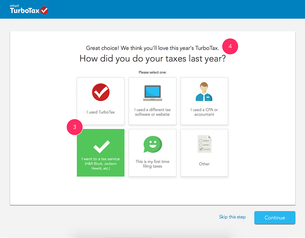
While patterns are a foundational for many designs and have many benefits for providing reliability and consistency for expected interactions, I refer to surprise of a well placed micro-interaction or the use of great content writing or interactive icons for a seemingly bland experience, such as filing your taxes.
TurboTax
Do the unexpected to delight and intrigue your audience.
Every ‘What’ has a ‘Why’
Every person’s story has a beginning, middle and an end. A novel is carried by conflict between deep seated ‘Why’s — the motivation behind actions, thoughts and worldview.
Engineers and designers simultaneously know too much and too little. They know too much about the technology and too little about how other people live their live and do their activities.
— Don Norman
Similarly, understanding user needs also requires digging deep into the ‘Why’ of their scenario. Beyond asking ‘what’ is the user’s goal, consider the ‘Why’s.
Why they want something to happen?
Why they expect it to happen?
Why is this goal important to them?
Without a concrete understanding of ‘Why’ something matters, we spiral off into random directions, becoming bloated with features or fixated on narrow use cases.
from Stories by Joanna Ngai on Medium https://blog.prototypr.io/what-ux-designers-can-learn-from-writing-a-novel-aed0a58088b?source=rss-225928e09472——2
Google’s AI research division, Google Brain, says it’s on a mission to find out. On Monday, the company announced a new research program called the People + AI Research initiative (PAIR for short) that’s all about understanding how humans interact with machine learning. As part of that effort, the company has developed a set of best practices that its teams use to design experiences that include machine learning.
It’s part of a philosophy the Google UX community is calling “human-centered machine learning,” where machine learning algorithms solve problems while keeping human needs and behaviors in mind. Detailed on Medium by Josh Lovejoy and Jess Holbrook, two designers in the Research and Machine Intelligence group at Google, these are Google’s rules for designing with machine learning while still keeping the user–and their humanity–at the center. Here are a few of the basics.
Lovejoy and Holbrook write that before rushing to include machine learning in your product or service, remember that it’s still your job as the designer to identify the problem and how best to solve it. Do the research that would be part of your conventional design process. Some problems may not need machine learning at all, while others might be perfectly suited to it. The point is, the algorithm doesn’t know if it’s the right tool to solve a problem. Don’t throw machine learning at everything–especially because it can be costlier to build than a simple fix.
For instance, Lovejoy and Holbrook point to the Gmail feature that reminds users to attach a file if they’ve mentioned the word “attachment” or “attached” in the body of the email. There’s no machine learning involved there—while AI might find more missing attachments, it’d be much more complicated and time-intensive to build.
In order to make sure machine learning is the right tool for the job, the duo recommend asking questions like these in order to identify what users expect from an AI-powered product:
Describe the way a theoretical human “expert” might perform the task today.
If your human expert were to perform this task, how would you respond to them so they improved for the next time? Do this for all four phases of the confusion matrix.
If a human were to perform this task, what assumptions would the user want them to make?
Out of a group of ideas for how to solve a problem, plot out which solutions would have the largest impact for users, and which would benefit the most from using machine learning. Ideas that both depend heavily on machine learning and would create the greatest impact for the users are the best ones to tackle.
Prototype With Real People Instead Of A Real Algorithm
One option for prototyping the duo suggest involves using participants’ real data (with their permission) in your machine learning system–another is to not use a machine learning system at all. This is called “Wizard of Oz” testing. In essence, participants believe they’re interacting with an AI system, but it’s actually controlled by a human. It was popular as a testing method 20 years ago, write Lovejoy and Holbrook, but the advent of machine learning has brought it back into the mainstream. These interactions are essential to guiding the design because when participants can earnestly engage with what they perceive to be an AI, they will naturally tend to form a mental model of the system and adjust their behavior according to those models,” they write.
Understanding how users’ mental models are formed is key to being able to design interactions. You can also learn about this by using participants’ data to simulate a wrong answer. How does the user respond when the machine fails? How does that change their future interactions?
A machine mis-categorizing input data might seem like a small mistake. But when that input data is a real-life human, being mis-categorized by an algorithm can have major consequences. For instance, if a machine learning algorithm is deciding whether a user is a bot or a real person, it matters a lot to a person who’s wrongly blocked than a bot that’s wrongly blocked. So you’d better make sure you’re thinking about the false positive.
In order to do this, Lovejoy and Holbrook recommend using what’s called a “confusion matrix,” which lays out on a grid when the algorithm’s response is accurate, when its response is inaccurate, when it returns a false positive, and when it returns a false negative. Ultimately that means deciding what’s more important–the precision (where there are fewer wrong answers, but less right ones), or the recall (where all the right answers are included, but there might be more wrong ones as a result). In some cases, it’s more important to prioritize precision over recall and vice versa–but that means understanding what is more important to your user.
Take Google Photos, for instance. Google designers decided that it’s important that if you type in “playground,” every single playground shows up–even if there are some photos that don’t fit in. But in terms of an algorithm that identifies online bots versus humans, perhaps it’s more important to be precise, so you don’t risk antagonizing users by locking them out of their accounts on the grounds that they’re not people.
How are you going to know how well the system is doing if you don’t know when it makes mistakes? Lovejoy and Holbrook write that sometimes machine learning models can be unpredictable, especially if the user’s idea of how a particular feature is supposed to work differs from the designer’s. Make sure you anticipate long-term feedback methods and build them into your platform directly for quantitative feedback–and sit down with people as they’re using it as well, to observe how their expectations from the platform change. In a world where designers don’t always understand how their AI-powered services and products work, Google’s solution is simple: get that data.
Of course, while Google has presented a set of rules on how to design for AI, the launch of the PAIR initiative is proof that even one of the pioneers of machine learning doesn’t yet understand how to responsibly design AI where humans are at the center. While it’s a promising step for Google, such initiatives are also a reminder of the challenges inherent in this technology: biased data, fallible assumptions, disregarded privacy, and all their consequences.
from Sidebar https://sidebar.io/out?url=https%3A%2F%2Fwww.fastcodesign.com%2F90132700%2Fgoogles-rules-for-designing-ai-that-isnt-evil
For most people, visiting San Francisco’s Museum of Modern Art isn’t exactly a casual trip. I’ve lived in San Francisco 6 years and have only made it once. However, now you can see some of the art from the museum by just texting the museum and asking. I’ve seen more art from its collection this afternoon than I have in years.
The SF MOMA currently houses 34,678 different pieces of artwork, but only roughly 5% of that collection is viewable at any given time if you happened to swing by the museum to check things out. Even if you do make it to the museum, seeing that 5% is a pretty lofty task. The MOMA says that in order to walk past every piece of artwork currently on display you’d need to trek roughly seven miles. That’s a lot of walking. It’s also likely a lot of seeing things you’re not interested in so that you can make your way to things you are.
Or, you could just text the museum.
A project called “Send Me SFMOMA” allows you to get a picture of roughly anything you want on demand, all you have to do is ask. The “anything” in that statement is a little rough. You can’t just message and ask to see a specific piece. However, you can message and ask for happiness, or the ocean, or a dog…
Screenshot of SF MOMA texts
To try it out, send a text to 572-51 with the words “Send Me” followed by what you’d like to see. I personally like testing the waters with emojis, which sometimes works and other times ends in failure. When there’s a match, you’ll get back an image from that 34,678-item collection. Presumably, you’ll never get the same image twice, so you can slowly work through the whole collection from your couch.
from Lifehacker http://lifehacker.com/text-sfs-moma-and-it-will-respond-with-art-to-fit-your-1796761145
Voice search is increasingly being adopted by consumers who are literally speaking to brands to get the answers to their questions. This habit of relying on a voice assistant to answer queries presents brands with ample opportunities to connect with customers in meaningful ways. But are companies capitalizing on this opportunity?
Google UK’s research into consumer perceptions of voice and text search has shown that while 57 percent of consumers still find text search highly functional, a growing number — 45 percent, in fact — feel that voice is the future. A massive 83 percent of the consumers we surveyed believe voice makes it even easier to find what they want from brands, while even more of them (89 percent) feel voice makes search faster.
This is making search an even more important channel when it comes to brand communications. Bringing voice into the equation means more people are searching more often. In fact, three-quarters of the consumers in our research believed that mobile voice search availability meant they search more.
It’s not that consumers are switching from one capability to the other. More than half (51 percent) currently use both text and voice, and they’re expecting results on both. Consumers need search to deliver fast, efficient, and targeted results. Brands should see this as an opportunity to communicate more authentically with their customers.
To do that, brands need to learn how customers use search. What external factors (weather, economy, life stage) are impacting customers’ perceptions? How and where are they using search? Why and what for? How can brands enhance search across voice, text, and mobile platforms so that it becomes a personal and engaging connection?
The shift from “text only” to “text plus voice” has been boosted by advances in technology, particularly in natural language processing (NLP). Providing a high-functioning voice capability is critical to delivering on customer experience.
Poor experiences using voice in the past have clearly colored some customers’ attitudes. Only a quarter of consumers who tried less-advanced voice technology four years ago still use it often today. In contrast, 42 percent of customers who have only started using voice in the last six months now use it daily.
It’s the ongoing challenge of promise and expectation meeting reality. Customers are still simply turned off when stuff doesn’t work. Half of millennials are frustrated by slow web page loads, and 57 percent of consumers overall would use voice search more if it could understand more complex commands. Voice, in particular, has to be an intuitive experience, with 42 percent saying they would use it more if they knew how to use it better.
This may mean that we’re still on the cusp of voice search becoming mainstream, but it’s also a call to action for brands. We’re just about over the top of the adoption curve, and brands and agencies need to take the concept seriously.
In the research, it became clear that consumers expect Google to be smart enough to recognize individuals’ voices and respond accordingly.
While it’s up to Google to continue developing our voice-activated products and NLP capabilities, just as we do with text search, brands can already start acting on the new demands of the channel.
For example, one respondent noted anecdotally in the research that he tended to search for things by voice that he wouldn’t think to look for using text. This opens up a whole new area of opportunity by optimizing for new search terms.
The frustration consumers commonly feel is another challenge-turned-opportunity. Almost twice as many consumers believe search is too slow when they’re on the move compared to when they’re sitting down. More than two-thirds find search slow when they’re rushed and anxious, compared to just 21 percent of people who are calm and relaxed.
It stands to reason that offering consumers the potential to switch seamlessly between voice and text mode, desktop and mobile, increases brands’ ability to serve and gives them a chance to rise above the competition.
But just because search via voice may be more convenient via mobile or when you are irritated or on the move doesn’t mean that brands should only cater to voice at this point.
There will be plenty of annoyed commuters who’d rather type in a search for taxi companies than speak into their mobiles. And many, many relaxed smart TV viewers sitting with a laptop or tablet would much prefer to say “OK Google” from the sofa when looking for Poldark’s broadcast time than search online.
Ultimately, it’s about consumer choice. Just consider the bank that insists on a call center rather than allowing the client to self-serve online, or vice versa. With consumer research, we can broadly infer that an individual will prefer one method over another. That doesn’t mean we only serve up the most popular option.
Brands that don’t provide a seamless digital experience — and this increasingly means optimizing for both text and voice search — will frustrate consumers and impact loyalty.
Matt Bush is the Director of Agencies at Google UK.
Above: The Machine Intelligence Landscape This article is part of our Artificial Intelligence series. You can download a high-resolution version of the landscape featuring 288 companies by clicking the image.
from VentureBeat https://venturebeat.com/2017/07/06/why-the-voice-of-the-consumer-is-so-important-to-ai/
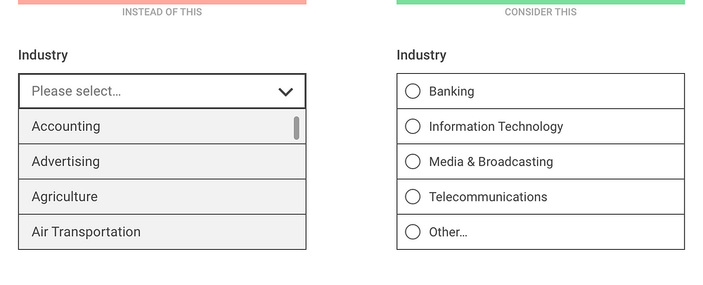
Using dropdown menus in forms might seem a no-brainer: they don’t take much space on the UI, they automatically validate the input, all browsers and platforms support them, they’re easy and cheap to implement, and the users know them well enough.
At the same time, though, dropdown (or select) menus are one of the most frequently misused form patterns and “should be the UI of last resort”, according to Luke Wroblewski and manyothers.
Let’s look at some of the limitations and concerns:
In a dropdown, the available options are not visible until you click or tap to open it. Also, the length of the list is hidden at first sight, that is, users can’t predict if a dropdown menu would contain 2 or 50 elements.
Selecting an option from a dropdown list (especially on mobile) is a multi-step process: you have to tap on the dropdown to open the list of options, then scroll and scan through the items to select one, and then close the dropdown.
Dropdown menus might make designers lazy: it’s super easy to just add all the possible options to a dropdown list without any prioritization (which makes it really similar to the hamburger menu, by the way).
Longer dropdowns, such as a country selector can be a nightmare to scan through, especially on mobile where keyboard search is usually not available.
Scrolling through the options might be painful on some mobile screens where the visible and scrollable area of the list is small:
On iOS, the number of visible options might be surprisingly low at first sight
The good news is that there are plenty of alternative input controls that will work better for you in many cases.
Consider the number of options
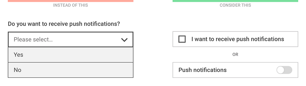
For binary (on/off) decisions, the dropdown menu is a really bad choice. What you need is a checkbox or a toggle switch.
If your dropdown only contains Yes/No or On/Off options, use a simpler switch instead
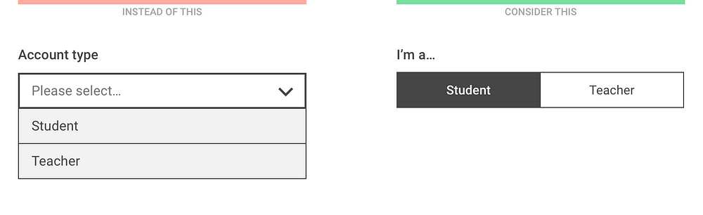
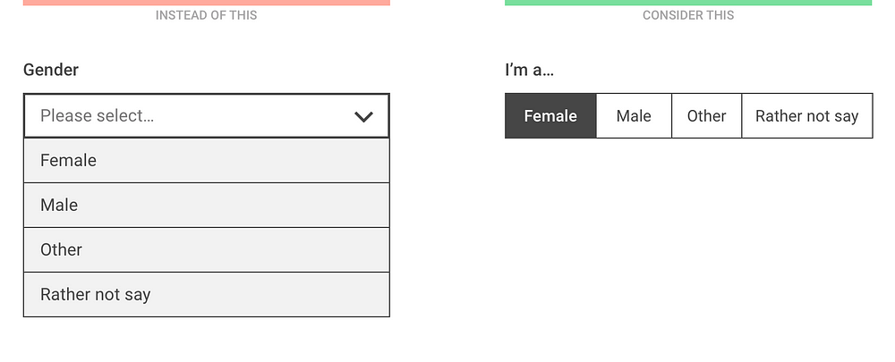
For a small number of mutually exclusive options, radio buttons or segmented controls are recommended so that all available options are visible at once, without having to open the list.
Segmented controls show the selected and the alternative option(s) at once
The number of visible options depend on the screen width and the length of the option labels but having more than 5 items is not recommended
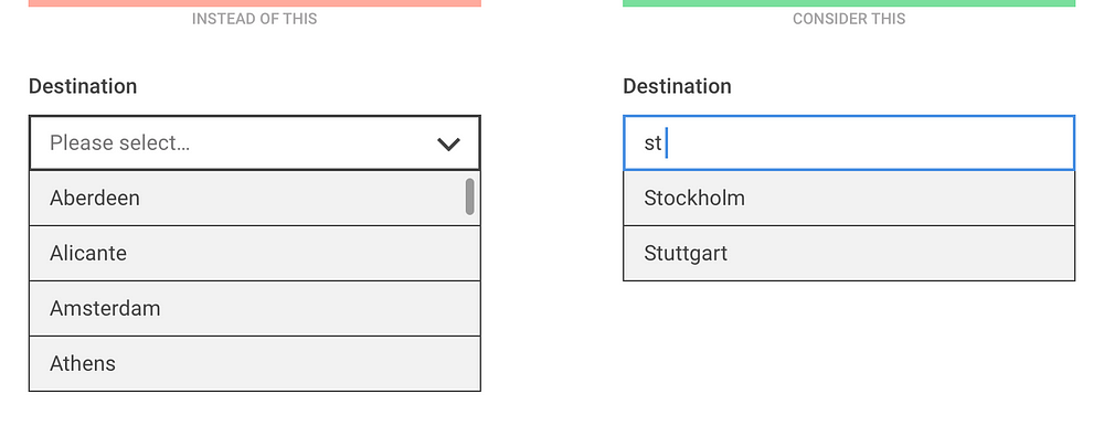
For a large number of well specified options, when users know exactly what they’re looking for, consider a “start typing…” solution where the list of filtered options is displayed after the first one or two letters.
Instead of scrolling through the list, let the users start typing and only show the filtered options
For large and diverse lists, try to use existing user data to prioritize the options and only list the first few most popular choices to the user. This way there’s a chance that 90% of the users will find their preference instantly and only 10% have to select Other and then specify it in the next question.
Although “Other” is not an elegant solution, such prioritization might improve the user experience for the majority of users
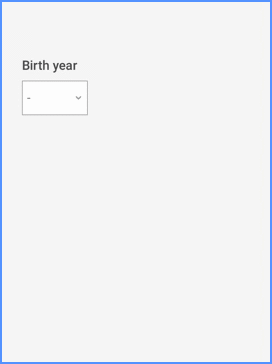
Consider the expected input
One of the benefits of a dropdown list is that users don’t have to type much. However, if the expected input is not too long and is frequently asked (such as personal data) it’s usually easier to type in rather than select it from a list:
Entering a birth year on a mobil device is easier with a numeric keyboard than by scrolling through a long list
In general, entering a numeric value on a mobile is usually more efficient with a keyboard.
Even though the sorting order of a numeric dropdown is clear, it might still be easier to type than scroll
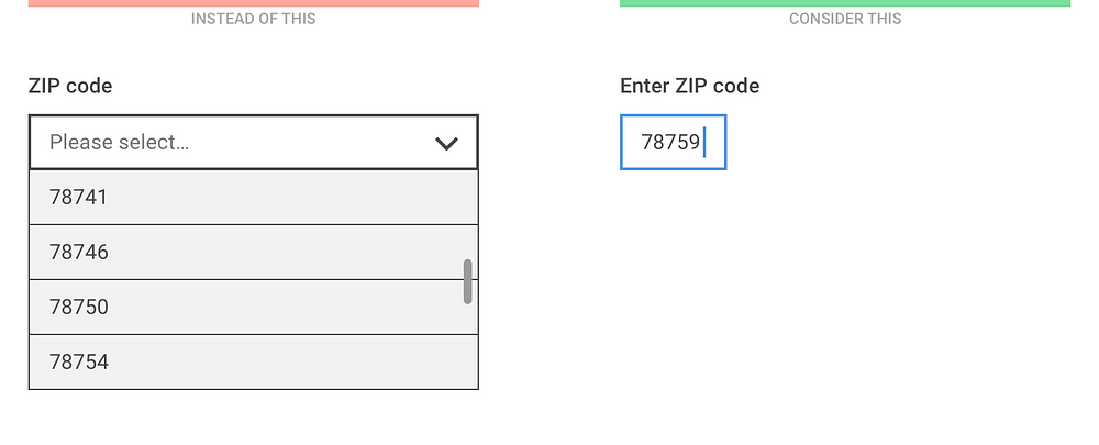
If it’s important to validate the user’s input, the “start typing…” approach might be useful where the input field is used to filter down the available options.
When listing the states of the USA, typing only one letter filters down the list well
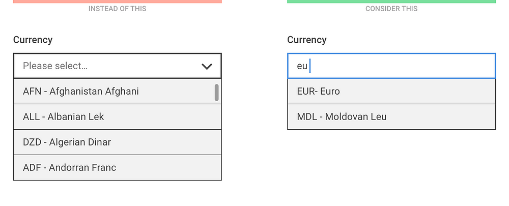
The ability to search in the list of options is especially helpful when the sorting order of the elements is not clear.
The sorting order for currencies might be unclear to users so make sure they can search in name and currency code, too
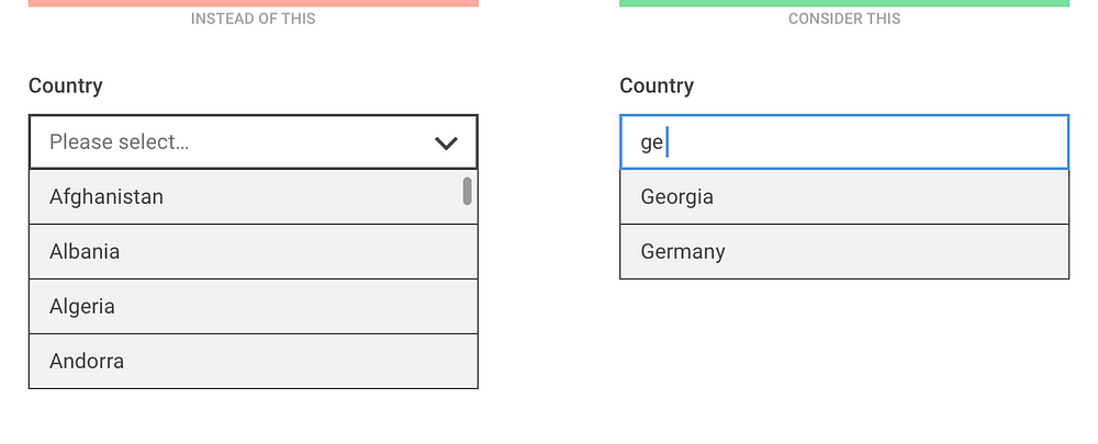
The same technique should be applied for the good old country list: instead of listing 200+ items, let users start typing and filter the results as soon as possible.
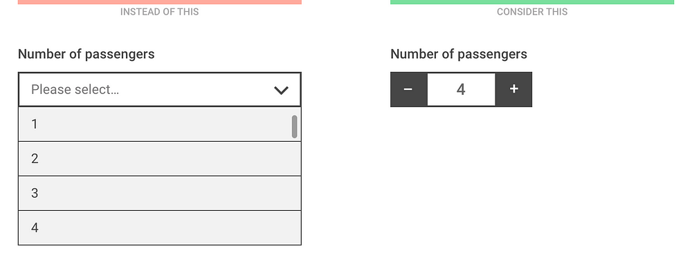
For discreet values representing quantity (such as the number of passengers or the number of items in a shopping cart), a stepper allows the users to quickly increase or decrease the number with one click or tap.
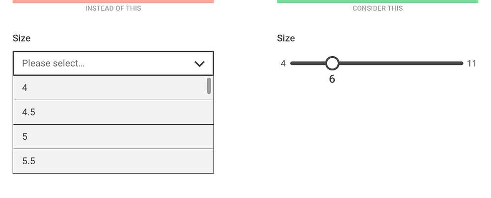
For non-discreet values or values that are located on a scale, consider using a slider.
Showing the minimum and maximum value of the scale might help the understanding of the context
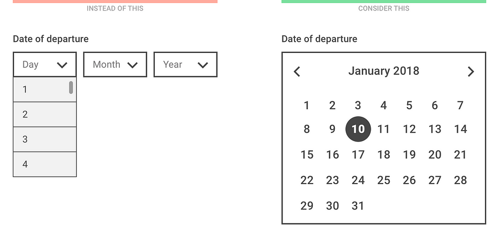
Picking a date with multiple select menus can be a really painful experience so for entering nearby dates, always use a date picker. (But never use it for entering birth dates!)
Consider designing smarter dropdowns
It goes without saying that dropdown menus should not be always avoided. You’ll find cases when a select menu is the most appropriate input control and that’s fine, just try to make it as user friendly as possible.
Use a meaningful label: the menu label or description should be clear and available even when the list is open. Inside the select menu, use a descriptive label that tells the users what they’re selecting (that is, “Select type” instead of “Please select”).
Sort items in a sensible way: based on user data, try putting the most popular choices on top of the list. Or, even pre-select the most popular one by default.
Use smart defaults: phones and browsers knows the user’s location, the date, and tons of other information. Use that data to pre-select the most probable option for every user.
Decrease the number of fields and let the computer do the work: if a user enters a ZIP code, the computer could already know the city and state — no need to ask. If a user enters a credit card number, the computer could already know it’s a MasterCard — no need to ask.
Consider using APIs: signing up with a Facebook Connect button is easier than filling out a registration form. Paying with Paypal is easier than having to type in your credit card data.
If you want to learn more about designing dropdowns,check out the brilliant SXSW Keynote by Golden Krishna and Eric Campbell:
from Sidebar https://sidebar.io/out?url=https%3A%2F%2Fmedium.com%2F%40kollinz%2Fdropdown-alternatives-for-better-mobile-forms-53e40d641b53
In recent years’ evidence has been mounting that points to a crisis in the reproducible results of scientific research. Reviews of papers in the fields of psychology and cancer biology found that only 40% and 10%, respectively, of the results, could be reproduced.
52% of researchers think there is a significant reproducibility crisis
70% of scientists have tried but failed to reproduce another scientist’s experiments
In 2013, a team of researchers published a paper describing ten rules for reproducible computational research. These rules, if followed, should lead to more replicable results.
All data science is research. Just because it’s not published in an academic paper doesn’t alter the fact that we are attempting to draw insights from a jumbled mass of data. Hence, the ten rules in the paper should be of interest to any data scientist doing internal analyses.
Rule #1—For every result, keep track of how it was produced
It’s important to know the provenance of your results. Knowing how you went from the raw data to the conclusion allows you to:
defend the results
update the results if errors are found
reproduce the results when data is updated
submit your results for audit
If you use a programming language (R, Python, Julia, F#, etc) to script your analyses then the path taken should be clear—as long as you avoid any manual steps. Using “point and click” tools (such as Excel) makes it harder to track your steps as you’d need to describe a set of manual activities—which are difficult to both document and re-enact.
Rule #2—Avoid manual data manipulation steps
There may be a temptation to open data files in an editor and manually clean up a couple of formatting errors or remove an outlier. Also, modern operating systems make it easy to cut and paste been applications. However, the temptation to short-cut your scripting should be resisted. Manual data manipulation is hidden manipulation.
Rule #3—Archive the exact versions of all external programs used
Ideally, you would set up a virtual machine with all the software used to run your scripts. This allows you to snapshot your analysis ecosystem—making replication of your results trivial.
However, this is not always realistic. For example, if you are using a cloud service, or running your analyses on a big data cluster, it can be hard to circumscribe your entire environment for archiving. Also, the use of commercial tools might make it difficult to share such an environment with others.
At the very least you need to document the edition and version of all the software used—including the operating system. Minor changes to software can impact results.
Rule #4—Version control all custom scripts
A version control system, such as Git, should be used to track versions of your scripts. You should tag (snapshot) multiple scripts and reference that tag in any results you produce. If you then decide to change your scripts later, as you surely will, it will be possible to go back in time and obtain the exact scripts that were used to produce a given result.
Rule #5—Record all intermediate results, when possible in standardized formats
If you’ve adhered to Rule #1 it should be possible to recreate any results from the raw data. However, while this might be theoretically possibly, it may be practically limiting. Problems may include:
lack of resources to run results from scratch (e.g. if considerable cluster computing resources were used)
lack of licenses for some of the tools, if commercial tools were used
insufficient technical ability to use some of the tools
In these cases, it can be useful to start from a derived data set that is a few steps downstream from the raw data. Keeping these intermediate datasets (in CSV format, for example), provides more options to build on the analysis and can make it easier to identify where a problematic result when wrong—as there’s no need to redo everything.
Rule #6—For analyses that include randomness, note underlying random seeds
One thing that data scientists often fail to do is set the seed values for their analysis. This makes it impossible to exactly recreate machine learning studies. Many machine learning algorithms include a stochastic element and, while robust results might be statistically reproducible, there is nothing to compare with the warm glow of matching the exact numbers produced by someone else.
If you are using scripts and source code control your seed values can be set in your scripts.
Rule #7—Always store raw data behind plots
If you use a scripting/programming language your charts will often be automatically generated. However, if you are using a tool like Excel to draw your charts, make sure you save the underlying data. This allows the chart to be reproduced, but also allows a more detailed review of the data behind it.
Rule #8—Generate hierarchical analysis output, allowing layers of increasing detail to be inspected
As data scientists, our job is to summarize the data in some form. That is what drawing insights from data involves.
However, summarizing is also an easy way to misuse data so it’s important that interested parties can break out the summary into the individual data points. For each summary result, link to the data used to calculate the summary.
Rule #9—Connect textual statements to underlying results
At the end of the day, the results of data analysis are presented as words. And words are imprecise. The link between conclusions and the analysis can sometimes be difficult to pin down. As the report is often the most influential part of a study it’s essential that it can be linked back to the results and, because of Rule #1, all the way back to the raw data.
This can be achieved by adding footnotes to the text that reference files or URLs containing the specific data that led to the observation in the report. If you can’t make this link you probably haven’t documented all the steps sufficiently.
Rule #10—Provide public access to scripts, runs, and results
In commercial settings, it may not be appropriate to provide public access to all the data. However, it makes sense to provide access to others in your organization. Cloud-based source code control systems, such as Bitbucket and GitHub, allow the creation of private repositories that can be accessed by any authorized colleagues.
Many eyes improve the quality of analysis, so the more you can share, the better your analyses are likely to be.


 https://yo-op.github.io/sketchcachecleaner/