


Dropdown alternatives for better (mobile) forms
Using dropdown menus in forms might seem a no-brainer: they don’t take much space on the UI, they automatically validate the input, all browsers and platforms support them, they’re easy and cheap to implement, and the users know them well enough.
At the same time, though, dropdown (or select) menus are one of the most frequently misused form patterns and “should be the UI of last resort”, according to Luke Wroblewski and many others.
Let’s look at some of the limitations and concerns:
- In a dropdown, the available options are not visible until you click or tap to open it. Also, the length of the list is hidden at first sight, that is, users can’t predict if a dropdown menu would contain 2 or 50 elements.
- Selecting an option from a dropdown list (especially on mobile) is a multi-step process: you have to tap on the dropdown to open the list of options, then scroll and scan through the items to select one, and then close the dropdown.
- Dropdown menus might make designers lazy: it’s super easy to just add all the possible options to a dropdown list without any prioritization (which makes it really similar to the hamburger menu, by the way).
- Longer dropdowns, such as a country selector can be a nightmare to scan through, especially on mobile where keyboard search is usually not available.
- Scrolling through the options might be painful on some mobile screens where the visible and scrollable area of the list is small:

On iOS, the number of visible options might be surprisingly low at first sight
The good news is that there are plenty of alternative input controls that will work better for you in many cases.
Consider the number of options
For binary (on/off) decisions, the dropdown menu is a really bad choice. What you need is a checkbox or a toggle switch.

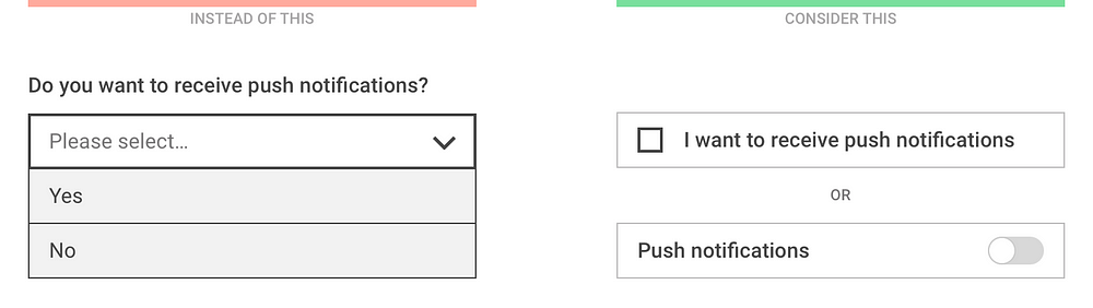
If your dropdown only contains Yes/No or On/Off options, use a simpler switch instead
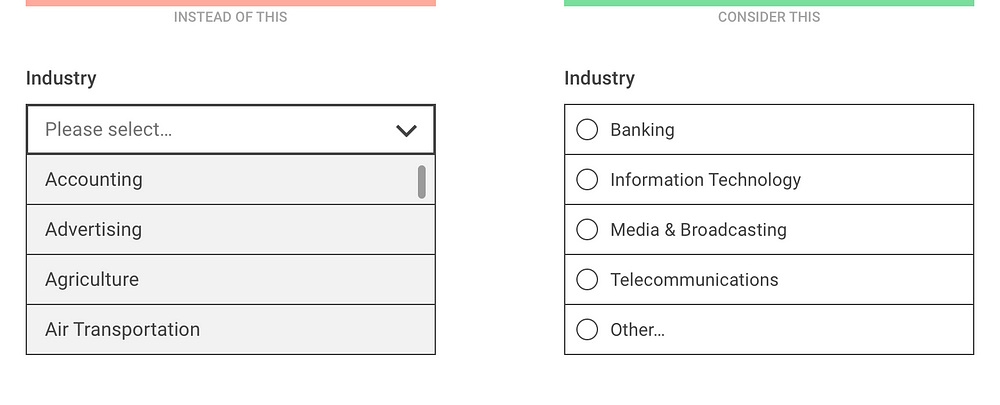
For a small number of mutually exclusive options, radio buttons or segmented controls are recommended so that all available options are visible at once, without having to open the list.

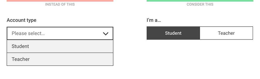
Segmented controls show the selected and the alternative option(s) at once

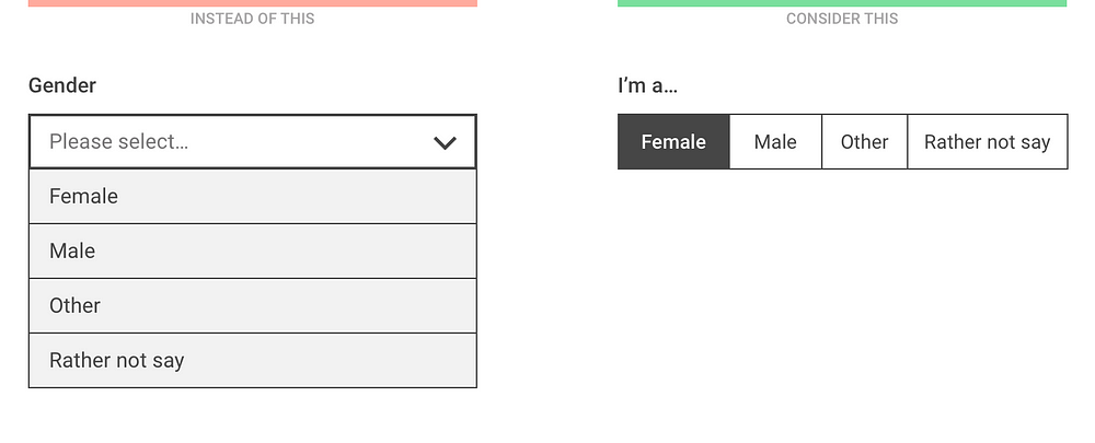
The number of visible options depend on the screen width and the length of the option labels but having more than 5 items is not recommended
For a large number of well specified options, when users know exactly what they’re looking for, consider a “start typing…” solution where the list of filtered options is displayed after the first one or two letters.

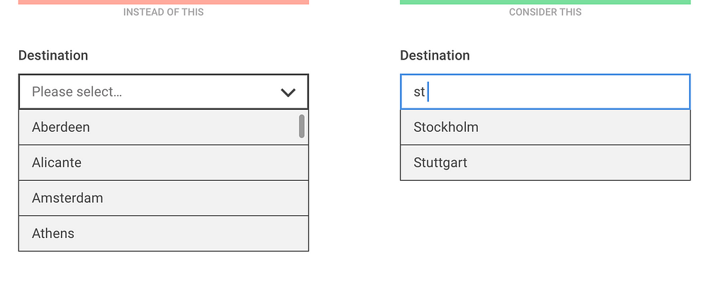
Instead of scrolling through the list, let the users start typing and only show the filtered options
For large and diverse lists, try to use existing user data to prioritize the options and only list the first few most popular choices to the user. This way there’s a chance that 90% of the users will find their preference instantly and only 10% have to select Other and then specify it in the next question.

Although “Other” is not an elegant solution, such prioritization might improve the user experience for the majority of users
Consider the expected input
One of the benefits of a dropdown list is that users don’t have to type much. However, if the expected input is not too long and is frequently asked (such as personal data) it’s usually easier to type in rather than select it from a list:

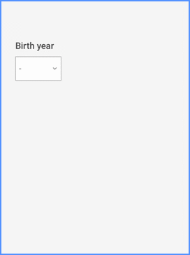
Entering a birth year on a mobil device is easier with a numeric keyboard than by scrolling through a long list
In general, entering a numeric value on a mobile is usually more efficient with a keyboard.

Even though the sorting order of a numeric dropdown is clear, it might still be easier to type than scroll
If it’s important to validate the user’s input, the “start typing…” approach might be useful where the input field is used to filter down the available options.

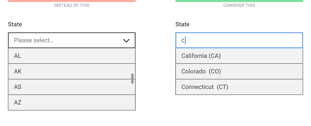
When listing the states of the USA, typing only one letter filters down the list well
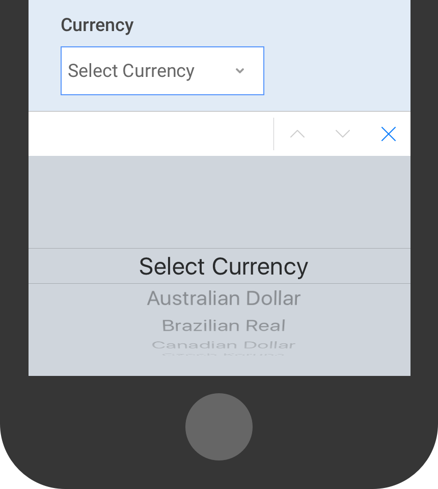
The ability to search in the list of options is especially helpful when the sorting order of the elements is not clear.

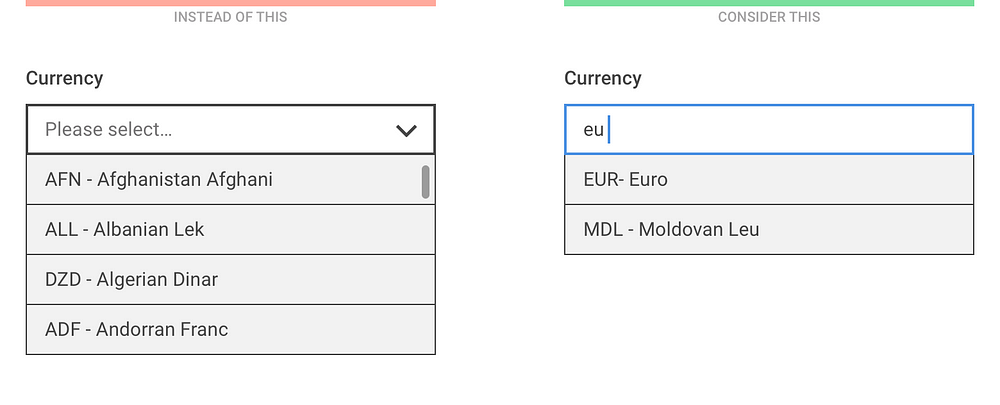
The sorting order for currencies might be unclear to users so make sure they can search in name and currency code, too
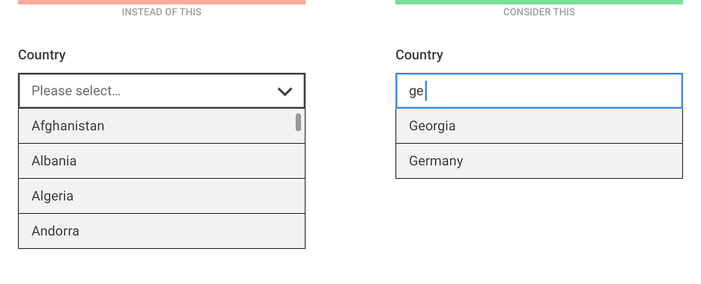
The same technique should be applied for the good old country list: instead of listing 200+ items, let users start typing and filter the results as soon as possible.

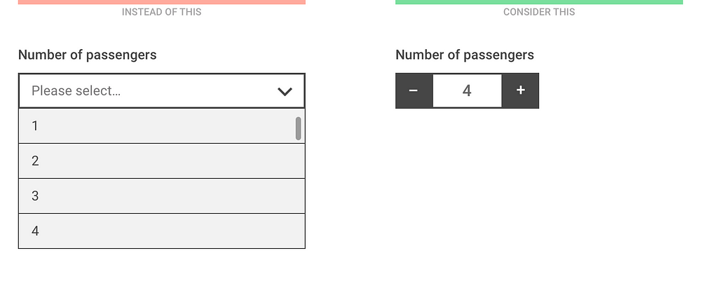
For discreet values representing quantity (such as the number of passengers or the number of items in a shopping cart), a stepper allows the users to quickly increase or decrease the number with one click or tap.

For non-discreet values or values that are located on a scale, consider using a slider.

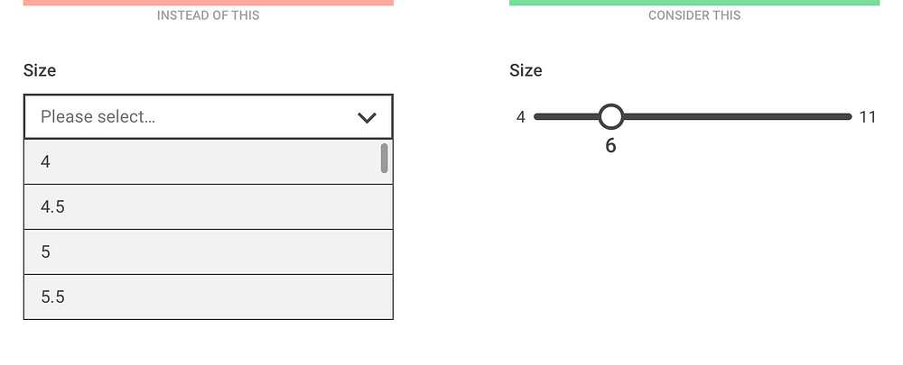
Showing the minimum and maximum value of the scale might help the understanding of the context
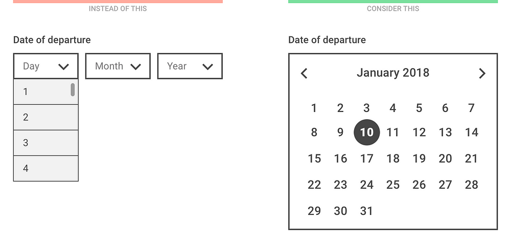
Picking a date with multiple select menus can be a really painful experience so for entering nearby dates, always use a date picker. (But never use it for entering birth dates!)

Consider designing smarter dropdowns
It goes without saying that dropdown menus should not be always avoided. You’ll find cases when a select menu is the most appropriate input control and that’s fine, just try to make it as user friendly as possible.
- Use a meaningful label: the menu label or description should be clear and available even when the list is open. Inside the select menu, use a descriptive label that tells the users what they’re selecting (that is, “Select type” instead of “Please select”).
- Sort items in a sensible way: based on user data, try putting the most popular choices on top of the list. Or, even pre-select the most popular one by default.
- Use smart defaults: phones and browsers knows the user’s location, the date, and tons of other information. Use that data to pre-select the most probable option for every user.
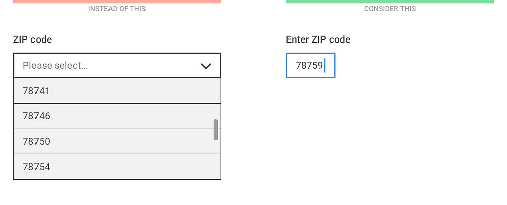
- Decrease the number of fields and let the computer do the work: if a user enters a ZIP code, the computer could already know the city and state — no need to ask. If a user enters a credit card number, the computer could already know it’s a MasterCard — no need to ask.
- Consider using APIs: signing up with a Facebook Connect button is easier than filling out a registration form. Paying with Paypal is easier than having to type in your credit card data.
If you want to learn more about designing dropdowns, check out the brilliant SXSW Keynote by Golden Krishna and Eric Campbell:

from Sidebar https://sidebar.io/out?url=https%3A%2F%2Fmedium.com%2F%40kollinz%2Fdropdown-alternatives-for-better-mobile-forms-53e40d641b53