This year, the world of logo design has lost one of its most prominent representatives, Ivan Chermayeff. In the odd case you don’t know who that is let me break it down for you really quickly. 60 years ago this man, Yale graduate, along with his Tom Geisman, founded the legendary firm Chermayeff & Geismar. It would become to be known as the creators of logos for such companies as Pan Am, Chase Bank, NBC and Xerox; channels such as Showtime and National Geogrpahic; and brands like Armani Exchange.
In 1979 Ivan Chermayeff and Thomas Geismar were awarded the AIGA Medal and in October 2014 they received the National Design Award for Lifetime by the Smithsonian’s Cooper-Hewitt, National Design Museum. Since, 2006 another designer joined forced in the firm, as a partner, Sagi Haviv. Apart from logos, they also deal with motion graphics and art in architecture.
Unfortunately, Chermayeff died this year, on December 3rd. He left behind a true legacy that will most likely be continued by its remaining two partners.
This is the man that said: “It is usually a two-month process, but it should look like it took five minutes.” That’s exactly what everyone in the business knows to be true. Only they’ve been doing it so successfully for 60 years, and counting.
To honor the two pioneering professionals, Dan Covert of Dress Code created the video below, which also features the last interview Ivan Chermayeff gave. The world of design has definitely lost a legend.
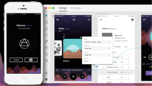
Framer is known as a prototyping app, but in an unexpected move they have just announced the launch of a fully integrated, browser-based, visual design tool.
Aimed at creative professionals, the new Framer is designed to rival established options including Creative Cloud and Sketch, new kids on the block Affinity and Figma, and is timed to steal the thunder of InVision, whose own much heralded design app is expected next month.
We’re betting on something that our competitors aren’t — that designers will want a tool which does both high-fidelity design and prototyping.
—Koen Bok, co-founder, Framer
Framer claims that this latest release makes it the first prototyping app to fully consolidate the entire designer toolkit—at least for screen based design.
The new app allows you to design everything from icons, through to hi-fidelity interactive mockups. Unlike some competitors, who are promising the moon in 2018, you can use Framer’s design tool now. The not unfamiliar interface is simple to use, and initial reactions have been broadly positive.
Framer’s approach has been a little…interesting, to put it succinctly. They have integrated AI [facepalm] so that you design something once, and Framer ‘intelligently’ reshapes and resizes the design across any device. I’m not saying this is a dubious approach, I’m not saying that responsive design is about more than making shapes fit a viewport, I’m not saying that this goes against a mobile-first methodology; I’m not saying any of that because we should be positive about any new tool that people have worked hard on.
Perhaps the best news for designers is that the tool is being released at all. We all saw the stagnation in design apps—and the corresponding impact that had design work—when Adobe was the only player in town. The more companies are forced to compete to win your custom, the better the tools on offer. It seems that 2018 could feature a design tools ‘space race’, with a dozen or more developers vying for an established slot in designers’ workflows.
Framer’s evolution into a full design tool, is on the one hand ambitious, and on the other inevitable. Framer won’t be talked about as an Adobe killer, it’s a different beast altogether; it may be that designers anticipating InVision’s new tool are tempted away. A creative process is a very personal thing, some designers will love Framer, others will not; it’s always nice to have a choice.
Framer is available now as a 14 day free trial, plans start from $12 per month.
from Webdesigner Depot https://www.webdesignerdepot.com/2017/12/framer-launches-fresh-new-design-tool/
A/B tests provide more than statistical validation of one execution over another. They can and should impact how your team prioritizes projects.
Too often, teams use A/B testing to validate bad ideas. They make minor changes and hope the test will produce big wins. But these tests can be counterproductive. Results that are a product of random variation (e.g. not statistically significant) yield unhelpful insights, and even good results are not guaranteed to hold true when your winning variable is shipped to a full audience.
If you adhere to A/B testing best practices and ask the right questions before running a test, you’ll learn what types of changes are actually worth your time and focus on projects that produce meaningful insights.
The impact of statistical power
There’s a lot written on frequent A/B testing mistakes. The most common error is calling tests too soon based on statistical significance. Sometimes your test result is significant because there’s an actual effect, other times it’s due to sheer noise. After all, a random sample is never going to be a perfect representation of the full population.
In order to differentiate an effect from noise, you not only need statistical significance but also statistical power. If you have more statistical power you can be more certain the lift is actually real.
To get enough power and run a test correctly, ask yourself:
How much do you think the change will increase the associated key performance indicator (KPI)?
Given this desired effect, how long will you need to run the test to get accurate results?
Is it worth the wait?
1. How much do you think the change will increase the KPI?
Say you want to improve your signup flow. You have a list of ideas and are trying to decide which ones to work on. You’re not happy with the UI, but a complete overhaul will take a month to design and build. On the other hand, you could try out a different color scheme, which won’t take long to change. Your team hypothesizes that the complete redesign can boost conversion from 10% to 15% whereas the color scheme change may boost conversion from 10% to 11%.
2. Given this desired effect, how long will you need to run the test to get accurate results?
Take your answer to the question above and plug it into this sample size calculator. Under the hood there’s serious statistics involved, but the basic logic is smaller effects take longer to detect whereas larger effects will be obvious sooner. This is an important insight: detecting small changes is expensive. In our example, the color scheme change only takes two days to build, but we’ll need 24x more data to test a 1% versus a 5% absolute lift.
3. Is it worth the wait?
With sample sizes in mind, you should consider how long a test would need to run to achieve reliable results. Say your signup flow gets 600 visits per day. The complete redesign will require two days to gather enough data while the color scheme change will take much longer. So the larger project takes 32 days to develop and test, while the smaller project takes 49. They both take a lot of time, but the complete redesign has more potential.
Focus on projects with bigger potential upside
Late last year, we thought our signup flow could do better. The layout on our previous signup page (shown below as the Control) was not logically organized. The integration methods were not displayed in an order that was most likely to be relevant to new users. And since our signup flow doesn’t see hundreds of thousands of visitors, we knew we had to test something that we thought was much better.
We wanted our signup conversion to increase by 10%. And after getting enough data, we looked at the signup rates between versions. Disappointingly, the difference was small and not statistically significant. The test was a wash, but that’s okay. We still decided to use the new version, because the signup experience was cleaner and put us in a better position to iterate and improve in the future.
What this approach means for startups
For young companies, small optimization projects just don’t make sense. Tests take a long time to run and distract you from working on projects that matter. You might see a slight uptick, but you’re likely working towards a local maximum. To get on the path towards the global maximum, young companies need to make big changes.
Larger companies have spent a lot of time working on flows and understanding their customers. They’re better suited for small improvements because they have the traffic to conclude tests faster. Plus, a 1% improvement means a lot more when you have hundreds of thousands of visitors a day.
Once you’ve made several large tests, have a good understanding of your customers and have large traffic volume, you can work on small optimizations. Remember, not every A/B test is going to yield the result you want. What’s important is that you determine your improvement goal and account for how long you need to run the tests to get the right kind of results. Otherwise you risk spending a lot of resources only to get back a negative ROI.
The students uncovered the origin behind energetic particles that exist in the inner areas of Earth’s radiation belt. Scientists have long theorized that highly charged protons in these areas originated from cosmic ray albedo neutron decay (CRAND), which is what occurs when cosmic rays smash into neutrons in the Earth’s atmosphere. It results in charged particles, which become trapped in the Van Allen Belts. However, scientists did not extend this theory to cover the electrons on the inner edge of the belts.
Now, students have confirmed that CRAND is also responsible for the presence of highly charged electrons. It’s satisfying to have this mystery resolved, especially because these charged particles have a practical impact on space travel. They pose a hazard to both satellites and astronauts leaving the protective shell of the Earth’s magnetosphere to travel to the moon, Mars and beyond. Understanding where these particles come from can help us predict them.
But this discovery is also powerful because of the way it was made: by students through the use of CubeSats. CubeSats are small satellites, about the size of a loaf of bread or a shoebox. They are inexpensive to manufacture, and thanks to rocket startup companies like Vector and Rocket Lab, will soon be relatively cheap to launch as well. This particular satellite was funded through an NSF grant, and as space becomes increasingly accessible to high school and college students, you can bet that more discoveries like this are in our near future.
from Engadget https://www.engadget.com/2017/12/13/students-solve-mystery-electrons-van-allen-belts/
Don’t let your fascination for AI get in the way of your fascination for solving real problems from real people.
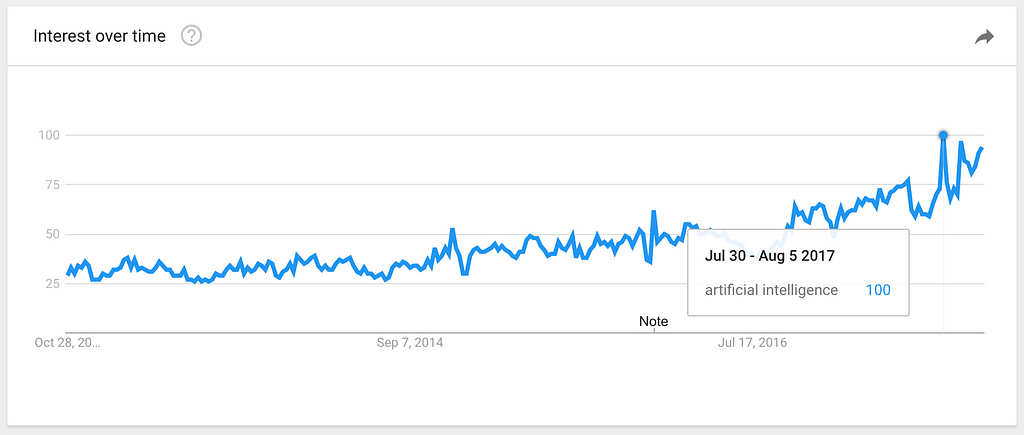
Interest for “Artificial Intelligence” over the last 5 years, according to Google Trends.
Artificial Intelligence is the big buzzword of today. If you are a digital designer, there are good chances that a quick scroll through your RSS reader, Twitter feed or Slack channels will show you more instances of the term “AI” than you would see just a year ago. New products being launched, journalists speculating how many years it will take for robots to take over the world, experts giving their opinion about how to design for AI.
Our entire industry is rushing to launch the world’s first AI-powered _______ (insert a product category here), without a proper use case or business case for it.
It doesn’t matter how it is going to be used, or by whom. What matters is to be the world’s first. Whatever it is. As long as there’s AI powering it.
In the next few months, every vertical of every industry will start to attach the AI-poweredlabel to all its products — as well as its variations “AI-enabled”, “AI-driven”, “AI-controlled”. It’s a process that has been happening in the last 1–2 years and will only intensify moving forward.
On the other hand, products that are proudly created by humans (not robots), will start to attach labels that sit at the extreme opposite of the spectrum: “hand-made”, “hand-crafted”, “curated by humans”, “human-made”.
But what does that mean for UX Designers?
To create anything that will be powered by AI, technologists inherently have to start with the data that will be used to train the AI and ultimately create these amazing AI-powered tools and services. This process is usually driven by engineers — the experts that actually know how to model the intelligence and enable it to take action based on data.
The problem with that is that teams usually pick the first problem that technology can be applied to, without validating it with real users. Is that technology solving a real user need?
Just because something is possible doesn’t mean it should exist in the world.
It’s the same story when the concept of mobile apps came up in the late 2000s. Hundreds of apps were being launched every week, solving problems no one ever had. The vast majority died; the ones that were relevant for people persisted.
As UX Designers, our biggest challenge will be to participate as early as possible in these types of projects. To be designing along with developers, as soon as data is available to be looked at. And to bring the good old design methods of user validation and user research to the moment decisions are made — so companies don’t spend millions of dollars solving problems that don’t exist.
When AI gets in the way of UX was originally published in uxdesign.cc on Medium, where people are continuing the conversation by highlighting and responding to this story.
from Stories by Fabricio Teixeira on Medium https://uxdesign.cc/when-ai-gets-in-the-way-of-ux-17de95f40772?source=rss-50e39baefa55——2
The Graphics Interchange Format is not intended as a platform for animation, even though it can be done in a limited way.
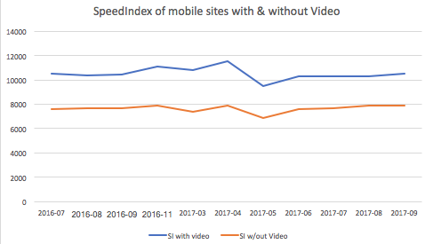
But they have become an awesome tool for cinemagraphs, memes, and creative expression. All of this awesomeness, however, comes at a cost. Animated GIFs are terrible for web performance. They are HUGE in size, impact cellular data bills, require more CPU and memory, cause repaints, and are battery killers. Typically GIFs are 12x larger files than H.264 videos, and take 2x the energy to load and display in a browser. And we’re spending all of those resources on something that doesn’t even look very good – the GIF 256 color limitation often makes GIF files look terrible (although there are some cool workarounds).
My daughter loves them – but she doesn’t understand why her battery is always dead.
GIFs have many advantages: they are requested immediately by the browser preloader, they play and loop automatically, and they are silent! Implicitly they are also shorter. Marketresearch has shown that users have higher engagement with, and generally prefer both micro-form video (< 1minute) and cinemagraphs (stills with subtle movement), over longer-form videos and still images. Animated GIFs are great for user experience.
So how did I go from love/hating GIFs to love/loving “Gifs”? (capitalization change intentional)
In the latest Safari Tech Preview, thanks to some hard work by Jer Noble, we can now use MP4 files in <img> tags. The intended use case is not long-form video, but micro-form, muted, looping video – just like GIFs. Take a look for yourself:
<img src="rocky.mp4">
Cool! This is going to be awesome on so many fronts – for business, for usability, and particularly for web performance!
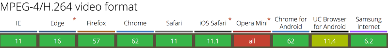
As many have already pointedout, using the <video> tag is much better for performance than using animated GIFs. That’s why in 2014 Twitter famously added animated GIF support by not adding GIF support. Twitter instead transcodes GIFs to MP4s on-the-fly, and delivers them inside <video> tags. Since all browsers now support H.264, this was a very easy transition.
Transcoding animated GIFs to MP4 is fairly straightforward. You just need to run ffmpeg -i source.gif output.mp4
However, not everyone can overhaul their CMS and convert <img> to <video>. Even if you can, there are three problems with this method of delivering GIF-like (Gif), micro-form video:
Unlike <img> tags, browsers do not preload <video> content. Generally preloaders only preload JavaScript, CSS, and image resources because they are critical for the page layout. Since <video> content can be any length – from micro-form to long-form – <video> tags are skipped until the main thread is ready to parse its content. This delays the loading of <video> content by many hundreds of milliseconds.
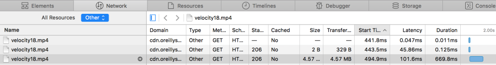
For example, the hero video at the top of the Velocity conference page is only requested 5 full seconds into the page load. It’s the 27th requested resource and it isn’t even requested until after Start Render, after webfonts are loaded.
Worse yet, many browsers assume that <video> tags contain long-form content. Instead of downloading the whole video file at once, which would waste your cell data plan in cases where you do not end up watching the whole video, the browser will first perform a 1-byte request to test if the server supports HTTP Range Requests. Then it will follow with multiple range requests in various chunk sizes to ensure that the video is adequately (but not over-) buffered. The consequence is multiple TCP round trips before the browser can even start to decode the content and significant delays before the user sees anything. On high-latency cellular connections, these round trips can set video loads back by hundreds or thousands of milliseconds.
And what performs even worse than the native <video> element? The typical JavaScript video player. Often, the easiest way to embed a video on a site is to use a hosted service like YouTube or Vimeo and avoid the complexities of video encoding, hosting, and UX. This is normally a great idea, but for micro-form video, or critical content like hero videos, it just adds to the delay because of the javascript players and supporting resources these hosting services inject (css/js/jpg/woff). In addition to the <video> markup you are forcing the browser to downloaded, evaluate, and execute the javascript player — and only then can the video start to load.
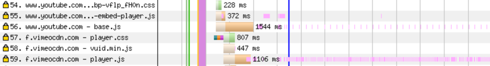
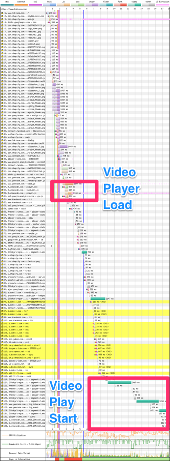
As many people know, I love my Loki jacket because of its built in mitts, balaclava, and a hood that is sized for helmets. But take a look at the Loki USA homepage – which uses a great hero-video, hosted on Vimeo:
If you look closely, you can see that the JavaScript for the player is actually requested soon after DOM Complete. But it isn’t fully loaded and ready to start the video stream until much later.
Most long-form video content – vlogs, TV, movies – is delivered via JavaScript-based players. Usually these players provide users with a convenient “share now” link or bookmark tool, so they can come back to YouTube (or wherever) and find the video again. In contrast, micro-form content – like memes and cinemagraphs – usually doesn’t come via a player, and users expect to be able to download GIFs and send them to friends, like they can with any image on the web. That meme of the dancing cat was sooo funny – I have to share it with all my friends!
If you use <video> tags to deliver micro-form video, users can’t right-click, click-and-drag, or force touch, and save. And their dancing-cat joy becomes a frustrating UX surprise.
3. Autoplay abuse
Finally, using <video> tags and MP4s instead of <img> tags and GIFs is brings you into the middle of an ongoing cat and mouse game between browsers and unconscionable ad vendors, who abuse the <video autoplay> attribute in order to get the users’ attention. Historically, mobile browsers have ignored the autoplay attribute and/or refused to play videos inline, requiring them to go full screen. Over the last couple of years, Apple and Google have both relaxed their restrictions on inline, autoplay videos, allowing for Gif-like experiences with the <video> tag. But again, ad networks have abused this, causing further restrictions: if you want to autoplay <video> tags you need to mark the content with muted or remove the audio track all together.
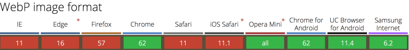
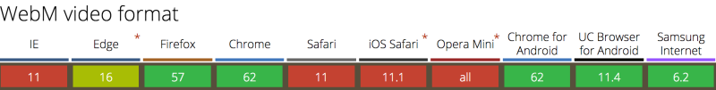
… but we already have animated WebP! And animated PNG!
The GIF format isn’t the only animation-capable, still-image format. WebP and PNG have animation support, too. But, like GIF, they were not designed for animation and result in much larger files, compared to dedicated video codecs like H.264, H.265, VP9, and AV1.
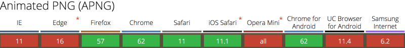
Animated PNG is now widely supported across all browsers, and while it addresses the color pallete limitation of GIF, it is still an inefficient file format for compressing video.
Animated WebP is better, but compared to true video formats, it’s still problematic. Aside from not having a formal standard, animated WebP lacks chroma subsampling and wide-gamut support. Further, the ecosystem of support is fragmented. Not even all versions of Android, Chrome, and Opera support animated WebP – even though those browsers advertise support with the Accept: image/webp. You need Chrome 42, Opera 15+ or Android 5+.
So while animated WebPs compress much better than animated GIFs or aPNGs, we can do better. (See file size comparisons below)
Having our cake and eating it too
By enabling true video formats (like MP4) to be included in <img> tags, Safari Technology Preview has fixed these performance and UX problems. Now, our micro-form videos can be small and efficient (like MP4s delivered via the <video> tag) and they can can be easily preloaded, autoplayed, and shared (like our old friend, the GIF).
<img src="ottawa-river.mp4">
So how much faster is this going to be? Pull up the developer tools and see the difference in Safari Technology Preview and other browsers:
Unfortunately Safari doesn’t play nice with WebPageTest, and creating reliable benchmark tests is complicated. Likewise, Tech Preview’s usage is fairly low, so comparing performance with RUM tools is not yet practical.
We can, however, do two things. First, compare raw byte sizes, and second, use the Image.decode() promise to measure the device impact of different resources.
NB: These results should be taken as directional only! Each codec could be tuned much more as you can see the vp9 fairs worse than the default vp8 outputs. A more comprehensive study should be done that considers SSIM.
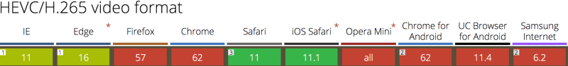
Yes animated WebP is smaller but any video format is much smaller. This shouldn’t surprise anyone since these modern video codecs are highly optimized for online video streaming. H.265 fairs very well as I expect AV1 will too.
The benefits here will not only be faster transit but also substantial $$ savings for end users.
Net-Net, using video in <img> tags is going to be much faster on a cellular connection.
Decode and Visual Performance Improvements
Next, let’s consider the impact of the decode and display effects on the browsing experience. H.264 (and H.265) has the notable advantage of being hardware decoded instead of using the primare core for decode.
How can we measure this? Since browsers haven’t yet implemented the proposed hero image API, we can use Steve Souder’s User Timing and Custom Metric strategy as a good aproximation of when the image starts to display to the user. It doesn’t measure frame rate, but it tells us roughly when the first frame is displayed. Better yet, we can also use the newly adopted Image.decode() event promise to measure decode performance. In the test page below, I inject a unique GIF and MP4 in an <img> tag 100 times and compare the decode and paint performance.
let image = new Image;
t_startReq = new Date().getTime();
document.getElementById("testimg").appendChild(image);
image.onload = timeOnLoad;
image.src = src;
return image.decode().then(() => { resolve(image); });
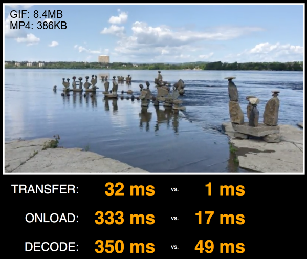
The results are quite impressive! Even on my powerful 2017 MacBook Pro, running the test locally, with no network throttling, we can see GIFs taking 20x longer than MP4s to draw the first frame (signaled by the onload event), and 7x longer to decode!
Localhost test on 2017 i7 MacBook Pro
Curious? Clone the repo and test for yourself. I will note that adding network conditions on the transit of the GIF v. MP4 will disproportionately skew the test results. Specifically since decode can start happening before the last byte finishes, the delta between transfer, display and decode becomes much smaller. What this really tells us is that just the byte savings alone will improve substantially the user experience. However, factoring out the network as I’ve done on a localhost run, you can see that using video has substantial performance benefits for the energy consumption as well.
How can you implement this?
So now that Safari Technology Preview supports this design pattern, how can you actually take advantage of it, without serving broken images to non-supporting browsers? Good news! It’s relatively easy.
Option 1: Use Responsive Images
Ideally the simplest way is to use the <source type> attribute of the HTML5 <picture> tag.
I’d like to say we can stop there. However, there is this nasty WebKit bug in Safari that causes the preloader to download the first<source> regardless of the mimetype declaration. The main DOM loader realizes the error and selects the correct one. However, the damage will be done. The preloader squanders its opportunity to download the image early and on top of that, downloads the wrong version wasting bytes. The good news is that I’ve patched this bug and it should land in Safari TP 45.
In short, using the <picture> and <source type> for mime-type selection is not advisable until the next version of Safari reaches the 90%+ of the user base.
Option 2: Use MP4, animated WebP and Fallback to GIF
If you don’t want to change your HTML markup, you can use HTTP to send MP4s to Safari with content negotiation. In order to do so, you must generate multiple copies of your cinemagraphs (just like before) and Varyresponses based on both the Accept and User-Agent headers.
This will get a bit cleaner once WebKit BUG 179178 is resolved and you can add a test for the Accept: video/* header, (like the way you can test for Accept: image/webp). But the end result is that each browser gets the best format for <img>-based micro-form videos that it supports:
Of course, don’t forget the Vary: Accept, User-Agent to tell coffee-shop proxies and your CDN to cache each response differently. In fact, you should probably mark the Cache-Control as private and use TLS to ensure that the less sophisticated ISP Performance-Enhancing-Proxies don’t cache the content.
GET /example.gif HTTP/1.1
Accept: image/png; video/*; */*
User-Agent: User-Agent: Mozilla/5.0 (Macintosh; Intel Mac OS X 10_13_2) AppleWebKit/605.1.13 (KHTML, like Gecko) Version/11.1 Safari/605.1.13

…

HTTP/1.1 200 OK
Content-Type: video/mp4
Content-Length: 22378567
Vary: Accept, User-Agent
Option 3: Use RESS and fall Back to <video> tag
If you can manipulate your HTML, you can adopt the Responsive-Server-Side (RESS) technique. This option moves the browser detection logic into your HTML output.
For example, you could do it like this with PHP:
<?php if(strlen(strstr($_SERVER['HTTP_USER_AGENT'],"Safari/605")) <= 0 ){ // if not firefox ?>
<img src="example.mp4">
<?php } else {?>
<img src="example.gif">
<?php }?>
As above, be sure to emit a Vary: User-Agent response to inform your CDN that there are different versions of your HTML to cache. Some CDNs automatically honour the Vary headers while others can support this with a simple update to the CDN configuration.
Bonus: Don’t forget to remove the audio track
Now, since you aren’t converting GIF to MP4s but rather you are converting MP4s to GIFs, we should also remember to strip the audio track for extra byte savings. (Please tell me you aren’t using GIFs as your original. Right?!) Audio tracks add extra bytes to the file size that we can quickly strip off since we know that it will be played on mute anyway. The simplest way with ffmpeg is:
ffmpeg -i cats.mp4 -vcodec copy -an cats.mp4
Are there size limits?
As I’m writing this, Safari will blindly download whatever video you specify in the <img> tag, no matter how long it is. On the one hand, this is expected because it helps improve the performance of the browser. Yet, this can be deadly if you push down a 120-minute video to the user. I’ve tested multiple sizes and all were downloaded as long as the user hung around. So, be courteous to your users. If you want to push longer form video content, use the <video> tag for better performance.
What’s next? Responsive video and hero backgrounds
Now that we can deliver MP4s via <img> tags, doors are opening to many new use cases. Two that come to mind: responsive video, and background videos. Now that we can put MP4s in srcsets, vary our responses for them using Client Hints and Content-DPR, art direct them with <picture media>, well – think of the possibilities!
By enabling video content in <img> tags, Safari Technology Preview is paving the way for awesome Gif-like experiences, without the terrible performance and quality costs associated with GIF files. This functionality will be fantastic for users, developers, designers, and the web. Besides the enormous performance wins that this change enables, it opens up many new use cases that media and ecommerce businesses have been yearning to implement for years. Here’s hoping the other browsers will soon follow. Google? Microsoft? Mozilla? Samsung? Your move!
from Sidebar https://sidebar.io/out?url=https%3A%2F%2Fcalendar.perfplanet.com%2F2017%2Fanimated-gif-without-the-gif%2F
Can typography encourage long-form reading—not just scanning? What are the most exciting areas of cutting-edge experimentation in typographic technology and digital layout, and what new skills will we need to design tomorrow’s web content? Three experts—Mozilla’s Jen Simmons, publication design legend Roger Black, and ALA’s Jeffrey Zeldman—discuss typography and layout on today’s web: where we are now, and where we’re going.
an article from Håkon Lie, like 12 years ago on A List Apart. It was like, You know, we should have webfonts because CSS will support it. What are we doing about this?
Roger: It was a long time. 1997, 20 years; there was a solution for webfonts that the community rejected. It was Microsoft’s EOT file format, which we don’t have to talk about. But in IE4, they supported the @font-face spec in the HTML W3C standard, and it was nice. But we said, “That’s not a standard, it’s not open, we don’t like that. We’d much rather use the Netscape solution,” and then Netscape kind of disappeared, and there was a lot of Arial for many years after that.
Jeffrey: And Jen, you work now at the place that wouldn’t exist without Netscape; the sort-of descendant, the grandchild of Netscape, which is Mozilla with the Firefox browser, which is like three generations, five generations maybe, in terms of rendering engine, from the initial…
Jeffrey: Mozilla really believes in open source and open fonts and the open web and all that stuff. And I know you’re here as Jen, you’re not here as a Mozilla representative, but still, it must color your perspective to some extent.
Jen: Yeah, well one thing I didn’t know until after I joined Mozilla and really got the opportunity to spend more time looking at the details of CSS and the implementations and comparing one browser to another, and looking at Firefox and seeing what’s missing, what do we need, what CSS should we prioritize… Firefox actually has really great support for fonts and typography. And there’s some details about CSS that we could be using, but it’s not really quite supported in every browser, so people hesitate to use it. Over and over again, I go to check, Have we put this in Firefox? Should I be advocating for this? And most of the time, with everything for typography, it’s like, Oh, we already did that. We did that a couple years ago. We’re waiting for other browsers to catch up at this point.
But I think you’re right, Roger. I think there’s so many tools when it comes to setting the type and making decisions about what font to use, and all the details of how to set it, that it’s gotten really overwhelming. People are a bit at a loss as to, like, what they need to know and how to do a good job.
Roger: Earlier this year, Jeffrey joined forces at Poynter, where I am today, Poynter Institute in St. Petersburg, Poynter Design Challenge. We asked five designers to come up with a better typographical solution or a better publication solution, better website solution for reading and for layout. And, there’s a very, very simple HTML prototype that you can find on the Zeldman.com site, which says, “Hey, let’s just use some of the typographic specifications that we’ve had for a long time—pull quotes, subheads, and nice captions, and a variety of these things.” He wrote up a nice HTML spec, and it’s funny, when we see typesetting on many websites, the homepages might be pretty exciting, but you get to the basic story page, and they’re god-awful. We have the classic news story page, and, you know, text interrupted by all kinds of advertising and other crap, and then a bunch of, you know, kind-of Taboola doodads at the bottom, and other things interrupting, and it’s very hard to read it. It’s like hundreds of years of typesetting history have completely been ignored to try to get a few clicks. And that’s one of, I think, the big challenges in typography. How do we circumvent the business model that’s making these ugly pages?
Jeffrey: But haven’t you also noticed, conversely, that on, let’s say, a few of the bigger papers, like washingtonpost.com, newyorktimes.com, the article pages have been pretty beautiful for a while now, that they use big type, very readable layout…
Roger: Yeah, or Medium.
Jeffrey: Yeah, Medium.
Jen: The Atlantic is a really great one.
Jeffrey: newyorker.com.
Jen: The New Yorker, the Atlantic, and the New York Times, to me, are the three big leaders in creating much more beautiful layouts.
Roger: So why do you think they’re succeeding? Because they have more money, or what?
Jen: I think something happened in the internal politics and probably in their user research, where they were able to say, “Hey, clutter, clutter, ads, ads, horrible, horrible. People don’t want this. Let’s declutter the page. Let’s find a way to get the ads that we need onto the page but do it in such a way that makes both the advertiser happy and the user, the reader, much, much happier,” rather than kind of going off of a bunch of assumptions about what the layout needs to be because of the advertising model.
Jeffrey: Those papers have a business model—
Roger: That’s off of their business model.
Jeffrey: Right, we’re saying the same thing. Yeah, those papers have a business model where it’s partly subscription, so that enabled them to experiment more. I also think they had to. I believe Rich Ziade’s Readability program from a few years ago, which is now pretty much defunct, sadly, but if you use Safari, an early version of it is built into the Safari browser; if you go to the article view, that’s just Readability 1.0.
But I believe that had a huge influence—I mean, it did on me. Like, after I looked at that for a while, I was like, I can’t have this cluttered… I loved my old cluttered layouts and I loved thinking that I was so good that I could make a cluttered layout that didn’t feel cluttered. And all of a sudden I was like, No, this is bullshit. Let’s remove everything inessential. Let’s strip it down as much as we can and make it a good reading experience that makes you sit back. That was the other thing to me. A page at newyorktimes.com, you actually lean back and analyze the news, as opposed to leaning forward and squinting. I think, physically, if you believe there’s a mind-body connection physically, those designers are saying, “Sit back, think about what we’re presenting. Don’t take it as gospel. These are the facts as we understand them. What do you think?”
Jen: Well, and, you know, “We’re going to make some space for you to really think,” like you said here, like, “instead of just tossing so much crap at you that you need to run away almost immediately. So, you’ve got to read, scan, fast, fast, get out of here, because we’re chasing you away.” To be like, “No, no, no, we’re not going to chase you away. We put a lot of time and effort into this.”
Roger: It’s fascinating to watch the acceptance of the idea that people are not reading your publication on desktop, or just at one place. You go to the New York Times, you go to Medium, and you’re sometimes on your phone, and sometimes you might have a tablet, and you might have a desktop, and you might have a huge screen that’s like what I’m looking at you guys on, that’s a 60-inch monitor.
Jeffrey: Like we’re on CNN. But also, don’t forget orbital content, the idea that people aren’t necessarily reading your content on your publication at all. What does that say about our freedom to innovate in layout, if the content that we’re creating is acceptably good enough anywhere? We’ve gone from… Right? That was the threat behind Readability, which for those who don’t remember, it was a device that removed all the cruft—I should have said that earlier. It removed all the junk from a layout so that it was a nice, readable…
Jen: Jeffrey, I think there’s a good chance that people are using those tools a lot, and that we don’t have any statistics on them. Google Analytics doesn’t tell you how many of the people who come to your website click on the reader-mode button. Safari has a reader-mode button, Firefox has a reader-mode button; Firefox has built Pocket directly into the browser, and we’re working on things to figure out how do we give people a better reading experience, especially when they’re going offline, they’re hopping on a train, they’re running around… And the fact that too many websites are crap. I mean, I’ve clicked on links in the past week where I just—I would have liked to have stayed on the website and seen it in their typography and everything, but I literally couldn’t. It was making me physically ill; it was such a crazy, cluttered, scrambled mess.
Jeffrey: Yes, yes, yes. Readability used to provide those stats. I believe Mercury Reader provides those stats. I’m not sure, though.
Jen: Yeah, the funny thing is, you know, people obsess all the time about how many IE6 users do we have, or how many IE10 users do we have, how many IE11… Nobody ever asks how many people aren’t even staying on the web page because our design is so terrible. It could be a really high number and we just don’t know it, because I don’t think that any of our stats tools measure how many people use tools like Readability, or Pocket, or Read It Later, or the reader modes, or the Instapaper… There’s a zillion ways to do it. It could be 40 percent of your audience, and you would have no idea.
Roger: Yeah, and I think that the page-view business model, which is audience-based, the idea that you get as many people looking at the pages as you can… Which is really the old broadcast model, it’s something that when publishers went into the web, they thought, “Okay, here’s our chance… We’re broadcasting, and we can have a huge audience and make it up in advertising.” For some of them, that’s working; for most of them, it isn’t. But it’s distorted the reading experience in a horrible way. And all you had to do is compare most websites, the conventional text page to Kindle…
In the ebook world, the typography, you can complain about the font choices and things like that, but once you’ve set your point size that you like that works on your device, it’s maybe no better than the cheap paperback, but that’s not bad, you could read it, and you know that you’re there to read. I don’t think that—we tried, like at the time at Readability, we were doing TreeSaver, and the business model didn’t support that because it didn’t get page views. The idea of reading a 2,000-word thing all the way through isn’t really treasured on the web. It’s not the important thing. The important thing is just to get to the beginning, to just show up, and then they count you.
Jeffrey: Can typography help overcome that long-ingrained habit of web readers, of, I’m going to read the headline and scan a couple of paragraphs and I consider that I’ve read this piece? Can a good layout actually draw people through the whole experience?
Roger: I think so. I mean, I hope so. What is a good layout? What are your rules of good type layout?
Jeffrey: I think it depends on the job it’s trying to do. Right now, I’m working on an ecommerce site, and I’m trying to apply some of the same principles. I’m still in the rough sketch phase, which is the most fun for me. But soon I’m going to actually have to commit to pixels, and I would like to bring some of the same thinking about classic, big, readable, engaging typography to a site that, by its nature, has to have a lot of stuff happening on the page. It can’t be a simple reader layout, it has to be a lot of stuff for you to browse and make decisions about and click pop-ups and all kinds of stuff. I guess my answer is, “It depends.”
But Jen, you’ve kind of abstracted the layout layer in a way. You’re currently actively engaged in studying layout not almost for its own sake, but what can layout be. Rather than starting with, “Okay, this is a news layout, so let’s do it the news way, this is a hospital page, so let’s make it look like a hospital page,” you’re going, “What can we do with the page?” Who was that great art director, Roger, from advertising in like—well, there were a bunch, but in the ’60s there was the guy, was it [Bob] Gage? They asked him how he stayed inspired, and he said, “I just keep finding new things to do with the page.” I think we have that opportunity on the web and haven’t really been using it.
Jen: Yeah. I mean, you know this, Jeffrey, because you’ve seen me talk at a lot of conferences. New technology has come along much in the same way that, once we finally had fonts and licensing for fonts to be able to use with @font-face, suddenly there was this new era of web typography. Because CSS Grid shipped in March 2017, almost three months ago, we now have tools to do layout in a way that was either completely impossible before, or it was possible, but it was laborious; it was just kind of too hard, or too fiddly, or too fragile to really be worth doing.
And so now with CSS Grid, but also with flexbox, with multicolumn layout, with box-sizing: border-box, we have like this whole bunch of combination of things. I think we really need to move away from using frameworks that we download from some third-party website and just kind of dropping everything into the layout that everybody else is using, and ask this question of What’s the job of the page we’re building? Maybe it’s an article, maybe it’s not. Maybe it’s an interface, maybe it’s a store, maybe it’s something else. How is it that people are trying to use it? It’s design. What are they trying to do? What do our users want? What do they need? What are they struggling with?
How can we use design, how can we use layout to better serve them, and really make an experience that’s the kind of experience that we want, that’s on-brand, or that’s easier or more elegant to use, if that’s the right value for this project or that helps people do the job that they’ve come there to do? And I have a feeling we’re going to see a huge change in layout, that we’re going to look back three years from now, five years from now, and it’s going to be really clear what came before and what came after, and we’re right at the tipping point of this massive change in page layout.
Jeffrey: I agree. I’ve been very inspired by what you’ve been doing and I’ve been following your articles, and your conference appearances, and all that. I also have a little story. One of the things that I do is every other semester I teach at the School of Visual Arts in the MFA Interaction Design program, and this semester I had a student, Ritwik Deshpande, he’s a brilliant guy, he was a journalist in India. He was very interested in music, and particularly in synthesizers, and he was very interested in creative web layouts and found that this whole Readability, Medium, this whole thing that’s been happening, which on one level is very good because it makes newspapers readable, on the other hand was sort of bringing this sameness to everything. He was sort of coming at the same thing Jen’s coming at.
So he, for his project, decided to do a piece on synthesizers, the reason being everyone learns about music synthesizers the same way. They sort of look at these instructional manuals, and there’s no interaction, there’s no dynamic interaction with… Actually, basically he designed something like you might see at a children’s museum in a way, like, this is a sine wave, this is a square wave, here’s what happens when you interact with these things. He used JavaScript and CSS to make these little interactive modules that showed a non-synthesizer player what it was to interact with synthesizers. He meshed that with explanatory text, and he made a custom layout that explained all this.
The reason I had to help him with his thesis was it was like almost everything I’m interested in in one piece, because it was about music and synthesizers, which I used to do, I used to play them; and it’s about web layout, and it’s about, How can I make this interactive learning? So, it was everything—education, writing; when does a page stop being a book-like experience and become something different; how far can you go with that before people become confused and need the reassurance of traditional paragraphs? He’s going to do more with this. It’s not a product.
Also, I loved it because usually when you have people graduating with an MFA in interaction design—I say “usually,” but it’s only been happening for a few years—but usually they’re trying to make a product. And this gentleman, Ritwik, was basically trying to make a learning experience for himself as a graphic designer, as an interaction designer, and as a fan of synthesizer-based music. I just thought, this is great, because it reminded me of the old web: I’m gonna make something cool that doesn’t exist because I’m curious about these things. I miss that. I love our new professionalism, but I do miss that experimentation for its own sake.
Jen: Me, too.
Roger: Yeah, there’s too much just copying the code.
Jeffrey: Yeah, especially when—
Roger: We’ve done that from the beginning.
Jeffrey: Right, but we didn’t have—if I made a two-column layout, I didn’t release it as a platform.
Jen: And a brand. [laughs]
Jeffrey: Right, and that sounds derogatory. But honestly, what people have made with Bootstrap… And it’s so complex. I’m not denigrating that. I’m not comparing it to my stupid two-column layouts from the ’90s. It’s a big deal. I think Rachel Andrew actually talked about, in her 2015 article, in her Christmas publication…
Jeffrey: Thank you. She said, “We told everyone, ‘Hey, web standards allow you to separate this structured content from this ugly—you can make a presentation and you can change it tomorrow, and you don’t have to have… But then as people wanted more and more complex app-like layouts with layers and everything, that was a lie.’” You ended up having to write HTML that was about, you know, divs that were sidebars. You didn’t have to, but if you wanted to do a certain kind of layout, you had to. And it became so complicated that something like Bootstrap’s just like, “Hey, if you’re going to do this anyway, I’ve gone through the trouble of doing it for you and I’ve got all the fallbacks in here, so here you go.” And you can’t really blame the industry for grabbing hold of something like that.
Jen: I feel like looking at the arc of history with layout, the shorter arc, I feel like Bootstrap and other tools like it—Foundation, and there’s others; and long before them there was 960 Grid and YUI I think was the first one, the Yahoo User Interface Library—there are reasons for that, and I think we needed them. I think we got into a situation where we needed to ship work, and we’re still trying to figure out what responsive web design meant, and we’re spending a lot of time reorganizing our entire workflow and our teams and what it meant to be a client or what it meant to have a content team versus a design team versus an engineering team… We had to restructure our whole entire organizations because of responsive web design. So, we had a lot going on, and just reaching for Bootstrap or something similar, it’s a good stopgap, whatever. But I think that era is over, and I think that a lot of companies, a lot of people are going to be like, “What are you talking about, Jen? There’s no way.” But three years from now, you’re going to be like, oh gosh…
Jeffrey: I also think there was an initial period—I mean, Roger, you were an exception. People who were trained designers, who knew what they were doing in terms of graphic design and art direction, who became web design gurus—that was an exception. Mostly it was like philosophy majors and English majors and all kinds of people without a design background. And then we had the period where there were more people like Roger. So, there was like the generation that, say, Jason Santa Maria represents. Somebody who went to art school, went to design school. There’s lots of designers like him; that was like this next wave—
Roger: And knew their history. Jason knows history.
Jeffrey: And knew their history. But now there’s a new generation of designers, I would say, who see themselves as product people, who are product people, and who actually think that layout and all that is some secondary work to be done by their assistants, and I think that might be hurting us in a way. The organizations listened to us and say, “Yes, design is very important! You’re right, we’re going to have an in-house design team!” But they don’t have actual hands-on designers necessarily running those teams. They have product people and marketing people who aren’t designers in a big sense—”big D” designers or whatever the hell that means. You know what I’m trying to say?
Jen: Yeah.
Roger: Yeah.
Jeffrey: There’s fewer people who came up through the craft of actually setting type and all this stuff. And so the juniors are doing that stuff, and they’re the ones, like Roger was saying in the beginning, being overwhelmed by all these typefaces and all these choices and all these tools, and the senior people aren’t bothering their pretty heads about typography and layout. They’re thinking about user retention and onboarding and all this stuff. I would love to see some product people also, or I would love to see more respect for this area, in addition to the respect we’re showing that aspect of design.
Roger: In the last day, I have had a big conversation on Facebook about photography, about the cover of Newsweek, of Rolling Stone, and Esquire, which I thought seemed oddly amateur this issue. It was fascinating to see the way people jumped on that conversation. There was this one guy from Singapore who just commented, “Well, ultimately it has to be in the hands of the readers. The readers will decide.” I think one of the things in all of this conversation about where we’re going with typography or layout on web, or in digital formats, is it forgets a little bit that what we’re trying to do is convey a message that readers and users will understand and enjoy. They’ll accept it, they’ll get something out of it, and they’ll come back. But it’s really this point-to-point communication between writer and reader that is the point of typography.
One of the things that’s happening is that the readers are having more info than they used to have. In the old days, a graphic designer often thought of herself or himself as an artist, thinking the big thoughts. You would stretch the canvas and then do the charcoal or the crayon, and then you’d paint, and then you’d have this wonderful thing that you would allow people to look at. So, it was a very top-down kind of communication. But in graphic design, in magazines or newspapers or advertising, or on the web or in print, it really is trying to get the message across.
And what’s happening—I think responsive, the whole responsive movement taught us an important lesson, that it’s not about that canvas square, it’s not an 8.5 by 11, or 1200-pixel-wide thing that we’re dealing with. We don’t actually know what we’re dealing with. There’s so many damn devices right now, and the media queries don’t always tell us the answers. It knows it’s an iPad, but it doesn’t know which generation it is or… We’re not getting good reporting back on what is actually the density of the screen, or the rendering method. We kind of guess. We sort of say, “Okay, it’s going to be these, and this percentage has to be this way.” But so many publications and advertising that I see, if I look at them on different devices, I can’t read it or it’s too small; or their lines are too wide, which is the oldest web-typography problem—put too many characters on a line so it’s harder to read.
But that’s sort of the current state. I think the most exciting thing about graphic design right now is the connection with the user and the reader. We’re beginning to understand who they are and what they want, and I think that ultimately the machine learning that we’re trying to do on the server side will start informing page layout so that people can read it more easily, with more enjoyment. Not that we’re asking them any questions about it; we’ll just watch what they like and give them more of that, and see what’s working, how the session time is being extended by different kinds of things. The metrics will start talking back to us and start transfiguring the pages. If we allow a variable format, then we can get amazing things. I mean, they can pick their own fonts, they could do their own kinds of colors and layouts if we collaborate with them. And as soon as we do that, as soon as we get the reader on board, then we’re geniuses. Then the design is great. That’s a huge challenge.
Jeffrey: I have mixed feelings about that. I like the idea of customization. I think customization is very important. We’ve always said the web is a conversation. We used to say it before we even had comments. We said, “The web is a conversation,” and then we started having comments on blog posts, if you guys remember blog posts and comments, and then we were like, “Yeah, it really is a conversation.” It was always a conversation design-wise too, because even back to the horrible days of liquid layout, where, “I want my screen this wide, and I’ll take that 10,000 characters per line,” and all that.
But there was always the chance that the user was going to install super-large fonts or override—I mean, I have a plugin in Chrome that lets me override any font on any site and replace it with some horrible thing. I’m having difficulty with, if I’m angry at a website, I can set it in Baby Teeth just for my own pleasure. So, there’s always been that thing, and I think it’s a mix, because you do want to let people—I mean, if someone has a problem with contrast, they need to be able to boost it. There are certain tools in the browser that let people do that, but it’s hard for a designer now, how people are interacting.
If we can make it an all-in-one design solution, like having type size widgets that we create instead of relying on the browser, then we might be able to. But now we’re playing three-dimensional chess with responsive layout, because, you know, what happens when someone makes this type seven times bigger, and, well, we’ve got all these minimum widths and… I guess what I’m saying is design is very hard right now, and although the user has always been in the mix and they’ve always had some power, once we start thinking about that and hoping that we’re going to get good design at the end of it, it becomes even trickier.
Roger: I think it’s like the templates that you’re designing anyway. You realize that you have to have adjustments for the different viewports. So, you know that it’s going to be one column in some places and multiple columns in other places. I think that’s how you deal with the users. You still want to build a road that they can travel on, but you’re deciding what the destination is. So, that means you have to guide that experience as best you can.
I think one of the things that we know is that if a reader feels that they’re a collaborator, that it’s a two-way communication, they remember stuff, they enjoy it much more. So, that’s not really what I’m talking about. I think in responsive design, the design challenge became much harder. We had to think about basic typographical relationships—a headline, a pull quote, a deck, a text, a caption. How do those things relate to each other? And there might be slightly different sizes and widths that we have to deal with, so we would write that into the code. But now what we’re saying is if we can find out what’s working for readers, let’s give them more like that. It’s one of the oldest things on the web, what they used to call collaborative filtering. We need collaborative filtering for design.
Jen: I think one thing that we do know for sure in 2017 that we didn’t know along the way at different points in the evolution of the web is that this medium is not controllable. We don’t know so many things about the conditions in which somebody is going through our website—screen size, font size, how they’re experiencing it. In a way, I feel dumb even saying that, because it’s so obvious and it’s so ingrained in the way that so many people work. And yet you meet web designers every day who don’t think that way at all; they’re designing fixed things in PDF and then they’re holding that thing up to the final result and they’re going, “I wanted 15 pixels and I don’t have 15 pixels. You’re not doing what I’m telling you to do.”
I still feel like the industry is struggling very hard with understanding what this creature is in this multidimensional… You don’t control it, but you do program it. So, you can create sort of a minimum and a maximum, and you can sort of say, under these conditions, this is what I want, and under these other conditions, this is what I want. And I can’t control it and I can’t necessarily predict when those conditions will be in place, but I can say some things and I can set some limits around what that means. And I think that that’s going to even be—with CSS Grid, with fixed websites, we had a fixed size. With fluid, we sort of said, “Oh, it’s going to be completely squishy.” With responsive, it’s like, “Okay, it’s being squished, everything is squishing evenly, or everything is stretching, everything is stretching evenly. We’ve rearranged things a little bit, but basically it’s all squishing and stretching at the same time.”
With CSS Grid, you could easily have some things that squish while this other thing stays fixed, and this other thing squishes while this one was fixed, and this other one’s fixed the whole time… I mean, it’s so much more dynamic in how it behaves in different ways. As I try to teach that layout… I don’t know, I think we’re in a strange time, because on the one hand, the web industry is not leveraging the power of graphic design in the way that we could be. We’re copying each other’s work too much. Too many things look like Medium; too many things look like web design out of 2007. Too many things look like copies of each other. Everybody’s bored, everybody’s talking about this, everybody’s ready to move on.
So, we definitely know that there’s a way in which we can use graphic design unlike we’ve ever seen on the web before—the power of the entire 20th century brought to the web. And simultaneously, the people who know that work the best, the historians, the people who know the history, the people who have been trained, the people who are coming out of schools do not understand the web at all. They think of it as a PDF format, it’s a format for displaying things that they drew in PDFs and that they figured out in PDFs. So, there’s this weird tension. We desperately need to figure out what our medium is in a way that we never have before, but we also need to bring the power of graphic design—and other fields, too. Like, I’ve been looking at a lot of filmmaking and cinematography lately, because I don’t think it’s just about print. It’s about standing between several different design mediums and realizing what our medium is.
Jeffrey: I have to make three quick points based on what you just said, because I’m so excited, my brain is going to explode. First of all, and I want to come back to CSS Grid, but none of my points are about CSS Grid. First of all, I think responsive—the questions about responsive and the fact that we don’t know has led naturally to pattern libraries, atomic design, modular design, whatever you want to call it when people say, “We’re designing systems instead of pages”—we’re still designing pages, ultimately.
Jen: We are.
Jeffrey: But to some extent—like I’m on a project now with a client, and I’m not comping pages yet. I’m just saying, “Here’s the call-to-action module—I think. Here’s how it might look on a wider screen, here’s how it might look on a smaller screen. Maybe it doesn’t change from one screen to the next, it’s just this, let’s call it one unit of width and height.” I’m thinking in terms of building blocks. Ultimately, to make a great page, you have to think of the page, but I do think responsive is leading us in a good direction toward pattern libraries, atomic design modules.
Second, I want to make a point about your wonderful comment, Jen, about how some of the experts in typography or experts in traditional publishing don’t understand the web. Wonderful example of this: there was a company I knew, they actually used Roger’s TreeSaver technology a few years back to create a set of publications that, of course, could configure themselves. They did pagination, and ads, and everything a publisher wants, but they were also responsive. No one was calling it that yet because responsive design and TreeSaver came out at the same time.
So, Roger and his colleagues came up with this product using JavaScript to basically paginate and do multipage layouts in any device. And this publishing company formed by experts who’d been at the helm of incredibly great traditional print publications over the years, they used to have their designers mount the layouts on foamcore and walk them in, and they’d look at them as if they were a fixed layout. And I can remember overhearing conversations where these experts said, “Why is there this white space here?” and it was explained, “Well, that’s where the article ended.” “Well, shouldn’t we sell an ad there?” “Well, but it’s not a print publication. That space exists on this device but not another.” “On which device?” “Well, whatever device this happens to represent. This is a hypothetical device.” It was completely different centuries, right?
Roger: It was sad.
Jeffrey: One last point: I think for browser makers, in the old days when we were doing the web standards thing, the browser makers were torn because they had people like Steve Champion from the Web Standards Project saying, “You must properly support CSS1.” And they’d say, “Yes, we hear you, but there’s a lot of detail to that.” And at the same time, we have this other designer, who represents a million customers, who wants colored scrollbars. We would get angry and say, “Screw colored scroll bars. Support CSS1.”
But the truth was the browser maker couldn’t afford to turn on either customer, and I think we’re at a similar inflection point here where the browser makers are excited about CSS Grid, and they’re excited about people pushing boundaries on layouts, but at the same time there’s all kinds of traditional businesses out there that are doing layouts like it’s 2007, and they have to support both. I would imagine it’s very hard to be a browser maker, because if you blow up the 2007 designs—I’m not saying that you have to, I’m not saying there’s causality, but you can’t turn your back on either customer. If you’re a TV show, you have to appeal to democrats and republicans—usually.
Jen: Browser makers are very obsessed with making sure that Google Docs runs fast, or that Facebook renders properly.
Jeffrey: Or that Gmail does what it does.
Jen: Because that’s what a typical person opening up a web browser wants. They want to use Google Docs, Gmail, and Facebook, and if those things are sort of broken, it doesn’t matter if it’s the fault of the people who made the websites, it seems like there’s something wrong with the browser.
Jeffrey: And I do remember a period in the Web Standards Project of us being very hardcore and saying, “Well, it should break. It should break! It’s coded wrong! It doesn’t validate! The div never closed! It should break! That’s the only way you’ll get these guys to do the right thing!” And the browser makers were like, “We can’t do that.” And then later on, “Yeah, of course they can’t do that. They’re a business.” To some extent, I can fall on my sword because I’m a designer thinking about what design should be…
Jen: Well, but also, I think—I mean, of course, there’s a wide range of different people and different companies and different folks who are making websites for different reasons, and all of those concerns are important. It’s not like one is more important than the other. I just know that myself, and probably you, Jeffrey, and a lot of us, we’re like in this little corner over here thinking deeply about design and what it can mean, and what we can give our clients by using design, by using graphic design, by using typography, by using the skills that come from the days of pasteup. People may or may not be into what we’re into, they may or may not want the skills that we have, but there’s definitely a huge audience that does.
And I also think that—you know, I’ve been thinking about the future, because I think there’s business opportunity there. When you get in the front, when you end up being the Boston Globe shipping the first responsive news website rather than shipping the last one ten years later, it gives you a competitive advantage. And not every company is willing or ready to take that kind of leap, but some want to; some want to be in front. Not everybody wants to copy Facebook’s layout. There are people who want to be the next Facebook and do something… Facebook’s layout was original when they came up with it. There’s other folks that want to go ahead and do something new. A lot of people say to me, “But what about usability? You’re talking about creating a whole new mental model for layout. No one’s going to understand how to use it. You’ve got to do things the way we’ve always been doing it because that’s how users are going to know how to use things.”
Jeffrey: “Blue underlined links!”
Jen: Yeah. It’s funny, sometimes when people say that to me, I think, “What do you think I’m advocating for? Do you think I’m advocating for some three-ring circus crazy-town of a layout?” I’m not. I’m advocating for: take the column of text and put it off-centered instead of centered.
Jeffrey: Right. Right.
Jen: Users are not going to be confused! It’s okay if the left margin is twice the width of the right margin. Or your navigation needs to be in a place where it’s expected to be, but it doesn’t have to be exactly the way that it’s been for the last ten years.
Jeffrey: Also, you were talking about film. With the first close-up, people ran in terror. They thought it was a giant severed head, they didn’t understand. And then they did. And when the sea waves were coming toward the camera, it was an ocean shot, they went out on a boat—people ran from the theater like they were going to drown. And then they got it. Today, if you think about the filmmaking we have now and imagine someone from 1910 watching just any modern film, they’d be terrified, they’d be hiding under their seat. Now audiences accept it and go, “That was fake. That was CGI.” People go in suspending their disbelief and yet looking for the CGI, right?
Jen: Yeah, and our users are smart, they’ve been evolving over time, and nothing is static.
Roger: They can find a “go” button, they can find the “okay” button if it’s on the left or right. It’s really annoying, but they can find it.
Jeffrey: Also, our generations are dying out, and, like, my daughter’s generation, they know how to use everything. I get angry, as a designer, I go, “This doesn’t make sense because the user interface was badly thought out.” But my daughter and her friends, they know how to do it. They look at it and go, “Oh yeah…” They can make mental models all day long. They can’t necessarily read, but they can make mental models… Actually, she’s a very good reader, that’s a stupid joke. But she learned this before she learned reading. She was slow to read, but she was using an iPhone at two.
Roger: Bringing up video is interesting, because in the current YouTube-standard world of video, video is its own layer that has nothing to do with anything else. If you want type in video, you put it in the video. You super it, or however you do it in your software that you’re editing the video in. One of the things I’m working on, and I do have a client in Myanmar who suddenly is starting a new publication that is going to be print, web, and video. So, it’s a 24-hour live-streaming news channel that’s over the top, it’s just on the web, and then it’s a print publication in Chinese and Myanmar, or Burmese. And the website has three languages: Burmese, Chinese, and English. How do you do all of that together? With a small staff? Because there’s still not a huge revenue stream, it’s in a small country and in a development stage.
So, we’re looking at ways, how could you separate the type… Because if you’re going to do video on the web, you need supertitles, you need to be able to let people read it if their sound’s off if they’re in a noisy place, or if they’re in their classroom and they want to watch video and not watch their teacher; you have to do it without sound. So, voiceover is not the answer. If you’re doing three languages, you have to have a layer of translation, and supertitles on top of that. So, how do we do that? And it gets very interesting, how do you know what the video is, or that the type is the right color, that they can read it, yada yada yada…
My friends in Holland are feverishly working on how you do responsive variable fonts that actually have server cues on what color, and other treatments—the outlines or shadows—they might, automatically in the font, take on. It’s very interesting stuff. So, I think that there are people willing to—I mean, this is not a first-world product, this is something happening in the developing world, where they really think, “Let’s make it really reassuring and great-looking, but at the same time, let’s forget about what video has been on the web and do something else.” I love that. It’s a big typographic challenge both for the programmers and the people who figure out the algorithms, and the type people, too. What are the fonts that can work in three languages together simultaneously just by flipping a switch?
Jeffrey: I’m really glad you said that, because I think supers in video are something that a lot of us don’t even think about, and should. I’m a web designer. I think about it because I have to, because of accessible video… I know I’m going to piss off either Netflix, Hulu, or Amazon. I don’t remember which. It’s either Netflix, Hulu, or Amazon, I was watching video and I discovered that, speaking of customizable, if you go into the supers, you can set the size, you can make it with a black outline, a white outline, you can make it yellow… My daughter went in and started making it like really crazy, like yellow type with an orange outline. But it’s like old Windows black metal jacket or whatever from Windows 3.1. Users can make stuff ugly as hell if they want to, which is my deal with customization, my concern with it.
But, I mean, there’s an opportunity. Setting type on video is going to be super important, and like with responsive design, some people are watching it on their little phone, some people are blowing it up to their full screen, some people are watching it inside a browser window in Firefox while they’ve got another browser window open doing something else. There’s a lot of complexity. Also, VR. Web VR is an emerging standard, and type for VR just for navigation, not enough people are thinking about it right now. I would love to see… Well, I’m sure the folks at Type Network are thinking about it. It’s type that’s experienced on a curve, and it’s lower res.
Roger: Well, that’s the interesting thing. I don’t think that the kind of customization you’re talking about is going to be done by users for the most part. I think that we’re happy to be able to make the type bigger, but how many people actually do that? 10 percent? I don’t know. It’s not a big number.
Jeffrey: People who need it.
Roger: People who are struggling. But at the same time, if you could find out what it is they like, if you can track their experience… And one of the things Matthew Carter said, “Readability is like 80 percent familiarity.” It’s like the web standards you’re talking about—or web conventions; they’re not really standards. If you go against the conventions, sometimes you lose people. At the same time, you can’t really expect them to fill out a form of their choices of design. But if you hear back from them in the same way we understand what device or what their viewport is, if we could find what they find easier to read, then we can make it more like that. And that’s an algorithmic problem more than it is a user decision.
Jeffrey: It’s almost a cross-site problem, too. Imagine if there were just a typography layer abstracted from your individual site which noticed after a while, “Wow, when this customer went to Type Network they boosted the font size, and then they went to A List Apart and they boosted the font size, and then they went to the New York Times and shrank the font size and changed it… So, what is it that they really seem to need?”
It would have to be really smart. Like, well, maybe they did this because of column width, or maybe they did this because of where they were viewing it or… But a sophisticated machine-learning layer… I mean, we have a primitive example of it now in, for example, I can tell my iPhone that I need a certain minimum type size in software that supports this, and then I use one Twitter client that supports it and my font is bigger. Let’s say I made it a little bit above middle because my eyes aren’t as good as they used to be, so I make it a little bit bigger than normal, and another software device doesn’t do it. But still, that’s the operating system extracting that.
Roger: The user.
Jeffrey: Yeah.
Roger: Well, I think you want the users to be complicit, but you can’t expect they’re going to do it.
Jeffrey: So, imagine a layer that exists… I don’t know where it exists, maybe the same place that—forgive me, I’m going to say AMP. Okay, I’m sorry, I hate AMP. But it exists somewhere, it’s being saved somewhere, or it exists where Google Fonts exists. Or it doesn’t have to be Google, it could be somewhere else. You opt in, it tracks you, and it starts adjusting font size to be better for you based on watching what you do. Would that be a boon for designers? Would that be a boon for users?
Roger: I think it’s inevitable. I think that in the same way that Amazon gives you stuff that you like, or that it thinks that you like—and it’s relatively successful at it—we’re going to see that affecting layout, too. And the typographical layers, also there’s some very interesting things that happen with language. Because, increasingly, your design has to go in multiple languages. The world is getting global and we want to be able to communicate with people who don’t necessarily speak English. So, then what happens? That’s another question of writing the rules so that layout can adapt to Chinese, which is really a functionally different thing. It doesn’t justify the same way; the whole thing is different. It’s these little squares that are very condensed. You can get much more text in Chinese in the same amount of space as you can in English or any Latin language. You know, one wag said, “Forget about icons. We could just all learn Chinese and we could put a Chinese glyph for every single thing that we needed touch on.” And it’s not a bad idea. I mean, we probably all should learn Chinese.
Jeffrey: Jen, in one of her talks, talks about we act as if design ended in the 1950s and 1960s in Switzerland and we’re all doing this one thing, this grid-based Helvetica approach to things. And that’s great, but there’s thousands of years of graphic design history from Asian cultures and Arab cultures and all these other places. It seems to me if you were designing for a Chinese website, that’s a perfect opportunity to not make a Western layout based on the grid, based on Swiss typographic design conventions, but instead actually look to Asian traditional graphic design, which was, after all, built around those languages, and use that on the web.
Roger: Yeah, and they had typesetting before we did.
Jeffrey: Indeed they did.
Jen: It’s interesting, because on the one hand I really want the kind of graphic design industry or whatever, the tradition of 20th-century graphic-design teaching and understanding, to come to the web because I think there’s a lot of power there. But on the other hand, I struggle with it a lot because it’s so incredibly arrogant and tied up in ideas of white supremacy and Western-culture supremacy, and, “This is the right way to do things,” and, “This is the way to do a grid, and this is the way to do typesetting, this is the way to use a font, and this is the way to do everything.” I don’t want to carry those ideas around. I don’t want us to all go, Hey, how should I use a grid? Oh, let me look at these experts, these particular people from this particular culture—
Roger: —from the Bauhaus… [laughs]
Jen:…and listen to them.
So, I’ve been really trying to educate myself around—because, also, I didn’t have a graphic design background, I didn’t have that kind of formal training, so I’ve been teaching myself over the last two years… But to balance out kind of, I don’t know, I have three feet of Western books and one foot of non-Western books; I really want that to balance back out even more. Trying to learn about Arabic design, learn about—like Japanese tradition of line grid, especially in vertical layouts, and all the rules and the details… It’s not like that happens separately. That’s definitely been cross-fertilized with modern ideas and cross-fertilized with the ideas out of the mid-20th century, lining things up and being rigid and having rules, and following the rules. All of this has been going back and forth the whole time.
But I do think it’s important for the web industry, when we are starting out on this new thing, to learn CSS Grid and to think about layout, and to learn entire new techniques for layout, to do so with a global perspective and to not fall into this idea of, “Well, this book I have on the Swiss use of the grid, or this use of the grid, that’s the way we should all do it.” No, that’s a way. It could be cool. There’s ideas we should look at, maybe we want to bring those ideas over, but let’s not get all, you know…
Roger: Typographically, there’s whole different conventions. In addition to reading the other way in Arabic, or the calligraphic tradition in the Indic scripts and in Arabic, and in very old Chinese or Japanese or Korean, you had to connect characters in a different way according to context. Most typesetting systems tried to force that into a Western model, which is not necessarily that successful. Now, in China there’s kind of a different thing going on where the square that all characters fit in, which started I think really when they started movable type, when they made wooden fonts, way before we did—that square made it easier for them. So, they kind of squished letters into that. Then after 700 years, people kind of get used to that, or 800 years, however long it’s been. So, then if you reintroduce Chinese calligraphy into the web, people get confounded. It’s like, “What is this? It’s dripping down the side, I can’t understand it, I can’t read it.”
Whereas in Devanagari, or Bengali, or Tamil, or the other big languages in India, the inability to have good ligatures makes it hard to read. I mean, the first fonts in the Indic world were so unreadable that Indian kids all did texting on their phones in Latin. They transliterated their own language in Latin because they couldn’t read the damn Devanagari. That’s been true in Myanmar, it’s been true in Cambodia, all the way through to the so-called Brahmic culture of lettering, it’s been very hard to adapt to electronic devices. It’s happening now. Google is actually leading the way, in many respects, on that. Google has 50 Devanagari fonts in Google Fonts. It’s kind of amazing. But it’s still setting types as separate glyphs.
With variable fonts, which we might not want to get into, there is an opportunity people like John Hudson have talked about, of using the hyphenation table in HTML to look up how you should connect ligatures in Indic languages. That would be great—and how much more fluid and beautiful we could become. For Westerners… I mean, I can’t speak any of these languages. I watched John Hudson at TYPO Labs Berlin, which you can see on YouTube. It’s an amazing idea of how this can happen. However, you need knowledge like his to be able to understand what it is, what we need to do. I think that’s the global challenge. We’re really moving quickly into a much more complicated world.
Jeffrey: There’s so much, again, to unpack, but I’d like to focus just on variable fonts for a minute, if you don’t mind, since I know you guys are working on them pretty hard. Tell me about that.
Roger: What do you want to know?
Jen: What is it?
Roger: I think the easiest way to understand variable fonts is that it’s several styles of a font, of a typeface family, pushed into one font file. So, you could have bold and light in the same font. Instead of having two or 12 or 15 or a hundred different variations of the weight of a font in different files, in your font menu to select, they could all be in one font. Using CSS, you could say, “Okay, I want a weight that’s 1/20th of that,” and the font will just respond—if the browser is up to it, which I think we’re seeing. All the browsers are making an interface that you can do this. So, the first iteration of variable fonts, so with these variations of weight or width or size, are happening in the kind of development versions of the big browsers right now.
Jeffrey: Are they doing it with fonts and some new CSS? Are they doing it with SVG? How do you control something like that that wasn’t envisioned when they wrote CSS?
Roger: Well, a variable font is a version of OpenType. It’s the next thing. So, the fonts are downloaded on the web just the way all TrueType or OpenType fonts are downloaded. The trick is to then specify how you want the variation to be issued on the page. That takes a little bit of a learning curve, but there are interfaces that people are working on to have slider bars for the three or four different axes that are in the font. Now, Google, Apple, Microsoft, and Adobe have embraced the first three axes of these fonts—weight, width, and size—because if you have one font instead of 15 fonts, the page loads faster. So, there’s an improvement of 30 percent of file size per font. Now, if you’re YouTube, you don’t maybe care too much about that. But for Google at large, the amount of text that’s being downloaded in the world simultaneously is a big thing, it’s a big number.
Jeffrey: Just so I understand: if I were using Adelle Sans and Adelle in a layout, in theory it could be one variable font that contained the right glyphs and serifs…?
Roger: Yeah, you could have serif axes. All of this started, we saw this with Multiple Masters that Adobe did years back.
Roger: Yeah. Then, right at the same time, there was a kind of untracked project called GX at Apple. If you look at the OS on Macs now, there’s a font called Skia, it was based on Greek inscriptions. It’s a beautiful font, and it is actually a variable font, it was done in TrueType GX. That’s the model of what we’re doing now. When Google heard about what GX had done at Apple 20 years ago, they said, “This could be a real savings on the web!” So, Google was the big impetus to make this happen.
So, they hired our company, Type Network, to make two demo fonts, all on GitHub. If you go to GitHub and look up Amstelvar, or Decovar, or if you go to the Type Network site, you can find these fonts, you can use them now, you can download them from GitHub. There’s a fairly interesting demo going on at the typenetwork.com site. Amstelvar uses these three main axes, and it’s quite exciting. And then Decovar uses lots of others, including the way that terminals and serifs are done on the letters, and decoration inside the stems and stuff. So, it shows you what the potential of variations might be for design, it’s really quite fun. These were both done by David Berlow.
Jen: Well, my understanding is that, for example, if I want to use Goudy right now, if I want to go and get myself a web font, download, and use Goudy on my website, for my body copy—like, okay, cool. Oh, I’ve got some type I want to do in italics? Well, the person who maybe doesn’t know as much about what they’re doing would just say, font-style: italic; and boom, you’re done. But if you really know a lot about typesetting, you’d realize, no, we don’t want to just take the regular font and make it sideways, like slanted. We want to download the italic font because the italic font is more beautiful.
Okay, so now you’ve got two fonts: you’ve got Goudy and you’ve got Goudy Italic. But then are we going to do some bolding? Okay, we’ve got the bold. Do we need the bold italic? Okay, well that would be four. But that’s too much data, so let me just… I’m not going to use bold on my website. Okay, why? Well, ’cause. So, I’ve got Goudy, I’ve got Goudy Bold
But now I want to do my H1 headlines in Goudy, too, but I really shouldn’t just take my font that was made for 14 or 16-point type and make it 36 points, because it’s not really nearly as beautiful as if I get the Goudy Display font. So, I get Goudy Display. But do I need Goudy Display Bold? Or, actually, they have a Black and they have a Light, and they have a… You could end up with…
And this would be, okay, we just have one font, and that one font knows, Hey, when you’re little, be like the little version of the font, and when you’re big, be like the big version of the font. And when you’re italic, the italics are actually computed and hand-coded into the same font and the bold is hand-coded into the same font.
Jeffrey: Is that what we’re looking at, Roger, for the future of something like Decovar?
Roger: Yeah. I think… Italic is the big challenge there. You’re probably going to end up with separate italic fonts. But in the simple italics, like something like Avenir italic, it’s mostly slanted anyway and just has some changes in some of the terminals to kind of make it more italic.
One of the things that Decovar shows is that you can change the x-height, you can slide up and down, or you can make other variations that are fun. And we hear a rumor that Adobe is going to support these fonts for desktop typesetting in the near future, maybe in the third quarter or maybe the fourth quarter of this year. That’s fun. I mean, that’s kind of interesting that they’re doing that. Because right now we’re talking about the web. But on the web we have a lot of SVG files for headings, for kind of static stuff that doesn’t have to be typeset, so there’s branding involved and all of that. And certainly in print it’d be fun to be able to make logos where you can make the text fit exactly in a rectangle that can be the same for different words—“baseball” and “basketball” could be fitted in the same rectangle…
Jeffrey: I want to make responsive logos, for instance, that’s just the graphic, and then above a certain size it’s the mark, and then above a certain size it’s the mark and type; and then the type, maybe there’s two different variants of the type. That’s coming soon; that’s gotta be coming soon.
Roger: Well, that I think is very, very possible. There’s an interesting site called Axis-Praxis, Laurence Penney’s site that you can go to—axis-praxis.org. You need a compliant browser, like the overnight build for Safari. He’s got some fun things like that you can play with right now. And I think you will—instead of using SVG, we could put fonts in there. What I was talking about is the desktop thing for an ad or something, or a publication design, that you want to print it, it’s not just web. So if Adobe gets in, and they’re one of the key members of this consortium that’s pushing this, this whole world could start taking place later this year. It already is happening, and all the browsers are working on it. I think the designer user interface, our interface for designing these things, is still up in the air.
Jeffrey: I think we have to wrap. We’re going to put Axis-Praxis in the show notes, and Type Network in the show notes…
Roger: That’s it?
Jeffrey: No, I could do this all day. You guys are so brilliant. I love chatting with you. It even makes me feel smarter, and there’s so much to learn and so much to play with. I hope that folks will continue to read. We’re going to have labs.jensimmons.com in the show notes, which is where Jen is showing the kinds of layouts that can now be done, for example, in CSS Grid, which we didn’t even get into. I would love to do this again in the future, because there’s so much. But I’m so sorry, my friends, I think we have to wrap things up.
Roger: It was fun.
Jen: Thanks so much for having me.
Jeffrey: Thank you both.
Roger: Thank you very much. Thank you for listening.
Jeffrey: Thank you, thank you.
“>
What can the era of mechanical typesetting teach us about layout and typography for today’s (and tomorrow’s) screens? What comes after the page-view business model? Can typography encourage long-form reading—not just scanning? What are the most exciting areas of cutting edge experimentation in typographic technology and digital layout, and what new skills will we need to design tomorrow’s web content?
What we talk about
How layout and typography were connected in the age of metal type, and why they will be again.
How to avoid being overwhelmed by all the tools and typefaces that are available today to today’s designers.
The history of layout on the web, and what multi-device reading and orbital publishing means to the practice of publication design.
Moving away from frameworks; bringing creativity back into layout.
Layouts that break the mold (and how to encourage them).
Helping the reader feel like a collaborator. The new wave of user customization, and how it impacts our designs.
CSS Grid and its portents.
Why it’s okay to try new layout ideas (why users won’t become confused).
Experimental, responsive variable fonts. Fonts that can work in three languages simultaneously, just by flicking a switch.
WebVR and typography.
Getting past the pervasive idea that 1950s Swiss layout was the final word in good design.
Typographic challenges in Chinese, Japanese, Korean, Bengali, Tamil, and other languages.
Variable fonts. What they are, and their potential to deliver more typographic power with less bandwidth.
Featuring
Transcript
Jeffrey Zeldman: Hello, welcome to A List Apart Events. I am here with Jen Simmons and Roger Black. My name is Jeffrey Zeldman, and we’re here to talk typography and layout on the web. Good morning, everybody.
Jen Simmons: Good morning.
Roger Black: Good morning.
Jeffrey: Jen, you had a thought about layout and typography and their inseparability, or lack thereof. Do you want to maybe kick things off with that?
Jen: Yeah, well we were just chatting a little bit before we started recording, about typography and layout, and I was thinking again this morning about how I think we—like, the web industry in the last couple years, we’ve really worked on typography and thought a lot about typography in maybe the last five years, figuring out how do you pick good fonts, how do you pair them together, how do you decide what size to make everything, and how do you set up a rhythm or make it look beautiful.
But in all of those conversations—on the web especially, but even sometimes if you’re thinking about InDesign—talking about typography or reading typography books, it’s all about the typefaces and the details of the type. But if you think back to setting metal type, or you think especially back to the era when the Linotype machine dominated and type came from this crazy contraption where there’s this giant keyboard and molten lead being squirted into these pieces of machinery that were moving and clacking and making all this noise, and on the other end would come out this line of type, this literal metal line of type… Layout, the actual layout, and the typography, were completely connected, they were the same thing.
I first thought of this because I was invited to speak at a typography conference and I kind of felt a little bit like, But what do I know about typography? I know about it as a person who sets type as a designer, but I’m no expert on typography. Then I was like, No, but typography and layout, now we think of it as two things, but we used to always think of it as one. It used to just be one thing.
Roger: Well in that era also, there was somebody in the middle, a typesetter or a compositor who actually, in the old days, knew something. When I worked for the New York Times in the ’80s, they still had these ex-Linotype operators doing pasteup, which was a little humiliating for them, but they actually knew what type was. In the era of kind of industrial specialization, we had a situation where those skills were put into the printing department or in the composing room, or at the printers, and the editors forgot how to do that stuff. If you go further back, you had Benjamin Franklin setting his own type. That was a different hands-on kind of typography, and we’re sort of back to that now.
Jeffrey: That’s really interesting. You’re right. I’m a publisher, it’s one of the things I do, but I started as a person writing and setting type on the web, to the extent that I could do that. It’s funny, I remember in advertising, too, we had that same— I started advertising in the late ’80s/early ’90s, and we had a guy, he would come in and buy us drinks basically, and we would spec type by looking at a specimen book and taking a guess, and he would come set it, and then we would cut apart his pasteup with a razor blade… Jen, do you remember this, too? Were you working during this period?
Jen: Yeah—
Roger: She’s not that old. [laughs]
Jen: No, I was trained in pasteup. I started in pasteup.
Jeffrey: This is amazing—
Roger: And you had a limited number of fonts, because it was whatever that typesetter had, or whatever your publication had. A graphic designer’s role might be to add more leading or see if there was another point size they could use. But often in a newspaper or a magazine, you were severely limited in the choices, there really weren’t a lot of fonts. One of the things that I think bewilders current designers is the proliferation of fonts. There are tens of thousands of fonts, many of them free at Google, or you move up a step and you go to Typekit and you spend just a little bit of money, but you have a ridiculous amount of options. That’s confusing for folks.
Jeffrey: Roger, you’ve been an art director for decades, but you also are cofounder and co-owner of a type company. In fact, you’re one of the reasons we moved to webfonts. I mean, I remember when this started as an article from Håkon Lie, like 12 years ago on A List Apart. It was like, You know, we should have webfonts because CSS will support it. What are we doing about this?
Roger: It was a long time. 1997, 20 years; there was a solution for webfonts that the community rejected. It was Microsoft’s EOT file format, which we don’t have to talk about. But in IE4, they supported the @font-face spec in the HTML W3C standard, and it was nice. But we said, “That’s not a standard, it’s not open, we don’t like that. We’d much rather use the Netscape solution,” and then Netscape kind of disappeared, and there was a lot of Arial for many years after that.
Jeffrey: And Jen, you work now at the place that wouldn’t exist without Netscape; the sort-of descendant, the grandchild of Netscape, which is Mozilla with the Firefox browser, which is like three generations, five generations maybe, in terms of rendering engine, from the initial…
Jeffrey: Mozilla really believes in open source and open fonts and the open web and all that stuff. And I know you’re here as Jen, you’re not here as a Mozilla representative, but still, it must color your perspective to some extent.
Jen: Yeah, well one thing I didn’t know until after I joined Mozilla and really got the opportunity to spend more time looking at the details of CSS and the implementations and comparing one browser to another, and looking at Firefox and seeing what’s missing, what do we need, what CSS should we prioritize… Firefox actually has really great support for fonts and typography. And there’s some details about CSS that we could be using, but it’s not really quite supported in every browser, so people hesitate to use it. Over and over again, I go to check, Have we put this in Firefox? Should I be advocating for this? And most of the time, with everything for typography, it’s like, Oh, we already did that. We did that a couple years ago. We’re waiting for other browsers to catch up at this point.
But I think you’re right, Roger. I think there’s so many tools when it comes to setting the type and making decisions about what font to use, and all the details of how to set it, that it’s gotten really overwhelming. People are a bit at a loss as to, like, what they need to know and how to do a good job.
Roger: Earlier this year, Jeffrey joined forces at Poynter, where I am today, Poynter Institute in St. Petersburg, Poynter Design Challenge. We asked five designers to come up with a better typographical solution or a better publication solution, better website solution for reading and for layout. And, there’s a very, very simple HTML prototype that you can find on the Zeldman.com site, which says, “Hey, let’s just use some of the typographic specifications that we’ve had for a long time—pull quotes, subheads, and nice captions, and a variety of these things.” He wrote up a nice HTML spec, and it’s funny, when we see typesetting on many websites, the homepages might be pretty exciting, but you get to the basic story page, and they’re god-awful. We have the classic news story page, and, you know, text interrupted by all kinds of advertising and other crap, and then a bunch of, you know, kind-of Taboola doodads at the bottom, and other things interrupting, and it’s very hard to read it. It’s like hundreds of years of typesetting history have completely been ignored to try to get a few clicks. And that’s one of, I think, the big challenges in typography. How do we circumvent the business model that’s making these ugly pages?
Jeffrey: But haven’t you also noticed, conversely, that on, let’s say, a few of the bigger papers, like washingtonpost.com, newyorktimes.com, the article pages have been pretty beautiful for a while now, that they use big type, very readable layout…
Roger: Yeah, or Medium.
Jeffrey: Yeah, Medium.
Jen: The Atlantic is a really great one.
Jeffrey: newyorker.com.
Jen: The New Yorker, the Atlantic, and the New York Times, to me, are the three big leaders in creating much more beautiful layouts.
Roger: So why do you think they’re succeeding? Because they have more money, or what?
Jen: I think something happened in the internal politics and probably in their user research, where they were able to say, “Hey, clutter, clutter, ads, ads, horrible, horrible. People don’t want this. Let’s declutter the page. Let’s find a way to get the ads that we need onto the page but do it in such a way that makes both the advertiser happy and the user, the reader, much, much happier,” rather than kind of going off of a bunch of assumptions about what the layout needs to be because of the advertising model.
Jeffrey: Those papers have a business model—
Roger: That’s off of their business model.
Jeffrey: Right, we’re saying the same thing. Yeah, those papers have a business model where it’s partly subscription, so that enabled them to experiment more. I also think they had to. I believe Rich Ziade’s Readability program from a few years ago, which is now pretty much defunct, sadly, but if you use Safari, an early version of it is built into the Safari browser; if you go to the article view, that’s just Readability 1.0.
But I believe that had a huge influence—I mean, it did on me. Like, after I looked at that for a while, I was like, I can’t have this cluttered… I loved my old cluttered layouts and I loved thinking that I was so good that I could make a cluttered layout that didn’t feel cluttered. And all of a sudden I was like, No, this is bullshit. Let’s remove everything inessential. Let’s strip it down as much as we can and make it a good reading experience that makes you sit back. That was the other thing to me. A page at newyorktimes.com, you actually lean back and analyze the news, as opposed to leaning forward and squinting. I think, physically, if you believe there’s a mind-body connection physically, those designers are saying, “Sit back, think about what we’re presenting. Don’t take it as gospel. These are the facts as we understand them. What do you think?”
Jen: Well, and, you know, “We’re going to make some space for you to really think,” like you said here, like, “instead of just tossing so much crap at you that you need to run away almost immediately. So, you’ve got to read, scan, fast, fast, get out of here, because we’re chasing you away.” To be like, “No, no, no, we’re not going to chase you away. We put a lot of time and effort into this.”
Roger: It’s fascinating to watch the acceptance of the idea that people are not reading your publication on desktop, or just at one place. You go to the New York Times, you go to Medium, and you’re sometimes on your phone, and sometimes you might have a tablet, and you might have a desktop, and you might have a huge screen that’s like what I’m looking at you guys on, that’s a 60-inch monitor.
Jeffrey: Like we’re on CNN. But also, don’t forget orbital content, the idea that people aren’t necessarily reading your content on your publication at all. What does that say about our freedom to innovate in layout, if the content that we’re creating is acceptably good enough anywhere? We’ve gone from… Right? That was the threat behind Readability, which for those who don’t remember, it was a device that removed all the cruft—I should have said that earlier. It removed all the junk from a layout so that it was a nice, readable…
Jen: Jeffrey, I think there’s a good chance that people are using those tools a lot, and that we don’t have any statistics on them. Google Analytics doesn’t tell you how many of the people who come to your website click on the reader-mode button. Safari has a reader-mode button, Firefox has a reader-mode button; Firefox has built Pocket directly into the browser, and we’re working on things to figure out how do we give people a better reading experience, especially when they’re going offline, they’re hopping on a train, they’re running around… And the fact that too many websites are crap. I mean, I’ve clicked on links in the past week where I just—I would have liked to have stayed on the website and seen it in their typography and everything, but I literally couldn’t. It was making me physically ill; it was such a crazy, cluttered, scrambled mess.
Jeffrey: Yes, yes, yes. Readability used to provide those stats. I believe Mercury Reader provides those stats. I’m not sure, though.
Jen: Yeah, the funny thing is, you know, people obsess all the time about how many IE6 users do we have, or how many IE10 users do we have, how many IE11… Nobody ever asks how many people aren’t even staying on the web page because our design is so terrible. It could be a really high number and we just don’t know it, because I don’t think that any of our stats tools measure how many people use tools like Readability, or Pocket, or Read It Later, or the reader modes, or the Instapaper… There’s a zillion ways to do it. It could be 40 percent of your audience, and you would have no idea.
Roger: Yeah, and I think that the page-view business model, which is audience-based, the idea that you get as many people looking at the pages as you can… Which is really the old broadcast model, it’s something that when publishers went into the web, they thought, “Okay, here’s our chance… We’re broadcasting, and we can have a huge audience and make it up in advertising.” For some of them, that’s working; for most of them, it isn’t. But it’s distorted the reading experience in a horrible way. And all you had to do is compare most websites, the conventional text page to Kindle…
In the ebook world, the typography, you can complain about the font choices and things like that, but once you’ve set your point size that you like that works on your device, it’s maybe no better than the cheap paperback, but that’s not bad, you could read it, and you know that you’re there to read. I don’t think that—we tried, like at the time at Readability, we were doing TreeSaver, and the business model didn’t support that because it didn’t get page views. The idea of reading a 2,000-word thing all the way through isn’t really treasured on the web. It’s not the important thing. The important thing is just to get to the beginning, to just show up, and then they count you.
Jeffrey: Can typography help overcome that long-ingrained habit of web readers, of, I’m going to read the headline and scan a couple of paragraphs and I consider that I’ve read this piece? Can a good layout actually draw people through the whole experience?
Roger: I think so. I mean, I hope so. What is a good layout? What are your rules of good type layout?
Jeffrey: I think it depends on the job it’s trying to do. Right now, I’m working on an ecommerce site, and I’m trying to apply some of the same principles. I’m still in the rough sketch phase, which is the most fun for me. But soon I’m going to actually have to commit to pixels, and I would like to bring some of the same thinking about classic, big, readable, engaging typography to a site that, by its nature, has to have a lot of stuff happening on the page. It can’t be a simple reader layout, it has to be a lot of stuff for you to browse and make decisions about and click pop-ups and all kinds of stuff. I guess my answer is, “It depends.”
But Jen, you’ve kind of abstracted the layout layer in a way. You’re currently actively engaged in studying layout not almost for its own sake, but what can layout be. Rather than starting with, “Okay, this is a news layout, so let’s do it the news way, this is a hospital page, so let’s make it look like a hospital page,” you’re going, “What can we do with the page?” Who was that great art director, Roger, from advertising in like—well, there were a bunch, but in the ’60s there was the guy, was it [Bob] Gage? They asked him how he stayed inspired, and he said, “I just keep finding new things to do with the page.” I think we have that opportunity on the web and haven’t really been using it.
Jen: Yeah. I mean, you know this, Jeffrey, because you’ve seen me talk at a lot of conferences. New technology has come along much in the same way that, once we finally had fonts and licensing for fonts to be able to use with @font-face, suddenly there was this new era of web typography. Because CSS Grid shipped in March 2017, almost three months ago, we now have tools to do layout in a way that was either completely impossible before, or it was possible, but it was laborious; it was just kind of too hard, or too fiddly, or too fragile to really be worth doing.
And so now with CSS Grid, but also with flexbox, with multicolumn layout, with box-sizing: border-box, we have like this whole bunch of combination of things. I think we really need to move away from using frameworks that we download from some third-party website and just kind of dropping everything into the layout that everybody else is using, and ask this question of What’s the job of the page we’re building? Maybe it’s an article, maybe it’s not. Maybe it’s an interface, maybe it’s a store, maybe it’s something else. How is it that people are trying to use it? It’s design. What are they trying to do? What do our users want? What do they need? What are they struggling with?
How can we use design, how can we use layout to better serve them, and really make an experience that’s the kind of experience that we want, that’s on-brand, or that’s easier or more elegant to use, if that’s the right value for this project or that helps people do the job that they’ve come there to do? And I have a feeling we’re going to see a huge change in layout, that we’re going to look back three years from now, five years from now, and it’s going to be really clear what came before and what came after, and we’re right at the tipping point of this massive change in page layout.
Jeffrey: I agree. I’ve been very inspired by what you’ve been doing and I’ve been following your articles, and your conference appearances, and all that. I also have a little story. One of the things that I do is every other semester I teach at the School of Visual Arts in the MFA Interaction Design program, and this semester I had a student, Ritwik Deshpande, he’s a brilliant guy, he was a journalist in India. He was very interested in music, and particularly in synthesizers, and he was very interested in creative web layouts and found that this whole Readability, Medium, this whole thing that’s been happening, which on one level is very good because it makes newspapers readable, on the other hand was sort of bringing this sameness to everything. He was sort of coming at the same thing Jen’s coming at.
So he, for his project, decided to do a piece on synthesizers, the reason being everyone learns about music synthesizers the same way. They sort of look at these instructional manuals, and there’s no interaction, there’s no dynamic interaction with… Actually, basically he designed something like you might see at a children’s museum in a way, like, this is a sine wave, this is a square wave, here’s what happens when you interact with these things. He used JavaScript and CSS to make these little interactive modules that showed a non-synthesizer player what it was to interact with synthesizers. He meshed that with explanatory text, and he made a custom layout that explained all this.
The reason I had to help him with his thesis was it was like almost everything I’m interested in in one piece, because it was about music and synthesizers, which I used to do, I used to play them; and it’s about web layout, and it’s about, How can I make this interactive learning? So, it was everything—education, writing; when does a page stop being a book-like experience and become something different; how far can you go with that before people become confused and need the reassurance of traditional paragraphs? He’s going to do more with this. It’s not a product.
Also, I loved it because usually when you have people graduating with an MFA in interaction design—I say “usually,” but it’s only been happening for a few years—but usually they’re trying to make a product. And this gentleman, Ritwik, was basically trying to make a learning experience for himself as a graphic designer, as an interaction designer, and as a fan of synthesizer-based music. I just thought, this is great, because it reminded me of the old web: I’m gonna make something cool that doesn’t exist because I’m curious about these things. I miss that. I love our new professionalism, but I do miss that experimentation for its own sake.
Jen: Me, too.
Roger: Yeah, there’s too much just copying the code.
Jeffrey: Yeah, especially when—
Roger: We’ve done that from the beginning.
Jeffrey: Right, but we didn’t have—if I made a two-column layout, I didn’t release it as a platform.
Jen: And a brand. [laughs]
Jeffrey: Right, and that sounds derogatory. But honestly, what people have made with Bootstrap… And it’s so complex. I’m not denigrating that. I’m not comparing it to my stupid two-column layouts from the ’90s. It’s a big deal. I think Rachel Andrew actually talked about, in her 2015 article, in her Christmas publication…
Jeffrey: Thank you. She said, “We told everyone, ‘Hey, web standards allow you to separate this structured content from this ugly—you can make a presentation and you can change it tomorrow, and you don’t have to have… But then as people wanted more and more complex app-like layouts with layers and everything, that was a lie.’” You ended up having to write HTML that was about, you know, divs that were sidebars. You didn’t have to, but if you wanted to do a certain kind of layout, you had to. And it became so complicated that something like Bootstrap’s just like, “Hey, if you’re going to do this anyway, I’ve gone through the trouble of doing it for you and I’ve got all the fallbacks in here, so here you go.” And you can’t really blame the industry for grabbing hold of something like that.
Jen: I feel like looking at the arc of history with layout, the shorter arc, I feel like Bootstrap and other tools like it—Foundation, and there’s others; and long before them there was 960 Grid and YUI I think was the first one, the Yahoo User Interface Library—there are reasons for that, and I think we needed them. I think we got into a situation where we needed to ship work, and we’re still trying to figure out what responsive web design meant, and we’re spending a lot of time reorganizing our entire workflow and our teams and what it meant to be a client or what it meant to have a content team versus a design team versus an engineering team… We had to restructure our whole entire organizations because of responsive web design. So, we had a lot going on, and just reaching for Bootstrap or something similar, it’s a good stopgap, whatever. But I think that era is over, and I think that a lot of companies, a lot of people are going to be like, “What are you talking about, Jen? There’s no way.” But three years from now, you’re going to be like, oh gosh…
Jeffrey: I also think there was an initial period—I mean, Roger, you were an exception. People who were trained designers, who knew what they were doing in terms of graphic design and art direction, who became web design gurus—that was an exception. Mostly it was like philosophy majors and English majors and all kinds of people without a design background. And then we had the period where there were more people like Roger. So, there was like the generation that, say, Jason Santa Maria represents. Somebody who went to art school, went to design school. There’s lots of designers like him; that was like this next wave—
Roger: And knew their history. Jason knows history.
Jeffrey: And knew their history. But now there’s a new generation of designers, I would say, who see themselves as product people, who are product people, and who actually think that layout and all that is some secondary work to be done by their assistants, and I think that might be hurting us in a way. The organizations listened to us and say, “Yes, design is very important! You’re right, we’re going to have an in-house design team!” But they don’t have actual hands-on designers necessarily running those teams. They have product people and marketing people who aren’t designers in a big sense—”big D” designers or whatever the hell that means. You know what I’m trying to say?
Jen: Yeah.
Roger: Yeah.
Jeffrey: There’s fewer people who came up through the craft of actually setting type and all this stuff. And so the juniors are doing that stuff, and they’re the ones, like Roger was saying in the beginning, being overwhelmed by all these typefaces and all these choices and all these tools, and the senior people aren’t bothering their pretty heads about typography and layout. They’re thinking about user retention and onboarding and all this stuff. I would love to see some product people also, or I would love to see more respect for this area, in addition to the respect we’re showing that aspect of design.
Roger: In the last day, I have had a big conversation on Facebook about photography, about the cover of Newsweek, of Rolling Stone, and Esquire, which I thought seemed oddly amateur this issue. It was fascinating to see the way people jumped on that conversation. There was this one guy from Singapore who just commented, “Well, ultimately it has to be in the hands of the readers. The readers will decide.” I think one of the things in all of this conversation about where we’re going with typography or layout on web, or in digital formats, is it forgets a little bit that what we’re trying to do is convey a message that readers and users will understand and enjoy. They’ll accept it, they’ll get something out of it, and they’ll come back. But it’s really this point-to-point communication between writer and reader that is the point of typography.
One of the things that’s happening is that the readers are having more info than they used to have. In the old days, a graphic designer often thought of herself or himself as an artist, thinking the big thoughts. You would stretch the canvas and then do the charcoal or the crayon, and then you’d paint, and then you’d have this wonderful thing that you would allow people to look at. So, it was a very top-down kind of communication. But in graphic design, in magazines or newspapers or advertising, or on the web or in print, it really is trying to get the message across.
And what’s happening—I think responsive, the whole responsive movement taught us an important lesson, that it’s not about that canvas square, it’s not an 8.5 by 11, or 1200-pixel-wide thing that we’re dealing with. We don’t actually know what we’re dealing with. There’s so many damn devices right now, and the media queries don’t always tell us the answers. It knows it’s an iPad, but it doesn’t know which generation it is or… We’re not getting good reporting back on what is actually the density of the screen, or the rendering method. We kind of guess. We sort of say, “Okay, it’s going to be these, and this percentage has to be this way.” But so many publications and advertising that I see, if I look at them on different devices, I can’t read it or it’s too small; or their lines are too wide, which is the oldest web-typography problem—put too many characters on a line so it’s harder to read.
But that’s sort of the current state. I think the most exciting thing about graphic design right now is the connection with the user and the reader. We’re beginning to understand who they are and what they want, and I think that ultimately the machine learning that we’re trying to do on the server side will start informing page layout so that people can read it more easily, with more enjoyment. Not that we’re asking them any questions about it; we’ll just watch what they like and give them more of that, and see what’s working, how the session time is being extended by different kinds of things. The metrics will start talking back to us and start transfiguring the pages. If we allow a variable format, then we can get amazing things. I mean, they can pick their own fonts, they could do their own kinds of colors and layouts if we collaborate with them. And as soon as we do that, as soon as we get the reader on board, then we’re geniuses. Then the design is great. That’s a huge challenge.
Jeffrey: I have mixed feelings about that. I like the idea of customization. I think customization is very important. We’ve always said the web is a conversation. We used to say it before we even had comments. We said, “The web is a conversation,” and then we started having comments on blog posts, if you guys remember blog posts and comments, and then we were like, “Yeah, it really is a conversation.” It was always a conversation design-wise too, because even back to the horrible days of liquid layout, where, “I want my screen this wide, and I’ll take that 10,000 characters per line,” and all that.
But there was always the chance that the user was going to install super-large fonts or override—I mean, I have a plugin in Chrome that lets me override any font on any site and replace it with some horrible thing. I’m having difficulty with, if I’m angry at a website, I can set it in Baby Teeth just for my own pleasure. So, there’s always been that thing, and I think it’s a mix, because you do want to let people—I mean, if someone has a problem with contrast, they need to be able to boost it. There are certain tools in the browser that let people do that, but it’s hard for a designer now, how people are interacting.
If we can make it an all-in-one design solution, like having type size widgets that we create instead of relying on the browser, then we might be able to. But now we’re playing three-dimensional chess with responsive layout, because, you know, what happens when someone makes this type seven times bigger, and, well, we’ve got all these minimum widths and… I guess what I’m saying is design is very hard right now, and although the user has always been in the mix and they’ve always had some power, once we start thinking about that and hoping that we’re going to get good design at the end of it, it becomes even trickier.
Roger: I think it’s like the templates that you’re designing anyway. You realize that you have to have adjustments for the different viewports. So, you know that it’s going to be one column in some places and multiple columns in other places. I think that’s how you deal with the users. You still want to build a road that they can travel on, but you’re deciding what the destination is. So, that means you have to guide that experience as best you can.
I think one of the things that we know is that if a reader feels that they’re a collaborator, that it’s a two-way communication, they remember stuff, they enjoy it much more. So, that’s not really what I’m talking about. I think in responsive design, the design challenge became much harder. We had to think about basic typographical relationships—a headline, a pull quote, a deck, a text, a caption. How do those things relate to each other? And there might be slightly different sizes and widths that we have to deal with, so we would write that into the code. But now what we’re saying is if we can find out what’s working for readers, let’s give them more like that. It’s one of the oldest things on the web, what they used to call collaborative filtering. We need collaborative filtering for design.
Jen: I think one thing that we do know for sure in 2017 that we didn’t know along the way at different points in the evolution of the web is that this medium is not controllable. We don’t know so many things about the conditions in which somebody is going through our website—screen size, font size, how they’re experiencing it. In a way, I feel dumb even saying that, because it’s so obvious and it’s so ingrained in the way that so many people work. And yet you meet web designers every day who don’t think that way at all; they’re designing fixed things in PDF and then they’re holding that thing up to the final result and they’re going, “I wanted 15 pixels and I don’t have 15 pixels. You’re not doing what I’m telling you to do.”
I still feel like the industry is struggling very hard with understanding what this creature is in this multidimensional… You don’t control it, but you do program it. So, you can create sort of a minimum and a maximum, and you can sort of say, under these conditions, this is what I want, and under these other conditions, this is what I want. And I can’t control it and I can’t necessarily predict when those conditions will be in place, but I can say some things and I can set some limits around what that means. And I think that that’s going to even be—with CSS Grid, with fixed websites, we had a fixed size. With fluid, we sort of said, “Oh, it’s going to be completely squishy.” With responsive, it’s like, “Okay, it’s being squished, everything is squishing evenly, or everything is stretching, everything is stretching evenly. We’ve rearranged things a little bit, but basically it’s all squishing and stretching at the same time.”
With CSS Grid, you could easily have some things that squish while this other thing stays fixed, and this other thing squishes while this one was fixed, and this other one’s fixed the whole time… I mean, it’s so much more dynamic in how it behaves in different ways. As I try to teach that layout… I don’t know, I think we’re in a strange time, because on the one hand, the web industry is not leveraging the power of graphic design in the way that we could be. We’re copying each other’s work too much. Too many things look like Medium; too many things look like web design out of 2007. Too many things look like copies of each other. Everybody’s bored, everybody’s talking about this, everybody’s ready to move on.
So, we definitely know that there’s a way in which we can use graphic design unlike we’ve ever seen on the web before—the power of the entire 20th century brought to the web. And simultaneously, the people who know that work the best, the historians, the people who know the history, the people who have been trained, the people who are coming out of schools do not understand the web at all. They think of it as a PDF format, it’s a format for displaying things that they drew in PDFs and that they figured out in PDFs. So, there’s this weird tension. We desperately need to figure out what our medium is in a way that we never have before, but we also need to bring the power of graphic design—and other fields, too. Like, I’ve been looking at a lot of filmmaking and cinematography lately, because I don’t think it’s just about print. It’s about standing between several different design mediums and realizing what our medium is.
Jeffrey: I have to make three quick points based on what you just said, because I’m so excited, my brain is going to explode. First of all, and I want to come back to CSS Grid, but none of my points are about CSS Grid. First of all, I think responsive—the questions about responsive and the fact that we don’t know has led naturally to pattern libraries, atomic design, modular design, whatever you want to call it when people say, “We’re designing systems instead of pages”—we’re still designing pages, ultimately.
Jen: We are.
Jeffrey: But to some extent—like I’m on a project now with a client, and I’m not comping pages yet. I’m just saying, “Here’s the call-to-action module—I think. Here’s how it might look on a wider screen, here’s how it might look on a smaller screen. Maybe it doesn’t change from one screen to the next, it’s just this, let’s call it one unit of width and height.” I’m thinking in terms of building blocks. Ultimately, to make a great page, you have to think of the page, but I do think responsive is leading us in a good direction toward pattern libraries, atomic design modules.
Second, I want to make a point about your wonderful comment, Jen, about how some of the experts in typography or experts in traditional publishing don’t understand the web. Wonderful example of this: there was a company I knew, they actually used Roger’s TreeSaver technology a few years back to create a set of publications that, of course, could configure themselves. They did pagination, and ads, and everything a publisher wants, but they were also responsive. No one was calling it that yet because responsive design and TreeSaver came out at the same time.
So, Roger and his colleagues came up with this product using JavaScript to basically paginate and do multipage layouts in any device. And this publishing company formed by experts who’d been at the helm of incredibly great traditional print publications over the years, they used to have their designers mount the layouts on foamcore and walk them in, and they’d look at them as if they were a fixed layout. And I can remember overhearing conversations where these experts said, “Why is there this white space here?” and it was explained, “Well, that’s where the article ended.” “Well, shouldn’t we sell an ad there?” “Well, but it’s not a print publication. That space exists on this device but not another.” “On which device?” “Well, whatever device this happens to represent. This is a hypothetical device.” It was completely different centuries, right?
Roger: It was sad.
Jeffrey: One last point: I think for browser makers, in the old days when we were doing the web standards thing, the browser makers were torn because they had people like Steve Champion from the Web Standards Project saying, “You must properly support CSS1.” And they’d say, “Yes, we hear you, but there’s a lot of detail to that.” And at the same time, we have this other designer, who represents a million customers, who wants colored scrollbars. We would get angry and say, “Screw colored scroll bars. Support CSS1.”
But the truth was the browser maker couldn’t afford to turn on either customer, and I think we’re at a similar inflection point here where the browser makers are excited about CSS Grid, and they’re excited about people pushing boundaries on layouts, but at the same time there’s all kinds of traditional businesses out there that are doing layouts like it’s 2007, and they have to support both. I would imagine it’s very hard to be a browser maker, because if you blow up the 2007 designs—I’m not saying that you have to, I’m not saying there’s causality, but you can’t turn your back on either customer. If you’re a TV show, you have to appeal to democrats and republicans—usually.
Jen: Browser makers are very obsessed with making sure that Google Docs runs fast, or that Facebook renders properly.
Jeffrey: Or that Gmail does what it does.
Jen: Because that’s what a typical person opening up a web browser wants. They want to use Google Docs, Gmail, and Facebook, and if those things are sort of broken, it doesn’t matter if it’s the fault of the people who made the websites, it seems like there’s something wrong with the browser.
Jeffrey: And I do remember a period in the Web Standards Project of us being very hardcore and saying, “Well, it should break. It should break! It’s coded wrong! It doesn’t validate! The div never closed! It should break! That’s the only way you’ll get these guys to do the right thing!” And the browser makers were like, “We can’t do that.” And then later on, “Yeah, of course they can’t do that. They’re a business.” To some extent, I can fall on my sword because I’m a designer thinking about what design should be…
Jen: Well, but also, I think—I mean, of course, there’s a wide range of different people and different companies and different folks who are making websites for different reasons, and all of those concerns are important. It’s not like one is more important than the other. I just know that myself, and probably you, Jeffrey, and a lot of us, we’re like in this little corner over here thinking deeply about design and what it can mean, and what we can give our clients by using design, by using graphic design, by using typography, by using the skills that come from the days of pasteup. People may or may not be into what we’re into, they may or may not want the skills that we have, but there’s definitely a huge audience that does.
And I also think that—you know, I’ve been thinking about the future, because I think there’s business opportunity there. When you get in the front, when you end up being the Boston Globe shipping the first responsive news website rather than shipping the last one ten years later, it gives you a competitive advantage. And not every company is willing or ready to take that kind of leap, but some want to; some want to be in front. Not everybody wants to copy Facebook’s layout. There are people who want to be the next Facebook and do something… Facebook’s layout was original when they came up with it. There’s other folks that want to go ahead and do something new. A lot of people say to me, “But what about usability? You’re talking about creating a whole new mental model for layout. No one’s going to understand how to use it. You’ve got to do things the way we’ve always been doing it because that’s how users are going to know how to use things.”
Jeffrey: “Blue underlined links!”
Jen: Yeah. It’s funny, sometimes when people say that to me, I think, “What do you think I’m advocating for? Do you think I’m advocating for some three-ring circus crazy-town of a layout?” I’m not. I’m advocating for: take the column of text and put it off-centered instead of centered.
Jeffrey: Right. Right.
Jen: Users are not going to be confused! It’s okay if the left margin is twice the width of the right margin. Or your navigation needs to be in a place where it’s expected to be, but it doesn’t have to be exactly the way that it’s been for the last ten years.
Jeffrey: Also, you were talking about film. With the first close-up, people ran in terror. They thought it was a giant severed head, they didn’t understand. And then they did. And when the sea waves were coming toward the camera, it was an ocean shot, they went out on a boat—people ran from the theater like they were going to drown. And then they got it. Today, if you think about the filmmaking we have now and imagine someone from 1910 watching just any modern film, they’d be terrified, they’d be hiding under their seat. Now audiences accept it and go, “That was fake. That was CGI.” People go in suspending their disbelief and yet looking for the CGI, right?
Jen: Yeah, and our users are smart, they’ve been evolving over time, and nothing is static.
Roger: They can find a “go” button, they can find the “okay” button if it’s on the left or right. It’s really annoying, but they can find it.
Jeffrey: Also, our generations are dying out, and, like, my daughter’s generation, they know how to use everything. I get angry, as a designer, I go, “This doesn’t make sense because the user interface was badly thought out.” But my daughter and her friends, they know how to do it. They look at it and go, “Oh yeah…” They can make mental models all day long. They can’t necessarily read, but they can make mental models… Actually, she’s a very good reader, that’s a stupid joke. But she learned this before she learned reading. She was slow to read, but she was using an iPhone at two.
Roger: Bringing up video is interesting, because in the current YouTube-standard world of video, video is its own layer that has nothing to do with anything else. If you want type in video, you put it in the video. You super it, or however you do it in your software that you’re editing the video in. One of the things I’m working on, and I do have a client in Myanmar who suddenly is starting a new publication that is going to be print, web, and video. So, it’s a 24-hour live-streaming news channel that’s over the top, it’s just on the web, and then it’s a print publication in Chinese and Myanmar, or Burmese. And the website has three languages: Burmese, Chinese, and English. How do you do all of that together? With a small staff? Because there’s still not a huge revenue stream, it’s in a small country and in a development stage.
So, we’re looking at ways, how could you separate the type… Because if you’re going to do video on the web, you need supertitles, you need to be able to let people read it if their sound’s off if they’re in a noisy place, or if they’re in their classroom and they want to watch video and not watch their teacher; you have to do it without sound. So, voiceover is not the answer. If you’re doing three languages, you have to have a layer of translation, and supertitles on top of that. So, how do we do that? And it gets very interesting, how do you know what the video is, or that the type is the right color, that they can read it, yada yada yada…
My friends in Holland are feverishly working on how you do responsive variable fonts that actually have server cues on what color, and other treatments—the outlines or shadows—they might, automatically in the font, take on. It’s very interesting stuff. So, I think that there are people willing to—I mean, this is not a first-world product, this is something happening in the developing world, where they really think, “Let’s make it really reassuring and great-looking, but at the same time, let’s forget about what video has been on the web and do something else.” I love that. It’s a big typographic challenge both for the programmers and the people who figure out the algorithms, and the type people, too. What are the fonts that can work in three languages together simultaneously just by flipping a switch?
Jeffrey: I’m really glad you said that, because I think supers in video are something that a lot of us don’t even think about, and should. I’m a web designer. I think about it because I have to, because of accessible video… I know I’m going to piss off either Netflix, Hulu, or Amazon. I don’t remember which. It’s either Netflix, Hulu, or Amazon, I was watching video and I discovered that, speaking of customizable, if you go into the supers, you can set the size, you can make it with a black outline, a white outline, you can make it yellow… My daughter went in and started making it like really crazy, like yellow type with an orange outline. But it’s like old Windows black metal jacket or whatever from Windows 3.1. Users can make stuff ugly as hell if they want to, which is my deal with customization, my concern with it.
But, I mean, there’s an opportunity. Setting type on video is going to be super important, and like with responsive design, some people are watching it on their little phone, some people are blowing it up to their full screen, some people are watching it inside a browser window in Firefox while they’ve got another browser window open doing something else. There’s a lot of complexity. Also, VR. Web VR is an emerging standard, and type for VR just for navigation, not enough people are thinking about it right now. I would love to see… Well, I’m sure the folks at Type Network are thinking about it. It’s type that’s experienced on a curve, and it’s lower res.
Roger: Well, that’s the interesting thing. I don’t think that the kind of customization you’re talking about is going to be done by users for the most part. I think that we’re happy to be able to make the type bigger, but how many people actually do that? 10 percent? I don’t know. It’s not a big number.
Jeffrey: People who need it.
Roger: People who are struggling. But at the same time, if you could find out what it is they like, if you can track their experience… And one of the things Matthew Carter said, “Readability is like 80 percent familiarity.” It’s like the web standards you’re talking about—or web conventions; they’re not really standards. If you go against the conventions, sometimes you lose people. At the same time, you can’t really expect them to fill out a form of their choices of design. But if you hear back from them in the same way we understand what device or what their viewport is, if we could find what they find easier to read, then we can make it more like that. And that’s an algorithmic problem more than it is a user decision.
Jeffrey: It’s almost a cross-site problem, too. Imagine if there were just a typography layer abstracted from your individual site which noticed after a while, “Wow, when this customer went to Type Network they boosted the font size, and then they went to A List Apart and they boosted the font size, and then they went to the New York Times and shrank the font size and changed it… So, what is it that they really seem to need?”
It would have to be really smart. Like, well, maybe they did this because of column width, or maybe they did this because of where they were viewing it or… But a sophisticated machine-learning layer… I mean, we have a primitive example of it now in, for example, I can tell my iPhone that I need a certain minimum type size in software that supports this, and then I use one Twitter client that supports it and my font is bigger. Let’s say I made it a little bit above middle because my eyes aren’t as good as they used to be, so I make it a little bit bigger than normal, and another software device doesn’t do it. But still, that’s the operating system extracting that.
Roger: The user.
Jeffrey: Yeah.
Roger: Well, I think you want the users to be complicit, but you can’t expect they’re going to do it.
Jeffrey: So, imagine a layer that exists… I don’t know where it exists, maybe the same place that—forgive me, I’m going to say AMP. Okay, I’m sorry, I hate AMP. But it exists somewhere, it’s being saved somewhere, or it exists where Google Fonts exists. Or it doesn’t have to be Google, it could be somewhere else. You opt in, it tracks you, and it starts adjusting font size to be better for you based on watching what you do. Would that be a boon for designers? Would that be a boon for users?
Roger: I think it’s inevitable. I think that in the same way that Amazon gives you stuff that you like, or that it thinks that you like—and it’s relatively successful at it—we’re going to see that affecting layout, too. And the typographical layers, also there’s some very interesting things that happen with language. Because, increasingly, your design has to go in multiple languages. The world is getting global and we want to be able to communicate with people who don’t necessarily speak English. So, then what happens? That’s another question of writing the rules so that layout can adapt to Chinese, which is really a functionally different thing. It doesn’t justify the same way; the whole thing is different. It’s these little squares that are very condensed. You can get much more text in Chinese in the same amount of space as you can in English or any Latin language. You know, one wag said, “Forget about icons. We could just all learn Chinese and we could put a Chinese glyph for every single thing that we needed touch on.” And it’s not a bad idea. I mean, we probably all should learn Chinese.
Jeffrey: Jen, in one of her talks, talks about we act as if design ended in the 1950s and 1960s in Switzerland and we’re all doing this one thing, this grid-based Helvetica approach to things. And that’s great, but there’s thousands of years of graphic design history from Asian cultures and Arab cultures and all these other places. It seems to me if you were designing for a Chinese website, that’s a perfect opportunity to not make a Western layout based on the grid, based on Swiss typographic design conventions, but instead actually look to Asian traditional graphic design, which was, after all, built around those languages, and use that on the web.
Roger: Yeah, and they had typesetting before we did.
Jeffrey: Indeed they did.
Jen: It’s interesting, because on the one hand I really want the kind of graphic design industry or whatever, the tradition of 20th-century graphic-design teaching and understanding, to come to the web because I think there’s a lot of power there. But on the other hand, I struggle with it a lot because it’s so incredibly arrogant and tied up in ideas of white supremacy and Western-culture supremacy, and, “This is the right way to do things,” and, “This is the way to do a grid, and this is the way to do typesetting, this is the way to use a font, and this is the way to do everything.” I don’t want to carry those ideas around. I don’t want us to all go, Hey, how should I use a grid? Oh, let me look at these experts, these particular people from this particular culture—
Roger: —from the Bauhaus… [laughs]
Jen:…and listen to them.
So, I’ve been really trying to educate myself around—because, also, I didn’t have a graphic design background, I didn’t have that kind of formal training, so I’ve been teaching myself over the last two years… But to balance out kind of, I don’t know, I have three feet of Western books and one foot of non-Western books; I really want that to balance back out even more. Trying to learn about Arabic design, learn about—like Japanese tradition of line grid, especially in vertical layouts, and all the rules and the details… It’s not like that happens separately. That’s definitely been cross-fertilized with modern ideas and cross-fertilized with the ideas out of the mid-20th century, lining things up and being rigid and having rules, and following the rules. All of this has been going back and forth the whole time.
But I do think it’s important for the web industry, when we are starting out on this new thing, to learn CSS Grid and to think about layout, and to learn entire new techniques for layout, to do so with a global perspective and to not fall into this idea of, “Well, this book I have on the Swiss use of the grid, or this use of the grid, that’s the way we should all do it.” No, that’s a way. It could be cool. There’s ideas we should look at, maybe we want to bring those ideas over, but let’s not get all, you know…
Roger: Typographically, there’s whole different conventions. In addition to reading the other way in Arabic, or the calligraphic tradition in the Indic scripts and in Arabic, and in very old Chinese or Japanese or Korean, you had to connect characters in a different way according to context. Most typesetting systems tried to force that into a Western model, which is not necessarily that successful. Now, in China there’s kind of a different thing going on where the square that all characters fit in, which started I think really when they started movable type, when they made wooden fonts, way before we did—that square made it easier for them. So, they kind of squished letters into that. Then after 700 years, people kind of get used to that, or 800 years, however long it’s been. So, then if you reintroduce Chinese calligraphy into the web, people get confounded. It’s like, “What is this? It’s dripping down the side, I can’t understand it, I can’t read it.”
Whereas in Devanagari, or Bengali, or Tamil, or the other big languages in India, the inability to have good ligatures makes it hard to read. I mean, the first fonts in the Indic world were so unreadable that Indian kids all did texting on their phones in Latin. They transliterated their own language in Latin because they couldn’t read the damn Devanagari. That’s been true in Myanmar, it’s been true in Cambodia, all the way through to the so-called Brahmic culture of lettering, it’s been very hard to adapt to electronic devices. It’s happening now. Google is actually leading the way, in many respects, on that. Google has 50 Devanagari fonts in Google Fonts. It’s kind of amazing. But it’s still setting types as separate glyphs.
With variable fonts, which we might not want to get into, there is an opportunity people like John Hudson have talked about, of using the hyphenation table in HTML to look up how you should connect ligatures in Indic languages. That would be great—and how much more fluid and beautiful we could become. For Westerners… I mean, I can’t speak any of these languages. I watched John Hudson at TYPO Labs Berlin, which you can see on YouTube. It’s an amazing idea of how this can happen. However, you need knowledge like his to be able to understand what it is, what we need to do. I think that’s the global challenge. We’re really moving quickly into a much more complicated world.
Jeffrey: There’s so much, again, to unpack, but I’d like to focus just on variable fonts for a minute, if you don’t mind, since I know you guys are working on them pretty hard. Tell me about that.
Roger: What do you want to know?
Jen: What is it?
Roger: I think the easiest way to understand variable fonts is that it’s several styles of a font, of a typeface family, pushed into one font file. So, you could have bold and light in the same font. Instead of having two or 12 or 15 or a hundred different variations of the weight of a font in different files, in your font menu to select, they could all be in one font. Using CSS, you could say, “Okay, I want a weight that’s 1/20th of that,” and the font will just respond—if the browser is up to it, which I think we’re seeing. All the browsers are making an interface that you can do this. So, the first iteration of variable fonts, so with these variations of weight or width or size, are happening in the kind of development versions of the big browsers right now.
Jeffrey: Are they doing it with fonts and some new CSS? Are they doing it with SVG? How do you control something like that that wasn’t envisioned when they wrote CSS?
Roger: Well, a variable font is a version of OpenType. It’s the next thing. So, the fonts are downloaded on the web just the way all TrueType or OpenType fonts are downloaded. The trick is to then specify how you want the variation to be issued on the page. That takes a little bit of a learning curve, but there are interfaces that people are working on to have slider bars for the three or four different axes that are in the font. Now, Google, Apple, Microsoft, and Adobe have embraced the first three axes of these fonts—weight, width, and size—because if you have one font instead of 15 fonts, the page loads faster. So, there’s an improvement of 30 percent of file size per font. Now, if you’re YouTube, you don’t maybe care too much about that. But for Google at large, the amount of text that’s being downloaded in the world simultaneously is a big thing, it’s a big number.
Jeffrey: Just so I understand: if I were using Adelle Sans and Adelle in a layout, in theory it could be one variable font that contained the right glyphs and serifs…?
Roger: Yeah, you could have serif axes. All of this started, we saw this with Multiple Masters that Adobe did years back.
Roger: Yeah. Then, right at the same time, there was a kind of untracked project called GX at Apple. If you look at the OS on Macs now, there’s a font called Skia, it was based on Greek inscriptions. It’s a beautiful font, and it is actually a variable font, it was done in TrueType GX. That’s the model of what we’re doing now. When Google heard about what GX had done at Apple 20 years ago, they said, “This could be a real savings on the web!” So, Google was the big impetus to make this happen.
So, they hired our company, Type Network, to make two demo fonts, all on GitHub. If you go to GitHub and look up Amstelvar, or Decovar, or if you go to the Type Network site, you can find these fonts, you can use them now, you can download them from GitHub. There’s a fairly interesting demo going on at the typenetwork.com site. Amstelvar uses these three main axes, and it’s quite exciting. And then Decovar uses lots of others, including the way that terminals and serifs are done on the letters, and decoration inside the stems and stuff. So, it shows you what the potential of variations might be for design, it’s really quite fun. These were both done by David Berlow.
Jen: Well, my understanding is that, for example, if I want to use Goudy right now, if I want to go and get myself a web font, download, and use Goudy on my website, for my body copy—like, okay, cool. Oh, I’ve got some type I want to do in italics? Well, the person who maybe doesn’t know as much about what they’re doing would just say, font-style: italic; and boom, you’re done. But if you really know a lot about typesetting, you’d realize, no, we don’t want to just take the regular font and make it sideways, like slanted. We want to download the italic font because the italic font is more beautiful.
Okay, so now you’ve got two fonts: you’ve got Goudy and you’ve got Goudy Italic. But then are we going to do some bolding? Okay, we’ve got the bold. Do we need the bold italic? Okay, well that would be four. But that’s too much data, so let me just… I’m not going to use bold on my website. Okay, why? Well, ’cause. So, I’ve got Goudy, I’ve got Goudy Bold
But now I want to do my H1 headlines in Goudy, too, but I really shouldn’t just take my font that was made for 14 or 16-point type and make it 36 points, because it’s not really nearly as beautiful as if I get the Goudy Display font. So, I get Goudy Display. But do I need Goudy Display Bold? Or, actually, they have a Black and they have a Light, and they have a… You could end up with…
And this would be, okay, we just have one font, and that one font knows, Hey, when you’re little, be like the little version of the font, and when you’re big, be like the big version of the font. And when you’re italic, the italics are actually computed and hand-coded into the same font and the bold is hand-coded into the same font.
Jeffrey: Is that what we’re looking at, Roger, for the future of something like Decovar?
Roger: Yeah. I think… Italic is the big challenge there. You’re probably going to end up with separate italic fonts. But in the simple italics, like something like Avenir italic, it’s mostly slanted anyway and just has some changes in some of the terminals to kind of make it more italic.
One of the things that Decovar shows is that you can change the x-height, you can slide up and down, or you can make other variations that are fun. And we hear a rumor that Adobe is going to support these fonts for desktop typesetting in the near future, maybe in the third quarter or maybe the fourth quarter of this year. That’s fun. I mean, that’s kind of interesting that they’re doing that. Because right now we’re talking about the web. But on the web we have a lot of SVG files for headings, for kind of static stuff that doesn’t have to be typeset, so there’s branding involved and all of that. And certainly in print it’d be fun to be able to make logos where you can make the text fit exactly in a rectangle that can be the same for different words—“baseball” and “basketball” could be fitted in the same rectangle…
Jeffrey: I want to make responsive logos, for instance, that’s just the graphic, and then above a certain size it’s the mark, and then above a certain size it’s the mark and type; and then the type, maybe there’s two different variants of the type. That’s coming soon; that’s gotta be coming soon.
Roger: Well, that I think is very, very possible. There’s an interesting site called Axis-Praxis, Laurence Penney’s site that you can go to—axis-praxis.org. You need a compliant browser, like the overnight build for Safari. He’s got some fun things like that you can play with right now. And I think you will—instead of using SVG, we could put fonts in there. What I was talking about is the desktop thing for an ad or something, or a publication design, that you want to print it, it’s not just web. So if Adobe gets in, and they’re one of the key members of this consortium that’s pushing this, this whole world could start taking place later this year. It already is happening, and all the browsers are working on it. I think the designer user interface, our interface for designing these things, is still up in the air.
Jeffrey: I think we have to wrap. We’re going to put Axis-Praxis in the show notes, and Type Network in the show notes…
Roger: That’s it?
Jeffrey: No, I could do this all day. You guys are so brilliant. I love chatting with you. It even makes me feel smarter, and there’s so much to learn and so much to play with. I hope that folks will continue to read. We’re going to have labs.jensimmons.com in the show notes, which is where Jen is showing the kinds of layouts that can now be done, for example, in CSS Grid, which we didn’t even get into. I would love to do this again in the future, because there’s so much. But I’m so sorry, my friends, I think we have to wrap things up.
Roger: It was fun.
Jen: Thanks so much for having me.
Jeffrey: Thank you both.
Roger: Thank you very much. Thank you for listening.
Jeffrey: Thank you, thank you.
from Sidebar https://sidebar.io/out?url=https%3A%2F%2Falistapart.com%2Fevent%2Fweb-typography-layout-past-present-future
This stunning photograph of the Milky Way over Harvey Dam in Western Australia was taken by Flickr user inefekt69 in February. It was selected as one of Flickr’s top images of 2017. So was this magnificent picture of Mont Saint-Michel in France, with its reflection showing in a puddle of water by Flickr user Loïc Lagarde.
A Dialog on Why the Humanities is the Next Frontier
There were always definite no-no’s whenever people have to face the big world of technology and business.
Have a major on English, Philosophy or Theology? Time to worry about what job you’re pursuing after college! Most likely it’s door-to-door Sales, HR, or another job that sucks the life out of you. Pick your poison!
Want to discuss philosophy, religion, and politics with your co-workers? Oh wait. Isn’t that tantamount to social suicide because it’s taboo especially in tech?
I remember the words my father used to say,
“What’s the point? What are you ever gonna get out of the arts and humanities when it comes to your life?”
That was the voice of reason I listened to when I took a business major that catered to app development in college. Not graphic design or anything else (because it wasn’t practical). But then again, a lot of surprises happen.
Surprise 1: I got into user experience, the love of my life, the milk to my latte, the hakuna to my tatas. It was the Aha! moment that brought my previous talents in graphic design and the skills I learned in my major together in one magical hot potato.
Surprise 2: I came to a get-together full of user experience (UX) professionals talking about God, Trump, existentialism and cultural issues. And there I thought I’d only be discussing run-off-the-mill things like wireframes, prototypes, the weather, and maybe even the good Korean Barbecues in the area. Turns out, I was very wrong.
And from those experiences, I figured that the next frontier of UX lies in the strong integration of humanities into the tech industry.
Now, you might be wondering how on earth the humanities can augment the wonderful world of UX and tech. But here’s my take at it: with so many issues happening and with the nature of tech and UX now focusing on collaboration, merging humanities into a field already interdisciplinary really does makes sense especially when you consider the problems the industry currently faces (sexism, racism, and its overwhelming influence).
Why the Tech Industry has Problems
There are a lot of things we can consider rather concerning about the user experience industry, and by extension, the tech industry. Despite my short stint here in sunny California’s professional scene, I’ve heard and experienced my fair share of those concerns.
1. Racism
With its deep festering history heavily rooted in housing and loan opportunities (learn that here from Adam Ruins Everything), it’s no surprise to me that people still have gripes when it comes to interacting with people of different backgrounds.
Some of us may think that tech in itself is pretty much an accepting diverse community but if you go look at the regular average standard of participation across all industries, tech has less participation from people who identify as minorities with the exception of Asian Americans.
What’s so surprising for me is that it’s the same case in user experience. Go into any UX meetup in Southern California and you can certainly see these sort of numbers.
Sometimes, you even come across ambiguous conversations like this. Here’s one I heard in a big UX conference:
Guy 1: “Hey, bro, we have a token black guy in this activity!”
Guy 2: “Think he’ll end up disrupting the lecture or the speaker? He looks like the type.”
Guy 1: “I don’t know, but I do find that a black guy like him that wants to be a UX professional very weird”
What’s so weird about that?
2. Sexism
Here’s a sexist meme that struck a negative chord with me:
Both cases undermine collaboration and forced both companies into divisive environments (in Google’s case) and uniform ones (in Uber’s case) which can be both bad in different senses.
But the most notable cases of sexism lie in the war stories that we hear from our everyday people. You’ve probably heard of some.
Ever heard of the “You’re not technical enough because you’re feminine” story?
In an interview conducted, a career coach cites the story of her female black colleague who owned a software development company. When dealing with clients, she actually had to say that she was definitely technical and that she knew her stuff when it came to software development because the sexist assumption of her identity came first before the assumption of being experienced by virtue of her job history.
It’s understandable to argue that men and women are different physically but it’s an entirely different thing when you start to generally, and hence erroneously, underestimate a gender/sex’s capability in a work setting.
Why do we have to limit people by what demographic they belong to instead of what they can objectively offer? With a thousand ideas streaming through our head, you’d think we’d manage to balance both emotion and thought into a good business rationale that can be utilized.
3. Overwhelming Power and Influence
We all know that the tech industry is highly influential. By releasing a new phone, letting an app go viral, or even just releasing a new feature, people freak out because tech affects their lives on a daily basis.
But the tech world also knows a lot about us. It knows what we search online, what we’re like, and where we’re even located. Moreover, in different servers out there, bits and pieces of our personal information can be brought together by large companies like Facebook and Google to, as they call it, serve their user base better.
But what exactly can that mean?
Did tech finally go haywire and trap us in a perfect imitation of our world?
Aside from the usual mumbo jumbo that says that tech enhances the quality of life that we live, tech has a large potential for mess-ups. Ever thought of some designer robot taking over the world or living in a matrix built out by some crazy fool? But on a more serious note, can you imagine what happens when some c-suite of a tech conglomerate decides to create services with dark UX (read more about Dark UX Patterns through Rami James’ article), and slowly infect the overarching community with problematic cancer.
Tech as we know it, like human beings, is flawed and dangerous yet absolutely wonderful.
Tech is limitless and transformative. We’re constantly on our toes for better solutions. We find them and eventually make them. What we fail to notice is that what we make often shapes us back mentally, an observable phenomenon that we can see from our information and tech-reliant culture.
The Humanities is Important and Inescapable
With all that laid out in the open, I can’t help but question why the humanities is something we reject on a professional level.
Why do we look at people funny when they say they have a degree in History or Philosophy?
Why do we continuously undervalue the worth of graphic design and underpay freelancers who do it for a living?
One way or another we’ll be dealing with literature, philosophy, politics, linguistics, and all the other fields included in the humanities as we interact with objects and people of different lifestyles. Whether you’re reading a book, listening to music, watching a form of media, or even just plain out standing up for your rights in a courthouse, humanities is seemingly inescapable.
As such, I’d like to ask again: why is it considered taboo to talk about the humanities at all?
In an industry that champions forward-thinking and collaboration (especially in UX), why are we not channeling resources to break past biases and learn from all opinions?
With the problems I mentioned, UX and tech are only selectively collaborative. When conducting hiring and internal processes through a racist or sexist lens, tech-based teams (whether it be in design or development) bind themselves up into echo chambers and they lose the chance to hear valid opinions from different backgrounds, and in a sense, business opportunities.
If it’s a matter of romantic or personal preference, selecting with race and sex can be okay (depending on what sort of relative viewpoint you’re coming from) but when it comes to matters that deal explicitly with the intellect, what reason do we have to discount qualified people from other backgrounds despite the sheer amount of talent out there?
And that’s why a refocusing on humanities can be a good and refreshing elixir to the tech industry’s myopia.
I Make It and It Shapes Me
Isn’t it odd that kids ask the most mind-boggling questions ever?
The Humanities is all about examining what it means to be human in our everyday experiences and doing something about it by shaping the world we live in.
There was a time I had to watch over a toddler for an hour or two as a favor. I had him reading a book in his bag while I tried to absently browse the internet. But then he asked me something I couldn’t directly answer: “What does it mean to be alive?”
Explaining that to a kid can get difficult. Some people find the answer in halls of worship. Others find it on the road or in what they do for a living. It’s always a different experience. And humanities, in its own inescapable way, tackles the variable answer to that question through song, literature, history, politics, philosophy, theology and more. No matter the medium, we constantly express what it means to be human and alive in action and make. We make things in pursuit of our self-set goals and we soon find those things weaving a narrative of who we are through itself.
In the context of tech as a whole, which we have already explained to be highly influential and hence actually does form us back as a social phenomenon, we often find ourselves at a crux.
What do we make? For whom do we make it? Why do we make it?
It’s these sort of questions that the humanities answers that I hope tech and UX can keep asking throughout system development and maintenance. With tech tending to ground itself on earning money with social responsibility added only as a sideshow, maybe the humanities can offer a more critical look and take.
The “I Know Nothing” Mindset
“You know nothing, Jon Snow”
The Humanities actively examines multiples sides to concepts and prides itself in presenting a good understanding of perspective.
Now unless you’re listening in to how your native country is amazing through mandatory state education for children, avid discussions on the topics of humanities are not just limited to one viewpoint. Good teachers and curricula have you go through a whole spectrum of perspectives on one topic and it’ll leave you feeling like the intern that doesn’t know much.
But that’s the best thing about the humanities. Not knowing much. Because when we acknowledge that limitation, we allow ourselves to bask in the reality that there’s an entire world full of discovery out there even if we can’t understand everything about it. In this manner, we open ourselves to keep on learning and actively listening and I’m sure that is better than recklessly pushing a design decision, hiring someone new, or even just sharing insights without any attempts of creating a wholesome understanding.
Putting the Humanities into Action in Tech and UX
Now, imagine if we start injecting that “I know nothing” perspective into the industry whilst acknowledging that whatever we make can make us back.
Imagine how our hiring would be like. Probably a bit more diverse, a little bit more objective by challenging sexism and racism.
Imagine what it’ll be like to make and design applications. Probably will be less reliant on verifying our own assumptions and design decisions which still does definitely happen even on a professional level.
Imagine how it’ll be when we stopped thinking the humanities as taboo. Probably more open to discussing politics (heck maybe even integrate UX into it) among other things.
You might be wondering: “How do we actually do that in a practical sense?”
One answer is to foster that sort of thinking through diversity programs but there’s also so much data and experience out there that just invalidates its viability in a business setting. If you go take a good look at Harvard Business Review’s articles, some diversity programs tend to fail in the sense that its returns are often just temporary or just plain counter-intuitive.
From 2011 to 2016, diversity has lessened for companies that implemented the three most common diversity programs: mandatory diversity training, grievance programs, and job tests (Robert Dobbin’s “Why Diversity Programs Fail). As such Harvard Business Review really does make a good point when they say “we can’t just simply unlearn years of biases.”
From the stories of professionals I’ve heard, there always seems to be a gap from diversity (the numbers) to inclusivity (the behavior) and for them, it’s been a mind-boggling adventure since there isn’t any clear-cut solution to cross that gap as an organization. It’s here that perhaps a good understanding of how the humanities operate can be advantageous and helpful.
When we acknowledge that we know nothing and that we change our world with what we make, we start taking a hard look at how we think and do things.
It’s in this humbleness and openness-to-experience that we can truly be humanely objective. And frankly speaking, UX as a field is at a prime space and mindset to actually practice this.
As an industry that built on collaboration, UX has absorbed methods from marketing, sociology, business, tech, and info design. Moreover, it was built upon the humanities in itself. With its roots in the design of everyday objects and a desire to care for the human condition, user experience is already primed for better integration with the humanitarian. With UX as a young industry, changes can be easily introduced especially from an ideological perspective as there isn’t a common way of doing and teaching things as a whole just yet.
Here are a few ways that we can start:
1. Non-compulsory Exposure
The very base of the whole issue of diversity really just involves pointing out that there’s a problem. We shouldn’t force it and it’s actually very important that we don’t.
As prior research in sociology would explain, “in an effort to enforce their autonomy, people will often disobey rules.” And that rings very true, especially in diversity. One such example demonstrating this is a research effort by the University of Toronto. They had white testers read a brochure about prejudice against the black minority. When people felt pressure to agree with it, the reading strengthened their bias against blacks. When they felt the choice was theirs, the reading reduced bias.
If we want to change what people think of the minority and the taboo, we shouldn’t fight as if people chose to be biased. We should only, at best, share what we think as an equal.
2. Mentoring
Based on a couple of interviews with people who identified as minorities in the design and tech industry, a few excelled in their careers because of various mentors who valued inclusivity. A few of them also opened up that it was their mentors who helped them feel welcome as they try to connect with them on a genuine and personal level. It’s mentors like these that challenge their peers’ biases by presenting minorities they hired in a more objective and supportive light.
Do mentors like these have to be someone in your current company? “No. With the right mindset, you can find a mentor anywhere, anytime, no matter what skill level,” a former Google intern said. The important thing is that you connect, not network. This person is not just a new business card, resume, or contact. They are a human person with aspirations, fears, skills, and opinions just like you, knowable but unknowable as a whole. User experience as a whole already practices empathy in relation to the target personae they design for. What’s stopping companies to practice this internally?
3. Leadership Selection
In the end, it all comes down to selecting good leaders. Whether it’s a CEO, a UX evangelist, or a lead position, influence and change more often than not come from the top if we don’t have the strength of numbers at the grassroots. If we want organizations to be inclusive, we have to be certain that our leaders and influencers also are. According to Robert Dobbin from Harvard Business Review, inclusive leaders have at least three of the following behaviors:
Ensuring that team members speak up and are heard
Making it safe to propose novel ideas
Empowering team members to make decisions
Taking advice and implementing feedback
Giving actionable feedback
Sharing credit for team success
So in regards to what’s actionable, we can either share our concerns with our leaders and hope they follow suit, hire the right leader, or be that leader and influencer for everyone else.
And I invite everyone to follow that calling.
“I’m starting with the man in the mirror.”
— Michael Jackson
Change begins when we acknowledge that we know nothing in comparison to the wealth of perspectives the world has to offer. Change begins when we take a hard look at how we think and do things. Change begins when we acknowledge we have the capacity to do great things.
Change begins by designing the self before designing our make and our world knowing that these things will form us back.
And that, ladies and gentlemen, is what the humanities hopes to instill. Despite all the taboos and negative biases associated with it, humanities has the right tools to help dispel the racial and sexist biases in tech and design. With it, maybe we can finally have the courage to freely and proudly exclaim that tech and UX are collaborative and progressive.
If you enjoyed this article thoroughly, take that finger or cursor of yours and clap clap clap!
We’re living in a time when design and user experience have never mattered more. The past decade of change shows us that design must constantly adapt as a discipline in order to meet user needs.While it’s impossible to see the future, we can still make some educated guesses about it. In this article, I go through some of the trends that will shape UX design in 2018 and, possibly, for several more years to come.
1. Content-Focused Experiences
Recent trends like minimalism and flat design focus on one thing. They remove the distraction from what’s really important: content. Content-focused experiences are experiences in which content shapes design (or design emphasizes content). A designer’s mission is to make sure that nothing impedes a viewer’s experience of the content. In an attempt to follow this trend, designers focus on the following visual aspects of design:
Distinct visual hierarchy. Good hierarchy in design eases the task of content comprehension.
Functional minimalism. By removing unnecessary elements it’s possible to provide a cleaner, more focused experience.
Whitespace. Giving content more room to breathe greatly improves a user’s experience.
Medium is a prime example of the trend for content-focused experiences
A content-focused experience isn’t limited to the visual part of design; the content itself has to be more helpful and engaging. That’s why, in 2018, we’ll see a growing importance of content strategy. Well-curated content will be a huge part of a brand’s success in digital products.
2. Time Saving Design
Today’s most successful websites and apps provide much more than relevant information in an easy-to-consume format. They create an intuitive experience that reduces friction and saves user’s time.Time is of the essence for success in both mobile and desktop environments. Users want the products that help them reach their goal as fast as possible and time-saving designs are key in helping them with that. Time-saving design allows users to take a limited number of steps from the moment they install an app/visit a site until the moment they take an action.This design has following characteristics:
Clear Navigation. It’s possible to create clear navigation by using the most popular navigation patterns along with good information architecture.
Context-specific information and features.To deliver excellent experiences it’s important to design for context–providing only the most relevant information and features on each step of the user journey.
Guidance. Guidance can be found in many different forms, starting from direct suggestions to delightful nudges (small rewards that alter a user’s behavior in a desirable way).
Linear user journey.Linear design is a journey that has a fixed beginning-middle-end structure and allows users to do just one specific action at each step of that journey.
Anticipatory design.Anticipatory design tries to anticipate a user’s needs and serve them the best possible experience.
These elements represent only a portion of possible design features that can save a user time.
Time-saving design is all about designing in the interest of saving time. Airbnb is a great example of such straight-to-the-point design.
3. Smarter Personalization
While personalization is related to time-saving design, it deserves its own part of the list. We’re moving from one-size-fits-all experiences towards individually tailored experiences where technology is adapted to people. With the power of personalized data and significant progress in AI and machine learning, we’re leaning towards systems that are capable of changing user experiences based on users themselves.In an attempt to get to know users on a deeper level, businesses will continue to search for new ways to offer a more personalized brand experience. This will move personalization to a whole new level.
One of the most common examples of personalization in modern apps/websites is personalized suggestions based on user actions. They increase the likelihood that a consumer will take action during any given site visit.
4. Omnichannel UX
The trend of focusing exclusively on the mobile audience should be re-evaluated. The growing number of connected devices will push the industry to create more dynamic and continuous digital experiences. With the rise of Internet of Things (IoT) devices, we’re moving from mobile-first experiences towards omnichannel experiences.The root of this trend lies in the nature of user interaction. To a user, it doesn’t matter where or how an interaction occurs. In fact, the interaction itself is largely invisible because a user has a goal she or he wants to achieve using the most relevant medium. That’s why a true user experience is device-agnostic. Users need experiences that match a context, defined by a user’s current device. Omnichannel UX brings consistency to a multi-device world. A designer who wants to create an omnichannel UX should create a seamless flow for the user’s journey by making it possible for the users to transition smoothly between devices when they use the product.We already have a few good examples of omnichannel UX among today’s apps. Uber is one of them. Requesting a ride from Uber can start on an Amazon Echo and end on an iPhone. That’s a good example of an experience that crosses two platforms, from two different vendors, with two different interfaces, yet is seamless to the user.
In 2018 we won’t necessarily be designing whole ecosystems, but we’ll pay more attention to the ways people transition from one touchpoint to the other. As users, we’ll see more digital experiences that are both dynamic and continuous.
5. Humanizing Digital Experience
People expect to interact with digital products the way they normally would with each other, and designers should prepare digital products to deliver on those expectations.
The trend of humanizing digital experiences is directly related to user emotions. The way a user feels about an interaction with a product has a great impact on whether or not they’ll use the product on a long-term basis.
Designers can focus on humanizing digital interactions by focusing on satisfying fundamental human needs (such as trust, transparency, and security):
The checkout flow in the Stripe app. The app uses animation to reassure the user: when the user clicks “Pay,” a spinner briefly appears before a user sees the success state. The checkmark animation encourages the user to feel like they easily completed the purchase. Image credits: Michaël Villar
As well as delighting users:
Humanizing mobile experiences with microinteractions. Image credits: Apple
The trend of humanizing digital experiences will result in more demand for psychologists, UX researchers, and other specialists who will help create more human experiences.
6. Voice User Interfaces
In 2018 we’ll continue moving away from designing for clicks and taps towards the domain of screenless experiences–a domain of Voice User Interfaces (VUIs). VUIs are already being deployed in a range of technologies: Apple has Siri, Google has OK Google, Microsoft has Cortana, and Amazon has Alexa. The rapid development of voice interaction capabilities in our daily lives makes it clear this technology will soon become either an alternative or even a full replacement to traditional graphical user interfaces (GUIs). According to Gartner, by 2018, 30 percent of our interactions with technology will happen through conversations with voice-based systems. At the same time, VUIs will likely to continue living alongside GUIs in 2018. There are two reasons for this. Firstly, it’s not always appropriate to use voice input (e.g. giving voice commands to devices in crowded place is socially unacceptable). Secondly, there is still a lot of improvement to be done in the conversational systems itself: VUIs require a better understanding of human’s conversation flow–not only the topics people talk about but how they talk about them.
Image credit: Samsung
7. Biometric Authentication
2018 will be the year we see how biometrics help make tasks like authentication and identity management easier for both businesses and end-users. Many progressive apps and services won’t require users to create and remember passwords, but will instead use biometric authentication methods for this purpose. As effortless authentication becomes a user expectation, other companies will overhaul the UI design of the authentication process.
With the facial recognition in Apple’s Face ID, your face becomes a password
8. Augmented Reality
AR will break through into mainstream culture. At the recent Facebook F8 conference for developers, Mark Zuckerberg claimed that soon all screens will be replaced by lenses for the ultimate AR experience. Considering the efforts of Google, Apple, Facebook, and Microsoft in this field, it sounds like a realistic possibility in the next few years. While the dominance of mobile phones won’t change anytime soon, we’ll see dramatic growth in augmented reality apps for mobile devices. There are three elements in mobile technology which will have a significant impact on mobile AR, and these are faster processors, higher quality displays, and better cameras.In the upcoming year, we’ll start to see more useful applications in augmented reality, like ones that aid translation between cultures and languages:
Google Translate app
Or ones that provide helpful details during complex procedures:
AR solution for the health industry. Image credits: oneyoungworld
Of course, there will be also a lot of apps for pure entertainment:
Image credits: Apple
9. One More Step Closer To Virtual Reality
One of the most significant changes in the future in the way we use our apps will be the emergence of virtual reality technology. However, there are a lot of challenges that must be addressed before VR becomes a standard way of interaction.2018 won’t be a year of VR, yet; while some of us will work on VR products, VR itself won’t’ be a mass-market effect. In 2018 we will see more progress in defining ‘best design’ practices for VR. Gestures will be in focus–natural gestures with similar meanings in the real world will help with translating actions in the virtual space.
VR gesture control by Leap Motion. Image credits: Techcrunch
10. Broader Role of UX Designer
UX has always been a broad category but, in 2018, a designer’s specialization will trend towards new technologies (like augmented reality, artificial intelligence, and virtual reality). The role of a UX designer is about to expand again.At the same time, being a UX designer in 2018 will be less about ‘doing all of the stuff yourself,’ and more about ‘connecting people together.’ This will put the focus on collaboration, fast prototyping, and automation in some steps of the UX process that previously were manual (such as the design handoff).
An emerging set of new tools like Adobe XD will significantly improve the workflow for designers.
Conclusion
As with trends of any nature, some come and go, whereas others stay the course and become fundamentals. But even though tools and ideas change and our understanding of design transforms, the mission of a designer stays the same: design exists to make people’s lives better.
Nick Babich is a developer, tech enthusiast, and UX lover. He has spent the last 10 years working in the software industry with a specialized focus on development. He counts advertising, psychology, and cinema among his myriad interests.