This Is What A Designer-Led Social Network Looks Like

The users of the social networking and research site Are.na have a hard time explaining what exactly it is. You could call it “a collection of digital meta-theses” or “playlists, but for ideas.” Some say it’s what would happen “if the French created the internet,” or that it’s “like nerdy Pinterest.” But perhaps the best way to explain the website’s ethos? “Social media for people who dislike social media.”

The site, which was created in late 2012 by a group of artists and designers intent on creating a space that they could use to incubate ideas over time, has no advertising and no tracking. It has a feed, but there are no algorithms dictating what you see or when. It is a digital space to collect images, text, links, and documents, but what you collect on the site isn’t about popularity: There are no “like” buttons. That’s because it was created by designers and artists who are attuned to good, ethical design, making it something of an anti-Facebook social network by creatives, for creatives who want a space online in which to think, gather their ideas together, and share them with others.

[Image: Are.na]

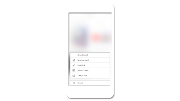
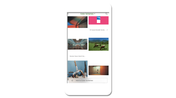
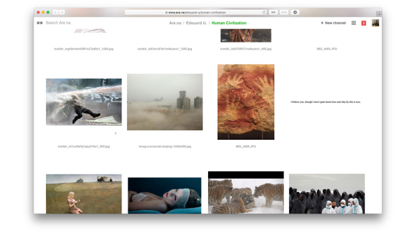
This difficulty in describing exactly what Are.na is has become part of its allure–“blocks” of content reside within folders called “channels,” and can be connected to as many channels as users want, creating a network of images, links, and text. On the site, there are even channels for crowdsourced descriptions of how to describe Are.na at a party and a channel for all the different ways in which people use it. For instance, one user keeps channels as reading lists, playlists, and as a portfolio for his work.

[Image: Are.na]

The platform’s lack of a simple explanation is perfectly suited to an era when more people want something different out of the internet. In the groundswell of anger and suspicion toward social media platforms like Facebook and Twitter for spreading misinformation, amplifying harassment, and stamping out nuance, Are.na feels like a necessary antidote–a calm white space where you can group your ideas, whatever their form or complexity. And while the site’s user base of 21,000 registered users and 7,000 active monthly users is minuscule compared to the social media giants, it is growing rapidly at 20% month over month.

“What does it feel like to connect to the information you’re consuming and feel like you’re building new thought in the same way that you would in a really good conversation with a friend or reading a good book, one of those human things that expand our brains?” says Charles Broskoski, Are.na’s cofounder. That, in essence, is Are.na’s goal: to make it easier for that kind of intelligent connection to happen online, replacing the passive consumption that manifests in hours spent mindlessly scrolling and “liking.”

As Broskoski put it, “[Are.na] is less like a casino and more like a nice library.”

[Image: Are.na]

No Ads, No Algorithms

On first glance, Are.na’s sparse website feels a little bit like Pinterest, except you can add more than photos. But for Broskoski, there are some fundamental differences: Pinterest focuses mostly on images, primarily of things that you can buy. It’s trying to sell advertising, while Are.na is not. Are.na’s freemium business model is central to the company’s ethos. You can sign up for Are.na for free and start creating blocks of content and folder-like channels, as long as they’re publicly available. But if you start to create larger private channels–which indicates to the Are.na team that you’re using the platform for bigger personal or professional projects–then the platform costs $5 per month, or $45 for the year.

“We think the business model is a fundamental thing that forms the user experience,” says Chris Barley, a cofounder and designer at Are.na with a background in architecture. “If we’re trying to have our users look at ads, that’s a different desire than giving them a space to work intellectually.”

Because the company isn’t trying to keep eyeballs on the site so it can sell more ads, the underlying mind-set is simply different. “We’re trying to set up this situation where we’re motivated to make people like the platform enough to pay for it,” says Broskoski.

Many social media companies that rely on ad revenue preach connectivity, positioning their service as the means to overcome the vast differences of time and space to share ideas and create a global community. This rings false, of course. These companies are motivated to connect you with friends and strangers because they can convert your attention into dollars. That’s part of what’s driving the backlash against Facebook and Twitter. “There’s a fundamental disconnect there,” Broskoski says. “We’re trying to make a company where that is actually the goal. We’re trying to build a normal business. If it’s useful enough then people will pay for it.”

The commercialization of the internet–partially to blame for the disconnect between the techno-utopian ideals of its earliest creators and its current state of affairs–was the reason the team created Are.na in 2012. Broskoski explains that in the early aughts, he and many of his friends were partial to an internet bookmarking site called Delicious, but when Delicious was bought by Yahoo in 2005, they decided they needed to create a tool of their own that wasn’t owned by a giant corporation–and Are.na was born. “Because we were artists and working on the internet, a lot of our practice had to do with searching out weird idiosyncratic things and going down the path of what we were interested in and then tying that to a thesis for a work,” Broskoski says. “The thing we wanted to do was collect all the resources we found in the world that felt important to us at a time and have a way to gather all that stuff into one place.”

At first, the site was mostly for Broskoski and a group of friends with similar mentalities. That was five years ago. Today, as paranoia about algorithms, data, and digital privacy rises amongst users of major social networking sites, Are.na might stand a chance with the rest of the world. “The cultural awareness of what people want out of the internet is changing and growing,” Barley says. “In other industries or areas that are not digital, health and wellness is a huge concern. But figuring out what that might mean in our digital lives is a more and more important space.”

Are.na’s designers have felt this disconnect online for many years, long before the 2016 election shook many people awake. “Designers and artists are those early-adopter types, and they’re more sensitive to how things get presented to them on the internet,” says Are.na cofounder and designer Chris Sherron. “They felt it as soon as Facebook introduced the like button. As soon as people started trolling on Twitter, they felt it.”

[Image: Are.na]

Trusting Users To Figure It Out For Themselves

As a designer-first site, Are.na’s web design is serenely white. It’s a bit confusing at first (in part, because there are so many ways you can use it), but when you try your hand at creating blocks and channels it quickly becomes intuitive. “I think a lot of current social networks don’t put enough trust in the user to think for themselves and in a way they overdo it in terms of the style, the colors, the language–you notice a lot of sites that use this real jokey and playful language,” Sherron says. “I think designers and artists who are the early adopters of the internet and the ones that set the trends–they’re seeing this and thinking, it doesn’t feel quite right. We want to make sure that we’re not taking people’s intelligence for granted and doing just enough.”

The challenges of the site–both the difficulty describing it and the vast number of ways you can use it–is also by design. “Part of the reason [Are.na] takes a little longer for people to get into is that it asks a little bit more of a user than something like Facebook,” Barley says. “The like button is the most mindless thing you could possibly do. What you do on Are.na is connecting, and it takes a lot more brain power. You’re marginally smarter for doing it and you build that muscle over a period of time.”

[Image: Are.na]

The company has found that a key draw for many users is the ability to work in small groups on the site–making it part social media and part productivity tool. Barley describes using Are.na for research, where three to five people collect and group information thematically into channels for everyone to reference. He joined the team about six months ago because he’d been using Are.na in a previous job. “It lets you have a thought over a long period of time and discover things slowly, rather than quick inspiration,” Barley says.

The platform has found a home in the classroom at universities like MIT, Yale, RISD, Parsons, Pratt, and Columbia, where professors and students have embraced it. Outside institutions are also using Are.na: The Chicago Architecture Biennial embeds content from the site on its blog, and the Guggenheim has built an entire interactive exhibition using Are.na as the content management system. And creative people who work at companies like Apple, Google, Tumblr, and Dropbox also use the service–which likely spills over into their professional work lives. Broskoski says that a recent user survey showed that 80% of people used Are.na in both personal and professional contexts. “It’s people who value intelligence throughout their day, both when by themselves and at work,” Barley says.

In 2016, the team built a bookmarking tool called Pilgrim that’s available for anyone to use, with Are.na as its backbone. At the end of 2017, they launched an iPhone app, a big step forward toward helping the platform grow and a common request from current users. And as the site enters its sixth year, its creators are hoping to double down on how Are.na can be used in team settings–something they’re already intimate with, given that they also use the platform for internal projects. What would Are.na look like if used in a larger context, like in a big corporation? “Those implications are really interesting if you think about entire companies slowly building ideas together over time, versus what they do now–these siloed brainstorm sessions that they push out on people,” Barley says. But even as they grow, the Are.na team is focused on their core user–which is, in essence, themselves.

“Making things that give dopamine hits for nothing is not what we’re trying to do. It’s usually in the service of thinking better and thinking with other people,” Barley says. In other words, they’re going to keep creating an ethically minded internet platform that puts its money where its mouth is. “Ethical might be one word,” he adds. “It’s our best guess about what we think people actually want now, and more of what people will want from the future.”

from Sidebar https://sidebar.io/out?url=https%3A%2F%2Fwww.fastcodesign.com%2F90157216%2Fthis-is-what-a-designer-led-social-networking-site-looks-like

UX audits and their importance in the design process

When getting started on a new design sprint it can be easy to want to hit the ground running by sketching or drafting wireframes, but an important first step that can sometimes be missed is the UX audit.

What exactly is a UX audit you might ask? When I say UX audit I am referring to the surveying the competitive (and sometimes not-so-competitive) landscape — seeing what others are doing, how they are doing it, and, potentially, why they are doing it that way.

UX audits are an important step in the design process because they allow the designer to:

  1. See what the landscape is like for a particular component or workflow. How are others doing it?
  2. Identify what works, what doesn’t, and what might be missing. Where is there opportunity for improvement?
  3. Understand what’s considered “best practice” and why. Why reinvent the wheel if there is already a standard convention that users are familiar with?

But auditing is not as simple as browsing the web and taking mental notes of what you see. As designers, that’s something we do all the time anyway. When actually conducting an audit, you need to keep a record of everything you’ve looked at to see the big picture. Insights and recommendations should come from documented findings, not fuzzy memories.

So how should you conduct a UX audit? I’ve outlined my steps to complete a successful audit below. These should help in your research and development of user-centered components and workflows.

1. Figure out what you’re auditing

Are you auditing a component like buttons, search boxes, or date pickers? Or maybe it’s something more complex like an account creation flow? Either way, nailing down what it is exactly that you’re looking for will help you stay focused with your audit.

2. Figure out who you should audit

Are you designing strictly for enterprise or is it consumer-facing? Or maybe it’s for something geared toward teens? While you’ll want to look at a mix of websites and apps to help understand best practices, you should definitely spend some time looking at other players in your space as well. There might be trends by industry, demographic, or device that you need to pay attention to.

I like to get as big a sample size as possible, but depending on what I’m auditing that might not always be possible. If what I’m auditing is more of a common component, I’ll try to target a pool of 10–20 samples (using a combination of apps, websites, and/or operating systems, depending on what I’m auditing).

3. Screenshot everything

Shift + Command + 4 is your new best friend. You’ll want to grab a screenshot of everything you see — every state, every page, every interaction. This will make it easier to remember and document for others later. If you don’t do this, I guarantee you’ll go back and end up doing it at some point later, so you might as well do it now.

I like to organize all my screenshots into a folder, organized by product, so I can refer back to them when putting together my research into a final document. File organization is easy to overlook but a true time saver in the end!

Capture everything you’re auditing with a screenshot

4. Review everything you’ve captured

By now you’ve looked at at least 20 apps or websites, if not more (because chances are you didn’t find what you were looking for at each place you looked).

It’s hard to remember what was what, who did what and in what order, so take some time to review what you’ve screenshotted. Looking through all your screenshots will help you prep for the next couple of steps.

5. Organize into buckets

See what categories emerge when you start to organize your samples into buckets. What features does each product have? What characteristics or traits are common?

I’m not typically a big Excel fan, but a spreadsheet definitely comes in handy here. I’m also more of a visual person, so being able to see a breakdown that way can help with understanding too.

Breaking down search features by product

6. Look for patterns

Use your matrix you’ve created to look for commonalities. You’re basically using it as heat map of sorts to help surface patterns. These patterns can help you determine what is a common convention that users are already familiar with.

Emerging patterns from characteristics of a search box component

7. Document and synthesize to share with your team

Now that you have some insights and recommendations you might want to share it with your team; this can help them understand why you made certain decisions. Formats for your audit documentation can range from a Keynote presentation to something more like a UX framework guideline, depending on what works for you.

Even if you don’t end up sharing it immediately, creating a document that can be referred to later is extremely valuable for future-you and/or other designers on your team, saving them from the re-work of having to conduct their own audit.

And remember how initially you figured out what you were auditing exactly? Well now that you have all this information, it might be a good time to actually define your component or workflow so to set the scope of what something like “search” actually means. For others reviewing this later, extra clarity can be extremely helpful for understanding and alignment.

Basic anatomy of a search box component defined

8. Use what you’ve learned

Make use of your new insights to inform how and what you do for your product and users. Test your designs, iterate if necessary, and always keep an eye open for changing trends!


UX audits and their importance in the design process was originally published in UX Design Collective on Medium, where people are continuing the conversation by highlighting and responding to this story.

from UX Design Collective – Medium https://uxdesign.cc/ux-audits-and-their-importance-in-the-design-process-55264e55ffd1?source=rss—-138adf9c44c—4

UX & Psychology go hand in hand — Introduction to human attention

A handy article about human attention from a psychologist’s and a UX Designer’s view.

As a UX designer, we design digital products that people interact with. When we designing these products, we spend a lot of time on different research to understand the behavior, habits, and needs of our users. However, there is a couple of general patterns that characteristic of all people. To be consciously used, we need to understand the process of human cognition.
The purpose of this article is to understand the concept, function and types of visual attention and to use this knowledge in everyday product design.

What does psychology say?

In this section one of my friend, Anikó Tőzsér helps us to clarify the basic principles of human attention.

What determines what we pay attention for?

Attention is an ability which helps to select the information between different stimuli and process. Our attention can decide that we want to deal with the stimuli or ignore it. Sometimes this process is automatic and sometimes we focus our attention on a problem which we have to solve.

Psychology of attention deals with mechanisms of perception which form the behavior, and how consistent behavior is created. Psychological researchers of attention concentrate on audition and sight.

Spatial attention vs feature-based attention

There are two ways of visual attention: spatial attention and feature-based attention. Spatial attention means that we direct our attention to a particular region. Feature-based attention means that we direct our attention to a particular feature, for example colour.

Human Information processing

For the sake of design products, which grab people’s attention, we need to understand the processing of human information.

However this is a debated issue.

  • When one period is finished, the next one starts, and the periods contain more and more complicated feature of the stimuli.
  • Others argue that it’s continuous, which means that every stimulus is transmitted immediately.

Types of attention

There are different types of attention, which are determined by the situation and the intensity of the stimuli.

Selective Attention: it is an automatic process, which chooses between important and less important stimuli depending on the situation. As we can attend to only one thing at the same time, this kind of process helps to select the most important stimuli in the given situation.

As a UX designer we need to be aware of the fact of intensive changes: intensive changes of the environment draw the user attention. With this fact under our belt, we can consciously design user experiences that truly fit the users.

Divided attention: if a process is automatic, more process can happen simultaneously. A great every day example is driving and talking at the same time. We can pay attention only to one action at the same time, that’s why if something happens on the road in front of the driver, the driver will stop talking and concentrate on the driving. In this moment the attention becomes Focused, when the attention is limited to one object, action or stimuli.

Focused attention is the brain’s ability to concentrate its attention on a target stimulus for any period of time.(cognitivefit)

Sustained Attention: Sustained attention is when we keep our focus on one subject for a long time, even if we need to repeat the given action or activity.

As a UX Designer, we need to know that during the learning and working activities (listening to a teacher or reading an online lesson) the users need to use their sustained attention. It means that everything on the user interface should serve this goal.

Attention is a limited cognitive resource

As a UX designer we need to reduce cognitive overload.
Each sense modality has some separate attentional resource. An auditory task interferes less with a secondary visual task would.
”It is much easier to monitor the road ahead while talking on a cell phone than when looking at the navigation system.” (Visualexpert)

In one moment 5–9 (7+-2 The magical number) objects can be detected, which means that the area of spatial attention is not constant, it can be broader or smaller.

Cocktail Party Effect:

Cocktail party effect is the ability to tune into a single voice and tune out all others during a crowded party. This also could happen in the digital environment. Web party effect is the cocktail party effect in the web environment.

As Dr. Susan Weinschenk explained in her article, you can use the senses to grab attention. Colours, contrast, fonts, white spaces, beeps, and tones are helping to capture attention.

Too Many Options (Hick’s Law)

More choices need more cognitive load. “It describes the time it takes for a person to make a decision as a result of the possible choices he or she has: increasing the number of choices will increase the decision time logarithmically.”

Change Blindness

Depending on our focus, our brains can be fully blind to changes going on around us. We need to design our products according the main user goals and tasks. UX is a treasure box full of with useful methods and techniques. Creating user journey map or conduct task analysis could help us to avoid the ‘change blindness’ effect.

Thank you! ❤️


UX & Psychology go hand in hand — Introduction to human attention was originally published in UX Design Collective on Medium, where people are continuing the conversation by highlighting and responding to this story.

from UX Design Collective – Medium https://uxdesign.cc/ux-psychology-go-hand-in-hand-introduction-to-human-attention-a70ffd2c4289?source=rss—-138adf9c44c—4