The Future of Data: A Decentralized Graph Database

Photo by Ander Burdain on Unsplash

A paradigm shift is happening that will change the way companies store, compute and transmit data. This shift will give birth to a plethora of new opportunities, including solutions to the most persistent problems faced by big tech companies and users alike. This article will explore one such opportunity — the creation of the first truly decentralized graph database. In addition to being scalable, cost-effective, and secure, this technology will allow users to manipulate and retrieve their data in a trustless, permissionless way.

This is not another story complaining about large technology companies violating data ethics. Rather it seeks to empathize with both users and companies and understand why they act the way they do, from economical, social and technological perspectives.

The Rise and Fall of Data

The rise of ubiquitous computing has been accompanied by an exponential increase in the rate of personal data production. From checking into social media on our phones to interacting with the Echo device sitting in our apartments, even our most mundane activities produce an enormous amount of data.

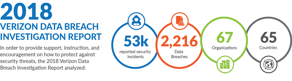
The question that isn’t being asked enough is — “What happens to that data once it is created?”. The answer varies from company to company, but in many instances our collective data is being misused by the very companies storing it or being hacked by malicious third parties. Facebook is a classic example: the platform has not only suffered major data breaches, affecting millions; but has also sold data to its partners without explicit user consent.

This is obviously a huge problem for both users and companies implicitly charged with protecting said data. Yet, users are not leaving these platforms and the companies are not making any significant changes. Why?

Users: The Illusion of Control & Ownership

There exist plenty of alternatives to Facebook on the Internet. So why is it that most of its users feel compelled to stay after the latest series of scandals?

I, and many others, believe it is mostly due to the “walled gardens” problem: after spending the last X years on *insert large tech company name here* users have uploaded and amassed huge amounts of data, such as friends, photos, memories, that cannot be easily transferred to a different platform. Users deleting their account means losing access to data that they thought belonged to them, because while they might own the content they post, they don’t own the “relationships” it creates on the platform.

Furthermore, most users are not concerned enough about their privacy, with respect to large corporations, to take action. It’s a trade off; for users’ lack of privacy is rewarded with free services, personalized products and ads. Most users don’t really feel like they have anything important to hide, so they willingly upload their data under the illusion that they “control” it.

The companies that create the products that generate and receive our data for free take a “carrot and stick” approach to data collection. You get additional features if you provide them with your data (hyper-personalization of services), and if you do not click “I Agree” to a 50 page document of Legalese, this may render your already-paid-for device or service useless. If the 21st century startup world has taught us anything, it’s that user experience reigns supreme.

Lastly, let’s face it, there is no guarantee that a newer, smaller, alternative startup with the same services will suffer from fewer data breaches than companies who dedicate millions of dollars every year to security.

Companies: The Advent of Cloud Computing

You would think that companies, on the other hand, would’ve taken significant steps to ensure data security after the last series of high profile data breaches. Yet, here we are, hearing about new hacks every other week.

The advent of cloud computing has led companies to store data in highly centralized data centers. Cloud computing saved companies billions of dollars; however, it came at the cost of having a single point of failure. This also meant that hackers now knew exactly where find users’ data. In the end, knowing that users wouldn’t be able to leave their platform, the decision to trade a little bad publicity for billions of dollars was an easy one.

Tech companies have also gotten into the habit of selling user data to their partners without requesting explicit user consent. Is this a problem users can even avoid? Users pay companies for their free services with their attention and time, by watching ads, and with their data. Some great projects like Solid, spearheaded by the inventor of the World Wide Web, Sir Tim Berners-Lee, are looking to solve this problem and are pushing for true control over our data.

However, Amazon, Google, Facebook and Apple — the “Big 4” of tech — have a monopoly over our data and have no intention of relinquishing this measure of control. Big tech companies are disincentivized to grant users total ownership and control of their data, as doing so would not only bring down those “walled gardens” but would sever another important, if not dominant, revenue stream: the ability to sell your data and the insights generated from it at no additional costs.

In the end, all of the decisions that have and are being taken are rooted purely in economic reasoning, as they often are with public companies.

A Paradigm Shift: Speed, Security & Cost

A paradigm shift is happening in the tech world that will change how companies store their data. Google and other tech companies are starting to hit a bandwidth wall within their own data centers. Simply put, they are reaching their maximum capacity when it comes to processing and transporting data.

On the other hand, every year, the personal computing devices surrounding us are becoming more and more powerful; many of these devices sitting idle most of the time. When connected in a coordinated way they can, and will, outperform any current data center in terms of speed, security and most importantly, cost.

Harnessing effectively the unused computing power of these devices wouldn’t spell the immediate end of the Cloud Computing era but would rather complement it, especially for latency sensitive tasks. It would also, however, announce the birth of the “Fog Computing” era (coined by Cisco in January 2014).

Fortunately, because Fog Computing relies on decentralized networks, it is also theoretically much harder to hack, thereby solving the security problem.

Fog Computing versus Cloud Computing

At a high level Fog Computing will initially work exactly like Cloud Computing for Big Tech companies: users will create, read, update and delete their data by submitting a request to the company who will in turn pass it on to the decentralized network of devices. This is the way things were done when Cloud Computing was king and there is no immediate apparent reason to do otherwise.

However, as we saw before, one of the main reasons people are staying on their current platforms is because no viable alternatives exist that would guarantee a better outcome. Fog Computing makes that assumption obsolete. Your data is now stored on thousands of devices across the world; and therefore, rather than passing through an intermediary such as a Big Tech company for your data, you can directly make request to the network of devices. A permissionless, trustless way to access your data.

This also means that by corresponding directly with a decentralized network, you can decide with much more granularity who has access and the rights to use your data: the Holy Grail of data ownership.

Why would the Big Tech companies want to allow you to communicate with the decentralized network then? Well, long story short, they don’t. However, this technology is being built and will readily be available to the public. Competition that offers this type of data control at scale will emerge, and since Big Tech companies’ data centers will not provide them with the same competitive advantages they do today, their entire business model will be in danger of being disrupted.

They will be forced to offer their users granular data control in order to stay competitive. This means giving users the option to either monetize their data, give it away for free or refuse entirely to have it used for any other purpose than the core services offered. This sacrifice’s cost pales in comparison to losing users entirely to competitors in the same market.

Blockchains Revisited

Blockchains have recently entered the spotlight as the first technology making use of decentralized networks of devices. Promising users full ownership and monetization of their data, blockchains are ostensibly compelling alternatives to legacy third party data farms. So why aren’t we all using blockchain technology? I believe this is simply because we misunderstand what blockchains are supposed to help us with.

Blockchains have been lauded as secure, immutable and transparent databases. Yet a blockchain can only hold very small amounts of data without having the computers hosting it run out of memory, and becoming centralized. Furthermore, blockchains are extremely hard to query; this is partly because data is stored in blocks with varying time stamps, but also because there exist no “easy” innate querying languages. Simply put, it is neither efficient nor easy to search blockchains for information.

Imagine a medical company needs to access blockchain data as fast as possible, it would likely first move the data to an efficient third party database, then execute its queries; thereby completely destroying the concept of decentralization. Blockchains are best suited to payment or purely transaction-based systems.

Indeed, that is what they were initially invented for: Bitcoin, a payment system with a relatively small digital footprint. While blockchains make use of the growing movement of increasingly powerful personal devices, they have a relatively narrow use case and do not make use of the paradigm shift’s full potential.

This is not to say that all blockchains are useless in the quest for more control over our data. A much broader use case emerged for blockchains when Ethereum was born.

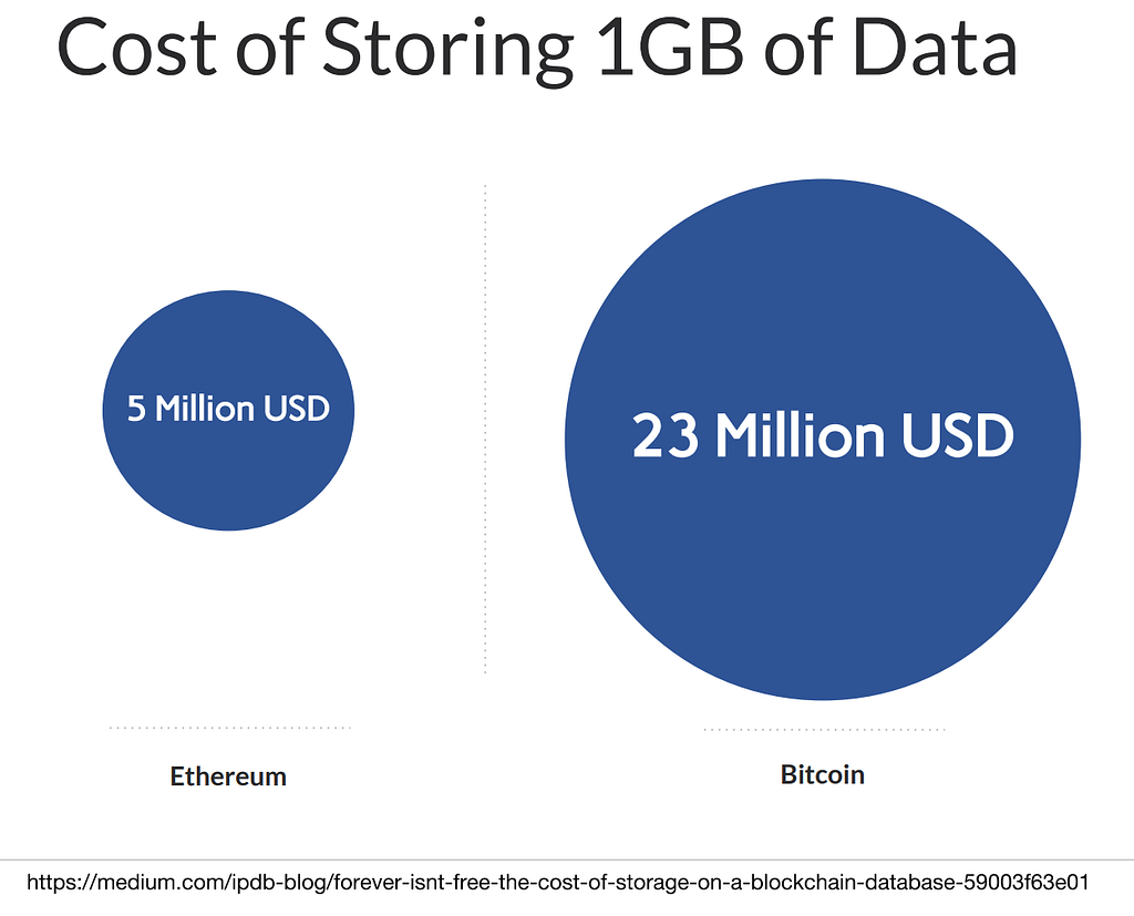
As you can see on the left, the prices for storing data on it are still outrageous. However, it introduced a revolutionary new concept: smart contracts, which, as we will see later on, are extremely handy when used in conjunction with decentralized storage solutions.

A Decentralized Graph Database

In order to accelerate the transition to the future described above, where each user is granted new levels of data ownership and control, we also need the associated technology: a decentralized network of devices that users can communicate with directly. Amongst its other features it should be private (for user data when needed), scalable (in terms of storage and computing power) and trustless (you don’t have to trust a central authority to access your data or to maintain its security). It would serve as the backend for products that could rival the user experience provided by Big Tech companies.

I had been thinking for a while for a solution to this conundrum, and, while working for Graphen, I produced a whitepaper (with the help of Columbia University Master students Peiqi Jin and Yang Yang) for a decentralized database.

This decentralized database functions exactly like a cloud database from the developer’s perspective; however, it is hosted on a completely peer to peer network. It is not a blockchain, but leverages some of the same cryptographic algorithms, such as Patricia-Merkle trees. I won’t expound on the technical details, the whitepaper is there for that, but it essentially consists of three parts:

  • The workers, who rent out storage space and computational power to host fragments of the database and compute queries. They are called masternodes and receive monetary rewards such as US dollars or cryptocurrencies in exchange for their hardware’s time. They are also incentivized to periodically check each other’s data and query results in order to guarantee the correctness of the overall system.
  • The users, who are usually developers or scientists, that create the databases. They are the ones that usually pay the fees to the masternodes.
  • The users that contribute data to a given database, through an app or directly, via requests to the masternodes. They can be the same as the previous users. They are also provided with a private key that allows them to retain full ownership of their information (the ability to request, delete or update their data with a request to the network without the permission of a third party).

I believe that graph databases are the future. With each passing day our world is becoming more interconnected, and so is the data we produce. Graph databases’ speciality lie in accommodating these relationships. Furthermore, all other “types” of data fit in graph databases: unstructured and structured data, while more efficiently manipulated in non relational and relational databases, respectively, can be stored in graph databases too (the converse is not true, eg. graph data cannot be stored in a non relational database).

https://wilsonmar.github.io/neo4j/

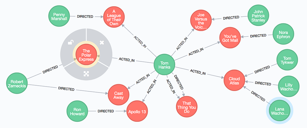
The applications of graph databases have been increasing significantly over the past few years. For example, graph databases are already being used by Facebook for their social media platform, by Stripe for fraudulent transactions, by Amazon for product recommendation and by companies all over the world for big data analytics in various domains and problems.

Graph databases are extremely fast, scalable and can generate incredible insights from the data they contain; which is why I chose them first to be implemented as decentralized, distributed databases.

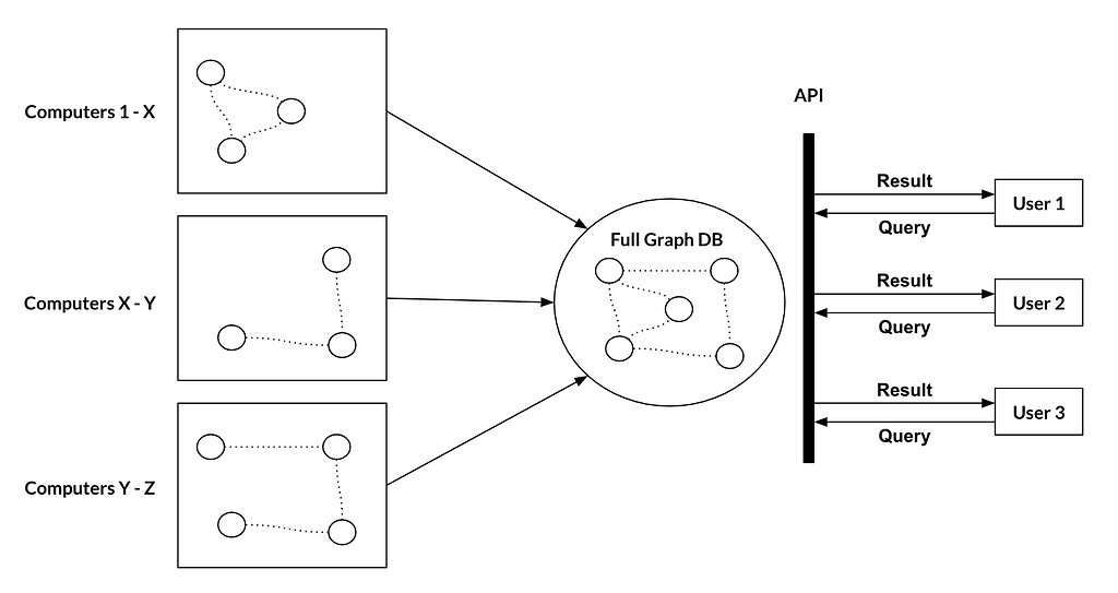
This decentralized graph database fulfills all of our aforementioned necessary features: scalability, trustlessness and privacy (by using a specific type of homomorphic encryption).

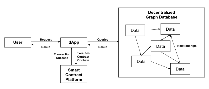
This is a very high level overview of what the data flow looks like:

A Truly Decentralized Internet

If we look at current Web 2.0 applications, we have a frontend, a backend and a database. While it doesn’t make much sense to decentralize the frontend, the backend logic can and should be decentralized. This is where smart contract platforms come in. Turing complete (theoretically able to solve any computation problem) smart contract platforms such as Ethereum, EOS or Cardano have the capability to support this logic with their native programming language. They can even correspond with the graph database to retrieve relevant data in a truly decentralized manner.

Ultimately, if this technology matures as intended, it could even become the very basis for the new semantic Internet Tim Berners Lee, the inventor of the Internet, describes in his Ted Talk.

“So, linked data — it’s huge. I’ve only told you a very small number of things.

There are data in every aspect of our lives, every aspect of work and pleasure, and it’s not just about the number of places where data comes, it’s about connecting it together.

And when you connect data together, you get power in a way that doesn’t happen just with the web, with documents.”

Thanks for taking the time to read this article! The whitepaper is available at www.graphenprotocol.com. Please don’t hesitate to contact me at mgavaudan@graphen.ai with any feedback or questions you might have.

We are in the process of raising money for a Graphen subsidiary that will specialize in this technology, so if you are an investor please email me for our pitch deck.

I’d also like to thank Dr. Jie Lu, Dr. Ching-Yung Lin, and all my other friends (Matteo, Kai, Haley, Kevin, Srikar, Eric, Lizzie…) for their help and feedback throughout this process.


The Future of Data: A Decentralized Graph Database was originally published in Hacker Noon on Medium, where people are continuing the conversation by highlighting and responding to this story.

from Hacker Noon https://hackernoon.com/the-future-of-data-a-decentralized-graph-database-bbb668715bd1?source=rss—-3a8144eabfe3—4

Never feel overwhelmed at work again: how to use the M.I.T. technique

Have you ever felt exhausted after a day at work? At the end of a busy day, you couldn’t remember how you spent your time. All you knew was that there was more to be done tomorrow. You were tired, overwhelmed, and even a bit frustrated — the to-do list always out-ran you.

You might have wanted to review your day and see how to be more productive. But the pain you had in your head from a long day was so strong that all you could do was drag yourself home and collapse on a couch until it’s time for bed. The next day, the same story repeats and it’s a never ending cycle.

That was my life over the past few months. As my role evolves, coding is no longer my sole responsibility. My days often consist of a mix of interviewing, various meetings, code reviews, ad-hoc discussions, and coding. Often, at the end of a day, I feel like a failure because I didn’t make as much progress on my project as I had wanted to. All I could think of was all the remaining work that needed to be done, which could be discouraging since I never seemed to be able to get to the bottom of the to-do list.

This troubled me for a long time. I knew objectively that I worked harder than ever. After a day of hard work, I deserve to feel accomplished and proud.

How the M.I.T technique helps me

Things changed after I discovered the M.I.T. technique: a powerful way to keep me focused and productive throughout the day.

A Most Important Task (MIT) is a critical task that will create the most significant results. Every day, create a list of two or three M.I.T.s, and focus on getting them done as soon as possible. Keep this list separate from your general to-do list. – The Personal MBA

Here is how I apply it to my day-to-day work. After I get to the office, first thing in the morning, I open my note-taking app (I use Workflowy). First off, I start a new section for the day and write down two to three most important tasks I want to focus on and get done under the M.I.T. section. Then I list out tasks, both M.I.T.s and non-M.I.T.s, in the order I plan to do them under the log section. I then check my schedule for the day and plan blocks of time for the M.I.T.s. I will try to get them done as soon as possible.

Lastly, before actually starting to work, I tell myself as long as I get the most important tasks (M.I.T.s) done, it’s a productive day that I should be proud of. Finishing these tasks is my definition of success for the day.

Here’s an example of how my note will look like:

As the day goes, new tasks come in. According to their urgency and importance, I add them to the log section. Here is how it might look like in the middle of the day:

My M.I.T.s for the day are flexible and can change. It’s totally fine if I need to swap a M.I.T. with a new one or even decide to not work on it and move it to another day altogether.

At the end of the day, I will update the progress of all the tasks, especially the M.I.T.s, and leave a note for tomorrow.

Here is how it might look like at the end of the day:

It feels great to be able to see all the tasks you worked on and how you spend your time at the end of a hard working day. (I also create a Google calendar event to log how I spend my time after I finish a task.)

Three great benefits of this approach.

  1. Listing M.I.T.s at the beginning of a day sets the tone for the day. The M.I.T. list is an anchor of my day. It keeps me focussed and calm. No matter how many meetings I have to go to or how many ad-hoc tasks pop up, I always return to my M.I.T. list and remind myself these are the focus of my day. If important things come up, I evaluate them with my M.I.T. list and update the list accordingly.
  2. Reviewing my log at the end of the day is an opportunity to reflect on how today went and identify areas of improvement. Besides that, it’s a time to celebrate all the tasks I accomplish and feel proud of my hard work. Software development is a marathon, not a sprint. It’s important that we regularly acknowledge the great work we have done and celebrate the small successes we have along the way. Before using this technique, I often felt overwhelmed and discouraged because I was too focused on the end goal and all the remaining work and failed to acknowledge the progress I made. This technique helps me enjoy every step of the journey.
  3. Having a log of how I spend my day makes weekly and monthly planning easier. At the end of each week, I can see how I spend my time and if it’s aligned with my priorities.

There are other areas in which I can improve my productivity and achieve better work-life balance while getting more done. I will explore and experiment with different techniques and share them on my personal blog when I find something interesting. Subscribe if you’re interested and don’t want to miss out!

My career plan for the year is to grow into a tech lead. I’m excited about all the learnings ahead and would love to share this journey with you in a brutally honest fashion. I will be sharing my weekly learnings on my personal blog.

In the next few months, I will focus on growing in the following areas, so you can expect to see learnings related to them:

  • focusing on the big picture of the project instead of near-term implementation details;
  • balancing my efforts between leading projects and coding;
  • work-life balance for long-term productivity;
  • the human side of software development: making sure everyone riding with me enjoys the ride and feels fulfilled and inspired.


Never feel overwhelmed at work again: how to use the M.I.T. technique was originally published in freeCodeCamp.org on Medium, where people are continuing the conversation by highlighting and responding to this story.

from freeCodeCamp https://medium.freecodecamp.org/never-feel-overwhelmed-at-work-again-how-to-use-the-m-i-t-technique-70d132aad0cc?source=rss—-336d898217ee—4

5 Simple Changes That Can Drastically Improve Your Conversion Rate

Photo by Hal Gatewood on Unsplash

“Test everything!!”

is the mantra of every marketer in the 21st century.

But for a small business or solopreneur, the volume/data is often not enough to constantly run extensive tests… not to mention the time, skills & resources required to set up a complex multi-variate testing system in the first place.

Instead of wasting a lot of time learning new technology, or figuring out how to structure & analyze large sets of data (that you probably don’t have), here are 5 simple things that have gotten positive results for other people in the past, that you can implement on your website to get results.

1. Move The CTA Above The Fold

“The Fold” is basically refering to the line of where the “first view” ends, and the rest of the site begins.

You know how when you open a website and the first thing you see? Everything you can see before scrolling is “above the fold”.

Everything else is below the fold.

Moving your call to actionabove the fold is one of the easiest things you can do.. but it can also be one of the most powerful.

The god-father of growth hacking himself, Sean Ellis, implemented this for his site “Growth Hackers” and got a 700% increase in Email Signups from this simple change.

2. Optimize Your Mobile Layout

Forego the clutter that automatic responsive design leaves for most mobile pages, and change your key pages to look great on mobile.

It’s 2019, more than 2 years since mobile overtook desktop for browsing the web, and still, a surprising amount of sites are not optimized for mobile.

More than 70% of all media time is spent on mobile, which means your mobile design should be an even bigger priority than how your landing pages look on desktop.

Make sure that your value proposition is fully legible, and that your background pictures end up looking okay & not compromising the readability of your content.

Hubspot increased their conversion rates on mobile by 10.7% by implementing a few key changes to their mobile layout.

3. Implement Single Keyword Ad Groups & Relevant Landing Pages

Single Keyword Ad Groups (or SKAG for short) is not a new principle within SEM, but it is routinely overlooked by in-house marketing teams and older agencies.

If you are using Google, Bing or other SEM ads, you need to stop being lazy with & make an effort to show users relevant content.

If you target multiple different broad keywords with one ad & one landing page, you are providing a bad user experience for your ideal customers.

This example from ConversionXL shows exactly what’s wrong with running a single ad to multiple broad keywords.

Think about the frame of mind people are when they turn to a search engine..

They want a specific solution to a specific problem, not a general category answer that might possibly contain what they want.

Implementing SKAGs has decreased CPCs by as much as 20% on client campaigns, and drastically decreased cost per lead and sale.

And I’m not alone in reporting these kinds of results.

The PPC agency clicteq cites implementing SKAG alone as increasing CTR by 14% and reducing CPA by 22%.

Sam Owen of Hanapin Marketing was able to reduce CPA by 50% and increase leads per month by 106% by implementing SKAGs.

4. Improve Site Speed

53% of mobile users will leave your site if it doesn’t load within 3 seconds.

And worse, after just one bad experience, 85% of users are unlikely to give your site a second chance.

Think about that for a second.

You only have 3 seconds to get your site fully in front of a potential customer, or you lose half of your potential customers.. forever.

So do what it takes to improve site speed.

The faster you do it, the fewer potential customers you will lose, and give a lasting bad impression while doing so.

  1. Test your website speed with a tool like Pingdom, Webpage Test or gtmetrix.
  2. Look at your results, and Google how to fix individual problems that come up.

If you have never tried this before, you will typically get more than a few Fs, which are high ROI fixes to make, and usually fairly straight forward.

More Tips:

  • Implement a CDN for larger files like scripts & images so the user gets the content served from a closer server. (For example AWS’ CloudFront or MaxCDN).
  • Reduce the size of your image files by smushing them, re-sizing or otherwize optimizing.
  • Upgrade your hosting to get better load speeds. (If your results show a long “wait” time during testing your page speed, this is typically an indicator that your server is slow.)

5. Make Sure You Implement Sound Copywriting Principles on your Landing Pages

The story of Initiative Q is the single greatest modern lesson in the power of copywriting… period.

Initiative Q touts itself as “tomorrow’s payment network”, and has since launching their invite-only beta managed to drive millions of sign-ups organically.

But to a marketer, that’s not the real story here.

The truth is, it didn’t take off immediatelly after opening the beta… the curve was looking less like a bell or tsunami, and more like a flat-line after they opened doors.

This doesn’t look like the curve of the latest internet fantasy money craze, does it?

And then they implemented one key change.

They didn’t do anything technical like adding a viral loop (it was already in play), they simply optimized one key piece of copy; the invite message.

The old message tried to explain the idea in somewhat dry technical terms “building the currency of the future.. blablabla”.

Their new message, leverages many an important copywriting principle, from familiarity & trust, scarcity, the power of FREE and finally FOMO.

“Initiative Q is an attempt by ex-PayPal guys to create a new payment system instead of credit cards that were designed in the 1950s. The system uses its own currency, the Q, and to get people to start using the system once it’s ready they are allocating Qs for free to people that sign up now (the amount drops as more people join — so better to join early). Signing up is free and they only ask for your name and an email address. There’s nothing to lose but if this payment system becomes a world leading payment method your Qs can be worth a lot. If you missed getting bitcoin seven years ago, you wouldn’t want to miss this.
Here is my invite link:
https://initiativeq.com/invite/XXXXXXXXX
This link will stop working once I’m out of invites. Let me know after you registered, because I need to verify you on my end.”

Look at how they start of by using “ex-paypal” guys as a lever to buy some quick trust through leveraging a known brand in the space.. and ending in a climax leveraging FOMO(that is behind every craze from Tulip to Bitcoin).

OMR covered this story & did a great break-down of the old, vs the new copy and why it works so much better.

Also courtesy of OMR’s Story.

And as you can see, the new copy paid off.

They experienced an increase in web traffic by a magnitude of thousands, if not millions, and by extension, conversions as well.

Don’t just focus on the technical.

Make sure that your copy, that your story, does a good job in convincing your visitors that you have something to offer, that there is a compelling reason to choose you.

To write better copy, remember a few key points:

  • The customer doesn’t care about you or your company, but about how you can help them and whether or not they trust your ability to do so.
  • Customers have options, what is a specific benefit of doing business with you, and not someone else?
  • Give them a reason to take action NOW, not later. (Initiative Q does this brilliantly by in theory incentivizing fast movers exponentially more than late-comers.)

For more advice on tackling human inertia by writing great copy moving your visitors to action, read the following books:

More Learning, More Changes & More Chances

The keys to a better performing website are the same as the keys to better performance in every area of your life.

Learning, deliberate change & risk taking combined with dedication.. played out over time.

Are you dedicated to driving even better results for your website & business every day & week?

Do you want not only direction & inspiration but applicable tactics that will give you real results right away? Sign up for my newsletter.


5 Simple Changes That Can Drastically Improve Your Conversion Rate was originally published in Hacker Noon on Medium, where people are continuing the conversation by highlighting and responding to this story.

from Hacker Noon https://hackernoon.com/5-simple-changes-that-can-drastically-improve-your-conversion-rate-ad495cbf0a9c?source=rss—-3a8144eabfe3—4

How this Maker quit his job and made his side projects profitable in 1 year


Go to the profile of Product Hunt

Last March, Andrey Azimov quit his job and gave himself one year to get to profitability as an Indie Maker. Since then, Andrey’s ‘Hardcore Year’ has been about shipping products like Encrypt My Photos, Progress Bar OSX, MacBook Alarm, Dark Mode List, and Preview Hunt — as well as getting to $1K per month in recurring revenue. 
 
Our friends at Blockstack talked to Andrey about his journey over the last year: 
 
Note: Andrey Azimov was also awarded a Product Hunt Golden Kitty Award for Maker of the Year last week! 😸🏆
 
Andrey, we love your ‘Hardcore Year’ effort. Can you tell us just more what inspired your desire to leave your job and generate recurring income?
 
I came to Bali May 2016. I met my ex-boss (Yaroslav Lazor, CEO of Railsware) at Dojo Bali, a co-working space. He offered me a job as a marketer and I worked for a year and a half in a great company with a smart people.
 
I was always passionate about making products and creating something that people would use. I dreamed to make some small side projects but couldn’t code and didn’t know how to start. Luckily I met Pieter Levels in December 2016 and he helped me to build my first app. It was a surfing web app that shows users the best time to surf (in the water — not online!).
 
The following year I launched three more apps. I did it all: the idea, the development, the marketing and sales. For me, that was more fun than working on just marketing for one product. 
 
And in March 2018, I decided to quit my job to follow my passion. I started a Hardcore Year — a one year experiment where I make apps full time and try to get $1,000 MRR (Monthly Recurring Revenue) to pay my bills. Back then, I felt scared and it was very risky, but I decided to listen to my gut and just did it. And it went pretty well — because now I don’t have to think about whether or not I should order juice with breakfast or not.

It looks as though you’ve been teaching yourself a lot of new skills this year. Which has been the most rewarding personally? And which has been the most helpful in accomplishing your goal of $1,000 MRR?
 
I think it was developing my “finishing muscle”. I finished all the projects I started and didn’t give up halfway.

Also, asking for advice from more experienced folks that have “skin in the game” helped a lot. 
 
On the topic of my MRR goal, EncryptMyPhotos took the #17 place in the App Mining Challenge, and made the most significant impact on my total MRR.

Among your various projects, what are some patterns you’re starting to see in terms of early indicators of success?
 
I think to start seeing some patterns, I need to have much more data (and experience). But after these nine months, I did discover some best practices that could increase a product’s chance of success. 
 
 For example:

  • Solve your own problems (so you will have at least 1 user).
  • Make products in existing markets. It means that the idea is already validated. Just make it niche and better at solving a small problem (again, a problem that you have personally).
  • Use the product yourself, share with friends (if this product logically makes sense to them) and see if they will use it!

What advice do you have for other folks that want to create additional income or work on something they are passionate about?
 
I think another reason to solve your own problems is because it’s fun for you. You’ll use the solution. Start small and niche.
 
It’s also always good to try to charge money for your products, because I think some of the best validation for a product is if people are actually paying for it. Another way is to join the App Mining Challenge so you can focus more on making things and not think about survival. 
 
 You recently submitted one of your products to our App Mining program. Were you interested in the world of crypto and decentralized applications before that?
 
No, I was more skeptical about it. There was a big crypto boom in 2017 in Bali. There were a lot of scams as well, so I didn’t dive into this topic until recently. When I had some free time, I tried to learn about the general blockchain concept, but nothing too serious.
 
I met Pierre-Gilles here in Bali. We had a lot of in common so we became friends and started working in the same café. One day he introduced me to Blockstack App Mining. I thought it could be fun and we decided to make something small that would solve our own problems.

What are the main differences in your mind when building a decentralized application vs. others you’ve worked on, or are there any?
 
I really like the concept of a decentralized setup where things are spread out from big companies like Google, Apple or Amazon and you don’t need to put all of your data into one basket.
 
Another thing with these services is that I have to do every little thing for the app setup –from the database, error messaging, user registration, etc. With Blockstack, it was done with a couple pieces of code and just worked. It was much more comfortable and a pleasure to use!
 
In your ideal world, what do you hope EncryptMyPhotos becomes in the near future and in the long-term?
 
Right now we have some basic functionality. It’s super simple but it works. And it seems like people like it because the app hit #1 on Product Hunt. Now we are thinking about how to optimize it for mobile, because a lot of our photos are taken from our phones, and it would be good if we could upload directly from mobile.

Want to get paid for your dApp? Register here for App Mining to be eligible for next month’s payouts. 👏

from Stories by Product Hunt on Medium https://blog.producthunt.com/how-this-maker-quit-his-job-and-made-his-side-projects-profitable-in-1-year-9c24ece56133?source=rss-b8b4445269d0——2

Top 10 JavaScript Trends to Watch in 2019


Take a deep breath. 2018 is over. If you’ve been buried up to your neck in projects, this article will bring you up to speed with the biggest JavaScript developments of 2018, and some predictions as to what 2019 will bring.

You can use this to understand which frameworks would be good to learn next. And if you want even more context, have a look at last year’s JS Trends post.

React vs Vue (oh, and Angular Too)

Facebook had its worst year ever politically, but you wouldn’t know it by looking at React. The front-end framework is still by far the most dominant of all frameworks, and it’s still the most-loved too.

React introduced a new context API, more accurate error reporting, and Hooks, a feature where you can use state and other React features without writing a class (currently in beta).

That’s not to say Vue.js has been lagging behind. On the contrary, Vue also had excellent updates in the form of Vue CLI v3, a new (beautiful) CLI tool to create pre-configured Vue apps and check performance stats. The framework has grown quite significantly again, and its open-source community remains as passionate and vocal as ever, with VueConf growing more popular each year.

And then, of course, there’s this:

I think Vue got the highest satisfaction rating among frameworks in State of JS this year (91.2%) — thanks to our users, and we aim to do even better! Hope we can change the mind of the 568 people who don’t want to use it again ;) https://t.co/7MrM8Y4ekq

— Evan You (@youyuxi) November 19, 2018

I’d be amiss not to mention Angular. Just from looking at the State of JS survey, it seems we might need to put Angular on life support soon 😂, with the “Would not use it again” rate jumping up 24 percentage points from 2017–18, compared to only a 3 point rise from 2016–17.

As we all know though, Angular still won’t die anytime soon. When comparing search terms in Google, React and Angular still come out far ahead of Vue. Similar for jobs: there are far more jobs that mention Angular and React than there are that mention Vue. This post goes in more detail about this, but suffice to say that Angular is far from dead, and can definitely still get you a job.

Node.js and the back-end landscape

The 2018 Node.js user survey confirms a lot of what we’ve been seeing at X-Team:

• ES2017 is more widely adopted now. • Most devs plan to increase their usage of Node in 2019.

• Increased popularity in Rust, Go, Python and Java are causing some devs to expand their skillsets to stay relevant.

In particular, they mentioned Node.js devs want to increase their involvement in Go in 2019, but we see devs wanting to switch to Go every year. The massive lack of available jobs, however, continues to make it a gamble of how you spend your learning time in 2019.

GraphQL’s rising popularity has also helped introduce more devs to Node, as most GraphQL tutorials teach implementation using Node + Express.

Next.js continues its rise in popularity, but not among many big companies willing to take the leap. Certainly though still a great option for

GraphQL

The biggest success story of 2018. Don’t be part of the 17% of JS devs who still don’t know what it is, as this train is moving quick. GraphQL serves as the replacement for REST APIs, and it’s grown with incredible speed over the last two years.

Apollo, a GraphQL client, gets downloaded 500k times/week compared to 10k times/week a year ago. 21% of Node users are using GraphQL as well.

Github, Netflix, PayPal, Salesforce, Atlassian, Reddit — just to name a few companies with insane traffic that are capitalizing on GraphQL’s scalability power already.

Less code (ship faster), consistent performance, better security —

One of the biggest benefits of GraphQL is that it allows the client to fetch only the data that they want. There should be no under- or over-fetching anymore.

Also check out X-Teamer Bartosz Krol’s intro to GraphQL tutorial.

Expect to see a lot more GraphQL in 2019.

There’s an App for That

The rise of progressive web applications (PWAs) mean that web apps have become pretty much as good as mobile apps. Go to m.facebook.com and compare it with the actual Facebook mobile app. Can you see any difference? Because I can’t.

This being said, apps are still terribly important for mobile and for desktop. And JavaScript is spilling over into app development too, as it’s become way easier to build apps with JavaScript.

The tools you’ll use to do so will either be Electron for desktop apps or React Native for mobile, although NativeScript is worth keeping an eye on too.

At most companies today, the conversation is centered around React Native vs. Flutter, Google’s competitor that utilizes Dart (this in-depth piece will explain why Dart is a good option).

I’d personally wait out 2019 before diving too heavily into Flutter, primarily since React is a common skill you can apply to React Native and still get most of the benefits of what you’d get from using Flutter. That said, it’ll be up to Facebook’s investment in React Native to decide how strong Flutter performs over the next 2 years.

Test, Test… Is this Thing On?

In terms of JavaScript testing, there’s not much new to report as it’s pretty much a level playing field.

The top three are Jest, Mocha, and Jasmine.

Jest continued its strong lead in 2018, and will continue into 2019.

Storybook

This year saw the release of Storybook 4.0, which now supports six new view layers (including Ember and Svelte) and it now integrates better with React Native, which is a great win for the React Native camp.

And, of course, they had to join the Dark Mode train 😂:

The story (see what I did there?) of Storybook, continuing to be driven forward with innovation and style from its community. It’s now the most popular UI component explorer out there, and it continues to be one of my favorite dev communities to watch grow.

In the End, Webpack Prevailed

Last year, a competitor to Webpack joined the ranks: Parcel.

Although it gained more stars on Github than even GraphQL has in that short timeframe, don’t plan on it dethroning Webpack anytime soon.

It will instead serve a different purpose in the dev ecosystem: introducing beginners to build tools, and serving as a quick-and-dirty option for side projects without the Webpack bloat and setup complexity.

Gulp and Grunt, on the other hand, I think we can safely assume won’t be around in 5 years.

Languages that compile to JavaScript

TypeScript, Elm, ClojureScript — we’ve watched them all for the past few years continue to inspire a smarter, safer and more elegant approach to coding. It’s a much-needed movement in the wild west of JavaScript.

And each year, I point to Reason (Facebook’s take on the already well-established OCaml) as the next-big-thing for JS, especially React developers. Jordan Walke, the creator of React, in fact thought of Reason before creating React; but at that time, things like TypeScript didn’t exist and no one was interested in learning another syntax and compiling to JS.

TypeScript in particular really helped pave a path for Reason to start gaining more serious momentum in 2019 and 2020.

I believe in Reason so much that we even invited the ReasonConf organizer to enlighten us via a private workshop for our community this past year.

That said, TypeScript is already well ahead of the game and will be a strong competitor, PLUS WebAssembly is finally ready to play with, which will introduce an entire new crowd of competitors for Reason, like the growingly popular Rust.

But because of React’s massive influence on development today, by 2020 you will absolutely see Reason/ReasonReact as an important part of the JS ecosystem, so long as the dev community at large continues to mature in its approach to coding.

GatsbyJS

The story of Gatsby continues to amaze. In 2018, it raised $3.8M and has been on fire ever since.

More and more brands are capitalizing on the power of Gatsby for their static websites, while still being able to pull data from anywhere using GraphQL.

2019 will only continue to see more Gatsby adoption, especially as the massive WordPress ecosystem begins to embrace it more as well.

Design and Development merging

framer, sketch plus react-sketchapp

Meanwhile, react-sketchapp made a big splash, allowing you to sync and render your Sketch assets with high-quality React components. For those already moved on to Figma, make sure to check out their API.

The rise of Figma adoption in particular was interesting to see, as it’s clear that the skills of a designer are evolving beyond just artwork and into being a contributing member of the dev team via great tools like Figma, FramerX, etc.

I expect we’ll continue to see more crossover tools like these in 2019, as they’ve been a dream of developers for ages.

2019 Study Material

  • GraphQL
  • Vue.js
  • Storybook
  • Webpack
  • Electron
  • React Native
  • GatsbyJS
  • react-sketchapp
  • Figma
  • Framer

Did I miss a trend you think is important? Drop a comment below and let’s add to the list.


Are you a JavaScript developer? Work from anywhere and join the most energizing community for developers while getting funded to do more of what you love. Learn more about X-Team.

Originally published at x-team.com on January 12, 2019.

from Hacker Noon https://hackernoon.com/top-javascript-trends-to-watch-in-2019-3ff6dd3cbf48?source=rss—-3a8144eabfe3—4

At CES 2019, bendy and tiny screens evolved from concepts to exciting tech


Having attended Consumer Electronics Shows since well before the name was officially shortened to CES, I’ve come to expect major TV set announcements every year — and had almost zero interest in them until last week’s show.

For years, the theme at CES was “bigger,” a competition between brands to show off gargantuan screens that no regular person could afford, all in the service of being the first company to hit some arbitrary diagonal measurement. On occasion, the pitch shifted to “better,” with signs pointing you to the deeper blacks, richer colors, or extra fine details that you mightn’t have noticed on your own.

If I had to sum up this year’s theme, it would be “convenience.” For some companies, that meant displaying screens that could hide away or be linked together to fill any space; for others, CES was about showing off 4K screens that could fit in your pocket or on your face. More importantly, these technologies didn’t look like research projects or early prototypes; they appear ready to hit actual stores in the foreseeable future.

Here’s what caught my attention, and should be on your radar over the next year.

Flexible screens

If the days of flat screens aren’t officially “over,” that’s only because the transition to curved displays won’t be either abrupt or complete, but rather gradual and partial. CES 2019 demonstrated conclusively that consumers should not expect screens to keep looking like 16:9 picture frames — instead, they’ll start to take different shapes all over the place.

LG’s examples were the most provocative. At the entrance to its booth, throngs of people stood transfixed under “The Massive Curve of Nature,” a wave-shaped array of flexible OLED screens displaying videos of water, deserts, and light. Other TV makers showed more seamlessly-stitched displays, but LG’s example was all about showing off flexibility.

Several companies offered smaller-scale examples of the technology. Japanese smartphone maker Sharp showed off a collection of traditional devices next to this flexible screen, noting that the same display could be used in either flat or dramatically curved configurations. While it’s hard to picture such a strongly curved handset fitting comfortably in a pocket, we’re getting closer to the point where phones (and watches) will casually use whatever organic, ergonomic shapes make sense to their designers — a decade-old vision that’s finally set to come true.

This year will certainly see flexible OLEDs make their way into convertible smartphone-tablets. Samsung and Huawei are both reportedly months away from officially introducing devices that unfold from “large smartphone” form factors to become small tablets. They technically were beaten to market by Royole’s FlexPai, a kludgy first-generation device, but it’s fair to assume that the better-known companies will soon offer more polished implementations of the idea.

Other applications of flexible displays were also compelling. Automakers showed off curved car cockpits with screens that could be used for entertainment, navigation, and voice assistant interactions.

LG showed off a flexible display that automatically rolled up into a table, becoming invisible when not in use, and seemingly completely rigid and flat when upright. The rolling mechanism was fully mechanized and seemingly silent, while using the OLED screen to provide a much better visual experience than the prior alternative — projector TVs.

Micro displays

The other compelling step forward at CES was tiny displays — high-definition screens so small that they’ll fit inside glasses. A company called Syndiant was showing off what it said were the world’s first 4K near-eye displays, bringing big screen TV technology into a form factor that people can wear.

The following image doesn’t do justice in color or detail to what’s inside the tiny Syndiant glasses, but it was as much as I could quickly capture using a camera. I saw a wide, colorful, high-definition image that looked far more like a modern TV than anything I’ve seen in lower-resolution headsets. Syndiant apparently is working with LG on the technology, and was using its 4K video footage to demo the displays.

It was established ahead of 2018’s Display Week event that 4K near-eye displays like this were coming soon, with the next goal to reach 8K resolutions that exceed the human retina’s ability to perceive individual pixels up close. Actually seeing a tiny 4K image look this good is enough to make one wonder whether the future of screens is in physically large displays, or in micro-sized ones that just look big to their viewers.

Many small companies with names you’ve never heard of before are working on similar technologies, as are larger players ranging from Apple to Google and Samsung. Patents suggest that the eventual goal is to move computing as we know it into a virtual, augmented, or mixed reality space, such that your “laptop” or “tablet” will become little more than a virtual object inside a lightweight pair of goggles. These high-def screens will be a major factor in making that happen.

Less exciting but still cool: 8K displays

It wouldn’t be CES without plenty of super-large displays that average consumers won’t be purchasing any time soon, if at all, and this year’s show certainly didn’t disappoint in that regard. As was the case in past years, virtually every major TV maker showed up with big 8K TVs, apparently to demonstrate continued readiness for the day when consumer 8K video broadcasts commence, 8K optical discs become available, or 8K game consoles are released. (Most companies are still trying to wrap their heads around 4K, so don’t hold your breath.)

The key thing about 8K TVs is that viewers cannot see the improvements over 4K TVs unless the screens are very large — think 75 inches or more, bigger than most sets sold today — and people are standing or sitting close, which they tend not to do with big screens. But if both of those criteria are met, you can witness an incredible level of detail: the Sharp display above offers 33 million pixels with a 120Hz refresh rate.

Rather than cropping the first 8K image above, I quickly moved closer to this 8K screen to grab a second shot from three inches away. Check out the tiny circles in those tiles — they look completely round rather than blocky, even at a short distance away from a large screen.

High-resolution displays of various sorts are going to rank fairly high on the “transformative technology” scale over the next five years, as screens are going to start appearing in shapes, sizes, and levels of quality that once seemed all but impossible. Questionable advances like 3DTVs have made CES screen announcements easy to tune out in recent years, but the latest technologies are set to make displays worth watching again.

from VentureBeat https://venturebeat.com/2019/01/15/at-ces-2019-bendy-and-tiny-screens-evolved-from-concepts-to-exciting-tech/

How to design website layouts for screen readers


Go to the profile of Ben Robertson

It’s easy to think about a layout as being a primarily visual concern. The header goes up top, the sidebar is over here, the call to action is in an overlay on top of the content (just kidding). Grids, borders, spacing and color all portray valuable visual data, but if these hints to the structure of a page are only visible, some users may find your content unintelligible.

You can experience this first hand if you try using a screen reader on the web. When I fired up VoiceOver on my Mac and took it out for a test drive, I realized that to a screen reader user, a lot pages are just a big heap of ‘content’, missing helpful organizational cues.

The experience can be kind of like listening to a long rambling story without any indication to what details are important or related to the main thread of the story. Halfway through the story, you aren’t sure whether it’s worth it to keep listening because you don’t know if you’ll even find what it is you’re looking for.

In the context of a website, your screen reader might be halfway through reading you a list of 50 sidebar links when you start wondering if there is any valuable content on the site at all.

Experiences like this are caused by websites that are built with layouts that are only visual. Ideally, however, our visual layouts should point to an underlying organizational model of our content. They should be visual indicators for a conceptual model. The visual indicators are just one way of revealing this model. The Web Accessibility Initiative’s ARIA (Accessible Rich Internet Applications) project provides alternative indicators to users who may need them.

I’ll walk through how to make use of these indicators to make a simple web page easy to use, navigate and read for users of assistive technology. All the example code is available on Github.

Want to up your accessibility game? Checkout my free email course: 
 ✉️
Common accessibility mistakes and how to avoid them.

Initial Layout

Here’s an example of a page with a pretty simple layout. We’ve got a header at the top containing a logo and navigation, some body content, a sidebar off to the right with a related posts list and a list of social media sharing links, a search box below the content, and a footer containing the contact info of our business.

Screenshot of the initial layout.

Visually, the content is pretty well divided, using a simple grid and background colors to distinguish the different elements. If you fire up VoiceOver on this page, you can navigate through the page pretty well using the next element command. The order of elements in the markup pretty much follows the visual order of elements. First we read the header, then the body copy, then the sidebar, then the search box, then the footer. That’s pretty good. If I press CAPS + U to pull up the VoiceOver menus, I can get a list of all the headers on the page and all the links, and navigate directly to them.

VoiceOver will display a navigable list of all headings on a page.
VoiceOver will also display a navigable list of all links on a page.

Just by using well-structured HTML, simple grouping with <div> elements and a good use of heading tags we’ve got a decent experience. It’s better than the rambling story websites I mentioned above, but it could be even better.

First we’ll add a skip-link as the first item of the page. A skip link is a very common accessibility feature that allows users to skip past lengthy lists of links and other information repeated on every web page directly to the main content of the current page.

It’s a link that is the first element in the tab order of the page. It is typically visually hidden, but when focused, it appears on-screen. To visually hide the link, we’ll add the following CSS:

.skip { 
clip: rect(1px, 1px, 1px, 1px);
position: absolute !important;
height: 1px;
width: 1px;
overflow: hidden;
word-wrap: normal !important; /* Many screen reader and browser combinations announce broken words as they would appear visually. */ }
/* Display the link on focus. */ 
.skip:focus {
background-color: #fff;
border-radius: 3px;
box-shadow: 0 0 2px 2px rgba(0, 0, 0, 0.6);
clip: auto !important;
color: #888;
display: block;
font-weight: bold;
height: auto; left: 5px;
line-height: normal;
padding: 15px 23px 14px;
text-decoration: none;
top: 5px;
width: auto;
z-index: 100000;
}

The link location of the skip link needs to be an id pointing to the main content of the page. In our case, I added id="main" to the <div class="content"> section and gave the skip link a url of href="#main".

If you visit the skip link page and hit your Tab key, the link should display. If you fire up VoiceOver and start navigating through the page, the skip link should be the first thing you come across, and clicking it should trigger VoiceOver to start reading the main content of the page.

WCAG Techniques Used

With this step, we’ve allowed users to skip straight to the meat of our page, but beyond easily accessing the main content, they still don’t have a good conceptual map of the rest of the page.

ARIA Roles and Landmarks

One way to provide users with a conceptual map of the page is by using semantic HTML5 elements like <header>, <nav>, <main>, <section>, and <aside>. These elements have built in data associated with them that is parsed by browsers and screen readers. They create landmarks on a web page. By using these elements judiciously in place of <div> elements, we can provide extra information to assistive technology devices and help the user build a conceptual map of our page.

I’ve maintained the same layout as before, but I’ve swapped some divs for some semantic HTML5 elements. I’ve also added a role attribute to the search component. Alternatively, you could keep all the divs and add a role instead of swapping them out for the new HTML5 elements. (See the w3 guidelines for ARIA roles)

Here are the key changes:

  • <div class="header"> becomes <header class="header">
  • <div class="main-navigation"> becomes <nav class="main-navigation">
  • <div class="content"> becomes <main class="content">
  • <div class="sidebar"> becomes <aside class="sidebar">
  • <div class="related-posts"> becomes <section class="related-posts">
  • <div class="search"> becomes <div class="search" role="search">

Now when I fire up VoiceOver and press CAPS + U, I get a new Landmarks menu. Inside this menu you can see the following elements:

  • banner
  • navigation
  • main
  • complementary
  • search
  • content information

Selecting any of these menu items takes the user straight to that element, so they can easily navigate through the different elements of a page. If they are at the bottom of the page, they can easily get back to the main navigation in the header via the Landmarks menu.

WCAG Techniques Used

We’ve dramatically increased the navigability of our page and provided an initial map to our users, but we’re missing a few things to make this experience really awesome. First, the names of our site sections are fairly generic. We aren’t exactly sure just from listening to the menu what might be in any of the elements. Second, some elements aren’t easily navigable. For instance, our sidebar components are all grouped under the label ‘complementary’.

We can add some well-thought out ARIA labels to make this experience even better.

Using Appropriate ARIA Labels

By peppering in some ARIA labels we can give the user an even more detailed conceptual map of our layout.

In this next iteration, I’ve added the following labels:

  • <nav class="main-navigation"> now has an aria-label of Primary Navigation.
  • <main class="content"> now has an aria-labelledby attribute of main-title and its <h1> has an id of main-title.
  • <aside class="sidebar"> now has an aria-labelledby attribute of sidebar-title and its <h2> has an id of sidebar-title.
  • Both <section> elements in the sidebar now have an appropriate ARIA label.

Let’s fire up VoiceOver again and pull up our Landmark menu with CAPS+U. Now we see that the ARIA labels we provided display next to each of our generic menu items. We also have a few extra menu items, because the <section> elements we provided labels for (Related Posts, Share Links), now have their own menu items.

The VoiceOver landmarks menu now shows detailed information about each of the sections on our page, including the aria-labels that we provided.

Now an assistive technology user has an equal (and maybe even better) conceptual map of the content and actions they can take on this website compared to a non-assistive technology user. They can get a quick overview of everything on the site, easily navigate to the section of the page they want, and quickly find what they are looking for.

WCAG Techniques Used

Wrap Up

With a combination of well-structured HTML markup, thoughtful use of ARIA roles and a careful labeling of site sections using ARIA labels, we’re able to create a user experience for assistive technology users that rivals the experience of non-assistive technology users. We were able to take the conceptual map that was implicit in our visual layout and expose it to assistive technology.

You may find holes in your conceptual map or sections that unnecessarily have the same function. The process can help you clarify your designs, identify areas that might not make sense conceptually or visually, and improve your design for all users of your site.

Want to dive deeper into building accessible websites? Join my free email course: 📨 Common accessibility mistakes and how to avoid them. 30 days, 10 lessons, 100% fun! 😀 Sign up here!


Originally published at www.upandup.agency.

from freeCodeCamp https://medium.freecodecamp.org/how-to-design-website-layouts-for-screen-readers-347b7b06e9cc?source=rss—-336d898217ee—4

Can UX Metrics Predict Software Revenue Growth?

Does better usability lead to more revenue?

What about positive word of mouth? Is it tied to revenue growth?

Are UX metrics for usability and intent to recommend able to track future revenue growth?

Many UX researchers who work for software companies or on software products collect UX metrics. In fact, we strongly advocate for it. As part of implementing a plan to improve UX, you need to start with UX metrics.

But is there any evidence that UX metrics are tied to business metrics such as revenue growth in the software industry?

SUS and NPS

To look for a relationship between UX metrics and growth in the software industry, we started with two of the most popular UX metrics: the System Usability Scale (SUS) and the Net Promoter Score (NPS). Both metrics are widely collected and reported, which make them good candidates for looking for a relationship with what UX teams measure (usability and likelihood to recommend) and what the business cares about (revenue growth and future revenue growth).

NPS Predicts Revenue Growth in Some Industries

I’m not aware of any studies associating SUS scores with revenue. We have examined the relationship between the  NPS and future revenue growth. We found that using the original NPS data reported by Reichheld was a good predictor of growth within the industry. Across the seven industries studied we found the NPS can predict around 38% of future revenue growth.

However, this likely represents a “best case” scenario for the predictive ability of the NPS as it was pre-selected to make the case for the NPS as a proxy for growth in 2003. Those industries included rental cars, life insurance, airlines, and grocery stores where experiences are often a mix of service, product, and company interaction. Does the same relationship apply in the software industry where the focus is often dominated by a product experience?

Finding SUS & NPS Data

As we did in our NPS replication study, we needed to go back in time far enough to examine future growth rates. For NPS data we used two data sources: a 2014 software report purchased from Satmetrix (12 products) and our (MeasuringU) NPS benchmark report. For SUS data we also used our 2014 software benchmark report (20 products).

There were some differences between how the data was reported and what products were included in both reports. SUS scores were only collected from the MeasuringU report. Also, in the MeasuringU report we broke out NPS and SUS scores by product, even when the product was part of a suite. Satmetrix reported only the NPS for MS Office and Adobe Creative Suite, while we provided NPS and SUS scores by product; Word, Excel, PowerPoint, and Photoshop.

To see how similar these independently collected sources of NPS data were, we needed to find the products in common. We approximated MS Office scores by averaging together Word, Excel, and PowerPoint scores but only had one of the products (Photoshop) in the Adobe Creative Suite. Satmetrix also included ride-sharing services Uber and Lyft, which we didn’t consider software and didn’t collect, so they aren’t included in this analysis.

Together that left us with four products in common:

  • TurboTax
  • Microsoft Office
  • McAfee Antivirus
  • Mint.com

Despite the small number of products, we still found a strong correlation between our NPS scores and the Satmetrix NPS scores (r = .84) suggesting that despite the different data collection methods and sources we have good agreement. This is an encouraging point of corroboration.

SUS Strongly Correlates with NPS

We’ve consistently seen a strong relationship between the SUS and NPS across many data sets. Typically, attitudes toward usability as measured by the SUS explain between 30%–50% of likelihood to recommend scores (the NPS). We also see that strong relationship with this data. The correlation between the 20 product SUS scores and NPS scores in the MeasuringU benchmark report is r = .81, meaning attitudes toward usability explain a substantial 66% of the variability in consumer software NPS. While these two concurrently collected attitudinal metrics have a strong correlation, do either of these predict revenue growth for their product?

Finding Growth Rates

To look for a relationship between metrics and growth we used a similar approach to our NPS analysis. With the 2014 NPS and SUS data, we collected financial data for the immediate years to predict growth (2014, 2015, and 2016). We again combed through financial statements of consumer software companies to find growth rates (not the easiest task).

Not all products have clear revenue because they’re free (e.g. Adobe Reader, Google Calendar, iTunes, Google Docs) or we had insufficient or no SUS data (e.g. Adobe Creative Suite, Google Docs, Norton Antivirus), or the revenue was not reported or associated to the product that we could find (e.g. Webex, Mint.com, Google Drive). We were able to find clear financial data for eight products (linked to sources of financial data so you can replicate):

UX Metrics Predict Growth

We found a strong positive correlation between the SUS and NPS for both 2014–2015 and 2014–2016 future growth years. The correlations using 2014 NPS and 2014–2015 revenue were strong (r = .65; p = .08) as well as with 2014–2016 revenue growth (r = .74; p = .03). The magnitude of the correlations is similar to what we found with Reichheld’s data, where NPS correlated r = .62 with immediate two-year revenue growth.

For SUS we also found a strong positive correlation between 2014 SUS scores and 2014–2015 revenue growth (r = .59; p = .12) and between 2014–2016 revenue growth (r = .74; p = .04).

Visualizations of the relationship between SUS and NPS can be seen in Figures 1 and 2. On average we’re seeing that attitudes toward usability (SUS) and users’ likelihood to recommend (NPS) are able to explain (predict) at least 50% of two-year future revenue growth rates. This is even larger than the relationship we found at the company level from Reichheld’s data.

Figure 1: Relationship between 2014 SUS scores and 2014–2016 revenue growth.


Figure 2: Relationship between 2014 Net Promoter Scores and 2014–2016 revenue growth.

When conducting a regression analysis, especially with a small sample size, one data point can have a large influence on the statistical relationship—either making or masking the underlying correlation.

In both figures we can see Dropbox had a high growth rate and corresponding high NPS and SUS scores. In contrast, AutoCAD had a low SUS score and lower growth for this period. Both products have a large influence on the regression equation and correlations. To see how robust the relationship is between these metrics and growth rates, we removed both products and reran the correlations. Encouragingly, even after removing both products, the correlations remained for SUS (r = .64) and NPS (r = .40). Not surprisingly though, with only six products, neither correlation was statistically significant—again illustrating the challenge of looking for relationships with only a few data points. Only very large correlations will be significant, but the non-significant correlations are still meaningful as part of a meta-analytic approach across studies and industries. This finding is nonetheless quite impressive as it shows a clear link between something that’s relatively easy to collect (user attitudes toward usability and recommending) and something that’s hard to collect, but important (future revenue growth). We’ll look to continue to corroborate these findings with future datasets and analyses.


Summary & Takeaways

In this article, we looked at the relationship between common consumer software UX metrics (NPS and SUS) and future revenue growth. We found:

Attitudes toward usability and likelihood to recommend explain (predict) future revenue growth. We found both SUS scores and Net Promoter Scores collected in 2014 had strong correlations to the revenue growth in the immediate year and two years (2014–2016).

Attitudes correlate with outcomes. Given the similar correlations for both the NPS and SUS and future growth, it’s likely that other attitudinal measures (e.g. satisfaction, UMUX-Lite, TAM) aggregated at the product level will correlate with future revenue. Future research should examine other measures with future revenue growth to see whether the SUS and NPS are “special” or just one of many attitudinal measures that companies can track.

UX metrics are valid leading indicators: This analysis suggests tracking common UX metrics such as the SUS and NPS in the consumer software industry may be good leading indicators of revenue growth. This is encouraging because many organizations already collect this data for their products. It’s also encouraging that popular UX metrics that measure customer attitude (which are easy to collect) are tied to future business outcomes (that are often hard to measure).

Free and bundled software may mask relationships. It’s quite challenging trying to isolate both attitudes toward products and then associate those attitudes to financial metrics. There’s a lot of free and bundled software (e.g. G Suite) that makes it hard to isolate the relationship between attitudes and business outcomes. A future analysis can include examining more success metrics for software that doesn’t have clear financial data.

Additional analysis is needed (always). If you’ve read my articles you know I’m a big fan of corroborating data. The more independent data sources that are able to replicate findings, the stronger the claims should be. I’m not aware of other data sets that have attempted to find the relationship between UX metrics and revenue and encourage others to look for this relationship (please share with us). We’ll be sure to keep investigating the relationship and post our findings.

from MeasuringU https://measuringu.com/uxmetrics-growth/

Video: UI animation trends for 2019

[invDropcap]A[/invDropcap]nimation is not just a “nice to have” in product design. Whether it’s UI animations to guide the user along their journey or videos for marketing, animation brings your product to life and gives a tangible experience to your users.

So, what animation trends should we be trying out more this year? Watch the video below to find out, or scroll down for a quick summary.

UI animation trend #1: Delightful onboarding

Delight your users before they even accomplish a single thing. First impressions are important, and this is a fantastic way to lead them into getting the most out of your product—and build a lot of character for your brand.

[invTip title="The 8 most important UI animations of all time" thumbnail="https://s3.amazonaws.com/www-inside-design/uploads/2019/01/aol-screen.jpg" url="https://www.invisionapp.com/inside-design/the-8-most-important-ui-animations-of-all-time/" /]

Headspace does this so well. Their animations start right when you open the app, and it’s really delightful, super cute, and relevant to their brand. I haven’t done a single meditation with Headspace yet, but I can’t wait to sign up and get started. And that’s just because of their animations at the beginning.

UI animation trend #2: Parallax scrolling

No, parallax scrolling isn’t the newest thing on the block, but there are many more ways to do this than just on a homepage.

Lyft does a nice job of subtle horizontal parallax scrolling between their ride options. Why is this important? Two reasons: When people touch that new tab, or scroll to the side and see how this… effects that… there is a sense of control. And who doesn’t like to feel like you’ve got a bit of control? It also helps with the discoverability within the app—when you’re swiping left and right and see the tabs moving changing, maybe you realize you can touch the tab instead of swiping. It lets someone know there are two different ways to perform the same task.

[invTweetSA author="Austin Saylor, Motion Designer"]“Animation is not just a ‘nice to have’ in product design.”[/invTweetSA]

UI animation trend #3: Feedback

There’s nothing more frustrating than not knowing what’s going on. Animation is a great way to clue the user in to things like incorrect passwords where the form field shakes, numbers animating up as your balance increases, or a creative loader spinner with helpful or even humorous—but most importantly on-brand—messaging.

UI animation trend #4: Feature discovery

Drawing attention to new features in a product is a great use of animation. Sure, you can bury new features and update text or try to reach people with email, but why not put it in your product itself?

This could be as simple as a pop-up speech bubble near the feature, or it could be as involved as what Relax Melodies did with their brand-new sound breathing feature. This was such a delightful way to learn what their new feature does, and it’s really got me considering purchasing the full version of their product.

Remember that animation, just like design, isn’t something you just tack on at the end. It’s not just a “for fun”—this is something that can help your users understand your product, help them get from A to B much faster and easier, and it’s a way to delight them and build brand presence.

So keep this in your design cycle—animation is awesome.

Read more about motion design

  • How I learned—and mastered—the fundamentals of motion design
  • Meet the illustrator behind Duolingo’s crying owl
  • 10 microinteractions that will inspire your next project
  • [invAd title="Meet InVision Studio" thumbnail="https://s3.amazonaws.com/www-inside-design/uploads/2018/07/Studio2x.png" url="http://www.invisionapp.com/studio" label="Download Now" /]

    The post Video: UI animation trends for 2019 appeared first on Inside Design.

    from Inside Design https://invisionapp.com/inside-design/video-ui-animation-trends-for-2019/

    Dissecting the intricacies of typography anatomy (with infographic)


    Go to the profile of Micah Bowers

    You’re a creative professional. You’ve been peering into a laptop all day, and while your eyes and mouse-fingers are fitter than ever, the rest of your body feels like a crumpled can of cola. So, you head to the local gym, shuffle over to the free-weights, and encounter a conversation between some muscle dudes:

    MD1: “Sup, bro. What’re you working today?”

    MD2: “Delts, traps, and tris. You?”

    MD1: “Dang, bro. It’s leg day. Quads and glutes.”

    MD2: “Go get it!”

    To the uninitiated, this exchange might as well be uttered in an Elvish tongue, but for those with prior exposure to the world of bodybuilding, it’s understood that these brawny gentle-bros are discussing which parts of the physical anatomy they plan to sculpt.

    In like fashion, designers have their own obscure nomenclature related to letter anatomy. Letter anatomy? Yes, the characters used to construct our written languages have anatomical features and classifications. In fact, letterform composition can be quite complex.

    Still, some may wonder, “If letters have anatomy, is there any practical value that comes with knowing what all the little parts are called?”

    There certainly is. Here are four examples that show how knowledge of letter anatomy is useful to professional designers:

    1. Conversations with Clients

    Most clients won’t have a clue what to call different letter parts. Instead, they’ll say things like, “That little arch connecting the ‘c’ and ‘t’ looks weird to me.” Because you’ve learned letter anatomy, you’ll know exactly what they’re referring to — Gadzook!

    Gadzooks come in a wide variety of styles, as evidenced by typefaces Geneva (left), Hoefler Text (middle), and Palatino (right).

    2. Diagnosing Design Issues

    Letterforms are responsible for all kinds of confounding design issues. Whether in logotypes, section headers, or navigation menus, sometimes letters just don’t look right. Knowing letter anatomy will allow you to quickly pinpoint the problem, understand why it exists, and find a solution. “That ‘e’ looks bad because the finial is too thick. Let’s add a bit more taper.”

    3. Enhancing Legibility

    Letter anatomy can actually hinder or improve legibility. For instance, fonts with ample counters (the negative space inside of letters like ‘p’ and ‘o’) and a tall x-height (the height of lowercase letters) are typically considered easier to read.

    This example compares the legibility of Poplar Std Black (left) and Muli Regular (right). Thanks to large counters and ample x-height, Muli is much easier to read at a smaller size.

    4. Letters are Everywhere

    If you’re a designer, there’s no escape — letters dominate our physical and digital environments. With ample letter knowledge, you’ll have access to more solutions when attempting to solve a wide array of visual design problems.

    Learning Lesser-Known Typography Anatomy

    In actuality, there are a ton of letter anatomy terms, and unless you’re a type designer, you probably don’t need to learn them all. Some are obscure and rarely implemented in the letters we encounter on a regular basis (ball terminal, diacritics, gadzook, etc.), and others are almost universally recognized (x-height, ascender, descender, etc.).

    With that in mind, we present a collection of commonly used — yet lesser known — letter parts that every designer should be aware of.

    Download a PDF version of this infographic.

    • • •

    Originally published at www.toptal.com.

    from UX Collective – Medium https://uxdesign.cc/dissecting-the-intricacies-of-typography-anatomy-with-infographic-a85e29c6ed5c?source=rss—-138adf9c44c—4