


You’re a creative professional. You’ve been peering into a laptop all day, and while your eyes and mouse-fingers are fitter than ever, the rest of your body feels like a crumpled can of cola. So, you head to the local gym, shuffle over to the free-weights, and encounter a conversation between some muscle dudes:
MD1: “Sup, bro. What’re you working today?”
MD2: “Delts, traps, and tris. You?”
MD1: “Dang, bro. It’s leg day. Quads and glutes.”
MD2: “Go get it!”
To the uninitiated, this exchange might as well be uttered in an Elvish tongue, but for those with prior exposure to the world of bodybuilding, it’s understood that these brawny gentle-bros are discussing which parts of the physical anatomy they plan to sculpt.
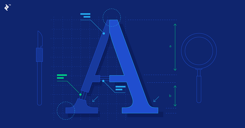
In like fashion, designers have their own obscure nomenclature related to letter anatomy. Letter anatomy? Yes, the characters used to construct our written languages have anatomical features and classifications. In fact, letterform composition can be quite complex.
Still, some may wonder, “If letters have anatomy, is there any practical value that comes with knowing what all the little parts are called?”
There certainly is. Here are four examples that show how knowledge of letter anatomy is useful to professional designers:
1. Conversations with Clients
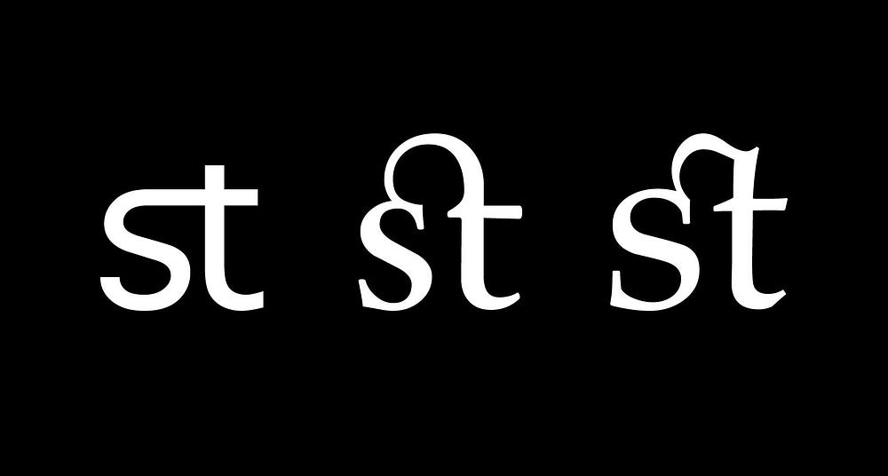
Most clients won’t have a clue what to call different letter parts. Instead, they’ll say things like, “That little arch connecting the ‘c’ and ‘t’ looks weird to me.” Because you’ve learned letter anatomy, you’ll know exactly what they’re referring to — Gadzook!

2. Diagnosing Design Issues
Letterforms are responsible for all kinds of confounding design issues. Whether in logotypes, section headers, or navigation menus, sometimes letters just don’t look right. Knowing letter anatomy will allow you to quickly pinpoint the problem, understand why it exists, and find a solution. “That ‘e’ looks bad because the finial is too thick. Let’s add a bit more taper.”
3. Enhancing Legibility
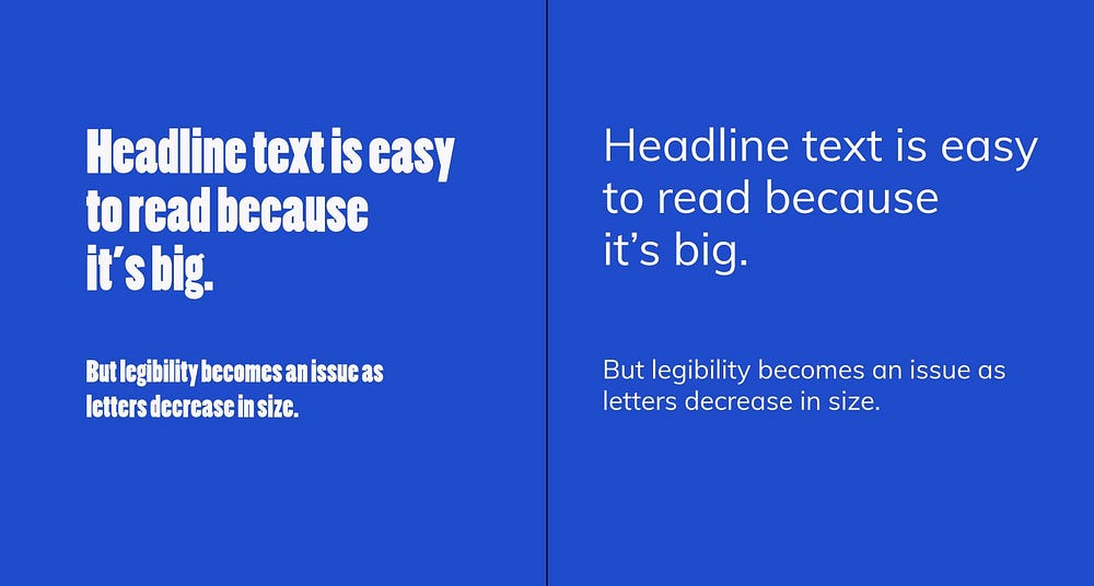
Letter anatomy can actually hinder or improve legibility. For instance, fonts with ample counters (the negative space inside of letters like ‘p’ and ‘o’) and a tall x-height (the height of lowercase letters) are typically considered easier to read.

4. Letters are Everywhere
If you’re a designer, there’s no escape — letters dominate our physical and digital environments. With ample letter knowledge, you’ll have access to more solutions when attempting to solve a wide array of visual design problems.
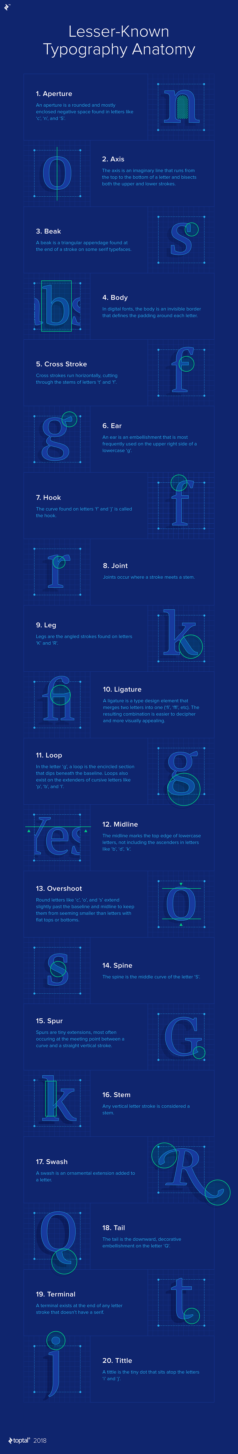
Learning Lesser-Known Typography Anatomy
In actuality, there are a ton of letter anatomy terms, and unless you’re a type designer, you probably don’t need to learn them all. Some are obscure and rarely implemented in the letters we encounter on a regular basis (ball terminal, diacritics, gadzook, etc.), and others are almost universally recognized (x-height, ascender, descender, etc.).
With that in mind, we present a collection of commonly used — yet lesser known — letter parts that every designer should be aware of.

Download a PDF version of this infographic.
• • •
Originally published at www.toptal.com.
from UX Collective – Medium https://uxdesign.cc/dissecting-the-intricacies-of-typography-anatomy-with-infographic-a85e29c6ed5c?source=rss—-138adf9c44c—4