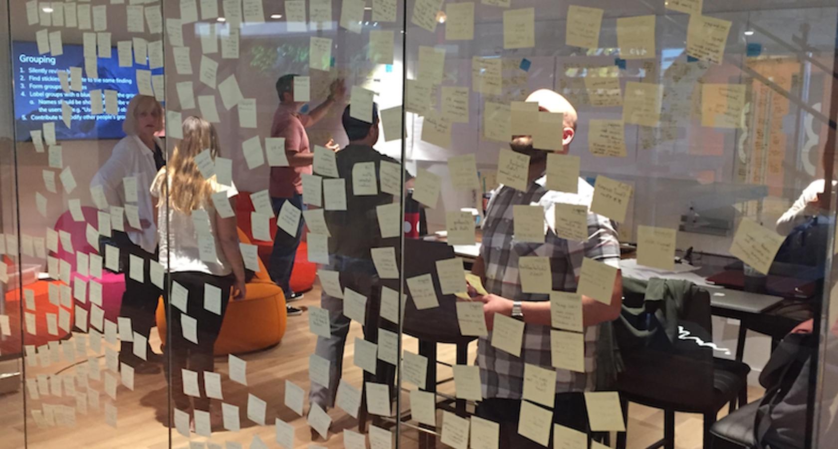
Making Personas Truly Valuable by Making Them Scenario-based

Personas are a fantastic tool for designers. They can guide important user experience decisions throughout the design process.

Many teams take an over-simplified approach, crafting personas that don’t offer any meaningful details to help with the design process. The documents they create look nice. They make good posters. Then everybody ignores them. These personas aren’t valuable.

After this experience, many teams give up on the idea of personas. That could be because they’re trying to make one set of personas for everything they do. We have a different approach that proves to make personas much more valuable.

When personas are valuable, they guide the team’s critical design decisions. These personas serve as a catalyst to having important design discussions. Because they’re based on scenarios, they ensure the team catches critical user paths through the design. Scenario-based personas offer more depth for user stories, so our developers build out better quality functionality.

We find personas based on roles are too vague.

For the last few months, our team has been working on a job board application, where companies can post their job openings and people can apply for the open positions. It would have been easy for us to fall into the common trap of defining our personas into user roles. The job board has two obvious roles: job posters and job seekers.

While ‘seeking a new job’ and ‘posting an open position’ are distinct activities in the application, they aren’t dictated by user roles. The same person could do both over time. Someone who has been posting jobs may also seek a change in their own career. At that point, they’d also become a job seeker.

Personas don’t help us when we define them on roles. Roles are too imprecise and ill-defined to make useful.

It’s clear we need functionality for someone when they’re posting a job and different functionality when someone is seeking a job. Beyond that, having personas of a job poster or a job seeker wouldn’t help us make any decisions. That’s where scenario-based personas come in.

We start with researched scenarios.

Before we started our research with the people who wanted to advertise their open positions, we hypothesized there were basically two overarching scenarios:

Scenario #1: Job poster with existing job description.
Job poster has a description they’ve posted in several other places (including their own company’s career page). They would like exposure to the audience of our job board. They’d like our job board to promote the description they already have.

Scenario #2: Job poster has brand new position with no existing description.
Job poster just received approval to hire a new team member. They haven’t posted the job anywhere yet and therefore haven’t written it up. They’d like to get applicants right away. They believe our job board firmly targets exactly the type of people that would make great candidates. They’d like to post the first job description on our site right away.

We were right in that both scenarios exist. However, our research showed the second scenario happened infrequently. As a result, our team changed up our delivery plans, deciding to focus on the first scenario: posters with existing descriptions.

We look for variations on how people approach our scenario.

Often, we can get by using only scenarios. Scenarios give us all the detail we need to build out the functionality. In these instances, every user who finds themselves in the scenario would approach it basically the same way.

However, in some projects, in-depth research shows us variations in how different people tackle the same scenario. That was certainly the case with job board posters.

We found multiple approaches to posting a job depending on who the job poster was. Here are some variations we found:

Hiring manager with only one position and not working with HR: This hiring manager has only the one position to advertise. They also have control of the hiring process, with no involvement from their HR recruitment department.

Hiring manager with multiple positions: This hiring manager is building out their team with multiple simultaneous openings. Some of the openings may be very similar positions (and may share the same job title), but will describe slightly different job objectives and requirements.

Hiring manager working with HR recruiter: This hiring manager is working with a recruiter from HR, who will screen applicants and answer the applicant’s preliminary questions about the position.

HR recruiter posting the position: This is a recruiter who is simultaneously recruiting multiple open positions within the organization. This recruiter posts the open position instead of the hiring manager, possibly on the hiring manager’s recommendation.

Each scenario-based persona will approach the design differently.

It was from our research that we learned how each persona was different from the others. We saw many people who were like our first persona: the one-position hiring manager who wasn’t working with HR. This was our simplest persona. They just need a way to copy and paste the description text into the job posting form.

The first hiring manager we met who had multiple positions to post was different from our first personas. They wanted to move between drafts of the job postings. They needed to make sure each position had the right information. We need to help them efficiently enter their posts without duplicating their efforts each time.

We also learned hiring managers who work with an HR recruiter need a way to share the job posting draft. They’d like the recruiter to give them feedback. This persona had different needs than our previous two personas.

Finally, the recruiters we met were very different from all the hiring managers. The recruiters worked with dozens of boards and were very interested in capabilities to track which boards produce the best applicants. They also needed to understand why they should choose this board and which types of positions. None of our hiring manager personas showed any interest in these capabilities.

By identifying each persona and noting their different needs, we can make sure we’re not missing any key functionality. We’re more likely to anticipate all of our users’ needs this way.

Our scenario-based personas emerged from our research.

To identify our personas, we paid attention to what we were learning from our research. We started the research by interviewing hiring managers, asking them to walk us through their hiring process.

We learned about their autonomy and their relationship with HR. We learned about the order that things happened in the hiring process. We learned who usually crafts the job description. We learned about their frustrations with attracting the best applicants.

It was in these interviews that we caught our first glimpses of the different personas. We learned more about them by using interview-based tasks as we conducted usability tests on our prototypes.

After each research session, we’d flesh out the persona descriptions a bit more. The more people we researched, the richer our understanding of each persona became.

These weren’t personas we created to figure out who to research. They were personas that emerged from the variations we saw once we started our research. We’ve found this to be a much easier way to get to more accurate and nuanced personas.

These personas are most useful for specific scenarios.

These four personas turned out to only be useful to our team for that particular scenario. For a different scenario (paying for the posting), we needed different personas (people who wanted invoices versus paying with a credit card). And we didn’t need any personas for the scenarios of turning off the job posting (because the position is no longer open) or extending the posting (because it hasn’t been filled before the post’s expiration date).

In the course of building something like our job board application, we could have a dozen or more scenarios. Personas would only matter to us for approximately half of our scenarios.

The personas for one scenario will unlikely influence the functionality of the other scenarios. We’ve found personas are most valuable when they’re specific to a single scenario. This makes describing the personas substantially easier. We only describe a persona’s specific attributes that will influence the functionality differently from other personas.

Bridging a gap between scenarios and user stories.

Many teams use user stories that look like As a [user], I need to [action] so [an outcome occurs]. With our scenarios and the personas from those scenarios, we can easily fill in all the pieces.

For example, using one of the personas I listed above, we can craft the user story of As a hiring manager working with HR, I need to share a draft of my job posting so my HR recruiter can add in details I’ve left out. Having both the personas and the scenarios to use as background information, creating rich user stories like these become simpler. They also give the developers more insight on where to take the functionality to make it work for the user.

We’ve found these scenario-based personas work very well with other UX techniques, such as Jeff Patton’s Story Mapping, Indi Young’s Mental Models, and Jeff Gothelf’s Lean UX. Scenario-based personas become a lightweight tool to ensure we’re covering all our bases and building the right design.

from Stories by Jared M. Spool on Medium https://medium.com/@jmspool/making-personas-truly-valuable-by-making-them-scenario-based-87522715cba3?source=rss-b90ef6212176——2

Everything you need to know about TensorFlow 2.0

Keras-APIs, SavedModels, TensorBoard, Keras-Tuner and more.

On June 26 of 2019, I will be giving a TensorFlow (TF) 2.0 workshop at the PAPIs.io LATAM conference in São Paulo. Aside from the happiness of being representing Daitan as the workshop host, I am very happy to talk about TF 2.0.

The idea of the workshop is to highlight what has changed from the previous 1.x version of TF. In this text, you can follow along with the main topics we are going to discuss. And of course, have a look at the Colab notebook for practical code.

Introduction to TensorFlow 2.0

TensorFlow is a general purpose high-performance computing library open sourced by Google in 2015. Since the beginning, its main focus was to provide high-performance APIs for building Neural Networks (NNs). However, with the advance of time and interest by the Machine Learning (ML) community, the lib has grown to a full ML ecosystem.

Currently, the library is experiencing its largest set of changes since its birth. TensorFlow 2.0 is currently in beta and brings many changes compared to TF 1.x. Let’s dive into the main ones.

Eager Execution By Default

To start, eager execution is the default way of running TF code.

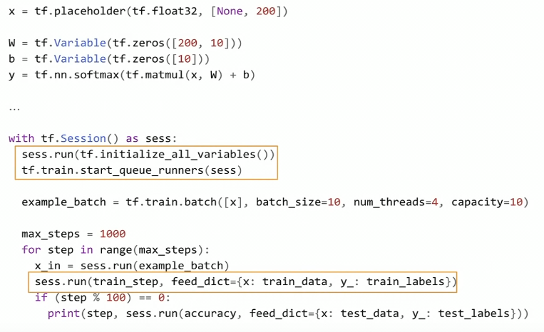
As you might recall, to build a Neural Net in TF 1.x, we needed to define this abstract data structure called a Graph. Also, (as you probably have tried), if we attempted to print one of the graph nodes, we would not see the values we were expecting. Instead, we would see a reference to the graph node. To actually, run the graph, we needed to use an encapsulation called a Session. And using the Session.run() method, we could pass Python data to the graph and actually train our models.

TF 1.x code example.

With eager execution, this changes. Now, TensorFlow code can be run like normal Python code. Eagerly. Meaning that operations are created and evaluated at once.

Tensorflow 2.0 code example.

TensorFlow 2.0 code looks a lot like NumPy code. In fact, TensorFlow and NumPy objects can easily be switched from one to the other. Hence, you do not need to worry about placeholders, Sessions, feed_dictionaties, etc.

API Cleanup

Many APIs like tf.gans, tf.app, tf.contrib, tf.flags are either gone or moved to separate repositories.

However, one of the most important cleanups relates to how we build models. You may remember that in TF 1.x we have many more than 1 or 2 different ways of building/training ML models.

Tf.slim, tf.layers, tf.contrib.layers, tf.keras are all possible APIs one can use to build NNs is TF 1.x. That not to include the Sequence to Sequence APIs in TF 1.x. And most of the time, it was not clear which one to choose for each situation.

Although many of these APIs have great features, they did not seem to converge to a common way of development. Moreover, if we trained a model in one of these APIs, it was not straight forward to reuse that code using the other ones.

In TF 2.0, tf.keras is the recommended high-level API.

As we will see, Keras API tries to address all possible use cases.

The Beginners API

From TF 1.x to 2.0, the beginner API did not change much. But now, Keras is the default and recommended high-level API. In summary, Keras is a set of layers that describes how to build neural networks using a clear standard. Basically, when we install TensorFlow using pip, we get the full Keras API plus some additional functionalities.

The beginner’s API is called Sequential. It basically defines a neural network as a stack of layers. Besides its simplicity, it has some advantages. Note that we define our model in terms of a data structure (a stack of layers). As a result, it minimizes the probability of making errors due to model definition.

Keras-Tuner

Keras-tuner is a dedicated library for hyper-parameter tuning of Keras models. As of this writing, the lib is in pre-alpha status but works fine on Colab with tf.keras and Tensorflow 2.0 beta.

It is a very simple concept. First, need to define a model building function that returns a compiled keras model. The function takes as input a parameter called hp. Using hp, we can define a range of candidate values that we can sample hyper-parameters values.

Below we build a simple model and optimize over 3 hyper-parameters. For the hidden units, we sample integer values between a pre-defined range. For dropout and learning rate, we choose at random, between some specified values.

Then, we create a tuner object. In this case, it implements a Random Search Policy. Lastly, we can start optimization using the search() method. It has the same signature as fit().

In the end, we can check the tuner summary results and choose the best model(s). Note that training logs and model checkpoints are all saved in the directory folder (my_logs). Also, the choice of minimizing or maximizing the objective (validation accuracy) is automatically infered.

Have a look at their Github page to learn more.

The Advanced API

The moment you see this type of implementation it goes back to Object Oriented programming. Here, your model is a Python class that extends tf.keras.Model. Model subclassing is an idea inspired by Chainer and relates very much to how PyTorch defines models.

With model Subclassing, we define the model layers in the class constructor. And the call() method handles the definition and execution of the forward pass.

Subclassing has many advantages. It is easier to perform a model inspection. We can, (using breakpoint debugging), stop at a given line and inspect the model’s activations or logits.

However, with great flexibility comes more bugs.

Model Subclassing requires more attention and knowledge from the programmer.

In general, your code is more prominent to errors (like model wiring).

Defining the Training Loop

The easiest way to train a model in TF 2.0 is by using the fit() method. fit() supports both types of models, Sequential and Subclassing. The only adjustment you need to do, if using model Subclassing, is to override the compute_output_shape() class method, otherwise, you can through it away. Other than that, you should be able to use fit() with either tf.data.Dataset or standard NumPy nd-arrays as input.

However, if you want a clear understanding of what is going on with the gradients or the loss, you can use the Gradient Tape. That is especially useful if you are doing research.

Using Gradient Tape, one can manually define each step of a training procedure. Each of the basic steps in training a neural net such as:

  • Forward pass
  • Loss function evaluation
  • Backward pass
  • Gradient descent step

is separately specified.

This is much more intuitive if one wants to get a feel of how a Neural Net is trained. If you want to check the loss values w.r.t the model weights or the gradient vectors itself, you can just print them out.

Gradient Tape gives much more flexibility. But just like Subclassing vs Sequential, more flexibility comes with an extra cost. Compared to the fit() method, here we need to define a training loop manually. As a natural consequence, it makes the code more prominent to bugs and harder to debug. I believe that is a great trade off that works ideally for code engineers (looking for standardized code), compared to researchers who usually are interested in developing something new.

Also, using fit() we can easily setup TensorBoard as we see next.

Setting up TensorBoard

You can easily setup an instance of TensorBoard using the fit() method. It also works on Jupyter/Colab notebooks.

In this case, you add TensorBoard as a callback to the fit method.

As long as you are using the fit() method, it works on both: Sequential and the Subclassing APIs.

If you choose to use Model Subclassing and write the training loop yourself (using Grading Tape), you also need to define TensorBoard manually. It involves creating the summary files, using tf.summary.create_file_writer(), and specifying which variables you want to visualize.

As a worth noting point, there are many callbacks you can use. Some of the more useful ones are:

  • EarlyStopping: As the name implies, it sets up a rule to stop training when a monitored quantity has stopped improving.
  • ReduceLROnPlateau: Reduce the learning rate when a metric has stopped improving.
  • TerminateOnNaN: Callback that terminates training when a NaN loss is encountered.
  • LambdaCallback: Callback for creating simple, custom callbacks on-the-fly.

You can check the complete list at TensorFlow 2.0 callbacks.

Extracting Performance of your EagerCode

If you choose to train your model using Gradient Tape, you will notice a substantial decrease in performance.

Executing TF code eagerly is good for understanding, but it fails on performance. To avoid this problem, TF 2.0 introduces tf.function.

Basically, if you decorate a python function with tf.function, you are asking TensorFlow to take your function and convert it to a TF high-performance abstraction.

It means that the function will be marked for JIT compilation so that TensorFlow runs it as a graph. As a result, you get the performance benefits of TF 1.x (graphs) such as node pruning, kernel fusion, etc.

In short, the idea of TF 2.0 is that you can devise your code into smaller functions. Then, you can annotate the ones you wish using tf.function, to get this extra performance. It is best to decorate functions that represent the largest computing bottlenecks. These are usually the training loops or the model’s forward pass.

Note that when you decorate a function with tf.function, you loose some of the benefits of eager execution. In other words, you will not be able to setup breakpoints or use print() inside that section of code.

Save and Restore Models

Another great lack of standardization in TF 1.x is how we save/load trained models for production. TF 2.0 also tries to address this problem by defining a single API.

Instead of having many ways of saving models, TF 2.0 standardize to an abstraction called the SavedModel.

There is no much to say here. If you create a Sequential model or extend your class using tf.keras.Model, your class inherits from tf.train.Checkpoints. As a result, you can serialize your model to a SavedModel object.

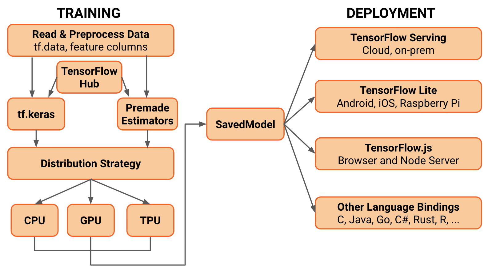
SavedModels are integrated with the TensorFlow ecosystem. In other words, you will be able to deploy it to many different devices. These include mobile phones, edge devices, and servers.

Image result for tensorflow 2.0

Converting to TF-Lite

If you want to deploy a SavedModel to embedded devices like Raspberry Pi, Edge TPUs or your phone, use the TF Lite converter.

Note that in 2.0, the TFLiteConverter does not support frozen GraphDefs (usually generated in TF 1.x). If you want to convert a frozen GraphDefs to run in TF 2.0, you can use the tf.compat.v1.TFLiteConverter.

It is very common to perform post-training quantization before deploying to embedded devices. To do it with the TFLiteConverter, set the optimizations flag to “OPTIMIZE_FOR_SIZE”. This will quantize the model’s weights from floating point to 8-bits of precision. It will reduce the model size and improve latency with little degradation in model accuracy.

Note that this is an experimental flag, and it is subject to changes.

Converting to TensorFlow.js

To close up, we can also take the same SavedModel object and convert it to TensorFlow.js format. Then, we can load it using Javascript and run your model on the Browser.

First, you need to install TensorFlow.js via pip. Then, use the tensorflowjs_converter script to take your trained-model and convert to Javascript compatible code. Finally, you can load it and perform inference in Javascript.

You can also train models using Tesnorflow.js on the Browser.

Conclusions

To close off, I would like to mention some other capabilities of 2.0. First, we have seen that adding more layers to a Sequential or Subclassing model is very straightforward. And, although TF covers most of the popular layers like Conv2D, TransposeConv2D etc; you can always find yourself in a situation where you need something that is not available. That is especially true if you are reproducing some paper or doing research.

The good news is that we can develop our own Custom layers. Following the same Keras API, we can create a class and extend it to tf.keras.Layer. In fact, we can create custom activation functions, regularization layers, or metrics following a very similar pattern. Here is a good resource about it.

Also, we can convert existing TensorFlow 1.x code to TF 2.0. For this end, the TF team created the tf_upgrade_v2 utility.

This script does not convert TF 1.x code to 2.0 idiomatics. It basically uses tf.compat.v1 module for functions that got their namespaces changed. Also, if your legacy code uses tf.contrib, the script will not be able to convert it. You will probably need to use additional libraries or use the new TF 2.0 version of the missing functions.

Thanks for reading.


Everything you need to know about TensorFlow 2.0 was originally published in Hacker Noon on Medium, where people are continuing the conversation by highlighting and responding to this story.

from Hacker Noon https://hackernoon.com/everything-you-need-to-know-about-tensorflow-2-0-b0856960c074?source=rss—-3a8144eabfe3—4

Using Sketch Libraries and primitives to build an even better system of buttons


Identifying design primitives and a case for building components which limit the amount of redundancy in your work

Go to the profile of Harry Cresswell

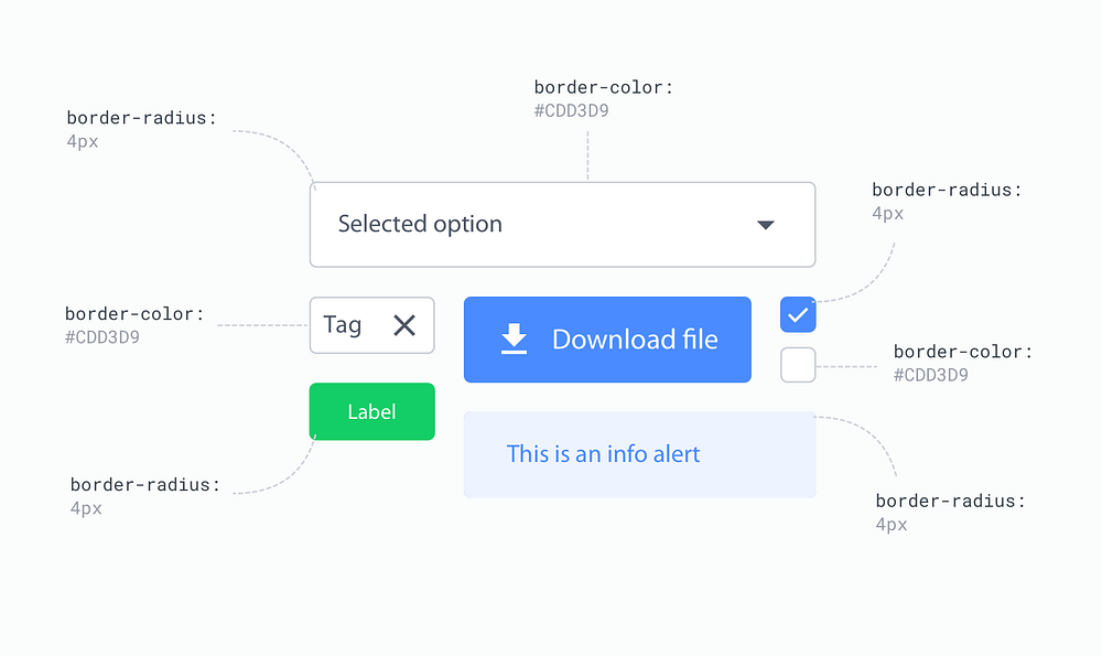
Components sharing the same border radius, stored in a ‘primitive’ sketch Library file.

In a previous article I share a process which uses Sketch Libraries to build the basic building blocks of a design system. Unless you’ve been living under a rock, Libraries will most likely be on your radar, if not already a part of your workflow.

By abstracting reoccurring properties which make up our designs, we can create reusable systems of styles and components, storing them in Libraries. This reduces design debt and improve the speed, efficiency and consistency in our work.

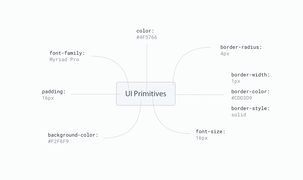
You might refer to these abstracted properties as “UI Primitives”, a term made familiar (I think) by Benjamin Wilkins of Airbnb and Dan Eden of Facebook.

This may not be the only use case for Libraries, but this is how I’ve been using them and it’s been a huge step for my design process. Now let me explain how I got there.

Design thinking in Primitives

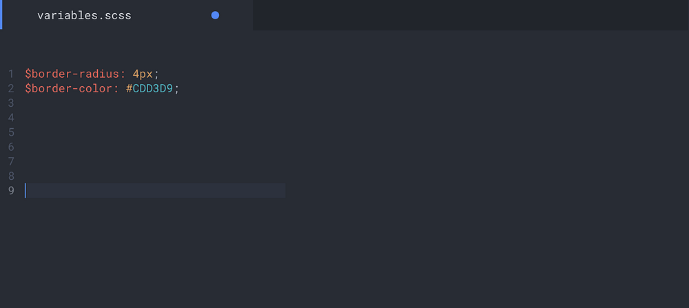
Think of primitives as the most granular level elements which the rest of your design is made up of. If you’ve ever worked with SASS then primitives are your variables. Likewise those familiar with the Lighting Design System will understand primitives as design tokens.

Certain CSS architectures recommend we group these primitive variables into a layer of abstraction and so we often create a folder of partial files and call it ‘abstracts’. If you hear any of these terms, know in most cases they are one and the same. What we’re doing here, is ‘abstracting’ the common styles from a design to make them reusable, in a way which prevents us from repeating ourselves unnecessarily.

Whether you are conscious of the primitives comprising your designs or not, an audit of your work will most likely reveal any number of these reoccurring properties. You will notice patterns and similarities shared between various parts of UI, which you as the designer have consciously implemented to create visual harmony in your work.

Taking the time to identify these patterns can have a huge impact on your process. Thinking in primitives will help you approach your work in a more systematic way, helping to solve common issues regarding the likes of scalability and consistency, as inevitably, they become an integral part of the design systems you create.

Putting primitives into practice to improve our design process in Sketch

Where a developer might extract these UI primitives, storing them as variables in order to reduce inconsistency and improve efficiency in their process. As designers we can achieve the exact same results by using Sketch Libraries.

An example of using variables to abstract the reusable properties found in the image up top.

So, how can we take this idea of UI primitives—being the most basic ingredients in designs—and use them to build larger, more identifiable components in a design system?

Primitive Libraries for a single source of truth

Splitting up your UI Kit into partial Sketch Libraries

I’m sure by now you must be familiar with the idea of using a UI kit, where all reusable components live in a single Sketch file. A ‘single source of truth’ as many refer to it.

Building on this idea, my current process involves splitting UI components and the primitives styles they comprise—which you may have once kept in a single sketch file called ‘UI kit.sketch’—into several independent Sketch files.

By taking these partial files and turning them into Libraries, primitives can be used in any other file and therefore any other component. Essentially, we’re creating lots of small, lightweight partial files to use across our designs or even across different projects.

It’s worth noting; this technique doesn’t have to stop at a component level. Why not split your shapes, colors, borders, icons and so on into seperate Sketch files. In other words, if you can identify a primitive style which occurs in multiples places in your designs, then—within reason—there’s a good chance it deserves it’s own Library file.

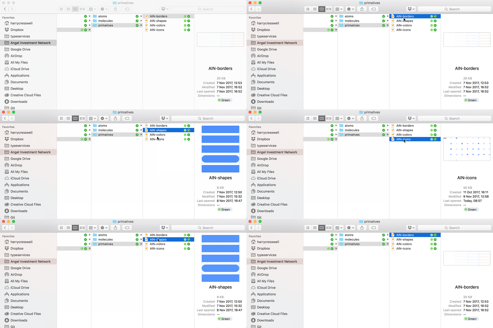
Folder of truth containing primitive Library files

Why bother with primitive Libraries?

By making primitive Libraries we can create one core set of highly reusable properties, vastly reducing complexity in our work. By keeping several small files, our projects will be easier to maintain, reuse and evolve, as each file contains fewer parts.

We can then use these primitive symbols to build more complex components, further reducing complexity in our atoms, molecules and organisms. Primitive symbols help us keep unique styles to a minimum, reducing our component files to a combination of primitives, nested components (depending on their level of complexity) and a handful of no-reusable properties.

In other words, the only new properties we will have to make when building components, are those tied specifically to the component themselves, as these properties have no case for reuse elsewhere in our designs.

“A unified design language shouldn’t just be a static set of rules and individual atoms — it should be an evolving ecosystem” — Karri Saarinen.

By managing and referencing primitive Libraries— our “single source of truth” — across multiple files, we can easily update, make changes or add to any one of these files at any moment in time.

We can add new components when needed, without conflict. We then have the ability to synchronise updates across our entire project. In effect, we can create a design ecosystem, which will evolve and grow in time. You could say we are able to create a living design vocabulary.

Thinking in primitives and making primitive Libraries not only aid you the designer, but also your collaborators, including developers. If you’re able to identify all cases of reusability in your designs, then the job of abstracting variables —from a developers perspective — becomes a seemingly simple process.

Using primitives to build atom level components

The next part of this article will look at using these ‘primitive’ Libraries to build more complex structures. I’ll walk you through the current process I use to build a flexible system of buttons, using the fewest number of unique Symbols possible

A fundamental part of any good design system, buttons are arguably the most identifiable atom (according to atomic design principles) in any user interface. And when abstracted, consist of a handful of primitive properties.

The anatomy of a button

Take a look at the buttons in your design and you’ll most likely notice a handful of reoccurring properties. You might identify similarities in any of the following:

  • Background Shape
  • Background Color
  • Border Width
  • Border Radius
  • Text Family
  • Text Color
  • Text Size
  • Padding (left, right, top, bottom)

We can assume that some of these primitives will appear elsewhere in our design too, perhaps for example, in form elements.

Illustrated anatomy of button labeled with various primitive properties

By splitting these reoccurring properties into Libraries, we can reference the these Libraries to build our buttons, as well as all other components in our system which share these same properties.

Keeping these primitive properties in Libraries will prevent us from having to create a new style each and every time we build a new component.

Auditing current button styles

As I mentioned previously, good design begins with a audit of what’s been before. When conducting an interface inventory for AIN, our current system revealed we were using 4 button types in a variety of color and shape styles.

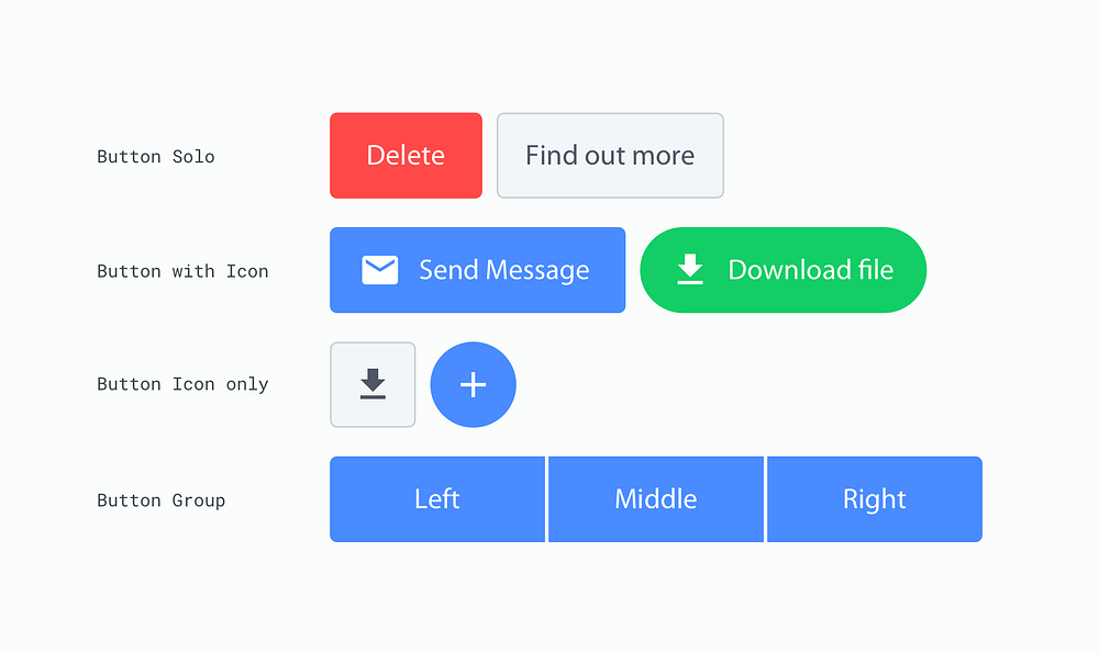
To be clear, when I refer to ‘type’ I mean buttons with noticeable structural differences, for example buttons with an icon are structurally different to those without. whereas when I say ‘style’ I’m referring to colors, borders, or any other cosmetic property which affect every type of button.

4 button styles in a variety of colors and shapes

Identifying button types

Based on the audit, it seemed logical to group the 4 types into the following categories:

  • button solo
  • button with icon
  • button icon only
  • button group (left, middle and right)

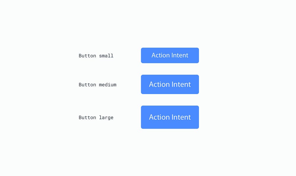
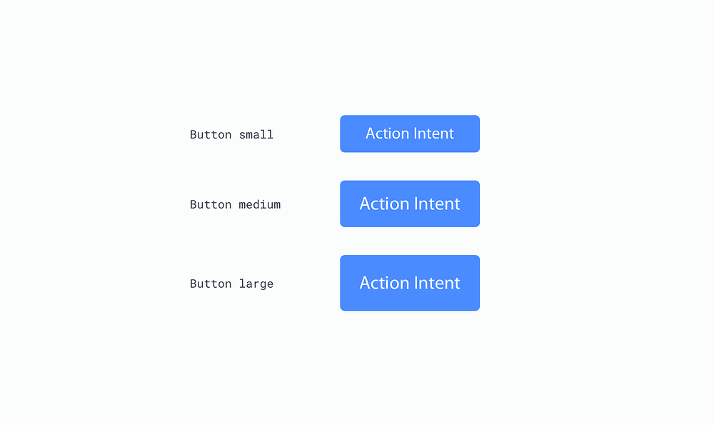
Each button type appears in our designs at 3 different sizes, which are based on a rhythm associated with the 8pt grid and refer to their height. Those sizes are 48px, 40px and 32px. For the sake of simplicity, I adopted t-shirt sizing when naming each size; Small, Medium and Large.

3 button sizes based off the 8pt grid

Identifying the primitives

Further to this, I identified a total of 6 primitive properties making up all buttons. Primitives, as we now know, being those properties which can be found elsewhere in our designs, and not just in our buttons. These were:

  • color
  • border
  • icon
  • shape
  • text
  • state

Although visually different, I realised colors, icons and border styles could easily reference some of these primitive Libraries I previously created. This would help keep unique properties to a minimum. I could also use fewer Symbols to make the various Button styles, as most of the style overrides could be handled directly by each independent Library. This meant I would have to make fewer Symbols to achieve the various styles.

I predicted I would only need a base Symbol for each Button type, which could then be use for every style instance found in that type of button.

These assumptions were mostly true, however the ‘text’, ‘shape’ and ‘state’ primitives (which we’ll get onto next) took a little more thought, due to their lack of reuse and specificity towards buttons only.

Dealing with button text

I decided to avoid creating a new primitive Library for text used in buttons as it’s highly specific to the buttons themselves. The text has a unique line-height depending on the button size, so the chances of the exact text style being found elsewhere is minimal. This meant creating a Library would be overkill.

In this case, it was easier to keep the complexity found with the text within the buttons sketch file itself, rather than referencing text from an external Library, which might never be used by other components in the system.

With that, I identified 4 different colors of text: Brand, dark, white and disabled. The text was also being used in 3 different sizes, one for each button size; large, medium and small.

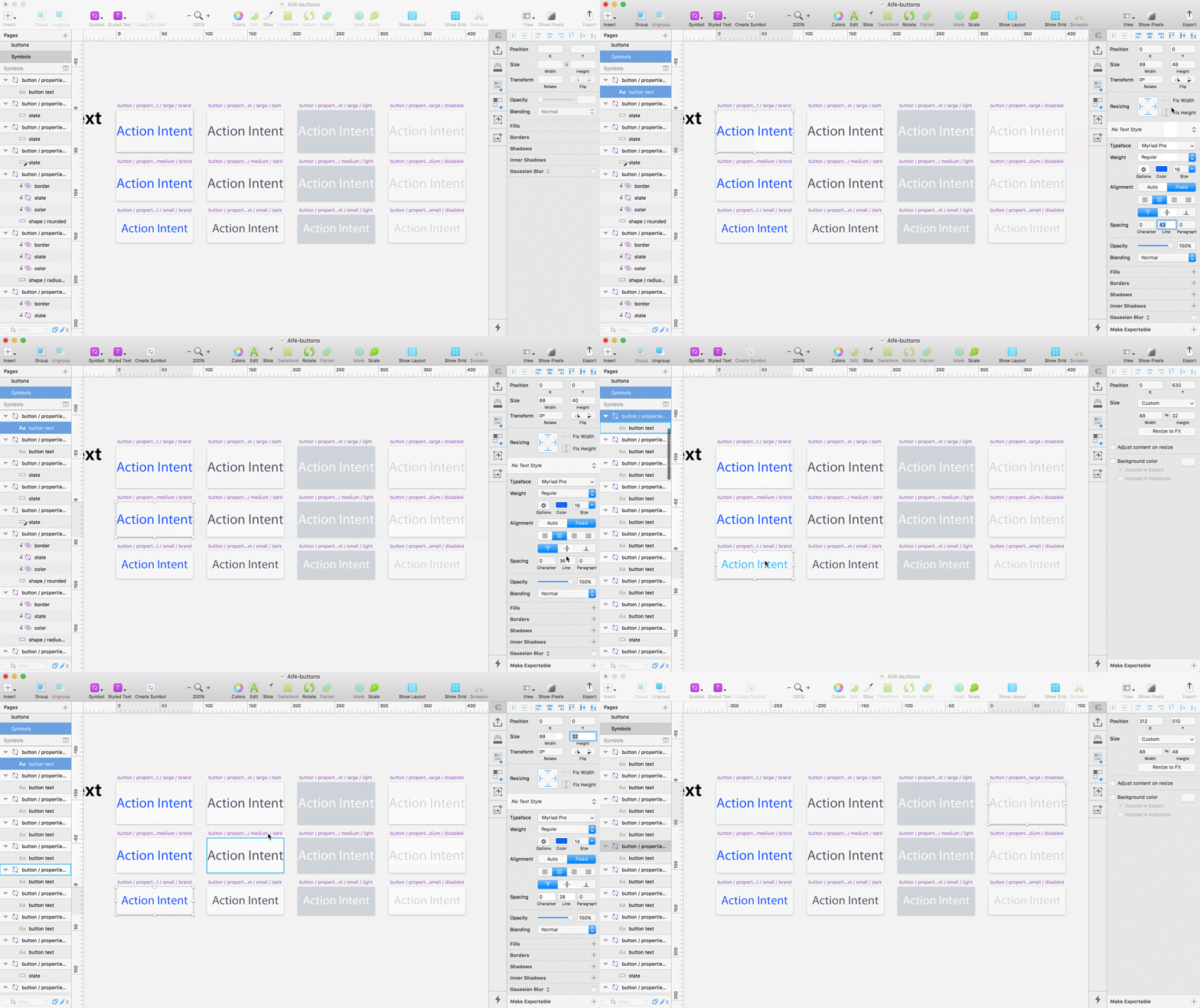
I created separate Artboards in a sketch file called AIN-buttons (the prefix ‘AIN–’ referring to the design system project)for each of these text properties and converted them all to Symbols. When I build the final button component, I will be able to override the text style when needed, by nesting these text symbols.

In order for these overrides to work, I made sure to keep my Artboard naming convention consistent I follow a basic naming system: component name, properties (which contains all properties in a property specific folder), property type, property size and color. It looked something like this:

button / properties / text / large / brand

Sidenote: In order to Override one Symbol with another, you also need to make sure your Artboards are the exact same size. So make sure all your text Artboards have the same height and width if you want them to show up as overrides in the inspector palette.

Dealing with button states

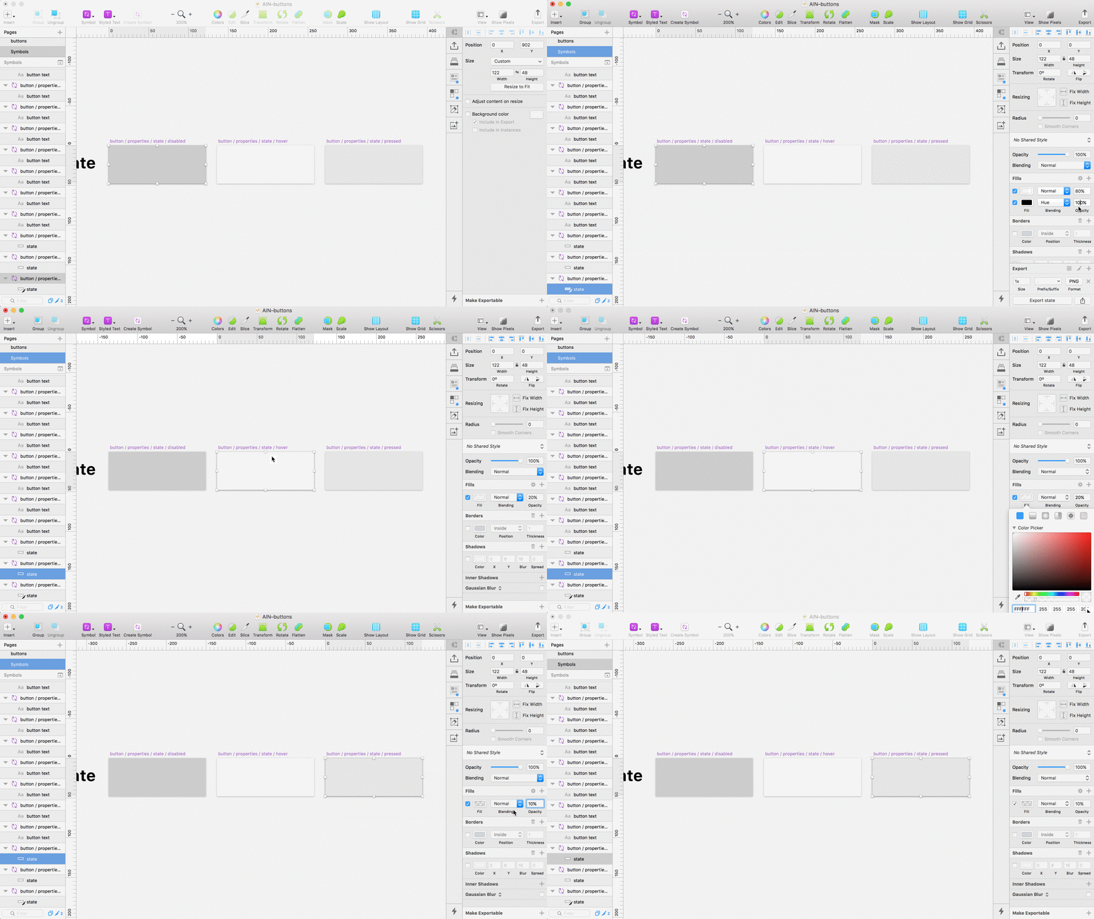
States were another design primitive unique to my button. That is, no other component in my system shares the same design for hover, pressed, and disabled States. This meant states should also be build directly in the Buttons Sketch file. As was the case with the text, I didn’t need to create another primitive Library unnecessarily.

Building button state symbols within the button component sketch file

Instead, I built 3 new symbols to be used as state Overrides and followed a similar naming convention as before:

button / properties / state / disabled

Each Symbol consists of a single rectangle layer with slightly different fills. The hover state I made using an Artboard with a rectangle fill of 20% white. For the pressed state I did the same but with 10% black fill. Disabled had an 80% fill of white and another fill of 100% black on top, this time with the blending mode set to ‘Hue’. This insures any color button appears desaturated when the state override is set to ‘disabled’.

Sidenote: The Artboard sizes isn’t important, as they can be resized later, just make sure all your state Artboards are the same size, this allow Overrides to work . You will however, need to make sure the sizes differs from your Text Symbol Artboards. This is so they don’t show up in the Text Overrides dropdown. It’s a slight annoyance when working with Overrides in Sketch and it’s not essential, but it will keep your Override options nice and clean.

Dealing with button shape

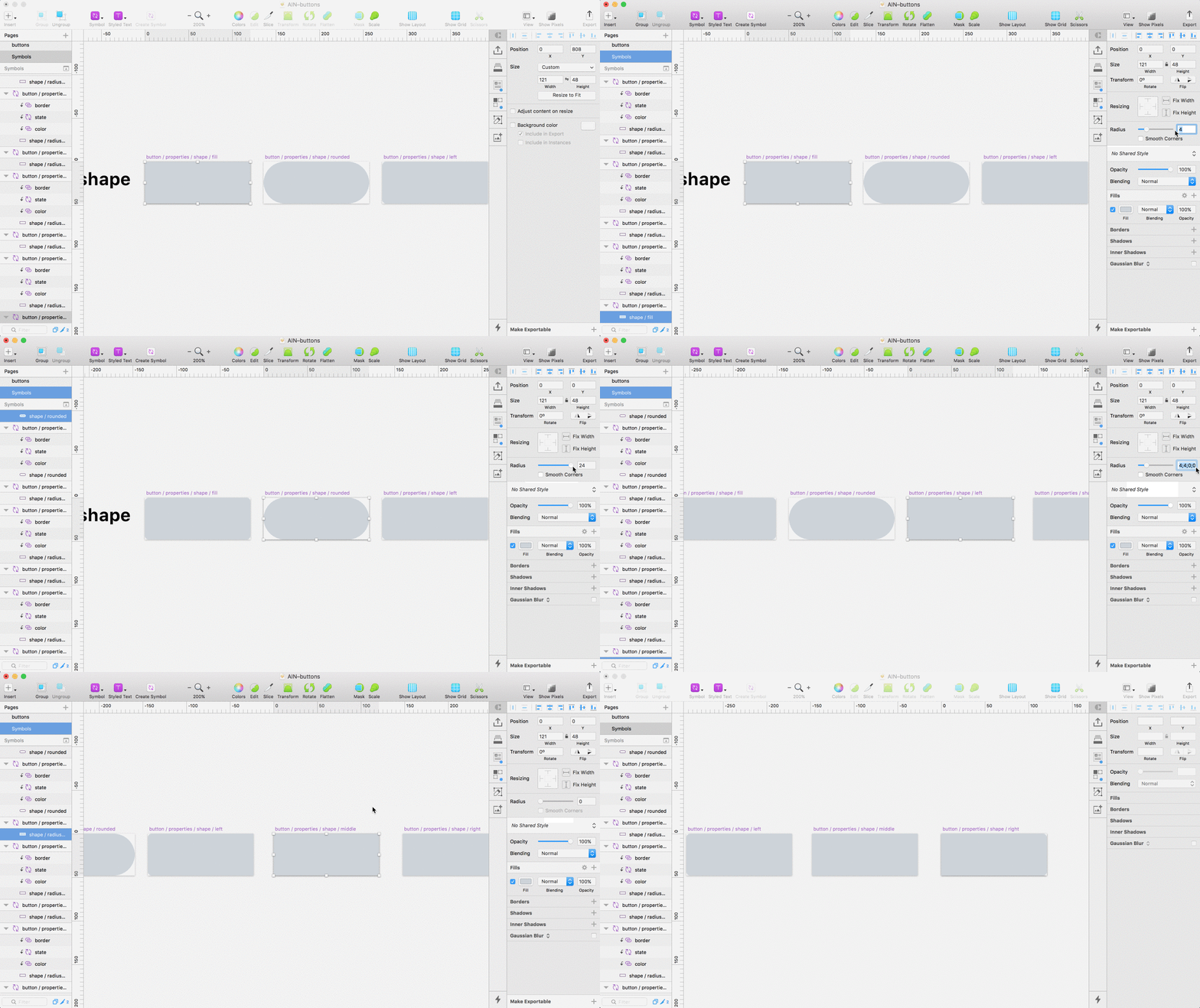
Handling states directly meant I also had to do the same with the button shape. This is because you can’t create a mask of native design elements (being elements belonging to the same file) using an external Library. So in order to reveal the button shape behind the state I was forced to build the shape primitive directly in the buttons sketch file.

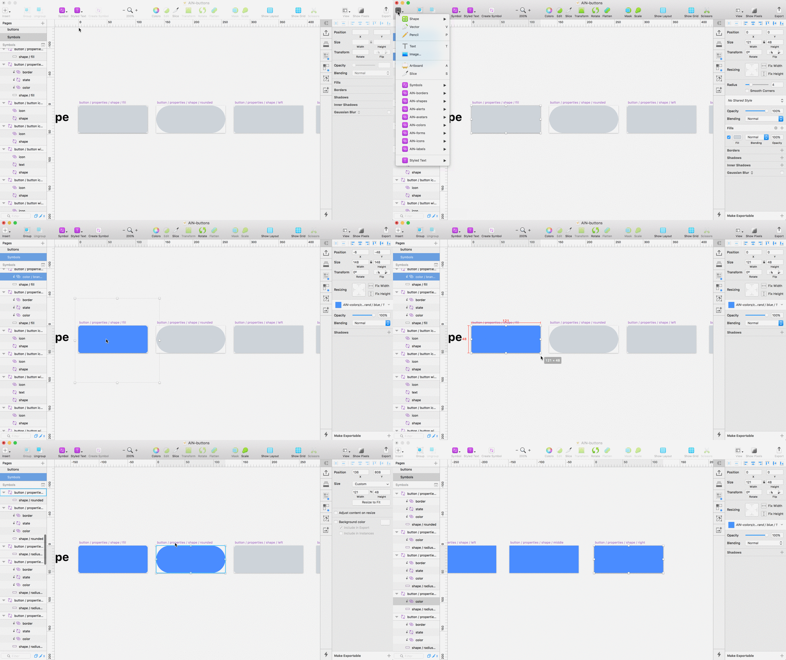
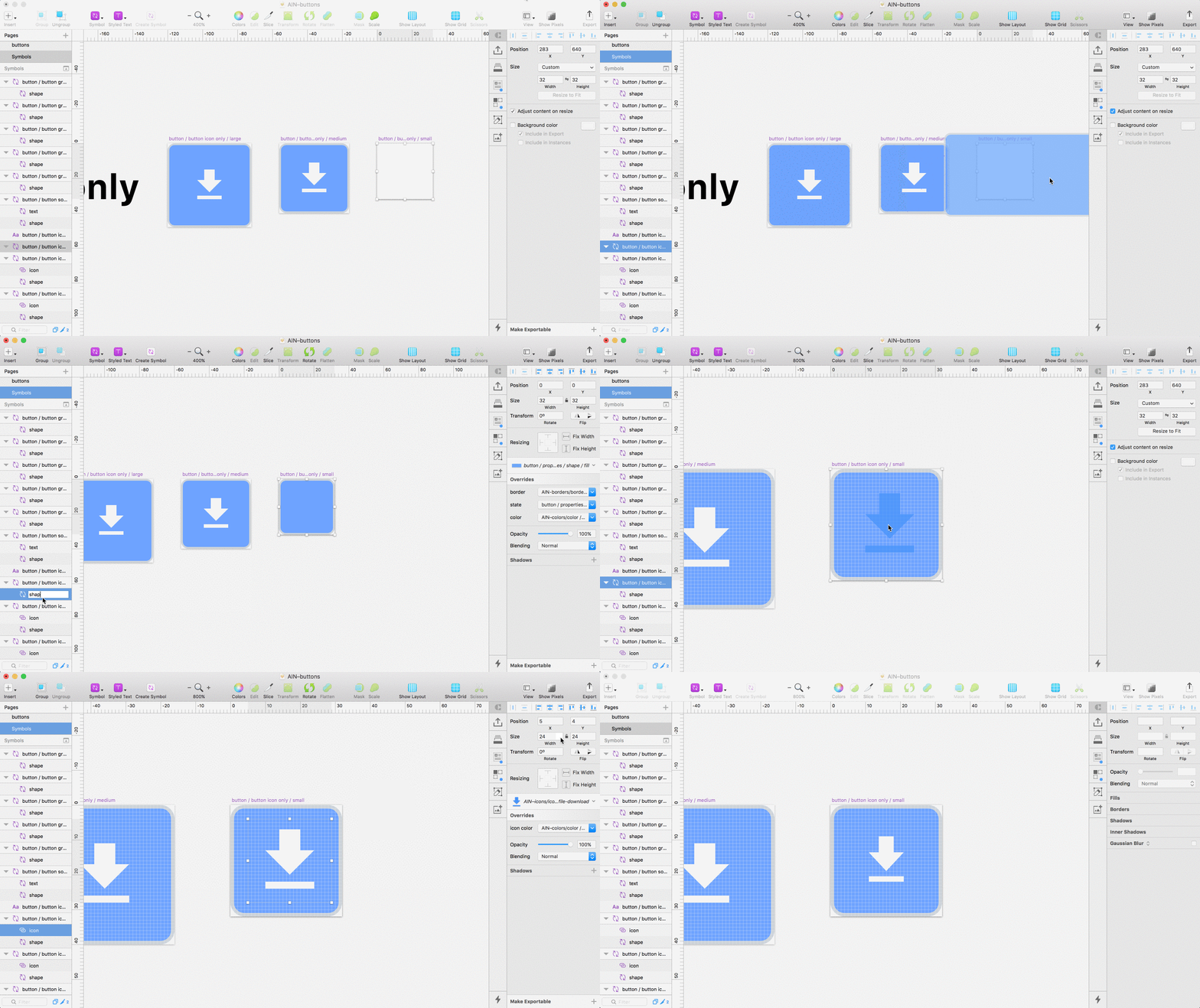
To do this I created 5 different Symbols to house the various shapes of my buttons. As before these Symbols will be used to as overrides, so I can easily change the shape of a button.

Creating unique Symbols for each of the 5 button shapes, to be used later as overrides

I named the 5 shapes used in the system: Fill (4px radius on each side), Rounded (100px radius on each side), Radius Left (4px radius on left), Radius Right (4px radius on right) and Radius None (0px radius on all sides). Those last 3 shapes will be used for my button groups — Left, middle and Right, in case that wasn’t clear.

Next I turned each shape into a Mask ‘ctrl click > Mask’ and inserted a color from my Color Library. As the color sits above a mask, the shape below will clip the color revealing the shape.

Masking shape and adding a color from the color Library

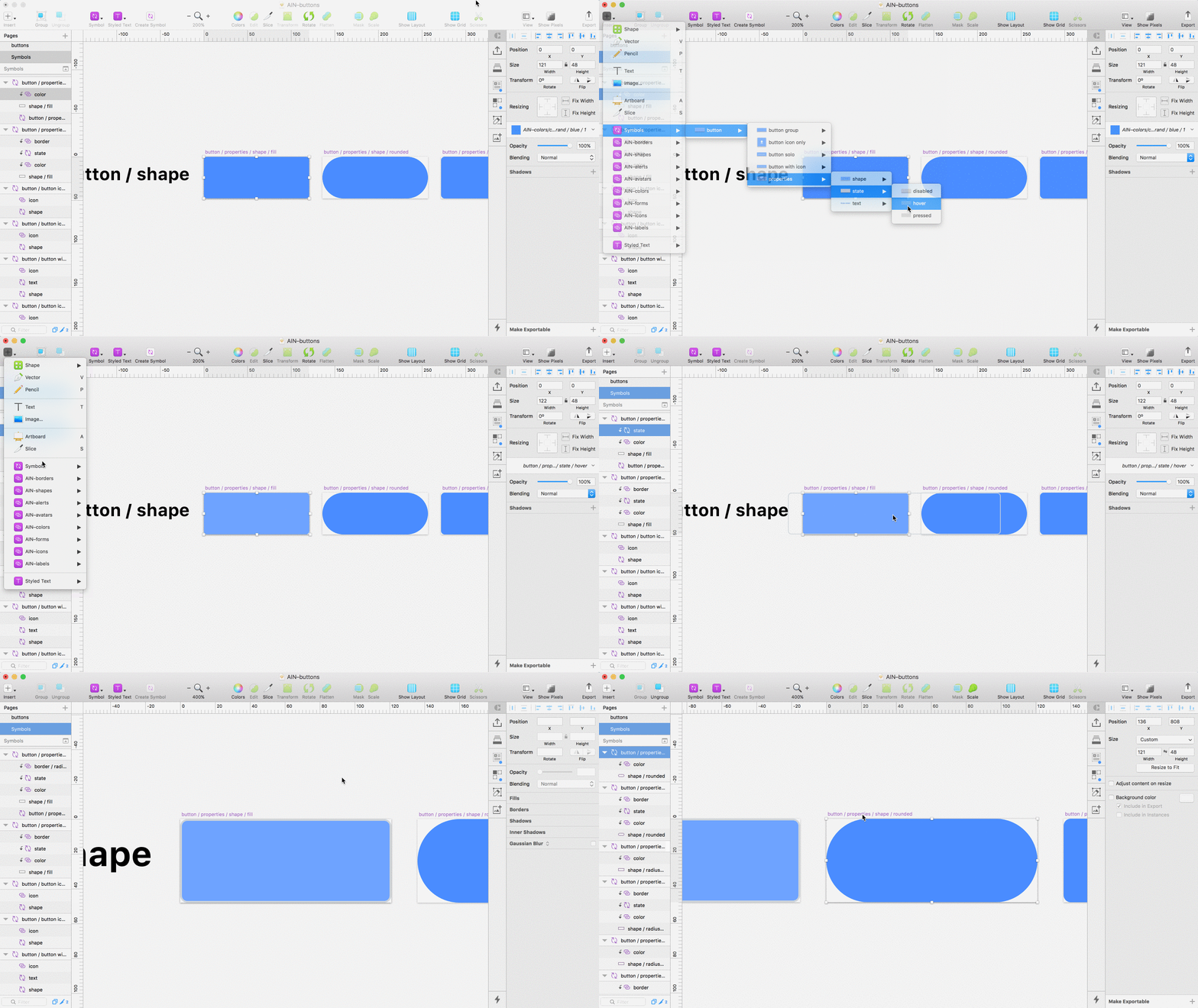
Then I nested the ‘state’ Symbol I made earlier on top of the color.

Finally I inserted a border from my Border Library file. Repeating the steps before, I made sure the naming convention followed suit:

button / properties / shape / fill

button / properties / shape / rounded

Nesting the State Symbol and border from a Border Library

Sidenote: Make sure your Shape Artboards are identical in sizes to each other, but different in size to both your Text and State Artboards. This will prevent them all showing up in the same Override dropdown and keep things organised.

Building the master button component for each button type

From here, all that’s left to do is build the master Symbols used for the various button types.This will pull together all our different primitive parts building one main button component, which we can use to create the various other buttons styles in our system.

Note: think of the master symbol as the one you insert into your designs mockups using Sketch Runner.

Just to recap that means we need to make a master Symbol for each of the following button types:

  • button solo
  • button with icon
  • button icon only
  • button group left
  • button group middle
  • button group right

Remembering for each button type we will also need unique masters for our 3 sizes.

Building the master symbol for solo buttons

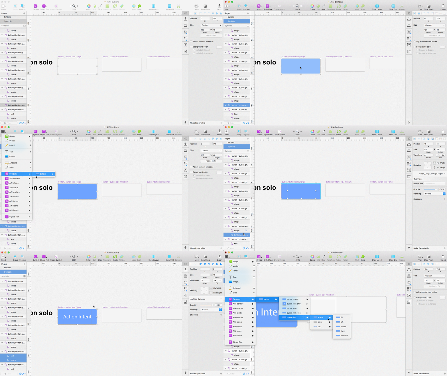
Solo buttons are fairly simple. 3 sizes, small, medium and large, each consisting of 2 nested symbols — Shape and Text. Bare in mind our core primitive Libraries were nested inside the shape symbol, so it’s relatively easy from this point. All we have to do is insert our shape and text symbols on a new Artboard for each size.

Building the master symbol for solo buttons

For each artboard I renamed the layers shape and text, so the override labels are easy to understand and not tied to any specific shape or text type when I come to use them.

Finally I turned the Artboard into a Symbol.

Filtering down the Insert menu shows our 3 new master button Symbols:

button > button solo > small

button > button solo > medium

button > button solo > large

Building the master symbol for buttons with an icon

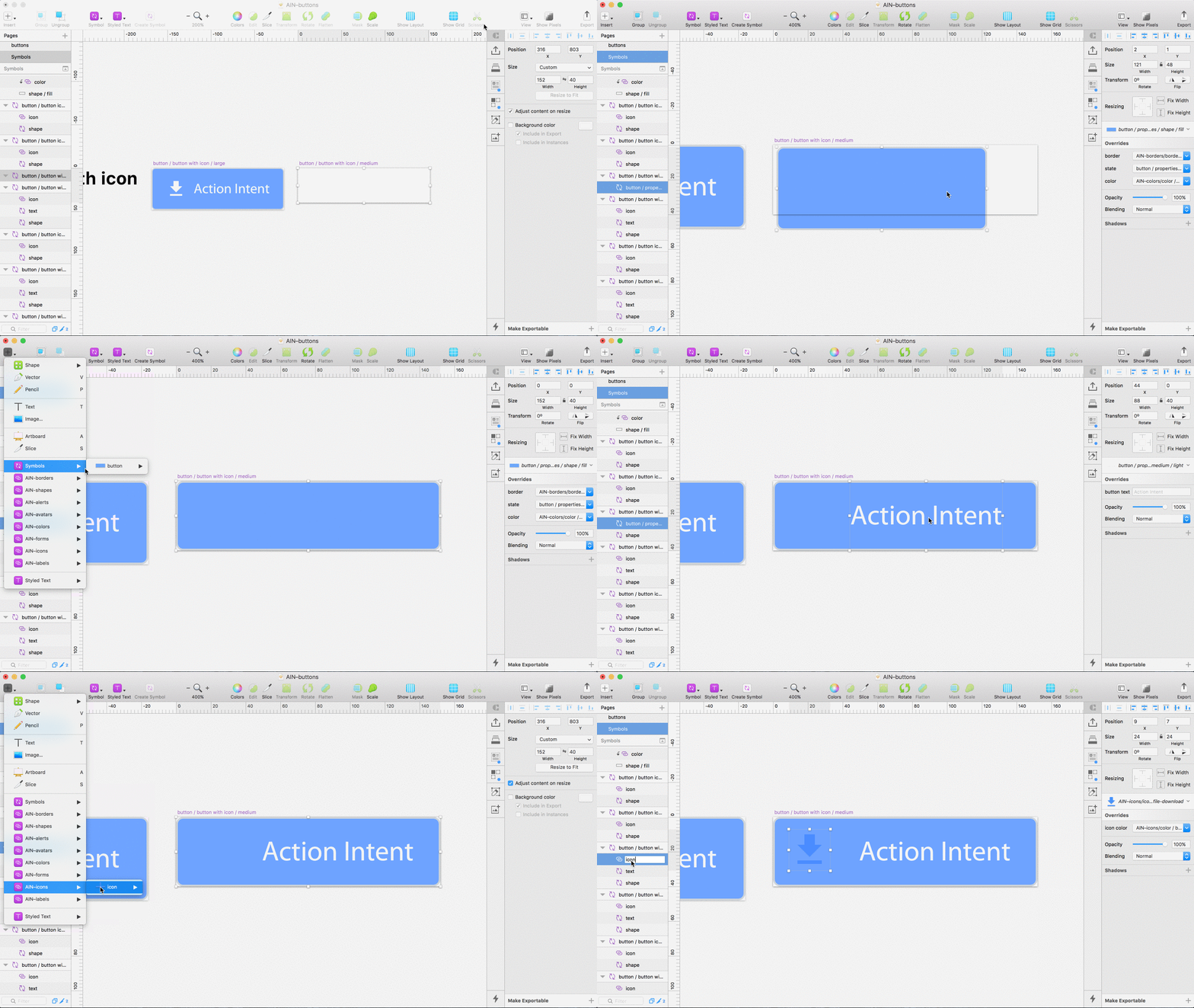
For Icon buttons I followed the exact same process as with solo buttons, the only addition was the inclusion of an icon from my primitive Icon Library. Any icon will do, as Overrides and icon color are already taken care of via the icon Library itself.

Building a master symbol for buttons with an Icon

Remember: ‘Ctrl +click > Create Symbol’ makes our icon buttons useable if you haven’t made the Artboard into a Symbol already.

Building the master symbol icon only buttons

Again, very simple, icon only buttons follow the same rules as before, however this time we’ve removed the nested text Symbol. As you can see in the GIF below I now only have 2 layers, an icon and shape symbol.

As before, I made a unique Symbol for each of the sizes I needed. One for small, medium and large icon buttons.

Creating the master symbols for icon only style buttons

Building the master symbol for group buttons

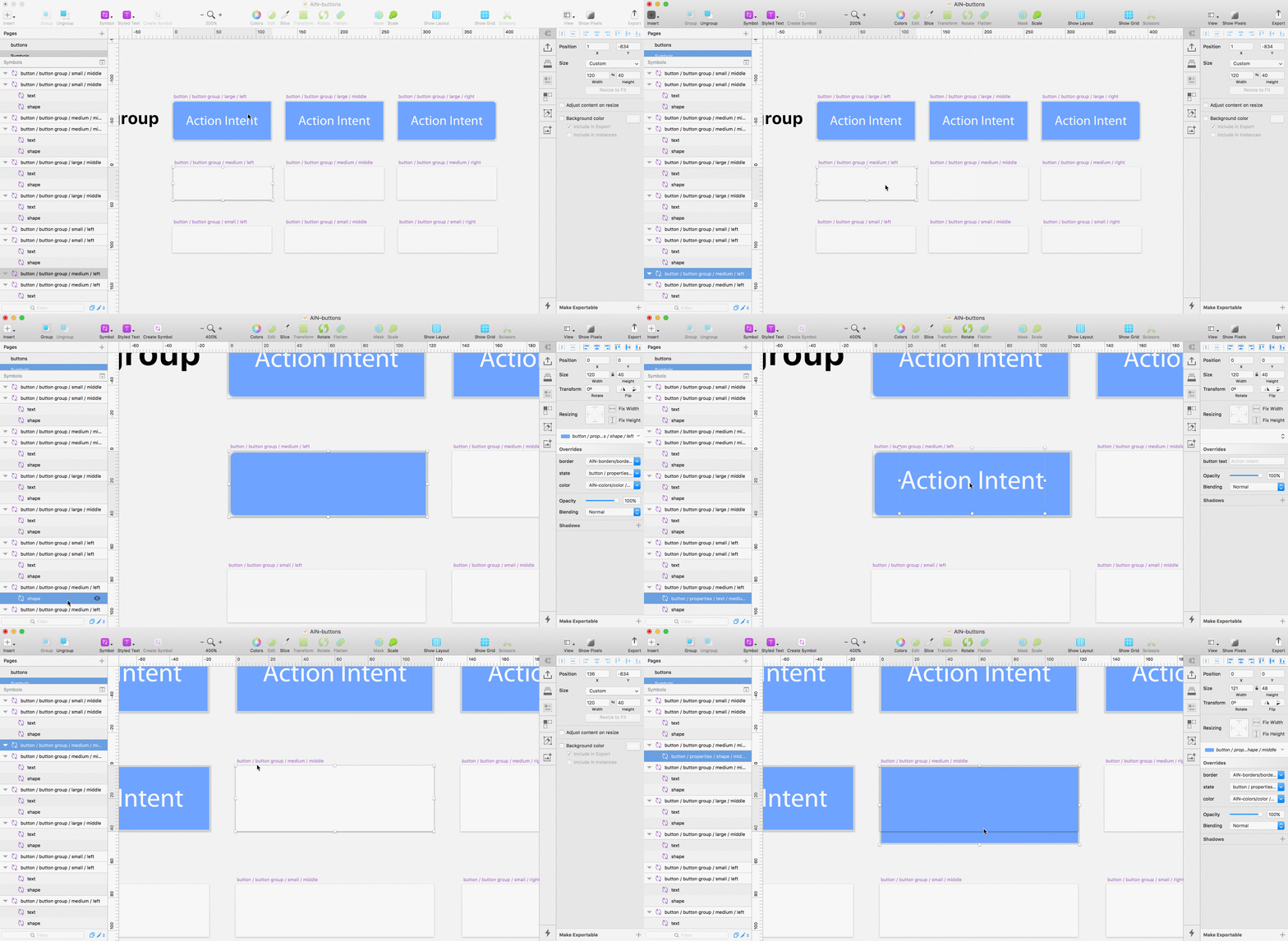
Building the group buttons required a total of 9 symbols. One for Left, middle and right in each of the 3 different sizes; small, medium and large. Except for their shape, which used a slightly different Override, group buttons are identical to our solo buttons.

When placing my nested shape Symbol I made sure the shape corresponded to the correct shape property. As an example, for the base symbol button / button group / medium / middle I needed to nest the symbol I created called button / properties / shape / middle and so on.

Creating the 9 base symbols for Group buttons

Using our new buttons and overriding styles

At this point, we now have a highly flexible system of buttons, made of the fewest number of parts possible.

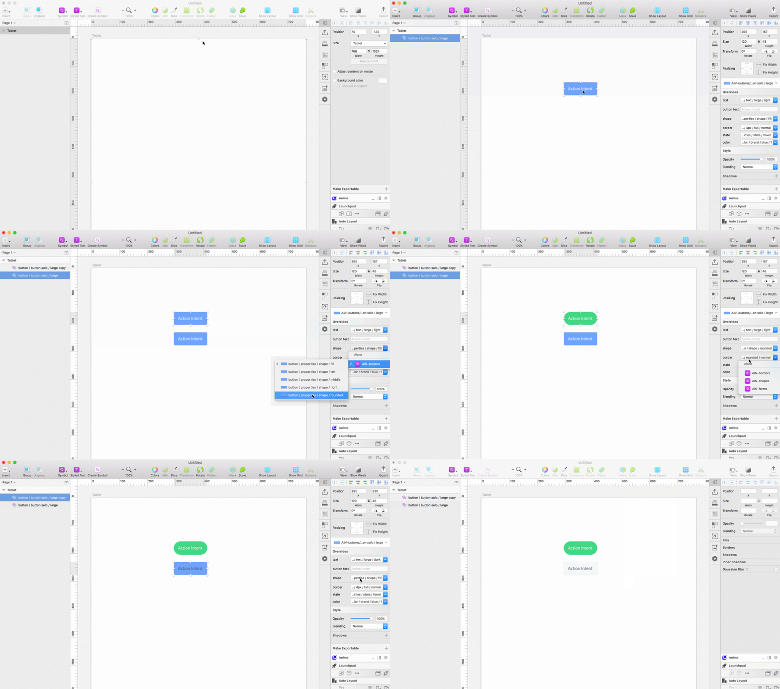
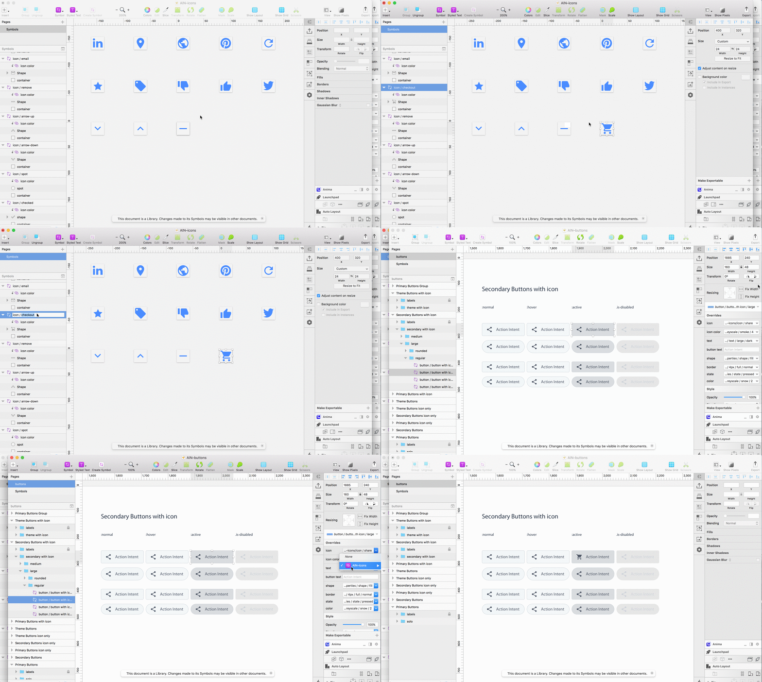
Using Overrides we can change the icon, button color, shape, text style and border without creating an entirely new button each time.

Inserting buttons with Runner and using overrides to change button styles

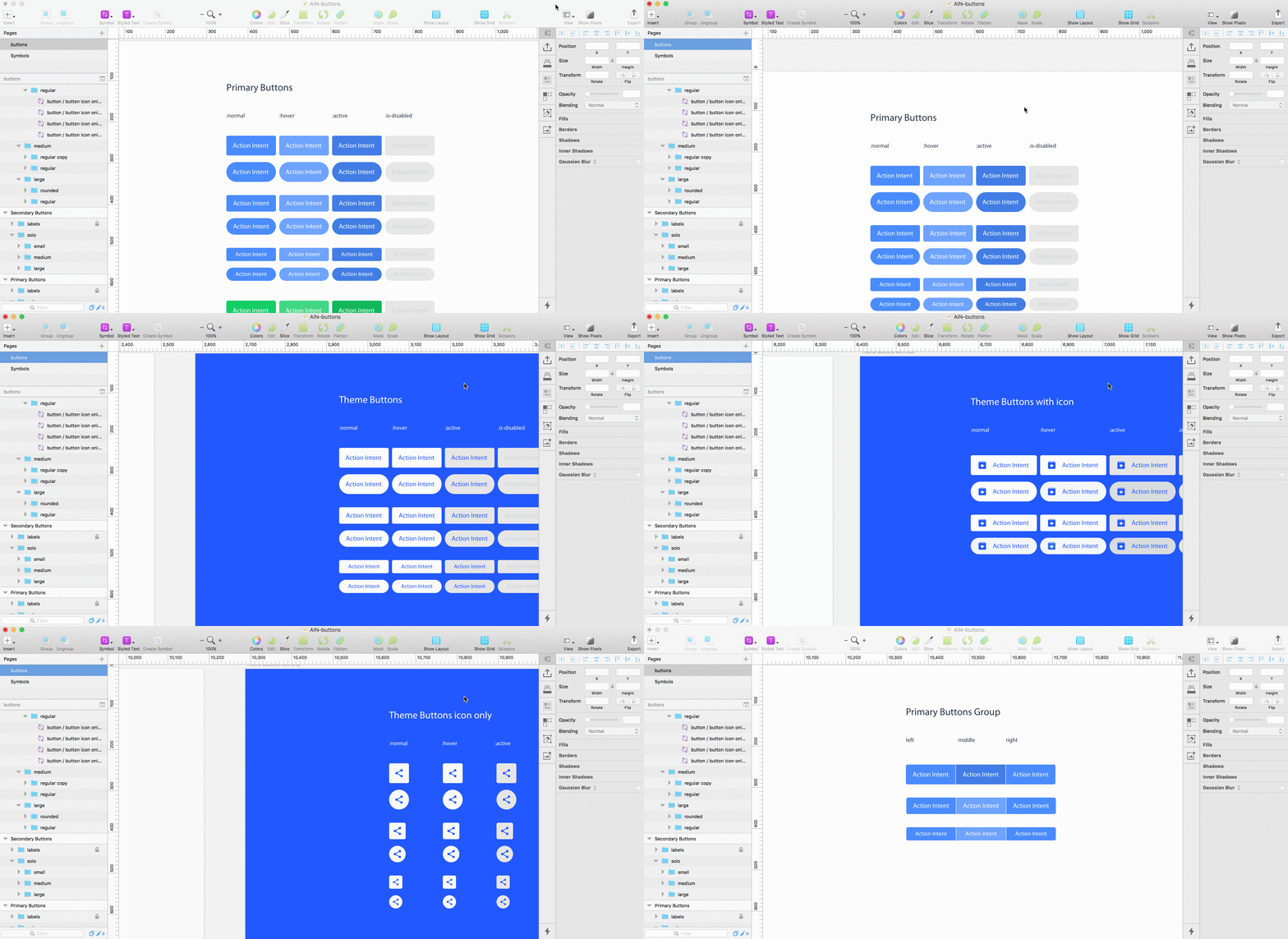
By mocking up my different Button styles on a new page within the AIN-buttons file, I now have a visual reference of each Button in the system.

Various button styles built using the button system

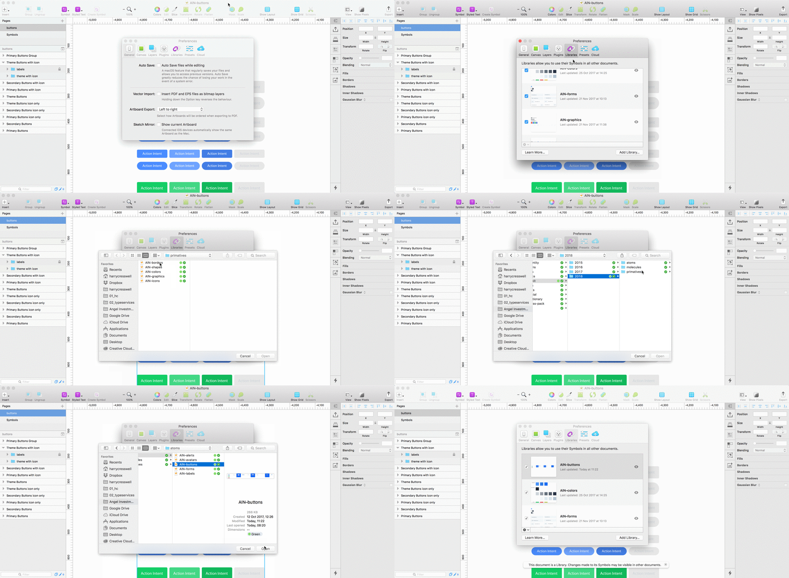
To use my button system elsewhere in my designs, in other files or other projects I can turn the entire file into a new Sketch Library. In this case, that meant turning AIN–buttonsinto a Library file.

Creating a Library to make buttons reusable across various projects and documents

By using Primitive Libraries I can easily add new elements to my system, say for example a new icon to my icon Library, and immediately access them to use in the Buttons file. In effect our design system can evolve as time goes by and with very little extra effort.

A demonstration of scalability using Libraries; adding icons and using them in different files in the system.

Wrapping up

I hope this article has helped show the importance of thinking in a primitives. Doing so will help you identify relationships in your designs and improve the consistency in your work. Taking a primitive approach and deconstructing your designs in this way can also help you see your designs in a holistic way.

Rather than viewing components as highly specific, complex but reusable patterns, we can break them down and identifying reusability in their primitive properties.

By combining this way of thinking with the use of Sketch Libraries, we can extract properties, much like a developer would variables, in order to create partial design files with less complexity, which in turn are easier to update and maintain. We can then utilise these primitive partial files to build larger components, whilst limiting design debt and keeping scalability in mind.

In the case of this article we looked at building buttons, however you might apply this thinking and process to building any component, regardless of complexity. Whether you are designing form elements, alerts or avatars, as in most cases, all these UI elements will share a certain number of primitive properties.

What next?

By now you should have a clear understanding of how you can Libraries and primitive to improve your workflow and create scalable design systems.

In another article I will look at using Buttons and other primitive Libraries, to build more complex components—molecules if you like—which, similarly, can be kept in an independent Library file, and represent the next level of structural complexity in a UI design system.

You can download the example project for reference, it includes primitive files for colors, icons, borders, shapes and component files for the buttons. I’ve also included my forms file, to illustrate how different components are made up of the same primitive Library files. I hope it helps you to see how I’ve set things up. Bare in mind you’ll need at least Sketch 47 for all this good stuff to work. And make sure you convert each file into a Library.

Resources


If you found this article helpful, please give it some claps 👏 so others who might benefit from reading it can find it easier. Thanks for taking the time to read it, I know it was a long one!


I’m Harry Cresswell. I co-founded indtl.com and work as a UX/UI designer and front-end dev at Angel Investment Network. I design type on my nights off and send out a newsletter on design and typography.

Find me on Twitter if you want to say hi.

from Medium https://medium.com/sketch-app-sources/using-sketch-libraries-and-primitives-to-build-an-even-better-system-of-buttons-ecc8f25486ac

Adopt a Design System inside your Web Components with Constructable Stylesheets


Won’t you adopt some CSS today?

As someone who makes stuff on the web, there are two things that I’ve been seeing quite a bit lately: Web Component discussion and CSS debates. I think that Web Components, or more specifically the Shadow DOM, is poised to solve some long-standing CSS problems. I’m a big fan of Web Components. In fact, I’m just wrapping up a book with Manning Publications now, called Web Components in Action.

Let’s quickly review where we are with CSS. Personally, I really dig working with CSS, but I never got super fancy with it. Whenever I start working with Less or SASS, or start adopting BEM or similar methodologies, I keep coming back to just writing plain, no-frills CSS. Under normal conditions, what I’m doing is not maintainable…like, at all. One article that popped up on my twitter feed recently is an argument against the Cascade. What?! “Cascading” is the first “C” in CSS!

Simon is right, though. Or, as right as you can be when generally speaking for all developers ever who make stuff on the web. Big projects have lots of CSS. As much as I love CSS, the more you have, the more brittle your page becomes. Rules start combining and snowballing together, until you’re debugging some crazy hard to find style or layout problems. It can also become a bit of a game of Wack-A-Mole. You spend an hour figuring out why a rule broke the thing it did, change it, but that breaks something else that you thought was unrelated.

It’s no wonder solutions keep being invented to manage this mess, including the latest CSS-in-JS and CSS Modules (not the upcoming CSS Modules browser feature). These two lean pretty heavily on your JS skills, not to mention your front-end tooling setups. I’m not going to argue against any solution that tries to solve a nasty problem that we’ve had for as long as CSS has been a thing, but I will say that I wish things didn’t have to be so complicated. I wish we could just use normal, straightforward CSS again.

Web Components and the Shadow DOM

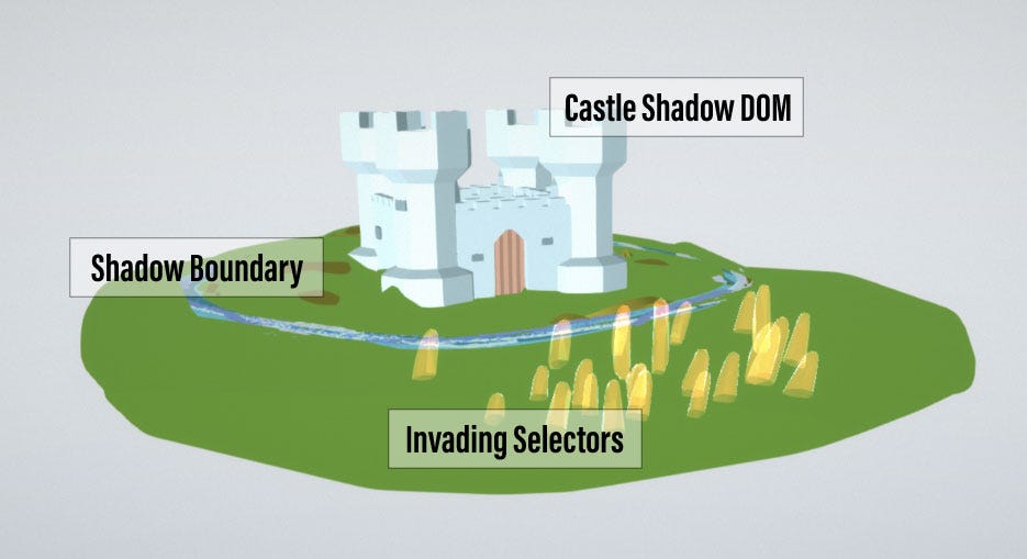
These days, I do! And it’s thanks to Web Components and the Shadow DOM. The Shadow DOM is the metaphorical moat around your UI component castle. It keeps out invading armies of selectors (both CSS and JS querySelectors).

Castle Shadow DOM keeps out CSS and JS selectors with the Shadow Boundary

Saying the Shadow DOM keeps out selectors is an important distinction I’ve had to adjust to recently. I used to say it keeps out style, but something like the following actually does inject style through the Shadow DOM.

body {
color: red;
}

The above style globally affects everything on your page. As such, all text will now be red (unless overridden by a more specific selector). It’s when you go deeper with some sort of selector, that the Shadow DOM successfully blocks your style. For example, if my Shadow DOM enabled Web Component contained a , we could style all buttons on the page leaving the Web Component buttons alone.

button {
color: red;
}

The Shadow DOM doesn’t let outsiders know what’s inside. Your outside CSS has no idea that your Web Component contains a button, and therefore won’t style it. The button selector has nothing to latch onto inside the Shadow DOM.

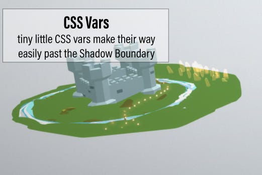
Another way that styles can be let through is by using CSS Vars. These are simply variables that are defined in your CSS. If you really want that button inside your Shadow DOM to be red, you could define a button color var in CSS.

:root {
--button-color: red;
}

Inside your component, your CSS could then use this variable to specify the button color.

button {
color: var(--button-color);
}

All that is great — the Shadow DOM protects our Web Component from style intrusion, but how do you actually use CSS within the component? Well, it’s not perfect yet. In my mind, perfection would be to just point to a CSS file and load it up, styling the mini-DOM of your Web Component. Instead, we’re still relegated to using JS to do anything in the component.

As with most elements, the shadowRoot property of your Shadow DOM based Web Component has an innerHTML property that you can set. You’ll typically set this to a long string of HTML and CSS to represent an entire mini-DOM making up your component. Don’t worry, it’s really not as bad as it sounds. With template literals (`), and ES6 Modules to separate out markup into different files to not clutter up your component logic, it’s pretty clean. I cover this approach very extensively in my book.

this.shadowRoot.innerHTML = `
<style>
:host {
background-color: blue;
}
button {
color: red;
}
#myspan {
color: green;
}
</style>
<div>
<span id="myspan"></span>
Example HTML Content
<button>Example Button</button>
</div>`;

Regardless, we’re still putting CSS in a JS file. It’s not “CSS-in-JS”, because we’re not transforming it at all, but again, having a plain CSS file would be the dream. Aside from this minor hiccup, the brittleness in web development has been solved! Style won’t infect our component from the outside, and style from our component won’t affect the outside world. Notice in the code snippet above, where we’re styling a button with no extra class specificity. This isn’t just a simple example, it’s fairly routine not to worry about doing something like this because only the buttons in this Web Component are styled this way. Similar with the span with an ID. You’d never use the ID attribute like this in a small UI component because the ID has to be unique to the page. Not so with the Shadow DOM, the ID only needs to be unique within the component.

Using the Shadow DOM and Web Components is like going back to simpler times when web development wasn’t so complex and fragile, because we’ve redefined the scope of a huge application or page, to a much smaller and manageable one. But, there is a major missing piece in all of this.

The missing piece is a Design System, and that’s the rub. We want to bubble wrap our component and protect it from all outside style, yet at the same time, we want just the right style to come in and make the contents of our component look like the rest of the application or page.

CSS Vars are just the about the only established way to do this, but doing things one variable at a time is a Sisyphean task.

CSS Vars are allowed right through the Shadow Boundary into your Web Component

Wedging a Design System into a Web Component today means likely exploding an established CSS system into pieces, turning the bits into Javascript strings, and figuring out a way to bring them all together in a meaningful way inside your component, only loading the bits you need. The other bad thing with this approach, is that you’re creating a design system from scratch in each and every component instance on your page. Its tons of duplicated CSS inside every mini-DOM.

Constructable Stylesheets

There are two brand new browser features poised to solve this problem. The first is CSS Shadow Parts/Theme. After spending a little time experimenting with Shadow Parts, it became clear that there is a lot of work to do around changing existing CSS to use “part” attributes in addition to classes. The design system is just one piece of the puzzle. There’s also a lot of onus on the Web Component developer to “export” parts through the the component into child components. The Shadow Theme feature sounds like it alleviates some of this, but unlike Shadow Parts, it’s not even supported by Chrome yet while Shadow Parts are only supported in Chrome right now.

The better option is the brand new “Constructable Stylesheets”. It’s not just better IMHO, it’s pretty close to perfect, and I think is poised to bring us back to our basic CSS roots in the Web Component world. Not, only is it already available in Chrome, but is easy to polyfill as well.

Constructable Stylesheets are an evolution rather than a brand new feature. Really we’re just extending the API of the Javascript CSSStyleSheet object. So, what’s new?

It used to be that after creating a new stylesheet, you could only edit the list of CSS rules. Now, though, you can replace the entire sheet, wholesale.

const sheet = new CSSStyleSheet();
sheet.replace(`@import url('directory/cssfile.css')
.then(sheet => {})
.catch(err => {});

Note that the above is using the async replace method. For loading stylesheets with the @import directive, the CSS won’t be immediately loaded. That said, the new stylesheet is available right away.

The next question to answer is what can we do with that stylesheet? Well, now in Chrome, both the document and shadowRoot objects have an adoptedStyleSheets property. This property accepts an array of stylesheets.

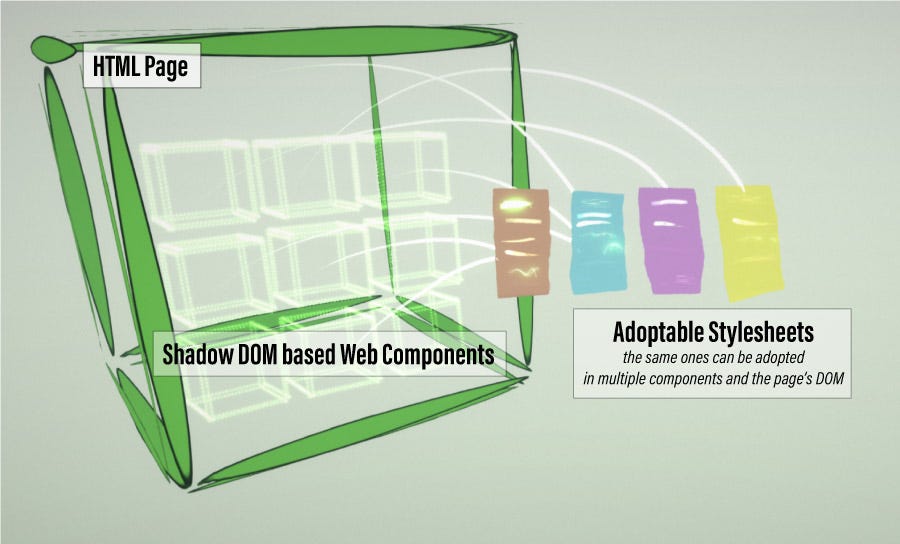
So now, a CSS file, or multiple CSS files from a design system can be adopted by any number of Shadow DOM enabled Web Components on a page. Not only that, but these style sheets aren’t copies — you’re not loading your Web Component instances with tons of cloned design system instances as is the case today. Every component (and the document) can share the same sheets, as well as pick and choose which CSS to adopt.

Stylesheets can be instantiated and adopted by the document object or your Web Component’s shadowRoot

Constructable Spectrum and Style Shelter

I hope you’re thinking this sounds as promising as I do! In theory, we can take a complete and unchanged design system and use it in Shadow DOM enabled Web Components! Instead of just writing a blog post that this is theoretically possible, I took that challenge on with a real design system. I just so happen to work as a prototyper at Adobe and love using Web Components in my work. Adobe’s design system, Spectrum, is something I use almost every day. Of course, I haven’t been able to use Spectrum in conjunction with the Shadow DOM, so I was really excited at the prospect of getting this to work.

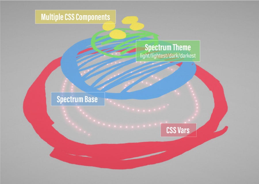
Spectrum itself is pretty awesome, too. It’s recently been reworked with CSS Vars as the basis of everything. And then, if a monolithic design system isn’t what you’re after, individual components are delivered as well. With Spectrum, a developer can layer on CSS Vars, the Spectrum base, the theme (light/dark variations), and finally a handpicked set of component CSS.

Layers of Adobe’s Design System, Spectrum

No really, I don’t just think Spectrum is awesome because I work at Adobe. It’s awesome because this fits extremely nicely with Web Components and Constructable Stylesheets. Each component can use some simple JS logic to adopt exactly the CSS it needs. Every component adopts the base CSS Vars and base system style. We can choose which theme to use and load those files as well. Last, each component should know exactly which Spectrum UI components it uses, and also load those CSS files. This also means that the index.html page doesn’t need to know anything about what components need to be included, nor link to any stylesheets itself. Every Web Component is completely self reliant.

All that’s missing is a global module that can keep a cache of all loaded sheets. Web Components can pull from this module, and if a CSS file has already been loaded, it will just deliver the cached sheet back. Before jumping in and getting Spectrum working inside my Web Components, I went to work and created Style Shelter (also available on NPM). In addition to caching, most sheets need to be adopted by the Web Components, but some (root level CSS Vars) need to be adopted by the document, so Style Shelter also handles adopting different sheets to different scopes.

I’m excited to say that my challenge to use Spectrum without changing any CSS worked like a charm! I knew I had to be thorough, too. Every CSS component needs to work, so I forked the Spectrum CSS repo and created a Web Component based demo page. I did run into some nuances to solve that were Spectrum specific, but you can read all about those details on the project’s readme.

Browser Support

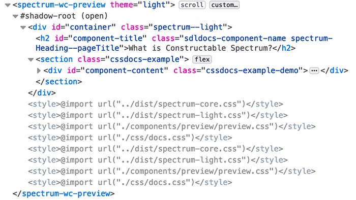
So, browser support makes us come crashing back to planet earth. Right now only Chrome (and one would assume the new Chromium powered Edge) supports Constructable Stylesheets. Firefox and Safari supposedly are considering or are working on the feature now, however. Good news, though! There is a polyfill, and it’s easy to use. The only downside is that styles are copied over and over again, just like I promised we didn’t need to do. Take this Shadow DOM in Chrome, and notice that even though the component is styled perfectly, there’s no style in shown — it’s all adopted.

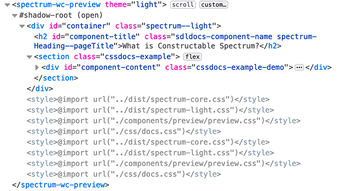
Now, compare that to Firefox. With the polyfill, the component is styled the same, but we can see all the adopted styles copied to the Shadow DOM.

So, hopefully Safari and Firefox deliver the goods reallllllll quick! Delivering an entire design system to a Shadow DOM with no changes is a really big deal. And I’m probably pushing my luck, but I’m going to need to ask all the browser vendors to deliver CSS Modules, too.

CSS Modules

The reason I want CSS Modules is not design system related. At the start of this article, I stated that I wanted plain, simple CSS again. Actual files, not CSS inside JS strings. I think it’s incredibly important that a well-built and shareable component be self-contained and not dependent on anything in the outside world. You might guess we can use Constructable Stylesheets here too, but there’s a small complication.

In my Constructable Spectrum demo, I do just that. I load up each component’s local style as an actual CSS file to be adopted. The problem is that stylesheet @imports are relative to the main index.html. So instead of pointing to ./mycomponent.css, I need to use the full path to my component’s CSS from the root of the project. Not great. Web Components should not need to know where they live in a project to function. They should be able to be moved around and used anywhere without thinking about these things.

JS modules, however, are loaded relative to whoever imported them. CSS Modules should be the same, and theoretically, you’ll get a CSSStyleSheet back…ready to be adopted. A nice bonus would be if the same CSS file is imported, it would be a reference to the same one that was loaded from a different Web Component. I don’t know if that’s the case in the spec, but it would certainly be AMAZING.

The Constructable Stylesheet approach is just gaining steam now and only supported in Chrome. Because of it’s uncertain future, I really couldn’t put them in my Web Components in Action book. That said, I’m excited that approaches like what I’ve outlined are a natural extension of Web Components today.

With the Shadow DOM, Web Components, Constructable Stylesheets, and possibly CSS Modules, we’ve got something great here. We’re on the verge of getting simple and easy to use CSS back, and it’s exciting!

from Medium https://medium.com/swlh/adopt-a-design-system-inside-your-web-components-with-constructable-stylesheets-dd24649261e

Baking Innovation Into Your Design Process

For many organizations, innovation has become a top priority. If your organization wants to deliver better products and services, you’ll need to move beyond only matching your competitor’s functionality. You’ll need to solve problems for your customers and users that no competitor is currently solving.

To deliver innovation, your organization doesn’t need to build a special innovation team to invent new technologies or patent new service processes. We’ve got all the arrows in our quiver. We only need to use them effectively.

Research the customer’s problems nobody else is solving.

As our organization matures our user research efforts, we will start shifting the research from investigating solutions (Are we building our designs the right way?) to investigating problems (Are we building the right designs?). This shift is essential for identifying where innovations will benefit the customers and users.

For example, when online payment processor Stripe launched their first product, it solved an important problem for small and medium-sized businesses. For the first time, It was easy to build a website that handled financial transactions.

In those days, the business didn’t have alternatives if they didn’t want to use a platform like Ebay or Etsy. It was hard for a small chain of restaurants to build an online ordering platform. Or, for a training company to build a way to let its students register and pay for courses.

Stripe’s teams focused their research on what caused friction in the work of their users — the developers of websites for those small and medium businesses. Their research uncovered new challenges those businesses wanted to overcome, like handle recurring payments and multiple currencies.

It was in the users’ pain that the Stripe product teams realized they could offer an advantage. None of Stripe’s competitors were solving these problems. This is how Stripe innovated and became the industry leader.

Populate the product roadmap with customer’s problems.

True innovation is hidden deep within the problems that our users are currently experiencing. Armed with our research of the problems, we plan out our roadmap of future product releases.

Grouping the problems into related themes, we identify where they should go on our product roadmap. A themes-driven roadmap shifts the entire team from outputs to outcomes.

Our team moves beyond producing features which sound good, but nobody may need. Instead, we’ll ensure each release will solve problems we know our customers are facing.

A themes approach to roadmaps is an essential approach to innovation. It keeps the team focused on the customer’s problems, providing a forcing function to stay grounded in what will change the marketplace.

Innovative solutions come out of deep understanding.

The Kano model gives us insights on where to start. We look for expectations the users have that we’ve missed. Often these have an easy fix, yet because no-one has done the research, neither us nor our competitors have ever addressed them.

We also look for inexpensive ways to exceed our users’ expectations. By focusing on addressing their needs and reducing friction, we can identify improvements that make the users’ experience smoother.

Fix enough of these problems and our products and services become more coherent and thoughtful to the user. Our users, like Stripe’s developer customers, will have a better experience and achieve their desired outcomes.

True innovation isn’t about a new invention. True innovation is about delivering new value. When our customers and users receive a friction-free, delightful experience, they get more value from our products and services.

We don’t need to start a specially-skilled innovation lab to make this happen. We need only to pay closer attention to our customers than our competitors are. (And, right now, chances are they’re not paying any attention to those customers.)

We’ll be first to market with designs that fit our customers like a glove. We achieve that by baking sound innovative practices into our day-to-day design process.

Read the article published on Playbook.UIE.com.

To deliver true innovation, every team must drive their roadmap from a deep understanding of customer needs. In our 2-day, intensive Creating a UX Strategy Playbook workshop, I’ll work directly with you and your team leaders to put together an action plan that will empower your teams to deliver game-changing innovative products and services.

We cap each workshop off at about 24 attendees. This gives me (Jared) plenty of time to work directly with you on the ideal strategy for your team. Spots fill up quickly, so don’t wait. Check out our upcoming workshop dates.

from Stories by Jared M. Spool on Medium https://medium.com/@jmspool/baking-innovation-into-your-design-process-a185c6e4c7a5?source=rss-b90ef6212176——2
Exploring the reasons for Design Thinking criticism

Design thinking has been called revolutionary, a “failed experiment,” and a set of buzzwords. While contradictory, these statements shed light on the increasing criticism of design thinking.

Design Thinking

If you aren’t familiar with design thinking, Tim Brown, CEO of design consultancy IDEO, defines it as “a human-centered approach to innovation that draws from the designer’s toolkit to integrate the needs of people, the possibilities of technology, and the requirements for business success.”

Fundamentally, design thinking is applying the same process designers have used for decades to make everything from cars, appliances, and digital products to business strategy and other large system problems.

A search for “design thinking” will result in images of Post-It notes scattered on a whiteboard, or these five steps in its process:

Design thinking ideation process

The ideation phase of design thinking involves brainstorming using techniques such as Post-It notes for idea sharing.

  • Empathize – Learn about your audience through research and interviews.
  • Define – Construct a point of view based on user needs.
  • Ideate – Brainstorm (Post-It notes on walls).
  • Prototype – Build a representation of your ideas.
  • Test – Test your ideas.

It is expected that this inclusive, exploratory, iterative process will help designers arrive at decisions on what future customers truly want.

An example is a request from a new client to redesign a bike part. Sales have slowed, and they believe that a new design will spark renewed interest and help fend off competitors. Absent of design thinking, we would dive in and create a new, slick design for this specific bike part.

Employing the design thinking process, however, we would get dramatically different results. The five-step design thinking process reveals that the problem can’t be resolved with a newly designed bike part.

The actual problem: A growing portion of the market feels intimidated by the complexity of newer bikes and longs for the simple, easy-to-use ones they grew up with.

The answer: Create an entirely new category of bike that resonates with the unmet needs of the market for simple, back-to-basics biking. The value of design thinking lies in the identification of a larger problem which then leads to a solution around that theory.

Design Thinking: A Brief History

Over the past fifty years, design thinking has transformed into a way of approaching and solving large problems whereby, in order to develop a formal, meaningful, and emotional connection, the user becomes a kind of co-designer.

Here’s a brief history of design thinking:

  • 1969 – Herbert A. Simon and Robert McKim describe a type of rudimentary “design process” that can be applied to science and engineering.
  • 1980 – Bryan Lawson addresses design in architecture. This would be the first time people are introduced to the idea of designers working with more humility in a participatory and democratic environment.
  • 1982 – Nigel Cross introduces design thinking to a general education audience, resulting in a broader and widely accepted view of design thinking.
  • 1991 – Design thinking is applied to business problems by David M. Kelly, founder of the design consultancy IDEO. The term becomes commercialized due to IDEO’s successful media coverage and high-profile case studies.

Regrettably, design thinking has evolved from an industrial approach to something superficial. From 1991 on, the popularity of design thinking would also become its greatest weakness.

The Value of Design Thinking

“Design Thinking isn’t just a method, it fundamentally changes the fabric of your organization and your business.” – David Kelley, founder of IDEO and The Stanford d.school

Design thinking is about creating a thoughtful environment where divergent voices have a seat at the table. The process of building empathy, exploring problems, prototyping, and testing affords designers the ability to engage in intellectual investigations.

Some benefits of the design thinking process are:

Inclusive design. The design thinking process unleashes people’s creative energy through brainstorming sessions and group involvement. This approach is often described as a democratic process where the gap between “designers” and “users” is closed, helping to destroy top-down thinking and create diversified solutions.

Problem synthesis. Design thinking employs a user-driven set of criteria that is approached with a blend of logical, linear thinking. In order to find the real problem, designers use these criteria to discover causality.

Diverse voices. The ideation phase of design thinking invites people from various backgrounds and includes them in brainstorming sessions. This enhances the creative process by supporting a divergent set of ideas.

Low-Risk. Design thinking is a low-risk process. The only thing invested is a set of ideas. Nothing has been built and no money has been spent developing solutions that require an outlay of cash and resources.

Design Thinking Criticism

A search online will reveal two divergent paths of design thinking. It won’t take long to realize that design thinking has become a victim of its own success. But why?

Alan Cooper shares his thoughts on design thinking

Alan Cooper shares his thoughts on design thinking on Twitter.

In some respects, it becomes vogue or trendy to attack what is currently popular.

A common argument against design thinking is that it dilutes design into a structured, linear, and clean process. Critics argue that real design is messy, complex, and nonlinear, it isn’t derived from a stack of Post-It notes and a few brainstorming sessions.

Design Thinking Isn’t Design

Natasha Jen, design partner at Pentagram, shared her criticism of design thinking in a now-infamous video that sparked heated debate and lengthy discussions within the design community.

Even without the hyperbole surrounding her talk, Jen brings up a couple of sound arguments against design thinking:

  • Design is human intuition. Does it really take an expensive and exhaustive design thinking process to understand that a medical treatment room for kids should have whimsical colors and a more delightful environment? She argues that spending money to arrive at this conclusion is nonsense.
  • Lack of crit. Design thinking has become a bunch of buzzwords lacking criticism. “Crits,” or criticizing others’ work, is a messy process where designers surround themselves with evidence. This process helps designers evaluate whether something is good or not and it isn’t linear or reduced to a bunch of Post-It notes. She argues that without crit, design thinking is actually anti-intellectual.

If we picture design thinking as a linear process void of messiness and mired in sequences, then it’s easy to see where Jen is coming from. True design is not linear and it is not clean. Out of the chaos comes the solution.

Design Thinking As a Buzzword

Businesses love systems, frameworks, and buzzwords. In the 1980s, the US was introduced to Total Quality Management (TQM). The concept, based on the idea of continuous improvement, transformed the entire manufacturing core.

TQM was everywhere. Classes sprouted up overnight. Management spent millions of dollars rolling it out. And if a company was not implementing TQM, then something must be wrong.

TQM eventually fell victim to its own popularity. It soon became trendy to attack. Forbes posits that design thinking is on the same trajectory.

Design Thinking as a Corporate Checkbox

Critics of design thinking believe that it has become yet another corporate box to check off. Once it becomes a: “Did you remember to check off that box?” mentality, it is no longer thought-provoking, nor does it stoke the fires of creativity.

Businesses feel an urgency to find new ways to innovate, so they jump on the next popular framework and feel good about what they are doing. But are they actually doing any good?

This dilution of design into a systemized process is worthy of the attacks. Designers know that it takes a thoughtful, complex, iterative, and messy process to arrive at a solution. We can’t learn this from a two-day workshop or a TED talk. Learning about empathy doesn’t mean we are empathetic all of a sudden.

Design Thinking SWOT

The classic marketing tool, SWOT—strengths, weaknesses, opportunities, and threats—is used to evaluate the internal and external opportunities of an organization. We can adapt this model to concepts outside of marketing. Here is a “SWOT” for design thinking:

Strengths

  • Helps people solve problems in a creative way
  • A low-risk exercise
  • Brings in divergent voices
  • Encourages idea generation
  • Inclusive
  • Helps pick apart business problems

Weaknesses

  • A linear, structured process
  • Reduces the design process to contained thinking
  • A corporate box to check off
  • Missing critical thinking (crits)

Opportunities

  • Helps bring people together to generate ideas
  • Helps solve problems in a linear process
  • Helps better understand customer needs
  • Gives structure to an otherwise messy process

Threats

  • Has become a buzzword
  • Popularity makes it open to attack
  • Losing relevance when seen as a box to check off
  • No clear understanding of what it really is

Conclusion

For the past fifty years, design thinking has been taking shape. Until the early 90s, when consulting firm IDEO began using it to solve large business problems, it was largely associated with science and engineering. In the corporate world, systemizing and frameworks are applauded so it was not long before design thinking became the newest trend.

In some ways, design thinking has become a victim of its own popularity, as evidenced by increasing criticism from those in the design community. Whether warranted or seen as vogue to go against the grain, the fact that design thinking lacks many of the messy, non-linear elements of the classic design process distinguishes it and sets it apart.

Both points of view can be considered with some conclusions:

  • Design thinking helps solve business problems. It should not be thought of as a replacement for classic and more traditional forms of design, such as industrial, product or digital design.
  • Design thinking is a type of design-related process, but not design in total.
  • Design thinking is a human-centered approach to solving problems. It isn’t trying to replace the messy, non-linear, and critique-oriented design process.
  • The term “design thinking” can be a misnomer because of the word “design.” It should be thought of as a business exercise which brings people together to help solve a problem.
  • It has fallen victim to attacks because of its popularity and the desire to go against the grain.

If used properly, design thinking is here to stay. It helps solve problems, brings divergent voices to the table, and carries a low risk. On the other hand, the classic design process is distinct from the design thinking process—it should remain so and continue to stand on its own.

•••

Further reading on the Toptal Design Blog:

from UX Collective https://www.toptal.com/designers/product-design/design-thinking-criticism

The Hungry Designer


Written by Ben Pujji at Atomic
Go to the profile of Atomic

Every software team has one. Good teams have a few. Great teams are packed with them.

Hungry designers are deeply motivated to design better products, create better experiences and help their team move faster.

Hungry designers are not defined by rank, or prefix. They are defined by their style. It doesn’t matter if they’re senior, junior or somewhere in-between. They can be the boss, but often they’re not. Nor does it matter how they signal their strengths: UX, Product, Interface, Interaction or Visual, whatever.

Hungry designers come to work each day relentlessly spotting and prioritising opportunities. They push to make things better, they create the momentum which drives their whole team forward.

The hungry are the ones who are forever starting conversations with their teams about better ways to design.

They’re the ones investing energy into refactoring tired workflow and spending hours learning new tools. They’re the optimists. The facilitators of change.

On the other hand, the satisfied designer isn’t driven to improve.

The satisfied designer has no appetite to create greater impact. They’re reluctant to find ways to make design a truly collaborative effort. They’re pathetically grateful for tiny advances in design tools, but with no underlying motivation to design better. They’re content with tired workflow.


We love the hungry

It’s easy for us to spot hungry designers at Atomic, because they challenge us too!

They ask us for features, and point out our shortcomings. They’re not deciding new tools via checklists, they’re hands-on and engaged.

But they also take time to share with us how their teams are struggling, where their workflow is creaking and how their tools are holding them back.

The hungry are the best customers we could ask for.

Here’s what our hungriest designers are most focussed on right now:

Graduating from feedback to collaboration

The bigger the team, the more likely feedback is being confused for collaboration.

Design feedback is an easy sport. Comments can be fired from everywhere, thanks to frictionless feedback mechanisms and the messaging apps that now occupy the center of every screen.

Feedback is great — but it’s the lowest form of collaboration. It requires little effort for the giver but can quickly become burdensome for the recipient. It easily becomes combative or aggressive and so much intent gets lost in the noise.

The hungry are embracing any new form of collaborative design they can find. They’re searching for ways to design closer together, to iterate each others ideas, and bring other core members of the software team closer towards design.

It’s hard to challenge an established workflow, especially if it feels like it requires a trade of velocity for quality. But bad ideas shipped faster are still bad ideas. They just arrive sooner.

Reducing confirmation bias

The more time we invest in exploring an idea, the more attached to it we become. The hungry are fighting by finding ways to reach fidelity in design sooner, with less effort.

Many are creating sophisticated pattern libraries to speed up their exploration process. Others are abandoning slow wireframing and paper-based prototyping in favour of early interactive prototypes to understand ideas more deeply, sooner.

Terms like goldilocks quality (not too much, not too little fidelity, but just right) coined in GV’s new book Sprint are being embraced as we hunt for language to frame how far to go when prototyping.

Center-stage, not top-table

Design is already rising to the top-table — that’s become a given for organizations who want competitive advantage. But it’s not all we imagined. Being trusted with more responsibility, bigger budgets and being given a bigger stick doesn’t immediately make design more impactful. Being center-stage does.

Designers who understand that design is a team sport aren’t focussed on power — they’re focused on impact. They’re building better connections and relationships with other parts of the software team and organization. They’re pushing for design to be visible and within an arm’s-length of every part of the team, at every level.


What are you hungry for?

Are you hungry to design better products and experiences?

We owe a huge debt to those around us who are — who keep us focussed on what matters, relentlessly pushing us forward.

Have you shared what you’re hungry for with your team? There’s no time like the present!

from Medium https://medium.com/atomic-io/the-hungry-designer-b295459b29ec

Designing Apps That Perform Well Even In Poor Connectivity


Go to the profile of uxplanet.org

Wish all we may for high speed internet connectivity, we cannot deny that networks do let us down, sometimes even on a broadband connection. Things are even harder when designing apps for regions that have even slower internet, like Asian countries. Apps that are too feature rich and heavy may look great and feel amazing, but can be a source of frustration when they do not work smoothly on poor networks.

Frustration leads to abandonment, lost sales and even bad reviews. So you end up paying for the network’s weakness. As unfair as that may sound, it’s a reality and the best we can do is find ways to design for poor networks. If we can successfully design apps that are light enough to work smoothly on lower bandwidths without sacrificing visual aesthetic and rich experience, that’s a win.

Fortunately, there are ways.

Let’s quickly dive into the best practices that will help you design apps that perform impressively even in poor connectivity:

1. Design Content That Can Be Viewed Offline

The designer’s worst enemy is an empty page. If your app just loses all data and draws a blank the moment connectivity is lost, it can mean a deal breaker. Instead, always make sure you design some pages that contain offline content that can ease the users into app inactivity. For instance, Facebook shows a cached section of the newsfeed even when the app is offline, with a clear alert that you are not connected to the internet. Instagram and Twitter too do a decent, if not spectacular job of showing at least some content even when offline.

Of course the pre-requisite to being able to provide content when offline is caching, which is the developer’s job, but as a designer, you need to design pages that are clear, concise and lightweight. This would mean using plain text, compressed to a point where it is just adequate, without much show and flair.

2. Design a Prioritized Logical Hierarchy

Designing for optimized bandwidth usage should be your priority from the get go. Develop a proper app structure, wherein all pages are organized in such a way that the users don’t have to open unnecessary pages. Impart all your pages a sound logical hierarchy so that users can quickly get to the content they want and not have to search their way around, opening and closing multiple avenues en-route. This would require a good deal of thinking and planning at the navigation design stage, so that moving from one page to another is intuitive enough to minimize downloading of pages.

3. Optimize Images

Rich high resolution images are the very lifeblood of your app’s visual appeal. However, they are also the most data-consuming aspects of your app. Fortunately, there are tools and techniques to help load images faster. You can use compression plugins in Sketch and Photoshop to compress files. Another extremely helpful technique is to use image slicing, so that parts of the image keep loading one at a time instead of making the user wait a long while before anything shows up. However, in too poor a connectivity, it is advisable to use CSS or Layout for visual appeal and minimize the use of images as much as possible. Alternatively, you can resort to using styled background colors instead of images.

Never replace text with images, as far as possible. Always convey important message in texts so users can read them even when connectivity is too poor to load images. Using a JPEG or PNG file with text in it should always be followed by a plain text alternative to fall back on. Also, Jpeg is better suited to low bandwidth than GIF or PNG. You can even explore a relatively new option in Styled Vector Graphics or SVG. Using the most suitable image formats can go a long way in reducing data consumption.

Optimizing your images is a large chunk of optimizing your app performance on low bandwidth. So pay special attention in this area when designing a stunning app.

4. Use A Mix Of Static And Dynamic Content

Most apps are big on dynamic content that is created real-time with scripted languages like PHP. This requires constant connectivity. Static content doesn’t change. It is easier to cache on the user end and loads up much faster. By having a good mix of static and dynamic content, you can not only reduce network requests and reduce downloads but also have something to offer when poor connectivity won’t let dynamic content load.

5. Design A ‘Text Only’ Version

Many apps are heavy in the images, videos and graphics that are very difficult to load on low bandwidths or in poor connectivity. News and magazine apps are an example. Clearly, quality pictures and video are an integral part of news. But you could follow in the footsteps of some of the biggest names like NPR, CNN and launch ‘text only’ versions of your apps that can be used in times of poor connectivity. In fact CNN and NPR launched their ‘text only’ sites when Americans were hit by the hurricane Irma and needed a news source for critical updates in a time of crisis.

6. Design a ‘Lite’ app

Most major social networks like Facebook and Twitter have a Lite version of their apps that are minimalistic and low on graphics, providing the bare essential content, even in poor connectivity. Not only should you consider designing a Lite app but also set it up in a way that the user is automatically shifted to it when the connectivity goes down. They shouldn’t have to re-login or switch apps manually.

7. Mention Clearly That there’s a Problem in Connection

Not informing the user that the problem is in the connection can be harmful too. No error message or a random error message does you little good.

If you open the Pinterest app without an internet connection, you will see a blank page with a message saying ‘No Pins to Display’. That’s about it. You aren’t given an explanation why, neither are you informed that there is a problem with the internet connection. This makes you think that there is a problem with the app, and that it’s the app’s fault.

Subtly and politely but clearly stating that there is no internet connectivity helps users understand where the problem is so they can either try to fix it — by checking and trying to reconnect — or can wait for connection to be re-established. At the least, they wouldn’t be blaming your app for their fractured experience.

Conclusion

A number of developing economies in places like Asia are currently housing a large chunk of the global app user population. However, poor internet connectivity is a regular feature in these areas. By not optimizing your app to perform flawlessly in low bandwidth areas, you could be missing out on a massive amount of users and hence revenue. By following the above guidelines, you could significantly reduce the amount of data your app consumes, making it perfect for users across the world even when the connectivity is poor, making sure that your revenue never goes down, and neither does your popularity.

About the author:

Jaykishan Panchal is a content marketing strategist at MoveoApps, an Mobile app development company. He enjoys writing about Technology,marketing & industry trends.


from UX Planet https://uxplanet.org/designing-apps-that-perform-well-even-in-poor-connectivity-8332e58d7f07