
Identifying design primitives and a case for building components which limit the amount of redundancy in your work


In a previous article I share a process which uses Sketch Libraries to build the basic building blocks of a design system. Unless you’ve been living under a rock, Libraries will most likely be on your radar, if not already a part of your workflow.
By abstracting reoccurring properties which make up our designs, we can create reusable systems of styles and components, storing them in Libraries. This reduces design debt and improve the speed, efficiency and consistency in our work.
You might refer to these abstracted properties as “UI Primitives”, a term made familiar (I think) by Benjamin Wilkins of Airbnb and Dan Eden of Facebook.
This may not be the only use case for Libraries, but this is how I’ve been using them and it’s been a huge step for my design process. Now let me explain how I got there.
Design thinking in Primitives
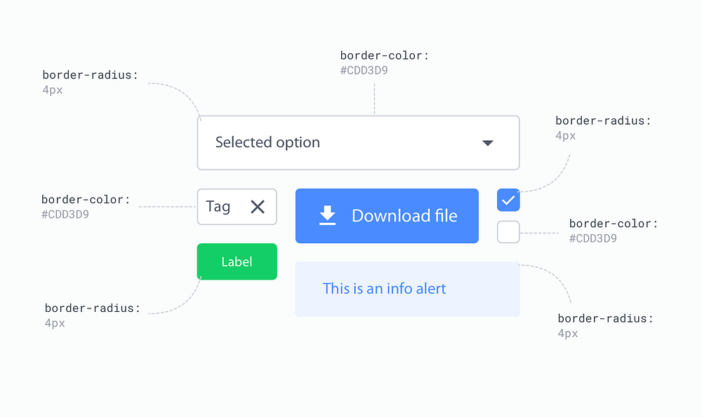
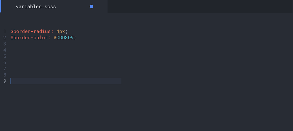
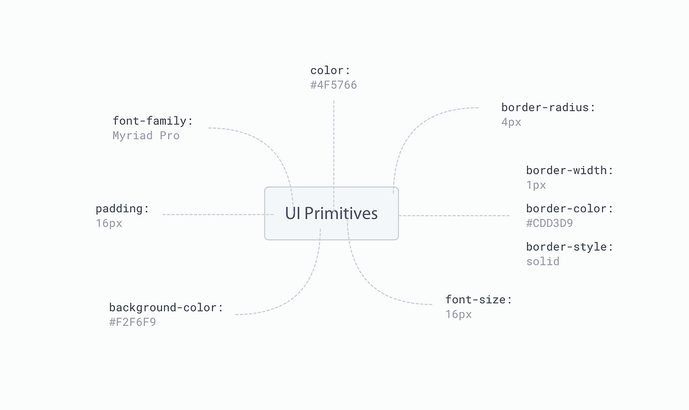
Think of primitives as the most granular level elements which the rest of your design is made up of. If you’ve ever worked with SASS then primitives are your variables. Likewise those familiar with the Lighting Design System will understand primitives as design tokens.
Certain CSS architectures recommend we group these primitive variables into a layer of abstraction and so we often create a folder of partial files and call it ‘abstracts’. If you hear any of these terms, know in most cases they are one and the same. What we’re doing here, is ‘abstracting’ the common styles from a design to make them reusable, in a way which prevents us from repeating ourselves unnecessarily.
Whether you are conscious of the primitives comprising your designs or not, an audit of your work will most likely reveal any number of these reoccurring properties. You will notice patterns and similarities shared between various parts of UI, which you as the designer have consciously implemented to create visual harmony in your work.
Taking the time to identify these patterns can have a huge impact on your process. Thinking in primitives will help you approach your work in a more systematic way, helping to solve common issues regarding the likes of scalability and consistency, as inevitably, they become an integral part of the design systems you create.
Putting primitives into practice to improve our design process in Sketch
Where a developer might extract these UI primitives, storing them as variables in order to reduce inconsistency and improve efficiency in their process. As designers we can achieve the exact same results by using Sketch Libraries.

So, how can we take this idea of UI primitives—being the most basic ingredients in designs—and use them to build larger, more identifiable components in a design system?
Primitive Libraries for a single source of truth
Splitting up your UI Kit into partial Sketch Libraries
I’m sure by now you must be familiar with the idea of using a UI kit, where all reusable components live in a single Sketch file. A ‘single source of truth’ as many refer to it.
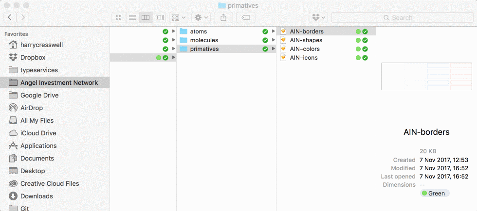
Building on this idea, my current process involves splitting UI components and the primitives styles they comprise—which you may have once kept in a single sketch file called ‘UI kit.sketch’—into several independent Sketch files.
By taking these partial files and turning them into Libraries, primitives can be used in any other file and therefore any other component. Essentially, we’re creating lots of small, lightweight partial files to use across our designs or even across different projects.
It’s worth noting; this technique doesn’t have to stop at a component level. Why not split your shapes, colors, borders, icons and so on into seperate Sketch files. In other words, if you can identify a primitive style which occurs in multiples places in your designs, then—within reason—there’s a good chance it deserves it’s own Library file.

Why bother with primitive Libraries?
By making primitive Libraries we can create one core set of highly reusable properties, vastly reducing complexity in our work. By keeping several small files, our projects will be easier to maintain, reuse and evolve, as each file contains fewer parts.
We can then use these primitive symbols to build more complex components, further reducing complexity in our atoms, molecules and organisms. Primitive symbols help us keep unique styles to a minimum, reducing our component files to a combination of primitives, nested components (depending on their level of complexity) and a handful of no-reusable properties.
In other words, the only new properties we will have to make when building components, are those tied specifically to the component themselves, as these properties have no case for reuse elsewhere in our designs.
“A unified design language shouldn’t just be a static set of rules and individual atoms — it should be an evolving ecosystem” — Karri Saarinen.
By managing and referencing primitive Libraries— our “single source of truth” — across multiple files, we can easily update, make changes or add to any one of these files at any moment in time.
We can add new components when needed, without conflict. We then have the ability to synchronise updates across our entire project. In effect, we can create a design ecosystem, which will evolve and grow in time. You could say we are able to create a living design vocabulary.
Thinking in primitives and making primitive Libraries not only aid you the designer, but also your collaborators, including developers. If you’re able to identify all cases of reusability in your designs, then the job of abstracting variables —from a developers perspective — becomes a seemingly simple process.
Using primitives to build atom level components
The next part of this article will look at using these ‘primitive’ Libraries to build more complex structures. I’ll walk you through the current process I use to build a flexible system of buttons, using the fewest number of unique Symbols possible
A fundamental part of any good design system, buttons are arguably the most identifiable atom (according to atomic design principles) in any user interface. And when abstracted, consist of a handful of primitive properties.
The anatomy of a button
Take a look at the buttons in your design and you’ll most likely notice a handful of reoccurring properties. You might identify similarities in any of the following:
- Background Shape
- Background Color
- Border Width
- Border Radius
- Text Family
- Text Color
- Text Size
- Padding (left, right, top, bottom)
We can assume that some of these primitives will appear elsewhere in our design too, perhaps for example, in form elements.

By splitting these reoccurring properties into Libraries, we can reference the these Libraries to build our buttons, as well as all other components in our system which share these same properties.
Keeping these primitive properties in Libraries will prevent us from having to create a new style each and every time we build a new component.
Auditing current button styles
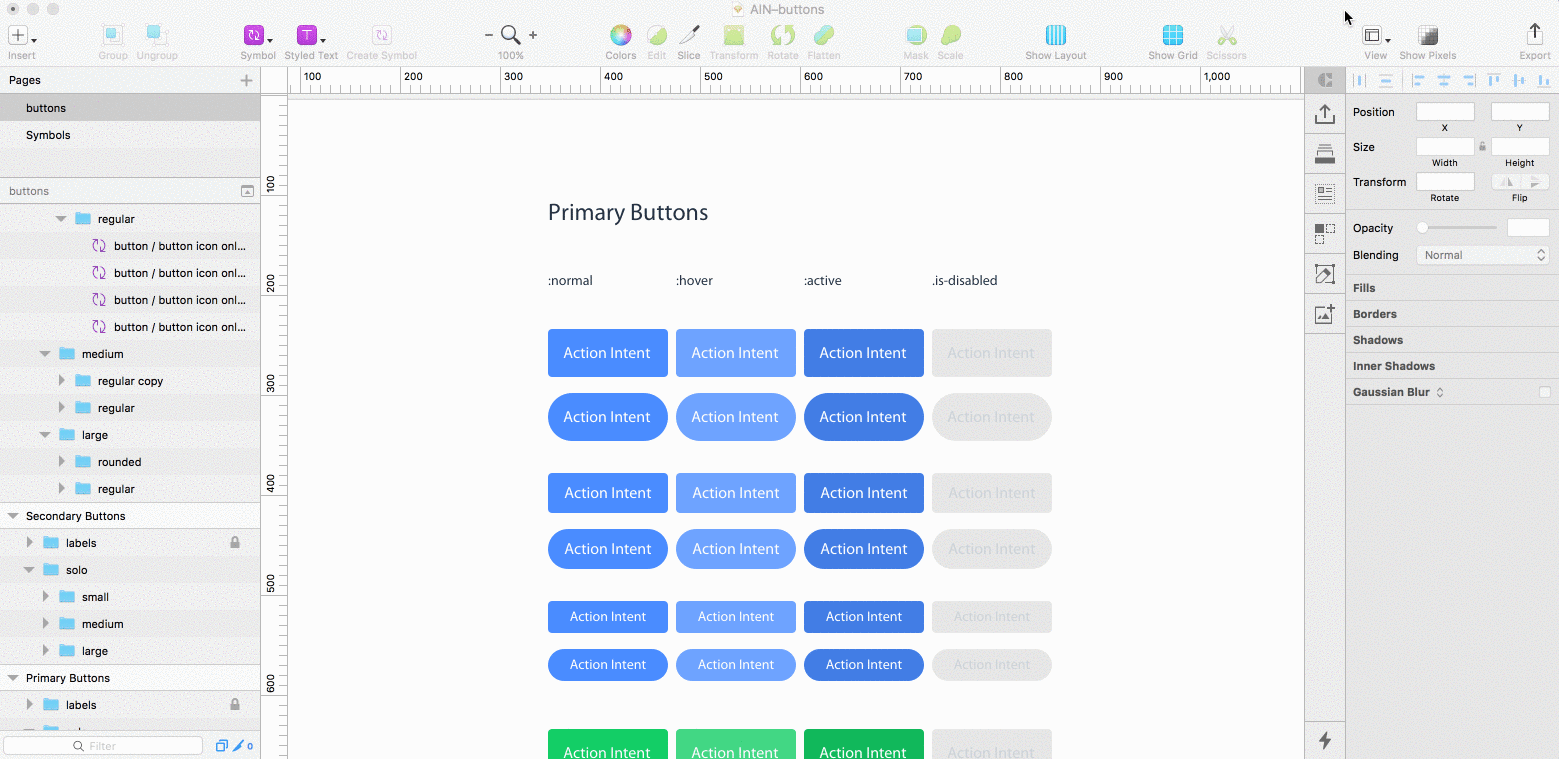
As I mentioned previously, good design begins with a audit of what’s been before. When conducting an interface inventory for AIN, our current system revealed we were using 4 button types in a variety of color and shape styles.
To be clear, when I refer to ‘type’ I mean buttons with noticeable structural differences, for example buttons with an icon are structurally different to those without. whereas when I say ‘style’ I’m referring to colors, borders, or any other cosmetic property which affect every type of button.

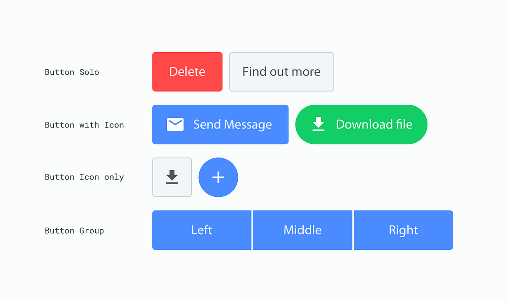
Identifying button types
Based on the audit, it seemed logical to group the 4 types into the following categories:
- button solo
- button with icon
- button icon only
- button group (left, middle and right)
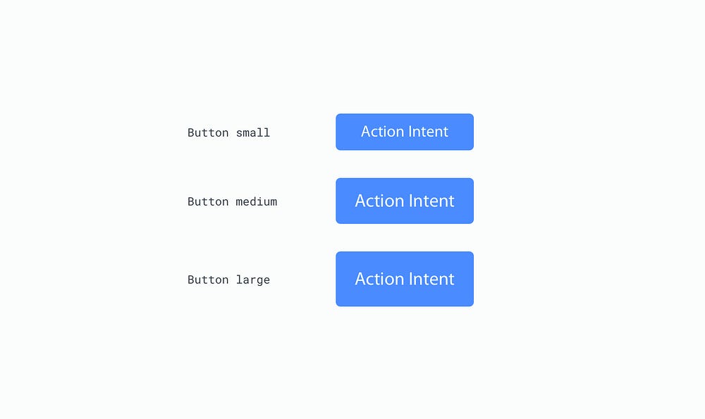
Each button type appears in our designs at 3 different sizes, which are based on a rhythm associated with the 8pt grid and refer to their height. Those sizes are 48px, 40px and 32px. For the sake of simplicity, I adopted t-shirt sizing when naming each size; Small, Medium and Large.
Identifying the primitives
Further to this, I identified a total of 6 primitive properties making up all buttons. Primitives, as we now know, being those properties which can be found elsewhere in our designs, and not just in our buttons. These were:
- color
- border
- icon
- shape
- text
- state
Although visually different, I realised colors, icons and border styles could easily reference some of these primitive Libraries I previously created. This would help keep unique properties to a minimum. I could also use fewer Symbols to make the various Button styles, as most of the style overrides could be handled directly by each independent Library. This meant I would have to make fewer Symbols to achieve the various styles.
I predicted I would only need a base Symbol for each Button type, which could then be use for every style instance found in that type of button.
These assumptions were mostly true, however the ‘text’, ‘shape’ and ‘state’ primitives (which we’ll get onto next) took a little more thought, due to their lack of reuse and specificity towards buttons only.
Dealing with button text
I decided to avoid creating a new primitive Library for text used in buttons as it’s highly specific to the buttons themselves. The text has a unique line-height depending on the button size, so the chances of the exact text style being found elsewhere is minimal. This meant creating a Library would be overkill.
In this case, it was easier to keep the complexity found with the text within the buttons sketch file itself, rather than referencing text from an external Library, which might never be used by other components in the system.
With that, I identified 4 different colors of text: Brand, dark, white and disabled. The text was also being used in 3 different sizes, one for each button size; large, medium and small.

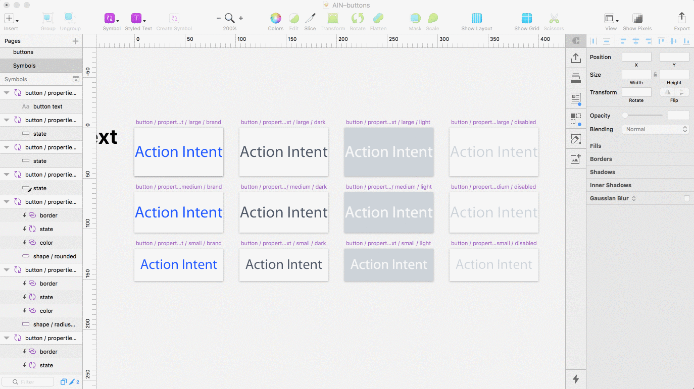
I created separate Artboards in a sketch file called AIN-buttons (the prefix ‘AIN–’ referring to the design system project)for each of these text properties and converted them all to Symbols. When I build the final button component, I will be able to override the text style when needed, by nesting these text symbols.
In order for these overrides to work, I made sure to keep my Artboard naming convention consistent I follow a basic naming system: component name, properties (which contains all properties in a property specific folder), property type, property size and color. It looked something like this:
button / properties / text / large / brand
Sidenote: In order to Override one Symbol with another, you also need to make sure your Artboards are the exact same size. So make sure all your text Artboards have the same height and width if you want them to show up as overrides in the inspector palette.
Dealing with button states
States were another design primitive unique to my button. That is, no other component in my system shares the same design for hover, pressed, and disabled States. This meant states should also be build directly in the Buttons Sketch file. As was the case with the text, I didn’t need to create another primitive Library unnecessarily.

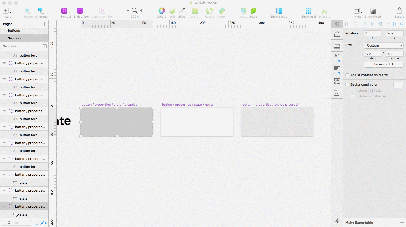
Instead, I built 3 new symbols to be used as state Overrides and followed a similar naming convention as before:
button / properties / state / disabled
Each Symbol consists of a single rectangle layer with slightly different fills. The hover state I made using an Artboard with a rectangle fill of 20% white. For the pressed state I did the same but with 10% black fill. Disabled had an 80% fill of white and another fill of 100% black on top, this time with the blending mode set to ‘Hue’. This insures any color button appears desaturated when the state override is set to ‘disabled’.
Sidenote: The Artboard sizes isn’t important, as they can be resized later, just make sure all your state Artboards are the same size, this allow Overrides to work . You will however, need to make sure the sizes differs from your Text Symbol Artboards. This is so they don’t show up in the Text Overrides dropdown. It’s a slight annoyance when working with Overrides in Sketch and it’s not essential, but it will keep your Override options nice and clean.
Dealing with button shape
Handling states directly meant I also had to do the same with the button shape. This is because you can’t create a mask of native design elements (being elements belonging to the same file) using an external Library. So in order to reveal the button shape behind the state I was forced to build the shape primitive directly in the buttons sketch file.
To do this I created 5 different Symbols to house the various shapes of my buttons. As before these Symbols will be used to as overrides, so I can easily change the shape of a button.

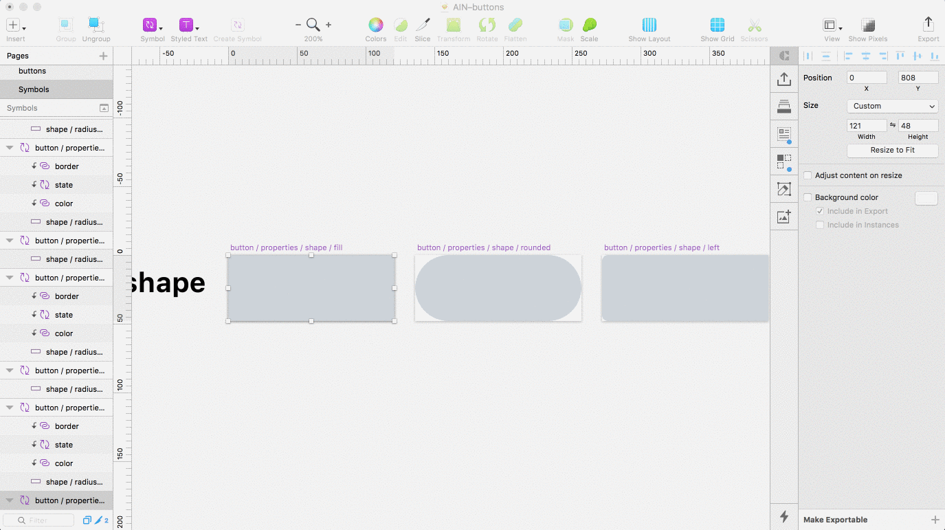
I named the 5 shapes used in the system: Fill (4px radius on each side), Rounded (100px radius on each side), Radius Left (4px radius on left), Radius Right (4px radius on right) and Radius None (0px radius on all sides). Those last 3 shapes will be used for my button groups — Left, middle and Right, in case that wasn’t clear.
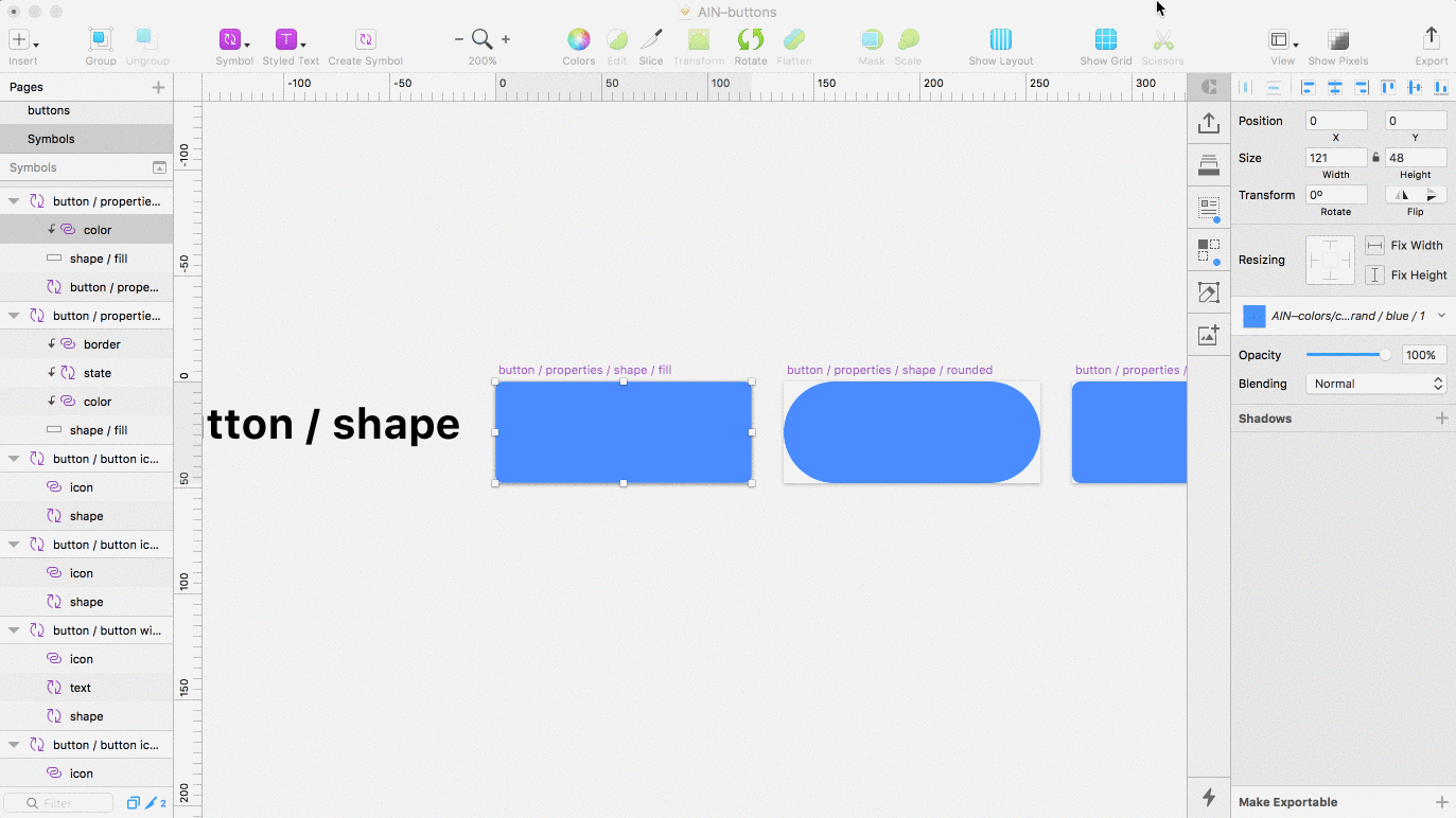
Next I turned each shape into a Mask ‘ctrl click > Mask’ and inserted a color from my Color Library. As the color sits above a mask, the shape below will clip the color revealing the shape.

Then I nested the ‘state’ Symbol I made earlier on top of the color.
Finally I inserted a border from my Border Library file. Repeating the steps before, I made sure the naming convention followed suit:
button / properties / shape / fill
button / properties / shape / rounded

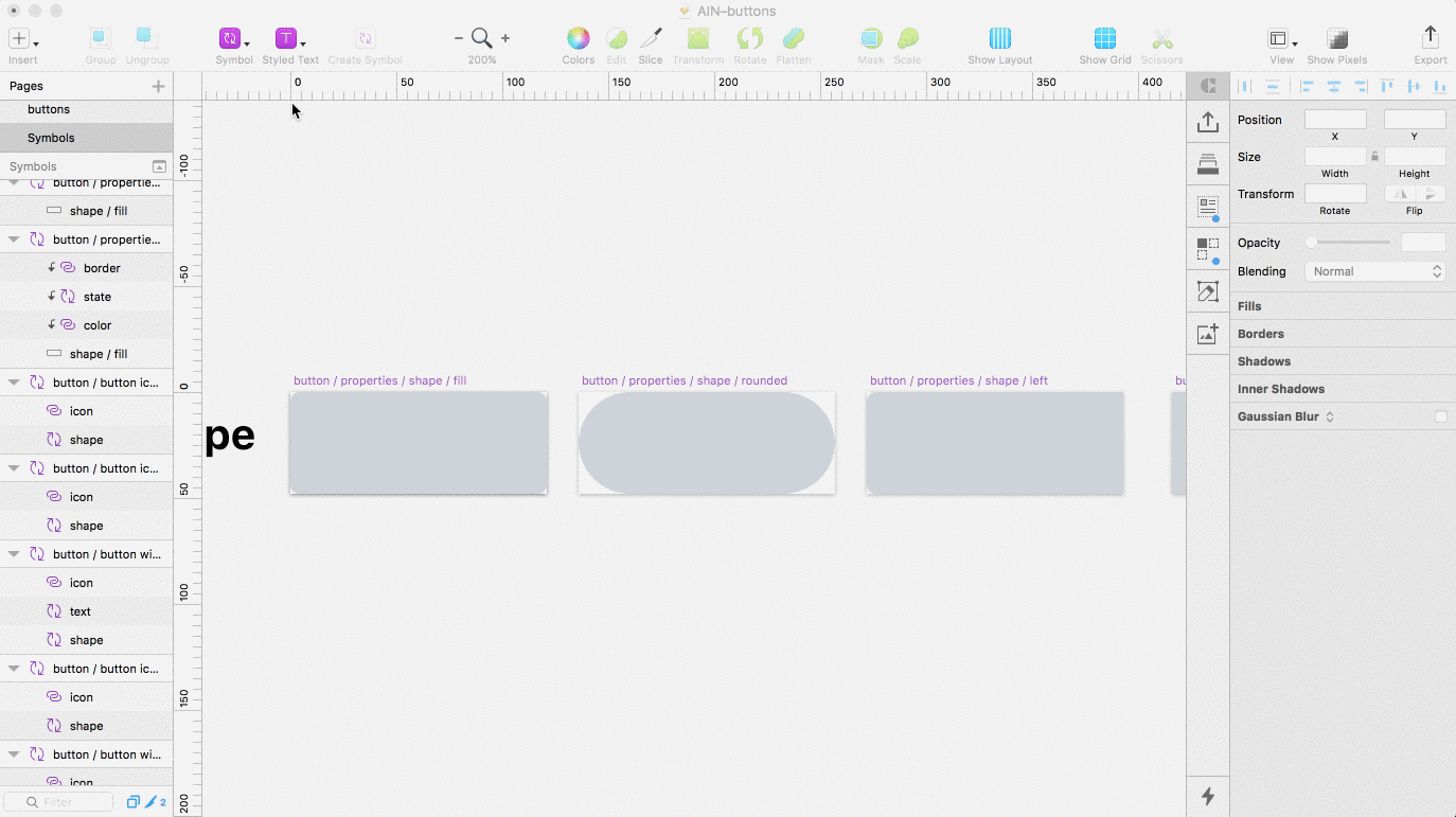
Sidenote: Make sure your Shape Artboards are identical in sizes to each other, but different in size to both your Text and State Artboards. This will prevent them all showing up in the same Override dropdown and keep things organised.
Building the master button component for each button type
From here, all that’s left to do is build the master Symbols used for the various button types.This will pull together all our different primitive parts building one main button component, which we can use to create the various other buttons styles in our system.
Note: think of the master symbol as the one you insert into your designs mockups using Sketch Runner.
Just to recap that means we need to make a master Symbol for each of the following button types:
- button solo
- button with icon
- button icon only
- button group left
- button group middle
- button group right
Remembering for each button type we will also need unique masters for our 3 sizes.
Building the master symbol for solo buttons
Solo buttons are fairly simple. 3 sizes, small, medium and large, each consisting of 2 nested symbols — Shape and Text. Bare in mind our core primitive Libraries were nested inside the shape symbol, so it’s relatively easy from this point. All we have to do is insert our shape and text symbols on a new Artboard for each size.
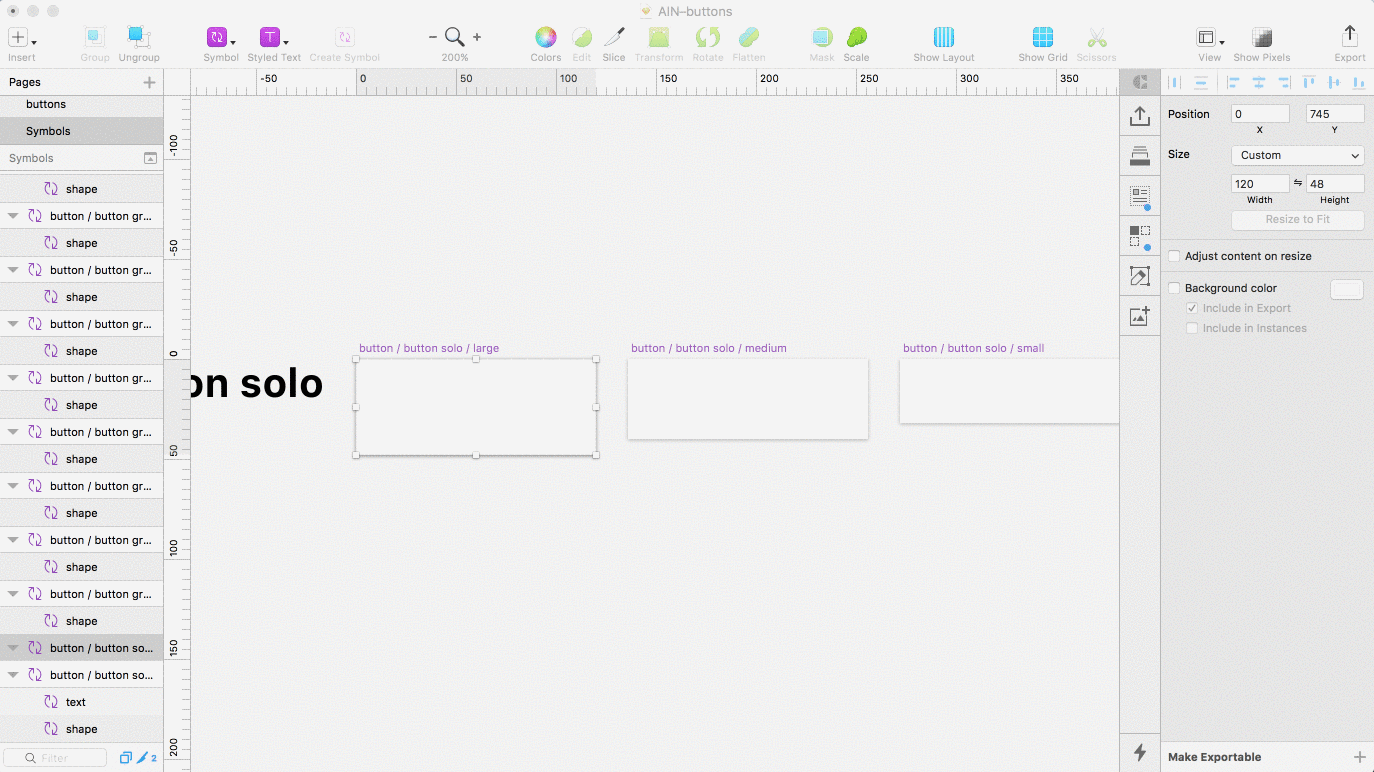

For each artboard I renamed the layers shape and text, so the override labels are easy to understand and not tied to any specific shape or text type when I come to use them.
Finally I turned the Artboard into a Symbol.
Filtering down the Insert menu shows our 3 new master button Symbols:
button > button solo > small
button > button solo > medium
button > button solo > large
Building the master symbol for buttons with an icon
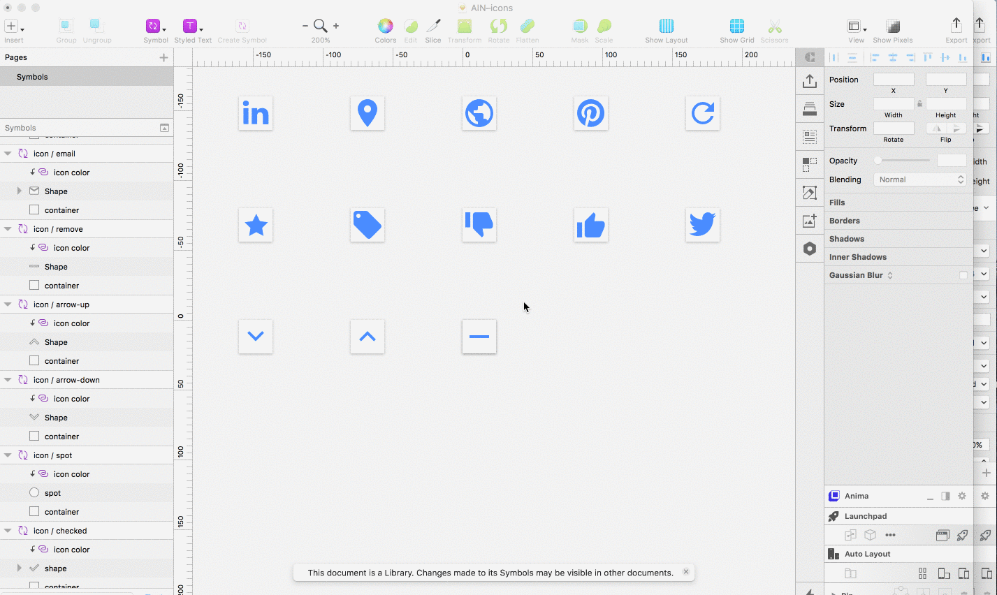
For Icon buttons I followed the exact same process as with solo buttons, the only addition was the inclusion of an icon from my primitive Icon Library. Any icon will do, as Overrides and icon color are already taken care of via the icon Library itself.

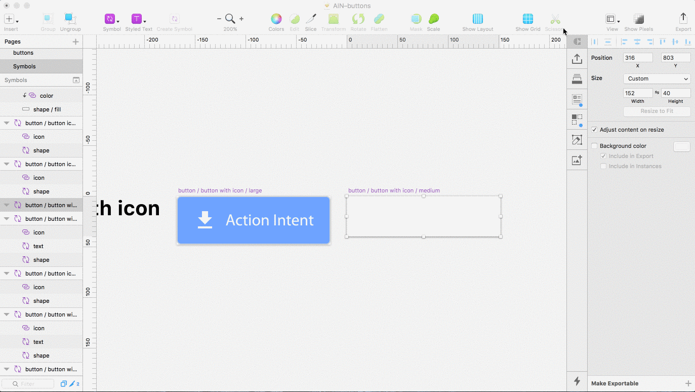
Remember: ‘Ctrl +click > Create Symbol’ makes our icon buttons useable if you haven’t made the Artboard into a Symbol already.
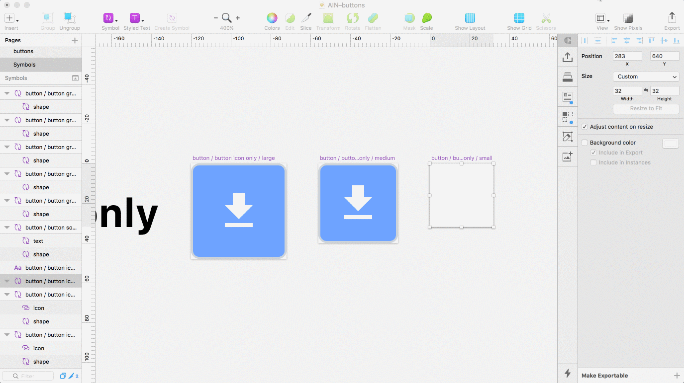
Building the master symbol icon only buttons
Again, very simple, icon only buttons follow the same rules as before, however this time we’ve removed the nested text Symbol. As you can see in the GIF below I now only have 2 layers, an icon and shape symbol.
As before, I made a unique Symbol for each of the sizes I needed. One for small, medium and large icon buttons.

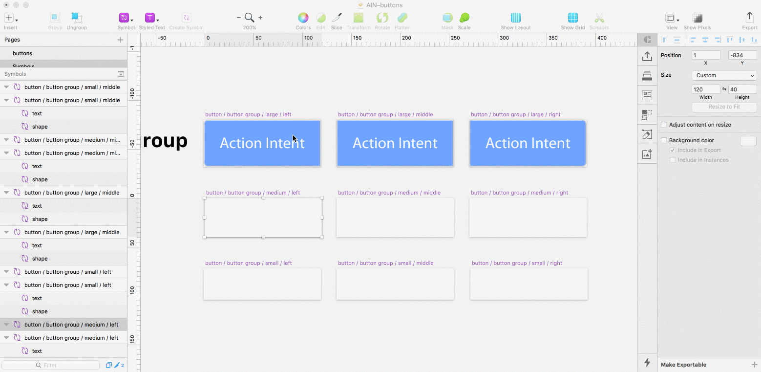
Building the master symbol for group buttons
Building the group buttons required a total of 9 symbols. One for Left, middle and right in each of the 3 different sizes; small, medium and large. Except for their shape, which used a slightly different Override, group buttons are identical to our solo buttons.
When placing my nested shape Symbol I made sure the shape corresponded to the correct shape property. As an example, for the base symbol button / button group / medium / middle I needed to nest the symbol I created called button / properties / shape / middle and so on.

Using our new buttons and overriding styles
At this point, we now have a highly flexible system of buttons, made of the fewest number of parts possible.
Using Overrides we can change the icon, button color, shape, text style and border without creating an entirely new button each time.

By mocking up my different Button styles on a new page within the AIN-buttons file, I now have a visual reference of each Button in the system.

To use my button system elsewhere in my designs, in other files or other projects I can turn the entire file into a new Sketch Library. In this case, that meant turning AIN–buttonsinto a Library file.

By using Primitive Libraries I can easily add new elements to my system, say for example a new icon to my icon Library, and immediately access them to use in the Buttons file. In effect our design system can evolve as time goes by and with very little extra effort.

Wrapping up
I hope this article has helped show the importance of thinking in a primitives. Doing so will help you identify relationships in your designs and improve the consistency in your work. Taking a primitive approach and deconstructing your designs in this way can also help you see your designs in a holistic way.
Rather than viewing components as highly specific, complex but reusable patterns, we can break them down and identifying reusability in their primitive properties.
By combining this way of thinking with the use of Sketch Libraries, we can extract properties, much like a developer would variables, in order to create partial design files with less complexity, which in turn are easier to update and maintain. We can then utilise these primitive partial files to build larger components, whilst limiting design debt and keeping scalability in mind.
In the case of this article we looked at building buttons, however you might apply this thinking and process to building any component, regardless of complexity. Whether you are designing form elements, alerts or avatars, as in most cases, all these UI elements will share a certain number of primitive properties.
What next?
By now you should have a clear understanding of how you can Libraries and primitive to improve your workflow and create scalable design systems.
In another article I will look at using Buttons and other primitive Libraries, to build more complex components—molecules if you like—which, similarly, can be kept in an independent Library file, and represent the next level of structural complexity in a UI design system.
You can download the example project for reference, it includes primitive files for colors, icons, borders, shapes and component files for the buttons. I’ve also included my forms file, to illustrate how different components are made up of the same primitive Library files. I hope it helps you to see how I’ve set things up. Bare in mind you’ll need at least Sketch 47 for all this good stuff to work. And make sure you convert each file into a Library.
Resources
- Constraints are a Fundamental Part of Design by Steven Bradley.
- Brad Frost’s Atomic Design Methodology.
- Building a Visual Language at Airbnb.
- Thinking in Symbols for Universal Design by Benjamin Wilkins.
- Dan Eden on Design System Structure.
- A Better Way to Make Buttons in Sketch by Jon Moore.
If you found this article helpful, please give it some claps 👏 so others who might benefit from reading it can find it easier. Thanks for taking the time to read it, I know it was a long one!
I’m Harry Cresswell. I co-founded indtl.com and work as a UX/UI designer and front-end dev at Angel Investment Network. I design type on my nights off and send out a newsletter on design and typography.
Find me on Twitter if you want to say hi.
from Medium https://medium.com/sketch-app-sources/using-sketch-libraries-and-primitives-to-build-an-even-better-system-of-buttons-ecc8f25486ac