A series of poster designs and illustrations
from Branding Served https://www.behance.net/gallery/64611543/Miscellaneous-Posters
A series of poster designs and illustrations
from Branding Served https://www.behance.net/gallery/64611543/Miscellaneous-Posters
Your website can reach a massive audience. Reaching, as well as attracting those users, however, requires a site that anyone can access. That’s why development and marketing teams need to review website accessibility checklists and ensure your site meets web content accessibility guidelines (WCAG).
Keep reading to view our definitive website compliance checklist of 50-plus standards to meet.
You’ll find all the requirements for accessibility, plus instructions on how to meet those guidelines. If you want to learn more about WCAG compliance and marketing your website online, sign up for our free weekly newsletter for industry tips, strategies, and more!
Assess your WCAG compliance fast with our up-to-date WCAG 2.0 checklist:
If your company doesn’t have a significant amount of time to dedicate to WCAG compliance, Level A can get you started. With Level A, you make some basic changes to your site that make it accessible to some (but not all) users.
| Level A Web Accessibility Checklist | |||||||||||||||||||||||||||||||||||||||||||||||||||||||||||||||||||||||||||||||||||||||||||||||||||||
| Guideline | Overview | Action Items | |||||||||||||||||||||||||||||||||||||||||||||||||||||||||||||||||||||||||||||||||||||||||||||||||||
| Non-text content | Offer alternatives for any non-text content. | Add alt text to images.
Add alt text to audio and video. Add names to controls, like “Submit.” | |||||||||||||||||||||||||||||||||||||||||||||||||||||||||||||||||||||||||||||||||||||||||||||||||||
| Audio-only and video-only | Offer alternatives to video- and audio-only content | Write transcripts for audio- and video-only content.
Link or place transcripts near audio or video content. Record audio tracks for video-only media. | |||||||||||||||||||||||||||||||||||||||||||||||||||||||||||||||||||||||||||||||||||||||||||||||||||
| Captions | Create captions for videos with audio | Add captions to all videos with sound. | |||||||||||||||||||||||||||||||||||||||||||||||||||||||||||||||||||||||||||||||||||||||||||||||||||
| Audio description or media alternative | Provide users with other options to videos with audio | Write video transcripts.
Provide audio descriptions of video. | |||||||||||||||||||||||||||||||||||||||||||||||||||||||||||||||||||||||||||||||||||||||||||||||||||
| Information and relationships | Build a logical structure for site and content | Use valid and proper HTML.
Apply clear labels to forms. Divide content with subheadings. | |||||||||||||||||||||||||||||||||||||||||||||||||||||||||||||||||||||||||||||||||||||||||||||||||||
| Meaningful sequence | Present site and content in a meaningful order | Separate navigation menus from content.
Use valid HTML. Use headings and lists. Arrange paragraphs in order. | |||||||||||||||||||||||||||||||||||||||||||||||||||||||||||||||||||||||||||||||||||||||||||||||||||
| Sensory characteristics | Use position, shape, sound, and size to provide users direction | Provide more than one sense, like sight and sound, for instructions. | |||||||||||||||||||||||||||||||||||||||||||||||||||||||||||||||||||||||||||||||||||||||||||||||||||
| Color usage | Provide an experience not reliant on color | Avoid color references in text, like instructing users to click a green button. | |||||||||||||||||||||||||||||||||||||||||||||||||||||||||||||||||||||||||||||||||||||||||||||||||||
| Audio control | Stop audio from playing automatically | Allow users to choose when to play audio, versus playing it automatically. | |||||||||||||||||||||||||||||||||||||||||||||||||||||||||||||||||||||||||||||||||||||||||||||||||||
| Keyboard | Allow users to use their keyboard to access and use your site | Remove any function that uses timed keystrokes, like a double tap. | |||||||||||||||||||||||||||||||||||||||||||||||||||||||||||||||||||||||||||||||||||||||||||||||||||
| No keyboard tap | Prevent keyboard-only users from becoming trapped on your site | Enable navigation control with arrow or “Tab” key.
Eliminate any instances where users cannot navigate or access your site without a keyboard. | |||||||||||||||||||||||||||||||||||||||||||||||||||||||||||||||||||||||||||||||||||||||||||||||||||
| Timing adjustable | Provide users with the option to control timing limits | Let users turn off, adjust, or extend any time limits except for real-time events, like an auction.
Allow users to pause moving or animated text. Allow users to delay update frequency. | |||||||||||||||||||||||||||||||||||||||||||||||||||||||||||||||||||||||||||||||||||||||||||||||||||
| Pause, stop, hide | Allow users to stop, hide, or pause moving, blinking, scrolling, or auto-updating content | Provide all moving, blinking, scrolling, or auto-updating content with user controls. | |||||||||||||||||||||||||||||||||||||||||||||||||||||||||||||||||||||||||||||||||||||||||||||||||||
| Three flashes or below | Eliminate any content that flashes more than three times per second | Remove any content that flashes more than three times per second. | |||||||||||||||||||||||||||||||||||||||||||||||||||||||||||||||||||||||||||||||||||||||||||||||||||
| Bypass blocks | Allow users to bypass parts of your page, like headers | Add a “Skip to Content” link to all site pages.
Make the “Skip to Content” link visible and accessible. | |||||||||||||||||||||||||||||||||||||||||||||||||||||||||||||||||||||||||||||||||||||||||||||||||||
| Page titled | Create page titles that tell users what page they are on and what that page is for | Write unique and descriptive titles for each page on your site. | |||||||||||||||||||||||||||||||||||||||||||||||||||||||||||||||||||||||||||||||||||||||||||||||||||
| Focus order | Provide users a logical and meaningful way to navigate and access site elements | Ensure site functionality with the “Tab” key.
Make the order of elements, like pages on your navigation, logical. | |||||||||||||||||||||||||||||||||||||||||||||||||||||||||||||||||||||||||||||||||||||||||||||||||||
| Link purpose in content | Use descriptive anchor text for links | Create easy-to-understand anchor text that aligns with the surrounding text. | |||||||||||||||||||||||||||||||||||||||||||||||||||||||||||||||||||||||||||||||||||||||||||||||||||
| Page language | Assign a language to every page | Use HTML to use the appropriate language code for pages. | |||||||||||||||||||||||||||||||||||||||||||||||||||||||||||||||||||||||||||||||||||||||||||||||||||
| On focus | Prevent elements from instantly changing when users interact with them, like by mousing over a link | Eliminate responses that happen automatically, like pop-ups, form submissions, and link openings.
Require a user action, like a mouse click to open a link, for responses to happen. | |||||||||||||||||||||||||||||||||||||||||||||||||||||||||||||||||||||||||||||||||||||||||||||||||||
| On input | Provide a predictable experience for users interacting with content, like a form | Remove any auto-submit form fields.
Eliminate any instances that remove a user’s control when interacting with an element. | |||||||||||||||||||||||||||||||||||||||||||||||||||||||||||||||||||||||||||||||||||||||||||||||||||
| Error identification | Offer easy-to-understand error messages | Provider users with explanations for errors and instructions on how to fix those errors.
Place error explanations near the error, like a required, but blank form field. | |||||||||||||||||||||||||||||||||||||||||||||||||||||||||||||||||||||||||||||||||||||||||||||||||||
| Labels or instructions | Create clear and helpful labels for website features that require user input, like a contact form | Label all input fields.
Describe the preferred format for input fields, like for a phone number or date. Provide helpful instructions for completing input fields. | |||||||||||||||||||||||||||||||||||||||||||||||||||||||||||||||||||||||||||||||||||||||||||||||||||
| Parsing | Resolve any significant website code errors and prevent future ones | Follow proper HTML structure and guidelines.
Fix any HTML elements with duplicate attributes. | |||||||||||||||||||||||||||||||||||||||||||||||||||||||||||||||||||||||||||||||||||||||||||||||||||
| Name, role, value | Build all website elements to work with assistive technology | Ensure site uses valid HTML markup.
Follow HTML specifications for website scripts. Level AA website accessibility checklistWith the Level AA website accessibility checklist, your business takes a more proactive approach to building and maintaining an accessible site. Most action items on this website compliance checklist make your website accessible to almost every single user.
|
|||||||||||||||||||||||||||||||||||||||||||||||||||||||||||||||||||||||||||||||||||||||||||||||||||
from Web Design – WebFX Blog https://www.webfx.com/blog/web-design/website-accessibility-checklist/

IDEO defines design thinking as the belief that all problems, even the intractable ones such as poverty, disease and inequality, are solvable. It hinges on the belief we can make a difference, and gives us an intentional process to search for and design relevant solutions to make in impact.
It’s a mindset and process that empowers children with the ability to think critically and creatively.
In many respects, schools have been helping students in elements of design thinking for decades. At the heart of design thinking sits the need for developing strong curiosities, and fostering the desire to understand and solve complex problems. It encourages empathy and optimism and embracing ambiguity. As such, design thinking has come in many forms, from project-based learning, challenge-based learning, to inquiry-based learning. They all have elements of encouraging good research, developing and testing approaches, and presenting findings.
Creative and critical thinking have always been crucial skills in learning how to unpack issues and problems. They are certainly even more important now as we deal with the challenges of rapid change in work, life, and the environment that require different approaches and a re-thinking in how to tackle them – statistics show millennials will go through as many as 15 jobs different jobs before they’re forty, stay at jobs for only 2 years, and have up to 5 or more career changes, showing necessity of adaptability. Schools, like businesses and industries, are also keen on developing innovation, creativity, and entrepreneurship. Without a proper understanding of the mindsets, the skillsets and tools that can be used, innovation and entrepreneurship very quickly become token buzzwords. When students experience the process of design thinking effectively, they learn how to ask better questions, see past perceived constraints, generate and filter ideas, and have multiple attempts at prototyping their solutions to discover what works and what wows. Consider the depth and breadth of learning that comes from years of working this way and you’ll begin to see how adaptable, creative, and knowledgeable students can become.
Once the methodology of design thinking becomes more familiar, it can be applied to almost any challenging task. Many schools see it as the domain of the humanities or sciences, but it works equally well in any field, even mathematics, languages, or physical education. At its core, design thinking needs learners to make connections, so it is when learning is well-integrated that real innovation starts.
An example of integrating design thinking into everyday subjects include encouraging students to redesign the classroom and classroom flooring as a way of teaching the concepts of perimeter and area. By getting the students to interact with the space, seeing how these mathematical concepts work in real life and how they can apply these concepts in their own redesigns, students not only can grasp these ideas easier, but also remain more engaged throughout the process.
What’s often missed when schools use design thinking approaches, however, is that it becomes another program done to students rather than with them. It’s important to nurture learning environments in which students think for themselves and also have a sense of agency, so when teachers look at curriculum they need to ask themselves: could I also undertake this? It makes a significant difference to the depth and impact of design thinking when the school community knows how it feels and what it takes to tackle complex problems. By using design thinking processes to plan and design learning, teachers become better at facilitating and networking this knowledge with their students.
To work well, design thinking needs the support and understanding from school leadership. It may start with a team of teachers using the processes within the curriculum, but it can also be a very effective way to bring the school community together. Instead of design thinking just being an effective way to address curriculum outcomes, it can also be an ideal way to tackle real problems and challenges in the school. This could be about new school buildings, classrooms changes, strategic planning, or enabling a new initiative with others outside the school.
In this regard, design thinking is not a subject. It is certainly not wise to teach it in isolation (much like people realise about technology), and it is not a form of pedagogy. It’s important to understand that when used well, design thinking will help reveal the learning culture. It will often bring to the surface the blockers and challenges that stand in the way of things being done differently. If we want our young people to begin to appreciate how hard and how intelligent we need to be to navigate this, then to work on real-world problems is also important. Often, the curriculum offers up all kinds of large-scale, complex issues, like natural disasters, wars, and immigration. Instead, schools would be best served initially using the processes of design thinking for the very problems that are core to their own community.
An example of students using design thinking to tackle community issues was when Brisbane primary school teacher, Elisabeth Hales, used design thinking in exploring the impact of climate change and the 2011 floods on their local communities. They created the topic ‘Burning plains and flooding rains’ to frame their thinking and research. Students explored the news, looked at and compared maps, studied data, watched TED Talks, interviewed people affected by floods, and asked lots of tough questions. Students then addressed their core challenge of ‘How might we help our local community to be flood ready?’. Students generated into lots of ideas and quickly began forming sketched prototypes. One group of girls designed a concept for a Flood Evacuation Kit, received early feedback, made a mock-prototype, then ended up pitching it to community members some of whom had been affected by the floods. This made for very memorable learning for everyone.
On an even more individual scale, during our Lemonade Stand Program, we ran a simple 1-hour design thinking exercise with our students, asking them to redesign each other’s’ gift giving experiences and routines. The students were instructed to interview each other and pose probing questions provoking thoughtful and emotional responses, before designing ‘magic-wand’ solutions and whittling these down and prototyping the most feasible idea.
In the limited time we had, students only had time to draw their solutions, but ideas ranged from apps that automatically pulled data from a user’s Facebook activities to suggest gifts that a person liked, to automated personal shopping services.
Our partners, NoTosh, have also been working with networks of schools. Some of the local projects have included convincing Taronga Zoo to improve one of their animal habitats, changing the school bell, helping parents to be more involved in the life of the school, or educating their peers about local wetlands. These schools have created learning environments where everyone speaks the same language of learning, and everyone grows the ambition to make things better.
Students’ descriptions of their learning from these types of projects is very articulate. Lauren, a Year 6 student who has been using design thinking for about 3 years, reflected that “my favourite thing about design thinking is that we can be as creative as possible and be free to let our imaginations go wild, while learning and answering the question.” This captures some very powerful insights about how important the process has been to her learning. Likewise Michelle, age 11, said “I think that Design Thinking is fun and educational, and also lets children use their curiosity, creativity, and gives us freedom of choice at the same time. Although a few troubles may happen.”
Design Thinking might at first seem like a nebulous area. However, with the growing success with its application in the K-12 curriculum and the increasing importance for students to be adaptable and have the capacity to think innovatively, design thinking is rapidly playing a more important role in engaging and teaching students.
Through design thinking schools are creating learning communities where everyone speaks the same language of learning, and everyone grows the ambition to make things better.
Our highly popular Lemonade Stand Program is coming online. Our Lemonade Stand Program empowers kids by teaching them entrepreneurial basics, with lessons on business model planning, design thinking and prototyping. To express your interest in beta-testing our new online platform, click here.
from Collective Campus Blog https://www.collectivecampus.io/blog/how-to-use-design-thinking-in-schools
By analyzing the extraordinarily strong gravitational pull of the giant black hole at the center of the Milky Way on a star near it, astronomers have shown that Einstein’s ideas about space and time still hold true as the best description yet of how gravity works.
According to Einstein’s theory of general relativity, gravity results from how mass warps space and time. The greater an object’s mass, the stronger its gravitational pull.
Scientists have largely tested general relativity’s predictions in relatively weak gravitational fields, such as those on Earth and in the solar system. In the presence of much stronger gravitational fields — such as those of the supermassive black holes thought to lurk in the hearts of virtually all large galaxies — researchers might discover violations of general relativity that could lead to new theories that might help explain cosmic mysteries such as dark matter and dark energy.
“Einstein’s right, at least for now,” said Andrea Ghez, a co-lead author of the research and astronomy professor at the University of California Los Angeles, in a statement. “Our observations are consistent with Einstein’s theory of general relativity. However, his theory is definitely showing vulnerability. It cannot fully explain gravity inside a black hole, and at some point we will need to move beyond Einstein’s theory to a more comprehensive theory of gravity that explains what a black hole is.”
Related: Images: Black Holes of the Universe
In the new study, astronomers investigated the supermassive black hole Sagittarius A*, often abbreviated Sgr A*. This giant, located in the Milky Way’s core, is about 4 million times the mass of the sun and about 14.6 million miles (23.6 million kilometers) in diameter.
The scientists monitored the star S0-2 in 2018, when it made its closest approach to Sagittarius A* during its 16-year orbit. The star got as close as 120 astronomical units (AU) from the black hole — an AU is the average distance between Earth and the sun, about 93 million miles (150 million kilometers) — traveling as fast as 2.7% the speed of light.
Using the Keck Observatory, Gemini Observatory and Subaru Telescope in Hawaii, the astronomers managed to track S0-2’s complete orbit in 3D. They combined these data with measurements they have made over the past 24 years.
The researchers investigated a prediction of general relativity known as “gravitational redshift,” wherein gravity can distort light. Much as how an ambulance siren sounds higher-pitched to people as the vehicle drives toward them and lower-pitched as it moves away, light falling toward a gravitational field gets shifted to the blue end of the spectrum, while light escaping from a gravitational field is reddened, or redshifted.
“These measurements signal the start of an era of where we can finally test the nature of gravity using the orbits of stars around the supermassive black hole at the center of our galaxy,” study lead author Tuan Do, an astrophysicist at the University of California Los Angeles, told Space.com.
“This has been long anticipated theoretically, but it is really exciting that we can finally do it,” Do added.”This is a milestone on the path to future, more powerful tests of general relativity and other theories of gravity.”

Image of the orbits of stars around the supermassive black hole at the center of our galaxy. Highlighted is the orbit of S0-2, the first star that has enough measurements to test Einstein’s theory of general relativity around a supermassive black hole.
(Image credit: Keck/UCLA Galactic Center Group)
The spectrum of light detected from S0-2 revealed the redshifting it experienced from Sagittarius A*’s extreme gravity was consistent with general relativity. It was “amazing” to see the predictions of the theory of general relativity “work even though black holes, much less supermassive black holes, were not even known when Einstein created his theory,” Do said.
This research on S0-2 is the first of many investigations of general relativity the scientists plan to conduct on stars near Sagittarius A*. One such target is S0-102, which has the shortest orbit among the more than 3,000 stars near the supermassive black hole, taking 11.5 years to circle it.
The scientists detailed their findings online today (July 25) in the journal Science.
Follow Charles Q. Choi on Twitter @cqchoi. Follow us on Twitter @Spacedotcom and on Facebook.
from Space.com https://www.space.com/supermassive-black-hole-gravity-einstein-relativity.html

Robot-assisted surgery promises nothing short of a paradigm shift in medicine. In subfields from urology and gynecology to cardiothoracic and pediatric surgery, it’s enabling surgeons to perform complex procedures without having to resort to laparotomy (surgical incisions into the abdomen). Better still, surgical robots contain cameras that capture every knife and needle movement and suture stitch, contributing to a video library which could be used to train gesture recognition systems for skills assessments, step-by-step instruction, and automation of pre- and post-operative tasks.
The trouble is, state-of-the-art methods for action recognition require samples like videos to be manually labeled, which tends to be both time-consuming and error-prone. Perhaps that’s why researchers at the Robotics Institute at UCL in London, the Polytechnic University of Milan, and the University of Verona recently explored in a preprint paper on Arxiv.org (“Weakly Supervised Recognition of Surgical Gestures“) a method that requires no more than several annotated demonstrations to train a recognition neural network algorithm.
By way of background, neural networks consist of neurons that are arranged in layers and transmit signals to other neurons. Those signals — the product of data, or inputs, fed into the neural network — travel from layer to layer and slowly “tune” the network by adjusting the synaptic strength (weights) of each connection. Over time, the network extracts features from the data set and identifies cross-sample trends, eventually learning to make predictions.
In this study, in order to find a mixture of multi-dimensional probability distributions that best modeled their surgical demonstration input corpus,the researchers leveraged an unsupervised recognition algorithm based on a classical Gaussian mixture model (GMM). It’s an ideal model architecture for tasks that didn’t rigidly influence each other, wrote the researchers, like simultaneous segmentation and classification. Additionally, it’s intuitive because the GMM-based algorithms represent action classes through independent means and other variables.
The researchers tapped three surgical demonstrations — two demonstrations from expert users and one demonstration from an intermediate user — along with ground truth annotations to initialize the GMM-based algorithm’s parameters. To validate it, the team sourced a public data set — JIGSAWS — containing labeled video and kinematic data captured during demos by eight surgeons with Intuitive Surgical’s da Vinci Surgical System. In a set of experiments, the paper’s coauthors say that with the proposed annotations and by redefining the actions and optimizing the inputs, they managed to boost overall recognition accuracy by 25% compared with the baseline and improve action class recognition.
“Experimental results on real surgical kinematic trajectories during a training exercise confirm that weakly supervised initialization significantly outperforms standard task-agnostic initialization methods,” wrote the coauthors.
That said, they concede that their experimental data sets were relatively small and that GMM approaches aren’t generally robust against “increasingly variable” data. But they say that in future work, they intend to explore further the effects of weak supervision on the initialization of probability distributions in unsupervised HMM-based approaches.
from VentureBeat https://venturebeat.com/2019/07/26/researchers-improve-robot-assisted-surgery-with-ai/

It is important for every new UX/UI Designer to know the key words of their profession and what they mean, as it can help them understand the value of Design and the mechanics of the design as a craft.
So here I am sharing the list of UX/UI Jargons that every aspiring or new designer should know and learn.
Note: Credits goes to all those people who have written these beautiful blogs to share their knowledge with the world. 👏 👏
~~~~~~~~~~~~~~~~~~~~~~~~~~~~~~~~~~~~~~~~
~~~~~~~~~~~~~~~~~~~~~~~~~~~~~~~~~~~~~~~~
~~~~~~~~~~~~~~~~~~~~~~~~~~~~~~~~~~~~~~~~
from Medium https://uxdesign.cc/a-list-of-design-concepts-every-ux-ui-designer-should-learn-7e2d8412b391
Dropbox. Slack. Evernote. Zoom. Figma. Mailchimp. Airtable. Notion. Grammarly. Typeform.
It’s not a coincidence that many of the most successful product-led SaaS companies offer a free trial or freemium plan. Users now expect to try products before purchasing—even requesting demo can feel like too high a hoop to jump through when there are self-serve options available.
But designing a successful premium product can be a real challenge. If users are getting what they want from a free product, what incentive do they have to pay? And if users are not getting what they want, what will keep them from abandoning the product altogether?
A well-designed upgrade prompt can be the key to engaging—and ultimately converting—free users into paying customers. Upgrade prompts can range from subtle reminders to paywalls that restrict actions outright—but they all need to pique the user’s interest.
Below, we’ll take a look at 3 strategies for successful upgrade prompts from popular freemium apps:
A common upgrade prompt strategy is to restrict a “premium” action right when the user clicks. This is a sensible prompt that reminds users which features are premium and which are not.
It can be a great way to build up the desire to upgrade.
Since this approach stops users from doing what they want, there’s a risk of annoying users. These are the types of prompts that active users might see several times a day. Freemium products that do this well are usually persistent, yet empathetic, with their messaging.
Music streaming service Spotify allows freemium users to skip 6 songs per hour. When they exceed their limit, users are prompted to upgrade to a premium account.
Spotify does a few things well here. For one, they warn users when they are approaching their usage limit. By the time they see the upgrade prompt modal window, users have been given plenty of fair warning, which takes the sting out of a paywall.

And the mobile modal itself is cleverly written to make the upgrade prompt feel like an opportunity, rather than a restriction (“you discovered a Premium feature” feels a lot nicer than “you’re not allowed to do that until you pay us”).

Spotify’s impressive paid subscriber rates—100 million paid users as of April 2019—suggest that their approach is working.
Teams (and individuals) can use Slack for free forever, but they are discreetly prompted to upgrade when they perform a very common function in the world of communications apps: searching through messages.

Instead of putting up a hard paywall, Slack hints that users could be getting more value from the service.

Clicking the “learn more” link leads users to the pricing page. This understated freemium upgrade prompt is a great and easy way to target users who have more urgent needs for a particular feature.
Instead of restricting certain premium actions before they happen, some products have subtle but persistent, reminders placed throughout the product experience. When users complete an action in the free version, they are reminded of the added benefits they could access by going premium.
This strategy is great for saying “hey! did you know you can also do this?” without interrupting a user’s workflow and causing friction. Users who want to explore premium options can do so, while others can simply ignore the prompt. And because the prompt appears consistently throughout the experience, users who choose to ignore it today will know where to click when they’re ready to upgrade tomorrow.
Dropbox has been honing its product-led approach for years. Their persistent yet subtle upsell messaging is a great example of upgrade prompts done well.
Free users are given limited storage space. Rather than simply hitting users with an upgrade prompt when they reach their limit, Dropbox uses a persistent (but dismissible) prompt to remind users of the restrictions that come with a free plan, and offer them the opportunity to upgrade at any time.

Alternating between similar but different copy and visuals in this space is a nice touch—it subtly attracts attention from users who may have otherwise tuned out the repeating prompt without intruding on their workflow.

Sometimes users don’t know they want until it’s offered If your product has advanced features or functionalities that enhance the user experience, let free users know about them! Promoting these features within the context of their possible use helps users understand how your premium service could work for them.
Guide users to the moment of conversion with carrots, not sticks!
Grammar checking tool Grammarly, for example, piques users’ interest in premium features by placing them just within reach.
In the Grammarly Assistant sidebar, a small badge lets users know that the tool detected additional writing issues like misuse of passive voice, iffy word choice, or improper formatting. It’s a clever strategy—letting users know they have a problem, and making wonder how much better their writing could be if they paid for the solution.

Also in the sidebar are 2 unobtrusive feature buttons that expand into upgrade prompts when clicked—professional proofreading and plagiarism checking services. It’s a smart way to advertise premium features that users might not be aware of, and make them easy to access when regular users decide the time has come to level up their editing.

Evernote uses another approach—the value-adding “pro tip.” When free users clip an article using the Chrome extension, for example, they see a message that says “clip on desktop, read on your phone.”

For users who can benefit from this feature, this message makes an enticing upsell prompt. For others, it comes across as a helpful, awareness-building tip. As with the other examples in this article, the key to success here is that Evernote keeps its prompt brief and unobtrusive.
Evernote does a good job of upselling outside their product as well. In the email below, they focus on a single premium feature to entice free users. The email leads with the benefits of the feature—users can clearly see how note history could positively impact their workflow—rather than a simple money grab.

Converting free users to paying customers isn’t just about creating a product that “sells itself.” Successful upgrade prompts require a solid understanding of your users and the journey they take through your product.
Timing is essential—and how you ask can be just as important as when you ask. The right moment to upsell will vary from product to product (and user to user, for that matter). But the examples above illustrate that freemium upgrade prompts work best when users feel they’re making the choice to pay because they’re enjoying your product and want to get more from it—not because you told them they have to.
Find out how your team can create compelling and contextual in-product upgrade prompts—and target them to the right users at the correct point in their journeys—with the Appcues Product-Led Growth Platform.
from www.appcues.com https://www.appcues.com/blog/best-freemium-upgrade-prompts
User Experience is one of the hottest topics in day today designer’s life. To make our product success and stand out from our competitors, we should ensure that we are treating our users in the best way. When it comes to modern-day users, who are much familiar with the latest technologies, it’s more than a visually appealing interface. This is where the term User Experience design step in.
We often choose different UX methods for different projects based on its complexity to get the best solutions. Among these processes, the heuristic review is one of the useful methods to figure out the usability issues and solving it based on its severity. We use ‘usability heuristics’ as guidelines to run this UX process.
Check out my previous blog to know more about heuristic evaluation and its methodologies.
In this blog, I am doing an advanced walkthrough on “Jakob Nielsen’s 10 Usability Heuristics” that are considered as the ideal guidelines for completing a heuristic evaluation. Even though it’s date back to 90s, it’s still relevant and useful.
The system should always show the status of an on-going operation to the users until it is done. So the user will get a clear understanding of the progress of that particular process/activity. Never create a situation where the user is completely confused over certain progress/process.
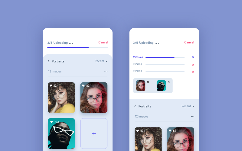
In the above example, the progress bar on top doing the job by indicating 3 out of 5 images are uploaded. Here the user is well aware of the progress and can wait without any hesitation until the process completed. Also, the user can tap on the progress bar and see the detailed upload status view. In a scenario where there are no such indications of progress, the user might get confused and would tap on the back button or reload. We can easily avoid such frustrating situations by making the system status visible.
Interaction with the user is a key point in product success. To make interaction easier between users and product, try using the components that are familiar to them. We can make that done by matching the design system with the real world. We can use texts, icons, illustrations, etc: that are familiar to the end users so that they can relate them with everyday things and easily understand the purpose of each element.
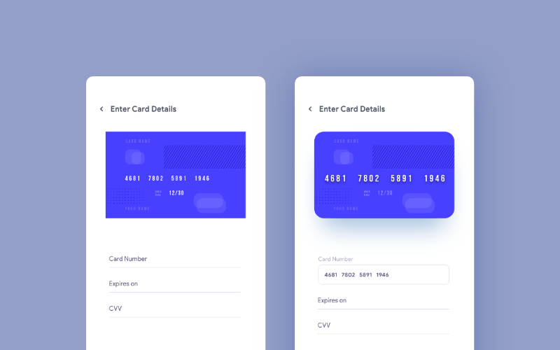
In this example, we can see a help animation/image on the top for the screen.
The users can relate these graphics with a real payment card and fill up the details without any confusion even if they are not familiar with net banking. Here we are making things pretty straight-forward and easier.
User needs complete control and freedom over the entire system. The system should help them to undo an action that happened by mistake. Frustrating usability issues would never help to retain users. That is how it is becoming one of the important points in this topic.

In the above example, it shows a success message popup for publishing a profile. It is not just only a success message popup. The undo button in that popup helps the user to go back and set up the profile again if they have done that by mistake.
The basic law of designers life. We should follow the consistency and standard throughout product design. Consistency is not only for colors and button styles, but it is also for the overall experience. Don’t let the users be confused by adding a different kind of experiences on different task flows. If we are choosing popup as a solution to a problem, then use the same solution on all the similar situations. Let them used to it.

This example is a portion of UI guideline of a product. Using Brand Guidelines we can keep the consistency and standard easily.
Users are humans. Humans tend to do mistakes. So we should always keep an eye to avoid those possible mistakes by giving appropriate suggestions and notifications when needed.

In the above example, it shows the password standards which need to follow while setting up the password. So she/he can crosscheck the password with system standard and complete the task successfully in their first attempt itself. Another example of error prevention can be seen in outlook. They will notify us if we forgot to add the attachment. The system will scan the message body and remind us with a message.
Try to minimize the use of the user’s memory. Suggest them the options that they might need. Or remind them to complete a certain task that needs to be done soon. Don’t let the users think too much or recall her/his memory to complete tasks.

The above design is a perfect example for this. Here, the designer has kept the recently viewed item in the home screen and that will remind the user about her/his last searches and items needed to buy. These kinds of approaches would help us to reduce the use of the user’s memory.
The design should be easier to use for all the user groups. Even though we have only one set of a user group, then there would be novice users and experienced ones. We need to satisfy both those categories. We cannot stick to expert users, because all of them were beginners once.

The above example shows how to handle this kind of situations. Here, to duplicate an element, a novice user can go to edit and click Duplicate. But there is a shortcut for the experts. They would press command D and duplicate things quickly. We can see a lot more examples in our daily life. When we installing software, we can be seen two options, Default and advanced installation. Experts will go with advanced installation to remove unwanted services from the software.
This sounds familiar as we are following this as a routine. Aesthetic and Minimalist design is not about adding white space. Its all about giving relevant data and removing all the unwanted things. Grab users attention towards the action need to be done there. Or give exact data that they want to see. Don’t put irrelevant data and elements to confuse the users.
Google.com is a perfect example of aesthetic and minimalist design. Also, have a look at the other search engines to see the difference.
Help the users to identify what is the exact error and suggest a way to get rid of that. If the user is not getting a helping hand on an error, they will definitely move away from the product.

Here in this example, the moment he typed the full username, the system shows that there is no such username. Now she/he can recheck the username and if still the error exists, they can use the recover link. Using that link he can recover or reset the username.
The presence of a user in the help page indicates that our product is not that intuitive(in most cases). But if we still think that our design is perfect, then we need to put more attention towards those kinds of users. This is why help and documentation are very important for better user experience.

As shown in the example, we should categorize different areas in a proper way so that the user can pick and correct area and followed by that find a solution. Also, we can add a FAQ section, to see the possible errors and its solutions from previous users. Adding a button to reach out customer care would be a very good move since some users prefer voice call even before looking at these help docs.
from Medium https://uxdesign.cc/user-experience-is-one-of-the-hottest-topics-in-day-today-designers-life-fb314978e1ff
from UX Collective – Medium https://uxdesign.cc/5-simple-activities-that-will-boost-your-creative-thinking-3869f81ceb88?source=rss—-138adf9c44c—4
Can you spot the differences between these two images?
If you look hard enough, you might notice a few subtle differences:
The image on the right:
The image on the left is a screenshot from Sketch, and the image on the right is a reproduction on iOS. These differences arise when the graphics are rendered. They have the exact same font, line spacing, shadow radius, colors, and gradient attributes — all of the constants are identical.

As you can see, some aspects of the original design can be lost during the conversion from the design file to real code. We’re going to explore some of these details so you can know what to watch for and how to fix them.
Design is critical to a successful mobile app. Especially on iOS, users are accustomed to apps that work well and look good.
If you’re a mobile app designer or developer, you know how important small details are to the end user experience. High-quality software can only come from people who care deeply about their craft.
There are many reasons why apps might not look as good as their original designs. We’re going to investigate one of the more subtle reasons — differences in rendering between Sketch and iOS.
Certain types of user interface elements have noticeable differences between Sketch and iOS. We are going to explore the following elements:
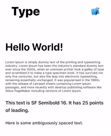
Typography can be implemented in various ways, but for this test I am going to use labels (“Text” element in Sketch, UILabel in iOS).
Let’s look at some of the differences:
The biggest difference in the example above is the location of line breaks. The third grouping of text starting with “This text is SF Semibold” breaks after the word “25” in the design, but after the word “points” in the app. This same problem occurs with the paragraph of text—the line breaks are inconsistent.
Another smaller difference is that the leading (line spacing) and tracking (character spacing) are slightly larger in Sketch.
It’s easier to see these differences when they are directly overlaid:

What about other typefaces? Replacing San Francisco with Lato (a widely used free font), we get the following results:

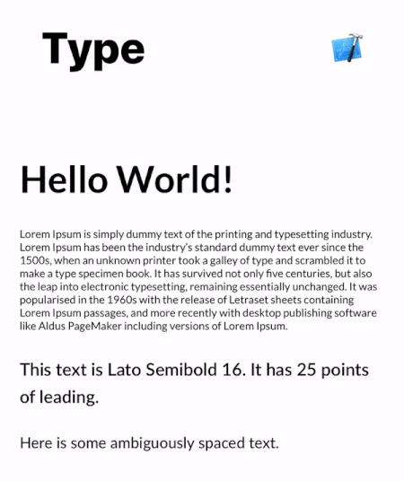
Much better!
There are still some differences in leading and tracking, but these are generally small. Be careful though—if the text needs to align with other elements like background images, these small offsets can be noticeable.
Some of these issues are related to the default iOS font: San Francisco. When iOS renders the system font, it automatically includes tracking based on the point size. This automatically-applied tracking table is available on Apple’s website. There is a Sketch plugin called “SF Font Fixer” which reflects these values in Sketch. I highly recommend it if your design uses San Francisco.
(Side Note: Always remember to make the text box wrap tightly around text in Sketch. This can be done by selecting the text and toggling between “Fixed” and “Auto” alignment, then resetting the width of the text box. If there is any extra spacing, this can easily lead to incorrect values being entered into the layout.)
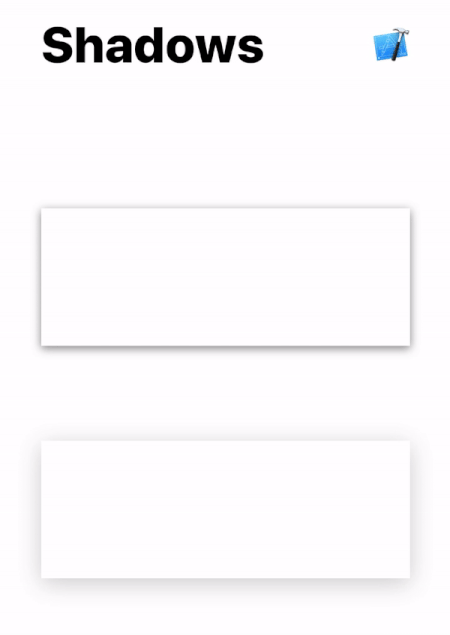
Unlike typography which has universal layout rules, shadows are less well-defined.
As we can see in the image above, shadows in iOS are larger by default. In the examples above, this makes the most difference on the top edges of the rectangles.
Shadows are tricky because the parameters between Sketch and iOS are not the same. The biggest difference is that there is no concept of “spread” on a CALayer, although this can be overcome by increasing the size of the layer that contains the shadow.
Shadows can vary wildly in their difference between Sketch and iOS. I’ve seen some shadows with the exact same parameters look great in Sketch but be nearly invisible when running on a real device.
Shadows are tricky and require manual adjustment to match the original design. Oftentimes, the shadow radius will need to be lower and the opacity will need to be higher.
// old
layer.shadowColor = UIColor.black.cgColor
layer.shadowOpacity = 0.2
layer.shadowOffset = CGSize(width: 0, height: 4)
layer.shadowRadius = 10
// new
layer.shadowColor = UIColor.black.cgColor
layer.shadowOpacity = 0.3
layer.shadowOffset = CGSize(width: 0, height: 6)
layer.shadowRadius = 7
The required changes vary based on size, color, and shape — here, we only need a few minor adjustments.
Gradients prove to be troublesome as well.
Of the three gradients, only the “orange” (top) and “blue” (bottom right) differ.
The orange gradient looks more horizontal in Sketch, but more vertical in iOS. As a result, the overall color of the gradient is darker in the final app than the design.
The difference is more noticeable in the blue gradient—the angle is more vertical in iOS. This gradient is defined by three colors: light blue in the bottom left corner, dark blue in the middle, and pink in the top right corner.

The start and ending points may need to be adjusted if the gradient is angled. Try offsetting the startPoint and endPoint of your CAGradientLayer slightly to account for these differences.
// old
layer.startPoint = CGPoint(x: 0, y: 1)
layer.endPoint = CGPoint(x: 1, y: 0)
// new
layer.startPoint = CGPoint(x: 0.2, y: 1)
layer.endPoint = CGPoint(x: 0.8, y: 0)
There’s no magic formula here*—the values need to be adjusted and iterated until the results visually match.
*Jirka Třečák posted an excellent response with links explaining how the gradient rendering works. Check it out if you want to dive deep into more code!
I built a demo app to easily see these differences on a real device. It includes the examples above, along with source code and original Sketch file so you can tweak the constants to your heart’s content.
This is a great way to increase awareness within your team—just hand them your phone and they can see for themselves. Simply touch anywhere on the screen to toggle bewteen the images (similar to the gifs above).
Get the open-source demo app here: https://github.com/nathangitter/sketch-vs-ios
Don’t assume that equal values imply equal results. Even if the numbers match, the visual appearance may not.
At the end of the day, there needs to be iteration after any design is implemented. Good collaboration between design and engineering is crucial for a high-quality end product.
Enjoyed the story? Leave some claps 👏👏👏 here on Medium and share it with your iOS design/dev friends. Want to stay up-to-date on the latest in mobile app design/dev? Follow me on Twitter here: https://twitter.com/nathangitter
Thanks to Rick Messer and David Okun for revising drafts of this post.
from Medium https://medium.com/@nathangitter/why-your-app-looks-better-in-sketch-3a01b22c43d7