
User Experience is one of the hottest topics in day today designer’s life. To make our product success and stand out from our competitors, we should ensure that we are treating our users in the best way. When it comes to modern-day users, who are much familiar with the latest technologies, it’s more than a visually appealing interface. This is where the term User Experience design step in.
We often choose different UX methods for different projects based on its complexity to get the best solutions. Among these processes, the heuristic review is one of the useful methods to figure out the usability issues and solving it based on its severity. We use ‘usability heuristics’ as guidelines to run this UX process.
Check out my previous blog to know more about heuristic evaluation and its methodologies.
In this blog, I am doing an advanced walkthrough on “Jakob Nielsen’s 10 Usability Heuristics” that are considered as the ideal guidelines for completing a heuristic evaluation. Even though it’s date back to 90s, it’s still relevant and useful.
The system should always show the status of an on-going operation to the users until it is done. So the user will get a clear understanding of the progress of that particular process/activity. Never create a situation where the user is completely confused over certain progress/process.
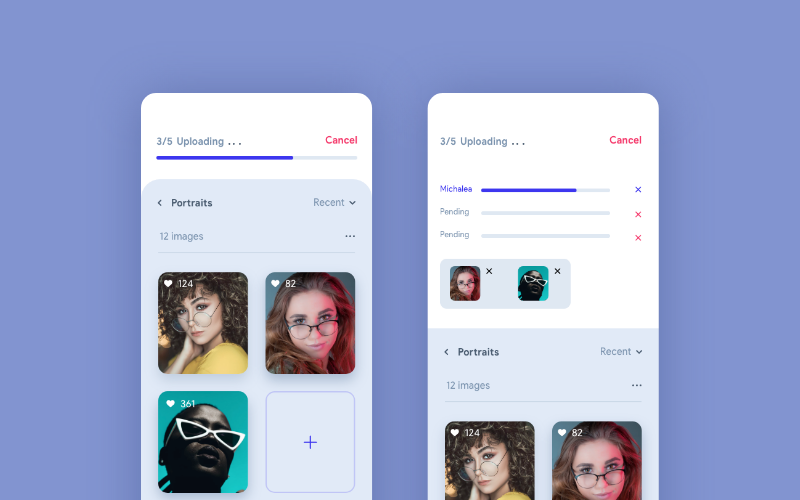
In the above example, the progress bar on top doing the job by indicating 3 out of 5 images are uploaded. Here the user is well aware of the progress and can wait without any hesitation until the process completed. Also, the user can tap on the progress bar and see the detailed upload status view. In a scenario where there are no such indications of progress, the user might get confused and would tap on the back button or reload. We can easily avoid such frustrating situations by making the system status visible.
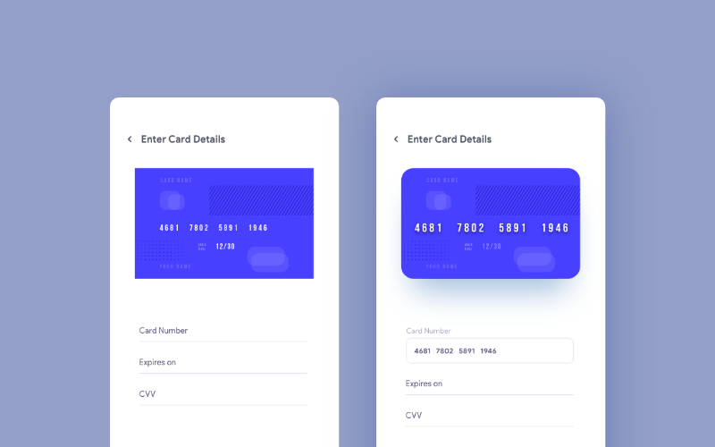
Interaction with the user is a key point in product success. To make interaction easier between users and product, try using the components that are familiar to them. We can make that done by matching the design system with the real world. We can use texts, icons, illustrations, etc: that are familiar to the end users so that they can relate them with everyday things and easily understand the purpose of each element.
In this example, we can see a help animation/image on the top for the screen.
The users can relate these graphics with a real payment card and fill up the details without any confusion even if they are not familiar with net banking. Here we are making things pretty straight-forward and easier.
User needs complete control and freedom over the entire system. The system should help them to undo an action that happened by mistake. Frustrating usability issues would never help to retain users. That is how it is becoming one of the important points in this topic.

In the above example, it shows a success message popup for publishing a profile. It is not just only a success message popup. The undo button in that popup helps the user to go back and set up the profile again if they have done that by mistake.
The basic law of designers life. We should follow the consistency and standard throughout product design. Consistency is not only for colors and button styles, but it is also for the overall experience. Don’t let the users be confused by adding a different kind of experiences on different task flows. If we are choosing popup as a solution to a problem, then use the same solution on all the similar situations. Let them used to it.

This example is a portion of UI guideline of a product. Using Brand Guidelines we can keep the consistency and standard easily.
Users are humans. Humans tend to do mistakes. So we should always keep an eye to avoid those possible mistakes by giving appropriate suggestions and notifications when needed.

In the above example, it shows the password standards which need to follow while setting up the password. So she/he can crosscheck the password with system standard and complete the task successfully in their first attempt itself. Another example of error prevention can be seen in outlook. They will notify us if we forgot to add the attachment. The system will scan the message body and remind us with a message.
Try to minimize the use of the user’s memory. Suggest them the options that they might need. Or remind them to complete a certain task that needs to be done soon. Don’t let the users think too much or recall her/his memory to complete tasks.

The above design is a perfect example for this. Here, the designer has kept the recently viewed item in the home screen and that will remind the user about her/his last searches and items needed to buy. These kinds of approaches would help us to reduce the use of the user’s memory.
The design should be easier to use for all the user groups. Even though we have only one set of a user group, then there would be novice users and experienced ones. We need to satisfy both those categories. We cannot stick to expert users, because all of them were beginners once.

The above example shows how to handle this kind of situations. Here, to duplicate an element, a novice user can go to edit and click Duplicate. But there is a shortcut for the experts. They would press command D and duplicate things quickly. We can see a lot more examples in our daily life. When we installing software, we can be seen two options, Default and advanced installation. Experts will go with advanced installation to remove unwanted services from the software.
This sounds familiar as we are following this as a routine. Aesthetic and Minimalist design is not about adding white space. Its all about giving relevant data and removing all the unwanted things. Grab users attention towards the action need to be done there. Or give exact data that they want to see. Don’t put irrelevant data and elements to confuse the users.
Google.com is a perfect example of aesthetic and minimalist design. Also, have a look at the other search engines to see the difference.
Help the users to identify what is the exact error and suggest a way to get rid of that. If the user is not getting a helping hand on an error, they will definitely move away from the product.

Here in this example, the moment he typed the full username, the system shows that there is no such username. Now she/he can recheck the username and if still the error exists, they can use the recover link. Using that link he can recover or reset the username.
The presence of a user in the help page indicates that our product is not that intuitive(in most cases). But if we still think that our design is perfect, then we need to put more attention towards those kinds of users. This is why help and documentation are very important for better user experience.

As shown in the example, we should categorize different areas in a proper way so that the user can pick and correct area and followed by that find a solution. Also, we can add a FAQ section, to see the possible errors and its solutions from previous users. Adding a button to reach out customer care would be a very good move since some users prefer voice call even before looking at these help docs.
from Medium https://uxdesign.cc/user-experience-is-one-of-the-hottest-topics-in-day-today-designers-life-fb314978e1ff