These days, we’re spoiled for choice when it comes to remote user research. The vast array of tools available at many different price points can be overwhelming — especially since many of the descriptions of tools are virtually indistinguishable.
Every remote-research tool promises to deliver user insights, but they do so in very different ways. If you’re trying to choose a tool, this list can help you understand exactly what you’re getting and make sure the service you pick is a good fit for your research needs.
All of the user-research tools compared in this article allow you to do studies that are:
Remote: Participants can be located anywhere, the entire study is completed online.
Unmoderated: Participants complete the study on their own, without a researcher guiding the session.
Task-based: Participants receive instructions to complete specific tasks.
Behavioral: Users’ actions are recorded by the tool so you can tell what people did and whether they successfully completed the tasks.
Interactive: Participants can test on live sites or interactive prototypes rather than just seeing a static image.
Do-it-yourself: You can plan and carry out your own studies, without using the tool’s research-consultancy services.
Video recordings capture sceen activity and think-out-loud narration by the test participant
Metrics are recorded for dimensions such as time spent, success rate, satisfaction, and perceived difficulty
What it reveals
What participants did and why they did it
How common certain problems, behaviors, and opinions are among participants
Challenges
Unstructured video recordings are time-consuming to watch and analyze.
Metrics do not reveal causes of behavior; low participant motivation or inaccurate self-reported data can cause misleading metrics
Useful when you need to…
Understand why a problem is happening and get ideas for how to fix it
Evaluate new designs when you have no idea what problems users might encounter
Inspire empathy for users within your team or organization
Track usability over time
Quickly and accurately assess precise frequency of problems
Quickly assess subjective participant reactions of a large group of participants
Persuade stakeholders who prefer quantitative data
Make sure you have a clear idea of what you hope to achieve through your research. Then you’ll be able to decide whether you need qualitative recordings, quantitative data, or both.
Tools and Data Types
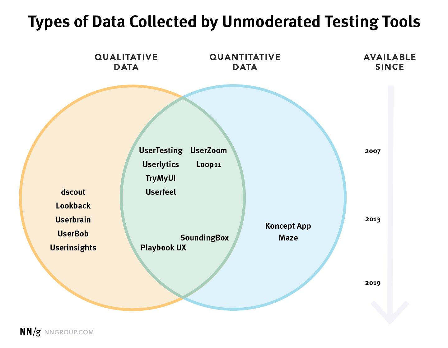
The chart below lists 15 different tools which can be used to conduct unmoderated usability testing. The position of each tool in this chart indicates both the type of data collected by the tool and how long the tool has been in existence. Generally speaking, tools which have been available longer are more mature, with more robust features. Also, though there is never any guarantee, a longer-lasting service is less likely to go under in the middle of your study and make any already-collected data evaporate into a lost corner of the cloud.
The diagram above indicates several unmoderated-testing tools which combine both types of data collection. The features listed for these tools are quite similar, so it can be difficult to distinguish between tools by reading their descriptions. Despite these surface similarities, there are important differences between these services, which are easier to understand if you’re aware of the history of each system. UserZoom and Loop11 initially focused on quantitative metrics, and later added qualitative recordings; while UserTesting, Userlytics, and Userfeel initially focused on video recordings and later added quantitative metrics. As you might expect, the tools’ original functionality tends to be more robust, while the newer features are more limited. (These distinctions are represented in the chart above by the placement of each tool’s name, which is positioned closer to its original data type.)
It’s also worth noting that the metrics-only tools included in this diagram, Maze and KonceptApp, are both designed to be used for testing prototypes and are not suitable for testing live websites or applications. Although they can simulate interactions, such as letting test participants click a link and move to another screen, this behavior requires you to actually build or import an interactive prototype.
Feature Comparison
Once you’ve determined the type of data you want to collect, review the precise capabilities of the tools you are considering. Some features which may be important to the design of your study are listed in the table below.
Recruiting
Study Design & Setup
Qualitative Data
Quantitative Data
Participant panel
Set quotas for multiple types of users
Custom screening question(s)
Multiple Languages
Bring your own users
External panel integration
Test websites (desktop, mobile, and prototype)
Test native mobile apps
Test static wireframes or screens
Separate instructions for each task
Persistent access to task instructions
Custom welcome & final screens
Copy a past study
Branching (skip logic) to personalize tasks
Randomize task order
Professional research services available
Shared projects for team collaboration
Supports moderated testing
Record screen & audio
Record face
Timestamped notes
Export individual session notes
Export all project notes
Download individual recordings
Download entire project
Share recordings via url
Produce video highlights compilation
Automatic transcription
Browse video thumbnails
Simple rating questions
Custom ratings and written questions
Task time
Filter out speeders and cheaters
Rate of task abandonment
Data export (csv or xls)
Data-visualization charts
Success rate by url or click location
Click heatmaps
Clickpath across screens
Features that you may need to consider when selecting remote unmoderated usability-testing software
This article has focused on tools for unmoderated usability testing, but that’s not always the right research method. For example, moderated usability testing (whether in-person or remote) is more appropriate for evaluating an early-stage prototype or to identify usability issues in interface or tasks that are so complex that it’s necessary to provide personalized directions and ask followup questions to fully understand users’ behavior. Also, all participants in unmoderated studies are people who were willing and able to install a browser extension or application and carry out a fairly complicated online interaction. If your target audience includes a lot of users who wouldn’t opt to participate in this type of research, you’ll need to use other methods to find and observe these people.
Summary: Many platforms for unmoderated usability testing have similar features; to choose the best tool for your needs, focus on the type of data that you need to collect for your goals.
These days, we’re spoiled for choice when it comes to remote user research. The vast array of tools available at many different price points can be overwhelming — especially since many of the descriptions of tools are virtually indistinguishable.
Every remote-research tool promises to deliver user insights, but they do so in very different ways. If you’re trying to choose a tool, this list can help you understand exactly what you’re getting and make sure the service you pick is a good fit for your research needs.
All of the user-research tools compared in this article allow you to do studies that are:
Remote: Participants can be located anywhere, the entire study is completed online.
Unmoderated: Participants complete the study on their own, without a researcher guiding the session.
Task-based: Participants receive instructions to complete specific tasks.
Behavioral: Users’ actions are recorded by the tool so you can tell what people did and whether they successfully completed the tasks.
Interactive: Participants can test on live sites or interactive prototypes rather than just seeing a static image.
Do-it-yourself: You can plan and carry out your own studies, without using the tool’s research-consultancy services.
Video recordings capture sceen activity and think-out-loud narration by the test participant
Metrics are recorded for dimensions such as time spent, success rate, satisfaction, and perceived difficulty
What it reveals
What participants did and why they did it
How common certain problems, behaviors, and opinions are among participants
Challenges
Unstructured video recordings are time-consuming to watch and analyze.
Metrics do not reveal causes of behavior; low participant motivation or inaccurate self-reported data can cause misleading metrics
Useful when you need to…
Understand why a problem is happening and get ideas for how to fix it
Evaluate new designs when you have no idea what problems users might encounter
Inspire empathy for users within your team or organization
Track usability over time
Quickly and accurately assess precise frequency of problems
Quickly assess subjective participant reactions of a large group of participants
Persuade stakeholders who prefer quantitative data
Make sure you have a clear idea of what you hope to achieve through your research. Then you’ll be able to decide whether you need qualitative recordings, quantitative data, or both.
Tools and Data Types
The chart below lists 15 different tools which can be used to conduct unmoderated usability testing. The position of each tool in this chart indicates both the type of data collected by the tool and how long the tool has been in existence. Generally speaking, tools which have been available longer are more mature, with more robust features. Also, though there is never any guarantee, a longer-lasting service is less likely to go under in the middle of your study and make any already-collected data evaporate into a lost corner of the cloud.
The diagram above indicates several unmoderated-testing tools which combine both types of data collection. The features listed for these tools are quite similar, so it can be difficult to distinguish between tools by reading their descriptions. Despite these surface similarities, there are important differences between these services, which are easier to understand if you’re aware of the history of each system. UserZoom and Loop11 initially focused on quantitative metrics, and later added qualitative recordings; while UserTesting, Userlytics, and Userfeel initially focused on video recordings and later added quantitative metrics. As you might expect, the tools’ original functionality tends to be more robust, while the newer features are more limited. (These distinctions are represented in the chart above by the placement of each tool’s name, which is positioned closer to its original data type.)
It’s also worth noting that the metrics-only tools included in this diagram, Maze and KonceptApp, are both designed to be used for testing prototypes and are not suitable for testing live websites or applications. Although they can simulate interactions, such as letting test participants click a link and move to another screen, this behavior requires you to actually build or import an interactive prototype.
Feature Comparison
Once you’ve determined the type of data you want to collect, review the precise capabilities of the tools you are considering. Some features which may be important to the design of your study are listed in the table below.
Recruiting
Study Design & Setup
Qualitative Data
Quantitative Data
Participant panel
Set quotas for multiple types of users
Custom screening question(s)
Multiple Languages
Bring your own users
External panel integration
Test websites (desktop, mobile, and prototype)
Test native mobile apps
Test static wireframes or screens
Separate instructions for each task
Persistent access to task instructions
Custom welcome & final screens
Copy a past study
Branching (skip logic) to personalize tasks
Randomize task order
Professional research services available
Shared projects for team collaboration
Supports moderated testing
Record screen & audio
Record face
Timestamped notes
Export individual session notes
Export all project notes
Download individual recordings
Download entire project
Share recordings via url
Produce video highlights compilation
Automatic transcription
Browse video thumbnails
Simple rating questions
Custom ratings and written questions
Task time
Filter out speeders and cheaters
Rate of task abandonment
Data export (csv or xls)
Data-visualization charts
Success rate by url or click location
Click heatmaps
Clickpath across screens
Features that you may need to consider when selecting remote unmoderated usability-testing software
This article has focused on tools for unmoderated usability testing, but that’s not always the right research method. For example, moderated usability testing (whether in-person or remote) is more appropriate for evaluating an early-stage prototype or to identify usability issues in interface or tasks that are so complex that it’s necessary to provide personalized directions and ask followup questions to fully understand users’ behavior. Also, all participants in unmoderated studies are people who were willing and able to install a browser extension or application and carry out a fairly complicated online interaction. If your target audience includes a lot of users who wouldn’t opt to participate in this type of research, you’ll need to use other methods to find and observe these people.
The information presented in list items is crucial for users trying to pick out the products they’re interested in.
However, once users are exposed to product attributes in the list item info, we observe in usability testing that many users will then want to filter the product list by some of these attributes. Yet our UX benchmark shows that 38% of e-commerce sites don’t have filters for all displayed product listing info.
As a result, users are often left with massive, intimidating product lists — and some will simply abandon because of the perceived difficulty in being able to zero in on a suitable product. Despite the severity of the issue, 38% of sites don’t provide filtering options for even the product attributes they include as list item info.
In this article, we’ll discuss the test findings from our large-scale usability study related to providing filters for all displayed list item info. In particular, we’ll discuss:
Why filtering is so crucial to users’ ability to find suitable products
How failing to provide filters for all the displayed types of list item info can lead to abandonments
Providing filters for all displayed list item info
Why Filtering Is Crucial to Finding Products
At Costco, filters provided for laptops can help users narrow down the product listing so they can focus only on those products that are suitable for them.
Filtering is about empowering users to take a large, generic product listing and narrow it down to a small, manageable selection of products that are uniquely tailored to their needs and interests.
When done right, filters enable users to see only the products that match their individual needs and interests. It’s the e-commerce equivalent of walking into a physical store and asking the salesperson for “a brown men’s leather jacket in size medium.”
While there are some “basic” filters that should be provided for nearly all products (e.g., “Price”, “Color”, “Average Customer Rating”), most of the time users are interested in filtering the product listing across category-specific attributes. For example, filtering a list of cameras by camera-specific attributes such as megapixels, zoom level, and lens mount — attributes that aren’t particularly meaningful to other types of electronics, such as TVs (which in turn have attributes that are important to their respective category without being relevant to cameras).
Providing both universal and category-specific attributes in the list item info is a great first step toward helping users find products of interest (yet 46% of sites display too little or poorly chosen content).
However, by virtue of displaying the information in front of the user in the product list item info, users are reminded that the product attribute is important. Or, in the case of users new to the domain, they are taught that the attribute is important. The very display of the attribute then further encourages users to filter by it.
How Missing Filter Types Can Result in Abandonments
“They need to have a filter for ‘Headphones’. And a filter for ‘Accessories’. Then have ‘Earphones’. They’d make life a lot easier…it’s so all over the place.” A user at Newegg, confronted with a massive 50-page product listing of headphones, earbuds, and accessories (first image), tried to filter to only see headphones. However, that filter wasn’t available (second image), despite the product type being included in the list item titles (e.g., “JVC Gumy Plus Inner Ear Headphones with Remote & Mic”). She abandoned out of frustration.
“Uh…okay. The filters aren’t that helpful. They’re not giving me headphone-specific filters for things like ‘Over-the-Ear’, ‘Under the Ear’, ‘Noise Cancellation’, ‘Noise Isolating’. I’m just getting a generic set.” A different user at Newegg became frustrated when he tried to find filters for product features (first image) that were specifically called out in the list item info (second image). He ended up closing the filter menu without selecting any, and struggled to find a relevant product in the product listing.
“All these wheeled ones I don’t like at all…there are so many!…I wouldn’t shop here.” A user at Overstock was looking to reduce clutter in the product listing (first image) by narrowing the list to only nonwheeled backpacks. However, there wasn’t a filter for this attribute (second image), and he abandoned the site.
During testing, as users realized foundational filtering types were missing, it led to an excessive amount of time being spent trying to find the filter type, which “must be there somewhere”.
Users simply can’t understand why, if a product attribute is “called out” by being displayed as part of the product listing item info, there wouldn’t be a way to filter to see only those products that contain that attribute (or, conversely, only those products that don’t contain that attribute).
Thus, users will often scan the filtering interface — multiple times if there are a lot of filters — for the filter they’re interested in. This leads to wasted effort and frustrated users if in the end the filter is simply unavailable.
On mobile, this issue is often worse, as filtering is typically hidden, and the viewport is smaller. Users must first find where filters are, open it (along the way likely experiencing hit-area issues or laggy features), then scan the available filters in a much smaller viewport than on desktop. Furthermore filters are often collapsed themselves in the filter interface, and thus it may be many taps (and many minutes) before a user knows for certain that a filter for a list item attribute doesn’t exist.
Once users realize that they have to browse hundreds or even thousands of irrelevant products, with only a handful of relevant items mixed in-between, many simply abandon.
Provide Filters for All Displayed List Item Info
In short, any piece of information that is so important that it’s included in the list item is also so important that users will need a way to filter by it. It’s therefore crucial to provide filters for all displayed list item info.
These include basic attributes, such as price and brand, which often can be provided sitewide. In addition, category-specific filters must also be provided for each product type carried. For example, sleeping bag products will need a “Temperature-Rating Filter”, while furniture will need a “Color” filter, hard drives a “Capacity” filter, etc.
When determining what category-specific filtering types are needed, one can (either programmatically or manually) look through the attributes included in the list items within each category.
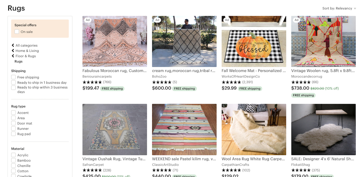
At Etsy, while there are many category-specific filters provided for the “Rugs” category, there isn’t a filter for a crucial attribute: size. Some users, seeing a wide range of rug sizes in the list items, would attempt to narrow the product listing to only those rugs that are a suitable size — but there’s no way to do that using the available filters.
It’s important to note that a site of course should have more filtering options than just the attribute types included in the list items. But those product attributes included in the list item are so foundational that they absolutely must be filters — they cannot be omitted without hurting the user’s filtering experience significantly.
Despite the severity of not including filters for all displayed list item info, 38% of sites in our benchmark don’t. Moreover, this was 42% of sites back in 2015 when we first started to track the issue — indicating that this is a persistent problem for e-commerce sites.
Furthermore, missing filters may be a symptom of an even more foundational issue of poor product data. To offer harmonized filtering values, the vendors’ product data and branded feature names need to be post-processed into a “common name” product attributes that can then be used to filter product listings and search results.
This article presents the research findings from just 1 of the 690+ UX guidelines in Baymard Premium – get full access to learn how to create a “State of the Art” user experience for product lists, filtering and sorting.
Authored by Edward Scott. Published on September 17, 2019.
User experience research, delivered twice a month
Join 19,000+ readers and get Baymard’s research articles by RSS feed or e-mail:
Popular Articles · a listing of our most popular research-based articles on e-commerce UX
UX Benchmark · benchmark with case studies of 60 major e-commerce sites ranked by e-commerce UX performance
Page Designs · navigate 3,974 manually annotated full-page screenshots categorized by page type
Products & Services:
Baymard Premium · full access to all 747 research-based design guidelines, UX case studies, page designs, and review tool ($720-$3,000 / year, based on plan)
Audit Service · get an in-depth analysis of your site’s UX, conducted by a Baymard researcher ($1,900-$9,700 based on scope)
from baymard.com https://baymard.com/blog/have-filters-for-list-item-info
Human computer interaction and user experience design have always relied on analogies and metaphors to bring attention to technology’s features and affordances. While analogies and metaphors are closely related, it’s smart to understand the differences. The distinctions among metaphors and analogies will also help to underscore why you may want to use one and not the other in certain situations.
Metaphor is about using something from another space to referring to something you actually designing.
Do: Make the unfamiliar familiar (Desktop metaphor)
Metaphors help us explain something new and unfamiliar in terms of the familiar. The most famous metaphor in human computer interaction and user experience design is Alan Kay’s “desktop metaphor”. The desktop metaphor moved us from command line commands to direct manipulation with digitally rendered objects.
The original 1984 Mac OS desktop that popularized the new graphical user interface.
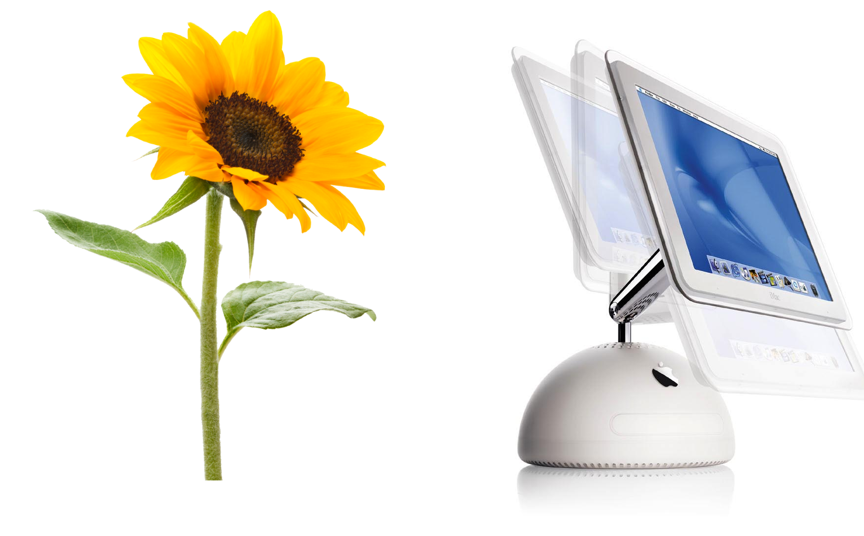
Do: Awake positive associations (Apple iMac)
With metaphors you can trigger emotions. When Apple designed a second generation of iMac, Steve Jobs and Johny Ive were walking though the garden and trying to image what the next generation would look like. Steve noticed a sunflower and suggested that the second generation should look like a sunflower. If you look at the picture below, you notice the way the screen can be maneuvered (the way it can be tilt) makes it look like a sunflower.
Using a metaphor of a sunflower makes an iMac feel more human.
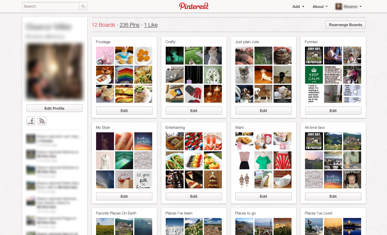
Do: Persuade people (Pinterest)
If you offer a product that is unlike anything out there, you may need to describe it at least partly in terms of something customers already understand. Pinterest, which reached 10 million users faster than any other social networking site, revolves around the metaphor of a pin board. Users “pin” photos they find on the web and organize them into topical collections. This metaphor actually foster creative thinking.
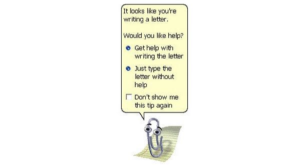
Picking a design metaphor is really hard. There is always a possibility to pick a design metaphor that can go terribly wrong. And we all know a bad metaphor can lead one astray. Microsoft Clippy was one of them. Clippy is famous for being one of the worst user interfaces ever deployed to the mass public. It turned out to be one of the most unpopular features ever introduced. Clippy reminds us that if we make metaphors too real, if we take them too far, they can become troublesome.
Microsoft Clippy was annoying animated paperclip that popped-up in the corner of the screen in Microsoft Word and completely distract your flow.
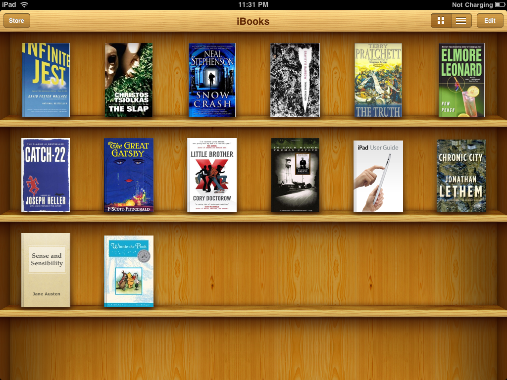
Don’t: Blindly mimic a real-world precedent (Apple iBooks)
Apple’s iBooks is a prime example of that. iBooks used a bookshelf design, complete with 3D shelves and wood textures. The bookshelf metaphor was intended to help users transfer previous knowledge about bookshelves (as a place to store and organize physical media) to the digital environment. The shelves and wood textures are irrelevant to the app’s functionality but were supposed to reinforce the metaphor. Apple later removed the skeuomorphic bookshelf design from the UI.
Apple iBooks use a familiar and understandable metaphor of a pine-wood bookshelf to give the user an understanding of what is being shown and to be able to relate to it.
Analogy is comparing two things of partial similarity often from the same category. The difference between analogy and metaphor is that metaphor is often reference something outside of the category.
Do: Seeing the familiar in a different light (Nest)
Human beings continually and naturally draw analogies as a way of making sense of the world. Analogies help us see the familiar in a new light, which in turn, enables us to generate novel solutions to problems. One good example is Nest which is using analogy in its thermostat design. Basically, the design is referring to the original Honeywell thermostat: its round and you can rotate it to configure your temperature. Nest could choose from a merative other ways to actually present its functionality, but they’ve choose this one. This made Nest thermostat look “strangely familiar.”
Honeywell’s original, iconic round thermostat (left) and Nest thermostat (right). Novel technologies, all described in terms of something comfortably familiar.
Do: Help people understand new concepts (Facebook)
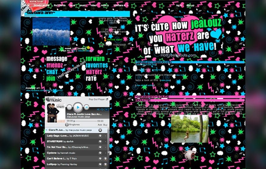
Our minds constantly, unconsciously compare new concepts to things we already know, as a way of understanding them. We look for similarities between our past experiences and any new situation to help us understand the new products. Before there was Facebook, the social media juggernaut which is changing how we communicate — and might change the face of media — there was MySpace. MySpace was targeted at the same audience and was to market long before Facebook. But there was a huge problem with MySpace — profile pages looked a bit odd for many users. Also MySpace allowed users to customize their profile. The final result of this you can see in example below.
A typical MySpace profile page
Facebook took quite orthogonal approach. It used an analogy with printed student profiles. Since many people had an experience with this type of data, this made Facebook very understandable and friendly for the majority of users.
Facebook used an analogy with a physical profile page for user digital profile.
Using symbols like metaphors and analogies for conveying meaning simplifies what you want to say. Metaphor and analogies aren’t just useful tools for educating and assisting users, they are an alchemy that transforms usable content into richly influential content and good products into great products.
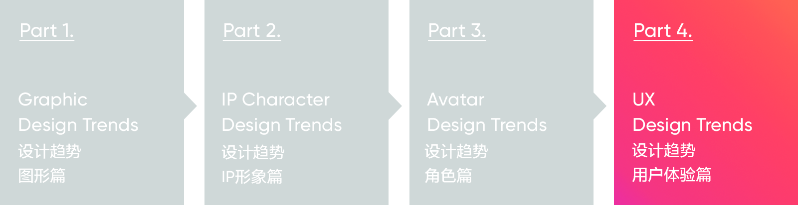
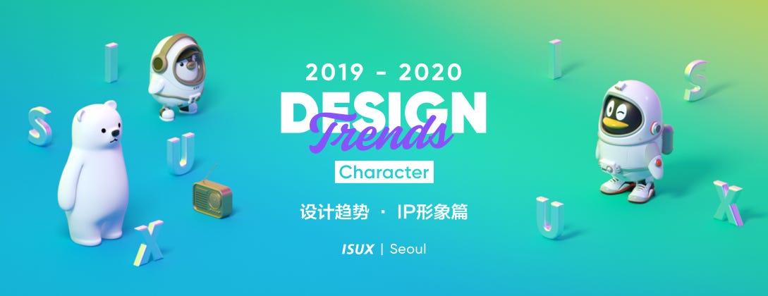
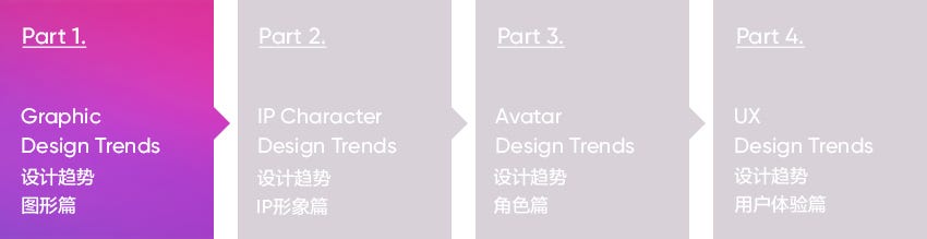
In this article, we will share the last part of design trends: “the UX design trend”.
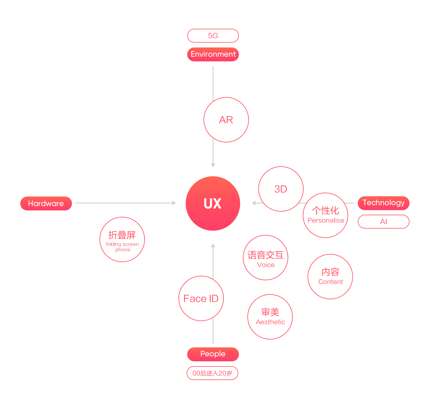
User experience is the feelings of users when using products, under the joint action of products, people and the environment. As technologies develop, and new products and services emerge in an endless stream, the behavior and psychology of consumers are constantly changing. We will analyze and summarize the user experience trends from four latitudes: technology, hardware, environment and users. In this changeable industry, we have to understand these trends when we are designing and improving new designs, and preparing for the upcoming future.
In order to better understand why there are these trends, we have summarized some signals from the objective conditions that influence the trend:
2019 is the first year of 5G
The latest research from Cisco shows that, nearly 12% of the world’s mobile data traffic comes from 5G connections in 2022. The 5G extreme high rate makes the content recommendation more personalized and precise. The Internet of everything will bring more intelligent terminals and more subdivision scenarios, and AR will have more application scenarios.
The Post-00s entering 20 years old in 2019
Their characteristics are more diverse, and there are a thousand Hamlets in a thousand people’s eyes. They like to be more social and interactive, and content is a tool that motivates them to interact and invest more time and money in areas of interest.
AI technology accelerates landing and expands applications
In recent years, AI technology has been widely used in mobile internet. The research report of artificial smart phone indicates that the most commonly used AI functions of consumers are voice assistant, face unlocking, intelligent map, smart shooting and beautifying. The core application scenario technology surrounding by voice and vision will continue to be upgraded.
The differentiation of smart phones
The emergence of the full screen, Face ID gradually replaced the Touch ID; major mobile phone manufacturers also tried to innovate in the form of products, launched a folding screen phone.
Internet products have switched from popularization to personalization, and more and more products are finding new chances via targeting segmentation. The design has changed from the experience of homogenization to a pursuit of personalization and innovation. Designers have to understand the target population that is completely different from their own, conduct segmentation user researches, and improve the product values by excellent user experience to retain users.
In the background of big data, there are multiple individual interests, and with the technical development of machine learning and artificial intelligence, products should focus more on personalized recommendations.
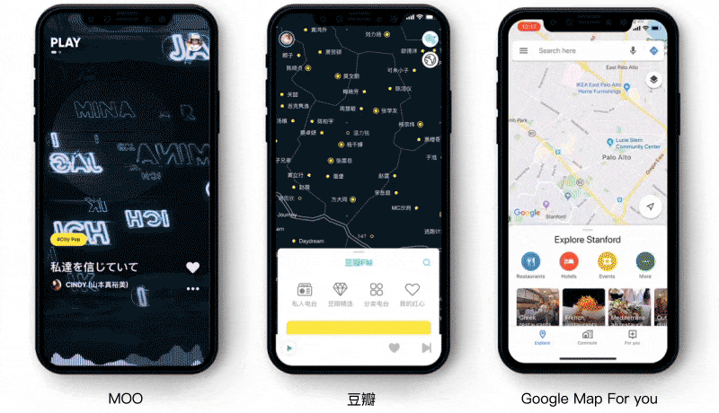
The “More understand you” information stream does not need users to search for songs they like from a bunch of song lists. Douban music map and Google Map For you to make your preferences clear.
Users are often using their phones in different places, and scenarization life characteristics can be perceived by internet devices. Designers need to perceive the current scene of users, and design accurately by understanding the requirements of the current scene, in order to improve the sense of surprise and happiness.
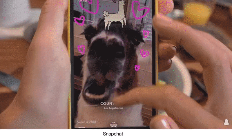
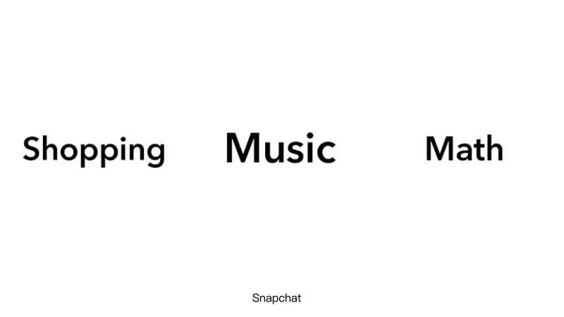
Snapchat can recognize the locations of where people are photographing in a party, and then they can book a taxi to this place online in the app.
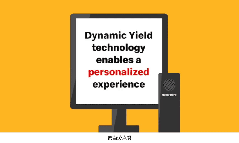
McDonald’s has a personalized recommendation technology, which can allow the restaurant to adjust the menu according to the weather, time and order records of consumers.
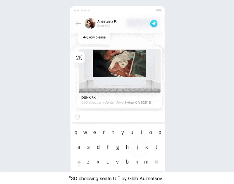
Users can experience the real viewing angle of the seat when they choose a seat in the cinema. The app will provide the ticket QR code when a user has nearly arrived at the cinema.
As AI voice technologies rapidly popularize, which helps people change habits and concepts, the users are increasingly using voice interaction. According to the report from ComScore, 50% of all searches will be voice searches in 2020; and 72% of users who have a voice assistant said that this has become part of their lives. Lots of tech-companies show their own smart speaker, and AI devices have changed the interaction with interfaces from GUI to VUI, and it doesn’t rely on the touch screen input, and provides the no navigation, no buttons, and no menus interfaces. Currently, domestic AI speakers are still a relatively primitive AI, and are often called by users as an artificial foolish voice system.
With the continuous development of artificial intelligence and machine learning, Google’s intelligent voice assistant has evolved rapidly. From the Continued Conversation published at last year’s I/O, users do not have to say ‘Hi Google’ for every instruction, and this year, the users do not need to say wakeup words, but just pick up the phone and let it help them.
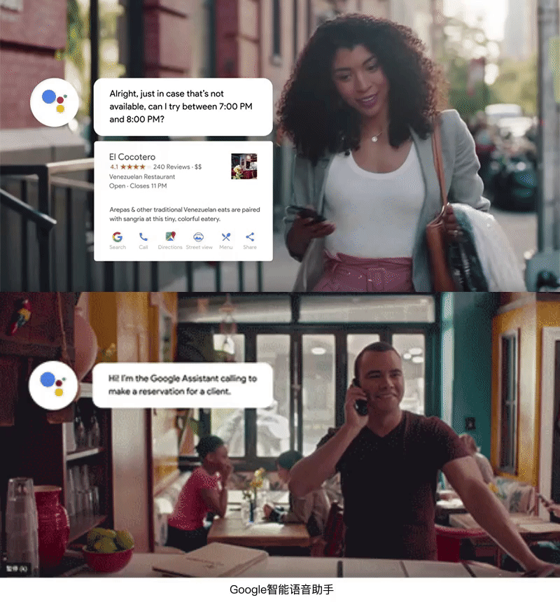
Released last year, Google Duplex can call a restaurant or a barbershop to make a booking for you. This year, it can help you rent a car, reply to messages, find photos to share with friends, write emails, and do other cross-app tasks.
The technological advancement will inevitably lead to efficiency improvement, as AI can more and more completely understand the highly personalized requirements put forward by users, and the voice interaction can be as natural as a human’s, and it can fast process the multi-tasks that are cross-app as well. VUI can reduce user-operating costs and shorten the operation process chains, and it becomes the daily “assistant” of the users.
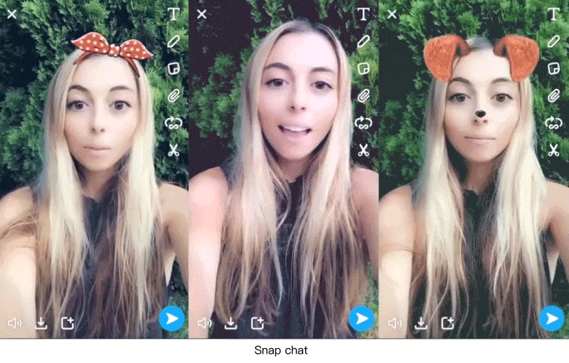
For the user, the use of voice is not only its convenience, but entertainment is also one of the important factors. Short videos are complemented in voice interaction and speech recognition. Snapchat introduces a sound filter that not only responds to sound volume, but also recognizes voice commands and then triggers corresponding animations.
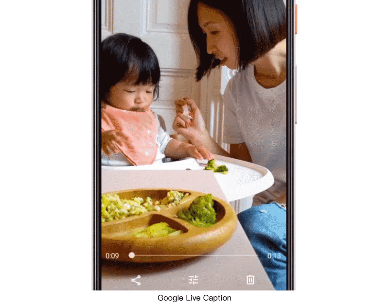
Live Caption voice recognition technology from Google converts video voice content into text subtitles and displays them in the conversation interface. It also recognizes keywords and forms text links, and then users can click and jump directly.
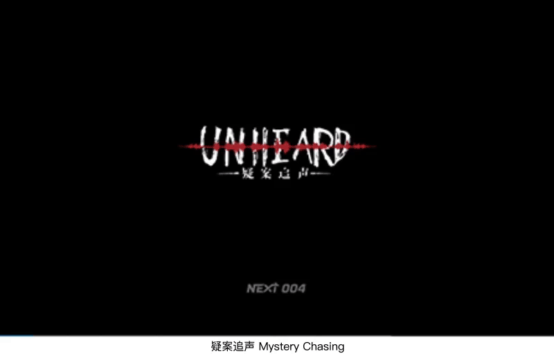
With the constant rise of the voice-controlled game and voice social media, voice makes the interaction more diverse. Tencent NEXT new work “Mystery Chasing” expresses the story with sound, listens to the sound and makes the reasoning and solve the case, and uses the sound to create an immersive experience.
Login app authentication is optimized from the previous “user name + password” mode to get the mobile phone dynamic verification code. Identity verification is not easy to use in the experience. The receiving and inputting of the verification code requires the user to spend a certain amount of time and effort. The appearance of full-screen phones has replaced Touch ID with Face ID. As the full-screen devices become more popular, more and more apps will be added with face recognition authentication, to achieve real-time and a more accurate one-click login.
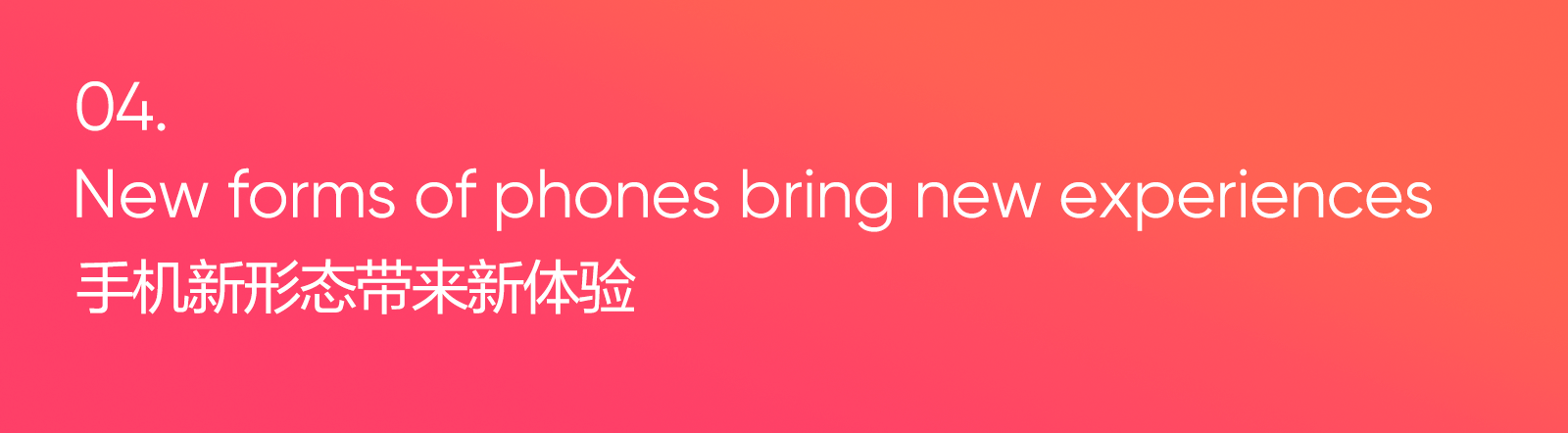
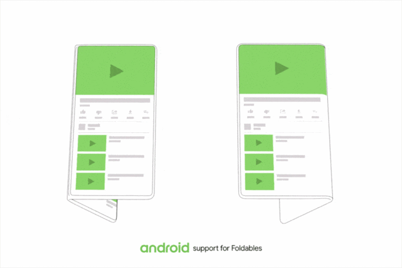
In order to mobilize the enthusiasm of consumers, the mobile phone manufacturer has developed it products from the full screen, lifting camera, and double-sided screen to the recent folding screen, and the emergence of new forms of mobile phones will bring a different operating experience.
A foldable screen can make the back of the phone become an additional interactive space, which is convenient for the user, as they can use two screens at the same time for different app operations. For example, a user is playing a game, meanwhile without switching out of the game the user can be directly turning over the screen to process social messages.
Foldable screen expansion can make the space bigger, and has an app running in the smaller screen. The screen can automatically adjust the size to match large layout, and show more functions. It can also perform multi-window operations, to avoid switching back and forth frequently between multiple applications.
The appearance of full-screen phones allows gestures operation to replace physical buttons.With the appearance of a folding-screen, the operation of a dual-screen will have more gesture operations, and it is necessary to simulate the natural, customary gestures of the person in the devices.
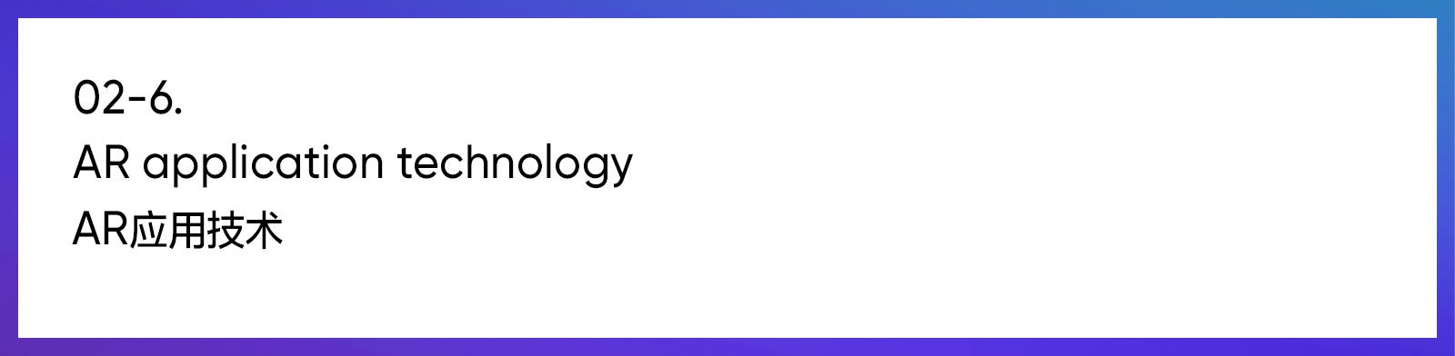
AR technology will play more of a valuable role with 5G and create more new scenarios. People can integrate the original fictional digital world into the real physical world via AR. According to the Gartner survey in 2018, about 46% of retailers plan to integrate AR/VR technology into their shopping experience in 2020.
Snapchat can use the camera to scan physical objects, display Amazon’s purchase links, and scan songs or math problems.
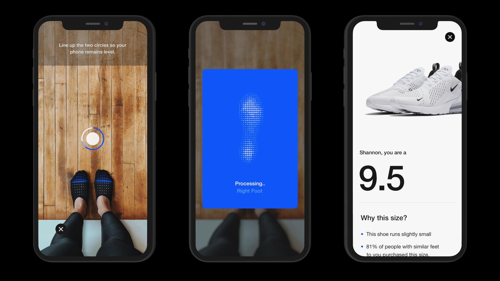
The “Scan” of the Nike app can fully scan and evaluate feet, and displays the length and width of the left foot and the right foot. According to the selected sports shoes, the most suitable shoe size will be recommended.
AR makes objects in the digital world more figurative. The user can put the painting into the real scene through AR when they want to search for a painting and want to buy one. The painting can be set in a real scenario via AR, and the user can check out the size, and color and whether it matches their home style.
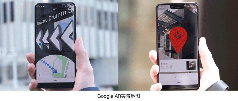
Google Maps provides AR real-world navigation. The top area of the screen will show the real scene content, while the bottom shows the digital map, and there is a large 3D arrow to guide the orientation. The interactive behavior of AR simulates user behavior in the real world, allowing users to quickly understand how to use it. Therefore, the core information needs to be transmitted through the simplest simulation of the real environment. The design of 3D elements can focus on visually guiding user operations, and produce physical effects, gravity and inertia simulation in real life, by making the 3D elements look more realistic and natural.
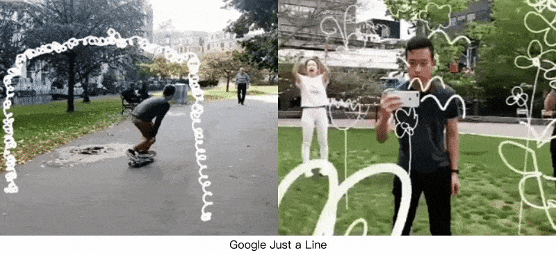
Google provides the first app, which supports the multi-user AR interaction, “Just a Line”, according to shoots through the camera, and then taps the screen to draw, and draws the picture you want to express.
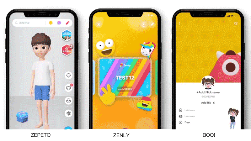
In addition to games, there are many products in the 3D display style, such as “ZEPETO” and “IMVU”, which use 3D Avatar to customize the image for users; “BOO!” uses 3D characters as interface design elements, and “ZENLY” uses the gyroscope effect on the interface card to make the card have a stereoscopic effect change. 3D techniques have been used more frequently in product design.
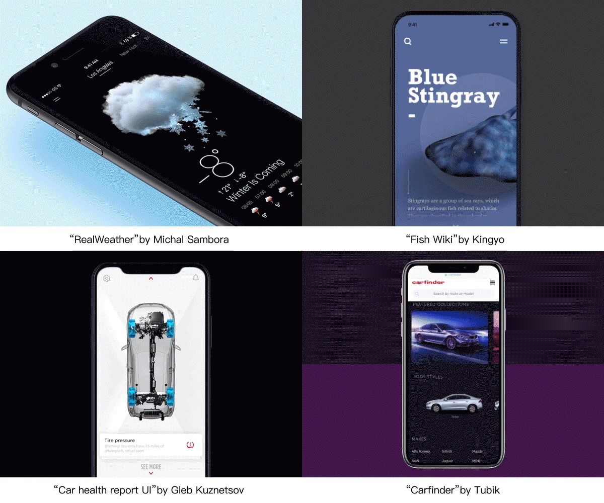
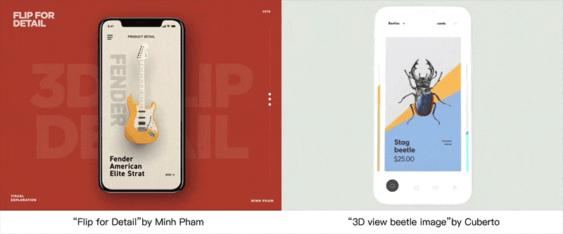
In addition to a fresher visual experience, 3D’s approach can also better serve the display of “goods”, giving users a more intuitive understanding of the product. We can see more real-world environments or product presentations using a three-dimensional approach.
Designers can also use the expressive power of 3D space to create a more solid and real space for product pages. In the process of the user’s operation of the screen, it brings a smoother and more realistic experience.
There are more and more people who “know that it’s too late but do not sleep at night”, and they have more fragmentation and leisure time to consume content, so the app design needs to be more immersive.
The increasing size of the screen affects the convenience of the user’s daily operations. How can the interface design improve the operating efficiency and experience of large-screen mobile phones? Samsung’s One UI divides the phone display screen into two areas: the upper area for viewing content and the lower area for interactions.
In order to facilitate page level switching, a gesture of a sliding exit is added.
The operations and content on the screen change according to the user’s actions, making it easier for users to notice the completed operation and prompting for the next step. The information is presented when the user needs it, reducing the user’s cognitive load.
More flexible and continuous page transition effects can help users better to remember product routes during page jumps, while providing a more comfortable experience. The conversion between pages is no longer only a simple four directions of entry or pull, but a flexible conversion process related to the content form. A consistent operation experience will be obtained when the user performs a directed operation on the page through gestures.
In order to serve the content better, we saw many products removed from the design of the “color block” at the top area. To bring users to a more immersive experience all “hard” segmentations will no longer be popular. Among them, the white and black full-screen background color can highlight the differentiation of the product content itself, rather than the difference in page performance.
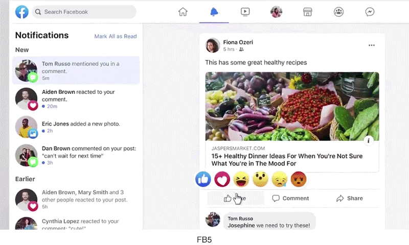
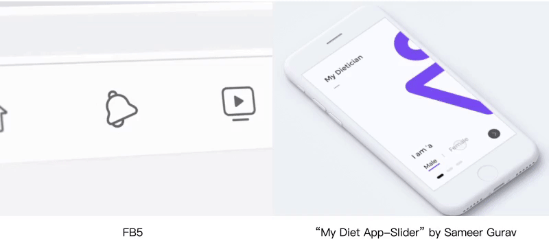
At the end of April, Facebook introduced a new simpler and more immersive “FB5” design style. In addition to removing the heavy top blue block design, the newly added “dark mode” will appear first in the video watching module, which will better serve the watching of video content.
The “dark mode” will appear in more app design. While the “immersion” of the user during browsing the content, the APP can help the user to turn on the “dark mode” at night, serving the user in the dark environment at night, and reducing the visual fatigue of the screen.
The Post-00s likes multiple interactive experiences, and the content+interaction gives new possibilities for content. The interactive video allows users to increase their sense of participation and get a personalized game experience, moreover making the content more entertaining and a dose of novelty.
Movies, games, and online dramas have all launched interactive works, and users have taken the initiative to participate in the selection from the third perspective to the first perspective, and these works are becoming highly personalized content. Interactive videos not only guarantee the quality of the story content, but also guarantee the interactive experience. The interaction of the content must be meaningful and affect the development of the story. This kind of interaction is effective and can touch the user’s emotions.
The Post-00s does not like to watch TV, but mainly use smart phones to get goods and services. Mobile payment changes the user’s payment habits, and users are willing to pay for the content that they are interested in.
The content-based E-commerce provides users with a more information-rich and entertaining experience that allows users to shop while they consume contents.
Young Internet users are growing up in a fast-growing technology and cultural environment. Naturally, these users have made a higher aesthetic pursuit of these products. In recent years, the “small and beautiful” design with a self-personality has also made it easier to impress users.
From the new icon design of Office 365, we can see more abstract and symbolic icon representation. Reduce the proportion of concretization (text areas) on the icon, and use more abstract shapes to express the meaning of the icon. The icon evolves in a more concise and geometric direction, while using rich color and texture changes to satisfy the icon’s recognition.
In addition, the design of the icon is more about the efficiency of the adaptation. Office uses resources in the SVG format to accommodate application extensions on different platforms.
With the advancement of performance techniques, such as the use of 3D elements, and the development of animation implementation technology, the performance of the response animation will be more delicate. The laws of motion that mimic nature will also become more popular, such as “arc motion”, “light perception”, “particle performance”, and “three-dimensional space”, etc., which will also enhance the design performance of products.
For the controllers in the interface, the design of the controllers will be closer to the real physical rules. Designers can give them a more realistic feel by expressing the controllers via animation performance.
Interesting response animation can also give users a more enjoyable and intimate feeling, while the more “human taste” in the animation is the key to providing a pleasant experience. We can feel the emotions and the character conveyed by the icons.
The most intuitive feeling brought about by the improvement of aesthetics is the progress pursued by the graphics itself. Therefore, in the interface illustration, the pursuit of visual art is more important. Users are tired of the same geometric figures or simple linear icons, and a more personalized character performance and painting techniques will be more popular with young people.
There are more and more Easter eggs become popular in movies, a small Easter egg can bring users a sense of surprise and ritual. Some exciting designs can be provided to users while meeting user requirements and creating a user experience.
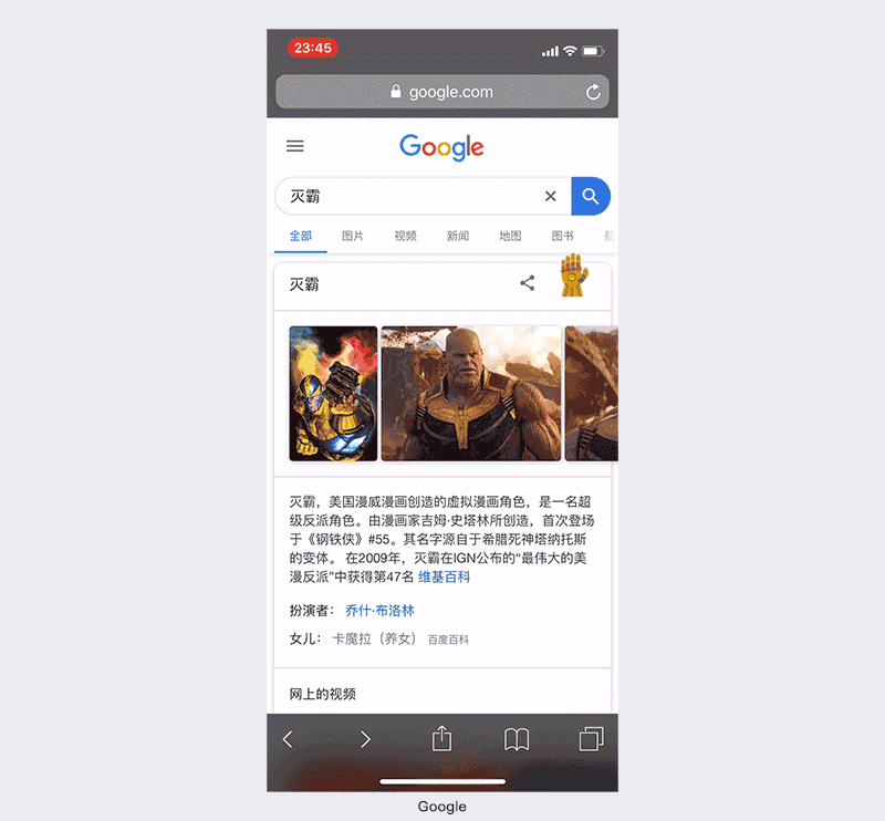
Google search added the Easter eggs of the Thanos in the “Avengers: Endgame”. Click the Infinity Gauntlet button then the search results will randomly “disappear” half. Google Maps launched a “Snake” Easter egg game for April Fool’s Day, which allows the snake (metro or bus) to become longer via eat the targets on different maps.
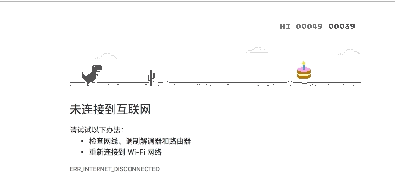
Google set up a small Easter egg for Chrome’s birthday and added a party element to the Dino Game: the little dinosaur will wear a birthday hat after it ate the cake.
In 2019, we can see the huge impact of technology on design and experience. The book “The innovator’s dilemma” describes that “every technology from slow to fast to the bottleneck, another subversive technology will quietly sprout and replace the previous technology.” Therefore, some design trends will suddenly disappear due to being technology-driven, and may also disappear due to the subversion of technology. As a designer, we should to learn how to recognize changes and constants in design trends for innovation and design improvement.
Technology and products are ultimately returning to becoming people-oriented, so designers need to understand the requirements of the bottom of human nature, not only to focusing on the design inside the screen, but also to pay attention to the design outside the screen, and improving the design for people using products or services is the future trend.
from Medium https://medium.com/@tencent.isux/2019-2020-design-trend-ux-7b10ae1872bb
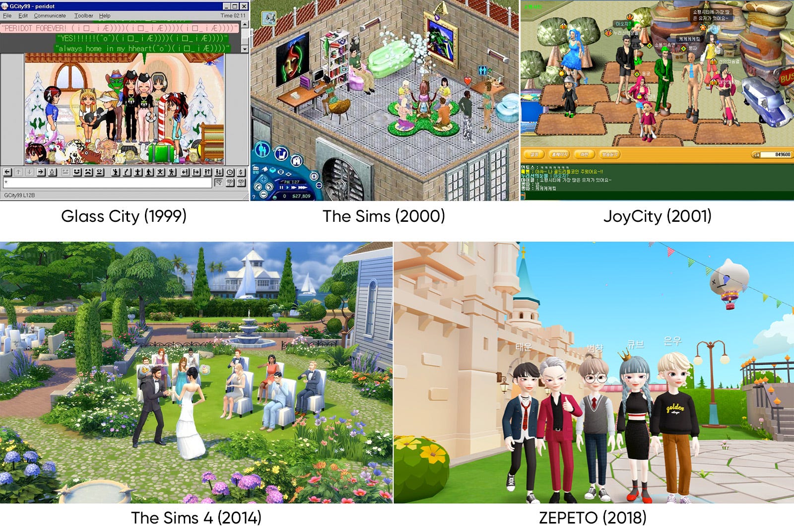
In this article, we will share our insights about avatar services which become popular again recently. As the IT world has become as a new dimensional social place, the presence and importance of avatar representing me in the virtual world is increasing day by day. Similar to reality, users invest time and money in decorating avatar to gain self-gratification or to appeal to others, move their avatar around the virtual space to meet and communicate with other users. The avatars which were partially used from a specific games or portal site profiles, has recently began to come closer to our lives according to the development of smartphones.
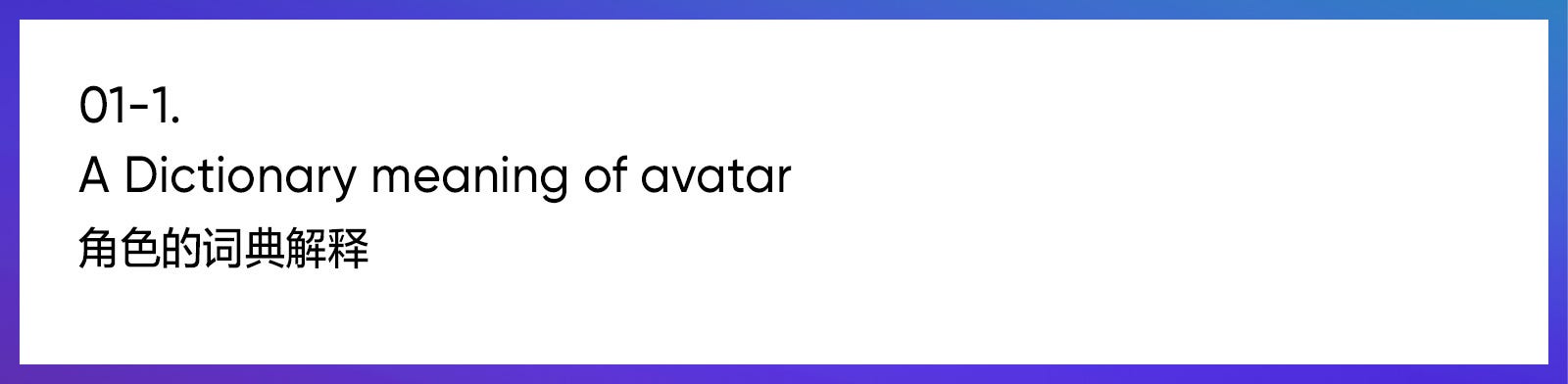
The word ‘avatar’ originates in Hinduism, where it stands for the ‘descent’ of a God in a earthly form. In mass media, the term ‘avatar’ was first used in 1992 in the science novel Snow Crash written by Neal Stephenson. It meant a one’s fictional other self in the virtual world, named ‘Metaverse’. In IT field, avatar means the visualized form of computer users themselves. The first avatar in online game was LucasArts’ online RPG Habitat in 1985. This was the first case which many users could control their avatar and interact with other users. (Wikipedia, NamuWiki)
Now, after changing the meaning from origin, the shape of the person that represents oneself in a game or a portal site is collectively referred to as avatar. Avatars have been mainly used for chatting and online games, but now its usage is expanded to cyber shopping mall, virtual education, virtual office(conference). An avatar connects the real world with a virtual space, and has characteristics that exist between anonymity and autonym. In the past, users were fascinated by the anonymity of cyberspace, but now they also have the desire to express themselves, and the avatars that satisfy both sides are attracting the attention. (NAVER Encyclopedia)
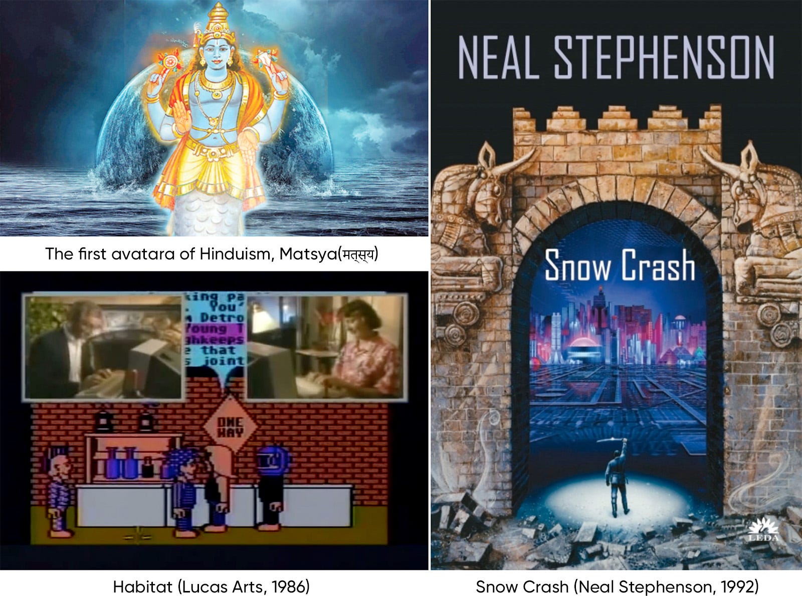
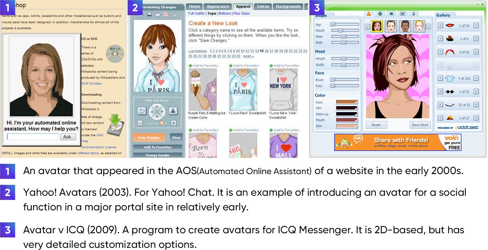
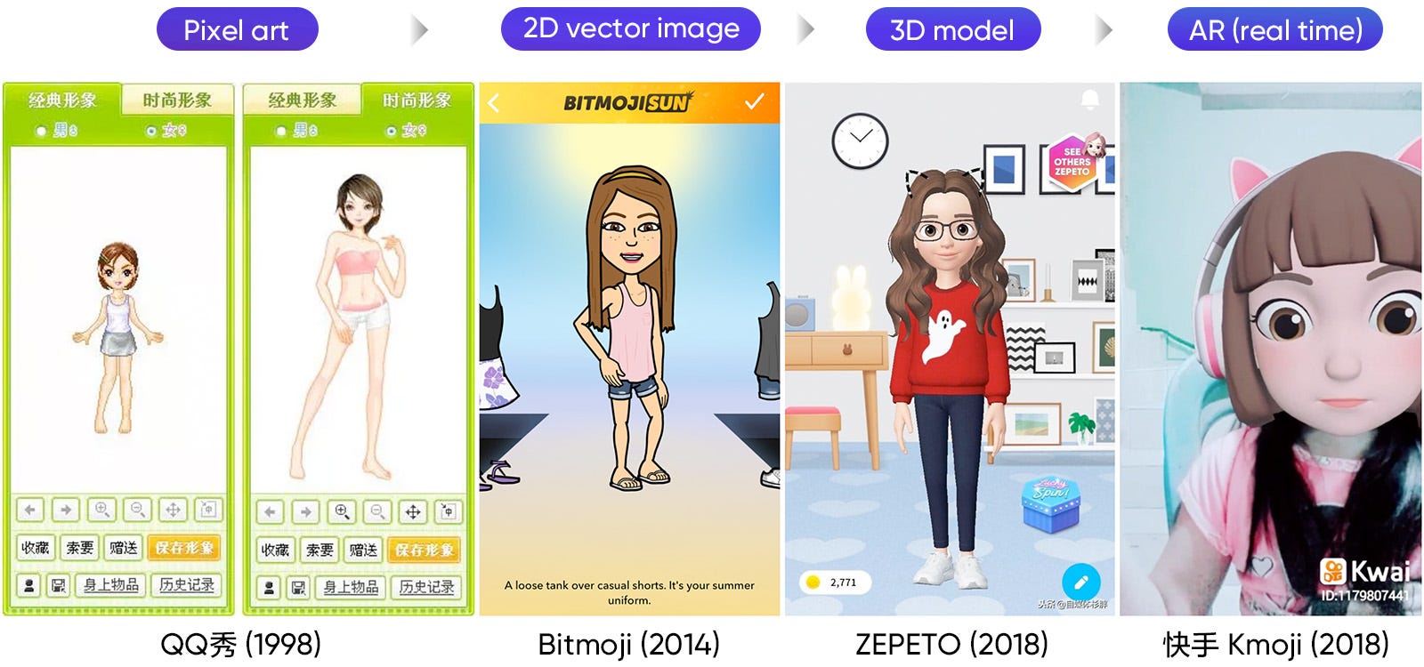
The avatar service coincides with the advance of technologies such as the appearance of GUI, the development of display technology and the development of communication technology. In the early days of IT industry, avatars were expressed in the form of rough pixels in a small resolution screen. However, since the performance of the computer and the quality of the communication line have been gradually improved, it is possible to express avatars using high quality graphic materials. In 2007, a high-performance mobile PC, smartphone, was introduced and we can meet high-quality avatars that were available only on the desktop in the hand nowadays. In addition, with the development of smartphone cameras and processors and the appearance of AR and VR technologies, it has reached a level where 3D avatars can be synthesized with real images in real time.
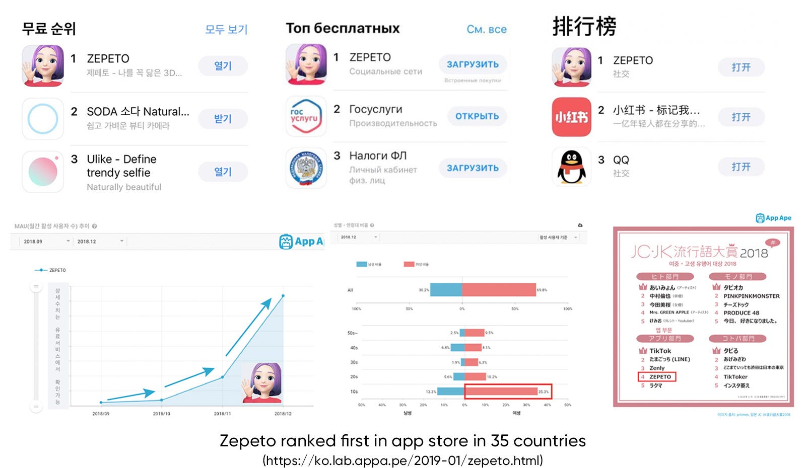
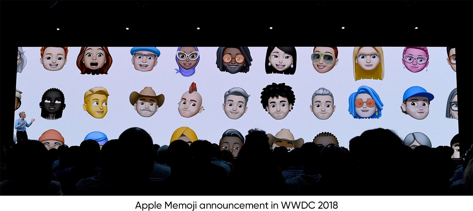
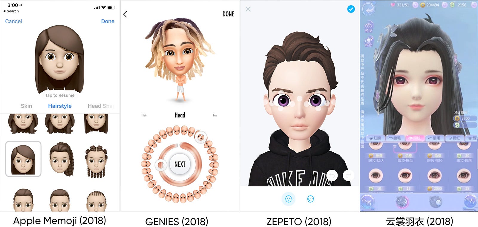
Since it was launched in September 2018, ZEPETO was ranked # 1 in the free app category in app stores of 35 countries. In just three months after its release, MAU has increased five-fold and total downloads have exceeded 12 million. (As of December 20, 2018)
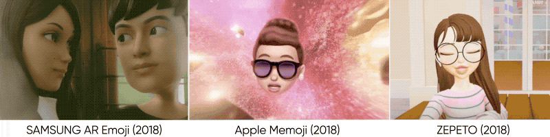
Although avatar related services have been steadily developed, 2018 was a particularly remarkable year for avatar services. Thanks to the development of smartphone devices and AR technology, Apple and SAMSUNG announced 3D emoji combined with face recognition and AR technology. And ZEPETO, an avatar service developed in Korea, attracted tremendous popularity in Asia. With their distinctive features and style, they herald a fierce competition in the avatar market. As the development capabilities of each company are leveled up to some extent, differentiated points such as attractive style, interesting functions, and user convenience will make or break their long-term success.
The table below shows the status of major avatar services now in service.
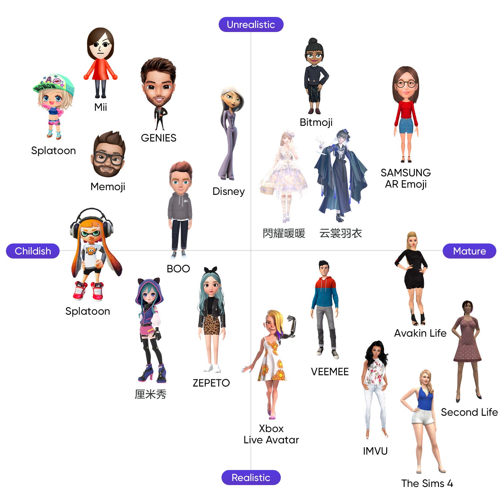
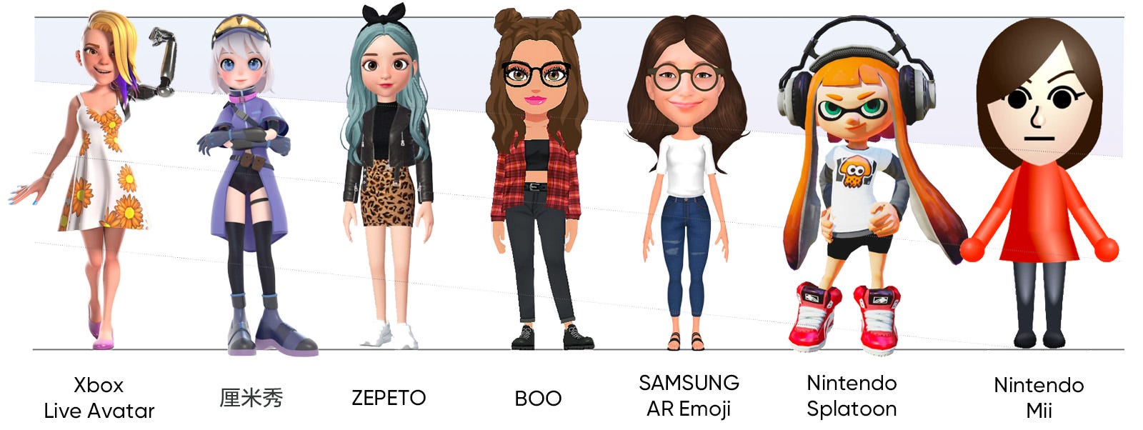
The following is a positioning map that arranges avatars according to their visual characteristics.
In this section, we are going to explore what trends are reflected in the current service avatar services and how they are appealing to users through their strengths.
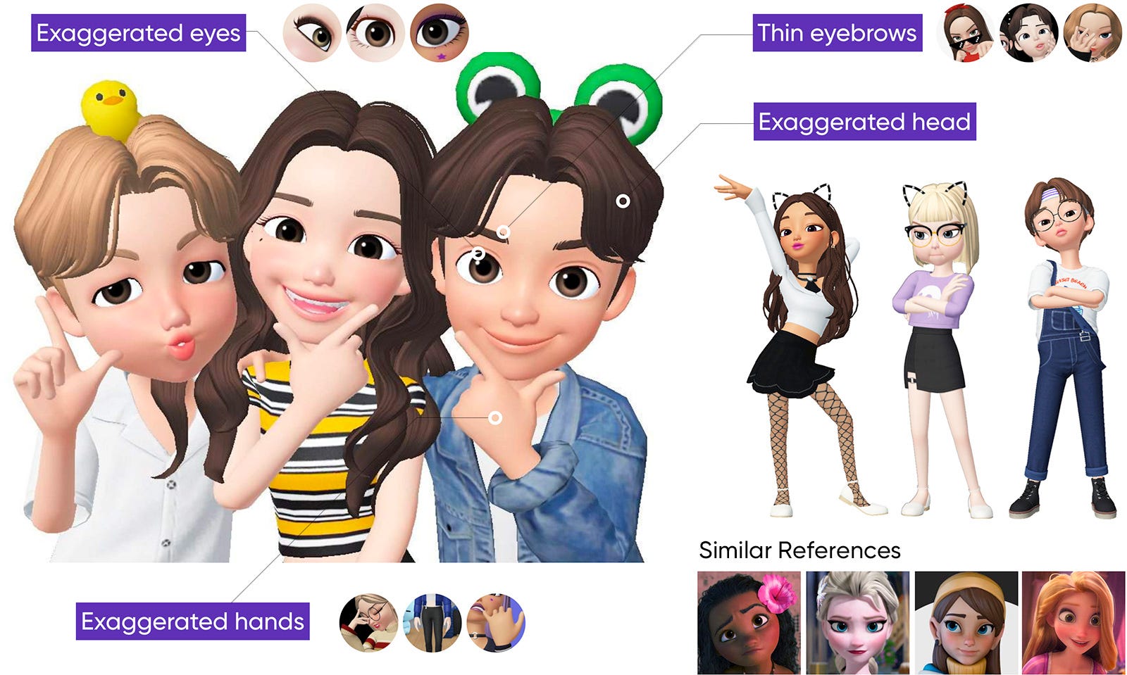
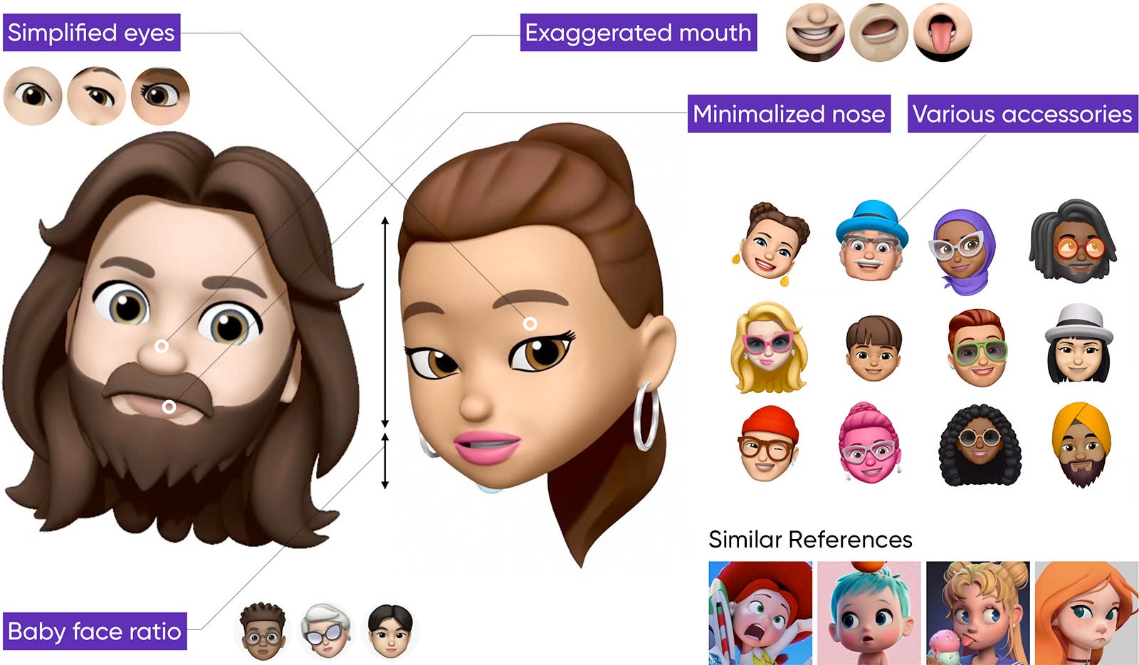
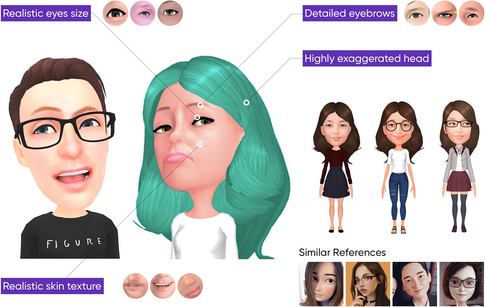
Because avatars have to maintain the visual completeness while realistically capturing the face of the user due to the nature of the service, designing an attractive avatar that satisfies these conditions at the same time is a difficult task. When the distortion, the styling, and the reality are blended in harmonious proportions on the style of the avatar, that service can attract many users. Most recently, most of the services are watching on 3D avatars, which are excellent in three-dimensional and realistic feeling, capable of producing individual styles.
We would like to briefly compare the visual differences that the some representative avatars have.
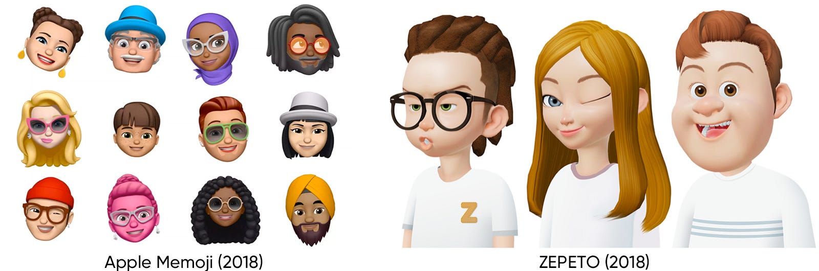
ZEPETO zepeto pursues an ideal and balanced appearance. They reduced the thinning and volume of the eyelashes according to the characteristics of the face of Asian people, and set the slope of the eyes to a gentle degree to give a warm impression. Also, the size of the head and the hands were greatly exaggerated so that the facial expressions and the hand movements can be seen well at various views.
Apple focuses on simplicity, clarity and rich emotions. Memoji is designed to simplify the shape of the face and maximize the use of the face recognition technology by moving all the parts dynamically. A simplified and rounded face gives a cartoon-like and cute impression.
SAMSUNG focuses on creating an avatar that looks almost the same with the user to promote their high-technology. All the elements such as a face, skins texture, a hair are designed to enhance its reality.
One of the QQ services, CM Show(厘米秀) has designed 3D avatar style in existing 2D avatars. Also, a new service using 3D avatars will be released soon. CM Show’s 3D avatars are designed to give a cute, unique and lovely feeling to match the taste of 10–20s who are the target users of the CM Show service. Unlike other avatars, it has a manga-style appeal. 3D version avatars will be applied on July, 2019.
The bodies of avatars also vary in shape and proportion. So, it is difficult to classify avatars’ body proportions according to exact criteria. But in general, avatars used in media with high resolution display devices have more higher body proportions. Avatars used in high-performance game machines and HD animation (such as Xbox) have relatively high body proportions. On the other hand, avatars used in mobile devices and small game machines usually have low body proportions.
Most avatar services have provided various palette for users to create their own avatars. Users can create a number of face combinations by selecting hair and eyebrows from a palette, and then selecting the most appropriate (usually self-similar) result. Like this, the existing 2D avatar was made by selecting images prepared in the library and combining them. However, in case of 3D avatar, with the advance of 3D technology, the user can adjust the detailed size and position of the face parts directly. This made it possible for each user to have his or her own avatar differentiated from others. This provides users with greater immersion and higher satisfaction.
Customization is one of the most important parts of the game industry in recent years. It has evolved from the way that the user has selected one of several pre-made faces, and now the user can ‘design’ the whole body by adjusting the each part one by one. This Customization allows users to create more diverse and personalized faces and many users were enthusiastic about this feature.. Users spend a considerable amount of time Customization as well as actual gameplay, even there’re some communities for users share and trade their Customization files. Now, Customization has become another new game in the game. Users want a system that allows them to modify their own faces freely, not limited options that developers have provided. On this account, most avatar service providers are trying to understand and apply a trend and user’s needs like these.
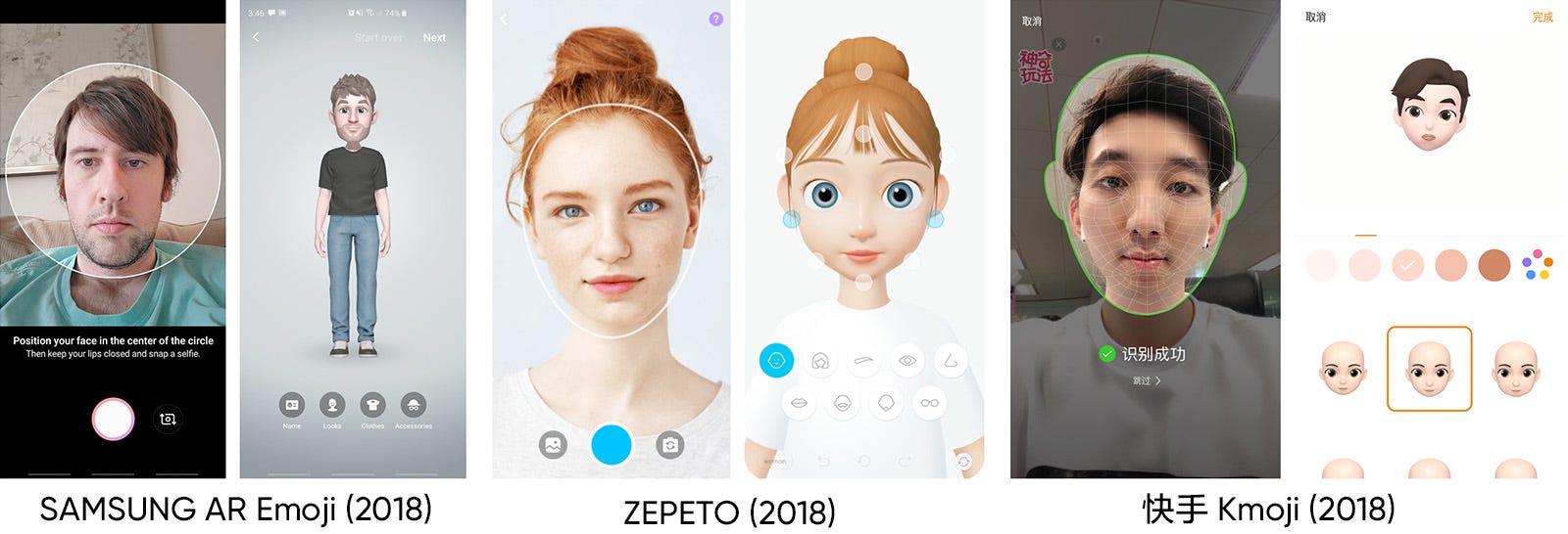
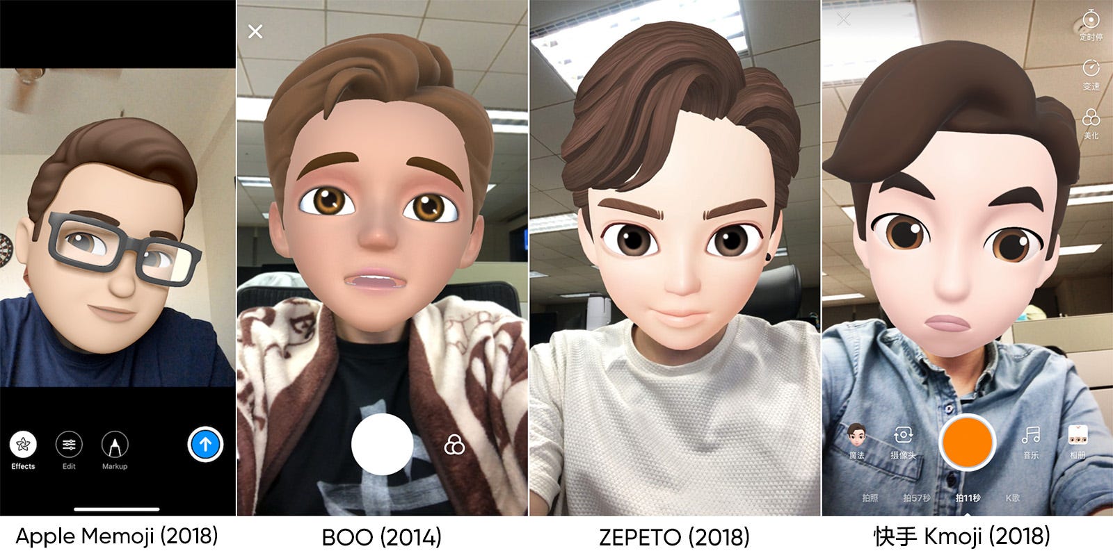
Is it possible to create an avatar by pressing shutter only once? Some services provide the automatic avatar generating function through facial recognition system. SAMSUNG AR emoji, SNOW’s ZEPETO, and kwai’s kmoji recognize the users’ pictures with their own technology and automatically create 3D avatars. Of course, after the creation, the user can make further modifications. In addition to the fresh concept, this kind of service also provides convenience to users by combining many things such as face shape and features. The new technology ‘Face Recognition’ has contributed in particular to introducing these avatar services to the public.
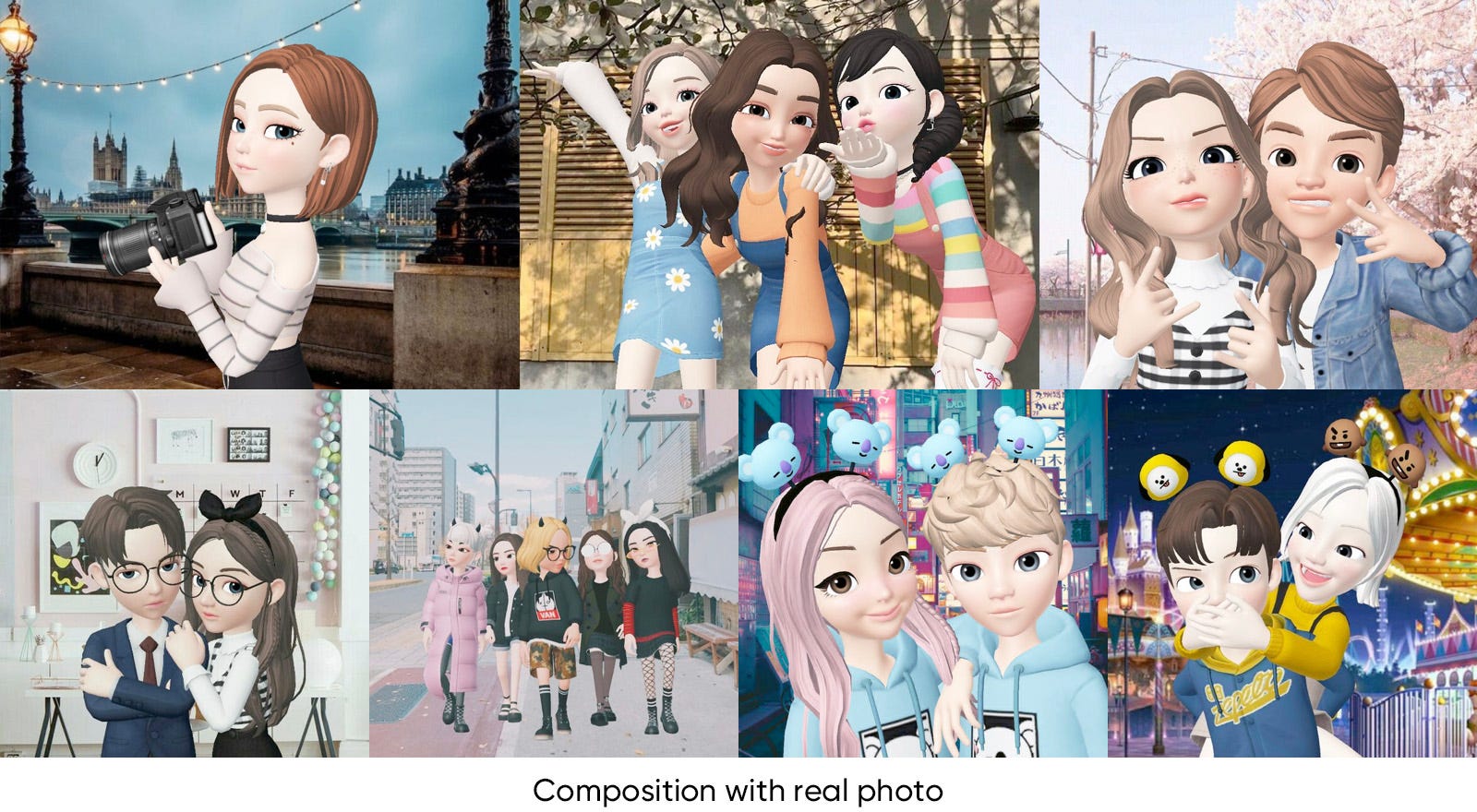
ZEPETO put a lot of effort into the photo shoot part compared to other services. It provides many systematically classfied poses and situations templates. Users can import their friend’s avatar to take a picture together, or they can import more friends to shoot a group photo. It also provides the ability to combine photos with solid color or realistic photo backgrounds.
The light, color, composition, and pose of the 3D avatar images are well adjusted so that they can blend naturally with various real photo backgrounds. With these features and detailed settings, users can bring ZEPETO’s avatars to their real world and create a realistic image, and this experience gives users a fresh feeling and interest.
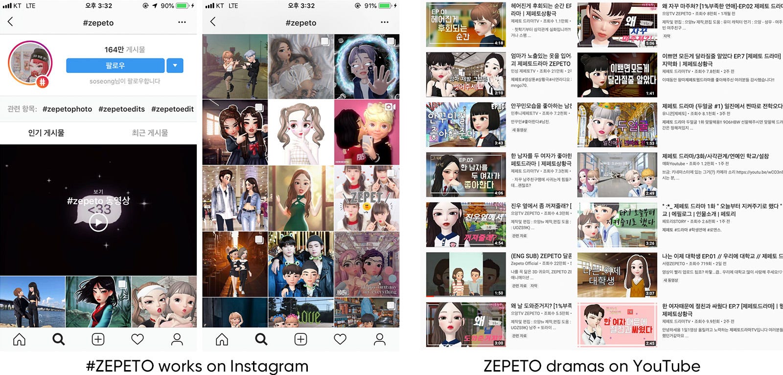
These functions make it easy for users to create various secondary creations. Because it is easy to 1) synthesize the background through the alpha matte, 2) express various emotions by using many facial expressions and gestures already provided, 3) generate various characters through customization function. By using these functions in a complex way, users can create and share photographs and videos of their own stories. (There are many channels that share only such creations.) ZEPETO drama is a new genre that has been popular among teenage girls. Through ZEPETO application, users participate in both creation and sharing processes and actively enjoy this culture.
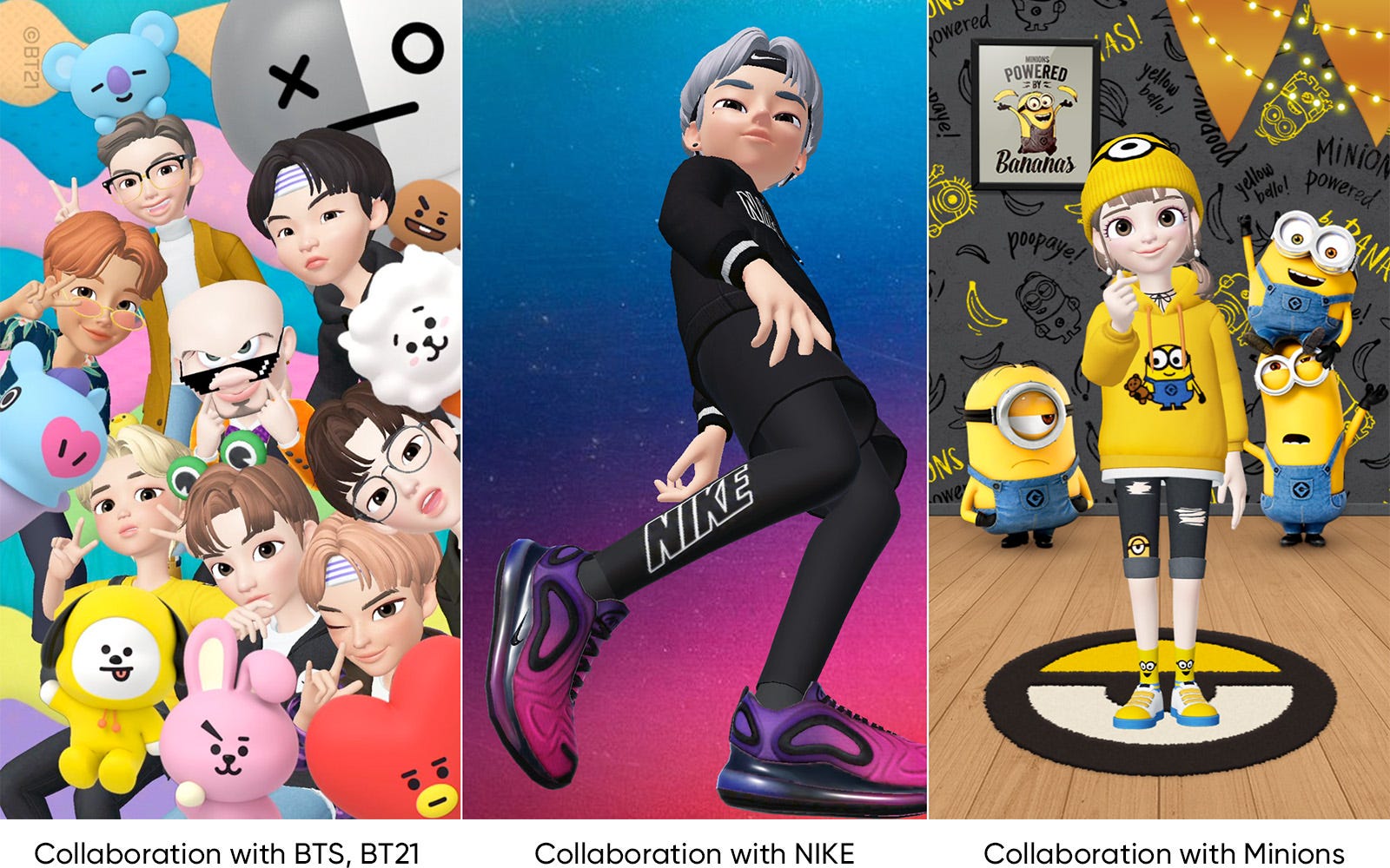
Based on these functions, ZEPETO has progressed many collaborations with various brands. Through collaboration, users can take pictures using specially prepared backgrounds, gestures, and items. And users actively share those pictures through social media. Collaboration with BTS in the early days of operation helped ZEPETO gain popularity. (It recorded a million shares on social media in a short period.)
ZEPETO focuses on how 3D characters are synthesized on the real world, there are also services that provide AR cameras using avatars. AR camera function has been used in various camera applications before avatar service. However, when this function was combined with the avatar service, it brought more powerful synergy. In the pa17st, animals, masks, and other characters have been synthesized on their faces, but these services can now be used to put avatars resembling the user directly on their faces. This gives users a stronger sense of differentiation and immersion.
The AR camera recognizes not only the still image but also the user’s facial expression in real time, and can record on the video. As the technology advances, it is now possible to express even more detailed and realistic movements, such as being able to track the shape of the mouth and tongue while the user is speaking. In case of facebook VR avatar, which is currently under development, is able to communicate and interact in real time by gathering colleagues’ avatars in a virtual space. In addition to this, Using VR lens allows for a more extended experience as if it were directly in the space. With this technology, avatar service has almost unlimited potential to be used in various fields such as telecommunication, game field.
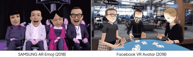
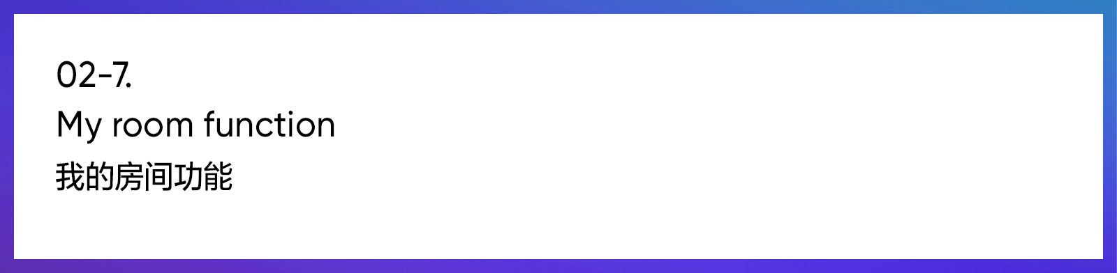
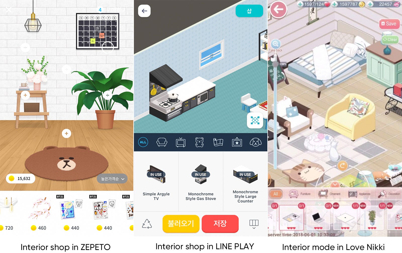
The most important element in avatar service is ‘My Room’. My Room plays an important role in giving the avatar a sense of reality as a space where the avatar exists at the user interface point. However, it does not just function as a background image, but also complement the avatar’s visual style. In many of the services, the interior design function is added to allow the user to purchase items and decorate the space directly, which is also a major profit model of the service. Users can design their own space to match their avatar style, visit other people’s spaces, exchange messages, and evaluate each other’s space.
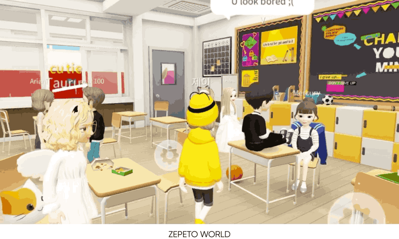
ZEPETO’s ‘my room’ function takes up a significant portion of the interface. It has a visually large area, so it can express the personality of the user more strongly by arranging additional items in accordance with the fashion and appearance of the avatar. (like a profile page for visual supplementation) But ZEPETO has an additional communication space called ZEPETO WORLD, so it does not provide any special playable functions other than comment functions. However, it functions as a representative page for accessing other users.
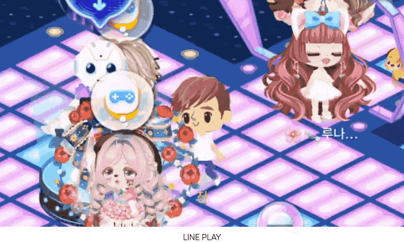
My Room is one of the main functions of LINE PLAY. It is the actual living space of the avatar in the game, and it is possible to interact with various objects purchased and arranged. In this space, the user can get the goods as rewards through the quests. It is also a space where collaboration with famous brands and celebrities is held. The Gacha system for getting adroable interior items is one the most important profit model of LINE PLAY.
There are various accessories for decorating the room. Special package sets are continually added for special events (like Christmas, Valentine’s Day, etc.) and collaborations(with fashion companies, celebrities, etc.). In order to keep users interested, it needs to constantly update items in this part, following trends and user’s preferences.
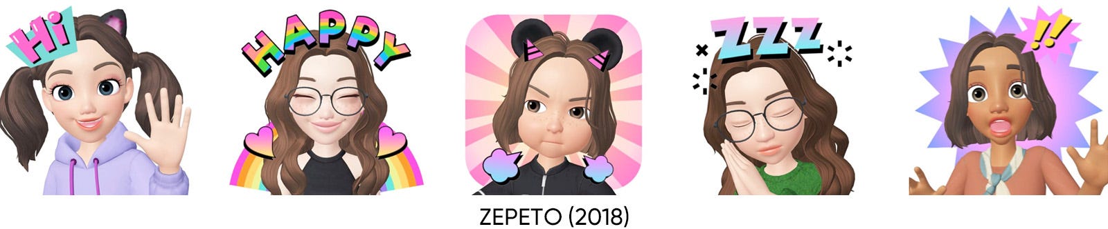
After created an own avatar, you can create a set of emoticons stickers that you can use in social media. At the click of a button, more than 10 stickers are automatically created according to the template. If there is no sticker you want, you can create your own unique stickers by combining various visual elements in the provided library. These stickers can be used freely on various platforms including messaging apps. A set of stickers made using avatars resembling users has a different charm than other common character stickers.
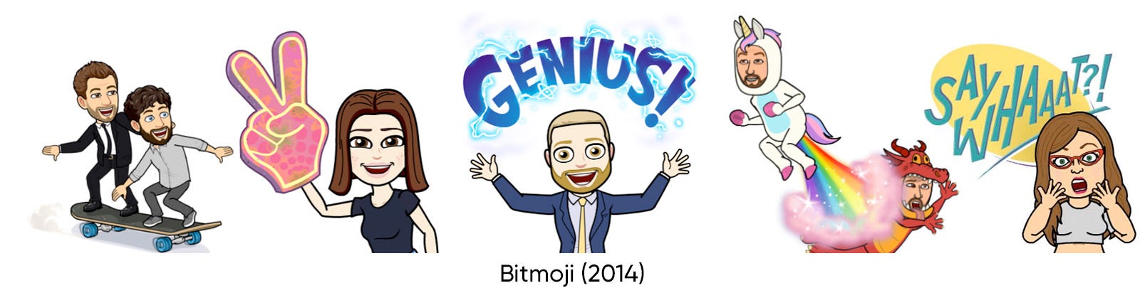
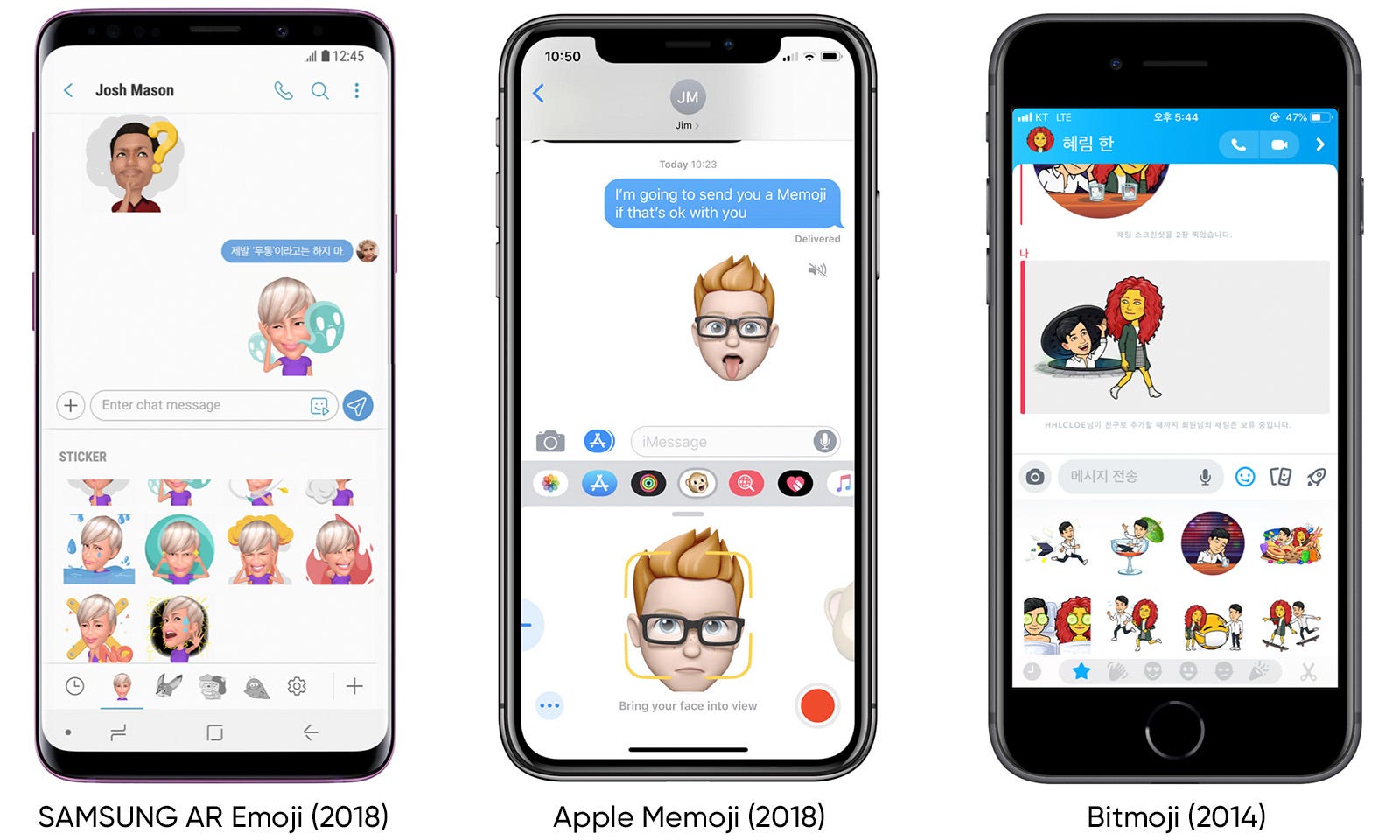
Most services only provide the ability to export the stickers created as image files. However, some services, especially SAMSUNG AR emoji and Apple’s Memoji, can be used by adding the avatar and sticker directly as additional emoji keyboard in the OS message app because the service is already included in the OS itself. (because they produce the hardware themselves.) Bitmoji can use its own stickers in the instant messenger app ‘Snapchat’ with the official linkage.
What if you could live another life in virtual space? In fact, there are many game services that focus more on these ideas. In particular, these types of games are developed and serviced mainly in the US and Europe. In the game, the user has his/her avatar and house (or must buy the land). Based on these, it is possible to have a kind of social life with a lot of other users. From social activities such as parties, swimming and meetings to various socio-economic activities such as labor and trade. It is more multidimensional than simple avatar game, but all of these activities are centered on avatar which represents the user.
In the case of ZEPETO and LINE PLAY, you can do simple communication based on the chat system in the space rather than playing specific activities using an avatar. (It provides a few simple gestures and actions to enrich chat.) ZEPETO WORLD is still in its early stages. However, service provider announced that they will expand the area continuously such as by adding games that can be played by several people in the future. (Actually this part is being updated at frequent intervals).
An avatar was a service that its use was limited to a specific site or a specific game. However, through the development of smart phones, popularity of 3D characters, and the installation in two biggest mobile OS, avatar services seem to almost completed preparations for popularization. Now, more attention will be focused on what you can do with your avatar, not just about what an avatar is. Let’s look forward to the endless transformation of avatars that can do many things instead of me in the potentially unlimited IT virtual reality.
Thank you for reading to the end, and the next report about UX design trend will be coming soon.
from Medium https://medium.com/@tencent.isux/2019-2020-design-trend-avatar-70a449cc5f21
In this article, we will share our insight about the character industry, the second theme of the ISUX Design Trend Report. Characters are frequently used as a marketing tool because they can provide friendly and positive images by applying them to services or products. As the number of ‘Kidults’ has increased, the character market is expanding a lot recently. In the past, while characters were treated as things for young children, now the culture of consuming character-related products is more focused on the 20–30s. People are eager to buy the limited editions of character items designed by character collaborations.
This research will first share the overall flow of the character market and introduce some recent character branding cases along with notable character collaborations.
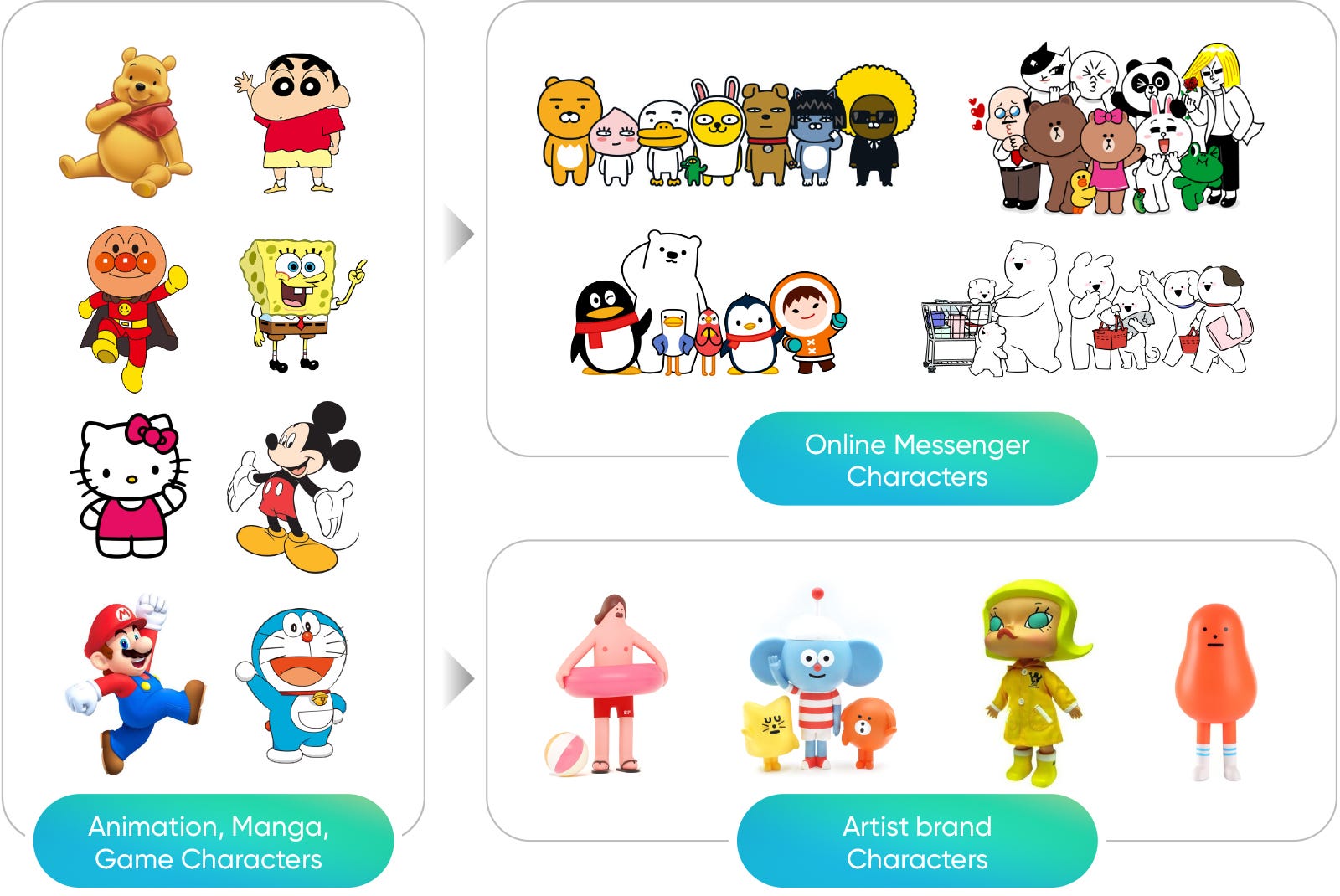
As all the countries have their own culture and emotions, popular characters in each country can be different. But when we look through the characters that are popular in various countries, we can see that well-branded characters can get global popularity. Traditionally, characters in animation, comics, and games have become popular but nowadays, characters from online messenger stickers are loved by many people regard to the usage of messenger apps. The characters created from online messengers are not only staying online but they are applied to various products and compete with traditional characters in the offline market.
According to the Korea Creative Content Agency, the global character market grew about 180.6 billion dollars in 2018, which increased about 20 percent from 2009 (151 billion dollars).
We’ve found there are 4 characteristics of the character market. First, unique storytelling is very important. Second, it is easier to cross borders and be loved than simple consumer goods, so multicultural sensitivity is important. Third, the license business is very important because it accounts for more than 50% of the total sales. Fourth, there are many cases of ‘One source multi use’ that transforms and expands original content into various forms.
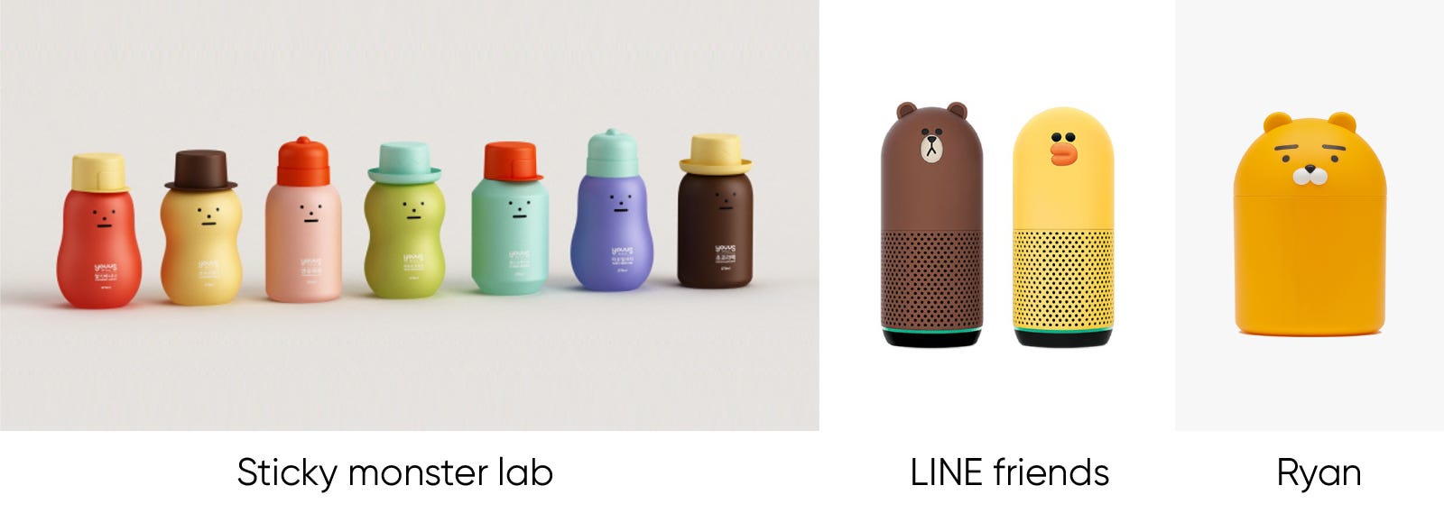
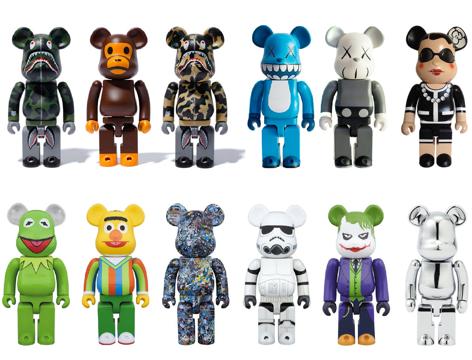
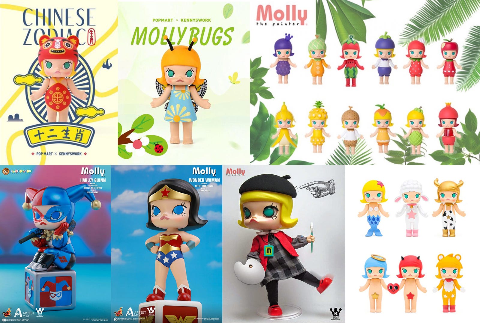
Traditionally, characters born in comic books, TVs, and games have been very popular for a long time. But recently, online sticker characters that help express emotions on messengers are becoming more popular as the use of messenger apps such as Kakao and LINE increases. In addition, as the character industry develops, artist-based companies create character brands with unique stories which a lot of brands wants to collaborations with. China’s Molly, Korea’s Sticky Monster Lab and Super Fiction are the representative examples.
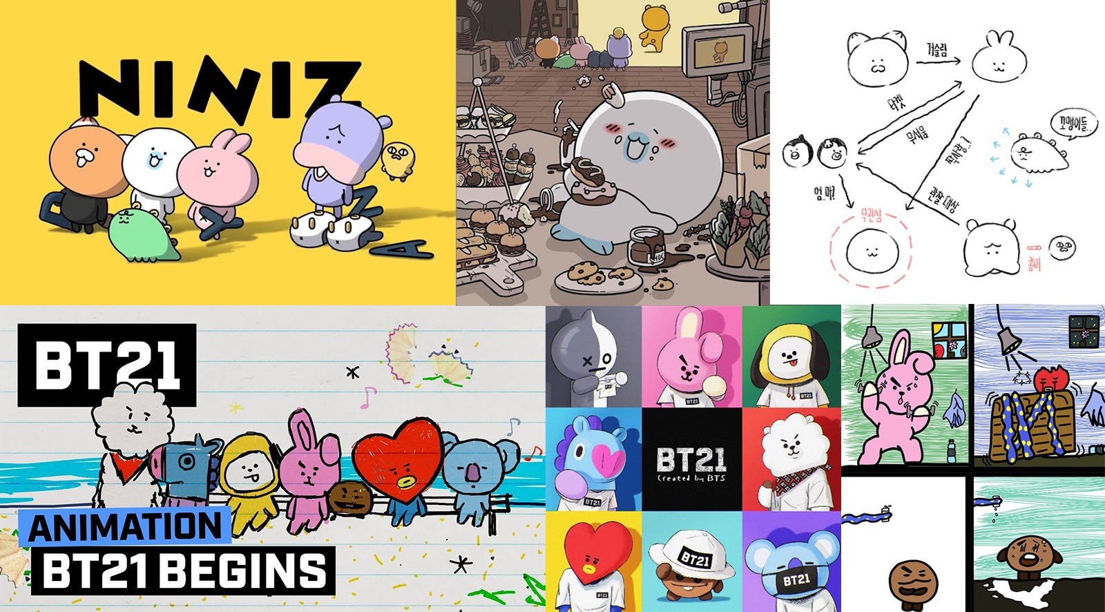
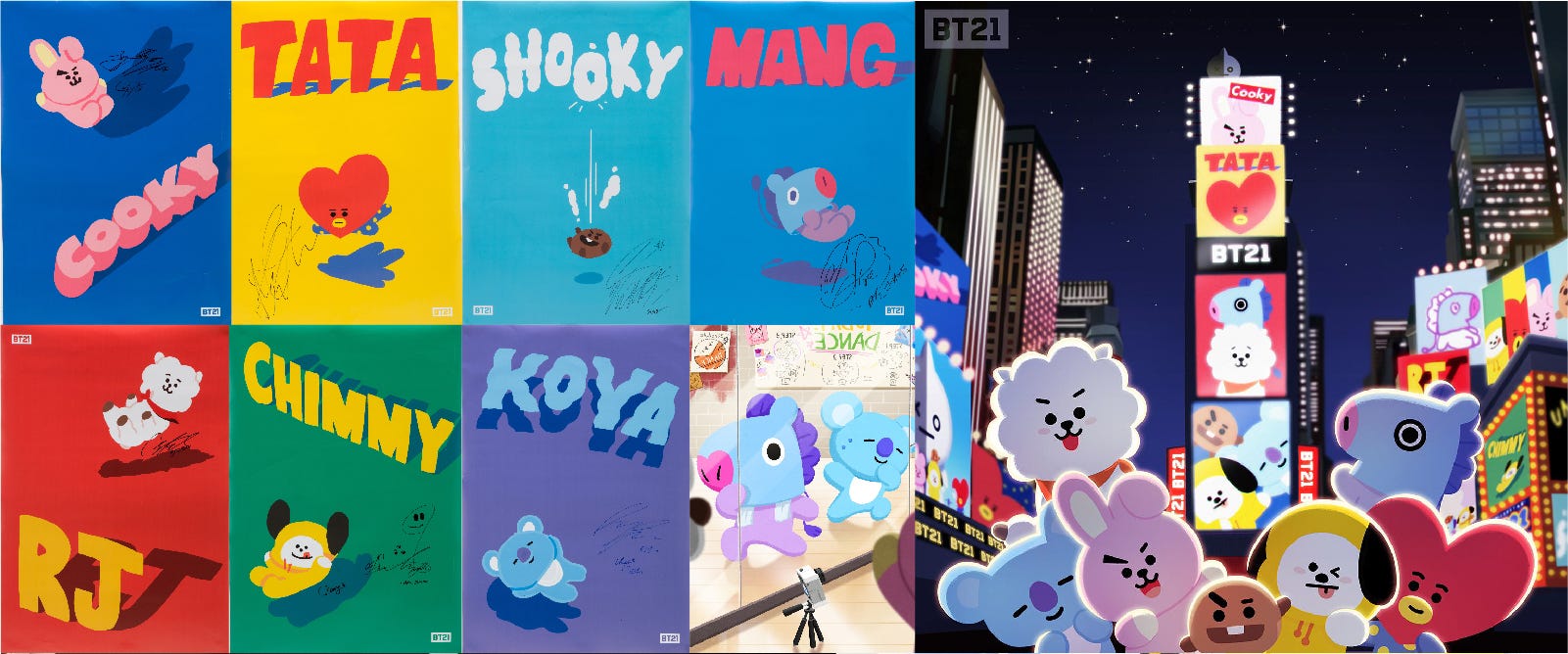
If you look at the characteristics of popular characters, there is a unique and easy-to-remember story that is not so different from our everyday life which we can easily sympathize with. Niniz and BT21 characters which were designed recently also have interesting background stories.
As the characters are used as online stickers, witty characters that can convey various emotions are becoming more popular. Rather than simply a cute character, somewhat nerdy and unique characters are popular.
A simple and cute shaped character is popular. A simple looking character is not only cute and pretty in shape, but also can be applied to various products using the basic character shape.
As 3D technology develops, 3D characters with vivid textures are also loved by people. 3D characters with detailed textures can be attractive even for adults.
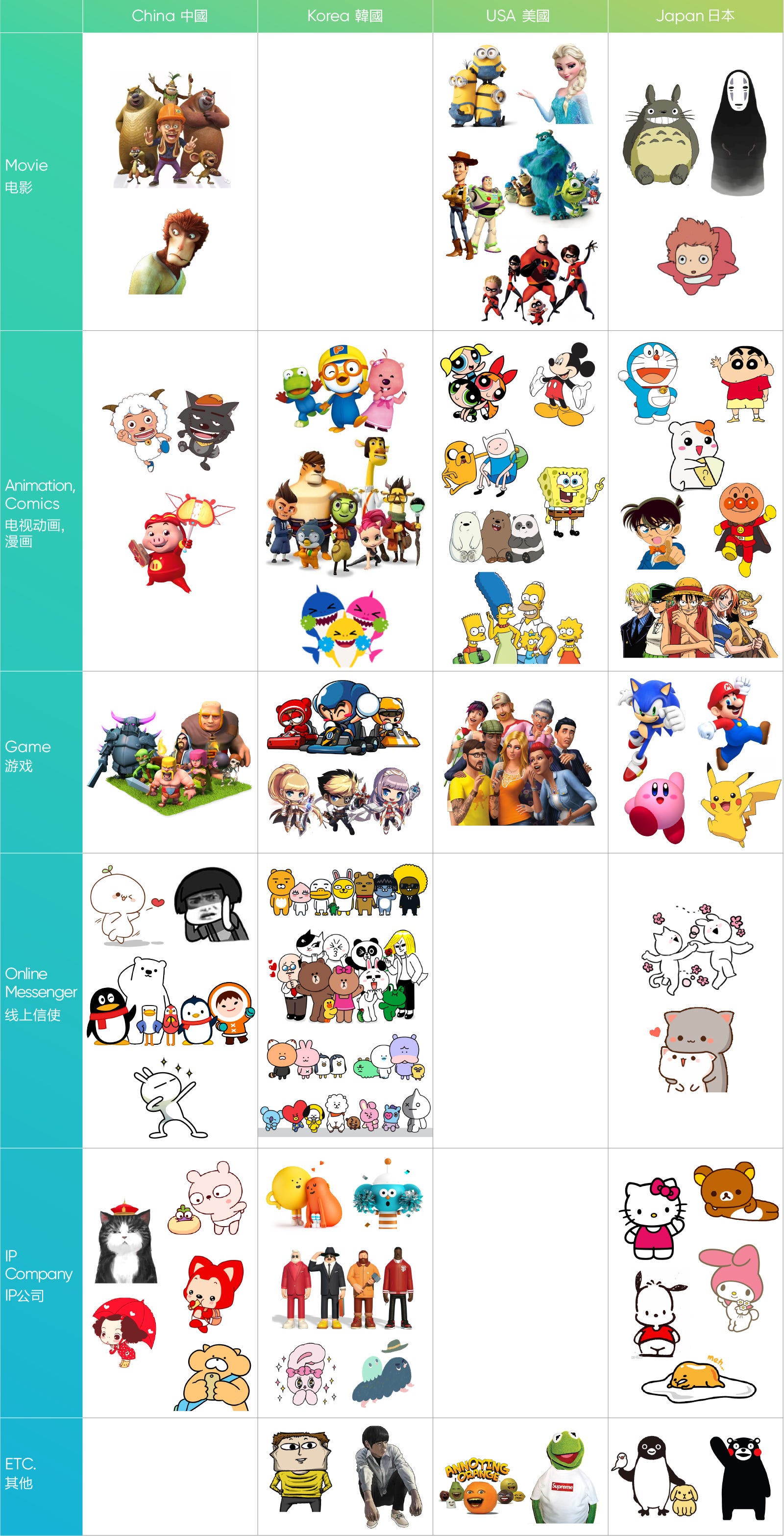
China
1)Various animal characters are popular. 2) Characters from other countries are also popular in China.
Korea
1)Characters from online stickers in messenger apps are popular. 2) There are many characters family brands rather than an individual character brands.
USA
1)Characters from animation are popular. 2) It is a somewhat in rough form, but funny characters are popular in internet memes.
Japan
1)There are many characters in unique hand drawing style. 2) Many characters are from games and animations. 3) Characters are used in various field of industries such as local governments and transportation cards.
Recently, there are many cases in which character businesses are expanded by collaborating with various industries. And there has been a collaboration with trendy fashion brands, popular artists or products with state-of-the-art technology which tend to expand character’s brand images. From the standpoint of a company or a brand, it is possible to convey a friendly and positive image through a character. We have summarized the noticeable cases of character collaboration.
This is a collaboration of Korea’s street brand Covernat and Ryan, which is one of the most popular character of Kakao Friends. A character collaboration can easily become cute but since they only applied Ryan which has with no expression on his face, it matched well with Covernat’s unique street brand image.
Anti Socal Social Club has used their flexible logo applying various phrases or brand names. In this collaboration, they applied their logo with the BT21 character, brand name and logo which is not too cute or awkward and harmonized well with the ASSC’s unique brand style.
This is a campaign that Nike collaborated with Super Fiction on 2019 Airmax day. The user can create a character lottery ticket taste and can upload it on the instagram with a hash tag. The character identity of the Super fiction was applied well on Nike, and the campaign using SNS attracted the young consumers.
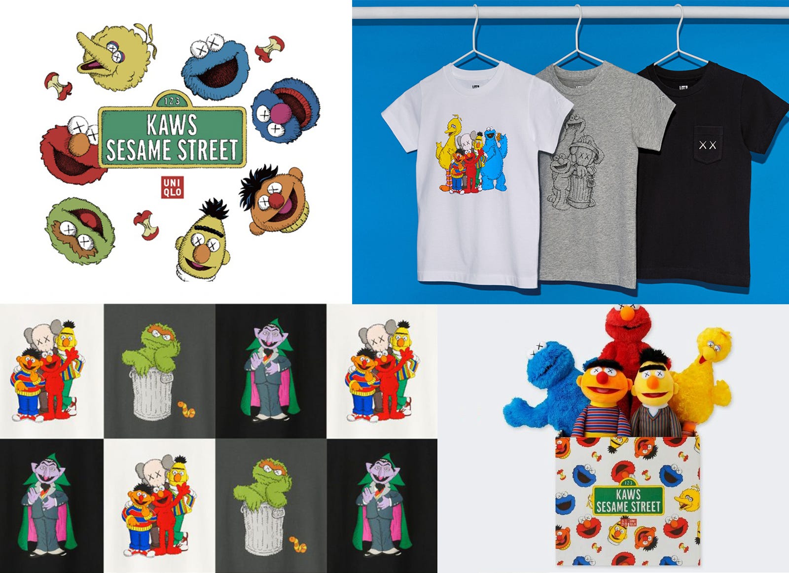
Global fashion brand Uniqlo has launched the KAWS X SESAME STREET UT collection, which is a collaboration between global pop artist KAWS and a popular children’s TV program SESAME STREET. UT (UNIQLO T-Shirt) is a unique T-shirt applying the pop culture concept such as music, art, film and animation which Uniqlo has selected.
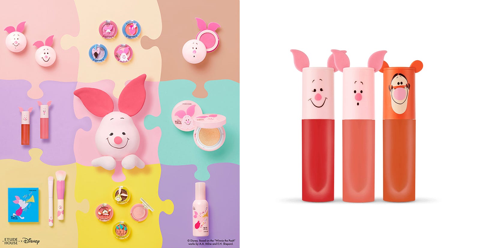
Korea’s leading cosmetics brand Etude House collaborated with Disney’s lovely pig character Piglet to celebrate the golden pig year of 2019. ‘Happy with Piglet Collection’ is a limited edition, offering a cute package and various products that can create a lovely makeup which will bring good luck to the new year.
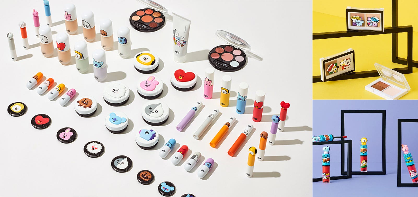
As K-beauty market grew, VT Cosmetics applied BT21 and BTS as the main models for their brand. They used BT21 characters in package designs and recently opened a pop-up store.
The fashion magazine Esquire described Ryan as a real selves and applied him as their cover model. They designed the cover by compositing the 3D Ryan with a real background which make the character feel more like a real model.
This was a collaboration project of Super Fiction and global fashion brand Maison Kitsune. They designed a toy figure reflecting the identity of fox character of Maison Kitsune. In front of the first Maison Kitsune store in Korea, a large sculpture of this fox is being exhibited.
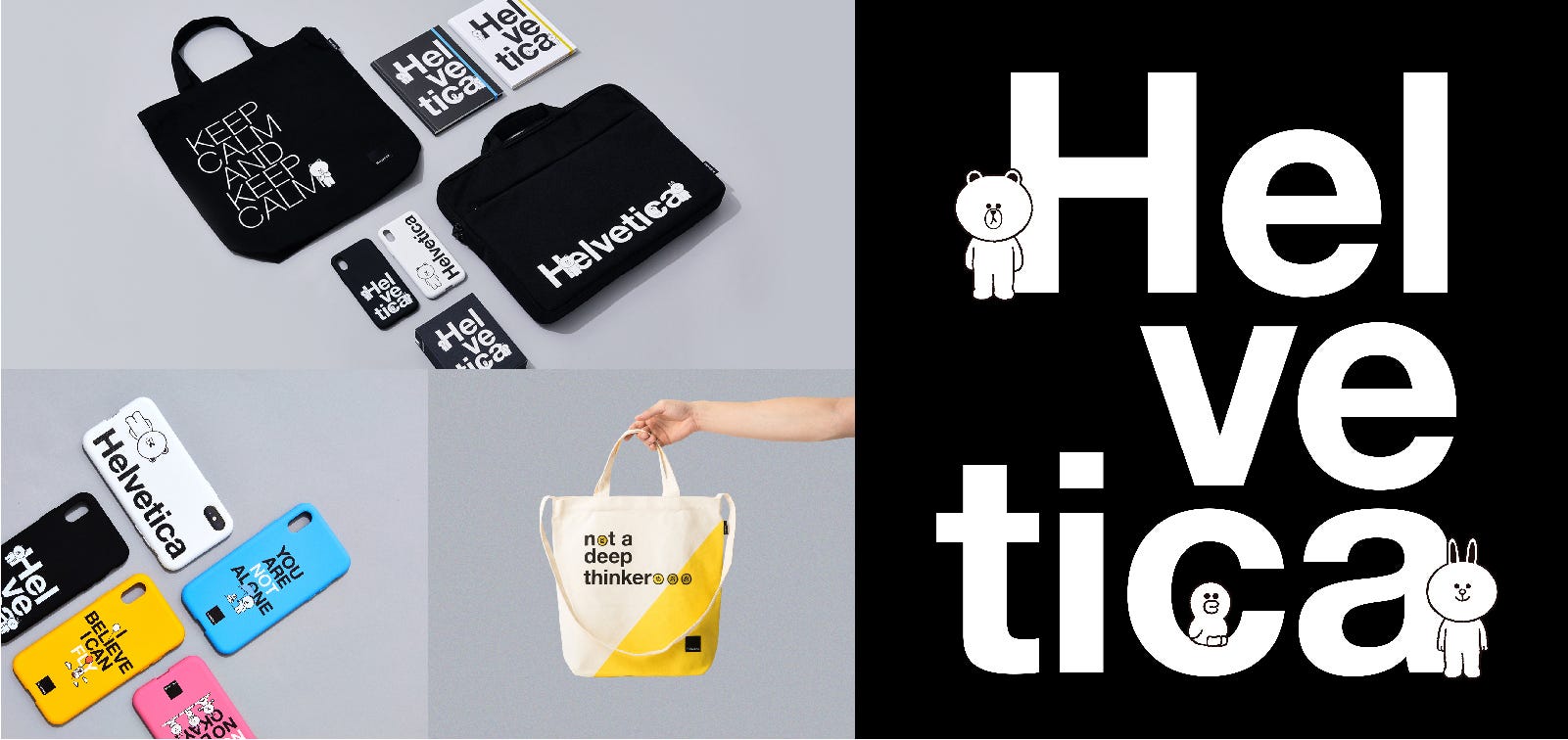
LINE Friends had a very unique collaboration with Helvetica, the font that represents Swiss modernism. This collaboration has got attention from the design industry and also gave consumers a fresh impression since it was the first collaboration between un-materialized font and a character brand.
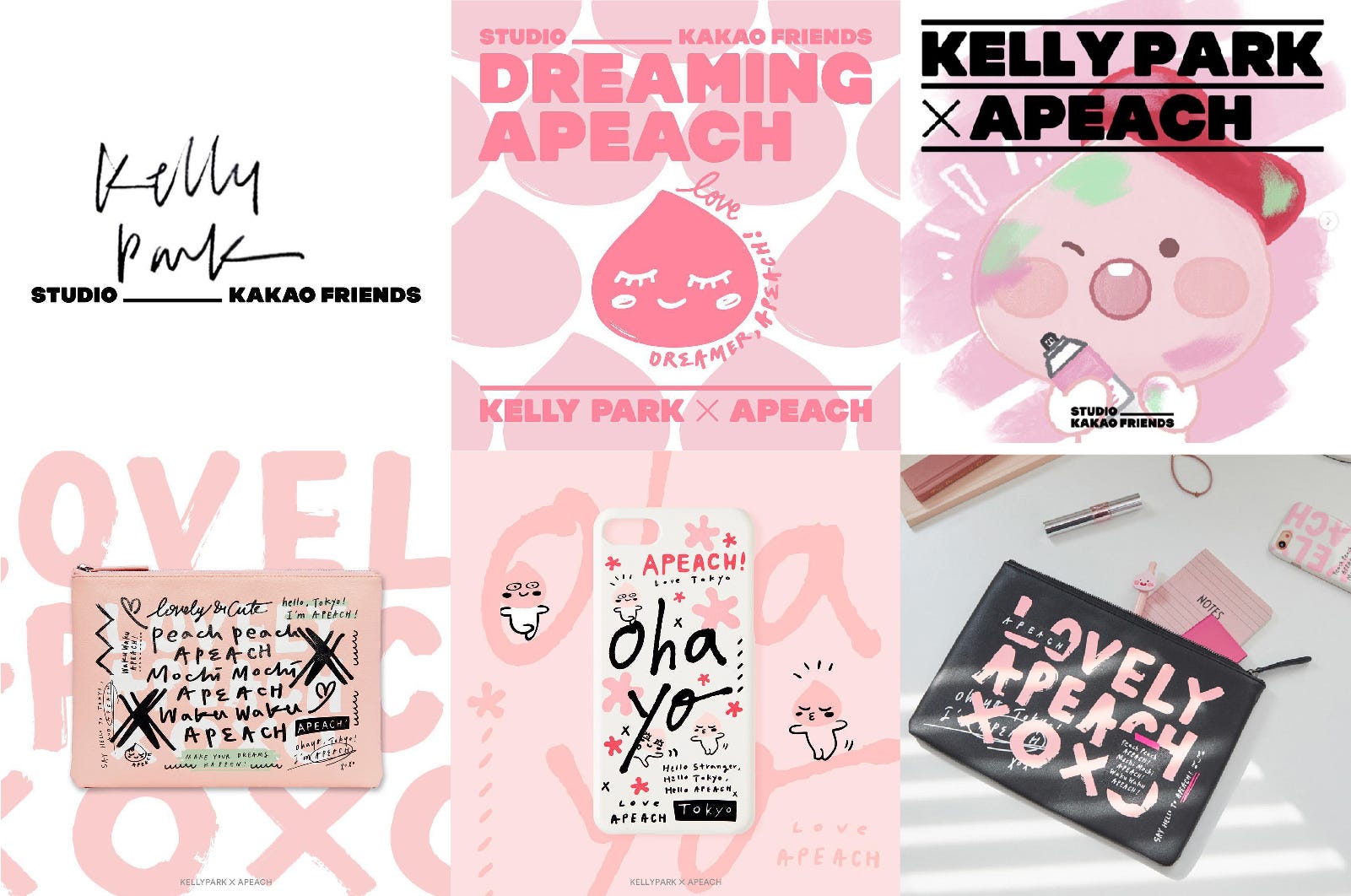
Kakao Friends had a collaboration between calligraphy artist Kelly Park and Apeach to open Kakao Friends Tokyo store. Kakao Friends Tokyo runs ‘Studio Kakao Friends’, which collaborate with creators from various fields around the world. The first project was with Korean calligraphy artist Kelly Park. Apeach’s lovely pink identity and Kelly Park’s powerful and stylish calligraphy were combined and created trendy and unique products.
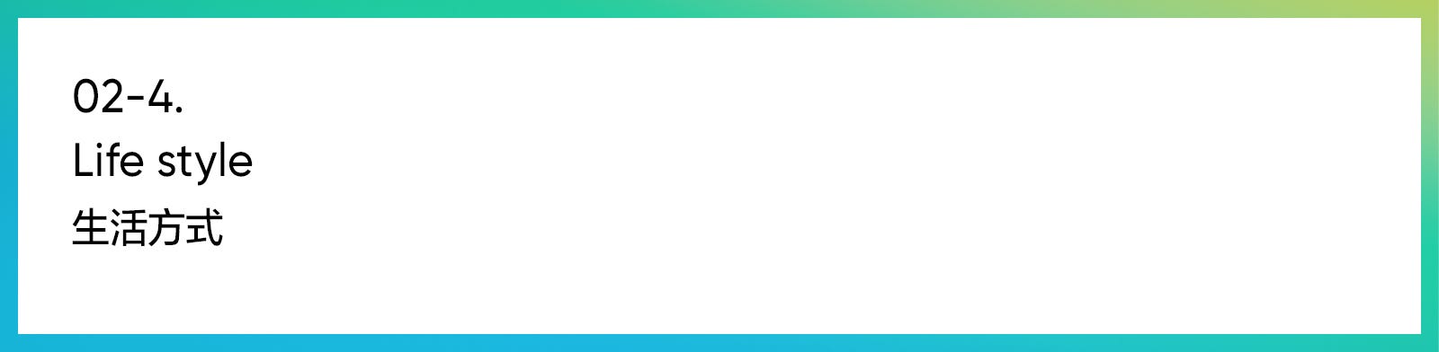
This is a collaboration between Japan’s camping brand Snowpeak and LINE Friends. Snowpeak is well known for their craftsmanship in the camping equipment industry and also famous for excellent design quality and nature-loving spirit. Snowpeak tried to apply the warm and friendly brand tone of LINE Friends into the their products which was outstanding.
This is collaboration between LINE Friends and french stationary brand Rhodia, which is a especially loved by artists and designers. This is a case that LINE Friends’ lovely character image was well applied to Rhodia’s luxury and artistic brand image.
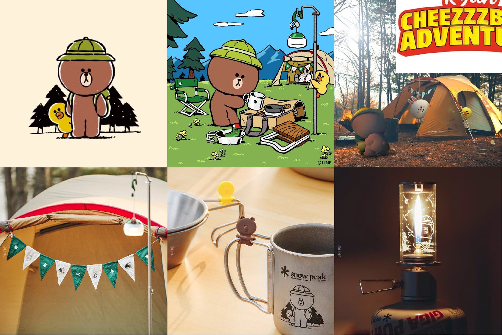
Café and bakery Quartet opened their second shop on the third floor of the Kakao Friends Gangnam flagship store and released the collaboration menu and goods. In addition to all the packages used in the cafe, the bakery also applied Kakao Friends’ characters, which gave the fun and wit to the Quartet brand.
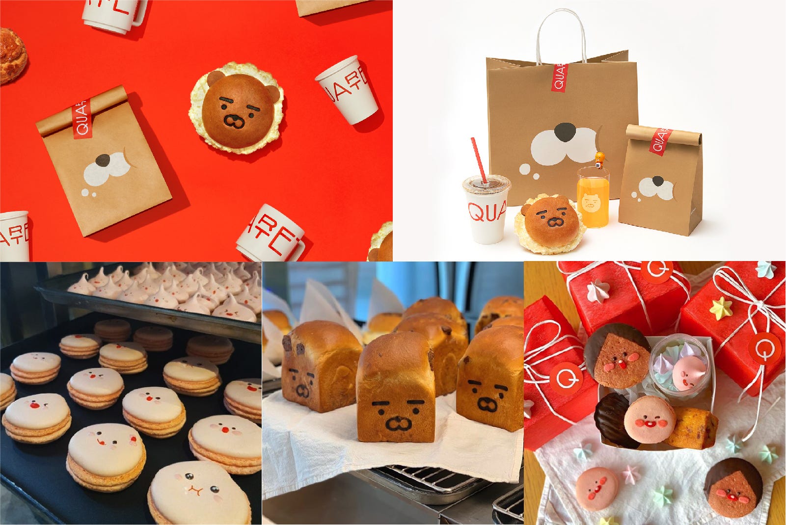
This is a collaboration between Tencent ISUX’s new character ‘PUPU’ and Naixue, a popular fruit tea brand in China. It is introduced along with the PUPU Fantasy Travel exhibition and is being sold at Naixue stores throughout Shenzhen, China.
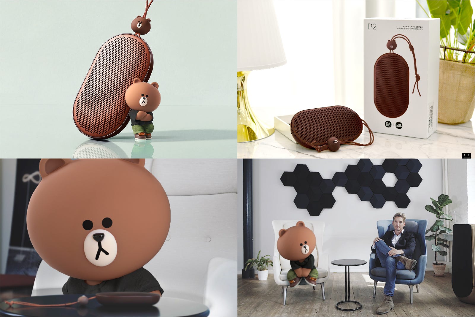
This is a collaboration project between Brown and Bang & Olufsen, a Danish company that manufactures expensive audio devices. Brown’s symbolic color and face were restrictively applied to the minimal design of Bang & Olufsen to maintain their high-end brand image.
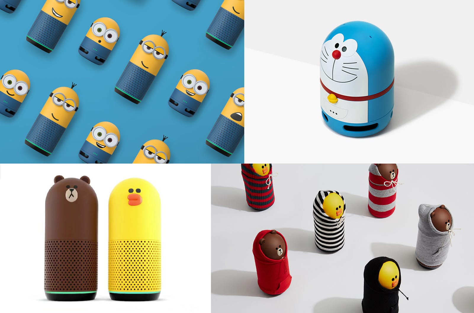
This is a collaboration between Xiaomi and Line Friends which is based on Xiaomi’s “Super Me (SUPER MI) concept. This edition applies the story of Brown, who has gained superpowers and became ‘Super Brown’ after he met Xiami. Xiaomi and LINE Friends will continue to have various collaboration.
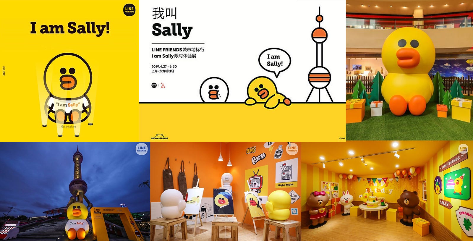
Clova Friends is an AI speaker brand made by LINE Friends’ mother company, Naver. Using the LINE Friends character Brown and Sally, they designed a cute and friendly artificial intelligence speaker. A lot of cute characters are tend to be applied to AI speakers since characters can make people feel more friendly to the device and have emotional access to it. Recently, they have designed some special editions through collaboration with Doraemon and Minions which were very popular.
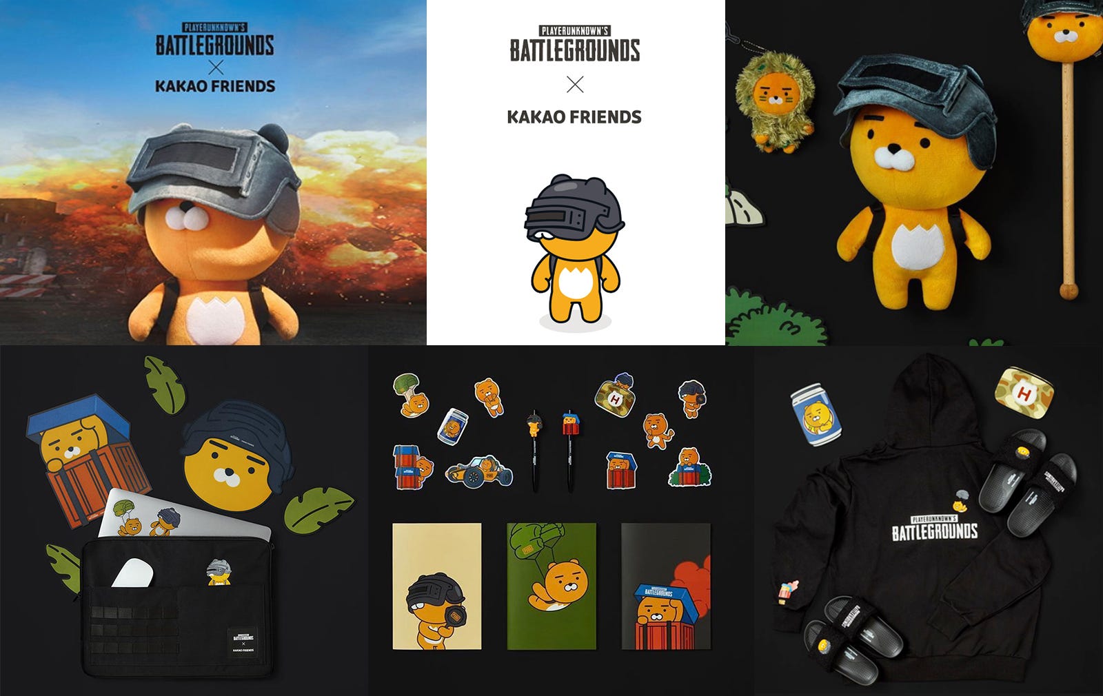
A collaboration of the popular PC game Battle Ground, which is being serviced by Kakao Games. Kakao Friends designed a Ryan doll who dressed like a character in the game and also few items that fans of Battle Ground game would love.
Supercell’s famous game Clash Royale and Kakao Friends made a snack game together in which the characters of Clash Royale were redesigned with Kakao Friends characters.
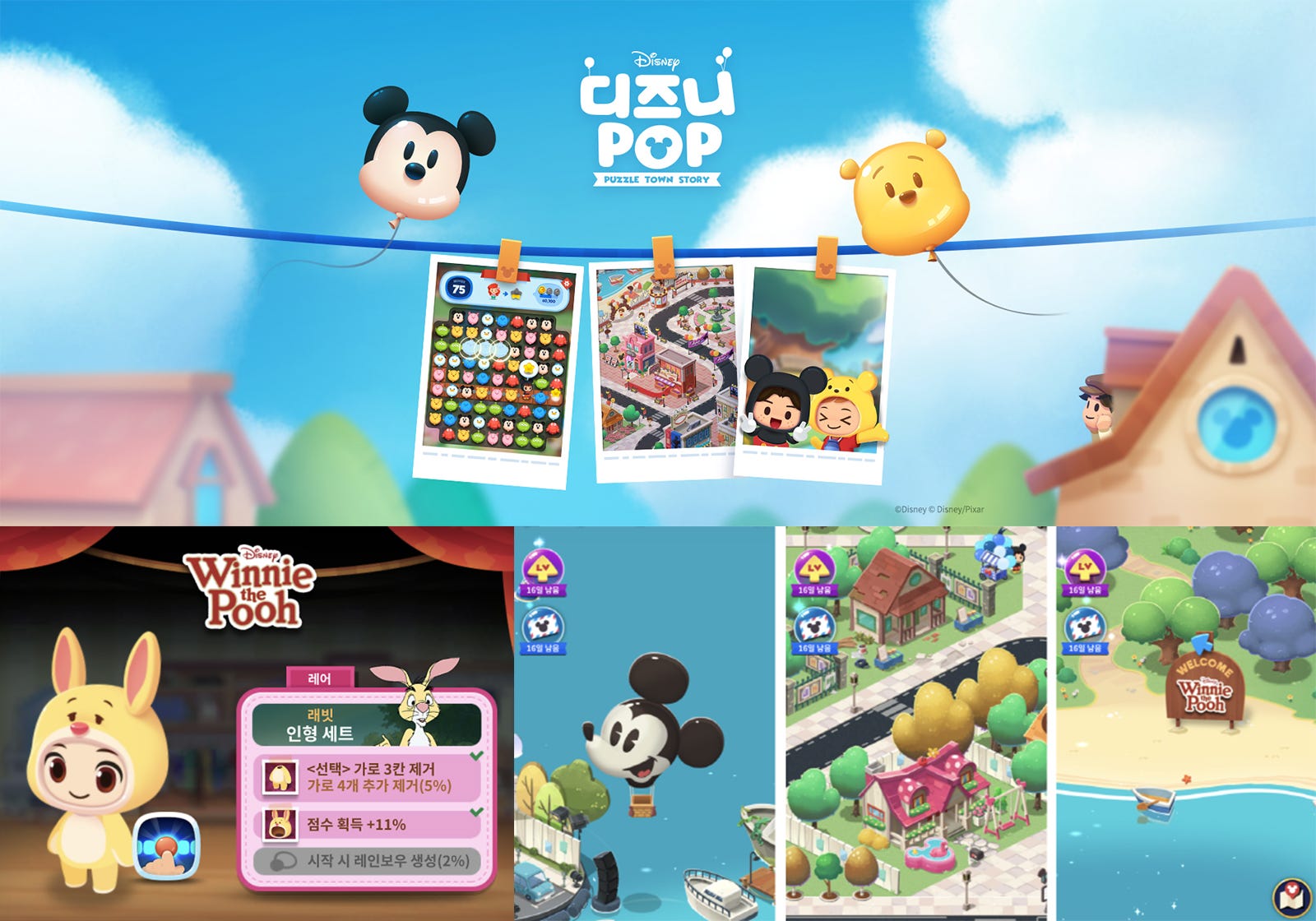
Mobile games using Walt Disney’s IP are being released one after another. Sundaytoz has released ‘Disney Pop’ which is a mobile casual puzzle game.
As various characters are created, there are a lot of attempts to make each characters distinctive from other brands since character business is getting more and more competitive. We have summarized the most prominent cases of character branding and also organized the characteristics of character-related businesses.
Recently, there were few cases to design a character resembling a star or develop new characters by participating in an idol star for the making character concept. The fans of the star naturally become a fan of the character so the character brand can easily get the popularity. By using a star in the brand strategy, it can also help to give a story to the character which makes the brand more interesting. Recently, the BT21 character is very popular which was developed by LINE Friends with the world-renowned K-pop artist group BTS.
LINE Friends created a character brand based on the sketches of BTS members, and this BT21 characters were able to use the worldwide fandom of BTS to enhance the popularity. Over a year, BTS members participated in all the processes from initial sketch of the character to the overall design, character personality and the background story. As the process was revealed in a making film, BT21 received explosive responses from domestic and foreign fans even before its launch. The number of SNS followers for BT21 already reached 16 million on January of 2019. The fashion brands such as Converse and Antisocial Social Clubs collaborated with BT21 characters and those products were sold-out 1–2 hours after their release.
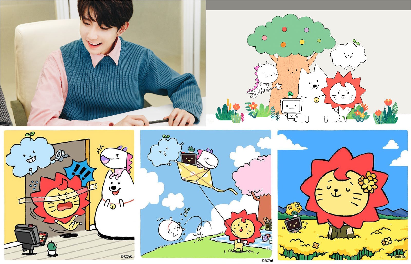
Roy 6 character was created by LINE Friends with China’s next-generation idol 王源 Roy Wang. Roy Wang participated in the character development with LINE Friends and first launched the Roy6 in China. The campaign song of Roy6 ‘Will you’ was a big hit that it took the first place on the main music charts of China right after it was released.
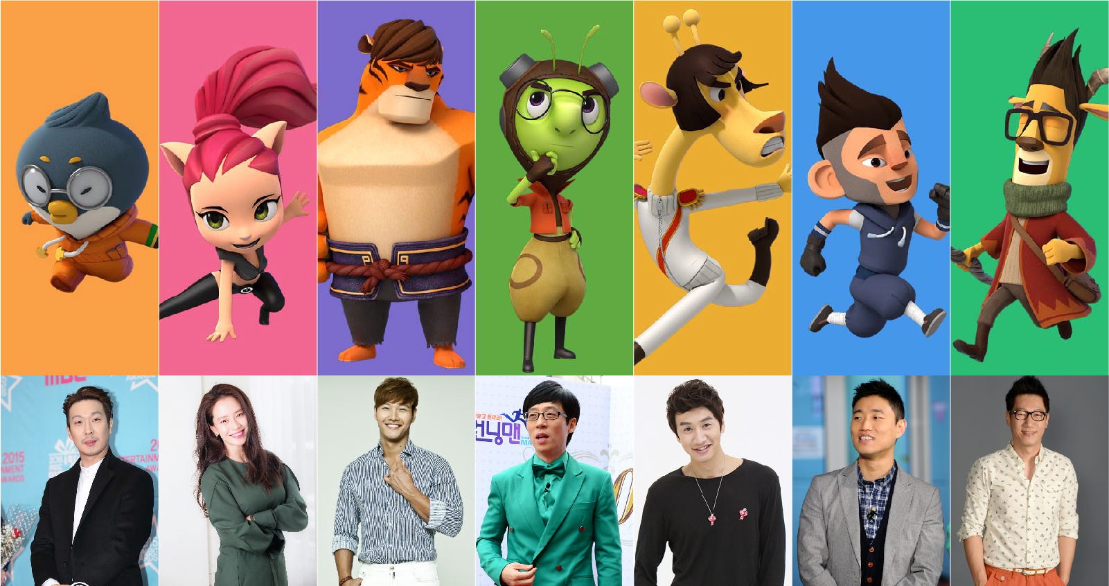
This is a 3D animation that LINE Friends made with the ‘Running Man’, an TV entertainment program which is very popular. Each of the characters were designed based on the real stars in the program. Based on the popularity of the program, animation has also become popular all over the world. In addition, a mobile game was also made with this 3D animation characters.
A character made by YG Entertainment, Korea’s leading agency that produces a lot of stars. Krunk can be easily seen in music videos and events or advertisements related to YG, with the concept of being a star singer. And various goods and figures of Krunk which is for promotion of YG artists are also popular.
Popular characters are also tend to be loved globally, so character brands try to promote their characters by opening offline shops or holding events in overseas. We have researched the cases that have recently succeeded in globalization of the character brand.
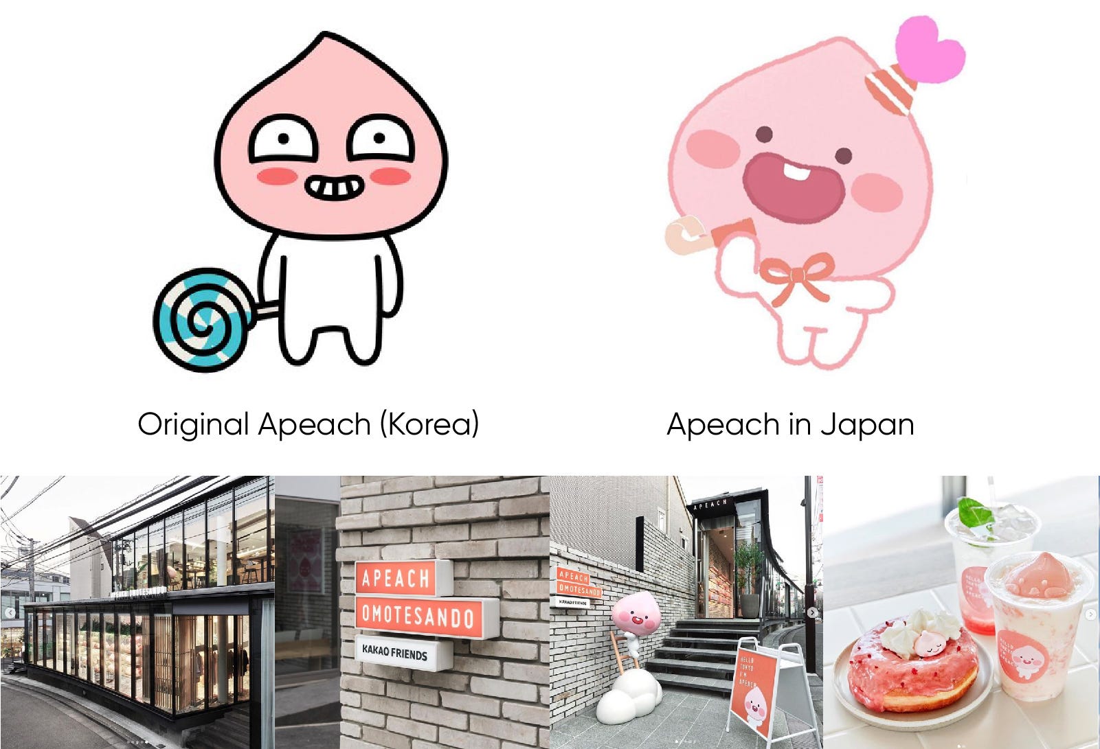
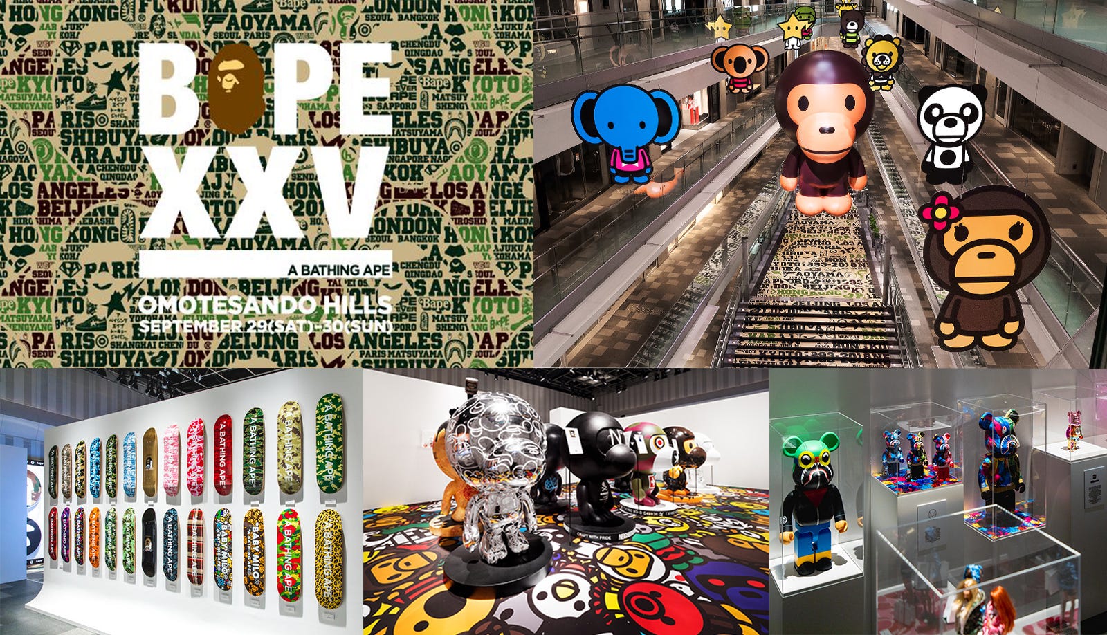
Kakao Friends opened a character brand shop in Omotesando, Tokyo, with the theme of Apeach. The Apeach character released in Japan is different from the original character which was modified to suit the unique sensibility of Japan. People can experience the character brand through various desserts and large sculptures of Apeach character in Apeach Omotesando shop. Based on its popularity in Japan, Apeach was selected as a main character of Tokyo Tourism Corporation.
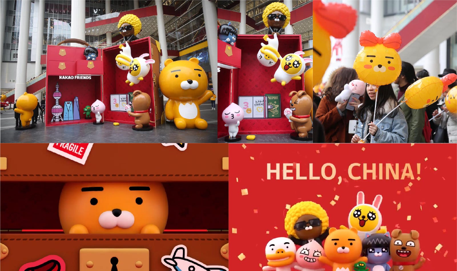
Recently, Kakao Friends opened a pop-up store in Shanghai which was a start for their business in China. This pop-up store had a concept of a ‘first trip to China’ that they placed big character figures around for people to have photos with it. China is one of the country where there is a big potential in character business so Kakao Friends will be also looking forward for their success in China market.
Line Friends opened a small theme park called “LINE Village” in Thailand last year using their chaaracters.When people visit this world’s first indoor attraction,they can see in real size characters and enjoy 23 rooms with different theme.The LINNE Friends store is a place not just for selling goods,but a place where people can have fun and have a new experience .They are also ready to open another theme park in Shanghai this year.
Kakao Friends designed a baby version character family ‘Kakao Little Friends’ which is not much different from the original characters, but has more soft and warm image. This version is applied to various products of Kakao Friends and especially goes well with the children related products.
Various characters were newly designed for BT21, conveying the concept of designing the family and friends of BT21. These various character versions were also loved by BTS fans.
By collecting character figures, consumers can possess their favorite characters in the most complete form. The value of a well-made figures is increasing rapidly as the number of Kidults are growing. A lot of special editions are designed and people love collecting them. Following this trend, character brands make their characters in to a toy figure, allowing people to feel more affection for their characters by possessing it.
Bearbrick is a collectable toy designed and produced by the Japanese company MediCom Toy. They design various editions through collaboration with famous brands and artists in bear-shaped figures which become their signatures, and they are loved by the collectors for a long time.
Molly is a character created by Hong Kong designer Kenny Wang, and is produced as a toy figure through collaboration with various brands. This grumpy but cute-looking girl character has a lot of fans around the world, and they are enthusiastic about Molly’s limited edition.
Super Fiction makes a lot of high quality figures of their characters and also designs a large size of sculptures as an art piece.
Avofriends is a character brand designed by a small studio in Korea, and it is recently getting popular in China and Hong Kong. They had a collaboration with one of the electronic payment system in Korea, Lpay which used Avofriends for their promotion.
By opening a character exhibitions in offline, it can make people understand more deeply about the character brand. And since people like to take photos in an interesting places to share on their SNS, a lot of character brands tend to open an exhibition to promote their characters and let people take photos with their favorite characters.
Celebrating their 25th anniversary, street brand Bape opened a large collaboration exhibition in Tokyo. 10 artists customized baby Milo characters which was placed in the exhibition and various brand collaboration products were introduced.
The global character brand LINE Friends opened the exhibition ‘I am Sally’ at the Shanghai landmark Oriental Pearl Tower in China. This first solo character exhibition of LINE Friends was opened on the birthday of Sally, and more than 60,000 local fans and tourists visited over the weekend. In particular, 4.6 meter tall mega Sally placed in the exhibition attracted attention and various exhibition booths and pop-up stores on Sally’s theme were designed.
Momo Planet opened an art exhibition in China with their newly designed graphic posters which delivers different image from their original character brand.
As we know, a lot of character brands try to expand their business by collaborating with various brands. But in recent years, companies who owns their IP have started different businesses with their original field, especially in F&B business.
Kakao Friends launched ‘Sunday cheezzzball’, a unique snack brand which used Ryan as the main model. Started with a background story that Ryan loves cheese ball, Kakao Friends expanded its distribution network to offline with their own snack brand ‘Sunday Cheese Ball’. They also designed a pop-up store with the concept of ‘A healing snack for people who feel somewhat lonely in the busy daily life’.
In addition, based on this cheese ball theme, Kakao Friends are preparing to open the first VR adventure park in Namsan N tower in Seoul. People can enjoy VR attraction as well as various food, drinks and goods applying Sunday Cheezzzball story.
LINE Friends’ first ‘Brown and Friends’ theme restaurant ‘BITE & BITE with LINE Friends’ was opened in Hong Kong International Airport. LINE Friends’ partnership based F&B business brand was designed to provide the best taste and enjoyable experience with LINE Friends characters. LINE Friends has been introducing a various of popular beverages and snack products, and has continued to expand its F&B business capabilities by operating cafés such as ‘BROUND’ in Korea and China.
Naver Webtoon has made ‘Babi Snack’ which was part of the story in the popular webtoon ‘Yumi’s cell’. ‘Babi Snack’ is a product that tried to make the same taste with the 30-year-old traditional tteokbokki that appears in the webtoon. Yumi’s cells attracted readers with their philosophy of tteokbokki and its excellent taste description in the story. Currently, they are selling this tteokbokki in the online store and Barbie food trucks have traveled throughout the country for six months for their fans.
— — — — —
Now the character is no longer a thing that appears in children’s movies or animation. There are high-quality characters that can be treated even as an art, and many Kidults with purchasing power are enthusiastic about it.
The 3D technology or VR allows the characters to be expressed in a high quality, and it is possible to show the characters more vivid and realistic. We are looking forward to the growth of the character industry which is rapidly developing and changing.
Thank you for reading to the end, and the next report about avatar design trend will be coming soon.
from Medium https://medium.com/@tencent.isux/2019-2020-design-trend-ip-character-98a27e00a901
ISUX has done a design trend research to share insights on 2019 – 2020 design trends. It is not necessary to follow the annual design trend report, but it is important whether the designer is aware of the trend.First, we summarized the overall graphic designtrends and then went through the recent expansion of the character market.Also, we have researched the avatar design trends started from the Zepeto appand Memoji and analyzed the UX trend for the last.
In this article, we would like to share ‘Graphic Design Trends’, the first part of the ISUX design trend report. ‘Graphic Design Trends’ shows the recent branding and motion graphic cases and summarizes 12 notable trends in overall graphic design.
Typography is constantly an important element in design and is used as a method of delivering strong brand messages. Since last year, a lot of brands applied bold San-serif fonts or used strong typography on their designs which has made this become a part of graphic design trend. In addition, there are a lot of typography cases that applying motions and can also find cases applying three-dimensional effect to typography reflecting 3D trends.
This is a moving poster design with a kinetic typography concept. Beyond simply placing image and text, three dimensionally moving text over a fixed image conveys a new impression. These graphics are mainly shared through SNS in forms of short looping video.
Uber developed San-Serif brand fonts along with logo redesign and applied them throughout the brand system. Uber’s moving posters designed with their brand font delivers Uber’s brand messages more strongly.
A typography design case which contains event information applied in 3D form as if it were a gift wrapping. A looping gif was applied as a main graphic of the design system.
The Nike Women’s advertising campaign in which Korean celebrities appear to support the subjective life of women, also applied bold gothic for their font. This font which is designed by Design Studio Guteform, basically has an extended form and also has a system that extends to a wider format to match with the proportion of the media. Dynamic and intense typography delivers messages of the campaign and interacts with other design elements which maximizes the graphic effect.
As Instagram applied colorful gradient for their brand color, color gradient trends have been going on for several years. Recently, bright and strong contrasted colors have been used in all graphics of branding, UI, and package design and this trend is applied not only to graphics but also to photography. The strong color combination, dreamy color tone and colorful gradient are expected to be applied to overall design in 2019–2020.
Recently, a lot of mobile apps apply colorful gradients on their icon design.
Eurosport’s 2018 Pyeong Chang olympic broadcast also applied strong color gradient to all the application designs including logos, graphics and photography. Especially, the contrast of fluorescent graphic and the dark background emphasis the atmosphere of winter sports.
This is a rebranding project of NBA news broadcasting company which reflects the latest trends like using colorful gradients and bold typography. They applied a system which various graphic outputs can be produced by applying various colors, fonts and layouts.
A branding for Tencent Video and Wajijiwa’s idol audition program ‘Mingri Zhi Zi’, expressing the talents of the participants with colorful gradients in different forms of circles. The graphic motifs change with participants as the program goes on.
Recently, asymmetric layout which only shows a part of the entire image has been applied a lot compared to the past when it was often designed based on the fixed grid system. Although each application seems to show only a part of the entire image, designers can apply the graphics to each applications that extend infinitely in a large system. By applying asymmetric layout, designer can have more freedom about applying the graphics elements which can convey a strong impression.
Graphic designer Vaszen Katro keep tries experiments with shapes, colors and layouts reflecting recent trends. Especially, there are many graphic outputs using asymmetrical and open layouts which are recent trends.
Korea’s leading cosmetics company(Amore)’s independent cosmetic brand ‘easy peasy’ tried to make this color cosmetics brand feel easier and more familiar based on their brand keywords easy, active, fun, bold and chat. In particular, the curves that seem to be drawn freely by hand applied throughout the branding system make all the graphics asymmetrical and express free and friendly brand image.
It is an example of identity that can expand the shape into various graphics and patterns using a simple square as a basic unit. The basic graphic elements are maintained simple, maximizing the effect of interactive image.
SM Entertainment, one of Korea’s largest entertainment agencies has developed a new brand identity that can reflect their expanding business. It is a flexible identity which basic circle changes it’s shape continuously making forms like connected S and M. The flexible symbol and the circular pattern of various colors are the core of SM Entertainment’s visual identity system.
This is an interesting branding case of a movie festival, designed with the images of film reel tangled instead of using a formal logo. It is a complex tangled film form which is not fixed, reflecting various colors and images in a complex way expressing various stories and emotions that movies can share to people which is the main purpose of the festival.
The basic rectangle unit conveying the core message of the exhibition is repeatedly copied in to three dimensional space which expresses the identity of the exhibition. This identity system has applied in interactive and modified forms throughout the exhibition, which has also been applied to various applications in different shapes.
3D trend has been so popular that graphic trends can not be discussed without it. Nowadays there are many attempts to show more vivid and fresh impression by applying sophisticated texture to 3D images. People are defining a new realism by adding a realistic texture to the geometric 3D forms which creates graphics that can not exist in reality.
George Stoyanov expressed the beauty of shape by compositing various geometric forms. This kind of visual attempts are interesting because it is difficult to make in reality.
This image was designed with geometric objects of different shapes, textures and colors expressing the identity of Adobe Think Tank which is a forum containing various topics.
The main copy “cozy” feeling is applied as soft fur material which give a new impression. This unrealistic graphics in a realistic texture gives a fresh feeling.
Using organic shapes is not a new trend that also can be found a lot recently on various graphics. It is sometimes used as a graphic motifs of brand identity, but also applied to short motion graphic videos or designed in 3D forms. This organic shape with strong colors or gradients conveys a sophisticated and dreamy atmosphere.
Organic forms are often applied in 3D, and this trend is widely applied in short video works shared on SNS. Especially for this year, there are many cases which transparent texture is applied to 3D organism form. This transparent material reflects the surrounding color and creates a mysterious atmosphere by applying various colors.
By applying bright and colorful gradient to organic shapes, this graphics express the identity of electronic music festivals in Paris.
Illustrations once had been backed up in trend by various graphics using photographs but now became a strong design trend. Lot of brands are trying to use graphics that can give a new impression to their brands by hiring famous illustrators. In addition to 2D illustrations, 3D character illustrations have become a trend since last year and more cases are being used for branding.
This is an example of 2D pattern design based on 3D character which is applied on package design and to the brand video.
Isometric is a method to draw 2D graphics in to three dimension which has been a trend widely applied in graphics and motion videos recently. A lot of designers use this technique to give a new impression by showing the whole graphic in one frame, creating a playful and unique atmosphere. It seems that isometric will be also popular this year as last year.
The isometric method can give an impression that objects become like a miniature. Recently, a lot of cases can be seen which have made the screen more special and interesting using this isometric technique.
Combining various type of graphics from different media was a common way to have an interesting effect from the past. Recently, there are lots of graphic cases that gives fresh impression by combining bold colors, realistic photographs or 3D images. Realistic images or videos combined with flat elements are considered to be one of the major trends of 2019–2020.
By adding glowing scribble animations to live-action videos, the videos can be more dynamic and interesting. Recently, more videos of dancers and singers in SNS platform apply this kind of effect.
There are a lot of work that is hard to know whether it is 2D or 3D. These videos can convey a new feeling by expressing the motion of the object in three dimensions rather than simply using 2D graphics.
As sharing graphics and images through SNS has become very common, short and repetitive motion graphics can be easily seen. A brand logo, illustration and various graphics are all shared in a short looping animation form.
As 3D become a main trend, short and repetitive images using 3D are also noticeable. Adding the real texture and 3D effects can convey unique atmosphere.
The development of AR/VR technology had a great impact on graphic and multimedia design trends. Recently, these new technologies lead people to have three dimensional brand experience.
Even though it is printed on a paper, this poster allows people to have interactive experience using 3D AR technology. The poster only contains simple geometric graphics and minimal information, but when it is seen through mobile, people can get more information and see three dimensional shapes.
Apple used the memoji to advertise Apple music which is based on AR technology. The famous artists such as Ariana Grande promoted their latest songs, while Apple had advertised Apple Music and memoji together through this ad.
This is a Shanghai Nike’s 360 degree online retail shop project through VR technology that allows you to purchase and experience services based on the amount of sweat that you made through exercise.
The real singers who sang POP/Stars on the opening stage of the League of Legends 2018 and the characters of K/DA had stage together using AR technology. The characters were tracked in real time and gave the effect of performing on the actual stage.
New retro, which interprets retro in a modern sense, has became a new trend. New retro is a word that combines ‘New’ and ‘Retro’, a modern interpretation of nostalgia for the past. It has become a new trend not only in design but also in various fields such as fashion, architecture and pop culture.
As well known cafe branding case in Korea, Firtz Coffee created a unique brand identity with retro logo and graphics.
A trend does not flow in one direction but can extend to various ways as we see how latest design trend reflects technologies such as 3D and AR/VR but also contains the retro style. I hope that these various graphic design trends will be applied in a new way, so that creative and interesting design outputs can be created.
Thanks for your reading and it comes to the end of Graphic Trends. IP Character Design Trends are coming soon…
from Medium https://medium.com/@tencent.isux/2019-2020-design-trend-graphic-620b6e9e693f
UX will expand coverage. In most, today, the UX is directed to websites and smartphones. At the same time, the list of applications that are developed taking into account the UX is relatively limited. Some applications cannot be used simultaneously since one of them does not adapt to another device. Also, difficulties are created by the lack of applications for some web services (for example, freelance projects).
Thus, the two key principles of the
UX-2020
are versatility and adaptability. Applications do not just have to be effective. They should work on in any way on any device.
UX will be the basis for attracting attention. The picture is important, but it has less influence. Everything comes up against time again. UX should be aimed at reducing the number of interactions to achieve the goal. So the user will get more satisfaction, and therefore more likely to return to the product again.
UX will move on to things. And I’m not talking about smartphones or watches. It is necessary to look much wider. For example, the improvement of clothing. Self-tying sneakers from the movie "Back to the Future 2" is a good example. It’s time to get rid of the idea that UX is associated only with devices. "User experience" is aimed at customer satisfaction, and therefore can be applied in any area.
Voice input
The most frequent interaction is pressing the mouse button or sensor, but speaking of UX trends for 2020, I want to start with a voice. This technology has been revolutionizing our lifestyle for several years now. Smart ideas like Google Home, Alexa, Amazon, or Siri are by no means a complete list of possibilities to control processes with the power of voice.
Today it is clear that the voice search has also passed an impressive optimization, we are already aware of new web dev trends. The browser will not display results for the word "mom" when you said "muffin." Search engines began to clearly perceive the long and most complex queries and not short words. It is expected that by 2020 about 50% of requests will be performed exclusively by voice.
So far there are some minor flaws. For example, voice input is not fast enough. Most
technologies
require from 5 seconds to process and 1-2 from above to produce the result. Search engines usually handle many queries in 2-3 seconds, which is still longer than text input.
At the same time, it is much faster to turn on the light in the house with a voice than to go to the switch. The presentation is easier to show using voice commands than walking around the room with a remote control or standing at all at the computer and pressing buttons. Moreover, voice input will make life easier for users with physical disabilities, such as blindness. The benefits of voice input are incontestable.
And the last tip: both large corporations and promising companies make voice input capabilities part of their strategy.
Emotion perception
UX designers face the challenge of developing and delivering digital experiences that take into account human emotions. Bringing such technology to the ideal will bring the entire Internet of Things to a new level.
What do we have today:
the ability to analyze opinions on the product by comments;
selection of music (far from ideal technology; for example, on Fridays, the user often listens to electronic music, which means he wants something active);
robots correct their actions if they see discontent on a human face;
preference analysis (for example, Genius technology in Apple Music).
Similar technologies at the dawn of activity, but already trendy. As mentioned above, the task of UX design is to satisfy the client. In other words – to achieve positive emotions.
The error of past generations is that they decided that robots are insensitive. This is somewhat wrong. Perhaps they cannot convey emotions, but are able to perceive them. How else to explain the fact that robots could write music?
To create a good UX design or web design at all you need to examine the user, and only then provide the product. The perception and analysis of emotions – the best way to understand the client. Therefore, such technologies will be the main trend of 2020 and the next years.
Augmented Reality and Gestures
Another technology that changes our lifestyle along with voice input. In fact, it is far from new. Slides with your finger across the screen of a smartphone are gestures. And special features for people with vices have been developed on many devices for a very long time. But if earlier it was an imperfect technology, today it has the ability to make life easier in most areas.
A bit funny, but telekinesis is becoming a reality, albeit rather limited. Close the louver-boards with a wave of your hand or turn on the monitor with a click of your fingers in many homes is already a commonplace thing.
From abstract things again go to a living example – ARkit from Apple. The technology of augmented reality can soon become the foundation of iOS, which means that in the future it will become a market trend.
Through
ARKit,
gyroscope and accelerometer, the user will be able to perform some actions by simply moving the device in space. It works as follows:
The user defines several end virtual points.
Directs the device at them.
A pre-scheduled action is performed.
Such a system significantly reduces the time to switch between
applications,
viewing data or cleaning the system. Thus, the user will be able to get the final result many times faster, freeing himself from the hassle much faster.
Device Synchronization
In today’s pace and trend of using the
Internet,
for most actions, it is important to provide constant access to the network, regardless of devices. In other words, there must be uninterrupted user interaction with everything that is on its line of sight.
One of the trends of the last 2-3 years among the developers is the “smartphone first”. We really spend most of our time with it. But it happens that at one moment the phone is inconvenient, and after a while, it is simply necessary, and all this is connected with one application.
Therefore, the next trend is device synchronization or a “hardware-independent approach in UX design.” Be it a smartphone, a watch, a laptop or a smart house – the user needs dynamic capabilities between all devices.
In many ways, such interactions are connected with the achievement of such goals as booking a hotel, calling a taxi or buying things. That is all that can be done via the Internet.
One example of a company that has already fully implemented a hardware-independent approach is Uber. Passengers can start the trip with voice commands, calling the car through Google Home and complete it upon arrival via phone or watch. That is, the client uses two or three devices for a single and continuous operation.
I advise you to think about how customers can use your product with uninterrupted action on different platforms.
Transition to materialism
In this case, affected and UI-design. We are talking about the rejection of a flat design in favor of detailed 3D-elements. That is, developers will change the look to simplify information.
The flat design is based on minimalism, crisp edges, bright colors and 2D illustrations. The material design developed by Google back in 2014 suggests deep detailing through grid-based layouts, adaptive animation and transitions.
One of the key advantages of flat design is the high page loading speed and quick product evaluation. But the material design will allow a multifaceted view of the product, which will give a clearer understanding of its purpose.
Among other advantages of material design can be identified:
increased interactivity and revitalization of the product;
increased adaptability;
quick perception of information.
In the end, increased detail increases confidence. It gives the impression that the developer has nothing to hide at all: he is ready to show the product from any direction.
Summing up
Many companies make 2020 a new starting point. This is no accident, because a lot of technological advances have occurred in the last two or three years. Now they require a little improvement and a new level. Accordingly, in 2020 we will see a lot of new trends.
UX will lead a complete revolution in attracting the attention of users. The smallest tasks will be carried out in the shortest possible time, practically without wasting time. "Contradictory interactivity" is coming. Users will act more, but spend less resources to achieve results.
from Merehead https://merehead.com/blog/ux-design-trends-2020/