

Human computer interaction and user experience design have always relied on analogies and metaphors to bring attention to technology’s features and affordances. While analogies and metaphors are closely related, it’s smart to understand the differences. The distinctions among metaphors and analogies will also help to underscore why you may want to use one and not the other in certain situations.
Metaphor is about using something from another space to referring to something you actually designing.
Do: Make the unfamiliar familiar (Desktop metaphor)
Metaphors help us explain something new and unfamiliar in terms of the familiar. The most famous metaphor in human computer interaction and user experience design is Alan Kay’s “desktop metaphor”. The desktop metaphor moved us from command line commands to direct manipulation with digitally rendered objects.


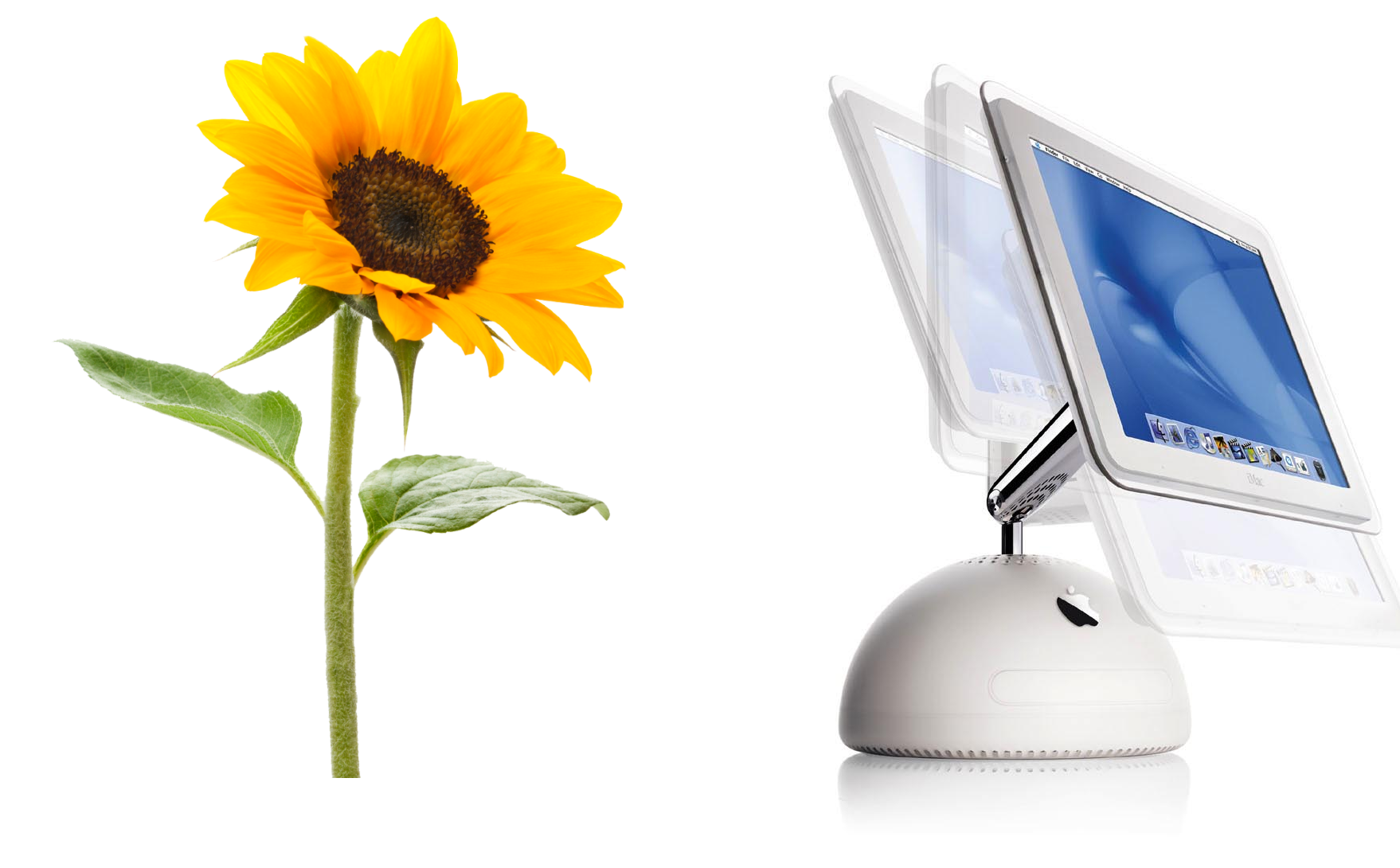
Do: Awake positive associations (Apple iMac)
With metaphors you can trigger emotions. When Apple designed a second generation of iMac, Steve Jobs and Johny Ive were walking though the garden and trying to image what the next generation would look like. Steve noticed a sunflower and suggested that the second generation should look like a sunflower. If you look at the picture below, you notice the way the screen can be maneuvered (the way it can be tilt) makes it look like a sunflower.

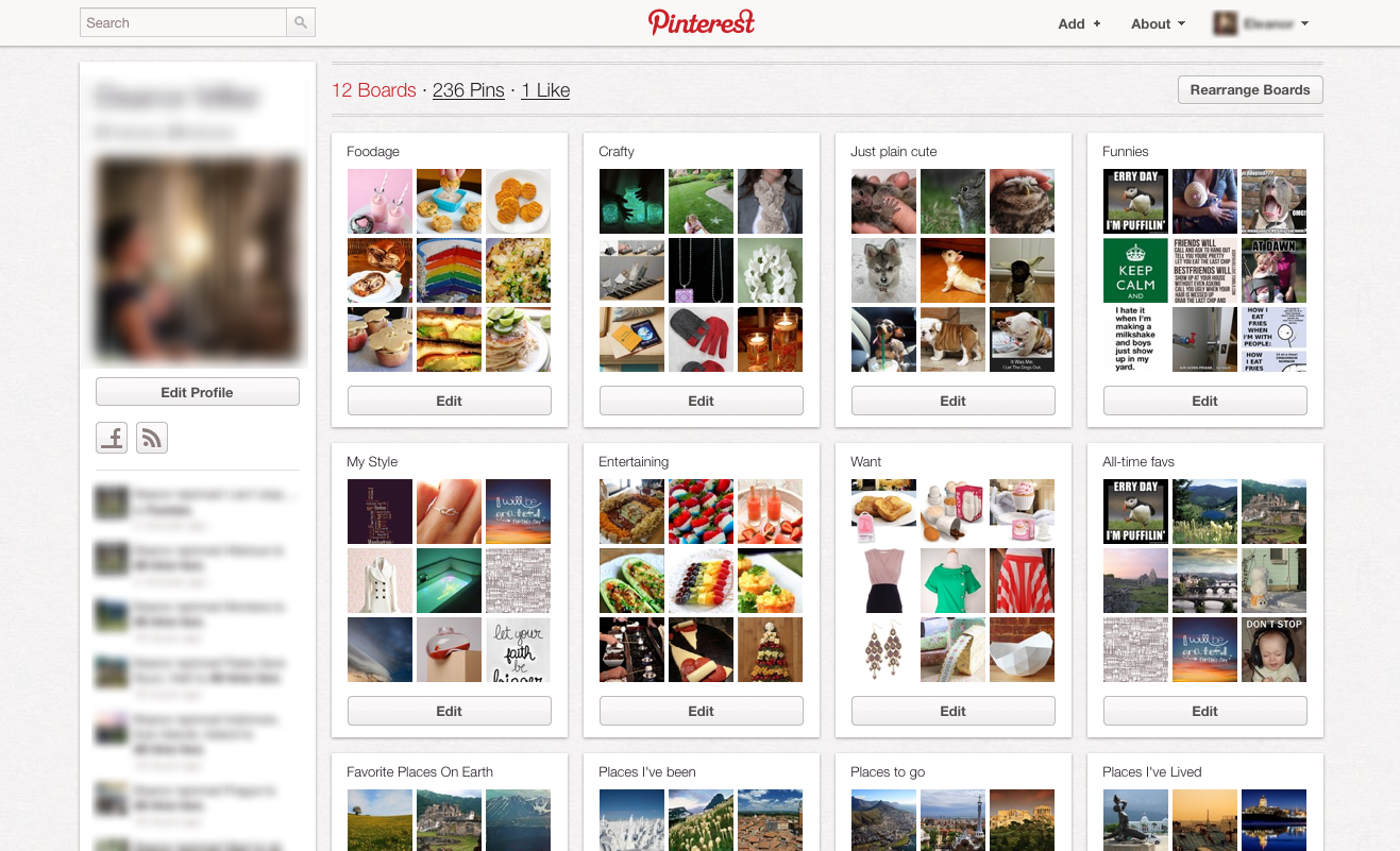
Do: Persuade people (Pinterest)
If you offer a product that is unlike anything out there, you may need to describe it at least partly in terms of something customers already understand. Pinterest, which reached 10 million users faster than any other social networking site, revolves around the metaphor of a pin board. Users “pin” photos they find on the web and organize them into topical collections. This metaphor actually foster creative thinking.

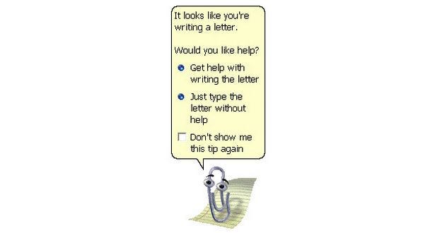
Don’t: Simplistically literal metaphor (Microsoft Clippy)
Picking a design metaphor is really hard. There is always a possibility to pick a design metaphor that can go terribly wrong. And we all know a bad metaphor can lead one astray. Microsoft Clippy was one of them. Clippy is famous for being one of the worst user interfaces ever deployed to the mass public. It turned out to be one of the most unpopular features ever introduced. Clippy reminds us that if we make metaphors too real, if we take them too far, they can become troublesome.

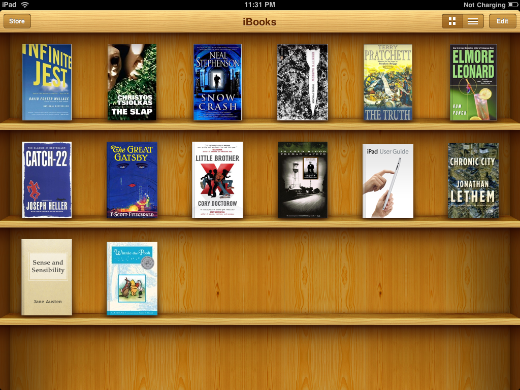
Don’t: Blindly mimic a real-world precedent (Apple iBooks)
Apple’s iBooks is a prime example of that. iBooks used a bookshelf design, complete with 3D shelves and wood textures. The bookshelf metaphor was intended to help users transfer previous knowledge about bookshelves (as a place to store and organize physical media) to the digital environment. The shelves and wood textures are irrelevant to the app’s functionality but were supposed to reinforce the metaphor. Apple later removed the skeuomorphic bookshelf design from the UI.

Analogy is comparing two things of partial similarity often from the same category. The difference between analogy and metaphor is that metaphor is often reference something outside of the category.
Do: Seeing the familiar in a different light (Nest)
Human beings continually and naturally draw analogies as a way of making sense of the world. Analogies help us see the familiar in a new light, which in turn, enables us to generate novel solutions to problems. One good example is Nest which is using analogy in its thermostat design. Basically, the design is referring to the original Honeywell thermostat: its round and you can rotate it to configure your temperature. Nest could choose from a merative other ways to actually present its functionality, but they’ve choose this one. This made Nest thermostat look “strangely familiar.”


Do: Help people understand new concepts (Facebook)
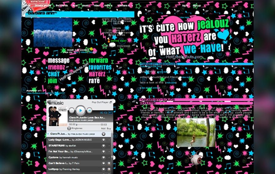
Our minds constantly, unconsciously compare new concepts to things we already know, as a way of understanding them. We look for similarities between our past experiences and any new situation to help us understand the new products. Before there was Facebook, the social media juggernaut which is changing how we communicate — and might change the face of media — there was MySpace. MySpace was targeted at the same audience and was to market long before Facebook. But there was a huge problem with MySpace — profile pages looked a bit odd for many users. Also MySpace allowed users to customize their profile. The final result of this you can see in example below.

Facebook took quite orthogonal approach. It used an analogy with printed student profiles. Since many people had an experience with this type of data, this made Facebook very understandable and friendly for the majority of users.


Using symbols like metaphors and analogies for conveying meaning simplifies what you want to say. Metaphor and analogies aren’t just useful tools for educating and assisting users, they are an alchemy that transforms usable content into richly influential content and good products into great products.
Thank you!
Originally published at babich.biz
from Medium https://uxplanet.org/metaphors-and-analogies-in-product-design-b9af77c18dba