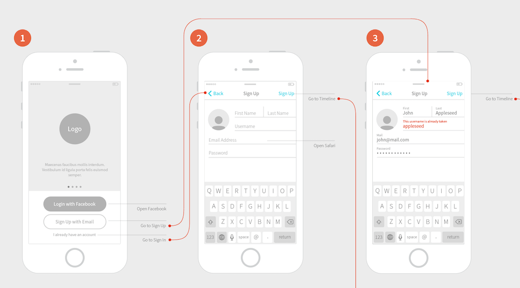
As our organization becomes more design mature, we can no longer use a one size fits all approach. We need to adapt specific approaches to different teams and different problems.
Here are three different approaches to maturing UX in your organization.
#1: Driving Product Teams to be More Design Mature
As our organization’s user experience design leaders, our responsibility goes beyond the UX designers, researchers, and content professionals we work with. We’re also responsible for designs our organization’s product and service teams deliver. If we want to see those teams deliver better-designed products and services, we need them to attain the skills, knowledge, and experience to get there.
#2: The Experience Vision: A Self-Fulfilling UX Strategy
The easiest way to create an effective experience vision story is to start with the current experience. What makes today’s experience with our product or service frustrating for our users?
Team members immersed in the current experience will do the best. This means the starting point for creating an experience vision is immersive user research. The key is to spend time studying the frustrations we put our users through.
Here’s a hard truth user experience design leaders find themselves learning: No one will buy into your UX design ideas if they can’t see how those ideas matter to them.
This is especially true for your organization’s leadership. They need to see how all those great UX design ideas will push forward their top priority, helping the organization. If they can’t see it, they won’t get behind your great ideas.
Within an organization, a design leader can only do so much on their own. At some point, getting executive buy-in becomes a necessity. Design leaders will then need to win over their executives by showing them how their UX design ideas make the organization stronger.
This article was originally published in our new UX Strategy with Jared Spool newsletter. If you’re passionate about driving your organization to deliver better-designed products and services, you’ll want to subscribe. Subscribe here.
Strategies to mature UX in your organization
Give your team the gift of a unique and unified UX strategy playbook. Bring your team to our Creating a UX Strategy Playbook workshop. This 2-day workshop provides you, as design leaders, the action plan you need to take your team and organization to a new level of design maturity.
from Stories by Jared M. Spool on Medium https://medium.com/creating-a-ux-strategy-playbook/three-ux-articles-centered-on-maturing-ux-in-your-organization-e7ba3ec4705?source=rss-b90ef6212176——2
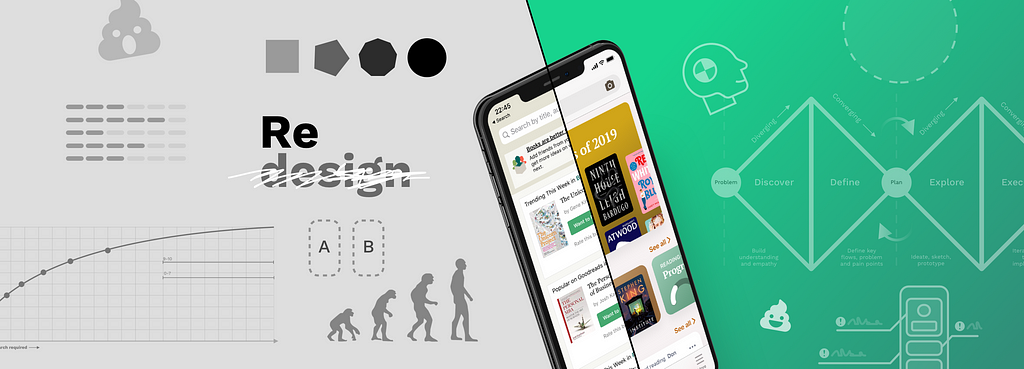
The process described in this article will work for various scopes of redesign — from a feature or view level to full application redesigns. These recommendations will help you avoid pitfalls and deliver value fast, and are based on the experience we gained from hundreds of redesigns, bumps, and bruises along the way.
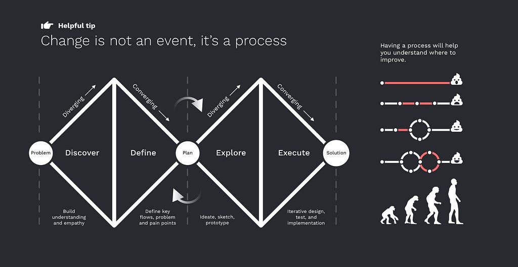
Change is not an event; it’s a process
Let’s clarify one thing from the start; this article is not a strick walkthrough. When designing a product today, it’s both impossible and unsensible to set up a rigid process and follow it for every situation; we need to be agile and quick to adapt. It is necessary to have an outline of the design process you will follow. If the results are not satisfactory, you can go back and analyze what you did wrong and improve the process. If you did things randomly, you would always get random results.
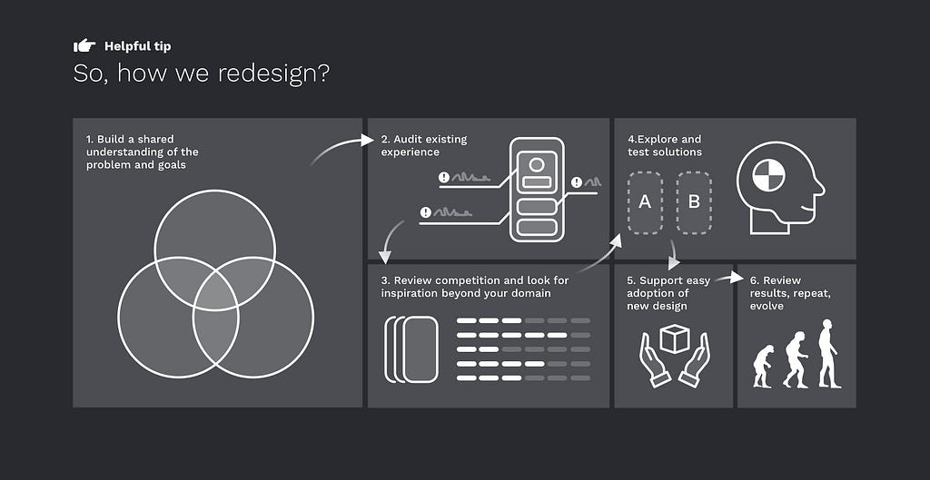
A great place to start is what many of you know as the “double diamond” process. It takes you through four main phases to get from the problem to the solution:
Discovery — building shared understanding and empathy
Definition — identifying key flows, challenges and pain points
Exploration — ideate, sketch, low fi prototype
Execution —iterative design, test, and implementation
A redesign is never really done; it’s a continuous effort to keep experience relevant.
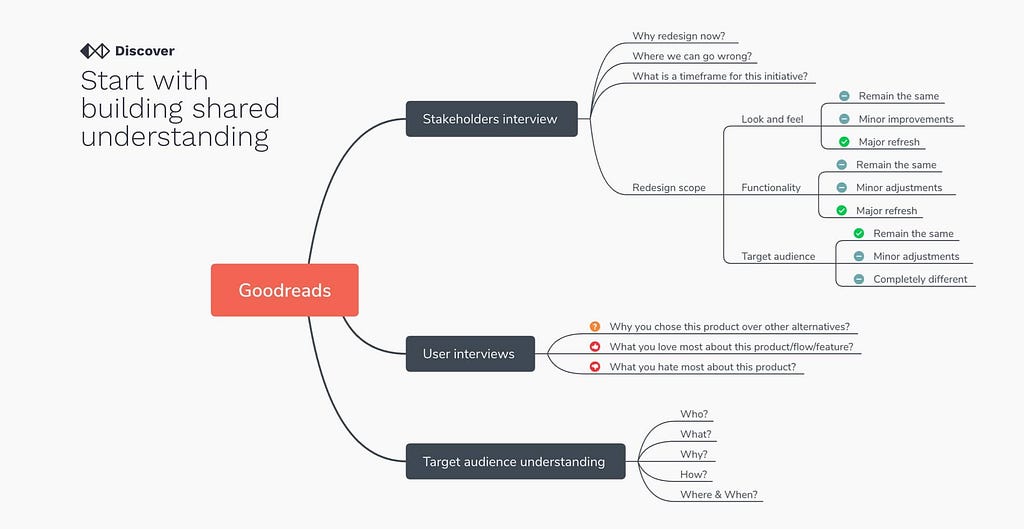
Start with building shared understanding
As a designer, your role is to bring everyone on the same page and unite over one common goal. First, interview stakeholders to understand what and why we are trying to achieve for the business and on what timeframe. Check their expectations regarding look and feel, functionality, and target audience. Interviewing dev and support teams it’s also a good idea to get more insight into what are problem areas.
But your primary target is users. Specifically, you need to be interested in the following:
Why you chose this product over other alternatives?
What you love most about this product/flow/feature?
What you hate most about this product?
On a higher-level before touching anything, you need to know Who is doing What?, Why and How they are doing it? There are many mind mapping tools like X-Mind that can help you structure and fill that info, even during the interview.
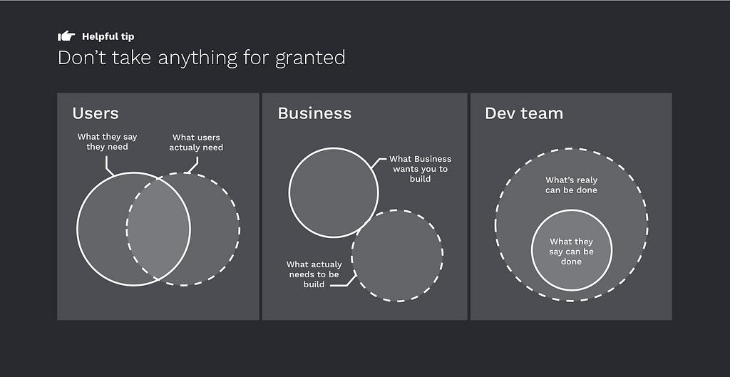
Don’t take anything for granted
Your goal is to listen and capture everyone’s thoughts and propositions, but don’t take it as absolute truth. In the end, you are the expert who needs to filter through the noise and find where to focus.
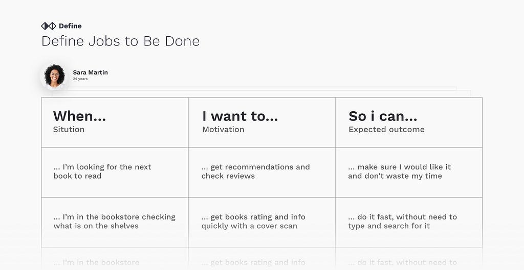
Define Jobs to Be Done
There are many activities you can do to understand users better, build empathy. User journeys and value propositions are beneficial, but there is not always time to do them when we are talking about something small. Personas, on the other hand, are fluffy and fake and have very little practical application. An essential thing that you can do is to list Jobs to be done. This will help you understand the user’s motivations and expectations.
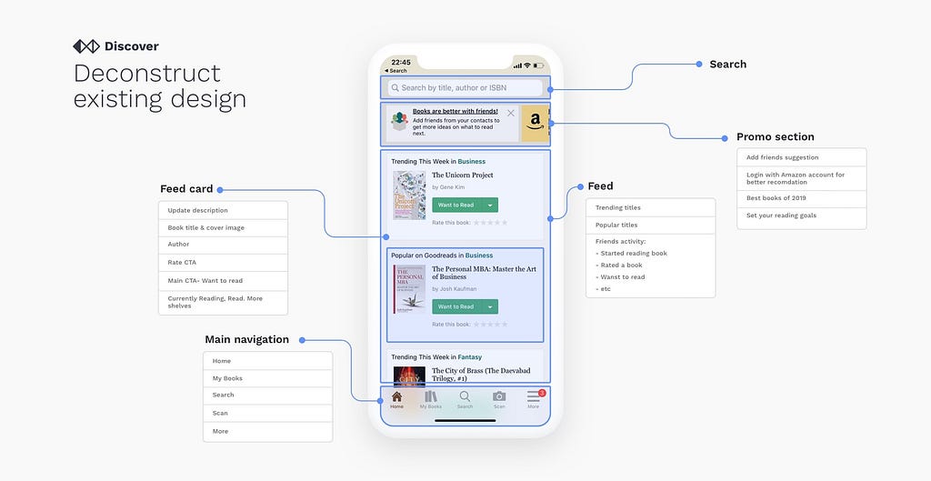
Deconstruct existing design
The number one mistake that designers do during the redesign process is that they completely ignore and disregard the current design. The worst thing you can do is to take the current design and create a new one based on your personal preferences. There was probably a ton of thinking and research that went into the creation of the original solution. Your goal is to carefully inspect the current design, try to understand how it works, and the intention behind each decision.
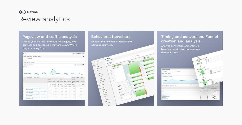
Review analytics
Once you narrowed down your focus to some key areas, you need to know the performance of the design. Since we are doing a redesign, we have a luxury of learning from analytics and checking the real design performance without subjective judgments. Usage data is the most persuasive argument you will have when you need to justify your design decisions with stakeholders and a baseline that you can use to compare the new design performance.
Pageview and traffic analysis Tracks your visitors’ entry and exit from different pages, what browser and screen size they are using, and where they are coming from.
Behavioral flowchart It helps you to understand how users behave and common journeys.
Timing and conversion. Funnel creation and analysis Analyzes conversion and creates baseline metrics to compare the new design.
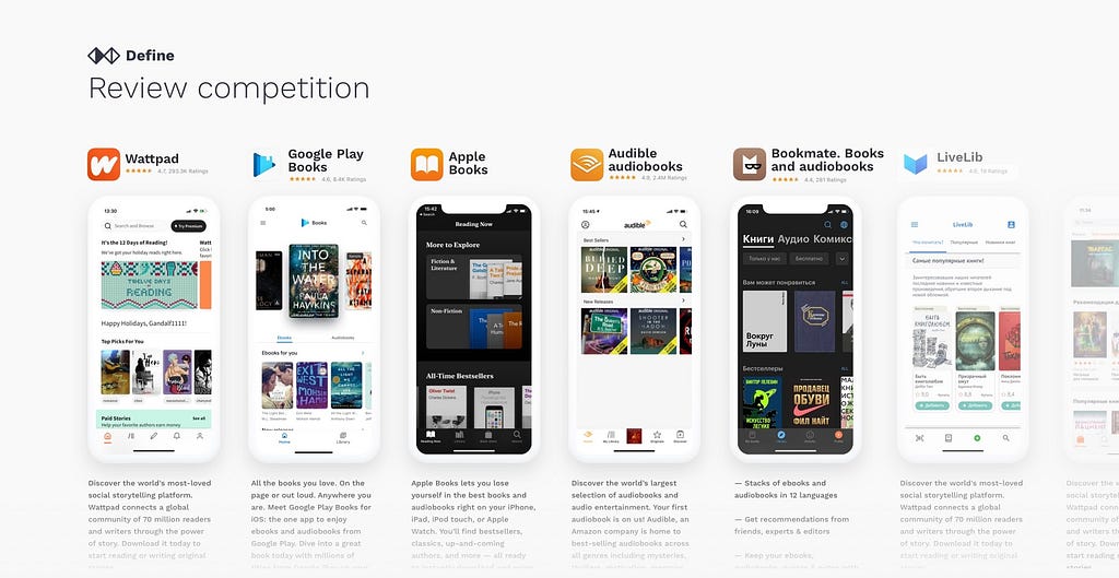
Review competition
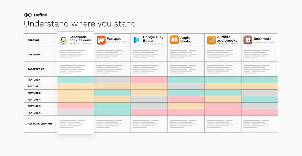
It’s one of the first natural questions that should come to mind. “Well, what are others doing?” As your customers will have to choose between your product and its alternatives, you need to analyze the experience they provide to customers. When reviewing both direct and indirect competition, look for commonalities, similar flows. Define what is considered a standard experience for your case. You can collect all of your findings in the InVision board or any similar tool.
Understand where you stand
Competitor analysis allows you to find out if there are any gaps in the market. If you have more time, start creating a simple matrix where you will list the core information about the competition. Understand what each competitor product is targeted at, how advanced their features are, what is their revenue model and market presence. Comparing it to your product will give you a high-level overview of where you stand.
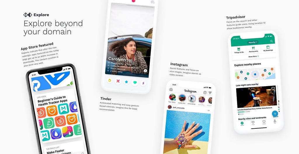
Explore beyond your domain
Fresh ideas and innovation are never coming from competitor analysis. As everyone keeping a close eye on each other, you can only learn what is considered to be a standard. For inspiration, look beyond your domain. There are hundreds of amazing products that deal with similar problems that you are trying to solve in a different context.
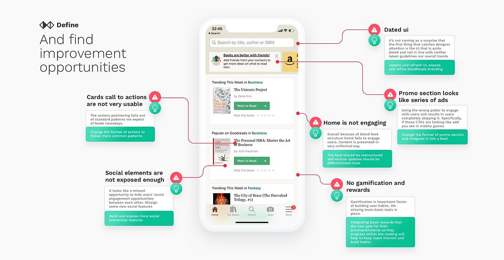
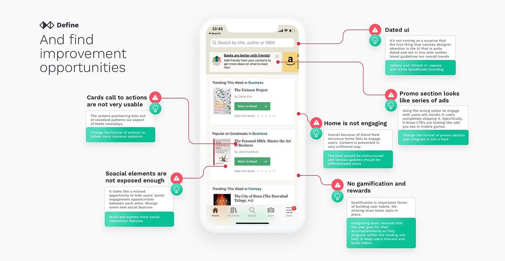
Identify key problem areas
Once you have understood everything clearly with the help of data from analytics, you can start identifying key problem areas with the existing design. Those problems can range from usability issues to visual flows, bugs, inconsistencies, wrong patterns applied, or exotic solutions without any reason. For usability check, you can use ten usability heuristics as a cheat sheet to find out whether the design ticks all boxes. https://www.nngroup.com/articles/ten-usability-heuristics/
And find improvement opportunities
Once you found out the issues, the next step is to find solutions for each identified problem. Competitive research and exploration should give you enough inspiration.
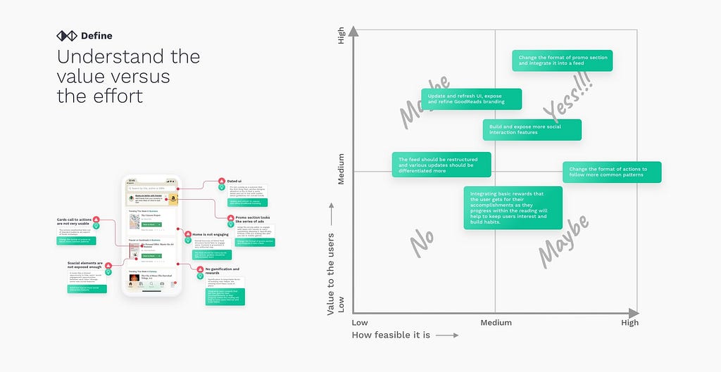
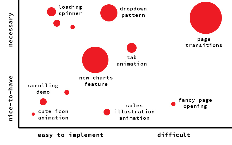
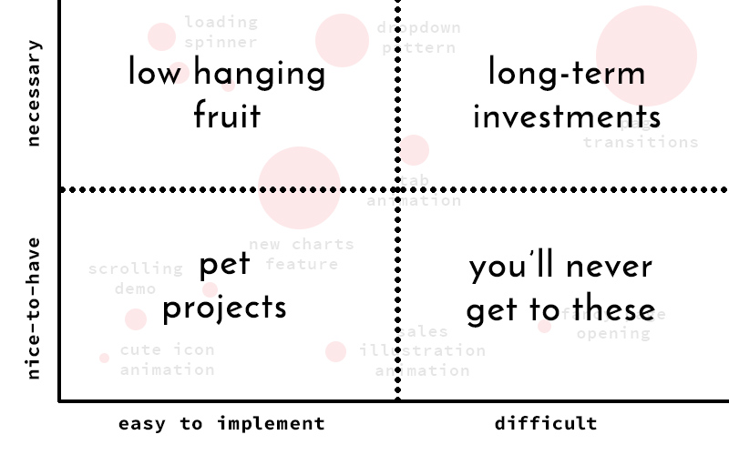
Understand the value versus the effort
Having a list of problems and ideas on how to solve them is a good thing, but it needs prioritization. We need to understand what are the low hanging fruits. For each opportunity, we need to understand what it will take to deliver it and how much value we will add for the end-user. Ideally, we want to focus on the upper right quadrant in the graph below.
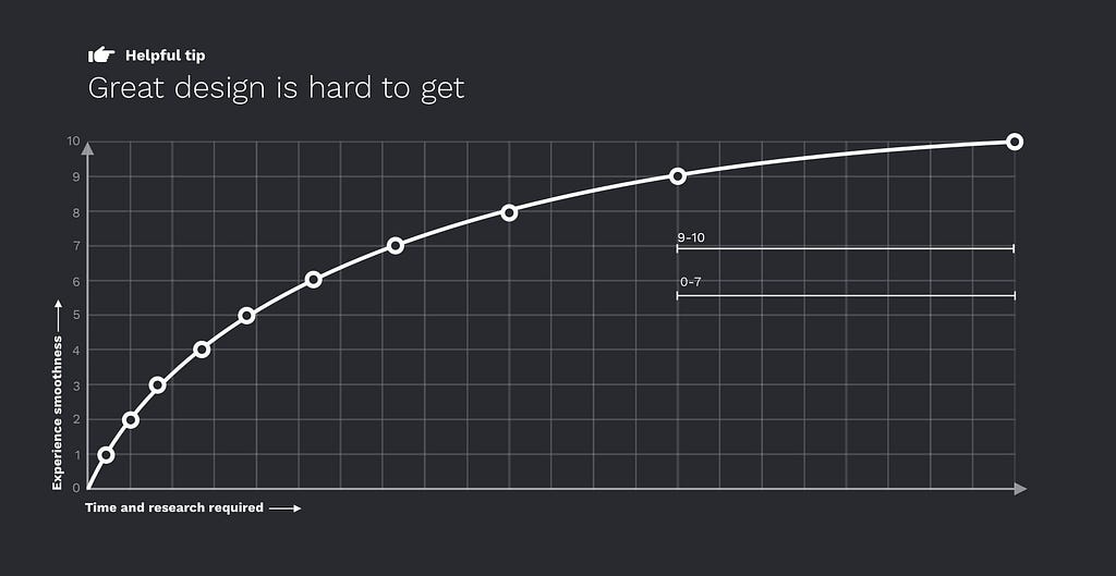
Great design is hard to get
There are no perfect designs, and there is always space for improvement. But excellent user experience comes at great cost. Creating a marginal improvement in already great design will require exponentially more resources invested than taking something bad and turning it into an average design. But don’t let this discourage you, in the great book “Zero to One: Notes on Startups” author Peter Thiel explains that marginal improvements will only get us so far. Sometimes to substantially improve the experience, you need to reinvent it completely.
Sketch on paper first
Hand sketches are great ways to start offloading some of the ideas from your head into the physical world. You can use a technic called Crazy eights sketching to force yourself to generate eight ideas in 8 minutes. This is a great way to force yourself out of one variant and explore other crazy ideas. It will be perfect if you can do it with stakeholders and event devs. Some ideas that come out of those sketches are unique and creative.
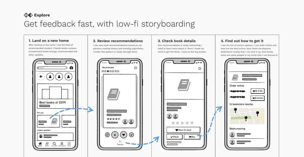
Get feedback fast, with low-fi storyboarding
Each hour spent on low fidelity will save 10 hrs from being spent on high fidelity work later. Try to sketch a very rough idea of flow, have a quick validation, and add a layer of fidelity. Starting feedback sessions with presentation of high fidelity work may show your stakeholders that there is no space for changes, and their opinion was not taken in the account.
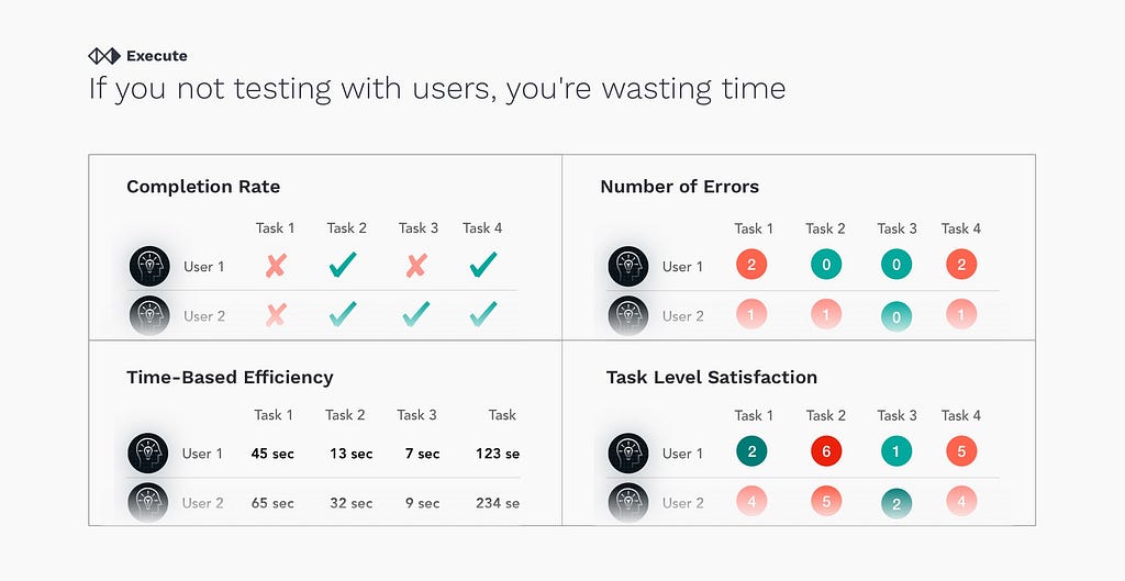
If you are not testing with users, you’re wasting time
It is as simple as that. Everyone can confidently say that they know better than the users, and “ users don’t know they need it till they get it.” That statement is true only in a very rare case. Don’t forget that everything you are doing is for users.
Sell your design
This is basic advice, even though so many people seem to miss it. Like in a fancy restaurant, presentation is as important as the dish itself. If you spend months crafting a design, spend some time on presentation. And remember you are not selling new styles, clean fonts. Create a new story, a story about newly empowered users, because humans are fascinated by stories and visions.
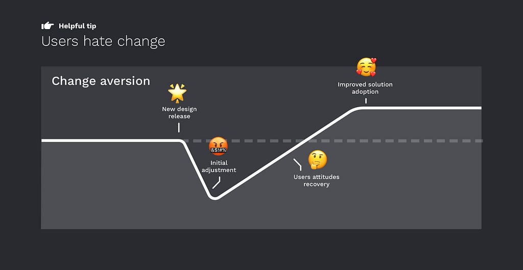
Users hate change
Once the newly redesigned product is delivered to end-users, everyone expects massive excitement and a stream of praise from gratefull users only to find out the effect may be the opposite. This stage requires patience and persistence. Users hate change, doesn’t matter how bad was the original design, they got used to it, and now they need to learn something new. Monitoring analytics post-release and keep in mind users will need to go through some initial adjustment. Give them some time to recover attitudes and fall in love with a new design. Support easy feature adoption with some contextual help and guidance.
There is always space for improvement
The design process never stops. New patterns emerge, more tools become accessible by users. Smooth user experience comes when you truly understand the problem you are solving and help users solve it effortlessly.
Leave your responses on what are your tips for a successful redesign. Follow for more design content in the future.
How to redesign, step by step was originally published in UX Collective on Medium, where people are continuing the conversation by highlighting and responding to this story.
from UX Collective – Medium https://uxdesign.cc/how-to-redesign-step-by-step-guide-869379604734?source=rss—-138adf9c44c—4
One of the things that has struck me in my transition from neuroscience labs to tech is the deep connections in tech to the way the world of science operates (including heavy adoption of scientific terms and techniques), but a general lack of depth in the understanding of what science can really teach us about how to do these things well. Even at ResearchGate, the largest platform at the intersection of tech and science, our professional interest in science rarely extends past specific experimentation techniques. I believe this misses a great deal of insight; that there is a lot more that we in tech can learn from how science has worked for hundreds of years to build knowledge and drive human progress.
Many of the tough, important things that tech claims to be “inventing” are actually problems that science has been grappling with for generations. The kinds of scientists and systems we need during different phases of growth, crisis, disruption, and return to growth can be learned not only from Steve Jobs’ biography, but also from Einstein and Newton’s. In this article, I’ll focus narrowly on the crisis that happens as an entrenched model is pushed to the breaking point, but by doing so I hope to also provide a more wide-angle lens for how to interpret great scientists as sources of inspiration for modern innovation.
Knowledge/paradigm fit vs product/market fit
Steven Dupree, currently Head of Marketing at Amava, gave a usefully simple and intuitive description of the growth process in tech as “the scientific method applied to a company’s key metrics.” For the most part, the specific brand of scientific method employed by tech companies is rapid iterative experimentation designed to optimize existing connections and loops. Thomas Kuhn in his canonical book “The Structure of Scientific Revolutions” calls this “normal science,” where existing paradigms or models are strengthened and further interconnected.
As with science, it’s fair to assume that most of product growth does and should operate in this way. Nonetheless, at a certain point, the existing model or paradigm defines its own local maximum and enters a period of crisis characterized by decelerating or even stalled growth. At this point, the science of optimization is no longer sufficient, and we need to look toward intuitive thinkers, generalists like Einstein and Bezos, as examples of how to get out of the rut by shifting our fundamental models and strategies.
Laying out Kuhn’s different phases in layman’s terms makes it easy to see where analogies exist to business*.
A few points are worth mentioning before diving into specifics on any particular phase:
You may be exceptionally smart and have knowledge/experience in all of these phases, but it’s quite certain you aren’t wired to be good at all of them because natural skill in one is often natural weakness in another. Developing that self-awareness (or as Eugene Wei calls it “your own invisible asymptotes”) is key.
The entity that goes through this can and often is an entire company, but it may also be one product or even in some cases one major feature. This also means at a larger company, you might have one area in crisis and another in “normal science.”
In product growth, we most often experience deceleration when our first successful acquisition channel becomes saturated, and we begin searching for ‘the next viable channel’. While any deceleration can feel like a crisis, constantly testing new channels and optimizing existing ones is essentially ‘normal science’ and doesn’t meet the definition of ‘crisis’ within this mental model.
Is it time for a crisis?
The content out there on how to run “normal growth” is vast, familiar, and fairly scientific already. So I’m going to focus on the “crisis” and “paradigm shift” phases. It’s in these challenges (where instinct is traditionally assumed to be the only option) that creative science can unearth new tools growth.
So what can science tell us about when a particular model is headed for its “growth horizon”? Here are a few key signals:
Decreasing success rate of experiments: People wrongly imagine science as mixing various things together and just seeing what happens, but like A/B testing a new signup flow, doing it properly requires having a hypothesis about what effect you will see and why. If you’re correct, you strengthen your existing views; if you aren’t, you change them. Either one fuels your next hypothesis, making it more precise and over time increasing the efficiency and impact of your work. At the growth horizon, more knowledge doesn’t yield significant wins because the room for optimization is too small.
Whether you’re working on a topical area like acquisition or you’re the head of growth for the whole company, keeping an eye (even roughly) on what % of your hypotheses lead to successful experiments (defined as a significant result above or at the level you expected) makes sense. I talked about building this into your experimentation tooling in a post years ago, or I think for many companies just looking at OKR grading over time would be a decent high-level proxy. It’s important to take experiment velocity and complexity into context, but generally speaking, if it feels like wins are harder to come by, it may be worth thinking about the health of the model as a whole.
Increasing failure to align results across teams or initiatives: Complex products can hide growth horizons via model whack-a-mole: what appears to be progress is simply shifting value from one place to another. This can happen especially if teams are competing for a resource that is essentially zero-sum, such as a person’s time, disposable income, or even attention. We have lots of technical solutions to try and combat this and as managers one of our main responsibilities is the proactive work of setting up OKRs and metric trees/north stars so that the whole organization is pushing in parallel towards the same destination. Doing this same work retrospectively, however, is even more revealing and less common; we humans are unfailingly biased in how we evaluate future possibilities by the current state rather than how we predicted the current state, and I’ve seen many companies hold off-sites to do quarterly or yearly planning across the org but very few do the same for quarterly or yearly retrospectives, despite how much richer past data is than future plans. Look at the wins and losses you actually had and try to fit them into a cohesive narrative for the increased value you’re delivering to users or customers. Can you attribute the wins in certain areas to losses in another or vice versa? Did your overall strategic hypothesis hold up? These questions can be invaluable for determining that much of your work is shifting around value in a model that is becoming a fairly dry sponge.
The Crisis Spotting Gene
The only progress I can see is progress in organization.
-Albert Einstein
Simply put, if you are in the weeds focused on a narrow bit of optimization, it’s unlikely that you will recognize the moment of crisis. Only by surveying the entire landscape and uniting knowledge gathered from a variety of perspectives can you see the full picture. It’s critically important to understand that this is basically opposite to the process of normal science itself, where you follow increasingly specific insights down a particular path (depth vs breadth is appropriate here). For this reason, Kuhn posits (and I agree) that most scientists who excel at “normal science” will not be the ones to identify a crisis. Take Einstein, who was never an experimentalist interested in “normal science;” his career was defined by trying to unite previously disconnected theories into a unified understanding of the physical laws of the universe. Unified-model thinkers like Einstein, who crave the process of finding common threads and organizing different fields of knowledge, will naturally identify weaknesses in the current paradigms. They definitely aren’t who you want optimizing your landing page conversions though.
Especially at larger companies, this can cause problems. Let’s say the head of your product org cut her teeth as a highly efficient leader of normal growth within narrower scopes: she led an impressively efficient team or few teams through the process of rapid iteration against the existing growth model. She A/B/Z tested subject lines and took an ax to every main flow in the product. Unless you have a true unicorn on your hands, it’s unlikely that she is the kind of person who will naturally sniff out the first signs of crisis and the need for a new model. She wants to have her face deep in the book, not organize the library.
Most product leaders at mature companies are somewhere in the middle: indeed the line between model optimizer vs model innovator is far from black and white. Rapid A/B testing of minute components of a funnel can be a highly specific engineering exercise and less dependent on abstract knowledge to drive hypotheses. Model creation or innovation as I’m describing here is closer to theoretical science. But most of the time, the priorities of the company and the focus of its leaders are squarely in the middle.
Having product leaders who are squarely between engineers and theoretical scientists means they can lead and support a wide range of more specialized practitioners. Nonetheless, it means they’re not the most natural fit for a crisis spotter or paradigm creator, so setting up metrics and processes can help support where natural tendencies fail.
New Model, Anyone?
If trying and failing to organize knowledge into a model creates the crisis, then trying and succeeding to do so resolves it. I would highly doubt anyone could come up with a rubric or framework for how to do this across the board given how complex and particular to each business and discipline it is (see the limitless literature on losing product/market fit as markets or technology change), but I do think science and experience can suggest a few ways to set the people responsible for this effort up for success.
Make sure they have a strong voice and connection to resources/freedom needed for experimentation. The Einstein analogy again fits well here, because it’s likely that a non-insignificant part of his success came from his ability to draw attention to his work. Through some luck (especially in timing) and quite a bit of charm, Einstein’s fame far outpaced his peers, some of whom were likely equally intelligent. This meant he could write theoretical papers and suggest experiments that might prove his theory. For example, his General Theory of Relativity suggested a phenomena involving the bending of light by the sun’s gravitational field, which was proved by a huge effort from the part of Sir Arthur Eddington in which Eddington traveled to Brazil and the coast of Africa to witness solar eclipses and measure the positions of stars. Had Einstein not been able to inspire others, his early theories would have remained exactly that, and he would not have gained the notoriety that allowed him to continue to attract more resources to his ideas.
Keeping engineering and other precious resources away from unproven projects is increasingly common in tech, but often not accompanied by a way for those projects to gain Einstein’s magnetic pull over time. A company I work with recently split off a “product discovery” team consisting purely of PMs, UX designers, and analysts. Their charge was to validate the potential of an entirely new business model for the company. Before too long the inability to run experiments outside of user interviews or surveys etc created what might be called “idea bloat;” too many ideas and theories floating around without the full suite of experimentation tools to test their potential fit. A model-innovating project needs to have the personalities and communication tools to marshall resources and pull engineers into these uncertain areas once the reward is worth the risk.
Find model thinkers, and make sure they have the right reporting and mentoring connections. Let’s say your Director/VP of Product is more of the engineering “normal science” type, which works because you’re mostly undergoing “normal” growth and his aggressive iteration moves metrics forward quickly. You also have a long-term growth project that would disrupt the current model, and so you find a generalist model-thinker to run that effort. Good so far! But if that generalist does her job correctly, it is going to appear to the tightly organized Director/VP that things lack structure. Here a quote from the biography of Vannevar Bush (the man largely responsible for creating the NIH and NSF) helps describe how “innovative” science happened at The Office of Scientific Research and Development (OSRD) during WWII:
The success of OSRD is explained not so much by administration as by a kind of fruitful chaos. The organism grew so big so fast, under a steady rain of government funds, that top administrators could not hope to reach down into every laboratory to instruct an investigator to halt this line of research or take up that. Thus when a researcher had a hunch that penicillin would be useful in fatal subacute bacterial endocarditis, and his committee turned his hunch down, he just went ahead and proved that in large doses over enough time it cured many cases. (…) [The OSRD] was set up to release the energies of the young, and this it did in great measure.
The OSRD was so successful in fact that the government realized that funding basic science with no established application in industry was key to the long-term success of the country. Before then very little academic science was funded by the government; now nearly all of it is.
The need for some controlled “fruitful chaos” and hunch-driven decision making means that in these projects the person tasked with validating a new model should likely be connected closely with entrepreneurial types (often the CEO), even reporting to them directly. The creation of the Kindle is an excellent example of this; Bezos spun off a siloed team tasked with disrupting Amazon’s core business at the time: online sales of physical books. To get the project up and running they were “sequestered away” from the rest of Amazon and gave progress updates directly to Bezos. Later they used the same model to launch Amazon’s early experiments into retail, which now includes Whole Foods, Amazon Go, and a lot more on the horizon.
I would also recommend setting these people up with advisors who are highly trained “model thinkers” that constantly need to imagine and pass quick judgment on new potential models, such as venture capitalists and management consultants (I also think these backgrounds make great hires for disruptive growth for that reason). And finally, be aware that one of the challenges is that the leaders of a company are often the ones who created the model in need of disruption in the first place. As in science, this can cause conflict even for the best and brightest – late in his life Einstein was famously skeptical and even hostile to the theories of quantum mechanics (now largely accepted as true) proposed by Niels Bohr and others that challenged some of the laws he helped create.
Shift, Scale, Rinse, Repeat
This process never ends primarily for one reason – your market doesn’t sit still. It is always moving. These days markets are moving/changing at an accelerating pace. As your market moves, your product needs to move with it making product/market fit a pulse that you need to constantly keep your thumb on. Additionally, in the effort to maintain growth, companies tend to expand their target audiences to new segments causing the need to step through this process again.
I’m lucky to have been deeply involved with Reforge during my time in SF and to continue counting on Brian for advice because his writing on model thinking and the endless cycle of product/channel/model/market fit explains this concept generally better than I can hope to do here. My hope is simply to extend the connection to science past where it has been traditionally seen as valuable. Models, experiments, and p-values are obviously scientific but so are the ways we pitch for resources, build knowledge structures, and manage a network of teams or labs with different specialties all working together to produce a whole that is greater than the sum of its parts.
It’s not to say that science does these things perfectly; in fact, the richness of history often comes from the learnings of failure and missed opportunity. My hope in writing this is just to suggest that science can offer a window into a system that has been iterating on many of the topics at the core of innovation for hundreds of years. The cycle of growth, crisis, and paradigm shifts is one of those, but new opportunities to find inspiration in science stretch back as far and wide as the possibilities of tech open ahead.
As a final resource, I’ll offer a few of my favorite science-focused books below that I would recommend to any product leader.
Einstein: His Life and Universe by Walter Isaacson
Isaac Newton by James Gleick
The Structure of Scientific Revolutions by Thomas Kuhn
The Model Thinker: What You Need to Know to Make Data Work for You by Scott E. Page
Endless Frontier by Gregg Zachary
Thinking, Fast and Slow by Daniel Kahneman
*It’s worth noting that some have criticized Kuhn for his desire to package up the complexity of science into neat rules and I’m sure I will (fairly) suffer the same critique; my intention is to help create a simple mental model that can help tech draw insight from science, but of course I understand just how unique every company feels (and is!) especially when you’re in it.
from Blog – Reforge http://www.reforge.com/blog/2020/1/28/from-einstein-to-bezos-what-science-can-teach-us-about-creating-and-disrupting-growth-models
“Many AI initiatives fail” was the overriding finding of “Winning with AI,” a 2019 report based on a survey of some 2,500 respondents jointly conducted by the MIT Sloan Management Review and Boston Consulting Group. “Among the 90% of companies that have made some investment in AI, fewer than 2 out of 5 report business gains from AI in the past three years,” the report found.
Why is it so hard to realize value from AI? Why do some efforts succeed while many more fail? To help answer these questions, the study looked for patterns in the survey data and in executive interviews to uncover what the companies that are succeeding with AI are doing. It found that the companies generating the most value from AI exhibit a distinct set of organizational behaviors. Let me summarize these findings.
Don’t limit AI strategy to IT strategy
A common mistake companies make is to assume that their AI strategy should be considered primarily from a technology perspective. As a result, their AI efforts have an IT- or data-analyst-centric focus. This is the wrong approach. The companies that derive the most value are those that view AI as a core pillar of their overall business strategy. Integrating AI into the business strategy ensures that AI initiatives get the proper focus across the organization, in particular with the CEO and other senior company executives, without whose sponsorship and support it’s nearly impossible for any transformative technology to succeed.
The survey found that companies with AI initiatives led by the chief information officer saw value in 17% of cases. But when other C-level executives led AI efforts, that rose to 37%.
Prioritize revenue growth over cost reduction
Companies often look to AI to help them cut costs and increase productivity. However, the survey found that more advanced users focus their AI initiatives on revenue generation and growth opportunities.
Cost-cutting and productivity benefits are a good way to get on the AI learning curve and to score early wins, which can spark enthusiasm for further AI initiatives. But revenue generation and growth are particularly powerful catalysts for taking AI deeper across the whole business. In addition, if a company doesn’t pursue new AI business opportunities, it’s quite likely that its competitors will.
Apply AI throughout the business
Companies leading in AI adoption have been able to extract more value from their AI investments because they’ve been applying AI pervasively across their functions, units and geographies. The survey also revealed that companies have more success with AI if they place carefully calculated bets.
The report divided the respondents into four groups:
Pioneers (20%) are leading-edge organizations that have widely adopted AI
Investigators (30%) understand AI but haven’t deployed applications beyond the pilot stage
Experimenters (18%) are learning by doing, conducting pilots without a deep understanding of AI
Passives (32%) haven’t adopted AI and have little understanding of the technology
“Among Pioneers, 35% have invested in 20 or more AI projects, double that of Experimenters and Investigators,” the report said.“But the quantity of applications is not the point. Rather, Pioneers focus on projects with the potential for transformative impact, and they accept that doing so entails greater uncertainty than less transformative projects. Among Pioneers, 29% characterize their projects as high risk, at a rate roughly twice that of Experimenters and Investigators.”
Despite the greater risk, Pioneers are also able to scale more projects on average, most likely due to their AI maturity, which enables them to choose their projects carefully and strategically.
When launching their AI initiatives, companies should start out by pursuing smaller, simpler projects that can yield quick wins. These can generate the necessary momentum and funding for more ambitious, longer-term AI projects.
Invest in AI talent
Almost all survey respondents said they’re facing a shortage of AI talent. There’s no simple answer to this problem. The survey suggested that the best approach is a combination of re-skilling workers, hiring new talent and looking to outside experts. Of organizations investing in all three talent routes, 65% are seeing a business impact from AI. In particular, the 59% of companies that are re-skilling workers have seen much bigger impact from their AI efforts than the 19% of companies not focused on re-skilling.
And, as is generally the case with transformative technologies, AI should be treated as not just a technical capability but as a major transformative initiative involving people, processes, culture and business strategy.
To succeed, AI should be managed as a cross-functional collaboration that brings together technologists, data scientists, business managers, process owners and support functions such as finance and legal. It also requires investments in data governance and data platforms to ensure the quality and availability of the data that fuels AI.
Irving Wladawsky-Berger worked at IBM from 1970 to 2007, and has been a strategic adviser to Citigroup, HBO and Mastercard and a visiting professor at Imperial College. He’s been affiliated with MIT since 2005, and is a regular contributor to CIO Journal.
from CIO Journal. https://blogs.wsj.com/cio/2020/01/24/why-some-ai-efforts-succeed-while-many-fail/?mod=_relatedInsights
Summary: The internet is increasingly used to gain knowledge and understanding of a topic. This knowledge is often acquired accidentally, as a byproduct of browsing. Critical internet use is becoming social.
The web has changed dramatically over the last two decades. To understand how user behavior has been affected by these changes, we replicated a 1997 study conducted at Xerox PARC. We asked people to describe a situation where online information significantly impacted their decisions or actions .
We found that, compared to 22 years ago, a larger proportion of current critical internet activities involved finding answers and gathering information in order to better understand a topic. A fair amount of information was acquired in a passive way, without looking for it, during browsing. And often, during critical activities, users turned to other people, asking for their help or opinion.
Methodology
In 1997, Julie Morrison, Peter Pirolli, and Stuart Card conducted a large-scale survey with 3,292 respondents in which they asked people to answer a single question:
A weekly selection of design links, brought to you by your friends at the UX Collective.
This email is automatically generated by Medium and might contain formatting issues in certain email clients. To get a better experience every week, make sure to subscribe at newsletter.uxdesign.cc.
from Stories by Fabricio Teixeira on Medium https://uxdesign.cc/invisible-design-systems-ux-from-1989-the-worlds-ugliest-color-and-more-ux-this-week-91f5ba202fd3?source=rss-50e39baefa55——2
Our modern front-end workflow has matured over time to include design systems and component libraries that help us stay organized, improve workflows, and simplify maintenance. These systems, when executed well, ensure proper documentation of the code available and enable our systems to scale with reduced communication conflicts.
But while most of these systems take a critical stance on fonts, colors, and general building blocks, their treatment of animation remains disorganized and ad-hoc. Let’s leverage existing structures and workflows to reduce friction when it comes to animation and create cohesive and performant user experiences.
Understand the importance of animation
Part of the reason we treat animation like a second-class citizen is that we don’t really consider its power. When users are scanning a website (or any environment or photo), they are attempting to build a spatial map of their surroundings. During this process, nothing quite commands attention like something in motion.
We are biologically trained to notice motion: evolutionarily speaking, our survival depends on it. For this reason, animation when done well can guide your users. It can aid and reinforce these maps, and give us a sense that we understand the UX more deeply. We retrieve information and put it back where it came from instead of something popping in and out of place.
Animation also aids in perceived performance. Viget conducted a study where they measured user engagement with a standard loading GIF versus a custom animation. Customers were willing to wait almost twice as long for the custom loader, even though it wasn’t anything very fancy or crazy. Just by showing their users that they cared about them, they stuck around, and the bounce rates dropped.
This also works for form submission. Giving your personal information over to an online process like a static form can be a bit harrowing. It becomes more harrowing without animation used as a signal that something is happening, and that some process is completing. That same animation can also entertain users and make them feel as though the wait isn’t as long.
Eli Fitch gave a talk at CSS Dev Conf called: “Perceived Performance: The Only Kind That Really Matters”, which is one of my favorite talk titles of all time. In it, he discussed how we tend to measure things like timelines and network requests because they are more quantifiable–and therefore easier to measure–but that measuring how a user feels when visiting the site is more important and worth the time and attention.
In his talk, he states “Humans over-estimate passive waits by 36%, per Richard Larson of MIT”. This means that if you’re not using animation to speed up how fast the wait time of a form submission loads, users are perceiving it to be much slower than the dev tools timeline is recording.
Reign it in
Unlike fonts, colors, and so on, we tend to add animation in as a last step, which leads to disorganized implementations that lack overall cohesion. If you asked a designer or developer if they would create a mockup or build a UI without knowing the fonts they were working with, they would dislike the idea. Not knowing the building blocks they’re working with means that the design can fall apart or the development can break with something so fundamental left out at the start. Good animation works the same way.
The first step in reigning in your use of animation is to perform an animation audit. Look at all the places you are using animation on your site, or the places you aren’t using animation but probably should. (Hint: perceived performance of a loader on a form submission can dramatically change your bounce rates.)
Not sure how to perform a good audit? Val Head has a great chapter on it in her book, Designing Interface Animations, which has of buckets of research and great ideas.
Even some beautiful component libraries that have animation in the docs make this mistake. You don’t need every kind of animation, just like you don’t need every kind of font. This bloats our code. Ask yourself questions like: do you really need a flip 180 degree animation? I can’t even conceive of a place on a typical UI where that would be useful, yet most component libraries that I’ve seen have a mixin that does just this.
Which leads to…
Have an opinion
Many people are confused about Material Design. They think that Material Design is Motion Design, mostly because they’ve never seen anyone take a stance on animation before and document these opinions well. But every time you use Material Design as your motion design language, people look at your site and think GOOGLE. Now that’s good branding.
By using Google’s motion design language and not your own, you’re losing out on a chance to be memorable on your own website.
What does having an opinion on motion look like in practice? It could mean you’ve decided that you never flip things. It could mean that your eases are always going to glide. In that instance, you would put your efforts towards finding an ease that looks “gliding” and pulling out any transform: scaleX(-1) animation you find on your site. Across teams, everyone knows not to spend time mocking up flipping animation (even if they’re working on an entirely different codebase), and to instead work on something that feels like it glides. You save time and don’t have to communicate again and again to make things feel cohesive.
Create good developer resources
Sometimes people don’t incorporate animation into a design system because they aren’t sure how, beyond the base hover states. All animation properties can be broken into interchangeable pieces. This allows developers and designers alike to mix and match and iterate quickly, while still staying in the correct language. Here are some recommendations (with code and a demo to follow):
Create timing units, similar to h1, h2, h3. In a system I worked on recently, I called these t1, t2, t3. T1 would be reserved for longer pieces, down to t5 which is a bit like h5 in that it’s the default (usually around .25 seconds or thereabouts).
Keep animation easings for entrance, exit, entrance emphasis and exit emphasis that people can commonly refer to. This, and the animation-fill-mode, are likely to be the only two properties that can be reused for the entrance and exit of the animation.
Use the animation-name property to define the keyframes for the animation itself. I would recommend starting with 5 or 6 before making a slew of them, and see if you need more. Writing 30 different animations might seem like a nice resource, but just like your color palette having too many can unnecessarily bulk up your codebase, and keep it from feeling cohesive. Think critically about what you need here.
The example above is pared-down, but you can see how in a robust system, having pieces that are interchangeable cached across the whole system would save time for iterations and prototyping, not to mention make it easy to make adjustments for different feeling movement on the same animation easily.
One low hanging fruit might be a loader that leads to a success dialog. On a big site, you might have that pattern many times, so writing up a component that does only that helps you move faster while also allowing you to really zoom in and focus on that pattern. You avoid throwing something together at the last minute, or using a GIF, which are really heavy and mushy on retina. You can make singular pieces that look really refined and are reusable.
React and Vue Implementations are great for reusable components, as you can create a building block with a common animation pattern, and once created, it can be a resource for all. Remember to take advantage of things like props to allow for timing and easing adjustments like we have in the previous example!
Responsive
At the very least we should ensure that interaction also works well on mobile, but if we’d like to create interactions that take advantage of all of the gestures mobile has to offer, we can use libraries like zingtouch or hammer to work with swipe or multiple finger detection. With a bit of work, these can all be created through native detection as well.
Responsive web pages can specify initial-scale=1.0 in the meta tag so that the device is not waiting the required 300ms on the secondary tap before calling action. Interaction for touch events must either start from a larger touch-target (40px × 40px or greater) or use @media(pointer:coarse) as support allows.
Buy-in
Sometimes people don’t create animation resources simply because it gets deprioritized. But design systems were also something we once had to fight for, too. This year at CSS Dev Conf, Rachel Nabors demonstrated how to plot out animation wants vs. needs on a graph (reproduced with her permission) to help prioritize them:
This helps people you’re working with figure out the relative necessity and workload of the addition of these animations and think more critically about it. You’re also more likely to get something through if you’re proving that what you’re making is needed and can be reused.
Good compromises can be made this way: “we’re not going to go all out and create an animated ‘About Us’ page like you wanted, but I suppose we can let our users know their contact email went through with a small progress and success notification.”
Successfully pushing smaller projects through helps build trust with your team, and lets them see what this type of collaboration can look like. This builds up the type of relationship necessary to push through projects that are more involved. It can’t be overstressed that good communication is key.
Get started!
With these tools and good communication, we can make our codebases more efficient, performant, and feel better for our users. We can enhance the user experience on our sites, and create great resources for our teams to allow them to move more quickly while innovating beautifully.
from 24ways.org https://24ways.org/2016/animation-in-design-systems/
Summary: Animation in UX must be unobtrusive, brief, and subtle. Use it for feedback, state-change and navigation metaphors, and to enhance signifiers.
In UX, motion and animation can be helpful and communicative, if used with restraint. Motion is most often appropriate as a form of subtle feedback for microinteractions , rather than to induce delight or entertain users. In this article, we explore the purposes of useful, unobtrusive feedback animation. In a second article , we discuss the details in timing and movement to make these animations appear smooth and natural.
The big advantage (and also drawback) of UI motion is that it attracts user attention . Our peripheral vision (specifically, through the rod-shaped photoreceptors in the human retina) is responsible for detecting motion. Evolutionarily, the fact that we can detect a movement outside the center of our field of vision is, of course, an advantage: we can discern danger and protect ourselves. But that means that we are sensitive and prone to be distracted by any type of motion (meaningful or not). That’s why motion in user interfaces can easily become annoying: it’s hard to stop attending to it, and, if irrelevant to the task at hand, it can substantially degrade the user experience (as any web user who has encountered a moving advertisement can attest).
Although animations can be useful and can build user expectation s about the UI, they should be used with a light touch — primarily as a tool for providing users with easily noticeable, smooth feedback.
TLdNR: push notifications became yet another way to artificially re-engage users and force content down their throat. That’s why so many of them hate it. But there’s some interesting use cases for it. Here is some advice on how to stop ruining it for the rest of us. Spoiler alert: stop asking for permission on page load (and make them useful for users)
A few weeks ago I stumbled upon a kind of fun / trollesque site: “ Should I Add Push Notifications To My Website? — No “. That’s all fun and I understand the purpose of this site and also why it exists. But I would not be that strict. There’s some interesting use-cases for push notification, BUT as usually website abused it for the sake of engagement. Users are now annoyed by it, the usual story of our industry. Here is my opinion and advice on that matter.
We got greedy, that’s why we can’t have nice things
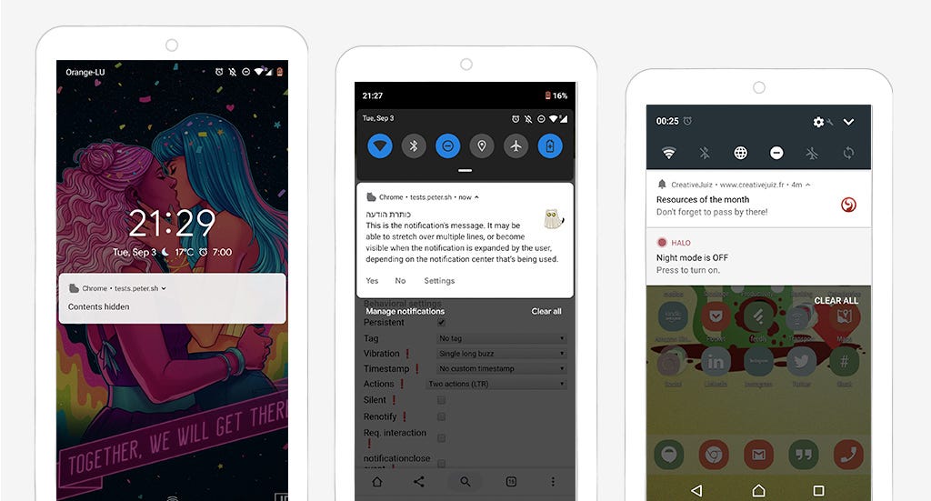
Push notifications used to be a “native app feature only”. You needed users to download your app to push them content. But things changed. Thanks to a few cool APIs like Push + Service Workersbrowsers now have the ability to send notifications to users. This works on both mobile (Android Chrome and Firefox) and desktop (Chrome on Mac and Win, Safari on Mac and Edge on Win10). Fortunately, users need to give permission to the site to send those. And sadly, that’s when things are starting to get annoying for them.
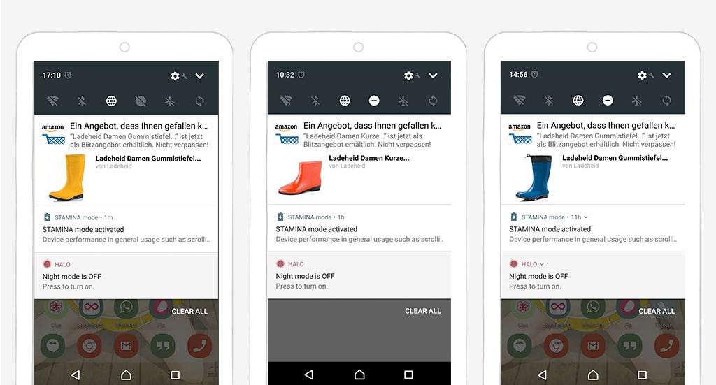
For the sake of **sick** growth hacking, we got greedy. Website owners now see push notifications as yet another way to force content down user’s throat, to increase page views and profit, to sell more “Gummistiefeln” shoes in the process (this will be explained later in the article). Don’t get me wrong, there’s nothing wrong with making money. But not at the expense of user’s experience.
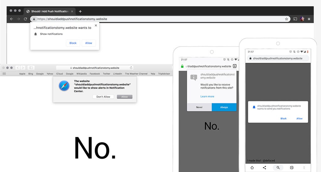
Different notifications permission request on safari and chrome desktop and mobile
According to Chris Wilson at Chrome Dev summit in 2018: “ 90% of permission prompts are dismissed or ignored”. This is why we can’t have nice things. Every time something new arrives on the web, some people find ways to ruin it for the rest of us. And this is exactly what is happening with push notifications. The big “issue” is not the technology, but what we do with it. Humans are both greedy and lazy.
Push notifications can bring value to users for some use-cases
You might think that I’m against push notifications. But I’m not. Let’s not forget that more and more of our tools and services are now cloud based. We have a lot of Sass tools, tools in the browser, etc. There’s actually some interesting cases for “in the browser push notifications” that bring real value to users. And that’s why I’m even more pissed at those sites who are abusing it and ruining it for the rest of us. There’s a lot of really cool stuff that we could do with push notifications. Here are a few examples, feel free to share yours in the comments.
Appointments, meetings and events
I hate calling doctors. I book my appointments on Doctena whenever I can. They have an app but honestly, I never bothered downloading it. I kind of expect that for the moment I don’t need to go to the doctor that often. Push notifications on such sites for appointments would be a great idea. Something like “yeah stef you got an appointment in 1 hours + the address”.
I also use the web version of outlook at my client’s office. I get notifications within the interface in the browser about my meetings. But if I’m not on the right tab (or if the tab was closed) I miss it. Let’s have some browser push notifications for meetings if the users want them (even if the tab was closed)!
Last but not least, notifications could be an interesting feature for conferences websites. Some conferences have a super complex setup with many rooms and users can schedule where they want to go. Sending them reminders about the sessions that will start soon could bring some value.
When it comes to professional or personal online tools, push notifications linked to appointments and events can be an interesting feature for some users.
Flight (train) delays on mobile browsers
Some of you might now that I travel a lot. I travel with a lot of different airlines. Like many users, I do not bother installing the native app of every company I will travel with. Even if they don’t install the app, users want to know about flight (or trains) delays. Some companies like KLM let you get notified by SMS or WhatsApp.
Push notifications also work for some mobile browsers like Android Chrome (not yet in Safari last time I checked). On Android, they integrate on the system like native notifications. They also work even when the website was closed thanks to Service Workers.
Push notifications in the browser integrated in the system
Notifications could be sent from the airline’s sites to user’s phones to give them information about arrivals, departures, gates and delays of their specific flight.
Also, if you want to know more about this kind of mobile nice little features and more, you can take a look at the slides of my talk on mobile capabilities: Super Secret Powers of Mobile Browsers
Deliveries
Another use case for valuable notifications is deliveries. Online shopping sites could send notifications about parcel status and delivery directly through their websites. No need to install an app.
Messages and chats (Slack, etc.)
One of the most obvious use cases for push notifications is of course messages and chats alerts. I won’t go into the details of the user’s attention and the issues of FOMO (Fear Of Missing Out) that can sometimes come with too many notifications, especially for chats. But again, we live in an area of a lot of communication tools are in the browser. If you take a look at slack, you can download their app for your computer, but you can also access your slack channels with the URLs in the browsers. Online chats and instant messages services are a good candidate for push notifications in the browser.
How to NOT ruin your push notifications experience
As you’ve read, push notifications can bring value to users. But for that, we need to ask for permissions and build them the right way
You only get one chance to ask the question — ask wisely.
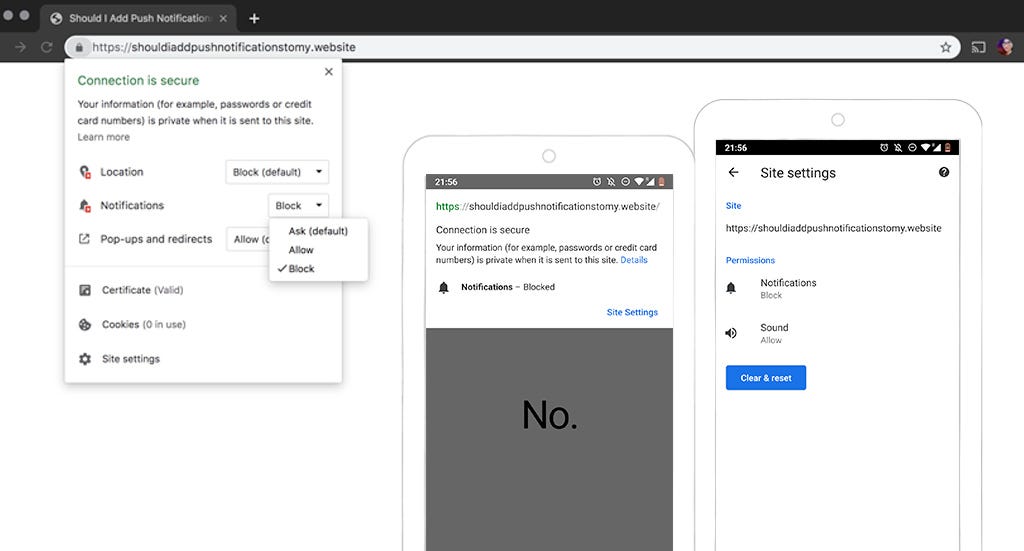
Users can refuse to grant access to notifications. If they change their mind afterwards and decide they want to give you permission to notify them, granting the access to push notifications back is tricky.
On Android and Chrome, they need to find some setting hidden deeply somewhere in the browser setting on both phone and desktop. Most users don’t even know how to do that. Believe me. I refused to grant access to microphone once, I needed it later for a call and it took me 10minutes to find how to grant the access again. Most users won’t even try.
Users need to dig through some settings to allow permissions once they refused
On iOS Safari, last time I checked, if the users refused to grant access, you can ask a second time. After that, users need to go somewhere in the settings (of the OS).
I don’t have a computer with Windows and Edge so I’ve no idea what happens if users refuse. I checked this article which explains a little bit how to enable disable them is it also looks that you need to go through settings. If you have Edge and know what happens when users refuse the notifications access you can comment 🙂
At the time of writing this article, this all means that, if users refuse to grant you access to notifications, it’s going to be a whole mess to get them to approve again. Understand this: you will get ONE CHANCE at asking permissions. And only one. And this also goes for microphone, geolocation, etc. So, choose wisely when and how to ask.
When and how to ask for push notifications permission
Users are not likely to grant you access on the first visit, especially if they don’t know your website. Especially if they come from a search engine, followed a link on a blog or social medias. They don’t know you, why would they want to engage with your content (yet) ? They’ve no idea what you will bring to the table. STOP trying to trick users into granting access on the first visit: don’t demand permissions on page load.
For the user to grant access to push notifications, they need to understand what’s the benefit. So, you need 2 things:
Help users users understand what they gain when they grant you access to push notifications
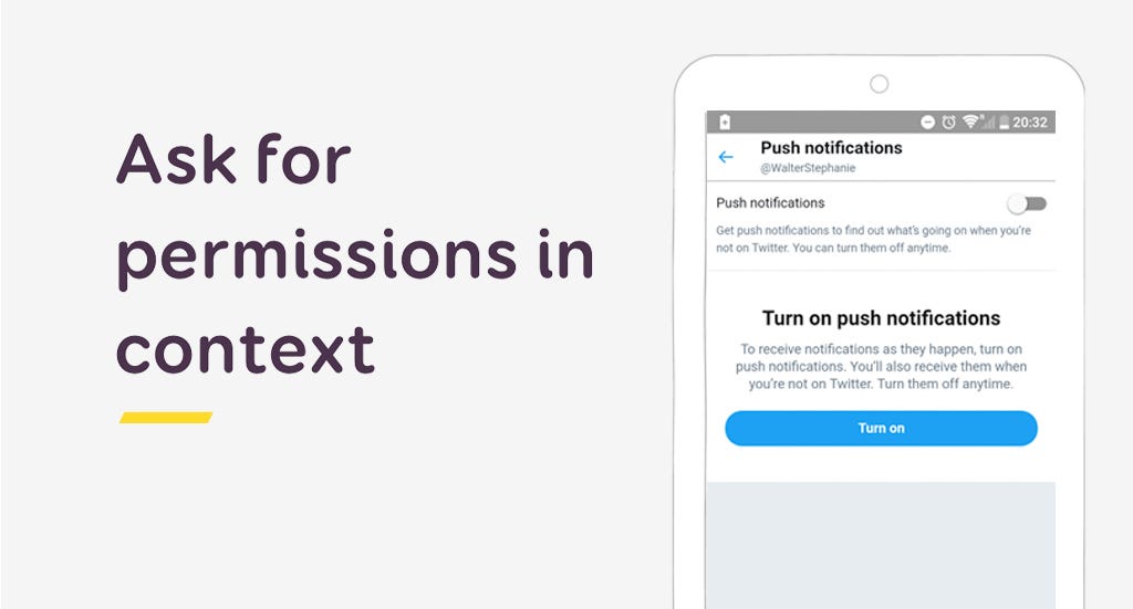
Ask in context (again, not on page load)
So…. Stop Demanding Permission Access On Page Load!!!
Back to my doctor’s appointment site. Once I booked the appointment, I could get a small block on the page explaining me that I can activate push notifications if I want to be reminded 1 hours before my appointment. For e-commerce site, you ask for permissions at the end of the checkout. Explain to users that they will be notified about the delivery status. For social networks, you could do like twitter’s PWA and tell users what they have to gain by turning on notifications.
In those cases, users already invested in your site and get the value proposition to enable push notifications.
Instead of triggering the “real” permission prompt right away, you can also have a first “fake” permission button in the browser. If the user refuses this one, you will get an extra chance to ask later. If they accept, you trigger the actual real permission request in the browser. This is called the “ double permission” pattern. Luke Wroblewski has an interesting 4 minutes video on that topic for native apps. But this technique can also work for websites.
Also, please note that I focus on notifications here. But it’s the same for geolocation or media/microphone permissions. Don’t ask on page load, ask in context, when users understand why you ask and what they will have to gain from it.
3 rules for good notifications
While it’s easy to throw any content towards user’s throats, good notifications are actually quite hard to achieve. Guess what: you need to understand what your users expect. Do some user research here, maybe some AB testing to really understand what kind of content they expect and what’s valuable for them.
By the way, if you are curious about what information you can put into browser notifications, you can play with this Notification Generator.
1 — Good notifications need good timing.
Again, this might sound obvious, but it’s not. Did you ever wake up in the middle of the night in Europe because of some poorly timed notifications from a US website? Time zones matter people!!!
Getting the delay notification after the flight took off is also not a great experience. Bottomline: make sure that the notifications you are sending are well timed based on your user needs.
You could also ask for user preferences somewhere in their settings to ask them:
How often they want to get notification (daily, weekly, for every event, etc.)
When they prefer to get them (if it’s not time sensitive like flight delays)
Another quick piece of advice: if your user is currently visiting your site on a tab and this tab is the active one, avoid push notifications. Instead, use notifications in the UI of your web app instead (like toasts or alerts).
2- Good notifications are precise and actionable
Notifications are no emails. The intent is to go straight to the point, short. So, don’t interrupt users with trivial things.
If you need users to do an action, you can add call to actions to them. Create precise call to actions so that users understand what to expect when they click.
3 — Good notifications are personal
Last year, amazon decided that I REALLY needed some Gummistiefeln shoes. They were quite persistent. For one month, they sent me all the different colors possible, trying and trying. I’m not sure why, I mostly buy hardware and hair color, never bought any clothes or shoes on the site. Anyway: don’t do that. I kept the push notifications on for fun, to be able to rant in an article. Most users might disable notifications at some point here when you start sending them not relevant content.
Nice try Amazon but I don’t need those boots, in yellow, nor do I need them in red, and nope, not blue either.
So, good notifications are personal. Try to customize them towards user preferences. Even better: let users decide what they want to see.
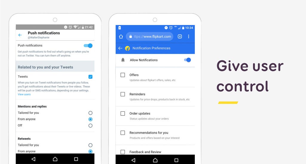
Let users control what they need
And this brings me to the last point: give users control over the notifications. Not all your users will want to get notification for all your content. Twitter lite and flipkart are 2 interesting examples. They let users customise what they want to receive as push notifications.
The PWA version of Twitter and of Flipkart let users personalise their notifications
Also, as mentioned before, it’s super complex to find out how to disable notifications in the browser. Please provide simple and user-friendly solution to opt-out of the notifications. And a way to turn them all off. To put it simple: you know those settings you use for newsletter to avoid annoying users (and ending up in the spam box)? You can do the same for push notifications. Thank you.
And yes, your growth hacking friends don’t like that idea. But yeahy, I’m a user experience designer, I’m here to fight for your users 😉
That’s it, I was going to write a “small article” but let’s face it, I don’t do small articles. I don’t have anything against push notifications. We got greedy and abused a really nice tool. Let’s stop doing that.
Going further
Here is a selection of interesting articles to go a little bit further:
Permission UX — the Google Guidelines for asking permission on the web (for notifications but also for geolocation)
Privacy UX: Better Notifications and Permission Requests — Vitaly’s great article on how to request for permissions and making push notifications less of a privacy issue, less stressful, a must read to go deeper into the topic
Why Permission Priming is Good UX this one deals more with the topic of native notifications but still relevant for web guidelines as well
I, I’m Stéphanie, I’m a Senior UX Designer and Mobile Expert. I write blog posts and speak at conferences. Do you want me to give a talk or workshop at your conference, or simply want to know more about me? You can take a look at my portfolio and contact me.
It’s a solid indicator that something’s gone wrong, but it won’t help you put out the fire. In order to diagnose and fix your customer retention problem, you need to look beyond the simple churn formula of customers out versus customers in.
You need to get an understanding of the customer retention metrics that tell you who is churning, when they’re churning, and why.
Only then will you be able to use your time wisely, and make the adjustments that will have the biggest impact on the health and growth of your business.
Below, we’ll take a closer look at how to find the source of that fire, and put it out before things burn down. Here are 4 important questions to ask about your churn rate—and 4 essential metrics to help you find the answers.
1. What is the best way to calculate churn?
No one’s denying that great acquisition is instrumental to the success of a company. But you can’t let your success in acquisition mask a churn problem further along the flywheel.
Let’s remind ourselves of the churn equation:
Churn = Number of users churned/total number of users
Here’s an example that illustrates the problem with that simple calculation:
The trouble with that chart is that the exact same behavior (adding 5,000 users) doesn’t yield the same result—the churn rate for September is lower than that of August. Rapid growth artificially decreases churn since all the new customers added each month haven’t yet had time to cancel.
When improving churn by just a few percentage can mean up to a 25% increase in revenue down the line, you don’t want to risk any inaccuracies.
💡Calculate churn the Shopify way
A churn number skewed by growth isn’t going to accurately tell you when something has gone right or wrong. That’s why Shopify came up with an adjusted formula that works for periods of high growth—and for startups that are growing fast.
Yes, we know that looks formula scary. So let’s break it down.
Churn = # of users churned
∑ = the sum of the number of users on every day(i=1) in the data set (n)
n = number of days in the period
If the users were added to the customer base gradually, then the average will increase, and it will affect your monthly churn number more. If the users were added to the customer base near the end, it wouldn’t skew your churn rate and give you the impression that it’s lower than it really is.
Basically, all this means is that you’re balancing out your acquisition with the average. Big spikes in growth won’t distort your number or mislead you into thinking you outperformed one month, and then underperformed the next.
2. Does your churn level off?
Inconsistency can be an even bigger red flag than high churn alone. If you can’t get your retention curve to flatten, then your product has no traction.
So let’s say that 100 users who start on January 1st and had a 40% retention rate by the end of the month—but the group hasn’t yet stopped churning. It’s still continually shrinking after the month ends; by the end of the second month, nothing will be left. If you have cohorts that are dwindling away into nothing and never leveling off, you have a huge problem.
If you’re losing customers at essentially the same pace as you’re acquiring them, your cohorts are going to look something like this:
Basically, your user base is just going to plateau and all that effort your teams put into acquiring new users never adds up over time. By the end of that time period, the new folks that you’re adding to your product each month barely make up for users lost.
Compare the curve of the graph above with the one below, in which we imagine that 50% of users stick around. Even when growth slows, your user base will grow significantly over time:
Separate users based on start date and perform a cohort analysis. What you want to look for is a flattening of the retention curve, or, that point in time in the cohort—whether it’s day 2 or week 3—where users stop churning. Take a look at these 2 cohort analyses.
In the first, each cohort is slowly churning until there’s nothing left.
But in the second, the retention curve flattens around Day 12, so that each new cohort builds on the growth achieved through the previous one.
If your analysis looks like the first, it means your should focus more attention on providing value to your users during onboarding and the early stages of retention. Look for ways to shorten your time to value to help users reach their aha moment as close to day 0 as possible.
3. How valuable are your users?
Even if you’re able to completely flatten that retention curve, some users are still going to fall off sooner or later. The goal is to decide how soon is too soon, and what we can do to keep them longer.
Legend has it that as long as the lifetime value of a customer (LTV) is higher than the customer acquisition cost (CAC), then you’re solid.
Basically, as long as you spend less on marketing than your overall revenue from those acquired users, you’re doing well.
LTV > CAC = 😁
Right?
Not exactly.
As the folks at OpenView Partners point out, this formula operates under 2 inaccurate assumptions:
Churn rates are constant
Everyone will eventually churn
As we showed in the previous section, churn rate isn’t constant, nor do we want it to be. We work to constantly improve it.
And assuming that everyone will eventually churn is a cop out—unless you operate in a truly transient market, you should be striving to have customers that never churn. Obviously, we’re not all going to reach Netflix-level retention. But that doesn’t mean your teams shouldn’t be sincerely trying to retain customers for life.
💡Calculate cumulative cohort revenue (CCR)
OpenView has come up with a better formula for understanding the value of your users. They recommend looking at something called cumulative cohort revenue (CCR) and comparing that against the CAC. The CCR is the total amount of revenue you made from a chunk of customers acquired within a certain time period (usually 12 or 24 months).
You’ll notice that the above formula includes a span of time. This formula ensures that you’re comparing the actual total revenue of any given cohort against the amount of money you spent to acquire them. No false assumptions for this one, and it gives clear insight into where you break even with your CAC.
Comparing your CCR versus CAC across different cohorts will show you whether you’re improving over time and how quickly you can recoup the amount of money you spend acquiring customers.
Thing is, a user might churn a minute, an hour, or even a week after they’ve made their mind up about your product. Maybe they keep meaning to cancel, but forget. Or maybe they keep thinking they’ll give it one more shot, but never get around to it.
So let’s say your customer retention graph has this concerning slope to it.
Yikes!
You might see that retention is plummeting but have no idea where things are going wrong. It looks like the curve steepens on day 14—but is that because something goes terribly wrong on day 14 or is that just when they remember to cancel?
💡DAU/WAU/MAU
Instead of looking at just retention, you should also be looking at behavioral analytics. This will give you a sense of who’s active and who just hasn’t gotten around to unsubscribing.
For that, you need to look at your activity levels. Depending on your product, you need to keep close attention to one of these metrics:
Daily Active Users (DAU)
Weekly Active Users (WAU)
Monthly Active Users (MAU)
If your product’s core value hinges on daily use (a messaging app, a workflow organizer, etc), then you have to look at daily activity numbers.
If, however, your product’s core value hinges on infrequent check-ins, keep track of the WAU or even the MAU.
Users don’t just wake up one day and decide to leave your app. Churn is usually preceded by a decline in activity. Set activity benchmarks for your users—if they don’t reach them, start re-engaging before it’s too late.
Diagnose before treating symptoms
It’s tempting to blindly apply any and all retention strategies to your user base—whether you have a churn problem or not. But this can result in you spreading yourself thin and achieving very little.
These 4 metrics equip you with the insights necessary to pinpoint your churn problem, in order to make the most impact ASAP.
And once these metrics show you great results, you can buckle down and start focusing on getting even more value out of those users.
from The Appcues Blog https://www.appcues.com/blog/customer-retention-metrics