
A weekly selection of design links, brought to you by your friends at the UX Collective.
This email is automatically generated by Medium and might contain formatting issues in certain email clients. To get a better experience every week, make sure to subscribe at newsletter.uxdesign.cc.
What to expect for UX in 2020?
- Rediscovering information architecture →
- Embracing new superpowers →
- Invisible design systems →
- Designers, unite →
The UX Collective newsletter is a self-funded newsletter read by over 124,500 designers every week, curated by Fabricio Teixeira and Caio Braga.
Stories from the community
What UX from 1989 can teach us →
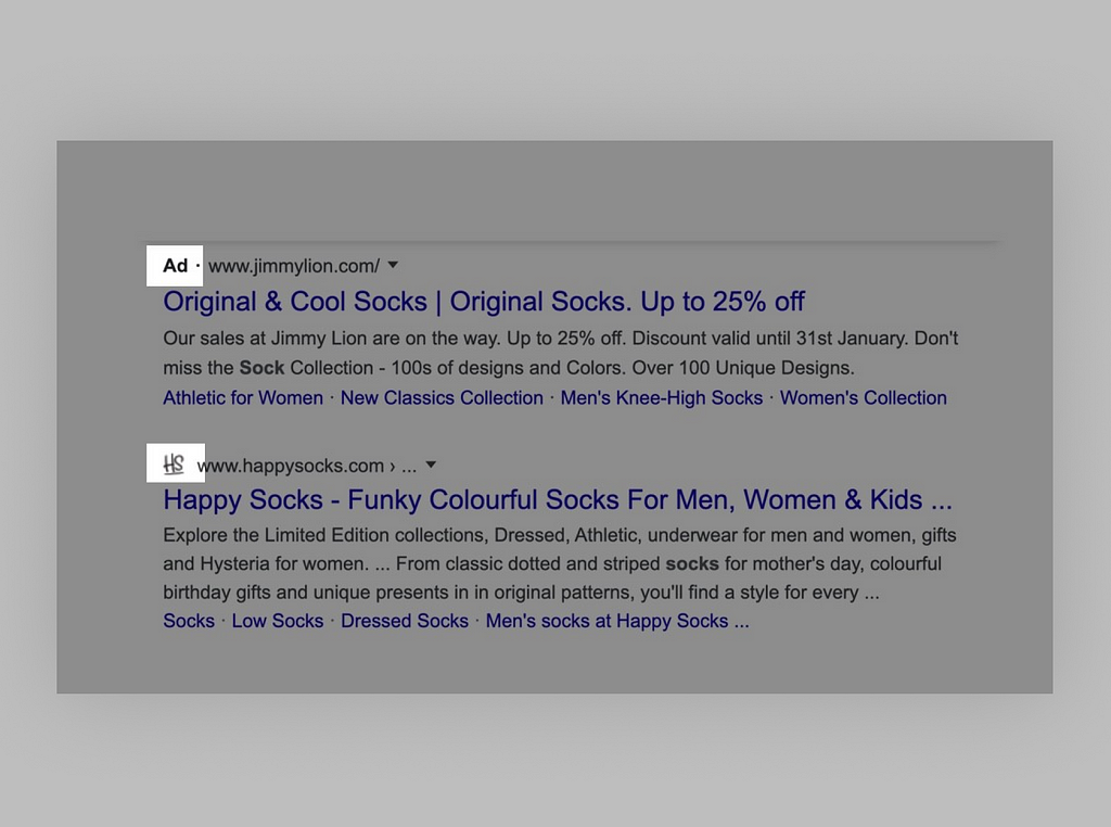
Why Google’s new search results are a dark pattern →

Burnout: the ugly side of UX →
News & Ideas
- The Evil List →
Which tech companies are doing the most harm? - Ugliest Color →
Meet Pantone 448C, the world’s ugliest color. - Google Well Being →
Google’s new tools, from ingenious to offensive. - Writing Accessibly →
How to meet WCAG2 standards in your writing.
Tools & Resources
- Browser Defaults →
Search elements and find browser default styles. - Tuple →
Remote pair programming for macOS. - Mine →
Decide where your data should or shouldn’t be. - Eunoia →
Words that don’t translate.
We believe designers are thinkers as much as they are makers. So we created the design newsletter we have always wanted to receive.
Invisible Design Systems, UX from 1989, the World’s Ugliest Color — and more UX this week was originally published in UX Collective on Medium, where people are continuing the conversation by highlighting and responding to this story.
from Stories by Fabricio Teixeira on Medium https://uxdesign.cc/invisible-design-systems-ux-from-1989-the-worlds-ugliest-color-and-more-ux-this-week-91f5ba202fd3?source=rss-50e39baefa55——2