Typography Classification in Augmented Reality
As we are progressing in augmented reality space the complexity of information is increasing with the introduction of more features and functions. Hence the existing typographic rules and structure of information in AR is not sufficient to solve for new variables (learn more).
Now the text is not just limited to static consumption, new challenges like movement, rotation, rendering of text (frame rate, resolution) are bringing up several issues like perspective distortion, distance reading, distortion of letter shapes etc. However, some of these challenges are not new at all, although the context has changed because of the three-dimensional medium. Example: learnings from highway signages typography can be applied to scenarios where you want to convey quick information to a user wearing AR glasses while walking on the road. In this case, directly translating the guidelines might not work perfectly because there are limitations of text rendering, vibrating text, the brightness of displays, and so on. And this is where the typography has to evolve and solve these novel challenges.
1. Anchoring of Information:
Before I jump onto explaining the text classification I would like to explain anchoring of text which controls the behaviour of text in different scenarios.
Anchored to head: In this case, the information moves along with the head movement of the user and always stay in front of him/her.
Anchored to space: The virtual elements are anchored to real-world coordinates in 3D space around the user. Hence the information stays at a particular position and the user sees it only when he/she is looking in its direction.
2. Placement zones
I have divided the user’s view into three regions based on the distance and priority of information that can be displayed in these regions.
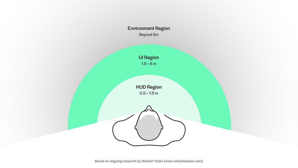
2.1 Heads-up Display (HUD) Region
This region is reserved for UI elements that are anchored to the head of the user and stay in the user’s view no matter where the user is looking (figure 1). It can be used for showing essential information like time, user-controlled notifications etc. similar to the status bar in the smartphones. However, I recommend using this space sparingly for absolutely necessary elements based on the use case. It is recommended not to place objects too close to the user as it results in the accommodation-vergence conflict which causes visual fatigue.
The placement in this region which closer to eyes enables the user to quickly see the essential info by shifting the focus from the real world and fixating on the information in the HUD region. As opposed to head movement if you place the same info below or sides of the main view.
2.2 User Interface (UI) Region
The ideal region where all the main experiences are to be placed for the most comfortable viewing experience. In the UI region, the virtual objects like a browser window can be anchored to both head or space around the user. This is the most interactive of all three regions where user can manipulate and play around with the virtual objects.
2.3 Environment (World) region:
It houses all the elements that are anchored to space on objects which are out of user’s control. Like virtual signages/billboards or location markers which give you info about the real-world objects. The augmented information in this region can extend to infinity but it is totally up to the experience designers to take a call on how far they want to extend the experience. What I mean by that if you are walking wearing AR glasses you can see the info of a few blocks in front of you versus how far you can see. Which is an interesting challenge because the information density increases with distance in the situation discussed above.
3. Classification of type of text
I have been working on the classification below to understand and define different scenarios and the consideration that should be kept in mind while choosing typefaces, setting text and even designing typefaces for different applications. The classification can also help you pick the right type of methods of rendering this video.
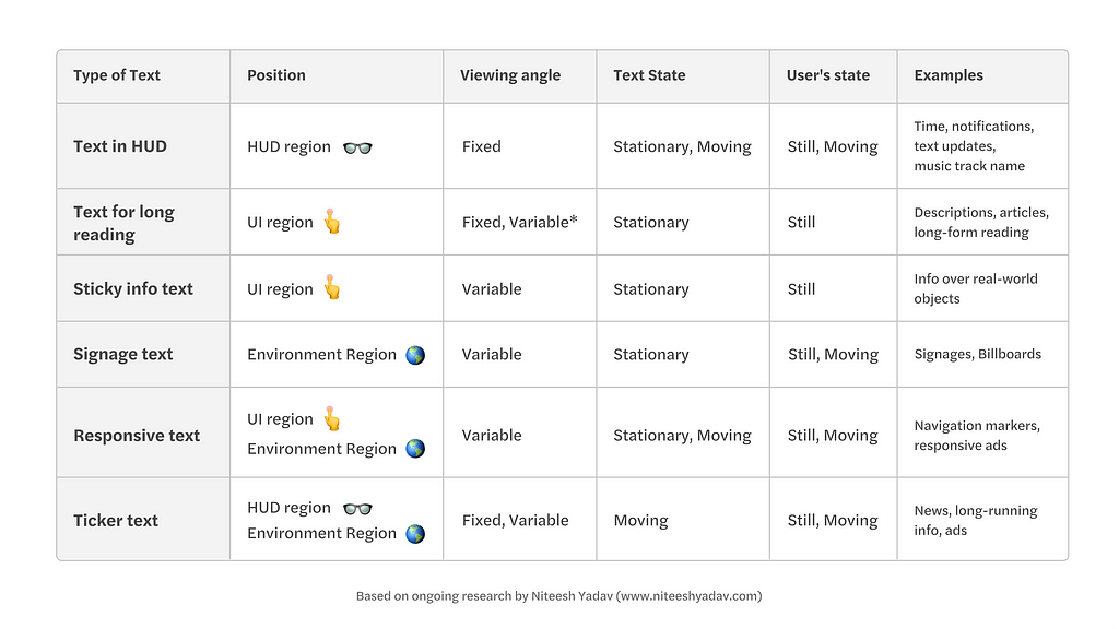
3.1 Text in HUD
In this case, the text sticks to the field of the view of the user and moves with the along with the user’s head movement.
3.2 Text for long reading
It should ideally be placed in the UI region for better reading experience within the range of 5 metres. You can allow the users to move the text to optimize the distance based on their reading preferences.
3.3 Sticky info text
The text which is anchored to the real-world objects (usually in a close range up to a few meters away from the user) that has a fixed orientation. What it means is that it changes position, direction based on how the user interacts with the real world object it is anchored to (micro-level interactions in real-world).
3.4 Signage text
It is similar to the sticky info text which anchored to the real world object but in this case, the user can’t move or change the orientation of the object. The information is anchored to macro-level objects like geo-location, buildings, vehicles etc.
3.5 Responsive text
It can be placed in both UI and environment regions where it changes its orientation (perspective) based on the user’s movement or specific programmed behaviours.
3.6 Ticker text
The term ticker comes from news tickers, the element which has moving text information. Quite a useful method to attract attention and show more information in a small area. Eg: notifications in HUD, showing information in supermarkets.
4. Parameters that make these text types unique
4.1 Viewing angle:
Fixed: the text remains right in front of the user and maintains the angle of view when the user is moving towards or around it. In this case, there is no perspective distortion.
Variable: the text stays in a fixed orientation and viewing angle changes based on the position of the user. Perspective distortion of text is a major issue here.
4.2 Text state:
Stationary: The most familiar way of consuming text is when it is static and right in front of us. Eg. text on shop signage, billboard etc.
Moving: Cases where the text constantly moving. Mostly used to solve issues like showing more info in limited space or to attract user’s attention. Eg. news and share market ticker strips.
4.3 User’s state:
Still: When the user is sitting or standing still at a particular location and consuming the information. Most of the text we consume currently is designed keeping in mind the static state of the user, be it reading a book or reading something on screens.
Moving: With augmented reality expanding to the real world where it becomes part of the day to day life this is a new challenge to make the text consumable in when the user is in motion (walking/running). The closest case we have right now is HUDs in cars.
Know more about Future of Typography here:
Note: All the information in this article is based on my ongoing research and some aspects might change and get updated as I move further. Stay in touch to get the latest updates: Twitter, Medium and LinkedIn
In the coming articles, I’ll share how this classification and the parameters will help you in making type decisions for your AR projects.
This is Part-VI of a series of articles in which I am discussing the typographic aspects of AR. It is based on my ongoing research on typefaces for AR headsets which started as part of my MA in Typeface Design at the Department of Typography and Graphic Communication, University of Reading, UK. The articles will help type designers and interface designers to understand the intricacies of the text in AR, to improve their workflow and design process. Click to read the article I, article II, article III, article IV and article V.
Typography classification in Augmented Reality was originally published in UX Collective on Medium, where people are continuing the conversation by highlighting and responding to this story.
from UX Collective – Medium https://uxdesign.cc/typography-classification-in-augmented-reality-v1-1-adae7a08d2d?source=rss—-138adf9c44c—4