
Over the last year or two, I’ve noticed a certain style emerge in brand and product design.
Look at the graphic below and you’ll see it. The colors are soft and muted, the shapes rounded and the typography unobtrusive. It’s what you could describe as clean. It’s approachable. It’s inoffensive. It’s almost… cute.

Zoom out and you’ll notice this particular aesthetic is everywhere.

As a designer, you can choose your response to it. Some, seeing how it’s proliferated in the tech world, may call it unoriginal. Others deem it "design for designers." There’s a hint of truth in all of it. I personally think it may be the most strategic design we’ve seen lately, even at the expense of originality.
The merit of this style is one thing to consider – and there’s no shortage of criticism in our community, if you’re looking for that – but I’m more curious to know: Why is this trend happening? What prompted it? Is it backlash from a previous trend or is there a deeper psychological reason behind it? We could easily dismiss it as the latest design trend, but I think it goes deeper.
The Kawaiization of product design
The word "Kawaii” is a prominent part of Japanese culture. In English, it most closely translates to "cute.” It’s a term used for everything from clothing to food to entertainment to physical mannerisms, to describe something charming, vulnerable, childlike or loveable. As I understand Kawaii, it’s almost more of a feeling than an adjective, a word that defies complete definition.
When a baby’s face makes us smile, or we see a puppy and have an urge to squeeze it, it’s Kawaii. And that positive feeling translates to objects and experiences beyond the classically “cute.” In Japan, the effect is employed to reduce agitation surrounded construction sites. It is capitalized by airlines and Japanese police forces to soften their perception or broaden their appeal.
Kawaii is essentially fulfilling the purpose of design.
Similar to how beauty is a function, Kawaii can be seen as a function. It elicits positive emotions that encourage social interaction. There are countless experimental studies on how the effect of Kawaii promotes calm behavior and narrows your focus. It’s even theorized to have healing power.
Looking at recent trends, it seems that Kawaii has, in some form, reached the West and influenced the way we are designing our digital products. As we move away from the clean yet cold aesthetic of minimalism, we’re adopting the psychological power of cuteness.
Our app designs have become soft, sweet, inoffensive. Bank interfaces use pastels, rounded corners and soft drop shadows to make mundane or unpleasant tasks more "fun.” Animojis have taken over our chats, and our productivity tools are starting to look like Animal Crossing.
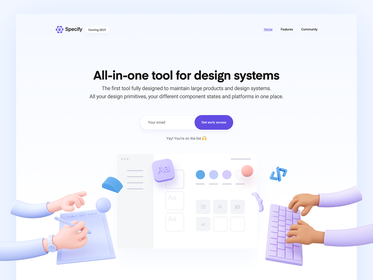
We are using Kawaii to make our products more palatable and less transactional. Claymation-style 3D hands imply our design tool is our friend. Circles and squiggles say our form-creation app is here to party. The muted colors and lack of sharp corners signal safety. It is approachable. It is charming. It’s Kawaii.
What we’re seeing in product design may be minimalism evolving, or it may be a response to previous trends. Or maybe it’s our way of dealing with greater societal issues. Studies have suggested that Kawaii, or fashion sub-cultures off-shooting from it, are a way of coping with social pressures and anxiety. Like putting on a mask to ease the pain of reality.
It could be just a trend, or it could be we are becoming more human, more childlike because we’re tired of being grownups. Given the context of the world around us, we are searching for positivity and comfort, and that’s why we add emojis to our spreadsheets.
"Havana" landing page image by Tran Mau Tri Tam.
"Specify" landing page image by Romain Briaux.
from House of van Schneider https://vanschneider.com/the-kawaiization-of-product-design