The myth of the “low hanging fruit”

TL;DR — Teams rush to build ‘low hanging fruit’, features they think will benefit users but also make them feel their achieving things. However, this is a mistaken belief that outputs equate to outcomes. But its almost as fast if you focus on the areas of highest value to your users and start by immediately delivering a small slice of that. You’ll end up delivering software just as quickly, which is a first step in making something truly great.

Photo by 44 Degrees North on Unsplash

This was originally a presentation I made to several design teams, describing the benefit of moving away from delivering product features and towards addressing the most impactful user issues that we were finding in our research. It was a reaction to managing several design teams that often had their goal post’s moved during the year. I felt there were growing frustrations from teams that were struggling to make things they felt were valuable.

In this changeable environment, they looked for ways they could quickly feel the glow of satisfaction when progress is being achieved. Combined with a changeable company strategy, teams looked for ‘quick wins’ to help prove efficacy (to both themselves and others in the organisation) in the new space they were told to operate in. This post was a response to delivering on the ‘low hanging [feature] fruit’. My point was that to be ‘Quick’ doesn’t mean you just start with the easy, obvious things, that are plucked with no strategic value.

This was never meant as a “this is the only way to do it” polemic. I was a design manager working across several multi-disciplinary product teams and wanted to communicate a supportive message that doing high-value work is what we’re here to do. That I was here to help move towards identifying areas of greatest opportunity and then do work to address that.

Note: Names here are changed to protect the innocent. By that, I mean companies and teams I have worked with.

Features over value

Designing features is a common way that many software teams think about what they need to make. In many cases, features appear like a 1:1 match for an identified user need. In some cases it’s a literal response: User says this, we build this. However, this approach is hit and miss and also is in opposition to a systematic way that consistently produces solid products over a long period. Yes, it can work, but will the team produce and deliver value that builds on or creates sustained changes in user behaviour? Over time?

Feature focus tends to produce software products that are poorly conceived (doesn’t match users needs well), lack continuity (poor experience) and most importantly, don’t address fundamental behaviours that make our product and services useful and valuable to our users.

It often reflects organisations that are racing to deliver, that prioritises ‘shipping’ over ‘shipping value’ and measures their output through metrics that reflect activity (burn downs) rather than outcomes that reflect changes in user behaviour (behavioural metrics). I am not saying there is not a space for any of that, but for the maturity of the organisation we were in, I felt that this was not the place.

So….another way to look at this is to reframe the issue from the product perspective and ask the question: how will we know we’re doing a good job?

This is how we framed it:

Our products are loved when they continually and consistently fulfil the high-value need(s) of our users. We will know when we’re succeeding at this when we see a corresponding change in user behaviour.

Value and Outcomes

At this point, it’s worth talking about what I mean by value and outcome. These key terms describe not only the benefit of what you’re making but the change in user behaviour that occurs. Firstly, value, in this sense, is the scale of a (potentially unmet) behavioural need in our users. At my last company, Babylon Health, we knew that reducing the time that clinicians spent entering data into the EHR took time and attention away from their patients. It effectively reduced their effectiveness as clinicians and reducing that clerical burden is high-value for both clinicians and patients.

An Outcome is a change in user behaviour that we know drives business results. This definition is taken from ‘Outcomes over Outputs’, and stresses the symbiotic relationship between the organisational benefit that comes from changes in user behaviour that the products or service creates that change. An outcome, using the Babylon example, would be a reduction in time spent entering clinical notes into the electronic health record. The hypothesis here is that reduced time spent entering data meant more time spent engaging and understanding their patients.

At Babylon, we spent a lot of time mapping out these outcomes as a way of understanding what are the behaviours we want to change and what behaviours will we see that will help us know we’re on the right path. We looked to reduce time spent at the keyboard, to improve data entry tools and use AI and NLP to take over the clerical burden of a consultation.

Mapping areas of value

So instead of just continually adding features to our product or service, we should try and reframe the problem so we’re focused on areas of opportunity. The question is not ‘let’s add this feature’ (to a product rammed with features) it’s more ‘let’s find areas where we think we can add value/change behaviour’.

This is a reframing of the question, from ‘what should we build next?’ to ‘what problem should we try to solve?’. It’s a subtle difference in approach and in a world of making software, its easy to get them mixed up as you’re still delivering software. The difference is really an area of opportunity could have many solutions, often delivered in combination, that addresses a behavioural need…and sometimes could also not be software and located anywhere along the value chain. Whereas a feature tends to be viewed as a chunk of code that drives an isolated benefit.

So…What we define as ‘areas of opportunity’ typically emerge through our generative research and are formed as a result of deep understanding of our users, user behaviour and the problem space we are working in.
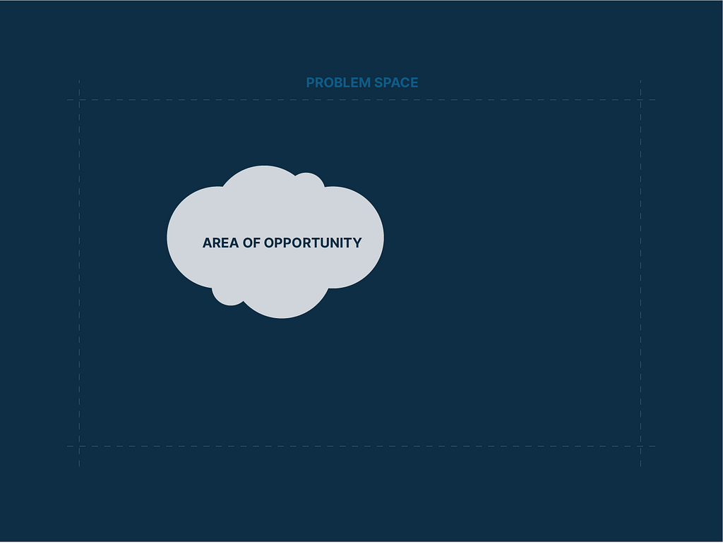
We tend to identify areas of opportunity or value within the problem space we are working. Sometimes they are so large, that can fill the entire problem space.

Often within a problem space, teams may identify many areas of opportunity and these areas even over-lap.
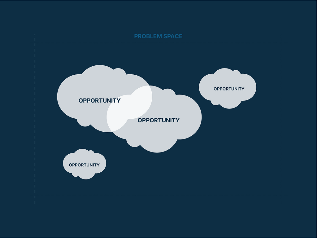
This is where continuous generative research identifies many of these areas of opportunity. Part of a team’s research activity is to constantly define, refine and add colour to these areas. This upward curve of understanding also highlights the behaviours around this opportunity we want to change. Teresa Torres refers to this as continuous discovery, an approach that looks to consistently identify areas of high value for users and fold that knowledge back into the product design process.

I can’t stress enough how important the nuanced view that emerges through continual research, helps create sublime products. I also can’t stress how important it is for design management/leadership to help give the space for teams to do this.

A bit about mapping and low hanging fruit

As hinted at earlier, The thing is mapping features and mapping areas of opportunity, is that they can look pretty similar.

When looking at features, a filter of effort and impact can be used to rank each one. Especially in high delivery pressure environments, teams are often asking themselves ‘what can do straight away that we think will deliver value’ and in a feature-focus world, it’s easy to understand why low effort tasks tend to get higher priority. It’s probably the easiest way teams can show efficacy and impact.
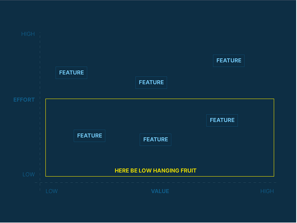
Low hanging fruit — the name describes features that exist in the bottom half of the diagram, occupying both of the ‘low effort’ quadrants

The diagram describes the situation of the low-hanging fruit. Effectively, this is the bottom half of the diagram. These are features that are low-to-high value that take the least amount of effort to deliver. The misconception is that picking the features in the bottom half of this map is what teams should prioritise. It makes sense, on some levels you’re delivering immediate value to users. It’s just that often, this value is often too small to make a wholescale and enduring behavioural change. Furthermore, it is likely to be poorly orchestrated, creating a fragment product experience. Worst of all, its equates outputs with outcomes and is usually done to assuage the needs of stakeholders in other parts of the organisation.

Secondly, this is hit and miss. There is no strategic approach here as there is no identification of value or of any user behaviour(s) you’re looking to change. We’re making stuff blindly hoping that things improve. Ironically teams could deliver all of these features but still not make zero substantial improvements for their users.

Why do teams do this? Lots of reasons..a few that sprang to mind include Tight deadlines, specific ‘deliverables’ have been promised upfront, KPI’s that reframed to deliver a feature, not an outcome, and often someone in the org has sold something and the teams need to fulfil that promise.

Mapping Opportunities

So what happens if you map areas of opportunity across the same two-axis? It yields similar results.
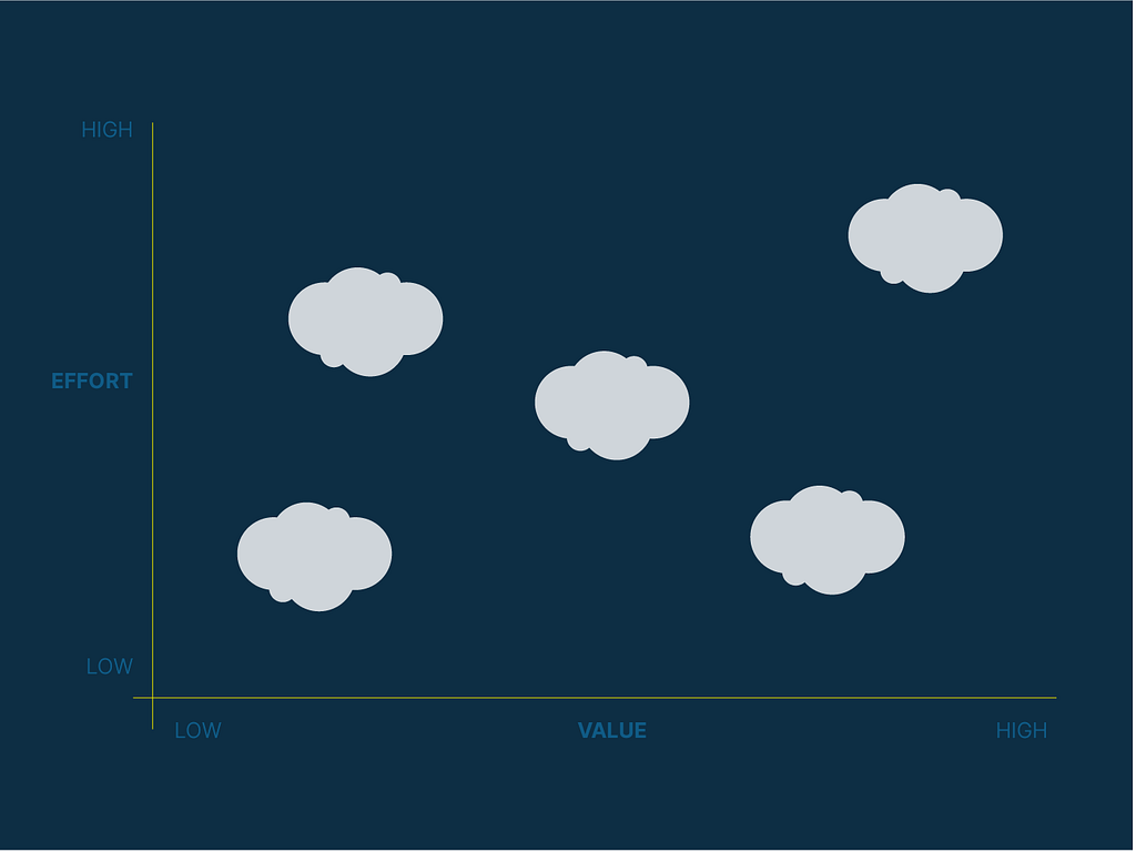
However, unlike the areas dominated by ‘low hanging fruit,’ we should aim to build what we think are the areas of the highest value. It is in these areas that are most likely to yield remarkable products, products that exist in a different space and solve real user problems.
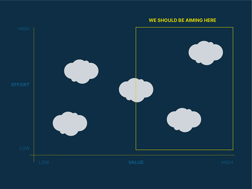
Ideally, this would be the top-right corner, areas that we believe are high value and high effort. As a friend said to me “If it was easy, everyone would be doing it!” @KarlBunyan

So we still ask the question: How can we deliver value to our users as fast as possible? And also, how can make sure we’re making the biggest impact? Remember the Agile manifesto has as a key principle that “Our highest priority is to satisfy the customer through early and continuous delivery of valuable software”.

But as I mentioned earlier, opportunities are sometimes too large in themselves. In this case, I pushed for teams to break these down (often through hypothesis generation) into more granular parts that they can deliver. Alongside this, they should cultivate a diligent focus on the outcomes you want to drive, so you know you are adding value (metrics).

Build the smallest slice of your biggest opportunities

This approach advocates building the smallest version of that first…and then keep going. So whereas ‘low hanging fruit’ represents a feature that’s easiest to deliver, looking towards outcomes and breaking them down, we seek to deliver the easiest part of what we think is the highest value. Ironically, we can almost do this at the same speed as delivering a feature classified as ‘low hanging fruit’

— —

There is always a cost in choosing to do work. By choosing one thing, you are making a choice not to do all the others. Teams can’t do everything and there is always the inverse to any action you take. That inverse is usually, what has the team chosen not to do?

Feature factories are such high-risk ventures, you can fluke success, even semi-sustained success, but if those features don’t work out, then you’ve invested time, usually at the expense of other things, like continuous discovery research.

This presentation aimed to show teams that speed of delivery does not sit in opposition to the delivery of value. Quickly choosing to deliver a feature is a product guess. And almost as quickly, one can find areas of value and look to break these down into smaller units that can be incrementally delivered. In product teams, out aim to deliver a change in outcomes (behaviours). By focusing on those and tackling these in a small, iterative way, we can deliver value as fast as tackling the ‘low hanging fruit’.

The UX Collective donates US$1 for each article published on our platform. This story contributed to Bay Area Black Designers: a professional development community for Black people who are digital designers and researchers in the San Francisco Bay Area. By joining together in community, members share inspiration, connection, peer mentorship, professional development, resources, feedback, support, and resilience. Silence against systemic racism is not an option. Build the design community you believe in.


The myth of the “low hanging fruit” was originally published in UX Collective on Medium, where people are continuing the conversation by highlighting and responding to this story.

from UX Collective – Medium https://uxdesign.cc/the-myth-of-the-low-hanging-fruit-5d5d8e6aa472?source=rss—-138adf9c44c—4

4 Ways to Apply Progressive Disclosure for Better Task Focus

Too many interfaces are guilty of displaying too much information at once. Not all that’s displayed is immediately relevant. Some information is temporarily irrelevant until users meet certain conditions. As such, you should conceal irrelevant info so users can focus on what’s relevant. Focusing on relevant info first allows them to complete tasks with fewer […]

The post 4 Ways to Apply Progressive Disclosure for Better Task Focus first appeared on UX Movement.

from UX Movement https://uxmovement.com/mobile/4-ways-to-apply-progressive-disclosure-for-better-task-focus/

Why car design education is broken

And how it could be fixed.

Matteo Licata Design
An old, not very good sketch from Yours Truly (picture from the Author)

Have you tried to Google “Behance Car Design Sketch” lately?

If you do, I bet your eyeballs will be assaulted by a barrage of out-of-proportion, often even out of perspective “vehicles” whose massive wheels and impossibly tiny glass fight for your attention, yet they all look the same. We have been fetishizing sketching to a point where we have lost sight of what matters, especially in the design academy’s world.

Over the past forty years, many automobile design courses have popped up in various locations worldwide, all seemingly with the same goal: to separate wealthy kids’ families from an atrociously large chunk of their cash in exchange for the “high education” needed to enter the field.

Except that’s not what they deliver, in most cases.

The proliferation of for-profit design schools flooded what has always been a small job market with bright, resourceful, and creative young professionals that sketch like demi-gods and make ace renders but know nothing of designing a vehicle. The result are hundreds of portfolios full of shiny eye-candy whose wheels don’t turn, suspensions have no travel, zero outward visibility.

As a former Pininfarina studio chief wisely stated in this brilliant Form Trends article

“You don’t pretend to beat Federer by simply hitting the ball hardest.”

Any game’s rules are there to be challenged, bent, or changed, but refusing to learn them in the first place gets you nowhere. Small wonder that “junior designers” ‘ market value has been driven below zero, as the supply of “sketch monkeys” vastly exceeds the little market demand for them.

I’ve seen things you wouldn’t believe…

…like plenty of talented young designers and supposedly “senior” ones, blissfully ignoring the most fundamental manufacturing realities because they’ve been issued a vehicle design diploma without ever see a technical drawing and a typical section.

I’ve seen 1:1 scale “epowood” (rigid resinous material used to make life-size vehicle mock-ups) models milled with bonnets whose shape could not be stamped, with shut-lines placed regardless of manufacturing technology,
Once, and this is one I’ll never forget, I’ve “taught” a smooth-talking, supposedly experienced colleague how to calculate the total diameter of a tire in millimeters from the sizes written on its sidewall. Enough said.

While the world certainly has worse problems than this, I feel for the families who get tricked into spending large sums on courses and masters whose titles sound impressive but offer little actual value in exchange.

Is there a solution?

Of course, there is. The formation of future automobile designers should be taken over by the automobile industry itself. Each year, according to their actual necessities, each manufacturer’s design studio should train a small number of thoroughly vetted candidates for free in exchange for a few years of a contractual commitment to the company once tuition will end.

I’m under no illusion it’ll ever be put into practice, but I believe it’s high time to have this discussion within the automobile design business.


Why car design education is broken was originally published in UX Collective on Medium, where people are continuing the conversation by highlighting and responding to this story.

from UX Collective – Medium https://uxdesign.cc/why-car-design-education-is-broken-7f27ca0216a8?source=rss—-138adf9c44c—4

Supernormal brings AI-powered asynchronous video messaging to remote teams


Zoom became one of this year’s big success stories for real-time video communications, as the rapid shift to remote work forced businesses to rethink their operations. Now a new startup is setting out to become the go-to platform for asynchronous video communications.

There is no shortage of non-real-time communication tools that allow globally distributed teams to check in with each other — email and Slack, for starters. But Supernormal is meshing video messaging with some nifty AI smarts to bring more engagement and utility to “async” interactions, where nuance and meaning isn’t lost amid a barrage of emojis. At a time when companies are increasingly committing to a distributed workforce spread across multiple time zones, Supernormal could carve itself a niche in a space awash with real-time video and voice tools.

“Supernormal is focused on helping teams communicate async and enabling key personas — engineers, designers, managers — to have creative time and choose when they want to consume or create team communication,” cofounder and CEO Colin Treseler told VentureBeat.

To aid its mission, the company today announced it has raised $2 million in a seed round of funding led by EQT Ventures, with support from several angel investors.

Supernormal (in the new normal)

Available via the web or through a desktop Mac app, Supernormal allows users to record company (or personal) announcements, presentations, greetings, or just about anything else. A separate function lets users record their screen in order to give presentations or product walkthroughs, with a little video avatar of the speaker embedded inside the screencast.

The app uses natural language processing (NLP) to instantly transcribe content and provide it as text beside the video while also extracting what it thinks are the three most interesting sentences from a transcript to suggest as caption summaries.

According to Treseler, the company develops its AI system “mostly” in-house. “We’ve built our own machine learning for detecting the most interesting sentences and have trained it on a massive corpus,” Treseler said.

Above: Supernormal: Screen recording with video message overlay

For businesses that sign up using their Slack or Google account credentials, Supernormal also automatically tags specific users in a company if their name is mentioned in the video, alerting the individual via Slack or Gmail. Presenters are notified whenever their team or intended audience has viewed the video, enabling them to follow up with any relevant communications.

Above: Supernormal: Text extraction and automatic alerts

Videos can also be embedded into digital properties such as websites, and dedicated links can be manually shared through any app. If they’re shared on Twitter, Slack, Facebook, or Microsoft Teams, they can be viewed inline directly on those platforms. Anywhere else, the user will have to click to view the video on the Supernormal platform itself.

There are other notable players in the space. San Francisco-based Loom is perhaps the most obvious example, having raised nearly $75 million in funding — including a $29 million tranche in the midst of the pandemic — from notable investors that include Sequoia Capital, Coatue, Kleiner Perkins, and Instagram’s founders. Founded in 2016, Loom has a bit of a head start and an impressive roster of clients, including Atlassian, Intercom, and HubSpot. It also offers additional smarts, such as a drawing tool, allowing presenters to illustrate or highlight specific items on their screen.

Prezi is doing some interesting things in the video presentation realm, though it’s aimed at a different market. Elsewhere, Slack is gearing up to launch a new Stories feature, which are essentially video-based status updates along the lines of Snapchat and Instagram’s consumer versions. Don’t be surprised if Microsoft follows suit with something similar for Teams.

Although it’s still early days for Supernormal, the startup’s use of AI to generate transcriptions, summaries, and smart alerts makes it worth keeping tabs on.

There are also potential use cases far beyond the enterprise, as Loom has demonstrated. For example, teachers struggling to get their entire class online for a live demo could simply record a short video-based presentation and send it by email for the students to view on their own time.

“Right now, we are seeing a lot of use by ‘prosumers,’ and we are open to education/nonprofits,” Treseler said. “Our core focus, however, will be on teams at the enterprise level.”

The story so far

As is increasingly the case with companies these days, Supernormal can’t be pinned to one location, with a workforce spanning the Americas and Europe. Treseler is currently based in Stockholm, Sweden, though he has served in various technical roles on both sides of the Atlantic over the past decade, including a two-year stint as a Facebook product manager in Menlo Park, California.

Treseler and his team started work on Supernormal in January, fortuitous timing given how global events would unfold in the months that followed. “When we started to create our solution, we didn’t expect every business to be relying on virtual communication this heavily,” Treseler said.

Supernormal was initially trying to be more of a catch-all video communication tool, but the company ultimately decided to go all-in on recorded video.

“We had live video in the initial product but felt that it wasn’t additive to the team experience and was not helping our core focus — shifting teams to becoming more asynchronous,” Treseler said.

Since its official launch in August, Supernormal claims it has been picked up by more than 400 teams, with workers at companies like Spotify and GitHub, and has seen “heavy engagement” across the spectrum, from SMBs to Fortune 500 companies.

The company is now working on native apps for Windows desktop and smartphones, along with one-click editing tools that enable users to remove pauses or specific words or sentences from transcripts. Treseler said the team is also exploring additional data reporting and analytics tools for customer-facing roles, such as sales and customer support.

In terms of pricing, it is entirely free for now, as the product is developed and iterated. But Supernormal will eventually adopt a SaaS model, with pricing to be determined. “We’ll eventually get to pricing that is considerably cheaper than the competitors in the space,” Treseler said.

With an extra $2 million in the bank, Treseler said the company will now double down on product development and expand its “fully remote team” around the world.

from VentureBeat https://venturebeat.com/2020/12/01/supernormal-brings-ai-powered-asynchronous-video-messaging-to-remote-teams/

Exploring usability heuristics: Visibility of system status

Photo by Clay Banks on Unsplash

When it comes to interaction design, visibility of system status is the first of Jakob Nielsen’s ten heuristics of usability. These principles date all the way back to the 90s and remain as the general rules of thumb today in the design of interfaces, as well as experiences beyond the screen.

In this article, I want to take a dive into the first heuristic. The visibility of system status is all about leveraging the use of clear communication and transparency in order to build trust and provide a great experience.

Let’s take a look at a few examples of this in action.

The visibility of system status refers to how well the state of the system is conveyed to its users. Ideally, systems should always keep users informed about what is going on, through appropriate feedback within reasonable time.

Important and timely feedback

When a user interacts with a website or app, the most important thing they need to know is whether their action was recognized. This is true for everyday experiences as well. Think about taking an elevator ride up to your office or apartment. How frustrating would it be if the buttons didn’t immediately light up in response to you pressing it? You would be left wondering if the system received your action or if it was working at all.

In digital design, visual feedback can exist in the form of color or state changes or progress indicators. This relays to the user that the system is working and reduces uncertainty about the action.

This example from Loom’s sign up page really takes it to the next level. Real-time feedback during your new account set-up communicates which password requirements you’ve fulfilled as you type, saving you time, energy, and uncertainty during the process.

Petition to have all forms designed this beautifully

Where you are and where you can go

No one likes to feel lost, whether it’s somewhere in person or online. That leads us to another system status that falls under this usability principle. When navigating a site or an app, the user should be informed of where they are on the site. This can be achieved in the form of highlighted menu labels or use of breadcrumbs. Breadcrumbs help users understand their location by showing them how they arrived at their current page and can even lead them to other relevant pages.

The breadcrumb trail shows the location of the current page within the hierarchy of ASOS’s site

Open communication

You probably wouldn’t be be very happy if any of your friends changed their dinner plans with you without ever updating you. That same idea applies to users as they should always be informed of any changes made in the system.

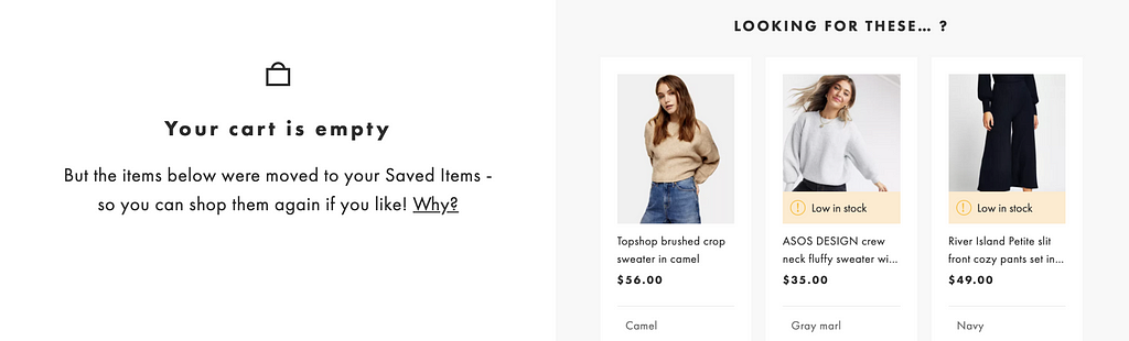
Take for example, my shopping cart on ASOS. After 60 minutes, my items are automatically moved to my saved items. If I left and came back the next day, I might be wondering why my cart is empty. The site does a great job of letting me know that all my items were moved and can be be easily accessed under saved items.

ASOS cart updates

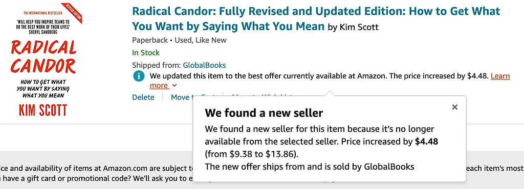
Another example can be seen on Amazon. I probably wouldn’t notice if the seller or price for a book changes in my cart, but they make sure to clearly indicate the details of any changes that might have occurred while I was away.

Amazon cart updates

To sum it up, the visibility of system status heuristic encourages open and continuous communication to enable a smoother experience for the user. It’s easy to see how this principle applies to our relationships with devices as much as it does to our relationships with other people.


Exploring usability heuristics: Visibility of system status was originally published in Prototypr on Medium, where people are continuing the conversation by highlighting and responding to this story.

from Prototypr https://blog.prototypr.io/exploring-usability-heuristics-visibility-of-system-status-30c7ef077adf?source=rss—-eb297ea1161a—4

How to hand over designs created in Framer X | by Daniel Kalman

How to hand over designs created in Framer X

Handing over single page designs is pretty straight forward: export web preview, drop it on Netlify and you’re done. In theory. There is a couple of pitfalls though.

I decided to use solely Framer X for my work at SatoshiPay, where I lead the design efforts. The unique product we are building requires unconventional interactions that would be hard to produce unless you had React and a ton of tutorials at hand — more on that later.

To keep existing workflows (almost) intact, first, I had to figure out a simple way to hand over static designs just like the all-too-familiar Sketch and InVision combo.

Prepare for different screen sizes

Before you dig into exporting stuff, take a minute to think of different screen sizes. Your peers might be using different monitors with different screen resolutions. To make sure your design looks like it should, check the following:

  1. Set the preview window to ‘Canvas — Responsive’
  2. Set constraints for different frames according to your needs and test them in the preview window

Note: in case you are working on responsive layouts, try the Responsive Layout Component by Steve Ruiz

Add custom fonts

To make sure everyone sees the exact same results, you’ll need to add the custom fonts you’ve used that others might not have installed on their computers.

Install the Font Files package by Jordan Dobson, and follow the installation instructions:

Export Web Preview

Easy. Go to File — Export Web Preview…

Add a couple of lines to the CSS

To make sure tools like Prism or CSSPeeper can inspect your designs you need one last change to make: open build/style.css in the exported Web Preview folder, and add the following lines at the end of the document:

[data-framer-component-type=’Stack’] { pointer-events: unset !important; } [data-framer-component-type=’Frame’] { pointer-events: unset !important; }

Drop it on Netlify

All there is left to do is to publish your design. Sign up for a Netlify account (its free), and simply drop the exported Web Preview folder onto it. In a second, your page will be live at the generated URL.

Inspect your designs with Prism or CSSPeeper and you should see dimensions, colors, and fonts. Bam its done.

Tip: Change the site URL to something easier to find before its too late

Hope this helps. Keep Framering.

from Medium https://dnlklmn.medium.com/how-to-hand-over-designs-created-in-framer-x-bc4233cd6f5f

There’s Gold In Them Thar SERPs: Mining Important SEO Insights from Search Results

Posted by AndrewDennis33

There’s gold in them thar SERPs…gold I tell ya!

Now, whether that phrase takes you back to a simpler (maybe? I don’t know, I was born in the 80s) time of gold panning, Mark Twain, and metallurgical assay — or just makes you want some Velveeta shells and liquid gold (I also might be hungry) — the point is, there is a lot you can learn from analyzing search results.

Search engine results pages (SERPs) are the mountains we’re trying to climb as SEOs to reach the peak (number one position). But these mountains aren’t just for climbing — there are numerous “nuggets” of information to be mined from the SERPs that can help us on our journey to the mountaintop.

Earning page one rankings is difficult — to build optimized pages that can rank, you need comprehensive SEO strategy that includes:

  • Content audits
  • Keyword research
  • Competitive analysis
  • Technical SEO audits
  • Projections and forecasting
  • Niche and audience research
  • Content ideation and creation
  • Knowledge and an understanding of your (or your client’s) website’s history
  • And more.

A ton of work and research goes into successful SEO.

Fortunately, much of this information can be gleaned from the SERPs you’re targeting, that will in turn inform your strategy and help you make better decisions.

The three main areas of research that SERP analysis can benefit are:

  • Keyword research
  • Content creation
  • And competitive analysis.

So, get your pickaxe handy (or maybe just a notebook?) because we’re going to learn how to mine the SERPs for SEO gold!

Finding keyword research nuggets

Any sound SEO strategy is built on sound keyword research. Without keyword research, you’re just blindly creating pages and hoping Google ranks them. While we don’t fully understand or know every signal in Google’s search algorithm — I’m pretty confident your “hopes” aren’t one of them — you need keyword research to understand the opportunities as they exist.

And you can find some big nuggets of information right in the search results!

First off, SERP analysis will help you understand the intent (or at least the perceived intent by Google) behind your target keywords or phrases. Do you see product pages or informational content? Are there comparison or listicle type pages? Is there a variety of pages serving multiple potential intents? For example:

Examining these pages will tell you which page — either on your site or yet to be created — would be a good fit. For example, if the results are long-form guides, you’re not going to be able to make your product page rank there (unless of course the SERP serves multiple intents, including transactional). You should analyze search intent before you start optimizing for keywords, and there’s no better resource for gauging searcher intent than the search results themselves.

You can also learn a lot about the potential traffic you could receive from ranking in a given SERP by reviewing its makeup and the potential for clicks.

Of course, we all want to rank in position number one (and sometimes, position zero) as conventional wisdom points to this being our best chance to earn that valuable click-through. And, a recent study by SISTRIX confirmed as much, reporting that position one has an average click-through rate (CTR) of 28.5% — which is fairly larger than positions two (15.7%) and three (11%).

But the most interesting statistics within the study were regarding how SERP layout can impact CTR.

Some highlights from the study include:

  • SERPs that include sitelinks have a 12.7% increase in CTR, above average.
  • Position one in a SERP with a featured snippet has a 5.2% lower CTR than average.
  • Position one in SERPs that feature a knowledge panel see an 11.8% dip in CTR, below average.
  • SERPs with Google Shopping ads have the worst CTR: 14.8% below average.

SISTRIX found that overall, the more SERP elements present, the lower the CTR for the top organic position.

This is valuable information to discover during keyword research, particularly if you’re searching for opportunities that might bring organic traffic relatively quickly. For these opportunities, you’ll want to research less competitive keywords and phrases, as the SISTRIX report suggests that these long-tail terms have a larger proportion of “purely organic SERPs (e.g. ten blue links).

To see this in action, let’s compare two SERPs: “gold panning equipment” and “can I use a sluice box in California?”.

Here is the top of the SERP for “gold panning equipment”:

And here is the top of the SERP for “can I use a sluice box in California?”:

Based on what we know now, we can quickly assess that our potential CTR for “can I use a sluice box in California?” will be higher. Although featured snippets lower CTR for other results, there is the possibility to rank in the snippet, and the “gold panning equipment” SERP features shopping ads which have the most negative impact (-14.8%) on CTR.

Of course, CTR isn’t the only determining factor in how much traffic you’d potentially receive from ranking, as search volume also plays a role. Our example “can I use a sluice box in California?” has little to no search volume, so while the opportunity for click-throughs is high, there aren’t many searching this term and ranking wouldn’t bring much organic traffic — but if you’re a business that sells sluice boxes in California, this is absolutely a SERP where you should rank.

Keyword research sets the stage for any SEO campaign, and by mining existing SERPs, you can gain information that will guide the execution of your research.

Mining content creation nuggets

Of course, keyword research is only useful if you leverage it to create the right content. Fortunately, we can find big, glittering nuggets of content creation gold in the SERPs, too!

One the main bits of information from examining SERPs is which types of content are ranking — and since you want to rank there, too, this information is useful for your own page creation.

For example, if the SERP has a featured snippet, you know that Google wants to answer the query in a quick, succinct manner for searchers — do this on your page. Video results appearing on the SERP? You should probably include a video on your page if you want to rank there too. Image carousel at the top? Consider what images might be associated with your page and how they would be displayed.

You can also review the ranking pages to gain insight into what formats are performing well in that SERP. Are the ranking pages mostly guides? Comparison posts? FAQs or forums? News articles or interviews? Infographics? If you can identify a trend in format, you’ve already got a good idea of how you should structure (or re-structure) your page.

Some SERPs may serve multiple intents and display a mixture of the above types of pages. In these instances, consider which intent you want your page to serve and focus on the ranking page that serves that intent to glean content creation ideas.

Furthermore, you can leverage the SERP for topic ideation — starting with the People Also Ask (PAA) box. You should already have your primary topic (the main keyword you’re targeting), but the PAA can provide insight into related topics.

Here’s an example of a SERP for “modern gold mining techniques”:

Right there in the PAA box, I’ve got three solid ideas for sub-topics or sections of my page on “Modern Gold Mining”. These PAA boxes expand, too, and provide more potential sub-topics.

While thorough keyword research should uncover most long-tail keywords and phrases related to your target keyword, reviewing the People Also Ask box will ensure you haven’t missed anything.

Of course, understanding what types of formats, structures, topics, etc. perform well in a given SERP only gets you part of the way there. You still need to create something that is better than the pages currently ranking. And this brings us to the third type of wisdom nuggets you can mine from the SERPs — competitive analysis gold.

Extracting competitive analysis nuggets

With an understanding of the keywords and content types associated with your target SERP, you’re well on your way to staking your claim on the first page. Now it’s time to analyze the competition.

A quick glance at the SERP will quickly give you an idea of competition level and potential keyword difficulty. Look at the domains you see — are there recognizable brands? As a small or new e-commerce site, you can quickly toss out any keywords that have SERPs littered with pages from Amazon, eBay, and Wal-Mart. Conversely, if you see your direct competitors ranking and no large brands, you’ve likely found a good keyword set to target. Of course, you may come across SERPs that have major brands ranking along with your competitor — if your competitor is ranking there, it means you have a shot, too!

But this is just the surface SERP silt (say that five times fast). You need to mine a bit deeper to reach the big, golden competitive nuggets.

The next step is to click through to the pages and analyze them based on a variety of factors, including (in no particular order):

  • Page speed
  • Visual aesthetics
  • Timeliness and recency
  • Readability and structure
  • Amount and quality of citations
  • Depth of coverage of related topic
  • How well the page matches search intent

If the page is lacking in any, many, or all these areas, there is a strong opportunity your page can become the better result, and rank.

You should also review how many backlinks ranking pages have, to get an idea for the range of links you need to reach to be competitive. In addition, review the number of referring domains for each ranking domain — while you’re competing on a page-to-page level in the SERP, there’s no doubt that pages on more authoritative domains will benefit from that authority.

However, if you find a page that’s ranking from a relatively unknown or new site, and it has a substantial amount of backlinks, that’s likely why it’s ranking, and earning a similar amount of links will give your page a good chance to rank as well.

Lastly, take the time to dive into your competitor’s ranking pages (if they’re there). Examine their messaging and study how they’re talking to your shared audience to identify areas where your copy is suboptimal or completely missing the mark. Remember, these pages are ranking on page one, so they must be resonating in some way.

Conclusion

Successful SEO requires thorough research and analysis from a variety of sources. However, much of what you need can be found in the very SERPs for which you’re trying to rank. After all, you need to understand why the pages that rank are performing if you want your pages to appear there, too.

These SERPs are full of helpful takeaways in terms of:

  • Keyword research and analysis
  • Content ideation and strategy
  • And competitive analysis and review.

These golden nuggets are just there for the takin’ and you don’t need any tools other than Google and your analytical mind — well, and your metaphorical pickaxe.

Sign up for The Moz Top 10, a semimonthly mailer updating you on the top ten hottest pieces of SEO news, tips, and rad links uncovered by the Moz team. Think of it as your exclusive digest of stuff you don’t have time to hunt down but want to read!

from Moz https://moz.com/blog/mining-seo-insights-from-search-results

patrick / articles / 3 things about CSS variables you might not know

CSS variables (or custom properties, depending on how you prefer to call them) are really cool, and chances are, you’re already using them in your projects already.

In this article, I’ll talk about 3 things that I think a lot of people might now know about:

  • what happens when a var() function uses an undefined variable,
  • how fallback values work,
  • and how browser DevTools can help you.

Undefined variables

There are several reasons why you may be trying to use an undefined variable in a var() function. We’ll look at a few in a minute. But before we do that, it’s important to know that when this happens, CSS falls back on its feet.
CSS and HTML are super resilient languages where mistakes are forgiven and one tiny error doesn’t prevent the entire page from rendering.

So, using an undefined variable won’t lead to a parsing error, it won’t prevent your stylesheet to load or parse or render. In fact, you might not even realize that something went wrong without a lot of investigation.

Some of the reasons using an undefined variable might happen are:

  • you’ve simply made a typo in the name of the variable,
  • you’re trying to use a variable you thought existed, but doesn’t,
  • or you’re trying to use a totally valid variable, but it happens to not be visible where you want to use it.

Let’s go over that last example.

Variables participate in the cascade. This means, for a variable to be available to a var() function, that variable needs to be declared in a rule that also applies to the element being styled, or to one of its ancestors.

For the sake of giving an example, let’s look at this:

ol li { --foo: red; }
ul li { color: var(--foo); }

Of course your particular case will likely be more complicated than this, with many more rules and much more complicated selectors. But what happens here is that for ul li elements to have the color red, they would also need to match the rule ol li where that color is actually defined. And that will probably not happen.

Now, in many cases, CSS variables tend to get defined in some top-level selector like :root or html and are therefore available throughout the DOM tree (those selectors match ancestor elements of all other elements in the page).
In this case, the problem of a missing variable almost never occurs.

However sometimes it’s handy to declare variables in other places and when you do this, you’ve got to start paying more attention to whether your variable will actually be visible (via the cascade) to where you intend to use it.

So, with this out of the way, let’s see how browsers deal with undefined variables:

  1. If the property is not inheritable (like border), then the property is set to its initial value.
  2. If it is inheritable (like color), then the property is set to its inherited value. If there isn’t any, then it is set to its initial value.

Let’s look at 2 examples to illustrate this:

:root {
--main-color: #f06;
}

.my-lovely-component {


border: 1px solid var(--main-colo);
}

In this first example above, a typo was made in var(-main-colo) and as a result the browser cannot tell what the final value for the border property should be. Because the border property is not inheritable in CSS, the browser finds itself in case 1 from above. It therefore sets the value to its initial state which happens to be medium none currentColor (see the initial value on MDN).
So, even if only the color part of the border was missing, the border will be missing entirely.

Let’s look at a second example now.

:root {
--main-color: #f06;
}

body {


color: gold;
}

.my-lovely-component {


color: var(--secondary-color);
}

In this one, an undefined variable was used in .my-lovely-component for the value of color.
Now, because this property is inherited, the browser will traverse the DOM up through the element’s ancestors until it finds one that does define a color value. The <body> element has a rule applied to it that specifies gold as a value, so that’s what will end up being used.

In both of these examples, the hard part is figuring out what’s happening exactly. In the last part of this article, I’ll explain how DevTools can help, but without specific tooling here, it would be really hard to understand the problem.

The source of it is that, even if those var() functions use invalid properties, when the browser parses the stylesheet, it has no way of knowing this. As far as it’s concerned, those border and color properties are totally valid. So we’re left with wondering why the border is missing in the first example, and why the color is black in the second.

Property names or values are only considered invalid by the style engine in a browser when those are not known. But since a var() function can resolve to pretty much anything at all, the style engine doesn’t know whether the value containing the function is known or not.
It will only know when the property actually gets used, at which point, it will fall back to an inherited or initial state silently, and leave you wondering what happened.

Thankfully, we’ll see later in this article how some new DevTools can help with this.

Fallback values and nesting

Here is another thing about CSS variables that doesn’t seem to get used a lot, and therefore is probably not very well known either: var() functions accept a second, optional, parameter.
So you can write something like this:

color: var(--theme-color, red);

What happens in this case is: if --theme-color is not found by the browser, it will fall back to using the value red.

Now, why would you use this? I can see a few reasons why this could be interesting:

  • It might come in handy if you’re creating a component that gets embedded into a bigger system and can be customized with variables, but you still want some safe defaults.
  • Or maybe you’re styling an element that has several states, with the default state using a var() with fallback value, and the other state defining the variable.

Let me give an example to clarify that second case:

.my-component {
color: var(--active-color, black);
}
.my-component:hover {
--active-color: red;
}

In this example, while the element isn’t being hovered, its color property uses an undefined variable (indeed, the --active-color property does not apply to the element yet), so the browser uses the fallback value. As soon as the user hovers over the element, the second rule starts to apply, and --active-color becomes defined, so the element switches to red.

Of course, this is a dummy example, and you could simply have defined color: red in the second rule and let it override the first one. But sometimes you need to use the variable in several properties at once.

Now, let’s look at a second weird thing that happens with fallback values: nesting var() functions.

Have you ever seen something like this:

color: var(--foo, var(--bar, var(--baz, var(--are, var(--you, var(--crazy)))));

This is totally valid, but probably completely useless.
What’s happening here is that the fallback value is, itself, another var() function. And because it is, it (in turn) can also use a fallback value, and so on…

To be honest, I don’t think I’ve seen var() functions used as fallback values very often, if at all. Fallback values themselves are probably rarely used to begin with.
But at least you know this is possible, and hopefully won’t be surprised if you ever see this.

Let me conclude on fallback values by looking at a third aspect which I think is rarely known and may lead to confusion: using commas.

A CSS variable is, basically, any text you want. Because a variable can be used anywhere a value would go, it doesn’t have any strong typing at all, and therefore the only important rule is that it shouldn’t contain a semicolon, since that signifies the end of the value (in reality, it’s more complicated than this).

As a result, something like this is valid:

--my-variable: one, two, three;

The interesting thing here is that fallback values also follow the same rule in that they can be any text you want. So the above example could also be used as a fallback value:

content: var(--foo, one, two, three);

Even though it really looks like the one, two, three part is three different parameters to the var() function, it’s really just one. Don’t get confused by that.

DevTools tips and tricks

In this last section I’ll go over some of the DevTools around CSS variables that you might now know about and which should make your life easier.

Autocompleting variable names

This one is super useful when doing some quick changes in the Elements/Inspector panel and your site defines a lot of different variables:
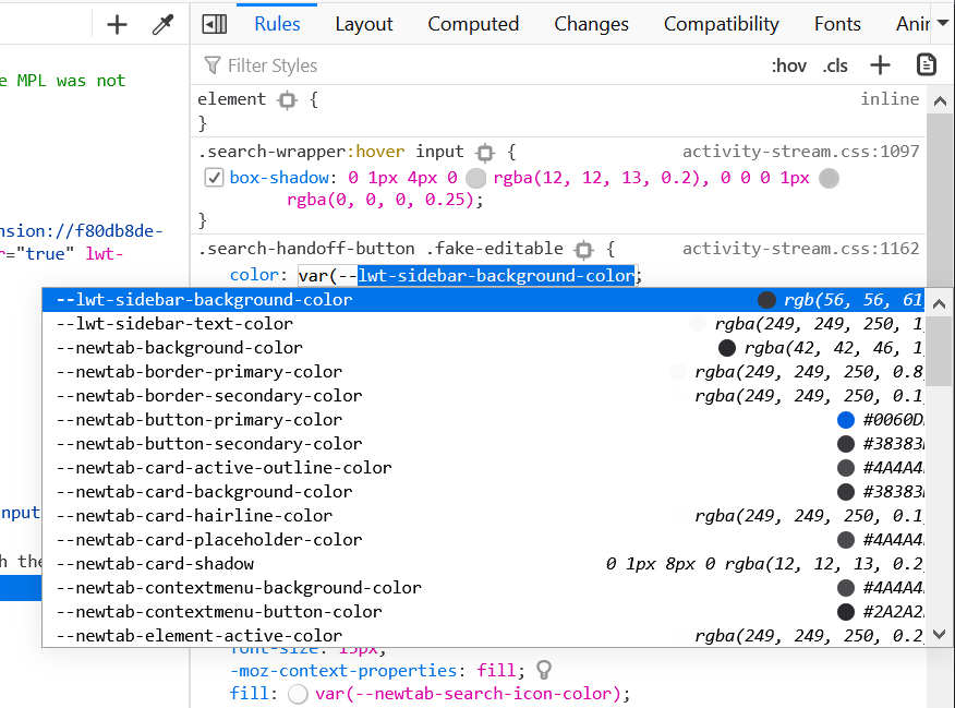
DevTools will automatically suggest the list of existing variables when you start typing var(.

Screenshot of Firefox's css var autocomplete

The above screenshot is in Firefox, but both Edge and Chrome also support this feature.

Knowing what the computed value is

When looking at a var() function in DevTools, it’s not necessarily easy to know what final value it computes to. The variable it uses may be lost in a really long list of rules, or it may itself point to another variable, making the hunt for the final value more difficult.

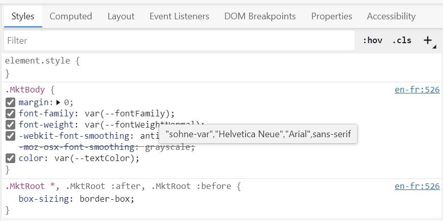
You can switch to the Computed tab in DevTools to see what the final computed value of the entire property is. But if you want to know what the computed value for just that var() function is, you can simply hover over it in DevTools:

Screenshot of the tooltip that appears in Edge when you hover over a var() function

The above screenshot is in Edge, but the same thing happens in Chrome and Firefox too.

Interestingly, if no tooltip appears, then that’s a good clue that the variable used is undefined.

Color types

A little earlier, I said that variables accepted any text at all, because when they’re defined, variables don’t really have a type yet.

A consequence of this is that what looks like a color may actually not be used as a color.
Consider the following example:

:root {
--i-look-like-a-color: black;
}

Even thought black is a valid color, at this point, we can’t assume that it will actually be used as one. It may end up being used in a animation-name property, or somewhere else.

That said, DevTools still show a little color swatch next to css variables that look like colors. That is done as a convenience, because they are very likely to actually be colors! And even if they aren’t, it’s not going to be a problem for users.

Screenshot of what color-looking variables look like in chrome DevTools

Future features

Now, 2 things that, I think, would be super useful but don’t exist yet is:

  • jumping from a var() function to where the variable used in it is declared,
  • quickly seeing that a var() function uses an undefined variable.

As it turns out, I’m working on exactly that right now in the DevTools for Chromium-based Edge and Chrome! You can check out the bug entry to follow along if you want.

Hopefully this article has been useful and you learnt a few things! Happy coding!

from patrickbrosset.com https://patrickbrosset.com/articles/2020-09-21-3-things-about-css-variables-you-might-not-know/

Brain-inspired electronic system could vastly reduce AI’s carbon footprint


Extremely energy-efficient artificial intelligence is now closer to reality after a study by UCL researchers found a way to improve the accuracy of a brain-inspired computing system.

The system, which uses memristors to create artificial neural networks, is at least 1,000 times more energy efficient than conventional transistor-based AI hardware, but has until now been more prone to error.

Existing AI is extremely energy-intensive — training one AI model can generate 284 tonnes of carbon dioxide, equivalent to the lifetime emissions of five cars. Replacing the transistors that make up all digital devices with memristors, a novel electronic device first built in 2008, could reduce this to a fraction of a tonne of carbon dioxide — equivalent to emissions generated in an afternoon’s drive.

Since memristors are so much more energy-efficient than existing computing systems, they can potentially pack huge amounts of computing power into hand-held devices, removing the need to be connected to the Internet.

This is especially important as over-reliance on the Internet is expected to become problematic in future due to ever-increasing data demands and the difficulties of increasing data transmission capacity past a certain point.

In the new study, published in Nature Communications, engineers at UCL found that accuracy could be greatly improved by getting memristors to work together in several sub-groups of neural networks and averaging their calculations, meaning that flaws in each of the networks could be cancelled out.

Memristors, described as “resistors with memory,” as they remember the amount of electric charge that flowed through them even after being turned off, were considered revolutionary when they were first built over a decade ago, a “missing link” in electronics to supplement the resistor, capacitor and inductor. They have since been manufactured commercially in memory devices, but the research team say they could be used to develop AI systems within the next three years.

Memristors offer vastly improved efficiency because they operate not just in a binary code of ones and zeros, but at multiple levels between zero and one at the same time, meaning more information can be packed into each bit.

Moreover, memristors are often described as a neuromorphic (brain-inspired) form of computing because, like in the brain, processing and memory are implemented in the same adaptive building blocks, in contrast to current computer systems that waste a lot of energy in data movement.

In the study, Dr Adnan Mehonic, PhD student Dovydas Joksas (both UCL Electronic & Electrical Engineering), and colleagues from the UK and the US tested the new approach in several different types of memristors and found that it improved the accuracy of all of them, regardless of material or particular memristor technology. It also worked for a number of different problems that may affect memristors’ accuracy.

Researchers found that their approach increased the accuracy of the neural networks for typical AI tasks to a comparable level to software tools run on conventional digital hardware.

Dr Mehonic, director of the study, said: “We hoped that there might be more generic approaches that improve not the device-level, but the system-level behaviour, and we believe we found one. Our approach shows that, when it comes to memristors, several heads are better than one. Arranging the neural network into several smaller networks rather than one big network led to greater accuracy overall.”

Dovydas Joksas further explained: “We borrowed a popular technique from computer science and applied it in the context of memristors. And it worked! Using preliminary simulations, we found that even simple averaging could significantly increase the accuracy of memristive neural networks.”

Professor Tony Kenyon (UCL Electronic & Electrical Engineering), a co-author on the study, added: “We believe now is the time for memristors, on which we have been working for several years, to take a leading role in a more energy-sustainable era of IoT devices and edge computing.”

from ScienceDaily – Artificial Intelligence https://www.sciencedaily.com/releases/2020/08/200827150957.htm

Exact Tests and Plots with edgeR – Basic Differential Expression Analysis

[This article was first published on R – Myscape, and kindly contributed to R-bloggers]. (You can report issue about the content on this page here)


Want to share your content on R-bloggers? click here if you have a blog, or here if you don’t.

Exact tests often are a good place to start with differential expression analysis of genomic data sets.

Example mean difference (MD) plot of exact test results for the E05 Daphnia genotype.

As usual, the types of contrasts you can make will depend on the design of your study and data set. In the following example we will use the raw counts of differentially expressed (DE) genes to compare the following Daphnia genotypes.

The design of our experiment is described by three replicates of ultra-violet radiation (UV) treatment, and three replicates of visible light (VIS) control for each of the Daphnia genotypes.

After normalization of raw counts we will perform genewise exact tests for differences in the means between two groups of gene counts. Specifically, the two experimental groups of treatment and control for the E05 Daphnia genotype.

D. melanica from the Olympic mountains in WA (left) and the Sierra Nevada mountains in CA (right).

Exact Test and Plotting Script – exactTest_edgeR.r

The following R script will be used to normalize raw gene counts produced by a quantification program such as Hisat2 or Tophat2. Then, we will perform exact tests for a specified genotype data set and plot both intermediate and final results.

We will use several different plotting functions to generate informative plots of our input data sets and exact test results with edgeR.

  • barplot – Bar plots of sequence read library sizes
  • plotMDS – Multi-dimensional scaling (MDS) scatterplot of distances between the samples
  • heatmap – Heatmaps of moderated log counts per million (logcpm)
  • plotBCV – Genewise biological coefficient of variation (BCV) plots against gene abundance
  • plotMD – Mean difference (MD) plots of all log fold change (logFC) against average count size
  • plotSmear – MA plots of log-intensity ratios (M-values) versus log-intensity averages (A-values)

Script Inputs

A csv formatted file of raw gene counts is expected as an input to the script. Below is an example raw gene count table where columns are samples, rows are gene IDs, and raw counts are represented by “N#” for simplicity here.

Additionally, the column numbers for the range of samples you wish to perform exact tests on need to be specified. So for example, the column numbers 1 and 6 should be input to perform an exact test on the E05 Daphnia genotype for the example raw gene count table above. This selects all replicates of the UV treatment and VIS control for the E05 genotype.


R Script

First, we should add some comments to the top of the R script describing how to run the script. We should also add a comment with a reminder of the purpose of the script.

#!/usr/bin/env Rscript
#Usage: Rscript exactTest_edgeR.r rawGeneCountsFile startColumn endColumn
#Usage Ex: Rscript exactTest_edgeR.r daphnia_rawGeneCounts_htseq.csv 1 6
#R script to perform exact test DE analysis of raw gene counts using edgeR

Before proceeding with plotting and exact tests we will need to import the edgeR library.

#Load the edgeR library
library("edgeR")

Next, we retrieve the input path for our raw gene counts and the column range for the exact test. The number of input arguments to the script are verified to help ensure that the required data is input to the script.

#Retrieve inputs to the script
args = commandArgs(trailingOnly=TRUE)
#Test if there is one input argument
if (length(args)!=3) {
  stop("One file name and a range of columns must be supplied.n", call.=FALSE)
}

Now we can import our data with the input path to our raw gene counts and the column range for the sample we want to test.

#Import gene count data
countsTable <- read.csv(file=args[1], row.names="gene")[ ,args[2]:args[3]]
head(countsTable)

The samples that represent our treatment and control need to be specified as a grouping factor to perform the exact tests with edgeR. In our example input data set the samples are ordered as:

  1. Treatment replicate 1
  2. Treatment replicate 2
  3. Treatment replicate 3
  4. Control replicate 1
  5. Control replicate 2
  6. Control replicate 3
#Add grouping factor
group <- factor(c(rep("treat",3),rep("ctrl",3)))
#Create DGE list object
list <- DGEList(counts=countsTable,group=group)

This is a good point to generate some interesting plots of our input data set before we begin preparing the raw gene counts for the exact test.

First, we will plot the library sizes of our sequencing reads before normalization using the barplot function. The resulting plot is saved to the plotBarsBefore jpg file in your working directory.

#Plot the library sizes before normalization
jpeg("plotBarsBefore.jpg")
barplot(list$samples$lib.size*1e-6, names=1:6, ylab="Library size (millions)")
dev.off()

Next, we will use the plotMDS function to display the relative similarities of the samples and view batch and treatment effects before normalization. The resulting plot is saved to the plotMDSBefore jpg file in your working directory.

#Draw a MDS plot to show the relative similarities of the samples
jpeg("plotMDSBefore.jpg")
plotMDS(list, col=rep(1:3, each=3))
dev.off()

It can also be useful to view the moderated log-counts-per-million before normalization using the cpm function results with heatmap. The resulting plot is saved to the plotHeatMapBefore jpg file in your working directory.

#Draw a heatmap of individual RNA-seq samples
jpeg("plotHeatMapBefore.jpg")
logcpm <- cpm(list, log=TRUE)
heatmap(logcpm)
dev.off()

There is no purpose in analyzing genes that are not expressed in either experimental condition (treatment or control), so raw gene counts are first filtered by expression levels. The normalized gene counts are output to the stats_normalizedCounts csv file.

#Filter raw gene counts by expression levels
keep <- filterByExpr(list)
table(keep)
list <- list[keep, , keep.lib.sizes=FALSE]
#Calculate normalized factors
list <- calcNormFactors(list)
#Write normalized counts to file
normList <- cpm(list, normalized.lib.sizes=TRUE)
write.table(normList, file="stats_normalizedCounts.csv", sep=",", row.names=TRUE)
#View normalization factors
list$samples
dim(list)

Now that we have normalized gene counts for our samples we should generate the same set of previous plots for comparison.

First, we plot the library sizes of our sequencing reads after normalization using the barplot function. The resulting plot is saved to the plotBarsAfter jpg file in your working directory.

#Plot the library sizes after normalization
jpeg("plotBarsAfter.jpg")
barplot(list$samples$lib.size*1e-6, names=1:6, ylab="Library size (millions)")
dev.off()

Next, we will use the plotMDS function to display the relative similarities of the samples and view batch and treatment effects after normalization. The resulting plot is saved to the plotMDSAfter jpg file in your working directory.

#Draw a MDS plot to show the relative similarities of the samples
jpeg("plotMDSAfter.jpg")
plotMDS(list, col=rep(1:3, each=3))
dev.off()

It can also be useful to view the moderated log counts per million (logcpm) after normalization using the cpm function results with heatmap. The resulting plot is saved to the plotHeatMapAfter jpg file in your working directory.

#Draw a heatmap of individual RNA-seq samples
jpeg("plotHeatMapAfter.jpg")
logcpm <- cpm(list, log=TRUE)
heatmap(logcpm)
dev.off()

With the normalized gene counts we can also produce a matrix of pseudo-counts to estimate the common and tagwise dispersions. This allows us to use the plotBCV function to generate a genewise biological coefficient of variation (BCV) plot of dispersion estimates. The resulting plot is saved to the plotBCVResults jpg file in your working directory.

#Produce a matrix of pseudo-counts
list <- estimateDisp(list)
list$common.dispersion
#View dispersion estimates and biological coefficient of variation
jpeg("plotBCV.jpg")
plotBCV(list)
dev.off()

Finally, we are ready to perform exact tests with edgeR using the exactTest function. The resulting table of differentially expressed (DE) genes are written to the stats_exactTest csv file to your working directory.

#Perform an exact test for treat vs ctrl
tested <- exactTest(list, pair=c("ctrl", "treat"))
topTags(tested)
#Create results table of DE genes
resultsTbl <- topTags(tested, n=nrow(tested$table))$table
#Output resulting table
write.table(resultsTbl, file="stats_exactTest.csv", sep=",", row.names=TRUE)

Using the resulting DE genes from the exact test we can view the counts per million for the top genes of each sample.

#Look at the counts per million in individual samples for the top genes
o <- order(tested$table$PValue)
cpm(list)[o[1:10],]
#View the total number of differentially expressed genes at 5% FDR
summary(decideTests(tested))

We can also generate a mean difference (MD) plot of the log fold change (logFC) against the log counts per million (logcpm) using the plotMD function. DE genes are highlighted and the blue lines indicate 2-fold changes. The resulting plot is saved to the plotMDResults jpg file in your working directory.

#Make a MD plot of logFC against logcpm
jpeg("plotMDResults.jpg")
plotMD(tested)
abline(h=c(-1, 1), col="blue")
dev.off()

As a final step, we will produce a MA plot of the libraries of count data using the plotSmear function. There are smearing points with very low counts, particularly those counts that are zero for one of the columns. The resulting plot is saved to the plotMAResults jpg file in your working directory.

#Make a MA plot of the libraries of count data
jpeg("plotMAResults.jpg")
plotSmear(tested)
dev.off()

Example Outputs – exactTest_edgeR.r

The following plots are example outputs from the above R script.

plotBarsAfter.jpg

Bar plot the library sizes of E05 sequencing reads after normalization.

plotMDSAfter.jpg

MDS plot of the relative similarities of E05 samples after normalization.

plotHeatMapAfter.jpg

Heat map of moderated log counts per million (logcpm) for the E05 genotype after normalization.

plotBCVResults.jpg

Biological coefficient of variation (BCV) plot of dispersion estimates for the E05 genotype.

plotMDResults.jpg

Mean difference (MD) plot of the log fold change (logFC) against the log counts per million (logcpm) for the E05 genotype.

plotMAResults.jpg

MA plot of the libraries of count data for the E05 genotype.
To leave a comment for the author, please follow the link and comment on their blog: R – Myscape.

R-bloggers.com offers daily e-mail updates about R news and tutorials about learning R and many other topics. Click here if you’re looking to post or find an R/data-science job.


Want to share your content on R-bloggers? click here if you have a blog, or here if you don’t.

The post Exact Tests and Plots with edgeR – Basic Differential Expression Analysis first appeared on R-bloggers.

from R-bloggers https://www.r-bloggers.com/exact-tests-and-plots-with-edger-basic-differential-expression-analysis/