The importance of time in UX design

The importance of time in UX design

Time is important to us. You could even say that time is extremely important to us. And given the fact that this article is called “The Importance of Time in UX Design,” you probably think that I will discuss the importance of time management. But no. I want to talk about the time that occurs in our brains. This article is about the importance of how time occurs within and is registered by our brains, as well as our system of perception needed to function and perform basic actions.

In this article I will determine:

• How does time affect our perception

• How does our brain function within the confines of time constraints

  • How can we use some of these issues to our advantage in UX design

What is our perception of time?

We are constantly faced with issues of time and time management. For example, we know that in order to cook chicken in the oven, we need 1 hour, or in order to get from home to the store at a steady pace we need at least 10 minutes. For us, these numbers are conditional time constants that we use to plan our actions.

“Our brain also has time constants.”

Time constants are moments of doing and behavior that our brains have standardized. So, our brain has these time constants and, unlike the store example, these constants are quite objective for every person. The time of each reaction and each action of our brains has actually been tracked by neuroscientists down to milliseconds. And, in fact, understanding the timing of these reactions is crucial for UX design.

How can brain time rules help in UX design?

Understanding and using the time constants of human perception will not help you create a more effective or beautiful product. However, understanding so-called “brain time rules” will help make your product more responsive to users. If your product is well synchronized with the user’s internal time requirements, then in the end it will be much more important for the user than the product’s efficiency or even layout.

“Understanding and using the time constants of human perception will help make your product more responsive to users.”

To better understand this, let’s look at an example. Let’s say, for instance, that your toaster has broken, and you have decided to take it to an expert repairman to have it fixed. There are two workshops in your area. The first is called “Sensitive workshop.” Here you will receive an order and the repairman will inform you about it, they will say how long it takes to diagnose a breakdown, and then they will say how long it takes to repair and will offer you to refuse the repair service if it does not fit your needs or schedule. The second workshop is called “Very, very fast,” and you heard that the equipment is being repaired really fast there. If you go there and hand your broken toaster to the repairman, he will not say a word to you about whether or not he started repairing your toaster, if it has broken at all, how long the repair will take, and you do not know if you can refuse to have it repaired. So what workshop do you take your toaster to?

In fact, the software can act similarly. For example, one application will copy your document for 30 minutes, but it will tell you that it will do just that much and will offer you the option to refuse to copy, and the second will perform the same action in 10 minutes, but will not tell you about it, and in general it will not interact with you. In fact, the second application does its job more efficiently, but the first will appeal to users much more.

Temporal constants of our brain and their application in UX design

In fact, there are a lot of time constants in the activity of our brain, however, there are only about 20 basic ones, and while we don’t need all of them, some of them are very necessary. We will not delve into the most minimal time constants, but rather focus on the most important.

0.1 second

That is the amount of time in which your brain fixes a causal relationship. Roughly speaking, if you print a document and the time interval between pressing a key and the appearance of a letter on the monitor screen exceeds 0.1 seconds, then the perception of the cause-effect relationship in your brain is destroyed, and you begin to doubt whether you pressed the right button, will likely start to press it once again, and you may also start to get nervous and experience negative emotions.

“Adjust the operating time of your product to the user’s time requirements”

As a result, we can conclude that the program or application should give the user a response to its action within 0.1 seconds. If the program cannot perform the required function, then within 0.1 seconds it should give the user a response that the function is running and show a busy indicator. Thus, the user will save the causal relationship of his actions with the program and will not have doubts.

1 second

This fleeting period of time is very clearly fixed by our brains. Suppose you are talking to a friend reading a book at the same time. Your attention is essentially divided into two streams. And your friend should interrupt his speech for exactly 1 second so that your brain turns 100% of its attention to your friend. If the pause in your friend’s speech is less than 1 second, then your brain will not notice this pause, and you will continue to do what you did. But as soon as a pause crosses the line of 1 second, your brain immediately pays attention to it. To create software, this constant can be used as follows. If the program, during interaction with the user, makes a delay in its activity, which will last more than 1 second, then the program should report it, otherwise, after this second, the user will be surprised and possibly even puzzled.

10 seconds

Ten seconds is the time a person spends on one short-term task. If a task requires more than 10 seconds to complete, then the brain ceases to perceive this task as one action and tries to break it down into several actions, the duration of which will fit into a 10-second interval. Thus, each short-term action that the user must perform while using your product should take up to 10 seconds and no more. If this action takes 15 or 20 seconds, it would be more expedient to divide this task into two subtasks. In this case, your user will not lose patience and will feel comfortable. For example, in your application, if the user needs to fill out a form or make a certain setting you will need to test how long this action takes and, if necessary, break it down into user-friendly 10-second steps.

100 seconds

About 1.5 to 2 minutes is needed for us humans to make a critical decision in an emergency. This is good, of course, you say, but how will this help us in UX design? Here is the answer.

“Put all the necessary information right under the users’ nose”

If your application, product, or system provides a process in which the user must make a critical decision, then you should take care that all the information necessary for making this decision is as accessible as possible and right before their eyes. After all, the user has 100 seconds to process this information and make a decision, and he will not want to spend a second on its search.

Conclusion

Based on these constants, we can draw certain conclusions. When you create a product, you know what functions your product performs, how complex they are, and how long they will last. Knowing the time frame and boundaries of user perception, you can redistribute resources, use employment indicators and progress indicators, as well as adjust the tasks of your product to the user’s temporary needs, and thus make your product more responsive to the user. This sensitivity and responsiveness, in the end, will be a big plus for you, because users will not experience anxiety and frustration while using the product. This, in essence, is the main task of UX design — to make the user experience as convenient and enjoyable as possible.

from Medium https://uxdesign.cc/the-importance-of-time-in-ux-design-89f573de533a

How can strategic design thinking empower designers?

Strategic design thinking

Lieutenant to his men: “Okay lads-who likes music?”
“I do, sir.” “Me, sir!” “Me too, sir!” “Right. Sir!” Four of the men respond.
Lieutenant: “Step up then, soldiers; I need you to move a grand piano to the officers’ mess hall.”

How often do designers find themselves in the same position as these soldiers?

Like the anecdote above, many clients and businesses often underutilize designers and assign them trivial, minor problem-solving tasks, or even worse, have them only provide window-dressing on an existing product. This is very shortsighted and akin to purchasing an Arabian racehorse to till the land. Most designers’ professional training and expertise allow for a wider set of fundamental problem-solving skills that can have a significant impact on business outcomes.

Also, many designers think their primary goal is to create a “delightful” or “intuitive” user experience-whatever that may mean-and a sleek, trendy design. But these things should not be the main focus. Designers need to learn to approach projects from a business perspective, think strategically, consider the primary objectives, and design towards users as well as business goals.

Realizing the changing role of designers in recent years, the Helsinki Design Lab, a design research initiative funded by the Finnish government, posed these questions through its advocacy for strategic design thinking:

  • What should be the role of designers in today’s complex business world?
  • What is strategic design, and how can it empower designers beyond their traditional practice?
  • How can strategic design thinking produce innovative projects that affect big-picture issues?

The research group’s goal was to identify and codify the design strategies and vocabulary developed within innovative case studies. As many important issues today are entrenched in systems and networks of several intersecting elements, each of the studies dealt with complex conditions.

Strategic design requires a certain vocabulary in order to communicate the values of the design practice. Many of these values have to do with becoming involved in the background and organization of projects, rather than the outcome or forming of the product. Any successful project, whether it’s a website, mobile app, or a luxury car is really a product of all of the underlying systems behind its making.

The success of a product is often a representation of the underlying organization.

The strategic design vocabulary describes the specific skills of designers that enable the practice to affect projects in a way that no other field can. The vocabulary can be condensed into four categories which will be defined later:

  1. Stewardship
  2. Glue
  3. Vehicles for Change
  4. Clarity

This synopsis of strategic design thinking is presented as a vocabulary rather than a set of tools and techniques such as a 10-step guide on how to be a good designer. Instead, it poses a question: How can designers take advantage of their expertise and broad skillset and employ it in a way that transcends the traditional design practice and influences big-picture issues?

Although the strategic design initiative focused largely on social issues and public projects, the Helsinki Design Lab also conducted case studies of businesses that showed major benefits from other design strategies. Some of the case studies designers produced solutions for were: the transformation of the UK government digital services, a 90-day plan for the reconstruction of a flood-devastated Constitucion City in Chile and all of its social infrastructures, and the forming of a new Danish business registry.

What Is the Difference Between Strategic and Traditional Design?

Designers often find themselves grafting the veneer onto a project with a flawed foundation, or known to have little effect on a “big picture” systemic challenge. Strategic design thinking questions the traditional design approach that focuses on the crafting of products and solutions to problems without investigating the deeper surrounding issues in context.

The aforementioned situation is an unfortunate result of how designers are often trained in the tools and techniques of problems oriented toward how to solve “fixing the facade” rather than how to go about understanding and questioning the fundamental issue. Typically, the prevailing attitude is that designers are not paid to question the brief and go into a thorough investigation or deep research but to merely design the “face” of the product.

Much of the time, there are scant opportunities for designers to question a design brief- yet framing the problem correctly at the beginning of a project can be critical to its outcome.

Strategic design is about applying the principles of traditional design to big picture systemic challenges such as healthcare, education, and the environment.

For example, an architect, hired to redesign an overcrowded school, reordered the bell schedule and staggered the dismissal of classes rather than proposing a new building. He saved the school millions of dollars by looking at the problem differently. However, in the process of looking more deeply, asking smart questions, and coming up with a clever solution, he lost the opportunity to charge for a lucrative contract. Some would say that’s shooting yourself in the foot. But isn’t it the duty of the designer to offer a truly honest solution, especially if it means avoiding the significant cost of an entirely new building?

The success of Apple under the guidance of Steve Jobs and Johnathan Ive is another great example of “big-picture thinking” and quality being in the details. The formidable duo understood how minor details, such as the sound a button makes when pressed, communicates an overarching concept representing the qualities of the brand.

Strategic Design Skill: Stewardship

Conceiving a brilliant design idea for a project is the easy part. The majority of the work comes from understanding how to actually go about producing the envisioned outcome. A specific vocabulary is essential in order for the strategic designer to communicate the value of their work.

Strategic designers need to see the difference between the design of the product and its delivery to users—they must own the process of carrying the project through to real-world users as an opportunity to extend their value. Designers do not simply craft the product; they are stewards who safeguard and ultimately guarantee the final performance of the project.

The “ designer as a steward” accepts the reality and its associated conditions and leads clients with a sure hand throughout the project. Isolated from real-world users, the traditional designer may expect their product to work beautifully, but ultimately be unprepared for unexpected obstacles, or new constraints encountered on the path to delivery. The strategic designer’s ability to confidently pivot in times of flux or uncertainty will not only help to avoid the potential collapse of a project but also open new design opportunities for innovative problem-solving.

Strategic Design Role: The Glue

Almost any project will have a series of competing values, potential outcomes, and skilled contributors that must all be coordinated in order to form a cohesive vision for a project. Often the client or other contributors on the team don’t have the time or interest to investigate and understand its deeper layers. The strategic designer acts as the “glue” binding the separate elements in order to deliver a collective vision.

Most clients see projects from the perspective of money and time. How much is it going to cost, and how long will it take? Today, however, the outcome of decisions have too much bearing on the social or ecological impact, where the underlying factors cannot be ignored. Skilled designers are accustomed to the necessary balancing act required to negotiate budgets, platform constraints, visual aesthetics, and performance.

One of the Helsinki Design Lab case studies that resulted in saving money and time without entirely overhauling the present infrastructure, was the improvement of the Danish business registry’s user experience. Although the obvious result for a casual observer was increased efficiency, there were several smaller outcomes that the designers came up with in order to produce even greater change over and above the original client brief.

During the initial investigation of the problem, the commissioned designers (Mind Lab, a team of design thinking consultants) produced several hour-long recordings of user interviews. The negative experiences of these users were edited into audio snippets of a few minutes each, just enough to convey an emotional understanding of the issues.

These negative customer testimonials were played in meetings and workshops to great effect, bringing everyone onto the same page and helping to develop empathy for customers. At the end of the day, the impact of this may be hardly noticed by a client, who would simply be aware that a government service is running smoothly. Nevertheless, this additional outcome was an essential tool in the strategic design process and was the result of the designer’s ability to curate the quality of the content at an infinitesimal level while understanding the potential of the big picture implementation within the context of a complicated project.

Strategic Design Experts — Vehicles for Change

For the strategic designer, the vision for a project often goes beyond the finished product. In Dan Hill’s book for Strelka Press, “ Trojan Horses and Dark Matter,” he identifies the strategic design outcomes for the Low2No architecture project worked on by the Finnish innovation consultancy Sitra.

The Low2No building was a project with the aim of producing strategic design outcomes which, in order to extend their impact, could be replicated in the future. (The project required significant changes to policies and infrastructure.) Some of the desired outcomes had the intention of providing future possibilities for the Finnish timber industry-the development of new tenancy models, the construction of communal environments, saving money, and the implementation of “smart city” services.

These outcomes hinged on the ability to make the building out of timber, which conflicted with existing fire codes that would be difficult to change. However, recent developments in new timber technology made these codes obsolete-the codes were changed and the building was carried forward.

Though it may have seemed a trivial construction material issue, in fact, it was the impetus that set in motion a much larger environmental project. As a result, the strategic design thinking that formed a deeper approach to construction created a much wider network of systemic change in the Finnish construction industry.

Strategic Design Thinking Clarity

The strategic design vocabulary is not necessarily a step-by-step guide on how to be a better designer. Its aim is to develop a strategic design process that goes beyond the production of various design deliverables. It aspires to elevate the value of the design profession to something fundamental to the process of innovation and cultural regeneration, not just something employed here and there.

Crucial decision-making in business and government can be affected early by strategic design thinking that defines the problem at hand, provides clarity, and illuminates potential solutions.

By bringing strategic design into the conversation at the beginning of a project when key decisions are made, wider and more comprehensive inputs can be used to help frame the problem accurately. If designers were able to improve communication with stakeholders and employ their skills more effectively through strategic design thinking, they would become a more valuable asset to any project and have a more substantial impact on “big picture” systemic challenges overall.

Originally written by Kent Mundle, edited by Miklos Philips and published at https://www.toptal.com


How can strategic design thinking empower designers? was originally published in UX Collective on Medium, where people are continuing the conversation by highlighting and responding to this story.

from UX Collective – Medium https://uxdesign.cc/how-can-strategic-design-thinking-empower-designers-f5f3e4ff8d8f?source=rss—-138adf9c44c—4

Why Toggle Tokens Are a Better Alternative to Checkboxes

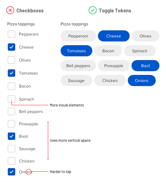
What interface component would you use for selecting from a large set of options? For most designers, checkboxes come to mind. But a long list of checkboxes is intimidating to users and can cause them to abandon your form. Not only that, but checkboxes are not efficient or easy to use because they take up space, increase the number of visual elements, and offer small tap targets.

A better component for option selection is toggle tokens. Toggle tokens conserve vertical space so you have room for more content and users don’t have to scroll. Checkboxes require vertical stacking, but toggle tokens allow for both vertical and horizontal stacking. This creates a compact arrangement that makes it less intimidating for users.

toggle-tokens-checkboxes

Not only that, but toggle tokens don’t require a checkbox and checkmark with the label. As a result, there are fewer elements on the screen competing for the user’s attention. Minimizing visual noise allows users to focus on the options.

The small tap targets of checkboxes can also cause tapping issues. Toggle tokens offer larger tap targets so users can make selections without mistapping.

All these benefits make toggle tokens a better component for selecting options than checkboxes. However, there is an exception when checkboxes fare better.

If your options have long text labels that wrap to multiple lines, you should use checkboxes. Checkbox labels aren’t horizontally constrained and allow enough space for more text. On the other hand, toggle tokens are constrained by its background shape and should only be used when your options are single text line labels.

toggle-tokens-labels

The name “toggle token” is also as intuitive as the name “checkbox.” It comes from its token-like shape and toggle functionality. Next time you’re thinking about using checkboxes for option selection, consider toggle tokens instead. You’ll conserve screen space and simplify the interface, which will prevent users from abandoning your form.

from UX Movement https://uxmovement.com/forms/why-toggle-tokens-are-a-better-alternative-to-checkboxes/

Framer Guide to React

Isn’t React for engineers?

I love this question. Because not too long ago, the question was: “Isn’t programming for engineers?”. This implies that we’ve since established that it isn’t. You don’t have to be an engineer to code. And you need “enough code to be dangerous” to greatly increase your potential for complex creative expression.

When designers talk about code, it’s most often in the context of designing interfaces. And the way we think of interface composition is in elements, like buttons, lists, navigation, etc. React is an optimized way to express interfaces in these elements, through components. It helps you build complex interfaces (and even simple interfaces get complex quickly) in an efficient way. By organizing your interfaces into three key concepts— components, props, and state—you can express anything you can think of and get all these things easily:

  • Clear structure and rules to help organize your code, so you don’t have to start over at a certain complexity.

  • A way to isolate, compose, and re-use parts of your code between projects and across teams in the form of simple components or even complex design systems.

  • Good rules to collaborate with others, as everything is built in a similar way.

React is a smart way to organize old interface code using simple concepts and rules. Saying that it‘s only useful for engineers would be like saying that no amateur photographer should ever buy a Leica. If you have the opportunity, why not work with the best tools?

Why does React seem so hard?

I’ve noticed that designers with experience building interfaces in jQuery, ActionScript, or (ironically) Framer Classic tend to struggle with React.

This has little to do with React and everything do to with programming models. The examples mentioned above use an imperative model, while React uses a declarative model. Let me explain the difference…

Imperative model

Much like giving someone step-by-step directions to cook a dish, an imperative model requires you to describe the exact steps to achieve a change.

Declarative model

A declarative model describes changes as before and after and lets the computer figure out the steps in between…much like ordering your custom frappuccino.

As designers, we’re used to working declaratively. Every timeline application where you tween between two states is a fantastic example. You describe before and after, and the computer figures out the tween.

Let’s try to look at this from a programmer’s perspective and build a simple login flow. This is not real or complete code, it just tries to illustrate the difference in approach.

The imperative app uses (fake) jQuery to describe exactly what to change if something happens. This should look familiar if you’ve used it a lot.

$("button .login").onClick(() => {

$("form").attr("enabled", false)

$("body").append($("div.spinner"))

doLogin((success, username) => {

if (success) {

$("form").remove()

$("div.spinner").remove()

$("body").append($(`Welcome back ${username}`))

} else {

$("form").attr("enabled", true)

$("form.error").text("Could not login")

$("div.spinner").remove()

}

})

})

COPY

The declarative (fake) React code describes the three different states of the app: logged_out, logging_in and logged_in. It seems to completely re-render your app at every change, but the trick is that under the hood it figures out all the differences and only updates those so that everything stays as fast as possible.

function App({ state = "logged_out", username = null }) {

if (!state === "logged_out") {

return <Login />

}

if (!state === "logging_in") {

return <Spinner />

}

if (!state === "logged_in") {

return <div>Welcome back {username}</div>

}

}

COPY

I hope these examples have illustrated why the declarative model makes a lot of sense for building interfaces. It does require a bit of a mind-shift if you have gotten used to the imperative model, but it’s ultimately worth it.

What is application state?

Now state can refer to many things. Animators see it as a visual configuration at a specific moment in time, explicitly defined. Web designers think of it as events that trigger a CSS class like hover, press, or loading.

But React was defined by engineers and they think of state as the current internal state of your application, which is defined as what you see on the screen. So in other words, state is all the variables that make up your application. Let’s look at some visual examples.

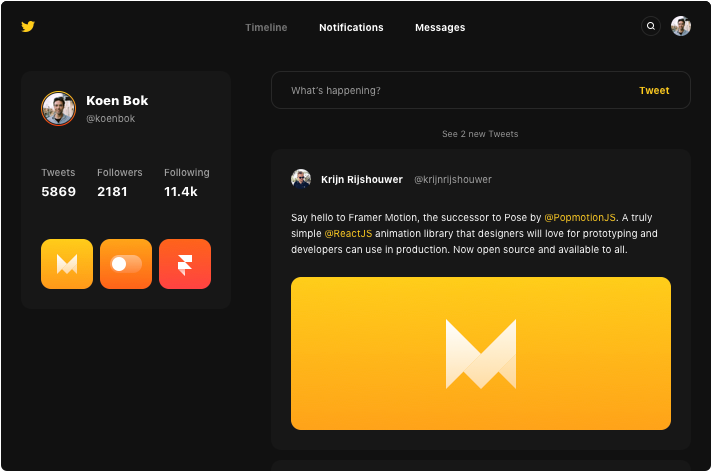
Twitter App Example

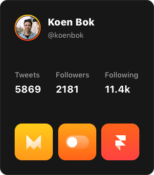
Let’s assume this card is my entire app for now. To draw it with real data I need 7 variables in total: profile_image_url, name, handle, tweets_count, tweets_images following_count and followers_count.

So if I were to describe the state in JavaScript it would look something like this:

{

profile_image_url: "koen.jpg",

name: "Koen Bok",

handle: "@koenbok",

tweets_count: 5869,

tweets_images: ["motion.jpg", "switch.jpg", "react.jpg"],

following_count: 2181,

followers_count: 11400

}

COPY

You see that these variables let me make every possible combination for this card. Much like a cold email template with variables Hello #{first_name} let’s meet for coffee.

But a full application state has way more things; from dynamic views to login fields. So let’s zoom out a little and look at an entire application state for a Twitter app.

Twitter App Example

Suddenly, there’s a lot more going on. Navigation tabs, logins, feed with loading, search etc. But nothing really changes in our approach. The state just becomes more extensive. Let’s look at what we would need to add to the above to describe the full Twitter interface state:

{

logged_in: true,

selected_tab: "feed",

search_query: null,

tweet: null,

feed_loading: false,

feed: [

{ id: 123, name: "Ryan Florence", tweet: "React gave me..." ... },

{ id: 456, name: "Krijn Rijshouwer", tweet: "Say hello to" ... },

]

}

COPY

You can see how these are all the variables that we need to show the application, neatly stored together. If we were to now write some interface code, it would look something like this (for simplicity’s sake, I’ve left some things out):

function Twitter(state) {

if (!state.logged_in) {

return <div>Login: <input /></div>

}

const feed = state.feed.map(item => (

<div>{item.name}: {item.tweet}</div>

));

return (

<div>

<button enabled={state.selected_tab !== "feed"}>Feed</button>

<button enabled={state.selected_tab !== "notifications"}>Notfications</button>

<button enabled={state.selected_tab !== "messages"}>Messages</button>

{state.feed_loading ? <div>Loading</div> : feed}

</div>

);

}

COPY

This is obviously an extremely simplified version, but if you have built prototypes before this should look really familiar. We really cleanly separated state and interface logic.

And now comes the magic moment (I hope). For me, this is the point where React really started to click. Look at the code again and notice how… simple it all is. Think about when you were building something similar in jQuery or Flash. You were likely writing a ton of:

$("#feed").click(function() {

$("#feed").attr("enabled", true)

$("#notifications").attr("enabled", false)

$("#messages").attr("enabled", false)

})

COPY

They all change the page a bit and update the state. But where is the state? It’s embedded in the page, and built up over time through all the functions that cause it to change. So when you eventually run into an unexpected state (and you will) it’s really hard to easily get an overview of the state, let alone reason or reproduce it so you can debug.

React always forces you to cleanly separate state and update it at once. That way you can write extremely simple code and avoid many bugs. It’s an extremely pleasant way to work. And it’s the main reason React (and other declarative component frameworks) are dominating.

To fully close the loop, let’s see how engineers look at (and talk about) this. This part isn’t needed to get work done, but it does seems like a pity to get this far and not also try to explain some of the very-accurate-but-deliberately-hard-sounding engineering terminology. Don’t worry if you don’t get this part (or don’t care).

So if you just take the Tweet function and completely empty it out you get:

function Tweet(state) { return output }

COPY

Or even more simplified in a mathematical notation:

Your application is a function of your state. Every time you insert the same state, you get the exact same output. You always render your entire app as a whole, so it’s extremely easy to reason about and React makes sure it’s still fast through only actually updating the changes.

If you want to go deeper on this concept I recommend Pure UI by Guillermo Rauch .

What are props and state?

This is likely the most often asked React question because it confuses so many people. But it’s honestly very simple, especially if you know some HTML. Before getting into the theory, let me show you using code. I’ll start with props because you almost always need props, but you definitely don’t always need state.

<img src="test.jpg" width="100px" height="100px" />

COPY

This element has three props: src, width and height. In HTML you would call them attributes. Programmers often call these properties; React just shortened it to props. That’s all there is to it.

Let’s say you would write your own special square image element in React, you get these passed in so you can use them:

function SquareImage({ src, size }) {

return <img src={src} width={size} height={size} />

}

<SquareImage src="test.jpg" size="100px" />

COPY

So props are just the attributes of your components. You use them to configure your components and it’s how components get values passed in from the outside. This last part is the key difference with state.

Because sometimes your component only needs values within the component itself. That sounds weird but think, for example, about a hover state that changes text. The component itself responds to the hover state, and changes its own text.

function Hovercraft() {

const [text, setText] = useState("Craft")

const mouseOver = () => setText("Hover")

const mouseOut = () => setText("Craft")

return <div onMouseOver={mouseOver} onMouseOut={mouseOut}>{text}</div>

}

<Hovercraft />

COPY

No outside values required, so we’re not using props, just state. It just needs a text value and that is only changed by the component itself. You can obviously mix props and state as needed.

Hooks and State

Hooks are a hip name for things you can do in a component. The most common one that you will run into is useState. It allows the component to remember some value, and update when it changes. The syntax may look a bit scary at first, but it’s really not that hard.

const [scale, setScale] = React.useState(1)

COPY

What this does is it sets the scale variable to the value 1. Much like:

So why all that other stuff? Well, when you change this scale in the future, you want to ensure the component changes with it, so it needs to update itself on the screen. In short, for React to know the value is updated, it needs a hook.

This is where the React.useState(1) comes in. It lets React know:

  • Hey React! You want to keep an eye on this value here.

  • Oh by the way the default value for it is 1.

React: no problem! I’ll keep track of it. Here you have two things back:

  • The current value for scale (which is 1 if you never changed it).

  • A function to update the value so that I know about it too, called setScale.

So the complicated looking const [scale, setScale] is just needed because React gives you back two things instead of one, and this little shortcut is a nice way to give them both names. You could actually write the exact same code without the shortcut like this:

const hook = React.useState(1)

const scale = hook[0]

const setScale = hook[1]

COPY

Whew, ok. I hope just enough info for you to now just use the shortcut. The last thing we need to look at is how to change the scale value with setScale. Let’s do that with a full example:

function MyComponent() {

const [scale, setScale] = React.useState(1)

return <Frame scale={scale} onTap={() => setScale(2)} />

}

COPY

Pretty easy; if you tap the scale gets set to 2 using setScale and React updates the component. To finish off, I’ll show you almost the same but now a little bit more explicit using the function notation I used before. This is mostly a preference, you can pick what you like better. Additionally, this example will increase the scale by 0.1 every time you tap.

function MyComponent() {

const [scale, setScale] = React.useState(1)

function onTap() {

setScale(scale * 1.1)

}

return <Frame scale={scale} onTap={onTap} />

}

COPY

A little more code, but a little simpler looking maybe. Again, up to you. But I like this. Here is a pretty great intro if you like to learn more about hooks and build something real.

Class or function components?

There are two ways to define components in React: functions and classes. Until the recent React Hooks release, class-based functions gave you more features for your components. But thanks to React Hooks they can now both do everything, so most people stopped using class-based components.

class KoenComponent extends React.Component {

render() {

return <div>Hello world!</div>

}

}

function KoenComponent() {

return <div>Hello world!</div>

}

COPY

We built the new Framer library on React Hooks because it it simpler and ensures that beginners won’t have to learn about classes, this, etc right off the bat. It’s quite elegant really.

TLDR; use functions and learn about Hooks if you plan to get more advanced with React.

What are overrides again?

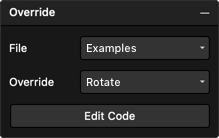
In Framer X, when you’d like to add code to canvas elements (defined as anything you draw that isn’t code), you have to use overrides. You can find overrides in the properties panel under code. Just select any object and attach the override you want. You can edit the overrides by clicking Edit Code where you’ll find that we’ve included a bunch of examples by default.

Framer X Overrides

Overrides essentially allow you to modify the props before they get set in the preview. So if you have a frame of the canvas with background: white and an override like so:

import { Override } from "framer"

export function ChangeBackground(): Override {

return {

background: "yellow",

}

}

COPY

…then the input from the properties starts off as a white color, but changes to yellow as the override gets applied.

Feeling confident about that? Let me show you what overrides look like in code (don’t worry if you don’t get this, it’s just helpful to understand).

function Canvas(props) {

Object.assign(props, ChangeBackground(props))

return <Frame {...props} />

}

COPY

Dynamic Overrides

Good news—overrides can also be dynamic. This means they get the properties that you set from the canvas are passed on, so you can use them as an input and modify them. Here’s an example that always moves a frame 50px down from its original position:

import { Override } from "framer"

export function ChangeTop(props): Override {

return {

top: props.top + 50,

}

}

COPY

Events

You’ll most likely want to use overrides for interactive work so let me quickly walk you through some cool examples. These use animation functions from our API: whileHover and animate.

import { Override } from "framer"

export function Hover(props): Override {

return {

whileHover: { scale: 1.2 },

}

}

export function RotateClick(props): Override {

const [rotate, setRotate] = React.useState(0)

return {

onTap() { setRotate(rotate + 90) },

animate: { rotate },

}

}

COPY

Between components

In order for components to communicate in a way that one animates when you click another, you’ll need a way to share data between components (also see state). Framer provides you with a simple Data object that does just that. It holds your data and tells your components to update when you change it.

Let’s create a very simple project that rotates a rounded square when you click on a yellow button. They will both need an override and we’ll call those Button and Rotate.

import * as React from "react"

import { Override, Data } from "framer"

const data = Data({ rotate: 0 })

export function Button(props): Override {

return {

onTap() {

data.rotate += 90

},

}

}

export function Rotate(props): Override {

return {

animate: { rotate: data.rotate },

}

}

COPY

As you can see, they both use the data object. The Buttonoverride modifies it on a tap, and that causes the Rotateoverride to animate to its new value.

from www.framer.com https://www.framer.com/books/framer-guide-to-react/

Gross Domestic Product: Banksy Opens a Dystopian Homewares Store

Tony the Frosted Flakes tiger sacrificed as a living room rug, wooden dolls handing their babies off to smugglers in freight truck trailers, and welcome mats stitched from life jackets: rather than offering an aspirational lifestyle, one South London storefront window depicts a capitalist dystopia. Created by Banksy and appearing overnight, Gross Domestic Product is the latest installation to critique global society’s major issues of forced human migration, animal exploitation, and the surveillance state.

The temporary installation, which will be on view for two weeks in the Croydon neighborhood, incorporates multiple window displays for a shop that is not in fact open to passersby. However, some of the items on display are available for purchase in GDP’s associated online store including the welcome mats, which Banksy hired refugees in Greek detainment camps to stitch; all proceeds go back to the refugees. Revenue from sales of the doll sets will also support the purchase of a replacement boat for activist Pia Klemp, whose boat was confiscated by the Italian government. The product line is rounded out with such oddities as disco balls made from riot gear helmets, handbags made of bricks, and signed—and partially used—£10 spray paint cans.

Tying this latest project to his larger body of work, Banksy incorporated familiar motifs. The fireplace and stenciled jacquard wallpaper from his Walled Off Hotel, the stab-proof Union Jack vest he created for Stormzy to wear at the Glastonbury Festival, and the Basquiat-inspired ferris wheel that appeared outside the Barbican all appear in GDP.

In a statement about the project, Banksy explains that the impetus behind Gross Domestic Product is a legal battle between the artist and a greeting card company that is contesting the trademark Banksy holds to his art. Lawyer Mark Stephens, who is advising the artist, explains, “Banksy is in a difficult position because he doesn’t produce his own range of shoddy merchandise and the law is quite clear—if the trademark holder is not using the mark then it can be transferred to someone who will.”

Despite this project’s specific goal of selling work in order to allow Banksy to demonstrate the active use of his trademark, the artist clarifies, “I still encourage anyone to copy, borrow, steal and amend my art for amusement, academic research or activism. I just don’t want them to get sole custody of my name.”

Per usual, Banksy shares updates on Instagram, where he claims recent projects, including GDP, which he just announced an hour ago as of press time.


View this post on Instagram


Amazing Banksy exhibition popped up in Croydon. #Banksy #Croydon

A post shared by Matt Hollander (@mhollander38) on

from Colossal https://www.thisiscolossal.com/2019/10/gross-domestic-product/

Tools for Unmoderated Usability Testing

These days, we’re spoiled for choice when it comes to remote user research. The vast array of tools available at many different price points can be overwhelming ⁠— especially since many of the descriptions of tools are virtually indistinguishable.

Every remote-research tool promises to deliver user insights, but they do so in very different ways. If you’re trying to choose a tool, this list can help you understand exactly what you’re getting and make sure the service you pick is a good fit for your research needs.

All of the user-research tools compared in this article allow you to do studies that are:

  • Remote: Participants can be located anywhere, the entire study is completed online.
  • Unmoderated: Participants complete the study on their own, without a researcher guiding the session.
  • Task-based: Participants receive instructions to complete specific tasks.
  • Behavioral: Users’ actions are recorded by the tool so you can tell what people did and whether they successfully completed the tasks.
  • Interactive: Participants can test on live sites or interactive prototypes rather than just seeing a static image.
  • Do-it-yourself: You can plan and carry out your own studies, without using the tool’s research-consultancy services.

Together, these qualities allow you to conduct studies that are similar to in-person usability testing, but without the moderator meeting individually with each participant. Unmoderated testing is often a good option when you have limited time or budget or when users are geographically dispersed.

2 Types of Data in Unmoderated Usability Testing

It’s important to understand that different types of data that can be collected by various tools. Some tools record unstructured qualitative data in the form of video recordings; some tools collect highly structured quantitative data about tasks, and some tools can gather both of these types of data.

Type of Data Qualitative Quantiative
How it is collected Video recordings capture sceen activity and think-out-loud narration by the test participant Metrics are recorded for dimensions such as time spent, success rate, satisfaction, and perceived difficulty
What it reveals What participants did and why they did it How common certain problems, behaviors, and opinions are among participants
Challenges Unstructured video recordings are time-consuming to watch and analyze. Metrics do not reveal causes of behavior; low participant motivation or inaccurate self-reported data can cause misleading metrics
Useful when you need to…
  • Understand why a problem is happening and get ideas for how to fix it
  • Evaluate new designs when you have no idea what problems users might encounter
  • Inspire empathy for users within your team or organization
  • Track usability over time
  • Quickly and accurately assess precise frequency of problems
  • Quickly assess subjective participant reactions of a large group of participants
  • Persuade stakeholders who prefer quantitative data

Make sure you have a clear idea of what you hope to achieve through your research. Then you’ll be able to decide whether you need qualitative recordings, quantitative data, or both.

Tools and Data Types

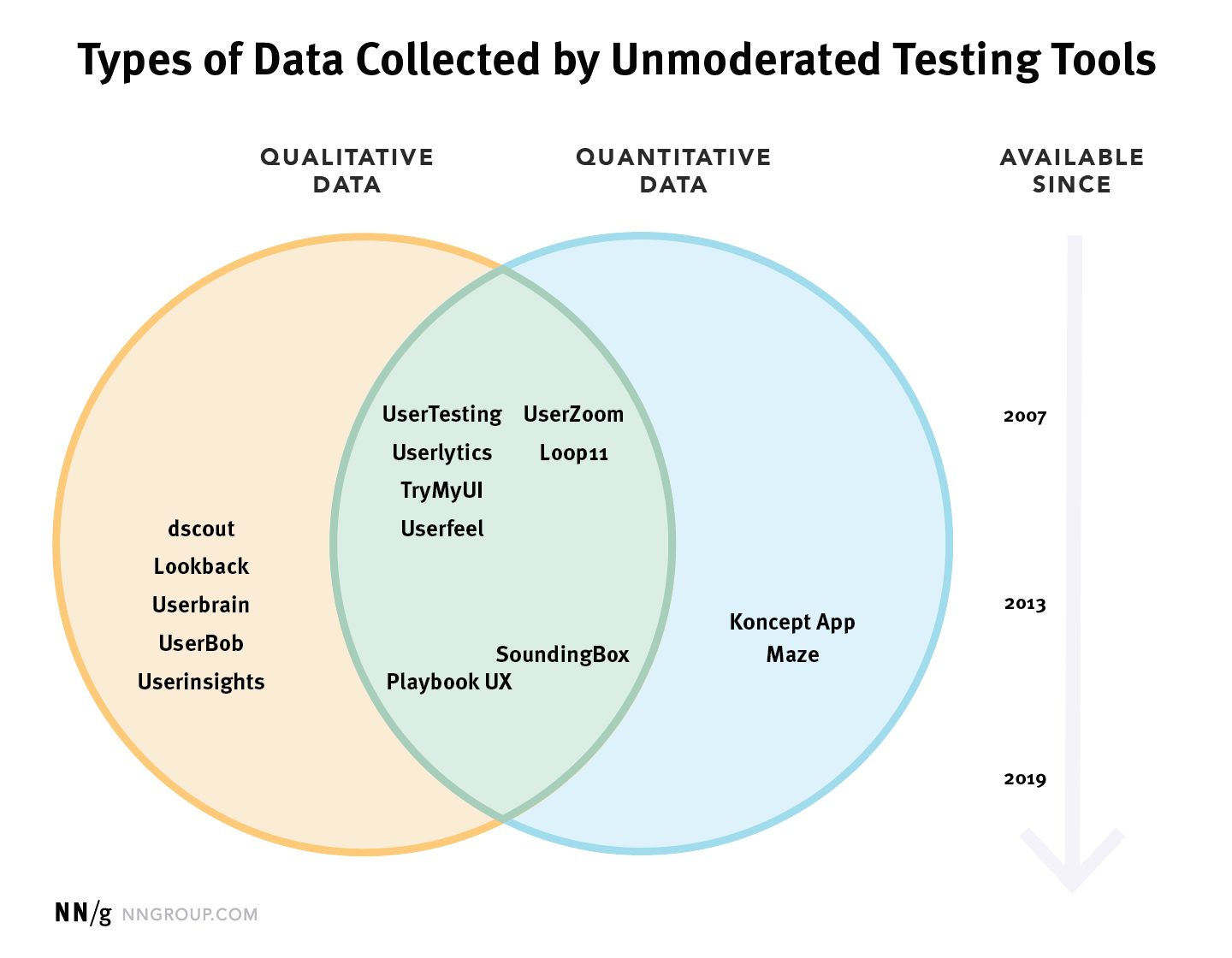
The chart below lists 15 different tools which can be used to conduct unmoderated usability testing. The position of each tool in this chart indicates both the type of data collected by the tool and how long the tool has been in existence. Generally speaking, tools which have been available longer are more mature, with more robust features. Also, though there is never any guarantee, a longer-lasting service is less likely to go under in the middle of your study and make any already-collected data evaporate into a lost corner of the cloud.

Venn diagram showing tools in the order of oldest to newest, grouped by whether they collect qualitative data (Dscout, Lookback, Userbrain, UserBob, UserInsights), or quantitative data (KonceptApp and Maze), or both (UserZoom, UserTesting, Userlytics, Loop11, TryMyUI, Userfeel, PlaybookUX, SoundingBox.

The diagram above indicates several unmoderated-testing tools which combine both types of data collection. The features listed for these tools are quite similar, so it can be difficult to distinguish between tools by reading their descriptions. Despite these surface similarities, there are important differences between these services, which are easier to understand if you’re aware of the history of each system. UserZoom and Loop11 initially focused on quantitative metrics, and later added qualitative recordings; while UserTesting, Userlytics, and Userfeel initially focused on video recordings and later added quantitative metrics. As you might expect, the tools’ original functionality tends to be more robust, while the newer features are more limited. (These distinctions are represented in the chart above by the placement of each tool’s name, which is positioned closer to its original data type.)

It’s also worth noting that the metrics-only tools included in this diagram, Maze and KonceptApp, are both designed to be used for testing prototypes and are not suitable for testing live websites or applications. Although they can simulate interactions, such as letting test participants click a link and move to another screen, this behavior requires you to actually build or import an interactive prototype.

Feature Comparison

Once you’ve determined the type of data you want to collect, review the precise capabilities of the tools you are considering. Some features which may be important to the design of your study are listed in the table below.

Recruiting Study Design & Setup Qualitative Data Quantitative Data
  • Participant panel
  • Set quotas for multiple types of users
  • Custom screening question(s)
  • Multiple Languages
  • Bring your own users
  • External panel integration
  • Test websites (desktop, mobile, and prototype)
  • Test native mobile apps
  • Test static wireframes or screens
  • Separate instructions for each task
  • Persistent access to task instructions
  • Custom welcome & final screens
  • Copy a past study
  • Branching (skip logic) to personalize tasks
  • Randomize task order
  • Professional research services available
  • Shared projects for team collaboration
  • Supports moderated testing
  • Record screen & audio
  • Record face
  • Timestamped notes
  • Export individual session notes
  • Export all project notes
  • Download individual recordings
  • Download entire project
  • Share recordings via url
  • Produce video highlights compilation
  • Automatic transcription
  • Browse video thumbnails
  • Simple rating questions
  • Custom ratings and written questions
  • Task time
  • Filter out speeders and cheaters
  • Rate of task abandonment
  • Data export (csv or xls)
  • Data-visualization charts
  • Success rate by url or click location
  • Click heatmaps
  • Clickpath across screens

Features that you may need to consider when selecting remote unmoderated usability-testing software

As a starting point for your comparison, we’ve prepared a list of tools and features we were able to confirm for each tool. This spreadsheet provides a detailed feature comparison for 15 tools for unmoderated user testing.

When to Use NONE of These Tools

This article has focused on tools for unmoderated usability testing, but that’s not always the right research method. For example, moderated usability testing (whether in-person or remote) is more appropriate for evaluating an early-stage prototype or to identify usability issues in interface or tasks that are so complex that it’s necessary to provide personalized directions and ask followup questions to fully understand users’ behavior. Also, all participants in unmoderated studies are people who were willing and able to install a browser extension or application and carry out a fairly complicated online interaction. If your target audience includes a lot of users who wouldn’t opt to participate in this type of research, you’ll need to use other methods to find and observe these people.

Finally, some research questions are better answered with a completely different type of study, such as an A/B test, 5-second test, interview, field study, card sort, or tree test. (Some services — most notably UserZoom — support a wide range of such research methods.) You should always figure out which research method best addresses your question before choosing any tool.

from Sidebar https://sidebar.io/out?url=https%3A%2F%2Fwww.nngroup.com%2Farticles%2Funmoderated-user-testing-tools

Tools for Unmoderated Usability Testing

4

Summary: Many platforms for unmoderated usability testing have similar features; to choose the best tool for your needs, focus on the type of data that you need to collect for your goals.

These days, we’re spoiled for choice when it comes to remote user research. The vast array of tools available at many different price points can be overwhelming ⁠— especially since many of the descriptions of tools are virtually indistinguishable.

Every remote-research tool promises to deliver user insights, but they do so in very different ways. If you’re trying to choose a tool, this list can help you understand exactly what you’re getting and make sure the service you pick is a good fit for your research needs.

All of the user-research tools compared in this article allow you to do studies that are:

  • Remote: Participants can be located anywhere, the entire study is completed online.
  • Unmoderated: Participants complete the study on their own, without a researcher guiding the session.
  • Task-based: Participants receive instructions to complete specific tasks.
  • Behavioral: Users’ actions are recorded by the tool so you can tell what people did and whether they successfully completed the tasks.
  • Interactive: Participants can test on live sites or interactive prototypes rather than just seeing a static image.
  • Do-it-yourself: You can plan and carry out your own studies, without using the tool’s research-consultancy services.

Together, these qualities allow you to conduct studies that are similar to in-person usability testing, but without the moderator meeting individually with each participant. Unmoderated testing is often a good option when you have limited time or budget or when users are geographically dispersed.

2 Types of Data in Unmoderated Usability Testing

It’s important to understand that different types of data that can be collected by various tools. Some tools record unstructured qualitative data in the form of video recordings; some tools collect highly structured quantitative data about tasks, and some tools can gather both of these types of data.

Type of Data Qualitative Quantiative
How it is collected Video recordings capture sceen activity and think-out-loud narration by the test participant Metrics are recorded for dimensions such as time spent, success rate, satisfaction, and perceived difficulty
What it reveals What participants did and why they did it How common certain problems, behaviors, and opinions are among participants
Challenges Unstructured video recordings are time-consuming to watch and analyze. Metrics do not reveal causes of behavior; low participant motivation or inaccurate self-reported data can cause misleading metrics
Useful when you need to…
  • Understand why a problem is happening and get ideas for how to fix it
  • Evaluate new designs when you have no idea what problems users might encounter
  • Inspire empathy for users within your team or organization
  • Track usability over time
  • Quickly and accurately assess precise frequency of problems
  • Quickly assess subjective participant reactions of a large group of participants
  • Persuade stakeholders who prefer quantitative data

Make sure you have a clear idea of what you hope to achieve through your research. Then you’ll be able to decide whether you need qualitative recordings, quantitative data, or both.

Tools and Data Types

The chart below lists 15 different tools which can be used to conduct unmoderated usability testing. The position of each tool in this chart indicates both the type of data collected by the tool and how long the tool has been in existence. Generally speaking, tools which have been available longer are more mature, with more robust features. Also, though there is never any guarantee, a longer-lasting service is less likely to go under in the middle of your study and make any already-collected data evaporate into a lost corner of the cloud.

Venn diagram showing tools in the order of oldest to newest, grouped by whether they collect qualitative data (Dscout, Lookback, Userbrain, UserBob, UserInsights), or quantitative data (KonceptApp and Maze), or both (UserZoom, UserTesting, Userlytics, Loop11, TryMyUI, Userfeel, PlaybookUX, SoundingBox.

The diagram above indicates several unmoderated-testing tools which combine both types of data collection. The features listed for these tools are quite similar, so it can be difficult to distinguish between tools by reading their descriptions. Despite these surface similarities, there are important differences between these services, which are easier to understand if you’re aware of the history of each system. UserZoom and Loop11 initially focused on quantitative metrics, and later added qualitative recordings; while UserTesting, Userlytics, and Userfeel initially focused on video recordings and later added quantitative metrics. As you might expect, the tools’ original functionality tends to be more robust, while the newer features are more limited. (These distinctions are represented in the chart above by the placement of each tool’s name, which is positioned closer to its original data type.)

It’s also worth noting that the metrics-only tools included in this diagram, Maze and KonceptApp, are both designed to be used for testing prototypes and are not suitable for testing live websites or applications. Although they can simulate interactions, such as letting test participants click a link and move to another screen, this behavior requires you to actually build or import an interactive prototype.

Feature Comparison

Once you’ve determined the type of data you want to collect, review the precise capabilities of the tools you are considering. Some features which may be important to the design of your study are listed in the table below.

Recruiting Study Design & Setup Qualitative Data Quantitative Data
  • Participant panel
  • Set quotas for multiple types of users
  • Custom screening question(s)
  • Multiple Languages
  • Bring your own users
  • External panel integration
  • Test websites (desktop, mobile, and prototype)
  • Test native mobile apps
  • Test static wireframes or screens
  • Separate instructions for each task
  • Persistent access to task instructions
  • Custom welcome & final screens
  • Copy a past study
  • Branching (skip logic) to personalize tasks
  • Randomize task order
  • Professional research services available
  • Shared projects for team collaboration
  • Supports moderated testing
  • Record screen & audio
  • Record face
  • Timestamped notes
  • Export individual session notes
  • Export all project notes
  • Download individual recordings
  • Download entire project
  • Share recordings via url
  • Produce video highlights compilation
  • Automatic transcription
  • Browse video thumbnails
  • Simple rating questions
  • Custom ratings and written questions
  • Task time
  • Filter out speeders and cheaters
  • Rate of task abandonment
  • Data export (csv or xls)
  • Data-visualization charts
  • Success rate by url or click location
  • Click heatmaps
  • Clickpath across screens

Features that you may need to consider when selecting remote unmoderated usability-testing software

As a starting point for your comparison, we’ve prepared a list of tools and features we were able to confirm for each tool. This spreadsheet provides a detailed feature comparison for 15 tools for unmoderated user testing. 

When to Use NONE of These Tools

This article has focused on tools for unmoderated usability testing, but that’s not always the right research method. For example, moderated usability testing (whether in-person or remote) is more appropriate for evaluating an early-stage prototype or to identify usability issues in interface or tasks that are so complex that it’s necessary to provide personalized directions and ask followup questions to fully understand users’ behavior. Also, all participants in unmoderated studies are people who were willing and able to install a browser extension or application and carry out a fairly complicated online interaction. If your target audience includes a lot of users who wouldn’t opt to participate in this type of research, you’ll need to use other methods to find and observe these people.

Finally, some research questions are better answered with a completely different type of study, such as an A/B test, 5-second test, interview, field study, card sort, or tree test. (Some services — most notably UserZoom — support a wide range of such research methods.) You should always figure out which research method best addresses your question before choosing any tool.

Attachments

(An earlier version of this article was originally published June 1, 2014. The article was last updated and revised on September 22, 2019.)


from Nielsen Norman Group https://www.nngroup.com/articles/unmoderated-user-testing-tools/

Product Listing UX: Have Filters for All Displayed List Item Info (38% Don’t) – Articles

The information presented in list items is crucial for users trying to pick out the products they’re interested in.

However, once users are exposed to product attributes in the list item info, we observe in usability testing that many users will then want to filter the product list by some of these attributes. Yet our UX benchmark shows that 38% of e-commerce sites don’t have filters for all displayed product listing info.

As a result, users are often left with massive, intimidating product lists — and some will simply abandon because of the perceived difficulty in being able to zero in on a suitable product. Despite the severity of the issue, 38% of sites don’t provide filtering options for even the product attributes they include as list item info.

In this article, we’ll discuss the test findings from our large-scale usability study related to providing filters for all displayed list item info. In particular, we’ll discuss:

  • Why filtering is so crucial to users’ ability to find suitable products
  • How failing to provide filters for all the displayed types of list item info can lead to abandonments
  • Providing filters for all displayed list item info

Why Filtering Is Crucial to Finding Products

At Costco, filters provided for laptops can help users narrow down the product listing so they can focus only on those products that are suitable for them.

Filtering is about empowering users to take a large, generic product listing and narrow it down to a small, manageable selection of products that are uniquely tailored to their needs and interests.

When done right, filters enable users to see only the products that match their individual needs and interests. It’s the e-commerce equivalent of walking into a physical store and asking the salesperson for “a brown men’s leather jacket in size medium.”

While there are some “basic” filters that should be provided for nearly all products (e.g., “Price”, “Color”, “Average Customer Rating”), most of the time users are interested in filtering the product listing across category-specific attributes. For example, filtering a list of cameras by camera-specific attributes such as megapixels, zoom level, and lens mount — attributes that aren’t particularly meaningful to other types of electronics, such as TVs (which in turn have attributes that are important to their respective category without being relevant to cameras).

Providing both universal and category-specific attributes in the list item info is a great first step toward helping users find products of interest (yet 46% of sites display too little or poorly chosen content).

However, by virtue of displaying the information in front of the user in the product list item info, users are reminded that the product attribute is important. Or, in the case of users new to the domain, they are taught that the attribute is important. The very display of the attribute then further encourages users to filter by it.

How Missing Filter Types Can Result in Abandonments

“They need to have a filter for ‘Headphones’. And a filter for ‘Accessories’. Then have ‘Earphones’. They’d make life a lot easier…it’s so all over the place.” A user at Newegg, confronted with a massive 50-page product listing of headphones, earbuds, and accessories (first image), tried to filter to only see headphones. However, that filter wasn’t available (second image), despite the product type being included in the list item titles (e.g., “JVC Gumy Plus Inner Ear Headphones with Remote & Mic”). She abandoned out of frustration.

“Uh…okay. The filters aren’t that helpful. They’re not giving me headphone-specific filters for things like ‘Over-the-Ear’, ‘Under the Ear’, ‘Noise Cancellation’, ‘Noise Isolating’. I’m just getting a generic set.” A different user at Newegg became frustrated when he tried to find filters for product features (first image) that were specifically called out in the list item info (second image). He ended up closing the filter menu without selecting any, and struggled to find a relevant product in the product listing.

“All these wheeled ones I don’t like at all…there are so many!…I wouldn’t shop here.” A user at Overstock was looking to reduce clutter in the product listing (first image) by narrowing the list to only nonwheeled backpacks. However, there wasn’t a filter for this attribute (second image), and he abandoned the site.

During testing, as users realized foundational filtering types were missing, it led to an excessive amount of time being spent trying to find the filter type, which “must be there somewhere”.

Users simply can’t understand why, if a product attribute is “called out” by being displayed as part of the product listing item info, there wouldn’t be a way to filter to see only those products that contain that attribute (or, conversely, only those products that don’t contain that attribute).

Thus, users will often scan the filtering interface — multiple times if there are a lot of filters — for the filter they’re interested in. This leads to wasted effort and frustrated users if in the end the filter is simply unavailable.

On mobile, this issue is often worse, as filtering is typically hidden, and the viewport is smaller. Users must first find where filters are, open it (along the way likely experiencing hit-area issues or laggy features), then scan the available filters in a much smaller viewport than on desktop. Furthermore filters are often collapsed themselves in the filter interface, and thus it may be many taps (and many minutes) before a user knows for certain that a filter for a list item attribute doesn’t exist.

Once users realize that they have to browse hundreds or even thousands of irrelevant products, with only a handful of relevant items mixed in-between, many simply abandon.

Provide Filters for All Displayed List Item Info

In short, any piece of information that is so important that it’s included in the list item is also so important that users will need a way to filter by it. It’s therefore crucial to provide filters for all displayed list item info.

These include basic attributes, such as price and brand, which often can be provided sitewide. In addition, category-specific filters must also be provided for each product type carried. For example, sleeping bag products will need a “Temperature-Rating Filter”, while furniture will need a “Color” filter, hard drives a “Capacity” filter, etc.

When determining what category-specific filtering types are needed, one can (either programmatically or manually) look through the attributes included in the list items within each category.

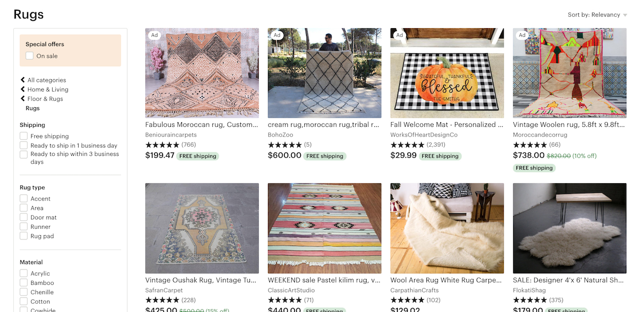
At Etsy, while there are many category-specific filters provided for the “Rugs” category, there isn’t a filter for a crucial attribute: size. Some users, seeing a wide range of rug sizes in the list items, would attempt to narrow the product listing to only those rugs that are a suitable size — but there’s no way to do that using the available filters.

It’s important to note that a site of course should have more filtering options than just the attribute types included in the list items. But those product attributes included in the list item are so foundational that they absolutely must be filters — they cannot be omitted without hurting the user’s filtering experience significantly.

Despite the severity of not including filters for all displayed list item info, 38% of sites in our benchmark don’t. Moreover, this was 42% of sites back in 2015 when we first started to track the issue — indicating that this is a persistent problem for e-commerce sites.

Furthermore, missing filters may be a symptom of an even more foundational issue of poor product data. To offer harmonized filtering values, the vendors’ product data and branded feature names need to be post-processed into a “common name” product attributes that can then be used to filter product listings and search results.

This article presents the research findings from just 1 of the 690+ UX guidelines in Baymard Premium – get full access to learn how to create a “State of the Art” user experience for product lists, filtering and sorting.

Authored by
Edward Scott. Published on
September 17, 2019.

User experience research, delivered twice a month

Join 19,000+ readers and get Baymard’s research articles by RSS feed or e-mail:

(1-click unsubscribe at any time)

Related Articles

See all 22 ‘Product Lists & Filtering’ articles

More E-Commerce Research

Free Research Content:

  • Popular Articles
    ·
    a listing of our most popular research-based articles on e-commerce UX
  • UX Benchmark
    ·
    benchmark with case studies of 60 major e-commerce sites ranked by e-commerce UX performance
  • Page Designs
    ·
    navigate 3,974 manually annotated full-page screenshots categorized by page type

Products & Services:

  • Baymard Premium
    ·
    full access to all 747 research-based design guidelines, UX case studies, page designs, and review tool
    ($720-$3,000 / year, based on plan)
  • Audit Service
    ·
    get an in-depth analysis of your site’s UX, conducted by a Baymard researcher
    ($1,900-$9,700 based on scope)

from baymard.com https://baymard.com/blog/have-filters-for-list-item-info

Metaphors and Analogies in Product Design

Human computer interaction and user experience design have always relied on analogies and metaphors to bring attention to technology’s features and affordances. While analogies and metaphors are closely related, it’s smart to understand the differences. The distinctions among metaphors and analogies will also help to underscore why you may want to use one and not the other in certain situations.

Metaphor is about using something from another space to referring to something you actually designing.

Do: Make the unfamiliar familiar (Desktop metaphor)

Metaphors help us explain something new and unfamiliar in terms of the familiar. The most famous metaphor in human computer interaction and user experience design is Alan Kay’s “desktop metaphor”. The desktop metaphor moved us from command line commands to direct manipulation with digitally rendered objects.

The original 1984 Mac OS desktop that popularized the new graphical user interface.

Do: Awake positive associations (Apple iMac)

With metaphors you can trigger emotions. When Apple designed a second generation of iMac, Steve Jobs and Johny Ive were walking though the garden and trying to image what the next generation would look like. Steve noticed a sunflower and suggested that the second generation should look like a sunflower. If you look at the picture below, you notice the way the screen can be maneuvered (the way it can be tilt) makes it look like a sunflower.

Using a metaphor of a sunflower makes an iMac feel more human.

Do: Persuade people (Pinterest)

If you offer a product that is unlike anything out there, you may need to describe it at least partly in terms of something customers already understand. Pinterest, which reached 10 million users faster than any other social networking site, revolves around the metaphor of a pin board. Users “pin” photos they find on the web and organize them into topical collections. This metaphor actually foster creative thinking.

Don’t: Simplistically literal metaphor (Microsoft Clippy)

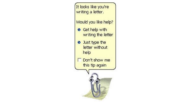
Picking a design metaphor is really hard. There is always a possibility to pick a design metaphor that can go terribly wrong. And we all know a bad metaphor can lead one astray. Microsoft Clippy was one of them. Clippy is famous for being one of the worst user interfaces ever deployed to the mass public. It turned out to be one of the most unpopular features ever introduced. Clippy reminds us that if we make metaphors too real, if we take them too far, they can become troublesome.

Microsoft Clippy was annoying animated paperclip that popped-up in the corner of the screen in Microsoft Word and completely distract your flow.

Don’t: Blindly mimic a real-world precedent (Apple iBooks)

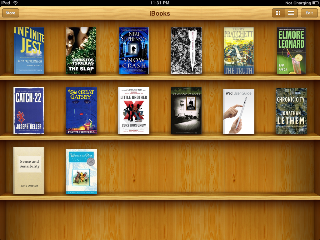
Apple’s iBooks is a prime example of that. iBooks used a bookshelf design, complete with 3D shelves and wood textures. The bookshelf metaphor was intended to help users transfer previous knowledge about bookshelves (as a place to store and organize physical media) to the digital environment. The shelves and wood textures are irrelevant to the app’s functionality but were supposed to reinforce the metaphor. Apple later removed the skeuomorphic bookshelf design from the UI.

Apple iBooks use a familiar and understandable metaphor of a pine-wood bookshelf to give the user an understanding of what is being shown and to be able to relate to it.

Analogy is comparing two things of partial similarity often from the same category. The difference between analogy and metaphor is that metaphor is often reference something outside of the category.

Do: Seeing the familiar in a different light (Nest)

Human beings continually and naturally draw analogies as a way of making sense of the world. Analogies help us see the familiar in a new light, which in turn, enables us to generate novel solutions to problems. One good example is Nest which is using analogy in its thermostat design. Basically, the design is referring to the original Honeywell thermostat: its round and you can rotate it to configure your temperature. Nest could choose from a merative other ways to actually present its functionality, but they’ve choose this one. This made Nest thermostat look “strangely familiar.”

Honeywell’s original, iconic round thermostat (left) and Nest thermostat (right). Novel technologies, all described in terms of something comfortably familiar.

Do: Help people understand new concepts (Facebook)

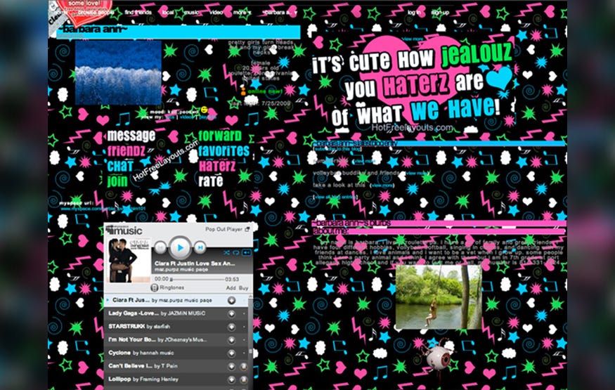
Our minds constantly, unconsciously compare new concepts to things we already know, as a way of understanding them. We look for similarities between our past experiences and any new situation to help us understand the new products. Before there was Facebook, the social media juggernaut which is changing how we communicate — and might change the face of media — there was MySpace. MySpace was targeted at the same audience and was to market long before Facebook. But there was a huge problem with MySpace — profile pages looked a bit odd for many users. Also MySpace allowed users to customize their profile. The final result of this you can see in example below.

A typical MySpace profile page

Facebook took quite orthogonal approach. It used an analogy with printed student profiles. Since many people had an experience with this type of data, this made Facebook very understandable and friendly for the majority of users.

Facebook used an analogy with a physical profile page for user digital profile.

Using symbols like metaphors and analogies for conveying meaning simplifies what you want to say. Metaphor and analogies aren’t just useful tools for educating and assisting users, they are an alchemy that transforms usable content into richly influential content and good products into great products.

Thank you!

Follow UX Planet: Twitter | Facebook


Originally published at babich.biz

from Medium https://uxplanet.org/metaphors-and-analogies-in-product-design-b9af77c18dba