If Nobody Reads Your Research, Did it Really Happen?


How great research and poor social skills can give your work a bad case of “Schrödinger’s Research”

Lesson 1: Make it eye-catching

If you can’t draw a line specific research you conducted to a change in the product, you may be experiencing a case of “Schrödinger’s Research.”

Don’t sweat! Schrödinger’s Research is a common phenomenon in the user experience industry. It occurs when bright researchers conduct brilliant UX studies, but the insights never make it out of their brain and into the brain of their stakeholders.

It’s as if the research might never have taken place at all.

Schrödinger’s Cat is a famous thought experiment highlighting the observer effect in quantum physics. If a cat is in a box with poison and has a 50/50 chance of surviving, the cat could theoretically be alive or dead, or both, until someone looks inside the box and checks.

Just like Schrödinger’s Cat, your research could be useless, impactful, or both — but it just isn’t anything until someone looks inside the box.

An Argument for Waving Your Research Around Like A Fucking Flag

Companies like Facebook tie promotions and raises to “impact” employees have upon the project for a reason. Though this approach has a few downsides that I’ll explore in another article, it does prompt researchers to tie the impact of their research to specific product changes.

When this works well, it incentivizes researchers to more proactively share their findings and follow through on areas of interest with design and product management to make sure improvements ship.

When you have a bad case of Schrödinger’s research, this may mean you can’t prove you’ve had any impact at all on the product.

This article will cover the few major steps in ‘socializing’ your research — or proactively bringing it into the design or decision making processes.

In general, we socialize research for a few company-wide benefits:

  • So the product is inspired by the user — user experience research findings shared early on in the design process can inspire elements of a design. This changes your product design process from “guessing and checking” to something more human centered.
  • So the product team makes better decisions — if designers and product managers are aware of the limitations and preferences of their user, they’ll make better UI and interaction decisions the first time through.
  • So the user becomes the ‘judge’ — teams that make decisions based on user experience research are less likely to steer towards what they personally prefer at the expense of the user. This also makes creative decision making more methodical by deferring to data rather than individuals on the design or management team.

Common Causes of Schödinger’s Research

Your team’s research blindness may be caused by any combination of: lack of awareness, ignorance, contempt, day drunkeness, or lack of bandwidth.

More likely though, there’s a problem with your method of communicating your findings.

  • Your method of presentation is boring or hard to absorb ex. dull, text-heavy slide decks or tons of confusing charts.
  • Your distribution channels suck — ex. overcrowded Slack channels, un-used Wikis, un-navigable document folders.
  • Your stakeholders don’t know the benefit of UX research ex. they view research as a yes/no nod on a design, they’re sure they know what’s best for the user.

Show Me What You Got

Even if your research is great, pertinent, timely — it still doesn’t speak for itself. User research, especially at a large company, is a role that requires the researcher to act as a spokesperson and mouthpiece for the user.

Here are a few ways that you can better share and promote your research findings. If you have other methods you employ, please let us know more about them in the comments!
Make Your Findings Interesting & Usable

Above all, the information you communicate must be accurate and given the correct context (ie. sample size, statistical significance).

But once you’ve nailed accuracy, make that shit as colorful, eye-catching and incendiary as possible to get people to read and absorb it.

Here are a few tips on effective slide decks from: UX Research is Boring and Nobody Reads It.

  • Use colors and themes to help stakeholders identify what information the research covers
  • Include a TL;DR and Recommendation slide as an index and for skimmers
  • Don’t just include that an element worked/didn’t. Tell the reader WHY

Make Your Research a Reference

If your research is unfindable, it can’t be used.

I create a research “Directory” for each product I work on with a team and circulate the link with pretty much everything I share. The Directory serves as an index of links. In the Directory, I include the following:

  • Description of product — Work with the product manager to come up with a brief description of the product and its basic functionality. Include a picture if possible.
  • Description of use case / user’s need — Briefly sum up what you know about the specific user and task at hand.
  • Primary Research Questions — What stage of research is this team at? Are we checking concepts against each other? Already fine-tuning usability? Just identifying areas for improvement of efficiency on an older product?
  • Links to Research and Design Resources — Include links to foundational research on user type/demographic trends, or the task the product approaches. Include usability test reports, noting the date and what part of the product was tested so stakeholders can jump to relevant data. Include any live test data
  • Upcoming Studies — I list my upcoming research and information on how to watch online or attend. I try to invest time in getting team mates to watch research because it means better understanding, people to bat around thoughts with, and fewer corrections down the line.
  • POC Information — List points of contact and contact information for engineering, design, product management, data and any other main stakeholders. This can help keep you from becoming the hub of all interactions.

Bring Your Research Directly To Your Stakeholder

I employ three main methods of sharing my research directly with peers.

1:1 Meetings

When I work on product teams I generally meet with the product manager once a week to gauge progress and priorities. I also meet 1:1 about once a week with the designers I work with to look at their most recent work and discuss edge cases and assumptions/concerns to explore in upcoming research.

1:1’s or small group meetings are also an excellent time to introduce the research you’ve just completed. You can answer questions and explore individual follow-up — for example, if a designer will need to re-think an interaction based on user research, you can let them know to plan extra time in their schedule to addres.

Research Read Out is a Terrible Name

Though I haven’t found a better way to refer to collecting people and sharing my research, Research Read Out is a deadly boring title for something awesome.

For each big research report (ex. a diary study or a set of surveys that reveal a trend) I like to organize a read out to share findings with context and answer questions.

Schedule 45 minutes to 1 hour. Ensure you have video conferencing set up, share the link, and record the session for those who cannot be there. Go through your report slide-by-slide, adding a bit of color or real examples to provide context. Photos and video clips from testing are your friend.

Because I like to multitask and the audience is captive

I also use these sessions to assign work or formally call issues out to add to our development or design timelines. I ask people about future availability and put time on the calendar so we remember to follow up.

Don’t be scared. Jokes helps when you’re being this direct. So does owning up to your approach and your intensity.

Speaking up and sharing your research can only help you and your user. When people react negatively to my action-oriented approach, it is to critique my personality rather than my accuracy or effectiveness. A grown woman can survive some shade, especially when my products end up shipping and numbers go up.
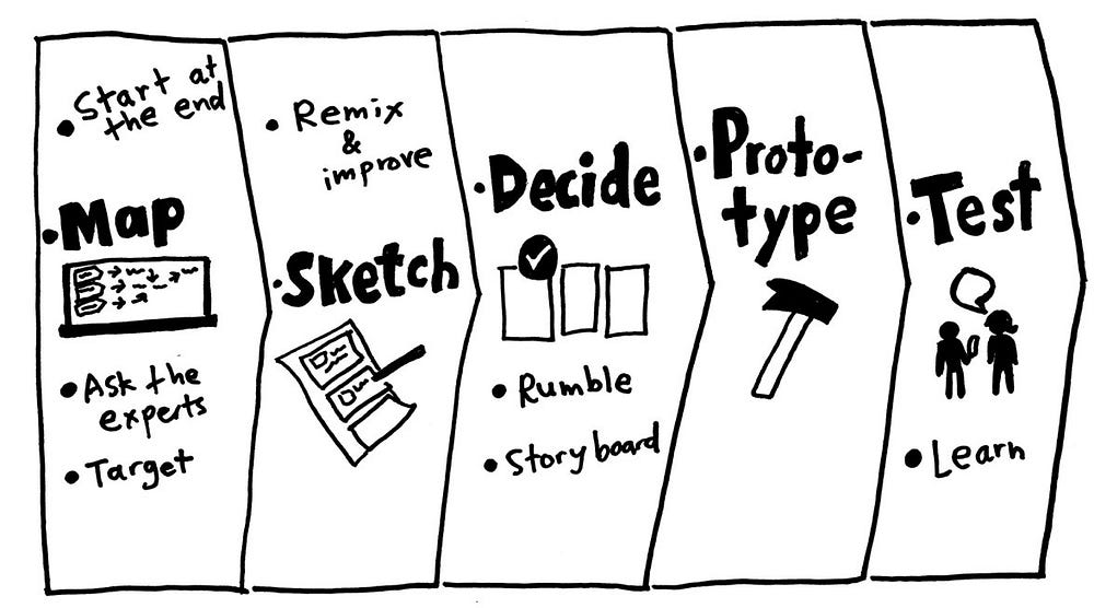
Insert Your Findings in the Design Process

User research shouldn’t be conducted in a vacuum. The researcher can work hand-in-hand with the rest of the product team to make sure that the user is at the center of the whole process.

Here are a few of my favorite ways to inject your research and knowledge about the user into the the design process.

Run a Sprint

Once you’ve got a nest of related issues, (for example, all kinds of reports of issues with the login process), it could be time to recommend a design sprint to address the whole section.

Work with the design team to insert user research into the sprint. I like to start sprints with a brief overview of our background knowledge on the user, their preferences and limitations.

When I have the time to get really fancy, I incorporate a quick round of user testing into the end of a sprint so designers can see reactions to the earliest sketches of their work and adjust accordingly.

Get Brainstorm Priorities Right

When your team is planning their next round of work or next set of feature priorities, jump in and insert some research.

Start brainstorms off by listing user needs and user priorities, then discuss company goals and metrics. If you ask your design team to just jump in and “maximize new signups”, you run the risk of designing predatory dark patterns.

“How might we satisfy (USER NEED) in a way that (COMPANY PRIORITY). “

Insert Your User Into Decision Making

Ideally a team is on the same page when it comes to priorities and what gets recommended for build or shipping.

The user researcher’s responsibility is advise the design, check impact with data, and above all, help you user achieve their goals.

As such, feel empowered to speak up in decision making meetings to point people towards relevant data or knowledge that you think is important to know about the user.

For example, if the product is about to ship but you have concerns about people misunderstanding, it is okay to pump the brakes and point people towards the data that makes you feel that way.

In fact, it is your responsibility :)

Share What You Know

Do you have tips or ways you’ve effectively shared your research findings? Please tell us about them in the comments below!


from Prototypr https://blog.prototypr.io/if-nobody-reads-your-research-did-it-really-happen-815bfca103ca?source=rss—-eb297ea1161a—4

This Is What A Designer-Led Social Network Looks Like

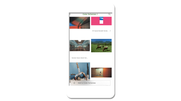
The users of the social networking and research site Are.na have a hard time explaining what exactly it is. You could call it “a collection of digital meta-theses” or “playlists, but for ideas.” Some say it’s what would happen “if the French created the internet,” or that it’s “like nerdy Pinterest.” But perhaps the best way to explain the website’s ethos? “Social media for people who dislike social media.”

The site, which was created in late 2012 by a group of artists and designers intent on creating a space that they could use to incubate ideas over time, has no advertising and no tracking. It has a feed, but there are no algorithms dictating what you see or when. It is a digital space to collect images, text, links, and documents, but what you collect on the site isn’t about popularity: There are no “like” buttons. That’s because it was created by designers and artists who are attuned to good, ethical design, making it something of an anti-Facebook social network by creatives, for creatives who want a space online in which to think, gather their ideas together, and share them with others.

[Image: Are.na]

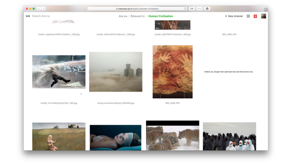
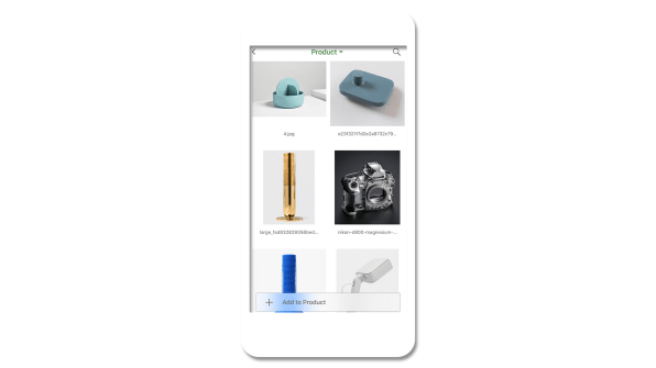
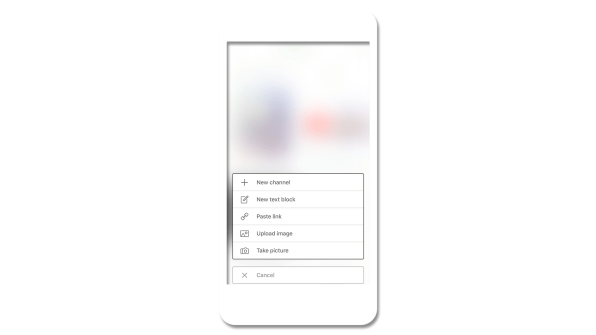
This difficulty in describing exactly what Are.na is has become part of its allure–“blocks” of content reside within folders called “channels,” and can be connected to as many channels as users want, creating a network of images, links, and text. On the site, there are even channels for crowdsourced descriptions of how to describe Are.na at a party and a channel for all the different ways in which people use it. For instance, one user keeps channels as reading lists, playlists, and as a portfolio for his work.

[Image: Are.na]

The platform’s lack of a simple explanation is perfectly suited to an era when more people want something different out of the internet. In the groundswell of anger and suspicion toward social media platforms like Facebook and Twitter for spreading misinformation, amplifying harassment, and stamping out nuance, Are.na feels like a necessary antidote–a calm white space where you can group your ideas, whatever their form or complexity. And while the site’s user base of 21,000 registered users and 7,000 active monthly users is minuscule compared to the social media giants, it is growing rapidly at 20% month over month.

“What does it feel like to connect to the information you’re consuming and feel like you’re building new thought in the same way that you would in a really good conversation with a friend or reading a good book, one of those human things that expand our brains?” says Charles Broskoski, Are.na’s cofounder. That, in essence, is Are.na’s goal: to make it easier for that kind of intelligent connection to happen online, replacing the passive consumption that manifests in hours spent mindlessly scrolling and “liking.”

As Broskoski put it, “[Are.na] is less like a casino and more like a nice library.”

[Image: Are.na]

No Ads, No Algorithms

On first glance, Are.na’s sparse website feels a little bit like Pinterest, except you can add more than photos. But for Broskoski, there are some fundamental differences: Pinterest focuses mostly on images, primarily of things that you can buy. It’s trying to sell advertising, while Are.na is not. Are.na’s freemium business model is central to the company’s ethos. You can sign up for Are.na for free and start creating blocks of content and folder-like channels, as long as they’re publicly available. But if you start to create larger private channels–which indicates to the Are.na team that you’re using the platform for bigger personal or professional projects–then the platform costs $5 per month, or $45 for the year.

“We think the business model is a fundamental thing that forms the user experience,” says Chris Barley, a cofounder and designer at Are.na with a background in architecture. “If we’re trying to have our users look at ads, that’s a different desire than giving them a space to work intellectually.”

Because the company isn’t trying to keep eyeballs on the site so it can sell more ads, the underlying mind-set is simply different. “We’re trying to set up this situation where we’re motivated to make people like the platform enough to pay for it,” says Broskoski.

Many social media companies that rely on ad revenue preach connectivity, positioning their service as the means to overcome the vast differences of time and space to share ideas and create a global community. This rings false, of course. These companies are motivated to connect you with friends and strangers because they can convert your attention into dollars. That’s part of what’s driving the backlash against Facebook and Twitter. “There’s a fundamental disconnect there,” Broskoski says. “We’re trying to make a company where that is actually the goal. We’re trying to build a normal business. If it’s useful enough then people will pay for it.”

The commercialization of the internet–partially to blame for the disconnect between the techno-utopian ideals of its earliest creators and its current state of affairs–was the reason the team created Are.na in 2012. Broskoski explains that in the early aughts, he and many of his friends were partial to an internet bookmarking site called Delicious, but when Delicious was bought by Yahoo in 2005, they decided they needed to create a tool of their own that wasn’t owned by a giant corporation–and Are.na was born. “Because we were artists and working on the internet, a lot of our practice had to do with searching out weird idiosyncratic things and going down the path of what we were interested in and then tying that to a thesis for a work,” Broskoski says. “The thing we wanted to do was collect all the resources we found in the world that felt important to us at a time and have a way to gather all that stuff into one place.”

At first, the site was mostly for Broskoski and a group of friends with similar mentalities. That was five years ago. Today, as paranoia about algorithms, data, and digital privacy rises amongst users of major social networking sites, Are.na might stand a chance with the rest of the world. “The cultural awareness of what people want out of the internet is changing and growing,” Barley says. “In other industries or areas that are not digital, health and wellness is a huge concern. But figuring out what that might mean in our digital lives is a more and more important space.”

Are.na’s designers have felt this disconnect online for many years, long before the 2016 election shook many people awake. “Designers and artists are those early-adopter types, and they’re more sensitive to how things get presented to them on the internet,” says Are.na cofounder and designer Chris Sherron. “They felt it as soon as Facebook introduced the like button. As soon as people started trolling on Twitter, they felt it.”

[Image: Are.na]

Trusting Users To Figure It Out For Themselves

As a designer-first site, Are.na’s web design is serenely white. It’s a bit confusing at first (in part, because there are so many ways you can use it), but when you try your hand at creating blocks and channels it quickly becomes intuitive. “I think a lot of current social networks don’t put enough trust in the user to think for themselves and in a way they overdo it in terms of the style, the colors, the language–you notice a lot of sites that use this real jokey and playful language,” Sherron says. “I think designers and artists who are the early adopters of the internet and the ones that set the trends–they’re seeing this and thinking, it doesn’t feel quite right. We want to make sure that we’re not taking people’s intelligence for granted and doing just enough.”

The challenges of the site–both the difficulty describing it and the vast number of ways you can use it–is also by design. “Part of the reason [Are.na] takes a little longer for people to get into is that it asks a little bit more of a user than something like Facebook,” Barley says. “The like button is the most mindless thing you could possibly do. What you do on Are.na is connecting, and it takes a lot more brain power. You’re marginally smarter for doing it and you build that muscle over a period of time.”

[Image: Are.na]

The company has found that a key draw for many users is the ability to work in small groups on the site–making it part social media and part productivity tool. Barley describes using Are.na for research, where three to five people collect and group information thematically into channels for everyone to reference. He joined the team about six months ago because he’d been using Are.na in a previous job. “It lets you have a thought over a long period of time and discover things slowly, rather than quick inspiration,” Barley says.

The platform has found a home in the classroom at universities like MIT, Yale, RISD, Parsons, Pratt, and Columbia, where professors and students have embraced it. Outside institutions are also using Are.na: The Chicago Architecture Biennial embeds content from the site on its blog, and the Guggenheim has built an entire interactive exhibition using Are.na as the content management system. And creative people who work at companies like Apple, Google, Tumblr, and Dropbox also use the service–which likely spills over into their professional work lives. Broskoski says that a recent user survey showed that 80% of people used Are.na in both personal and professional contexts. “It’s people who value intelligence throughout their day, both when by themselves and at work,” Barley says.

In 2016, the team built a bookmarking tool called Pilgrim that’s available for anyone to use, with Are.na as its backbone. At the end of 2017, they launched an iPhone app, a big step forward toward helping the platform grow and a common request from current users. And as the site enters its sixth year, its creators are hoping to double down on how Are.na can be used in team settings–something they’re already intimate with, given that they also use the platform for internal projects. What would Are.na look like if used in a larger context, like in a big corporation? “Those implications are really interesting if you think about entire companies slowly building ideas together over time, versus what they do now–these siloed brainstorm sessions that they push out on people,” Barley says. But even as they grow, the Are.na team is focused on their core user–which is, in essence, themselves.

“Making things that give dopamine hits for nothing is not what we’re trying to do. It’s usually in the service of thinking better and thinking with other people,” Barley says. In other words, they’re going to keep creating an ethically minded internet platform that puts its money where its mouth is. “Ethical might be one word,” he adds. “It’s our best guess about what we think people actually want now, and more of what people will want from the future.”

from Sidebar https://sidebar.io/out?url=https%3A%2F%2Fwww.fastcodesign.com%2F90157216%2Fthis-is-what-a-designer-led-social-networking-site-looks-like

UX audits and their importance in the design process

When getting started on a new design sprint it can be easy to want to hit the ground running by sketching or drafting wireframes, but an important first step that can sometimes be missed is the UX audit.

What exactly is a UX audit you might ask? When I say UX audit I am referring to the surveying the competitive (and sometimes not-so-competitive) landscape — seeing what others are doing, how they are doing it, and, potentially, why they are doing it that way.

UX audits are an important step in the design process because they allow the designer to:

  1. See what the landscape is like for a particular component or workflow. How are others doing it?
  2. Identify what works, what doesn’t, and what might be missing. Where is there opportunity for improvement?
  3. Understand what’s considered “best practice” and why. Why reinvent the wheel if there is already a standard convention that users are familiar with?

But auditing is not as simple as browsing the web and taking mental notes of what you see. As designers, that’s something we do all the time anyway. When actually conducting an audit, you need to keep a record of everything you’ve looked at to see the big picture. Insights and recommendations should come from documented findings, not fuzzy memories.

So how should you conduct a UX audit? I’ve outlined my steps to complete a successful audit below. These should help in your research and development of user-centered components and workflows.

1. Figure out what you’re auditing

Are you auditing a component like buttons, search boxes, or date pickers? Or maybe it’s something more complex like an account creation flow? Either way, nailing down what it is exactly that you’re looking for will help you stay focused with your audit.

2. Figure out who you should audit

Are you designing strictly for enterprise or is it consumer-facing? Or maybe it’s for something geared toward teens? While you’ll want to look at a mix of websites and apps to help understand best practices, you should definitely spend some time looking at other players in your space as well. There might be trends by industry, demographic, or device that you need to pay attention to.

I like to get as big a sample size as possible, but depending on what I’m auditing that might not always be possible. If what I’m auditing is more of a common component, I’ll try to target a pool of 10–20 samples (using a combination of apps, websites, and/or operating systems, depending on what I’m auditing).

3. Screenshot everything

Shift + Command + 4 is your new best friend. You’ll want to grab a screenshot of everything you see — every state, every page, every interaction. This will make it easier to remember and document for others later. If you don’t do this, I guarantee you’ll go back and end up doing it at some point later, so you might as well do it now.

I like to organize all my screenshots into a folder, organized by product, so I can refer back to them when putting together my research into a final document. File organization is easy to overlook but a true time saver in the end!

Capture everything you’re auditing with a screenshot

4. Review everything you’ve captured

By now you’ve looked at at least 20 apps or websites, if not more (because chances are you didn’t find what you were looking for at each place you looked).

It’s hard to remember what was what, who did what and in what order, so take some time to review what you’ve screenshotted. Looking through all your screenshots will help you prep for the next couple of steps.

5. Organize into buckets

See what categories emerge when you start to organize your samples into buckets. What features does each product have? What characteristics or traits are common?

I’m not typically a big Excel fan, but a spreadsheet definitely comes in handy here. I’m also more of a visual person, so being able to see a breakdown that way can help with understanding too.

Breaking down search features by product

6. Look for patterns

Use your matrix you’ve created to look for commonalities. You’re basically using it as heat map of sorts to help surface patterns. These patterns can help you determine what is a common convention that users are already familiar with.

Emerging patterns from characteristics of a search box component

7. Document and synthesize to share with your team

Now that you have some insights and recommendations you might want to share it with your team; this can help them understand why you made certain decisions. Formats for your audit documentation can range from a Keynote presentation to something more like a UX framework guideline, depending on what works for you.

Even if you don’t end up sharing it immediately, creating a document that can be referred to later is extremely valuable for future-you and/or other designers on your team, saving them from the re-work of having to conduct their own audit.

And remember how initially you figured out what you were auditing exactly? Well now that you have all this information, it might be a good time to actually define your component or workflow so to set the scope of what something like “search” actually means. For others reviewing this later, extra clarity can be extremely helpful for understanding and alignment.

Basic anatomy of a search box component defined

8. Use what you’ve learned

Make use of your new insights to inform how and what you do for your product and users. Test your designs, iterate if necessary, and always keep an eye open for changing trends!


UX audits and their importance in the design process was originally published in UX Design Collective on Medium, where people are continuing the conversation by highlighting and responding to this story.

from UX Design Collective – Medium https://uxdesign.cc/ux-audits-and-their-importance-in-the-design-process-55264e55ffd1?source=rss—-138adf9c44c—4

UX & Psychology go hand in hand — Introduction to human attention

A handy article about human attention from a psychologist’s and a UX Designer’s view.

As a UX designer, we design digital products that people interact with. When we designing these products, we spend a lot of time on different research to understand the behavior, habits, and needs of our users. However, there is a couple of general patterns that characteristic of all people. To be consciously used, we need to understand the process of human cognition.
The purpose of this article is to understand the concept, function and types of visual attention and to use this knowledge in everyday product design.

What does psychology say?

In this section one of my friend, Anikó Tőzsér helps us to clarify the basic principles of human attention.

What determines what we pay attention for?

Attention is an ability which helps to select the information between different stimuli and process. Our attention can decide that we want to deal with the stimuli or ignore it. Sometimes this process is automatic and sometimes we focus our attention on a problem which we have to solve.

Psychology of attention deals with mechanisms of perception which form the behavior, and how consistent behavior is created. Psychological researchers of attention concentrate on audition and sight.

Spatial attention vs feature-based attention

There are two ways of visual attention: spatial attention and feature-based attention. Spatial attention means that we direct our attention to a particular region. Feature-based attention means that we direct our attention to a particular feature, for example colour.

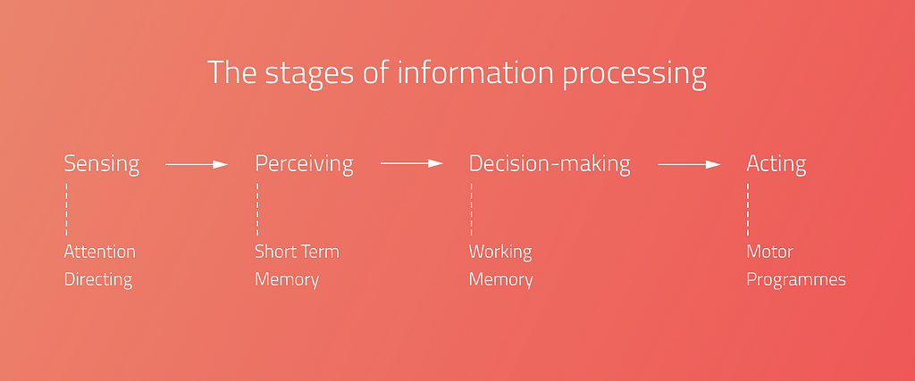
Human Information processing

For the sake of design products, which grab people’s attention, we need to understand the processing of human information.

However this is a debated issue.

  • When one period is finished, the next one starts, and the periods contain more and more complicated feature of the stimuli.
  • Others argue that it’s continuous, which means that every stimulus is transmitted immediately.

Types of attention

There are different types of attention, which are determined by the situation and the intensity of the stimuli.

Selective Attention: it is an automatic process, which chooses between important and less important stimuli depending on the situation. As we can attend to only one thing at the same time, this kind of process helps to select the most important stimuli in the given situation.

As a UX designer we need to be aware of the fact of intensive changes: intensive changes of the environment draw the user attention. With this fact under our belt, we can consciously design user experiences that truly fit the users.

Divided attention: if a process is automatic, more process can happen simultaneously. A great every day example is driving and talking at the same time. We can pay attention only to one action at the same time, that’s why if something happens on the road in front of the driver, the driver will stop talking and concentrate on the driving. In this moment the attention becomes Focused, when the attention is limited to one object, action or stimuli.

Focused attention is the brain’s ability to concentrate its attention on a target stimulus for any period of time.(cognitivefit)

Sustained Attention: Sustained attention is when we keep our focus on one subject for a long time, even if we need to repeat the given action or activity.

As a UX Designer, we need to know that during the learning and working activities (listening to a teacher or reading an online lesson) the users need to use their sustained attention. It means that everything on the user interface should serve this goal.

Attention is a limited cognitive resource

As a UX designer we need to reduce cognitive overload.
Each sense modality has some separate attentional resource. An auditory task interferes less with a secondary visual task would.
”It is much easier to monitor the road ahead while talking on a cell phone than when looking at the navigation system.” (Visualexpert)

In one moment 5–9 (7+-2 The magical number) objects can be detected, which means that the area of spatial attention is not constant, it can be broader or smaller.

Cocktail Party Effect:

Cocktail party effect is the ability to tune into a single voice and tune out all others during a crowded party. This also could happen in the digital environment. Web party effect is the cocktail party effect in the web environment.

As Dr. Susan Weinschenk explained in her article, you can use the senses to grab attention. Colours, contrast, fonts, white spaces, beeps, and tones are helping to capture attention.

Too Many Options (Hick’s Law)

More choices need more cognitive load. “It describes the time it takes for a person to make a decision as a result of the possible choices he or she has: increasing the number of choices will increase the decision time logarithmically.”

Change Blindness

Depending on our focus, our brains can be fully blind to changes going on around us. We need to design our products according the main user goals and tasks. UX is a treasure box full of with useful methods and techniques. Creating user journey map or conduct task analysis could help us to avoid the ‘change blindness’ effect.

Thank you! ❤️


UX & Psychology go hand in hand — Introduction to human attention was originally published in UX Design Collective on Medium, where people are continuing the conversation by highlighting and responding to this story.

from UX Design Collective – Medium https://uxdesign.cc/ux-psychology-go-hand-in-hand-introduction-to-human-attention-a70ffd2c4289?source=rss—-138adf9c44c—4
Chermayeff & Geismar: 60 years of logos

Honoring Chermayeff & Geismar: 60 years of logos

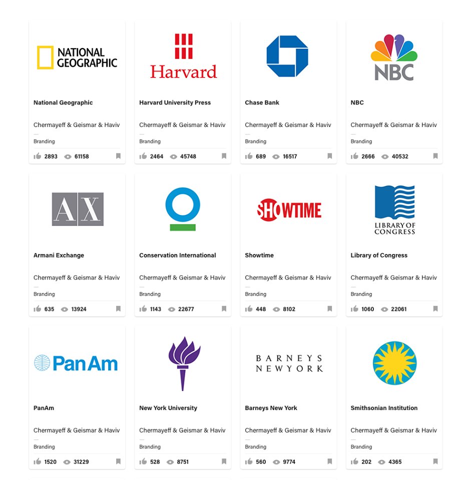
This year, the world of logo design has lost one of its most prominent representatives, Ivan Chermayeff. In the odd case you don’t know who that is let me break it down for you really quickly. 60 years ago this man, Yale graduate, along with his Tom Geisman, founded the legendary firm Chermayeff & Geismar. It would become to be known as the creators of logos for such companies as Pan Am, Chase Bank, NBC and Xerox; channels such as Showtime and National Geogrpahic; and brands like Armani Exchange.

Chermayeff & Geisman

In 1979  Ivan Chermayeff and Thomas Geismar were awarded the AIGA Medal and in October 2014 they received the National Design Award for Lifetime by the Smithsonian’s Cooper-Hewitt, National Design Museum. Since, 2006 another designer joined forced in the firm, as a partner, Sagi Haviv. Apart from logos, they also deal with motion graphics and art in architecture.

Unfortunately, Chermayeff died this year, on December 3rd. He left behind a true legacy that will most likely be continued by its remaining two partners.

This is the man that said: “It is usually a two-month process, but it should look like it took five minutes.” That’s exactly what everyone in the business knows to be true. Only they’ve been doing it so successfully for 60 years, and counting.

To honor the two pioneering professionals, Dan Covert of Dress Code created the video below, which also features the last interview Ivan Chermayeff gave. The world of design has definitely lost a legend.


The post Chermayeff & Geismar: 60 years of logos appeared first on Tshirt-Factory Blog.

from Tshirt-Factory Blog https://blog.tshirt-factory.com/chermayeff-geismar-logos.html

Framer Launches Fresh New Design Tool


Framer is known as a prototyping app, but in an unexpected move they have just announced the launch of a fully integrated, browser-based, visual design tool.

Aimed at creative professionals, the new Framer is designed to rival established options including Creative Cloud and Sketch, new kids on the block Affinity and Figma, and is timed to steal the thunder of InVision, whose own much heralded design app is expected next month.

We’re betting on something that our competitors aren’t — that designers will want a tool which does both high-fidelity design and prototyping.

—Koen Bok, co-founder, Framer

Framer claims that this latest release makes it the first prototyping app to fully consolidate the entire designer toolkit—at least for screen based design.

The new app allows you to design everything from icons, through to hi-fidelity interactive mockups. Unlike some competitors, who are promising the moon in 2018, you can use Framer’s design tool now. The not unfamiliar interface is simple to use, and initial reactions have been broadly positive.

Framer’s approach has been a little…interesting, to put it succinctly. They have integrated AI [facepalm] so that you design something once, and Framer ‘intelligently’ reshapes and resizes the design across any device. I’m not saying this is a dubious approach, I’m not saying that responsive design is about more than making shapes fit a viewport, I’m not saying that this goes against a mobile-first methodology; I’m not saying any of that because we should be positive about any new tool that people have worked hard on.

Perhaps the best news for designers is that the tool is being released at all. We all saw the stagnation in design apps—and the corresponding impact that had design work—when Adobe was the only player in town. The more companies are forced to compete to win your custom, the better the tools on offer. It seems that 2018 could feature a design tools ‘space race’, with a dozen or more developers vying for an established slot in designers’ workflows.

Framer’s evolution into a full design tool, is on the one hand ambitious, and on the other inevitable. Framer won’t be talked about as an Adobe killer, it’s a different beast altogether; it may be that designers anticipating InVision’s new tool are tempted away. A creative process is a very personal thing, some designers will love Framer, others will not; it’s always nice to have a choice.

Framer is available now as a 14 day free trial, plans start from $12 per month.


from Webdesigner Depot https://www.webdesignerdepot.com/2017/12/framer-launches-fresh-new-design-tool/

The golden rule of A/B testing: look beyond validation

A/B tests provide more than statistical validation of one execution over another. They can and should impact how your team prioritizes projects.

Too often, teams use A/B testing to validate bad ideas. They make minor changes and hope the test will produce big wins. But these tests can be counterproductive. Results that are a product of random variation (e.g. not statistically significant) yield unhelpful insights, and even good results are not guaranteed to hold true when your winning variable is shipped to a full audience.

If you adhere to A/B testing best practices and ask the right questions before running a test, you’ll learn what types of changes are actually worth your time and focus on projects that produce meaningful insights.

The impact of statistical power

There’s a lot written on frequent A/B testing mistakes. The most common error is calling tests too soon based on statistical significance. Sometimes your test result is significant because there’s an actual effect, other times it’s due to sheer noise. After all, a random sample is never going to be a perfect representation of the full population.

In order to differentiate an effect from noise, you not only need statistical significance but also statistical power. If you have more statistical power you can be more certain the lift is actually real.

To get enough power and run a test correctly, ask yourself:

  1. How much do you think the change will increase the associated key performance indicator (KPI)?
  2. Given this desired effect, how long will you need to run the test to get accurate results?
  3. Is it worth the wait?

1. How much do you think the change will increase the KPI?

Say you want to improve your signup flow. You have a list of ideas and are trying to decide which ones to work on. You’re not happy with the UI, but a complete overhaul will take a month to design and build. On the other hand, you could try out a different color scheme, which won’t take long to change. Your team hypothesizes that the complete redesign can boost conversion from 10% to 15% whereas the color scheme change may boost conversion from 10% to 11%.

2. Given this desired effect, how long will you need to run the test to get accurate results?

Take your answer to the question above and plug it into this sample size calculator. Under the hood there’s serious statistics involved, but the basic logic is smaller effects take longer to detect whereas larger effects will be obvious sooner. This is an important insight: detecting small changes is expensive. In our example, the color scheme change only takes two days to build, but we’ll need 24x more data to test a 1% versus a 5% absolute lift.

3. Is it worth the wait?

With sample sizes in mind, you should consider how long a test would need to run to achieve reliable results. Say your signup flow gets 600 visits per day. The complete redesign will require two days to gather enough data while the color scheme change will take much longer. So the larger project takes 32 days to develop and test, while the smaller project takes 49. They both take a lot of time, but the complete redesign has more potential.

Focus on projects with bigger potential upside

Late last year, we thought our signup flow could do better. The layout on our previous signup page (shown below as the Control) was not logically organized. The integration methods were not displayed in an order that was most likely to be relevant to new users. And since our signup flow doesn’t see hundreds of thousands of visitors, we knew we had to test something that we thought was much better.

We wanted our signup conversion to increase by 10%. And after getting enough data, we looked at the signup rates between versions. Disappointingly, the difference was small and not statistically significant. The test was a wash, but that’s okay. We still decided to use the new version, because the signup experience was cleaner and put us in a better position to iterate and improve in the future.

What this approach means for startups

For young companies, small optimization projects just don’t make sense. Tests take a long time to run and distract you from working on projects that matter. You might see a slight uptick, but you’re likely working towards a local maximum. To get on the path towards the global maximum, young companies need to make big changes.

Larger companies have spent a lot of time working on flows and understanding their customers. They’re better suited for small improvements because they have the traffic to conclude tests faster. Plus, a 1% improvement means a lot more when you have hundreds of thousands of visitors a day.

Once you’ve made several large tests, have a good understanding of your customers and have large traffic volume, you can work on small optimizations. Remember, not every A/B test is going to yield the result you want. What’s important is that you determine your improvement goal and account for how long you need to run the tests to get the right kind of results. Otherwise you risk spending a lot of resources only to get back a negative ROI.

The post The golden rule of A/B testing: look beyond validation appeared first on Inside Intercom.

from The Intercom Blog https://blog.intercom.com/why-ab-tests-should-yield-more-than-results/

Students solve a 60-year-old space radiation mystery

The students uncovered the origin behind energetic particles that exist in the inner areas of Earth’s radiation belt. Scientists have long theorized that highly charged protons in these areas originated from cosmic ray albedo neutron decay (CRAND), which is what occurs when cosmic rays smash into neutrons in the Earth’s atmosphere. It results in charged particles, which become trapped in the Van Allen Belts. However, scientists did not extend this theory to cover the electrons on the inner edge of the belts.

Now, students have confirmed that CRAND is also responsible for the presence of highly charged electrons. It’s satisfying to have this mystery resolved, especially because these charged particles have a practical impact on space travel. They pose a hazard to both satellites and astronauts leaving the protective shell of the Earth’s magnetosphere to travel to the moon, Mars and beyond. Understanding where these particles come from can help us predict them.

But this discovery is also powerful because of the way it was made: by students through the use of CubeSats. CubeSats are small satellites, about the size of a loaf of bread or a shoebox. They are inexpensive to manufacture, and thanks to rocket startup companies like Vector and Rocket Lab, will soon be relatively cheap to launch as well. This particular satellite was funded through an NSF grant, and as space becomes increasingly accessible to high school and college students, you can bet that more discoveries like this are in our near future.

from Engadget https://www.engadget.com/2017/12/13/students-solve-mystery-electrons-van-allen-belts/

When AI gets in the way of UX

Don’t let your fascination for AI get in the way of your fascination for solving real problems from real people.

Interest for “Artificial Intelligence” over the last 5 years, according to Google Trends.

Artificial Intelligence is the big buzzword of today. If you are a digital designer, there are good chances that a quick scroll through your RSS reader, Twitter feed or Slack channels will show you more instances of the term “AI” than you would see just a year ago. New products being launched, journalists speculating how many years it will take for robots to take over the world, experts giving their opinion about how to design for AI.

Our entire industry is rushing to launch the world’s first AI-powered _______ (insert a product category here), without a proper use case or business case for it.

It doesn’t matter how it is going to be used, or by whom. What matters is to be the world’s first. Whatever it is. As long as there’s AI powering it.

In the next few months, every vertical of every industry will start to attach the AI-powered label to all its products — as well as its variations “AI-enabled”, “AI-driven”, “AI-controlled”. It’s a process that has been happening in the last 1–2 years and will only intensify moving forward.

On the other hand, products that are proudly created by humans (not robots), will start to attach labels that sit at the extreme opposite of the spectrum: “hand-made”, “hand-crafted”, “curated by humans”, “human-made”.

But what does that mean for UX Designers?

To create anything that will be powered by AI, technologists inherently have to start with the data that will be used to train the AI and ultimately create these amazing AI-powered tools and services. This process is usually driven by engineers — the experts that actually know how to model the intelligence and enable it to take action based on data.

The problem with that is that teams usually pick the first problem that technology can be applied to, without validating it with real users. Is that technology solving a real user need?

Just because something is possible doesn’t mean it should exist in the world.

It’s the same story when the concept of mobile apps came up in the late 2000s. Hundreds of apps were being launched every week, solving problems no one ever had. The vast majority died; the ones that were relevant for people persisted.

As UX Designers, our biggest challenge will be to participate as early as possible in these types of projects. To be designing along with developers, as soon as data is available to be looked at. And to bring the good old design methods of user validation and user research to the moment decisions are made — so companies don’t spend millions of dollars solving problems that don’t exist.


When AI gets in the way of UX was originally published in uxdesign.cc on Medium, where people are continuing the conversation by highlighting and responding to this story.

from Stories by Fabricio Teixeira on Medium https://uxdesign.cc/when-ai-gets-in-the-way-of-ux-17de95f40772?source=rss-50e39baefa55——2

Evolution of : Gif without the GIF

tl;dr

  • GIFs are awesome but terrible for quality and performance
  • Replacing GIFs with <video> is better but has perf. drawbacks: not preloaded, uses range requests
  • Now you can <img src=".mp4">s in Safari Technology Preview
  • Early results show mp4s in <img> tags display 20x faster and decode 7x faster than the GIF equivalent – in addition to being 1/14th the file size!
  • Background CSS video & Responsive Video can now be a “thing”.
  • Finally cinemagraphs without the downsides of GIFs!
  • Now we wait for the other browsers to catch-up: This post is 46MB on Chrome but 2MB in Safari TP

Special thanks to: Eric Portis, Jer Noble, Jon Davis, Doron Sherman, and Yoav Weiss.

Intro

I both love and hate animated GIFs. Ode to GeocitiesThanks Tim

Safari Tech Preview has changed all of this. Now I love and love animated “GIFs”.

Everybody loves animated Gifs!

Animated GIFs are a hack. To quote from the original GIF89a specification:

The Graphics Interchange Format is not intended as a platform for animation, even though it can be done in a limited way.

But they have become an awesome tool for cinemagraphs, memes, and creative expression. All of this awesomeness, however, comes at a cost. Animated GIFs are terrible for web performance. They are HUGE in size, impact cellular data bills, require more CPU and memory, cause repaints, and are battery killers. Typically GIFs are 12x larger files than H.264 videos, and take 2x the energy to load and display in a browser. And we’re spending all of those resources on something that doesn’t even look very good – the GIF 256 color limitation often makes GIF files look terrible (although there are some cool workarounds).

My daughter loves them – but she doesn’t understand why her battery is always dead.

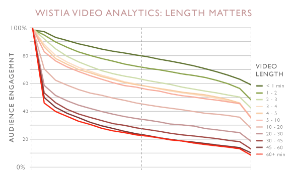
GIFs have many advantages: they are requested immediately by the browser preloader, they play and loop automatically, and they are silent! Implicitly they are also shorter. Market research has shown that users have higher engagement with, and generally prefer both micro-form video (< 1minute) and cinemagraphs (stills with subtle movement), over longer-form videos and still images. Animated GIFs are great for user experience.

videos that are <30s have highest conversion

So how did I go from love/hating GIFs to love/loving “Gifs”? (capitalization change intentional)

In the latest Safari Tech Preview, thanks to some hard work by Jer Noble, we can now use MP4 files in <img> tags. The intended use case is not long-form video, but micro-form, muted, looping video – just like GIFs. Take a look for yourself:

<img src="rocky.mp4">
Rocky!

Cool! This is going to be awesome on so many fronts – for business, for usability, and particularly for web performance!

As many have already pointed out, using the <video> tag is much better for performance than using animated GIFs. That’s why in 2014 Twitter famously added animated GIF support by not adding GIF support. Twitter instead transcodes GIFs to MP4s on-the-fly, and delivers them inside <video> tags. Since all browsers now support H.264, this was a very easy transition.

<video autoplay loop muted inline>
  <source src="eye-of-the-tiger-video.webm" type="video/webm">
  <source src="eye-of-the-tiger-video.mp4" type="video/mp4">
  <img src="eye-of-the-tiger-fallback.gif"/>
</video>

Transcoding animated GIFs to MP4 is fairly straightforward. You just need to run ffmpeg -i source.gif output.mp4

However, not everyone can overhaul their CMS and convert <img> to <video>. Even if you can, there are three problems with this method of delivering GIF-like (Gif), micro-form video:

1. Browser performance is slow with <video>

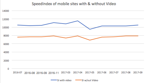
As Doug Sillars recently pointed out in a HTTP Archive post, there is huge performance penalty in the visual presentation when using the <video> tag.

Sites without video, load about 28 percent faster than sites with video

Unlike <img> tags, browsers do not preload <video> content. Generally preloaders only preload JavaScript, CSS, and image resources because they are critical for the page layout. Since <video> content can be any length – from micro-form to long-form – <video> tags are skipped until the main thread is ready to parse its content. This delays the loading of <video> content by many hundreds of milliseconds.


For example, the hero video at the top of the Velocity conference page is only requested 5 full seconds into the page load. It’s the 27th requested resource and it isn’t even requested until after Start Render, after webfonts are loaded.

Worse yet, many browsers assume that <video> tags contain long-form content. Instead of downloading the whole video file at once, which would waste your cell data plan in cases where you do not end up watching the whole video, the browser will first perform a 1-byte request to test if the server supports HTTP Range Requests. Then it will follow with multiple range requests in various chunk sizes to ensure that the video is adequately (but not over-) buffered. The consequence is multiple TCP round trips before the browser can even start to decode the content and significant delays before the user sees anything. On high-latency cellular connections, these round trips can set video loads back by hundreds or thousands of milliseconds.


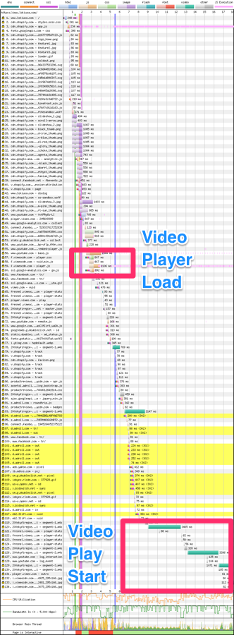
And what performs even worse than the native <video> element? The typical JavaScript video player. Often, the easiest way to embed a video on a site is to use a hosted service like YouTube or Vimeo and avoid the complexities of video encoding, hosting, and UX. This is normally a great idea, but for micro-form video, or critical content like hero videos, it just adds to the delay because of the javascript players and supporting resources these hosting services inject (css/js/jpg/woff). In addition to the <video> markup you are forcing the browser to downloaded, evaluate, and execute the javascript player — and only then can the video start to load.


As many people know, I love my Loki jacket because of its built in mitts, balaclava, and a hood that is sized for helmets. But take a look at the Loki USA homepage – which uses a great hero-video, hosted on Vimeo:

lokiusa.com filmstrip
lokiusa.com video

If you look closely, you can see that the JavaScript for the player is actually requested soon after DOM Complete. But it isn’t fully loaded and ready to start the video stream until much later.

lokiusa.com waterfall

WPT Results

2. You can’t right click and save video

Most long-form video content – vlogs, TV, movies – is delivered via JavaScript-based players. Usually these players provide users with a convenient “share now” link or bookmark tool, so they can come back to YouTube (or wherever) and find the video again. In contrast, micro-form content – like memes and cinemagraphs – usually doesn’t come via a player, and users expect to be able to download GIFs and send them to friends, like they can with any image on the web. That meme of the dancing cat was sooo funny – I have to share it with all my friends!

If you use <video> tags to deliver micro-form video, users can’t right-click, click-and-drag, or force touch, and save. And their dancing-cat joy becomes a frustrating UX surprise.

3. Autoplay abuse

Finally, using <video> tags and MP4s instead of <img> tags and GIFs is brings you into the middle of an ongoing cat and mouse game between browsers and unconscionable ad vendors, who abuse the <video autoplay> attribute in order to get the users’ attention. Historically, mobile browsers have ignored the autoplay attribute and/or refused to play videos inline, requiring them to go full screen. Over the last couple of years, Apple and Google have both relaxed their restrictions on inline, autoplay videos, allowing for Gif-like experiences with the <video> tag. But again, ad networks have abused this, causing further restrictions: if you want to autoplay <video> tags you need to mark the content with muted or remove the audio track all together.

… but we already have animated WebP! And animated PNG!

The GIF format isn’t the only animation-capable, still-image format. WebP and PNG have animation support, too. But, like GIF, they were not designed for animation and result in much larger files, compared to dedicated video codecs like H.264, H.265, VP9, and AV1.

Animated PNG is now widely supported across all browsers, and while it addresses the color pallete limitation of GIF, it is still an inefficient file format for compressing video.

Animated WebP is better, but compared to true video formats, it’s still problematic. Aside from not having a formal standard, animated WebP lacks chroma subsampling and wide-gamut support. Further, the ecosystem of support is fragmented. Not even all versions of Android, Chrome, and Opera support animated WebP – even though those browsers advertise support with the Accept: image/webp. You need Chrome 42, Opera 15+ or Android 5+.

So while animated WebPs compress much better than animated GIFs or aPNGs, we can do better. (See file size comparisons below)

Having our cake and eating it too

By enabling true video formats (like MP4) to be included in <img> tags, Safari Technology Preview has fixed these performance and UX problems. Now, our micro-form videos can be small and efficient (like MP4s delivered via the <video> tag) and they can can be easily preloaded, autoplayed, and shared (like our old friend, the GIF).

<img src="ottawa-river.mp4">

So how much faster is this going to be? Pull up the developer tools and see the difference in Safari Technology Preview and other browsers:

Take a look at this!

Unfortunately Safari doesn’t play nice with WebPageTest, and creating reliable benchmark tests is complicated. Likewise, Tech Preview’s usage is fairly low, so comparing performance with RUM tools is not yet practical.

We can, however, do two things. First, compare raw byte sizes, and second, use the Image.decode() promise to measure the device impact of different resources.

Byte Savings

First, the byte size savings. To compare this I transcoded the trending top 100 animated Gifs from giphy.com and then converted into vp8/vp9/webp/h264/h265.

NB: These results should be taken as directional only! Each codec could be tuned much more as you can see the vp9 fairs worse than the default vp8 outputs. A more comprehensive study should be done that considers SSIM.

Below are the median (p50) results of the conversion:

Format Bytes p50 % change p50
GIF 1,713KB
WebP 310KB -81%
WebM/VP8 57KB -97%
WebM/VP9 66KB -96%
WebM/AV1 TBD
MP4/H.264 102KB -93%
MP4/H.265 43KB -97%

Yes animated WebP is smaller but any video format is much smaller. This shouldn’t surprise anyone since these modern video codecs are highly optimized for online video streaming. H.265 fairs very well as I expect AV1 will too.

The benefits here will not only be faster transit but also substantial $$ savings for end users.

Net-Net, using video in <img> tags is going to be much faster on a cellular connection.

Decode and Visual Performance Improvements

Next, let’s consider the impact of the decode and display effects on the browsing experience. H.264 (and H.265) has the notable advantage of being hardware decoded instead of using the primare core for decode.

How can we measure this? Since browsers haven’t yet implemented the proposed hero image API, we can use Steve Souder’s User Timing and Custom Metric strategy as a good aproximation of when the image starts to display to the user. It doesn’t measure frame rate, but it tells us roughly when the first frame is displayed. Better yet, we can also use the newly adopted Image.decode() event promise to measure decode performance. In the test page below, I inject a unique GIF and MP4 in an <img> tag 100 times and compare the decode and paint performance.

let image = new Image;
t_startReq = new Date().getTime();
document.getElementById("testimg").appendChild(image);
image.onload = timeOnLoad;
image.src = src;
return image.decode().then(() => { resolve(image); });

The results are quite impressive! Even on my powerful 2017 MacBook Pro, running the test locally, with no network throttling, we can see GIFs taking 20x longer than MP4s to draw the first frame (signaled by the onload event), and 7x longer to decode!

Localhost test on 2017 i7 MacBook Pro

Curious? Clone the repo and test for yourself. I will note that adding network conditions on the transit of the GIF v. MP4 will disproportionately skew the test results. Specifically since decode can start happening before the last byte finishes, the delta between transfer, display and decode becomes much smaller. What this really tells us is that just the byte savings alone will improve substantially the user experience. However, factoring out the network as I’ve done on a localhost run, you can see that using video has substantial performance benefits for the energy consumption as well.

How can you implement this?

So now that Safari Technology Preview supports this design pattern, how can you actually take advantage of it, without serving broken images to non-supporting browsers? Good news! It’s relatively easy.

Option 1: Use Responsive Images

Ideally the simplest way is to use the <source type> attribute of the HTML5 <picture> tag.

<picture>
  <source type="video/mp4" srcset="cats.mp4">
  <source type="image/webp" srcset="cats.webp">
  <img src="cats.gif">
</picture>

I’d like to say we can stop there. However, there is this nasty WebKit bug in Safari that causes the preloader to download the first <source> regardless of the mimetype declaration. The main DOM loader realizes the error and selects the correct one. However, the damage will be done. The preloader squanders its opportunity to download the image early and on top of that, downloads the wrong version wasting bytes. The good news is that I’ve patched this bug and it should land in Safari TP 45.

In short, using the <picture> and <source type> for mime-type selection is not advisable until the next version of Safari reaches the 90%+ of the user base.

Option 2: Use MP4, animated WebP and Fallback to GIF

If you don’t want to change your HTML markup, you can use HTTP to send MP4s to Safari with content negotiation. In order to do so, you must generate multiple copies of your cinemagraphs (just like before) and Varyresponses based on both the Accept and User-Agent headers.

This will get a bit cleaner once WebKit BUG 179178 is resolved and you can add a test for the Accept: video/* header, (like the way you can test for Accept: image/webp). But the end result is that each browser gets the best format for <img>-based micro-form videos that it supports:

Browser Accept Header Response
Safari TP41+ H.264 MP4
Accept: video/mp4 H.264 MP4
Chrome 42+ Accept: image/webp aWebP
Opera 15 Accept: image/webp aWebP
Accept: image/apng aPNG
Default aGif

In nginx this would look something like:


map $http_user_agent $mp4_suffix {
    default   "";
    "~*Safari/605"  ".mp4";
}

location ~* .(gif)$ {
      add_header Vary Accept;
      try_files $uri$mp4_suffix $uri =404;
}


Of course, don’t forget the Vary: Accept, User-Agent to tell coffee-shop proxies and your CDN to cache each response differently. In fact, you should probably mark the Cache-Control as private and use TLS to ensure that the less sophisticated ISP Performance-Enhancing-Proxies don’t cache the content.

GET /example.gif HTTP/1.1
Accept: image/png; video/*; */*
User-Agent: User-Agent: Mozilla/5.0 (Macintosh; Intel Mac OS X 10_13_2) AppleWebKit/605.1.13 (KHTML, like Gecko) Version/11.1 Safari/605.1.13

…

HTTP/1.1 200 OK
Content-Type: video/mp4
Content-Length: 22378567
Vary: Accept, User-Agent

Option 3: Use RESS and fall Back to <video> tag

If you can manipulate your HTML, you can adopt the Responsive-Server-Side (RESS) technique. This option moves the browser detection logic into your HTML output.

For example, you could do it like this with PHP:

<?php if(strlen(strstr($_SERVER['HTTP_USER_AGENT'],"Safari/605")) <= 0 ){ // if not firefox ?>
<img src="example.mp4">
<?php } else {?>
<img src="example.gif">
<?php }?>

As above, be sure to emit a Vary: User-Agent response to inform your CDN that there are different versions of your HTML to cache. Some CDNs automatically honour the Vary headers while others can support this with a simple update to the CDN configuration.

Bonus: Don’t forget to remove the audio track

Now, since you aren’t converting GIF to MP4s but rather you are converting MP4s to GIFs, we should also remember to strip the audio track for extra byte savings. (Please tell me you aren’t using GIFs as your original. Right?!) Audio tracks add extra bytes to the file size that we can quickly strip off since we know that it will be played on mute anyway. The simplest way with ffmpeg is:

ffmpeg -i cats.mp4 -vcodec copy -an cats.mp4

Are there size limits?

As I’m writing this, Safari will blindly download whatever video you specify in the <img> tag, no matter how long it is. On the one hand, this is expected because it helps improve the performance of the browser. Yet, this can be deadly if you push down a 120-minute video to the user. I’ve tested multiple sizes and all were downloaded as long as the user hung around. So, be courteous to your users. If you want to push longer form video content, use the <video> tag for better performance.

What’s next? Responsive video and hero backgrounds

Now that we can deliver MP4s via <img> tags, doors are opening to many new use cases. Two that come to mind: responsive video, and background videos. Now that we can put MP4s in srcsets, vary our responses for them using Client Hints and Content-DPR, art direct them with <picture media>, well – think of the possibilities!

<img src="cat.mp4" alt="cat"
  srcset="cat-160.mp4 160w, cat-320.mp4 320w, cat-640.mp4 640w, cat-1280.mp4 1280w"
  sizes="(max-width: 480px) 100vw, (max-width: 900px) 33vw, 254px">

Video in CSS background-image: url(.mp4) works, too!

<div style="width:800px, height: 200px, background-image:url(colin.mp4)"/>

Conclusion

By enabling video content in <img> tags, Safari Technology Preview is paving the way for awesome Gif-like experiences, without the terrible performance and quality costs associated with GIF files. This functionality will be fantastic for users, developers, designers, and the web. Besides the enormous performance wins that this change enables, it opens up many new use cases that media and ecommerce businesses have been yearning to implement for years. Here’s hoping the other browsers will soon follow. Google? Microsoft? Mozilla? Samsung? Your move!

from Sidebar https://sidebar.io/out?url=https%3A%2F%2Fcalendar.perfplanet.com%2F2017%2Fanimated-gif-without-the-gif%2F