Designing for AI means designing like it’s 1999

You can’t talk about 1999 without Hamster Dance.
You can’t talk about 1999 without Hamster Dance.

That means looking back at the unfinished, handmade web to reinvent how we design for AI — and who we become — now.

If you designed for the web in 1999, you remember the feeling while the Hamster Dance video was playing in the background.

Pages were handmade — for a lot of us, the WYSIWYG editor was Notepad — the conventions were improvised, the JavaScript was rough, and some of the most popular things online were gloriously, defiantly pointless, like the Hamster Dance.

The browser wars were still on, so a layout that worked in Netscape often broke in Internet Explorer — and you couldn’t always trust two versions of the same browser to render a page the same way. We had all the tags — FRAME, MARQUEE and BLINK.

The tools we now treat as basic weren’t there yet either. CSS technically existed, but browser support was so patchy you couldn’t really lay out a page with it — serious layouts meant nesting tables inside tables and propping them open with invisible single-pixel spacer GIFs.

“Responsive design” wouldn’t even be named for another decade; you built a site for one screen size — 640 by 480 — and everyone on a different one squinted or scrolled sideways.

You shipped something, watched people get confused, and changed it.

You were improvising the medium and inventing its toolkit at the same time, which is a strange way to work and, in hindsight, the whole opportunity. And it looks a lot like now.

“History never repeats itself, but it does often rhyme.” — Mark Twain

There’s a bigger pattern underneath this, and the venture capitalist John Doerr has a name for it and has made a lot of money off of it. He describes technology as arriving in roughly thirteen-year tsunamis.

Doerr’s timeline seems about right, but it seems to be about 14 years apart:

  • 1980: The microchip, the PC and the hamburger menu.
  • 1994: The internet — the wave we were all surfing, poorly.
  • 2007: Mobile and cloud computing, breaking together.
  • 2022: AI, the one he says is breaking.

If the cadence holds, we aren’t in the calm middle of that wave. We’re at the front of it, holding on to our surfboard for dear life. But it’s our wave to surf.

We have extraordinary capability and almost no shared conventions for handing it to people — no settled patterns, no agreed vocabulary (ambient, really? They’re just fancy Cron Jobs), half the tooling still being written as we use it, literally by the technology itself. The tools are remarkable; the ground under them is soft, shifting like a tech quicksand.

That isn’t a complaint. It’s an invitation.

The conventions that will eventually feel obvious — the ones the next generation of designers inherit without thinking about them — don’t exist yet.

The conventions are still unclaimed, and the people building in this stretch are the ones who get to set them.

You aren’t adapting to a future someone else has already drawn up — you’re one of the people drawing it.
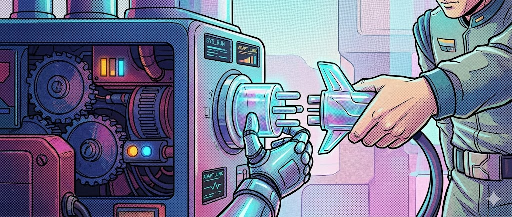
A standard can win and still be a moving target. Build so you can change the plug without rebuilding the machine.

Standards and Protocols Haven’t Settled Yet

In 1999 you picked a side in the browser wars and hoped your layout survived the other one. Bet wrong, a lot — on a proprietary plugin, a tag only one browser supported, on Flash (which was 99% bad according to Jakob Nielsen) — and you rebuilt.

Today the equivalent is choosing among protocols that are barely a year old, backed by companies still feeling out how they’ll cooperate (or not, altogether).

The Model Context Protocol is the clearest case.

Anthropic released it in late 2024, and within a year ChatGPT, Cursor, Gemini, and Microsoft Copilot had adopted it, with more than 10,000 public servers running against it. Then, in December 2025, Anthropic handed it to a new foundation under the Linux Foundation for neutral governance.

That’s real convergence, and faster than the web ever managed — HTML and CSS took years to stabilize. It will do the same here.

It’s also the lesson: even the standard that won changed hands inside twelve months, and the layers stacked around it — authentication, permissions, agent-to-agent messaging — are still being ironed out.

A protocol can be the obvious choice and still be a draft.

Then and now

  • Then: The web’s standards didn’t exist yet, and the ones that mattered took years to settle. You bet on a browser, a plugin, a proprietary tag, and then waited to find out whether the rest of the industry would follow you or strand you. The danger was the vacuum — building something real on top of nothing anyone had agreed to.
  • Now: The standards arrive fast, sometimes within weeks, which feels like progress. But they keep changing hands and shifting shape while you build on them, and the layers around them — auth, permissions, agent-to-agent messaging — stay contested. The danger has flipped: it isn’t the absence of a standard, it’s committing to one that’s still a moving target.

Accepting it

Build against today’s standard, but behind a thin adapter you control. When the spec moves, you rewrite a connector, not your product.

Chat is the first guess, not the final form. The interface that wins is the one you stop noticing.

The Interaction Paradigm Is Still Being Invented

We defaulted to chat the way early sites defaulted to the page — because it was what shipped first, not because it was right. For years the web bent everything it touched into a scrolling document: forms, storefronts, video, software all crammed into the shape of a page until better patterns slowly emerged.

Chat is doing the same thing now. We pour research, coding, drafting, and decision-making into a single conversation thread, because the thread is what we have. It’s really a command line that learned to speak English — powerful, and still a guess.

A text box is a thin interface for something this capable. By mid-2025, ChatGPT alone was handling about 18 billion messages a week from 700 million users, and the overwhelming majority still happens through typed back-and-forth.

Voice, background agents, AI folded invisibly into existing tools — all of it is being tried, none of it has won.

This is the part designers should find thrilling. Nobody has decided yet what the dominant way to work with a model looks like.

Then and now

  • Then: The open question was how to arrange information and actions on a page — where the navigation lived, how a person scanned it, how they moved from one screen to the next. Hard work, but the page sat still while you figured it out, and the patterns you landed on stayed put once you found them.
  • Now: The question is how a person should hold a conversation with a system that talks back, decides, and sometimes acts on its own. That’s harder, because the interface itself improvises — the same input can produce a different response twice — so you’re designing an interaction whose other half won’t behave identically each time you test it.

Accepting it

The chat window is not the destination. Prototype the same task three ways — conversational, embedded, ambient — and let people show you which one disappears into their work by building that prototype at warp speed and testing it.
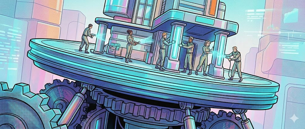
The foundation keeps moving. Design for where it’s heading, not where it is today.
The foundation keeps moving. Design for where it’s heading, not where it is today.

Everyone’s Building on Infrastructure That’s Changing Under Them

The hardest thing about 1999 wasn’t the browsers. It was that the whole platform kept moving — connection speeds, screen sizes, what a server could do — so a design that made sense in spring looked dated by fall.

Pull up the era on the Internet Archive’s Wayback Machine and you can watch big sites rebuild themselves again and again, chasing a target that wouldn’t hold still. You want proof? I had to design this for a 8-bit video card.

The models underneath us move faster than that. METR, a research nonprofit, found that the length of task a frontier model can complete on its own has been roughly doubling every seven months. The thing you designed around in January is materially more capable by summer.

That sounds like good news, and it is. But it quietly invalidates your design.

The careful handoffs you built around the model’s weak spots, the places you inserted a human, the tasks you ruled out as too hard — those choices were right for a model that no longer exists.

Assumptions don’t fail loudly here. They just expire which is both a good and bad thing.

Then and now

  • Then: The platform underneath you improved — faster connections, bigger screens, more capable servers — and that mostly helped. Your design aged and started to look dated, but it kept working. The floor rose without pulling the rug out from under what you’d already shipped.
  • Now: The platform gets smarter, not just faster, and that cuts both ways. A more capable model can quietly invalidate the decisions you made around its old limits — the handoffs, the human checkpoints, the tasks you ruled out as too hard — so an upgrade you didn’t ask for can turn yesterday’s careful design into the wrong design overnight.

Accepting it

Design for where the puck is going. Build for the capability you’ll plausibly have in two or three model generations, and make the parts most likely to change the easiest parts to replace.

Today’s price is a subsidy, not a settled cost. Build for the day the meter runs true.
Today’s price is a subsidy, not a settled cost. Build for the day the meter runs true.

We’re Still Working Out the Business Model

In 1999 nobody knew how the web would pay for itself. Subscriptions, banner ads, e-commerce, “eyeballs” — every theory had backers, and most were wrong. The ones that stuck reshaped what got built: the ad model gave us free everything, and the surveillance that came with it.

AI is in the same fog, with bigger numbers. The labs are spending more to answer you than they charge: by early 2026, Anthropic’s margins had reportedly swung from about negative-94% in 2024 to roughly +40% in 2025, while OpenAI was projected to burn around $14 billion in 2026.

Consumer subscriptions remain heavily subsidized — a familiar move, like the cheap early Uber rides that venture money quietly paid for. It looks a lot like 1999 where Pets.com was shipping 50 pounds of dog food, cross country, for free.

That subsidy won’t last forever, and pricing will reset.

The features that feel free today — long context, dozens of tool calls per task, an agent left running all afternoon — are exactly the ones most exposed when the economics rationalize. What you can afford to build today may cost very differently tomorrow.

Then and now

  • Then: The web spent years not knowing how it would pay for itself, but the experiment ran on relatively modest budgets, and the losses were survivable while the answers shook out. When the ad model finally won, it reshaped what got built — and most teams had time to see it coming and adjust.
  • Now: AI is running the same experiment at a vastly larger scale and burn rate, with the cost of every interaction sitting right under the product. Because the numbers are so big and the subsidy so heavy, the reckoning arrives sooner and lands harder — pricing will reset beneath the features that feel free today, and it won’t wait politely for you to be ready for it.

Accepting it

Know your cost per interaction, not just your headcount. Design experiences that stay viable if the price of a model call doubles — and be honest about which features only pencil out while someone else is paying.

The demo is the easy 80%. The product lives in the other 20%.
The demo is the easy 80%. The product lives in the other 20%.

The Gap Between Hype and Reliable Execution Is Wide

Demos are easy, even more so now.

The web was full of dazzling Flash intros in 1999 that fell apart the moment a real person tried to do something — and most of us learned to hunt for the “skip intro” button. AI has its own version of that gap, and right now it’s wide.

Really wide. Double wide. Mobile home wide.

MIT’s 2025 “State of AI in Business” study found that about 95% of generative-AI pilots delivered no measurable impact on the bottom line. The models usually weren’t the problem; integration, workflow fit, and reliability were — the unglamorous work of fitting a tool to how people actually operate.

Here’s the hard part for designers. A system that’s brilliant 90% of the time and confidently wrong the other 10% is harder to build around than one that simply breaks.

Visible failure tells the user when to stop trusting it. Confident, fluent, wrong does the opposite — it earns trust exactly when it shouldn’t and we have to solve for that.

The product isn’t the impressive answer. It’s everything around the answer that helps a person tell the good 80% from the bad 20%.

Then and now

  • Then: The gap between demo and reality was mostly cosmetic. A Flash intro dazzled and then fell apart; a page looked better than it worked. But the failure was visible — you could see the seams, and so could users, who learned to distrust the flashy thing and route around it fast.
  • Now: The gap is more dangerous precisely because it hides. A confident, fluent, wrong answer looks exactly like a confident, fluent, right one, so the failure doesn’t announce itself the way a broken layout does. The work shifts from making the output impressive to helping a person tell the good output from the bad — which is the harder design problem by far.

Accepting it

Design for the failure, not the demo. Decide in advance where a human checks the work, make the model’s uncertainty visible, and build the graceful recovery before you build the impressive path.

We’ve found a hundred small uses and not yet the one. The dark door is the work.
We’ve found a hundred small uses and not yet the one. The dark door is the work.

Nobody Agrees on What the “Killer App” Actually Is — and We Know It Isn’t Chat

Every new platform spends its early years hunting for the thing it’s truly for. The web had its false starts — web portals, “push” media, branded “channels” that were going to replace the browser — and serious money chased each one (PointCast was briefly the future of media) before search, commerce, and social turned out to be the shapes that mattered. The killer app is almost always obvious in hindsight and almost never the thing the hype named at the time.

AI is mid-hunt. Look at what people actually do with it: in OpenAI’s large 2025 usage study, the most common activities were writing, practical guidance, and information-seeking — useful, but spread across dozens of small jobs rather than one defining one.

Chat is the container we ship them in. It isn’t the killer app.

The killer app is probably something chat is currently standing in for, poorly. You won’t name it from the top down. It’ll show up as a job done so well it stops feeling like “using AI” at all.

Then and now

  • Then: The web found its defining shapes by trial and error, burning through portals, push media, and branded “channels” before search, commerce, and social turned out to be what mattered. Costly, but the dead ends were at least legible as dead ends — once people stopped using them, you knew.
  • Now: AI is earlier in the same hunt, with one twist that makes it trickier. Its most natural-feeling interface — conversation — is good enough at standing in for everything that it may be hiding the real app rather than revealing it. The thing that feels like the answer could be the very thing keeping you from finding it.

Accepting it

Watch where people fight the interface to get something done — exporting, re-pasting, working around it. Those friction points are the unbuilt product. Design toward the job, not the chat log.

This Is a Time of Reinvention — Including Your Own

None of this is a warning. It’s an invitation — an invitation to code again, to build the thing before anyone has worked out the right way to build it.

The reason 1999 was such a good time to be a designer is the same reason now is: the medium hadn’t hardened, so the work mattered more. The conventions we take for granted on the web — the shopping cart, the news feed, the login — were invented by someone making a reasonable guess and watching what happened. You can still see those early guesses preserved in places like the Web Design Museum. They weren’t discovered. They were tried.

We’re in that stretch again.

The standards are soft, the models keep moving, the business model is unproven, and nobody knows the killer app. That isn’t a reason to wait. It’s the clearest signal we have that the things worth building haven’t been built yet — and the same goes for the people who’ll build them.

It also means more work. In a settled medium you reach for a proven pattern and move on.

Here there isn’t one yet, so you end up inventing the approach — the tooling, the conventions, the answer to how the thing should even work — instead of borrowing it.

That’s slower and less certain than building on what already exists. It’s also the point. The extra effort is what invention costs, and right now it actually buys you something.

And the medium isn’t the only thing getting reinvented.

The people who came through 1999 well are the ones who kept reinventing themselves — hand-coders who became information architects, table-layout obsessives who picked up CSS, then interaction design, then whatever the next wave demanded.

The durable skill was never a particular tool. It was the willingness to become someone a little different every few years. This moment asks the same of you.

Some of what you’re good at today won’t matter much in a decade, and some of what will matter can’t be taught yet, because no one has worked it out.

So you reinvent the work, and you reinvent yourself along with it — and the second is the harder, more lasting bet.

Experiment.

Be wrong usefully.

Reinvent the medium, and reinvent yourself with it. The rules get written by whoever shows up to write them.


Designing for AI means designing like it’s 1999 was originally published in UX Collective on Medium, where people are continuing the conversation by highlighting and responding to this story.

from UX Collective – Medium https://uxdesign.cc/designing-for-ai-means-designing-like-its-1999-da9c53d24644?source=rss—-138adf9c44c—4


Psychology for UX: Study Guide

Bringing psychology and technology together is at the heart of UX design because UX is people. However, you do not need a degree in psychology to understand the basics of how humans function. Most psychological principles that are relevant to UX are easy to understand but make a big difference when applied correctly. Since the beginning, NN/g has always preached that the best designs are built for people as they really are — not who we wish they were.

Don Norman (one of our principals) calls himself a cognitive designer because regardless of the type of products you are working on, what matters is that you design systems for how people think. The following resources will help you explore and understand many of the psychological principles that help create the best user experiences and achieve an organization’s goals.

Resources in this study guide are grouped under the following topics:

Attention

Although most people feel like they notice everything going on around them, their ability to do so is very limited. Humans cannot focus their attention on everything at once — their brains automatically filter out anything that doesn’t seem useful.

Items that are close together are perceived as being related.

Memory

Human memory is limited and imperfect. The limits of human memory affect people’s ability to process information and shape the way information is stored for long periods.

Sensemaking

People are not like cameras. They do not objectively capture information and process it the same way as anyone else would. People constantly try to make sense of the world by relying on their own experiences and understandings. However, sometimes these perceptions are accurate and sometimes they are not.

Decision Making and Choice

Having more options does not always lead to greater satisfaction. Making choices (especially complex ones) is difficult and requires significant mental effort. Guiding users through decisions by making things simple will improve their experience in every context.

Motor Processes and Interaction

Interactions between humans and technology are inherently limited by human abilities and their willingness to act. To create the best user experiences, systems need to adapt to people, not people to systems.

Motivation

UX designers must create usable designs, but they must also create designs that people are motivated to use. However, leveraging what we know about human motivation in ways that harm people is both unethical and harmful for a business.

Cognitive Biases

Patterns that describe systematic ways in which people deviate from rational thinking are often called biases or heuristics. These biases are mental shortcuts people use to save themselves from doing extra mental work when making sense of the world.

Persuasion and Influence

Although they may not realize it, many people are not firmly decided on a course of action until they take it. Psychology describes how people give weight to certain types of information as they choose courses of action and the factors that can nudge their decisions.

Trust is foundational to all relationships — including relationships between users and websites. It is important for designs to establish credibility and win users’ trust to develop a long-term relationship.

Emotion and Delight

Don Norman said, “without emotions, your decision-making ability would be impaired.” Emotions play a critical role in daily functioning and determine which experiences will delight people.

Attitudes toward Technology

The way people use technology affects their lives. Designers must take care to impact people in positive ways through the designs they create.

Additional Paid Resources

Full-day courses:

Books:

from NN/g latest articles and announcements https://www.nngroup.com/articles/psychology-study-guide/

Decoding the Art of Color Palettes for Scalable Design Systems

Extended color palettes

Since user interfaces have numerous components with multiple layers and states, defining just one color for each category mentioned above isn’t enough. Additionally, this can lead to issues with accessibility and creative restraints. We solve this by using the colors defined above as the base for our extended palettes. Try to get around 10 different shades of the base color.

When it comes to building out an extended color palette, I’ve seen multiple ways to go about it. Below, I describe the two most popular ones:

Color palette generators

Here, you use a color palette generator that does some math in the background and generates an extended color palette based on the base color defined by you. This method is pretty straightforward and highly recommended if you’re a beginner or crunched for time.

While there are multiple tools for this on the internet, I prefer using a neat little Figma plugin named Foundations: Color Generator. All you need to do is choose a color profile (I prefer Material) and define your base color, and it will generate an extended color palette. The real reason I prefer this plugin is for the additional options it provides; design tokens, color palette snippets with color contrast ratios, and the ability to add the entire palette to your Figma styles, all with one click, or maybe a few.

The plugin also neatly mentions the color contrast ratios. Since we’d most likely use the 500 shade as our base, ensure that the color contrast ratio against white is 4.5:1 or greater..

ColorBox by Kevyn Arnott

If the method above seems too simple for your taste or you just want complete control over your palette, ColorBox is just the tool for you. The ColorBox method is relatively advanced and time-consuming. It can be difficult to achieve a harmonious transition if you don’t know what you’re doing, so choose this one carefully.

Unlike the previous step, you trade the convenience of one-click generators for granular control. You can define everything from the hue, saturation, and brightness to the easing functions applied to them.

You can learn more about the tool here.

from Design Systems on Medium https://blog.kamathrohan.com/decoding-the-art-of-color-palettes-for-scalable-design-systems-e77a3cc8d3de

3D Gaussian Splatting

3D Gaussian Splatting is a recent volume rendering method useful to capture real-life data into a 3D space and render them in real-time. The end results are similar to those from Radiance Field methods (NeRFs), but it’s quicker to set up, renders faster, and delivers the same or better quality.

Plus, it’s simpler to grasp and modify. The result of the method can be called Splats.

Create a Gaussian splatting by using a mobile app like Polycam or Luma:

That’s it! Now you can start adjusting how the splats look in your Spline scene.

Apply Cropping
When using crop areas, Spline only exports the visible splats within these areas to increase performance in your final exported scene.

If you also want to permanently apply your crop areas in-editor, you can press "Apply Cropping". This will permanently delete the invisible splats outside the cropping area, which can increase performance within the editor itself.

You can use crop areas to remove parts from your splats. This can be useful for optimization/performance but also for aesthetic reasons.

Note: Support for the splats within the Performance panel will be added soon.

Note: Mobile support is partial. This is still an experimental feature (recent technology) and mobile support is an ongoing effort.

Gaussian splats are rendered in a different way than normal objects or geometries, this means that not all of the features are directly compatible when mixing them together.
Currently, the following features are either not compatible or partially supported with Splats:

Don’t be discouraged by the limited support!
Until recently, it was almost impossible to render real-time hyperrealistic 3d representations like this on the web. The technology is evolving fast, and improvements will come over time!

Keep an eye on Spline’s updates!

from 3D Gaussian Splatting https://docs.spline.design/e17b7c105ef0433f8c5d2b39d512614e

Web Components Will Outlive Your JavaScript Framework

If you’re anything like me, when you’re starting a project, there’s a paralyzing period of indecision while you try to figure out how to build it. In the JavaScript world, that usually boils down to picking a framework. Do you go with Ol’ Reliable, a.k.a. React? Something slimmer and trendier, like Svelte or Solid? How about kicking it old school with a server-side framework and HTMX?

When I was writing my CRDT blog post seriesAn Interactive Intro to CRDTs | jakelazaroff.comCRDTs don’t have to be all academic papers and math jargon. Learn what CRDTs are and how they work through interactive visualizations and code samples.jakelazaroff.com/words/an-interactive-intro-to-crdts/, I knew I wanted to include interactive demos to illustrate the concepts. Here’s an example: a toy collaborative pixel art editor.

JavaScript is required to run this demo.

Even though I’ve written before — and still believe — that React is a good default optionNo One Ever Got Fired for Choosing React | jakelazaroff.comIf you spend a lot of time on Hacker News, it’s easy to get taken by the allure of building a project without a framework.jakelazaroff.com/words/no-one-ever-got-fired-for-choosing-react/, the constraints of a project should determine the technology decisions. In this case, I chose to use vanilla JS web components. I want to talk about why.

There was one guiding principle for this project: although they happened to be built with HTML, CSS and JS, these examples were content, not code. In other words, they’d be handled more or less the same as any image or video I would include in my blog posts. They should be portable to any place in which I can render HTML.

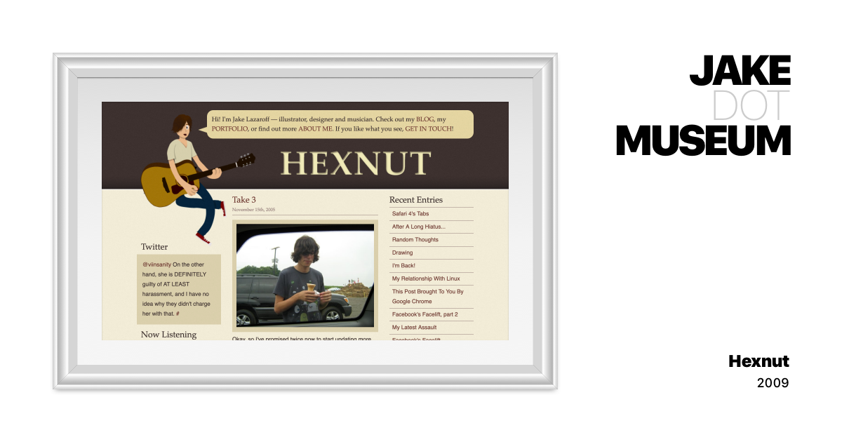
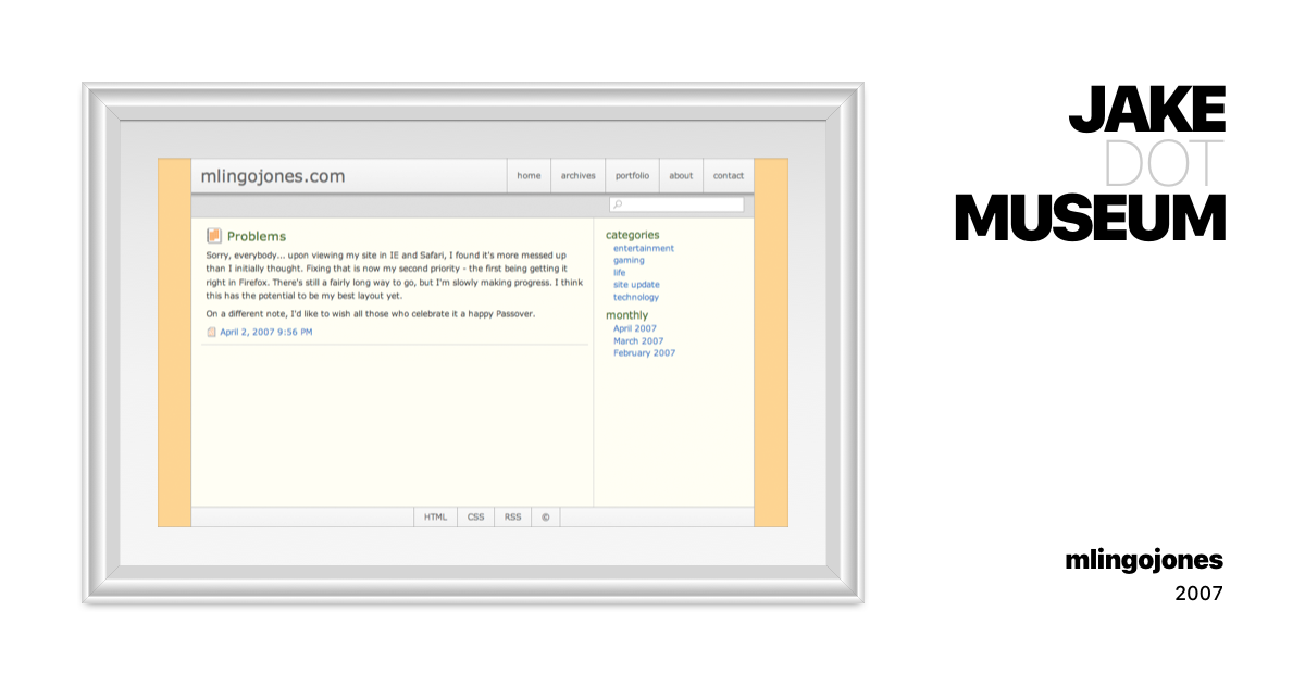
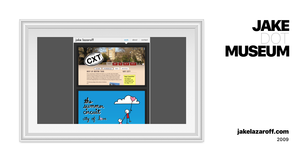
As of 2023, this blog is built with Astro. Before that, it was built with my own static site generatorjakelazaroff.com v5 | JAKE.MUSEUMA collection of visual and hypertext media.jake.museum/jakelazaroff-v5/. Before that, Hugojake.nyc v3 | JAKE.MUSEUMA collection of visual and hypertext media.jake.museum/jakenyc-v3/; before that, a custom CMS written in PHPblog.jakelazaroff.com | JAKE.MUSEUMA collection of visual and hypertext media.jake.museum/jakelazaroff-blog/; before that, TumblrHexnut v5 | JAKE.MUSEUMA collection of visual and hypertext media.jake.museum/hexnut-v5/, Movable TypeHexnut v4 | JAKE.MUSEUMA collection of visual and hypertext media.jake.museum/hexnut-v4/ and WordPressmlingojones | JAKE.MUSEUMA collection of visual and hypertext media.jake.museum/mlingojones/ — and I’m sure I’m missing some in between. I really like Astro, but it’s reasonable to assume that this website won’t run on it forever.

One thing that has made these migrations easier in recent years is keeping all my content in plain text files written in Markdown. Rather than dealing with the invariably convoluted process of moving my content between systems — exporting it from one, importing it into another, fixing any incompatibilities, maybe removing some things that I can’t find a way to port over — I drop my Markdown files into the new website and it mostly Just Works.

Most website generators have a way to include more complex markup within your content, and Astro is no different. The MDX integration allows you to render Astro components within your Markdown files. Those components have access to all the niceties of the Astro build system: you can write HTML, CSS and JS within one file, and Astro will automagically extract and optimize everything for you. It will scope CSS selectors and compile TypeScript and let you conditionally render markup and do all sorts of other fancy stuff.

The drawback, of course, is that it all only works inside Astro. In order to switch to a different site generator, I’d have to rewrite those components. I might need to split up the HTML, CSS and JS, or configure a new build system, or find a new way to scope styles. So Astro-specific features were off limits — no matter how convenient.

But Markdown has a secret weapon: you can write HTML inside of itDaring Fireball: Markdown Syntax Documentationdaringfireball.net/projects/markdown/syntax#html! That means any fancy interactive diagrams I wanted to add would be just as portable as my the rest of my Markdown as long as I could express them as plain HTML tags.

Web componentsWeb Components – Web APIs | MDNWeb Components is a suite of different technologies allowing you to create reusable custom elements — with their functionality encapsulated away from the rest of your code — and utilize them in your web apps.developer.mozilla.org/en-US/docs/Web/API/Web_Components hit that nail square on the head. They’re a set of W3C standards for building reusable HTML elements. You use them by writing a class for a custom element, registering a tag name and using it in your markup. Here’s how I embedded that pixel art editor before:

<pixelart-demo></pixelart-demo>

That’s the honest-to-goodness HTML I have in the Markdown for this post. That’s it! There’s no special setup; I don’t have to remember to put specific elements on the page before calling a function or load a bunch of extra resources.1 Of course, I do need to keep the JS files around and link to them with a <script> tag. But that goes for any media: there needs to be some way to reference it from within textual content. With web components, once the script is loaded, the tag name gets registered and works anywhere on the page — even if the markup is present before the JavaScript runs.

Web components encapsulate all their HTML, CSS and JS within a single file, with no build system necessary. Having all the code for a component in one place significantly reduces my mental overhead, and I continue to be a huge fan of single-file components for their developer experience. While web components aren’t quite as nice to write as their Astro or Svelte counterparts, they’re still super convenient.2

In case you’re not familiar with web components, here’s the code for that <pixelart-demo> component above:3

import PixelEditor from "./PixelEditor.js";

class PixelArtDemo extends HTMLElement {
  constructor() {
    super();

    this.shadow = this.attachShadow({ mode: "closed" });
    this.render();

    const resolution = Number(this.getAttribute("resolution")) || 100;
    const size = { w: resolution, h: resolution };

    const alice = new PixelEditor(this.shadow.querySelector("#alice"), size);
    const bob = new PixelEditor(this.shadow.querySelector("#bob"), size);

    alice.debug = bob.debug = this.hasAttribute("debug");
  }

  render() {
    this.shadow.innerHTML = `
<div class="wrapper">
<canvas class="canvas" id="alice"></canvas>
<canvas class="canvas" id="bob"></canvas>
<input class="color" type="color" value="#000000" />
</div>
<style>
.wrapper {
display: grid;
grid-template-columns: 1fr 1fr;
grid-template-rows: 1fr auto;
gap: 1rem;
margin: 2rem 0 3rem;
}
.canvas {
grid-row: 1;
width: 100%;
aspect-ratio: 1 / 1;
border: 0.25rem solid #eeeeee;
border-radius: 0.25rem;
cursor: crosshair;
}
.color {
grid-column: 1 / span 2;
}
</style>
`;
  }
}

customElements.define("pixelart-demo", PixelArtDemo);

Everything is nicely contained within this one file. There is that one import at the top, but it’s an ES module importJavaScript modules – JavaScript | MDNThis guide gives you all you need to get started with JavaScript module syntax.developer.mozilla.org/en-US/docs/Web/JavaScript/Guide/Modules — it doesn’t rely on any sort of build system. As long as I keep all the files together, the browser will sort everything out.

Another nice thing about Web components is shadow DOM, which isolates the component from the surrounding page. I think shadow DOM is often awkward when you want to share styles between your components and the rest of your app, but it’s perfect when you do truly want everything to be isolated. Just like images and videos, these components will look and act the same no matter where they’re used.

Sorry — they’re not just like images and videos. Web components can expose attributes that allow you to configure them from the outside. You can think of them as native props. Voilà:

JavaScript is required to run this demo.

Two input ranges with different accent colors. In this case, I’m just setting a CSS variable, which is one of the few things allowed into the shadow DOM:

<range-slider style="--accent: #0085F2"></range-slider>

Here’s a more complex example:

JavaScript is required to run this demo.

And here’s the markup. It uses attributes to alter the component’s behavior, setting the resolution to 20 and showing debug information on every pixel:

<pixelart-demo debug resolution="20"></pixelart-demo>

If you were wondering what those calls to getAttribute and hasAttribute were doing in the web component class, now you know. This was particularly useful when reusing the same component for different stages of a tutorial, allowing me to enable certain features as the tutorial progressed.

The other part of the equation was using vanilla JS. There are frameworks that compile to web components — most notably Lit (although I’d call it more of a library) but also Stencil, Svelte, and probably others. I’m sure they’re all wonderful tools that would have made my life easier in a lot of ways. But frameworks are dependencies, and dependencies have a bunch of tradeoffs. In this case, the tradeoff I’m most worried about is maintenance.4

That goes for TypeScript, too. By my count, the last 15 versions of TypeScript have had breaking changes — many of them new features that I was happy to have, even though I had to change my code to accommodate them. But as much as I love TypeScript, it’s not a native substrate of the web. It’s still a dependency.

There’s a cost to using dependencies. New versions are released, APIs change, and it takes time and effort to make sure your own code remains compatible with them. And the cost accumulates over time. It would be one thing if I planned to continually work on this code; it’s usually simple enough to migrate from one version of a depenency to the next. But I’m not planning to ever really touch this code again unless I absolutely need to. And if I do ever need to touch this code, I really don’t want to go through multiple years’ worth of updates all at once.

I learned that lesson the hard wayPreserving the Web | jakelazaroff.comjake.museum: an online collection of my web design and development work, from 2007 to the present day. But finding the source code was just the beginning. A lot has changed since 2007, and getting these old sites up and running again is not as simple as plopping the files on a server.jakelazaroff.com/words/preserving-the-web/ when I built my online museum, wiping the cobwebs off of code saved on laptops that hadn’t been turned on in a full decade. The more dependencies a website had, the more difficult it was to restore.

I’ve been building on the web for almost 20 years. That’s long enough to witness the birth, rise and fall of jQuery. Node.js was created, forked into io.js and merged back into Node. Backbone burst onto the scene and was quickly replaced with AngularJS, which was replaced with React, which has been around for only half that time and has still gone through like five different ways to write components.

But as the ecosystem around it swirled, the web platform itself remained remarkably stable — largely because the stewards of the standards painstakingly ensured that no new change would break existing websites.5 The original Space Jam websiteSpace Jamwww.spacejam.com/1996/ from 1996 is famously still up, and renders perfectly in modern browsers. So does the first version of the website you’re reading nowjakelazaroff.com v1 | JAKE.MUSEUMA collection of visual and hypertext media.jake.museum/jakelazaroff-v1/, made when I was a freshman in college 15 years ago. Hell, the first website ever createdThe World Wide Web projectinfo.cern.ch/hypertext/WWW/TheProject.html — built closer to the formation of the Beatles 6 than to today! — still works, in all its barebones hypertext glory.

If we want that sort of longevity, we need to avoid dependencies that we don’t control and stick to standards that we know won’t break. If we want our work to be accessible in five or ten or even 20 years, we need to use the web with no layers in between. For all its warts, the web has become the most resilient, portable, future-proof computing platform we’ve ever created — at least, if we build with that in mind.

from jakelazaroff.com https://jakelazaroff.com/words/web-components-will-outlive-your-javascript-framework/

When Will AR Shopping Be a Mass-Market Reality?


We hear a lot about AR shopping, such as 3D virtual try-ons. Among the common chorus of value propositions, it engenders buyer confidence, such as knowing that the shoe fits or the eyeliner shade is right. That can lead to higher eCommerce conversions and lower return rates.

To be more specific, AR shopping can include 3D product models in zoom & rotate carousels on e-Commerce sites (e.g., Google Swirl). It can also involve AR lenses (e.g., Snapchat), which takes things a step further by activating the camera for real-world scene placement.

On the user end, interest is growing due partly to Gen Z’s growing spending power. As they cycle into the adult consumer population, they bring camera-native tendencies with them. Along with broader cultural adoption, this generational effect could accelerate AR shopping adoption.

But those aren’t the only gating factors. There are also adoption barriers on the merchant end. These have been lowered to some degree by players like Snap which make AR experience creation easier. But that still often leaves a workflow gap: 3D product models themselves.

Will AR Marketing Reach $14.5 Billion by 2027?

Democratization Efforts

These 3D models are representations of products that are the centerpiece of virtual try-ons. They need accurate textures, colors, etc. And though any manufactured product has a CAD model floating around somewhere, they have to be compressed and optimized for mobile shopping.

This 3D-model bottleneck is starting to be alleviated by players that streamline and democratize the process. They include VNTANA in 3D model management, optimization, and deployment. On the capture/creation end, there are players like CG Trader that produce 3D product models.

Meanwhile, other democratization efforts continue to progress. For example, Apple’s Object Capture lets developers build 3D model-creation capabilities into their apps to further reduce friction in producing these assets. Among other things, this can empower smaller merchants.

In fact, Shopify continues to lean into this principle. It recently integrated the latest flavors of Object Capture in iOS 17. This lets merchants scan products to create 3D models using an iPhone Pro’s LiDAR scanner as opposed to the advanced photogrammetry equipment usually needed.

One benefit to such merchants, beyond raising their game with AR, is cost. The current standard for product displays in eCommerce is HD photography, which isn’t cheap. In fact, CG Trader has quantified how 3D model creation is cheaper and more versatile than photo shoots.

Is AR Shopping Cheaper to Produce Than Traditional eCommerce?

Common Sequence

Stepping back, though all the above presents opportunities for brands and retailers, there’s still adoption friction. Here, the lesson is the same as with past tech revolutions, such as mobile marketing: develop early competency or be ill-prepared when the tipping point comes.

This will play out through a common sequence. First, early-adopter brands will offer AR shopping. Then consumers will get a taste for it and start to get acclimated. That acclimation then evolves into expectation. And that’s the moment when AR shopping reaches that tipping point.

Brands that haven’t adopted the technology at that point are suddenly behind. And like early days of the smartphone era, this puts laggards at a competitive disadvantage. That’s followed by years of playing catchup… which is costlier than adopting the technology in the first place.

As they say, those who don’t study history are destined to repeat it. Though AR will have its own evolutionary path, its adoption and competitive dynamics will have at least some parallels to past tech cycles and emerging media formats. We’ll see who has the best institutional memory.

More from AR Insider…

from AR Insider https://arinsider.co/2023/11/01/when-will-ar-shopping-be-a-mass-market-reality/

ML System Based on Light Could Yield More Powerful, Efficient LLMs


By MIT News

August 25, 2023
Comments

Artist's rendition of a computer system based on light that could jumpstart the power of machine-learning programs like ChatGPT.

With the new system, the team reports a greater than 100-fold improvement in energy efficiency and a 25-fold improvement in compute density over state-of-the-art digital computers for machine learning.

Credit: Ella Maru Studio

A team led by researchers at the Massachusetts Institute of Technology has developed a light-based machine learning system that could surpass the system behind ChatGPT in terms of power and efficiency, while also consuming less energy.

The compact architecture is based on arrays of vertical surface-emitting lasers developed by researchers at Germany’s Technische Universitat Berlin.

The system uses hundreds of micron-scale lasers and the movement of light to perform computations.

The researchers said it could be scaled for commercial use in the near future, given its reliance on laser arrays commonly used in cellphone facial identification systems, and for data communication.

They found the system to be 100 times more energy efficient and 25 times more powerful in terms of compute density than current state-of-the-art supercomputers used to power existing machine learning models.

From MIT News
View Full Article


Abstracts Copyright © 2023 SmithBucklin, Washington, D.C., USA


No entries found

from Communications of the ACM – Artificial Intelligence http://cacm.acm.org/news/275783-ml-system-based-on-light-could-yield-more-powerful-efficient-llms