The Original Emoji Set Has Been Added to The Museum of Modern Art’s Collection

We are thrilled to announce the addition of NTT DOCOMO’s original set of 176 emoji to the MoMA collection. Developed under the supervision of Shigetaka Kurita and released for cell phones in 1999, these 12 x 12 pixel humble masterpieces of design planted the seeds for the explosive growth of a new visual language.

From left: 1999 NTT DOCOMO emoji; 2016 iOS emoji

From its founding in 1991 by the Japanese national carrier Nippon Telegraph and Telephone, NTT DOCOMO was at the forefront of the burgeoning field of mobile communications. In keeping with Japan’s longstanding pioneering role in technological adoption, Japanese tech companies, and NTT DOCOMO in particular, were ahead of the curve in incorporating mobile Internet capabilities into cell phones. Early mobile devices, however, were rudimentary and visually unwieldy, capable of receiving only simple information about weather forecasts and basic text messaging. For the revolutionary “i-mode” mobile Internet software NTT DOCOMO was developing, a more compelling interface was needed. Shigetaka Kurita, who was a member of the i-mode development team, proposed a better way to incorporate images in the limited visual space available on cell phone screens. Released in 1999, Kurita’s 176 emoji (picture characters) were instantly successful and copied by rival companies in Japan. Twelve years later, when a far larger set was released for Apple’s iPhone, emoji burst into a new form of global digital communication.

Emoji tap into a long tradition of expressive visual language. Images and patterns have been incorporated within text since antiquity. From ancient examples to, more recently, the work of creative typesetters, these early specimens functioned as a means of augmenting both the expressive content of the text and the overall aesthetic quality of the printed page — and in some cases the icons were the language. With the advent of email in the 1970s and the subsequent evolution of concise, almost telegraphic correspondence, the conveyance of tone and emotion became both harder and more urgently important. Beginning in the 1980s, computer users in the West began composing emoticons to create simple faces out of preexisting glyphs — the ubiquitous smiley face 🙂 is an example. In Japan, the larger character set necessitated by the language allowed for even more complicated images, giving rise to kaomoji, or picture faces, such as the now common shruggy: ¯\_(ツ)_/¯. When combined with text, these simple images allow for more nuanced intonation. Filling in for body language, emoticons, kaomoji, and emoji reassert the human in the deeply impersonal, abstract space of electronic communication.

The transition from desktop to mobile platforms necessitated a further rethinking of the customs long associated with written correspondence. This was especially true in Japan, where the cultural necessity of exacting salutations and complex honorifics made early devices’ impractical for widespread adoption. Emoji were an ingenious shortcut around this and other problems. The release of NTT DOCOMO’s emoji contributed to a radical alteration in the way the Japanese communicated through mobile phones.

Working within the software and hardware limitations of the late 1990s, Kurita created his emoji on a small grid of 12 x 12 pixels. Drawing on sources as varied as manga, Zapf dingbats, and commonly used emoticons, Kurita designed a set of 176 emoji that included illustrations of weather phenomena, pictograms like the ♥, and a range of expressive faces. While successful, emoji remained a largely Japanese concern until 2010, when they were translated into Unicode. This development meant that a user in Japan could send an emoji to a user in France with the same basic image being represented on both ends. Google included emoji in its Gmail as early as in 2006, but it wasn’t until 2011, when Apple added emoji functionality to its iOS messaging app, that the emoji explosion began.

Shigetaka Kurita’s emoji are powerful manifestations of the capacity of design to alter human behavior. The design of a chair dictates our posture; so, too, does the format of electronic communication shape our voice. MoMA’s collection is filled with examples of design innovations that radically altered our world, from telephones to personal computers to the @ symbol. Today’s emoji (the current Unicode set numbers nearly 1,800) have evolved far beyond Kurita’s original 176 designs for NTT DOCOMO. However, the DNA for today’s set is clearly present in Kurita’s humble, pixelated, seminal emoji.

Emoji continue to grow in use across the world. To get a sense of just how rapidly they’re enmeshing themselves in contemporary discourse, check out Matthew Rothenberg’s bewildering emojitracker, which documents emoji use on Twitter in real time. Or head to San Francisco for the first ever Emojicon, a celebration of all things emoji (at which I will be speaking). Lastly, a forthcoming installation at MoMA, opening in early December, will further elaborate on the evolution of emoji and give visitors an opportunity to see them in a new light (and no doubt inspire a few selfies).

This acquisition was the work of many people both at MoMA and at NTT DOCOMO. First and foremost I must thank the indefatigable Paola Antonelli, our fearless advocate for expanding an appreciation of the field of design to new realms, who initiated this project. I also thank our Chief Curator, Martino Stierli, A&D Curatorial Assistant Michelle Fisher, Alexis Sandler of the MoMA General Counsel office, Betty Fisher in the Exhibition Design department, and the Junior Associates of the Museum of Modern Art who generously sponsored the forthcoming exhibition. And I commend and send thanks to NTT DOCOMO’s large team, who exhibited tremendous patience, flexibility, and an adventurous spirit well in keeping with their company’s great heritage.

from Sidebar http://sidebar.io/out?url=https%3A%2F%2Fmedium.com%2Fmoma%2Fthe-original-emoji-set-has-been-added-to-the-museum-of-modern-arts-collection-c6060e141f61%23.yyb8mh48i

Support for new ad formats in AdWords Scripts

AdWords scripts now fully support responsive ads, image ads, HTML5 ads and multiple Gmail ad formats. See our guideon ad types and related code snippets to learn more about using these ad formats in Scripts.

This update also introduces a media service which can be used to upload and query media for use in ads. See our ad media guide for a more detailed overview of media support.

If you have any questions about these changes or AdWords scripts in general, you can post them on our developer forum.

 – , AdWords Scripts Team

from Google Ads Developer Blog http://googleadsdeveloper.blogspot.com/2016/10/support-for-new-ad-formats-in-adwords.html

Google’s ‘DeepMind’ AI platform can now learn without human input

‘DeepMind’ AI platform can now learn without human input

DeepMind is now capable of teaching itself based on information it already possesses.

In a significant step forward for artificial intelligence, Alphabet’s hybrid system — called a Differential Neural Computer (DNC) — uses the existing data storage capacity of conventional computers while pairing it with smart AI and a neural net capable of quickly parsing it.

A new era of tech events has begun

We’re back in New York this November for the 4th edition of our growth-focused technology event.

“These models can learn from examples like neural networks, but they can also store complex data like computers,” wrote DeepMind researchers Alexander Graves and Greg Wayne.

Much like the brain, the neural network uses an interconnected series of nodes to stimulate specific centers needed to complete a task. In this case, the AI is optimizing the nodes to find the quickest solution to deliver the desired outcome. Over time, it’ll use the acquired data to get more efficient at finding the correct answer.

The two examples given by the DeepMind team further clear up the process:

  1. After being told about relationships in a family tree, the DNC was able to figure out additional connections on its own all while optimizing its memory to find the information more quickly in future searches.
  2. The system was given the basics of the London Underground public transportation system and immediately went to work finding additional routes and the complicated relationship between routes on its own.

Instead of having to learn every possible outcome to find a solution, DeepMind can derive an answer from prior experience, unearthing the answer from its internal memory rather than from outside conditioning and programming. This process is exactly how DeepMind was able to beat a human champion at ‘Go’ — a game with millions of potential moves and an infinite number of combinations.

Depending on the point of view, this could be a serious turn of events for ever-smarter AI that might one day be capable of thinking and learning as humans do.

Or, it might be time to start making plans for survival post-Skynet.

via ScienceAlert


Differentiable neural computers
on DeepMind

TNW’s West Coast reporter covering all the comings and goings in the SoCal tech scene and elsewhere. Connect via Twitter, Facebook or Instagram.

from The Next Web http://thenextweb.com/artificial-intelligence/2016/10/17/deepmind-ai-platform-can-now-learn-without-human-input/

Any good Product Design case studies that involve Machine Learning?

12 minutes ago from , Senior UX Designer at HubSpot

I’m looking for case studies that discuss how designers have applied Machine Learning when building a product or website. Specifically, I’m curious to see how they visually show the Machine Learning solution itself (logic, mapping, etc.) since so much of it is abstract.

Any good ones that you all have come across?

from Designer News Feed https://www.designernews.co/stories/75495-any-good-product-design-case-studies-that-involve-machine-learning

Designing systems or: How I learned to stop worrying and love the modal window

You know the feeling. 

User data suggests that you should tweak the onboarding flow a little. Your invite user screen definitely needs improvement. And you’re downright embarrassed about that stats section you designed 3 years ago. Not to worry—you got this. You can easily push an update to fix this, right? 

But if it’s in the nascent stages, your product is probably evolving rapidly to meet market demands and changing conditions, your engineering team is resource-stressed, and your sales team is rallying everyone to improve the numbers. In the middle of all this, it’s understandable if improving UX isn’t always on the top of your stakeholders’ minds. 


“Treated unwisely, modal windows can frustrate users.”

Any idea to improve design is weighed for its cost against its apparent impact (sales, more users—mostly sales). And your passionate monologue of the real cost of bad UX fails to impress.

It’s a matter of prioritizing—do we ship critical features or fix minor annoyances for users? We’ve all been there.

But then it’s the designer’s job to find creative ways to fix any small issues before they bubble up into something serious.

“Wait, they said minor annoyance, right?”

When the design team here at Chargebee faced something similar, we knew we had to find creative ways to convince them. 

Chargebee’s web app is sophisticated, to say the least. You have thousands of users interacting with several aspects of the app on a daily basis. With multiple engineering sprints happening at the same time, it’s not often we get a chance to sneak in improvements. What would be the one thing that we could do to make the biggest impact on the user experience with the least strain on engineering?

Enter modal windows

Yeah, modals. Ta-da!

"Yeah, yeah. Change the plan, but what a nice-looking popup –Everyone

“Yeah, yeah. Change the plan, but what a nice-looking popup.” –Everyone


We wondered if an adaptive, flexible, all-in-one modal design that can be easily re-used throughout the app would have a chance to improve a big part of the user experience. This might seem a little anti-climatic. We thought this was a random idea at first, too.

Why modal windows?

I know the notoriety modal windows get. Treated unwisely, modal windows can frustrate users. I was one of those designers who avoided using modals windows as much as possible. But I’ve since mellowed my position. Modal windows carry context to the parent screen and we can use a consistent pattern for similar actions. And with modern tools like Flex, we can create a flexible design that adapts to different types of content. 


Both of these are from the same modal framework.

Both of these are from the same modal framework.

We also designed the modal to be responsive, keeping in mind Luke Wroblewski’s now accepted standard on one-handed mobile interactions.


04.modal-mobile

We set out to study all kinds of existing interactions and input areas — anything that can be pulled out of the interface and pushed to our new modal. This gave us an opportunity to provide a familiar experience for our users while fixing a lot of those tiny issues. 

To make our case stronger, we hacked together a prototype showing how easy it would be for developers to build new modal windows with just a few clicks and very little code. We hoped that the adaptive design along with quicker turnarounds for engineers would make it easier for us to convince stakeholders. It can easily make a big impact while keeping costs low.


Quick prototype showing the possibilities of the modal window system.

Quick prototype showing the possibilities of the modal window system.

And it worked! The stakeholders could visualize how versatile the modal was and the developers loved it because it was easy to feed in parameters, which helped us get a buy-in. 

In the next stages, the engineering team created and pushed new interactions to the modal in record time, and from a design perspective, we were able to fix a lot of ungainly interactions in the app. A win for everyone.

Of systems

I‘ve always been aware of designer bias, and I know that being a better designer is to consider the limitations of other functions and understand the real needs of the product at a given point. But then, these limitations force you to be more thoughtful, and they drive you to present the best possible version of your solution. And chasing a random idea proved to be fruitful.


06-quote

Rather than designing modal boxes with narrow use cases, we ended up building an entire system of modals. And systems are cost effective. They force you to be considerate of deployment and other functions, and they’re just a better bang for your buck.


“Systems force you to be considerate of deployment.”

When you own user experience, you also own a part of the product. As a product-owner, your prime motive is to maximize the value of your product. And I’ve learned that designing versatile systems is one of the ways you can do just that.

How are you learning to be a better designer? What was your modal window? Tell us on Twitter: @InVisionApp.

This post was originally published on Medium.


More posts like this

Praveen Francis
Praveen Francis heads design at billing solutions startup, Chargebee. He’s into UX strategies, rapid prototyping, and recently, film photography.

from InVision Blog http://blog.invisionapp.com/modal-window/

The Morning Download: Next-Generation AI Starts to Learn from Experience, Google DeepMind Researcher Says

Good morning. Advances in artificial intelligence are paving the way for autonomous systems that can learn from experience, just as the human mind does when it interprets the world, according to researchers from Alphabet Inc.‘s Google. In a paper published Wednesday in the journal Nature, researchers from Google’s DeepMind project report that a prototype they […]

from CIO Journal. http://blogs.wsj.com/cio/2016/10/13/the-morning-download-next-generation-ai-starts-to-learn-from-experience-google-deepmind-researcher-says/?mod=WSJBlog

How Unsexy Collaboration Apps Made Atlassian A Quiet Powerhouse

Scott Farquhar, co-CEO of hit project-management and chat software maker Atlassian, remembers lean times in New York’s East Village a decade ago. “We were two young guys, and we thought New York was a fantastic place to go open an office,” he says of himself and fellow Aussie cofounder and co-CEO Mike Cannon-Brookes. “Being poor in New York is not fun, and we were really poor. We didn’t pay ourselves much back then.”

The two were parsimonious because it was their own money. They bootstrap-funded Atlassian from its beginning in 2002, and the company has been profitable since 2005. After a smash-hit IPO that raised $462 million in December 2015, the company is currently valued at $6.15 billion. Now Atlassian is announcing its next big step: taking on companies like Zendesk and Salesforce for customer service software.

Atlassian’s Confluence

Atlassian wasn’t a glamorous startup and remains a low-key company—despite having over 60,000 customers in 160 countries and being named for the Titan who holds up the sky. Its group chat service, HipChat, has taken the role of plain stepsister to chic rival Slack. (Atlassian claims that HipChat is having “tremendous growth,” but it refuses to provide numbers to back that up.) Other products—collaboration tools mainly for software developers—are even less glamorous, but are lucrative. They include the Jira project-management software, Bitbucket code repository and version tracker, and Confluence—something like Google Drive for wikis and other company documentation.

Atlassian has become a mainstay in many, many technical teams, and Jira (from the Japanese name for Godzilla) has expanded beyond software development and IT task tracking into general project management. Users include not only tech clients like NASA, Netflix, Tesla, and Twitter, but also John Deere, Sotheby’s, the U.S. Department of Defense, and Hillary Clinton’s presidential campaign. “I think the breadth of it surprises people,” says Farquhar.

Scott FarquharPhoto: courtesy of Atlassian

Atlassian is announcing its next step at the company’s user conference, Atlassian Summit, which hosts over 3,000 people in San Jose starting October 12. Beyond a laundry list of technical and feature-upgrade announcements, the big news is the expansion of Jira into customer service and relationship management. The Service Desk version of Jira, launched in 2013, was meant for employee helpdesks inside a company, but clients have been requesting external customer support from the beginning, says Farquhar. “Originally, we thought, why would you do that? Just use Zendesk or plenty of other things out in the market,” he says.

But clients wanted one support system connecting both the employees and customers, according to Farquhar. That now puts Atlassian up against a wide field of competitors. Besides Zendesk (another recent IPO hit, valued just under $3 billion), they include Freshdesk, Kana, and Salesforce’s Desk.com.

Farquhar and I are chatting about the news a week before the summit at Atlassian’s U.S. HQ in San Francisco’s South of Market neighborhood. It was a challenge to get through the masses attending Salesforce’s Dreamforce convention (where Farquhar gave a keynote address). This Lollapalooza for customer relationship management attracts about 170,000 visitors, plus celebrities like U2 are hired to entertain them. The host company is building what will be the second-tallest skyscraper west of the Mississippi.

The feeling at Atlassian is the antithesis of that grandiosity. We’re in a gutted industrial building way down on Harrison and 7th streets, next to the elevated freeway and a block from a row of bail-bond shops.

Farquhar, who has tousled curly hair and an Aussie accent, is wearing jeans and a company T-shirt. The casual style is common among Bay Area tech titans, but it’s a consistent look for Farquhar, featured in both his official headshot photo (which includes a hoodie) and in his bobblehead. The leadership team is pictured on the Atlassian site as a collection of six bobblehead figures. We’re with another member of the team, company President Jay Simons, who’s wearing a down vest.

Atlassian’s bobblehead honchos

It’s hard to avoid comparing the maker of HipChat to its rival, Slack, whose founder, Stewart Butterfield, is a startup celebrity, lionized in the tech and business press. He’s also a natty dresser with a penchant for accessories like scarves and bowties. On Twitter, Butterfield has about 54,000 followers and a moody profile photo; Farquhar has about 9,000 followers and what looks like a quickie smartphone snap.

I ask Farquhar if the lack of buzz and celebrity status hurts Atlassian. “No, I don’t think so at all,” he says. “There’s always the flavor of the month that’s out there.” (And that was before Workplace by Facebook emerged.)

The casual approach has defined and benefitted Atlassian from its beginning. It took off by doing what now seems like common sense—advertising online, providing direct downloads and free trials, and giving some software away to small users (currently for HipChat and Bitbucket). “The enterprise software world [sales process] was still putting people on planes, and flying people around, and cold calling for lead generation,” says Farquhar of the industry back in 2002. Atlassian’s approach was instead modeled on consumer products and shareware.

“If you’re going to get 50,000 or 60,000, or 500,000 customers, you’re not going to win those customers through hand-to-hand combat,” says Simons, who joined Atlassian in 2008. He brags about how little the company spends on sales and marketing, which account for a “high teens” percent of revenue, versus other enterprise software makers like $51 billion behemoth Salesforce, which spends about half its budget on sales and marketing and is not yet profitable. (Skyscrapers are expensive.)

“I think Bitbucket’s doing a really smart thing for startups that maybe don’t have too many engineers,” says Krystal Flores, an engineer at Twine Data, which collects data from mobile apps for ad targeting. Her team moved its software repository from paid service GitHub to Bitbucket, which is free for teams of five or fewer. “The GitHub UI [user interface] is 10 times better,” she says, “but for free I’m not going to complain [about Bitbucket].” Twine Data doesn’t appear to be alone. Atlassian says that Bitbucket has had 13-fold growth since 2013, to over 5 million developers in 900,000 teams.

Planning this article in Jira was overkill, but it might work well for a book.

Atlassian software users seem happy with less polish in exchange for more capabilities. Flores has used the Asana task-management software, which she finds better looking and easier to get started with than Jira. But her team prefers Jira for its advanced functions: she calls its time tracking for projects “10 times better than Asana.”

However, that requires grabbing a widget from the Atlassian Marketplace of over 3,000 apps. “A lot of the functions some teams might consider essential to their workflow are not included in the basic Jira product; they require add-ons,” reads one product review.

from Co.Labs https://www.fastcompany.com/3064536/how-unsexy-collaboration-apps-made-atlassian-a-quiet-powerhouse?partner=rss

Why VR won’t take over the world (and why AR will)

Someone finally has to say it out loud: in today’s tech discussions VR gets way too much attention. VR won’t take over the world in the foreseeable future in the sense the Internet or smartphones did. Augmented reality, on the other hand, has every chance to become the defining technology of the next decade.

Let’s make something clear before we go into details: virtual reality is huge. It’s not going to go away, and things we learn about the interaction between technology and the human mind will be incredibly important down the road. But we won’t all live in the Matrix. Not yet, at least.

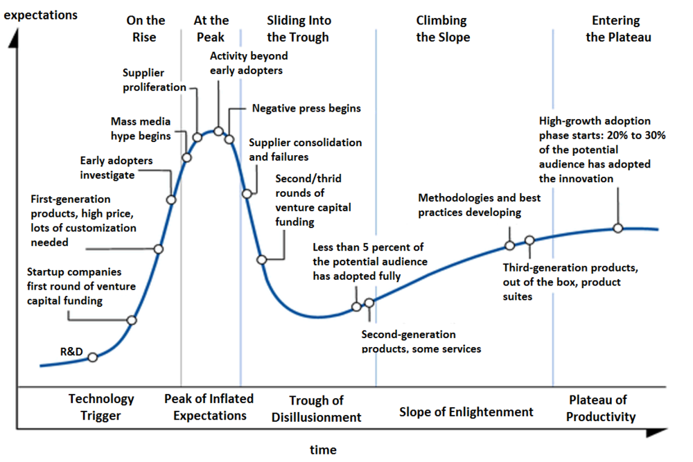
You are probably familiar with Gartner’s hype cycle model:

VR is quickly approaching what the model calls the "Peak of Inflated Expectations". VR enthusiasts dream about a world where we spend considerable time (if not all our day) in virtual worlds, doing… well, everything. This won’t happen and not because the technology won’t be good enough. Today’s VR headsets, the Vive, the Oculus Rift or PSVR are not great, and the mobile VR solutions are very basic; but this will change. The VR headset of 2018 will be light and won’t require half a dozen cables. The headsets of 2022 won’t be much bulkier than a pair of sunglasses. So, what will prevent VR from going mainstream?

It’s human nature. There are competing theories in psychology about what makes a person happy, but there are recognizable common themes. Connectedness or relatedness is definitely one of them: we need meaningful personal relationships to be happy; competence and a sense of accomplishment are another widely cited factors. We are incredibly quick in embracing technologies empowering us as human beings. The landline telephone, the personal computer, the Internet, the smartphone makes us more competent and more connected. VR falls short in both. There are no jobs imaginable that can be better done in virtual reality, where we, humans, have to compete with code (no, not even creative jobs). Virtual reality, at least in its current form, won’t bring us closer to others either.

Fun is another core element of happiness and no doubt that VR is really good at delivering fun. The problem is it comes at a high attention price. There’s no rule saying "the more immersive an experience the more fun it is". The Sims is pretty immersive as a computer game, but disproportionately more people get their daily dose of fun playing Candy Crush Saga exactly because it’s not immersive. Candy Crush and the like fill the gaps in your day and utilize the moments when otherwise you’d probably just do nothing and relax. VR can’t be consumed in bits. Even if the technology becomes as easy to use as possible, you just can’t jump in and out from a virtual world.
 
VR will have its place on the market. Today, the number of console gamers in the world is well north of 100 million, and they are happy to pay with their attention for a special gaming experience. VR will be huge as a gaming platform, and you might even argue that it will become "mainstream" in this sense. But it’s far from taking over the world.

On the other hand, augmented reality doesn’t ask for your exclusive attention, and it ticks all the boxes.

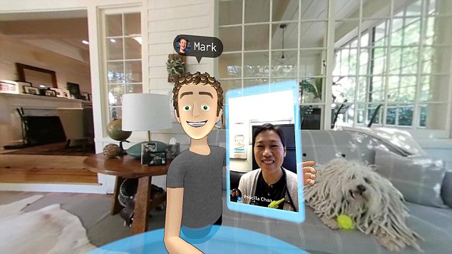
It makes you connected. No one want to hang out with a crappy avatar, even if it’s Zuckerberg’s virtual representation. Sure, it’s interesting to try once or twice, but the majority of the people will stick to FaceTime and Skype. That is until they can finally use holograms to be (almost) physically in the same room with the people they are talking to.

It makes you competent. It provides you information (often previously inaccessible information) if you want it and when you want it. This is exactly what made the Internet, and later the smartphone indispensable.

And if you’ve ever played Pokemon Go you already know it’s tons of fun.

(So, yes, this site is not dead. We had a hell of a few months, working on exciting projects. We are still here, so stick with us, like us or follow us.)


from RealityShift http://realityshift.io/blog/why-vr-wont-take-over-the-world-and-why-ar-will

How To Design With Discipline: UX Lessons From 3M

image02

The 3M Health Care Business Group follows a strict UX design process that allows for complexity—but isn’t overly complex.

With $30 billion in revenue and 90,000 employees worldwide, 3M has built a thriving business over the past 100-plus years on one core principle: applying science in collaborative ways to improve people’s lives.

That principle is paramount to the work of the 3M Health Care Business Group’s UX team. Projects include physical products such as smart inhalers and digital products ranging from enterprise medical coding software to internal sales tools.

“Our design approach is to regularly connect with colleagues in other disciplines like marketing and R&D as strategic partners,” says Andy Vitale, lead interaction designer at 3M Health Care. “When our UX and business teams work together with clear vision and goals, we find greater success through a shared commitment to authenticity.”

Vitale’s team currently supports six different divisions of the Health Care Business Group at 3M; Health Information Systems (e.g. billing and hospital quality of care), Critical and Chronic Care, Food Safety, and Drug Delivery Systems, Infection Prevention, and Oral Care (dental and orthodontic).

His small team tackles a big list of projects, supporting both new products and long-established brands.

In a complex space where large companies struggle with scaling UX methodologies, 3M stands in stark contrast to engineering-driven enterprise. The product development process reflects one of the most mature UX models we’ve seen to date.

Due in part to the strong design culture built in the past few years since Chief Design Officer Eric Quint joined the organization, 3M Design follows a disciplined UX process rooted in co-design and customer validation.

“Show, don’t tell” is a philosophy that drives all the design work you see below.

Design at 3M Health Care

Team structure

Vitale’s six-person UX team for 3M Health Care covers the following disciplines:

  • Interaction Design
  • User Research
  • UX Strategy
  • Information Architecture
  • Visual & UI Design
  • Content Strategy
  • Front-End UX Development

Each team member’s skillset is T-shaped. While they may specialize in certain disciplines, each person can also help cover other areas as needed.

Initial research

At 3M, product and feature solutions can come from multiple sources, including business, technical or design teams. The 3M Health Care Design Officer also meets with the division leadership to prioritize projects based on resourcing, current status, and expected impact.

Once a project starts, the first step for the UX team is to review any existing research for context around the design problem. Stakeholders provide the following information to designers on an ongoing basis:

  • Market research: Information around the market landscape and how existing or future 3M solutions could fit.
  • Industry insights research: Information specific to the business division that identifies opportunities.
  • Voice of customer research: Any initial user research conducted by the business.

By reviewing the three sources of research, the design team better understands the current status of the project and the desired target users. The information also provides talking points for stakeholder interviews and helps uncover points of validation for future field visits with customers.

Stakeholder interviews

After reviewing the existing research, Vitale’s team prepares a short discussion guide for stakeholder interviews. The stakeholder interviews help the team understand business requirements. They also inform the first draft of the design brief.

Stakeholder interviews are usually conducted on an individual basis, lasting between 45 minutes to 60 minutes per session. Occasionally, the team might conduct department interviews instead (e.g. two to three marketing people in one interview), but they don’t hold cross-departmental group stakeholder interviews.

The 1:1 format allows Vitale’s team to thoroughly explore each person’s subject matter expertise and vision of success for the project. If more information is required, the designers are free to schedule follow-up interviews.

When conducting stakeholder interviews, consider Kim Goodwin’s guidelinesfor each department:

  • General Stakeholder Interview
  • Marketing Stakeholder Interview
  • Engineering Stakeholder Interview
  • Sales Stakeholder Interview
  • Executive and SME Stakeholder Interview

Customer journey mapping

With a clearer picture of business requirements, the UX team conducts a customer journey mapping workshop to plot out the user’s perspective before, during, and after service:

  • Emotions: Any moments of satisfaction, anticipation, and frustration.
  • Touchpoints: Every step of the journey that the user interacts with the company
  • Channels: Where interactions occur (e.g. online, mobile app, etc.).
  • Moments of Truth: Any particular touchpoints or actions that generate lasting frustration or satisfaction.

The designers typically map the journey out on a large board, while stakeholders add their thoughts with Post-it notes next to each step. Together, the team then discusses all of the potential roadblocks and opportunities.

“We try to build the customer journey collaboratively before we get too far ahead of ourselves,” Vitale explains. “Before we talk to customers, we want to make sure we’re all on the same page internally as far as understanding the problem and opportunity.”

After the first half-day “all-hands” customer journey mapping workshop, the design team will then follow up with two-hour sessions as needed. Once the whole exercise is complete, the UX team sends a summary email prioritizing the project goals and any newly revealed constraints.

For efficiency, Vitale recommends first sending out a clear agenda with timeboxes for each part of the workshop.

Grab design ebooks created by best designers

All for free

the-book_bundle

Do you want to know more about UI Design?

Download ‘The Enterprise UX Best Practices Bundle’ FOR FREE!

Download e-book for free

Close

Contextual inquiries

Following the customer journey mapping, the UX team conducts on-site field research, which could last up to several days with multiple users at different organizations.

Because Vitale’s team designs enterprise products, they speak with the end-users, managers, and software purchasers. The goal of the on-site visits is to validate all the insights generated so far in the initial research analysis and customer journey mapping.

“Empathy mapping is a critical part of our work,” Vitale explains. “From the beginning, we’re doing customer field visits to observe our users in their natural habitats. We’ve found bringing customers in for interviews wasn’t enough–we need to be where they live and work to truly understand their issues. And we don’t want to just hear their pain points, we want to hear their needs and desires.”

During onsite visits, the team gathers customers together for conversations about their needs and solutions based on a prepared discussion guide. Vitale’s team typically stay onsite for a few days, with hour-long group discussions and many 1:1 observations (30 to 60 minutes) of individuals at work.

“We like to observe our users doing their normal tasks,” Vitale says. “They tend to get comfortable with us looking over their shoulder. It’s just so important to understand the reasoning behind what they do rather than just their steps.”

At the end of each day, all of the designers will sort their notes into a shared template. The designated research lead then sorts through the data to remove duplicates and identify patterns.

Building user personas

Once the team returns to their office at 3M, they transform the new information into personas for user groups.

These personas are shared with the business team. The team will also update the design brief to reflect new user requirements uncovered in the field visits. “By looking at these personas together as a design team, we can see the overlaps in needs between different user groups,” Vitale says. “From there we can begin sketching solutions around the initial hypotheses and core features.”

Once the design team has finished more refined sketches of the feature ideas, they present the concepts to key internal stakeholders. All the consolidated research is available to everyone in a cloud folder.

The design brief

The research ultimately feeds into the formal design brief.

While the first draft is created after the stakeholder interviews, the design brief takes final shape after the field research. The design brief puts everyone on the same page and references:

  • Business needs explored through stakeholder interviews
  • User needs validated through field research
  • Overall UX principles based on brand guidelines and sketching
  • Project timeline

Once all internal stakeholders agree to the brief, the team dives into more detail.

Feature prioritization

With involvement from the developers, the UX team prioritizes all features based on feasibility and how much they align with the goals of the design brief.

A spreadsheet acts as an early product roadmap by breaking down features by category, owner, and schedule. The team also includes tabs for technical, UX, and business notes.

To visualize requirements for stakeholders and developers, the UX team also creates atomic models (in Illustrator) mapping out page flows and taxonomies. Since the models will evolve, the team doesn’t want to overwhelm stakeholders with a complex tree of 50 to 60 features across the whole system. Instead, designers only share high-level interactions between 10 and 12 core feature sets.

Once the team finishes their work, they hold a 2-hour workshop for stakeholder feedback on the following items:

  • Spreadsheet of prioritized features
  • Relationships between feature sets outlined in atomic models
  • User research and market research supporting the above decisions

Priorities may shift, so designers need to be ready. “Storytelling is one of our greatest strengths as designers,” Vitale says. “By explaining how each feature impacts the user along touchpoints of the customer journey map, we create a common reference point for stakeholders. They start to see how their decisions impact the user, and identify the path to the right solution.”

User-validated design sprints

The next step: design sprints. The first sprints address high-impact features.

Before they start, the team reaches out to a core group of users (typically eight to 12 people) to schedule testing.

3M Health Care’s UX team then follows an alternating one- to two-week sprint cycle of design and user testing for feedback and validation. Starting with low-fidelity prototypes, the design team increases the fidelity as their concepts begin to solidify, and the users become more comfortable with the design sprint process.

image00

Design at 3M Health Care

“We usually build and test prototypes within that 40- to 80-hour duration. We understand our user’s time is valuable and appreciate that they are willing to spend time working with us,” Vitale says.

The overall length of the project varies widely depending on whether the project is an update to an existing product or an entirely new offering.

The design and testing cycles typically happen in a “rinse and repeat” format before they move into development. To keep everyone on track, the whole team also participates in daily standups.

For the sake of efficiency, the 3M Health Care team tests users remotely and through satisfaction surveys. Along the way, they communicate regularly with their core business team and adjust the design and technical requirements as needed.

Despite the different project lengths and scopes, the commitment to customer testing and team collaboration helps define the final design.

“Our basic methodology is always the same: we put the right people in the room, work together to solve problems, and make sure the customer’s voice is heard,” Vitale explains. “The results are increased customer satisfaction and ultimately, a real seat at the table for UX to impact the organization.”

Conclusion

3M Health Care’s structured process shows how enterprise companies can practice collaborative design amid complexity:

  • Check every design problem against initial research before diving into a full kickoff.
  • Validate existing research with on-site customer interviews.
  • Involve stakeholders in co-design sessions to sketch out ideas, but empower designers to make the key decisions.
  • Align the larger team to a formal design brief informed by market and user research.
  • Adjust design sprint length based on iteration stage.
  • Alternate each design sprint with a usability testing sprint.

For more best practices from top companies, download the free e-book Real-Life UX Processes: Design in Action.

1-wxwvfhs6on82xuusr_cnja

Originally posted on FastCo. Design

The post How To Design With Discipline: UX Lessons From 3M appeared first on Studio by UXPin.

from Blog – Studio by UXPin https://www.uxpin.com/studio/blog/design-discipline-ux-lessons-3m/

Credit Unions Turn to Blockchain Amid Increasing Competition

business people, puzzle piece

A less-discussed type of financial entity, the credit union service organization (CUSO), has emerged as an unlikely – but significant – player in the industry’s CU Ledger blockchain initiative.

In fact, to say that the involvement of CUSOs in broader credit union collaborations on blockchain has been a surprise wouldn’t shock may long-time industry observers.

Part of the trend is is simply pure business. With the number of credit unions in the US declining by about 250 institutions per year, this means CUSOs are competing for a ever-smaller piece of the pie.

But the advent of distributed ledger technology has brought several CUSOs together with more than 50 credit unions on the CU Ledger initiative, a development whose significance isn’t lost on industry veterans.

Robert Hackney, president of Card Services for Credit Unions (CSCU), an organization with around 2,000 credit union members, notes that these steps represent a “first” for his group and many of its peers.

Hackney told CoinDesk:

“It’s not that there’s bad blood or we’d let competition get in the way, but I think it’s the first time there’s [a technology] that really facilitates a collaborative effort.”

CUSOs are entities owned by federally chartered and insured credit unions that focus on a core competency, such as payment card processing services or business loan originations. Because credit unions tend to be smaller in size, CUSOs serve as a way for a group of these institutions to pool their resources to provide better, cheaper and new services to their members.

So while credit unions themselves don’t shy away from collaboration, CUSOs haven’t seen a reason to work together.

While blockchains have been lauded for their combination of cryptography, time-stamped accounting and data management, for permissioned ledgers to really see their full potential, Hackney acknowledges that competing entities will need to drop some old customs.

“It’s technology that we all may be able to use. That’s why we’re working together,” Hackney said.

The involvement of CUSOs in the industry is also a sign of its shift from possible applications for retail payments to the edges of financial systems. The CU Ledger initiative, for example, is focusing on utilizing smart contracts and finding a solution for user-centric digital identity.

Why identity?

With it’s user-focused mentality, self-sovereign identity fits well into the credit union’s narrative.

Developing “user-centric identity could solve a lot of problems in banking,” said Dean Young, senior vice president of industry engagement at Payment Services for Credit Unions (PSCU), another CUSO that’s a part of the CU Ledger project.

The main problem? Fraud.

“Imagine a world where … there’s 100% certainty that someone making a transaction is who they are,” said Young.

A sleeker identity system could also be helpful as it relates to the decreasing number of credit unions. Many times, credit unions merge or get acquired by other credit unions because it allows them to scale while also making revenue within a cumbersome regulatory environment, said Hackney.

Because of that, “it’s not uncommon for a credit union to have its credit portfolio with us (CSCU) and its debit portfolio with PSCU,” he said. “So if there are ways to authenticate through different portfolios and different providers that would be very beneficial in this environment.”

Destiny control

In that view, the credit unions and their service providers stand to potentially benefit by using the technology. But what about the members themselves?

According to Young, the answer lies in the portability of a single digital ID, which could eliminate the need for managing hundreds of username and password pairs.

That, and the ability to exert far greater control over that information.

That kind of individual control is one of the reasons the credit union industry decided to build it’s own ledger system, working on an identity proof of concept with Evernym, a startup  based in Salt Lake City.

“The ability for the credit union movement to create a ledger and control its own destiny is more appealing than some avenues we looked at,” Young said.


Looking ahead

The traditional banking industry’s more competitive nature might be one reason no commercial blockchain product has launched in the financial services space as of yet. But the Cu Ledger group is working on a short timeline for implementation.

The CU Ledger effort plans on having a proof-of-concept up and running by the first quarter or early second quarter of next year, according to Young.

The effort is fueled by fees paid by those taking part in the project. To be a part of CU Ledger, the founders asked for a minimum investment of $10,000 per participant. But since that could be a challenge for some smaller credit unions, the terms were flexible, said Young.

“Collaboration is foundational in this industry, Young said. “This is not just a PSCU commercial solution. We don’t believe in a ‘build it and they will come’ philosophy but more of a philosophy of ‘build it together and then they’re already here.’”

The presence of CUSOs such as CSCU and PSCU, along with credit union participants and their members, should jumpstart adoption when the time comes. Since the two CUSOs work with more than half of all credit unions in the US, the kind of integration needed largely exists as-is.

Pieces of a puzzle image via Shutterstock

BlockchainCredit UnionsCUSOsIdentity

from CoinDesk http://www.coindesk.com/credit-unions-blockchain-competition/