Why the next generation of startups won’t build apps

It’s easy to forget that the internet is really young.

For all practical purposes, it’s only about 20 years old. In the history of media and communications technologies, that’s not a long time at all.

But even though the internet is young, it’s changing fast. Over the past few years, we’ve seen the internet become oriented around people rather than destinations (apps and webpages). Alongside, we’ve the rise of multiple different types of interfaces. How will this affect tomorrow’s startups?

(I explored these ideas in a talk I gave on our Inside Intercom world tour earlier this year. The video and slides are embedded below, or scroll down to read more about why the next generation of startups won’t build apps.)

The best way to understand these things is to look back at other times in history when other transformational technologies emerged. If you do that, you see that these things take decades to stabilize.

In the short time the internet has been with us, it’s actually transformed most of society in ways we could never have imagined. It’s totally changed news, for example – where we go to get news, how news breaks.

It’s changed how we buy things too – whether that’s online with Amazon or with other retailers too. It’s changed the economics of everything. But it’s also changed how we buy offline too. These offline businesses also have to adapt, and it changes the economics of their business.

The internet has also fundamentally changed how we communicate. This is my gratuitous family photograph – me, my wife, and our twins who were born in San Francisco when we lived there.

For my parents, this was their first grandchild. They got to experience their grandchildren being born, not the actual birth you’ll be glad to hear, but they got to FaceTime with us, and actually see their grandchildren move, see how tired we looked, all sorts of things. It was very real.

Even if you went back five years ago, maybe ten years ago, the experience for them would be entirely different. They would have had to wait for us to take photographs, print them, and post them to them. Later there was video, which you could shoot on a camcorder and email.

The internet, in such a short space of time, has really changed how we communicate with each other. It’s also changed how we navigate the world. I’m aging myself when I say I remember a time when I used to read books and get maps before I got on an airplane to go somewhere else. No one does that anymore.

They get on the plane, the plane lands and they get off. They take out their phone, and it tells them where they are, where to go, what’s around, what’s next, what’s recommended, and so on. It’s actually changed how people move around physical space.

So it’s important to remember that the internet is still really young and that it’s changing things fast.

Interfaces connect makers and consumers

The second thing is interfaces. An interface is actually quite simple – it connects the makers of something with the consumers of that thing. It’s really that simple. It’s the thing that connects.

Interfaces aren’t a new thing either. They go back hundreds of years. For example, we can go back to markets and market stalls; a market stall was the interface, what connected a business person with potential customers. Stores are exactly the same. The store is an interface between the business owner and potential customers.

When the internet first came about and the first websites were being launched and developed, it looked very similar. This was also an interface – the thing that connected people who used the internet with startups. The website was an interface.

Boo.com, one of the earliest examples of internet ecommerce

What’s interesting about all of these interfaces is that they are all destinations. The market stall, the store, websites, and apps, they are all destinations. We want people to go to our website. We measure that by traffic, by people that actually have to navigate to it. Mobile apps are exactly the same. Interfaces simply connect businesses and consumers. Up until now, interfaces have always been destinations.

People are connected and social

The above photograph is taken from space looking back towards Earth. This is Iberia – Spain and Portugal. You can see Madrid. You can see the northern tip of Africa. You can see Valencia. You can see Lisbon.

What’s amazing about this photograph is that it tells you we’re connected. A sense of connection is actually one of the most primal motivators of the human species. We actually want to connect with one another.

Another universal truth about humans is that we are social. We live for our family, friends and colleagues – probably in that order. Think about the things in your life you do everyday – they all revolve around other people.

When you put these things together, what you start to see is that you have a transformational technology – the internet, and the underlying notion that people orient around other people.

It becomes obvious in hindsight that these things will merge, that they will connect themselves. It’s clear that the internet will actually re-architect itself around people, and all of the services and things we build on the internet will be centered around people and connections and relationships.

The internet is now deeply orientated around people.

When I worked at Google and Facebook, this was emerging as a huge paradigm shift. Both companies thought this was a zero-sum game. There would be one winner, and one winner only.

At the time, Facebook was winning and Google felt this existential threat that they needed to win and own the address book, or own the social graph. If you owned that you would have this immense power. That’s not what happened at all. It was not a zero-sum game. What actually happened was that there many winners. Now there are over a dozen apps, with over a hundred million active users. Many people won.

You can extend this idea not just to messengers and social platforms but any product or service that connects people like Uber, Postmates and Airbnb. They’re connecting people to do new things in new ways. Pretty much every fast-growing technology company is oriented around this idea of connecting people. They are offering new value in new ways because the internet is catching up with real life. That’s all that’s happening.

What happens when people, interfaces and technology connect

What’s interesting though is we are past the point of no return. This shift has happened. The internet is now deeply orientated around people, and that change is not going to reverse.

When you realise the internet is oriented around people, it’s interesting to explore the connection and the relationship between the internet, this foundational technology, these interfaces that up until now have been destinations, and this orientation around people.

Websites are destinations. Not only that, they are also heavily inspired and influenced by the technologies that preceded it. The below website, the BBC, looks like a newspaper. But slowly we are moving away from thinking about pages and traffic and destinations towards something quite different.

Likewise, when you think of things like the App Store, you realize it’s simply a destination to download other destinations. Everyone can sense this model is broken. If you build a mobile app today and you want users, you basically have to buy ads. That’s because people aren’t browsing the App Store. People aren’t sitting at home thinking, “I wish I had a new app.” Yet many startups still think that’s what happens.

So people aren’t browsing the App Store, but they are on these social platforms. Hundreds of millions of people are on multiple platforms, dozens if you count the Airbnbs, Ubers and Postmates of the world. There will probably be hundreds of these new types of services and these huge new platforms are changing.

When you look at all of these things in combination:

  • The internet is young and changing
  • Interfaces are no longer destinations
  • Things are becoming oriented around people

You get two tracts of thought.

1. People-oriented systems

The first is we’re moving towards people-oriented systems, not destinations. Look at the App Store and why it was successful. Discovery was one factor. You could get discovered in the early days. You can’t really anymore. Payment was a big thing. No one wants to deal in payments. You just don’t want to do it, so you outsource it to some other company who does it way better. Apple had iTunes and a whole payment infrastructure there.

You can now discover new things while you’re inside social platforms.

Nowadays, all of the social platforms like Facebook have also got payment infrastructure. You’ve got companies like Stripe who are doing really interesting things to take all of that away, so that’s being eroded. That competitive advantage of these destinations has been eroded.

Meanwhile, something fascinating is happening with these social platforms. Take Bitmoji. I was chatting with a friend on Facebook recently and they sent me a Bitmoji of them. Straight away I thought, “That’s cool. I want that.” Inevitably, I made a Bitmoji of myself, and started using it. Then other people were like, “I want that. What is that?”

This is discovery in context. You can discover new things while you’re inside the social platforms themselves, in the context of the conversation. It’s way more valuable. Bitmoji as a company don’t need app store distribution. These social platforms are so big, but Bitmoji can easily, organically grow in context on the back of those numbers.

When you start thinking about an interface sitting between a customer and a business, you start start to notice other types of things like Bitmoji. Like Uber inside Facebook Messenger. Again, this is discovery in context. You can call on Uber, get an Uber. It’s happening in the flow of a conversation.

What’s fascinating about this is that this is not a destination for Uber. Uber aren’t thinking about Messenger as a destination. There are no ads driving traffic, paid by Uber to Facebook Messenger. That’s just not happening. It’s not a destination.

No one is thinking about pages or traffic or any of that stuff. Something else is happening. What they have to do is they actually have to start to think about how to design a system around that. Suddenly, it’s a people-oriented system. It’s like, “Oh shit. If we’re designing Uber inside Facebook and other social platforms, we have a whole new set of constraints. A whole new set of criteria we need to figure out.” It’s just different.

2. Multiple types of interfaces

The second thing is that there are many types of interfaces, not just apps. Magic is one of Silicon Valley’s most interesting startups. The technology Magic use is SMS. Not voice, AI or machine learning technology – just SMS. Their interface is just texting. They didn’t build a fancy app, they just use SMS. Easy to understand and global distribution. Why would you not use SMS?

Laiye which is the Chinese version of Magic uses WeChat. Exactly the same thing. Why would they build this new interface, this proprietary UI, put it in an app store, when they can just build on WeChat? That’s where the people are.

There’s plenty of other examples. X.ai is another, again, one of the most interesting startups happening around. The interface they choose was email. This is so profound for them that they say, “No signup, no password, no download. You just email.” The whole service is through the interface of email. Again, easy to understand and everyone’s got it.

There’s also other platforms you can build on. You can build a Slack app. You can build a bot in Facebook Messenger. You can build a card for Twitter. For example, Twitter has a whole card platform. Your whole interface can just be cards sitting inside Twitter. There’s a whole heap of options. Or you could just have APIs. The “I” stands for interface and there’s lots of opportunities to build things that are just APIs talking to other APIs.

Things connecting to new things and providing value for people. Again, this isn’t new. Charles Eames, a famous designer in the 1950s had this quote where he said, “Eventually everything connects.” This is happening right now because of the internet. We’re being connected together in all these new interesting ways. When you think about these things, you realize there are many types of interfaces. These many types of internet interfaces are connecting people who make things to people who might want to consume them.

The internet is young. It’s changing. It’s oriented around people now. It’s all about systems and system design. There are many different types of interfaces. Why does this matter?

The Fortune 500 was actually created fairly recently in 1955. Of the first 500 companies, the best companies at the time, only 67 still exist. That’s not a long time ago – just 60 years ago. The reason they don’t exist is because they didn’t adapt to change. They didn’t see change as it was happening around them.

By definition, our industry is changing and changing fast. Everything you do today, all of the things you think you know today, won’t be there tomorrow. There will be different things tomorrow. And we need to embrace that idea.

The post Why the next generation of startups won’t build apps appeared first on Inside Intercom.

from The Intercom Blog https://blog.intercom.com/why-the-next-generation-of-startups-wont-build-apps/

Microsoft Design: Inclusive design toolkit download

We’ve developed a toolkit to show how human diversity can create better design constraints. And how to connect seemingly niche solutions to broader markets. Our toolkit can be used with any existing design processes.Discuss

from Sidebar http://sidebar.io/out?url=https%3A%2F%2Fwww.microsoft.com%2Fen-us%2Fdesign%2Fpractice

Why Windows 98’s User Onboarding is Better Than Yours

Reading through Microsoft’s 1995 Interface Guidelines is like unearthing a lost relic. The 381-page tome — for designers creating Windows apps — got me thinking about how much has changed, not only with Microsoft but with software overall. The guidelines are ahead of their time.

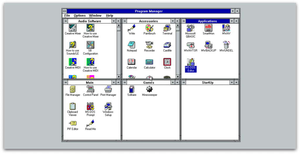
They’re concerned with helping the user get to grips with the OS, and there’s a focus on empathy and a hint Microsoft is starting to think about UX. That’s which isn’t something Windows 3.1 makes any effort to do. On first run, you’re thrown into this jumble:

If you like this article, give it some sharing ❤️

windows 98 user onboarding

I decided to take a nostalgic trip back to Windows 98, re-experience it and write the article I wished I could have read.

For me, a notable part of Windows 98’s UX is its user onboarding process. After the cryptic start screen from Windows 3.1, it’s a great thing to see. User onboarding is getting the user from a state of confusion to feeling comfortable with the software as quickly as possible. It’s about teaching them enough fundamentals that they can learn the rest on their own, minimizing the ‘red tape’ of setup and getting them ready to go in the most frictionless way possible.

First of all — what are some examples of user onboarding techniques?

Before the days of dedicated apps for creating an onboarding experience, software designers had to do it themselves. Now, thanks to powerful processors and bigger-than-floppy-disk memory size, experiences are smoother and fancier. Even so, the principles are the same as ever. Here are some examples:

Registration forms

No one wants a game of 20 questions where the prize is signing up. Back in the days of Windows 98, as I’ll look at in a moment, you had to put in very little information before landing on the desktop. This is even easier nowadays thanks to Google/social authentication, as shown below in Process Street:
process street user onboarding signup

Empty states

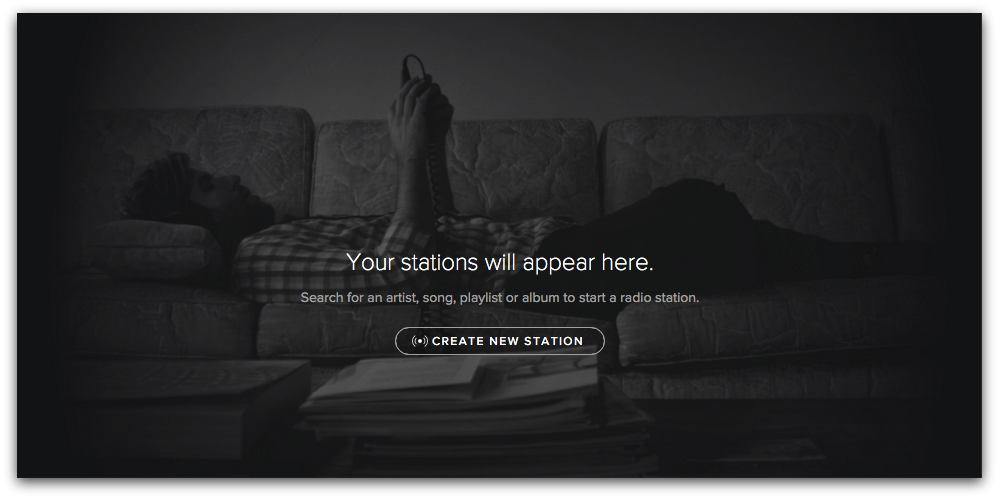
As covered in a previous article, empty states are what the user sees when there is no data to display on the screen. Any holes in the user onboarding process can be fixed with empty states since they (should) tell you why you’re seeing nothingness, and how to fill that space with something useful. Here are some good empty state examples: Spotify

spotify user onboarding

Spotify’s (cunningly optimized) interface won’t show you an empty space if you have no stations.

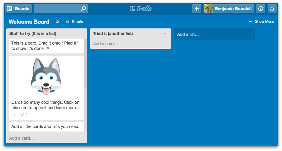
trello user onboarding best practices

Trello’s empty state is an example board that explains the core features and makes Trello’s onboarding experience fun and educational, not a trawl through the user manual.

Interactions, not user manuals

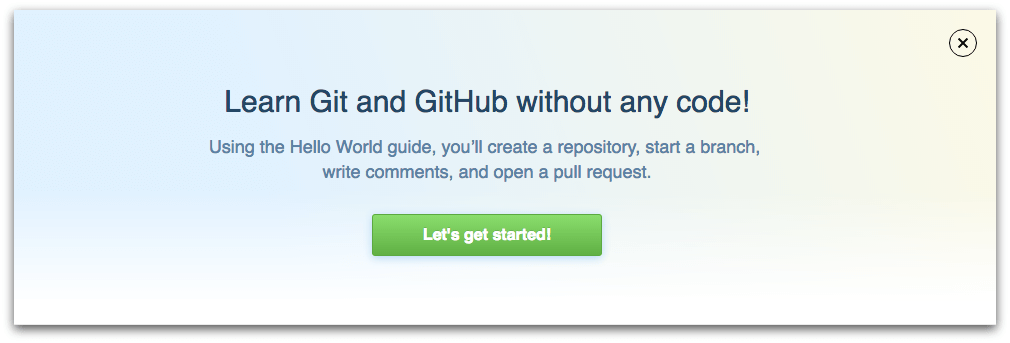
Even if they’re not paper, apps do still have documentation. Check out GitHub’s massive help section, for example. There’s nothing stopping software companies providing online user manuals and FAQs, but far away from the age of documentation-driven onboarding and have adopted a ‘learn by doing’ mindset.

github user onbarding

When you create a new GitHub account, the banner above is what you see over your empty dashboard.

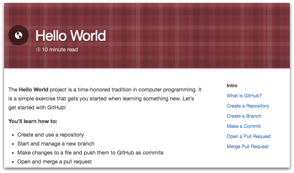
github user onboarding

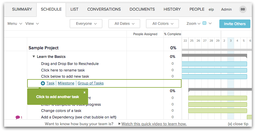
While it does technically take you to an online user manual, it teaches you how to use the app by guiding you step-by-step through a real use case, not an abstract glossary of features. Similarly, when signing up for TeamGantt the first choice you make is whether to be guided through an interactive sample project or to start fresh.

teamgantt user onboarding

The sample project comes with tip boxes which take you through a basic workflow with the app that’s vital to your proficiency.

Now let’s look at how Windows 98 uses these user onboarding techniques.

User onboarding: Windows 98 style

I’ve looked before at how Microsoft build their user onboarding into games for Windows 3.1, but the truth is that 3.1’s onboarding was otherwise pretty poor. The software was designed for command line users with prior knowledge, and the only help offered was with getting used to the GUI, not the OS itself. Perhaps that’s why Windows 95 & 98 — the first Windows operating systems which considered onboarding for the common user — sold over 10 times more copies than 3.1 did, 6 years prior.

Windows 98 uses Progressive Profiling

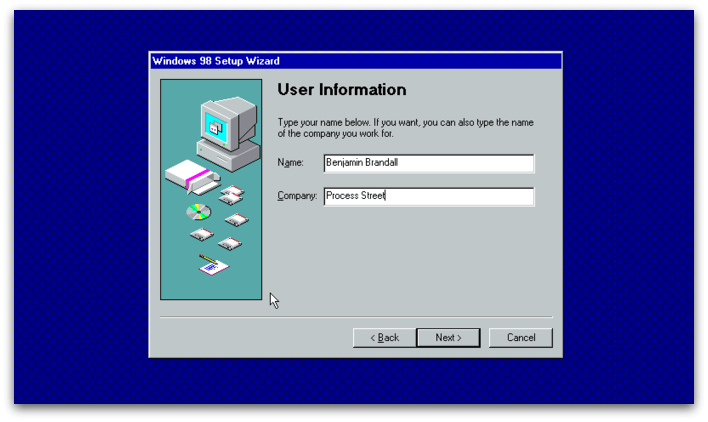
Progressive Profiling — what Auth0 calls breaking down a registration form into manageable steps — helps beat the overwhelming experience of being presented with a huge form upon signup.

windows 98 user onboarding

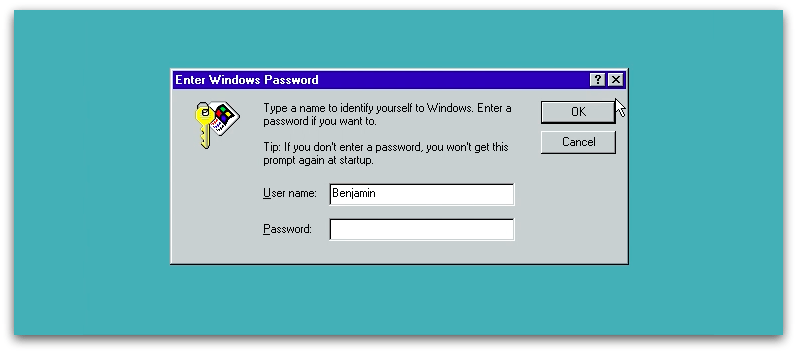
Windows 98, even though it’d love for you to register every detail under the sun, doesn’t force it. In fact, the first time I was asked to provide a password was when logging off for the first time.

windows 98 user onboarding

The initial setup is as friction-free as you could ask for, even saving the modem setup for when you decide to connect to the internet — either when opening Outlook, Internet Explorer or trying to connect directly.

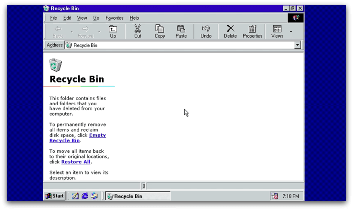
The recycling bin is a great empty state

Windows 98 doesn’t have many true empty states because it comes populated with a ton of shortcuts and files. I did, however, find a great example in the recycling bin that’s just as useful as the modern day ones I pointed out earlier.
windows 98 user onboarding

The process of throwing something into a bin and being able to either permanently trash it or uncrumple it and use it again is also a familiar one, so that helps the mechanics here make sense to new users.

Setup lets you take the path of least resistance

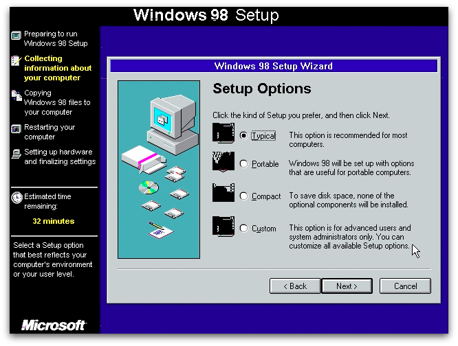
If you don’t want to ‘customize all available Setup options’, you’re welcome to take a typical installation.

windows 98 user onboarding setup

Unlike 3.1, which assumes you’re familiar with computers and the command line, 98 puts together a starter pack of components for the average user so you can get set up as quickly as possible, without too many decisions.

Learning to use Windows 98 by completing small exercises

Part of Window 98’s onboarding sequence is getting used to using the mouse and keyboard. In line with the interface guidelines:

“The user should always feel in control of the software, rather than feeling controlled by the software”

It teaches you to control the software, as well as letting you skip the tutorial at any time.

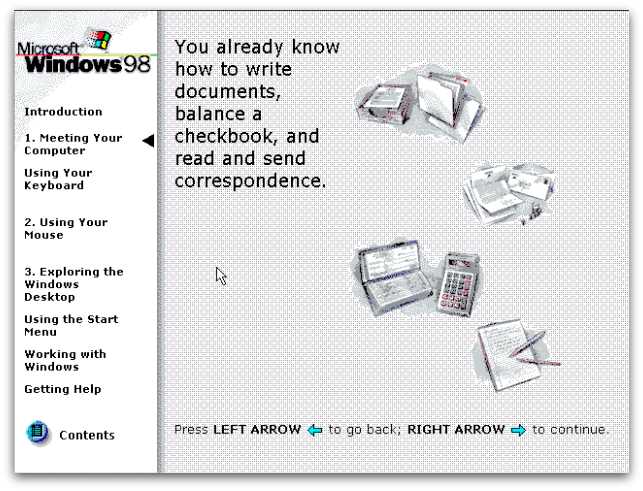
By completing these small exercises the user’s going to get used to the fundamentals of Windows, framed in a way that’s more obvious to them than if they were thrown into the OS without explanation. There’s even a test at the end so you can see how much you know!

Comparing software to real world experiences

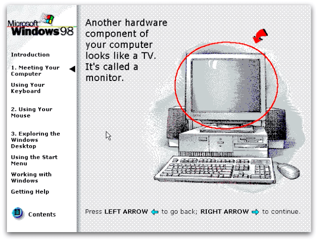
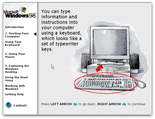
In 1997, computers weren’t nearly as widespread as they are now. For that reason, Microsoft compared computers to objects the user was sure to be familiar with, like a typewriter and a TV.

windows 98 user onboarding real world example

Back when this comparison was made, 64% of US households didn’t own a computer. That’s since dropped to 16%, which explains why we don’t see charming explanations like these any more.

user onboarding windows 98

The idea of comparing technology to past objects was popular with Steve Jobs, who used it as a main component of his designs until the release of iOS7.

Skeuomorphism is a catch-all term for when objects retain ornamental elements of past, derivative iterations–elements that are no longer necessary to the current objects’ functions.” — Tim Worstall

For Windows 98 (unlike Apple’s terrible brushed chrome phase), it wasn’t purely a design aesthetic. It was a way to familarize users with what they’re seeing by drawing on their past experiences. It’s the reason why recognizable UI elements make sense. Nowadays we know what the red plus is for on Google Drive, and can reliably theorize that it does the same thing in Google Photos. Back then, we knew what a TV and typewriter is so could use that knowledge to make sense of new technology in the exact same way.

Why did Windows 98 turn out so well?

The dramatic jump in quality between Windows 3.1 and 95/98 could be explained by the presence of documentation. In the documentation, the writer shows concern, and awareness of a user’s experience that wasn’t obvious in 3.1’s approach of throwing you headfirst onto your desktop. Quoting from the 1995 Windows Interface Guidelines:

“Avoid adding new elements or behaviors unless the interface does not otherwise support them. More importantly, avoid changing an existing behavior for common elements. A user builds up expectations about the workings of an interface. Inconsistencies not only confuse the user, they also add unnecessary complexity.”

This also applies to how Microsoft connect the experience with a computer to situations and objects the user already understands.

win 98 user onboarding

Why it’s so good: Microsoft made no assumptions about its market

After the brief setup, you can choose to either get straight to it, or select an option that says you’ve never used a computer before. It has another selective help section purely for users of 3.1, Mac, and people who have never used a mouse or keyboard before. And what have we got now? Thankfully Microsoft recycle-binned Windows 8 — an OS my mum said is ‘rubbish’ — but its failings and the core UX principles it overlooked after writing them 20 years earlier don’t give me much hope that we’ll ever again see as much genuine empathy for the user as we saw in 98.

And it’s that empathy Microsoft knew they needed to tap into that helped them create such the experience. They knew it was a ‘do or die’ moment for them — if the user didn’t pick up on the OS’s functions quickly, it’d be dead in the water.

There’s nothing like the terrifying consequence of outright failure to motivate you to create an amazing user onboarding experience.

About the author:
Benjamin Brandall is the head of content marketing at Process Street. When he’s not writing on SaaS, design, and startups, you’ll find him on his personal blog or Twitter.


Liked this article? Be among the first to get new content!

Development tips, tricks and news. Delivered to your inbox.

If you like this article, give it some sharing ❤️

from Sidebar http://sidebar.io/out?url=http%3A%2F%2Fusersnap.com%2Fblog%2Fwindows-98-user-onboarding%2F

Shyp’s Price Comparison Service — Upload bulk addresses, batch process & print shipping labels


We’ve been heads down building this for months so I’m so excited to finally launch it. One of the values of our existing Shyp product is that we compare shipping rates across USPS, UPS and FedEx to ensure we’re providing the best rates. We realized that businesses all over the US would get value from this and so decided to rebuild our product to offer this functionality separate from our pickup and packaging experience.
Now users anywhere in the US can compare shipping rates and purchase shipping labels from Shyp. If they’re in San Francisco, LA, Chicago or New York, they can still get our full pickup and packaging services. Along with this release we also introduced an entirely new web experience since businesses doing larger volumes of shipping kept requesting a web dashboard for managing their orders.


– Jesse Miller

Discussion
|
Link

from Product Hunt https://www.producthunt.com/r/c27f625f352555/78366?app_id=339

6 Ways Designers Need to Adapt in the Age of AI

6 Ways Designers Need to Adapt in the Age of AI

Source: Facebook Research

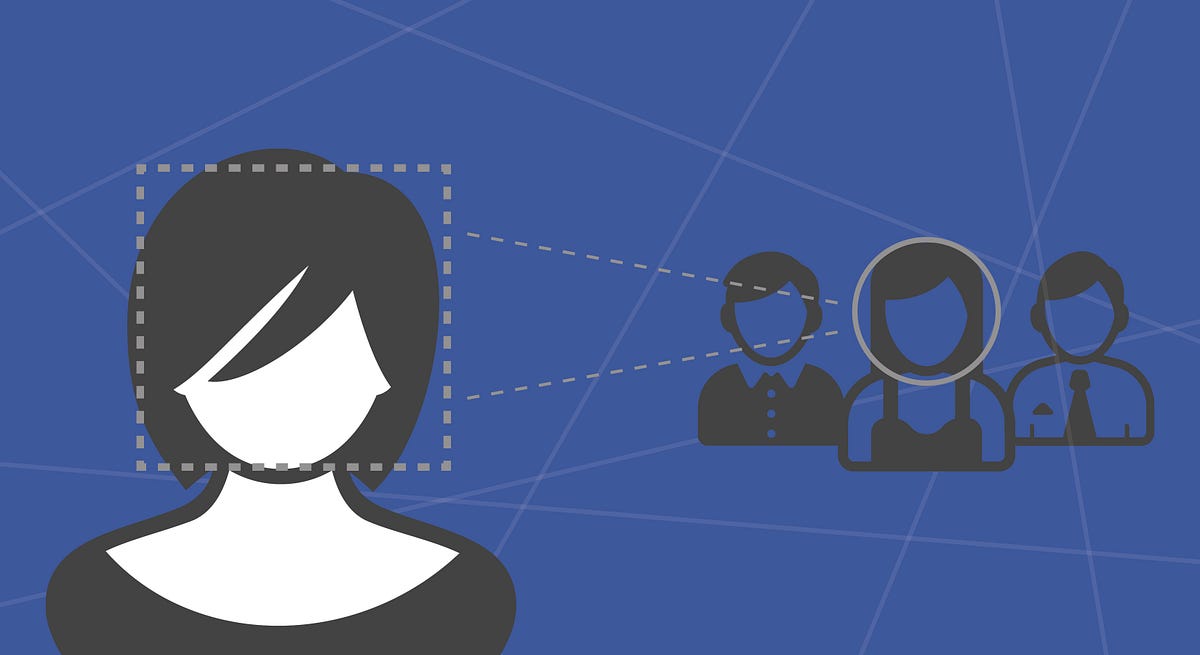
Have you noticed anything interesting the last time you uploaded a picture on Facebook? Perhaps you picked up on the fact that sometimes Facebook tries to tag your friends and family for you. Welcome to DeepFace, Facebook’s facial recognition system. If you’re wondering why it’s called DeepFace, it’s because at its core, the system is based on a type of Artificial Intelligence (AI) called Deep Learning.

AI is here, and it’s changing the way that we interact with technology on a daily basis. Most of the time, we don’t even realize when it’s happening. As designers, it’s going to become increasingly important to not only understand the fundamentals of AI, but also to adapt our process and mindsets accordingly. Below are six important changes that designers will need to consider.

  1. First and foremost, it’s time to learn about what AI is. While designers don’t need to create their own HAL 9000s just yet, a basic understanding of AI (in particular, the areas of Machine Learning and Deep Learning) will give you a huge advantage.
  2. Once you’ve learned some of the fundamentals, it’s time to buddy up with your favourite data scientist. Just like digital designers collaborate almost constantly with front-end developers today, similar collaboration with AI specialists & data scientists will be the relationships of the future.
  3. Design feedback loops are going to get shorter. As methods such as machine learning start providing designers with deeper, more precise insights, designs will need to respond and adapt more quickly. In the long run, this will also help speed up the time required, for example, to find the right product-market fit.
  4. Designers will need to focus (even more) on asking “why?” The quantitative analytics & insights that come out of machine learning algorithms will help point designers in the right direction, but will rarely uncover underlying human behaviours or motivations. For example, imagine building a travel platform where predictive analytics can help inform the system of the most likely country that the user is looking to book a trip in. While there is of course value in this type of insight, the really interesting piece happens when we can understand why users (or user segments) make the choices that they do so that we can design dynamic experiences.
  5. The world of AI just starting to open up new modes of interaction, and as designers, we need to catch up. Siri, Cortana and Alexa are all personified AI-based digital assistants. With Apple’s recent opening up of the Siri API, application designers can now use voice-based commands to interact with their apps. So fa2r, for most applications, this just allows us to do the same things that we could with a touch interface, using our vocal chords. However, over the coming months and years, designers will start to find unique modes of interaction based on voice that allow us to interface with digital systems in completely new ways.
  6. Finally, no article about AI would be complete without a consideration for privacy. Privacy by design will continue to be more and more important as we create more immersive, dynamic and personalized digital systems and applications. I’ve long considered how online learning courses could be improved if we enabled the cameras on users’ devices to detect a student’s current state of understanding and level of interest. If a student starts to tune out during a video lecture (there are plenty of well-documented facial cues that can be used to detect this), perhaps the lecture pauses, repeats a section or tries to explain the concept in a different manner. In a world where the microphones & cameras on our devices are on by default (in order to have the best user experience), a user’s privacy, and how we communicate that privacy, will become increasingly important.

It’s been about 10 years since the last major revolution in digital design took hold — mobile devices. Over the next 10 years, AI, and the insights it can deliver, will again radically change the role of designers in creating meaningful, engaging digital tools and systems.

from uxdesign.cc – User Experience Design – Medium https://uxdesign.cc/6-ways-designers-need-to-adapt-in-the-age-of-ai-bdf22a55c295?source=rss—-138adf9c44c—4

What UX designers need to know about product management

As a product manager by trade, I’ve had countless conversations with UX designers about what product management is really about. Online, there’s plenty of chatter that seeks to justify the existence of product managers to curious UX-kinfolk.

Today, I want to shift the conversation to something more interesting – celebrating shared objectives and considering product management as a viable career path for UX professionals.

As is typical of product managers, I fell into the role by accident. I had to look up what a product manager even did before my first interview for the role back in 2001.

‘Product manager’ is one of those roles that draws in people from a myriad of trades and industries. Regardless of qualifications and experience, excellent product managers share common traits like customer empathy, curiosity, great communication, good listening and a philosophy of continuous improvement.

Even though you can’t pursue a degree in product management at university, you’ll find us in the thick of the action in many product-centric companies today – leading from the front.  

So, what is product management?

You know what UX is, so I won’t preach to the choir a first principles definition of user experience or user experience design. But, for the sake of alignment, in my mind, the fundamental mission of UX is to present to your user the fastest path to satisfaction.

If I boil down the essence of why a business needs product management, it’s to answer these two questions:

  • What problems are we solving?
  • Who are we solving it for?

It sounds basic, but around half of all new product development efforts fail because these two questions are not adequately answered.

On a broader level, organisations invest in product management as a business strategy to achieve sustained competitive advantage. These organisations typically have growth objectives – to grow profit or market share, for example.

Sustained growth requires sustained competitive advantage. To achieve this, a business needs to invest in differentiated, hard to copy, value creation – that plays to the strengths of the business – over a sustained period. Product management is the practice of delivering this sustained competitive advantage.

For product-led companies, great product managers are a business necessity. They’re the people who ensure scarce company resources are allocated to making the right products and helping the business grow.

Product management ≠ UX

There’s a decent overlap between the role of a product manager and a UX designer – both roles seek to understand customer problems and empathise with the user. So it’s no surprise that on occasion UX designers and product managers clash.

Product Managers and UX Designers both play a role owning the customer problem.

Product managers and UX designers both play a role owning the customer problem.

Power struggles arise over who makes the call on delivering value to the customer – especially in recently expanded teams with the introduction of one of the roles (UX or product management). The roles are not the same, though, nor should they be trying to do the same thing. When this happens, someone isn’t playing to their position on the field.

You could say a product manager is a Jack of all trades and a master of none. Interestingly, the number one challenge of any product manager is competing priorities. There’s always more to do than available hours in a day. Product managers can’t try to be experts at everything. Whether that’s trying to optimise a remarketing program in Adwords, or spending too much time computing price elasticity for their high volume product. Trying to out-design a UX specialist on the interface for a new cloud offering means they miss the big picture.

Any product manager who doesn’t embrace UX expertise needs their head read. UX shares the customer research load, guides best practice in product design and shepherds that through development. UX designers are critical to a product manager’s success.

Why a career in product management?

Recent research shows that product management is now the highest paid role in Silicon Valley. A product manager in Sydney can earn, on average, $100,000 p.a. and a Senior Product Manager $145,000 according to job website Glassdoor.

The most rewarding aspect of product management is having a diverse and profound impact on the success of a business and its customers. You get to direct the energy of a talented group of people towards helping customers. It’s quite a buzz when done well. 

In many organisations, product management is a high profile role. You get great exposure to senior leadership and it opens up more diverse career advancements in senior management. Of course, it’s not without its challenges. Occasionally it can feel like an overwhelming, thankless, 24-7 arse-kicking. But, if your organisation has strong leadership, and you can balance your attention between the finer details and the big picture, it’s a rewarding way to develop your career.

Want to learn more?

If you want to learn more about product management and hear from an inspirational speaker lineup, Leading the Product could be the conference for you. This 1-day event brings together more than 500 product professionals on 20 October in Melbourne, and 25 October in Sydney. UX Mastery is a proud sponsor of this year’s event.

Leading the Product has an impressive lineup of UX speakers, including:

See the full speaker lineup

How about a free ticket?

UX Mastery has a free pass to Leading the Product to giveaway! To enter, you just need to tell us: “What’s one thing you wish you could get Product Managers to understand?” Entries close on Friday 7 October so be quick! Enter here.

More articles on this topic:

  • Welcome to the UX Mastery blog. We’re excited about bringing you all of the tips, tools and tricks we’ve learned over the years—not to mention insights and experience from some of the most respected UX…

  • In the next in our series of reviews of online UX courses, Sarah gets stuck into how to get a job in product management. She is promised tips to frame her resume, get a recruiter’s…

  • Career Foundry’s Rosie Allabarton debunks 4 common myths around starting a career in UX, and offers some practical tips for those considering a career transition.

, , ,

from UX Mastery http://uxmastery.com/get-to-know-product-management/

UX Binge-Watch, the Google Docs of Design, Emotional Objects and more UX this week

UX Binge-Watch, the Google Docs of Design, Emotional Objects and more UX this week

Here’s what is hot in UX this week

After finishing Mr. Robot and Transparent, I needed to find my next binge-watching endeavor. Instead of starting a new random TV show, I’ve decided to use my free hours to learn more about VR from a UX perspective (after all, the future of our profession is on it).

That’s when I came up with UX Binge-Watch, Season 1: Virtual Reality™.

Hope you enjoy the 9 episodes.

Start binge watching now →

Adobe pretty much dominates the design world, but today a company called Figma is looking to take the giant on in much the same way Google Docs took on Microsoft Office: by focusing on online collaboration. 
via Fabricio Teixeira

Snapchat announced Spectacles, their first hardware product, last Friday evening. Despite being the first hardware effort from our current social darlings, Evan Spiegel and company seem to be playing down the product.
via Fabricio Teixeira

The best way to propose redesign ideas is when you have convincing data in hand. I used to propose redesigns without data, all of which inevitably got rejected. Why?
via Caio Braga

There are some pretty intriguing riffs on the basic premise of chat-based user interface design collected on this page by Muzli.
via Fabricio Teixeira

Sustainability focuses on efficient and effective solutions that are better for society, the environment, and companies. How does that have anything to do with Product Design?
via Caio Braga

Ideas

Pins won’t save the world. Voting might. →

KnowYourFont: see how much you really know about typefaces →

OpenColor: an open-source color scheme that works for colorblind users →

Google announced Keyword, its new blog for everything Google-related →

Here’s how a Boing 737 is built, in nine days →

Meetup redesigned their homepage and visual identity →

Apple now offers search ads within its app store

A Conversation With Luke W.

Our friendly UX Bear had a conversation with Luke Wroblewski (@lukew) this week, talking about form design and the best practices of designing forms that are simple and interesting to use.

💬 Chat with Luke on uxchat.me →

Tools & Resources

Mailchimp published its new Email Design Guide this week →

Atomic announced v2 of its design/prototyping tool →

Here’s an explainer video on how to write explainer videos

LittlePlane offers SVG stencils for your wireframes →

CitySets is a growing collection of free city-based icon sets →

Wait… there’s more

Years ago it was common practice to place a link to your sitemap in the footer navigation. Those days are over because the footer itself has become the new site map.
via Fabricio Teixeira

A couple of great friends sent it after crashing at my place in Amsterdam for the weekend. They could have sent an e-mail, or a Facebook message, or an SMS, or a Tweet. But they didn’t. They put pen to paper and wrote a real thank-you note.
via Caio Braga

Thinking about color schemes for the UI of your current design project? Here are three aspects to consider as you design your next interface, along with examples of different applications in the wild.
via Fabricio Teixeira

I’ve long referred to Color, Type and Icons as the “Big 3” of a system’s visual language. All UI components — from Buttons on up — are built with them. But I left something out. Space, our final frontier.
via Fabricio Teixeira

Today, the user doesn’t have to look for the content — but simply ask a chatbot which replies instantaneously. In an era where interface problems are solved by magical combination of voice and conversational interface, it seems UXD will lose its purpose in the industry.
via Fabricio Teixeira

Brought to you by your friends at uxdesign.cc

Like the links? Share the love ♥

from uxdesign.cc – User Experience Design – Medium https://uxdesign.cc/ux-binge-watch-the-google-docs-of-design-emotional-objects-and-more-ux-this-week-fab3da4ad5d7?source=rss—-138adf9c44c—4

Why brutalism boosts conversions

For those of us familiar with brutalism on the web, we don’t necessarily look at it as a favorable design choice. That’s because it…

Continue reading on »

from Stories by WebdesignerDepot on Medium https://medium.com/@WebdesignerDepot/why-brutalism-boosts-conversions-1b6048cdd736?source=rss-333f2d0f1634——2