5 signs your product and UX teams are disconnected

I’m a little spoiled. As a product manager and startup founder I’ve been lucky to work with fantastic UX design professionals to launch several successful products and features.


I’ve seen first hand how great products come to life when product management and UX work closely together at the early stages of product development.


But it doesn’t always happen that way.


All too often, product and UX are siloed and don’t have a shared understanding of the customer or the job to be done. Or product and UX don’t collaborate effectively. It’s unfortunate. After all, product managers and UX designers share the same goals, right?


Although product and UX roles often overlap, the skills required from great product managers and great UX designers are different. The way I think about it is that product managers are focused on market requirements and the success of the product from a business perspective. UX is focused on understanding users’ needs and implementing solutions to improve their experience.


Where can things go wrong? Here are some symptoms of a disconnected PM/UX relationship and a few ideas of what you can do to fix them.

1. UX isn’t included in customer discovery

To me, the most important part of product management (and the most fun) is customer discovery—determining the customer’s jobs-to-be-done, the product’s value proposition, the minimum viable features, and so on.


So why is it then that so many product managers conduct customer discovery and then throw their learnings over the fence to “the designers”?


Isn’t it equally important for UX to understand customers’ motivation and pain?


“UX designers must understand customers’ motivation and pain.”

At a previous company I helped validate and launch a major new service. We were designing the service from scratch, and I was on point to engage with prospective customers to understand what to build. At the early stages our small team included a UX designer to hear the customer needs (directly from prospects), understand the problems, and learn about the solutions we would potentially displace.


Our team began building this customer learning into early wireframes and then prototypes so we could learn iteratively during the validation phase. It also gave us a visual way of engaging with prospects rather than a simple phone interview. This made a big difference.


The result was a cohesive team that launched an innovative service with a design that leapfrogged the competition. The customer adoption exceeded our expectations and I chalk that up in large part to the collaboration between product and UX at the earliest stages.


2. Roadmap initiatives lack UX consideration

In a recent post on our blog, Michael Peach of Pendo wrote that “onboarding requirements and measurements should be included with every item on the roadmap”—the same goes for UX considerations.


UX should not be exclusively separate initiatives, but rather baked into every feature on the roadmap. UX is an ongoing part of the process.


I talk often about how products are built iteratively, but this doesn’t mean that iterative products lack UX consideration. And it certainly doesn’t mean that design is something that you “skin” on a feature after it’s been released. Great design and usability should be baked into the earliest MVP.


“Great design and usability should be baked into the earliest MVP.”


An obvious solution is for leadership to provide an appropriate level of UX resources. If only 1 designer is shared among several PMs and dozens of developers, there will be strain on the process.


Regardless of resources, it’s essential for product to communicate regularly with the UX team as the roadmap is developed and inevitably changes. When product thinks of UX as an important stakeholder, the roadmap is likely to include design as a core part of new initiatives.


3. Product and UX aren’t working collaboratively

How collaborative is the relationship between your product and UX teams? Teams with a continuous exchange of feedback and regular meetings will build better products.


I encourage product teams to involve UX in the early feature discussions. When UX isn’t involved in feature discussions, the UX team won’t feel as much ownership. Or you run the risk of the UX team not being on the same page.

Or even worse, the feature isn’t well received and PMs blame the designers (or designers blame PMs).


“Teams with a continuous exchange of feedback will build better products.”


At ProductPlan, our customers use our software to build visual product roadmaps. So it’s imperative that our product be beautiful and easy to use. In many ways we consider our app to be presentation software. So for most features we integrate UX into our product discovery process as early as possible.


For example, we added a feature to make it easier for our customers to add milestones onto their roadmaps. We involved UX in the early discovery to understand the job that our customers wanted to accomplish. There were many ways the milestone feature could have been implemented and our product team worked iteratively with UX and customers to develop a solution we knew would be great. Today, milestones are one of our most used features in the product.


Product managers and UX should be on the same page and share a common mission—the company’s or product’s strategic goals. If your strategic goals aren’t communicated (or well defined), there will be conflict between product and UX.


When product and UX operate in silos you wind up with products and features that aren’t compelling. I like the way that Melissa Perri phrased it: “Product Management with no user experience design creates functional products that don’t make users excited. User experience design with no product management produces delightful products that don’t become businesses.”


“Without well-defined strategic goals, there will be conflict between product and UX.”


In my experience, the best UX and product relationships are fostered by an entrepreneurial environment where risk is accepted, and a free exchange of ideas is encouraged. Tension is sometimes good. UX should challenge product (and vice-versa).

4. Product and UX are the same person

In some organizations, product and UX are the same person. This is often the case at early-stage companies where dedicated design or UX is a luxury. Look, I’ve done my fair share of wireframes and usability tests, but I know that a dedicated UX pro can run circles around me.


In the past I’ve worked on products and acted as the PM/UX combo. Once we had the resources to hire an UX designer, there were inevitably improvements that could be made—and an open exchange of ideas was encouraged.


If your company or product is further along, your team needs to have dedicated product and UX professionals. Although they may overlap depending on your team’s structure and capabilities, here’s one way of looking at their different responsibilities:


Product:

  • Market requirements
  • Feature requirements
  • Roadmap prioritization
  • Set strategic goals and themes
  • Roadmap communication and release planning


UX:

  • User and persona research
  • Wireframes, prototypes, site maps
  • Interaction design
  • Usability testing
  • UI text


There have been a lot of articles written about the ratio of UX to product (or engineering). But more important in my mind is where UX is in the organization. How closely are they tied to product teams? If they are reporting to marketing, or another team disconnected from product management, the collaboration may be strained.


5. “User delight” stories die in your backlog

Most product managers have experienced this at one point: as you prioritize the backlog (or start to cut stories to make a release on time), there is pressure to de-prioritize stories that are “user delight” stories. These might be enhancements or even new features that, when the pressure is on, can take a back seat to bugs and customer requests.


UX designers love to add as much polish to a product as they can fit in during a development cycle. While MVPs and getting a feature out the door is important, product managers sometimes de-prioritize these user stories that are not considered tangible features.


Unfortunately these user delight stories sit in the backlog and never make it into a sprint. After all, how can a PM trade out that “P3 bug” for a slick loading animation your designer has been working on? How does a PM quantify something as amorphous as “user delight” to justify sacrificing some other development initiative?


“Users can tell when your product is made with love.”


While no one story of this nature makes or breaks the user experience, cumulatively they can add up to result in a product with a mediocre user experience. Savvy users can detect this, leaving them with an impression of a cheap or poor quality product. Users can tell when your product is made with love.


After talking with our UX designer at ProductPlan, here are a couple ways you might solve this problem:

  1. Give your UX designer a certain number of points each sprint dedicated to user delight. These stories are purely aesthetic in nature and dovetail with more functional user stories.
  2. Bake user delight into each story with a checklist that your UX designer signs off on. This can be anything from animations, to button hover states or clever copywriting. This method requires strict discipline on the part of the team, but ensures a gradual improvement of the experience as opposed to cramming in that extra polish towards the end of a release.

Anything that adds perceived value to the quality of the product will ultimately pay dividends to your user’s experience. And it will simultaneously improve the working relationship between product and UX by demonstrating to your designer that product managers care about design.


Through this collaboration—when product management and UX work closely together—you will build better products. On top of that, a quality product is something a designer can be proud of and this will improve their morale more than anything. Quality products equal happy designers.


More posts like this

Jim Semick
Jim Semick is founder of ProductPlan, roadmap software for product teams. Jim has validated and launched several new products including AppFolio, GoToMyPC and GoToMeeting. Jim is a frequent speaker on new product development. Want to read more? Read his product management blog posts. Follow him on Medium and Twitter.

from InVision Blog http://blog.invisionapp.com/product-ux-team-collaboration/

Use these powerful research techniques to understand what motivates your users

We need customer input to create products people love—products they want to use and pay money for. You can use questionnaires to try and understand your users’ motivations, but the problem is that questionnaires lack flexibility and don’t get to core human emotions.

The solution: generative research.

Hands-on exercises unlock the mental space where your customers’ motivations live. There’s always a gap between what we say and what we do—that’s just human nature. Generative research gets past the cognitive filters and brings out the deeper levels of human experience.


“Hands-on exercises unlock the mental space where your customers’ motivations live.”

Elizabeth B.-N. Sanders wrote (opens PDF), “When all 3 perspectives (what people do, what they say, and what they make) are explored simultaneously, one can more readily understand and establish empathy with the people who use products and information systems.”


generative-framework

Benefits of hands-on exercises for interviews

  1. Become a better listener and reach a shared understanding
  2. Make a conversation unfold naturally and achieve a strong rapport
  3. Get rich information on users’ motivations and expectations
  4. Discover ways to get stories full of emotion and detail
  5. Learn from the participant’s own insights about themselves
  6. Feel true empathy to generate a solution

Types of exercises

The cool thing about the generative research method is that it’s just a framework. It’s a way of thinking and conducting research, and it encompasses many types of exercises. Let’s explore some of them.


“Exercises create a bridge from the superficial to the deeper levels of human experience.”

Lists

This exercise is basically asking participants to recollect ideas related to a given concept. What you’ll get are ideas from the top of their mind, which is good because it means those are the most important to them. Lists are low effort to complete but yield rich discussion.


image-2-lists

Lists are useful for:

  1. Collecting elements of a category (e.g. “Types of meals I cook”)
  2. Gathering feelings and needs around a topic
  3. Compiling inventories (e.g. “What’s in my bathroom cabinet”)
  4. Capturing schedules about a day

Sentence completion

For this exercise, you give participants a series of incomplete sentences that they must finish. This is a good trick to have them project their inner associations with the concept you’re exploring. These are easy to complete and are good conversation starters.


image-3-mad-lib

Use sentence completion to:

  1. Elicit associations, desires, preferences, and values about a topic
  2. Gather a participant’s own words to understand the symbolic meanings associated with the concept
  3. Assess motivations and attitudes


Sorting
Card sorting involves giving participants set of cards, each labeled with a piece of content or functionality, then asking them to sort the cards into groups that make sense to them. The result you get will help you to increase the system’s findability.


image-4-sort

With card sorting, you can:

  1. Identify and explore categories
  2. Understand relationships among elements, which leads to uncovering users’ mental models
  3. Learn about preferences and priorities (when participants rank order elements)
  4. Remember stories (when participants select or sort images)

Make

This is a broad range of exercises, but they all center around the idea of giving participants tokens they can arrange to tell a story about themselves. They’re also useful to help them exemplify subjective and complex ideas, like thinking about the future or health-related issues.

Some activities to consider:

  1. Drawings
  2. Collage
  3. Sculpture, models
  4. Building (e.g. with Legos or paper cut-outs)

Keep in mind participants need lots of time to create and explain.


image-5-make

Useful for:

  1. Expressing hard-to-articulate ideas
  2. Capturing moods and feelings
  3. Generating future scenarios


“To create meaningful solutions we must understand the emotional range of our audience.”


Design is all about people

Customers are no longer passive consumers. In order to create meaningful solutions, we must understand the emotional range of our audience.

We can gain access to the emotional space of our users if we use hands-on exercises. If we empathize with them, chances are we can design a product that will fit into their lifestyles.


“Design is all about people.”

Generative research techniques will help you explore the hidden nuances and create solutions to their problems. Let’s not forget that people are the real experts at understanding their own ways of living.

As Steve Jobs said: “It’s not the consumers’ job to figure out what they want.”


More posts like this

Misael Leon
Misael Leon is a Product Designer at Nearsoft, Inc. He has over twelve years of experience creating, developing, and designing strong visual concepts and solid software products. He simplifies complex systems by throwing users into the mix. He does it through Design Thinking and Human-Centered Design methodologies.
He is passionate about the future and believes the world can be a better place if people stay connected and share knowledge. His mission is creating effective and intuitive tools that facilitate the work of others.

from InVision Blog http://blog.invisionapp.com/generative-research-ux/

Understanding your client: 7 difficult questions to ask up front

Congratulations—you’ve won the pitch and got the job. As a designer, though, the hard work has just begun.


Whether you’re a freelancer or working at an agency, it’s not always easy to ensure you get the information you need from a client. You may feel like you’re going blind into a large company with a set culture, and defined identity and values.


Still, initiating contact and getting the right preliminary information from your client prior to starting work is vital. The information you gather will set the tone for the rest of the project—and help in putting together an accurate quote, timeframe, and working schedule.


It’s easy to shy away from asking vital tough questions early in the process when you’re working for yourself. If you want to set up a successful client relationship, however, you need to ask these questions.


How are you different?


What sets your client apart from the thousands of other people who offer the same thing?


Push for a solid answer here so you can better understand their culture and how they’re different in the services or product they provide, their office space, or their approach to work.


From there, think about how to reflect that in their design.


Why do you want a new brand/logo/identity/website?


Make sure any potential client is starting this process for the right reasons. Ask them what exactly they want to change and why.


If it turns out they’re looking for a quick fix or a rapid increase in short-term business, it may be wise to question whether they’re looking as far into the future as they need to.


What do you think this project will improve?


Though a new design might look better, what exactly will it improve? Your client might be sending the wrong message if you rebrand or change their visual identity too strongly, and these updates will have to be justified.


As a designer, the last thing you want is to have your site design bear the weight of bottom-line business performance. There are of course strong cases for how refreshing a brand identity will improve the marketing, direction, and profits of company, but ensure they are well thought out and solid.


Before working with a client, make sure they have a clear vision of how a new brand or look-and-feel will improve the company—or will at least let you help them find that vision.


“Getting key design questions answered ahead of time saves so many headaches later.”


How much do you have to spend?


Don’t avoid the ever-pressing issue of budget and spend. Address this early and come to grips with how much your client has budgeted for the project. Ask for specifics, and don’t make any assumptions.


This is especially true with first-time clients, before a working relationship has been developed. If nothing else, it will give you a good idea of the scope of the project, and how much you will be able to deliver within their budget and associated timeframe.


What are your long-term goals?


This ties into the previous questions about timing for the project, and why your client seeks a brand refresh or digital/print rebranding.


Ask about long-term goals. These form the backbone of a company, especially a small one, so probe into what they’re looking to achieve in the future. Also be sure to ask about existing designs, other current design projects, and anything else you should be aware of before you begin. Most companies will have existing structures you might need to work around or within.


The work you do for them may be around for a while—make sure it fits into their plans and won’t become outdated fast.


What’s the timeline for this project?


A very clear idea of a project timeline needs to be established so everyone knows what to expect when. It’s easy to get going on the work, get excited by the idea, and get caught up in the creative—only for the client to say they were expecting it far earlier than you were expecting.


Make goals, targets, and deadlines—and stick to them. Also be realistic about how much can be achieved within a certain timeframe and make sure these are communicated.


Ask honest questions about what your client wants done and give honest answers about your capacity and abilities.


Who are the key stakeholders/decision makers?


This may not be a difficult question, but it’s an important one. The answer to this needs to be pinned down as early as possible.


You need to be speaking to the right people—as in, the ones who can sign off your work.


We all know work can often be held up throughout the review, feedback, and sign-off process. This can get even worse if you realize down the line you’ve talked to people with no real power to say “yes” or “no” to your designs. Many people within an organization will have creative opinions on your work, but it’s vital that the main decision-maker is happy with it.

“Who needs to see your work before it’s good to go? Identify the real decision-makers.”


Questions—and attempting to find the answers—are a huge part of the job we do when we’re creating or refreshing a brand identity for a client.


In the best-case scenario, you’ve asked and answered the right questions about potential clients before you ever sign on the dotted line. If not, ask these vital questions as early as possible in the process to save yourself potential headaches later.


Consider this “getting to know your client phase” to be the crucial first part of your design process.


More posts like this

Jacob Little
Jacob Little is the Digital Marketing Manager at Bristol based Fiasco Design, a multi-award winning creative design agency based in Bristol. Bringing ideas to life with design and code, whether it’s branding, web design, animation or print.

from InVision Blog http://blog.invisionapp.com/design-client-questions/

Secrets Of The Most Productive People: 2016

Actor, Comedian, and Entrepreneur

On staying busy: “Once you’ve accomplished a goal, you’re all done. And I don’t ever want to be all done.” On collaborating: “I don’t walk into a meeting with a ‘me, me, me’ attitude. I walk in and say, ‘How do I become your partner?’ ” Read more.

Time he wakes up: Between 4:30 and 5:30 a.m.
First thing he does in the morning: “Get up, go to the gym. I’m probably in there for an hour to an hour and a half.”
Productivity tool: “Kevmoji. Kevmoji puts a constant smile on my face and helps me take text messaging to the next level.”
Most productive space: “I go onstage to figure things out. I’ll have a premise, a couple of beats, and I’ll go onstage and talk about the thoughts. That’s how I write.”
Time he goes to bed: “Depends on the day. Tonight, probably 11:30 or midnight.” —As told to Benjamin Svetkey

Cochair, Bill & Melinda Gates Foundation

“When I worked at Microsoft for nine years and didn’t have kids, I would often stay late, polishing some presentation for the next day. My best friend had two kids at the time, and she had to go home for dinner—she didn’t have a choice. If you have to be home, you squeeze a lot into the last hour. Being a parent taught me to task-shift very quickly. But it also taught me to take pauses.” Read more.

Time she wakes up: “6:30. My morning starts with a little bit of yoga and meditation. And then right after that, I get the kids up.”
What she does while commuting: “I have been listening to the Hamilton sound-track pretty much nonstop.”
Email strategy: “I split my personal and my office emails into two different folders, and I’m very disciplined about only going into business ones at certain times of the day.”
Last thing she does at night: “I think of one thing I’m grateful for. It’s a nice way to settle your mind before you go to sleep.”
Time she goes to bed: Between 9:30 and 10 p.m. —As told to Missy Schwartz

President and CEO, Gucci

“In fashion, you cannot make a decision with 100% of the information. You can collect all the data and conduct all the focus groups, but that is a picture of the past. You have to [make decisions] based on demand, feelings, rationality, and emotions. Why do you go into the shop to buy something? Because you are emotionally driven. Nobody needs any more bags and suits. Sometimes you see shows for luxury companies and you say, ‘My God, that is so boring. Why did you need to do a show for this?’ If you don’t take risks, you’re going to lose. . . .We are not a consumer-goods company, we are a luxury company. We have to create demand even if the people aren’t ready, because in 18 months, they will be.

from Co.Labs https://www.fastcompany.com/3065435/secrets-of-the-most-productive-people/secrets-of-the-most-productive-people-of-2016?partner=rss

Our top 5 DesignTalks of 2016

We’ve had 23 incredible speakers so far this year in our #DesignTalk series. Tens of thousands of you have participated in discussions ranging from freelancing skills to how to design for executives.

Check out our top 5 most popular talks below—and find out how you can get your topic idea on the list for 2017.


5 years of Lean UX


Since the idea first percolated in 2010 through to its current state as a permanent hashtag on Twitter, Lean UX changed the way we look at designing products—including how we work with our colleagues in product management, software engineering, marketing, and executive leadership.

In this tactical talk, Jeff Gothelf, author of Lean UX, shares his key insights from 5 years of teaching, writing about, and practicing Lean UX.


Unified design


Today’s web users are fanatically multi-screen users. They’ll add a product to their Amazon cart on a laptop at work and finish checking out on a smartphone in bed. Responsive web design laid the foundation for designing multi-screen UX within the browser by creating a unified browsing experience. Unified design aims to build on that foundation by unifying the entire experience across devices and platforms.

Cameron Moll teaches 10 best practices for delivering a unified, consistent user experience regardless of where the digital experience begins, continues, and ends.


The human-first principles for mobile success


We all strive to be better human beings. We want an attractive body, a meaningful life, and to become more intelligent about the things that count. And the more connected we become to our mobile products, the more we expect from them. Mobile products are essentially an extension of ourselves.


Mobile guru and Silicon Valley veteran SC Moatti teaches the “human-first” principles that are the foundation for mobile success, in this robust talk.


Done is better than perfect


You’ve wrapped up a project, and now you’re ready to ship it. But then your mind starts racing: Is it even good? Did I miss anything? Will people like it? Is it actually done? If your work does what it’s supposed to, it’s ready to go—but how do you overcome that fear and just press send?

In this talk with Brad Weaver, Chief Experience Officer at Nine Labs, we cover the steps to getting more work out there more often—and how to build better relationships with your clients and users along the way.


How to manipulate people, in a good way


As designers and makers, we have the power to change people’s behavior. But what’s the right way to use this power? How can you use product psychology to persuade people ethically?

Nir Eyal, the bestselling author of the number-one ranked book on product design, Hooked: How to Build Habit-Forming Products, shares his new research into how to persuade people for good.


Our last DesignTalk of 2017

Want to create a product people love? You have to get into the habit of doing more research. The problem is that most teams mistakenly believe research is time consuming and expensive. If you get into the habit of doing fast and frequent feedback, you’ll glean critical insights that inform every product decision and prevent you from building something people don’t want.

Join us for a DesignTalk with Sarah Doody to learn how to establish a research schedule and choose research activities that fit your timeline and budget.


Looking forward

Let us know what topics and speakers you’re interested in for next year by tweeting to us @InVisionApp.


more-talks

from InVision Blog http://blog.invisionapp.com/top-design-talks-webinars-of-2016/

InVision is Awesome But Not Perfect

Warning: If you’re part the team behind InVision, please don’t hate me, I published it here hoping this well help you improve the app in a way or another. I’m a big fan (clearly kissing some asses before you get to read all the critical criticism and become angry).

P.S. there are a lot of gifs in here, so hold on for a couple of seconds until they all load.

from Sidebar http://sidebar.io/out?url=https%3A%2F%2Fblog.prototypr.io%2Finvision-is-awesome-but-not-perfect-81f48b52875c%23.bqp8pvuky

The Difference Between Streets, Boulevards, Avenues, and Other Roads

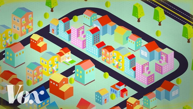
As you drive around a city, you’ll see streets, avenues, lanes, courts, parkways, and more types of roads than you can count. Turns out, those naming conventions aren’t just for kicks. They actually mean something.

In this video from the Vox YouTube channel, Phil Edwards gives the lowdown on what all those words means when it comes to transportation. Here’s a quick taste of what you’ll learn:

  • Road (Rd.): Can be anything that connects two points. The most basic of the naming conventions.
  • Way: A small side street off a road.
  • Street (St.): A public way that has buildings on both sides of it. They run perpendicular to avenues.
  • Avenue (Ave.): Also a public way that has buildings or trees on either side of it. They run perpendicular to streets.
  • Boulevard (Blvd.): A very wide city street that has trees and vegetation on both sides of it. There’s also usually a median in the middle of boulevards.
  • Lane (Ln.): A narrow road often found in a rural area. Basically, the opposite of a boulevard.
  • Drive (Dr.): A long, winding road that has its route shaped by its environment, like a nearby lake or mountain.
  • Terrace (Ter.): A street that follows the top of a slope.
  • Place (Pl.): A road or street that has no throughway—or leads to a dead end.
  • Court (Ct.): A road or street that ends in a circle or loop.

Knowing what each road type does can help you navigate almost any city a lot easier. You’ll have a better sense of direction and won’t have to rely on Google Maps as much. Not every city in the world follows these naming conventions exactly, but you’d be surprised how many do.

How streets, roads, and avenues are different | YouTube

from Lifehacker, tips and downloads for getting things done http://lifehacker.com/the-difference-between-streets-boulevards-avenues-an-1789115850

How Zara Spent $0 In Advertising To Disrupt The Fashion Industry

In September 2016, Microsoft founder Bill Gates slipped to #2 in Forbes’ annual list of the World’s Richest Billionaires. Gates’ premier position, which he had steadfastly maintained for many years, was usurped — if only for a few days — by an Amancio Ortega. In comparison to Gates’ public stature and celebrity, Ortega was a relative unknown and it took market watchers, entrepreneurs and business journalists a few incredulous Google searches to discover that the 80-year-old Spaniard was actually the founder of clothing giant Zara.

On closer inspection though, it seems hardly surprising that a figure as unknown and low-key as Ortega helms one of the world’s largest fashion empires. For one, Zara, in keeping with Ortega’s reluctance to do interviews or court any kind of publicity, invests little to no money in advertising. Unlike competing brands and fashion houses, Zara scarcely appears on billboards; its collections do not figure in fashion shows; neither does it lobby for Vogue’s gilded pages, nor does it associate itself with any celebrities or high-profile fashion designers.

Indeed, it bends all the rules and defies all the conventions that have endured since the time fashion, as it were, emerged from the aristocratic salons and bohemian boutiques of 19th Century Paris, and entered the mass market. And yet, Zara is thriving. With over 2,100 stores across the world and a revenue of $15.9 Billion (2016), it is one of the most valuable companies in the world.

Unlike competing brands and fashion houses, Zara scarcely appears on billboards; its collections do not figure in fashion shows; neither does it lobby for Vogue’s gilded pages, nor does it associate itself with any celebrities or high-profile fashion designers.

Unlike competing brands and fashion houses, Zara scarcely appears on billboards; its collections do not figure in fashion shows; neither does it lobby for Vogue’s gilded pages, nor does it associate itself with any celebrities or high-profile fashion designers.

So how does Zara do it?

The answer is Fast Fashion. Fast Fashion, pioneered by Zara, is both the dynamo of its success and its most distinguishing factor. In contradistinction, legacy fashion brands, whose products are priced higher, follow the more orthodox and time-honored approach of Seasonal Fashion, wherein the bulk of their inventory is designed and manufactured before the beginning of every season, allowing no room for design improvements or changes mid-season.

Before proceeding, let’s strike a clear distinction between Fast Fashion and Seasonal Fashion clothing. While most apparel brands reserve 80% of their inventory towards Seasonal Fashion clothing, Zara does the opposite, reserving only 50% for its seasonal line and devoting the rest to Fast Fashion items. From hereon, all facts, figures and details will relate to Zara’s Fast Fashion clothing and not the other 50% of its inventory.

What is Fast Fashion?

Since it came en vogue, Fast Fashion has been adopted by several other brands — H&M, notably, commits up to 20% of its inventory towards Fast Fashion items — with the result that the concept has become elastic and loosely defined. We’ve, however, tried to delineate it by examining its core features.

Fast Fashion is at the very centre of Zara’s strategy; it is what gives it an edge over legacy fashion retailers like Calvin Klein, Armani etc.

Frugal

Zara’s approach to Fast Fashion can be traced to Ortega’s earliest business venture in 1963 — when he sold quilted bathrobes and lingerie that were inspired from designer brands. To this day, Zara stays true to Ortega’s thrifty design processes. Compared to its competitors, the company does not hire high-profile designers or invest too heavily in crafting wholly original designs. In contrast, its designers, young, anonymous and enthusiastic, work in concert to create and modify designs with strict adherence to market demands.

Imitative

Zara’s genius lies in identifying the latest fashion fads; it keeps an army of fashion watchers who keep an eye on what’s trending on runways, what couture brands are producing and what avant-garde designers are exhibiting, and accordingly tailoring its fabrics to stay on top of trends. In doing so, Zara has run afoul of the storied gatekeepers of fashion as well as indie designers. In 2012, luxury brand Christian Louboutin took legal action against Zara for allegedly imitating one of its shoe designs and selling it at half the price. Although the case was dismissed, fashion journalists surmised that Zara manages to steer clear of trouble by tweaking its designs just enough to avoid copyright violations. Similarly, young and emerging designers have railed against Zara for selling alleged knockoffs of their work.

Zara’s genius lies in identifying the latest fashion fads; it keeps an army of fashion watchers who keep an eye on what’s trending on runways, what couture brands are producing and what avant-garde designers are exhibiting, and accordingly tailoring its fabrics to stay on top of trends.

Zara’s genius lies in identifying the latest fashion fads; it keeps an army of fashion watchers who keep an eye on what’s trending on runways, what couture brands are producing and what avant-garde designers are exhibiting, and accordingly tailoring its fabrics to stay on top of trends.

Responsive

If you had been shopping for jeans at any of Zara’s outlets in New York City in the later months of 2001, chances are that you purchased a pair that was black in color. This isn’t mere coincidence; instead, it is a part of Fast Fashion’s core strategy. A few days after the September 11 attacks rocked NYC, Zara’s store managers realized that the bulk of their customers were in a sullen mood. The observation was relayed to Zara’s designers, who quickly swung into motion. Only a few weeks later, Zara rolled out a new collection that was entirely in black.

In fashion parlance, turnaround time represents the time it takes for a current collection to be replaced by a new one. For most fashion retailers, the turnaround time is 3–6 months. In comparison, Zara, as it demonstrated in the aftermath of September 11, can push a collection from the canvas to the store shelf in two weeks.

What Makes Fast Fashion So Fast

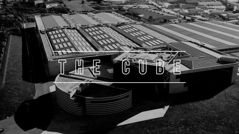
The Cube is where Zara’s 200-member design team, its procurement and production teams work in coordination. Tokyo, Mumbai, Rio de Janeiro or London — no matter where you shop, at least 50% of every Zara outlet’s inventory (in other words, its Fast Fashion inventory) begins its course at The Cube.

The Cube is where Zara’s 200-member design team, its procurement and production teams work in coordination. Tokyo, Mumbai, Rio de Janeiro or London — no matter where you shop, at least 50% of every Zara outlet’s inventory (in other words, its Fast Fashion inventory) begins its course at The Cube.

Arteixo is a quiet town located in A Coruña, on the Spanish coastline. With its Galician architecture and historical landmarks, it seems hardly indistinct from the dozens of heritage towns dotting the Spanish countryside. Under its cobbled streets, though, runs a 124-mile-long network of high-speed monorail tracks that converge under a colossal and forbidding megastructure called The Cube. Given its enormity and futuristic design, The Cube seems like something out of the sets of 2001 A Space Odyssey. It is, in actuality, the nerve centre of Zara’s worldwide operations.

The Cube is where Zara’s 200-member design team, its procurement and production teams work in coordination. Tokyo, Mumbai, Rio de Janeiro or London — no matter where you shop, at least 50% of every Zara outlet’s inventory (in other words, its Fast Fashion inventory) begins its course at The Cube.

Read The Rest Here


How Zara Spent $0 In Advertising To Disrupt The Fashion Industry was originally published in The Startup on Medium, where people are continuing the conversation by highlighting and responding to this story.

from The Startup – Medium https://medium.com/swlh/how-zara-spent-0-in-advertising-to-disrupt-the-fashion-industry-59526b5000af?source=rss—-f5af2b715248—4